Blue and Red Counties in the 2008 Presidential Election: An Analysis of Intracluster Correlation
←
→
Page content transcription
If your browser does not render page correctly, please read the page content below
AAPOR – May 14-17, 2009
Blue and Red Counties in the 2008 Presidential Election:
An Analysis of Intracluster Correlation
Bonnie E. Shook-Sa1 and Vincent G. Iannacchione2
1
RTI International, 3040 East Cornwallis Road, Research Triangle Park, NC 27709
2
RTI International, 701 13th Street, N.W., Suite 750, Washington, DC 20005
Abstract
Recent theories suggest that individuals are clustering within culturally and politically
homogeneous neighborhoods. This clustering has led to an increasingly polarized
electorate comprised of individuals who have an increased intolerance for ideas and
behaviors that are different from their own (Bishop, 2008).
The 2008 American National Election Time Series Study (ANETSS), a nationally-
representative political behavior and public opinion survey, is based on a probability
sample of 82 Counties. Using intracluster correlation as a measure of “sameness” on key
outcomes (e.g., political ideology, voting behavior, religious affiliation, and political
enthusiasm), we evaluate whether or not the 2008 ANETSS data support the clustering
theory within counties.
Key Words: Political Polarization, Cluster Analysis, 2008 American National Election
Time Series Study
1. A Big Sort?
Recent theories suggest that individuals have been clustering themselves into culturally
and politically homogeneous places (Bishop, 2008). Over the past several decades,
people across the country have migrated into culturally-distinct neighborhoods, resulting
in a political segregation. Communities across the United States have become more
homogeneous in cultural values, religious beliefs, and political attitudes. In The Big Sort,
Bill Bishop claims that this clustering has led to an increasingly polarized electorate
comprised of individuals who have an increased intolerance for ideas and behaviors that
are different from their own.
1.1 Level of Clustering
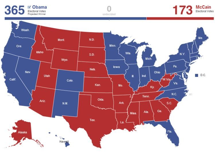
Under the electoral system in the United States, the presidential candidate receiving the
plurality of each state’s votes wins all of the electoral votes for that state1. This ‘winner
takes all’ system means that much attention is given to the concept of red states (voting
predominately for Republican candidates) and blue states (voting predominately for
Democratic candidates) (see Exhibit 1). Looking at county vote returns within each state,
it is evident that political segregation is occurring not at the state level, but at the county
or sub-county level (see Exhibit 2). If we define ‘landslide’ blue counties as those where
more than 60% of voters voted for Barack Obama in the 2008 Presidential election and
‘landslide red’ counties as those where more than 60% of voters voted for John McCain,
then we see that there are landslide blue counties in red states and landslide red counties
in blue states (see Exhibit 3). This clustering likely extends to the sub-county level, where
1
Nebraska and Maine do not follow the ‘winner takes all’ rule.
6148AAPOR – May 14-17, 2009
blue neighborhoods exist within red counties and red neighborhoods exist within blue
counties.
Exhibit 1: 2008 Presidential Vote Results by State2
Exhibit 2: 2008 Presidential Vote Results by County3
State Color County Outcome Number of Counties Percent
Landslide Blue 200 6%
Landslide Red 251 8%
Blue
Other 969 31%
Total 1,420 46%
Landslide Blue 99 3%
Landslide Red 1,072 34%
Red
Other 523 17%
Total 1,694 54%
Exhibit 3: Distribution of Landslide Counties in the 2008 Presidential Election4
2
http://elections.nytimes.com/2008/results/president/map.html
3
http://www.washingtonpost.com/wp-
srv/politics/interactives/campaign08/election/uscounties.html
6149AAPOR – May 14-17, 2009
1.2 Characteristics that Define Clustering
Several demographic characteristics define the clustering of individuals into politically
and culturally homogeneous communities (Bishop 2008). In recent elections, population
density has been a strong predictor of political preference. Republicans have been
migrating to rural areas of the country while Democrats have been migrating to more
urban areas.
Education, income, and age have also become defining characteristics of the clustering.
People with post-secondary education have been migrating to cities with high
concentrations of people with higher education degrees, creating both income disparities
and disparities in educational attainment among different cities across the country. This
trend is even more pronounced for young Americans, and the disparities are particularly
striking when looking at urban versus rural areas. Young adults in rural areas are less
likely to have a college degree than young adults in urban areas.
There is also a religious component to the clustering. Democratic counties have been
losing churchgoers in recent years, while church membership has been increasing in
predominately Republican counties. This has political implications. Those who attended
church at least once a week were more likely to vote Republican in 2000 and 2004.
Additionally, there are racial and marital components to the clustering. Since 1970, white
Americans have become increasingly more concentrated in counties voting
predominately for Republicans. A higher percentage of people are married in
predominately Republican counties than in predominately Democratic counties.
2. The 2008 American National Election Time Series Study
2.1 Survey Design
The 2008 American National Election Time Series Study5 (ANETSS) is a nationally-
representative survey of political behaviour and public opinion. It was based on a multi-
stage probability sample consisting of 82 counties, 160 Census Tracts, 297 Census Block
Groups (CBGs), and resulted in 2,323 pre-election interviews. The 2008 ANETSS over-
sampled Latinos and African Americans.
The ANETSS data were weighted to reflect the different selection probabilities at various
stages of sampling and to compensate for differential nonresponse and undercoverage.
The weighting process entailed three major steps. The first step consisted of the
computation of design weights to account for unequal probabilities of selection at each
stage. In the second step, the design weights were adjusted for nonresponse using a
response propensity approach (Folsom 1991). In the third step, the nonresponse-adjusted
weights were poststratified to Current Population Survey estimates of the target
population of U.S. citizens 18 years of age and older to ensure proper coverage.
4
Landslide Counties are those where over 60% of the voters voted for either Barack Obama
(Landslide Blue Counties) or John McCain (Landslide Red Counties).
County Vote Results were taken from http://www-
personal.umich.edu/~mejn/election/2008/counties.xls and
http://www.usatoday.com/news/politics/election2008/president.htm
5
http://www.electionstudies.org/
6150AAPOR – May 14-17, 2009
We used the PROC WTADJUST procedure in SUDAAN (RTI 2008) to adjust the design
weights for nonresponse, undercoverage, and to truncate extreme weights. The procedure
implements the Generalized Exponential Model of Folsom and Singh (2000) which
provides double protection against the biases from nonresponse and coverage error
because its use can be justified with either a coverage model or with a response
prediction model. Extreme weights were trimmed in a way that any losses/gains in the
weight sums were accounted for in the subsequent computation of the weight
adjustments.
2.2 The 2008 ANETSS and Political Clustering
Since the primary sampling units (PSUs) in the 2008 ANETSS were counties and since
the ANETSS measures political and cultural outcomes related to the factors contributing
to the political clustering described in The Big Sort, both the design and the content of
the ANETSS enabled a two-part analysis of the political clustering theory. First, we
examined relevant study outcomes to determine whether or not political clustering
existed within counties. Then, we attempted to explain within-county homogeneity using
demographic factors such as education, age, and race.
We first assigned a color to each county using auxiliary data. We assigned each of the 82
counties in the sample a county color based on the actual vote returns for that county (see
Exhibit 4). These color assignments consisted of landslide victory counties (very blue
and very red), solid victory counties (blue and red), and battleground counties (purple).
County Color County Vote Results
Very Blue % Obama > 60%
Blue 52% ≤ % Obama ≤ 60%
Purple % Obama < 52% and % McCain < 52%
Red 52% ≤ %McCain ≤ 60%
Very Red % McCain > 60%
Exhibit 4: Assignment of County Color
Did the ANETSS Track the 2008 Election Results?
Before using the results of the 2008 ANETSS to determine whether or not political and
cultural clustering exists in the United States, we first wanted to ensure that the 2008
ANETSS adequately represented the population. Despite the over-sample of Latinos and
African-Americans, weighted estimates from the 2008 ANETSS tracked the overall
election results very closely (see Exhibit 5).
Actual
Standard Popular
Candidate Estimate Error Vote6
Barack Obama 53.0% 2.9% 52.7%
John McCain 43.5% 2.9% 46.0%
Other 1.9% 0.5% 1.3%
Don't Know / Refused 1.7% 0.3% N/A
Exhibit 5: Estimated 2008 Presidential Vote and Actual Popular Vote
6
CNN Election Center (2008)
6151AAPOR – May 14-17, 2009
Did the ANETSS Track the 2008 Election Results by County Color?
Since our analysis is based on a comparison of different types of counties from the 2008
ANETSS (i.e. different county colors), we wanted to ensure that the 82 counties in the
sample were representative of the population in terms of the distribution of county colors.
As Exhibit 6 shows, the estimated distribution of the eligible voting population from the
ANETSS (Sample Distribution) tracks fairly closely to the national distribution of the
voting population7 within each county color. For example, 27% of the voting population
live in counties that voted in a landslide for Barack Obama (very blue counties), while the
weighted estimate from the 2008 ANETSS is 22% with a standard error of 5%.
National Sample Std.
County Color Distribution Distribution Error
Very Blue 27% 22% 5%
Blue 25% 18% 5%
Purple 15% 18% 5%
Red 16% 17% 5%
Very Red 17% 25% 6%
Exhibit 6: Comparison of National and Sample County Color Distribution
3. A Measure of Homogeneity
Since the goal of this analysis was to compare the degree of homogeneity among
different types of counties (e.g. blue counties and red counties), we needed a measure for
this homogeneity.
Intracluster correlation (ICC) is a measure of homogeneity within clusters. ICC tells us
how similar elements within the same cluster are on a particular outcome (Lohr 1999).
M SSW
ICC 1 * , where
M 1 SSTO
M = cluster size
SSW = Sum of Squares within PSUs
SSTO = Total Sum of Squares
Thus a high ICC indicates a high level of homogeneity within clusters since most of the
total variance is due to variation between clusters rather than variation within clusters.
ICC is a better measure of homogeneity than simply comparing means and confidence
intervals since ICC tells us the source of the variation (between clusters versus within
clusters). Means and standard errors can be similar with very different ICCs. This is
evident in Exhibit 78. The estimated proportions of people in very blue counties who felt
7
The national distribution excludes Alaska and Hawaii since they were excluded from the target
population of the 2008 ANETSS
8
All ICC estimates were made using SUDAAN’s (RTI 2008) PROC LOGISTIC and PROC
REGRESS
6152AAPOR – May 14-17, 2009
angry or afraid of Barack Obama were similar, but we estimated more within-county
agreement on the ‘afraid’ question than the ‘angry’ question.
Outcome Mean Std. Error ICC
Angry 20% 2% 0.04
Afraid 19% 3% 0.10
Exhibit 7: Comparison of Means, Standard Errors, and ICCs for Two Outcomes from the
2008 ANETSS in Very Blue Counties
4. Analysis and Results
We calculated the ICCs within each of the five county colors for 26 political attitude,
political behavior, and cultural behavior outcomes from the 2008 ANETSS. We expected
that ICC would be the highest in landslide counties (very blue and very red), moderate in
solid victory counties (blue and red), and lowest in battleground counties (purple). This
would produce a U-shaped graph as we moved from very blue to very red counties.
4.1 Single Outcome ICCs
Many outcomes from the 2008 ANETSS demonstrated the U-shaped ICCs. Exhibit 8
shows the support for Barack Obama (the respondent either voted for Obama or, if the
respondent did not vote, the respondent intended to vote for Obama). As would be
expected, the proportion of support for Obama decreased from very blue to very red
counties (from 73% to 37%). However, the ICCs follow a U-shaped pattern, with the
strongest levels of homogeneity in the very blue and very red counties, and weakest
homogeneity demonstrated in the purple counties.
80% 0. 2 0
73%
0. 1 8
70% 64%
0. 1 6
58%
60%
53% 0. 1 4
50% 0. 1 2
Mean
ICC
40% 37% 0. 1 0
0. 0 8
30%
0. 0 6
20%
0. 0 4
10%
0. 0 2
0% 0. 0 0
Very Blue Blue Purple Red Very Red
Exhibit 8: Support for Barack Obama: Means and ICCs in the 2008 ANETSS
While many outcomes that we expected to demonstrate within-county homogeneity did
so, other outcomes did not demonstrate the homogeneity that we expected. For example,
weekly church attendance across the different county colors did not demonstrate
6153AAPOR – May 14-17, 2009
noticeable differences, either in the percent who attend church once a week or on the
within-county homogeneity (ICCs) on this issue (see Exhibit 9).
0. 2 0
80%
0. 1 8
70%
0. 1 6
60%
0. 1 4
50% 0. 1 2
Mean
ICC
40% 0. 1 0
0. 0 8
30% 26%
23% 22% 22%
20% 0. 0 6
20%
0. 0 4
10%
0. 0 2
0% 0. 0 0
Very Blue Blue Purple Red Very Red
Exhibit 9: Church Attendance: Means and ICCs in the 2008 ANETSS
Averaged across all 26 individual outcomes of interest, the ICCs within each county color
demonstrate the expected U-shape (see Exhibit 10). While it is clear from the minimum
ICC within each county color that some outcomes demonstrated little to no clustering, as
a whole the 2008 ANETSS data did support the clustering theory. However, ICCs in
general were lower than expected. The maximum ICC across the 26 outcomes for any
county color was 0.26, which means that an estimated 74% of the variation on this
outcome was attributable to within-county variation. This within-county heterogeneity
might be explained by sub-county clustering (i.e. there are red neighborhoods in blue
counties and blue neighborhoods in red counties).
Very Very
Blue Blue Purple Red Red
Minimum 0.03 0.00 0.00 0.00 0.00
Maximum 0.25 0.26 0.13 0.14 0.16
Median 0.09 0.03 0.02 0.04 0.05
Mean 0.11 0.04 0.04 0.04 0.06
Exhibit 10: ICCs for 26 Outcomes of Interest from the 2008 ANETSS
4.2 Explaining the Homogeneity
In The Big Sort, Bill Bishop proposes several outcomes that contribute to the clustering
of individuals within like-minded communities. To test whether or not these variables
‘explain away’ the homogeneity, we fit both the unadjusted model demonstrated in
section 4.1 (Obama = county color) and an adjusted model using variables related to the
covariates Bishop citied as defining factors of the homogeneity (Obama = County Color,
Race, Urbanicity, Education, Marital Status, Age, Church Attendance). The results
demonstrate that the covariates account for almost all of the homogeneity within blue,
6154AAPOR – May 14-17, 2009
purple, and red counties. However, there is still some homogeneity left unexplained in
the very blue and very red counties (see Exhibit 11).
0.18
0.16
Unadjusted Model
0.14
Adjusted Model
0.12
ICC
0.10
0.08
0.06
0.04
0.02
0.00
Very Blue Blue Purple Red Very Red
Exhibit 11: Unadjusted ICC vs. ICC Adjusted for County Color, Race, Urbanicity,
Education, Marital Status, Age, and Church Attendance
5. Conclusion and Future Work
For some attitudes and behaviors, such as feelings towards Barack Obama and John
McCain, the data in the 2008 ANETSS show evidence of political clustering. The data
show higher levels of within-county homogeneity in landslide counties (counties that are
more politically clustered) than competitive counties (counties that are not as politically
clustered) for several outcomes of interest. However, the data show that some attitudes
that we would expect to demonstrate within-county homogeneity are not homogeneous
within counties, such as church attendance and feelings about same-sex marriage. Other
attitudes are more homogeneous in red counties than blue counties (e.g. feelings about
whether or not the country is headed in the right direction) or in blue counties than red
counties (e.g. feelings towards Christian Fundamentalists).
Education, race, urbanicity, age, and marital status explain much of the within-county
homogeneity for support for Obama, but the remaining homogeneity in the landslide
counties and the relatively low ICCs in general demonstrate the need to look below the
county level.
Future work will focus on neighborhood homogeneity. Census Block Groups (CBGs) are
geographic areas that, on average, contain about 500 households, so CBGs can be thought
of as neighborhoods. The 2008 ANETSS data come from 297 CBGs, which allows for
analysis at the neighborhood level. We will utilize Hierarchical Linear Modeling (HLM)
as a way to estimate the variance components attributable to counties and to CBGs within
6155AAPOR – May 14-17, 2009
counties. We will also use a Jackknife method to calculate variances for the ICCs to
utilize formal testing between the county colors on various outcomes of interest.
Acknowledgements
The authors would like to acknowledge the work of Bill Bishop and Robert Cushing
since inspiration for this paper came from The Big Sort.
The authors would also like to acknowledge Joseph McMichael and Joe Eyerman for
their contributions to this research.
References
Bishop, Bill. The Big Sort. Boston: Houghton Mifflin, 2008.
Folsom, R.E. (1991). “Exponential and logistic weight adjustments for sampling and
nonresponse error reduction.” Proceedings of the American Statistical
Association, Section on Survey Research Methods, pp.197-202.
Folsom, R.E. and A.C. Singh (2000). “The generalized exponential model for sampling
weight calibration for extreme values, nonresponse, and poststratification.”
Proceedings of the American Statistical Association, Section on Survey Research
Methods, pp. 598-603.
Lohr, S.L. (1999). Sampling: Design and Analysis. Brooks/Cole Publishing Company,
Pacific Grove, CA.
Research Triangle Institute (2008). “SUDAAN Language Manual, Release 10.0.”
Research Triangle Park, NC: Research Triangle Institute.
6156You can also read