Brand Guidelines 2021 - Emergency Nurses Association
←
→
Page content transcription
If your browser does not render page correctly, please read the page content below
Brand Guidelines 2021

                        last revised: 06/01/21
Letter from the Chief Executive Officer
The dynamic nature of emergency nursing requires a vibrant and exciting brand. One that represents
the energy, passion and commitment necessary to succeed. Built with this goal in mind, we are proud
to share ENA’s new brand you.

Our brand is the visual and verbal representation of our mission, vision and core values. A strong brand
is critical to future of ENA and does several important things:

          • Reinforces our brand awareness and increases consideration through consistent use
          • Heightens nursing awareness of ENA and our mission
          • Enhances ENA’s credibility
          • Improves the recognition of the ENA Foundation

This document articulates all core elements of the new ENA brand. Verbal and visual components working together
in harmony. The resulting experience will be a unified and compelling representation of ENA. We are all stewards of
our brand and it is everyone’s responsibility to adhere to these guidelines.

We hope this helps you in your efforts to implement the new ENA Brand.

                                                  Regards,

                                                  Nancy MacRae, MS
                                                  Chief Executive Officer
Table of Contents
Our Story . . . . . . . . . . . . . . . . . . . . . . . . . . . . . . . . . . . . . . . .                  4
      Our Belief . . . . . . . . . . . . . . . . . . . . . . . . . . . . . . . . . . . . . . . . . . . . . 9
      Our Voice . . . . . . . . . . . . . . . . . . . . . . . . . . . . . . . . . . . . . . . . . . . . 10

Logo . . . . . . . . . . . . . . . . . . . . . . . . . . . . . . . . . . . . . . . . . . . . .             11
      Logo Elements . . . . . . . . . . . . . . . . . . . . . . . . . . . . . . . . . . . . . . . .        12
      Tagline Overview  . . . . . . . . . . . . . . . . . . . . . . . . . . . . . . . . . . . . .          13
      Logo Colors . . . . . . . . . . . . . . . . . . . . . . . . . . . . . . . . . . . . . . . . . .      14
      Size and Spacing . . . . . . . . . . . . . . . . . . . . . . . . . . . . . . . . . . . . . .         15
      Logo Misuse . . . . . . . . . . . . . . . . . . . . . . . . . . . . . . . . . . . . . . . . . .      16
      Foundation Logo . . . . . . . . . . . . . . . . . . . . . . . . . . . . . . . . . . . . . .          17
      Logo Alternate  . . . . . . . . . . . . . . . . . . . . . . . . . . . . . . . . . . . . . . .        18

State and Chapter Logos . . . . . . . . . . . . . . . . . . . 19
      Additional Lockup Examples . . . . . . . . . . . . . . . . . . . . . . . . . . . .                   21
      National Logo Usage  . . . . . . . . . . . . . . . . . . . . . . . . . . . . . . . . . .             22
      Personalization . . . . . . . . . . . . . . . . . . . . . . . . . . . . . . . . . . . . . . .        23
      Do’s and Don’ts . . . . . . . . . . . . . . . . . . . . . . . . . . . . . . . . . . . . . . .        24
      Lapel Pins . . . . . . . . . . . . . . . . . . . . . . . . . . . . . . . . . . . . . . . . . . . .   25

Color . . . . . . . . . . . . . . . . . . . . . . . . . . . . . . . . . . . . . . . . . . . . . 26
      Primary Color Palette . . . . . . . . . . . . . . . . . . . . . . . . . . . . . . . . . .            27
      Secondary Color Palette  . . . . . . . . . . . . . . . . . . . . . . . . . . . . . . .               28
      Accent Color Palette  . . . . . . . . . . . . . . . . . . . . . . . . . . . . . . . . . .            29
      Foundation Color Palette . . . . . . . . . . . . . . . . . . . . . . . . . . . . . . .               30

Typography . . . . . . . . . . . . . . . . . . . . . . . . . . . . . . . . . . . .                         31
      Primary Headline, Sans-Serif Typeface . . . . . . . . . . . . . . . . . . . 32
      Secondary Body, Serif Typeface . . . . . . . . . . . . . . . . . . . . . . . . . 33
      Primary Web-Safe Alternate Typeface . . . . . . . . . . . . . . . . . . . 34

Applied Brand . . . . . . . . . . . . . . . . . . . . . . . . . . . . . . . . . 35
      Brand Identity: Letterhead  . . . . . . . . . . . . . . . . . . . . . . . . . . . . . 36
      Brand Identity: Business Card  . . . . . . . . . . . . . . . . . . . . . . . . . . 37
      Brand Identity: Envelope . . . . . . . . . . . . . . . . . . . . . . . . . . . . . . . 38

Image/Graphic Style . . . . . . . . . . . . . . . . . . . . . . . . . 39
      Photography Style  . . . . . . . . . . . . . . . . . . . . . . . . . . . . . . . . . . . . 40
      Graphic/Pattern  . . . . . . . . . . . . . . . . . . . . . . . . . . . . . . . . . . . . . . 41
“Brand is the promise,
Why do we need brand                                              the big idea, the expectations
                                                               that reside in each customer’s mind
guidelines?                                                    about a product, service or company.
In today’s world, people are constantly bombarded                    Branding is about making
with competing messaging. The clutter and volume are                an emotional connection.”
overwhelming. It’s increasingly difficult for organizations               —Alina Wheeler, author
to be noticed and remembered. To counter, organizations                 of Designing Brand Identity
are developing a uniform and easily recognized identity
system to communicate consistent messaging to their
members.

Our goal is whenever a member opens an ENA email,
receives an ENA brochure, visits the ENA website…
                                                              How should this guide
the experience is the same. They immediately know:
This is ENA.                                                  be used?
                                                              This is a guide to the basics that must be followed in all
With a consistent voice in place, ENA can clearly tell its    instances. This guide should not limit creativity; instead,
story and build an emotional connection with members.         it should provide direction that will guide all to produce
                                                              materials with greater consistency, recognizability and
This guide provides several identity pieces to help build     visual harmony.
brand consistency:
                                                              This guide is a living document; it will continually be
       • Logo                                                 edited and updated. Please visit the ENA Brand Center
                                                              for the current version.
       • Color

       • Typography

       • Applied Brand                                        Whom can I contact with
       • Image/Graphic Style                                  questions?
                                                              Contact creative at the National Office,
                                                              creative@ena.org.
Who should use this guide?
ENA staff, volunteers, and state and chapter leaders
will use these guidelines when designing or producing
materials, or when directing outside vendors to
produce materials. These guidelines should also be
given to corporate partners or other organizations that
will produce materials with the ENA name and logo.

2 | 2021 BRAND GUIDELINES
Who We Are
               We are the premier association that connects,
               educates and advocates for the improvement
               of the emergency nursing profession.

3 | 2021 BRAND GUIDELINES
Our Story

4 | 2021 BRAND GUIDELINES
Listen Intently

5 | 2021 BRAND GUIDELINES

Prepare Confidently

6 | 2021 BRAND GUIDELINES
Exceed Expectations

7 | 2021 BRAND GUIDELINES

ENA has positioned itself as the premier emergency
         nurses association for nearly 50 years by staying involved
         with members.
         By listening to our member base, understanding is one of ENA’s
         core competencies. We understand what resources emergency
         nurses need. We understand how to effectively provide educational
         tools. We understand each other’s day-to-day struggles. We also
         acknowledge that we don’t know everything. We recognize that
         every emergency nurse — experienced and inexperienced — has a
         unique set of obstacles and opportunities. We want to understand
         and analyze everything from the best way to triage to understanding
         when emergency nurses take lunch breaks (if they can find the time).
         We obsess over these details and distinctions because we believe
         they contribute to the defining of ENA’s story — where we’ve been,
         where we are now, and more importantly… where we’re going.

8 | 2021 BRAND GUIDELINES
OUR STORY Our Belief
A Ready
Resource
We believe we can enhance the emergency nursing profession by offering educational
resources, an understanding community and a powerful voice. Rather than viewing
ourselves just as an association, we see ourselves as a true addition to the emergency
nursing profession.
In a rapidly changing field with new obstacles and opportunities, ENA is the nurse’s
advocate, support system and guide to best-practice care solutions.
9 | 2021 BRAND GUIDELINESOUR STORY Our Voice
Passionately
Informative
In a profession that’s extremely fast-paced, we pride ourselves on communicating
clearly and efficiently. Our messaging is direct, informative and concrete while
maintaining an approachable tone that allows for connection.
10 | 2021 BRAND GUIDELINESLogo 11 | 2021 BRAND GUIDELINES
LOGO                         Logo Elements
                             The logo is one of, if not the most important element within a brand system. It’s
                             designed to act as the face of a brand and represent its essence and overall aesthetic.
                             Oftentimes, the logo is the first experience a viewer has with an organization’s brand.
                             So, it is imperative that it be legible, conceptually strong and captures the spirit of
                             what the brand is all about. The ENA logo does this with a bold, energetic presence
                             driven by the large letterforms. The logo deservingly places the emphasis on the
                             “N” found in the middle, negative space. Symbolically, it creates a mental link of
                             envisioning oneself filling that space, fitting into ENA.

                                                 Negative space forming “N” letterform

                                                                                                    Logomark

                                                                                                    Logotype

12 | 2021 BRAND GUIDELINES
LOGO Tagline Overview
Whether it’s through education or advocacy, ENA genuinely cares about the
members’ safety and preparation when in the emergency department. Additionally,
“Committed to Care” is something that’s deeply embedded within the emergency
nursing profession as a whole.
Tagline
Tagline Horizontal Alternate
Logo/Tagline
13 | 2021 BRAND GUIDELINESLOGO Logo Colors
The primary use of the logo should always be in the primary purple and dark gray (see
pages 22–25 for color breakdown). White is permitted for environments that require
contrast. When color is not possible, black is permitted.
Other logo productions
METALLIC SILVER AND produced as jewelry. It can be blind
FOIL STAMP embossed, debossed or etched on glass.
If there’s a need for a touch of elegance, The logotype can also be laser-cut into
a metallic silver color (not gold, bronze, materials. Additionally, it can be printed
etc.) may be used. Pantone 10077 is or embroidered onto fabric. Always
a premium silver metallic ink that’s a remember that quality control is vitally
cost-efficient way to add a bit of sparkle important, so be sure to ask for a proof
to a piece. In addition to printing, a more to ensure the integrity of the logotype.
expensive, but beautiful, way to add In certain limited circumstances, it may
silver is by using a foil stamp process. be necessary to use an alternate version
(as seen on page 20) of the logo to
OTHER PRODUCTION METHODS ensure the legibility of the “N” in the
In addition to printing, the logotype can negative space. This alternate version
be produced using a variety of methods, of the logo is only to be used with
such as silk screening, embroidery, explicit permission from creative,
molded plastic or environmental creative@ena.org.
installations. The logotype can be
14 | 2021 BRAND GUIDELINESLOGO Size and Spacing
Every logo lives in a variety of environments, surrounded by various design elements —
patterns, images, graphic elements or even other logos. For this reason, the space
allotted around the logo is essential to properly represent the brand. The logo should
be surrounded on all sides by clear space the height of the bottom arm of the “E.” The
only exceptions to this rule are the tagline or chapter lockups. To protect legibility and
impact, the logo must be reproduced no smaller than 0.5" (12.7 mm). When reproduced
in sizes smaller than this minimum, the logo loses its legibility and impact.
X
X
X
Size and Spacing
1in./72pt.
15 | 2021 BRAND GUIDELINESLOGO Logo Misuse
To establish and reinforce awareness and recognition of the logo, consistent
reproduction is essential. To ensure consistency, never alter the color, rotate, distort or
add shadows, glows, strokes or other effects to the logo. The logo must never appear
within a shape or container, be typeset or be used in a sentence. The logo should also
never be used to create a custom lockup (e.g., chapter name or custom URL). Use only
the approved digital files that are supplied from the National Office.
EMERGENCY NURSES
ASSOCIATION
Chicago
16 | 2021 BRAND GUIDELINESLOGO Foundation Logo
The ENA Foundation is differentiated from the main ENA brand in color applied to the
logomark. Structurally, it’s arranged and locked up much like the main ENA logo. The
“Foundation” logotype is typeset in the same space underneath the main logomark
and spans the full length of the “E-N-A.” The tagline lockup follows suit with the main
ENA logo, having a separating line with the tagline to the right.
Main Foundation Logo
Foundation
Logotype
Foundation Logo/Tagline Lockup
17 | 2021 BRAND GUIDELINESLOGO Logo Alternate
In limited scenarios where the ENA logo is being produced in various methods
where the “N” in the negative space becomes illegible or does not allow for the
floating triangle spaces within the mark, there’s an alternate logo that’s available
for use. These various methods may include signage, embroidery or environmental
productions. This version of the logo is only to be used when the primary ENA logo
can’t be used to properly produce in a legible fashion that maintains the integrity of
the brand and name. This alternate is only to be used with approval from creative
at the National Office, creative@ena.org.
Enclosed white space for increased legibility
18 | 2021 BRAND GUIDELINESState and
Chapter Logos
19 | 2021 BRAND GUIDELINESSTATE AND State and Chapter Logos
CHAPTER
Because ENA is a nationwide organization with a number of chapters within each state,
LOGOS it’s important for the logo to function well as a stand-alone brand element, as well as
locked up with the names of local chapters. In this way, states and chapters have a sense
of ownership within the overall ENA organization and brand. The state/chapter name
is typeset below and left-aligned to the main logomark. The state/chapter name should
use the Nunito Sans SemiBold Italic font and same gray as the main logotype to maintain
a cohesive look and feel, while introducing a new level of hierarchy. Placing the state/
chapter name below the main logo allows these lockups to work with the tagline
as well.
The state/chapter names should not extend past the width of the main ENA mark,
whether by itself or locked up with the tagline. If the name is too long to fit on one line
underneath the ENA mark, there should be a break to a second line of text. Whenever
possible, widows (single-word lines of text) should be avoided. It’s also important
to balance multiple-line lockups so that the width disparity between these lines
of text are as minimal as possible. See the next page for examples of multiple-line
state/chapter lockups.
State and chapter logos are available in the ENA Brand Center. For alternate logos,
contact creative at the National Office, creative@ena.org.
State/Chapter Lockup
State/Chapter
Type
State/Chapter Lockup with Tagline
20 | 2021 BRAND GUIDELINESSTATE AND Additional Lockup Examples CHAPTER LOGOS 21 | 2021 BRAND GUIDELINES
STATE AND                    National Logo Usage
CHAPTER
                             External audiences may or may not know what the letters “E-N-A” stand for. When
LOGOS                        creating materials for these audiences, we encourage the use of the National ENA
                             logo which spells out “Emergency Nurses Association.” Positioning the state council
                             or chapter name below or to the side is acceptable as long as the spacing follows
                             branding guidelines. See page 15, “Size and Spacing.”

                         X

                                                                 X

                         X

                                                            X

22 | 2021 BRAND GUIDELINES
STATE AND Personalization
CHAPTER
There may be times when state and chapters will want to show their local pride.
LOGOS ENA encourages this and asks that the following be kept in mind:
•W
hen using a personalized crest, the official ENA state or chapter logo,
or the national logo should appear as well somewhere else on the piece
•W
hen adding additional elements around the state and chapter logo, make
sure adequate space is allowed. See page 15, “Size and Spacing.”
•W
hile ENA encourages state and chapters to show their local pride, we ask
that it is limited to internal usage only (ie: General Assembly, local meetings)
and using the National ENA brand when marketing externally. See page
22, “National Logo Usage.”
PERSONALIZED
CREST
The official logo appears
elsewhere on the piece.
PLACING ELEMENTS
There is adequate space
between the official logo
and the crest.
23 | 2021 BRAND GUIDELINESSTATE AND Do’s and Don’ts
CHAPTER
Below are some do’s and don’ts to help you use your state and chapter logos correctly.
LOGOS If you are unsure about the way you are using your logo, feel free to contact creative
at the National Office, creative@ena.org.
DO
When marketing to an external
audience, use the national ENA
logo. You can spell out your
State or Chapter name below
or to the side.
DON’T
Use personalized crests
to market externally.
DO
When the audience is internal,
you may use your personalized
crest and have your official
State or Chapter logo
somewhere else on the piece.
DON’T
Use your personalized crest
alone.
DON’T
Place your personalized crest
too close to the official State
or Chapter logo. See page
15, “Size and Spacing.”
DON’T
Incorporate the official
State or Chapter logo in your
personalized crest. See page
16, “Logo Misuse.”
24 | 2021 BRAND GUIDELINESSTATE AND Lapel Pins
CHAPTER
Placing logos within a shape or container is not permitted. See page 16, “Logo
LOGOS Misuse.” However, an exception will be made when it comes to lapel pins. Due to the
size restraints of a pin, you may place your State or Chapter logo within the shape of
your state as long as the shape does not touch the logo.
DON’T
Place the official State or
Chapter logo within a shape
or container. See page 16,
“Logo Misuse.”
EXCEPTION
You may place your State or
Chapter logo within the shape
of your state as long as the
shape does not touch the logo.
25 | 2021 BRAND GUIDELINESColor 26 | 2021 BRAND GUIDELINES
COLOR                        Primary Color Palette
                             Purple and dark gray are the core colors of our brand. They should be present and
                             most prominent in each and every communication, without exception. These primary
                             colors capture the spirit of the ENA brand and emphasize a unique presence within
                             the professional nursing organizational space.

PMS 2617 C
                                                                  90%      80%       70%      60%       50%      40%
C84 / M99 / Y0 / K12
R89 / G0 / B114
HEX#590072

PMS Cool Gray 11 C
                                                                  90%      80%       70%      60%       50%      40%
C44 / M34 / Y22 / K77
R83 / G86 / B90
HEX#53565A

27 | 2021 BRAND GUIDELINES
COLOR Secondary Color Palette
These colors should play a supporting role. Use them only as secondary accents to
complement the primary colors. In most cases, only one or two secondary hues should
be used in addition to the primary colors to avoid a cluttered appearance. Full shades
of color should be used as the default; however, tints of secondary colors can be a
good strategy for certain graphic elements like graphs, diagrams, charts and tables.
Tints of secondary colors should not be used for text, where it’s likely too hard to read.
PMS 2386 C
90% 80% 70% 60% 50% 40%
C83 / M54 / Y0 / K0
R45 / G104 / B96
HEX#2D68C4
PMS 2228 C
90% 80% 70% 60% 50% 40%
C92 / M0 / Y34 / K0
R0 / G165 / B189
HEX#00A5BD
PMS 376 C 90% 80% 70% 60% 50% 40%
C54 / M0 / Y100 / K0
R132 / G189 / B0
HEX#84BD00
28 | 2021 BRAND GUIDELINESCOLOR Accent Color Palette
Accent colors should be used sparingly a little goes a long way. Use when a pop of
color is needed to highlight and draw attention. Just one accent color should be used
at a time. Full shades of color should be used as the default; however, tints of accent
colors can be a good strategy for certain graphic elements like graphs, diagrams,
charts and tables. Tints of accent colors should not be used for text, where it’s likely
too hard to read.
PMS 1585 C
90% 80% 70% 60% 50% 40%
C0 / M61 / Y97 / K0
R255 / G106 / B19
HEX#FF6A13
PMS 123 C
90% 80% 70% 60% 50% 40%
C0 / M19 / Y89 / K0
R255 / G199 / B44
HEX#FFC72C
PMS 1788 C 90% 80% 70% 60% 50% 40%
C0 / M88 / Y82 / K0
R238 / G39 / B55
HEX#EE2737
29 | 2021 BRAND GUIDELINESCOLOR Foundation Color Palette
Below are the dark blue and gray that make up the primary colors for the ENA
Foundation color palette. The same gray is used as found in the ENA primary color
palette to offer a level of consistency. When applying color to Foundation pieces,
these — along with the colors on the previous page — should be used.
PMS 2186 C
90% 80% 70% 60% 50% 40%
C100 / M46 / Y0 / K46
R0 / G73 / B134
HEX#004986
PMS Cool Gray 11 C
90% 80% 70% 60% 50% 40%
C44 / M34 / Y22 / K77
R83 / G86 / B90
HEX#53565A
30 | 2021 BRAND GUIDELINESTypography 31 | 2021 BRAND GUIDELINES
TYPOGRAPHY                   Primary Headline,
                             Sans-Serif Typeface
                             Nunito Sans is a contemporary and legible font choice with a variety of weights
                             for design flexibility. Aesthetically, it strikes a balance between professional and
                             approachable that fits well to communicate ENA messaging. This typeface should
                             only be used for headlines and large-scale type/messaging.

                             It’s available for free to download, as well as for use with both Google Fonts and
                             Adobe Typekit. When Nunito Sans is unavailable, it should be substituted with Arial.

                             Arial should only be used when Nunito Sans is unavailable for use.

                             Aa
                             Nunito Sans Light                                    Nunito Sans Light Italic
                             ABCDEFGHIJKLMNOPQRSTUVWXYZ                           ABCDEFGHIJKLMNOPQRSTUVWXYZ
                             abcdefghijklmnopqrstuvwxyz                           abcdefghijklmnopqrstuvwxyz
                             0123456789?!@#$%&                                    0123456789?!@#$%&

                             Nunito Sans Regular                                  Nunito Sans Italic
                             ABCDEFGHIJKLMNOPQRSTUVWXYZ                           ABCDEFGHIJKLMNOPQRSTUVWXYZ
                             abcdefghijklmnopqrstuvwxyz                           abcdefghijklmnopqrstuvwxyz
                             0123456789?!@#$%&                                    0123456789?!@#$%&

                             Nunito Sans Bold                                     Nunito Sans Bold Italic
                             ABCDEFGHIJKLMNOPQRSTUVWXYZ                           ABCDEFGHIJKLMNOPQRSTUVWXYZ
                             abcdefghijklmnopqrstuvwxyz                           abcdefghijklmnopqrstuvwxyz
                             0123456789?!@#$%&                                    0123456789?!@#$%&

                             Nunito Sans Black                                    Nunito Sans Black Italic
                             ABCDEFGHIJKLMNOPQRSTUVWX YZ                          ABCDEFGHIJKLMNOPQRSTUVWX YZ
                             abcdefghijklmnopqrstuvwxyz                           abcdefghijklmnopqrstuvwxyz
                             0123456789?!@#$%&                                    0123456789?!@#$%&

32 | 2021 BRAND GUIDELINES
TYPOGRAPHY Secondary Body,
Serif Typeface
EB Garamond offers elegance and readability, making it suitable when there’s
a large amount of type or when the contrast of a serif is needed.
It’s available for free to download, as well as for use with both Google Fonts
and Adobe Typekit. When EB Garamond is unavailable, it should be substituted
with Times.
Times should only be used when EB Garamond is unavailable for use.
Aa
EB Garamond Regular EB Garamond Italic
ABCDEFGHIJKLMNOPQRSTUVWXYZ ABCDEFGHIJKLMNOPQRSTUVWXYZ
abcdefghijklmnopqrstuvwxyz abcdefghijklmnopqrstuvwxyz
0123456789?!@#$%& 0123456789?!@#$%&
EB Garamond SemiBold EB Garamond SemiBold Italic
ABCDEFGHIJKLMNOPQRSTUVWXYZ ABCDEFGHIJKLMNOPQRSTUVWXYZ
abcdefghijklmnopqrstuvwxyz abcdefghijklmnopqrstuvwxyz
0123456789?!@#$%& 0123456789?!@#$%&
EB Garamond ExtraBold EB Garamond ExtraBold Italic
ABCDEFGHIJKLMNOPQRSTUVWXYZ ABCDEFGHIJKLMNOPQRSTUVWXYZ
abcdefghijklmnopqrstuvwxyz abcdefghijklmnopqrstuvwxyz
0123456789?!@#$%& 0123456789?!@#$%&
33 | 2021 BRAND GUIDELINESTYPOGRAPHY Primary Web-Safe Alternate Typeface
There are any number of computers, web browsers and digital applications where
the ENA brand is visualized. In many of these occurrences, Nunito Sans (headlines)
or Gotham (body) may not be available for use. In these cases, Arial should be used
in its place as a web-safe alternate.
Aa
Arial Regular Arial Italic
ABCDEFGHIJKLMNOPQRSTUVWXYZ ABCDEFGHIJKLMNOPQRSTUVWXYZ
abcdefghijklmnopqrstuvwxyz abcdefghijklmnopqrstuvwxyz
0123456789?!@#$%& 0123456789?!@#$%&
Arial Bold Arial Bold Italic
ABCDEFGHIJKLMNOPQRSTUVWXYZ ABCDEFGHIJKLMNOPQRSTUVWXYZ
abcdefghijklmnopqrstuvwxyz abcdefghijklmnopqrstuvwxyz
0123456789?!@#$%& 0123456789?!@#$%&
34 | 2021 BRAND GUIDELINESApplied Brand 35 | 2021 BRAND GUIDELINES
APPLIED                      Brand Identity: Letterhead
BRAND
                             It is essential that this piece of the core brand identity visually represent ENA with
                             a clean, professional aesthetic. This letterhead clearly displays the logo and contact
                             information at the top of the page. This, in conjunction with the overall tone of the
                             messaging, creates an established presence for future communications.

                             Letterhead Front

                                            Committed to Care           Schaumburg, Illinois 60173   Overall page margin
                                            ena.org
                                                                        847.460.4000

                                                                                                     Body top margin

36 | 2021 BRAND GUIDELINES
APPLIED Brand Identity: Business Card
BRAND
As a key piece of the ENA brand identity, the business card is designed to quickly and
efficiently express the overall professional aesthetic in a concise format. It features the
logo and tagline prominently along with all of the information displayed on the front.
The business card establishes precedent for certain typographic design decisions that
build hierarchy for this piece as well as other brand materials
moving forward.
Card Front
Jane Jefferson
SENIOR MANAGER , CRE ATIVE SERVICES
930 E. Woodfield Road
Schaumburg, Illinois 60173
ena.org
DIRECT 515.275.1653
EMAIL jane.jefferson@ena.org
Card Back
collaboration
compassion
philanthropy
excellence
learning inquiry
diversity integrity
37 | 2021 BRAND GUIDELINESAPPLIED Brand Identity: Envelope
BRAND
The envelope is designed to clearly and succinctly display the logo and contact
information in a way that’s clean and professional so that the recipient develops
an innate trust of the content found within it.
Envelope Front
38 | 2021 BRAND GUIDELINESImage/Graphic Style 39 | 2021 BRAND GUIDELINES
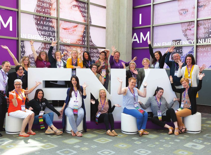
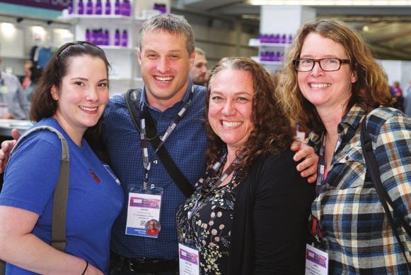
IMAGE/                           Photography Style
GRAPHIC
                                 Being an organization consisting of thousands of valued members, it’s important to
STYLE                            capture the spirit of these members with imagery that’s bold, energetic and emotive.
                                 By incorporating imagery that adheres to the following style guidelines, brand
                                 and marketing collateral can more readily connect with both current and potential
                                 members with an elevated margin of relatability.

SAFETY STANDARDS
Images should feature
emergency nurses following
proper safety protocols.

EMOTIVE
Photography should spark a
sense of inspiration, emotion,
excitement, etc. Use images
that are dynamic, bright and
optimistic in subject matter.

CONNECTED
It’s important to capture a
sense of community within
photography. Images of
members interacting with each
other can emphasize the true
power and depth of the ENA
network.

40 | 2021 BRAND GUIDELINES
IMAGE/ Graphic/Pattern
GRAPHIC
The ENA brand captures the fast-paced, energetic, and cohesive environment that
STYLE emergency nurses thrive in every single day. The following graphics and patterns
have been developed to emphasize the overall brand essence in conjunction with
the core ENA brand elements, color, typography, and imagery.
COLOR CORNERS
The color corner element can
be used in the upper right
and/or lower left corners.
The angle of the corner matches
the angle found in the “A” of the
ENA logo.
GRAY DIAGONAL
LINES
The angle of the diagonal lines
matches that of the angle in the
“A” of the ENA logo.
VALUES
ENA's values can be used as a
word cloud background texture.
Care should be taken not to
compete with other typography
found on the piece.
41 | 2021 BRAND GUIDELINESThank You
For taking the time to review ENA’s brand guidelines.
If you have an questions, please contact creative@ena.org.
930 E. Woodfield Road
Schaumburg, Illinois 60173
847.460.4000
ena.orgYou can also read