Brand Style Guide January 2019 - Pacify
←
→
Page content transcription
If your browser does not render page correctly, please read the page content below

Brand Style Guide January 2019

Table of Contents
            Brand Vision ................................................................. 3

            Color Palette ................................................................ 4

            Logo ................................................................................ 5

            Typography .................................................................. 8

            Illustration .................................................................. 10

            Photography .............................................................. 13

            Examples of Use ........................................................ 17

            Notes and Contact ................................................. 20

    BACKGROUND

    Pacify is the first 24/7 telehealth app for new parents. Our on-demand technology quickly
    and conveniently connects new parents to a nationwide network of healthcare experts at
    the touch of a button through their mobile devices. Studies have shown that the first 1,000
    days of a child’s life are the most important to their development. Pacify’s technology was
    created because we recognized that new parents need highly-responsive, non-emergency
    healthcare support during this critical time period.

    In addition to maintaining a thriving consumer product business, Pacify provides its services
    to many new parents at no cost through partnerships with employers, health plans, and
    other public health programs. Pacify is filling an important gap in the healthcare system as
    a premier go-to resource for pediatric advice and support.

2 Pacify Brand Style Guide 2019

     WWW.PACIFY.COM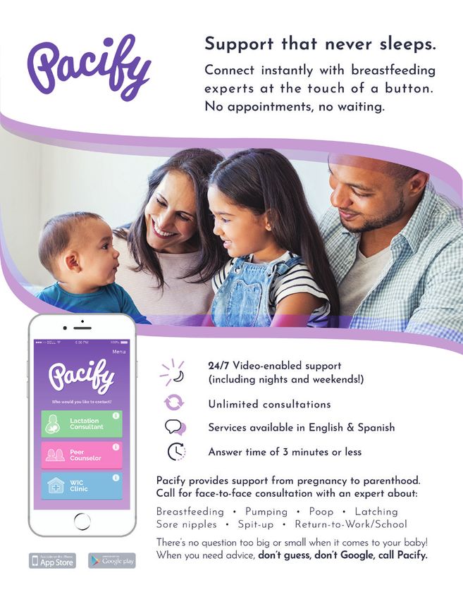
Brand Vision
    Pacify is bringing peace of mind to new parents. We created Pacify to provide low-cost,
    high-quality healthcare services to new and expecting parents, relieving their anxieties and
    keeping them and their children healthier. Pacify is committed to five key values in support
    of our mission:

                       Clinical excellence
                       Research clearly demonstrates that breast milk provides superior health,
                       nutritional, economic, and emotional benefits to both mom and baby.
                       We use approaches that have strong, evidence-based support to increase
                       breastfeeding rates and support new parents.

                       Empathy
                       Pacify is committed to following the breastfeeding recommendations
                       set forth by the American Academy of Pediatrics and the World Health
                       Organization (WHO). We are also committed to empathy, and our goal
                       is never to make a Pacify user feel defensive, anxious, or insufficient.

                       Health Equity
                       Pacify believes everyone should have a fair and just opportunity to be
                       healthier. This requires removing obstacles to health such as poverty,
                       discrimination, and their consequences, including powerlessness and lack
                       of access to good jobs with fair pay, quality education and housing, safe
                       environments, and health care.

                       Innovation
                       Pacify is committed to bringing the best technologies to the toughest
                       public health problems. We believe telehealth can continue to improve the
                       well-being and happiness of our users, and innovation will always be at
                       the core of what we do!

                       Team
                       Pacify is building a team of mission-driven, high-achieving, public health
                       warriors! None of the above matters if we can’t attract, cultivate, and
                       retain the best people.

3 Pacify Brand Style Guide 2019

     WWW.PACIFY.COM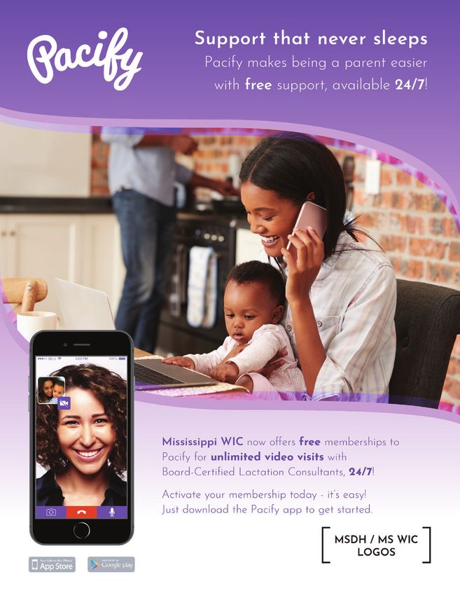
Color Palette
    We have carefully curated Pacify’s color palette to appeal to the maternal and nurturing
    sensibilities of our users, while communicating the innovation of our mobile platform
    technology. Preeminent in our primary palette is our logo color, “Pacify Purple,” which
    should be used most liberally to identify the brand; the remaining primary palette should
    accompany “Pacify Purple” where additional color is needed, with the secondary palette
    serving as subtle accent tones. Refer to the following schema to remain on-brand when
    representing Pacify in print and web graphics, data vizualization, and related collateral.

    PRIMARY

         “Pacify Purple”

       CMYK: 66/74/0/0            CMYK: 23/57/0/0       CMYK: 21/35/0/0       CMYK: 55/0/6/0
        RGB: 111/89/165           RGB: 194/130/184      RGB: 196/167/208      RGB: 95/202/232
        HEX #6f59a5                HEX #c282b8           HEX #c4a7d0           HEX #5fcae8

    SECONDARY

                    CMYK: 0/69/31/0          CMYK: 0/3/13/0        CMYK: 43/2/42/0
                    RGB: 242/117/134         RGB: 254/244/221      RGB: 149/204/168
                     HEX #f27586              HEX #fef4dd           HEX #95cca8

                                   CMYK: 4/13/0/0        CMYK: 8/4/4/0
                                  RGB: 240/222/237      RGB: 232/236/238
                                    HEX #f0deed           HEX #e8ecee

4 Pacify Brand Style Guide 2019

     WWW.PACIFY.COM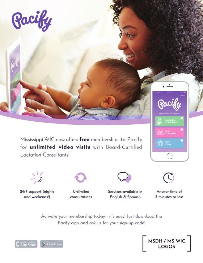
Logo
    The Pacify wordmark is the fundamental expression of our brand identity - it is used
    to represent Pacify the product (mobile app) and Pacify-related collateral (SDK
    technology, Provider networks, collaborations and partnerships, etc.). It should never
    be distorted or redrawn when utilized for communications or co-branding. Please
    adhere to the following guidelines to ensure that the Pacify wordmark is always
    applied consistently and maintains brand integrity.

    CLEAR SPACE

       x                                  x
                                                   When using our logo with additional
                                                   visual elements (text, graphics,
                                                   photographs, or other logos), it’s
                                          x
                                                   important to give it some space to
                                                   breathe. Always maintain a minimum
                                                   clear space proportionally equal to x,
       x                                  x        as outlined in the diagram at left.

    MINIMUM SIZE AND SCALING
    Do not alter, rotate, or distort the Pacify wordmark. To ensure the wordmark maintains
    visual impact, do not reduce its scale below a half inch (36 pixels) wide. To maintain
    proportions when scaling, hold the “Shift” key in most software programs.

                   0.5” or 36 pixels
                    Minimum size

5 Pacify Brand Style Guide 2019

     WWW.PACIFY.COM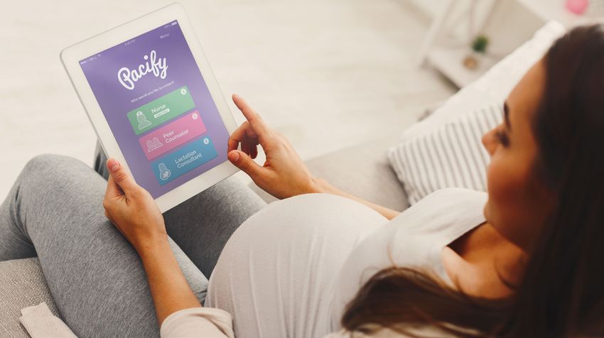
Logo

    COLOR
    Best Practice: Pacify’s wordmark should appear in “Pacify Purple” over white or reversed
    out wherever possible.

    Secondary Options: In cases where our “Pacify Purple” and white color combination is not
    possible, you may utilize our brand color palette as a backdrop for our wordmark in the
    following combinations.

    Incorrect Color Usage: The Pacify wordmark itself should never be modified to any color
    other than “Pacify Purple,” white, or black (when color is not possible). Do not place our
    standard “Pacify Purple” or black logo over any backdrop other than white. Do not place
    our white logo over light backdrops which would render it illegible.

6 Pacify Brand Style Guide 2019

     WWW.PACIFY.COM
Logo

    Over Photos: Our “Pacify Purple” logo should only be placed over light photos upon which
    it is legible. In other instances, our white logo may be used prominently or as a watermark.

    DON’TS
    Do not alter, distort, or embellish our logo in any way. The following examples demonstrate
    incorrect usage of our logo:

                      Do not italicize, skew, stretch, or distort the proportions.

           Do not change the                Do not outline               Do not apply drop-
                opacity                                                      shadows

                                             Do not apply                  Do not apply
             Do not rotate
                                              gradients                  graphic effects or
                                                                              filters

7 Pacify Brand Style Guide 2019

     WWW.PACIFY.COM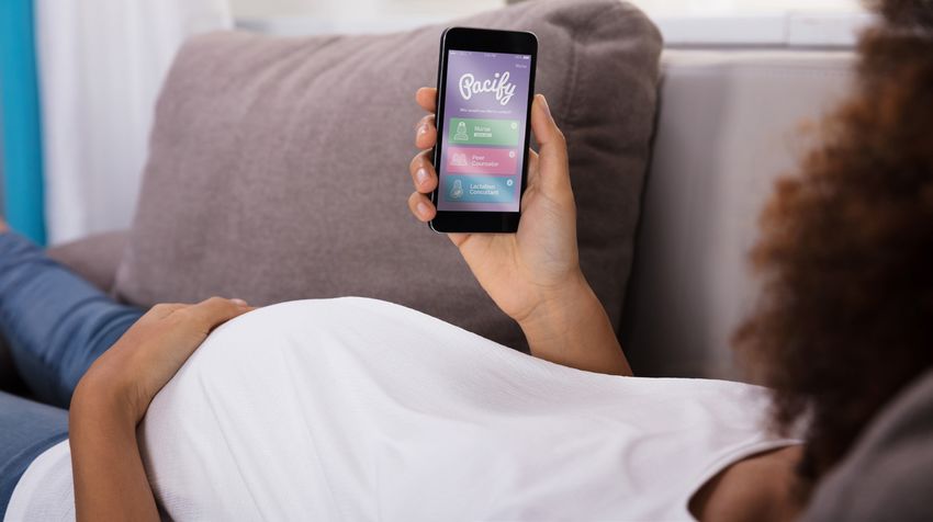
Typography
     PRIMARY TYPEFACE                                              Josefin Sans Thin
                                                                   Josefin Sans Thin Italic
    Across all platforms representing the
                                                                   Josefin Sans Light
    Pacify brand, as a rule and wherever
                                                                   Josefin Sans Light Italic
    possible, use Josefin Sans.
                                                                   Josefin Sans Regular
    It’s geometric, elegant, and welcoming
                                                                   Josefin Sans Italic
    appeal make it ideal for both user and
    partner-facing design. After this, use                         Josefin Sans SemiBold
    fallback font as needed.**                                     Josefin Sans SemiBold Italic
                                                                   Josefin Sans Bold
                                                                   Josefin Sans Bold Italic
     FALLBACK FONT

     Helvetica Neue Thin                                           Helvetica Neue Thin Italic
     Helvetica Neue Light                                          Helvetica Neue Light Italic
     Helvetica Neue Regular                                        Helvetica Neue Italic
     Helvetica Neue Medium                                         Helvetica Neue Medium Italic
     Helvetica Neue Bold                                           Helvetica Neue Bold

     TEXT COLOR OPTIONS

       CMYK: 66/74/0/0            CMYK: 84/74/47/45          CMYK: 65/56/53/29           CMYK: 59/46/29/3
        RGB: 111/89/165             RGB: 44/51/71              RGB: 85/87/90              RGB: 116/127/150
        HEX #6f59aa5                HEX #2c3347                HEX #55575a                 HEX #747f96

                                   CMYK: 55/0/6/0             CMYK: 23/57/0/0
                                   RGB: 95/202/232            RGB: 194/130/184
                                    HEX #5fcae8                HEX #c282b8

    **Please note: contracts, grants, and other legal documents sent or received may adhere to the standards
    expected of that medium (eg. Times New Roman).

8 Pacify Brand Style Guide 2019

     WWW.PACIFY.COM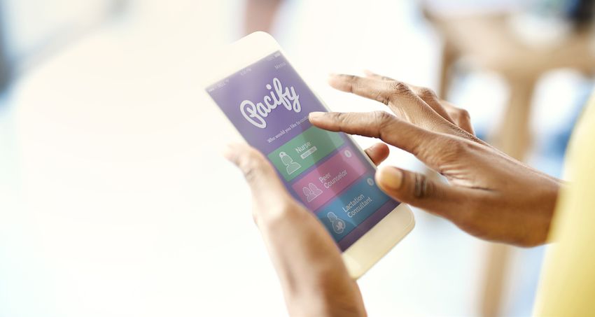
Typography

     HIERARCHY OF FONT STYLES
    The following definitions classify typographic rules for web and document-based collateral.
    Marketing materials such as flyers, posters, postcards, etc., may customize these styles
    (adjust size, weight, and color) to accomodate design flexibility.

    This is a Page Title - H1
     Josefin sans (semibold); HEX#6f59aa5; 28 pt

     THIS IS A PRIMARY HEADING - H2
     Font: Josefin sans (semibold, uppercase only); HEX #2C3347; 14 pt

     This is a Secondary Heading - H3
     Font: Josefin sans (semibold); HEX #2C3347; 12 pt

    This is Paragraph Text. Lorem ipsum dolor sit amet, consectetuer adipiscing elit. Donec
    odio. Nullam malesuada erat ut turpis. Suspendisse urna nibh, viverra non, semper suscipit,
    posuere a, pede. Morbi in sem quis dui placerat ornare. At vero eos et accusamus et iusto
    odio dignissimos ducimus qui blanditiis praesentium voluptatum deleniti atque corrupti quos
    dolores et quas molestias excepturi sint occaecati cupiditate non provident, similique sunt in
    culpa qui officia deserunt mollitia animi, id est laborum et dolorum fuga.
     Font: Josefin Sans (light); HEX#55575a (highlight semibold, HEX#5fcae8); 12 pt

    oo Over    1,500 participants enrolled in the Pacify program between June 2016 and
       December 2017
     Data callout A Font: Josefin Sans (semibold); HEX#c282b8; 18-24 pt

    Users connected with an IBCLC in an average of           22 seconds
     Data callout B Font: Josefin Sans (semibold); HEX#5fcae8; 18-24 pt

9 Pacify Brand Style Guide 2019

     WWW.PACIFY.COM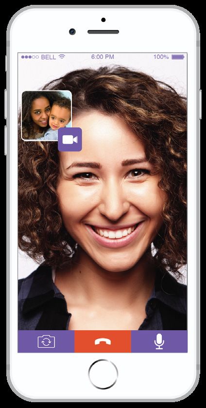
Illustration
     We use illustration to communicate ideas, vizualize data, and tell stories to our users
     and partners alike. Pacify’s illustrative style has been carefully crafted to convey
     a sense of optimism, tranquility, and approachable innovation through the use of
     geometric shapes, smooth curves, and a soothing color palette. We serve diverse
     populations across the country and are careful to represent the wide range of
     demographics in our communities.

     ILLUSTRATIONS
                                                                         Smooth curves, soft
        Solid, left-oriented,                                            geometric shapes
             tonal shadows
         (no soft gradient/
            drop shadows)

                    X

                                     Diverse demographic representation;
                                absence of facial features allows for relatability
     Circular frames create
     narrative vignettes

                                                       BELL

                                        BELL

     Reduce and simplify illustrations to create
     icons and building blocks for infographics

10 Pacify Brand Style Guide 2019

     WWW.PACIFY.COM
Illustration
INFOGRAPHICS
Infographics can consist of illustrative vignettes woven together by timelines, directional
narratives, and text...
• Moms calling throughout
pregnancy and baby’s 1st year
• Pacify trains health plan
staff to sign up members
• Detailed reports are
clinically actionable
and data-rich •Trained to refer members
back to health plan
for resources
...or a full, cohesive illustration conveying a moment-in-time.
11 Pacify Brand Style Guide 2019
WWW.PACIFY.COMIllustration
ICONS
Pacify’s iconographic styles range from detailed illustrations (full color palette, maximum visual
information included), to simplified graphics (primary color palette only, two-tone, reduced
detail), to basic icons (monochrome, suggestive representation). Narrative infographics
and animations should implement the highest level of detail, whereas broader concepts and
overviews (such as data vizualization and bulleted lists) can utilize simplified icon styles.
Detailed
Simplified
Basic
12 Pacify Brand Style Guide 2019
WWW.PACIFY.COMPhotography
Photography is a vital tool for representing the diverse communities that we serve and
communicating the values that drive the Pacify experience.
Our photography style is light, relaxed, and approachable, utilizing natural light and a
soft focus whenever possible. Photos of users interacting with our product and with each
other should feel natural and unassuming. Photos used in Pacify-related collateral should
communicate calming, nurturing, and optimistic sentiments focused on empathy for the
parenting journey (see following pages).
When cropping and placing photos, use soft curves as framing devices, which can
incorporate bands of our brand colors and/or a matching overlay on the image.
When depicting the Pacify app itself, use either or both of these screens:
Home Call Screen Provider Call Screen
13 Pacify Brand Style Guide 2019
WWW.PACIFY.COMPhotography
14 Pacify Brand Style Guide 2019
WWW.PACIFY.COMPhotography
15 Pacify Brand Style Guide 2019
WWW.PACIFY.COMPhotography
16 Pacify Brand Style Guide 2019
WWW.PACIFY.COMExamples of Use
Please see the following examples of materials incorporating some of the principles
outlined in this style guide:
8.5” X 11” FLYER (NOT TO-SCALE)
Photo meets brand photography
criteria, framed by soft waves in Primary logo over white with H3 font style, scale adusted
our primary palette appropriate clear space to accomodate flyer layout
Buletted list
of simple
two-toned
icons,
consistent
Standard graphic
in-app styling
call screen
Body font
weights
adjusted to
emphasize
information
17 Pacify Brand Style Guide 2019
WWW.PACIFY.COMExamples of Use
8.5” X 11” FLYER (NOT TO-SCALE)
Photo meets brand photography
criteria, framed by soft waves in White logo over primary palette H3 font style, scale
our primary palette with appropriate clear space and color adusted
Standard
in-app Body font
provider weights
call screen adjusted to
emphasize
information
PARTNER
LOGO
Space saved for cobranding with partner organization
18 Pacify Brand Style Guide 2019
WWW.PACIFY.COMExamples of Use
8.5” X 11” FLYER (NOT TO-SCALE)
Photo meets brand photography
criteria, framed by soft curves in Standard logo, legible over light
our primary palette photo, with appropriate clear space
Standard
Body font in-app
weights call screen
adjusted to
emphasize
information Simple two-
toned icons,
consistent
graphic
styling
PARTNER
LOGO
Space saved for cobranding with partner organization
19 Pacify Brand Style Guide 2019
WWW.PACIFY.COMNotes
oo This style guide will be updated as additional brand collateral is produced and as
our product needs evolve.
oo Brand specifications for channel-specific partnerships and projects are outlined in
separate documents (eg. Medicaid Marketing Guide). Please see those documents
for specifications regarding cobranding and customization.
Contact
For questions regarding branding or to request brand templates or materials, please
contact Pacify’s Creative Director, Courtney Beglin, at courtney@pacify.com.
20 Pacify Brand Style Guide 2019
WWW.PACIFY.COMYou can also read