Buckets: Visualizing NBA Shot Data - CPSC 547 Project Proposal
←
→
Page content transcription
If your browser does not render page correctly, please read the page content below
Buckets: Visualizing NBA Shot Data
CPSC 547 Project Proposal
Peter Beshai pbeshai@cs.ubc.ca
This game has always been, and will always be, about buckets.
–Bill Russell, 11-time NBA champion
Domain, Task, Dataset
Sports fans typically enjoy looking at stats for their favourite teams and players, and
basketball fans are no exception. Every single shot taken in the National Basketball
Association (NBA) is recorded with their SportVU Player Tracking technology and many
of the statistics derived from the system are provided freely online via their web site
stats.nba.com. While there are numbers representing all the shots taken on the court
throughout a given season, much information is lost by discarding the spatial data
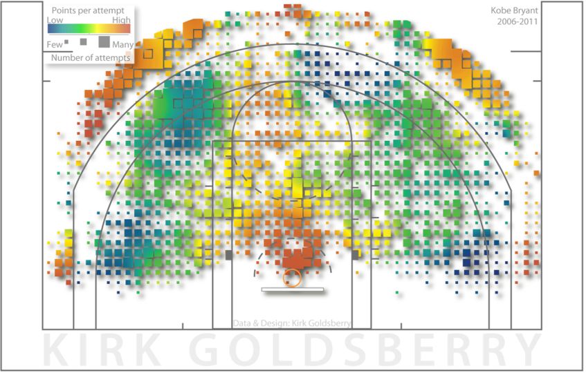
associated with them. In 2012, Kirk Goldsberry revolutionized NBA analytics by
introducing the shot chart [5], a visual representation of a player’s shot performance
displayed on as a discretized heatmap over a half-court of basketball (Figure 1).
Currently, shot charts are being used most frequently as static images produced by
experts and disseminated via news articles. I would like to extend Goldsberry’s work by
providing an interactive tool for generating shot charts for individual players, teams, and
the league overall with various filters and other tools available to facilitate comparison
and a deeper understanding of shot behavior in the NBA.
Figure 1. Shot chart from CourtVision [x], depicting Kobe Bryant's points per attempt with colour (low is blue, high is
orange), and number of attempts with the size of each box
1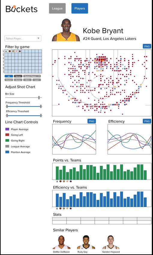
Buckets: Visualizing NBA Shot Data // CPSC 547 Proposal                     Peter Beshai

I will narrow my dataset to focus solely on the shots taken in the 2013-2014 regular
season in the NBA. There were 1230 games played, with 204,126 shots taken by 563
players, providing a rich base of data to analyze. My project aims to support casual
basketball fans who are curious to learn more about their favourite players, as well as
general trends in the league overall. I primarily intend to support the following tasks:

   •   Discover average shot distributions across the league, across each position, and
       for each team
   •   Discover average shot distributions for individual players
   •   Compare a player’s shot distribution against the league average, and against their
       position average
   •   Compare a player’s shooting performance against each team in the league
   •   Identify which players are best in user-selected areas of the court across the whole
       league
   •   Discover which players are the best in the league at any pre-determined zone on
       the court
   •   Enjoy basketball statistics and visualizations
   •   Share basketball visualizations, potentially with an export as PNG feature built-in

Secondarily, if time allows, I would also like to support these tasks:

   •   Discover five player line-up geometry and trends
   •   Discover players with similar shot distributions
   •   Compare player shot distributions against one another
   •   Compare shot distributions of teams against one another
   •   Summarize a player’s shot distribution with a “signature graphic,” such as a
       simplification of a shot chart as a collection of blobs overlaid on a court
       representing aggregate shot data

Personal Expertise
My only expertise in the domain comes from being an avid Toronto Raptors fan. I read
the online community /r/nba on Reddit on a daily basis and often take note of articles
discussing visualizations of basketball data. I have yet to create any visualizations for
NBA data, but have some very limited prior experience using D3.js for a social network
data exploration tool I created in CPSC 554m. I also have extensive experience in web
programming.

Proposed Infovis Solution
The primary focus of this project is to create a visualization tool that allows users to
explore NBA shot data in a variety of novel ways. There are five different main views I
hope to create: Player View, League View, Lineup View, Player Comparison View, and
Match-up View. I recognize there may not be enough time to complete all of the views
specified, and so I’ve assigned a priority ranking to each of them, with the intent to
definitely complete those ranked 1-2, and the others if time permits.

                                                                                         2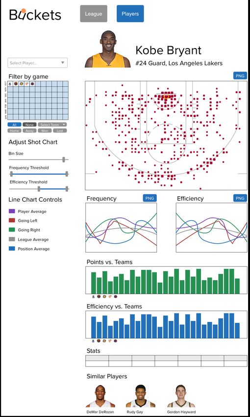
Buckets: Visualizing NBA Shot Data // CPSC 547 Proposal                        Peter Beshai

   •   Player View (rank 1). This view provides a detailed representation of an
       individual player’s shot data, including the player’s shot chart, a pair of line charts
       showing a simplification of the shot chart data, bar charts breaking down a
       player’s shot data versus each team in the league, and a table of general basketball
       statistics.

       The shot chart shows a combined encoding of frequency by size of marks, and
       efficiency by the colour of marks as a discretized heat map on top of a court
       layout. Here, efficiency is a measure of how many field goals shot from that
       location score (field goal percentage). There will be filtering controls to allow
       users to limit the data shown in the shot chart, such as showing only data from
       selected individual games, away games, home games, games they won or lost, and
       games versus specific teams. Users will also be given control of how the shot
       chart renders, with sliders for controlling the bin size and the minimum thresholds
       of frequency and efficiency for displaying marks on the chart. (Tasks: discover
       shot behavior variation, average shot data)

       The line charts reduce the dimensionality of the shot chart data, simplifying from
       x-y positions to distance-from-basket. One line chart will depict shot frequency on
       the y-axis, and another will depict efficiency, both having distance on the x-axis.
       In both charts, there will be up to five lines: the player’s average, the player’s
       average going to the left side of the basket, the player’s average going to the right
       side of the basket, the league average, and the league average for this player’s
       position. Each line will be toggleable by the user. (Tasks: discover shot behavior
       variation, average shot data; compare vs. league, vs. position)

       There will be two bar charts depicting the player’s efficiency and total points
       broken down versus each team in the league (one bar per team). (Tasks: compare
       shot behavior vs. teams)

       Supplementary data commonly found on player statistical pages will be included,
       such as team, jersey number, and position. Various averages for different
       statistical categories, such as points, assists, and rebounds per game, will be
       shown in a tabular format. (Tasks: enjoy basketball stats)

       If time permits, I am also interested in integrating a list of players with similar
       shooting styles, which will require employing a machine learning algorithm on
       the shot data. (Tasks: discover similar players)

   •   League View (rank 2). This view provides an overview of the shot data across
       the entire league and is intended to provide users with a baseline of which areas
       on the court are used the most, as well as which areas provide the highest degree
       of efficiency. This will be rendered in the typical shot chart fashion, with marks
       varying in size by frequency and in colour by efficiency. There will be a large

                                                                                            3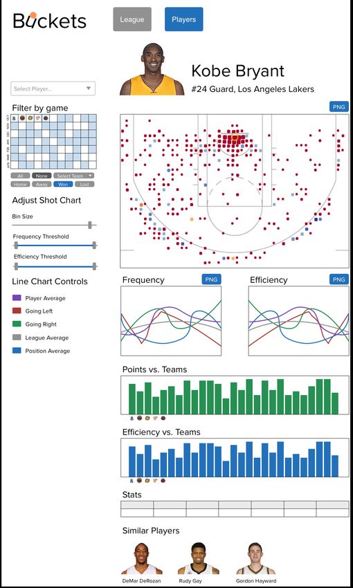
Buckets: Visualizing NBA Shot Data // CPSC 547 Proposal                      Peter Beshai

       shot chart featuring the overall league average, accompanied by five small
       multiples indicating the averages of the league split by player position. This view
       may also contain 30 small multiples indicating the shot charts of each team in the
       league, based on the average data from the starting lineup of each team. (Tasks:
       discover average league trends, average position trends, average team trends)

       Besides the league average shot chart, two additional features will be available on
       this view: Who owns the court? and Shot Chart Query.

       Who owns the court? A half-court will be drawn, the same background as used in
       shot charts, except it will be split into around a dozen zones. The user will specify
       an attribute, such as frequency, efficiency, or total points, and the resulting
       visualization will show a player’s head in each of the zones representing the top
       player in the league in that attribute at that section of the court. (Task: discover
       the best players)

       Shot Chart Query. A half-court will be drawn, split into zones as described above,
       except in this case the zones will be selectable. The user can select a number of
       zones and select an attribute to query, such as frequency, efficiency, or total
       points, and then find a list of players who are the best in the specified attribute
       across the selected zones. (Task: identify top players at a set of positions)

   •   Lineup View (rank 3). This view focuses on the aggregate patterns of a specified
       group of five players, with the intention of providing insight into the geometry of
       a five-man lineup. There will be a large shot chart providing representations of
       each player as different layers with linked highlighting and colour coding used to
       distinguish the marks. Given that colour coding will be used to indicate the
       player, this shot chart can only show one of frequency or efficiency, which the
       user can select, as opposed to the combination used in previously described shot
       charts. Another encoding option I will experiment with to circumvent this issue is
       using lightness variance as the encoding for efficiency, in which case I may be
       able to support frequency and efficiency without consuming the hue channel used
       for encoding players. The user will be able to toggle on and off each of the five
       players and be able to swap out players with others at will. Beyond the shot chart,
       there will also be 1D distance-from-basket charts, similar to those described in the
       Player View section, for both frequency and efficiency. These charts will differ
       from those previously described in that they will be stacked line charts, with one
       line for each player. (Task: discover line-up geometry and trends)

   •   Player Comparison View (rank 4). In this view, two players are selected and
       there is a single large shot chart, as well as two small multiples, one for each
       player. There is a slider component for controlling the rendering of the large shot
       chart; when all the way left, it shows player 1, all the way right shows player 2,
       and in the middle shows both players. This view could possibly be extended to
       support comparing teams based on their starting five players. The intention of this
       view is to allow provide a more interactive tool for comparing shot data between

                                                                                          4
Buckets: Visualizing NBA Shot Data // CPSC 547 Proposal                      Peter Beshai

       two players. This view could also include the 1D distance-from-basket charts
       described in the Player View section, with only two lines: one for each player.
       (Task: compare player shot data)

   •   Match-up View (rank 5). This view allows the user to explore how team
       shooting behavior varies against individual teams. The user selects two teams and
       is presented with four shot charts: two shot charts represent the average shot data
       for each team, and two shot charts represent the shot data restricted to games
       when the teams face off against one another. (Task: compare team shot data)

Scenario of Use
Eric is a basketball fan, curious to learn more about his favourite player Kobe Bryant. He
navigates to the Buckets web page and clicks Players to load Player View. Once it loads,
he then uses the autocompleting search widget to enter Kobe Bryant as the player he is
interested in seeing. Kobe’s shot analysis data is shown (Figure 2) and Eric focuses on
the shot chart depicting Kobe’s average shooting frequency and efficiency at various
parts on the court. He begins filtering by a variety of metrics, observing how Kobe’s
efficiency varies when playing at home versus playing away, as well as between games
Kobe has won versus games lost (Figure 3). Knowing Kobe has historically done very
well against the Toronto Raptors, Eric filters the shot chart data to only show games
versus them, and discovers variations in Kobe’s shooting pattern. He selects all games
again and simplifies the shot chart visualization to only show locations where Kobe
shoots with better than 50% accuracy by dragging a slider (Figure 4). Eric then looks
over the line charts and notices that while Kobe more frequently goes to the right side of
the basket for his shots, he is actually more efficient going to the left. He confirms his
hunch that Kobe shoots way more than the league average at all positions on the court
based on the lines in the chart. He toggles off some of the lines in the chart, leaving only
Kobe’s average and the league average (Figure 5), and he exports the resulting charts as a
PNG to share with his friends. Eric then discovers other players he might be interested in
following under the Similar Players section, as they have similar playing styles to Kobe,
and begins reviewing their Player View pages by clicking on their names in the provided
list.

Before leaving, Eric clicks League from the navigation menu and loads the League View.
He reviews the league average shot chart and the average shot charts for each position
(Figure 6) before switching to the Who owns the court? view by clicking a tab. There he
sees Kobe’s face in a number of locations as the most frequent shooter, and he feels a
sense of pride (Figure 7). Curious to see who shoots the most three pointers overall, he
switches to the Shot Chart Query tab and select all of the three-pointer zones and runs a
query (Figure 8). The results are shown in a list that he reviews and finds, unsurprisingly
that Stephen Curry, Klay Thompson and Damian Lillard are at the top of the list.

                                                                                          5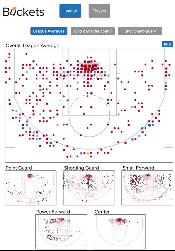
Buckets: Visualizing NBA Shot Data // CPSC 547 Proposal       Peter Beshai

  Figure 2. Player View showing Kobe's shooting statistics.
                                                                        6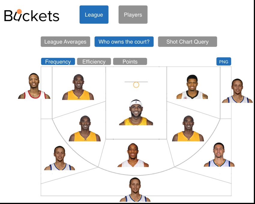
Buckets: Visualizing NBA Shot Data // CPSC 547 Proposal                                          Peter Beshai

  Figure 3. Player View showing Kobe's shooting statistics with the shot chart filtered to won games.

                                                                                                           7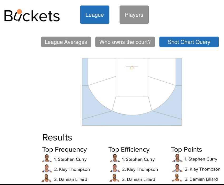
Buckets: Visualizing NBA Shot Data // CPSC 547 Proposal                                           Peter Beshai

  Figure 4. Player View showing Kobe's shooting statistics with the shot chart filtered to only show shots with
  greater than 50% efficiency.
                                                                                                                  8
Buckets: Visualizing NBA Shot Data // CPSC 547 Proposal Peter Beshai Figure 5. Player View showing Kobe's shooting statistics with line charts filtered to only show the player’s average and the league average. 9
Buckets: Visualizing NBA Shot Data // CPSC 547 Proposal                                        Peter Beshai

  Figure 6. League View showing shot charts of the league’s average shooting behavior and small multiples for
  each position.                                                                                                10
Buckets: Visualizing NBA Shot Data // CPSC 547 Proposal                                       Peter Beshai

  Figure 7. League View showing the Who owns the court? feature based on the frequency of shots taken at
  different zones on the court.

                                                                                                           11
Buckets: Visualizing NBA Shot Data // CPSC 547 Proposal Peter Beshai
Figure 8. League View showing the Shot Chart Query feature where the user has selected all the three-point shot
zones. Results are shown broken down for frequency, efficiency, and points for the aggregated locations.
12Buckets: Visualizing NBA Shot Data // CPSC 547 Proposal Peter Beshai
Proposed Implementation Approach
My solution will be built with D3.js [3], with the intention to share it widely on the
Internet via my personal web site (peterbeshai.com). I have already written and run a
script in node.js to scrape all the shot data from the stats.nba.com web site, and I have
created a rudimentary MySQL database to store the data within. To create the web
backend API to provide the data to D3.js, I am planning on using PHP due to its extreme
portability. I am considering using AngularJS [1] for providing structure to the web
interfaces to help with simplifying the code for filtering and having views communicate
with one another, but I have no experience with it, so it may be infeasible given the time
constraints. I have already created the half-court background to NBA specification in
Adobe Illustrator. I am also considering using PureCSS [11] to aid in the design of the
web interface.
I will be building the entire visualization from scratch.
Milestones and Schedule
Nov 07 Have a rudimentary implementation of Player View where you can select
players and see their basic shot charts.
Nov 14 Status Update deadline. Have a completed implementation of Player View.
Nov 21 Basic implementation of League View where league and position averages are
shown, and Who owns the court? is roughly implemented.
Nov 28 Completed League View, begin lower ranked features.
Dec 05 Post on /r/nba on Reddit to hopefully get insightful comments to include in my
presentation and paper. Begin writing paper and working on presentation.
Dec 12 Presentation deadline.
Dec 15 Paper deadline.
Previous Work
Visualization of basketball data shot is a fairly recent phenomenon. Goldsberry’s
CourtVision introduced the shot chart by creating a discretized heat map over an NBA
court to represent a player’s field goal attempts and their efficiency, which proved
effective in demonstrating which players are the best shooters in the NBA [5]. In
SnapShot, Pileggi et al. used a similar technique, but for hockey shot data [10]. Instead of
breaking the arena into a grid, they created a radial heat map to indicate at which distance
most shots were taken from. They also made use of the small multiples idiom to provide
an overview of the data from all the arenas in the National Hockey League (NHL), which
was effective in helping analysts discover unexpected behaviour.
On the web, basketball visualization is growing in popularity. A recent web site, Nylon
Calculus, is dedicated completely to basketball analytics and has a modestly interactive
shot chart tool where users can select any player in the league and view their shot chart
[2]. Beyond the basic shot charts, there have been recent articles discussing a new
visualization they are using called TeamSPACE where 5-player lineups are visualized in
terms of the areas on the court they use the most [4]. NBA.com has an extensive stats
13Buckets: Visualizing NBA Shot Data // CPSC 547 Proposal Peter Beshai
section, which focuses primarily on tables of numbers, but also includes basic shot charts
depicting each shot a player made in an individual game, as well as a player’s efficiency
broken down by zones on the court [9]. Very recently, the Washington Post [7] published
some novel visualizations depicting the player’s of the Washington Wizard’s shot
attempts in a variety of different ways including: a stylized 1-dimensional chart showing
imaginary shooting arcs, with a similar feel to SnapShot’s radial heat map, dot plots
indicating efficiency and frequency by distance from the basket. Goldsberry has recently
published a novel interactive visualization of rebounding in the NBA [6]. Luis has
published an article discussing his analysis and visualization of player movement and the
plus-minus statistic [8].
References
1. AngularJS. (2014). Retrieved October 31, 2014, from https://angularjs.org/
2. Clemens, A. (2014). NBA Shot Charts - Nylon Calculus. Retrieved October 31,
2014, from http://nyloncalculus.com/shotchart/nba/
3. D3.js - Data-Driven Documents. (2014). Retrieved October 31, 2014, from
http://d3js.org/
4. D'Anna, M. (2014, October 22). TeamSPACE: Time Travelin' - Nylon Calculus.
Retrieved October 31, 2014, from
http://nyloncalculus.com/2014/10/22/teamspace-time-travelin/
5. Goldsberry, K. (2012). Courtvision: New visual and spatial analytics for the NBA.
In 2012 MIT Sloan Sports Analytics Conference.
6. Goldsberry, K. (2014, October 14). How Rebounds Work. Retrieved October 31,
2014, from http://grantland.com/features/how-rebounds-work/
7. Lindeman, T., & Gamio, L. (2014, October 29). The Washington Wizards'
shooting stars. Retrieved October 31, 2014, from
http://www.washingtonpost.com/wp-srv/special/sports/wizards-shooting-stars/
8. Luis, J. (2014, February 24). Game on! Retrieved October 31, 2014, from
http://fathom.info/latest/6985
9. NBA.com/Stats. (2014). Retrieved October 31, 2014, from http://stats.nba.com
10. Pileggi, H., Stolper, C. D., Boyle, J. M., & Stasko, J. T. (2012). Snapshot:
Visualization to propel ice hockey analytics. IEEE Transactions on Visualization
and Computer Graphics, 18(12), 2819-2828.
11. Pure. (2014). Retrieved October 31, 2014, from http://purecss.io/
14You can also read