CELL VS. WIFI: ON THE PERFORMANCE OF METRO AREA MOBILE CONNECTIONS
←
→
Page content transcription
If your browser does not render page correctly, please read the page content below
Cell vs. WiFi: On the Performance of Metro Area Mobile
                           Connections

                                  Joel Sommers                                                          Paul Barford
                                 Colgate University                                                University of Wisconsin
                         jsommers@colgate.edu                                                         pb@cs.wisc.edu

ABSTRACT                                                                             Keywords
Cellular and 802.11 WiFi are compelling options for mobile Inter-                    Cellular, WiFi
net connectivity. The goal of our work is to understand the per-
formance afforded by each of these technologies in diverse en-                       1. INTRODUCTION
vironments and use conditions. In this paper, we compare and
                                                                                        Over the last five years there has been an explosion in the avail-
contrast cellular and WiFi performance using crowd-sourced data
                                                                                     ability and use of mobile devices that are both cellular and 802.11
from Speedtest.net. Our study considers spatio-temporal per-
                                                                                     WiFi enabled. The combination of a short range, high-speed capa-
formance (upload/download throughput and latency) using over 3
                                                                                     bility and a longer range, lower speed capability is compelling and
million user-initiated tests from iOS and Android apps in 15 dif-
                                                                                     enables a wide range of new mobile applications. Driven by the
ferent metro areas collected over a 15 week period. Our basic per-
                                                                                     popularity of applications that run on hybrid cell phones such as
formance comparisons show that (i) WiFi provides better absolute
                                                                                     the iPhone and Android-based devices, there is a large and growing
download/upload throughput, and a higher degree of consistency in
                                                                                     demand for bandwidth by mobile users.
performance; (ii) WiFi networks generally deliver lower absolute
                                                                                        A vexing problem for WiFi enabled cell phone users, service
latency, but the consistency in latency is often better with cellular
                                                                                     providers and application designers is seeking out and supporting
access; (iii) throughput and latency vary widely depending on the
                                                                                     the connectivity option that provides the best and most reliable per-
particular access type (e.g., HSPA, EVDO, LTE, WiFi, etc.) and
                                                                                     formance. Over shorter time scales issues that affect performance
service provider. More broadly, our results show that performance
                                                                                     include local availability of services, load at a particular site, char-
consistency for cellular and WiFi is much lower than has been re-
                                                                                     acteristics of the handset, and interference. Over longer time scales,
ported for wired broadband. Temporal analysis shows that average
                                                                                     performance is affected by issues such as the ongoing introduction
performance for cell and WiFi varies with time of day, with the best
                                                                                     of new technology and deployment of new service provider infras-
performance for large metro areas coming at non-peak hours. Spa-
                                                                                     tructure.
tial analysis shows that performance is highly variable across metro
                                                                                        To assist users in the effort of understanding their connectivity
areas, but that there are subregions that offer consistently better per-
                                                                                     options, a number of commercial and open-source throughput test-
formance for cell or WiFi. Comparisons between metro areas show
                                                                                     ing applications are available. When invoked, these applications at-
that larger areas provide higher throughput and lower latency than
                                                                                     tempt to determine the maximum bandwidth for both uploads and
smaller metro areas, suggesting where ISPs have focused their de-
                                                                                     downloads from the target device. At basis, these applications send
ployment efforts. Finally, our analysis reveals diverse performance
                                                                                     streams of random bytes via HTTP (e.g., data blobs through GET
characteristics resulting from the rollout of new cell access tech-
                                                                                     and POST methods) between the target device and a test server.
nologies and service differences among local providers.
                                                                                     The receiving application measures the bits/second received over
                                                                                     small time periods (e.g., one second) and reports the highest sus-
Categories and Subject Descriptors                                                   tained rate that is achieved. Details of the specific mechanisms for
C.2.1 [Network Architecture and Design]: Wireless communica-                         selecting sending rates, measurements and reporting vary between
tion; C.4 [Performance of Systems]: Performance attributes; C.4                      applications. However, data gathered by these applications offer
[Performance of Systems]: Measurement Techniques                                     the possibility to provide unique insights into mobile device per-
                                                                                     formance.
                                                                                        In this paper, we describe an investigation of mobile device per-
General Terms                                                                        formance using crowd-sourced data provided by one of the most
Design, Experimentation, Measurement, Performance                                    popular and widely deployed mobile bandwidth testers, Speedtest.
                                                                                     net [7]. This unique and rich data set includes information about
                                                                                     the device operating system used for the test (iOS or Android), a
                                                                                     unique handset identifier, GPS coordinates of the mobile device,
Permission to make digital or hard copies of all or part of this work for            time of test, upload and download speeds achieved, etc. Of equal
personal or classroom use is granted without fee provided that copies are            importance is the fact that Speedtest servers are deployed in over
not made or distributed for profit or commercial advantage and that copies           600 locations world wide and are used by tens of thousands of users
bear this notice and the full citation on the first page. To copy otherwise, to      on a daily basis.
republish, to post on servers or to redistribute to lists, requires prior specific      The focus of our study is to understand the spatio-temporal char-
permission and/or a fee.
IMC’12, November 14–16, 2012, Boston, Massachusetts, USA.                            acteristics of performance of WiFi-enabled cell phones in a selec-
Copyright 2012 ACM 978-1-4503-XXXX-X/12/11 ...$15.00.                                tion of metro areas with different population densities and diverse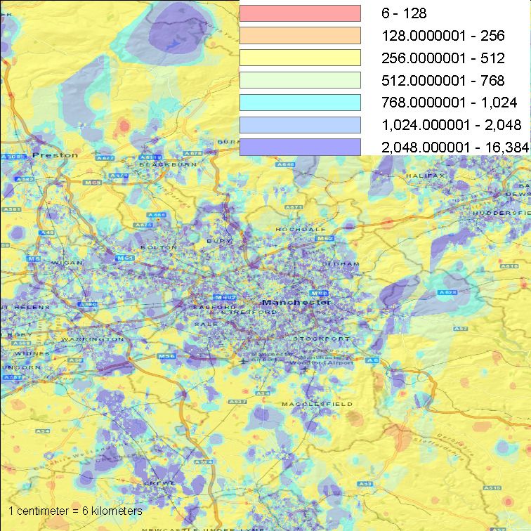
geographic characteristics. We seek answers to basic questions
such as: what is the relative performance of cellular vs. WiFi in
a given geographic area? How does performance vary across local
access providers, and how does cell and WiFi performance vary in
sub-regions within the metro area? How does cellular and WiFi
performance vary temporally in the metro area and in sub-regions
within those areas? How consistent is performance for individual
users over time? What specific features in the data differentiate
observed performance? The long-term goal of our work is to for-
mulate conclusions about the spatio-temporal aspects of WiFi en-
abled cell phone performance that will lead to improvements in the
relevant protocols, configurations, and infrastructure.
   Our evaluation indicates a rich yet complex set of characteristics
of spatio-temporal performance of mobile devices in a metro area.
As expected, we find absolute WiFi download and upload perfor-
mance to be superior to cellular performance in most areas, and
                                                                          Figure 1: Packet exchange protocol initiated when the
that WiFi exhibits a higher degree of performance consistency. We
                                                                          Speedtest application is started on a client system.
also find that WiFi latency measurements are at least a factor of two
lower than cell latency in all areas, but that different providers can
exhibit vastly different latency characteristics, and consistency in      2.1 Speedtest Overview
latency is often better with cellular access. Further, the absolute la-
                                                                             Speedtest.net [7] is a bandwidth/performance evaluation plat-
tency difference between cell and WiFi tends to be smaller in larger
                                                                          form that is managed and maintained by Ookla, Inc. [6]. The ap-
metro areas and the overall variability in latency is lower, suggest-
                                                                          plication can be run via a flash-based web site, and native apps
ing that greater efforts have been made to optimize those cellular
                                                                          are available for both Apple iOS-based devices (including iPod
deployments. Although we find cell performance in large metro ar-
                                                                          touches, iPhones, and iPads) and Android-based devices (includ-
eas superior to performance in other areas, throughput and latency
                                                                          ing a variety of phones manufactured by HTC, Motorola, Samsung,
performance measures vary widely depending on the specific ac-
                                                                          and Sony Ericsson, among many others). Over 3B performance
cess type and service provider. Furthermore, we observe that while
                                                                          tests have been run since Speedtest began in 2006, with a signifi-
new cellular access technologies such as 4G LTE offer throughput
                                                                          cant increase in use over the past twelve months. Daily tests exceed
speeds comparable to WiFi, the upload performance consistency is
                                                                          125K per day, globally.
currently low, suggesting that these deployments are not yet fully
                                                                             Each Speedtest is initiated by the client (either a browser or mo-
optimized. More generally, our results show that performance con-
                                                                          bile app) as shown in Figure 1. Upon invocation, a test request
sistency for cellular and WiFi is significantly lower than has been
                                                                          is directed to the Speedtest server that is deemed to be geographi-
reported for wired broadband access. Our results also show that
                                                                          cally nearest to the client. There are servers deployed in over 600
based on trends toward higher throughput cellular access technolo-
                                                                          locations world wide. Per the Speedtest wiki [5], latency, down-
gies, connectivity decisions based solely on throughput may not be
                                                                          load, and upload tests are conducted via HTTP (TCP port 80). La-
obvious in the future.
                                                                          tency tests are based on request/response pairs with the average
   Recognizing the diversity of physical and IT infrastructures and
                                                                          of 10 RTT ping-style tests reported for the latency measurement.
time variations in usage patterns within a given metro area, our
                                                                          Speedtest refers to the download and upload tests as “throughput
analysis includes evaluations of subareas over a variety of time win-
                                                                          tests”, since their focus is on reporting download/upload speeds by
dows. Our results show that download/upload performance in sub-
                                                                          transferring small files between client and server.
areas follows a standard diurnal cycle but is highly variable. Specif-
                                                                             A download test begins with an initial transfer of a fixed-size
ically, we find that while WiFi performance tends to be more uni-
                                                                          file from server to client to establish an estimate for throughput.
form across subareas, cell performance in subareas shows higher
                                                                          This initial test results in selection of another file that will be used
variability and there are fewer instances of subareas with consis-
                                                                          for generating final test results. The size of the second file varies:
tently good performance. We find that subareas with consistently
                                                                          smaller files are used when the initial estimate suggests lower band-
poor performance tend to be more localized in large metro areas for
                                                                          width and larger files are used when the initial estimate suggests
both cell and WiFi. These results have implications for both users
                                                                          more bandwidth. The target test file is then transferred repeatedly
and operators in terms of expectations for performance in both fixed
                                                                          (using naming tricks to prevent client caching) using up to 8 paral-
and vehicular settings, for diagnosis of performance degradation
                                                                          lel HTTP threads (a configurable option). Throughput estimates
and for future provisioning.
                                                                          based on these file transfers are provided at up to 30 times per
                                                                          second. The top 10% and bottom 30% of the throughput samples
2.    DATA                                                                are discarded and the remaining samples are averaged to derive a
   In this section we describe the unique data set that forms the basis   throughput sample. The reason for this kind of sampling is to try
of our study. We discuss Speedtest’s deployment and performance           to remove burst effects due to OS overhead and other effects and
measurement system. We also describe the Speedtest data that are          arrive at a maximum throughput estimate that corresponds to the
the focus of our study and provide information about the metro            expected case for the user. Test runs are tuned to be relatively short
areas in which the data were collected. Finally, we discuss how           (maximum of tens of seconds) to enhance user experience. Upload
conclusions drawn from the data sets can be influenced by the areas       tests are conducted in a similar fashion. We note that in prior work,
and methods used for collection.                                          Bauer et al. [12] found that the Speedtest method results in a fairly
                                                                          accurate characterization of last-mile performance.
                                                                             In this work, we consider data collected from tests initiated from
                                                                          the iOS and Android apps. Each full test results in a rich log entry at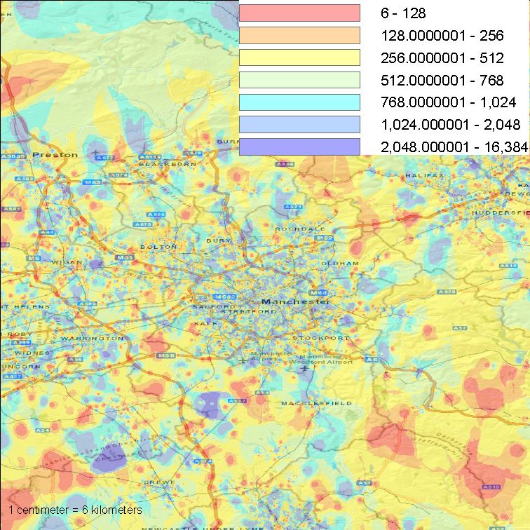
Table 1: Summaries of census and Speedtest data from the 15 target metro areas that are the subject of our evaluation. Speedtest
data are for the period from February 21, 2011 to June 5, 2011. US census data are from [14], European census data are from [28],
Asian census data are from [1, 3, 4], and non-US per capita income (PCI) data are from [11].
              Location (market type)     Pop.   Metro Rank   Annual PCI               iOS                              Android
                                                                           Unique     # WiFi       # cell    Unique     # WiFi       # cell
                                                                          handsets       tests      tests   handsets       tests      tests
              New York, NY (large)      18.9M           1        $50.8K     89,356   246,222      78,729      97,994   100,794     353,784
              Los Angeles, CA (large)   12.8M           2        $45.9K    150,804   425,197     105,901     174,221   181,928     606,564
              Chicago, IL (large)        9.5M           3        $51.0K     27,018    62,997      12,084      41,482    34,437     104,667
              Columbia, SC (medium)      768K          70        $41.7K      4,931    11,553       3,138       6,779      6,331     18,975
              Syracuse, NY (medium)      663K          80        $39.8K      6,122    16,801       3,627       5,165      6,808      9,898
              Madison, WI (medium)       569K          89        $49.2K      8,549    23,995       3,853       6,718      9,625     14,012
              Jackson, TN (small)        115K         321        $36.6K      5,117    13,742       3,034       2,645      3,894      5,655
              Lawrence, KS (small)       111K         329        $37.5K      3,231      8,164      1,893       3,917      4,058     11,498
              Missoula, MT (small)       109K         331        $34.4K        860      2,479        604         526        872        806
              Manchester, UK (europe)    2.2M         N/A        $41.4K     80,211   291,564      30,810      32,221    82,700      37,767
              Brussels, BE (europe)      1.8M         N/A        $45.2K     22,624    48,085      11,033       4,311      7,192      3,964
              Belgrade, SP (europe)      1.6M         N/A         $6.0K      3,849    11,606       1,477       9,599    18,865      13,101
              Palembang, ID (asia)       1.5M         N/A         $2.0K        415        743        621         504        756        749
              Almaty, KZ (asia)          1.4M         N/A         $6.9K      1,949      4,821      1,674         903      1,097      1,947
              Ulaanbaatar, MN (asia)     1.1M         N/A         $1.6K        673      1,861        275         340        621        289

the local Ookla server that includes the client IP, device type and OS         On average, we observe tests initiated by 7,551 handsets per
version, client geographic coordinates (longitude / latitude), server       day to the 15 servers for which we have data (3,863 by iOS users
name and coordinates, great-circle distance from the client to the          and 3,688 by Android users). From these handsets, an average of
server (computed using the Haversine formula), timestamp, upload            14,961 individual tests are initiated per day from cellular access,
and download speeds (in kb/s), latency (in milliseconds), access            and 15,521 per day using WiFi. Interestingly, for the Android app,
type (cellular or WiFi), and the cellular carrier or WiFi network           there are 11,273 tests per day on average via cellular technology,
provider. In the Android data set, for some tests we have finer             and 4,380 via WiFi, while for the iOS app, there are only 2,464 tests
grained information about the specific cellular access type (e.g.,          via cellular technology per day on average, compared with 11,141
EDGE, HSPA, EVDO-A, or LTE). For the iOS data, no such fine-                via WiFi. Also, in 9,230 cases, we observe the same handset in at
grained information exists; we only know whether the access is via          least two different metro areas. Moreover, the distribution of the
cell or WiFi. For each of the apps, we also have a unique device            number of tests initiated per handset is skewed. On average, there
fingerprint that allows us to identify measurements initiated by the        are 6.0 tests per handset, with a (rather high) standard deviation of
same handset (user) even if the test is initiated using a different         17.4. Our data also include a great deal of diversity with respect
access technology or from a different service provider.                     to handset type and operating system version. Table 2 shows the
                                                                            unique number of devices and unique device/OS pairs (including
2.2 Data Sets Considered                                                    different OS versions) per site, as well as the top three devices (and
   The data we consider in our initial evaluation were collected            percentage share) for each site. Interestingly, while the number of
from servers located in 15 metro areas over a period of 15 weeks            tests per site is generally dominated by Android devices, the iPhone
from February 21, 2011 through June 5, 2011. In each case the               is the singularly most popular device, and other iOS-based devices
metro areas are locations with Speedtest servers. Selection of the          are also very popular.
sites was based at a high level on attempting to amass a manageable            Data for each test include highly accurate GPS-derived geographic
data corpus, yet one that provides a broad perspective on cellular          coordinates for the location of each test. The coordinates are only
vs. WiFi performance in metro areas that are diverse in their ge-           taken once during a test so we cannot tell from a single test whether
ographic, socio-economic and behavioral characteristics. In par-            or not a client was moving during a test. There are, however, in-
ticular, we focus on three different metro area types in the US,            stances in our data sets where multiple tests are run consecutively in
small (Lawrence, KS; Jackson, TN and Missoula MT), medium                   relatively close geographic proximity and when plotted on a map,
(Madison, WI; Syracuse, NY and Columbia SC) and large (New                  we can see that the positions follow roads perfectly. Thus, we can
York, NY; Los Angeles, CA and Chicago, IL). We also include                 infer that a subset of our tests were run while users were traveling.
metro areas in Europe (Belgrade, Serbia; Brussels, Belgium and                 Figure 2 shows an example of the positions of all cellular clients
Manchester, United Kingdom), and in Asia/Pacific (Ulaanbaatar,              that access the Los Angeles, CA, Manchester, UK and Lawrence,
Mongolia; Almaty, Kazakhstan and Palembang, Indonesia). The                 KS servers during the 15 week test period. Maps of WiFi client
specific choices were made primarily based on market size with an           locations from these metro regions, and maps of client locations
attempt to select areas for each category that had roughly the same         from other metro areas have similar profiles. In the large metro
population. While the specific geographic boundaries of the US              areas, cellular and WiFi tests are conducted with more uniformity
metro areas are defined by the US Census bureau, European and               over the highly populated metro area; in smaller metro areas, there
Asian markets do not define metro areas in the same way. Thus,              are tight clusters of test locations in densely populated subregions
for each server we only include tests that are conducted within a           with sparser use in less populated areas. In short, test locations cor-
100 km radius of a given server. Details of the individual metro            relate highly with population density. (In the Los Angeles, CA and
areas and their associated Speedtest data sets can be found in Ta-          Lawrence, KS plots shown in Figure 2, we show US zip code di-
ble 1. As shown in the table, the markets vary widely in terms of           visions, with more densely populated zip codes shaded darker than
socio-economic characteristics and Speedtest use.                           more sparsely populated zip codes.) This variable profile suggests
Table 2: Handset diversity: numbers of unique devices and device/OS pairs for each of the 15 servers, as well as the top three devices
for each site (and percentage share of all devices for that site).
Three most popular devices
Location Unique devices Unique device+OS 1st (%) 2nd (%) 3rd (%)
New York, NY 473 1223 iPhone (26.0) iPad (8.8) HTC Supersonic (8.4)
Los Angeles, CA 558 1340 iPhone (24.9) HTC Supersonic (10.7) iPad (8.4)
Chicago, IL 320 925 iPhone (20.9) HTC Mecha (13.3) iPad (8.4)
Columbia, SC 125 265 iPhone (20.9) HTC Mecha (14.7) HTC Supersonic (9.8)
Syracuse, NY 124 253 iPhone (30.6) iPad (12.0) iPod touch (10.2)
Madison, WI 135 273 iPhone (29.9) iPad (14.4) iPod touch (12.3)
Jackson, TN 79 154 iPhone (46.1) iPad (8.5) Motorola Droid 2 (6.9)
Lawrence, KS 124 246 iPhone (26.4) HTC Supersonic (20.4) iPad (7.8)
Missoula, MT 51 99 iPhone (31.1) iPad (17.7) iPod touch (15.1)
Manchester, UK 412 899 iPhone (52.0) iPad (11.7) iPod touch (8.8)
Brussels, BE 178 354 iPhone (43.6) iPad (11.4) iPod touch (8.9)
Belgrade, SP 309 613 iPhone (18.2) HTC Bravo (8.9) HTC Buzz (8.2)
Palembang, ID 68 124 iPhone (29.4) Samsung GT-P1000 (8.6) iPad (8.2)
Almaty, KZ 124 239 iPhone (49.7) iPad (11.2) HTC Supersonic (4.6)
Ulaanbaatar, MN 94 158 iPhone (36.2) iPad (15.6) iPod touch (9.5)
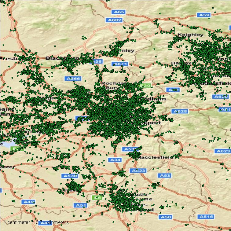
Figure 2: Locations of Speedtests by cellular users in the Los Angeles, CA (left), Manchester, UK (center) and Lawrence, KS (right)
metro areas during the measurement period of February 21 to June 5, 2011. Area included in each plot is approximately 50km by
50km.
the need for a more detailed spatial analysis, which we describe in establishing baselines for performance or assessing testing bias in
Section 3. In all cases, there is a high degree of overlap between each metro area that we consider other than appealing to statistical
cellular and WiFi test locations. characterizations and the relatively large numbers of tests included
in our data. Lastly, although we are able to identify individual users
in our data via unique device identifiers, our comparisons between
2.3 Discussion cellular and WiFi performance are at an aggregate level. In future
We argue that the Speedtest data are compelling from the per- work, we intend to carefully examine cellular versus WiFi perfor-
spective of their richness, availability in a huge number of markets mance on an individual user basis.
and broad adoption by users. However, there are several limita- We are limited, to a certain extent, in our spatial analyses by the
tions that are important to acknowledge since they could influence fact that we do not have up-to-date ground truth locations of all cell
the conclusions drawn from our study. towers and WiFi access points that provided connectivity for hand-
Speedtest data are crowd-sourced and rely on users invoking and sets for all tests. In densely populated areas there are likely to be
running the throughput test application. While we have some abil- thousands of access points operated by many different providers.
ity to distinguish between handset types (for iOS devices, we do These would provide natural anchor points for spatial clustering
not know the hardware generation, but for Android devices, we of the performance data. The difficulty in assembling these data
have the specific model number), device configurations can vary, sets for diverse markets is substantial. While regulatory agencies
especially with jail-broken devices. Thus, there could be variations such as the FCC keep databases of cell tower locations [16], they
that could lead to biases in the test results. For example, we have are often incomplete, and similar databases in non-US markets are
no way of knowing whether a given test is run indoors or outdoors. sometimes difficult to obtain. However, we plan to consider cell
Similarly, when and where the application is invoked depends en- tower locations as identified in sources such as [2] in future evalua-
tirely on how individuals derive value from the tests. We expect tions of our data. There are similar archives for WiFi access points
that the application will often be used when performance with the e.g., [8], but the completeness of these databases is unknown.
local default technology is perceived to be poor. Hence, the results Economic considerations certainly come into play for all con-
of the performance tests might tend to be biased toward poor oper- stituencies (users, service providers and application designers) men-
ating conditions for each technology. However, we have no way of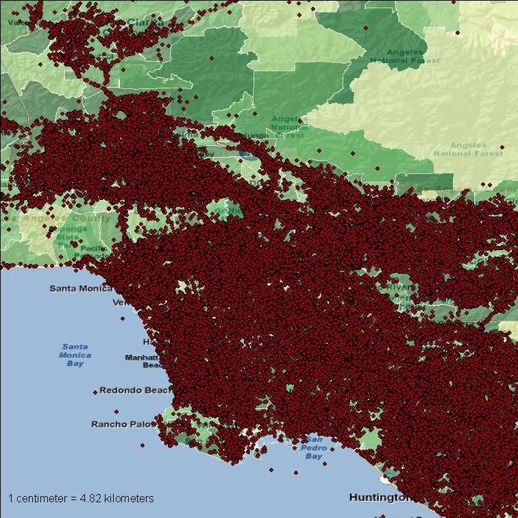
tioned or discussed in this paper. For users, connectivity may be         time windows, we also expect to be able to observe and characterize
subject to data transfer limits and traffic shaping. Although WiFi        anomalous events such as outages and periods of degraded service.
user plans are rarely data-quantity limited, they are partitioned among      Our temporal analysis considers two characteristics: client use
openly available for free, openly available for paying users, and pri-    versus time, and performance versus time. In the case of the for-
vate connectivity.                                                        mer, we plot the aggregate hourly invocations of the test application
   Service providers make decisions on infrastructure density based       over the 15 week period. In the case of the latter, we plot the aver-
on many different issues including projected user growth, risks as-       age hourly upload and download performance for cellular and WiFi
sociated with losing customers due to under provisioning and ge-          over the 15 week period. We also compute the per-handset average
ographic expansion of service. Finally, application designers must        normalized performance for each hour of the day, and the stan-
carefully consider how to manage data transfers so that user experi-      dard deviation of the normalized performance for each hour of the
ence under expected conditions is acceptable. Otherwise, they risk        day, as in [33]. These measures allow us to determine whether cer-
losing customers. While these issues are fascinating and certainly        tain hours in the day give consistently better or worse performance
play a role in the use of mobile devices, drawing explicit lines be-      than others. Note that while we have a large number of total data
tween the Speedtest measurements and economic issues is a subject         points across all servers, the data are still quite temporally sparse.
of future study.                                                          Thus, we do not examine time windows smaller than 1 hour. Nev-
                                                                          ertheless, these plots provide insights on how performance for each
3.    EVALUATION METHODOLOGY                                              technology varies with time of day in each metro area.
  Our evaluation takes a top-down approach to assessing the spatio-       3.3 Spatial Characteristics of Subregions
temporal performance characteristics of cellular and WiFi through-
                                                                              We believe that metro areas are a highly useful spatial aggregate
put and latency in the target metro areas. This section describes the
                                                                          for our study since they provide a sufficient corpus of daily data
methods that we use to evaluate Speedtest data toward the goal of
                                                                          for temporal analysis and are commonly used in socio-economic
being able to draw conclusions about the relative capabilities and
                                                                          analyses. Analyses at the metro area scale can enable the impact of
robustness of each technology.
                                                                          large scale events such as storms or power outages to be evaluated.
3.1 Basic Performance Characteristics                                     However, metro areas typically comprise hundreds of square miles,
                                                                          potentially thousands of cellular and WiFi access points and mil-
   We begin by calculating the basic statistical characteristics of
                                                                          lions of users. As indicated above, this density can preclude iden-
performance for each technology including maximum, average, min-
                                                                          tification of smaller scale unexpected or noteworthy events, which
imum and standard deviation over the entire 15 week period in each
                                                                          is a goal of our work. To that end, we also analyze performance in
of the 15 metro areas. This analysis does not distinguish between
                                                                          subregions for each metro area.
times of day or subregions within a given metro area. As such, it ig-
                                                                              To analyze subregions, we generate a spatial interpolation of
nores the more complex and potentially interesting characteristics
                                                                          performance using a technique called inverse distance weighting
of performance. However, it does enables us to begin to understand
                                                                          (IDW) [32]. In IDW, the interpolated performance varies accord-
the data from an aggregate perspective and establish simple rank-
                                                                          ing to the distance away from measurement points. The method
ings between area types (i.e., large, medium, small, Europe, and
                                                                          can produce a smooth contour of predicted performance based on
Asia) and rankings of metro areas within each area type.
                                                                          measurement data, and we color each contour band depending on
   From this coarse view of the data, we drill down by analyzing
                                                                          interpolated performance (e.g., blue for good performance, yellow
per-handset performance measures. For the set of tests initiated
                                                                          for intermediate performance, and red for poor performance).
by each handset in a metro region, we separate the series of tests
                                                                              With 15 weeks of data for each metro area, the question of the
by access technology (WiFi, cell, or some more detailed cell ac-
                                                                          temporal selection of data for subregions is also important. Se-
cess type) and by service provider. To obtain the service provider,
                                                                          lections over longer time periods enable a first order perspective
we use the IPv4 to autonomous system mapping data provided by
                                                                          similar to what we conduct for entire metro areas, while selections
www.team-cymru.org. From this grouping, we can compute
                                                                          over shorter time scales enable assessment of localized changes in
summary statistics such as the median, mean, or 95th percentile
                                                                          performance, which is a goal of our work. Similar to our basic and
for throughput and latency for a given handset (user) when using a
                                                                          temporal analyses, we consider subregion performance over the full
given access provider and access technology in a given market. We
                                                                          15 weeks as well as shorter intervals of days or hours.
then plot scatterplots of upload vs. download throughput to com-
                                                                              Our spatial analysis is facilitated by the ArcGIS tool [19] —a
pare the throughput performance that different users obtain from
                                                                          widely used Geographic Information System that is easily adapted
different networks and access technologies. We also compute per-
                                                                          to processing the Speedtest data. With ArcGIS, we are able to per-
formance consistency measures using the same method of [33].
                                                                          form IDW and kriging [29] analyses, among other types of spa-
In particular, we plot CDFs of normalized per-handset through-
                                                                          tial analyses. We are also able to overlay our plots on base maps
put and latency performance. The normalization is performed by
                                                                          that include roads and administrative or political boundaries, such
taking the average divided by the 95th percentile in the case of up-
                                                                          as county, state and country borders, and postcode or zipcode di-
load/download throughput, or taking the average divided by the 5th
                                                                          visions. ArcGIS exposes a Python-based API, which we heavily
percentile in the case of latency.
                                                                          leveraged for our work. While this API does not expose all Ar-
3.2 Temporal Characteristics                                              cGIS functionality, it enables repetitive tasks to be automated. In
                                                                          total, the scripts that were developed for Speedtest data analysis
   The diurnal behavior of Internet traffic is one of its most well-
                                                                          comprised several hundred lines of code, which we intend to make
known empirical characteristics. Prior studies of WiFi networks
                                                                          publicly available.
(e.g., [22]) and cellular traffic (e.g., [20]) have shown that diurnal
usage patterns are also evident. The goal of our temporal analysis is
to assess the extent to which client tests follow a diurnal pattern and   4. PERFORMANCE RESULTS
how the expected diurnal use of cellular and WiFi has an impact on          In this section we report the results of our spatio-temporal anal-
performance in our target metro areas. By drilling down on smaller        yses of cellular and WiFi performance in the 15 target metro areas.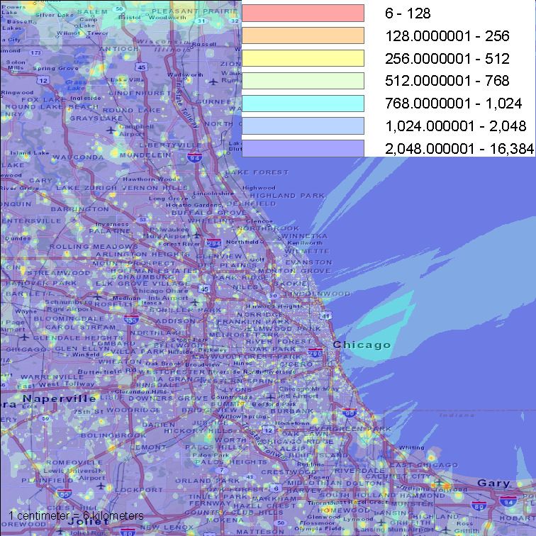
Table 3: Download throughput for cell and WiFi from the 15 target metro areas for full 15 week period. All values are in kb/s.
       Location          Cell Mean (Stdev)    WiFi Mean (Stdev)    Cell 5th %   Cell Median    Cell 95th %   WiFi 5th %   WiFi Median    WiFi 95th %
       New York, NY        3194.4 (4234.7)       7621.7 (5574.8)        108.0         1678.0      12922.0         404.0         7040.0      17617.0
       Los Angeles, CA     2261.6 (2914.4)       6528.3 (5051.1)         62.0         1262.0        7607.0        352.0         5556.0      15376.0
       Chicago, IL         3770.8 (4787.8)       8288.7 (6021.6)        125.0         2250.0      14014.0         396.0         7770.0      18598.0
       Columbia, SC        4297.9 (6582.3)       4975.9 (4019.3)        113.0         1276.0      20681.0         254.0         4286.0      12222.0
       Syracuse, NY        1634.4 (1916.7)       7866.5 (5288.0)        130.0         1143.0        4315.0        381.0         7914.0      16705.0
       Madison, WI         1258.3 (1513.2)       6103.0 (4507.9)         99.0          895.0        3485.0        347.0         5742.0      14173.0
       Jackson, TN            907.9 (728.4)      4251.9 (3767.2)         69.0          792.0        2138.0        223.0         3171.0      10926.0
       Lawrence, KS        1878.8 (1919.5)       5771.0 (4969.5)         95.0         1182.0        5931.0        274.0         4623.5      15685.0
       Missoula, MT        1014.4 (1013.0)       4672.8 (4203.0)        107.0          747.0        2607.0        283.0         3579.0      12952.0
       Manchester, UK      1358.9 (1314.6)       5811.8 (4825.6)         28.0         1077.0        3842.0        267.0         4717.0      15635.0
       Brussels, BE        1243.4 (1727.3)       8609.7 (5700.5)         61.0          902.0        4370.0        546.0         8171.0      18160.0
       Belgrade, SP        1416.5 (1469.4)       3370.3 (2820.0)         35.0          884.0        4596.0        296.0         2952.0        8861.0
       Palembang, ID          574.9 (819.8)        682.7 (866.6)         21.0          256.0        2312.0         43.0          457.0        1928.0
       Almaty, KZ          1310.5 (1465.8)       3001.4 (3461.0)         26.0          783.0        4636.0        136.0         1855.0        9116.0
       Ulaanbaatar, MN       1066.5 (999.4)      2263.3 (3346.0)         34.0          960.0        2595.0         90.0          975.0      10789.0

    Table 4: Upload throughput for cell and WiFi from the 15 target metro areas for full 15 week period. All values are in kb/s.
       Location          Cell Mean (Stdev)    WiFi Mean (Stdev)    Cell 5th %   Cell Median    Cell 95th %   WiFi 5th %   WiFi Median    WiFi 95th %
       New York, NY        1804.6 (4577.9)       2873.2 (3314.6)         52.0         772.0         5428.0        177.0         2020.0      10094.0
       Los Angeles, CA     1572.3 (4174.6)       2112.0 (3186.8)         62.0         715.0         4290.0        184.0         1022.0        9154.0
       Chicago, IL         1587.0 (3412.5)       3025.4 (2325.9)         46.0         802.0         5289.0        265.0         3530.0        6539.0
       Columbia, SC        1493.6 (2460.4)       1123.2 (2129.3)         47.0         708.0         5676.0        124.0          446.0        4422.0
       Syracuse, NY          768.5 (1388.9)      2426.4 (3269.0)         74.0         683.0         1293.0        208.0          985.0      10919.0
       Madison, WI           671.9 (1296.4)      1856.0 (2502.9)         55.0         478.0         1389.0        168.0         1064.0        5251.0
       Jackson, TN            524.2 (745.7)      1771.1 (2579.0)         41.0         429.0         1258.0        101.0          930.0        6976.0
       Lawrence, KS           634.6 (756.0)      2153.7 (2905.8)         45.0         554.0         1434.0        137.0          908.0        7773.0
       Missoula, MT          719.2 (1834.6)      1188.4 (1907.9)         53.0         479.0         1890.0        124.0          731.0        4048.0
       Manchester, UK         708.1 (755.3)      1384.6 (1950.7)         25.0         396.0         1659.0        180.0          745.0        5589.0
       Brussels, BE           530.1 (657.7)      1699.3 (1622.1)         37.0         326.0         1773.0        233.0         1397.0        4185.0
       Belgrade, SP           437.7 (709.8)       653.3 (1334.6)         32.0         351.0         1553.0         97.0          389.0        1618.0
       Palembang, ID          156.8 (251.7)       514.2 (1269.1)         18.0          76.0          662.0         46.0          239.0        1596.0
       Almaty, KZ             731.6 (830.0)      1455.5 (2736.0)         26.0         374.0         2497.0         58.0          829.0        6154.0
       Ulaanbaatar, MN        277.6 (335.7)      2202.5 (3465.7)         29.0         154.0          926.0         55.0          846.5      10371.0

While we endeavor to be comprehensive in our reporting, the size                 cess, there are more obvious “tiered” performance bands evident,
of our data set and scope of our analyses precludes inclusion of all             especially for AS7132 (AT&T) and AS20115 (Charter), than for
analyses due to space constraints. Thus, in a number of cases, we                the cellular access networks. Note that Figure 3 is annotated to
show figures and report findings that are exemplars of a broader set             point out some of these evident performance tiers in the upload di-
of results.                                                                      rection. For WiFi networks, these bands likely represent different
                                                                                 service plans available to customers. With cellular networks, there
4.1 Basic Characteristics of Performance                                         are not typically service plan limits on throughputs, but rather on
                                                                                 total numbers of bytes transferred. Thus, the bands present in the
4.1.1 Aggregate Performance                                                      cellular plot (around 600 kb/s upload, and just over 1 Mb/s upload,
                                                                                 for UMTS and HSDPA) are more likely due to different modula-
   Our analysis begins by examining the general characteristics of
                                                                                 tion rates in the cellular access. We observe in the plot that the
cellular and WiFi performance in each of the target metro areas.
                                                                                 performance bands are most evident in the upload direction; es-
These characteristics can be found in Tables 3, 4, and 5. The side-
                                                                                 pecially for WiFi, there are no obvious download throughput tiers.
by-side comparison shows that WiFi provides better maximum and
                                                                                 We hypothesize that this difference is due to the typically asymmet-
average performance for nearly all regions for upload and down-
                                                                                 ric configuration of last-mile access technologies (e.g.,, Cable and
load performance and latency. One regional exception is Columbia,
                                                                                 DSL), which makes it easier for the Speedtest application to satu-
SC, which has a number of very high throughput cellular tests that
                                                                                 rate the available upload capacity. Lastly, we hypothesize that as
cause the average and 95th percentile to be higher than WiFi. These
                                                                                 higher speed cellular access technologies become more prevalent
tests are all from devices using the 4G LTE cell access technology,
                                                                                 (e.g., LTE), providers may need to impose service plan rate lim-
which has substantially higher throughput than some older access
                                                                                 its similar to wired broadband access networks in order to better
technologies. The tables also show that the difference in upload
                                                                                 manage access network congestion.
performance between WiFi and cell is much smaller than the dif-
                                                                                    In order to evaluate whether there are any significant perfor-
ference in download performance.
                                                                                 mance differences between Android-based and iOS-based devices,
   In Figure 3 we show scatterplots of upload versus download per-
                                                                                 we plot in the left plot of Figure 4 the median download for iOS de-
formance for cell (left) and Wifi (right) for the Madison, WI metro
                                                                                 vices versus the median download for Android devices computed
area. Each data point is computed as the 95th percentile value for
                                                                                 for each local access carrier in each of the five metro area types.
a given handset. These plots are representative of other metro ar-
                                                                                 The right-hand plot shows median latency for iOS devices versus
eas. First, as with Tables 3 and 4, WiFi performance is generally
                                                                                 median latency for Android devices, again computed for each local
higher than cell. We note that the highest cellular throughputs are
                                                                                 access carrier. The plots are created from WiFi measurements only;
for the LTE access technology. We also observe that for WiFi ac-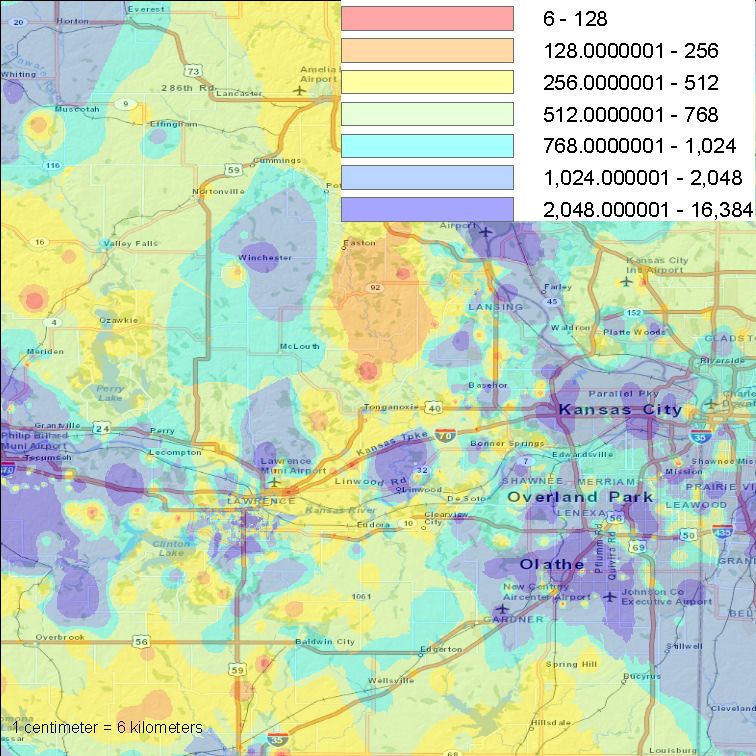
Table 5: Latency for cell and WiFi from the 15 target metro areas for full 15 week period. All values are in milliseconds.
       Location          Cell Mean (Stdev)    WiFi Mean (Stdev)    Cell 5th %   Cell Median   Cell 95th %   WiFi 5th %   WiFi Median   WiFi 95th %
       New York, NY           282.0 (575.9)        111.9 (261.8)         68.0         159.0         786.0         21.0          54.0         336.0
       Los Angeles, CA        268.0 (354.2)        120.5 (314.4)         67.0         165.0         776.0         24.0          64.0         350.0
       Chicago, IL            178.5 (318.9)         96.1 (227.1)         63.0         122.0         429.0         22.0          53.0         255.0
       Columbia, SC           252.2 (316.8)        187.7 (313.6)        102.0         183.0         736.0         55.0         120.0         456.0
       Syracuse, NY           238.9 (199.0)        131.2 (225.3)        115.0         171.0         558.0         29.0          73.0         358.0
       Madison, WI            262.3 (267.8)        119.9 (258.1)         99.0         184.0         773.0         24.0          69.0         343.0
       Jackson, TN            339.1 (363.9)        168.2 (309.4)        116.0         226.0         858.0         23.0         107.0         412.0
       Lawrence, KS           323.5 (351.6)        177.3 (286.0)         95.0         250.0         778.0         30.0         113.0         470.0
       Missoula, MT           360.3 (247.2)        190.3 (241.1)        165.0         314.0         687.0         47.0         115.0         412.0
       Manchester, UK         335.2 (491.4)        129.7 (265.6)         98.0         221.0         912.0         34.0          92.0         313.0
       Brussels, BE           281.6 (321.7)        103.8 (242.1)         84.0         203.0         755.0         28.0          67.0         238.0
       Belgrade, SP           329.4 (475.7)        113.5 (379.0)         79.0         226.0         842.0         22.0          52.0         318.0
       Palembang, ID         583.8 (1334.4)       371.7 (1144.5)        148.0         348.0        1095.0         62.0         179.0         917.0
       Almaty, KZ             356.7 (663.3)        141.3 (405.0)         90.0         194.0        1114.0         27.0          77.0         364.0
       Ulaanbaatar, MN       649.4 (1935.9)        239.3 (824.6)         76.0         216.0        1990.0         17.0          67.0         862.0

Figure 3: Scatterplots of upload versus download performance for cellular (left) and WiFi (right) for the Madison, Wisconsin metro
area. Data points represent 95th percentile for a given handset. Points are colored based on service provider. and marker shapes are
different for each access technology.

we do not show results for cellular tests due to the lack of detailed            (Chicago, IL) and a much smaller metro area (Lawrence, KS). First,
access technology information for iOS devices (we only know it is                we see that latencies for the larger Chicago market are generally
cellular, not what specific flavor). Interestingly, while throughput             smaller than for the Lawrence market. Indeed, for other metro ar-
does not appear to be affected by OS version (the upload plot re-                eas, the trend is clearly toward shorter latencies for large cities and
sults are similar to the download plot shown), iOS appears to induce             longer latencies for smaller cities. These results thus suggest that
consistently higher latency measurements than Android. Since the                 service providers expend more effort to engineer their networks for
same organization (Ookla) designed the app for each OS, we con-                  good performance in larger markets than smaller ones. We also see
clude that iOS either introduces significantly more buffering of net-            that specific latency distributions are highly provider dependent:
work data, or its APIs are not optimized to deliver low packet-level             for the Chicago plot, we see that the two curves showing WiFi
latency.                                                                         latency distributions are highly dissimilar: one provider delivers
   Turning to a broader view of latency performance, we see in Ta-               quite low latencies, while another gives some of the worst latencies
ble 5 a vast difference between cell and WiFi performance. Cell                  observed overall. We also observe that the latency profiles for all
latencies are generally longer than WiFi, with mean cell latencies               access types offered by a given provider often have similar charac-
approaching or exceeding a third of a second in many cases, and                  teristics. This is especially true for the Lawrence, KS plot, but also
very large 95th percentile latencies in all metro areas. Even the me-            clearly evident in other metro areas (not shown). In other analyses
dian cell latency is at least twice as large as WiFi latency for nearly          (also not shown), we did not find any meaningful correlation be-
all regions we consider (Columbia, SC is the only exception). Re-                tween latency and distance to the server. This lack of correlation is
call that for each server, we only consider tests carried out within a           likely due to packets traversing cellular backhaul networks that are
100 km radius.                                                                   possibly geographically far away from the local Speedtest server,
   To examine the latency issue further, we plot in Figure 5 empir-              an issue that has been identified in prior work [18, 31].
ical cumulative distribution functions for WiFi connections and for
specific cellular access technologies, for providers from which we
see the most tests. The figure shows results for a large metro area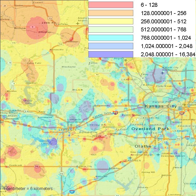
Figure 4: Scatterplots of iOS versus Android download and latency performance for WiFi. The left plot shows median download
performance for iOS devices versus median download performance for Android devices, computed for each local access carrier in
each of the five metro area types. The right plot shows similar results but for latency (i.e., median latency of iOS devices versus
median latency of Android devices).

                   Figure 5: CDFs of latency for different access types; Chicago, IL (left) and Lawrence, KS (right).

4.1.2 Performance Consistency                                           sent degraded performance. Likewise, if latency is consistent, we
   We now examine consistency of performance results. We use            also expect to see points along each CDF curve to be close to 1.
the method of Sundaresan et al. [33]: for each handset (user), we       However, any deviations from good latency will result in normal-
construct cumulative distribution functions of normalized perfor-       ized values higher than 1 (i.e., inflated latencies). For each of the
mance, where the normalization is computed as the mean divided          plots below, we only consider users for which we had at least 5 tests
by the 95th percentile. (For latency, instead of using the 95th per-    from which to compute a consistency measure; all other users’ data
centile, we use the 5th percentile in the normalization computation.)   are discarded. The authors of [33] found that download and upload
The motivation behind each of these normalizations is to identify       performance for wired broadband access networks exhibited high
how far average measures deviate from good performance, where           consistency, except for a small number of service providers.
good is defined as the 95th percentile throughput and 5th percentile       In Figure 6 we plot download (left), upload (center), and la-
latency. We produce separate CDFs for each local access provider        tency (right) performance consistency for Los Angeles (top) and
and for each access type. If throughputs are consistent, points along   Belgrade (bottom). Plots shown are representative of other metro
each CDF curve should be close to 1; any points less than 1 repre-      areas. We observe in these plots a low degree of performance con-
Figure 6: Performance consistency for Los Angeles (left) and Belgrade (right) for download (top), upload (middle), and latency
(bottom). Plots shown are representative of other metro areas.
sistency, especially compared with the results of [33]. In their        tency of WiFi throughput is generally better than cellular, but cel-
work, nearly all curves were very close to 1, representing highly       lular latency performance tends to be more consistent than WiFi.
consistent performance (the one exception was the Cable provider        Lower consistency of WiFi latency is likely due to the impact of
Charter). Our results are exclusively generated from wireless tests,    overbuffering at broadband access routers. Local providers exhibit
and reveal that mobile users generally have to cope with much more      similar performance consistency characteristics for all offered ac-
variable performance than users on wired networks. In Figure 6, we      cess types, suggesting that providers use the same backhaul infras-
also observe that WiFi upload/download performance is generally         tructure to support various last-mile access methods. Performance
more consistent than cell upload/download, though it depends on         consistency for wireless access is markedly lower than has been re-
the local access provider. Furthermore, in many cases, we see sim-      ported for wired broadband access, with a great deal of variation
ilar performance consistency characteristics for the various access     depending on local service provider. The higher variability present
technologies that a given service provider supports in a metro area     with wireless access performance is likely due to variability in sig-
(c.f. Figure 5). We hypothesize from these similarities that some       nal quality, deployment density of base stations and cell towers, and
providers use the same network “backhaul” infrastructure for both       suboptimally designed service provider backhaul infrastructure, in-
cellular and WiFi access in an effort to optimize their network in-     cluding distant placement of cellular gateway nodes [31].
frastructures to minimize costs. Therefore, our hypothesis assumes
that a shared bottleneck in the provider network is the cause of        4.2 Temporal Characteristics of Performance
the observed similarity in performance consistency between cellu-          Our temporal analysis begins by analyzing the frequency of use
lar and WiFi. We intend to examine this hypothesis in detail in         of the Speedtest application in the target regions. Figure 7 shows
future work.                                                            the number of hourly invocations of the application for cellular and
   Interestingly, we observe that while LTE offers high absolute        WiFi over a two week period for six representative metro areas.
throughput performance, its upload performance consistency is poor.     The figures clearly show the characteristic diurnal pattern for each
For example, in the Los Angeles upload consistency plot (top mid-       region and technology. We see that there are many hundreds of
dle) in Figure 6, we see that LTE’s performance consistency is          invocations of the Speedtest app per day in larger metro areas, but
lower than many other access types. Other metro areas show simi-        that the measurements are fairly sparse in smaller metro areas, with
lar characteristics. We hypothesize that the cause for this behavior    typically fewer than 10 invocations of the Speedtest applications
is simply that service providers have not yet optimized LTE instal-     per hour in Lawrence, KS. Lastly, we observe that in some markets
lations, and have rather focused on getting services initially rolled   there are similar numbers of invocations of the app over WiFi and
out.                                                                    cellular access (e.g., New York, NY and Los Angeles, CA), but
   With respect to latency performance consistency, we see that         major differences in other markets (e.g., Manchester, UK).
while WiFi offers generally higher absolute throughputs and more           Next, we analyze the temporal characteristics of upload and down-
consistent throughput, cellular latency is generally more consistent.   load performance for cellular and WiFi. Figure 8 shows the hourly
In the case of Los Angeles (top right plot), except for one service     average upload and download performance for each technology
provider that delivers poor performance consistency for most ac-        over a 6 day period for one metro area from each of the five area
cess types it offers (AS21928), WiFi latencies exhibit a lower de-      types (notice the different y-axis scales for cellular (top) and WiFi
gree of consistency than cellular access types. Similarly, for the      (bottom)). We observe that for cellular access, the performance
Belgrade plot (lower right), 2 of the 4 least consistent access tech-   for all but the largest metro area is fairly similar over time; perfor-
nologies are WiFi. We hypothesize that this lower degree of per-        mance for the New York, NY region clearly stands above the oth-
formance consistency is due to the effect of overbuffering at ac-       ers. This trend is similar for other metro areas in the five area types.
cess routers. Many access routers are well known to exhibit la-         The latency profiles in Table 5 and Figure 5 suggest that the better
tency pathologies due to overprovisioning of buffers [21, 33], and      engineered cellular infrastructure for some providers in large metro
it is likely that user WiFi access is often through a home-grade        areas has a clear impact on throughput performance. We observe
router connected to a wired broadband connection. Another pos-          that for WiFi connections, while the smallest metro areas have gen-
sibility for the lower degree of performance consistency in WiFi        erally lower throughputs, the differences are not as great among the
is higher contention for WiFi frequency bands, and differences be-      metro areas for WiFi as they are for cellular connections.
tween WiFi and cellular medium access control. However, since              In other results (not shown due to space constraints), we observe
we observe the same pattern of lower consistency in WiFi across         that performance in the largest metro areas is better during non-
all metro areas—even the most sparsely populated ones where we          peak hours (i.e., early morning hours) than for other times of day.
would not expect the effect of contention to be significant—we be-      For other metro areas, there is no statistically significant difference
lieve that overbuffering is the more likely cause.                      in measured performance between peak and non-peak hours. We
   Lastly, we note that in different metro areas, there are clear in-   note that in Sundaresan et al. [33], the authors observed a distinct
stances of some service providers exhibiting generally poor perfor-     performance difference in peak versus off-peak hours, due to net-
mance consistency for all offered services. For example, AS21928        work load. We do not observe such a strong characteristic because
in Los Angeles, and to a lesser extent, AS8400 in Belgrade. This        of the significantly lower degree of performance consistency we see
observation further supports the notion that performance for vari-      in our data.
ous access technologies offered by a given service provider exhibit
similar qualities due to using the same backhaul infrastructure.
                                                                        Main findings.
                                                                           We find higher throughput performance over time for larger metro
Main findings.                                                          areas, further supporting the notion that service providers expend
   Absolute WiFi performance is better than cellular access, in gen-    more effort to engineer networks in more populous locations. We
eral. Throughput performance does not appear to be correlated with      find some evidence for higher performance during off-peak hours
operating system (iOS or Android), however latency measurements         and lower performance during peak hours, though to a lesser degree
are generally higher with iOS devices, suggesting too much buffer-      than has been reported for wired broadband access. The cause for
ing or APIs that are suboptimally designed. Performance consis-         this difference is likely due to the higher overall variability present
Figure 8: Average hourly performance for cellular downloads (top left), cellular uploads (top right), WiFi downloads (bottom left)
and WiFi uploads (bottom right) for exemplars in each of the metro areas during April 24 to April 30, 2011.
in wireless access performance resulting from frequency band con- the city center and surrounding, more rural, areas. Although that
tention and overbuffering at edge routers. pattern is somewhat less clear with cellular upload performance
in Manchester, the areas of highest performance still generally lie
4.3 Spatial Analysis of Subregion of Perfor- closer to the Manchester city center, with larger and more preva-
mance lent areas of poor performance in surrounding, less urban, areas.
Our spatial analysis of subregions within metro areas begins by A similar observation holds for the Lawrence, KS metro area and
considering spatial performance variations using the entire 15 week other areas (not shown). (Note that since the Chicago, IL metro
data set. To generate our plots below, we apply an inverse distance area is extremely large, this pattern is not observable in the plots
weighting interpolation [32] to the performance measurements over shown. Expanding the plotted region reveals poorer performance
a region. Pixels are colored according to interpolated performance. further away from the city center.)
In the plots below, we apply the following color symbology to up- We note that plots of download performance reveal similar vari-
load/download performance: 2 Mb/s: indigo. We istics, and utilize available cell tower and WiFi maps, along with
apply this same symbology for both upload and download perfor- economic and population data, to drill down on the likely causes
mance in order to make the plots visually comparable. for the observed performance characteristics.
Figure 9 shows plots of interpolated upload performance for WiFi
(top) and cell (bottom) for three different metro regions (Chicago, Main findings.
IL, Manchester, UK, and Lawrence, KS, left to right, respectively) We see a high degree of spatial performance variability, with
over the 15 week data set. The plots show that upload performance some metro areas exhibiting performance degradation as one moves
is spatially variable. Since the plot is produced from the entire 15 further away from the metro area center. Observed performance
week data collection period, regions in which the color is yellow differences are likely due to cellular tower and WiFi base station
or red suggest that there are subareas with consistently poor perfor- placement, and density of placements, as well as local contention
mance. due to load.
We also observe that although WiFi upload performance is broadly,
on average, at least twice as fast as cellular performance (c.f. Ta-
ble 4), the spatial performance characteristics reveal a much more
complex picture. For the Chicago, IL metro area, we observe that
WiFi upload performance is better across the entire region. How-
ever, when examining the Manchester, UK plots, we observe a clear
separation in WiFi upload performance between areas closer toFigure 9: Inverse distance weighting interpolation plots for WiFi upload performance (top) and cellular (bottom) for Chicago, IL (left), Manchester, UK (center) and Lawrence, KS (right), for the entire 15 week data set. 5. RELATED WORK Their results show a wide range of variable behaviors (diurnal pat- There is a large and growing body of work that examines the be- terns, expanded RTT’s during peak hours, etc.) that are consis- havior and characteristics of WiFi networks. Studies that are most tent with a number of our observations. Other empirical studies closely related to ours have been focused on analyzing mobile use of behavior in cellular networks include [24, 26, 31]. More re- characteristics in live deployments. Birk et al. analyze the behavior cently, there have been several studies focused on smartphone per- and characteristics of a city-wide commercial WiFi mesh network formance. Falaki et al. use measurements from instrumented hand- in [13]. Their study is based on a diverse set of measurements of sets to study diversity in smartphone traffic characteristics [20], a 250 node mesh operated by a single provider. Their assessment while Huang et al. use a purpose-built application deployed on of client performance was based on a set of targeted active mea- a large number of handsets to study smartphone application perfor- surements, and showed temporal variations with peak performance mance [23]. Shafiq et al. [31] and Elmokashfi et al. [18] recently achieved during the day (since customers are primarily residential) examined cellular network performance characteristics. One par- in contrast to wireline networks. In a related study, Sen et al. pro- ticularly interesting finding from these studies is the impact that pose a framework for client-assisted active measurement of wide- the topology of the cellular backhaul network plays in performance. area wireless networks [30]. Similar empirical studies of WiFi be- Our work differs from these in its scope and focus on comparative havior in localized settings include [9, 15, 22, 27]. More recently, analysis of cellular and WiFi. LaCurts and Balakrishnan report results of an empirical study of There are several prior studies that investigate cellular and WiFi 110 different WiFi mesh networks in diverse markets around the performance simultaneously. The notion of the combined use of world [25]. While their study reveals a range of characteristics of cellular and WiFi in a vehicular setting is addressed in [10]. That these networks, it does not address client performance, which is our study considers cellular and WiFi availability in three cities as the focus. While all of the aforementioned studies expand the body of basis for their work. In [17], Deshpande et al. evaluate cellular knowledge on WiFi behavior, our work differs in objective, scope, and WiFi performance in the New York metro area, also in a ve- measurement details and the fact that we include analysis of cellu- hicular setting. Measurements are taken with a laptop that is driven lar performance. throughout the target area, which enables highly targeted spatio- There is also a growing literature on empirical studies of cellu- temporal tests. Their results highlight the widely available, lower lar networks. Tan et al. describe one of the first empirical studies performance characteristics of cellular versus the lower availabil- of 3G cellular networks in [34]. Their work is focused in a single ity, higher performance characteristics of WiFi. While there are large metro area and includes an examination of client through- similarities between these studies and our own, our results comple- put and other performance characteristics using measurements of ment and expand the prior work by reporting client performance in data transfers between a small set of smartphones and their servers. diverse markets using a larger body of crowd-sourced data.
You can also read