Disparity in the quality of COVID-19 data reporting across India - BMC Public Health
←
→
Page content transcription
If your browser does not render page correctly, please read the page content below
Vasudevan et al. BMC Public Health   (2021) 21:1211
https://doi.org/10.1186/s12889-021-11054-7

    RESEARCH ARTICLE                                                                                                                             Open Access

Disparity in the quality of COVID-19 data
reporting across India
Varun Vasudevan1*              , Abeynaya Gnanasekaran1 , Varsha Sankar2 , Siddarth A. Vasudevan3 and James Zou4

    Abstract
    Background: Transparent and accessible reporting of COVID-19 data is critical for public health efforts. Each Indian
    state has its own mechanism for reporting COVID-19 data, and the quality of their reporting has not been
    systematically evaluated. We present a comprehensive assessment of the quality of COVID-19 data reporting done by
    the Indian state governments between 19 May and 1 June, 2020.
    Methods: We designed a semi-quantitative framework with 45 indicators to assess the quality of COVID-19 data
    reporting. The framework captures four key aspects of public health data reporting – availability, accessibility,
    granularity, and privacy. We used this framework to calculate a COVID-19 Data Reporting Score (CDRS, ranging from
    0–1) for each state.
    Results: Our results indicate a large disparity in the quality of COVID-19 data reporting across India. CDRS varies from
    0.61 (good) in Karnataka to 0.0 (poor) in Bihar and Uttar Pradesh, with a median value of 0.26. Ten states do not report
    data stratified by age, gender, comorbidities or districts. Only ten states provide trend graphics for COVID-19 data. In
    addition, we identify that Punjab and Chandigarh compromised the privacy of individuals under quarantine by
    publicly releasing their personally identifiable information. The CDRS is positively associated with the state’s
    sustainable development index for good health and well-being (Pearson correlation: r = 0.630, p = 0.0003).
    Conclusions: Our assessment informs the public health efforts in India and serves as a guideline for pandemic data
    reporting. The disparity in CDRS highlights three important findings at the national, state, and individual level. At the
    national level, it shows the lack of a unified framework for reporting COVID-19 data in India, and highlights the need
    for a central agency to monitor or audit the quality of data reporting done by the states. Without a unified framework,
    it is difficult to aggregate the data from different states, gain insights, and coordinate an effective nationwide
    response to the pandemic. Moreover, it reflects the inadequacy in coordination or sharing of resources among the
    states. The disparate reporting score also reflects inequality in individual access to public health information and
    privacy protection based on the state of residence.
    Keywords: Data reporting quality framework, Pandemic data reporting, COVID-19, India, Coronavirus

*Correspondence: devan@stanford.edu
1
 Institute for Computational & Mathematical Engineering, Stanford University,
Palo Alto, California, USA
Full list of author information is available at the end of the article

                                         © The Author(s). 2021 Open Access This article is licensed under a Creative Commons Attribution 4.0 International License,
                                         which permits use, sharing, adaptation, distribution and reproduction in any medium or format, as long as you give appropriate
                                         credit to the original author(s) and the source, provide a link to the Creative Commons licence, and indicate if changes were
                                         made. The images or other third party material in this article are included in the article’s Creative Commons licence, unless
                                         indicated otherwise in a credit line to the material. If material is not included in the article’s Creative Commons licence and your
                                         intended use is not permitted by statutory regulation or exceeds the permitted use, you will need to obtain permission directly
                                         from the copyright holder. To view a copy of this licence, visit http://creativecommons.org/licenses/by/4.0/. The Creative
                                         Commons Public Domain Dedication waiver (http://creativecommons.org/publicdomain/zero/1.0/) applies to the data made
                                         available in this article, unless otherwise stated in a credit line to the data.
Vasudevan et al. BMC Public Health           (2021) 21:1211                                                                           Page 2 of 12

Background                                                                         Quality of data reporting
India reported its first case of COVID-19 in the state of                          A leading Indian English newspaper, The Hindu, pub-
Kerala on January 30, 2020. Since then the disease has                             lished an article showing variance in COVID-19 data
been reported in several other states and union territories                        reporting across the states in India [7]. However, their
(UTs) of India. As of July 18, 2020, the Ministry of Health                        analysis has atleast three main limitations. First, it pro-
and Family Welfare (MoHFW) of India reported over a                                vides only a high-level summary of the variance in data
million COVID-19 confirmed cases and over twenty-six                               reporting and is limited to 21 states. Second, the arti-
thousand COVID-19 deaths in the country [1]. India is a                            cle focuses only on data reported in the health bulletins.
developing nation and has the second largest population                            Third, they don’t provide a quantitative analysis. Janiaud
in the world. India is also a democracy with 28 states and                         and Goodman developed less granular metrics to assess
8 union territories. Therefore, coordinating an effective                          reporting quality in the U.S. states [8].
response to the pandemic, across all the regions, presents
a unique and unprecedented challenge to India.                                     Data quality
   Both the central and state governments in India have                            Data quality is a multidimensional concept with dimen-
introduced multiple measures and interventions for the                             sions such as, accuracy, accessibility, completeness, inter-
containment of COVID-19 [2]. It is well known that public                          pretability, relevancy, and timeliness [9]. There are frame-
adherence to these measures and interventions is essen-                            works for data quality assessment that are motivated by
tial for managing the pandemic [3]. In order to keep the                           what data quality means to the consumers of data [10, 11].
public informed about the ongoing situation, the states                            Although there is an overlap between quality of data and
in India have been reporting COVID-19 data collected                               quality of data reporting, they are not quite the same.
through surveillance programmes. As per World Health                               Accuracy is a crucial aspect in data quality. However,
Organization’s (WHO) guidance, surveillance is essential                           while measuring the quality of data reporting, the empha-
to monitor trends in COVID-19, to conduct risk assess-                             sis is not on the accuracy of data, instead it is on the
ments, and to guide preparedness and response measures                             presence or absence of a piece of information and the
[4]. Reporting relevant data in a timely, transparent, and                         format in which it is reported.
accessible manner is crucial during a pandemic [3]. The
advantages of such a timely reporting are atleast two-fold.                        Data visualization
First, it fosters trust between the government and the pub-                        Visualization is critical for understanding data. Excel-
lic and, thereby ensures public cooperation. Second, it                            lent statistical graphics communicate complex ideas with
enables the scientific community to rapidly and continu-                           clarity, precision, and efficiency [12]. The best practices
ally study the reported data to gain insights and propose                          in creating statistical graphics are discussed extensively
better containment measures and policies. A schematic of                           in the books by Cleveland and Tufte [12, 13]. There
a good data reporting system that we envision is shown in                          is also rich literature on developing effective real-world
Supplementary section S1 of Additional file 1.                                     dashboards [14], and interactive visualization for the
   Each Indian state1 has its own mechanism (daily bul-                            web [15].
letins, dashboards, etc.) for reporting COVID-19 surveil-
lance data. The content and format of the data reported                            Crowdsource initiative for COVID-19 data reporting
through these bulletins/dashboards vary substantially                              covid19india.org is a volunteer driven crowd-sourced
from state to state [5, 6]. Figure 1 shows how total (cumu-                        tracker for COVID-19 cases in India. They collect and
lative) numbers are reported by three different states in                          curate COVID-19 data from all across India, from a vari-
India. Notice how Assam and Gujarat report just the                                ety of sources, including but not limited to state govern-
total numbers, whereas Kerala reports the numbers and                              ment websites [16, 17]. The curated data is reported on
their trend graphics. In addition to reporting the num-                            their website in the form of tables, trend graphics, and
bers, providing trend graphics is essential because it                             color-filled maps. The covid19india team has an active
concisely represents the data, and makes it more inter-                            page on Twitter with more than 100 thousand follow-
pretable and accessible to the general public. In the                              ers. Based on the number of followers and the kind of
rest of this section, we give a brief overview of data                             questions they ask (see Supplementary section S3, Addi-
reporting quality, data quality, data visualization, and a                         tional file 1), it is evident that people are seeking granular
crowdsource initiative for reporting COVID-19 data. We                             COVID-19 data on a daily basis. This crowdsource ini-
conclude the section with a summary of our objectives                              tiative is a commendable example for public participation
and contributions.                                                                 during a crisis. Nevertheless, it is not sufficient, and does
                                                                                   not replace the need for clear and consistent government
1 Fromhere on, unless specified otherwise, the word state refers to both a state
                                                                                   official reporting for the following reasons. The initia-
and union territory in India.                                                      tive is volunteer driven and hence accountability is not
Vasudevan et al. BMC Public Health     (2021) 21:1211                                                                                 Page 3 of 12

 Fig. 1 Screenshots from the government COVID-19 web pages of Assam, Gujarat, and Kerala displaying cumulative data. Kerala is the only state
 among these three states to provide both a textual summary and trend graphics
Vasudevan et al. BMC Public Health   (2021) 21:1211                                                           Page 4 of 12

guaranteed in the event of an error or lapse in report-        disease, (ii) emergency management decision making pro-
ing. Moreover, their sources for data include social media,    cess, and (iii) compromising privacy or stigmatization of
which are noisy.                                               specific groups of people or both.
                                                                  The report items also represent five possible stages
Objectives and contributions                                   through which an individual can go through during a
The variance in reporting COVID-19 data across the             pandemic. For example, an individual could move from
Indian states raises two key questions. First, what is the     the stage of being under quarantine, to being a con-
minimal data that the public needs to know to under-           firmed case, and from there could recover in a couple
stand the gravity of the situation and cooperate with          of weeks, or if the situation worsens, could move to
the government? Second, how different is the quality           ICU. At the time of this study, all confirmed COVID
of data reporting from one state to another? In this           patients in India were hospitalized and treated in one
paper, we answer the two aforementioned questions by           of the following facilities: COVID Care Centers, Ded-
developing a systematic framework to evaluate the qual-        icated COVID Health Centers or Dedicated COVID
ity of COVID-19 data reporting. We then use it to assess       Hospitals [21].
the quality of reporting done by the states in India. We          Each “Metric - Report item” pair is a data reporting
compare the quality of reporting of each state to its Sus-     quality indicator (variable). Overall there are 45 indica-
tainable Development Goal India Index for Good Health          tors in our framework across the four scoring categories.
and Well-Being (SDG3-II), reported by NITI Aayog               It is important to note that neither the list of metrics,
[18, 19]. Based on our framework we also provide a min-        nor the list of report items used in our scoring table are
imal template that the states can use for daily COVID-         exhaustive. It is a representative minimal set. We define
19 data reporting (given in Supplementary section S2,          the report items as follows.
Additional file 1). We also present our findings on
an interactive Tableau dashboard that’s easily accessible      (1) Laboratory Confirmed: refers to individuals who
[20].                                                              tested positive for COVID-19.
                                                               (2) Deaths: refers to individuals who passed away while
Methods                                                            being COVID-19 positive [22, 23].
We developed a set of metrics to score the quality of          (3) Recovered: refers to individuals who recovered from
“COVID-19 data reporting” done by the states in India.             COVID-19.
These metrics are shown in column 2 of Table 1. The met-
                                                               (4) Quarantine: refers to individuals who are under
rics are further grouped into four categories: availability,
                                                                   quarantine either at home or specific government
accessibility, granularity, and privacy, as shown in column
                                                                   facilities. The definition of who should be
1 of Table 1. Using these metrics, we examine the qual-
                                                                   quarantined and for how long has evolved during the
ity of reporting for five items relevant to COVID-19. They
                                                                   course of pandemic in India.
are confirmed, deaths, recovered, quarantine and inten-
sive care unit (ICU) cases. These are called as report items   (5) ICU: refers to COVID-19 positive individuals who
and appear as column headers in the scoring table. The             are under treatment in an ICU.
report items and the metrics for availability and granular-
ity are based on WHO’s recommendations to the different          In our framework, we do not make any distinction
nations for reporting surveillance data to them [4]. The       between methods used to define a case as confirmed (RT-
choice of accessibility metrics reflect our belief that the    PCR, rapid antigen test, etc.) or recovered (by symptoms
format in which pandemic data is reported/presented            or lab test). The methods used have changed over time
should ensure that the key public health messages reach        and across states in India. However, to the best of our
a wider audience beyond the scientific community. For          knowledge, at the time of this study RT-PCR test was used
example, the widely used phrase “flatten the curve” is eas-    through-out India to determine a case as confirmed or
ily understood if data is presented in the form of trend       recovered [24].
graphics.
   The choice of report items and metrics (in particular       Scoring categories
privacy) are also influenced by the questions posed in the     In this section we give an overview of the four scoring
paper, “Transparency during public health emergencies:         categories.
from rhetoric to reality” [3]. The paper identifies three
YES/NO questions to help in deciding whether or not to         (1) Availability of data. During a pandemic, few generic
release a piece of information related to a public health          questions that people seek to answer are: “How are
emergency. These questions seek to understand the role             we doing?”, “How do we know how we are doing?”,
of a piece of information in: (i) reducing the spread of a         “How long will this last?”, “How do the numbers
Vasudevan et al. BMC Public Health (2021) 21:1211 Page 5 of 12
Table 1 CDRS Scoring metric table
Report Item
Category Metric Confirmed Deaths Recovered Quarantine ICU
Total {0,1} {0,1} {0,1} {0,1} {0,1}
Availability Daily {0,1} {0,1} {0,1} {0,1} {0,1}
Historical data {0,1} {0,1} {0,1} {0,1} {0,1}
Ease of access {0,1}
Availability in English {0,1}
Accessibility
Trend graphics – Total {0,1} {0,1} {0,1} {0,1} {0,1}
Trend graphics – Daily {0,1} {0,1} {0,1} {0,1} {0,1}
Stratified by age {0,1} {0,1} {0,1} – {0,1}
Stratified by gender {0,1} {0,1} {0,1} – {0,1}
Granularity
Stratified by comorbidities {0,1} {0,1,2} {0,1} – {0,1}
Stratified by districts {0,1} {0,1} {0,1} {0,1} {0,1}
Privacy Compromise in privacy {-1,1}
This table is filled for each state by inspecting the COVID-19 data reported by that state. The entry within a cell in the table lists all the possible values with which that cell can
be filled. Broadly, a 0 represents an unreported item, and a 1 represents a reported item
from today compare with yesterday’s?”, “How many pre-existing medical conditions are collected for each
people have tested positive so far”, and so on. With person being tested [29]. Therefore, aggregating and
such questions in mind we measure the availability of then stratifying that information should be
data by checking if the total, daily, and historical data straightforward. At a higher level stratified
are available for each report item. information is useful in the following ways. (i) District
(2) Accessibility of data. Data should not only be level data keeps the public informed about the gravity
available, it should also be easily accessible. We of situation in their neighborhood. (ii) People can
measure the accessibility of data based on ease of self-identify how susceptible they are to get infected
access, availability in English, and the presence of and hence take the necessary precautions. For
trend graphics. Ease of access refers to the ease of example, granular data can answer questions of the
getting to the web page where data is reported. kind, “I’m 65 and healthy, should I be worried?” (iii)
Research has shown that trend graphics are superior Scientific community can study the effect of factors
than tables for identifying and displaying trends [25]. like age, gender, and comorbidities on contracting
A good visual concisely represents the data and the disease, its progression, and the outcome.
makes it more interpretable and accessible to the (4) Privacy of data. Data released by the government
general public. Therefore, to measure accessibility we should include only the minimum information
also check, if a trend graphic of total and daily are necessary to conduct public health activities [30]. It
available for each report item. However, we do not should not contain any personally identifiable
assess the attributes of a graphic such as shape (length information. Violating privacy by releasing personally
to height ratio), line weight, choice of colors, font size identifiable information can have the following
of text, and whether the graphic is interactive or not. consequences. (i) It can discourage people from
(3) Granularity of data. Granularity refers to the cooperating with the government, thereby hurting
stratification of the total number for each report public health rather than helping. (ii) Women can be
item. We check if the total is stratified by age, gender, victims of harassment calls when their phone
comorbidities, and districts. Recent studies have number is released. A study by Truecaller shows that,
shown the role of age, gender, and comorbidities in in general, 8 out of 10 women in India receive
influencing the outcome of a COVID-19 positive harassment and nuisance calls [31]. Releasing phone
individual [26–28]. As per the Indian Council of numbers can further amplify the general trend. (iii)
Medical Research (ICMR) specimen referral form for Discrimination and stigmatization of specific groups
COVID-19, data on age, gender, district, and of people [32–34].Vasudevan et al. BMC Public Health (2021) 21:1211 Page 6 of 12
Scoring data curation score of 1 if patient specific comorbidities are reported.
We evaluated the quality of “COVID-19 data reporting” Finally, the privacy indicator is given a score of -1 if the
done by the states during the two week period from May data reporting compromises privacy by releasing person-
19 to June 1, 2020 by recording information in Table 1. ally identifiable information such as name, address or
Hereafter, this recorded data is referred to as the scoring phone number. If privacy is not compromised a score of
data and the two week period is referred to as the scor- 1 is assigned. Indicators that are not applicable for a state
ing period. By May 18, India was already under lockdown are marked as ‘NA’. For example, stratified by districts is
for more than 50 days. This is sufficient time for state gov- not applicable to Chandigarh, as it doesn’t have any dis-
ernments to develop a good data reporting system. The tricts. For more details on the scoring metrics and scoring
fact that India had reported 96 thousand confirmed cases data curation refer to Supplementary sections S4 and S5
by then made it all the more important to warrant a high of Additional file 1.
quality data reporting system. Therefore, our choice of
scoring period is reasonable and the scoring data curated Score calculation
during this period captures a quasi-steady state for report- For each state we calculate four categorical scores —
ing. States that reported less than 10 total confirmed cases availability, accessibility, granularity, and privacy, and an
as of May 18, were excluded from the study. The excluded overall score, which is referred to as the COVID-19 Data
states were: Arunachal Pradesh, Dadra and Nagar Haveli Reporting Score (CDRS). Categorical scores for a state are
and Daman and Diu, Lakshadweep, Manipur, Mizoram, calculated by summing the entries corresponding to that
Nagaland and Sikkim. After the exclusion we were left category in the scoring table. The normalized score N in
with 29 states for assessment. In each of these states, as category c for state s, is then calculated as,
per Wikipedia, the first case was reported atleast 30 days
T(c, s)
prior to May 19. N(c, s) = ,
M(c, s) − m(c, s)
The authors applied the scoring criteria in Table 1 to
each state and reached a consensus on the curated scoring where T is the total score and, M and m are the maximum
data. For each state, the authors checked the government and minimum possible scores. CDRS is the normalized
and health department websites for COVID-19 data to sum of these four categorical scores and is given by,
fill the scoring table. If no data was available on either of
T(c, s)
those websites then a google search was done to find other CDRS(s) = c∈C
c∈C M(c, s)
official sources. During the process if any official website
was found to contain COVID-19 data, then that was used where C denotes the set of all categories. CDRS ranges
to fill the scoring table. Social media websites like Twit- from 0 (lowest quality) to 1 (highest quality). For numer-
ter and Facebook were excluded for the following reasons. ical examples of CDRS and categorical score calculation,
First, there are multiple social media platforms. Expect- see Supplementary section S7, Additional file 1.
ing people to be on the right platform and following the CDRS and the normalized categorical scores for the
right person to obtain relevant public health information states are available in Supplementary Table S3 of Addi-
is unreasonable. Second, relevant information can easily tional file 1. The normalized scores for availability, acces-
get lost amid several posts. Third, obtaining historical data sibility, and granularity range from 0 (lowest value) to 1
by scrolling through the feed is practically impossible. (highest value). The normalized privacy score is 0.5 when
We begin the scoring data curation with a score of 0 there is no violation of privacy and −0.5 otherwise. Pri-
for each indicator. We then check the COVID-19 data vacy score is not applicable for states that do not report
reported by the state and fill the scoring table as follows. any data. For all the score calculations, normalization was
Indicators corresponding to total, daily and historical met- adjusted to account for not applicable (‘NA’) entries in the
rics are assigned a score of 1 if total, daily and histor- scoring data (see Supplementary section S5, Additional
ical data are available. Indicators for trend graphics are file 1). We also present CDRS as a color map as shown in
assigned a score of 1 if the corresponding trend graphic is Fig. 2. The map was generated using Tableau Desktop soft-
present. If all the data is available in English then the cor- ware version 2020.2.1 and the boundary information for
responding indicator gets a score of 1. The ease of access regions in India was obtained as shapefiles from Datameet
indicator is scored 1 if the web page where data is reported [35].
is linked from either the state government website or the
state health department website. Indicators representing CDRS and SDG3-II
stratification by age, gender, comorbidities, and districts SDGs are a set of 17 global goals to achieve by 2030, set
are given a score of 1 if the reported data contains total by the United Nations in 2015 [18]. The SDG India Index
for a report item disaggregated by these variables. For 2019–2020, developed by NITI Aayog, is a framework to
deaths, the comorbidity indicator is assigned an additional measure the progress of states based on their performanceVasudevan et al. BMC Public Health (2021) 21:1211 Page 7 of 12
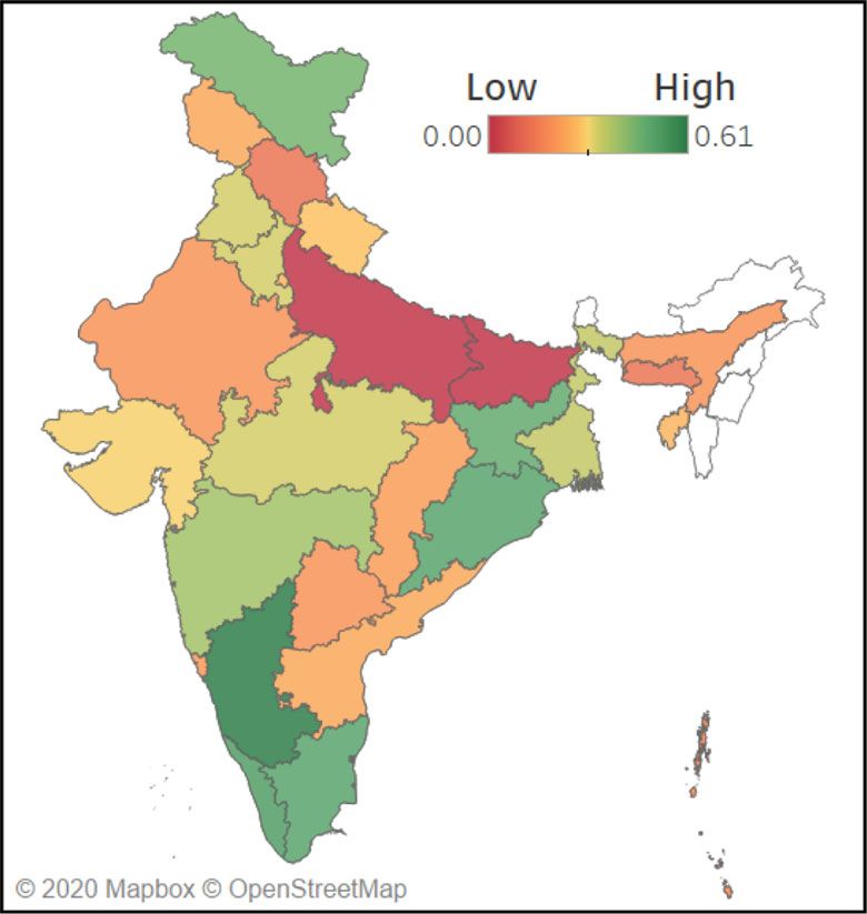
Fig. 2 (a) Map showing CDRS across the states and UTs in India. States and UTs that were excluded from our study are filled with a white color. The
map clearly shows the geographical disparity in COVID-19 data reporting in India. The map was generated using Tableau Desktop software version
2020.2.1 and the boundary information for regions in India was obtained as shapefiles from Datameet (http://projects.datameet.org/maps/). (b) A
dot plot showing the spread of CDRS values. On the y-axis, states are sorted in the decreasing order of CDRS
across SDGs [19]. The framework was developed using CDRS for the different states, both as a color-filled map
100 indicators across 54 SDG targets. SDG3-II measures and as a dot plot. Visuals for the normalized availability,
the performance of states on the third SDG, which is, accessibility, granularity, and privacy scores are available
“Good Health and Well-Being for all”. The value for SDG3- in Supplementary Figure S3, Additional file 1.
II ranges from 0–100, where 100 implies that the state The best data reporting is done by Karnataka (0.61),
has achieved the target set for the year 2030. The indica- Kerala (0.52), Odisha (0.50), Puducherry (0.50), and Tamil
tors used by NITI Aayog in their framework to calculate Nadu (0.50). All these states provide a dashboard that
SDG3-II are listed in Supplementary section S6 of Addi- shows the trend of COVID-19 data graphically. They also
tional file 1. We assess the Pearson and Spearman’s rank provide district wise stratification of the total confirmed,
correlation between CDRS and SDG3-II using the corr recovered, and deaths due to COVID-19. However, not
function in Matlab R2019a. all of them stratify the data according to age, gender, and
comorbidities, the factors that are known to have a cor-
Results relation with the COVID-19 fatality rate [26–28]. Even
A COVID-19 Data Reporting Score (CDRS), and four nor- Karnataka, the state with highest CDRS, has further scope
malized categorical scores were calculated for 29 states in for improvement.
India. In each of these states, the first case was reported On the other hand, Uttar Pradesh (0.0), Bihar (0.0),
atleast 30 days prior to our assessment. Thus, they had Meghalaya (0.13), Himachal Pradesh (0.13), and Andaman
atleast a month’s time to build a high-quality data report- and Nicobar Islands (0.17) rank at the bottom. Uttar
ing system. Our results and conclusions should be viewed Pradesh and Bihar do not publish any COVID-19 data
and interpreted in light of this time frame. on their government or health department website. How-
There is a strong disparity in the quality of COVID-19 ever, Bihar seems to release some data on Twitter. See
data reporting done by the different states. The five num- Supplementary section S9 of Additional file 1 for more
ber summary of CDRS is, min = 0.0, first quartile = 0.2, details. Himachal Pradesh, Meghalaya, and Andaman &
median = 0.26, third quartile = 0.41, and maximum = 0.61. Nicobar Islands, report just the total count for few report
The disparity can be clearly seen in Fig. 2, which shows the items. Daily count, trend graphics and granular data areVasudevan et al. BMC Public Health (2021) 21:1211 Page 8 of 12 not reported by these states. For details on the num- confirmed, deceased, and recovered cases. Figure 1c ber of states that report a specific information, refer to shows the screenshot of a trend graphic displayed on Fig. 3. Kerala government’s COVID-19 dashboard. Figure 4 shows the bulletin and visualization provided In general, the worst categorical scores are for gran- by Karnataka on May 31, 2020. Karnataka’s COVID-19 ularity. Even Jharkhand, the top state in this category, page is linked from the state government’s website. The scored only a 0.50, while the median normalized granu- state releases a health bulletin and a state war room larity score is 0.17. For more details on the granular data bulletin everyday, and also maintains a dashboard. The published by Jharkhand refer to Supplementary section bulletins are available in English, and provides informa- S8 of Additional file 1. Karnataka and Tamil Nadu are tion on the total confirmed, deaths, recovered, quaran- the only states to provide details of death (including tined, and active ICU cases. The bulletins also report comorbidity information) for each deceased person. The some daily (new) data, and some data stratified by following states do not report any data stratified by age, age, gender, and districts. In addition, the demograph- gender, comorbidities, or districts: Andaman and Nico- ics and comorbidity data are reported for each deceased bar Islands, Andhra Pradesh, Bihar, Chandigarh, Delhi, person. Trend graphics are available either through the Goa, Himachal Pradesh, Meghalaya, Telangana and Uttar bulletins/dashboard. Pradesh. Karnataka and Punjab score the highest in availabil- Among the states that were assessed 27 reported some ity. Both these states report the daily and total numbers data. Privacy doesn’t apply to states that do not report any for confirmed, deceased and recovered cases. They also data. Among the 27 states that report some data, all of report COVID-19 cases in Intensive Care Units (ICUs). them except Chandigarh and Punjab, report de-identified Historical data is available for both the states in the form information and do not violate the privacy of the peo- of daily bulletins. Among the states that report data, ple residing in their state. Chandigarh has released name Assam, Himachal Pradesh, and Meghalaya score the low- and residential address of people under home quaran- est for availability. This is because they report only the tine. Punjab has released name, gender, age, and mobile total count for confirmed, deceased, and recovered. A number of persons inbound to the state from New Delhi screenshot of the data reported by Assam is shown in on May 10, 2020. Figure 5 shows screenshots from the Fig. 1a. documents published in the government websites of Pun- COVID-19 data can be accessed from the state’s offi- jab and Chandigarh that contain personally identifiable cial websites for 83% of the states evaluated. Only 10 information. states make the data more accessible by providing a According to MoHFW as of May 18, 2020, the total visual representation of the trend. Karnataka and Kerala number of confirmed cases in India were about ninety- score the highest (0.75) in accessibility. These states pro- six thousand. The top ten states when sorted accord- vide trend graphics for both total and daily data, for the ing to the number of confirmed cases contributed to a Fig. 3 Table shows the number of states reporting an item out of twenty-nine states/UTs. Twenty-six of these report the total number of COVID-19 confirmed cases and deaths, and twenty-seven states report the number of recovered individuals. Only a handful of the states publish cumulative data stratified by age, gender, and comorbidities
Vasudevan et al. BMC Public Health     (2021) 21:1211                                                                                 Page 9 of 12

 Fig. 4 Bulletin and visualization provided by the Karnataka government on May 31, 2020 as examples of high-quality COVID-19 data reporting
Vasudevan et al. BMC Public Health      (2021) 21:1211                                                                               Page 10 of 12

 Fig. 5 Screenshots of the documents published by Punjab (top panel) and Chandigarh (bottom panel) that contain individually identifiable
 information of people under quarantine. The Names and addresses of individuals were reported on the official website and we blacked it out here

staggering 91% of the total confirmed. These ten states                       The disparity in CDRS across the states highlights three
are shown in Figure S5 (see Supplementary, Additional                      important findings at the national, state, and individual
file 1) above the horizontal dashed line. Tamil Nadu is the                level, respectively. First, it shows the lack of a unified
only state among those ten states with a CDRS in the 75th                  framework for reporting COVID-19 data in India, and the
percentile. Figure S2 of the Supplementary (in Additional                  need for a central agency to monitor or audit the quality
file 1) shows a scatter plot that displays the relationship                of data reporting done by the states [5]. Without a uni-
between CDRS and SDG3-II. A positive correlation was                       fied framework, it is difficult to aggregate the data from
observed between CDRS and SDG3-II (Pearson corre-                          different states, gain insights from them, and coordinate
lation: r = 0.630, p = 0.0003; and Spearman’s rank                         an effective nationwide response to the pandemic. Not
correlation: r = 0.578, p = 0.001).                                        just that, unified high-quality data reporting also signifies
                                                                           transparency and hence increases public trust in the gov-
Discussion                                                                 ernment. Containment becomes easier when the public is
The scoring data curated in this study identifies what                     well-informed.
data each state in India is reporting and its format.                         Second, it reflects the inadequacy in coordination or
We observed that the majority of states are not report-                    sharing of resources among the states in India. Coordina-
ing the number of confirmed cases and deaths strati-                       tion among states is particularly important as more people
fied by age and gender. Hoffmann and Wolf make sim-                        start moving across the states in the coming months.
ilar observations in the data reported from European                       While it might not be possible for all the states to setup
countries, and call for standardized data collection by                    a high-quality dashboard in a short time, states can nev-
national health authorities [36]. They report that as of                   ertheless seek help and learn from the best data reporting
July 6, 2020, data on ages were incomplete for France,                     practices followed by the other states.
and completely missing for Armenia, Luxembourg, North                         Third, the disparate reporting score also reflects
Macedonia, Turkey, Serbia and Bosnia-Herzegovina. As                       inequality in individual access to public health informa-
of May 1, 2020, even the US lacked a shared standard                       tion and privacy protection based on the state of resi-
for COVID-19 data reporting, resulting in a large vari-                    dence. The inequality highlights that the state-level efforts
ation in the quality of reporting across the states and                    do not align with the central government’s vision of treat-
counties [37].                                                             ing public health data as a public good, within the legal
Vasudevan et al. BMC Public Health (2021) 21:1211 Page 11 of 12
framework of data privacy, as described in the 2018–19 assign unequal weights, however, finding an appropri-
economic survey of India [38]. We cannot stress enough ate set of unequal weights is beyond the scope of this
about the importance of respecting the privacy of all cit- work.
izens. One might argue that providing residential address Abbreviations
of people under home quarantine is helpful to identify COVID-19: Coronavirus disease 2019; UT: Union Territory; MoHFW: Ministry of
areas to avoid in a locality. However, the same infor- Health and Family Welfare; ICMR: Indian Council of Medical Research; ICU:
Intensive Care Unit; WHO: World Health Organization; CDRS: COVID-19 data
mation can be conveyed using hotspot maps that can reporting score; SDG: Sustainable Development Goals; SDG3-II: Sustainable
be generated using geomasking techniques to protect Development Goal 3 - India Index
privacy [39].
The observed positive correlation between CDRS and Supplementary Information
SDG3-II suggests that governments which are making The online version contains supplementary material available at
more progress toward the “sustainable development goal https://doi.org/10.1186/s12889-021-11054-7.
of good health and well-being” also tend to have better
COVID-19 data reporting. The scatter plot of CDRS ver- Additional file 1: Schematic of a good data reporting system (section S1);
sus total confirmed COVID-19 cases shown in Figure S5 Template for daily COVID-19 data reporting (section S2); Twitter page of
covid19india.org (section S3); Details of the scoring metrics (section S4);
(see Supplementary, Additional file 1) suggests that states Scoring process (section S5); SDG3-II (section S6); Categorical scores
with the highest number of cases also tend to have poor (section S7); Screenshot from a bulletin published by Jharkhand (section
COVID-19 data reporting, which could further exacerbate S8); Additional notes on a few states (section S9); Sources for scoring data
(section S10); Total confirmed COVID-19 cases as of May 18, 2020 (section
the pandemic challenges. S11).
Conclusions Acknowledgements
Overall, our scoring framework and CDRS together helps The authors would like to thank Professor Steven Goodman of Stanford
University for sharing his work on data reporting qualities which inspired this
in identifying the differences in the quality of COVID-
work. The authors would like to thank Minal Patil from India and Vikranth
19 data reporting across India. In addition to reveal- Dwaracherla from Stanford University for translating the bulletins released by
ing the disparity in the quality of reporting, CDRS the states of Gujarat and Andhra Pradesh to English, respectively. We would
also like to thank Samuel Joseph and Aravindh Kumar from Stanford
also highlights that there is tremendous scope for all
University, and Jithin K. Sreedharan from Purdue University for many helpful
states to improve. The categorical scores enable states discussions. Finally, thank you to Professor Vijay Chandru of the Indian Institute
to identify their strengths and weaknesses. In each cat- of Science and Dr. Giridara G. Parameswaran of the All India Institute of
egory, states can learn from their peers and improve Medical Sciences, New Delhi for their feedback.
their quality of reporting. States that score high in Authors’ contributions
a category can serve as role models to the other All authors contributed to drafting the manuscript. Scoring metrics were
states. formulated by V.V., A.G., and J.Z. Scoring data was curated and analysed by V.V.,
A.G., V.S. and S.A.V. J.Z. supervised the project. All authors reviewed and
Although we focus on India in this paper, the scope of approved the final manuscript.
the scoring framework is not limited just to India. It can
be adapted to other countries. Within India, our scor- Funding
J.Z. is supported by NSF CAREER 1942926, NIH R21 MD012867-01, NIH
ing framework could also be applied at the district level P30AG059307, NIH U01MH098953 and grants from the Silicon Valley
to evaluate the quality of data reporting across districts Foundation and the Chan-Zuckerberg Initiative. The funding sources had no
within a state. A future work is to conduct the same study role in the study design, data collection, data analysis, data interpretation, or
writing of this manuscript.
a few months later and assess the change in the quality of
data reporting. Availability of data and materials
The curated scoring data is publicly available at https://github.com/varun-
vasudevan/CDRS-India. The data was curated from publicly available sources
Limitations listed in Supplementary section S10 of Additional file 1.
Some of the limitations of our study are as follows. (i)
We did not include the reporting of testing data in our Declarations
framework. This is because the degree of relevance of
testing data in understanding the course of pandemic Ethics approval and consent to participate
Not Applicable.
depends on whether testing was done on a scientific ran-
dom sampling basis or not. (ii) Some states in India have Consent for publication
developed mobile applications for COVID-19. We were Not Applicable.
unable to download and install them due to geograph- Competing interests
ical restrictions. Therefore, our study doesn’t consider The authors declare that there are no competing interests.
data that states might be reporting through these mobile
Author details
applications. (iii) To calculate the scores, we assign an 1 Institute for Computational & Mathematical Engineering, Stanford University,
equal weight to each reported item. One could potentially Palo Alto, California, USA. 2 Independent Researcher, Palo Alto, California, USA.Vasudevan et al. BMC Public Health (2021) 21:1211 Page 12 of 12
3 Independent Researcher, Neuchatel, Switzerland. 4 Department of Biomedical 24. ICMR. Strategy for COVID-19 testing in India (May 18, 2020). https://www.
Data Science, Stanford University, Palo Alto, California, USA. icmr.gov.in/pdf/covid/strategy/Testing_Strategy_v5_18052020.pdf.
Accessed 08 Aug 2020.
Received: 4 August 2020 Accepted: 12 May 2021 25. Gelman A, Pasarica C, Dodhia R. Let’s practice what we preach: turning
tables into graphs. Am Stat. 2002;56(2):121–30.
26. Verity R, Okell LC, Dorigatti I, Winskill P, Whittaker C, Imai N, et al.
References Estimates of the severity of coronavirus disease 2019: a model-based
1. MoHFW India. COVID-19 Statewise Status. https://www.mohfw.gov.in/. analysis. Lancet Infect Dis. 2020;20(6):669–77.
Accessed 12 June 2020. 27. Jin JM, Bai P, He W, Wu F, Liu XF, Han DM, et al. Gender differences in
2. MoHFW India. Containment Plan for Large Outbreaks: Novel Coronavirus patients with COVID-19: Focus on severity and mortality. Front Publ
Disease 2019. https://www.mohfw.gov.in/pdf/ Health. 2020;8:152.
3ContainmentPlanforLargeOutbreaksofCOVID19Final.pdf. Accessed 13 28. Richardson S, Hirsch JS, Narasimhan M, Crawford JM, McGinn T,
July 2020. Davidson KW, et al. Presenting Characteristics, Comorbidities, and
3. O’Malley P, Rainford J, Thompson A. Transparency during public health Outcomes Among 5700 Patients Hospitalized With COVID-19 in the New
emergencies: from rhetoric to reality. Bull World Health Organ. 2009;87: York City Area. JAMA. 2020;323(20):2052–9.
614–8. 29. ICMR-NIV. ICMR Specimen Referral Form for COVID-19 (SARS-CoV2).
4. WHO. Global surveillance for COVID-19 caused by human infection with http://niv.co.in/Specimen_referral_form.pdf. Accessed 05 May 2020.
COVID-19 virus: Interim guidance. https://apps.who.int/iris/rest/ 30. Lee LM, Gostin LO. Ethical Collection, Storage, and Use of Public Health
bitstreams/1272502/retrieve. Accessed 14 July 2020. Data: A Proposal for a National Privacy Protection. JAMA. 2009;302(1):
5. Chatterjee P. Is India missing COVID-19 deaths? Lancet. 2020;396(10252): 82–84.
657. https://doi.org/10.1016/S0140-6736(20)31857-2. 31. Fai Kok K. Truecaller Insights: The impact of harassment calls & sms
6. Balsari S, Sange M, Udwadia Z. COVID-19 care in India: the course to for women in India, Brazil, Colombia, Egypt and Kenya. https://truecaller.
self-reliance. Lancet Global Health. 2020;8(11):e1359–60. blog/2020/03/05/truecaller-insights-the-impact-of-harassment-calls-
7. Radhakrishnan V, Sen S, Singaravelu N. How do States fare on reporting sms-for-women-2020/. Accessed 31 May 2020.
COVID-19 data? https://www.thehindu.com/data/data-how-do-states- 32. Lancet T. India under COVID-19 lockdown. Lancet (London, England).
fare-on-reporting-covid-19-data/article31919280.ece. Accessed 27 June 2020;395(10233):1315.
2020. 33. Chatterje P. Gaps in India’s preparedness for COVID-19 control. Lancet
8. Janiaud P, Goodman S. Incomplete and Absent Reporting of Critical Infect Dis. 2020;20(5):544.
COVID-19 Epidemic Statistics by State Departments of Health. In 34. ICMR Bioethics Unit. National Guidelines for Ethics Committees reviewing
submission. 2020. Biomedical & Health Research during COVID-19 Pandemic. ICMR -
9. Pipino LL, Lee YW, Wang RY. Data quality assessment. Commun ACM. National Centre for Disease Informatics & Research, Bengaluru. https://
2002;45(4):211–8. www.icmr.gov.in/pdf/covid/techdoc/EC_Guidance_COVID19_06052020.
10. Wang RY, Strong DM. Beyond accuracy: What data quality means to data pdf. Accessed 06 May 2020.
consumers. J Manag Inform Syst. 1996;12(4):5–33. 35. Community Created Maps of India. DataMeet. http://projects.datameet.
11. Vetrò A, Canova L, Torchiano M, Minotas CO, Iemma R, Morando F. org/maps/. Accessed 18 May 2020.
Open data quality measurement framework: Definition and application to 36. Hoffmann C, Wolf E. Older age groups and country-specific case fatality
Open Government Data. Gov Inf Q. 2016;33(2):325–37. rates of COVID-19 in Europe, USA and Canada. Infection. 2020;49:1–6.
12. Tufte ER. The visual display of quantitative information. vol. 2. Cheshire: 37. Patino M. Coronavirus Data in the U.S. Is Terrible, and Here’s Why. https://
Graphics Press LLC; 2001. www.bloomberg.com/news/articles/2020-05-01/why-coronavirus-
13. Cleveland WS. Visualizing data. Summit: Hobart Press; 1993. reporting-data-is-so-bad. Accessed 21 Dec 2020.
14. Wexler S, Shaffer J, Cotgreave A. The big book of dashboards: visualizing 38. Ministry of Finance. Economic Survey 2018–2019, Volume 1. https://www.
your data using real-world business scenarios. Hoboken: Wiley; 2017. indiabudget.gov.in/budget2019-20/economicsurvey/index.php.
15. Murray S, Vol. D3. Interactive data visualization for the web: an Accessed 25 June 2020.
introduction to designing with. Sebastopol: O’Reilly Media, Inc.; 2017. 39. Hampton KH, Fitch MK, Allshouse WB, Doherty IA, Gesink DC, Leone
16. covid19india. covid19india.org data sources. https://telegra.ph/Covid-19- PA, et al. Mapping Health Data: Improved Privacy Protection With Donut
Sources-03-19. Accessed 27 June 2020. Method Geomasking. Am J Epidemiol. 2010;172(9):1062–9.
17. covid19india. covid19india.org. https://www.covid19india.org/. Accessed
27 June 2020. Publisher’s Note
18. UN. About the Sustainable Development Goals. https://www.un.org/ Springer Nature remains neutral with regard to jurisdictional claims in
sustainabledevelopment/sustainable-development-goals/. Accessed 23 published maps and institutional affiliations.
June 2020.
19. NITI Aayog. SDG India Index and Dashboard 2019–2020. 2019. https://niti.
gov.in/sdg-india-index-dashboard-2019-20. Accessed 25 June 2020.
20. Vasudevan V, Gnanasekaran A, Sankar V, Vasudevan SA, Zou J. Tableau
dashboard: Disparity in the Quality of COVID-19 Data Reporting Across
India. https://public.tableau.com/profile/varun.vasudevan1956#!/
vizhome/DisparityintheQualityofCOVID-19DataReportingAcrossIndia/
CDRS. Accessed 12 June 2020.
21. MoHFW India. Guidance document on appropriate management of
suspect/confirmed cases of COVID-19. https://www.mohfw.gov.in/pdf/
FinalGuidanceonMangaementofCovidcasesversion2.pdf. Accessed 28
June 2020.
22. ICMR-NCDIR India. Guidance for appropriate recording of COVID-19
related deaths in India. http://ncdirindia.org/Downloads/CoD_COVID-
19_Guidance.pdf. Accessed 24 May 2020.
23. WHO. International guidelines for certification And classification (coding)
Of COVID-19 as cause of Death. https://www.who.int/classifications/icd/
Guidelines_Cause_of_Death_COVID-19.pdf?ua=1. Accessed 24 May 2020.You can also read