Event-based analysis of people's activities and behavior using Flickr and Panoramio geotagged photo collections
←
→
Page content transcription
If your browser does not render page correctly, please read the page content below
Event-based analysis of people’s activities and behavior using Flickr and
                      Panoramio geotagged photo collections

           Slava Kisilevich, Milos Krstajic, Daniel Keim, Natalia Andrienko, Gennady Andrienko
                          University of Konstanz, slaks@dbvis.inf.uni-konstanz.de
                      Fraunhofer Institute IAIS, gennady.andrienko@iais.fraunhofer.de

                              Abstract                           lated to individual and social activity, and movement of
   Photo-sharing websites such as Flickr and Panoramio           people. However, analysis of movement data is usually
contain millions of geotagged images contributed by peo-         performed on data captured by GPS devices, since these
ple from all over the world. Characteristics of these data       devices are the most widely available source of this kind
pose new challenges in the domain of spatio-temporal             of data. The most important difference between GPS tra-
analysis. In this paper, we define several different tasks re-   jectories and user-generated photo datasets is in the way
lated to analysis of attractive places, points of interest and   the data records are generated: while raw GPS data lack
comparison of behavioral patterns of different user com-         semantic meaning and background information, geotagged
munities on geotagged photo data. We perform analysis            photos are hand-picked by humans. Each record from the
and comparison of temporal events, rankings of sightsee-         photo dataset carries underlying information about the sur-
ing places in a city, and study mobility of people using         rounding area and the owner of the photo. This data can be
geotagged photos. We take a systematic approach to ac-           regarded as a set of trajectories of multiple users or as inde-
complish these tasks by applying scalable computational          pendent spatio-temporal events and can be used for analy-
techniques, using statistical and data mining algorithms,        sis of attractive areas, places of interest, landmarks or user
combined with interactive geo-visualization. We provide          travel preferences. Besides, new insights about local indi-
exploratory visual analysis environment, which allows the        vidual and group dynamics could lead to recommendations
analyst to detect spatial and temporal patterns and extract      and customized services in tourism, improvements in local
additional knowledge from large geotagged photo collec-          administration and targeted product offerings.
tions. We demonstrate our approach by applying the meth-            In the exploration of geospatial image data, we could be
ods to several regions in the world.                             interested in users’ trajectories [2] that consist of sequences
   Keywords—Geo visual analytics, geotagged images, spatio-      of photos taken during their photo sessions. Images taken
temporal analysis, movement data, clustering                     by a single user, that are adjacent in time within a certain
                                                                 region can be seen as a trajectory taken by this user, while
1     Introduction                                               photo session can be regarded as a time window of a certain
    In the last years, the amount of information created in      size in which the photos were taken.
the digital universe is growing rapidly. Some forecasts              Another question is what are the places where the activ-
predict that the information added annually will increase        ity of people is high. The places where a lot of people take
more than tenfold, from 161 exabytes to nearly 1800 ex-          photos present attractive areas that grab photographers’ at-
abytes between 2006 and 2011 and images comprise its             tention because of location specific attributes. Within a
largest component [9]. Part of these information is dis-         specific area there are different places, which could be
tributed over Internet on photo-sharing websites, such as        ranked according to their attractiveness. Usually, these are
Flickr1 and Panoramio2 . These sites contain billions of         region landmarks, but they could also be areas of temporal
photos, which are publicly available and annotated with          interest, because of an event happening in a specific time
different kinds of useful metadata: image size, tags, ti-        period. Thus, temporal attribute of the data is of much im-
tles and spatio-temporal information - where and when the        portance in the analysis of attractive areas and presents a
photo was taken.                                                 task of its own. Besides analysis of specific areas, our goal
    In our work, we are interested in several different as-      is to perform comparison between different communities,
pects of geospatial analysis of large photo collections re-      their behavior and mobility and different attractive areas
    1 http://www.flickr.com
    2 http://www.panoramio.com
and points of interest in different time periods.                 co-authors in the framework of urban and tourism studies.
    In this paper, we take a systematic visual analytics ap-      Concentration and movement of tourists at the scale of a
proach to accomplish different tasks in event-based analy-        city is analyzed in [11] using Flickr geotagged photos. For
sis of geotagged image data. By considering the character-        this, the authors identified tourists in the city of Rome us-
istics of the data, we define seven possible tasks for anal-      ing user profiles and built heatmaps to visualize regions of
ysis of attractive places, points of interest, behavior, and      high tourist concentration. The heatmaps were created by
mobility of people based on geotagged photos. Obviously,          dividing a region into cells, counting the number of people
these huge collections require scalable computational tech-       who took photos in every cell and smoothing the visualiza-
niques in order to perform efficient analysis. At the same        tion by interpolating between values of every cell. How-
time, we employ visualization and geovisualization tech-          ever, no detailed analysis of the method, its advantages and
niques to represent the data and allow the analyst to interact    disadvantages was provided. In addition, flow maps were
with it in order to provide insight, detect spatial and tempo-    used to visualize tourist movement between visited places.
ral patterns, and extract meaning and additional knowledge        These places were connected by lines whose widths were
during exploration of these multivariate datasets.                proportional to the number of tourists. Mean-shift, a non-
                                                                  parametric clustering algorithm, was used in [6] to find the
2   Related Work                                                  most attractive places on Earth on a local and city scales us-
    In recent years, various general techniques for analysis      ing Flickr photos. The authors presented examples of maps
of movement data and human activities in particular were          with movements of people. However, no detailed analysis
proposed. Different techniques for 3D geo-visualization of        of the movement was presented.
space-time patterns of people’s travel experience and mo-
bility is presented in [16]. An approach for discovering          3   Analytical Framework
different types of motion patterns is proposed in [17] and           We take a systematic approach suggested in [3] to defin-
applied on football players to find meaningful group mo-          ing possible types of analysis tasks related to the data about
tion patterns. Two types of algorithms for mining interest-       geotagged photos. We consider these data as a specific in-
ing patterns from trajectories acquired by GPS-enabled de-        stance of the generic data type describing events, i.e. ob-
vices are proposed in [10]. In the first type, the trajectories   jects having positions in space and time. This data type can
are converted into a sequence of stops or important parts         be represented by the formal model
(regions in which an object stayed more than a predefined                         O → S × T ×A1 . . . × An ,                  (1)
time interval) before the algorithm for mining interesting
patterns is applied. In the second type, the identification       where O is the set of objects (events), S is the space (set of
of important parts in a trajectory is part of the algorithm       places), T is the time (set of moments), and A1 . . . An are
for mining patterns. Progressive clustering of trajectories       additional attributes of the events, if available. Table 1 lists
of moving objects is presented in [18]. The authors com-          the major analysis tasks defined generically on the basis of
bined clustering with visual interaction to let the analyst       the data structure and instantiated for the case of geotagged
apply different distance functions based on the particular        photos.
characteristics of trajectories under investigation. Visu-           To perform these tasks, an analyst needs a visual rep-
alization techniques (aggregations, ringmaps) of daily re-        resentation of the data and the way to interact with it. The
peating activities like travel, work, shopping are presented      visual environment in which the analyst could interactively
in [19]. An algorithm for finding interesting places and          perform data exploration and analysis should implement
mining travel sequences from GPS trajectories is proposed         many of the general visual data exploration approaches
in [20]. The algorithm detects frequent sequences on dif-         such as brushing, focusing, multiple views, linking [4] and
ferent scales, taking into account the interestingness of the     support geo-visualization approaches such as direct depic-
visited place and the experience of a user.                       tion, visualization of abstract data summaries, and extrac-
    Research on movement data is usually done on trajec-          tion and visualization of computationally extracted pat-
tories acquired by GPS-enabled devices. However, large-           terns to allow the analyst to quickly generate and test his
scale GPS datasets, which would allow us to perform qual-         hypothesis.
itative analysis on the level of a city or country, are still        Taking into consideration basic requirements of a geo-
not available. On the other hand, geotagged photo collec-         visualization environment and requirements needed for
tions could be obtained on the world scale, which makes           analysis of the tasks, we developed a framework in which
them a valuable resource for the analysis of people’s ac-         Google Earth plays a primary role of geo-browser [13].
tivities. Importance of analysis of tourist activity, their be-   The integration of Google Earth into a custom application
havior and interests using geotagged photos has been re-          allowed us to compensate on the lack of direct support
cently addressed in series of publications of Girardin and        of geo-processing by implementing the geo-processing
Table 1: Generic tasks in analysis of event data and their specification for Panoramio/Flickr photo data
 Task                   Component           Generic                                                 Specific
 Category               in focus
 Pattern identification Spatial position  Find patterns in the spatial distribution of the events   Detection and analysis of attractive areas
                                          (A) For the whole time period                             sections 5.1, 5.2
                                          (B) For selected time intervals
 Pattern identification Temporal position Find patterns in the temporal distribution (frequency)    Analysis of temporal distributions
                                          of the events                                             in selected places:
                                          (A) On the whole territory (large area)                   section 5.3
                                          (B) In selected places
 Pattern comparison     Spatial position  Compare the spatial distribution patterns                 Comparisons between time intervals:
                                          (A) In different time intervals                           section 5.4
                                          (B) For different subsets of events                       Comparisons between communities of
                                                                                                    people: sections 5.6, 5.7
 Pattern comparison     Temporal position Compare temporal distribution patterns                    Comparison of temporal distributions
                                          (A) In different places                                   in different places: section 5.3
                                          (B) For different subsets of events

as part of the framework and enrich the functionality of              location of the object being photographed. This justifies
Google Earth by such methods which are not available in               our use of visual analytics methods, which require human
its stand-alone version like multiple views, linking, and re-         involvement in addition to automated analysis in the explo-
gion selection using a drawing tool.                                  ration of the data.
                                                                          Occasionally, the temporal information was not correct.
4   Data collection and preprocessing                                 Thus, in the flickr dataset 6, 229 photos have wrong dates
    The dataset was collected by downloading photo meta-              and 50, 076 photos have dates after February 1, 2010 while
data from Flickr and Panoramio sites, using publicly avail-           the data have been collected before February 2010. More-
able APIs. The downloading of metadata from Flickr was                over, 9, 943, 161 combinations of user id and time stamp
performed similar as described in [6]: an initial user id was         occurred several times, 30, 377, 849 records in total. We
used to download his photo metadata. Then, we down-                   have to disregard entries in which timestamps were not
loaded all the user’s contacts. To speed up the process of            provided or were incorrect for the tasks, where temporal
retrieving heterogeneous users, we retrieved all groups to            aspect has a crucial role. 72, 454 photographers stored just
which the user belongs, and using group information we                a single photo, therefore these entries are not suitable for
were able to retrieve all the people who belong to these              some of the tasks.
groups. This process was applied again on other users. We                 The data are being collected since the beginning of June,
collected 86, 314, 466 entries from 4, 137, 248 users to the          2009 and, as to the end of January, takes up around 100 GB
time of writing this paper, which allows us to apply spa-             of our server’s disk space.
tiotemporal analysis virtually on every region in the world.
    Panoramio data was downloaded by providing bound-                 5     Tasks and visual analytics components
aries of a specific region of interest. We collected                     In this section we consider seven possible tasks for anal-
9, 296, 104 entries from 738, 341 users for Western Europe            ysis of movement data based on geotagged photos.
and 3, 374, 535 entries from 391, 595 users for North and
South America. In both datasets a number of attributes                5.1    Analysis of attractive areas
were obtained, including those that are most important for               Finding interesting or attractive locations is usually of
our tasks: owner id, photo id, photo URL, geographical                great importance in analysis of people’s mobility. While
coordinates, and timestamp.                                           interestingness or attractiveness depends on the context of
    During the data collection process we converted geo-              the problem, the analysis is usually done by finding places
graphical coordinates expressed in degrees to Universal               where trajectories of many people intersect often, or where
Transverse Mercator (UTM) such that analysis tasks that               people’s activity is more frequent than in other places. In
require Euclidian distances can directly use UTM coordi-              case of photo data, people travel and take photos of inter-
nates.                                                                esting places. The interestingness is defined with respect to
    Geo-referenced photo data may introduce a level of un-            the user’s own understanding (to take a photo or not), how-
certainty. In some cases, coordinates could refer to the po-          ever, if a substantial number of people like to take photos in
sition of the photographer, while in others they refer to the         the same region, it can suggest that the place is attractive.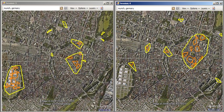
One of the approaches to find attractive places is to divide       photos in every cell. The simple way to interpret these re-
an area into cells and count the number of people taking           sults is to build heatmaps [12] using interpolation between
photos in every cell. This approach has several disadvan-          values of every cell. While this approach can provide quick
tages. The division into cells is done irrespective of the         understanding of the level of attractiveness, it is a closed-
data distribution, thus the results are sensitive to the size of   box solution, which does not allow any further analysis to
the cell. Therefore, another approach, which has to capture        be carried out on top of heatmaps. We propose to use den-
the essence of the data, is required.                              sity based clustering as described in Section 5.1 to build
    Density based clustering algorithms, such as DB-               density maps [14].
SCAN [7] or OPTICS [5], are good candidates for analysis
                                                                       Density maps are used to highlight areas of people’s ac-
of attractive areas. Based on the notion of density con-
                                                                   tivity within a cluster. Areas with different concentration
nectivity between points using distance and density thresh-
                                                                   are visualized by using color scale. This gives the analyst
olds, these algorithms are able to find clusters of differ-
                                                                   a possibility to differentiate between areas with lower con-
ent shapes, sizes, filter outliers (regions where density is
                                                                   centration and areas with high concentration. The density
less than a predefined threshold) and have regions of dif-
                                                                   maps are built using different resolution levels which al-
ferent densities within a cluster. These algorithms require
                                                                   lows inspection of all places together (left part of Fig1(c))
minimum two parameters: the radius threshold around a
                                                                   or by close zooming as presented in the right part of
point and the minimum number of points (density thresh-
                                                                   Fig.1(c). The density map is built as follows: (1) Clusters
old) within the radius.
                                                                   are obtained using a density based clustering algorithm as
    In this task we used DBSCAN in order to analyze at-
                                                                   described in Sect 5.1 (2) In a cluster, the weight of every
tractive regions in the city of Munich during the month of
                                                                   geotagged photo is calculated using density function based
March 2008. 399 flickr users from total 20, 200 were re-
                                                                   on its relative position to photos of other users in a clus-
trieved for that month.
                                                                   ter. Therefore, the weight of a photo will be high if a lot of
    We propose to visualize the results of the clustering by
                                                                   photos of different users are located near that photo. The
providing boundaries of clusters using convex hull algo-
                                                                   weight of a photo can indicate high activity or importance
rithm 1(a) which is the fastest way to determine an area
                                                                   of a region around that photo and can be used as a represen-
based on a set of point observations (photo points in our
                                                                   tative image to highlight this activity. (3) Every geotagged
case). The analyst has a visual feeling where people con-
                                                                   photo location is mapped to a color using the weight calcu-
centrate in the city and which parts of the city attract more
                                                                   lated in the previous step. In contrast to heatmaps, density
people. The visualization can be combined with filtering
                                                                   maps don’t produce false points due to interpolation. Only
options, such that only clusters in which the number of
                                                                   existing photos, which belong to a cluster, will be visual-
people is more than a predefined threshold will be visu-
                                                                   ized. This approach allows applying other techniques on
alized. In our example, the largest area is situated in the
                                                                   top of density maps such as splitting dense clusters into
center of the city where 71 people took photos.
                                                                   local clusters and finding representative images.
    Several approaches can be proposed to compare ob-
tained clusters: (1) Comparing boundaries of clusters (see              The obtained clusters may span over large territory due
left part of Fig.1(a)); (2) Applying color to a cluster where      to a popularity of an area (and parameters chosen for den-
color is mapped according to a specific attribute. The right       sity based clustering algorithm) and have different densi-
part of 1(a) demonstrates clusters with colors mapped to           ties. Such clusters can be further split into a number of
the number of people who took photos in clusters (Color            local clusters with a given radius by utilizing the weight of
Brewer and Log scale were used to map colors); (3) Ob-             a photo as a split heuristic. Since a weight can be regarded
taining statistics for an individual cluster by clicking on        as a value of local maximum, the splitting is performed by
the boundary of the cluster (see Fig 1(a)); (4) Produc-            selecting the most weighted photo as a centroid of a local
ing histogram of clusters using some dependent variable.           cluster and assigning all photos that are located within a
Fig. 1(b) shows a histogram of clusters and number of              predefined radius to this cluster. This is repeated for each
people who took photos in those clusters. The statistical          most weighted photo that has not been assigned to any lo-
information about every cluster and histogram are pre-             cal cluster yet. Local clusters can be used for locating rep-
sented using Google Earth balloon feature.                         resentative images, which reflect the main attractions in a
                                                                   cluster. Since every geotagged location has a photo behind
5.2   Visualization of attractive areas using density              it, it can be visualized and treated as a representative photo
      maps                                                         of a cluster. Using weight of every photo, the represen-
   As was discussed in Section 5.1, the common and fast            tative image of the cluster can be defined as a photo that
approach to analysis of attractive areas is to split the region    has the maximum weight in the cluster (see Fig.1(d)). For
into grid cells and count the number of people who took            the illustration of density maps we selected a region of St.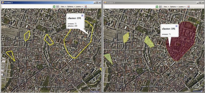
Martin Island. Its main attractive areas can be seen on the       people.
left part of Fig 1(c), where a yellow color is used to de-
pict the most concentrated areas. We focus on one such            5.5   Detailed analysis of clusters
region, Maho Beach, which is one of the most attractive               As was already mentioned, the cluster boundaries are
areas on the island, due to its vicinity to the airport landing   obtained by applying convex hull algorithm on the photo
strip (the right part of Fig.1(c)), where planes fly very low     locations belonging to a cluster. While cluster boundaries
before they land.                                                 provide a general feel of the extents of a cluster, they
    Maho Beach spans over large area (people take photos          don’t provide any information about particular locations
of landing planes from nearby places such as Hotels and           of taken photos. Finding out where the photos were taken
pubs) and constitutes one dense cluster, therefore we split       in a cluster and which photos are assigned to a cluster
it into series of local clusters having the same radius (100      can be important for a detailed analysis of attractive areas.
meters). Using weights of photos, we retrieve the location        Fig. 1(g) demonstrates this approach by visualizing photos
of the most weighted photo in every cluster and display the       belonging to a cluster as red circled placemarks. Using
image that belongs to that photo location (Fig.1(d)).             the interaction environment of our framework, different
                                                                  information can be obtained, such as owner id, photo id,
5.3   Analysis of temporal distributions of events                title and the time the photo was taken.
   Temporal distributions of events can reveal some inter-
esting expected or unexpected behavioral patterns. For ex-
                                                                  5.6   Ranking of sightseeings in a city and validat-
                                                                        ing findings by comparison of ranks from dif-
ample, the activity of people can increase during a national            ferent communities
holiday or local event such as football match. Fig.1(e)               Very often, when we plan our trip, we want to find out
presents graphs of the daily and monthly activity of people       which locations are more interesting to visit than the oth-
as number of persons who took photos in a specific area as        ers. In other words, we would like to be able to order the
a function of time. After inspecting the graphs the analyst       places by some criteria. In general, user-defined ranking
can narrow down the region of interest or/and the time            of places can be used in such scenarios as tour planning or
frame to get more detailed results. Also, this approach           recommendation. There are web sites that provide rank-
can be used to perform comparison of multiple temporal            ings of points of interest (POIs) in the world based on ex-
distribution patterns. The analyst can find similarities and      plicit or implicit scores provided by users, such as reviews,
differences between events occurring in different places at       opinions, comments or ratings. One of these websites is
specific time intervals by comparing their graphs in multi-       TripAdvisor (http://www.tripadvisor.com)
ple views or using overlays in a single view.                         Another possibility to rate the places is to use photo
                                                                  data, by counting the number of people who took photos
5.4   Comparison of spatial distributions in differ-              in the POI vicinity. A simple automatic approach would
      ent times                                                   be to take every photo and to assign it to a nearest POI.
    Different places may attract different number of peo-         This approach is simple but inaccurate for two reasons.
ple in different periods of time. It can be influenced by         First, we need to obtain the POI database for a particu-
weather conditions or other events like sport or holiday.         lar region, which can be a problematic task. Second, POIs
Revealing such differences may be important to local ad-          can be of different sizes. For example, a zoo may span sev-
ministrations or tourist services. Fig.1(f) presents cluster      eral square kilometers, while a statue covers several square
boundaries in Munich (depicted in yellow) for two differ-         meters. However, the POI location is usually described by
ent time periods. The left part shows the places where peo-       a single coordinate, so it can happen that a photo taken
ple took photos during the October Festival 2008; the right       within the natural boundaries of POI won’t be assigned to
image shows the places during month of March, 2008. It            it, because it is located far away from the center coordinate
can be seen, that during the festival people are mostly con-      defined for a POI.
centrated within the area of the event (large cluster in the          Analysis of title or tags may introduce other inaccu-
south-west part of the map) and less interested in other at-      racies due to missing information, differences in naming
tractive places, while in March people mostly visit places        or different languages. This is the case when the ranking
located in the center of the city.                                based on manual outline of a POI region may be more ap-
    The analyst may also be interested in splitting large         propriate and provide more control to the analyst. Google
dense clusters into local ones (as described in Section 5.1)      Earth is very handy because it allows the user to easily lo-
filtering those local clusters where the number of people         cate any POI and navigate to it, so there is no need to have
is below some predefined threshold. Orange clusters in            an external POI database. The manual outline of a region
Fig.1(f) correspond to local clusters having more than 9          is added as an extension in our framework. For this, we’ve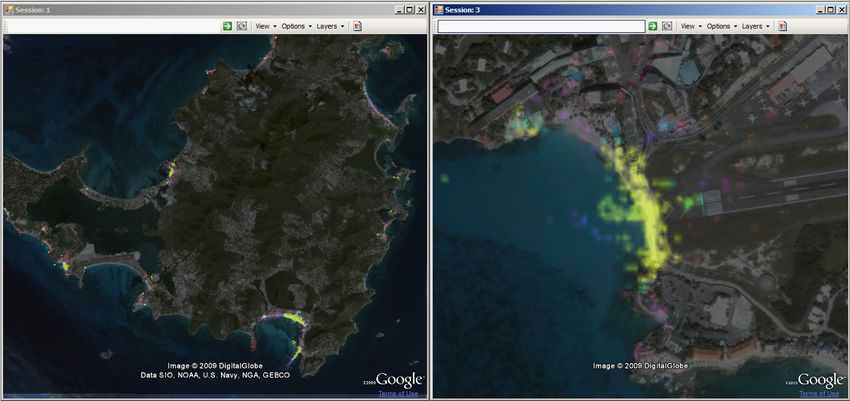
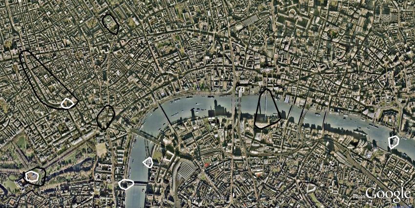
defined 50 most interesting sightseeings in Berlin3 and out-   gions in London during the year 2008 using a variant of
lined them as shown in Fig.1(h). We counted the number         DBSCAN algorithm with adaptive densities[15], applied
of people in every region using Flickr (47859 photos and       on Panoramio (5266 photos from 1082 users) and Flickr
4567 users) and Panoramio (39625 photos and 6630 users)        (94765 photos from 12062 users). Since the number of
datasets. The results of ranking are shown in Fig.1(h) us-     users in Flickr is almost 11 times larger, we used 40 users
ing different perspectives where the numbers represent the     as a MinPts threshold parameter [7] for Panoramio data and
ranks starting from 1 (top rank). The left part of Fig.1(h)    410 users for Flickr.
shows the results using 3D perspective where the size of           The algorithm produced 5 dense clusters using
vertical lines are inversely related to the rank of a POI,     Panoramio and 4 dense clusters using Flickr data. The
while the right part of Fig.1(h) shows the ranked places       observation reveals that two places in London are highly
from above. The navigation to a specific POI and acqui-        visited by people from both communities: Victoria Memo-
sition of POI ranks can be done by clicking on the POI         rial and the area of Piccadilly Circus. However, the Greater
region. We don’t impose any visualization style in our ex-     London Urban Area is not among the highly visited places
ample, but colors or symbol sizes can be used to allow the     in case of Panoramio. Likewise, the London Eye is not
user to visually differentiate between ranks.                  among the highly visited places in case of Flickr.
    The ranking also allows us to compare and validate be-
havioral patterns of different groups. For example, we         6   Discussion and future work
would like to compare how close the ranking results are            In this paper, we analyzed the structure of the event-
between Flickr, Panoramio and TripAdvisor communities.         based movement data to define systematically seven tasks
Many approaches to achieve this exist: we could use par-       for event-based analysis of people’s travel activities, be-
allel coordinates, statistical measures or tabular compari-    havior and mobility using geotagged photo data, collected
son. We decided to use Andrews Plot, which is proven           and shared by people from all over the world. We showed
to be a good graphic method for detecting outliers [1] in      that attractiveness of places can be obtained from photo
multivariate data. The plotting is performed by converting     data and presented computational and visual techniques to
n-dimensional data into a function in a two-dimensional        analyze these places with and without temporal dimension.
space of the form:                                             We presented a way to assess attractiveness of places based
            √                                                  on ranking and compared differences between three com-
fx (t) = x1 2 + x2 sin(t) + x3 cos(t) + x4 sin(2t) + . . . ,   munities (Flickr, Panoramio, TripAdvisor). We suggested
                                                         (2)   a set of visual analytics methods combining computational
where −π ≤ t ≤ π and coefficients of x1 , x2 , x3 , ... are    techniques with interactive visual displays to support the
terms in Fourier series.                                       analysis of such data.
    The variables listed first give more weight to the func-
                                                                   In the future, we shall address in more detail the analy-
tion and it is suggested [8] that the original data is pro-
                                                               sis tasks for the trajectory-oriented view. Likewise, we will
vided in the order of importance. Fig.1(i) presents the
                                                               concentrate on definition of further tasks related to analy-
variations between ranks given by members of 3 commu-
                                                               sis of photo data and develop new computational and visual
nities. The X-axis represents the 23 most ranked places
                                                               analytics methods.
sorted in descending order using Flickr ranked places as a
reference point. Y-axis is a frequency variation described     Acknowledgements
by Equation 2. It can be seen, that Panoramio has smaller
fluctuations around Flickr, which suggests that Panoramio         This work was partially funded by the German Research
ranking is more similar to Flickr than ranks from TripAd-      Society (DFG) under grant GK-1042 (Research Training
visor.                                                         Group ”Explorative Analysis and Visualization of Large
                                                               Information Spaces”), and by the Priority Program (SPP)
5.7    Comparison of attractive area patterns of dif-          1335 (”Visual Spatio-temporal Pattern Analysis of Move-
       ferent communities                                      ment and Event Data”).
    The comparison of rankings is not the only way to com-        The authors wish to thank two anonymous reviewers for
pare behavioral patterns. The analyst may select the re-       their helpful comments.
gion of interest and apply clustering algorithm using data
from different sources. The obtained clusters may reveal       References
some interesting patterns and differences between commu-        [1] DF Andrews. Plots of high-dimensional data. Bio-
nities. 1(j) shows the results of finding highly visited re-        metrics, 28(1):125–136, 1972.
   3 http://www.visitberlin.de/english/sightseeing/

e si sehenswuerdigkeiten.php, January 2010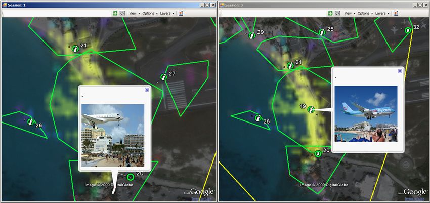
[2] G. Andrienko, N. Andrienko, P. Bak, S. Kisilevich,       [12] F. Kessler, R. McMaster, H. Howard, and T. Slocum.
     and D. Keim. Analysis of community-contributed                Thematic Cartography and Geovisualization. Pren-
     space-and time-referenced data (example of flickr             tice Hall, 2008.
     and panoramio photos). In Proceedings of IEEE Vi-
     sual Analytics Science and Technology (VAST 2009),       [13] S. Kisilevich, D. Keim, and L. Rokach. A generic
     pages 213–214, 2009.                                          google earth-based framework for analyzing and ex-
                                                                   ploring spatio-temporal data. In 12th International
 [3] N. Andrienko and G. Andrienko. Exploratory anal-
                                                                   Conference on Enterprise Information Systems, 2010.
     ysis of spatial and temporal data: a systematic ap-
     proach. Springer Verlag, 2006.
                                                              [14] S. Kisilevich, F. Mansmann, A. Bak, P. Tchaikin, and
 [4] N. Andrienko, G. Andrienko, and P. Gatalsky. Ex-              D. Keim. Where would you go on your next vaca-
     ploratory spatio-temporal visualization: an analytical        tion? - a framework for visual exploration of attrac-
     review. Journal of Visual Languages and Computing,            tive places. Proceedings of the GeoProcessing 2010,
     14(6):503–541, 2003.                                          2010.
 [5] M. Ankerst, M.M. Breunig, H.P. Kriegel, and
     J. Sander. OPTICS: Ordering points to identify           [15] S. Kisilevich, F. Mansmann, and D. Keim. P-dbscan:
     the clustering structure. ACM SIGMOD Record,                  A density based clustering algorithm for exploration
     28(2):49–60, 1999.                                            and analysis of attractive areas using collections of
                                                                   geo-tagged photos. In 1st International Conference
 [6] D.J. Crandall, L. Backstrom, D. Huttenlocher, and             on Computing for Geospatial Research & Applica-
     J. Kleinberg. Mapping the world’s photos. In                  tion, 2010.
     Proceedings of the 18th international conference on
     World wide web, pages 761–770. ACM, 2009.                [16] M.P. Kwan and J. Lee. Geovisualization of human
 [7] M. Ester, H.P. Kriegel, J. Sander, and X. Xu. A               activity patterns using 3D GIS: a time-geographic ap-
     density-based algorithm for discovering clusters in           proach. Spatially integrated social science, 27, 2004.
     large spatial databases with noise. In Proc. KDD, vol-
     ume 96, pages 226–231, 1996.                             [17] P. Laube, S. Imfeld, and R. Weibel. Discovering rel-
                                                                   ative motion patterns in groups of moving point ob-
 [8] B.S. Everitt and G. Dunn. Applied multivariate data           jects. International Journal of Geographical Infor-
     analysis. 2001.                                               mation Science, 19(6):639–668, 2005.
 [9] J. Gantz, C. Chute, A. Manfrediz, S. Minton,
     D. Reinsel, W. Schlichting, and A. Toncheva.             [18] S. Rinzivillo, D. Pedreschi, M. Nanni, F. Giannotti,
     An updated forecast of worldwide information                  N. Andrienko, and G. Andrienko. Visually driven
     growth through 2011. 2008. http://www.                        analysis of movement data by progressive clustering.
     emc.com/collateral/analyst-reports/                           Information Visualization, 7, 3(4):225–239, 2008.
     diverse-exploding-digital-universe.
     pdf.                                                     [19] J. Zhao, P. Forer, and A.S. Harvey. Activities,
                                                                   ringmaps and geovisualization of large human move-
[10] F Giannotti, M. Nanni, F. Pinelli, and D. Pedreschi.
                                                                   ment fields. Information Visualization, 7(3-4):198–
     Trajectory pattern mining. In 13th ACM SIGKDD in-
                                                                   209, 2008.
     ternational conference on Knowledge discovery and
     data mining, page 339, 2007.
                                                              [20] Y. Zheng, L. Zhang, X. Xie, and W.Y. Ma. Mining
[11] F. Girardin, F.D. Fiore, C. Ratti, and J. Blat. Lever-        interesting locations and travel sequences from GPS
     aging expicitly disclosed location information to un-         trajectories. In Proceedings of the 18th international
     derstand tourist dynamics: a case study. Journal of           conference on World wide web, pages 791–800. ACM
     Location Based Services, 2(1):41–56, 2008.                    New York, NY, USA, 2009.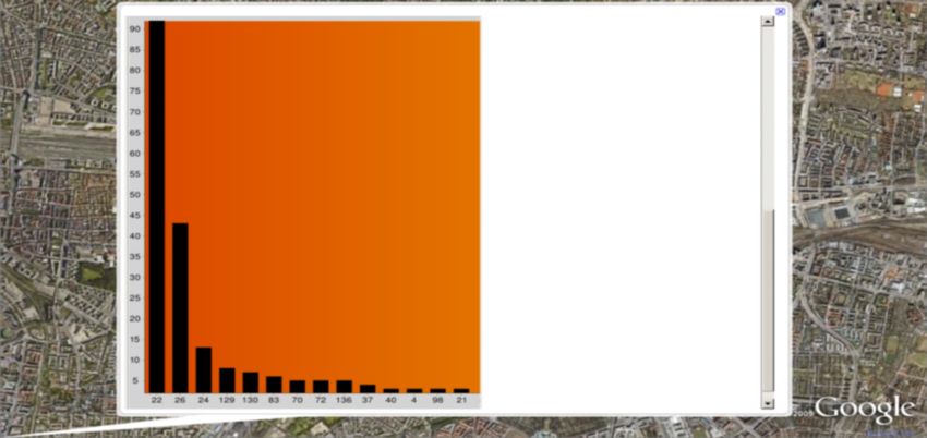
(a) Cluster visualization using convex hull (left and right) and convey- (b) Aggregated cluster statistics using histogram. X-Axis: cluster ids,
ing additional information using color (right)                           Y-axis: number of people who took photos in a cluster

(c) Attractive areas using density maps with different level of resolu-               (d) Representative images of local clusters
tions

                    (e) Daily and monthly events                           (f) Comparison of spatial distributions in different time intervals

     (g) Visualization of exact places where people took photos                (h) Ranked POIs (Berlin) using 2D and 3D perspectives

(i) Comparison of ranking scores between Flickr, Panoramio and Tri- (j) Comparison of behavioral patterns between Flickr (black clusters)
padvisor communites                                                 and Panoramio (white clusters) communities

                                           Figure 1: Illustration of visual analytics tasks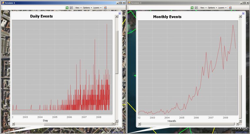
You can also read