InfoColorizer: Interactive Recommendation of Color Palettes for Infographics
←
→
Page content transcription
If your browser does not render page correctly, please read the page content below
UNDER REVIEW                                                                                                                                      1

                                             InfoColorizer: Interactive Recommendation of
                                                    Color Palettes for Infographics
                                                                  Lin-Ping Yuan, Ziqi Zhou, Jian Zhao, Yiqiu Guo, Fan Du, Huamin Qu

                                             Abstract—When designing infographics, general users usually struggle with getting desired color palettes using existing infographic
                                             authoring tools, which sometimes sacrifice customizability, require design expertise, or neglect the influence of elements’ spatial
                                             arrangement. We propose a data-driven method that provides flexibility by considering users’ preferences, lowers the expertise barrier
                                             via automation, and tailors suggested palettes to the spatial layout of elements. We build a recommendation engine by utilizing deep
                                             learning techniques to characterize good color design practices from data, and further develop InfoColorizer, a tool that allows users to
                                             obtain color palettes for their infographics in an interactive and dynamic manner. To validate our method, we conducted a
arXiv:2102.02041v1 [cs.HC] 3 Feb 2021

                                             comprehensive four-part evaluation, including case studies, a controlled user study, a survey study, and an interview study. The results
                                             indicate that InfoColorizer can provide compelling palette recommendations with adequate flexibility, allowing users to effectively obtain
                                             high-quality color design for input infographics with low effort.

                                             Index Terms—Color palettes design, infographics, visualization recommendation, machine learning.

                                                                                                                    F

                                        1    I NTRODUCTION                                                              ments is finally found, there is still a big question on which
                                        Infographics have been widely accepted as an effective                          color in the palette should be applied to which element of
                                        means to convey abstract information to the general public.                     the infographic. The spatial layout of these elements matters
                                        Besides the content and structure of infographic elements                       [50], [38], for example, a piece of text of less contrast color
                                        (e.g., shapes, pictograms, text, and indices), the colors of                    with its background element is hard to read.
                                        these elements and their combination—color palette—are                              The above example reveals three key challenges of de-
                                        essential, because it significantly influences its aesthetics,                  signing color palettes using the existing tools: 1) creating a
                                        engagement, and memorability [25], [12]. However, either                        palette from scratch requires users having relevant exper-
                                        crafting an infographic or selecting an effective palette is                    tise, 2) using predefined palettes by the tool limits users’
                                        not easy, especially for general users who lack expertise in                    freedom, and 3) applying a palette to an infographic is
                                        design, since each task requires considering many factors                       complicated due to the spatial layout of elements.
                                        simultaneously such as layout, appearance, and perceptual                           To address these challenges, we propose InfoColorizer, an
                                        effectiveness. While many authoring tools [33], [39], [74],                     interactive tool that allows general audience to effectively
                                        [70], [16], [19], [69] have been developed to facilitate info-                  design color palettes during infographic creation, using a
                                        graphics creation, these tools do not provide adequate color                    data-driven approach (Fig. 1). We employ deep learning
                                        design supports. Users are required either to manually craft                    to extract color design practices from a large dataset of
                                        color palettes or choose them among a predefined set.                           infographics created by designers, and then use the learned
                                            Imagine a marketing manager, Linda, obtains a blue-                         model to recommend appropriate color palettes. This lowers
                                        background infographic online, and wants to use it in her                       expertise barrier of users to craft good color palettes. Partic-
                                        slides with the company brand theme, which is red. She                          ularly, we frame the learning process as a conditional gen-
                                        loads the infographic into Adobe Illustrator, but soon gets                     erative problem, and leverage VAEAC (Variational AutoEn-
                                        stuck in attempting to create a color palette from scratch.                     coder with Arbitrary Conditioning) [29] to recommend color
                                        While there are many principles for color design, Linda is                      palettes dynamically based on conditions (e.g., color prefer-
                                        not familiar with them, and thus has no idea how to leverage                    ences) set by users. This offers flexibility to users by enabling
                                        them to get a harmonious palette. Thus, she turns to the                        partial specification of palettes with exact or vague color
                                        predefined palettes in the tool, but finds limited available                    constraints. Moreover, we characterize infographics with
                                        choices to satisfy her needs. She wants the background red                      features including the information of element spatial layouts
                                        while having some elements’ colors to reflect affective or                      in the dataset, allowing for integrating such knowledge into
                                        semantic information. Even a palette meeting all the require-                   our learned model. This suggests color palettes tailored for
                                                                                                                        particular element arrangements in infographics. InfoColorizer
                                        •   Lin-Ping Yuan and Huamin Qu are with the Hong Kong University of            also supports some basic editing functions, allowing users
                                            Science and Technology. E-mails: {lyuanaa, huamin}@cse.ust.hk.              to try out different infographic layouts, obtain correspond-
                                        •   Ziqi Zhou and Jian Zhao are with the University of Waterloo. E-mails:       ing color palette recommendation, and iteratively refine
                                            {z229zhou, jianzhao}@uwaterloo.ca.                                          their design. The source code of the system (including the
                                        •   Yiqiu Guo is with the Xi’an Jiaotong University. Email:
                                            maxleaf@stu.xjtu.edu.cn.                                                    models, user interface, and examples) will be available at
                                        •   Fan Du is with Adobe Research. Email: fdu@adobe.com.                        https://github.com/yuanlinping/InfoColorizer.
                                                                                                                            We validated InfoColorizer through a comprehensive
UNDER REVIEW                                                                                                                                   2

Recommendation Engine                                   Visual Interface        that colors are essential to make visualizations memorable
 Training Data        VAEAC         Recommendations      User Preferences       and influence a first impression [12], [25].
                                                          bind the same color
                                                                                    Besides empirical studies, data-driven methods or ma-
                                           ......                x x x x
                                                           set color
                                                                                chine learning models were applied for tagging visual and
                                                                                textual elements in infographics [14], estimating the vi-
                                                                                sual importance of elements [15] based on crowdsourcing
         Feature Extraction                             Infographic Editing     data [32], exploring perceived personalities [76], and com-
                                                                                puting similarity of infographics to facilitate search [55].
                       ......
                                                                                Recently, Lu et al. [41] explored high-level narrative flows
                                                                                of infographics extracted from online collections. However,
Fig. 1. InfoColorizer consists of a recommendation engine and a visual          none of the above works focuses on the color aspect of in-
interface. The recommendation engine is constructed by first extracting
structure and color information from inforgraphics and then training a          fographics design. Inspired by these techniques, we employ
deep learning model, VAEAC, to characterize good color design prac-             a data-driven method to extract good color design practices
tices. The visual interface further allows users to obtain recommended          and utilize them for recommendations.
palettes, specify various preferences, edit infographics, and retrieve new
                                                                                    To facilitate the creation of an aesthetic infographic,
recommendations iteratively.
                                                                                researchers have developed many authoring tools, which
evaluation containing four parts. First, we demonstrate the                     fall into three main categories: programming toolkits, inter-
usefulness of InfoColorizer with case studies using real-                       active design environments, and semi- or fully-automated
world infographics and example scenarios. These cases                           tools. Programming toolkits (e.g., D3 [13]) allow users to
reveal that the system can facilitate color palettes design                     create visualizations at the greatest extent of flexibility.
with cogent recommendations in different tasks such as                          However, they usually have a steep learning curve and
filling empty wireframes and combining infographics with                        are challenging for general users. Thus, many interactive
different color schemes. Then, we conducted a controlled                        design environments have been developed to facilitate users
user study with 24 design novices. The qualitative and                          without programming skills, such as Adobe Illustrator. Also,
quantitative results show that InfoColorizer offers higher                      tools that support data binding were proposed to ease the
efficiency and better creativity support than a baseline with                   creation of data-driven charts and infographics, including
manual color design with online resources. Third, we car-                       the binding of standard marks [56], icons [70], and hand-
ried out an online survey study with 102 users to compare                       drawn shapes [33], [74], [39]. However, they still require
artist-designed, predefined, randomly-generated, baseline-                      users to manually craft infographic elements. To further
crafted and InfoColorizer-recommended color palettes on                         lower the barrier, semi- or fully-automatic tools were devel-
aesthetics and readability. The results indicate that although                  oped to support creating infographics directly from different
InfoColorizer’s recommendations were not perceived as                           inputs, such as natural language statements [19], tables [69],
good as artist-designed palettes, they received higher scores                   and timeline images [16].
than the other three methods on both factors. Finally, we                           While providing rich capabilities, almost all the above
interviewed four graphic design experts in depth; they                          systems leave users with two options to obtain a color
appreciated InfoColorizer’s novel features and were able                        palette—which is critical for the aesthetics of their
to generate compelling infographics meeting their needs                         infographics—including: 1) manually creating one from
effectively within a few operations. In summary, our main                       scratch and 2) choosing from a predefined collection. The
contributions include:                                                          former requires expertise in color design and the latter limits
• A novel data-driven approach that recommends palettes
                                                                                a user’s flexibility. Our work aims to address these issues via
   for infographics by leveraging deep learning techniques                      interactive recommendation. Motivated by the discussion of
   with the consideration of elements’ spatial arrangements,                    Lu et al. [41] on the spatial structure of infographics, we go a
   while offering flexibility for user preferences of colors;                   step further to integrate the information of elements layout
• An interactive tool, InfoColorizer, that incorporates the
                                                                                into suggesting proper color palettes.
   data-driven recommendation and makes it easily accessi-
                                                                                2.2   Color Palette Design Principles and Tools
   ble and manageable to users, along with the support of
   iterative design and basic infographic editing; and                          Prior studies mainly focus on improving perceptual discrim-
• Insights and results from a series of evaluations covering                    inability and aesthetics of designed color palettes in data
   case studies, a controlled user study, an online survey, and                 visualization. Levkowitz et al. [36] suggested that discrim-
   an interview study.                                                          inable palettes should effectively mirror encoded data and
                                                                                accurately convey data differences. Visualization designers
                                                                                are recommended to consider many factors, such as un-
2     R ELATED W ORK
                                                                                derlying data types [64], visual consistency [51], tasks [65],
2.1   Infographic Models and Authoring Tools                                    and color properties (from basic visual separability [68],
Compared to plain charts or text, infographics incorporate                      contrast [45], and difference metrics [63], to more advanced
additional visual embellishments, such as icons, shapes,                        color appearance [35], name differences [27], affect [10], and
images, and pictograms, to convey abstract information ap-                      semantics [37], [57]). Moreover, studies indicated that using
pealingly. Previous empirical studies have shown that em-                       harmonious colors [44] or adjusting hue and saturation [46]
bellished charts and pictographics increase comprehension,                      can increase the aesthetics of visualizations.
engagement, and memorability, while not reducing viewers’                           However, applying these principles in practice can be
accuracy [11], [24]. Further, researchers have demonstrated                     difficult for non-experts. Many techniques have been pro-
UNDER REVIEW                                                                                                                        3

posed to ease this process, such as ColorBrewer [26] that          3     I NFO C OLORIZER D ESIGN AND OVERVIEW
provides predefined color palettes for encoding sequential,        In this section, we outline the design goals for developing
diverging, and qualitative data. In the case of graphic design     InfoColorizer, followed by an overview of our method.
(i.e., not encoding any data), some commercial interactive
tools (e.g., Adobe Color [9]) utilize harmonic templates to
help users craft customized color palettes with high quality.      3.1   Design Goals
     Further, researchers have developed algorithms to auto-       As most infographics tools focus on authoring the geo-
matically generate color palettes for different applications.      metrical content of infographic elements, our main goal
For categorical data, Colorgorical [23] creates palettes based     is to facilitate the essential follow-up step—color design.
on user-defined balance of color discriminability vs. aes-         Motivated by the aforementioned scenario and limitations
thetic preference. Palettailor [40] further provides a data-       of the existing tools, we derive the following design goals to
aware approach that generates and assigns colors for multi-        guide the development of InfoColorizer.
class scatterplots, bar and line charts to maximize their              G1: Lower expertise barrier for crafting professional
visual discrimination. For numerical data, Smart et al. [61]       color palettes. Graphic designers consider many factors
modeled expert-designed color ramps to suggest palettes.           simultaneously when creating high-quality palettes, such as
Besides data charts or visualizations, algorithms have been        aesthetics, harmony, and perceptual discriminability. How-
designed for (re)coloring other types of media, such as            ever, this task is challenging for general users due to the lack
natural images and patterns [18], [48]. O’Donovan et al. [49]      of expertise, as there could be unlimited numbers of choices
proposed a color compatibility model that can score the            for a color palette. The system should characterize good practices
quality of any five-color palettes. By considering compat-         embodied in handcrafted designs, and assist users with automatic
ibility and spatial arrangements of colors, Lin et al. [38]        palette recommendation that reflects these good practices.
suggested a probabilistic model for coloring 2D patterns.              G2: Offer flexibility to embed different kinds of user
     However, the above techniques focus on data charts/           preferences. Users may have preferences and constraints
visualizations, natural images, or patterns; none of them          when creating palettes. For example, they may want to
are developed for infographics with unique characteristics.        apply a specific or semantically meaningful color to a par-
First, infographics consist of both data elements and visual       ticular element. They may also want to set multiple relevant
embellishments, where colors play multiple roles such as           elements with the same color for consistency. The system
visual group indicators and artistic decorators [41]. Second,      should provide a flexible mechanism to allow for specifying various
the spatial arrangement of its elements is different from that     types of color preferences on elements of interest, as well as
in other media, which may exhibit complicated semantics            alleviate users from considering colors for other elements.
and convey a narrative. Perhaps the general methods on                 G3: Incorporate consideration of spatial arrangements
suggesting palettes for website design [9], [49], [26], [23] can   of elements. The spatial layout of elements in an infographic
be used for infographics. But they are limited in generating       greatly influences its perceived color appearance. Even if a
palettes with a fixed number of colors (e.g., five), and do not    palette looks good independently, it can have poor perfor-
indicate how users assign colors to infographic elements.          mance after being applied to an infographic. Further, there
                                                                   exist numerous ways to apply a palette to an infographic
                                                                   (e.g., around 510 assignments for a five-color palette and
2.3   Visualization Recommendation
                                                                   a ten-element infographic), causing much trial-and-error
Researchers have explored various techniques for recom-            tweaking. The system should adapt palettes to particular spatial
mending appropriate visualizations, including some com-            arrangements of input infographics in recommendations, thus
mercial tools such as Tableau. One category falls in rule-         freeing users from the tediousness of tuning color assignments.
based methods. APT [43] introduces a compositional al-                 G4: Support simple user interactions and iterative
gebra to enumerate the space of charts and ranks them,             design of color palettes. General users rely on an easy
which was later extended in SAGE [54]. CompassQL [71],             interface for accessing different system functions. The sys-
the basis of Voyager [72] and Voyager 2 [73], offers flex-         tem should provide intuitive user interactions such as obtain-
ible query specifications for searching the visualization          ing effective palette recommendation, specifying color preferences
space and providing recommendations. Further, Draco [47]           and other constraints, and previewing & editing infographics.
leverages answer set programming to describe constraints           Further, the color palette design process is often iterative
over visualization design. Another category is data-driven,        by trying different ideas. The system should facilitate refining
based on machine learning techniques. VizML [28] learns            results in a human-in-the-loop manner, such as bookmarking
design choices from a corpus of data vs. visualization pairs.      recommended palettes, storing history of recommendation, and
Data2Vis [21] is an end-to-end neural network that gen-            tuning constraints according to their needs.
erates visualizations directly from data. DeepEye [42], on
the other hand, combines rule-based methods and machine
learning to rank and classify visualizations.                      3.2   Method Overview
    While the above systems allow users to effectively create      Based on the above goals, we develop InfoColorizer, a visual
visualizations from input data, none of them adequately            system that provides interactive palette recommendation
supports recommending color designs of generated charts.           for an infographic with flexible user preference settings. As
Moreover, as mentioned above, infographics have unique             shown in Fig. 1, we employ a data-driven approach to au-
characteristics that are different from ordinary charts or         tomatically acquire good practices exhibited in infographic
visualizations, which is the focus of our work.                    collections and then utilize the “learned knowledge” to
UNDER REVIEW                                                                                                                                      4

recommend palettes, with a visual interface that allows user         (a)             Visual Group                      (b)
interactions with the underlying recommendation.
    More specifically, considering an infographic I =
{E1 , E2 , · · · , En }, where Ei is an element, we characterize                                                                    ... ... ...

I with a set of non-color features F = {F1 , F2 , · · · , Fm } and
color features C = {C1 , C2 , · · · , Cn } for the n elements (see
Sec. 4). The non-color features F include information at dif-
ferent granularity (e.g., infographic and element levels), and             Artistic
the spatial arrangement of elements, which are combined                                               VIF & Backbone               [text] [text]
                                                                           Graphical Data
and represented in a tree structure (G3). For expert-designed                01
                                                                       LOREM IPSUM                                           01
infographics, the color features C, and their relations with
                                                                     Fig. 2. (a) Artistic elements, graphical data elements, visual groups,
the features F reflect good practices that we wish to capture.       and visual information flow (VIF) & backbone in an infographic. (b) The
    We therefore frame our recommendation process as a               conceptual tree model. Some branches are omitted for simplicity.
conditional generative problem (see Sec. 5). We employ Vari-
ational AutoEncoder with Arbitrary Conditioning (VAEAC)              4.2        Conceptual Model of Infographics
[29] as our generative model, because of its flexibility             As shown in Fig. 2-a, Lu et al. [41] characterized an info-
in adapting any features as conditions. That is, given a             graphic as a combination of artistic decorations (e.g., shapes,
collection of expert-designed infographics, with features            images, and cliparts) and graphical data elements (e.g., icons,
(Fk , Ck ), the model can learn a probability distribution over      text, and indices). Graphical data elements are then orga-
the full feature set—non-color features F and colors C—to            nized into visual groups to convey pieces of information.
capture the good practices (G1). Later, the learned model can        Visual groups are further presented in sequential order,
be used to generate any “missing” features of an infographic         called visual information flow (VIF), to indicate a narrative of
I with knowing the rest (i.e., the arbitrary conditions). For        the infographic. The path connecting the semantic centroids
example, users can specify colors Ci and Cj for certain              of the visual groups is called VIF backbone.
elements Ei and Ej , and the conditional generative prob-                However, this infographic model is not sufficient for our
lem becomes sampling from p(C \ Ci,j |F, Ci,j ), allowing            case, because it only considers graphical data elements when
for the flexibility of incorporating different kinds of user         composing visual groups. This is oversimplified, because
preferences (G2). To make the above recommendation easily            the artistic decorations and their colorfulness largely affect
accessible and configurable, we design a visual interface            the aesthetics of infographics, and thus are important in
for InfoColorizer, which also enables iterative generation of        determining proper color palettes for a visually compelling
colors and simple infographic editing functions (G4).                infographic. Further, while VIF captures a high-level spatial
                                                                     structure to make logical sense, more detailed spatial rela-
4     DATASET AND I NFOGRAPHIC M ODEL                                tionships between individual elements arguably influence
                                                                     the color palette design. For example, two elements next to
To achieve the design goals, the starting step is to identify        each other (i.e., adjacency) may share the same color to imply
high-quality infographic datasets from which a data-driven           the “Similarity” Gestalt Law [20]; and one element fully on
method can extract good palette design practices (G1). Fur-          top of another (i.e., inclusion) is benefited from choosing a
ther, we need to conceptually model infographics in a form           high contrast color with respect to the one below.
that is effective for algorithms to understand and process.              To address these issues, we first extend Lu et al.’s model
In this section, we discuss the above two aspects.                   [41] by including both artistic and graphical data elements
                                                                     in visual groups, as well as VIFs, which characterizes an
4.1   Dataset                                                        infographic from a logical perspective (Fig. 2-a). Inspired
Previous studies collected several infographic datasets, such        by trees being used to analyze topological structures of
as MassVis [12], [5], Visually29K [14], [15], [8], InfoVIF [41],     images [62], we further employ a tree structure, which incor-
[4] and Timelines [16], [7]. In this work, we chose InfoVIF          porates Lu et al.’s model and characterizes an infographic
(containing 13,245 infographics) as our initial test bed for         from a spatial perspective (G3). The structure can describe
the following reasons. First, compared to MassVis and                the adjacency and inclusion spatial relationships at multiple
Visually29K, InfoVIF tends to be more useful for general             levels (Fig. 2-b). The root node of a tree represents the whole
audiences, because most items are design templates that              infographic (i.e., the background canvas), and the second
can be used as a starting point to create personalized info-         layer of the tree represents all the visual groups, whose de-
graphics. Second, InfoVIF contains infographics with more            scendant nodes are artistic or graphical data elements within
uniform styles of visual elements and layouts than those in          the corresponding visual group. Under a visual group node,
MassVis and Visually29K, allowing machine learning to bet-           a parent-child link indicates element inclusion, and a sibling
ter capture common design patterns in infographics. Third,           relation indicates adjacency in layout. Our model conceptu-
compared to Timelines, InfoVIF has a broader coverage of             alizes an infographic from both logical and spatial aspects,
infographics, including not only timelines but also other            allowing data-driven models to extract associations between
types. Finally, infographics in InfoVIF are contributed by           these aspects and color designs.
world-wide designers with high-quality and diverse design
themes. Thus, InfoVIF is a suitable resource from which
good color design practices can be extracted (G1).
UNDER REVIEW                                                                                                                       5

5     I NFO C OLORIZER S YSTEM                                    conditional generation. Moreover, users may have specific
In this section, we describe InfoColorizer in detail. As shown    preferences on coloring certain infographic elements (G2),
in Fig. 1, the system consists of a recommendation engine         meaning that some part of C is in the conditions. VAEAC,
and a visual interface. We first describe the feature extrac-     as an extension of VAE, can handle the above requirements,
tion process (Sec. 5.1) and how we characterize good color        by incorporating a binary mask vector b that controls which
design practices using the VAEAC model (Sec. 5.2). We then        part of x is the conditions (observed features) or not (un-
demonstrate InfoColorizer’s ability to support flexible color     observed features). Its encoder and decoder are p(z|x1−b , b)
preferences specification (Sec. 5.3), and the visual interface    and q(xb |z, x1−b , b), respectively, where x1−b is the observed
that enables an effective palette design workflow (Sec. 5.4).     part and xb is the unobserved part. The model is trained
                                                                  with a full set of features x, and can fill in any “missing”
                                                                  unobserved part of x (i.e., called feature imputation) during
5.1   Characterize Infographics with Various Features             the generation stage with a dynamic input of b. When
For an infographic I, we compile a set of color C and non-        applying to our case, we treat F always observed and set
color F features to describe its visual appearance and spatial    part of C observed, controlled by a user input b. If none of
arrangement of elements (G3).                                     C is observed (i.e., b = ~1), the model can generate a full
    We extract the color values of all elements and the           color palette for an infographic; and if some colors of C is
infographic background as the color features C. CIELab            observed (i.e., specified by a user with certain colors), the
color space is used because of its perceptual uniformity.         model can generate the rest of a color palette with these
We distill a list of non-color features F at the multiple         colors satisfying users’ constraints. Details regarding the
levels. At infographic level, we obtain VIF Type, Visual          user preferences support will be introduced in Sec. 5.3.
Group Number, and Visual Group Distance. Features in visual           We trained VAEAC using the obtained features for info-
group level contain Visual Group Element Number and Rela-         graphics, [F, C], described in Sec. 5.1. We also considered
tive Visual Group Size. At element level, we extract Element      two alternative models including: 1) GAIN (Generative
Type, Relative Element Size and Relative Element Pixel Area for   Adversarial Imputation Nets) [75], which is the state-of-
each artistic and graphical data element. In addition, we         the-art GAN-based model for feature imputation, and 2)
use the nested set model [22] to represent the tree structure     MICE (Multivariate Imputation by Chained Equations) [67],
(Sec. 4.2) of an infographic by storing Left Index Number and     which is a classic non-deep-learning method. Our exper-
Right Index Number of each node. A complete explanation of        iments indicated that VAEAC performed the best on the
the above features and technical details about the extraction     dataset. Details about the model training, comparison, and
algorithms can be found in Appendix Sec. A.                       evaluation can be found in Appendix Sec. B.
    The non-color features embed many design factors con-
sidered by experts. Specifically, they help organize informa-     5.3   Offer Flexibility with Versatile User Preferences
tion about narrative flow (VIF), visual groups (Visual Group      With a trained VAEAC model, InfoColorizer can not only
Number and Distance), size(Relative Visual Group Size, Relative   recommend colors for each infographic element but also
Element Size/Pixel Area), shape (Element Type). Besides, the      support flexible control over the colors in recommendation
tree structure reveals the spatial arrangement of elements        (G2). InfoColorizer supports two kinds of user constraints:
(G3) and other design factors, such as layers by tree traversal   1) specifying colors for certain elements in either an exact or
background/foreground contrast by inferring parent-child          a vague form, and 2) binding several elements together to
relationships, etc. Characterizing these factors makes cap-       have the same color in recommended palettes.
turing high-level color design practice from infographics              As mentioned in Sec. 5.2, VAEAC can generate un-
possible with a data-driven approach.                             observed colors conditioning on non-color features and
                                                                  observed colors. Thus, we can generate palettes meeting
5.2   Lower Expertise Barrier with Recommendation                 users’ preferences by manipulating the input feature vector.
                                                                  Specifically, if a user assigns an exact color (e.g., in CIELab
The next step is to train a machine learning model that
                                                                  space [l, a, b]) to an element Ei , the corresponding color
extracts good design practices in data and utilizes that for
                                                                  features of Ei are set to [l, a, b], indicating these features are
providing recommendations (G1). As mentioned in Sec. 3.2,
                                                                  observed. Moreover, users can assign colors to an element
we frame the recommendation process as a conditional
                                                                  Ei semantically using a word (referring to a range of colors)
generative problem, and employ Variational AutoEncoder
                                                                  such as a color name (e.g., red, skyblue), an object (e.g., apple,
with Arbitrary Conditioning (VAEAC) [29], a special kind
                                                                  dollar), and a kind of affect (e.g., exciting, calm). To handle
of VAE (Variational AutoEncoder) [34].
                                                                  such vague specifications, we first collected over 200 (word,
    In general, a VAE aims to learn a bidirectional mapping
                                                                  colors) pairs from the previous works on color names [27],
between data items x in an application domain and vari-
                                                                  color affect [10], and color semantic [37], as well as a website
ables z in a continuous latent space. The model consists
                                                                  [3]. We then utilize this information to manipulate the input
of two parts—an encoder p(z|x) that converts x to z and
                                                                  feature vectors. When a word is assigned to an element
a decoder q(x|z) that does the opposite; and the training
                                                                  Ei , we randomly select k colors from the corresponding
process is to learn the two probability distributions. In our
                                                                  color set and then generate k input vectors (we set k to
case, x is the infographic features, [F, C], and z reflects the
                                                                  3 in InfoColorizer), where each has a different color (from
abstract knowledge in data.
                                                                  [l, a, b]1 to [l, a, b]k ) for the observed features of Ei . We can
    We want to obtain color palettes according to a specific
                                                                  thus obtain k sets of recommendations and randomly pick
design of infographic structure reflected in F, which is a
                                                                  some for presentation.
UNDER REVIEW                                                                                                                     6

    Users can also bind relevant elements (e.g., those within   five). She picks her favorite one, Fig. 3- 4 -P1, for preview
a visual group, or all icons, text, etc.) to constrain them     and refinement. The chosen palette is then duplicated in
with the same color in recommendations. We adopt a post-        the Color Preferences section (Fig. 3- 1 -CP2), and the info-
processing method on the recommended color palettes. For        graphic is automatically colored by the palette (Fig. 3- 5 ).
example, suppose that Ei , Ej , Ek are bound, for each rec-         However, Linda is not satisfied with the colors of the
ommended color palette, we randomly select one of them          first and last bars (i.e., “01” and “05”). She thus clears the
based on a probability decided by their areas, and then set     colors of the two bars (Fig. 3- 1 -CP3), and requests new
all three elements with the color of the selected one.          recommendations with this preference setting. The results
                                                                are shown in Fig. 3- 3 . Similar to the previous iteration, she
5.4   Support User Workflow with Visual Interface               picks her favourite palette in Fig. 3- 3 -P2, which updates
                                                                the Color Preference section (Fig. 3- 2 ) and the infographic
We develop a visual interface that enables users to itera-      (Fig. 3- 6 ). Linda is quite happy with this color design and
tively obtain desired palettes by supporting basic editing      exports the infographic for her presentation slides.
and previewing functions, color preference and other con-
straint specification, and interactive recommendation (G4).
    The interface (Fig. 3) consists of three interactively-     6     E VALUATION
coordinated panels. The Content Library (Fig. 3-A) stores raw   To assess the effectiveness and usefulness of InfoColorizer,
materials (e.g., shapes, images, icons) and infographic tem-    we conducted a four-part evaluation. We first use several
plates. Users can create an infographic either from scratch     case studies to demonstrate that InfoColorizer is able to
or based on a template, and color it using InfoColorizer’s      generate compelling color palettes under different scenarios.
palette recommendation. Users can also upload bitmap im-        In addition, we quantitatively and qualitatively evaluate
age infographics or add text, and modify the colors accord-     InfoColorizer from the perspectives of novice creators, in-
ing to their needs. Selected resources can be edited on the     fographic readers, and graphical design experts separately
Main Canvas (Fig. 3-B). The toolbar on the top supports some    by conducting a controlled user study, a survey study, and
simple editing functions such as arrange, group/ungroup,        an interview study. These studies comprehensively reflect
duplicate, and delete. The Control Panel (Fig. 3-C) is a core   the strengths and weaknesses of InfoColorizer on different
component, where users can obtain desired color palettes        aspects. Detailed information about our studies can also be
by iteratively specifying preferences, obtaining recommen-      found in the supplementary materials.
dations, and refining the design. Overall, we designed the
interface with common panels and components to improve
                                                                6.1   Case Studies
the usability and learnability. However, we proposed a
novel widget for setting color preferences (Fig. 3-C1) with     Fig. 4 presents a set of infographics colored by recom-
visualizations of layered elements and interactive linking.     mended palettes. More diverse and complicated cases can
    Here, we use a simple scenario to demonstrate an in-        be found in our supplemental materials. We demonstrate
teractive workflow of obtaining desired palettes with Info-     how InfoColorizer can facilitate palette creation under dif-
Colorizer. Suppose the marketing manager, Linda, wants to       ferent user preferences and constraints. We consider three
improve a chosen infographic from the Content Library (the      use cases: a) colorizing a wireframe infographic, b) improv-
first one in Fig. 3-A). She then clicks “Analyze Infographic”   ing the color readability of an infographic, c) stitching two
which analyzes the spatial relationships of its elements and    infographics with different color schemes. For each case, we
displays a tree structure on the Color Preferences section      select one infographic from a website [6]. We demonstrate
(Fig. 3-C1). The tree, informing our conceptual infographic     InfoColorizer’s recommendations under four conditions: 1)
model (see Fig. 2), is visualized as rectangles in horizontal   no preferences, 2) exact color specification, 3) vague color speci-
layers. The bottom layer is the background canvas, and the      fications, 4) elements binding. In Fig. 4, we use “Pin” icons
second bottom layer contains the elements directly placed       to indicate elements that are specified with exact colors,
on the background, and so forth. The rectangle color in-        annotate the words on elements that are specified vaguely,
dicates users’ preference of the corresponding element; an      and add links to elements that are bound together. We can
empty rectangle with a diagonal line means no constraint.       see that InfoColorizer can generate compelling palettes for
    Initially, she wants the background to be lighter and       the source infographics under different conditions; all of
all the text to be pure white consistently. With the Color      the results are obtained through one to two requests of
Preferences section (Fig. 3-C1), she assigns a vague color      recommendations.
specification with the word “light” to background canvas;            Even without any color preferences, InfoColorizer is able
the word is shown on top of the rectangle. She then binds       to suggest cogent color palettes. For example, in Fig. 4-A1,
the four text objects and sets “#FFFFFF” (i.e., white) as       the colors of the four shapes are in a smooth and consistent
their colors. The bound elements, which will always have        theme. In Fig. 4-C1, a user wants to obtain a palette for
the same colors in recommendations, are indicated by the        the head adapted to the bulb, and thus sets no preferences
small red dots below. The resulting color preference setting    for the head while fixing colors for the bulb. The system
is shown in Fig. 3- 1 -CP1.                                     recommends a color palette for the head similar to that of
    Linda clicks “Get Recommendations”, and a list of rec-      the bulb, indicating that the model utilizes observed color
ommended palettes meeting her needs are then returned by        features (i.e., the bulb) to influence unobserved) color features
InfoColorizer (Fig. 3- 4 ). The number of returned recom-       (i.e., the head). Moreover, by assigning the backgrounds in
mendations can be adjusted in InfoColorizer (the default is     Fig. 4-A2,B2 with desired colors, the original foreground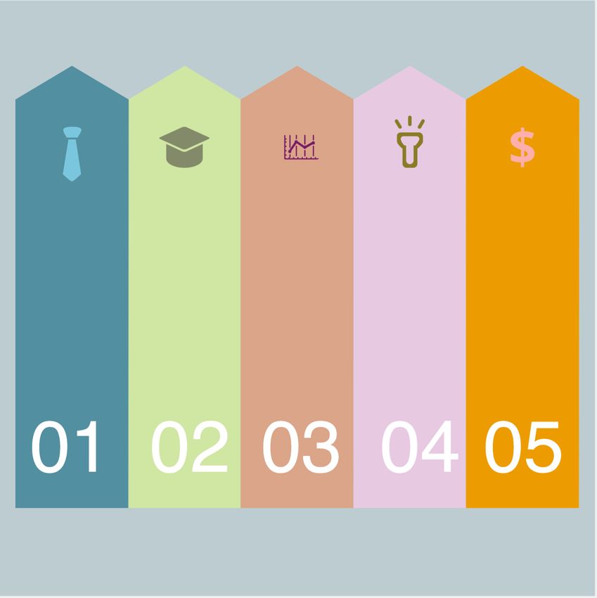
UNDER REVIEW                                                                                                                                                             7

                            A                                                                                                                     C
                                     6 Current Result                     1 Previous Color Preferences                                   C1

                                                                            t
                                                                          ligh
                                                                                                                                  2 Current Color Preferences
                                                                CP1

                                                                CP2
                                                                                                                                         C2

                                     B                                                                                                   C3
                                                                CP3

                                     5 Previous Result                                                                                   C4
                                                                        4 Previous Recommendations                                3 Current Recommendations

                                                              P1

                                                                                                                           P2

  Fig. 3. InfoColorizer consists of three linked panels: (A) Content Library stores materials for creating infographics; (B) Main Canvas supports
  simple editing functions to compose infographics; (C) Content Panel offers setting color preferences and viewing recommendations, composed of
  four sections: (C1) Color Preferences, (C2) Original Colors, (C3) Bookmarks, and (C4) Recommendations. It allows users to obtain desired color
  palettes by iteratively 1 2 specifying preferences, 3 4 getting recommendations, and 5 6 previewing the results for further refinement.

                   source   no preference exact color    vague color                                binding   study aimed to investigate two aspects of the workflow:
                                                                          yellow
wireframe

                                                                                                              (S1) whether InfoColorizer can facilitate users for obtaining
                                                                                     green

                                                                                                              satisfactory palettes for their infographics, and (S2) whether
                                                         red

                                                                                                              InfoColorizer can support users’ creativity in designing
              A0                A1            A2          A3                                   A4
                                                                         orange
                                                                                                              palettes. In particular, we investigate these questions under
                                                                        dark pink
readability

                                                                                                              the situations that users have specific color preferences and
                                                                                    hot pink
                                                          bright pink

                                                                                                              consider the spatial layout of graphic elements.
                                                                                    pink

              B0                B1            B2          B3 light pink                        B4
                                                                                                              6.2.1 Study Setup
                                                                                                              Baseline. To better assess the pros and cons of InfoCol-
stitching

                                                                                                              orizer’s novel features, we considered a baseline to simulate
                                                                                exciting                      a common color palette design process in practice, in which
              C0                C1            C2          C3                                   C4             people derive palettes from different sources, including
  Fig. 4. Example cases of three different infographic creation scenarios                                     color pickers, predefined palettes, and online websites [30],
  with four different user preference conditions.                                                             and then color their infographics with a design tool. We
                                                                                                              thus developed a baseline version of InfoColorizer by dis-
  colors are filled or enhanced with colors in contrast to                                                    abling the palette recommendation function and allowing
  the backgrounds. Further, after specified with some words                                                   users to seek colors via online resources and tools. In
  of general color hues and semantics, InfoColorizer returns                                                  particular, we suggested three widely-used websites: Adobe
  athletically pleasing infographics. For example, in Fig. 4-                                                 Color [9], ColorBrewer [1], and Coolors [2]. However, users
  B3, a user demands a pink-themed infographic but has no                                                     could still employ any other online resources. With these
  idea about what specific pink colors are the best, and thus                                                 websites, users could explore numerous expert-designed or
  specifies general color categories with words. In Fig. 4-C3,                                                automatically generated palettes, craft palettes from scratch
  “exciting” is attached to all the color strips on the head to                                               using harmony rules, and search palettes with words like
  match the underlying semantics of getting an idea (i.e., the                                                lucky, moonlight, covering a range of functions offered in
  bulb). Finally, by binding some elements together, a user                                                   InfoColorizer. We did not choose any commercial tool such
  can obtain more consistent color palettes, such as linking                                                  as Adobe Illustrator as the baseline, because the learning
  the corresponding arrows in Fig. 4-B4 to indicate different                                                 curve is quite high for general users and the interfaces are
  types of stages, and associating the relevant parts between                                                 dramatically different.
  the head and the bulb in Fig. 4-C4.                                                                             Participants and Apparatus. We recruited 24 partici-
                                                                                                              pants (10 females and 14 males; aged 19–26) from a local
  6.2 Controlled User Study                                                                                   university. They are all with normal color vision and their
  We further conducted a controlled study to evaluate Info-                                                   backgrounds range from engineering, law, to business. From
  Colorizer with real users on color palette design tasks. This                                               a pre-study questionnaire, their average years of experience
UNDER REVIEW                                                                                                                                  8

  (a) Time      (b) Count             (c) Questionnaire Rating              6.2.2 Results and Analysis: Task Performance
                                                                            Fig. 5-a and Fig. 5-b show the completion time of Task 1 and
                                                                            the resulting infographics count in Task 2, respectively. An
                                                                            independent-samples t-test showed significant differences
                                                                            on both the completion time (t = −4.83, p  0.001) and
                                                                            infographic counts (t = 2.29, p = 0.02). This indicates
                                                                            that participants generated satisfying palettes for the in-
Fig. 5. Results of the controlled user study: (a) Completion time for       fographics faster with InfoColorizer (µ = 197 seconds,
generating satisfying infographics in Task 1. (b) Counts of the resulting   95% CI = [173, 222]) than with Baseline (µ = 306 sec-
infographics in Task 2. (c) Participants’ subjective ratings on the exit-
                                                                            onds, 95% CI = [265, 346]) for Task 1. Moreover, for Task
questionnaire (the higher the better).
                                                                            2, participants created more satisfying infographics with
in visualization or design is 0.375 (σ = 0.77), so that                     InfoColorizer (µ = 9.25, 95% CI = [5.7, 12.8]) than with
they are novice users for our study tasks. Also, their self-                Baseline (µ = 4.7, 95% CI = [3.4, 5.9]).
reported expertise of color theories (e.g., harmony rules,
color semantics) was: M = 2 and IQR = 2, on a 7-point                       6.2.3 Results and Analysis: Participants’ Feedback
Likert scale (1=“do not know at all” and 7=“very familiar”)                 To further answer S1, besides the quantitative task per-
We deployed InfoColorizer and its baseline version on the                   formance, we analyzed participants’ ratings on the exit-
cloud, and participants completed the study remotely via                    questionnaire ( Fig. 5-c). We performed a Mann-Whitney
video conferencing software on their own machines.                          test to compare the two conditions on each question.
    Tasks. We created four experimental infographics with                        For Q1, participants generally thought Baseline was eas-
certain contextual information (e.g., talking about a kid’s                 ier to learn (U = 37.5, p = 0.014), which might be because
weekend). Participants needed to complete two tasks during                  the interface of InfoColorizer was more complicated with
a study session. Task 1 aimed to assess the efficiency of                   the recommendation function. Nevertheless, all participants
the tool (S1), in which participants needed to color three                  gave a positive rating (≥ 5) for InfoColorizer.
infographics (out of the four) until they were satisfied with                    There was no significant difference on Q2 for the two
the results, one by one, without a time limitation. For each                conditions (U = 63.5, p = 0.32). However, InfoColorizer
infographic, according to the context, three forms of color                 in general received more positive ratings. This could be be-
preferences were specified for three elements during the                    cause InfoColorizer is equipped with the recommendation
tasks, including: an exact color, a color name, and a semantic              that benefited novices by “reducing the search space” (P6).
or affective word. Task 2 aimed to assess the creativity                    After being demonstrated InfoColorizer, P1 from Baseline
supported by the tool (S2), in which participants colored the               condition commented: “It is exactly what I want, because it
same infographic (the rest one of the four) within 15 minutes               can alleviate my burden to collect, assign and adjust colors.”
to obtain as many satisfying results as possible. In this task,                  A significant difference was found (U = 31.5, p = 0.007)
users were given general contextual information instead of                  between the two conditions for Q3, indicating that Info-
concrete preferences. In each task, we explicitly explained                 Colorizer allows participants to easily colorize infographics
the constraints or context and asked participants to ensure                 under specific color constraints. Among the participants
the pre-defined preferences were met and each element was                   using the Baseline, P10 complained: “Sometimes I cannot
distinguishable. For the baseline, participants could import                get proper colors meeting preferences while looking harmonious
a color palette as a whole to minimize the effort of copying                from the three websites, so I need to determine colors in a trial-
and pasting single colors from the websites.                                and-error process myself.” Additionally, P12 said that “I use
    Design and Procedure. We employed a between-subjects                    ColorBrewer in my daily life, but the choices are limited. I also
design, with 12 participants finishing two tasks in each                    feel inconvenient when I want to change a single color in a
condition: InfoColorizer or Baseline. We ensured that each                  certain palette, because the remaining colors cannot be updated.”
infographic appeared in Task 2 three times in each condition                Participants from the InfoColorizer condition reported that
across participants, and counterbalanced the order of the                   they also encountered such difficulties; however, they felt
remaining three infographics for Task 1. Each study session                 that InfoColorizer “integrates knowledge about colors, semantics
began with a tutorial about the tool (i.e., InfoColorizer                   and emotions,” (P7) and “the recommendation can solve these
or Baseline with websites). Then, participants completed a                  difficulties.” (P8).
training task on a different infographic (than the four) with                    Though no significance was found (U = 49.5, p = 0.091)
similar task requirements. They could ask any questions                     on Q4, InfoColorizer (µ = 6.25, σ = 0.87) had a higher
about the tool. After, participants were instructed to perform              average score than Baseline (µ = 5.42, σ = 1.51) and a
Task 1 and then Task 2 in order. They took a short break                    smaller variance on Q4, indicating its stability in reducing
between the two tasks. In the end, they filled in an exit-                  the burden for color adjustment. P17 using Baseline said: “I
questionnaire (on a 7-point Likert scale where 1 is “strongly               had no idea whether a palette would work well for an infographic
disagree” and 7 is “strongly agree”) and the Creativity Sup-                after being applied, even though the palette looked fine on the
port Index questionnaire [17], followed by a semi-structured                websites. Thus, I needed to keep trying or finished colorizing based
interview. For participants in the Baseline condition, we                   on my intuition.” This was also echoed by P1 and P12 (in the
also briefly demonstrated InfoColorizer and asked for their                 Baseline condition).
comments. Each study session lasted around 1.5 hours and
each participant received $12 in compensation.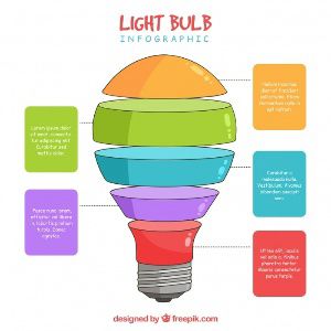
UNDER REVIEW                                                                                                                           9

                                TABLE 1                                       Baseline. For Task 1, it was rare for participants to
 Participants’ scores on the five factors and the final CSI scores (the   use a complete palette directly from the online sources [9],
     higher the better) of InfoColorizer (I) and Baseline (B), with
                  independent-samples t-test results.                     [2], [1], since none could meet all the color preferences.
                                                                          Most participants started with elements having the con-
  CSI Dimension                I       B      T-test
                                                                          straints. We noticed that Coolers [2] was more popular for
  Expressiveness             33.8    26.7     t = 2.84, p = 0.009         them to get started. The reasons might be: 1) compared to
  Exploration                35.2    26.5     t = 3.38, p = 0.003         ColorBrewer [1], Coolers support searching palettes with
  Results Worth Effort       36.3    25.8     t = 9.71, p  0.001
                                                                          keywords; and 2) Coolers has more flexible interactions to
  Immersion                  32.5    27.2     t = 2.08, p = 0.049
  Enjoyment                  35.8     29      t = 3.85, p = 0.001         generate palettes with gradient and with over five colors
                                                                          than Adobe Color [9]. After coloring these elements, partici-
  CSI                        57.9    45.1     t = 4.75, p = 0.0001        pants usually chose colors from the color picker and swatch
                                                                          embedded in the system for the remaining elements. The
6.2.4 Results and Analysis: Creativity Support                            swatch consisted of palettes pre-loaded from ColorBrewer
To answer S2, we utilized the Creativity Support Index                    and imported by them from Coolor and Adobe Color previ-
(CSI) [17], which quantifies how well a tool can support                  ously. The adjustment of color palettes and color assignment
users’ creativity based on a research-tested questionnaire.               happened in various ways, including: 1) participants might
One usage of CSI is to compare two tools used by people                   adjust colors both before and after obtaining the first com-
from two groups for the same tasks, which is well-suited to               plete palettes; 2) some finished quickly only via one to two
our study. Followed the practices in the previous work (e.g.,             adjustments, while others repeatedly assigned several colors
Playful Palette [59] and Color Builder [60]), we asked users              to one element and compared the corresponding results; and
to rate the corresponding study system on five factors: Ex-               3) they usually either focused on elements in an arbitrary
pressiveness, Exploration, Results Worth Effort, Immersion,               order or just from left to right, and they tended to adjust
and Enjoyment. Table 1 shows each factor’s scores, based on               elements locally if the elements were clustered visually.
which we calculated the final CSI scores.                                     For Task 2 without requirements, they relied more on
    Overall, InfoColorizer received a mean CSI score of 57.9              complete palettes in the provided tools by changing one
(σ = 6.51), much better than that of Baseline: a mean of 45.1             to three colors or just trying different color assignments.
(σ = 6.72). A independent-samples t-test showed a signif-                 When searching palettes in Adobe Color and Coolors, some
icant difference (t = 4.75, p = 0.0001), indicating InfoCol-              participants only focused on whether palettes were aesthetic
orizer performed considerably better than Baseline. More-                 while others might filter palettes using keywords fitting
over, InfoColorizer significantly outperformed Baseline on                the infographic topic. In both tasks, we observed that all
all the factors. The biggest difference existed in Results                participants did not use other online coloring tools, nor did
Worth Effort. Though some recommended palettes were                       they use the color wheel and harmony rules provided by
inferior to their expectation, participants still thought the             Adobe Color. It might be because they were novice users
overall recommendations were acceptable and the palette                   and unfamiliar with other tools and the rules.
refinement workflow of InfoColorizer was smoother than                        InfoColorizer. Users behaved much more consistently
Baseline. Thus, they could obtain qualified and satisfactory              than Baseline on the two tasks. They started with specifying
palettes for an infographic with less effort. The experience              preferences by inputting words, getting recommendations,
in Task 2 influenced how participants felt about the Ex-                  and bookmarked palettes they liked. They might adjust
pressiveness and Exploration of InfoColorizer and Baseline,               one to two unsatisfactory colors by using the color picker,
because they needed to be creative to provide as many solu-               swatch, or recommendation functions. More participants
tions as possible. Several participants reported that InfoCol-            requested recommendations again since it allowed them
orizer sometimes surprised them by recommending palettes                  to obtain many possible results. They often finished one
of different styles that they had never thought about, so                 infographic in Task 1 within two requests. As for Task 2, they
that they could explore many different possibilities. On the              usually got the first satisfactory result within two requests
contrary, P7 using Baseline said that “The websites can help              and had bookmarked two to four palettes, from which they
me search colors when I have an idea, but they cannot provide             could derive more palettes in the next request. We observed
me with ideas.” To further improve Expressiveness, P16 and                that they had less hesitation and pauses during the creation
P17 suggested to include more vague descriptive words                     than participants using Baseline. It might be because that
into InfoColorizer. The better performance on Immersion                   InfoColorizer provided them with a more consistent work-
and Enjoyment of InfoColorizer may be related to the fact                 flow, reduced their mental effort, and allowed them to focus
that it has a higher degree of integration than Baseline. This            on points of interest.
was because participants could find colors under specific
preferences and assign them to elements within a single                   6.3   Survey Study
system instead of several websites.
                                                                          Our controlled study validated the effectiveness of Info-
6.2.5 Results and Analysis: Participants’ Behaviors                       Colorizer from an infographic creator’s perspective. But
                                                                          how good are the generated infographics from a con-
We qualitatively investigated participants’ behavioral pat-               sumer’s perspective? To answer this question, we con-
terns based on our observation, revealing that they adopted               ducted a survey study to evaluate the quality of InfoCol-
different ways to get started, obtain the first palettes, modify          orizer recommended color palettes comparing against a set
colors, and adjust color assignment.                                      of other methods, including both human- and machine-
UNDER REVIEW                                                                                                                      10

     Scores on Aesthetics                 Scores on Readability      aesthetics (µ = 5.45, 95% CI = [5.31, 5.59]) and readability
                                                                     (µ = 5.72, 95% CI = [5.59, 5.85]), respectively. This is plau-
                                                                     sible because these color palettes were carefully designed
                                                                     by the professional designer. Among the rest, InfoColorizer-
                                                                     recommended palettes obtained the highest overall scores
                                                                     in aesthetics (µ = 4.60, 95% CI = [4.44, 4.75]) and read-
                                                                     ability (µ = 5.20, 95% CI = [5.06, 5.34]). A Friedman test
     Artist    InfoColorizer   Baseline       Predefined    Random
                                                                     indicated significant differences between different methods
Fig. 6. Survey study results: the average scores on aesthetics and   for aesthetics (χ2 = 261.27, p < 0.001) and readability
readability with 95% CIs (the higher is better; from 1 to 7).        (χ2 = 267.6, p < 0.001). Post-hoc Dunn tests with Bon-
                                                                     ferroni adjustment showed that the score of InfoColorizer-
generated palettes. Specifically, we compare five condi-             recommended palettes was significantly higher than that
tions: 1) artist-designed, 2) InfoColorizer-recommended,             of randomly-generated color palettes both on aesthetics
3) Baseline-crafted, 4) ColorBrewer-predefined, and 5)               (z = 6.64, p < 0.001) and readability (z = 6.11, p < 0.001),
randomly-generated color palettes.                                   as well as significantly higher than that of ColorBrewer-
                                                                     predefined palettes both on aesthetics (z = 8.53, p < 0.001)
6.3.1 Study Setup.                                                   and readability (z = 10.96, p < 0.001). It is not surpris-
We used the four experimental infographics mentioned in              ing that InfoColorizer outperformed the random condition
Sec. 6.2 and crafted palettes for them under each of the             because InfoColorizer had learned good practice embed-
five conditions. To obtain artist-designed palettes, we asked        ded in expert-designed infographics while random palettes
a professional designer to create a color palette for each           were sampled from the whole color space. Before study,
infographic. For InfoColorizer and Baseline conditions, we           we thought that ColorBrewer might be better than Info-
utilized the results generated by participants in Task 2             Colorizer on aesthetics but worse on readability. However,
of the controlled user study. This is because no concrete            the survey results show that InfoColorizer outperformed
preferences were set in Task 2, and thus the results were pro-       in both aspects, indicating that even a good predefined
duced under the same settings among the artist-designed,             palette can have poor aesthetics and readability because of
InfoColorizer, and Baseline conditions. For the ColorBrewer          improper color assignment. While there was no significance
condition, only categorical palettes were considered. We             between InfoColorizer-recommended and baseline-crafted
randomly selected a palette and assigned colors in it to             palettes on aesthetics (z = 0.69, p = 0.49), the average score
the infographic elements. Lastly, we randomly generated              of InfoColorizer was significantly higher readability than
color palettes and then randomly applied them to the in-             that of Baseline (z = 4.75, p < 0.001). This indicates that
fographic. In total, for each experimental infographic, we           InfoColorizer not only improved users’ creation efficiency
generated one palette for artist designed condition and nine         as shown in Sec. 6.2, but also ensured that the recommended
palettes for the other four conditions. We formulated the            palettes had at least the same level of quality as user-crafted
study as online surveys. Each survey has four problem                palettes with the Baseline on both aesthetics and readability.
sets, each containing five pictures derived from an identical
experimental infographic but colored with five palettes,             6.4   Interview Study
each for one of the above conditions. The artist designed            The aforementioned studies evaluated InfoColorizer on dif-
palette was repeated across all surveys; for the other four          ferent aspects, including promising cases in our dataset,
conditions, the color palettes were randomly selected from           infographic creators’ efficiency and experience compared to
the corresponding generated ones above. Therefore, each              a baseline, and the quality of recommended color palettes
survey contained 4 × 5 = 20 pictures in total. For each              based on infographic consumers’ opinions. The users were
problem set, we asked participants to provide two 7-point            all novices in graphics design, which belong to our target
scores (the higher is better), on color aesthetics and color         user group (i.e., general audience). But how does the tool
readability. We randomized the order of conditions within            look like in the eyes of an expert? Thus, we further con-
each problem set, as well as the order of the problem sets.          ducted an interview study to collect in-depth qualitative
                                                                     feedback from graphic designers, in which they used In-
6.3.2 Participants.
                                                                     foColorizer to design color palettes for infographics of their
We released the survey on Amazon Mechanical Turk, and                own interests, in a more realistic setting.
collected 102 responses in total, all valid. Their demograph-
ics information is as follows: 81 males and 21 females, aged         6.4.1 Study Setup
17–57 (µ = 32.3, σ = 8.5), 0–16 years (µ = 2.2, σ = 3.5) of          We recruited four experts (two females and two males) from
experience in visualization or design, and all with normal           an online design community. All of them have over three
color vision. Their backgrounds included science, business,          years of experience in designing user interfaces, infograph-
finance and engineering. Participants completed the study            ics, and data visualizations.
on their own machines.                                                   Each study session lasted about an hour and started
                                                                     with a 10-minute survey about their experience in design,
6.3.3 Results and Analysis.                                          the tools or methods they used to choose or design color
Fig. 6 shows the scores of five conditions on color aesthetics       palettes, and the difficulties they encountered when using
and element readability. We can see that artist-designed             those tools or methods. Then, we provided a short tuto-
palettes received the highest average scores on both color           rial of InfoColorizer and asked the participants to freely
You can also read