Measuring the Spread of COVID-19 in Kentucky: Do We Have the Right Data? - Institute for the Study of Free ...
←
→
Page content transcription
If your browser does not render page correctly, please read the page content below
Measuring the Spread of COVID-19 in
Kentucky: Do We Have the Right Data?

               Kenneth Troske
                Paul Coomes

                   October 2020

      Institute for the Study of Free Enterprise
                   Working Paper 33

               University of Kentucky
    244 Gatton College of Business and Economics
             Lexington, KY 40506-0034
                    http://isfe.uky.edu/
Measuring the Spread of COVID-19 in Kentucky: Do We Have the Right Data?
by
Kenneth Troske and Paul Coomes1
October 29, 2020
Executive Summary
We examine various measures of COVID-19 infections, hospitalizations and deaths, with an
emphasis on data for Kentucky. We find that:
• Data on the number of new reported cases of the disease obtained from convenience samples (as
opposed to representative random samples) is an inaccurate measure of the spread of the disease
in the State. Using CDC data and national studies, it appears that there were ten times the
number of infections in March than reported for Kentucky at the time and by September the State
is still capturing only one out of two people infected.
• A better measure of new cases can be obtained from model-based estimates of new daily cases
that adjusts for the number of people being tested, the demographic characteristics of who is
being tested, hospitalization rates, death rates, data on mobility, as well as the known biases in
the reported data.
• By the end of September, the state had confirmed about 66,000 cases, while model-based
estimates and CDC data indicate from the that the true number at that point was over 200,000
cases.
• There is little indication that Kentucky hospitals were ever in danger of being overwhelmed with
patients. We estimate that around 1.5-2.0 percent of people who contract COVID-19 end up in
the hospital while around 0.4 percent of them end up in the ICU, and these numbers have
remained fairly constant since May. The percent of ICU beds used by COVID-19 patients has
ranged between 10-15 percent while the rate of hospital bed usage has been in the 3-4 percent
range.
• The estimated case fatality rate was around 10 percent at the start of the pandemic, but then fell
quickly and seemed to level off at around 1.5 percent towards the end of September. In contrast,
the estimated infection fatality (IFR) rate is fairly constant over the entire period at around 0.7
1
Kenneth Troske is Richard W. and Janis H. Furst Endowed Chair of Economics, University of Kentucky;
and Paul Coomes is Emeritus Professor of Economics, University of Louisville. This paper was commissioned by
the Institute for the Study of Free Enterprise at the University of Kentucky. Abby Troske provided research support.
We appreciate the very useful suggestions from Peter Mueser, Ted Smith, and Liz Coomes.
1percent. This is consistent with the State data on new reported cases being an underestimate of
the number of people who actually contracted COVID-19
• People aged 80 and older have accounted for around 50% of the monthly deaths since June,
despite being only 5% of the population of the state. The share of new deaths among people over
60 has remained fairly constant at around 90%. Over one-half of fatalities have occurred in
nursing home patients, and the proportion has been stable since March.
To accurately track the spread of the infection requires random testing of the population, with
samples that represent people by age, gender, ethnicity, and place. This has been done on a limited scale
in Jefferson County, as well as in the state of Indiana, but has not been implemented statewide in
Kentucky. Another promising tool is the sampling of sewage wastewater around communities. This
method can detect the presence of the virus in a population, even as small as a dormitory or nursing
facility. While used in Jefferson County, as well as other places around the world, there has been no
statewide program in Kentucky.
Evidence on the cost of shutting down schools and businesses, along with the IFR estimates by
age and the share of deaths in Kentucky by age make clear that people under 65 are paying the biggest
share of the cost of fighting the disease but are receiving the smallest share of the benefits. Given this, it is
not surprising that parents are pushing for schools to reopen and people around the world are protesting
efforts to reclose the economy. It would seem like the best course forward would be to obtain better data,
and use the reliable data we already have, such as data by on death rates and IFR by age, to better direct
efforts and resources at fighting the virus so we can protect the elderly and other vulnerable populations
while keeping schools and businesses open.
The coronavirus is a serious disease that is imposing enormous costs on the people of Kentucky
through an increase in the number of people getting sick, being hospitalized, and ultimately dying.
However, the costs of the polices designed to help slow the spread of the disease, such as closing
businesses and schools, are also large (See Coomes, 2020 for a discussion of these costs) so it is
important to ensure that we are adopting the most efficient, effective and well targeted policies to combat
the disease, which requires having the necessary data to design and assess these policies. Failing to use
the bests data results in a waste of taxpayer money and unnecessary deaths. Unfortunately, given the
limitations of the existing data resources, public officials do not have any better understanding of how the
disease is spreading throughout the State or the deadliness of the disease than they did back in March,
This means that policy decisions moving forward are going to be as inaccurate as ones made in the past.
Given the impact of the disease it is hard to understand why the state continues to ignore the
recommendation of the National Academy of Sciences, Engineering and Medicine, as well as the
2evidence for random testing programs implemented in Jefferson County and Indiana, and devote at least
some portion of their testing budget to periodically testing random samples of the population so that we
can develop better measures of how the disease spreads through communities, a better understanding of
the fatality of the disease, and better measures to protect the most vulnerable people in Kentucky while
limiting the economic and social burden of public health policies. Given the enormous costs the disease is
imposing on Kentuckians, it seems worth making the relatively small investments in collecting better data
that could help save additional lives.
3I. Introduction
Starting in late February the spread of a new virus—COVID-19—around the world began turning
lives upside down, including the lives of people in Kentucky. As people learned how potentially deadly
the virus was they began taking steps to limit their contact with others to try and protect themselves. As
health officials and policy makers also began sensing the seriousness of the virus they began taking steps
to limit the spread and impact of the virus by ordering businesses they deemed as nonessential—schools,
universities, daycare centers, restaurants, bars, theaters, concerts, sporting events, much of retail, and
government offices—to close, and began urging people who didn’t work in essential businesses to stay at
home. Many of these efforts came about in reaction to experiences in Italy and New York City where the
health care systems were overwhelmed by an explosion of people seeking urgent medical care. And while
there is evidence that these efforts helped slow the spread of the disease (Allcott, et al., 2020,
Courtemanche, et al., 2020 and Friedson, et al., 2020), these efforts clearly came at enormous immediate
costs to the economy in the form of unemployment and lost output, and also resulted in costs that will last
long into the future due to lost schooling resulting from the closing of K-12 schools and universities, as
well as business bankruptcies (Coomes, 2020, Fuchs-Schündeln, et al., 2020).
Based on previous pandemics, epidemiologists have developed a sophisticated model—called the
SIR model—to predict how infectious diseases spread through the population. This model is then used to
design policies to slow the spread of the virus. Two key parts of this model that indicate the seriousness
of a virus are the reproduction rate (R)—how many people are infected by a single infected individual,
and the infection fatality rate (IFR)—how many people who become infected die as a result of the
disease. However, the COVID-19 virus has features that differ in important ways from other pandemic
infections. For many previous infectious diseases, such as Ebola, a large percentage of people who
contract the disease show symptoms and become sick, which results in them being treated by a health care
provider and tested for the disease. In this situation it is relatively straightforward to track how the disease
spreads through the population and how many people die from the disease. In contrast, with COVID-19
we have discovered that many people who become infected either show no symptoms or very mild
symptoms and the likelihood of being asymptomatic and the likelihood of dying from the disease appears
to vary by characteristics such as age, gender, race/ethnicity, and co-morbidities. Since people with mild
or no symptoms are less likely to get tested it is difficult to obtain accurate, unbiased, measures of either
R or IFR, since primarily the sickest people get tested. Additionally, alternative measures to assess the
severity of the virus in an area, such as the percent of positive tests and changes in the percent positive
rate over time, are biased in complex ways that are affected by how many people get tested and by who
gets tested. These inaccuracies in measures of the severity of the virus then lead to poorly targeted
policies to combat the spread of the virus. Also, because the bias differs across the different measures
4used to track the virus, people tend to focus on the one measure that supports their preferred policy. It also
leads to uncertainty among citizens about the severity of the disease, which in turn lessens support for any
proposed course of action. Unfortunately, policy makers nationwide have been slow to adopt alternative,
but more accurate, ways of measuring the spread of the virus, despite the urgings by leading experts
(National Academy of Sciences, Engineering and Medicine, 2020).
We start this paper by providing a non-technical discussion of how the data are collected and how
the number of tests and who is tested can affect common measures. Next, using data for Kentucky, we
will present a number of different measures of the spread of the virus in the state to document how the
virus has spread in Kentucky, but also to demonstrate how changes in different measures can lead to
different policy conclusions. We will also offer suggestions on alternative ways to collect data on the
virus as well as ways to combine existing measures that result in more accurate, less biased, measures
leading to more effective policies.
II. Measuring the Seriousness of COVID-19.
Based on past pandemics epidemiologists and other health researchers and officials have
developed two measures to track the seriousness of an infectious disease, the reproduction rate, referred to
as R or R(t), and the infection fatality rate or IFR. R measures how quickly a disease spreads through a
given population of people. R is an estimate of how many people are infected by a single person who has
contracted the disease. Rates above one indicate the disease is expanding in a population and a growing
number of people are getting sick while rates below one indicate the disease is contracting and fewer
people are getting sick. Since the reproduction rate changes over time as people undertake efforts to avoid
getting sick and health officials adopt policies to limit the spread of the virus, the measure typically used
is the effective R, designated as R(t). (R(0) is the initial reproduction rate when the disease enters a
population). Given basic math, an R(t) of 2 or 3 is concerning because it indicates that the disease is
spreading quickly through the population.
For a disease where almost everyone who contracts the disease shows symptoms and receives
treatment, then calculating R is fairly straightforward. One can simply observe how the number of people
who show symptoms changes over time, the number of people hospitalized, and, by contacting people
who a sick person has come in contact with, can produce a fairly accurate and unbiased estimate of how
quickly the disease is spreading through a population.2
However, measuring R(t) is much more difficult in situations like the current pandemic where
many of the people who contract the disease experience only mild or no symptoms of the disease and
2
If the onset of symptoms occurs sometime after someone has contracted the disease, then adjustments
need to be made to calculate R at any given point in time.
5never seek treatment. And even if they contact a physician they are advised to stay home and let the
disease runs its course unless symptoms become more serious. In this situation, measuring the spread of
the disease is much more complicated since most people who are tested are those with serious symptoms
and are likely infected. In this situation, relying on who tests positive for the disease will substantially
underestimate the number of people with the disease at a point in time, and will bias any estimates of R(t)
in complex ways. In the simplest case, suppose everyone is equally likely to contract the disease, but a
fraction who get it show no symptoms. Also assume that the likelihood that one person with the disease
spreads the disease to someone else is independent of whether the person shows symptoms. Then the
estimate of the number of people who have the disease at a given time will understate the true number of
people who have the disease. Data from the surveillance studies conducted by the Centers for Disease
Control (CDC) in April 2020 (https://www.cdc.gov/coronavirus/2019-ncov/covid-data/serology.html)
showed that approximately one in ten people who had the coronavirus were diagnosed with the disease,
meaning the reported number of people who were diagnosed with the disease on a given day substantially
understated the true number. In this situation in order to measure R(t) you need to build a model that
incorporates the fact that the number of people who are infected at any point in time is an underestimate
and then use this model to predict the true R given the bias in the observed data.
The model becomes more complicated if, as the awareness of the disease grows, people change
their behavior to limit the chances they become infected, or if governments implement policies to limit
the spread of the disease (See Allcott et al. 2020 for evidence that this did occur). In addition, if people
who are not as sick respond by increasing the likelihood they are tested, this should both reduce the
number of people with the disease who are never tested and lead to a decline in the number of new tests
that are positive. Another complication arises when people get tested more than once. One reason why
this occurs is when someone tests positive for the disease, quarantines for a given period, they will then
be retested, sometimes several times, to make sure they no longer have the disease. Then to measure R(t)
you have to build a more complicated model to incorporate all of these other factors.3 The problem is that
without accurate data on who is sick, one has to make assumptions about the influence of these other
factors, and these assumptions lead to less accurate and biased measures if these assumptions consistently
understate or overstate the extent of the problem. Evidence showing how the number of people who had
the disease that were never diagnosed again comes from the CDC surveillance testing which found by
June that one in four people who had the coronavirus were diagnosed, compared to one in ten in April.
3
All of this assumes that the tests for the disease are perfectly accurate. If they are not, then estimates of
R(t) need to incorporate the inaccuracies of the test. However, this is true even in situations where
most people who contract the disease show symptoms.
6Measuring the true reproduction rate becomes even more complex if we change a few of the
assumptions made above. There have been a number of studies showing that the elderly are the most
vulnerable to the coronavirus. A number of factors contributed to this vulnerability including more
comorbidities which increase the likelihood that someone dies from the virus, and the fact that they are
more likely to live in congregate living facilities which tended to increase the spread of the disease. A
recent meta-analysis estimating how the severity of the disease varies by age found that the infection
fatality rate was close to zero for people under age 44 (0.04%) but rose to 2.4% for those 65-74, 8.9% for
people 75-84 and 36.8% for people 85+ (Levin et al., 2020). Given the different fatality rates it seems
likely that people of different ages would take different action to protect themselves in the face of the
disease, which would lead to different infection rates. This same study found support for this hypothesis,
reporting an estimated infection rate for people 0-49 of 7.5%, 5.1% for people 50-64, and 4.5% for people
65+. Similar evidence is found by the CDC in their surveillance studies. This suggests that the number of
people diagnosed with the disease by the current testing being employed is going to vary not only by the
number of tests conducted, but also by who is tested. For example, if the elderly were more likely to die
from COVID-19, it seems likely that they were more likely to be tested during the onset of the disease—
something supported by the limited data on the characteristics of who was being tested in March and
April. This also means that the bias from using testing data to predict the number of people infected will
be a function of both the number of tests administered and also who is tested. Testing more people means
that the estimated infection rate should fall. However, if younger people are more likely to be infected
then increasing the number of young people tested will lead to an increase in the percent of tests that are
positive. Now any model designed to estimate R(t) is going to have to incorporate these possible changes
in both the number of tests and who is being tested using the best guess about how the likelihood of being
infected varies by age and other demographic characteristics. Incorporating these factors again increases
the complexity of these models and makes them less accurate and subject to unknown biases. The bottom
line is that using data from tests of people who choose to be tested leads to an inaccurate and biased
estimate of how the virus is spreading through society at any point in time.
Measures of IFR suffer from similar problems as measures of R(t). Since we do not have a good
count of the number of people infected with COVID-19 it is difficult to measure how many people died
from COVID-19 relative to the number infected with COVID-19. Again, since not everyone shows
symptoms and is tested, it is not clear that every death from COVID-19 is being captured. Since many
people who die from COVID-19 also have other comorbidities some COVID-19 deaths may be attributed
to other factors. Of course, the converse can also be true. There is some evidence that the undercount of
deaths from COVID-19 is smaller than the undercount of those who have the disease (Heuveline and
Tzen, 2020). In addition, even though the death rate may be a more accurate estimate of how the disease
7is spreading, given the delay between the onset of the disease and death, it is a less timely measure.
However, if one is primarily interested in tracking the spread of the disease, measures of death rates do
appear to be a better measure of the spread.
Because of the complexity in measuring R(t) and IFR, public health officials have turned to other
measures to judge how the disease is spreading and to inform policy efforts to limit the spread of the
disease. The problem is that most of the measures being used suffer from the same problems that plague
efforts to measure R(t). The National Academes of Science, Engineering and Medicine (NAS), a group of
the leading researchers in the U.S., issued a report in June 2020 discussing the strengths and weaknesses
of many of the measures being used to track the spread of COVID-19 (see National Academy of Sciences,
Engineering and Medicine, 2020). This report concluded that the primary measure reported and used by
officials in Kentucky, the fraction of tests that are positive, has the advantage of being timely but likely
overstates the proportion of people with the disease at a point in time. They also point out that this
measure will be affected both by the number of people being tested as well as the age and race/ethnicity
of who is being tested. The NAS report expressed similar concerns about measures such as the
hospitalization rate (whether measured per case, per infection, or per population) or the number of
confirmed cases. NAS also expressed concerns about the lag and accuracy of measures based on reported
deaths.
It is worth noting that measures such as the number of confirmed cases and hospitalization rates
are used to track the virus because of concerns that the spread of the virus could overwhelm the healthcare
system in a region. And while this was certainly a legitimate concern initially, only in a few isolated cases
such as Wuhan, China, Italy and New York City did this ever become an issue. Officials seem to have
shifted to using these same measures to assess the appropriate policy responses to the virus, for which
these measures are not as well suited.
One measure that the NAS report singled out for having the least bias and being the most accurate
were results obtained from prevalence surveys or tests of random samples of the population. Why is this
the case? First, if random samples are truly random, then they will incorporate differences in infection
rates by demographic characteristics and will effectively control for these differences thereby producing
an unbiased estimate of the number of people infected at a point in time. The accuracy of these tests is
easily adjusted by altering the number of people being tested. In addition, it is much simpler to calculate
R(t) using the results from tests of random samples of people at different points in time. With random
samples the estimate of the infection rate will not be affected by the number of people tested (although the
accuracy will be) nor by who is being tested since you are always testing the “same people.” Tracking
infected people after they have been tested will show the percentage of people who die from the virus,
providing an accurate estimate of IFR at a point in time. The one limitation of random testing is
8timeliness. It will take time to process all the tests from a random sample of the population, so it may take
a week or two to have an estimate of R(t) from a specific date. This makes it less desirable to measure the
likelihood that the health systems will be overwhelmed, but again, given that this has not happened except
in a few extreme situations, this seems like a less important limitation.
The advantage of repeated random testing is it provides the most accurate, least biased, measure
of R(t) and IFR, and therefore, the most accurate measure of the severity of the disease at a point in time
and how the severity changes over time. It also allows one to compute an accurate measure of how the
infection rate and death rate varies by important demographic characteristics such as age and
race/ethnicity. Given these advantages one obvious question is why there are so few examples of
governments undertaking regular random sample testing of the population? One argument is cost, because
it is expensive to draw random samples of the population, setting up locations where they can be tested,
convincing individuals to come in and get tested and then following them over time. Of course, most state
and local governments have already set up testing locations and are spending a substantial sum of money
on testing, so it seems likely that they could afford to devote some portion of their testing budget to
efforts that would provide more accurate, less biased measures of how the disease is spreading through
the population. In addition, accurate data allows policy makers to design less costly policies better
targeted towards protecting the most vulnerable people in the population as well as to accurately assess
the effectiveness of existing policies. A study by Acemoglu, et al. (2020) estimates that polices better
targeted to protect the most vulnerable people could achieve the same outcome we achieved by shutting
down large parts of the economy, at almost half the cost. Accurate measures of the spread of the disease
could also limit criticism of policies that are based on inaccurate and biased estimates. We discuss these
issues further below.
The report from the NAS suggests that officials should use a variety of measures to assess the
spread and seriousness of the disease instead of relying on any single measure. The report also leads to
the conclusion that random sampling over time should be an important part of any testing regime. In
section IV of this report we will present graphs on many of the measures discussed that are specific to
Kentucky. These graphs will provide a view of how the virus has spread in Kentucky as well as illustrate
how these measures can be affected by minor changes in assumptions underlying the graphs. Before
doing so, in the next section we discuss the data we use to construct the various measures
III. Data used to measure the spread of the virus in Kentucky
Most of the data used in this paper come from the COVID Tracking Project
(https://covidtracking.com/). The COVID Tracking Project is a voluntary organization that arose out of an
article published in The Atlantic about the lack of data being systematically compiled to track how
9COVID-19 was spreading in the U.S. and in separate states. These data are collected by systematically
scraping data from web pages for all 50 states and five U.S. territories. For Kentucky these data are
obtained from the state web page that reports the daily updates for COVID-19
(https://govstatus.egov.com/kycovid19).
We have chosen to use the COVID Tracking Project data for several reasons. First, they are
updated daily and all of the new as well as historic data are available in an electronic format. Also, data
are available back to early March. In contrast, the data on the Kentucky web site is only provided daily as
a pdf document and only recently have older daily reports been made available, and these are only
available starting June 1. Also, while the state tries to eliminate duplicate tests from their data, it is not
clear how this is done. In contrast, the COVID Tracking Project documents how they process the data.
Finally, the COVID Tracking Project are the data used in a number of academic studies and efforts to
produce model-based estimates of the spread of the virus, making it easier to compare our measures with
measures for other states and the U.S as a whole. We will supplement the COVID Tracking Project data
with data from other sources, including some additional data, such as the number of confirmed cases by
age and the number of confirmed deaths by age, available from the Kentucky COVID-19 web site
(https://govstatus.egov.com/kycovid19).
We also use data from the Institute for Health Metrics Evaluation (IHME) as well as surveillance
data on the extent of past infection from the CDC. IHME is one of several groups using data collected by
The COVID Tracking Project to model the spread and deadliness of the disease taking into account that
all of the data come from individuals who chose to be tested—that is, taking into account that tests are not
based on random samples of the population so results are potentially biased estimates of the spread and
seriousness of the disease. We will focus on IMHE data for Kentucky. The CDC surveillance data
primarily come from measuring seroprevalence (antibodies) in blood samples from various locations
around the country that were collected for other purposes (blood tests ordered by doctors, people donating
blood, etc.). These data are still a convenience sample, so they are still potentially biased relative to data
from true random samples, but they are a much larger samples and likely contain less bias than samples
taken from people who chose to be tested. In addition, the CDC adjusts these data for age and other
characteristics of who is being tested to make them more representative of the population (something the
state of Kentucky is not doing when presenting the number of confirmed cases).
Finally, we also present data from the rt.live web site. Rt.live presents model-based daily
estimates of R(t), again taking into account the problems with the reported data. Like IHME, rt.live uses
data from the COVID Tracking Project in their models. The IHME data, combined with surveillance data
from the CDC and data from rt.live, provide evidence on the inaccuracy and bias of the data being used
by national, state and local governments. They also help illustrate the point that all the data being used,
10included data on “confirmed” cases are estimates of who is infected. As the NAS report indicates, all
these estimates have known issues with accuracy and bias. Absent data from random samples, one is often
forced to trade-off biased estimates that are timely, with less biased, and therefore more accurate,
estimates that have a longer lag. Part of the point we are making here is that it is important to understand
these biases and inaccuracies when formulating and evaluating policies to minimize the impact of the
virus. And it is important to use a variety of different measures—including those obtained from random
samples—when trying to formulate the most effective policies.
IV. Measuring the Spread and Impact of the Coronavirus in Kentucky
a. Measuring the spread of COVID-19
We begin our analysis of the spread of COVID-19 in Kentucky with Figure 1, which presents the
daily number of new reported cases of COVID-19 based on confirmed positive tests. One of the issues
with reported cases is that they vary substantially based on the day of the week simply because many labs
and testing sites are not open on weekends. Moreover, often several days of test results are ‘dumped’ at
once into the state database. To control for this variation, we graph the seven-day moving average of the
number of reported cases. According to the State, the first recorded COVID-19 case in Kentucky was
March 6. 2020, so the first date we start reporting is March 12. In many of the figures we also add a line
on the date the Governor ordered schools and non-essential businesses to close—March 16—the date
restaurants and most retail were allowed to re-open with some restrictions, May 22—and the date the
Governor issued a mandatory mask order, July 10. Finally, all of our main graphs use data through
September 30, 2020.
11Figure 1 - Daily New Diagnosed Cases in Kentucky, 7-day moving average
700
KY issues mandetory mask order
600 Restaurants, most retail,
allowed to reopen, with
KY closes schools, restrictions
restaurants, etc.
500
400
300
200
100
0
As seen in Figure 1, the reported number of cases rose slowly for a few days, but then began to
rise quickly reaching an initial peak around May 10. Reported cases then began an unsteady decline
before leveling off around June 18. Cases then began to rise quickly again after the 4th of July before
again reaching a plateau around the end of August and continuing into September. For September the
average number of new cases a day is approximately 524 but there is a substantial amount of daily
variation around this number.
Examining these data makes clear how much variation there is in the day-to-day number of
reported cases, even after the data have been smoothed. Clearly, the more testing that is performed the
more positive cases will be found. Figure 2 provides some evidence for this, though the relationship is not
perfect because the number of positive cases is also a function of who is being tested. In this figure the
blue line shows the number of new viral tests conducted per day while the red line shows the number of
new cases reported from viral tests per day. This figure shows that the number of new cases detected
generally increases with the number of tests given, though in July the number of cases rose at a much
faster rate than tests, suggesting a higher underlying positivity rate. For much of the month of August the
number of new tests hovered around 9,000, new detected cases hovered around 500. New tests increased
dramatically starting in middle September, rising to around 20,000 and jumps again to around 30,000 in
the last week and a half of the month. Over this period the seven-day average of new positive tests jumps
from around 450 to around 580. It is not clear why the number of tests jump in the middle of September,
although it may be related to the fact that colleges and universities in the state were testing all students
coming to campus at the start of the academic year.
12Moreover, the number of positive cases is misleading when the number of tests changes so much
between the early and later periods. In particular, the testing rate through early May was extraordinarily
low, so that comparing the number of positives in the period before May with the number of positives
after that is not really valid, also implying that the so-measured long-term trend in positivity is
misleading. The large shifts in testing induces confusion into the interpretation one might give to the
observed pattern of numbers of positive tests.
Figure 2 - Daily New Tests and New Diagnosed Cases in Kentucky, 7-day moving average
45,000 700
Source: The Covid Tracking Project, https://covidtracking.com/
40,000
600
35,000
500
30,000
400
25,000
20,000
300
15,000
200
10,000
100
5,000
0 0
Another the reason for the observed variation in the data is that testing is mainly voluntary, so
who chooses to show up on a given day for a test is still random and why someone might get tested has
likely changed over time. Initially people who got tested were told to by a doctor or had a job, such as
working in a hospital or a nursing home, that required them to be tested. Recently, however, tests have
become more readily available so now people get tested prior to traveling and often after they return
home so they can avoid quarantining or if they are going to visit an older relative, or for a myriad of other
idiosyncratic reasons. We are now testing athletes on a regular basis as well as many other K-12 and
college students. All of this means that the number of people who show up to be tested on any given day,
as well as the characteristics of who shows up varies substantially over time.
One example of how the number of reported infections might change over time as a result of who
is being tested comes from testing students as they started the fall semester. As was mentioned above,
recent estimates of the infection rate by age shows that people under age 49 are 1.5 times more likely to
be infected then people 65 and older.4 If we devote a larger share of tests to young people going to
college, then we could see an increase in the number of positive tests even if there is no change in the
4
Results from the CDC surveillance testing indicates that the difference may be as large as two times.
13underlying infection rate in the population. This possibly accounts for some of the increase in new
positive cases seen towards the end of September.
Figure 3 - Reported Daily New Diagnosed Cases as a Percent of New Daily Tests in Kentucky, 7-day moving average
20%
Restaurants, most retail, KY issues mandetory
18% allowed to reopen, with mask order
restrictions
16%
14%
12%
10%
8%
6%
4%
2%
Source: The Covid Tracking Project, https://covidtracking.com/
0%
Understanding the variation in both the number of new cases and the number of new tests is
important because the number of new cases divided by the number of new tests—what is often referred to
as the percent positive, or positivity rate—is a common measure used to determine how quickly the virus
is spreading in an area. This is what is presented in Figure 3.5 As Figure 3 shows, this number was quite
high back in March, but fell substantially to around 6% in August and fell further in September to around
4%. Again, however, there is a substantial amount of variation in this number making it difficult to draw
strong conclusions from daily movements. As the NAS report and the example above makes clear, the
percent positive rate will be affected both by the number of tests as well as the demographic
characteristics of who gets tested, meaning that it is important to combine movements in this number with
other measures before drawing strong conclusions about how the virus is spreading in an area.
Figure 4 presents estimates of the actual number of new cases of COVID-19 a day based on the
IHME model—the solid blue line—along with an upper and lower bound for the estimates—the dashed
black lines. This model uses data on reported cases, confirmed deaths, hospitalizations, individual
mobility in an area (based on data obtained from cell-phones), protective measures in an area, such as
5
Kentucky calculates the percent positive rate by dividing the number of new positive cases and number of
new tests based on virology tests. Here we are using all tests since this is comparable to the estimates
produced by IHME.
14mandates for wearing masks along with information on who is being tested in an area, to develop their
best estimate of the true number of COVID-19 cases in a day. It is important to recognize that one of the
advantages of these estimates is the people developing the IHME estimates recognize that they are
estimates and produce an upper and lower bound for the estimates, providing a measure of the uncertainty
associated with the estimates. In contrast, when reporting the number of new reported cases, which is also
an estimate of the true number of new cases, state officials do not provide any bounds indicating the level
of uncertainty associated with this estimate. Instead they are treated as if they are the true count.
Figure 4 - Estimated Actual New Cases in Kentucky, 7-day moving average
2,500
Restaurants, most retail,
KY closes schools, restaurants, allowed to reopen, with KY issues mandetory mask order
etc. restrictions
2,000
1,500
1,000
500
Source: The Institute of Health Metrics and Evaluation,
http://www.healthdata.org/
0
The blue line in Figure 4 shows a much higher rate of infection throughout the period than is seen
in Figure 1, particularly early in the pandemic. Figure 1 shows an initial peak in daily reported infections
in early May at around 200 new cases a day. In contrast, Figure 4 indicates that the peak in infections
likely occurred in late March/early April at around 1,250 infections a day before declining steadily
through early June. Both figures indicate that cases began rising again in early July, but Figure 1 suggests
that the new peak reached in early September of 634 cases a day was over three times larger than the peak
in early May, while Figure 4 shows the second peak was comparable to the estimated number infections
we saw in April.
Comparing Figures 1 and 4 makes clear that it is inappropriate to compare the number of new
confirmed cases being reported currently with the number reported earlier in the pandemic to draw
conclusions about whether the daily rate of new infections is “high” or “low”. Estimates by the CDC
based on surveillance data showed that in April actual cases were ten times higher than reported cases.
Appling this estimate to the reported number of cases in Kentucky seen in Figure 1 suggests that there
15were around 1,600 new COVID-19 cases a day in Kentucky, which is slightly above the upper estimate of
the IHME model. By June the CDC data suggests actual cases were four times higher than reported cases.
Again, applying this to the data on reported cases for Kentucky suggests that actual new cases were
around 680, which is close to the IHME estimates. Finally, comparing the recent IHME estimates for
Kentucky with the reported data suggest that actual cases are twice as large as reported cases, meaning
that the true number current cases is around 800 confirmed cases a day. Using data from CDC along with
the estimates from IHME again suggests that in the current period the actual number of new cases is
comparable to, or below, the number of cases we saw back in April. These data also make clear that
statements in the media claiming that COVID-19 cases are at record levels are likely to be wrong given
how many undiscovered cases there were in April and May.
Figure 5 – Total Number of Confirmed Cases and Estimated Cases in Kentucky, 7-Day Moving Average
250,000
Restaurants, most retail,
KY closes schools, KY issues mandetory mask order
allowed to reopen, with
restaurants, etc. restrictions
200,000
150,000
100,000
50,000
Source: The Institute of Health Metrics and
Evaluation, http://www.healthdata.org/ and The
Covid Tracking Project,
https://covidtracking.com/
0
Next, Figure 5 plots the total number of COVID-19 cases in Kentucky as of a given date using the
number of confirmed cases reported by the state—the blue line—and the estimated number of cases
reported by IHME—the red line. Based on the State data as of September 30, there have been 66,484
cases of coronavirus in Kentucky, while based on IHME data there have been 201,163 cases by this date.6
These are very different numbers and paint a much different picture of the spread of the disease in
Kentucky. As of August 2, based on their seroprevalence estimates for Kentucky, the CDC estimated that
2.1 percent of the population in Kentucky had contracted the disease, with a lower bound estimate of 1.2
6
These counts are based on the seven-day moving average of the number of new cases.
16percent and an upper bound estimate of 3.3 percent. The IHME estimates indicate that approximately 2.8
percent of the population of Kentucky had been infected by August 2, which is within the bounds of the
CDC estimate. In contrast, based on the reported number of cases from the state 0.7 percent of the
population had been infected, which is well below even the lower bound of the CDC estimates. The data
on new cases reported by officials in Kentucky appears to be a significant underestimate of the true
number of cases.
Figure 6 - Estimated Effective Reproduction Rate (R(t)) in Kentucky
2.6
Source: rt.live
2.4
2.2
2.0
1.8
1.6
1.4
1.2
1.0
0.8
Figure 6 plots the estimated effective reproduction rate or R(t) by day using the estimates
available from the rt.live web site. These data show that the virus was spreading very quickly initially,
with initial estimates of R(t) above 2 back in March. However, the reproduction rate dropped quickly and
by the beginning of May the estimated rate was around 1.0. It began rising again at the beginning of June,
reached a peak of around 1.19 toward the end of June before falling again through the end of August.
Recently there has been an increase to around 1.2, but given the uncertainty surrounding the latest
estimates it is difficult to tell the exact size of any increase. However, the reproduction rate remains well
below the levels seen in the beginning of April and appears comparable to the rates seen in the end of
June. This pattern is much more consistent with what we have seen with IHME data, but very different
from the pattern seen using the new reported cases data released by the state.
17Figure 7 - Share of New Cases in a Month by Age in Kentucky
0.40
Source: State of Kentucky,
https://govstatus.egov.com/kycovid19.
0.35
0-19
20-39
0.30
40-59
60-79
0.25 80+
0.20
0.15
0.10
0.05
0.00
June July August September
Finally, Figure 7 shows the share of new cases reported by age for each month starting in June.
These data come directly from the information on the state web page
(https://govstatus.egov.com/kycovid19) since this information is not collected by the COVID Tracking
Project. We start in June because the state does not report the share of cases by age for earlier months. In
order to put the numbers in the graph in context it is important to know that people 0-19 make up 24% of
the total population in the state, people 20-39 make up 26% of the population, people 40-59 are 25%,
people 60-79 are 20%, and people 80 and older make up 5% of the population of Kentucky. The graph
shows that since June the group most likely to get infected is those 20-39 years old. Approximately 35%
of the new reported cases every month occur among people this age, despite accounting for only 26% of
the population. The next largest share of cases occurs among people 40-59 with around 27% of cases
which is comparable to their share of the population, while people under 19 account for around 19% of
the cases while accounting for 24% of the total population. People aged 60-75 account for around 16% of
the cases which is less than their share of the population, while around 4% of people 80 and older are
infected which is comparable to their share of the population. In addition, it is also true that the share of
new cases among people over 60 has remained fairly constant at around 20%, despite efforts to minimize
the likelihood that these folks contract the disease.
An obvious question is why are those in the 20-39 age cohort so prone to getting the disease?
Unfortunately, without test results from a random sample of the population along with information about
their habits, it is difficult to answer this question. One possibility is that this group is more likely to work
and interact with others, but so are people 40-59 years old and they have a much lower infection rate. As
18we shall see, it is the case that people aged 20-39 years are the least likely to die from the virus, so it may
be that they take this into account and take fewer measures to protect themselves. Unfortunately, given
the lack of appropriate data, all we can do is speculate. It is a very important issue, however, as younger
people dominate the workforce, and better measures may have allowed us early on to target policies to the
elderly and vulnerable, letting others continue working.
One thing we have seen from the figures presented is that data from IHME, the CDC and rt.live
paint a fairly consistent picture of the spread of the virus in Kentucky—initially it spread fairly quickly
and a large number of people were infected. Since then, while there have been some increases and
decreases, the spread has slowed, and the reproduction rate has hovered around or slightly above one. In
contrast, the rate of infections reported in the media gives the impression that the virus has been spreading
more quickly lately, primarily because the testing done by the state missed most of the people who
became infected early in the pandemic. Next, we turn to examining some measure of the outcome of the
virus—hospitalizations, the use of the ICU, and death rates.
b. The Hospitalization rate and the rate of people being admitted to the ICU
Figure 8 presents the reported and estimated rate of COVID-19 cases that end up in the hospital
and in the ICU. The CDC provides an estimated timeline for how the disease affects an individual
(https://www.cdc.gov/coronavirus/2019-ncov/hcp/planning-scenarios.html). These estimates indicate that
the median time between becoming infected and being hospitalized is between seven and fifteen days.
Using this information we construct the estimated hospitalization and ICU rates (the red and green lines)
using data from by Kentucky on the number of new people entering a hospital or ICU on a given day
Figure 8 - Reported and Estimated Rate of Hospitilizations and ICU in Kentucky, 7-day moving average
120%
Restaurants, most retail,
allowed to reopen, with
KY issues mandetory mask order
restrictions
100%
80%
Hospitilization Rate, Reported
ICU Rate, Reported
60%
Hospitilization Rate, Estimated
ICU Rate, Estimated
40%
Source: The Institute of Health Metrics and Evaluation,
http://www.healthdata.org/ and The Covid Tracking Project,
https://covidtracking.com/
20%
0%
19divided by the number of new reported cases 11 days earlier. For the estimated hospitalization and ICU
rate (the blue and yellow lines) we divided the reported numbers of new people entering the hospital and
ICU on a given day by the IHME estimate of the true number of new infections eleven days earlier.
Similar to Figure 1 the number of new cases on a given day is based on a seven-day moving average of
the numbers actually reported by the state and by IHME.
This figure shows a similar pattern to what we have seen in the other graphs. Using the data
reported in the media leads to a pattern that displays a large amount of variation. In contrast the estimates
suggest much lower rates and smaller swings in the rate of hospitalization and the rate of people entering
the ICU. However, all lines suggest that the rate of hospitalization and ICU usage was higher early in the
pandemic but has declined in the more recent period. Using the estimated data shows that around 1.5-
2.0% of people who contract COVID-19 end up in the hospital while around 0.4 percent of them end up
in the ICU, and these numbers have remained fairly constant in the recent period.
Of course, public health officials and others are rightfully concerned about whether the spread of
the infection will overwhelm the health care system. To assess how the infection is impacting the
healthcare system in the state, Figure 9 plots the percent of total hospital beds and total ICU beds in the
state that are occupied on a given day by patients with COVID-19 while the data on number of hospital
beds and number of beds in the ICU comes from data reported by IHME.7 The data on number of patients
currently hospitalized and currently in the ICU on a given day come from the state reported data. We
Figure 9 - Percentage of Hospital Beds and ICU Beds used by COVID-19 Patients, 7-Day Moving Average, Kentucky
25%
Restaurants, most retail allowed
to reopen, with restrictions. KY issues mandetory
mask order
20%
Hospital Beds Used
ICU Beds Used
15%
10%
5%
Source: The Covid Tracking Project,
https://covidtracking.com/
0%
7
IHM|E reports that there are 16,156 hospital beds and 1,215 ICU beds available in Kentucky on average
over this period.
20again use a seven-day moving average for both numbers to smooth out reporting fluctuations. This figure
shows that, initially close to 20% of ICU beds in the state were occupied by COVID-19 patients while
around 2.5% of total hospital beds were occupied by people with the coronavirus. More recently the
percent of ICU beds used by COVID-19 patients has ranged between 10-15% while the rate of hospital
bed usage is in the 3-4% range. While it is clearly important to keep track of this number, it currently does
not appear that the spread of the virus is overwhelming hospital resources in the state.
c. Fatality Rates
Officials often argue that fatality rates are not a good way to track the spread of the virus because
there is a delay between the time a person contracts the disease and when they die from it, so it is a
lagging indicator. This is certainly true, but as has been argued by others (i.e., Heuveline and Tzen, 2020
and Meyerowitz-Katz and Merone, 2020), the reported number of deaths relative to the true number of
deaths appears to have less bias than the reported number of cases relative to the true number of cases. In
addition, as we report below, the reported number of deaths are similar to the estimated number of deaths
from other sources, which indicates that they are potentially another important measure to use in assessing
both the spread and severity of the virus.
We start with Figure 10 which plots data on the reported number of daily deaths resulting from
COVID-19. Again, to smooth over issues with the timing of when deaths are reported, we plot a seven-
day moving average of the reported deaths. This figure shows that early in the pandemic around seven
Figure 10 - Reported Covid-Related Deaths per Day in Kentucky, 7-day moving average
12
Restaurants, most retail, KY issues mandetory
Schools, restaurants, etc. closed, allowed to reopen, with mask order
March 17 restrictions
10
8
6
4
2
Source: The Covid Tracking Project,
https://covidtracking.com/
0
21people were dying from COVID-19 a day. By the end of June the number of deaths had fallen to around 5
deaths a day, but by the end of the period the number of deaths is comparable to what we saw initially—
around seven to eight deaths a day. This pattern corresponds to the pattern of estimated new cases seen in
Figure 4.
Another measure of deaths that is used to track the spread and seriousness of COVID-19 is the
number of excess weekly deaths in a region8. To calculate the number of excess deaths in a region the
CDC starts with the actual number of weekly deaths over the previous three years. They use these data to
estimate the average expected number of deaths in a week in a region, as well as an upper threshold of the
expected number of deaths in a week in a region. Excess deaths are then calculated in two ways. First, as
the difference between the actual number of deaths and the upper threshold of the expected number of
deaths, when the actual number of deaths exceeds the upper threshold of expected number of deaths. If
the difference is less than or equal to zero (if the actual number of deaths is less than or equal to the
threshold value) then excess deaths are zero. This is a lower bound estimate of the number of excess
deaths in a week in a region. The second measure is the difference between the actual number of deaths
and the average expected number of deaths when the actual number of deaths exceeds the average
expected number of deaths. If the difference is less than or equal to zero then the number of excess deaths
is zero. This is an upper bound estimate of the number of excess deaths in a region in a week.
The NAS report views excess deaths as a better measure of deaths due to COVID-19 than the
reported number because of issues with trying to assign the cause of death. More recently concern has
been expressed that excess deaths may be an undercount of the true number of COVID-19 related deaths
because socially isolating may lead to fewer people dying from other infectious diseases such as
pneumonia or influenzas. However, it is an alternative measure that is worth considering.
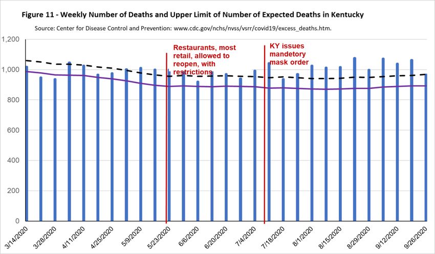
Figure 11 shows the total number of deaths per day in Kentucky—the blue bars—along with a
black dashed line showing the upper threshold of the expected number of deaths in Kentucky in a week
during this period, and the solid purple line showing the average expected number of deaths in Kentucky
in a week during this period. The first measure of excess deaths—the lower bound estimate—is measured
as the difference between the top of the blue bar and the dashed line in weeks where the top of the blue
bas lies above the blue bar. For example, for the week of 5/9/2020 the top of the blue bar, or the actual
number of deaths, is at 1,011 while the black dashed line is at 979, so the number of excess deaths in
Kentucky in this week is 32 (1011-979). In the week of 6/6/2020 the lower bound estimate of the number
of excess deaths in Kentucky would be 0 because the top of the blue bar lies below the black dashed line.
8
See www.cdc.gov/nchs/nvss/vsrr/covid19/excess_deaths.htm#dashboard
22The second measure of excess deaths—the upper bound measure—is the difference between the
top of the blue bar and the solid purple line in weeks where the top of the blue bar is above the solid
purple line. For example, again looking at the week of 5/9/2020 the purple line is at 909 so the upper
bound estimate is 102 (1011-909). Over this period, the only weeks in which the number of excess deaths
is 0 using the second measure are the weeks of 3/21/202 and 3/28/2020.
Figure 11 shows that for several weeks early in the pandemic the number of excess deaths is zero
based on the upper threshold estimate of the number of deaths, even though there were people were dying
from COVID-19. As we mentioned above, the likely reason for this is that with non-essential businesses
closed and many people staying at home there were less deaths due to other things such as automobile
accidents, violent crime or other infectious diseases such as pneumonia or influenza. Starting in May,
however, the number of actual deaths consistently exceeds the upper threshold of the expected number of
deaths as well as the average expected number of deaths.
Summing the measure of excess deaths based on the upper threshold of the expected number of
deaths between the beginning of April and the end of September there were 891 excess deaths in
Kentucky. This is below the reported number of COVID-19 deaths of 1,065, consistent with this estimate
of excess deaths being of lower bound of the number of COVID-19 related deaths. However, summing
the number of excess deaths in Kentucky over this period based on the average expected number of
deaths in the State indicates there were 2,470 excess deaths over the period, consistent with this being an
23upper bound on the estimate of the number of COVID-19 related deaths. The fact that the reported
number of deaths lies between the two bounds suggested that the reported number of COVID-19 related
deaths is a reasonable estimate of the actual number of COVID-19 related deaths and therefore that the
reported number of COVID-19 related deaths is a more accurate measure of the spread of the disease in
the state than the reported number of new cases.
Figure 12 plots an estimate of the case fatality rate (CFR) and the infection fatality rate (IFR).
The case fatality rate is the number of people who die from COVID-19 divided by the number of people
who are reported to have COVID-19. The infection fatality rate is calculated as the number of people who
have died from the disease divided by the estimated number of people who contracted from the disease.
The CDC timeline discussing how the virus affects individuals indicates that the time to death for people
who die of the disease is between 15 to 30 days. Therefore, to calculate the case fatality rate (the red line)
we divide the number of COVID-19 reported deaths on a given day by the number of new reported cases
Figure 12 - Estimated Case and Infection Fatality Rate in Kentucky, 7-day moving average
14%
12% Restaurants, most retail allowed KY issues mandetory
to reopen, with restrictions. mask order
10%
8%
Case Fatality Rate
Infection Fatality Rate
6%
Source: The Covid Tracking Project, https://covidtracking.com/
and The Institute of Health Metrics and Evaluation,
www.healthdata.org/
4%
2%
0%
18 days earlier. To calculate the infection fatality rate (the blue line) we divide the number of reported
COVID-19 deaths on a day by the estimated number of true infection 18 days earlier. The estimated case
fatality rate is around 10% at the start of the pandemic, but then falls quickly and seems to level off at
around 1.55 towards then end of the period. This is what one would expect since early in the period we
were only testing the sickest people who would be more likely to die from the virus. In contrast, the
estimated infection fatality rate is fairly constant over the entire period at around 0.7%. This estimate of
the IFR is nearly identical to the estimated population IFR reported in Meyerowitz-Katz and Merone
(2020) (an IFR of 0.68%) and is the same as the estimated population IFR reported by Levin et al. (2020),
24You can also read