Politicians' neighbourhoods: Where do they live and does it matter?
←
→
Page content transcription
If your browser does not render page correctly, please read the page content below
NICEP Working Paper: 2021-03

  Politicians’ neighbourhoods: Where do they
             live and does it matter?

                                 Olle Folke
                               Linna Martén
                              Johanna Rickne
                              Matz Dahlberg

Nottingham Interdisciplinary Centre for Economic and Political Research

School of Politics, The University of Nottingham, Law & Social Sciences Building,
University Park, Nottingham, NG7 2RD
ISSN 2397-9771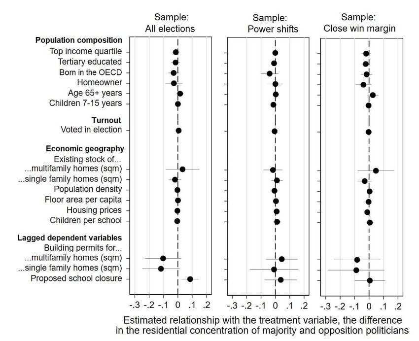
Politicians’ Neighborhoods: Where do they Live
                  and does it Matter?∗

           Olle Folke†‡           Linna Martén§   Johanna Rickne§§
                                    Matz Dahlberg¶

                                         April 2021

                                           Abstract

   This paper studies the political economy of local politicians’ neighborhoods. We
   use detailed population-wide data on the location of politicians’ and citizens’ homes
   and their socioeconomic traits. We combine this information with neighborhood-
   level data on building permits and proposals to close schools. A descriptive analysis
   uncovers that politicians live in neighborhoods with more socio-economically ad-
   vantaged people and more of their own party’s voters. Next, we analyze whether
   having politicians in a neighborhood reduces the likelihood that local public “bads”
   are placed there. This analysis compares home neighborhoods for politicians with
   different degrees of political power (ruling majority or opposition) and where power
   was won in a close election. We find negative effects on approved building permits
   for multifamily homes and proposals to close schools. This result is most likely ex-
   plained by undue favoritism. We conclude that local politicians live in advantaged
   neighborhoods that they shield from local public bads.

    ∗
      The order of authors is randomized. We thank Katrin Uba for kindly sharing data on school
closures, and Ellen Westman Persson, Hannes Skugghall, Christoffer Eriksson, and Dany Kessel
for excellent research assistance. We also thank Jens Olav Dahlgaard and seminar participants
at the MSU Workshop on Political Economics (2018), Universitat de Barcelona, Uppsala Univer-
sity, U.C. San Diego, the Madrid Political Economy Workshop (2020), Universitat Autonoma de
Barcelona, The DPSA (2020), and Urban Lab at Uppsala University for useful comments. We
gratefully acknowledge financial support from the Knut and Alice Wallenberg Foundation, the
Swedish Research Council, Riksbankens Jubileumsfond, and Handelsbankens Forskningsstiftelser.
    †
      Department of Political Science, Uppsala University
    ‡
      Swedish Institute for Social Research, Stockholm University
    §
      Nottingham University and CEPR
    ¶
      Institute for Housing and Urban Research and Department of Economics at Uppsala University,
      CESifo, IEB at Barcelona and VATT Helsinki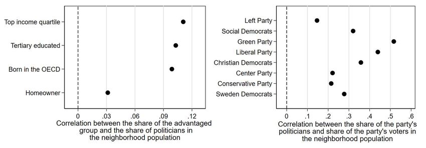
1     Introduction
Geography is at the heart of politics. Many of the most important political decisions
are not about which public goods the government should provide, but where it
should locate them. This paper examines a specific geographic aspect of politics
– the neighborhoods in which politicians live within their electoral district. We
describe what types of neighborhoods these are. We then test whether the spatial
distribution of politicians’ homes affect their decision-making.

We draw on unique data from Sweden to provide new information about the type
of people who become politicians. To date, research on descriptive political rep-
resentation has focused on politicians’ personal traits. For example, prior studied
have found that women, ethnic and racial minorities, and working-class people are
chronically under-represented in political assemblies around the world.1 Politicians’
neighborhoods have been largely overlooked.2 Contextual theories of politics un-
derscore the importance of these surroundings. A person’s political preferences are
a function not only of their own traits, but also the traits and predispositions of
individuals in their proximity (Huckfeldt et al., 1993; Enos, 2017).

Our study of spatial decision-making uncovers a new political determinant of these
decisions – the location of politicians’ homes. The analysis targets local politicians
who make crucial decisions about local development and land use. These local of-
ficials decide where (and which type of) buildings can be constructed. They also
choose where to place public services like schools, public transportation, parks, af-
fordable housing, and cultural and sports facilities. Although these services provide
value for the surrounding society, the directly affected neighborhoods might resist
   1
     Some recent examples from this large literature include Carnes and Lupu (2015), Dancygier
(2017), Thomsen and King (2020), Carnes (2020), and Barnes et al. (forthcoming).
   2
     Bartanen et al., 2018 show that school board politicians in Ohio live in areas with above-
average household income and house values, a higher percentage of people with post-secondary
qualifications, and below average proportions of racial and ethnic minorities. The study most
closely related to ours is the contemporaneously written paper by Harjunen et al. (2021), which
shows that Finnish politicians live in richer neighborhoods that are less likely to experience school
closures.

                                                                                          2
specific projects, for example apartment buildings (Hankinson, 2018; Trounstine,
2020). We use the terminology local public bads to describe this phenomenon.

Swedish administrative records contain highly accurate demographic and economic
variables for the country’s entire population. We combine this data with a complete
list of the universe of municipal politicians. Sweden’s 290 municipalities are divided
into voting precincts of similar size following boundaries in the natural environ-
ment. We use information on the home precinct of every citizen and politician to
approximate local neighborhoods. At the neighborhood level, we add datasets for
two common local public bads that fall under the purview of municipal politicians
– (1) all approved building permits for new multifamily and single-family housing
(from the Building Permit Register) and (2) proposed school closures (collected in
a survey of municipalities by Uba (2016, 2020) that the authors extended to more
recent years).

Our descriptive analysis shows that politicians’ neighborhoods generally share two
key features. First, they have larger shares of socio-economically advantaged groups
– more high-income earners, residents born in OECD (Organisation for Economic
Co-operation and Development) countries, homeowners, and people with tertiary
education. This pattern is stronger for politicians in center-right parties than for
those on the ideological left. These descriptive findings also hold when we use the
detailed coordinate information in the data and construct smaller-scale, individu-
alized, neighborhoods. Second, politicians tend to live in neighborhoods in which
their party received a disproportionally large share of votes.

We find that the location of politicians’ homes influences decisions about local public
bads. During election periods, fewer building permits for multifamily homes are
approved, and fewer proposals to close schools are made, in neighborhoods in which
more politicians from the local majority party vs. the local opposition live. We
see no effect for single-family homes, which local residents are typically less likely
to resist (Einstein et al., 2019; Hankinson, 2018; O’Grady, 2020). We quantify

                                                                              3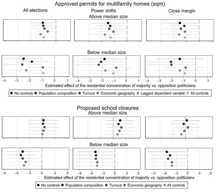
the magnitude of the results by calculating the average impact of a switch in the
governing majority. We find that a shift in the governing majority leads to a re-
allocation of 14% of the new construction of multifamily homes and a 19-percentage-
point drop in the likelihood of proposed school closures in neighborhoods dominated
by politicians from the new majority.

We argue that our estimates should be interpreted causally. The analysis compares
political decisions on local public bads for neighborhoods that have the same number
of politicians but with different degrees of power. We also restrict the sample to
municipalities in which this power, i.e. being in the ruling majority, was decided by
a close election. In our sample of three election periods, many municipalities had
close elections that quasi-randomly brought left-wing and center-right coalitions to
power about half of the time. We add an extensive amount of data from additional
government registers and other sources to test the core assumption of the empirical
strategy. This analysis shows that the relative power of the politicians who live in a
neighborhood is statistically independent of numerous proxies for anticipated public
protests and economic profitability rationales for the spatial placement decisions of
local public bads.

Does the location of politicians’ homes matter because politicians co-reside with their
party’s voters? An extended analysis of the mechanisms suggests that this is not the
case. Flexible control variables for the spatial allocation of voters do not affect our
main results. By exclusion, this indicates that (conscious or unconscious) favoritism
of the home neighborhood is a more likely explanation. Politicians’ impartiality
might be compromised by economic self-interest, localized information flows, or
personal interactions with aggrieved neighbors.

Our results contribute to the large literature on the political determinants of the
spatial distribution of public funds. They echo earlier findings that electoral dis-
tricts with more politicians receive more public funds in majoritarian systems (e.g.,
Ansolabehere et al., 2002; Knight, 2008; Elis et al., 2009). They are also in line with

                                                                              4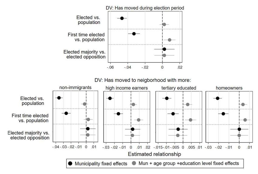
the results from previous studies of proportional representation (PR) systems, which
have concluded that the regional allocation of funds favors politicians’ hometowns
(Fiva and Halse, 2016a; Baskaran and Lopes da Fonseca, 2018). We add the impor-
tant insight that within electoral districts, decisions about land uses with negative
local externalities are strongly affected by the location of politicians’ homes.

We contribute to two ongoing, and related, scholarly debates. First, we add to
the literature on how parties affect policy (i.e., does it matter who is in power)
by showing that who is in government affects the allocation of public bads within
electoral districts (Ferreira and Gyourko, 2009; Gerber and Hopkins, 2011; Folke,
2014). Secondly, we add to the debate on the effect of descriptive representation by
showing that yet another trait, the neighborhood where a politician lives, matters for
policy outcomes (Chattopadhyay and Duflo, 2004; Hyytinen et al., 2018; O’Grady,
2019). Naturally, these two finding also have implications for vote choices. At a
higher level, they imply that vote choices matter. At a more detailed level, they
imply that voters benefit from casting votes for parties with politicians living in
their neighborhood, providing a rationale for the so-called friends and neighbors’
effect.

Our results have important implications for the broader academic discussion of
neighborhood traits. Prominent research in economics and other disciplines has
underscored that local living conditions are crucial determinants of the life trajecto-
ries of adults and children (Chetty et al., 2016; Chetty and Hendren, 2018; Johnston
and Pattie, 2014). We show how local political factors help shape these conditions.
In turn, our results suggest that local political institutions are a potentially fruitful
area of policy intervention to improve the level and equity of local living environ-
ments. The increasing geographic segregation and inequality observed around the
world highlight the urgency of these findings (Storper, 2018).

                                                                                5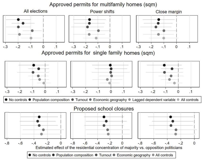
2     Political economics of politicians’ neighborhoods
This section builds on previous research to develop three hypotheses about the polit-
ical economics of politicians’ neighborhoods. The first two, discussed in Section 2.1,
concern the neighborhoods’ characteristics: we predict they have socio-economically
advantaged populations and larger vote shares for the politician’s party. Section 2.2
examines the third hypothesis – that politicians reduce the allocation of local public
bads to their own neighborhoods.

2.1    Traits of politicians’ neighborhoods

The supply of and demand for politicians can both help us understand where they
are likely to live. On the supply side, affluent people are more likely to participate in
politics and (of course) to live in well-off areas. Socioeconomic advantage encourages
people’s political activity by offering skills, money, and networks (Verba and Nie,
1972; Brady et al., 1995; Norris and Lovenduski, 1995). Advantaged groups might
also enter politics because they have more to gain. Previous studies report that
homeowners are more active than non-homeowners in local politics (Yoder, 2020),
likely because the value of their homes is directly tied to local political decisions.

On the demand side, party behavior may exacerbate the selection of affluent citizens.
For example, parties may want immigrant minorities as members, but be reluctant to
let them run in competitive districts (e.g., Blomqvist, 2005). Such party behavior
likely reinforces the well-established pattern that politicians tend to have higher
incomes and education than the people they represent (Dal Bó et al., 2017; Bhusal
et al., 2020).

Two centrifugal forces also disperse politicians’ homes across rich and poor neigh-
borhoods. The first is parties’ organizational structures. Local parties often consist
of clubs spread out among neighborhoods that recruit members, hold meetings,
and oversee the day-to-day aspects of election campaigns. To the extent that clubs

                                                                                6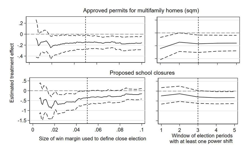
recruit members and nominate candidates, the decentralized nature of party orga-
nizations leads to the dispersion of politicians’ homes.

The second centrifugal force is electoral incentives: voters may prefer candidates
who live close to them. One strand of research has observed that factors ranging
from personal friendships to shared political preferences and local pride generate a
“friends and neighbor voting effect” (Key, 1950; Lewis-Beck and Rice, 1983). An-
other strand has observed that voters “look for locals” because they interpret local
ties as knowledge of the area’s needs and concerns (Cain et al., 1987; Carey and
Shugart, 1995). The findings from these studies imply that even geographically
centralized parties might benefit from recruiting politicians from an array of neigh-
borhoods (Latner and McGann, 2005). Although this preference for neighbors has
mainly been observed in candidate-centered systems, there is also supportive evi-
dence from countries that rely on party-based voting (reviewed by, e.g., Arzheimer
and Evans, 2012; Erlingsson and Öhrvall, 2018).3

While parties’ organizational structures and electoral incentives work to geograph-
ically disperse politicians’ homes across neighborhoods, advantaged groups’ self-
selection into candidacy and parties’ skewed recruitment likely dominate. We there-
fore predict that:

Hypothesis 1a: Politicians live in socio-economically advantaged neighborhoods.

Politicians from different parties are likely to live in different parts of town, since so-
cial classes are segregated across neighborhoods and the ideological divisions between
them underpin the traditional distinction between left and right parties (Lipset and
Rokkan, 1967). Socioeconomic cleavages have been found to determine both voting
(e.g., Kitschelt, 1994) and political candidacy (O’Grady, 2019; Dal Bó et al., 2017,
   3
     For instance, Campbell and Cowley (2014) randomize UK candidates’ local residency, gender,
age, occupation, and education, and find that occupation and place of residence have the largest
effects. Also in the UK, Arzheimer and Evans (2012) analyze observational data and show that
voters prefer politicians who live closer to them, conditional on other observable traits. Jankowski
(2016) shows that voters actively search PR ballots for information about which politician lives in
their electoral district and are more likely to vote for that person.

                                                                                          7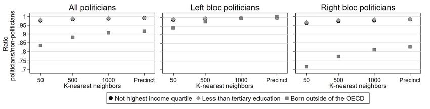
c.f. Katz and Mair, 2009). To the extent that (1) parties systematically recruit
politicians from different social groups and (2) these groups are spatially segregated
across neighborhoods, we predict that:

Hypothesis 1b: Politicians live in neighborhoods in which their party has a larger
vote share.

2.2    Local public bads and politicians’ neighborhoods

We follow Aldrich (2008) and define a local public bad as a project that benefits the
surrounding area but has negative (perceived) effects on the immediate vicinity. The
general positive effects give politicians an incentive to place these bads somewhere
in the municipality. But resistance from neighborhoods makes their exact placement
a contentious decision.

The two local public bads we study exemplify such a political trade-off. The con-
struction of new housing benefits a municipality by bringing in new taxpayers and
alleviating housing shortages. It also makes the city more affordable and protects
the quality of life of low- and middle-income families (see Been et al., 2019 for
a review). But the closer to a person’s home the proposed construction is, the
greater the opposition (Tighe, 2010; Hankinson, 2018). This opposition is based on
perceived threats to property values, competition for local public goods, physical
disruptions including blocking natural light and views, and anti-poor sentiments or
racial prejudice (Larsen et al., 2019; Trounstine, 2020; Tighe, 2010; Einstein et al.,
2019). These concerns generally grow with the size of the construction, and oppo-
sition to multifamily homes is generally more intense than to single-family homes
(Einstein et al., 2019).

School closures are a cost-saving measure that benefits a municipality by eliminating
schools with few students, weak performance, or large investment needs (e.g., Åberg-
Bengtsson, 2009; Witten et al., 2003). But for people in the school’s immediate

                                                                             8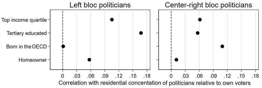
neighborhood, closures mean longer commutes for children (Witten et al., 2003) and
the removal of an arena for local identity building and cultural events (Kilpatrick,
2002).

We believe the location of politicians’ homes may have a causal effect through two
main mechanisms. The first is political representation. If Hypothesis 1b (that politi-
cians live in neighborhoods where their parties have larger vote shares) is correct,
parties could be delivering benefits to these neighborhoods as part of a clientelis-
tic exchange for votes. However, this is unlikely in advanced democracies with PR
systems.4 Programmatic considerations might be more important and arise if party
platforms cater to the economic interests of different socio-economic groups. Lo-
cal public bads might form part of these agendas. For example, constructing new
apartments in a neighborhood with more right-leaning (affluent) people might serve
a left-leaning party’s agenda of economic redistribution.5

The second mechanism is favoritism: having politicians’ homes in a neighborhood
might cause fewer local public bads to be placed there. Favoritism can arise from
both conscious and unconscious thought processes. At the most conscious level,
politicians may act in pure self-interest. By protecting their neighborhood from
local public bads, they also protect the (perceived) value of their own property, or
that of friends and relatives who live there. Information flows may lead to favoritism
in a more unconscious way. Politicians cannot obtain full information on the costs
and benefits of all placement options for every local public bad, and their own
neighborhoods’ perceptions are likely to skew the information they receive. People
   4
      For example, a careful study of the allocation of spending in Spanish municipalities finds no
evidence that parties allocate stimulus funds to more partisan neighborhoods (Carozzi and Repetto,
2019). Likewise, using Swedish data, Dahlberg and Johansson (2002) reject the hypothesis that
incumbent governments purchase votes by investing in regions where they already have high levels
of support (i.e., no support for the prediction from the model in Cox and McCubbins (1986)).
    5
      In majoritarian systems, politicians might cater to personal constituencies in the form of
targeted sub-constituencies within electoral districts (Fenno, 1977), for instance by granting pork-
barrel favors via committee service, which could include the type of decisions on local public bads
studied in this paper. However, personal constituencies are minimal in closed-list PR systems (Fiva
and Halse, 2016b; Karlsson, 2018).

                                                                                          9
obtain information via social networks, and interactions with neighbors serve as
vehicles for the transmission of political information and guidance (Huckfeldt and
Sprague, 1987; Huckfeldt et al., 1993). These information flows deliver the negative
localized public opinion to the politician, for example on the perceived damage of
closing a school, or environmental concerns about housing construction.
To the extent that neighbors protest the local public bads, a politician could perceive
citizen opposition to be more intense if it occurs in his or her own neighborhood (as in
Huckfeldt and Sprague, 1987). Put differently, neighbors’ direct access to politicians
might create a local accountability effect around visible projects (following political
economics frameworks such as Besley, 2006).6 It is also possible that a politician’s
home functions as an opportunity structure for protests and thereby makes them
more likely (Meyer and Minkoff, 2004).
Given the ideas summarized in this section, which connect politicians’ homes to
fewer local public bads due to political representation and favoritism, we predict
that:
Hypothesis 2: The presence of politicians’ homes in a neighborhood reduces the
likelihood that local public bads will be placed there.
At least three other aspects may affect the placement of public bads, which might
also correlate with the placement of politicians’ homes. First, politicians might live
in neighborhoods where the placement is less politically feasible because it generates
more public protest (e.g., Aldrich, 2008). Second, they might live in neighborhoods
with more swing voters who are willing to switch parties between elections, which
would create a different type of political rationale for shielding the neighborhood.
Third, politicians might live in neighborhoods in which it is less economically prof-
itable to place the local public bad. In the empirical sections that follow, we develop
an identification strategy to address omitted variable bias from these sources.
6
Jankowski (2016) argues that an expectation of greater accountability to the local population
motivates people to preference vote for a politician who lives in their electoral district.
103 Swedish municipalities
Municipalities are Sweden’s lowest administrative level of government. They are
responsible for key policy areas like child care, K-12 education, elder care, and
local infrastructure, which together employ approximately 25% of the labor force.
Municipalities also set their own income tax rates, usually around 20% of income.
Each municipality is governed by a municipal council with between 21 to 101 mem-
bers (the median is 41), depending on population size. Councilors are ”leisure
politicians” who receive small lump sum payments to attend meetings while holding
regular jobs (Dal Bó et al., 2017). There is no evidence that winning a council seat
generates monetary gains (Berg, 2020) that would, for example, allow the politician
to move to a wealthier neighborhood.
Local elections take place every four years. People vote in their electoral precinct,
and turnout is usually high at around 90% of the 18+ population. Under the flexible-
list PR system, voters chose between parties but can also cast a voluntary preference
vote. Given the low share (approx. 30%) and high vote threshold, individuals rarely
win a council seat because of their preference votes (Folke et al., 2016).
Councilors are elected in multi-member districts. Two-thirds of Sweden’s munici-
palities have one district, and most others have two. We ignore these administrative
borders since they lack the typical functions of electoral districts. Candidates are
not required to live in the district they represent, and parties almost always field
the same ballot throughout the municipality.
There are some indications that geographic concerns affect the results of local elec-
tions. At least in larger municipalities, many political parties have regional clubs
that serve as the initial point of entry for new members. These clubs form the basis
for political meetings and grassroots activism. They also function as the organiza-
tional basis for candidate nominations. Ballot papers typically list the politician’s
neighborhood next to their name, along with their age and occupation (74% of the
11ballots in our sample period contained this information, authors’ calculation).
We use electoral precincts to approximate neighborhoods. The median number of
precincts per municipality is 10, and there are about 6,000 precincts in the country.
Two features make precincts suitable proxies for neighborhoods. The first is their
similarity in terms of size. In our sample period, the median precinct has 1,200
adult inhabitants, and 90% of the precinct-year observations fall within the range
of 644 to 1,799.7 Second, precinct borders usually follow the intuitive divisions of
neighborhoods, such as water divisions (streams or islands) or infrastructure (large
roads or other hard-to-pass elements). This is because each precinct has a single
polling station, and the borders are drawn to facilitate physical access to the polling
station.
Parties’ seat shares in the council correspond to their vote shares. A single party
can form a governing majority if it obtains more than 50% of the seats; otherwise
parties come together in coalitions to reach this threshold. A crucial fact for our
empirical analysis is that governing majorities nearly always comprise parties from
the same ideological bloc – left (Social Democrats, Left Party, Green Party) or
center-right (Conservatives, Center Party, Liberal Party, Christian Democrats). The
Sweden Democrats, Sweden’s radical right party, played an unimportant role in local
coalition formation during our study period.
The governing majority controls the municipality’s political agenda and appoints all
executives, including the mayor and policy committee chairs. The council decides
on our two local public bads: the education and construction policy committees
send formal proposals for school closures and building permits to it. Bureaucrats
are involved in both processes but do not make formal proposals or take decisions,
with the exception of small-scale and routine building permits.8
7
Appendix Figure A3 shows the full distribution of precinct sizes and precincts per municipality.
8
Swedish law prohibits the delegation of substantive decisions on building permits to bureau-
crats, and in many municipalities bureaucrats are not allowed to make rejection decisions (Boverket,
2020).
124 Data
We use population-wide administrative data that covers all local politicians and all
permanent residents in Sweden. Variables include education level, income, region
of birth, and the electoral precinct of residence. Statistics Sweden collects this data
from administrative records and makes it available for research in a de-identified
format. However, due to its sensitive nature and legal limitations the data is not
publicly available. Table A1 summarizes our final precinct-level data set.
Before each election, political parties must report their candidate lists (ballots) to the
government and they also provide all candidates’ personal ID codes. The Electoral
Agency then collects data on which candidates were elected to the municipal council.
We have access to these data for three elections (2002, 2006, and 2010), which totals
39,312 election-person observations of municipal councilors.
The Electoral Agency also maintains precinct-level data on election results. We use
variables for turnout and the number of voters for each party. There are 17,427
precinct-year observations in our three cross-sections of data, and more than 90%
of these precincts are inhabited by at least one elected politician.
The property register contains data on existing properties 1998-2014, while data
on approved housing construction come from the yearly register of building permits
(1998–2014).9 The register contains all approved permits for a floor space above 25
m2 , which number approximately 7,300 per year. Each permit details the electoral
precinct, month and year of approval, number of housing units, and total floor space,
and whether it is for a single-family or multifamily home.
Data on formal proposals for public primary school closures was kindly shared by
Katrin Uba (Uba, 2016, 2020) for the years 2002–2009; we used the same methodol-
ogy to extend the data to 2010–2014. We requested municipalities to submit a list of
proposals and obtained a 60% response rate. We then followed Uba’s method of us-
9
The Swedish Planning and Building Act of 1987 requires municipalities to report this data.
13ing Google searches and newspaper archives to systematically search for additional
proposals. This information was merged with a dataset compiled by the Swedish Na-
tional Agency for Education, which contains all Swedish schools and their addresses.
We dropped cases where a school address was missing in the national register or we
could not find a match based on the school name (this happened for 3% of schools
with a closure proposal).
While the building permits can be matched exactly to the individual-level data
by precinct, the schools are merged with the precinct grid using 500 × 500-meter
geocoded identifiers (details available in Appendix Section A.1). We use the same
method to merge our dataset with information on homeownership, from the database
GeoSweden, and information about house prices from Swedish network of real estate
agents.
5 Descriptive analysis of politicians’ neighborhoods
We use a descriptive analysis to test whether politicians live in neighborhoods with
more socio-economically advantaged residents (Hypothesis 1a) or more voters from
their own party (Hypothesis 1b). Setting up this description is a bit more em-
pirically complicated than one might think. Comparing neighborhoods with and
without politicians is not an option, because they live in nine out of ten neighbor-
hoods in the average municipality. We instead use a concentration measure across
neighborhoods to capture how different groups are geographically concentrated in
specific neighborhoods. This measure compares the spatial distributions of a focal
group (such as high-income earners) to a non-focal group (for example, non-high
earners). The measure is the neighborhood sub-component of the most commonly
used measure of segregation, the Dissimilarity index (Massey and Denton, 1988).10
PN Xn
10
This index is defined as: Dm = 12 n=1 | X m
− YYm
n
|. The index measures the proportion of the
focal group that would have to move to another neighborhood as a share of the municipality’s total
population in order for the group to be completely evenly spread out among all neighborhoods.
14Our concentration measure is defined as:
Xn Yn
Cn,m = Xm
− Ym
We measure the size of focal group X in each neighborhood n and municipality m.
We benchmark its distribution against people who are not part of the focal group
(Y ); together, these two groups make up 100% of the population.
Xn
The first term of the measure ( Xm
) is the share of the focal group that resides in
the neighborhood (for example, 20% of the municipality’s high-income earners or
politicians). The second term is the share of the non-focal group that lives there
(for example, 10% of non-high-income earners or non-politicians). In this example,
the concentration measure takes the value 0.1, which demonstrates that the focal
group is over-represented in the neighborhood compared to the non-focal group by
10 percentage points. Appendix subsection A.3 shows a more detailed example. The
concentration measure tells us the proportion of the focal group that would need
to leave or enter each neighborhood to make the groups evenly spread out across
neighborhoods.
Our concentration measure has at least three attractive features. First, and most
importantly, it is independent of the size of the focal group in the municipal popu-
lation. This is particularly important when we compare the distributions of small
groups (such as politicians) to those of large groups (such as people born in an OECD
country). Second, the measure can be easily adapted to calculate distributions of
variables other than people, such as local public bads. If we use local public bads
as the focal group and the full population as the non-focal group, the concentration
measure tells us how much more, or less, of the local public bad a neighborhood
has relative to its share of the municipal population. Finally, the municipality av-
erage of our concentration measure is, by design, zero. Thus our analysis relies on
within-municipality variation.
To test the two hypotheses, we first calculate the concentration measure for politi-
15cians and then for four focal groups of socio-economically advantaged people. We
then relate these to each other by calculating correlation coefficients. This non-
parametric method has an important advantage. It normalizes the relationship so
that the coefficient can be interpreted as the variation in one variable, in standard
deviations, that follows from changing the other variable with 1 standard devia-
tion.11
When calculating the correlation coefficients, and in the rest of the analysis in the
paper, we adjust for municipality size with weights. Large municipalities have more
neighborhoods, and the three largest cities account for 16% of the precinct-year ob-
servations. Weighting observations with the inverse number of neighborhoods gives
each municipality equal importance in the calculation of the correlations, regardless
of its size. This weighing does not affect the substance of our findings.
Results: Socio-economic advantage. We define four focal categories of socio-
economically advantaged individuals: (1) people in the Top income quartile, i.e. the
top 25% of the national distribution of disposable income, (2) Tertiary educated
people who completed at least one semester of tertiary education, people (3) Born
in the OECD, and (4) Homeowners who own rather than rent their housing unit.
The categorization of OECD-born people compared to others captures the main
delineation of socio-economic status based on race/ethnicity in the Swedish con-
text. Immigrants from inside the OECD are mostly labor immigrants with similar
outcomes to native-born citizens, while those from outside the OECD are mostly
refugees (Åslund et al., 2017; Fasani et al., 2018). More details about the variables
are listed in Appendix section A.2.
Figure 1 shows the correlation coefficients between the concentration of politicians
11
Another advantage is that by relating two spatial distributions to each other for a given set
of neighborhoods within a municipality, we avoid the critique that is sometimes raised against
the Dissimilarity Index, namely that it is sensitive to both the number of neighborhoods within
a municipality and to exactly how the borders of the neighborhoods are drawn. Relating one
concentration measure to another can, of course, also be done with regression analysis, which
yields the same conclusions.
16and the concentration of the four advantaged groups. We pool all politicians in
the left-most graph and split the sample by political bloc (left and center-right) in
the other two graphs. In the full sample of politicians, their homes are co-located
across neighborhoods with the homes of more socio-economically advantaged citi-
zens across all four groups, which confirms Hypothesis 1a. Politicians’ neighbor-
hoods have greater concentrations of high-income people, people with tertiary ed-
ucation, homeowners, and OECD-born residents. For high-income, high-education,
and OECD-born residents, the correlation coefficients are about 0.15. This means
that a 1-standard-deviation higher concentration of municipal councilors is associ-
ated with a 0.15-standard-deviation larger concentration of the advantaged group.
The correlation with homeowners is also positive, but half the size at 0.07.
Figure 1: Correlations between the residential concentration of politicians vs. socio-
economically advantaged groups.
Note: The figure shows the correlation coefficient for the concentration of politicians across neigh-
borhoods within municipalities, and the concentration of citizen types across those same neighbor-
hoods. The exact calculation of these concentration measurements is explained in section 5. Ob-
servations are weighted by the inverse of the number of precincts in the municipality (N=17,427).
The split by political ideology reveals a substantial difference. Center-right politi-
cians’ homes are more strongly concentrated in advantaged neighborhoods than
left-wing politicians’ homes across all four measurements of advantage. Another
striking result is that left-wing politicians are not counterbalancing the locations of
center-right politicians in terms of living in the opposite types of places. The skew
of politicians’ residences as a whole toward advantaged neighborhoods comes from
a strong skew of the center right and a zero (or at least much weaker) skew for the
17left.
The results across the political blocs beg the question of whether politicians’ homes
are skewed compared to the distribution of their own voters. Center-right politicians
might be more over-represented in more affluent neighborhoods than the left bloc,
but still be more similar to their own voters than politicians from the left bloc. We re-
calculate the concentration measures for the politicians, replacing all non-politicians
as the non-focal group with non-politicians who voted for the political bloc. This
analysis shows that both left and center-right politicians are more likely than their
own voters to live in socio-economically advantaged neighborhoods (see Figure A5).
For three of the four groups (high income, high education and homeowners) this
pattern is stronger for left bloc politicians.
While we might suspect that politicians live in more advantaged areas because their
political office helped them afford to move there, we replicate Figure 1 for residential
neighborhoods in election years for first-time councilors and demonstrate that this
is not the case. This graph is strikingly similar to Figure 1 (see Figure A6). In
Appendix Section A.5, we also verify that councilors are not more likely to move
than the average citizen in the municipality, or more likely to move to a more
advantaged neighborhood. We also show the absence of different moving patterns
between majority and opposition politicians, which is important for the later analysis
of local public bads.
Politicians might live in advantaged neighborhoods because they are themselves
advantaged. Unfortunately, there is no straightforward way to find out if this is the
case. We can, however, note that large proportions of politicians belong to affluent
groups. Municipality averages show that 54% of politicians have a high income
compared to 20% of the adult population; 48% vs. 24% have tertiary education;
and 97% vs. 96% are OECD born. This over-representation exists in both ideological
blocs but is more pronounced in the center-right bloc.12
12
Among left-bloc politicians, 52% have a high income, 41% a high level of education, and 96%
18In the Appendix we show that our results are not sensitive to splitting the sample by
median municipality size (see Figure A6) or to replacing the concentration measure
with simple shares of politicians, high-income people, etc. in the neighborhood’s
population (see Figure A8). There are potential drawbacks with our approximation
of neighborhoods as electoral precincts. Even if precincts follow natural boundaries,
they might be larger (or smaller) than the “natural” neighborhoods of a city. The
precincts may also be more appropriate for people who live in its center rather
than at the border. We construct a sensitivity test for these issues using our fine-
grained geocoded data. The coordinate information for people’s homes allows us
to calculate individualized neighborhoods by drawing concentric circles around each
person based on the k-nearest neighbor approach (Östh, 2014). We describe the
approach and the results in detail in Appendix section A.4. They confirm Hypothesis
1A by showing that politicians live in socio-economically advantaged neighborhoods,
and this pattern becomes stronger when we use a more narrow definition of each
persons’ neighborhood.
Results: Voters. Figure 2 plots the residential concentration of politicians from
each of the eight parties in the Swedish parliament against the residential concentra-
tion of their voters. When we measure the concentration of voters for a party, we use
voters for all other parties as the non-focal category. An alternative approach, which
yields highly similar results, expands this reference group to also include people who
did not vote (see Figure A7).
OECD born. In the center right, 59% a have high income, 57% a high level of education, and 98%
OECD born.
19Figure 2: Correlations between the residential concentration of each party’s politi-
cians and voters
Note: The figure shows the correlation coefficient for the concentration of politicians across
neighborhoods within municipalities, and the concentration of voters for the same party.
Section 5 explains how these concentration measurements were calculated. Observations
are weighted by the inverse of the number of precincts in the municipality. N=17,427
neighborhood-year observations in three yearly, pooled cross-sections, 2002, 2006, and 2010.
All parties have positive correlation coefficients. This confirms Hypothesis H1b by
showing that politicians from all parties are more likely to live in a neighborhood
where a larger proportion of the party’s voters live. The coefficients are 0.3–0.4 for
most parties, which means that a 1-standard-deviation higher concentration of the
party’s voters is associated with a 0.3–0.4 standard deviation higher concentration
of its politicians. Two parties, the Left Party and the Sweden Democrats, stand out
with weaker correlations (0.14 and 0.21), while the Green Party stands out with a
stronger one (0.55). The results in this sub-section are robust to the same sensitivity
tests that we used in the previous section (see Figure A7 and Figure A8).
206 Politicians’ homes and the spatial allocation of
local public bads
We select all building permits for housing and divide them into two categories:
multifamily homes, which are apartment buildings, and single-family homes.13 The
average municipality approved 5.7 multifamily home permits per election period,
comprising 231 apartments, and 103 permits for single-family homes for a total of
141 housing units. The average permit for multifamily homes had 17 times more floor
space than the average permit for single-family homes. In all three election periods,
nearly two-thirds of municipalities approved at least one permit for multifamily
homes, and more than 98% approved at least one permit for single-family homes.
Using additional data on completed buildings, we can ascertain that more than
95% of all permits resulted in finished buildings within eight years of the approval
(authors’ own calculations, see footnote 14).
For each category of permits, we sum up the amount of approved floor space in
each neighborhood and election period, starting in October in one election year
and ending in September of the next election year. We then calculate the concen-
tration of approved floor space across neighborhoods within each municipality. As
mentioned above, we measure the concentration of permits relative to the distribu-
tion of the municipal population across neighborhoods. The concentration measure
should therefore be interpreted as the neighborhood’s share of all the approved floor
space in the election period relative to its share of the municipal population. Figure
A10 illustrates the distributions of both concentration measures for each type of
building permit.
For school closures, we create a binary dependent variable that takes the value 1 if
there was a proposal to close at least one school in a neighborhood during the election
13
Single-family homes include small proportions of semi-detached houses (0.5% of the permits)
and townhouses or row houses (4%).
21period and 0 for neighborhoods that had at least one school but no proposals. Two-
thirds of the neighborhoods have at least one school and there are a total of 909
proposals. In all three election periods, there was at least one proposal in 40% of
the municipalities.
Notably, we do not analyze finished buildings or implemented school closures. This
reduces measurement error caused by long implementation times, which often drag
into the next election period, which would make it more difficult to identify the
politicians in charge. While a potential limitation of our approach is that since
decisions may be reversed before implementation, our variables may fail to capture
actual changes in people’s life conditions. Such reversals are very rare for building
permits,14 but are likely more common for proposals to close schools.
Identification strategy. We want to test whether politicians’ homes cause fewer
local public bads to be located in a neighborhood (Hypothesis 2). Our identification
strategy for this causal effect has two components that seek to address the problem of
omitted variables. The high likelihood of such a problem is indicated by the previous
result that politicians live in advantaged neighborhoods. These neighborhoods not
only have more politicians living in them; they also have greater anticipated or actual
public protests, and a systematically smaller or larger profitability of different local
public bads. Because they have more affluent residents, they are also more likely
to house swing voters (see the models in Lindbeck and Weibull, 1993; Dixit and
Londregan, 1996).
As a first component of our identification strategy we disaggregate the concentra-
tion measure for politicians by accounting for political power. Specifically, we cal-
culate the concentration measure separately for majority and opposition politicians,
14
For a subset of our data, we can provide the construction times for buildings. Starting
in 2010, each newly constructed building in the Swedish property register can be linked to its
building permit. Of all permits issued in 2010, 95% resulted in finished buildings eight years later,
i.e. before the end of our sample period in 2018. Far fewer (6%) were finished in the same year
as the approval, one-third were finished within two years, and two-thirds within three years. The
average completion time was longer for multifamily homes than for single-family homes.
22and subtract one from the other in each neighborhood. The new variable captures
whether a neighborhood contains more (or fewer) homes of majority relative to op-
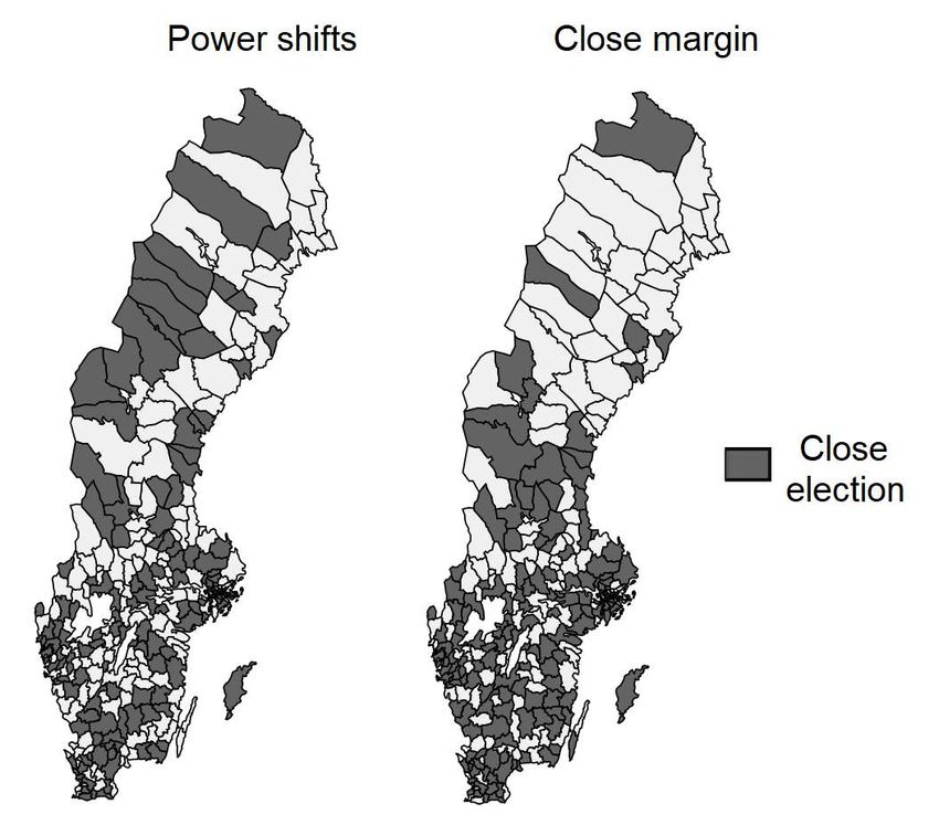
position politicians (Figure A9 shows the distribution). A map that marks where
individual politicians live within a municipality that had a close election illustrates
our identifying variation (see Figure A2). Politicians’ homes are not only unevenly
spread out across neighborhoods; politicians from the two blocs are also unevenly
spread out relative to each other. As power shifts hands between the blocs, this be-
comes our identifying variation. Second, we restrict the analysis to close elections.
The intuition for this restriction mimics that of a regression discontinuity design
(RDD) analysis. Where levels of political competition are high, the winning bloc
of political parties is determined by chance. Thus, in these elections, which neigh-
borhoods have more majority than opposition politicians should also be determined
by chance. This makes the characteristics of neighborhoods that are dominated
by majority vs. opposition politicians more comparable on both observable and
unobservable characteristics.15
We use two definitions of close elections. First, we define an election as generating
a power shift if power shifted between the two blocs at least once in the last three
elections (49% of the data). Electoral data is available to calculate this variable for
all three elections in our sample. Second, we define an election as having a small
win margin if either bloc’s margin to a seat majority was below 5% of the total
vote share (48% of the data).16 . The results are not sensitive to variations in these
definitions, as we show below. Both types of close elections are spread out across
15
A fully fledged RDD cannot be implemented in our context. The seat majority for one bloc
does not always lead to a ruling majority from that bloc. In about 10–15% of close elections,
small parties form coalitions across bloc lines. Defining the forcing variable is also complicated by
the existence of two relevant seat thresholds – a center-right seat majority and a left-wing seat
majority. A fuzzy RDD analysis could, in theory, use either of these thresholds separately, but this
would generate quite imprecise estimates (results are available upon request). Nor is it possible
to conduct an RDD analysis of individual politicians who get elected (or not) to the council.
The marginal “losers” typically sit on the council as substitutes and progress into office as their
colleagues leave during the term.
16
For a description of how the win margin is calculated, see Folke and Rickne (2020)
23municipalities throughout the country (see Figure A1).
We regress each of the three dependent variables (Lnt ) on the difference in residential
concentrations between majority and opposition politicians (Pnt ) using the following
equation:
Lnt = αmt + βPnt + γX’nt + nt (1)
where β is our estimate of interest. Fixed effects for the combination of munici-
pality and election period are included in the analysis of school closures. They are
not needed for the building permits since those dependent variables only contain
variation within the municipality-election period. We report the results from this
bivariate regression before and after adding a vector of control variables (Xnt ). As
we show in the next section, these controls are uncorrelated with the treatment and
therefore have little effect on the size or significance of our coefficient of interest.
Testing the identifying assumption. Our identifying assumption is that the
treatment variable is independent of other variables (both observable and unob-
servable) that could also affect the allocation of local public bads. Following our
previous discussions, such omitted variables are likely to stem mainly from public
protests, swing voter residents, and profitability concerns.
Protests make neighborhoods less attractive for a local public bad. They raise costs
by causing delays, increasing the bureaucratic workload, and even forcing the early
termination of projects before completion. It is therefore no surprise that empirical
research shows that politicians take anticipated protests into account when decid-
ing where to site local public bads (Aldrich, 2008; Grimes and Esaiasson, 2014). A
neighborhood’s protest potential is shaped by who lives there. Money and personal
networks are particularly important resources in mounting political opposition to un-
wanted projects (van Stekelenburg and Klandermans, 2013). High socio-economic
status predicts protest as part of its general positive impacts on political participa-
tion (as discussed above, and see also empirical work on protests by, e.g., Grimes and
24Norén Bretzer, 2008; Einstein et al., 2019). Empirical studies also show that people
in single-family homes tend to protest more than others (Pendall, 1999; Whittemore
and BenDor, 2019).
The party might center its efforts on neighborhoods where they are most likely to
produce more votes. For evidence that political parties cater to swing voters in
Swedish politics, see e.g., Dahlberg and Johansson, 2002; Johansson, 2003. Similar
to the protest potential, the share of swing voters in a neighborhood has an expected
correlation with socio-economic status. According to the probabilistic voting models
in Lindbeck and Weibull (1993) and Dixit and Londregan (1996), there is a trade-off
between political preferences and income. The stronger citizens’ political preferences
are and the richer they are, the harder they are to ”buy” for the incumbent. The
likelihood that voters will switch party allegiances may, hence, be associated with
traits that are correlated with income, implying that swing voters might be unequally
distributed over neighborhoods (c.f. Hypothesis 1). Our empirical analysis will
control for these types of concerns to study the causal impact of politicians’ homes.
A neighborhood’s profitability for a specific local public bad is shaped by both its
demographics and economic geography. Housing construction may be more prof-
itable in affluent areas, which tend to have more complementary infrastructure and
more willing construction companies, and where land sales bring in more money
to the public budget. For school closures, it is more profitable to target smaller,
rural schools in depopulating areas and older schools with greater investment needs
(Uba, 2016; Larsson Taghizadeh, 2016). Such closures help the municipality save
money by exploiting economies of scale and adapting the school system to changing
demographics.
We create a number of variables to capture these dynamics. We then show that
they are uncorrelated with the treatment variable by plotting estimates from bivari-
ate regressions between the two, using the full sample and the two sub-samples of
municipalities with close elections.
25Starting at the top of Figure 3, we see a lack of correlations for six variables cap-
turing neighborhoods’ population composition – the concentration measures for the
four socio-economically advantaged groups analyzed previously, as well as people
aged 65+ and children of primary school age (7–15). The next estimate shows no
correlation with the concentration of people who voted, a common proxy for an-
ticipated protest intensity in previous research (Aldrich and Crook, 2008; Grimes
and Esaiasson, 2014). Next, we show that there are no correlations with the six
economic geography variables, which capture the pre-existing built environment in
the neighborhood. They are calculated in the first year of each election period.
We examine the concentration of existing square meters of multifamily homes and
single-family homes, the population density, the existing floor space per capita, and
the neighborhood’s average house prices. As an approximation of school size we
also look at the number of children (aged 7–15) per primary school. The bottom
rows of the figure show estimates for the one-period time lag of the three dependent
variables, i.e. their values in the previous election period. In the full sample of
elections, the treatment variable has sizeable and near-significant correlations for
all three lagged dependent variables. This could reflect a treatment effect in the
previous election period in a subset of political strongholds. If the same political
majority stays in power over time, and continues to live in the same neighborhoods
as the opposition, and decides to place fewer public bads in their neighborhoods,
this correlation would arise. But it could also reflect a more problematic situation.
Majority and minority politicians might live in neighborhoods with different proba-
bilities of receiving local public bads for reasons other than our intended treatment
effect of politicians’ homes, but which are not captured in correlations with the other
predetermined variables. Reassuringly, the middle and leftmost panels demonstrate
that these imbalances go to zero in the samples of close elections, particularly for the
sample with power shifts. This finding suggests that political strongholds explain
the correlation with the lagged dependent variable in the full sample.
26You can also read