Save the Pies for Dessert
←
→
Page content transcription
If your browser does not render page correctly, please read the page content below
perceptual
      edge                        Save the Pies for Dessert
                                        Stephen Few, Perceptual Edge
                                    Visual Business Intelligence Newsletter
                                                 August 2007

Not long ago I received an email from a colleague who keeps watch on business intelligence
vendors and rates their products. She was puzzled that a particular product that I happen to
like did not support pie charts, a feature that she assumed was basic and indispensable. Be-
cause of previous discussions between us, when I pointed out ineffective graphing practices
that are popular in many BI products, she wondered if there might also be a problem with
pie charts. Could this vendor’s omission of pie charts be intentional and justified? I explained
that this was indeed the case, and praised the vendor’s design team for their good sense.

Here sits the friendly pie chart:

Its slices are upturned into an inviting smile. Its simple charm is beloved by all but a few,
welcomed almost everywhere; familiar and rarely threatening. Of all the graphs that play
major roles in the lexicon of quantitative communication, however, the pie chart is by far the
least effective. Its colorful voice is often heard, but rarely understood. It mumbles when it
talks.

Nothing in the graph design course that I teach is more controversial than what I say about
pie charts. People love them dearly and are often shocked to hear me speak ill of them.
When students in my course don’t raise objections immediately, despite the shock on their
faces, they often approach me during a break to defend their frequent use of pies. Many,
I suspect, respond this way because they can’t imagine how they could possibly convince
people where they work to abandon their beloved pies.

Pie charts are not without their strengths. The primary strength of a pie chart is the fact that
the message “part-to-whole relationship” is built right into it in an obvious way. Children
learn fractions by looking at pies sliced in various ways and decoding the ratio (quarter, half,
three quarters, etc.) of each slice. A bar graph doesn’t have this obvious purpose built into
its design. Not as directly, anyway, but it can be built into bar graphs in a way that prompts
people to think in terms of a whole and its parts. This can be accomplished in part by using a
percentage scale. It is easy and natural to think in terms of various percentages in relation to
Copyright © 2007 Stephen Few, Perceptual Edge                                          Page 1 of 14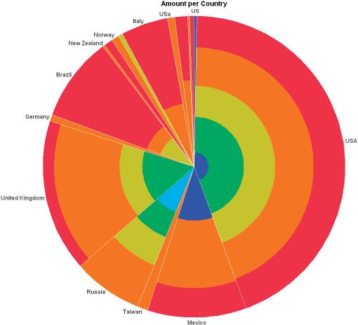
the whole of 100%. Seeing a bar extend to 25% along a quantitative scale conveys a part-to-
whole relationship only slightly less effectively than a pie chart with a quarter slice, especially
if the bar graph’s title declares that it displays the parts of some total (for example, “Regional
Breakdown of Total Revenue”). Despite the obvious nature of a pie charts message, bar
graphs provide a much better means to compare the magnitudes of each part. Pie charts
only make it easy to judge the magnitude of a slice when it is close to 0%, 25%, 50%, 75%,
or 100%. Any percentages other than these are difficult to discern in a pie chart, but can be
accurately discerned in a bar graph, thanks to the quantitative scale.

Allow me to illustrate. Here is a pie chart with six slices. Notice how easy it is to determine
that the value of Company C (the green slice) is 25%, one quarter of the pie.

                                                                   Company A
                                                                   Company B
                                                                   Company C
                                                                   Company D
                                                                   Company E
                                                                   Company F

Now notice how that even the green slice, which was easy to read as 25% above, is no
longer as easy to recognize as 25% in the chart below.

                                                                   Company B
                                                                   Company C
                                                                   Company D
                                                                   Company A
                                                                   Company E
                                                                   Company F

None of the values have changed. I simply sorted the slices by size. In the earlier example,
our ability to decode the green slice at 25% was assisted by the fact that the green slice
began at the 6 o’clock position and extended neatly to the 9 o’clock position. Positions at the
extreme top, right, bottom, and left of a circle mark 90 degree intervals from one another,
Copyright © 2007 Stephen Few, Perceptual Edge                                            Page 2 of 14
each of which forms a right angle. These four positions, as well as the 90 right angles that
the intervals form, are quite familiar to our eyes and minds. In the second example, however,
because the green slice now begins at a less recognizable position, the size of the slice is
more difficult to judge.

You might argue that this problem can be easily solved by labeling the values of each slice,
as shown here:
                                                           1%
                                                7%

                                 10%

                                                                                  Company B
                                                                            40%   Company C
                                                                                  Company D
                                                                                  Company A
                          17%                                                     Company E
                                                                                  Company F

                                                     25%

Why stop here? With this pie chart, we’re forced to waste time bouncing our eyes back and
forth between the legend on the right and the slices of the pie to figure out which slice repre-
sents which company. We can solve this problem by directly labeling the slices with both the
company names and the values, as shown here:
                                                            Company F, 1%
                                           Company E, 7%

                              Company A, 10%

                                                                                  Company B, 40%

                       Company D, 17%

                                                 Company C, 25%

Do you realize what we have just done? Because the pie chart was difficult to read, we
added values so we wouldn’t have to compare the sizes of the slices and we added direct

Copyright © 2007 Stephen Few, Perceptual Edge                                                      Page 3 of 14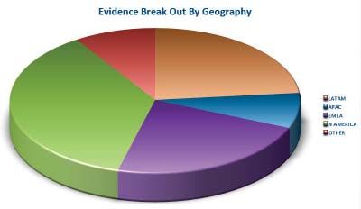
company labels so we wouldn’t have to rely on a legend. We turned the pie chart into an
awkwardly arranged equivalent of a table of labels and values. Here’s the same information,
arranged as a properly designed table:
                                                Companies     Percentage
                                                Company B           40%
                                                Company C           25%
                                                Company D           17%
                                                Company A           10%
                                                Company E            7%
                                                Company F            1%
                                                Total              100%

This information is much easier to read when presented in a table than it was when awk-
wardly arranged around the periphery of the pie. So why use a graph at all? Why show a
picture of the data if the picture can’t be decoded and doesn’t present the information more
meaningfully? The answer is: You shouldn’t. Graphs are useful when a picture of the data
makes meaningful relationships visible (patterns, trends, and exceptions) that could not be
easily discerned from a table of the same data.

But what if we could display this same information in a graph that is easy to read; one that
adds useful meaning by allowing us to compare the magnitudes of the values without label-
ing them? Here’s the same data displayed in a bar chart:
                                         Company Percentages of Total Market Share

                                0%       5%       10%   15%   20%   25%    30%   35%   40%

                  Company B

                 Company C

                 Company D

                  Company A

                  Company E

                  Company F

Now the values can be compared with relative ease and precision, relying solely on the
graph, without labeling the values. What value does this bar graph offer, compared to a
table? In little more than a glance it paints a picture of the relationships between six com-
panies regarding market share. Not only is their relative rank apparent, but the differences
in value from one company to the next is readily available to our eyes. Could we construct
this same picture in our heads from a table of the same values? Perhaps, but it would take
a great deal of effort and time. Why bother when a graph can do the work for you and tell
the story in a way that speaks directly to the high-bandwidth, parallel imaging processor in

Copyright © 2007 Stephen Few, Perceptual Edge                                                Page 4 of 14
your brain, which operates much faster than the part of your brain that handles text, which is
needed to process tables?
Few people, if any, know more about graphs than William Cleveland, who has studied them
extensively. Cleveland writes:
When a graph is made, quantitative and categorical information is encoded by a
display method. Then the information is visually decoded. This visual perception is
a vital link. No matter how clever the choice of the information, and no matter how
technologically impressive the encoding, a visualization fails if the decoding fails.
Some display methods lead to efficient, accurate decoding, and others lead to inef-
ficient, inaccurate decoding. It is only through scientific study of visual perception that
informed judgments can be made about display methods. (William S. Cleveland, The
Elements of Graphing Data, Hobart Press, 1994, p. 1)
And what is Cleveland’s opinion of pie charts? He refers to pie charts as “pop charts,”
because they are commonly found in pop culture media, but much less in science and
technology media. “Pie charts [along with other forms of area charts] do not provide efficient
detection of geometric objects that convey information about differences of values.” (Ibid, p.
268)
I’m afraid I’ve jumped ahead a bit in our story. I intend to explore the pie charts more com-
prehensibly, beginning with their history. To sum up what I’ve said so far:
Countless people buy that this familiar chart is a friendly guy.
This opinion, however, is far too high; he is, after all, a humble pie.
The History, Use, and Workings of Pie Charts
The pie chart first appeared in 1801 in a publication entitled The Statistical Breviary by
William Playfair. In this publication, Playfair used a variety of graphs to present geographical
areas, populations, and revenues of European states. We have Playfair to thank for many
of the popular graphs that we use today, including the bar graph. Although he didn’t invent
the line graph, his innovative work popularized it as a means to display quantitative values
across time. More than anyone before him, Playfair relied on graphical representations of
quantitative data because he believed that “making an appeal to the eye when proportion
and magnitude are concerned, is the best and readiest method of conveying a distinct idea”
(William Playfair, The Statistical Breviary, T. Bensley, 1801, p. 4).
The term “pie chart” was not coined until years later and it is not the only food metaphor that
has been used to describe it. The French referred to it as using the name of their soft round
cheese—camembert. Playfair used circles in various ways to represent quantitative relation-
ships by varying their sizes, subdividing them into slices, and overlapping them, much like
Venn diagrams. The graph on the following page, from The Statistical Breviary, displays a
series of circles arranged side by side with their centers aligned. Each circle represents a
geopolitical region, sometimes divided into sectors through the use of slices, such as parts
of the Turkish Empire in the second circle from the left.
Copyright © 2007 Stephen Few, Perceptual Edge Page 5 of 14Although Playfair usually made wise judgments about graphical images and their use for
presenting data, he did not in 1801 have the benefits of the large collection of research
that has since examined the effectiveness of various graphical devices. He understood the
intuitive ability of a sub-divided circle to represent part-to-whole relationships, but not the
perceptual problems that we encounter when trying to compare its parts.
Pie charts encode quantitative values primarily by two means: two-dimensional areas of the
slices and the angles formed by the slices as they radiate out from the center of the pie. We
now know that neither of these visual attributes is easy to compare. Our eyes are great at
comparing differences in 2-D location and differences in line length, but not 2-D areas and
angles. In the example below, the graph on the left uses the 2-D locations of data points and
the one on the right uses line lengths (in this case, the lengths of the bars) to encode values.
As you can see, both make it very easy to see and interpret differences between values.
0% 5% 10% 15% 20% 25% 30% 35% 40% 0% 5% 10% 15% 20% 25% 30% 35% 40%
Company B Company B
Company C Company C
Company D Company D
Company A Company A
Company E Company E
Company F Company F
Copyright © 2007 Stephen Few, Perceptual Edge Page 6 of 14You might be inclined to believe that you can do a better job than most in judging differences
in values that are encoded as 2-D area. Here’s a simple test. If the area of the small circle
below equals a value of 1, what is the area of the large circle?
??
11
Not easy, is it? When I ask students to guess the size of the large circle, I get answers rang-
ing from around 6 to 50.The area of the large circle is actually 16 times the area of the small
circle. Stephen Kosslyn writes:
The systematic distortion of area is captured by “Steven’s Power Law,” which states
that the psychological impression is a function of the actual physical magnitude raised
to an exponent (and multiplied by a scaling constant). To be precise, the perceived
area is usually equal to the actual area raised to an exponent of about 0.8, times a
scaling constant…In contrast, relative line length [such as the lengths of bars] is per-
ceived almost perfectly, provided that the lines are oriented the same way. (Kosslyn,
Stephen, Graph Design for the Eye and Mind, Oxford University Press, 2006, p. 40)
Perhaps you object to the fact that you had to rely on relative 2-D areas alone to discern
the differences above, without the benefit of relative angles as well, which play a role in pie
charts. Here’s another test, this time using an actual pie chart. Look at the pie chart below
and try to place the slices in order from largest to smallest.
Cabernet Sauvignon
Sangiovese
Prosecco
Chardonnay
Syrah
Tempranillo
Pinot Grigio
Having trouble? As you can see, comparing the angles of the slices doesn’t make it any
easier.
Copyright © 2007 Stephen Few, Perceptual Edge Page 7 of 14Naomi Robbins writes:
We make angle judgments when we read a pie chart, but we don’t judge angles very
well. These judgments are biased; we underestimate acute angles (angles less than
90°) and overestimate obtuse angles (angles greater than 90°). Also, angles with
horizontal bisectors (when the line dividing the angle in two is horizontal) appear
larger than angles with vertical bisectors. (Naomi Robbins, Creating More Effective
Graphs, Wiley, 2005, p. 49)
If a chart is doing its job, you shouldn’t have to struggle. Look at how easy it is to compare
the percentages using the bar graph below, which displays the same values:
Total Revenue by Product
0% 5% 10% 15% 20% 25% 30%
Sangiovese
Pinot Grigio
Prosecco
Cabernet Sauvignon
Chardonnay
Syrah
Tempranillo
Pies in All Their Modern Glory
The pie chart, like all graphs that use the position, length, or area of objects to represent
quantity, includes an axis with a quantitative scale, only it is never shown. The axis and scale
of a pie chart is not linear, as it is with most graphs, but circular, for it is located along the
circumference of the circle. Here’s what a pie chart would look like if its axis and scale were
visible:
100% | 0%
95% 5%
90% 10%
85% 15%
80% 20%
75% 25%
70% 30%
65% 35%
60% 40%
55% 45%
50%
Copyright © 2007 Stephen Few, Perceptual Edge Page 8 of 14People love dressing up their pie charts today to look mouthwatering. Why stick with a simple 2-D pie chart when you can add a third dimension of depth to the picture and throw in some lighting effects and contoured edges while you’re at it, as shown here? It’s pretty and eye-catching, but is it more meaningful or easier to interpret? Actually, by adding depth to the pie and changing its angle, we’ve made it more difficult to interpret. The green slice now appears greater than it actually is, because of the depth that’s been added. The slices are now more difficult to compare, because the angle skews their appearance. For those of you who can’t resist tilting your pies (after all, pie tilting is an ancient and re- spected sport among cultures known for their talent with pastries), let me illustrate the effect that you’re creating. Below are three pie charts that are exactly the same, except that the one above is 2-D and the other two are 3-D and tilted. Notice how different the relationships between the slices appear from one version to the next. Copyright © 2007 Stephen Few, Perceptual Edge Page 9 of 14
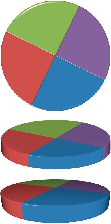
Why stop here? Based on what many software vendors advertise, we’re encouraged to
tweak them out with abandon. For example, with Excel and several other products, you can
now easily manipulate the transparency of the pie, creating utterly useless charts such as
this:

Believe it or not, this is the same pie chart as the one above. The only difference is that now
you can see through it. Aren’t you happy Microsoft added this nifty feature? Trust me when
I say that I am not doing anything here that isn’t marketed with pride by countless software
vendors. Here’s a Crystal Xcelsius pie chart that’s been polished to a high-gloss gleam:

I pulled this example from a dashboard. One of the objectives of a dashboard is to present
information in a way that can be quickly read and easily understood. If you glance at this too
quickly, however, you’re liable to think that it contains three slices. This misperception is a
result of the simulated reflection of light on the shiny surface of the pie. When light reflects
like this off of objects in the real world, we find it annoying. We have to squint to block the
glare in an effort to see the object clearly. Why would we ever want to reproduce this annoy-
ing and misleading effect on a computer screen?

Sometimes, despite their obvious limitations, absurd demands are placed on pie charts to
show a great deal more than usual. On the following page there is an example from Advizor
Analyst/X (an otherwise good product), which attempts to show two levels of part-to-whole
relationships at one time: one per country (the slices) and one per product type (the circular
bands of color within each country). It would be impossible to compare quantities of a prod-
uct type between countries, given how differently they are shaped.

Copyright © 2007 Stephen Few, Perceptual Edge                                          Page 10 of 14
Let’s examine another ineffective use of pie charts. Edward Tufte once said that “the only
 worse design than a pie chart is several of them, for then the viewer is asked to compare
 quantities located in spatial disarray both within and between pies” (Edward Tufte, The
 Visual Display of Quantitative Information, Graphics Press, 1983, p. 178.) I share Tufte’s
 opinion that this is an ineffective way to compare multiple part-to-whole relationships.
                  2004                              2005                                 2006                                 2007

                                                                                                                                                        Company A
                                                                                                                                                        Company B
                                                                                                                                                        Company C
                                                                                                                                                        Company D
                                                                                                                                                        Company E
                                                                                                                                                        Company F

 Try to follow the changes of these various companies and how they compare to one another
 through time. It is nearly impossible. Notice how easily you can do it, however, using the
 following display:
                             2004                                  2005                                 2006                                 2007
             0%      10%   20%   30%   40%   50%   0%      10%   20%   30%   40%   50%   0%     10%   20%   30%   40%   50%   0%     10%   20%    30%   40%   50%

 Company C

 Company E

 Company B

 Company D

 Company A

 Company F

Copyright © 2007 Stephen Few, Perceptual Edge                                                                                                    Page 11 of 14
This is a vast improvement over the series of pie charts above, but is still not as easy as
it ought to be to see the up and down changes in part-to-whole percentages from year to
year. Nothing shows change through time better than a line. Here’s the same data, this time
displayed as a single line graph:
Company Percentages of Market Share by Year
50%
45%
40%
Company C
35%
30%
25%
Company D
20%
15% Company E
10% Company A
Company B
5% Company F
0%
2004 2005 2006 2007
Now it is easy to see the changes and to compare the magnitudes of the parts in a given
year. What we can’t see in this example, however, are market revenues as a whole and how
they changed from year to year. For this view, we can use an area graph (see below):
U.S. $ Total Company Revenues by Year
20,000
Company F
Company A
16,000
Company D
12,000
Company B
Company E
8,000
4,000 Company C
0
2004 2005 2006 2007
Keep in mind that any individual graph might serve a particular purpose exceptionally well,
but suffer from problems if used for other purposes. This area graph, for example, does a
good job of showing how total revenues changed from year to year and also gives a sense
of each company’s portion of total revenues in a particular year. You would not want to use
it, however, to discern how each company’s portion of the whole changed from year to year.
This is true for two reasons:
1. The unit of measure is dollars, not percentages, so an increase in dollars of a single
Copyright © 2007 Stephen Few, Perceptual Edge Page 12 of 14company’s revenues from one year to the next could actually represent a decrease in
its percentage of the whole.
2. Other than Company C, which is positioned at the bottom of the graph and has a flat
baseline, you cannot trace the top of each country’s colored area to determine how its
revenues changed, but you must focus on the height of the area in any one year from
its bottom to its top, which is more difficult to judge.
The Secret Strength of Pies
You might be wondering, aside from the natural way that pie charts suggest a part-to-whole
relationship, do they have anything else going for them? I have read every research study
that I could find that tested the effectiveness of pie charts versus other means of displaying
quantitative data, beginning with one that was done in 1926 by W. C. Ells, and have found
only one advantage that can confidently be attributed to pie charts. Unfortunately, this one
strength is rarely if ever useful. Ian Spence of the University of Toronto has been involved
with several of these studies from 1989 on. In 1991, Spence and Stephan Lewandowky
conducted a series of experiments to compare the relative effectiveness of different means
to display the same part-to-whole relationship—a pie chart, a bar chart, and a table—for a
variety of tasks.
The study was titled “Displaying Proportions and Percentages,” which was published in
Applied Cognitive Psychology (Volume 5, pages 61-77). For each task they measured the
speed and accuracy of test subjects’ responses. The one slight advantage of a pie chart over
a bar graph involved a task that required subjects to answer the question, “Which is greater,
A+B or C+D?”, while examining one of the three charts below:
A
D
B
C
A B C D
A B C D
10 25 7 26
Copyright © 2007 Stephen Few, Perceptual Edge Page 13 of 14Sometimes the parts that the subjects were asked to sum were adjacent to one another
(for example, A+B) and sometimes they were not (for example, A+C). It is not difficult to
believe that it is somewhat easier to sum the areas of slices in a pie than it is to imagine the
combined heights of bars stacked on one another. I wonder, though, if the advantage that
pie charts had over bar graphs would have been eliminated when the parts that were being
summed were not adjacent to one another and the bar graph display had been complete,
with its quantitative scale (see below).
D
C A
B
30
25
20
15
10
5
0
A B C D
Regardless, the fact remains that a comparison of two sets of summed parts is rare in the
real world. But, by all means, should you ever need to display data for this purpose, a pie
chart would serve you well. Otherwise, save the pies for dessert.
About the Author
Stephen Few has worked for over 20 years as an IT innovator, consultant, and teacher.
Today, as Principal of the consultancy Perceptual Edge, Stephen focuses on data visualiza-
tion for analyzing and communicating quantitative business information. He provides training
and consulting services, writes the monthly Visual Business Intelligence Newsletter, speaks
frequently at conferences, and teaches in the MBA program at the University of California,
Berkeley. He is the author of two books: Show Me the Numbers: Designing Tables and
Graphs to Enlighten and Information Dashboard Design: The Effective Visual Communica-
tion of Data. You can learn more about Stephen’s work and access an entire library of
articles at www.perceptualedge.com. Between articles, you can read Stephen’s thoughts on
the industry in his blog.
Copyright © 2007 Stephen Few, Perceptual Edge Page 14 of 14You can also read