The Economic Costs of NIMBYism: Evidence from Renewable Energy Projects
←
→
Page content transcription
If your browser does not render page correctly, please read the page content below
Energy Institute WP 311

         The Economic Costs of NIMBYism:
      Evidence from Renewable Energy Projects

                                    Stephen Jarvis

                                     January 2021

Energy Institute at Haas working papers are circulated for discussion and comment purposes.
They have not been peer-reviewed or been subject to review by any editorial board. The Energy
Institute acknowledges the generous support it has received from the organizations and
individuals listed at https://haas.berkeley.edu/energy-institute/about/funders/.

© 2021 by Stephen Jarvis. All rights reserved. Short sections of text, not to exceed two
paragraphs, may be quoted without explicit permission provided that full credit is given to the
source.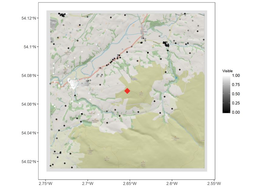
The Economic Costs of NIMBYism

                         Evidence from Renewable Energy Projects

                                             Stephen Jarvis*

                                              January 2021
                                (Click here for the latest version)

                                                  Abstract

      Large infrastructure projects can create widespread societal benefits, but also frequently
      prompt strong local opposition. This is sometimes pejoratively labeled NIMBY (Not In
      My Backyard) behavior. In this paper I estimate the economic costs of NIMBYism and
      its role in local planning decisions. To do this I use detailed data on all major renewable
      energy projects proposed in the United Kingdom spanning three decades. First, I use
      hedonic methods to show that wind projects impose significant negative local costs, while
      solar projects do not. I then show that planning officials are particularly responsive to
      the local costs imposed within their jurisdictions, but fail to account for variation in these
      costs across jurisdictions. The result has been a systematic misallocation of investment,
      which may have increased the cost of deploying wind power by 10-29%. Much of this can
      be attributed to the fragmented and localized nature of the planning process.
      JEL Codes: Q4, Q5, R1

      Keywords: Infrastructure, Electricity, Renewables, NIMBY, Local, Planning

   * Stephen  Jarvis: Energy & Resources Group and Energy Institute at Haas, University of California at
Berkeley. Berkeley, CA 94720. Email: jarviss@berkeley.edu. I would like to thank Severin Borenstein,
Meredith Fowlie and David Anthoff for their fantastic comments throughout this project. I also wish to
acknowledge colleagues at the Energy Institute at Haas and the Energy & Resources Group, as well as seminar
participants at Lawrence Berkeley National Laboratory’s Energy Markets and Policy Group, the US Association
for Energy Economics and the Haas Research Seminar in Real Estate. Danielle Schiro, Fiona Stewart, Ana
Fung and Keanna Laforga provided excellent research assistance collecting planning documents for this project.
Lastly I would like to thank the Fisher Center for Real Estate & Urban Economics and the Library at the
University of California, Berkeley, for generously providing funding to support the completion of this research.

                                                       1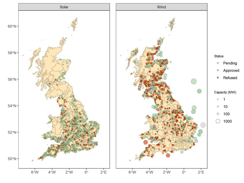
1         Introduction

Large infrastructure projects can create widespread societal benefits and are often critical to
tackling major national or global challenges. A prime example is climate change mitigation
and adaption, which will require large investments over the coming decades in areas such
as renewable energy production, power grid infrastructure and public transit (IEA, 2018).
However, large infrastructure projects such as these also create concentrated local impacts
that can in turn lead to fierce lobbying during the planning approval process. This lobbying by
local residents and businesses is sometimes pejoratively labeled NIMBY (Not In My Backyard)
behavior and is thought to be common in a range of settings.

        One area where the topic of NIMBYism has been widely debated is renewable energy de-
ployment.1 Here a wealth of survey-based studies have examined the factors that determine
community acceptance for wind and solar projects (Wolsink, 2000; Bell et al., 2013; Burning-
ham, Barnett and Walker, 2015; Rand and Hoen, 2017; Hoen et al., 2019). Importantly though,
the actual economic consequences of local opposition and its influence on the planning process
remains poorly understood. There is some empirical evidence that local residents that oppose
wind farms respond by voting the politicians responsible out of office (Stokes, 2016), or by
pushing for new zoning regulations constraining development (Winikoff, 2019). There is also
some limited evidence that certain features of wind or solar projects may be associated with
projects being more likely to be approved (Roddis et al., 2018), but whether this is resulting
in insufficient or misallocated investment has yet to be studied.

        The political economy of spatial misallocation has been studied in a number of other con-
texts. Place-based policies to encourage regional economic development have fallen in and out
of favor, often meeting with mixed success (Glaeser and Gottlieb, 2008; Austin, Glaeser and
Summers, 2018; Chen et al., 2019). Nevertheless, there is evidence that politicians’ attempts to
promote economic activity in their jurisdiction can raise local welfare (Greenstone and Moretti,
2003; Greenstone, Hornbeck and Moretti, 2008). However, whether these local gains also raise
overall social welfare is less clear cut. For instance, research on housing development has shown
that local planning restrictions have resulted in chronic underinvestment that acts as a sub-
stantial drag on the economy (Glaeser and Gyourko, 2018; Hsieh and Moretti, 2019). Given
the growing urgency of combating climate change, it seems plausible that similar impediments
    1
    NIMBYism can be more precisely defined as “the combined preference for the public good and a refusal to
contribute to this public good” (Wolsink, 2000). The public good of interest here is the provision of renewable
energy, with the aim of mitigating climate change and ensuring secure energy supplies, and the refusal to
contribute is most clearly expressed by a locality’s decision to deny planning permission for a proposed project.

                                                       2
to the deployment of renewable energy could also impose large costs on society.

   The siting of undesirable industrial facilities, such as landfills and harzardous waste sites, has
also been been an important area in which placed-based policies and spatial misallocation have
been studied. Research has linked siting decisions to both the size of the local external costs
imposed and to the political power of nearby residents (Mitchell and Carson, 1986; Hamilton,
1993; Currie et al., 2015). Early studies on the siting of undesirable facilities also formed the
basis for the broader literature on environmental justice, and the economic and political forces
that produce unequal distributions of environmental burdens (Hsiang, Oliva and Walker, 2019;
Banzhaf, Ma and Timmins, 2019). In many ways the transition to renewable energy has been
held up as a panacea to these past environmental injustices. But wind and solar projects also
create their own winners and losers, and existing political processes will be key to determining
whether they perpetuate existing inequities (Carley and Konisky, 2020).

   In this paper I estimate the economic costs created by misallocation in the siting of re-
newable energy projects. For this I focus on the United Kingdom where I am able to draw
on detailed planning data for all renewable energy projects, including information on projects
that were not approved. The planning data allows me to credibly estimate the scale and dis-
tribution of impacts on local residents in the form of changes to nearby property values. I then
link these local costs to the likelihood of projects gaining approval. The vast majority of wind
and solar projects in the UK must be approved at the local level by county planning officials.
This allows me to estimate how local officials weigh local impacts during the approval process,
including how this compares to the weight they place on the other wider societal benefits of
these projects. I then conclude by estimating to what extent these features of the planning
process lead to the spatial misallocation of investment.

   To approximate the impacts of a new wind or solar power project on nearby residents
and businesses I focus on estimating how the construction of a project is capitalized into
local property values and rents. There is a burgeoning literature that uses hedonic methods
to estimate the value of various environmental amenities, including those affected by large
infrastructure projects (Bishop et al., 2020). One area of focus has been power projects, such
as fossil or nuclear power plants (Davis, 2011; Tanaka and Zabel, 2018). Increasingly research
has turned to looking at the local impacts of renewable power projects; primarily the visual
and noise disamenities caused by wind farms. On balance these studies find negative effects on
property values, although the magnitudes can range significantly from finding no effect (Lang,
Opaluch and Sfinarolakis, 2014; Hoen and Atkinson-Palombo, 2016), to finding modest or even

                                                 3
large reductions (Gibbons, 2015; Sunak and Madlener, 2016; Dröes and Koster, 2016; Jensen
et al., 2018; Dröes and Koster, 2020). I find that the median wind project causes a roughly 4-5%
reduction in residential property values at distances of around 2km. Effects are larger at closer
distances and also increase with the size of a project, although at an attenuating rate. Effects
are larger when a property is likely to have direct line-of-sight to the wind farm, and when
properties are located in wealthier, less deprived areas. This suggests the bulk of the adverse
impact is due to visual intrusion. I also find new evidence of an appreciation in property
values in areas where projects are refused planning permission. In reaching these estimates
this paper makes a number of important methodological improvements; the most important of
which is that I use information on planned but unsuccessful projects to more credibly construct
a plausible comparison group and increase confidence in the observed effects.
In addition to looking at wind farms I also provide one of the first estimates of the impact of
solar projects on nearby residential property values (Dröes and Koster, 2020; Gaur and Lang,
2020). Interestingly, I do not find any statistically significant effects, even at relatively small
distances of 1km. This seems consistent with the lower levels of visual intrusion created by
solar panels when compared to wind turbines. In addition to looking at solar projects I also
expand the scope of my analysis beyond the prior literature and look at impacts on commercial
property values. Existing research has focused exclusively on residential property values, with
the exception of Haan and Simmler (2018) who look at agricultural land values. The impact
on commercial property values is as yet unstudied and seems potentially important if these
projects have adverse effects on tourism or displace existing agricultural activity. I do not find
statistically significant effects from either wind or solar projects on commercial property values,
although these results are less precisely estimated.
Using my estimates of the local impacts of wind and solar projects, I then examine how
they influence the planning approval process. To do this I use data on the planning outcomes
of roughly 3,500 wind and solar projects spanning almost three decades. For each project I
estimate both the local impacts (e.g., on residential property values) and the wider societal
impacts (e.g., the market value of the electricity produced or the external value of any emissions
abated and the costs of constructing and operating the project). I then estimate which factors
have a stronger effect on the likelihood of projects receiving planning approval. I find evidence
that local planning officials are indeed particularly responsive to local property value impacts.
This is consistent with the fact that wind projects are much less likely to be appoved than solar
projects. Interestingly these effects are more pronounced in politically conservative areas.
4That local officials pay attention to local factors is unsurprising. In fact, there is a com-
pelling argument to be made that local policymakers are in fact making optimal private deci-
sions for their respective jurisdictions. The key here is that what may be optimal for a given
local area can in aggregate create harmful outcomes for society as a whole. In the context of
renewable energy, I find that refusing a renewable energy project to avoid adverse local impacts
may indeed benefit local residents. However, the resulting underprovision of renewable energy
or the shift in development to more remote, more expensive projects, raises the costs of climate
change mitigation for society as a whole. This problem is particularly acute for wind projects
as they are most clearly subject to misaligned planning incentives.
To quantify the potential scale of the problem and the scope for Pareto-improving trades,
I identify the set of projects that would have produced the observed annual deployment of
renewable energy at least cost to society. I find that failures in the planning process have
contributed to a significant misallocation of investment, increasing the cost of the UK’s de-
ployment of wind power by £23 billion as of 2019. These costs are substantial, amounting to
29% of the lifetime capital and operating costs of all the wind projects built over this period.
The equivalent misallocation in solar power has been just £0.3 billion, or less than 2%.
Interestingly, the scale of the increased costs in wind deployment depend heavily on the
tradeoff between onshore and offshore wind. The UK’s early investments in offshore wind power
have been expensive, with large potential cost savings available from simply substituting toward
onshore wind, even where this incurs larger local costs. Studying onshore and offshore wind
separately causes the misallocated investment costs arising from the planning process to fall
to £8 billion, or around 10%. The merits of any substitution between onshore and offshore
wind to date are largely driven by the extent of learning-by-doing from the early offshore wind
projects. Where offshore wind learning has been substantial, local opposition to onshore wind
may even have had the beneficial unintended consequence of pushing development offshore,
driving down future costs for this nascent technology. Where offshore wind learning has been
minimal, local opposition to onshore wind will likely have cost the UK dearly.
Of the potential gains from reallocating wind power investment, a substantial portion can
be achieved by switching to wind projects that are cheaper to build and less remotely located,
even though these create larger local impacts. A systematic bias against projects with higher
local costs is consistent with the fact that local planning officials are particularly responsive
to variations in local costs within their jurisdictions. This suggests that there are potentialy
legitimate concerns around the impact of NIMBYism on planning outcomes.
5Importantly though, an even larger portion of the observed misallocation appears to be
driven by the opposite problem; namely that many projects with high local costs have actually
still gone ahead. The likely explanation lies in another dynamic created by the fragmented
and localized nature of the planning process: a lack of coordination. while local planning
officials are responsive to variations in local costs within their jurisdictions, they appear to do
a poor job of accounting for variation in local costs across jurisdictions. Because most of the
variation in local costs is in fact across jurisdictions, failing to coordinate at the regional or
national level is potentially even more costly than concerns about NIMBYism. Furthermore,
current planning guidance exacerbates the problem by trying to share the burden of renewable
deployment across all jurisdictions, discouraging the concentration of capacity at larger projects
in fewer areas, especially those with lower local costs in general.
Policymakers have already tried a range of policies that would appear to address some
of the undesirable planning outcomes identified here. These policies include direct payments
to local residents from project developers, changes to tax regulations to allow more revenues
from renewable energy projects to be kept locally, and efforts to encourage local ownership of
renewable energy projects. My findings suggest the scale of these transfers may have to increase
significantly in some instances to address concerns about NIMBYism. Similarly, finding ways
to improve coordination across jurisdictions, either through a greater role for national planning
officials or facilitating regional collaboration, could also yield real benefits.
Rapidly growing global demand for electricity and concerns about climate change mean that
a further $20 trillion in new power plant investment is expected by 2040, mostly in renewable
sources (IEA, 2018). The findings in this paper suggest that this expansion could be achieved
at much lower cost if more care is taken when incorporating the impacts on local communities
into the process. Energy infrastructure projects such as those studied here also share many
similarities with other large infrastructure projects in sectors such as transportation, water and
waste. There is every reason to think that similar problems exist in those contexts too, and so
exploring the gains elsewhere remains a fruitful area for further research.
This paper is structured as follows. Section 2 provides context on the development of
renewable energy in the United Kingdom. Section 3 covers the analysis on the capitalization
into property values. Section 4 covers the analysis on the planning process. Section 5 concludes.
62 Background on Renewable Energy in the UK
The first commercial wind farms in the UK were constructed in the early 1990s. Rapid adoption
of wind power took off in the 2000s such that capacity has now grown to 24GW as of 2019,
producing 20% of the UK’s electricity (BEIS, 2020a). This expansion is set to continue, with
wind power forecast to provide 40-55% of the UK’s electricity by 2030 (NGET, 2019). Projects
have tended to be located in the windier and more remote regions of the north and west of the
country. Many projects have also been sited in coastal areas with roughly half of the total wind
capacity now located offshore. The emergence of solar power in the UK has been more recent
with capacity only really starting to grow in 2010 following the adoption of a more generous
subsidy regime. By 2019 the UK’s solar capacity stood at 13GW and produced 4% of the UK’s
electricity (BEIS, 2020a). Future growth is expected to be modest with solar power forecast
to provide 6-7% of the UK’s electricity by 2030 (NGET, 2019). Most of this capacity has
been located in the flatter agricultural areas in the south of the country where solar potential
is highest. Unlike wind power, small-scale residential and commercial solar installations are
widespread making up roughly a third of total solar capacity.
Despite a relatively broad political consensus in the UK on the importance of tackling
climate change, the expansion of renewable energy has still been uneven and contentious. Both
wind and solar projects have historically been dependent on carbon taxes and production
subsidies, both of which are set at the national level. In the 1990s and 2000s the vast majority
of support went to onshore wind, in part because this was the most well-established technology
at the time. In 2009 and 2010 a number of reforms were introduced that supported the rapid
expansion of both solar power and offshore wind. In 2015 a new Conservative government made
a number of major changes that led to a significant decline in new investment for both solar
power and onshore wind. These changes included freezing the UK carbon tax, cutting the funds
available to solar power and blocking future onshore wind farms from receiving any subsidies.
In the case of onshore wind these policy changes were driven in part by the vocal opposition
of rural voters to wind turbines. Their views were echoed by the then-prime minister David
Cameron who vowed to “rid” the countryside of these “unsightly” structures. Interestingly
offshore wind was not subjected to the same hostile policy environment, perhaps because these
projects tend to be located a long way out at sea. In 2020 the moratorium on subsidies for
onshore wind was lifted, in part due to waning opposition from Conservative voters.
Besides shifting national politics, arguably the most important determinant of the deploy-
7Figure 1: Renewable Energy Projects in the UK
Notes: These figures show the location of projects and the timing of when they were submitted for
planning permission. Project sizes are determined by their capacity (in MW). Projects are classified by
their development status. “In Review” are projects that have submitted a planning application but have
yet to receive a final decision. “Completed” are projects that have been approved and are either awaiting
construction, under construction, operational or have been subsequently decommissioned. “Abandoned” are
projects that were refused planning permission or were otherwise withdrawn or halted. The administrative
boundaries depicted are the local planning authorities responsible for processing planning applications.
8ment of renewable energy is the planning approval process. In the UK the overwhelming
majority of applications for planning permission are managed by local planning authorities.
These local authorities are the primary unit of local government in the UK and on average
cover around sixty thousand households.2 Project developers submit a planning application
to the relevant local planning authority. The local planning authority considers the merits of
the proposal in line with national and local planning guidelines. A public consultation period
is required where affected stakeholders have the opportunity to provide comments. The local
planning authority then decides to either approve or refuse the planning application.
In making their determinations local planning authorities must weigh a range of competing
factors. Planning authorities have a legal duty under the 2008 Planning Act to mitigate
and adapt to climate change. However, the national guidelines are relatively open-ended,
stating that “all communities have a responsibility to help increase the use and supply of green
energy, but this does not mean that the need for renewable energy automatically overrides
environmental protections and the planning concerns of local communities”. In considering any
issues raised by local stakeholders, planning guidelines emphasize the importance of promoting
renewable energy, the suitability of the local area for the technology being proposed, and the
impact (both individually and cumulatively) on the character of the surrounding landscape,
especially where this affects nearby heritage assets of cultural significance (e.g., churches, castles
and monuments), national park designations, or sites of environmental significance. In many
cases EU law requires that applicants conduct an environmental impact assessment. For wind
projects there is also a requirement to conduct a noise assessment, as well as a number of
safety standards to ensure the proposed turbines do not interfere with flight paths or radar
installations. Beyond these requirements there is a general preference against strict criteria or
zoning (e.g., setbacks, buffer zones or quotas). However, there is scope for planning authorities
to seek amendments to planning applications, or approve them with certain conditions aimed
at mitigating potential concerns that may have been raised.
There are two main exceptions to local control of the planning process. The first arises
when projects are sufficiently large that they are deemed to have substantial national or re-
gional importance (e.g., motorways, airports, rail networks, ports etc.). In these situations the
planning decision is made by the national Planning Inspectorate, and any directly affected local
authority is included as a statutory consultee. In the case of renewable energy, projects with a
capacity greater than 50MW have historically been deemed to be of national significance. How-
2
This means UK local authorities are broadly analogous to US counties.
9ever, as part of the reforms introduced by the Conservative government of 2015 this threshold
was removed for onshore wind projects such that all subsequent projects would be considered
at the local level irrespective of size. The second exception to local control arises when a devel-
oper appeals the decision of a local planning authority. Once an appeal is lodged the national
Planning Inspectorate conducts a review and decides to either uphold or overturn the initial
decision. In both cases the split between local and national control provides an opportunity to
examine how decisionmakers at these different scales weigh planning applications.
To help document the impact of the planning process on the deployment of renewable
energy, the UK government maintains and publishes a database on the planning applications
for all major renewable energy projects that have been proposed since 1990. Figure 1 shows
where these projects have been located and when they were submitted for planning approval.
Table 1 provides a range of additional summary statistics on outcomes from the planning
process for wind and solar projects as documented in the planning database.
Table 1: Summary Statistics on Project Planning Outcomes
Solar Wind
Number of Projects 1675 1775
Total Capacity (MW) 13737 58618
Average Capacity (MW) 8.2 33.0
Length of Planning Process to Initial Decision (days) 143 545
Length of Planning Process to Final Decision (days) 184 643
Initial Decision Approval Rate 0.724 0.391
Share of Projects subject to National Authority Decision 0.001 0.128
National Authority Initial Decision Approval Rate 1.000 0.648
Local Authority Initial Decision Approval Rate 0.723 0.353
Share of Projects Appealed 0.123 0.230
Appeal Success Rate 0.461 0.460
Final Decision Approval Rate 0.779 0.490
Notes: This table contains summary statistics for all wind and solar energy projects in the UK with a
capacity of 1MW or greater. This excludes projects that are under review at the time of writing. Projects
can be subject to approval by either a local or national planning authority. The planning authority makes
an initial decision to either approve or refuse the project. Projects may then be appealed in which case the
final decision may differ from the initial decision.
The projects covered in the planning database comprise the overwhelming majority of wind
and solar capacity in the UK. There is a roughly even split of projects across the two technology
types, although wind projects are larger on average and so account for the vast majority of
total renewable capacity. Despite this, it is noticeable from Table 1 just how much tougher the
planning process is for wind projects. Recieving a planning decision takes three to four times
longer for wind projects. The approval rate is much lower as well, with 39% of wind projects
10being approved compared to 72% for solar projects.
Interestingly, Table 1 provides suggestive evidence that national planning decisionmakers
are more positively predisposed to renewable energy projects. This is reflected in the higher
approval probability for projects decided at the national level. This is also further demon-
strated by the impact of the appeals process. In total just under 600 projects were subject
to an appeal, representing roughly 10GW of capacity. A larger proportion of these are wind
projects, consistent with their higher likelihood of refusal. The appeal success rate is 46%,
giving a roughly even split between projects that were upheld on appeal and projects that
were overturned on appeal. Accounting for appeals means the final planning approval rates
increase to 49% for wind projects and 78% for solar projects.
I provide further information on some of the key reasons why projects are refused by col-
lecting the planning decision letters for a sample of projects. Based on the refusal decisions of
120 wind and solar projects I find that by far the most cited reason is the visual impact of a
project on nearby residents and the overall character of the surrounding landscape. Visual im-
pact reasons were mentioned in 60% of solar refusals and 75% of wind refusals. The next most
common are a related set of concerns about the proximity of a project to culturally important
heritage sites. Heritage concerns were mentioned in 30% of solar refusals and 50% of wind
refusals. Unsuprisingly, noise concerns do not appear in any of the solar refusals. Interestingly
though, noise concerns do not feature particularly heavily for wind projects either, with only
25% mentioning noise as a reason for refusal. This may seem puzzling at first given the noise
from rotating turbine blades is widely considered to be an important local impact of any wind
project. It may simply be that, while important, noise impacts are still small relative to visual
disamenities. Or the explanation might be that there are already clear objective regulations
for noise limits, and so developers are likely to ensure these are met for all proposed projects.
Visual impacts, on the other hand, are harder to explicitly include in planning procedures and
so provide far greater latitude for subjective interpretation by local decisionmakers.
The planning outcome data described here makes clear that a big challenge for the deploy-
ment of renewable energy is gaining the backing of local residents and firms. In many ways this
makes renewable energy projects similar to most other large-scale infrastructure projects, and
so the findings here may be instructive for other sectors. However, the particular importance of
national and global factors (e.g., climate change) makes wind and solar projects a particularly
challenging case when planning processes are so dominated by local decisionmakers. Unlike
more traditional local infrastructure like transport or housing, most of the benefits of wind
11and solar projects are spread diffusely throughout wider society while many key costs remain
concentrated locally. The risk here is that, in the absence of some kind of direct payments,
local decisionmakers are unlikely to put much weight on benefits accruing to non-local actors.
This paper will assess the extent of the costs imposed by these misaligned incentives.
3 Capitalization analysis
Renewable energy projects create a number of local economic impacts. Of primary interest here
are the various visual and noise disameneties generally associated with these projects. Credibly
estimating the scale of any of these impacts is challenging. Hedonic property value models have
become the primary empirical tool for estimating willingness to pay for environmental quality
(Bishop et al., 2020). The primary measure of local impacts utilized here is therefore based on
estimating capitalization into property values. In using this approach, I do not differentiate
between the various local impacts associated with wind and solar projects, instead focusing on
the aggregate net effect.
3.1 Empirical Strategy
3.1.1 Property value data
Residential property transactions data is from Her Majesty’s Land Registry and covers virtually
all sales of residential properties in England & Wales since 1995. Each transaction includes a
unique identifier for a given property, as well as the date of the sale and the postcode location
of the property. Postcodes in the UK are a very granular geographic unit with around 15
households per postcode (approximately equivalent to census blocks in the US). Summary
statistics can be found in Table 2.
Commercial property rents data is from the Valuation Office Agency (VOA) and provides
average annual assessed rental values for commercial properties in England and Wales since
2000. The underlying source of this data is property-level information that VOA collects as
part of its role in setting taxes levied on commercial properties, known as business rates.
Unfortunately the raw property-level data is not yet available for use in academic research.
However, the VOA does still publish detailed data on annual average rents at the Lower Layer
Super Output Area (LSOA) level. Fortunately LSOAs are sufficiently granular geographic units
12(approximately equivalent to census tracts in the US) to ensure there is meaningful variation
in exposure to renewable energy projects. Summary statistics can be found in Table 3.
Table 2: Residential Property Transactions Summary Statistics
Total Detached Semi-Detached Terraced Flat
Sale price (thousands) 185.1 278.1 165.9 149.3 169.0
(223.4) (261.2) (160.8) (224.6) (225.3)
New property 0.0909 0.134 0.0608 0.0563 0.155
(0.287) (0.341) (0.239) (0.230) (0.362)
Leasehold tenure 0.222 0.0388 0.0731 0.0924 0.974
(0.416) (0.193) (0.260) (0.290) (0.160)
Floor area 90.48 127.9 89.05 82.84 59.70
(58.06) (85.30) (48.95) (38.97) (28.01)
Energy efficiency rating 61.32 60.55 60.02 60.30 66.55
(12.98) (13.52) (12.13) (12.61) (13.11)
Rural 0.177 0.339 0.175 0.129 0.0645
(0.381) (0.473) (0.380) (0.336) (0.246)
Index of Multiple Deprivation 19.48 12.84 18.21 23.96 21.17
(13.95) (9.207) (13.10) (15.65) (13.05)
N (millions) 23.90 5.55 6.64 7.34 4.37
Notes: This table shows means and standard deviations are shown for the entire dataset and then for each
of four broad housing types. Floor areas and energy efficieny ratings are taken from Energy Performance
Certificates and are available for a subset of properties. The rural control is based on whether the output
area (OA) that a postcode belongs to was classed as rural in 2011. The Index of Multiple Deprivation is
a composite measure of regional living standards where higher numbers refer to more deprived areas. The
unit of observation is a sale of a residential property on a given date.
Table 3: Commmercial Property Rents Summary Statistics
Total Industrial Retail Office Other
Average rental value (thousands) 16.85 19.64 21.60 24.20 9.122
(29.38) (37.58) (48.33) (49.65) (13.27)
Average floorspace 303.3 612.8 189.8 240.0 147.6
(524.7) (1078.5) (280.4) (355.8) (185.8)
Rental value per m2 61.78 34.93 89.64 89.67 63.43
(47.17) (19.14) (59.70) (49.76) (58.80)
Number of properties 64.37 31.34 33.47 34.43 24.54
(130.4) (39.46) (51.70) (101.3) (45.58)
Rural 0.217 0.310 0.142 0.199 0.274
(0.402) (0.450) (0.344) (0.387) (0.434)
Index of Multiple Deprivation 22.44 23.02 25.35 22.82 22.45
(15.59) (15.33) (16.24) (15.90) (15.54)
N (millions) 0.57 0.41 0.33 0.31 0.43
Notes: This table shows means and standard deviations for the entire dataset and then for each of four
broad sector categories. The rural control is based on the population-weighted share of output areas (OA)
classed as rural in 2011. The Index of Multiple Deprivation is a composite measure of regional living
standards where higher numbers refer to more deprived areas. The unit of observation is at the lower layer
super output area (LSOA) by year level.
133.1.2 Defining treatment
The capitalization analysis throughout this paper consistently uses some variation on a difference-
in-differences framework. Treatment is therefore determined by the combination of 1) whether
projects are nearby (distance), 2) whether projects have come online yet (post), and 3) the
intensity of exposure as measured by the size of a project (capacity).
Tlt = (distancelt ∈ k) · postlt · f (capacitylt ) (1)
The proximity of a property to a nearby renewable energy project (distance) is determined
by whether the distance between that property’s location and the centroid of the project falls
into a given distance bin, k. For residential properties their location, l, is based on the centroid
of their postcode. For commercial properties promixity is taken to be the average of the
proximity values for the postcodes within each LSOA. I use five distance bins (K = 5). For
wind projects these are: 0-2km, 2-4km, 4-6km, 6-8km and 8-10km. This is informed by prior
studies which found the primary effects for wind projects are concentrated within distances
of less than 3km (Dröes and Koster, 2016; Jensen et al., 2018; Dröes and Koster, 2020) and
have completely decayed by around 10km (Gibbons, 2015). For solar projects the distance bins
are: 0-1km, 1-2km, 2-3km, 3-4km and 4-5km. The smaller bins are consistent with the likely
smaller distance over which these projects are visible.
The temporal specificity of treatment (post) is based on the year when a project becomes
operational. Though the project data do include exact dates, fully specifying treatment at the
postcode-day level is not necessary. This is because there is unlikely to be a sharp change in
property values on the date when projects become operational because of the presence of signif-
icant anticipation and adjustment effects that persist over several years. This is substantiated
by the event study regressions discussed later.
The nature of the treatment effect estimated is then determined by a measure of project size,
which I capture as a function of the cumulative wind or solar capacity from all nearby projects
(capacity). I focus on the cumulative capacity across all projects because this accounts for
the fact that many locations have multiple wind or solar projects nearby, and so only focusing
on the nearest or the first project will understate the true nature of exposure. Similarly,
limiting the analysis to locations that are only near to a single project also risks undermining
the external validity of the analysis. I use project capacity as my measure of the intensity of
14Figure 2: Treatment Exposure
Notes: This figure shows the proportion of postcodes over time that are exposed to at least one renewable
energy project at a given distance range. The closest distance bin is in red and the furthest is in light blue.
Treatment is clearly increasing over time as more projects come online. Treatment begins earlier in the
period for wind projects whereas solar projects only began meaningful development after a change in the
subsidy regime in 2010. In all regressions I drop any properties at locations that do not fall into one of
these distance bins by the end of the analysis period.
treatment because it is a straightforward measure of the size of a project. Larger capacity solar
projects have more solar panels spread across a greater area. Larger capacity wind projects
have more wind turbines and/or taller wind turbines. As a robustness check, I also estimate
additional specifications using alternative measures of project size (e.g., the number of wind
turbines).3 The results for these alternative specifications can be found in the appendix.
Prior studies generally use a simple binary indicator for the presence of any project. In a
limited number of cases this is extended by looking at differential effects based on the intensity
of exposure (e.g., using different bins for small vs large projects). One of the most recent studies
on this topic demonstrates that a log specification does a good job of capturing the general
response of the treatment effect to increasing exposure (Jensen et al., 2018). In particular, a
log specification captures the attenuation of the treatment effect as project size increases. As
we might expect, the first wind turbine or acre of solar panels should probably have a larger
3
For wind projects an obvious choice is the number of turbines, in line with prior work. This seems par-
ticularly important because the relationship between MW of capacity and the number of turbines has been
changing over time as turbines become larger. Examining the capitalization effects of both measures can offer
valuable insights into whether the move to projects with fewer, larger turbines is mitigating or exacerbating
local impacts. For solar projects I considered the land area covered by solar panels to be the most appropri-
ate choice. Unlike wind turbines though, the relationship between solar panel capacity and surface area has
remained relatively constant at roughly 5-6 acres per MW (Ong et al., 2013). As such, the results estimated
using solar capacity can be simply rescaled where an effect in terms of area covered is desired.
15incremental effect than the tenth or the hundreth. I also found a log specification to perform
well, and so my preferred functional form is the log of cumulative wind or solar capacity.4 The
resulting treatment effects show how a 1% increase in wind or solar capacity nearby leads to
a x% change in property values. For ease of presentation many of the results shown later will
convert this into an estimate of the absolute impact for the median project, which is generally
around 10MW in size. The results using alternative functional forms (e.g., linear in capacity)
can be found in the appendix.
3.1.3 Difference-in-difference specification
Throughout this analysis I employ a quasi-experimental difference-in-difference approach. This
hinges on comparing changes in property values for locations that have a new renewable energy
project constructed nearby to changes in property values for other similar locations that do
not have a new renewable energy project constructed nearby. The basic difference-in-difference
specification used here is of the general form:
K
X
log(Pilrt ) = βk Tlt + γXit + θrt + λl + ilrt (2)
k=1
Here P is a measure of the value of a property (or group of properties), i, at location,
l, within region, r, in year, t. For the residential property sales this is the transaction price
of a property and for the commercial property rents this is the annual average rental value
per square meter. Unless otherwise specified the treatment effect coefficients, βk , capture the
% change in property values from a 1% increase in wind or solar capacity in distance bin k.
Regressions are estimated separately for wind and solar projects and jointly for all k distance
bins. In addition to estimating the regressions jointly for all k distance bins, I also repeat the
analysis in a sequential manner for a set of distance circles. In this case separate regressions
are estimated with treatment determined by distances of 0-2km, 0-4km, 0-6km, 0-8km and
0-10km for wind projects, and 0-1km, 0-2km, 0-3km, 0-4km and 0-5km for solar projects.
This alternative approach helps make comparisons to other studies, as well as facilitating
the examination of possible sources of heterogeneity (discussed later).5 Standard errors are
4
When taking logs of variables that contain zeroes I use the approach set out in (Bellego and Pape, 2019).
5
The primary benefit here is computational. For the regressions with all k distance bins estimated jointly,
the memory requirements when estimating these in an event study setup with multiple interactions for hetero-
geneous treatment effects quickly becomes prohibitive. The distance circles approach that estimates treatment
effects based on one distance at a time mitigates this while still producing coefficients that are similar.
16clustered based on location to account for correlation between nearby observations.6
In all regressions I limit the sample to properties in locations that ever fall into one of the
included distance bins. For the joint regressions this means the analysis is limited to locations
within 10km of a wind or 5km of a solar project by the end of the period.7 Properties are
treated in a given time period when a project is completed nearby (i.e. within a relevant nearby
distance bin). The resulting control group is formed by properties that do not experience a
change in their treatment status during that period. This includes locations that have yet
to have a project completed and locations or where a project was completed in previous time
periods. This ensures that the control observations are broadly comparable to those undergoing
treatment.8
I account for unobservable time-invariant determinants of property values using a rich set of
location fixed effects, λl . For the residential property regressions these are at the postcode-by-
housing-type level. Properties in a given postcode of a given housing type are likely to be highly
comparable, particularly because postcodes only include around fifteen properties each.9 To
explore purely within-property variation I also estimate versions with address-level unit fixed
effects.10 For the commercial property regressions the data are already aggregated to regional
annual totals by LSOA. As such the location fixed effects are at the LSOA level. This presents
a challenge in that any LSOA may have a range of different commercial activities contributing
to the average. However, this is mitigated somewhat by estimating these regressions both for
the average of all commercial properties, and for four sectors within each LSOA: retail, office,
industrial and other. Moreover, while an LSOA is a more aggregated unit than a postcode it is
still relatively small, corresponding to roughly one thousand households. As such, commercial
activities within a given LSOA are still likely to be relatively homogenous, particularly at the
6
For the residential property regressions I cluster at the output area (OA) level and for the commercial
property regressions I cluster at the middle layer super output area (MSOA) level
7
For solar projects this is 34% of the residential sales sample and 32% of the commercial rents sample. For
wind projects this is 34% of the residential sales sample and 30% of the commercial rents sample.
8
To further ensure the focus is on the rural and suburban areas where these visual and noise disamenities
are likely to be most relevant I also dropped any remaining properties located in the core of major urban areas.
In most cases these locations had already been dropped due to wind and solar projects not being sited in built
up areas. However, there were a small number of exceptions where a few small wind or solar projects were sited
in industrial areas (e.g., along the River Thames in London). Dropping these manually ensured the analysis
was not unduly influenced by the very large number of observations in these dense urban areas.
9
As can be seen in Table 2 there are clearly substantial differences between property types and so controlling
for these is important. Where this isn’t the case though, a postcode fixed effect can be averaging across very
different property types. Increasing the granularity of the fixed effects to the postcode-by-housing-type level
resolves this in a far more robust manner than including a simple aggregate control for housing type.
10
This has the benefit of capturing property-specific factors that can’t be captured by the post code fixed
effect. The drawback here is that the estimation can only use the subset of addresses with multiple sales, which
reduces statistical power and raises the issue that these repeatedly sold properties are not representative of
properties more generally.
17sector level.
To account for unobservable time-variant determinants of property values all regressions
include time fixed effects, θrt , at the year-of-sample-by-region level. I also explore the sensitivity
of my results to using more granular regions to increase the richness of these fixed effects.11 Of
course, allowing the time fixed effects to vary by region does risk absorbing a portion of the
treatment effect of interest and so this should be kept in mind when interpreting the results.12
Finally, to capture observable time-variant determinants of property values a limited set of
additional controls, X, are included. For residential properties the available controls include
whether a sale is for a new home and the type of tenure (e.g., freehold vs leasehold).13 For a
subset of the residential proporties there is also information on house floor areas and energy
efficiency ratings. For commercial properties the available controls include average floor areas.
Identification of a credible causal effect using a difference-in-difference approach faces a
number of challenges in this context. Key to this is the parallel trends assumption; namely that
in the absence of treatment the treated and control locations would have experienced similar
changes in property values. If the location and timing of wind and solar projects was randomly
assigned we could be confident that this assumption holds. However, here the treatment is
obviously not randomly assigned. Instead there is selection of locations into treatment in terms
of where projects are actually approved and built. Moreover, conditional on ever being treated
there is also selection in terms of when treatment happens (earlier vs more recent projects).
Some of the major factors driving selection into treatment may be seemingly unrelated to
residential or commercial property values (e.g., wind speed). However, other factors almost
certainly are related to selection into treatment during the planning process and directly or
indirectly related to local property values (e.g., visual or historical appeal of local landscape,
local political preferences, presence of important ecological habitats and wildlife). The primary
solutions to this challenge that I have set out thus far are the decision to a) limit the controls
to locations that are near to a completed project by the end of the period, and b) make the
11
First I use the eleven regions that were formerly known as Government Office Regions. These comprise
nine English regions and then Wales and Scotland and range in size from roughly 1 to 4 million households
so are fairly analogous to small US states. Second I use the roughly four hundred local authorities in the UK
which are more analoguous to US counties.
12
I did explore just using a single set of year-of-sample effects for the whole of the UK. However, different
parts of the UK have clearly experienced differential rates of economic growth and property value appreciation
over this period, and these divergences are probably at least partially correlated with treatment. For instance,
the more prosperous south is also where the majority of solar projects are located, while the north where
economic growth has lagged behind has also seen a larger portion of wind projects.
13
Someone with a freehold property owns the property and the land it stands on. A leaseholder owns the
property but not the land is built on. The latter is more commonly used for flats and apartments where the
property owner is only purchasing a part of an entire building.
18parallel trends assumption conditional on a rich set of fixed effects and controls. This ensures
that the control properties forming the counterfactual are very similar to treated properties
and that the variation being used for identification is not confounded by other factors.
I augment the difference-in-difference setup using a series of event studies. Here the treat-
ment variable is now interacted with a series of event dummies indicating whether a given
observation is s years before (pre) or after (post) the date when a project became operational.
I include ten years of pre-periods (Spre = −10) and five years of post-periods (Spost = 5),
the last of which also captures any observations that are more than five years after a project
becomes operational. This should allow for sufficient time for the any effects to materialize.
The resulting specification is of the form:
Spost
K
X X
log(Pilrt ) = βk,s Tlt + γXilt + θrt + λl + ilrt (3)
s=Spre k=1
The event study approach has a number of benefits in this setting which is why it is my
preferred specification. First, it helps identify potential anticipation and adjustment effects.
Because planning and construction can last several years we might expect anticipatory effects
well before a project becomes operational. It also seems plausible that it could take time
for the housing market to adjust before the true scale of the local effects from a new project
become clear. Both of these factors mean that the standard difference-in-difference treatment
coefficients estimated using Equation 2 may underestimate or overestimate the true effect.
Properly accounting for these anticipation and adjustment effects is therefore important for
understanding the true capitalization effect and the manner in which it manifests. Second, the
event study can help provide some supporting evidence that parallel trends hold in the pre-
period. Third, a number of recent papers have shown that difference-in-difference estimates can
be biased when there is variation in treatment timing (Goodman-Bacon, 2018). One partial
solution is to employ some form of event study as it can more consistently pin down the source
of identifying variation and how it is affected by variation in treatment timing (Borusyak and
Jaravel, 2017; Callaway and Sant’Anna, 2019). Of course, the main drawback to the event
study approach is that it requires estimating a far larger number of coefficients which reduces
statistical power.
193.1.4 Comparing approved and refused projects
At present the analysis follows prior studies by using locations near completed projects to define
both the treated and control groups. However, it seems reasonable to think that locations
near to completed projects are not the only areas with properties that could act as plausible
controls. For example, there are many remote windy areas in the UK that have properties that
are comparable to treated ones, but that have not yet themselves had a wind farm completed
nearby. I take advantage of the unique information available in the UK’s renewable energy
planning database to construct an alternative comparison group based on properties near to
proposed projects that ultimately were not built.
To do this, I first construct a full secondary set of treatment variables in the exact same
manner set out previously, but this time derived from projects that were proposed but ulti-
mately failed. For failed projects treatment happens based on the date when a project would
have become operational if it had been approved and completed.14 These additional treatment
variables for the failed projects, T F , are included in the regression alongside the original treat-
ment variables for the completed projects, T C . This can be seen in the modified version of
Equation 2 below, and the intution is the same for modifying Equation 3.
K
X K
X
log(Pilrt ) = βkC TltC + βkF TltF + γXilt + θrt + λl + ilrt (4)
k=1 k=1
Coefficients are estimated as before but now a direct comparison can be made between the
coefficents for the completed projects and the coefficients for the failed projects. This change
has a number of possible benefits. First, the sample size of properties available for use in
the estimation is larger which improves statistical power. This is because I still include any
properties at locations that ever fall into one of the included distances bins, but the distance
bins now refer to both completed and failed projects. Second, the control groups for each
distance bin are now more targeted because I can more explicitly compare areas that were or
could have been a certain distance from a project. Third, there is the possibility of looking
more explicitly at sorting behavior. However, this expansion of the control group has some
clear drawbacks, not least the fact that comparing locations with completed projects to those
with failed projects puts concerns about selection bias into even sharper relief.
To tackle possible concerns about selection, I exploit information about the planning pro-
14
Note that this is based on the final planning decision and so is after accounting for any delays created by
the appeal process.
20cesses for projects. I repeat the estimation for all specifications set out thus far but now interact
treatment with whether a project was subject to an appeal. This offers a potential way to mit-
igate concerns about selection bias by focusing on the effects for a subset of more “marginal”
projects (i.e. projects that only just got built or only just failed). Marginal completed projects
are those where the appeal overturns the initial refusal and marginal failed projects are those
where the appeal upholds the initial refusal. Limiting the analysis to properties treated by this
subset of projects rules out locations with projects that a) were almost certain to be approved
and likely imposed smaller local disamenities, and b) were almost certain to be refused and
likely imposed larger local disamenities. The remaining projects were clearly thought to be
sufficiently undesirable by the local planning authority to warrant refusal and thought to be
sufficiently valuable by the developer to warrant appealing. As such it seems plausible that this
subset of projects is more credibly comparable than simply using the entire sample of projects.
3.1.5 Differential impacts
The visual impact of wind and solar projects is consistently cited as a key reason that projects
are refused planning permission. Prior work has also found that negative impacts on local
property values are primarily due to visual disamenity (Gibbons, 2015; Sunak and Madlener,
2016). I examine whether properties that are likely to have direct line-of-sight to a project
experience different effects than properties where projects are obscured by the landscape (e.g.,
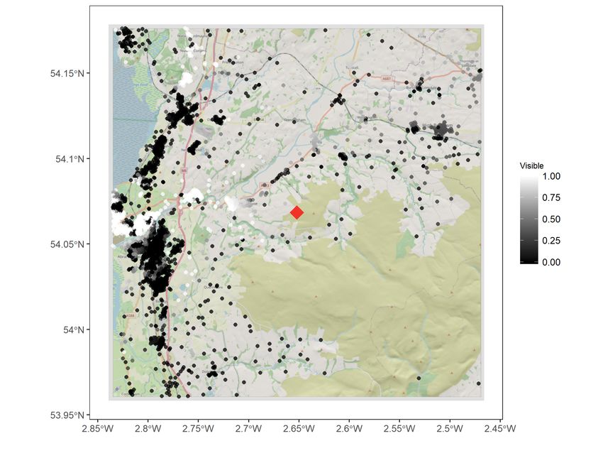
behind a hill). To do this I start with the location of each project and the heights of the
turbines or panels installed. I then combine this with a digital elevation model of the UK to
determine if the straight line that connects each pair of points is intersected by the terrain.
Where it is, the project is assumed to be obscured and where it is not the project is assumed to
be visible. It is worth noting that this approach is certainly not without its flaws. For instance,
it only uses the central point of a project rather than the area covered, and it can’t account
for other features that may act to block line-of-sight such as trees or buildings. Nevertheless,
it should still be sufficient to isolate clear differences in visibility. Full details on the visibility
analysis can be found in the appendix.
The second key source of differential impacts that I study is whether effects are different
in wealthy neigborhoods relative to poorer neighborhoods. In general we might expect the
impact of a nearby wind or solar project on property values to be larger in both absolute
and proportional terms for properties in wealthier neighborhoods. This is because wealthier
neighborhoods will tend to already enjoy greater value from the kinds of environmental ameni-
21You can also read