The New York City Community Air Survey - Results from Year One Monitoring 2008-2009
←
→
Page content transcription
If your browser does not render page correctly, please read the page content below
The New York City
Community Air Survey
Results from Year One Monitoring 2008-2009

Contributors
New York City Department of
Health and Mental Hygiene
Sarah Johnson
Iyad Kheirbek
Grant Pezeshki
J. Bryan Jacobson
Daniel Kass

Mayor’s Office of Long-Term
Planning and Sustainability
Adam Freed

New York City Department of
Environmental Protection
Carter H. Strickland, Jr.

Queens College City University of New York
Holger M. Eisl
John E. Gorczynski
Alyssa Benson
Andres Camacho
Jordan Werbe-Fuentes
Jonah Haviland-Markowitz
Rolando Munoz
Anna Tilles
Steves Vanderpool
Steven Markowitz

University of Pittsburgh
Jane E. Clougherty

Hunter College City University of New York
Thomas Matte

ZevRoss Spatial Analysis
Zev Ross
Hollie Kitson

New York City Department of
Health and Mental Hygiene
Lise Millay Stevens, Editor

Acknowledgements: The contributors are grateful to colleagues from the City and State agencies that provided logistical support and advice.
The New York City Community Air Survey contributors also appreciate the input of experts in air pollution monitoring, exposure assessment
and health effects who provided comments on the project design.
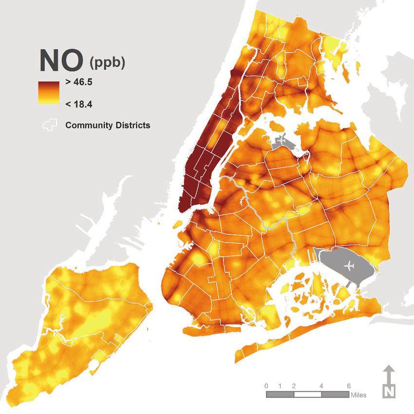
Table of Contents

  Letter from the Commissioner and Director ............................................1
  Executive Summary ....................................................................................2
  Introduction and Background....................................................................3
  Methods .......................................................................................................5
  Results .........................................................................................................7
  Discussion .................................................................................................20
  Annex: Reference Map of Community Districts ....................................22
1 I The New York City Community Air Survey, Results from Year One Monitoring 2008–2009

     Letter from the
     Commissioner and Director

    April 2011

    Dear Fellow New Yorker:

    Four years ago, PlaNYC set in motion a range of actions to make the City’s environment more sustainable,
    healthier and enjoyable for its growing population. Compared to most U.S. cities, New York is already
    among the most transit-friendly and walkable, affording its residents and those of neighboring communities
    access to jobs, entertainment and recreation with less need for driving and its attendant impact on the
    environment. But more remains to be done. Our vibrant, densely developed city that brings people together
    also puts many residents near concentrations of emission sources – especially buildings and traffic. As the
    New York City Community Air Survey (NYCCAS) has shown, too many New Yorkers live, work, shop and
    attend school in neighborhoods with poor air quality.

    NYCCAS, a PlaNYC initiative, is an important part of the Health Department’s work to track environmental
    quality and its impacts on the health of New Yorkers. The reports generated by this landmark survey provide
    the public and officials with important information they need to develop policies to enhance air quality and
    public health.

    We hope that you will find it useful and informative.

    Sincerely,

    Thomas Farley, M.D., M.P.H.                                David Bragdon
    Commissioner                                               Director
    Department of Health                                       Office of Long-Term Planning and
    and Mental Hygiene                                         and Sustainability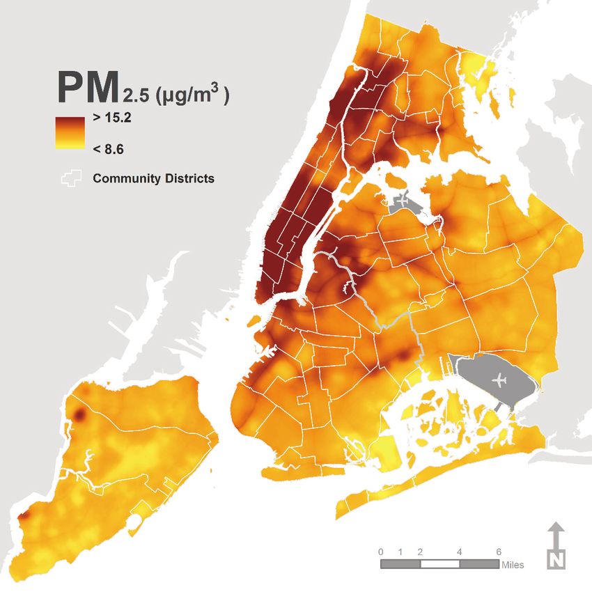
The New York City Community Air Survey, Summer 2009 Results I 2

Executive Summary
The most basic need for a healthy living environment is          residual oil-burning boilers (a significant predictor of
clean air; pollution of the air can pose a major threat to       PM2.5) and building density (a significant predictor of
the well-being of all New Yorkers. To improve the health         NO2 and NO). Building density may also reflect vehicle
of its residents, the city launched its first comprehensive      emissions, since commercial areas with high concentra-
sustainability plan, PlaNYC, to establish goals and              tions of large buildings also tend to have high volumes
initiatives that improve air quality. One such initiative        of traffic and congestion.
charged the Department of Health and Mental Hygiene
                                                                 Indicators of on-road vehicle traffic were predictive of all
with developing the New York City Community Air Survey
                                                                 4 pollutant concentrations—total traffic with PM2.5, NO
(NYCCAS) to study geographic patterns of air pollution
                                                                 and NO2 levels; truck traffic with PM2.5 and EC levels;
across the 5 boroughs. Since its launch in December
                                                                 and location along a bus route with NO levels (bus
2008, the survey has measured street-level air pollution
                                                                 routes tend to carry more total traffic than other roads,
at 150 locations across the city over every season of the
                                                                 on average). Although NO2 concentrations might be
year, gathering data on common air pollutants that affect
                                                                 expected to be highest near highways in less densely
public health such as fine particles, elemental carbon,
                                                                 developed cities, NYCCAS results showed that in New
nitric oxide, nitrogen dioxide and ozone (summer only),
                                                                 York City, the highest NO2 concentrations overall were
sulfur dioxide (winter only) and certain metals.
                                                                 in Manhattan locations with many busy surface roads
Prior NYCCAS reports have shown that winter pollutant            and where large commercial and residential buildings
levels are higher in areas that have a high density of           are in close proximity. Data from NYCCAS air pollution
buildings with boilers burning fuel oil, particularly residual   monitors in Times Square and other midtown locations
fuel oil (grade #4 and #6 heating oil). Both winter and          show that creating traffic-free plazas can immediately
summer pollution levels tend to be higher in areas where         improve air quality for many pedestrians.
traffic is concentrated.
                                                                 The findings of this NYCCAS report affirm the need
This report summarizes the results of the first 4 seasons        for initiatives to reduce traffic and building-related
(from December 2008 to December 2009) of NYCCAS                  emissions, especially in the most polluted parts of the
monitoring for 4 pollutants—fine particles (PM2.5)               city. Prior survey findings showed the local impact of the
elemental carbon (EC), nitric oxide (NO) and nitrogen            most polluting heating fuels, spurring state and local
dioxide (NO2)—which varied 2-fold or more across the             measures to reduce heating oil emissions and provide
monitoring sites. High levels of all 4 pollutants were           cleaner air with fewer health impacts. Steps to make
detected in midtown and downtown Manhattan, and in               buildings more energy efficient also will contribute to
sections of the Bronx, Brooklyn, Queens and Staten               reducing emissions from heating and electric power
Island along busy freeways. The high levels are driven, in       generation. Traffic-related pollution poses a greater
part, by major emissions sources, such as traffic and            challenge for policy-makers—trucks, cars and buses are
building-related emissions, specifically heating oil.            all significant contributors. To achieve goals for cleaner
Although direct emissions from buildings are highest             air and reduced CO2 emissions, and increase physical
during the wintertime heating season, hot water heating          activity, private car trips must decline in favor of public
and cooking are year-round sources of combustion                 transit, biking and walking.
emissions.
In NYCCAS models, indicators of these pollutants are
the density of boilers and, specifically, the density of oil
burning boilers (significant predictors of EC), density of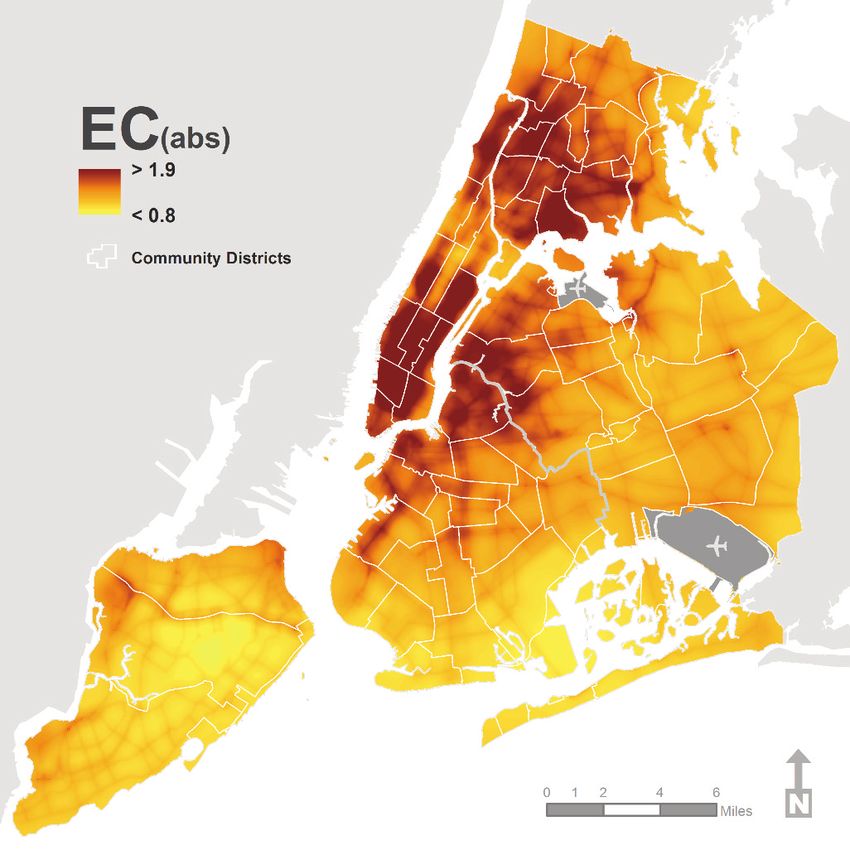
3 I The New York City Community Air Survey, Results from Year One Monitoring 2008–2009

     Introduction and Background
                    New York City’s first comprehensive sustainability       These pollutants are associated with exacerbation
                    plan, PlaNYC, established goals and initiatives for      of asthma and other respiratory diseases, and
                    improving air quality and charged the Department         cardiovascular disease leading to more symptoms
                    of Health and Mental Hygiene with developing the         and increased emergency department visits, hospital
                    New York City Community Air Survey (NYCCAS)              admissions and even deaths. Certain populations
                    to study geographic patterns of air pollution across     are especially susceptible to the effects of air
                    the 5 boroughs. Since its launch in December 2008,       pollution, including young children, who are still
                    NYCCAS has measured street-level air pollution           developing physically, seniors and people with
                    at 150 locations across the city, in each season of      chronic lung or cardiovascular diseases.
                    the year. NYCCAS measures common air pollu-
                                                                             Important sources of many of these pollutants in
                    tants that affect public health including fine parti-
                                                                             New York City are fuel combustion emissions from
                    cles, elemental carbon, nitric oxide, nitrogen
                                                                             road vehicles, off-road equipment, building
                    dioxide and ozone (summer only), sulfur dioxide
                                                                             heating systems, electric power generators and
                    (winter only) and certain metals.
                                                                             cooking, among others. City air quality is not only
                    Prior NYCCAS reports have highlighted large              affected by local emissions, but also by emissions
                    differences in air pollution concentrations in           transported over long distances, such as
                    different parts of the city in winter and summer         coal-fired power stations in the Midwest. Although
                    seasons; levels are higher in winter in areas with a     emissions from distant sources tend to affect
                    high density of buildings that use boilers burning       all neighborhoods similarly, air pollution sources
                    fuel oil, particularly residual fuel oil (grade #4 and   within the city cause differences in pollution levels
                    #6 heating oil). Both winter and summer pollution        among neighborhoods.
                    levels tend to be higher in areas where traffic is
                                                                             NYCCAS assessments complement essential air
                    concentrated, including parts of midtown, down-
                                                                             monitoring by the New York State Department of
                    town, and northern Manhattan, and sections of
                                                                             Conservation, which provides critical data for
                    the Bronx, Brooklyn and Queens along major
                                                                             regulatory purposes to compare city-wide trends
                    highways. This report summarizes the first 4 sea-
                                                                             with national standards. The limited number of the
                    sons of NYCCAS monitoring, from December
                                                                             state’s monitors do not provide neighborhood-level
                    2008 to December 2009.
                                                                             detail.
                                                                             Fine Particles (PM2.5) are small, airborne particles
                    Air pollution is a significant public                    with a diameter of 2.5 micrometers or less. PM2.5
                    health problem in New York City.                         that can penetrate deep into the lungs, causing
                    There is no more basic need for a healthy living         inflammation of the airways, exacerbating lung
                    environment than clean air; air pollution can            and heart disease, increasing hospital admissions
                    threaten the well-being of all New Yorkers.              and contributing to premature mortality. Sources
                    NYCCAS measures common air pollutants,                   of PM2.5 include all types of combustion sources;
                    including fine particles (PM2.5), elemental carbon       the elemental composition of PM2.5 can vary by
                    (EC) and nitrogen dioxide (NO2) that have                source and determine PM2.5 health effects.
                    established links to adverse health impacts.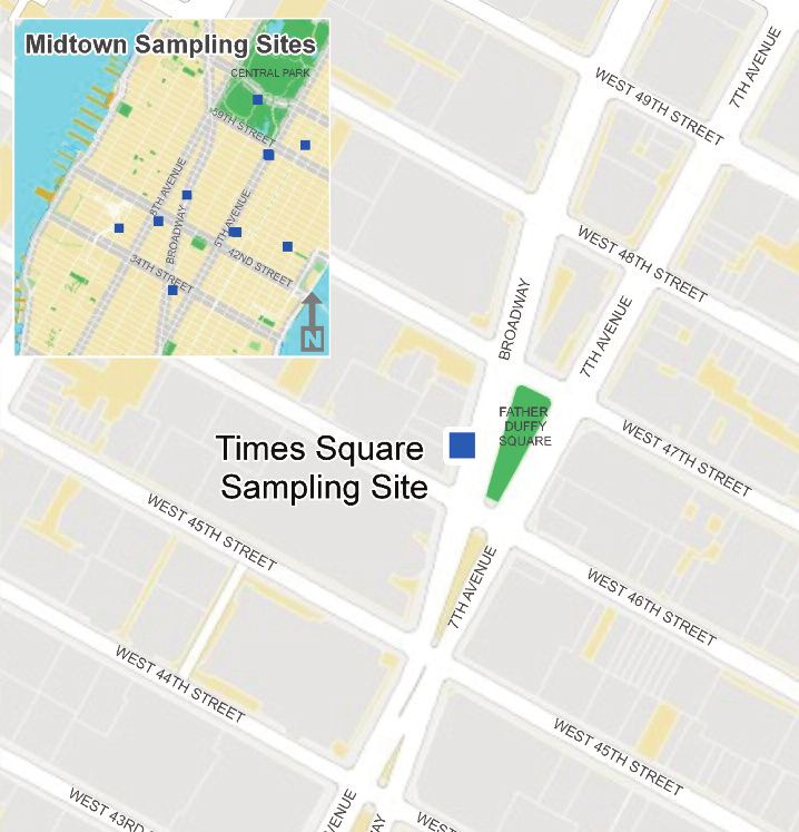
The New York City Community Air Survey, Results from Year One Monitoring 2008–2009 I 4

Elemental Carbon (EC) is a component of PM2.5          The Department of Health and Mental Hygiene
emitted from fossil fuel combustion, including         began monitoring air pollutants at 150 locations
diesel exhaust. EC can cause irritation of the         throughout the city in December 2008. Previous
airways and exacerbate asthma, may increase the        reports describe results from the first winter season
risk of lung cancer, and like greenhouse gases,        (December 2008–March 2009), in December 2009
can contribute to hotter temperatures in cities        and summer season (June 2009–August 2009), in
(the urban heat island effect).                        July 2010. Supplemental reports and other information
                                                       about NYCCAS are available at nyc.gov/health/nyccas.
Nitrogen Oxides (NOx) are gases produced by
                                                       This report describes the results from 1 year of
fuel combustion. They include nitric oxide (NO),
                                                       monitoring, from December 2008 to December
which is rapidly converted to nitrogen dioxide (NO2)
                                                       2009, and is limited to the 4 pollutants that were
after emission from vehicles and other sources.
                                                       measured year-round.
Exposures have been associated with lung irritation,
emergency department visits and hospital
admissions for respiratory conditions. Nitrogen
oxides also contribute to the formation of ozone.
NYCCAS measures 2 other important local pollu-
tants only during certain seasons. Sulfur dioxide
(SO2) is measured only in winter, when emissions
in the city from burning sulfur-containing fuels
(such as residual heating oil) increase. Ozone is
measured only in the summer, when the highest
concentrations occur.

The Community Air Survey aims to
understand New York City’s air
pollution problem and inform future
air quality improvement measures.
The goals of NYCCAS are to:
  Measure concentrations of important air
  pollutants that affect public health.
  Measure how seasonal pollution concentrations
  near street level vary across the city’s diverse
  neighborhoods.
  Learn how emissions from traffic, buildings
  and other local sources affect air pollution
  levels across city neighborhoods.
  Help to inform policy priorities for reducing
  local emissions and improving air quality.
  Provide information to improve how the city
  monitors air quality in the future.
  Estimate population exposure to air pollution
  for future surveillance and health research.
5 I The New York City Community Air Survey, Results from Year One Monitoring 2008–2009

     Methods
                    NYCCAS was designed according to established            for variation that occurs across the city over
                    scientific methods for studying variations in air       time, mainly due to weather conditions. Four
                    pollution, using air samplers mounted on light          season-specific measurements, adjusted for time,
                    poles near street level (Figure 1). The 150 sites       were averaged to compute an annual average
                    chosen represent a wide range of traffic, building      concentration for each site.
                    density and other neighborhood features (Figure 2)
                                                                            The Winter 2008–2009 report and technical
                    to allow for comparisons across the city. If, for
                                                                            appendices, available at nyc.gov/health/nyccas,
                    example, only high-traffic locations were selected
                                                                            provide more details on monitoring methods and
                    in each neighborhood, the data would not be
                                                                            quality-control protocols.
                    useful for estimating pollution in other locations or
                    for comparison across neighborhoods. There
                    were 3 steps in selecting sites:                        Data are analyzed to determine which
                    (1) The map of New York City was divided into           neighborhood factors and pollution
                    a grid of more than 7,500 cells, each 300 x 300         sources predict higher pollutant levels.
                    meters. Cells were classified according to traffic      While the 150 sites in New York City represent one
                    and building density, 2 key indicators of local         of the largest and most dense monitoring networks
                    emissions near the monitoring locations.                in the country, they do not cover all possible
                    (2) 120 “systematic” sites were selected by taking      locations in the city. NYCCAS uses a widely-used
                    a random sample of locations; high traffic and          modeling approach known as land-use regression
                    high building areas were given priority.                to provide air pollution estimates for unmonitored
                                                                            locations. Land-use regression has been used
                    (3) 30 “purposeful” sites were assigned to ensure       previously to study air pollution exposure and
                    that at least 1 monitor was located in every            health effects in urban areas. The method
                    community district, to fill geographic gaps in the      examines how measured pollution levels vary in
                    systematic sites, and to ensure sampling of             relation to traffic, buildings, ground cover and
                    locations of interest, such as high-traffic areas,      other neighborhood factors near NYCCAS monitor
                    or areas near transportation facilities or large        locations. Using the relationship between sources
                    construction sites.                                     and concentrations of air pollutants at monitored
                    The resulting sample includes 141 street-side           locations, a statistical model is used to estimate
                    locations and 14 sites in parks (Figure 2). Each of     annual average air pollution levels throughout
                    the 150 NYCCAS sites was monitored, from                city neighborhoods, including locations where
                    December 2008 to December 2009 for 1                    no measurements were taken. Further
                    randomly-assigned, 2-week period in each of the         statistical methods were used to smooth the
                    4 seasons from December 2008 to December                estimates for mapping purposes. More detail on
                    2009. Five reference sites—one centrally                the land-use regression analysis and data
                    located in each borough, away from potential            sources used to identify factors contributing to
                    pollution sources—were monitored during each            air pollution patterns are available online at
                    2-week period. Data from these 5 sites were used        nyc.gov/health/nyccas.
                    to adjust the measurements from other sites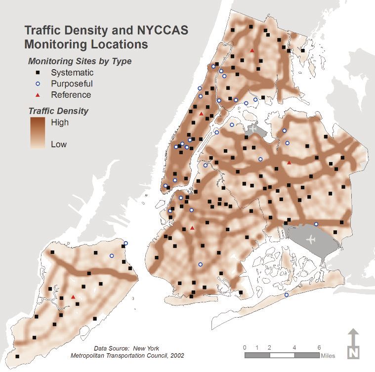
The New York City Community Air Survey, Results from Year One Monitoring 2008–2009 I 6

Figure 1. The New York City Community Air
Survey uses portable air samplers mounted
10 to 12 feet from the ground on light poles,
close to street level, to collect air samples
throughout the 5 boroughs.

Figure 2. New York City Community Air Survey monitoring locations.

7 I The New York City Community Air Survey, Results from Year One Monitoring 2008–2009

     Results
                Data on average annual pollution levels can                                                    Most of the source indicators identified in the
                provide information on general air quality                                                     models reflect sources such as traffic within a
                conditions and exposure to populations. The U.S.                                               specified distance (for example, 100 meters) of the
                Environmental Protection Agency sets certain air                                               sampling location; this does not indicate that more
                quality standards based on annual averages; many                                               distant sources have no impact at all, only that their
                epidemiologic studies and data are based on the                                                influence was not strong enough to be detected in
                association between annual average air pollution                                               the statistical model.
                exposure and health outcomes.
                Overall, annual average pollution levels varied widely                                         Fine Particles (PM2.5)
                across locations for each of the 4 pollutants in this
                                                                                                               Across all NYCCAS sampling sites, after adjusting
                report—fine particles (PM2.5), elemental carbon
                                                                                                               for differences in weather, annual fine particles
                (EC), nitric oxide (NO) and nitrogen dioxide (NO2).
                                                                                                               (PM2.5) at street level averaged 11.3 μg/m3,
                Pollution concentrations were strongly associated
                                                                                                               compared with 10.5 μg/m3 at rooftop regulatory
                with geographic patterns of emission sources, such
                                                                                                               monitoring sites (Figure 3). PM2.5 concentrations
                as traffic and buildings. For each pollutant, the data
                                                                                                               varied from less than 9 μg/m3 to almost 20 μg/m3
                summary contains:
                                                                                                               at NYCCAS sites throughout the city.
                  The range of average concentrations at NYCCAS
                                                                                                               These differences in annual average PM2.5
                  sites compared to citywide average levels from
                                                                                                               concentrations across the sites were most strongly
                  regulatory monitoring sites
                                                                                                               associated with nearby truck traffic (Figure 4) and
                  Average pollutant concentration levels by low,                                               with the density of boilers burning residual heating
                  moderate, and high values of the 2 strongest                                                 oil (#4 or #6 grade)1 (Figure 5).
                  emission source indicators
                  A list of other source indicators that
                  were included in the final statistical
                                                                                                               Figure 3. Annual average PM2.5 varies 2-fold across
                  model
                                                                                                             New York City Community Air Survey monitoring sites.§
                  Maps of estimated pollutant                                                       20
                  concentrations predicted by the
                  statistical model; the maps show                                                  15
                                                                                          μg/m3)*

                                                                                                                                                                                                  Maximum
                  community district boundaries and                                                                                                                                               75th Percentile
                  a reference map labeled with community
                                                                                   PM2.5 (μ

                                                                                                    10                                                                                            Average
                  district numbers is available on page                                                                                                                                           DEC Annual
                                                                                                                                                                                                  Average
                  22. An online annex available at                                                   5                                                                                            25th Percentile
                  nyc.gov/health/nyccas provides a                                                                                                                                                Minimum

                  chart for each pollutant, summarizing                                              0
                  the average and range of estimated                                                     §
                                                                                                          Data show distribution of annual average estimates at 150 NYCCAS sites. New York State Department of
                                                                                                         Environmental Conservation annual average is calculated using data from the 11 Federal Reference Method
                  concentrations by community district.                                                  monitoring sites within New York City.
                                                                                                         * PM2.5 = Airborne fine particulate matter that is less than 2.5 micrometers in diameter; µg/m3 = micrograms
                                                                                                         per cubic meter
                                                                                                         Data source: U.S. Environmental Protection Agency Air Quality System. See the Technical Appendix for
                                                                                                         calculation methods.

                    1
                        Number 6 oil is also known as “heavy fuel oil” or residual oil, and is the remainder of crude oil after removing, by distillation, the lighter
                        gasoline and distillate fuel oils. Number 4 oil is a blend of distillate (#2) and residual (#6) fuel oils used in boilers or furnaces for space
                        heating.
The New York City Community Air Survey, Results from Year One Monitoring 2008–2009 I 8
In the overall land-use regression model, the modeling and smoothing methods. The highest
following factors were important predictors of estimated concentrations of PM2.5 are evident in
annual average PM2.5 concentrations at NYCCAS areas of the highest traffic and building density, such
monitoring sites (in order of importance): as in midtown Manhattan. PM2.5 concentrations are
also relatively higher along highways and major
Average density of truck traffic within 1 mile2
roads. The lowest estimated PM2.5 levels are in parts
Number of boilers burning residual oil within of the outer boroughs, away from major roadways.
1 kilometer
Area of industrial land use within 500 meters
Figure 4. Annual average PM2.5 levels are 30% higher at sites
Land area with vegetative cover within 100
with higher, compared to lower, truck traffic density.§
meters (an inverse association; more vegetative
15
cover was associated with less PM2.5) 13.1
10.8
Traffic density within 100 meters2 μg/m3)* 10.1
10
The association of PM2.5 with industrial land use may
PM2.5 (μ
partially reflect the presence of additional truck
5
traffic and idling in industrial areas, and localized
emissions from industrial equipment, such as
generators and boilers. The inverse association with 0
Lower Medium Higher
vegetative cover, after accounting for other source
Truck Traffic Density
indicators, may reflect fewer emission sources in
§
Truck Traffic density is estimated based on the average density of truck traffic within 1 mile of sampling locations.
vegetated areas, trapping or deposition of particles Each category includes one-third of sampling sites, with traffic density of lower, 0.03-0.88; medium, 0.88-2.29; and
higher 2.29-7.46.
by vegetation, or a combination of both. To study this * PM2.5 = Airborne fine particulate matter that is less than 2.5 micrometers in diameter; µg/m3 = micrograms per
cubic meter
finding further, the association between pollutant
Data source: New York Metropolitan Transportation Council. See Technical Appendix for calculation methods.
concentrations and tree canopy was examined in the
summer; data were adjusted for pollution source
indicators. Results can be found online in Exploring
the Effect of Vegetative Cover on Pollutant Levels.
Figure 5. Annual average PM2.5 is 30% higher at sites
The Health Department is working with the city’s
in regions of higher, compared to lower, density of boilers
burning type #4 or #6 oil.§
Department of Parks and Recreation experts and
other scientists to further study the influence of trees 15
13.0
on air quality.
10.9
10.1
μg/m3)*
The variation in PM2.5, while considerable, was less 10
than that for EC, NO and NO2 because a large
PM2.5 (μ
portion of PM2.5 is produced by major sources
5
outside the city, such as electric power plants in the
Midwest. Since local sources, such as traffic, tend
to account for the majority of EC and NOx, these 0
Lower Medium Higher
pollutants vary more within the city.
Density of Boilers Burning #4 Oil or #6 Oil
Figure 6 shows the estimated annual average PM2.5 §
Density of oil burning boilers using oil #4 or #6 is estimated within 1 km of sampling location. Each category includes
one-third of sampling sites, with count of boilers of lower, 0-4; medium, 4-34 and higher, 34-146.
concentrations across New York City based on the * PM2.5 = Airborne fine particulate matter that is less than 2.5 micrometers in diameter; µg/m3 = micrograms per cubic meter
NYCCAS measurements and land-use regression Data source: New York City Department of Environmental Protection boiler permitting and registration database.
See Technical Appendix for calculation methods.
2
The average was computed using a method that weights traffic on nearby roads more than traffic on distant roads.9 I The New York City Community Air Survey, Results from Year One Monitoring 2008–2009
Figure 6. Map of estimated PM2.5 concentrations, 2008-2009.
* PM2.5=fine particulates; ug/m3=micrograms per cubic meterThe New York City Community Air Survey, Results from Year One Monitoring 2008–2009 I 10
Elemental Carbon
Elemental carbon (EC) is a component of Figure 7. Annual average elemental carbon varies 5-fold across
PM2.5. Annual EC concentrations averaged 1.25 New York City Community Air Survey monitoring sites.§
3.5
absorbance units (abs), which are estimated by
3.0
measuring the amount of light absorbed by PM2.5
deposited on a filter. Higher absorbance indicates 2.5 Maximum
EC (abs)*
larger EC concentrations. EC levels varied 2.0 75th Percentile
Average
significantly across all NYCCAS sites during the 1.5 25th Percentile
year, from just above 0.5 abs to almost 3 abs Minimum
1.0
(Figure 7).
0.5
Variations in annual average EC across locations
0
was strongly associated with boiler density. §
Figure shows distribution of annual average estimates at 150 New York City Community Air Survey sites.
See Technical Appendix for calculation methods.
Figure 8 shows that NYCCAS sampling sites in
* EC=elemental carbon; abs=absorbance
areas with higher boiler densities (burning any fuel
type) had higher EC concentrations (average, 1.6
abs) than sites with lower boiler densities Figure 8. Elemental carbon levels are 60% higher at sites
(average, 1.0 abs). with higher, compared to lower, boiler density.§
2.0
Variations in annual average EC were also strongly
1.6
associated with nearby truck routes. Figure 9 1.5
1.2
EC (abs)*
shows that sampling sites with at least 1
1.0
designated truck route within 100 meters 1.0
averaged 1.4 abs EC and those with no truck
0.5
route within 100 meters averaged only 1.1 abs.
This finding is consistent with a contribution of
0
diesel emissions to EC concentrations. Lower Medium Higher
Boiler Density
The land-use regression model identified §
Boiler density is estimated based on the number of building boilers registered with the Department of Environmental
Protection burning any type of fuel within 200m of each sampling location. Each category includes one-third of
the following as important predictors for EC sampling sites, with boiler counts of lower, 0-3; medium, 3-18; and higher, 19-188.
at NYCCAS sample locations (in order of * EC=elemental carbon; abs=absorbance
Data source: NYC Department of Environmental Protection (DEP) boiler permitting and registration database.
importance): See Technical Appendix for calculation methods.
Boiler density (any fuel) within 200 meters
Figure 9. Annual average elemental carbon levels
Total length of truck routes within 100 meters
are 20% higher at sites near a truck route.§
Density of oil burning boilers (grades 2, 4 and 6) 2.0
weighted by boiler size3 within 1 kilometer
1.5 1.4
Area of industrial land use within 1 kilometer.
EC (abs)*
1.1
As with PM2.5, the association of EC with 1.0
industrial land use may be partially due to truck
traffic and idling in industrial areas. 0.5
Figure 10 shows higher EC concentrations in 0
Manhattan and the Bronx, and in other areas that None One or More
have more truck routes, industrial land use, and Nearby Truck Route
§
large buildings that require large heating boilers. Nearby truck routes are those within 100 meters of the sampling location.
* EC=elemental carbon; abs=absorbance
See Technical Appendix for calculation methods.
3
Weighted by boiler rated output in British Thermal Units11 I The New York City Community Air Survey, Results from Year One Monitoring 2008–2009
Figure 10. Map of estimated elemental carbon concentrations, 2008-2009.
* EC=elemental carbon; abs=absorbanceThe New York City Community Air Survey, Results from Year One Monitoring 2008–2009 I 12
Nitric Oxide
Figure 11. Annual average nitric oxide varies 13-fold across
Annual average nitric oxide (NO) averaged about
New York City Community Air Survey monitoring sites.§
31 ppb, but varied widely across NYCCAS sites 140
(from less than 10 to almost 130 ppb) (Figure 11). 120
Differences across locations in annual average NO 100 Maximum
NO (ppb)*
levels were most closely associated with local 80 75th Percentile
Average
building density, which may be an indication of
60 25th Percentile
emissions from hot water boilers, cooking and DEC Annual
40 Average
other building-related combustion, but may also
Minimum
reflect congested and idling traffic in densely 20
developed parts of the city. 0
§
Figure shows distribution of annual average estimates at 150 New York City Community Air Survey sites.
Traffic density within 100 meters of the sampling Department of Environmental Conservation annual average was calculated using data from 3 monitoring sites
for NO within New York City.
site also contributed to notable differences in * NO=nitric oxide; ppb=parts per billion
Data source: U.S. Environmental Protection Agency Air Quality System .
annual average NO concentrations across the See Technical Appendix for calculation methods.
city; in areas of heavy traffic, the average was 43
ppb, almost twice that of low-traffic density areas Figure 12. Annual average nitric oxide levels in areas with high building
(Figure 13). NO concentrations are high near busy density are 70% higher than those in areas with low building density.§
roadways because they are a component of fresh 45 41.1
traffic emissions. Rapid conversion of NO to NO2 40
by a chemical reaction causes NO concentrations 35
29.2
30
NO (ppb)*
to decline steeply over relatively short distances 24.1
25
from roadways. 20
15
The land-use regression model approach 10
identified the following as important predictors 5
0
of NO concentrations at NYCCAS sites: Lower Medium Higher
Interior square footage of buildings within Building Density
1 kilometer §
Building density is estimated as total interior built space within 1 km. Each category includes one-third of sampling
sites, with total interior built space area of lower, 0-1.3; medium, 1.3-3.1; and higher, 3.1-26.1 square kilometers. Visit
gov/health/nyccas for calculation methods.
Traffic density within 100 meters * NO=nitric oxide; ppb=parts per billion
Data source: New York City Planning MapPLUTO buildings data. See Technical Appendix for calculation methods.
Vegetative cover within 100 meters
(an inverse association)
Figure 13. Annual average nitric oxide levels in areas with high traffic
Bus traffic density within 100 meters density are nearly twice those in areas with low traffic density.§
45 42.7
Buses tend to travel on busier roads; the
40
association with bus traffic may be partially due 35
29.4
to heavy overall traffic on bus routes. The inverse
NO (ppb)*
30
association between NO and vegetative cover 25 22.3
20
may indicate fewer emissions sources in areas
15
with higher densities of green space and 10
trees, or physical and chemical processes 5
associated with trees and plants that may affect 0
Lower Medium Higher
NO concentrations (e.g., chemical reactions
Traffic Density
with leaves, air cooling or differences in relative
§
Traffic density is estimated based on the length of roads and road types within 100 meters of each sampling location
humidity). weighted by the average traffic volume by roadway type for each borough. Each category includes one-third of
sampling sites, with weighted traffic density of lower, 0-33.4; medium, 33.4-76.8; and higher, 76.8-452.6
vehicle-kilometers per hour.
* NO=nitric oxide; ppb=parts per billion
Data source: Market Planning Solutions Inc. and New York State Office of Cyber Security and Critical Infrastructure.
See Technical Appendix for calculation methods.13 I The New York City Community Air Survey, Results from Year One Monitoring 2008–2009
Figure 14. Map of estimated nitric oxide concentrations, 2008-2009.
* NO=nitric oxide; ppb=parts per billionThe New York City Community Air Survey, Results from Year One Monitoring 2008–2009 I 14
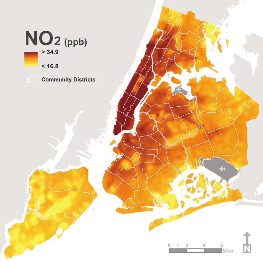
Figure 14 shows estimated annual average NO
concentrations across the city; concentrations are Figure 15. Nitrogen dioxide varies 5-fold across
generally higher in Manhattan, other areas with New York City Community Air Survey monitoring sites.§
a high density of buildings, and along major 70
roadways in the outer boroughs. 60
50 Maximum
Nitrogen Dioxide
NO2 (ppb)*
40 75th Percentile
Average
Annual average nitrogen dioxide (NO2) averaged
30 DEC Annual
about 27 ppb, but ranged from 12 to about 60 Average
20 25th Percentile
ppb across survey sites throughout the city
Minimum
(Figure 15). 10
0
Differences in NO2 across locations were most §
Figure shows distribution of annual average estimates at 150 New York City Community Air Survey sites.
strongly predicted by density of built space within Department of Environmental Conservation annual average is calculated using data from the 3 monitoring sites
for NO2 within New York City.
1 kilometer of the sampling site and the amount of * NO2=nitrogen dioxide; ppb=parts per billion
Data source: U.S. Environmental Protection Agency Air Quality System. See Technical Appendix for calculation
traffic within 100 meters (Figures 16 and 17). methods.
The land-use regression model identified Figure 16. Annual average nitrogen dioxide levels are 60% higher
the following as important predictors of in areas with higher, compared to lower, density of built space.§
NO2 concentrations at NYCCAS sampling 40
locations: 34.5
30 26.0
Interior square footage of buildings within
NO2 (ppb)*
1 kilometer 21.3
20
Traffic density within 100 meters of the
sampling site 10
Vegetative cover within 100 meters (an inverse 0
association) Lower Medium Higher
Density of built space
Location on a bus route (compared to non-bus §
Square footage of built space is estimated within 1 km of sampling location. Each category (includes one-third of
route locations) sampling sites, with built space density of lower, 0-1.34; medium,1.34-3.13; and higher, 3.13-26.08 square kilometers.
* NO2=nitrogen dioxide; ppb=parts per billion
Nighttime population within 1 kilometer Data source: New York City Planning MapPLUTO buildings data. See Technical Appendix for calculation methods.
The inverse association between NO2 and
vegetative cover may simply indicate fewer Figure 17. Nitrogen dioxide levels are 43% higher in areas
emissions sources in areas with higher plant with higher, as compared to lower, traffic density.§
density, or it may indicate physical and chemical 40
32.5
processes associated with plants and trees
30 26.5
that affect NO2 concentrations (e.g., chemical
NO2 (ppb)*
22.7
reactions with leaves, air cooling and differences
20
in relative humidity). Most bus routes are also
heavily-travelled roads; this effect may be due in 10
part to heavy overall traffic.
Figure 18 shows estimated annual average 0
Lower Medium Higher
nitrogen dioxide concentrations across the city.
Traffic Density
These concentrations are generally higher in §
Traffic density is estimated based on the length of roads and road types within 100 meters of each sampling location
Manhattan and other areas with high traffic weighted by the average traffic volume by roadway type for each borough. Each category (lower, medium, and higher)
includes one-third of sampling sites, with weighted traffic density of lower, 0-33.4; medium, 33.4-76.8; and higher,
76.8-452.6 vehicle-kilometers per hour.
densities, and along major roadways in the outer
* NO2=nitrogen dioxide; ppb=parts per billion
boroughs. Data source: New York Metropolitan Transportation Council. See Technical Appendix for calculation methods.15 I The New York City Community Air Survey, Results from Year One Monitoring 2008–2009
Figure 18. Map of estimated nitrogen dioxide concentrations, 2008-2009.
* NO2=nitrogen dioxide; ppb=parts per billionThe New York City Community Air Survey, Results from Year One Monitoring 2008–2009 I 16
Case Study
Air Quality at Times Square Before and After Pedestrian Plazas Were Established
On Memorial Day weekend 2009, traffic was routed away from Broadway between 42nd and 47th Streets
in Times Square, simplifying traffic patterns, reconnecting 7th Avenue through Times Square, and
converting 5 blocks of Broadway to pedestrian space for shoppers, office workers and tourists. The
project was initiated as a 6-month pilot and was made permanent in early 2010.
The project evaluation showed that travel times improved by 15% for traffic travelling northbound on 6th
Avenue and by 7% overall in the project area. The initiative also reduced the number of pedestrian
injuries by 35% and increased the number of pedestrians moving through Times Square along
Broadway and 7th Avenue by 11 percent. The more than 350,000 daily pedestrians who visit Times Square
had additional space; previously, people walking through the area routinely overflowed the sidewalks,
creating safety concerns and discouraging many people from visiting the area. Combined traffic volumes
on Broadway and 7th Avenue at 44th Street declined from about 2,400 per hour (between 7 a.m. and 8 p.m.)
to 1,550 per hour after implementation. See Green Light for Midtown Evaluation Report for more information.
Figure 19. New York City Community Air Survey monitor locations in Times Square.17 I The New York City Community Air Survey, Results from Year One Monitoring 2008–2009
NYCCAS monitors were placed in Times Square and throughout midtown prior to the traffic closures,
including a monitoring site at Broadway between 46th and 47th Streets, near the north end of the pedestrian
areas (Figure 19). Data from winter and spring 2009 air monitoring, prior to the closure, showed that
concentrations in Times Square of NO and NO2, 2 pollutants that are closely associated with traffic, were
among the highest in city locations, and were much higher than the average in other midtown locations
(Figure 20). After the pedestrian plazas were created, concentrations of these same pollutants during the
same seasons in the next year were substantially lower and less than in other locations; PM2.5 (which is not
as strongly related to traffic as NO and NO2) did not show a consistent decline in the area after the
conversion. The NYCCAS monitors also showed that concentrations of traffic-related air pollutants did not
worsen in other midtown locations—in fact, they improved slightly.
In combination, these data indicate that, along with improving in traffic flow, safety and available
public space, the Times Square project resulted in much less exposure of pedestrians (more than
a quarter-million daily) to traffic-related pollutants.
Figure 20. Oxides of nitrogen concentrations at Times Square
monitoring sites before and after the conversion to a pedestrian plaza.
90 Before Pedestrian After Conversion
Plaza Conversion
80
70
Mean NO2 (ppb)
60
50
40
30
20
10
0
0
09
09
9
10
9
8
g1
r0
ll 0
r0
ng
er
er
nte
nte
Fa
rin
mm
mm
ri
Sp
Sp
Wi
Wi
Su
Su
Times Square
160 Before Pedestrian After Conversion
Plaza Conversion Midtown Sites
140
Non-Midtown
120
Mean NO (ppb)
NYC Mean
100
80
60
40
20
0
8
09
09
0
9
0
9
r0
g1
0
r1
ll 0
ng
r
er
nte
nte
e
Fa
r in
mm
mm
ri
Wi
Sp
Wi
Sp
Su
Su
* NO2=nitrogen dioxide; NO=nitric oxide; ppb=parts per billionThe New York City Community Air Survey, Results from Year One Monitoring 2008–2009 I 18
Case Study
Traffic Pollution on Residential Streets Near the Long Island Expressway
As described in this and prior NYCCAS reports, air samples collected across the city show that oxides
of nitrogen (NO and NO2) are strongly related to traffic; the highest concentrations have been recorded
close to busy roadways. To evaluate this pattern near a busy highway with relatively light traffic and
no large buildings or other facilities nearby, supplemental air survey monitors were placed for a
2-week period in summer along residential streets, at distances ranging from 20 to 200 meters
perpendicular to, and on the north and south sides of, the Long Island Expressway in Eastern Queens
(Figure 21).
Figure 21. New York City Community Air Survey monitoring locations along Long Island Expressway, Eastern Queens.
Concentrations of both NO and NO2 decreased with distance from the Long Island Expressway. NO2
concentrations within 50 meters of the expressway were 50% higher and NO levels were almost 4 times
the concentrations at the monitoring sites more than 150 meters from the highway (Figure 22). These data
reflect the pattern that occurs across the city—ambient oxides of nitrogen, which are strongly related to
nearby traffic, are higher near busy roadways. While the concentrations measured are lower than in mid-
town, the results also show that even in more suburban neighborhoods, residents living nearest to freeways
will experience higher exposures to traffic pollutants outdoors near their homes. These exposures could be
reduced by a combination of lower traffic volumes and cleaner vehicles on the busiest roadways.19 I The New York City Community Air Survey, Results from Year One Monitoring 2008–2009
Figure 22. Nitrogen oxide levels decline in areas further away from
the Long Island Expressway in Queens, New York City.
NO2-South
28 NO2-North
26 Mean Background
24
NO2 (ppb)*
22
20
18
16
14
12
10
0 50 100 150 200 250
Distance from highway (m)
NO-South
70 NO-North
60 Mean Background
50
NO (ppb)*
40
30
20
10
0
0 50 100 150 200 250
Distance from highway (m)
* NO=nitric oxide; NO2=nitrogen dioxide; ppb=parts per billion
Limitations of NYCCAS
The pollution concentrations observed from the 12- Land-use regression models cannot evaluate the
month period of December 2008 to December 2009, impact of any single facility or precisely predict
may differ from concentrations during other years, concentrations at specific locations, such as at
but citywide patterns are likely to be similar from individual street corners or addresses. Despite these
year-to-year, reflecting a fairly consistent source of limitations, the results are useful for identifying areas
major pollution, such as highways. of the city with higher or lower pollution levels and
common sources, such as traffic, that affect these
patterns.The New York City Community Air Survey, Results from Year One Monitoring 2008–2009 I 20
Discussion
Air pollution is a major cause of illnesses and of important emission sources, such as traffic and
death in New York City and in other urban areas buildings.
across the United States. Common pollutants in the
NO2 is often used as an indicator of traffic
air emanate from sources that are distant, regional
pollution. NYCCAS monitoring shows higher NO2
and local; therefore, only a combination of federal,
concentrations close to busy roadways throughout
state and local efforts will improve air quality in
the city; this pattern was confirmed with several
all New York City neighborhoods. NYCCAS is an
samples collected near the Long Island Expressway.
important initiative in New York City that informs
The recently updated National Ambient Air Quality
local actions with concrete data about the city’s air
Standard for NO2 establishes a new, 1-hour maximum
pollution problem.
standard of 100 ppb. This standard creates a need
Prior survey findings on wintertime air pollution (see for new monitoring locations near the busiest
the NYCCAS Winter Report and nickel monitoring highways since, throughout the United States, the
Nickel Concentrations in Ambient Fine Particles: highest amount of NOx emissions (38%) emanate
Winter Monitoring, 2008-2009) have already helped from on-road vehicles.
to spur measures to control and eventually eliminate
In contrast to what might be expected in less
emissions from an especially polluting type of heating
densely-developed cities where highway traffic
oil, known as residual or grade #6 oil. This report on
produces the highest density of NOx emissions,
average air pollution levels across all 4 seasons affirms
NYCCAS monitoring shows that the highest NO2
the importance of heating oil as a local pollution source.
concentrations citywide are in Manhattan at loca-
Emissions from traffic also degrade year-round air tions where a number of busy surface roads and
quality in all 5 boroughs—from traffic-choked large commercial and residential buildings are in
Midtown to quieter neighborhoods near major high- close proximity. NOx emissions from buildings and
ways. This report details the impact of pollution from related stationary sources in the city are 25% of the
traffic in 2 specific locations (near the Long Island local total (compared to 3% nationally), nearly as
Expressway in the spring of 2009 and Times Square high as the 30% locally from on-road vehicles (U.S.
before and after traffic closures in May 2009) and the Environmental Protection Agency, 2005). Meeting
potential for reducing it. Although these findings the new NO2 standards in the busiest New York City
were not unexpected and have been identified in neighborhoods will require new initiatives to reduce
other cities, NYCCAS, for the first time, contains both traffic and building emissions. Data from the
data on these associations that can inform priorities New York City Department of Transportation and the
for local action. NYCCAS air pollution monitors in Times Square and
other midtown locations show that creating traffic-
free pedestrian plazas can immediately improve air
Air pollution levels vary by neighborhood.
quality for pedestrians while maintaining or improving
NYCCAS monitoring described in this report shows the flow of traffic elsewhere.
enormous variation in neighborhood air pollutant
Although direct emissions from buildings are
levels. Pollutants with mostly local sources, such as
highest during the winter heating season, hot
EC, NO2 and NO, in particular, can vary 5- to 13-fold
water heating and cooking are year-round sources
from one location in the city to another. While each
of combustion emissions. Indicators of these in
pollutant has its own unique geographic pattern, the
NYCCAS models include density of boilers and,
maps of all 4 pollutants show important similarities,
specifically, density of oil-burning boilers (significant
such as high levels in midtown and downtown
predictors of EC), density of residual oil-burning
Manhattan, and in sections of the Bronx, Brooklyn,
boilers (a significant predictor of PM2.5), and building
Queens and Staten Island along busy freeways.
density (a significant predictor of NO2 and NO).
These high levels are driven in part by a convergence21 I The New York City Community Air Survey, Results from Year One Monitoring 2008–2009
Building density may also be a measure of vehicle Emissions should be reduced.
emissions since commercial areas with high
The findings in this report affirm the need for more
concentrations of large buildings also tend to
local action to reduce traffic- and building-related
have high volumes of traffic and congestion.
emissions, especially in the most polluted parts of
the city. Recent state and local measures to
What are the implications of the study reduce, and eventually eliminate, the most
for public health? polluting heating fuels are expected to result in
NYCCAS monitors pollutants that are proven to cleaner air and fewer health impacts. Steps
have adverse health effects at concentrations that towards making buildings more energy efficient
are common in the city. The pollutants evaluated will also reduce emissions from heating and
for this report include PM2.5, which is associated electric power generation.
with the exacerbation of cardiovascular and lung Traffic-related pollution poses a greater challenge;
diseases (including asthma), and contributes to trucks, cars and buses are all significant
work and school absences, emergency room contributors. Replacing and retrofitting old,
visits, hospitalizations and premature mortality. heavy-duty diesel vehicles should be expanded
Elemental carbon is a marker of exposure to and accelerated. Continued conversion of the taxi
diesel exhaust, which is linked to chronic lung fleet to hybrids is a priority, as taxis account for a
inflammation, may cause or exacerbate allergies, significant amount of vehicle traffic in midtown
and is a probable human carcinogen. NO2 is a Manhattan, adding to already high levels of pollu-
respiratory irritant that can exacerbate respiratory tion. Changes in vehicles themselves, however,
illnesses, such as asthma, and also can result in will produce slow progress at best. The number
emergency department visits and hospitalizations. of private automobile trips must decrease in favor
There are factors responsible for the public health of public transit, biking and walking; such
impact of New York’s air pollution other than changes will produce cleaner air, reduce CO2
concentrations of single pollutants. These pollu- emissions and increase physical activity. Im-
tants emanate from certain common sources; provements in access to, and the efficiency of,
many New Yorkers are exposed to high concen- mass transit should be coupled with planning new
trations of multiple, harmful pollutants (including housing and commercial development in neigh-
those measured in NYCCAS and others, such as borhoods that are already close to public transit.
benzene and ultra-fine particles). The tendency for Creating plazas to separate people from vehicles
higher concentrations of pollutants to occur in in some of the city’s busiest neighborhoods can
densely-populated neighborhoods exacerbates significantly improve air quality for pedestrians
the potential public health impacts of air pollution. and create quieter and more pleasant places to
In addition, the sectors of the population who are walk, shop and enjoy the city.
especially susceptible to air pollution (for example, There are many components to the PlaNYC
people with asthma), varies greatly across all city initiatives to improve air quality; to learn more, visit
neighborhoods. nyc.gov/html/planyc2030/html/home/home.shtm.The New York City Community Air Survey, Results from Year One Monitoring 2008–2009 I 22 Annex: Reference Map of Community Districts.
23 I The New York City Community Air Survey, Results from Year One Monitoring 2008–2009

                      Manhattan                                      Queens
                      Battery Park City, Tribeca (1)                 Astoria, Long Island City (1)
                      Greenwich Village, SOHO (2)                    Sunnyside, Woodside (2)
                      Lower East Side, Chinatown (3)                 Jackson Heights, North Corona (3)
                      Chelsea, Clinton (4)                           Elmhurst, South Corona (4)
                      Midtown Business District (5)                  Ridgewood, Glendale, Maspeth (5)
                      Stuyvesant Town, Turtle Bay (6)                Forest Hills, Rego Park (6)
                      West Side, Upper West Side (7)                 Flushing Bay Terrace (7)
                      Upper East Side (8)                            Fresh Meadows, Briarwood (8)
                      Manhattanville, Hamilton Heights (9)           Woodhaven, Richmond Hill (9)
                      Central Harlem (10)                            Ozone Park, Howard Beach (10)
                      East Harlem (11)                               Bayside, Douglastown, Little Neck (11)
                      Washington Heights, Inwood (12)                Jamaica, St. Albans, Hollis (12)
                                                                     Queens Village, Rosedale (13)
                                                                     The Rockaways, Broad Channel (14)
                      Bronx
                      Melrose, Mott Haven, Port Morris (1)           Staten Island
                      Hunts Point, Longwood (2)
                      Morrisania, Crotona Park East (3)              Stapleton, Port Richmond (1)
                      Highbridge, Concourse Village (4)              New Springville, South Beach (2)
                      University Hts., Fordham, Mt. Hope (5)         Tottenville, Woodrow, Great Kills (3)
                      East Tremont, Belmont (6)
                      Bedford Park, Norwood, Fordham (7)
                      Riverdale, Kingsbridge, Marble Hill (8)
                      Soundview, Parkchester (9)
                      Throgs Nk.,Co-op City, Pelham Bay (10)
                      Pelham Parkway, Morris Park, Laconia (11)
                      Wakefield, Williamsbridge (12)

                      Brooklyn
                      Williamsburg, Greenpoint (1)
                      Brooklyn Heights, Fort Greene (2)
                      Bedford Stuyvesant (3)
                      Bushwick (4)
                      East New York, Starrett City (5)
                      Park Slope, Carroll Gardens (6)
                      Sunset Park, Windsor Terrace (7)
                      Crown Heights North (8)
                      Crown Heights South, Wingate (9)
                      Bay Ridge, Dyker Heights (10)
                      Bensonhurst, Bath Beach (11)
                      Borough Park, Ocean Parkway (12)
                      Coney Island, Brighton Beach (13)
                      Flatbush, Midwood (14)
                      Sheepshead Bay, Gerritsen Beach (15)
                      Brownsville, Ocean Hill (16)
                      East Flatbush, Rugby, Farragut (17)
                      Canarsie, Flatlands (18)
Health
You can also read