U.S. Bond Market Outlook: Government Shutdown, No Fed Tapering, Now What? - Tom Tzitzouris Oct 9, 2013
←
→
Page content transcription
If your browser does not render page correctly, please read the page content below
U.S. Bond Market Outlook:
Government Shutdown, No Fed
    Tapering, Now What?

            Tom Tzitzouris
     Head of Fixed Income Research
       Strategas Research Partners

              Oct 9, 2013
             (202)-223-7646
      ttzitzouris@strategasrp.com

                                     1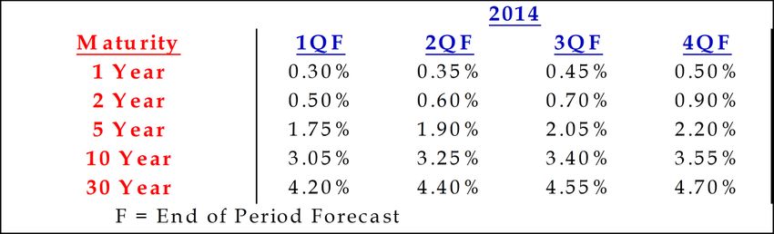
Government Shutdown and the
        Debt Ceiling Debate Impacts:

FOR NOW ALL CLEAR, THOUGH EXTENDED GOVERNMENT
 SHUTDOWN COULD POSE RISK TO THE CREDIT MARKETS
Each day that the government shutdown persists, the risk to the corporate, muni, and EM credit
markets rises. This risk rises slowly at first, but more rapidly if the shutdown continues to drag on,
and this is to say nothing of the risk from another debt ceiling fight. Yet corporate credit, including
high yield, is potentially in another sweet spot for now, where growth is adequate to support debt
service needs, bond market use has generally been conservatively rationed (refinancings are still a
strong source of issuance), and the Fed is now seemingly on hold for another quarter, with
rumblings of a January move now starting to gather steam. All of this suggests that there are few
catalysts for an uptick in corporate credit selling, and little immediate risk that corporate spreads
will bulge higher in the early days of this shutdown. In fact, strong arguments can also be made for
the EM credit sector and the muni sector, though seasonal municipal issuance patterns could add
some pressure to muni spreads, as October is typically a more active supply month. Altogether,
we expect credit sensitive sectors to ride out the government-induced noise fairly well, with
little or no spread widening up to a certain point. But when that point is potentially
breached is difficult to say, and it would seem to be no later than the first signs that the
debt ceiling fight is becoming toxic. If and when this occurs, credit markets could become
one of the first visible casualties.

                                                                                                     2
NO STRESS YET: INVESTMENT GRADE CREDIT SPREADS
HAVE FOUND A HOME JUST ABOVE THEIR SUMMER LOWS
Barclays Index Option Adjusted Spreads
1.6% (Investment Grade Corporates)
Ignoring for the moment the risks posed by a prolonged government shutdown, we find the
fundamental and technical backdrop for investment grade credit spreads to be fairly indicative of
a benign environment for the remainder of the year. This is in light of the Fed’s decision to
postpone tapering as well as what’s shaping up to be a generally flat YoY change in corporate
1.5% credit worthiness. The risk to this view is a credit market disruption like we witnessed in 2011.
1.4%
1.3%
7/1/13 7/16/13 7/31/13 8/15/13 8/30/13 9/14/13 9/30/13
Barclays Index Option Adjusted Spreads
2.6% (Investment Grade Corporates)
2.4%
2.2%
2.0%
1.8%
We would expect to see an equally abrupt move in
spreads if the current shutdown threatens to take the
debt ceiling negotiations hostage, but the magnitude of
1.6%
any move this time is likely to be much smaller, more
likely on the order of 40 to 50 bps, rather than 100.
1.4%
7/1/11 7/16/11 7/31/11 8/15/11 8/30/11 9/14/11 9/30/11
3HY MARKETS EMBED FAR MORE RISK THAN HIGH GRADE,
BUT FOR NOW THEY’VE BEEN WELL-BEHAVED
Barclays Index Option Adjusted Spreads
5.0% (High Yield Corporates)
The Fed has granted the high yield market a reprieve from what, once again, seemed like a
4.9% prolonged spread correction higher, though it’s interesting to note that HY spreads
stabilized well in advance of the Sept FOMC. Absent a debt ceiling fiasco, we see no
4.8% immediate threats to this HY spread stability for the remainder of the year, though we
still believe that the next move in HY spreads is more likely to be higher than lower.
4.7%
4.6%
4.5%
4.4%
4.3%
4.2%
7/1/13 7/16/13 7/31/13 8/15/13 8/30/13 9/14/13 9/30/13
Barclays Index Option Adjusted Spreads
8.2% (High Yield Corporates)
7.8%
7.4%
7.0%
6.6% The 2011 summer spread surge in the HY market was
both abrupt, and painful, and unlikely to be duplicated
6.2% in another round of debt ceiling poker. Nontheless, this
sector is still about 50 bps rich to its 2011 levels, and far
5.8% more susceptible to market seizures than the
investment grade space. And with little liquidity to
5.4% backstop even a modest jump in nervousness, spreads
could still jump 100 bps in a panicked week.
5.0%
7/1/11 7/16/11 7/31/11 8/15/11 8/30/11 9/14/11 9/30/11
4SUPPLY DYNAMICS COULD STALL THE BROADER MUNI
RALLY, BUT A GREATER THREAT LOOMS IN PUERTO RICO
Ratio of AAA 10 Yr Muni GO Yield to 10 Yr TSY Yield
120%
110%
Muni supply seems poised to rebound into a traditionally high supply month,
helping to stall the noisy rally of the broader muni market since the start of the
summer. But lurking beyond the shadows of the current standoff in
Washington is the growing problem of Puerto Rico, which may become the
topic of focus once eyes have shifted away from the nation’s capital.
100%
7/1/13 7/16/13 7/31/13 8/15/13 8/30/13 9/14/13 9/30/13
PUERTO RICO A CASUALTY OF A DEBT CEILING CRISIS?
Barclays Puerto Rico Index Yield to Worst
Puerto Rico embeds the debt load and weak economic growth
7.0%
of Greece circa 2010, with the high need for U.S. dollar
denominated liquidity of Mexico circa 1994. That is to say that
Puerto Rico resembles a struggling sovereign with a choking
6.5% debt load, without the ability to print its own currency.
6.0%
Puerto Rico’s bond market access was legitimately threatened
5.5%
this summer, and it stands to reason that the Commonwealth
could be a casualty of a toxic debt ceiling debate. As such, we
believe that Puerto Rico may be the single greatest risk to
5.0% the U.S. credit markets in the next 12 months.
7/1/13 7/16/13 7/31/13 8/15/13 8/30/13 9/14/13 9/30/13
5Setting the Tone for Global Markets:
Fed Purchase Plans and U.S. Bond Market Will
Likely Determine Tone of Global Markets!
6THE WORLD IS MY CDO!
Thought of as one gigantic CDO, global financial markets have just witnessed a jump in both the
volatility of the collateral that backs this global CDO as well as the correlations in the loss potential
on those assets. In other words, U.S. equities, U.S. HY bonds, and even investment grade
corporates and munis should all have experienced material losses since May, while
emerging market bonds and equities should have witnessed even steeper losses, all
because uncertainty is higher, and there’s less opportunity to diversify this risk away.
FIND YOUR ASSET SLICE OF THE GLOBAL CDO
AAA Tranche
U.S.
Treasuries
AA Tranche German, Canadian, Australian
Sovereigns, and U.S. Agencies
Top quality, most liquid Munis, Provincials,
A Tranche Aussie states, and U.S. and Canadian Corporates,
non-German core European Sovereigns
U.S. HY bonds, peripheral European Sovereigns,
BBB Tranche Emerging Europe Sovereigns, and Mexican Sovereigns
U.S. Equities, Commodities, and
BB Tranche lower quality Emerging Market Sovereigns
Residual Tranche Emerging Market Equities
7IS AN OCTOBER OR DECEMBER TAPER NOW LIKELY?
HAS THE FORM OF THE FED EXIT BLUEPRINT CHANGED?
We still believe that the process of a Fed exit from these extraordinary programs will be a
multi-year event, likely starting by slowly tapering purchases, and possibly ending with a
small amount of outright sales somewhere between 2 to 3 years after tapering has ended.
The in between steps will be the critical components, as they offer the greatest opportunity for
miscommunicated Fed strategy to resonate across markets, adding volatility to expectations and
possibly even causing term premiums to build into the belly and long end of the curve. But the
decision not to cut purchases early, and then assess the program on a real time basis thereafter, may
have increased the odds that purchases remain unchanged throughout 2013. For now, we’re
leaning towards a cut to purchases in December, but the precise is now more uncertain
and the form may vary considerably from the consensus expectation for September.
ONE POSSIBLE ROADMAP FOR A FED EXIT
Stage 1: Taper Purchases to Two-Sided Flexible Schedule;
Timing: Mid to Late Fall 2013
Stage 2: Halt Purchases Entirely and Publicly Discuss Portfolio Runoff;
Timing: Q2 2014 with portfolio runoff communication beginning in Q3 2014
Stage 3: Begin Portfolio Runoff (Likely both MBS and TSY);
Timing: Late Q3 2014 with communication throughout 2014 on conditions for
raising short rates
Stage 4: Raise Short Rates/Increase Interest on Excess Reserves;
Timing: Q2 or Q3 2015 with slow and steady hikes throughout 2015 and 2016
Stage 5: Accelerated Rate Hikes, if Needed;
Timing: Mid to late 2016 with hawkish tone throughout the period
Stage 6: Asset Sales, if Needed;
Timing: Early to mid-2017 with potential sales of between $0 and $1 trillion.
8IN BETWEEN TAPERING AND OUTRIGHT TIGHTENING
LIES PORTFOLIO MANAGEMENT AND COMMUNICATION
Assuming that tapering has begun before the end of 2103, we expect to see a slow
escalation of hawkish Fed communications from there on out, assuming a continued
improvement in the labor market and diminishing global macro risks. The next two steps (an
end to purchases and a move towards portfolio runoff) will most likely come within 12 months of
the initial Fed announcement to taper. It’s also during these stages that a miscommunication could
spark another bond market rout. This risk may be heightened by the announcement of a new Fed
Chairperson, who will be guiding the bulk of the Fed’s exit in the coming years. Again, this suggests
that policy may be deliberately slow and communications cautiously worded, both leading up to,
and after tapering. One key concern now is that by not tapering in September, the Fed may
have sacrificed some credibility, making an eventual decision to taper a sloppier exercise
with potentially more resulting market volatility.
TERM PREMIUMS HAVE VARIED THROUGH THE SUMMER,
BUT HAVE STABILIZED AT REASONABLE LEVELS
Treasury Term Structure Yield Premium1 (as of 10/1/13)
0.5%
0.4%
0.3%
0.2%
0.1%
0.0%
2 3 5 7 10
Maturity
9THE RISE IN TERM PREMIUMS WAS THE BASIS FOR
THE SUMMER SELLOFF, AND IT REMAINS A RISK
It’s the phenomenon of rising term premiums across the Treasury curve that set off two rounds of
global bond market routs this summer, and was likely a motivating factor to the Fed’s decision not
to taper in September. The reason is that yield premiums to short rate implied fair value rise when
the uncertainty about the pace and timing of rate hikes rises. But this may be unavoidable when
the tapering is formally announced, particularly in light of perceived Fed backtracking this
month.
U.S. 10 Year Yield Premium to Fair Value2
0.6%
Central Banks around the globe, the Fed included,
would presumably like to see risk premiums on
0.4% longer-term safe haven bonds remain anchored as
policy shifts in the U.S. The initial hints that this
may be difficult to achieve may have, at least in
part, played a role in delaying tapering.
0.2%
0.0%
-0.2%
-0.4%
-0.6%
Dec-12 Jan-13 Feb-13 Mar-13 Apr-13 May-13 Jun-13 Jul-13 Aug-13 Sep-13 Oct-13
1) We’ve used our internal model with an expected short rate path of a 25 bps hike in Jun 2015 and 25 bps every quarter for 3 years, and then flat
for the remainder of the decade to construct a fair value. This is then used to extract the yield term premium.
2) Here we’ve used Bloomberg’s estimate of the 10 year term premium, which varies slightly in magnitude and interpretation from our own
internal model.
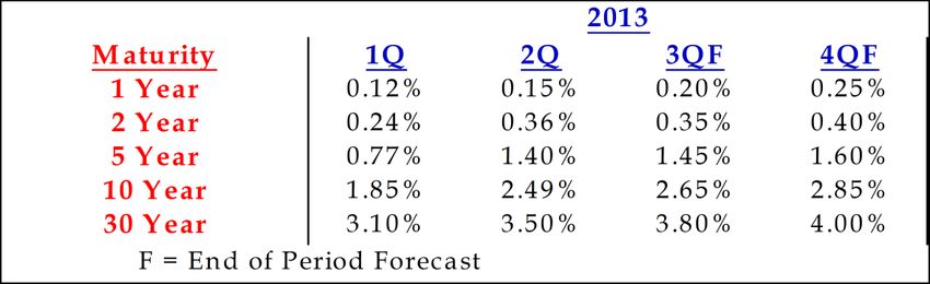
10U.S. YIELD OUTLOOK FOR 2013:
We now believe that tapering is most likely to occur in December, though precise
timing and form will depend entirely on the evolution of broader economic data. With
this said, cuts are now more likely to be evenly weighted between MBS and
Treasuries, suggesting $20 billion of total cuts as a starting point.
2013 U.S. YIELD FORECAST:
TERM PREMIUMS STABILIZING IN POSITIVE TERRITORY
Although unexpected macro shocks could easily destabilize risk markets and send Treasury yields
and term premiums much lower, the broader narrative on the economy would still appear to be
supportive of positive term premiums on Treasuries beyond 5 years maturities. At the same time,
the still fragile economy is likely to find that term premiums are limited in how far they can run up
without threatening to create new macro shocks (i.e. India, Brazil, and even U.S. housing markets),
suggesting that even a taper by December is not a given. For the 10 year Treasury, we see the
term premium remaining inside of 50 bps for the remainder of the year.
STRATEGAS 2013 YIELD FORECASTS
Rising yields from here may be unavoidable, but the pace over the next 12 months
may depend on how credible the Fed is in distinguishing tapering from tightening.
Although we expect the Fed to find some success in restraining further anxieties
on this front, it now seems likely that by postponing tapering, that this goal will
be much more difficult going forward.
11IN NEAR-TERM, SHORT RATE IMPLIED FAIR VALUE AND
TERM PREMIUM STILL PROVIDE SOME BASIS FOR YIELDS
The short rate implied fair value, along with some expectation of how the yield premium will
evolve, still give us a good estimate of how Treasury yields will evolve over the next 12 to 24
months. And these have formed the basis for our yield forecasts, with the belief that the front end
of the curve would remain anchored below or near fair value for longer than the intermediate and
back end of the curve. As such, our forecasts have embedded the expected evolution of fair value,
with a term premium that was commensurate with that stage of the expansion/credit cycle. The
difficulty with this approach has been that the term premium has transitioned much more rapidly
towards a later cycle level than expected. If we were to extrapolate the current 35 bps term
premiums out to the middle of 2015, we would find 10 year yields quickly approaching 4%
by early 2015, and the 3% level being breached in early 2014.
Expected Evolution of the U.S. 10 Year Yield
(Fair Value +42 BPS Term Premium)
4.00%
We’ve revised our forecasts as our forward
3.75%
looking view of the term premium has
evolved. If we were to use the current level of
3.50% term premium to extrapolate out, our revised
10 year forecast would look more like this.
3.25%
3.00% Fair Value
2.75% Fair Value + 35 BPS
Our forecasts had been founded in part on the belief that the
2.50%
term premium would slowly rise throughout 2013, moving
into positive territory in 2014. But Term premiums have
2.25% stabilized in positive territory, and it would likely require
another macro shock and flight back to quality to push
2.00% premiums back into negative territory from here.
Jul-13 Sep-13 Dec-13 Mar-14 Jun-14 Sep-14 Dec-14 Mar-15 Jun-15
12THE MEAT OF THE FED’S EXIT PLAN:
A MOVE TOWARDS TIGHTENING IN 2014 AND 2015
If net new purchases are drawn down to zero by the middle of 2014, as the Fed has hinted, then
the next step will be to allow the existing portfolio to begin to runoff. This announcement is likely
to be made in the late 3rd quarter of 2014, at which point, the Fed will then effectively be in the
tightening phase. If 2010 and early 2011 are any indication of the future, it’s likely that a cautious
Fed will be slow to move from portfolio runoff to an increase in the overnight rate, suggesting that
a rate hike is still at least 6 months, and possibly as much as a year away. This suggests that the
2s/10s spread could continue to rise even after tapering is complete, potentially reaching
an unprecedented steepness before rate hikes commence. If growth and yield expectations are
both moving decidedly higher in the immediate months that follow portfolio runoff, and macro
risks are absent, then the Fed may transition towards a more hawkish tone while moving to raise
short rates earlier. In this scenario, the first rate hike could arrive as soon as the Q1 2015,
which would allow the curve to briefly steepen further from here, before beginning to
flatten before the end of 2014.
U.S. Treasury 2s/10s Spread
At 240 bps, the 2s/10s spread
3.0% now sits about 50 bps away
from its record high. We
believe that a 300 bps 2s/10s
spread in the U.S. may be in
play before 2014 is over.
2.0%
1.0%
0.0%
-1.0%
Aug-89 Aug-93 Aug-97 Aug-01 Aug-05 Aug-09 Aug-13
13U.S. YIELD OUTLOOK FOR 2014:
YIELD NORMALIZATION BEGINS
We see U.S. curve steepening from current levels for most of 2014, as the Fed is
slow to remove accommodation, and even slower to hint at raising rates. This
should put less pressure on the 2 year yield in the early going, though 5 and 7 year
yields could display exceptional volatility, particularly around key communication and
transitions points for the Fed. But once rate hikes begin to enter the lexicon in
late 2014, curve steepening should stall, with curve flattening commencing by
the end of the year.
STRATEGAS 2014 YIELD FORECASTS
The process of 10 year yields moving closer to trend nominal growth
is what we call “yield normalization”. This is a separate process from
both the erosion of safe haven price premiums (already witnessed)
and the “great rotation” (which should follow normalization).
14LONGER-TERM VIEW OF FAIR VALUE:
YIELD NORMALIZATION MAY LOOM IN 2014:
Once wage pressures begin to enter the equation, the notion of fair value needs to shift from one
which is dominated by the impact of short rates, towards one which is dominated by longer-term
fundamentals. For the 10 year, chief among these fundamental benchmarks is long-term nominal
growth expectations. As we’ve frequently noted, history would suggest that for a decade-long trend
growth rate of 4.0% to 4.5%, the 10 year yield should find a home close to 4%. But this is a moving
target, as nominal growth expectations are unlikely to stall around 4% once they begin to rise again.
This suggests that yield normalization, which is the second stage in the rise in yields, may
commence sometime in 2014, and wage increases are likely to be an early indicator of these risks.
Average Quarterly 10 TSY Year Yield vs
Trend Nominal Growth3
9.0%
Quarterly Avg 10 YR
6.0%
3.0%
A semi-permanent move in nominal GDP above
4% would likely warrant an acceleration in long
bond yields, regardless of the Fed’s stance on the
0.0%
future path of the short rate. For now, this looks
Trend
like a mid to late 2014 risk, though rising wages
Nominal GDP
could call this hypothesis into question.
-3.0%
Jan-90 Nov-93 Oct-97 Aug-01 Jul-05 May-09 Mar-13
3) For “trend nominal GDP”, we’ve taken the average of the existing quarter, the previous two quarters, and the successive two
quarters so as to incorporate some measure of forward and backward looking foundation for trend expectations.
152015 AND BEYOND:
TIGHTENING MAY LAST FOR 2 TO 3 YEARS AND FED MAY
EVEN END THE CAMPAIGN BEFORE ASSET SALES
Using 2004 as a guide, the Fed’s rate hike campaign should be slow and last 2-3 years. The pace will
depend largely on growth and employment, but the balance sheet size compared to 2004 will be a
key difference. If long bond yields become unanchored (visualized by an asymptotic 2s/10s
or 10s/30s spread), or intermediate inflation expectations continue to rise above 3%, the
rate hike campaign might last longer than 2 years, be more aggressive than the slow, 25
bps increments the market’s expecting, or might require a more rapid pace of liquidity
withdrawal; asset sales. But the important point to note is that outright asset sales are likely to be
the last tool deployed, and only then when inflation expectations are threatening to become
unanchored. Even then, this is likely to be 3 to 4 years after purchases will have stopped, which
means that between 10% and 20% of the Fed’s balance sheet will have already runoff. What’s
more, the GDP normalized size of the Fed’s balance sheet will likely be about 50% to 60% greater
than it was in late 2007, at the start of the easing campaign. Putting it all together, even if asset
sales are needed, the amount required to bring the Fed’s balance sheet down to a “more
normal level” might be as little as $500 billion, though it could be as high as $1 trillion.
5 Yr Market Implied Inflation Expectation vs
6% Fed Funds Target Rate
It seems unlikely that the Fed would move
towards tightening with inflation expectations
5% Ideally, the Fed would like to bouncing around 2%. Rather, like 2003 and again
see medium-term inflation in 2010 and 2011, we would expect the Fed to
expectations remain between require at least one and possibly two quarters of
4%
2% and 3% improving nominal growth before hiking. This
suggests that 5 year breakevens need to get
3% closer to 3% before a hike is on the table.
2%
1%
0%
-1%
Jan-02 Aug-03 Mar-05 Nov-06 Jun-08 Feb-10 Sep-11 May-13
16ONE KEY QUESTION REMAINS:
CAN TAPERING BE SEPARATED FROM
TIGHTENING IN THE MARKET’S MIND?
In light of this blueprint, the key near-term question to keep in mind is, “can the Fed separate
tapering expectations from tightening expectations”? In other words, once the Fed begins to
implement a transition, will the market take the Fed at its word, that the meat of the exit is still long
off in the distance, or will financial markets rush to pull forward the cost of uncertainty? The
answer to this question will likely determine how much volatility financial markets display
over the next 12 months, when tightening is not a legitimate risk, and whether or not the
rise in rates becomes a detriment to global growth, or worse, a cause of regional crises.
EARLY TIGHTENING CONCERNS HAVE EVAPORATED,
BUT HOW LONG WILL THIS LAST?
Rate Hike Probabilities vs U.S. 5 Year Yields
12%
But delaying tapering is a double-
Uncertainty about the timing
edged sword, and the Fed may find
of the first rate hike surged in
10% that it’s even more difficult to
May and again in July. But
separate tapering concerns from a
these concerns have subsided
market-implied tightening when
as Larry Summers withdrew
8% tapering is finally announced.
his Fed Chair candidacy and
tapering was delayed
6%
4% OIS-Implied Rate Hike Prob. (Jan 2014)
5 Yr Yield
2%
0%
5/6/2013 7/6/2013 9/20/2013
17AN EVEN LONGER-TERM VIEW OF FAIR VALUE:
THE GREAT ROTATION
Beyond 2015, the dreaded “Great Rotation” may be all but inevitable. This is the stage in the rising
yield environment where long bond yields surge rapidly higher, providing a material yield premium
even to trend nominal growth. This is also the stage which leaves no doubt that a bond bear market
is in full swing. This stage may be set off by a surprisingly high nominal GDP print, well after
nominal GDP had stabilized at typical levels (i.e., if longer-term trend GDP has stabilized around
5%, then one or two prints above 6% would likely set off such a surge in yields). Using history as a
guide, we can expect to see the 10 year yield find a home between 5% and 7% during this stage.
Admittedly, this is a wide range, but it suggests that yields may have as much as another 300 bps to
rise, AFTER having normalized around 4%. And this move could be rapid, as it’s motivated by
complete capitulation from anchored, core bond investors (banks, pensions, and longer horizon
endowments are just a few), who were previously reluctant to sell. This is usually the cyclical end to
the rising yields, as long bond yields tend to overshoot nominal growth, helping to bring about
economic correction, but the secular trend from there may be still higher in the decades to come.
U.S. 10 Year Treasury Yield
9.00% History suggests that the Great Rotation will
eventually deposit 10 year yields somewhere in the
5% to 7% range, with more recent history
suggesting a final resting place of around 5.25%.
7.00%
5.00%
3.00%
1.00%
Jul-93 Jul-95 Jul-97 Jul-99 Jul-01 Jul-03 Jul-05 Jul-07 Jul-09 Jul-11 Jul-13
18Q: WHAT CAN WE EXPECT OVER THE NEXT 12 MONTHS?
A: VOLATILITY!
At current levels, long bond yields aren’t near either their long-term or their short-term fair values.
In the near-term, this value is rising from around 2.30% for the 10 year, and should be around
2.50% by the end of the year, but we’re well above that now. Yet, we’re a long way from the 3.75%
level, which is about fair value on a nominal growth basis and will be about fair value on an implied
short rate basis in 2 years. As a consequence, strong econ data will push yields drastically higher
than most forecasts would call for, while weaker data has the potential to wipe out most of the
yield gains since May. Complicating things, is that the 2.4% to 2.5% zone is not a stable zone for
the 10 year, because it spurs follow on effects from mortgage buying and selling, and the result is
that we’re unlikely to find peace at those levels either. This leads us to believe that modestly
improving growth expectations over the next quarter will lead to an equilibrium of about
2.75% on the 10 year, while a return to sluggish growth will lead to a stable habitat around
2.25%, with the potential for much traversing this divide on mixed data.
SURPRISING ECONOMIC DATA CAN CAUSE
TREMENDOUS YIELD VOLATILITY
10 Year Treasury Yield (Early 1983 to Late 1986)
Superimposed over Short-Term Supply and Demand Curves
14%
Price of Funds
13% (Yield)
When yields are not near
stable points from a supply
12%
standpoint (i,e. the supply
of lendable funds is highly
eleastic), even marginally
11%
surprising economic data
can cause volatile yield
responses, called diverging
10%
cobwebs, before a new
equilibrium is reached.
9% Market's Treasury’s
Supply of Demand for
Funds Funds
8%
7%
Dec-79 Dec-80 Dec-81 Dec-82 Dec-83 Dec-84 Dec-85 Dec-86 Dec-87 Dec-88 Dec-89
Quantity of Funds
19BEWARE THE HILL STREET SYNDROME:
CRIME AND DEBT A TOXIC BREW FOR CITIES
Is the lesson from Detroit as simple as high crime and overburdened tax bases are a toxic mix?
That is to say, after all the legal and econometric studies on Detroit's bankruptcy have
been peer-reviewed, will the final conclusion be just a modified version of the Reinhart and
Rogoff hypothesis; that there's some combination of debt AND crime that permanently
impairs growth? In deference to the Captain Frank Furillo and his cast of regulars in the Hill
Street Precinct, we've frequently referred to this phenomenon as the "Hill Street Syndrome". With
Detroit finally having succumbed to the syndrome, we wonder if there are other large American
cities which are following close behind. Thankfully, it appears for now that the answer is no, as
even among distressed cities, Detroit may have been an outlier. Nonetheless, there are other
cities, along with their surrounding satellite communities, which are pushing closer to the event
horizon which swallowed Detroit, and perhaps most importantly, these risks don't appear to be
priced into the GO bond market.
A TALE OF TWO CITIES
Violent Crime Rate Per 100,000 Residents
3000
2500
2000
The twin peaks of the 80s were followed
1500 by a precipitous drop in crime for much
of the country over the next two decades. Detroit NYC
But Detroit has been an exception, seeing
1000
little progress since the worst days of the
80s. This, no doubt, worsened Detroit’s
prospects for economic recovery after
500
the financial crisis.
0
1980 1984 1988 1992 1996 2000 2004 2008 2012
20LET’S BE CAREFUL OUT THERE!
Personal Crime Rates Per 100,000 Residents
Violent Aggravated
City Population Robbery
Crime Rate Assault
Detroit, Michigan 713,239 2,137 696 1334
St. Louis, Missouri 320,454 1,857 664 1099
Oakland, California 395,317 1,683 851 754
Memphis, Tennessee 652,725 1,584 472 1032
Atlanta, Georgia 425,533 1,433 551 827
Baltimore, Maryland 626,848 1,417 552 780
Cleveland, Ohio 397,106 1,366 795 464
Buffalo, New York 262,484 1,238 556 623
Kansas City, Missouri 461,458 1,200 361 758
Miami, Florida 404,901 1,198 494 663
Detroit was the leader in the category of Property crime rankings in 2011 show the
violent crime in 2011, but it was by no same general cast of characters, with a
means an outlier. Other troubled slightly different ordering. High rates of
Midwestern and Southeastern cities face property crime, by definition, impair the
daunting violent crime problems that will primary revenue streams of many city and
consume city services, and potentially county governments, and pose a threat to
serve as a “senior tranche” to bondholders future budgets.
if credit worthiness declines.
Property Crime Rates Per 100,000 Residents
Motor
Property
City Population Burglary Vehicle
Crime
Theft
St. Louis, Missouri 320,454 8,010 2189 1051
Atlanta, Georgia 425,533 7,084 1762 1262
Cincinnati, Ohio 297,160 6,886 2246 429
Memphis, Tennessee 652,725 6,489 2031 526
Cleveland, Ohio 397,106 6,377 2696 1031
Columbus, Ohio 787,609 6,227 1926 459
Detroit, Michigan 713,239 6,144 2242 1594
San Antonio, Texas 1,355,339 5,967 1131 435
Oklahoma City, Oklahoma 586,208 5,819 1681 692
Miami, Florida 404,901 5,661 1270 667
21WHEN CRIME RATES ARE COMBINED WITH DEBT
BURDENS, DETROIT STANDS ALONE
The combination of high crime, and high per capita debt may be the toxic mix that cripples any
city’s fiscal recovery plans. In the case of Detroit, the high crime alone wasn’t that much of an
outlier, but when combined with the city’s also high per capita indebtedness4, Detroit can
easily be seen as an extreme case. Nonetheless, many key U.S. cities are also in the wrong
quadrant of combined crime and debt, most notably Baltimore, Philadelphia, and Memphis, with
Oakland, Newark, Nashville, and a host of others bordering on the danger zone.
Scatter Plot of 50 Most Violent U.S. Cities Vs Per Capita G.O. Debt
$6,000
NYC
Cities in this upper right quadrant are
$5,000 the most at risk from above average
debt AND above average crime.
Detroit was clearly the most far gone,
Per Capita G.O. Debt
though other large cities have also
$4,000 found their way into this danger zone.
$3,000
$2,000 Memphis
Detroit
Philadelphia
Baltimore
$1,000
San Jose
$-
0 500 1000 1500 2000 2500
Violent Crime Per 100,000 Residents
4) Here we’ve estimated per capita indebtedness using just General Obligation debt from the most recently available Comprehensive
Annual Financial Reports for each of the 50 most violent cities on the list. Of note, some cities on the list have no G.O. debt.
22IS THE MARKET DIFFERENTIATING AMONG UPPER RIGHT,
AND LOWER LEFT QUADRANT CITIES
In general, the message appears to be that, as of now, the market is pricing in little, if any
incremental default risk for issuers in or approaching the danger zone. This may be partly hidden
by the fact that issuers like NYC are unique, and must be considered separately. Likewise, some of
the larger, more crime ridden cities, also tend to have the advantages of being more visible, more
liquid issuers in high tax states, so a better comparison might be to high quality, liquid issuers in
that state. Still, the result seems to be that the current market environment, after we’ve
stripped out Detroit, shows little risk premium for upper right quadrant cities. Although the
circumstances that may require such a risk premium may yet result from the legal precedent that is
Detroit, and our analysis also doesn’t consider pension related debt burdens, it still seems at least a
little curious to us that markets aren’t overtly pricing in tail risk for these more hamstrung of
municipalities. As the case law unfolds though, we may eventually see a change in this dynamic.
Scatter Plot of Avg 10 Yr G.O. Yield vs Hybrid City Strain Index:
Violent Crime + Per Capita G.O. Debt
4.5% (Yields as of 7/19/13)
At best, the market is pricing in no
linear relationship between our hybrid
Avg G.O. Yield Per City
4.0% measure of city stress and respective
10 year G.O. yields. At worst, the
relationship might even be weakly
negative, due to the influence of NYC.
NYC
3.5%
Portland, OR
3.0%
2.5%
0 1,000 2,000 3,000 4,000 5,000 6,000
Hybrid Strain Index: Violent Crime Rate + Per Capita G.O. Debt
23THERE IS A SILVER LINING FOR THE CITIES THAT AREN’T
AS FAR GONE AS DETROIT; RISING PROPERTY TAXES
It’s possible that if Detroit had been given infinitely more time, then rising property values would
have eventually helped to right the city’s fiscal ship. It’s possible, but not likely. Rather, one of the
lessons to be learned from Detroit is that intervention needs to be done early enough to prevent
erosion of the tax base so that property values can support revenue demands, particularly in an
economic downturn. With home prices rising again, local property tax revenues will likely
provide a buffer for even the most indebted cities, making another Detroit unlikely in the
next few years. But cities that don’t heed the warning that high crime and high debt must be dealt
with BEFORE property values begin to plunge again, may find that the expected uptick in property
tax revenues just delays the onset of the Hill Street Syndrome, but doesn’t actually prevent it.
Local Property Tax Revenues &
Freddie Mac House Price Index
16%
18% 14%
Freddie Mac House Price 12%
13% Index, 12 Mo. Rolling, Y/Y
Pct Chg, Left 10%
8%
8%
3% 6%
4%
-2%
2%
Local Property Tax Revenues, 12
-7% Mo. Rolling, Y/Y Pct Chg,
3 Year Lag, Right 0%
-12% -2%
'89 '92 '95 '98 '01 '04 '07 '10 '13
24International Outlook:
Australian Bond Market:
Longer-term Convergence with U.S. Curve
Creates Short-term Opportunity for Bonds,
Though Currency Weakness Lingers. RBA Rate
Cuts May Offset Some Currency Risks for
Medium Maturity Bonds.
25LESSONS FROM CANADA:
CONVERGENCE TOWARDS U.S. CURVE WAS A
KEY TREND OVER THE LAST 25 YEARS
As trade between the U.S. and Canada has grown, and Canadian Central Bank policies began to
mirror those of the U.S., the yield curves of the two sovereigns began to converge, particularly in
the 7 to 10 year region. This likely reflects a combination of logistical proximity, cultural
similarities, but most of all, similar long-term growth, savings, and investment trends.
Canadian 10 Year Yield - U.S. 10 Year Yield
3.0%
The convergence between the relatively higher
yielding Canadian curve and the U.S. equivalent
presented an opportunity for investors in longer
duration Canadian bonds over the past 25 years.
2.0% This opportunity was not without risks, as a
30% plunge in the Canadian dollar in the 90s
made this convergence a high beta trade.
1.0%
0.0%
-1.0%
Aug-89 Aug-93 Aug-97 Aug-01 Aug-05 Aug-09 Aug-13
26STRATEGAS’ THESIS:
AUSTRALIAN CURVE IS LIKELY TO CONTINUE
ITS OWN CONVERGENCE WITH U.S. CURVE
For much of the same reasons why the Canadian and U.S. curves converged in the last
quarter century, we would argue that the same phenomenon should play out between the
U.S. and Australia. Logistical and trade balance differences between Canada and Australia suggest
that this convergence may not be as smooth as the one witnessed between the U.S. Canada, but
converging global banking regulations suggest that this risk is more likely to be reflected in the
exchange rate, rather than in intermediate and long maturity bonds.
Australian 10 Year Yield - U.S. 10 Year Yield
3.0%
2.0%
1.0%
The convergence between the U.S. and Aussie curve has
accelerated since the financial crisis has subsided, and
0.0%
we would expect this to continue for a fairly wide range
of nominal growth rates in the U.S. This suggests that
some benefit to maintaining a slightly higher duration
in Australian bonds than in other regions.
-1.0%
Aug-99 Aug-01 Aug-03 Aug-05 Aug-07 Aug-09 Aug-11 Aug-13
27WE PREFER MEDIUM MATURITY AUSSIE CORPORATES
WHICH HAVE HELD UP WELL AS ECONOMY WEAKENED
The Australian economy remains sluggish in 2013, roughly 2 years after export disinflation began to
work its way through the broader economy. Not surprisingly, the Aussie dollar had delivered one
of the largest losses in the actively traded FX market this year until tapering was postponed. And
with a clear Central Bank bias towards further easing, AUD weakness seems more likely than
strength in the near-term. From a balance of trade standpoint, the combination of export
disinflation and modest, currency-induced, import inflation, may pose a risk to the Australian
corporate credit sector. This is worrisome in light of the heavy concentration of financials in the
Australian corporate bond market, and the high debt burden of Australian consumers. Add to this
a toppy Australian housing market, and it could be a blueprint for a selloff in Australian credits.
Yet, corporates have held up well since global yields began to rise in May, even outperforming their
U.S. counterparts before FX effects are taken into consideration. And with the RBA seemingly
content to ease its way towards stronger domestic growth, it seems unlikely to us that Aussie
corporates will fall victim to capital flight the way emerging market equivalents have. In light of
this, we view medium maturity (roughly 5 years) Australian investment grade corporates as
an attractive allocation, and with yields that are 200+ bps north of U.S. equivalents, they
seem likely to outperform in the absence of further downside in the AUD. At the same
time, we would resist the temptation to add or reduce duration in Australia, instead
preferring to gradually roll down the curve over the next year. This allows investors to take
advantage of the steep corporate curve between 3 and 5 years and the easing bias at the RBA.
IS AUD WEAKNESS HURTING BOND RETURNS AND TRADE?
Australian Dollar in U.S. Dollars
1.14
1.10
1.06
1.02
0.98
0.94 Australian dollar weakness has impaired the otherwise healthy
total returns of Aussie bonds. At the same time, there are fears
0.90
that AUD weakness may actually spur a modest uptick in
0.86
import price inflation, without a concurrent rise in export prices.
Aug-11 Jan-12 Aug-12 Jan-13 Aug-13
28WEAKENING TRADE POSES A RISK TO AUSSIE CORPORATES
Australian Terms of Trade Proxy
15% (QoQ Export Price Chg - QoQ Import Price Chg)
12%
9%
6%
3%
0%
-3%
Slowing global demand for Australian exports
-6% and rising costs of imports have both worked
against the Australian economy, posing some
-9%
risk to the bank and financials led local
-12% corporate bond market.
-15%
Jun-03 Jun-04 Jun-05 Jun-06 Jun-07 Jun-08 Jun-09 Jun-10 Jun-11 Jun-12 Jun-13
Australian Trade Balance
3,500 (Monthly, in Millions of AUD)
2,800
2,100
1,400
700
0
-700
-1,400
The balance of trade had been a drag on the
-2,100
Australian economy since late 2011, though recent
-2,800 data would seem to indicate that import inflation
risks from a weaker AUD are limited.
-3,500
Jun-07 Jun-08 Jun-09 Jun-10 Jun-11 Jun-12 Jun-13
29AT LEAST ONE MORE RBA RATE CUT
PRICED IN DURING 2013
OIS-Implied Overnight Rate Probabilities (as of 9/9/13)
50%
Cash
Swaps suggest a 36% chance of a 25 bps rate cut by year end and Rate of
about a 10% chance of a cut to 2.00%. Although further rate cuts 2.25%
could convey a bearish tone to the AUD, it would likely keep
the credit curve steep between 3 and 5 years, allowing for 5
year bonds to roll down into price gains over 12 to 24 months.
25%
Cash
Rate of
2.00%
0%
10/01/2013 11/05/2013 12/03/2013 02/04/2014
5 YEAR AUSSIE CORPORATES REMAIN ONE OF THE MORE
ATTRACTIVE LOCATIONS IN DEVELOPED MARKETS
Yield Shifts (5/1/13 to 9/9/13)
5 Yr Aussie corporates have outperformed U.S. equivalents and U.S. Treasuries since May, as rate cuts
1.5% have helped to pull intermediate-term yields lower in Australia. If the RBA cuts another 50 bps, this
should support maturities inside of 5 yrs and offset some of the effects from further AUD weakness
1.0%
0.5%
0.0%
5 Yr Aussie A Rated 5 Yr U.S. A Rated Corps 5 Yr U.S. Treasury
Corps
30MAINTAINING SHORT HY POSITIONS AFTER 2 YEAR RALLY
We’ve noted that the greatest risk to corporate credits in the next year is not likely to be from
deterioration in credit worthiness. Rather, spread widening, the bigger risk in our view, is likely to
arise from the previous deterioration in corporate sector liquidity, which may be brought to the
forefront by another surge in benchmark rates. Clearly this is a conditional risk, – if benchmark
yields surge, then poor market depth could worsen the performance of spread products as selling
escalates – but it’s a risk that’s worth preparing for by eyeing the risk reward tradeoffs between
spread duration and spread carry. Thus, we believe it’s prudent to keep investment grade
corporate duration near 5 years, while reducing both high yield duration and overall high
yield exposure. We believe that bank loans are one attractive way to reduce high yield
duration, but as this trade becomes more crowded, and regulatory uncertainty threatens to
limit bank and institutional demand, another attractive option may be higher quality (BB)
short duration notes (roughly 2 to 3 years), which have begun to cheapen again.
HY AND IG SPREADS HAVE BEEN STABLE SINCE LATE JULY
Barclays U.S. Indices Option Adjusted Spreads (in BPS)
180 Spreads have stabilized again as yield movement itself has 600
moderated from July’s surge. But this stability isn’t likely to last if
yields begin marching higher again. At a minimum, this suggests
not only a need to resist adding duration with yields at 2 year
highs, but also an opportunity to reduce high yield duration.
160 500
140 400
Inv. Grd. (LHS)
HY (RHS)
120 300
Sep-12 Dec-12 Mar-13 Jun-13 Sep-13
31FLATTER HY SPREAD CURVE SINCE MAY PRESENTS
ANOTHER CHANCE TO MOVE INTO LOW DURATION BBs
Yield Shift From 5/1/13 to 9/04/13
1.6%
As the rise in Treasury yields has slowed, U.S. BB Corps
HY spreads have stabilized, helping to U.S. TSY
1.4%
provide a decidedly flatter shape to the
BB spread curve. Once again this may
1.2% offer the opportunity to either cut
duration in the HY or even the
1.0% investment grade space by moving into
short duration BB names (2 to 3 years).
0.8%
0.6%
0.4%
0.2%
0.0%
3M 6M 1Y 2Y 3Y 4Y 5Y 7Y 8Y 9Y 10Y
SHORT HY SPREADS ALSO WIDER VERSUS C OMPARABLES
Barclays Indices Option Adjusted Spreads
09/04/13
3.5% 5/1/2013
With the exception of auto ABS, which have
widened on fears of weakening borrower
3.0% credit quality, short and intermediate-term BB
spreads are wider versus both similar
2.5% duration ABS, and investment grade corporate
alternatives, despite the higher durations
2.0% found in these investment grade corporates.
1.5%
1.0%
0.5%
0.0%
ABS Credit Card ABS Auto A Corporate Baa Corporate Intermediate Ba
32
U.S. High YieldPRIMARY RISK TO A MIGRATION INTO SHORT HY IS A
NEAR-TERM SURGE IN HY DEFAULTS
Fitch U.S. High Yield Default Rate (with Fitted Trend)
18%
Both short-term (below) and longer-term
16% trends in high yield suggest that defaults
likely bottomed in the past 2 years around
14% 2% and should eventually gravitate back
towards an average of around 5%.
12%
10%
8%
6%
4%
2%
0%
2000 2001 2002 2003 2004 2005 2006 2007 2008 2009 2010 2011 2012 2013
Fitch U.S. High Yield Default Rate (with Fitted Trend)
With 2 year BB yields now about 90 bps above
3.0% History suggests that a HY default rate of 2.5%
similar maturity ABS, and assuming a 40% recovery
to 3.5% is likely over the next 1 and 2 years. This
rate, this suggests a loss adjusted outperformance
would imply a BB default rate of about 1.0% in
for 2 year BBs of about 25 bps to ABS over 1 year
the next year and about 1.5% over 2 years.
and about 90 bps for 2 years.
2.0%
1.0%
0.0%
Jul-11
Feb-12
Aug-11
Feb-13
Dec-11
Jul-12
Aug-12
Mar-12
Dec-12
Jul-13
Mar-13
Jun-11
Nov-11
May-12
Jun-12
Sep-12
Nov-12
May-13
Jun-13
Oct-11
Sep-11
Apr-12
Oct-12
Apr-13
Jan-12
Jan-13
33BUT WIDER SPREADS CAN’T BE DISCOUNTED AS A SOURCE
OF UNDERPERFORMANCE, EVEN FOR 2 YEAR BB NOTES
With only 2-3 years of duration, and a steep spread curve between 1 and 2 years, wider spreads are
not likely to be a primary source of underperformance in short duration high yield. This is in
contrast to broad market investment grade and high yield, where spread duration is a prime
concern over the next 12 months. Yet, it’s possible that the high yield spread curve could continue
to display a bear flattening tone if benchmark yields surge and investors begin to liquidate their
most liquid paper (usually higher quality, shorter duration paper). At present, we believe that the
risks of a material spread widening are growing in the broader credit space, and although we believe
shortening high yield duration or even migrating some investment grade duration towards shorter
high yields are practical ways to reduce this risk, it can’t eliminate it entirely, particularly in another
brutal round of selling. Nonetheless, 2 to 3 year bonds face little to no spread duration risk
for holding periods beyond 12 months.
Strategas Corporate Spread Stability Index
vs
Barclays Corporate OAS Change 12 Months Forward
1.0%
Forecast Change in OAS
(Strategas Spread Stability Index)
0.5%
0.0%
'08 '09 '10 '11 '12 '13
-0.5%
-1.0% Actual Change in OAS
The Strategas Corporate Spread Stability Index, (12 Months Forward)
-1.5%
which we introduced earlier this year, is designed to
express the likely path of broad investment grade
-2.0%
corporate spreads over the successive 12 months. On
-2.5% account of corporate spreads’ high propensity to
mean revert over periods of 12 months or longer, the
-3.0% Strategas index tends to track the direction of spread
movements fairly well, and the change in direction
-3.5% (the second derivative) even better, but it tends to
overshoot and undershoot in the early going.
-4.0%
-4.5% The index is now suggesting that investment grade spreads are prone to widening
by roughly 50 bps over the coming 12 months. This does also suggest a moderate
-5.0% risk that short duration HY spreads could widen enough over 12 months to
eliminate any outperformance versus comparable short duration assets.
-5.5%
34You can also read