Venmo, the easy, minimalistic way to send payments - and stay connected - Isabelle Armstrong HCDE 301: Advanced Communication
←
→
Page content transcription
If your browser does not render page correctly, please read the page content below
Venmo, the easy,
minimalistic way to
send payments –
and stay connected
A memo by:
Isabelle Armstrong
HCDE 301: Advanced Communication

                     October 8th, 2018
                  University of Washington
Introduction:
Since its inception in 2009, Venmo has provided a platform to facilitate peer-to-peer
payment transactions. This memo evaluates Venmo’s success through its user
interface using three of Jakob Nielsen’s Usability Heuristics: consistency and
standards, aesthetic and minimalist design, and flexibility and efficiency of use. Venmo
processed 17.6 billion USD in 2016 and is projected to increase that in 2018 [1]. As its
usage increases, it is valuable to evaluate its user interface, uncovering design
strengths and pain points. This report discusses these concepts through a background
of Venmo, methods used, results and discussion, a conclusion, and recommendations.

Background:
Mobile transaction applications have become increasingly popular in the smartphone
age, both supplementing and surpassing traditional online web-banking popularity [2].
Venmo sets itself at the forefront of this revolution, backed by its parent company
PayPal. Usage includes sending, ‘Pay’, or requesting, ‘Request’, money from other
users through their username (Figure 1). The application also integrates a social
aspect, where mutual friends’ transaction activity are posted to feeds, ”Global” and
“Friends”. The Venmo user’s account is linked to Facebook, populating the ‘Friend
feed’. In 2018, Venmo also released its “Venmo-card” credit card option in congruence
with MasterCard. The functions and UI of this option will not be evaluated due to its
novelty and limited use.

  Figure 1: Main component           Figure 2: The social component of Venmo.
  of Venmo. [4].                     [4].

                                           1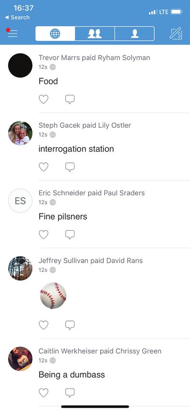
Methods:
Three of Jakob Nielsen's Usability Heuristics will be used to evaluate the Venmo user
interface, consistency and standards, aesthetic and minimalist design, and flexibility
and efficiency.

Consistency and Standards
Nielsen describes consistency and standards as not having to “wonder whether
different words, situations, or actions mean the same thing” [3]. Consistency helps
users move across platforms and recognize mechanisms that are familiar to them.
Without consistency and standards, both between related apps and within the
application, users may struggle to complete simple, but important tasks.

Aesthetic and Minimalist Design
This standard is noted as, “dialogues should not contain information which is irrelevant
or rarely needed,” according to Nielsen [3]. Minimalistic design has dominated the
most successful mobile applications on the market. design is highly aesthetic if it
brings pleasure to the user, increasing the likeliness to return to the application and
report high competence while using it [5].

Flexibility and Efficiency of Use
Efficiency of use allows the user to complete menial tasks with satisfaction and ease.
Nielsen describes this property as “accelerators -- unseen by the novice user -- [that]
may often speed up the interaction for the expert user such that the system can cater
to both inexperienced and experienced users” [3]. Efficiency of use becomes
important for users when deciding whether to keep an application or not. Fourteen
percent of users report that they delete an application when it’s not efficient after a few
tries [9].

Results and Discussion
Throughout the evaluation, Venmo’s minimalistic design and color scheme stood out to
be the defining features of this application. The literature surrounding how good design
influences is clear; it increases sales, customer satisfaction, and efficiency [5]. Venmo
implements a saturated blue color scheme, with a monochromatic white, grey, and
black accents[6]. Surveys from YouGov show that users across various cultures,
primarily choose the saturated blue hues as their “favorite” color [7]. Blue is also a
relatively neutral color that typically does not connotes “negative” implications, like red
might, with stopping or warning signifiers.

                                              2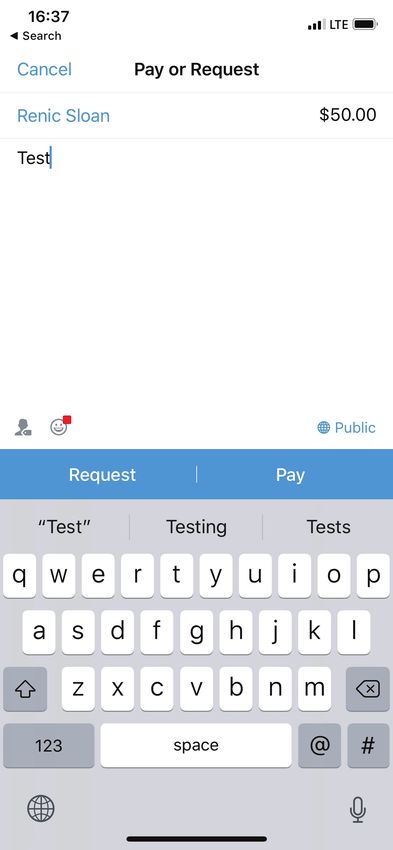
Venmo pairs blue with white space, helping users engage with the content and
facilitating ease of use, especially in the social feed [8]. Venmo particularly focuses on
minimizing use of text and information than what is typically seen. This is in
accordance with Nielsen’s “Aesthetic and Minimalist Design” principle explained
previously, where he notes, “every extra unit of information in a dialogue competes with
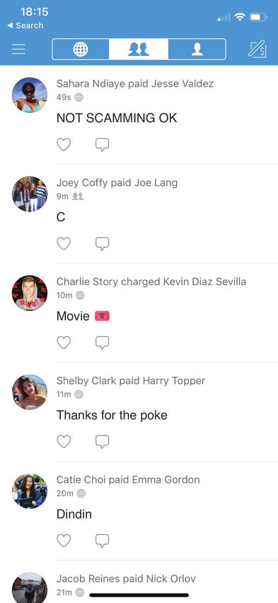
the relevant units of information and diminishes their relative visibility” [3]. In Figure 3,
the main page of the application, the social page denotes payments for items with
Emoji emoticons and short text descriptions. Most text descriptions do not exceed ten
words.
Figure 3: Social Feed Screen. [4].
The minimalist features work synchronously with efficient usage. Some users though,
experience deficiency in the ‘Pay’ or ‘Request’ screen. The two options are labeled
similarly, using the same color, type, and size. This causes issues for those with low
visibility in screens and harms transaction completion efficiency. While the app
streamlines payments, the aesthetic choice of keeping the buttons and colors the
same hinders users’ efficiency and ease of use. This is also in accordance with the
“consistency and standards” aspect of the Nielsen's heuristics explains that “users
should not have to wonder whether different words, situations, or actions mean the
same thing” [3]. The lack of difference in the buttons’ styling risks user error,
accidentally selecting ‘Pay’ or ‘Request’ when they meant to do the opposite. Figure 4
shows the similarities between buttons, and Figure 5 shows the subsequent responses
where users maybe get confused.
3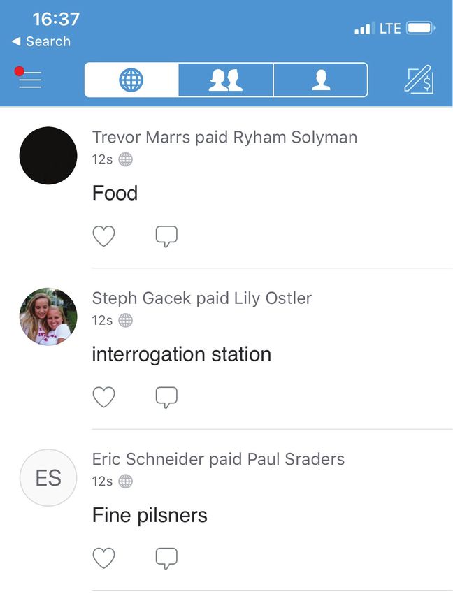
Figure 4: The pay and request screen. [4].

               Figure 5: Next screen after pressing Pay or Request. [4].

The similarities between the button is the first instance of problematic user interaction
when completing transaction in Venmo. The aesthetic design exceeds its minimalistic
goals and may ultimately confuse the user. The necessity for consistency with colors,
size, and other aspects of this screen inhibits efficiency and ease in an integral way.

Not a sign of friction, but instead a seemingly unnecessary add-on, the ‘Global’ shared
payments screen is a part of the application that does not add to its design, efficiency,
or enhance its consistency or standards. The page, which displays all user payments
in a stream of text blocks (seen in Figure 6) is unnecessary, especially considering that
the application is focused on peer-to-peer transactions and highlights them already in
the friends screen of sharing payments.

                             Figure 6: The global payment
                             sharing feed. [4].

                                             4
Conclusion:
Despite this key issue, the rest of the application follows the methods I discussed
earlier, Consistency and Standards, Aesthetic and Minimalist Design, and Flexibility
and Efficiency of Use. As explained, the design focuses on white space and lack of
text to bring together a social page focused on short bursts of fun rather than the
quantity of payment. Users rate the product highly for efficiency and in design giving
the application 4.9/5 out of 3.7M ratings in the Apple App Store and 4.5/5 out of
150,000 ratings in the Google Play Store.

Recommendations:
Venmo should improve their interface by:
     - Adding color to the ‘Pay’ and ‘Request’ buttons for easier access and better
       consistency and standards.
      - Adding a bill-splitting calculator, where users input a full bill, and can request
        friends to contribute to complete it, increasing efficiency and flexibility.
      - Eliminating the Global feed, or give users autonomy to toggle it on or off,
        which would improve the aesthetic and minimalist design, as well as the
        flexibility of the interface.

                                           5
References
[1] Peachey, K. (2018). Banking by app 'to overtake online by 2019'. [online] BBC
News. Available at: https://www.bbc.com/news/business-44166991 [Accessed 10 Oct.
2018].

[2] Poletti, T. (2017). PayPal partnerships pay off, and Venmo could take off next.
[online]. Available at:
https://www.marketwatch.com/story/paypal-partnerships-pay-off-and-venmo-could-tak
e-off-next-2017-04-26 [Accessed 10 Oct. 2018].

[3] Nielsen, J. (2018). Ten Usability Heuristics. [ebook] San Jose: Stanford. Available
at: https://tfa.stanford.edu/download/TenUsabilityHeuristics.pdf [Accessed 10 Oct.
2018].

[4] Screenshot, Venmo LLC via Isabelle Armstrong.

[5] Paunovic, G. (2018). The Bottom Line: Why Good UX Design Means Better
Business. [online] Forbes.com. Available at:
https://www.forbes.com/sites/forbesagencycouncil/2017/03/23/the-bottom-line-why-goo
d-ux-design-means-better-business/#8f6e68523960 [Accessed 10 Oct. 2018].

[6]Venmo, LLC. (2018). About the brand. [online] Venmo.com. Available at:
https://venmo.com/about/brand/ [Accessed 10 Oct. 2018].

[7] Reviews. [Online]. Available at:
https://itunes.apple.com/us/app/venmo-send-receive-money/id351727428?mt=8
[Accessed 10 Oct. 2018].

[8] Reviews. [Online]. Available at:
https://play.google.com/store/apps/details?id=com.venmo [Accessed 10 Oct. 2018].

[9] Shaoolian, G. (2018). 5 Mobile App Features Your Customers Want. [online]
Forbes.com. Available at:
https://www.forbes.com/sites/gabrielshaoolian/2017/06/07/5-mobile-app-features-your-
customers-want/#37dd090b47bf [Accessed 10 Oct. 2018].

                                          6
You can also read