CEP Discussion Paper No 1569 September 2018 Measuring Urban Economic Density J. Vernon Henderson Dzhamilya Nigmatulina Sebastian Kriticos - CEP (LSE)
←
→
Page content transcription
If your browser does not render page correctly, please read the page content below

ISSN 2042-2695

  CEP Discussion Paper No 1569
        September 2018

Measuring Urban Economic Density

      J. Vernon Henderson
     Dzhamilya Nigmatulina
        Sebastian Kriticos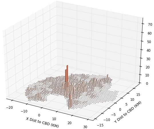
Abstract
At the heart of urban economics are agglomeration economies, which drive the existence and extent of
cities and are also central to structural transformation and the urbanization process. This paper
evaluates the use of different measures of economic density in assessing urban agglomeration effects,
by examining how well they explain household income differences across cities and neighborhoods in
six African countries. We examine simple scale and density measures and more nuanced ones which
capture in second moments the extent of clustering within cities. The evidence suggests that more
nuanced measures attempting to capture within-city differences in the extent of clustering do no better
than a simple density measure in explaining income differences across cities, at least for the current
degree of accuracy in measuring clustering. However, simple city scale measures such as total
population are inferior to density measures and to some degree misleading. We find large household
income premiums from being in bigger and particularly denser cities over rural areas in Africa,
indicating that migration pull forces remain very strong in the structural transformation process.
Moreover, the marginal effects of increases in urban density on household income are very large, with
density elasticities of 0.6. In addition to strong city level density effects, we find strong neighborhood
effects. For household incomes, both overall city density and density of the own neighborhood matter.
Key words: cities, economic density, Africa
This paper was produced as part of the Centre’s Urban Programme. The Centre for Economic
Performance is financed by the Economic and Social Research Council.
This work was supported by the World Banks Strategic Research Program funded by the UK
Department for International Development and by an Africa Research Program on Spatial
Development of Cities at LSE and Oxford, which is funded by the Multi Donor Trust Fund on
Sustainable Urbanisation of the World Bank, and by the UK Department for International
Development. We thank Patricia Jones for sharing value added, location, employment and industrial
code data for Kampala firms from the Uganda Business Inquiry survey of 2002.
J. Vernon Henderson, London School of Economics and Centre for Economic Performance,
London School of Economics. Dzhamilya Nigmatulina, London School of Economics and Centre for
Economic Performance, London School of Economics. Sebastian Kriticos, International Growth
Centre, London School of Economics.
Published by
Centre for Economic Performance
London School of Economics and Political Science
Houghton Street
London WC2A 2AE
All rights reserved. No part of this publication may be reproduced, stored in a retrieval system or
transmitted in any form or by any means without the prior permission in writing of the publisher nor
be issued to the public or circulated in any form other than that in which it is published.
Requests for permission to reproduce any article or part of the Working Paper should be sent to the
editor at the above address.
J.V. Henderson, D. Nigmatulina and S. Kritikos, submitted 2018.
Introduction
   At the heart of urban economics are the sources and nature of agglomeration economies,
which drive the existence and extent of cities. Agglomeration economies are also central to
structural transformation in developing countries: why people urbanize. The literature is
replete with studies attempting to estimate the productivity or wage premium from being
in cities compared to rural areas or from being in bigger versus smaller cities (e.g. Ciccone
and Hall (1996) and Glaeser and Mare (2001), with reviews of the literature in Combes and
Gobillon (2015) and Rosenthal and Strange (2004)). These studies adopt specific, simple
measures of agglomeration such as indicator variables for settlement type (e.g. urban
verus rural), a continuous total population measure, or at best, a basic population density
measure, where the denominator (area) is often inconsistently defined across cities. They
also adopt a specific definition of cities and urbanized areas, often chosen by national
statistics bureaus based on qualitative aspects of land use and the built environment, degree
of centrality of activity, and other often less than precise measures. In some countries,
population density plays a role in the definition but usually not a central one.
   In general, these studies do not provide any statistical rationale for their choices¿ For
example, city definitions are driven by the convenience of adopting some official defini-
tion. Measures of agglomeration are typically chosen with little analysis as to why, with no
quantitative evaluation of what measure(s) would be most relevant. This paper will focus
on an evaluation of different agglomeration measures which we characterize as economic
density measures. We first consider traditional options: urban versus rural, a continuous
total population measure, and a continuous measure of overall population density. How-
ever, these measures do not capture, for a given population and overall density, the degree
to which economic activity is clustered within a city. Two cities with the same density and
population may have very different levels of clustering of economic activity within the city,
which can be captured by other measures reflecting variation in population densities within
a city. We derive and utilise several measures. This issue is important given the increasing
use of the De La Roca and Puga (2017) measure (for example, Collier et al. (2018)), which
reflects to some extent the degree of clustering. Does simple population density suffice or
do we learn more by using more nuanced measures capturing aspects of clustering?

                                             2
To evaluate the efficacy of different measures, consistent with the literature, the paper
will examine how well different measures explain income differentials across space. We
do this for a set of six African countries in a sample that covers the rural sector, 193 low-
density urban settlements with over 5,000 people, and 115 high-density cities with over
50,000 people. We will adopt consistent definitions of urbanized areas. These consistent
definitions will be based on population densities for each 1 km grid square across space.
We aggregate contiguous squares of high density to create cities – which are the consolida-
tion of an urban core and a surrounding lower density fringe – and aggregate contiguous
squares of lower density to create stand alone, low density [LD] settlements. We do not
know the “best” definitions but we will use ones which are consistent across countries and
accord with other population density based initiatives (for example, OECD (2012)). While
admittedly the density and population thresholds we choose are to some degree arbitrary,
they are based on types of thresholds some countries and researchers cite or use – other
papers in the volume tackle that problem more directly.
   For the measurement of economic density, there is the issue of determining relevant
spatial scales. While most papers explore agglomeration benefits at the level of a city
or county, a few papers look within cities at the extent of spatial decay, finding a very
rapid spatial decay (Arzaghi and Henderson (2008), Rosenthal and Strange (2008)). In
Arzaghi and Henderson (2008) spatial decay of estimated effects within New York City is
so quick as to beg the question of why such a huge city even exists. Clearly, there must
be some other overall benefits, such as labor market externalities or greater input varieties
from being in New York beyond density in the own neighborhood. Here we explore both
effects together: those from overall city economic density and from own local neighborhood
economic density. We will ask also if people living in the urban core versus fringe of the
city benefit differentially from overall density characteristics of the city.
   We also explore some economic issues. How do marginal scale effects, or elasticities,
based on correlations with income measures vary across the spatial hierarchy: rural areas,
LD settlements, and cities? Do scale effects vary by the way income is measured: personal
income from all sources or wage income, as compared to household income? What are the
issues in looking at each income measure and what household or personal characteristics

                                                3
should be controlled for?
   Our work is based on a set of developing countries in Africa where there is a literature
focused on push-pull issues in the urbanisation process. These are reviewed in Hender-
son and Kriticos (2018) or Gollin et al. (2016), with analysis of classical push arguments in
Schultz et al. (1968), Matsuyama (1992), Gollin et al. (2007), and Bustos et al. (2016) and
an analysis of pull arguments in Lewis (1954), Hansen and Prescott (2002), and Galor and
Mountford (2008). While we know climate deterioration or conflict may also push people
into cities (Henderson et al. (2017), Fay and Opal (1999), Barrios et al. (2006), Brückner
(2012)), we want to see if in Africa there is the appearance of strong income pull factors.
That is motivated by a literature which argues that, while African cities have high popu-
lation densities, they remain unproductive for the development of traded goods such as
manufactured goods because they have low economic density (Collier and Jones (2016),
Venables (2018), and Lall et al. (2017)). Low economic density arises if firms and eco-
nomic activity more generally are not clustered but spread throughout the city, potentially
because of the high costs of commuting within cities inducing firms to locate nearer to
residents (Fujita and Ogawa, 1982). We will explore whether African cities have a lower
degree of clustering of economic activity relative to the rest of the world and we will take
a detailed look at patterns of clustering within Nairobi and Kampala.
   In the paper, Section 1 starts with how we define cities and what are the advantages and
disadvantages of the LandScan (2012) dataset on economic activity that we use. We then try
to ground-truth LandScan (2012) data using Nairobi and Kampala as test cases. Section 2
defines various measures of economic density for urbanized and rural areas, decomposing
them into first and second moment components. Section 3 compares the extent of economic
density and its attributes for African cities versus other cities worldwide. Section 4 looks at
the relationship between different measures of economic density and income differentials
across the whole spatial hierarchy. Section 5 looks specifically at cities and examines issues
such as the optimal rate of spatial discount for De La Roca and Puga (2017) measures of
neighbor effects; the role of the second moment aspects of economic density measures; and
how important local density measures are within cities, as well as location within the city.
Section 6 looks in detail at how the productivity of firms within Kampala is related to the

                                              4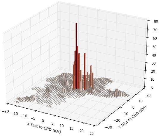
characteristics of the neighborhood in which they locate.

1     Using Landscan Data and Defining Urbanized Areas

1.1     Landscan data

To analyze measures of economic density, we need fine spatial resolution data to calculate
neighborhood effects and variation in clustering within a city. And we need the most
accurate data available. For countries like the USA, both finely gridded population and
employment data are available from censuses. However, in most developing countries that
is not the case. Population data is only available at a coarse scale such as regional or
local government political unit, and economic censuses in Sub-Sharan Africa are generally
non-existent. Even when they do exist (e.g. Uganda), they tend not to be publicly available.
      Our primary data source is LandScan (2012) from Oak Ridge National Laboratory in
the USA, which is now being used in some research (e.g. Desmet et al. (2018)). Oak Ridge
takes population data from censuses and other sources worldwide on as fine a spatial
scale for each country as they can obtain. They then create a measure of an ambient
population for each 1km grid square on the planet, in a process we describe below. The
ambient population is meant to represent where people are on average over the 24 hour
day. To assess the ambient population, they appear to use nocturnal and diurnal population
estimates for at least some areas of the globe, although these are not publicly available.
Later in a ground-truthing exercise for Nairobi and Kampala, we will demonstrate our
own interpretation of how nocturnal and diurnal populations might be estimated and
combined.
      For Landscan, as is for WorldPop1 , the Global Human Settlements Layer2 , and similar
data sets, a key element in this process involves taking population numbers at some upper
level of spatial scale and allocating people to fine grid squares based on where they are
likely to live and possibly work. The typical standard in such work has been to allocate
people on the basis of the relative extent of ground cover in a grid square from Landsat
satellite imagery, or its enhanced versions.
    1 http://www.worldpop.org.uk/data
    2 http://ghsl.jrc.ec.europa.eu/datasets.php

                                                  5
Landscan has two key advantages and two key disadvantages over other data sets.
First, Oak Ridge National Lab is more explicit in the fact that they are trying to estimate
the ambient population with potentially nocturnal and diurnal populations; while in other
algorithms this is implicit through the general smearing of the population into built cover,
without workplace or residence distinction. The second advantage of Landscan is that Oak
Ridge National Lab has access to information which would improve precision over the use
of Landsat to just assign people to built cover. Oak Ridge has access to very high-resolution
satellite data (under 10-40cm) which potentially allows them to distinguish building types
based on what building shapes are likely to house employment versus residents (versus
commercial activities like shopping), as well as potentially to distinguish roads for commut-
ing and even infer building heights with digital elevation modeling [DEM]. A key disad-
vantage in using Landscan is the complete lack of specificity and transparency as to what
Oak Ridge researchers actually do; hence, our use of the word ”potentially” in describing
what they might do. The second disadvantage, which they acknowledge, is that Landscan
data for different time periods are not comparable over time, presumably both because
of differential availability of high-resolution data over time and increasingly sophisticated
extraction of information from later satellite images.
   Hopefully in the future, proposed data sets such as the High Resolution Human Set-
tlement Layer (HRSL)3 or Modelling and Forecasting African Urban Population Patterns
(MAUPP)4 – which also use very high spatial resolution data – will be able to cover a
wider set of time periods and countries consistently with a more explicit methodology.
Then one will be able to compare them with Landscan and do more comprehesive ground-
truthing exercises. Second while ambient population may be a relevant measure to use in
characterising economic density, one might prefer to know about clustering and density of
employment. If the assignment of people to workplace buildings gets very sophisticated,
we would be able to explore the use of employment density measures, as well as ambient
population ones.
  3 https://www.ciesin.columbia.edu/data/hrsl
  4 http://spell.ulb.be/project/maupp

                                                6
1.2     Ground-truthing Landscan

Here we attempt to ground-truth Landscan measures at the grid square level for Kampala
and Nairobi, two cities where we have fine spatial resolution data on population and em-
ployment which is unavailable to Oak Ridge National Lab. We further attempt to replicate
Landscan’s ambient population measure by grid square using an assignment alogirthm on
our own data. We will conclude that Landscan measures do well and seem superior to
other commonly used measures which smear population into grid squares on the basis of
built cover on the ground.
      In the upper panels of Figures 1 and 2, we show the population and employment distri-
bution for Kampala and Nairobi in 1 km grid squares. The population data for Nairobi is
at the level of 2,213 enumeration units for 2009 contained in the 2015 built area of Nairobi
defined in Henderson et al. (2018). For Kampala in 2002, population is at the level of 174
parishes within the administrative unit of Greater Kampala. We assign population levels
from these survey units to the 1km grid square level by applying a weighted sum to the
survey area numbers, where the weights reflect the share of land mass from each survey
area(s) that falls within a 1km grid square. To make Kampala 2002 population comparable
to 2011 employment numbers, we blow up the population in each grid square by an overall
population growth rate of 3% per annum from 2002 to 2011. For employment, we use the
economic census, which covers private and public employment for Kampala for 2011, and
provides exact location points of firms across the city. One issue is that total employment
in the census is far below known estimates; hence, given the age distribution in Kampala
and labor force participation of urban Uganda, we have multiplied each grid squares em-
ployment by 2.761 to make up for the employment deficit.5 The implicit assumptions in
allocating growth and under-counting of employment to grid squares are obvious.
      For Nairobi in 2009, we can quite accurately infer population of the grid square, based
on fine-scale EA data. However, we dont know total employment, nor its distribution. We
infer total employment based on Nairobi’s 2009 population, and labor force participation
and age distribution numbers for urban Kenya. Since there is no economic census for
   5 TheWorld Bank estimates that labor force participation of people aged 15 or more in Uganda is 0.71.
There are 1,704,604 people of age 15+ in Kampala from the 2011 census. Thus, approximately 1,210,267 people
should work out of the total city population of 2,957,505. The Economic census only captures 438,374 of these.

                                                      7
Nairobi, we obtain the distribution of employment using data from Henderson et al. (2018),
where for each grid square we know the footprint and height of every building in Nairobi
in 2015 – from aerial photo and Lidar data – and can calculate building volume. We
match these buildings with land use maps, before taking total employment of the city and
smearing it into grid squares according to each grid squares share in total volume of non-
residential buildings in Nairobi. The alternative would be to smear it into commercial and
industrial buildings, ignoring public buildings. Crucially, unlike Landscan we dont need
to base smearing on inferences from satellite images of what uses buildings have; instead,
we know the use and the volume fairly accurately.
   For each city we create a measure of the ambient population according to the following
equation:


                                  10           14         10
             Replicationi =            Empi +     Popi +     (1 − LFPc ) Popi            (1)
                                  24           24         24

We base our replication of the ambient population just on places of work and residence,
where we assume for 14 hours of a day (nocturnal) all people are in their grid square of
residence to sleep, eat, and recreate. For 10 hours a day, we add in the employment in
the grid square, allowing people time to work, hangout, and finish commuting. We then
add in the non-working population of the grid square assuming they remain in that square
kilometer and subtract out the resident workers (since we have already counted employ-
ment). If everyone works in their grid, then we just have total grid square population; but,
for downtown grid squares where few people live, most have replication numbers from
employment. We make no allowance for the time people are on roads or shopping outside
the grid square. We have no information on which to base such inferences, especially in a
context where so many people commute by walking.
   In Figure 1 for Kampala, we show 4 items. As noted above, in the upper left panel of
each figure is the population distribution over space and on the right upper panel is the
employment distribution. In the bottom panel, on the left, we have Landscan numbers;
and on the right, we have our replication numbers. For Kampala, we see the overall mono-
tonicity of the city. Although it is hard to see, the very low bar population grid squares
near the centre are to some degree filled in by where employment spikes. The bottom

                                               8
right panel shows our smearing to get the ambient population. The Landscan figure has an
obvious degree of smoothing, with reduced peak heights and assignment of lots of people
into low-density grid squares. Of course, it could be that Landscan is allocating people
during commuting times to roads and to shopping areas, and that is the reason for the
smoothing. Overall it seems Landscan may do a reasonable job: the simple correlation co-
efficients of Landscan numbers with population, employment and our replication numbers
are respectively 0.55, 0.60, and 0.60.
For Nairobi in Figure 2, we note our employment patterns lack the sharp peaks of
Kampala, in part because we smear employment into non-residential buildings, including
public buildings. If we just smeared into commercial and industrial buildings we would
get sharper peaks near the centre, but that doesnt mean it is a better choice. The Land-
scan figure again exhibits a degree of smoothing, missing the sharper peaks we see in our
replication, as well as missing high-density slum areas to the south-west of the city centre.
However, Landscan does seem to do a better job of capturing low-density grid squares near
the city center in Nairobi than it does for Kampala. For Nairobi, the simple correlation co-
efficients of Landscan numbers with population, employment and our replication numbers
are higher at respectively 0.65, 0.56 and 0.69.
For Nairobi, we also know exactly the footprint (or ground cover) of all buildings. We
can calculate what would happen if we just smeared total urban area population by share
of each grid square in total urban area built cover, hence replicating what Landsat based
smearing exercises seem to be trying to do. The bottom panel of the figure shows the
result. Inferred density is basically flat throughout the city. As in Henderson et al. (2018),
the figure implies built cover per grid square is basically flat throughout the city (while
building volume and height decline sharply with distance from the centre). This clearly
shows that smearing population into built cover to calculate within-city density variation
would be more problematic than using Landscan data.
1.3 Defining Urbanized Areas
As noted earlier, the problem with typical definitions of urbanized areas – from the United
Nations or economic censuses of different countries for instance – is that they employ
9country-specific city and settlement definitions, which means there is no consistency across
countries. Second, although occasionally definitions are somewhat density based, most
defintions are based on qualitative and subjective criteria including governance elements.
Many countries define cities based on status in the political-spatial hierarchy, local political
boundaries defined historically, or through an application or evaluation process to redefine
rural areas as cities, which tends to under-represent newer fast-growing agglomerations
due to delays both in application and evaluation as well as the granting of status.
We employ a consistent density based definition across our African countries, using
LandScan (2012) population per grid square. We set population per grid square, or den-
sity thresholds to define cities and settlements. To do so, we apply a smoothing algorithm
so that each own grid square is assigned the average density of neighbors within 7km.
Smoothing is essential to avoid large doughnut holes in cities, due to terrain factors, air-
fields, parks, big open public spaces and the like. We define a core city as a set of contigu-
ous grid squares all of which have a density greater than or equal to 1,500 per sq. km. and
the population of these contiguous squares must sum to 50,000 or more. The area included
in these contiguous squares over 1,500 per sq. km. define the area and population of what
we call the city core. We then add in a fringe to each city core, which includes all contigu-
ous grid squares with population density over 500 per sq. km. The core combined with a
fringe is called a city.
For smaller urbanized places that are stand-alone, we require a collection of contiguous
grid squares all with (a smoothed) population density over 500 per sq. km., which collec-
tively sum to 5,000 or more. We call these low density [LD] settlements. Full details of
these urban definitions are given in Appendix B.
The process and impact of threshold decisions are illustrated in Figure 3 for Nairobi.
Core city areas are in dark blue, and overall cities are also outlined in dark blue. There
are two cities in the figure, Machakos to the bottom right and Nairobi. Nairobi consists of
the main core and three small core areas, essentially satellite towns now falling under the
umbrella of Nairobi. The fringe of Nairobi consists of pink and light blue areas, within the
dark blue outline. Our choice of 500 per sq. km. is based on the idea that a lower threshold
such as 300 per sq. km. (yellow areas) is too loose and extends too far into more rural and
10low-density settlement areas much further north of Nairobi. And it would place the centre
of the Nairobi well outside its true central core. A higher cutoff of, say, 750 people per
sq. km. (light blue areas) may be too stringent and exclude satellite cities around Nairobi
that are very likely to be within the commuting zone. Obviously, other arguments about
drawing boundaries can be made. In the figure we also outline in green the independent
LD settlements. Some are very spatially distinct but some follow ribbons (roads) to the
north out of Nairobi, where rural areas are interspersed with urbanized settlements. In the
figure everything in yellow or the Google Earth background is rural.
2 Defining Economic Density
Figure 4 illustrates issues about urban density definitions.6 All hypothetical cities in Figure
4 have the same total population (180) in thousands and average density (5). City 1 has no
clustering. Cities 2 and 3 have the same degree of within grid square clustering, with half
the grid squares with no population and half with 10 people per grid. The 10 means greater
within grid square possibilities for intersecting with others (the pairwise possibilities for
meetings for example, ((n-1)!). However city 2 allows for more possibilities for interactions
with neighbors. Ignoring the boundaries in city 3, on average a grid squares has 40 queen
neighbors, while in city 2 a grid square has 80 queen neighbors.
We now turn to two measures which reflect these differences, personal population den-
sity and De La Roca and Puga (2017) density [RPA]. For a given city area, personal popula-
tion density is a weighted, rather than simple, sum of own cell population densities. So in
Figure 4, that gives a value of 5 for city 1 and 10 for cities 2 and 3. The RPA measure further
makes a distinction between cities 2 and 3. It does a sum of grid square measures, where
each grid square measure is a distance discounted sum of your own and neighbors density
out to a given radius. Each grid square measure is weighted by its population share in the
city. This measure will give a higher value for city 2 than 3.
The basics of what we present is not our invention. Modi (2004) proposed the idea and
term personal population density. Small and Cohen (2004) calculate, on a coarser scale,
6 Figure
4 and the definition and decomposition of personal population density is borrowed from on-going
work by Henderson, Storeygard and Weil. This is gratefully acknowledged.
11a spatial Gini as a measure of within-gridcell variation in activity. De La Roca and Puga
(2017) calculate the RPA measure we use, based on the city 2 idea that neighbors matter.
What we add, based on on-going work by Vernon Henderson, Adam Storeygard and David
Weil, is a decomposition for personal population density, which as far as we know is new;
and, in this paper, we do a similar one for the RPA measure. Also De La Roca and Puga
(2017) don’t apply a distance discount factor. Below, we experiment empirically to try to
find the discount rate that optimizes the added explanatory power of the economic density
measures.
For personal population density [PPD] the measure for city j with Nj cells is:
Nj
Pij Var ( Pij )
PPD j = ∑ Pij = PD j 1 + 2
= PD j (1 + CV ( Pij )2 ) (2)
i
P j PD j
Nj
∑i Pij
where CV: coefficient of variation; Nj : number of grid sqs.; and PD j = Nj .
PPD can be decomposed into overall population density [PD], a typical scale measure,
and one plus the coefficient of variation. The latter captures the degree of variation rela-
tive to the mean within the city and, thus the degree to which activity is concentrated in
particular cells. So cities 2 and 3 (ignoring city bounds) have the same degree of variation
and clustering, but one that is higher than city 1 in Figure 4.
Note that the coefficient of variation has a long history, starting from Williamson (1965),
for use as a measure of regional income inequality within a country. Here we are using it
as a measure of economic density inequality within a city or settlement. Of course, urban
economics has other measures of spatial inequality including spatial HHIs and Gini’s. We
focus on the coefficient of variation because it comes from a natural decomposition; and
one which carries over in essence to the RPA measure.
For the RPA agglomeration measure, the decomposition is
Pij Cov( Aij , Pij )
RPA j = ∑ Aij = AD j 1 + (3)
i
Pj AD j PD j
Nj
∑i Aij
where AD j = Nj ; Aij = ∑kes Pkj e−αdik
12In equation 3, Aij is the measure over radius s of the discounted sum of neighbors
ambient populations. We use an s of about 6 kms, limiting the local radius so we can
distinguish later the effects of city wide versus local density. RPA j is the weighted average
of the Aij , where weights are each grid squares share of the city population. AD j is the
simple average of the Aij across grid squares over the city. RPA j can then be decomposed
into the simple average, and 1 plus the covariance of Aij and Pij , divided by their simple
averages. The latter term captures the degree to which population is allocated to grid
squares with high measures of neighbors (city 2), as opposed to either being uniformly
spread (city 1) or being in grid squares which arent clustered with others of high density
(city 3).
In general, we will have measures of PPD j and RPA j at the level of a city or LD set-
tlement. We will also have local measures, characterizing the neighborhood around which
people live both for rural and urban areas, including for neighborhood i, PPDij , PDij , and
Aij . These we will describe in the particular contexts in which they arise. In all cases, the
neighborhood of a grid cell is the square area running 5 cells to the east, west, north and
south, or an area by size 11x11 grid squares (or 11x11 km which would be similar to a circle
of radius 6.2).
3 How does economic density in Africa compare with the rest of
the world?
Before proceeding into income and wage analyses, we see if our data support the idea
that economic density in Africa is lower than in other parts of the world, despite what
is presumed to be high population density in urban Africa. We interpret lower economic
density as implying that, for the same overall ambient population density, there is less
clustering of economic activity within African cities, so that potentially PPD j and RPA j ,
are lower, and certainly that the coefficient of variation and covariance terms in equations
(2) and (3) would be lower.
We look at this for the world. To deal with issues that are pertinent outside of Africa,
we focused just on larger agglomerations defined in a simple fashion. Details are in Ap-
13pendix B, but effectively these areas are defined by two criteria. First, they are blobs with
contiguous pixels of the density of above 1,500 per sq. km. Then, for these blobs to be in
our sample, they should have at least one UN listed metropolitan area and the populations
of all the listed UN metropolitan areas in the blob should sum to at least 800,000. Once
we have defined these areas, we then give the agglomeration the Landscan population
number obtained by summing over all grid squares in the blob. The primary issue is that,
with lower density criterion, vast swathes of seemingly rural areas in India and China, are
combined into, and considered, gigantic urban areas regardless of whether the areas are
really urban in nature. Hence, we prefer the higher density thresholds as well as a cross
check with the official UN data.For 6 African countries, we did our own checks, but doing
the world in detail for smaller places and densities was beyond our scope.
Given these criteria, we establish a set of 599 cities worldwide, with 451 in the devel-
oping world. We ran regressions with dependent variables, in logs, as follows: personal
population density [PPD], simple population density [PD], the coefficient of variation term
in eq (2), the De La Roca-Puga agglomeration measure [RPA], the simple average of the
local De La Roca-Puga measure [AD], and the covariance term in (3). For the RPA mea-
sure, we use a spatial discount rate of -0.5, as compared to De La Roca and Puga (2017)
who use no discounting. Later in the paper we will analyse the optimal rate of discount
for a particular and narrower context, where we find that -0.5 is close to the optimal rate
for Africa.
Figure 5 shows the differences in PPD worldwide by country; where within each coun-
try we take a weighted average of each city’s PPD. Blank areas are countries without cities
in the data set. It is clear that African countries, in general, have very high PPD, as well
as parts of South and East Asia. The question is whether that is just from high overall
population density. We use simple regressions with dummies for regions of the world to
answer that. Our regression results are presented in Tables 1a and 1b, where the top panel
of each table gives the basic results controlling just for city ruggedness from Nunn and
Puga (2012) and will represent what the raw data tell us. The bottom panel additionally
controls for GDP per capita from the Penn World Tables (PWT 7.0), to see the extent to
which differences in levels of development explain the patterns.
14In the top panel of Table 1a, the base case is the 148 large cities in developed coun-
tries. Relative to these, Sub-Saharan Africa cities have higher measures across the board,
including in particular the coefficient of variation and covariance terms, where they are re-
spectively 44 and 27 per cent higher. Moreover, terms for Africa are higher than the rest of
the developing world terms, including those for the coefficient of variation and covariance
terms. With no separation into nocturnal and diurnal populations, we don’t know if this
involves greater clustering of residences or workplaces, or both; it is the ambient popula-
tion as the measure of economic density. The bottom panel adds a control for ln GDPpc.
This reduces the Africa terms making them smaller absolutely and relative to the rest of
the developing world. Now the differentials on the coefficient of variation and covariance
terms are insignificant. In summary, in the raw data Sub-Saharan African cities have higher
coefficients on the coefficient of variation and covariance terms, which contradicts the pre-
sumption of the literature. Moreover, greater clustering seems to be negatively related to
GDPpc, with developed countries having the lowest degree of clustering, perhaps where
automobile cities like Atlanta and Houston form the stereotype.
In terms of just developing countries, Table 2, shows that relative to Asia, the outlier
with lower clustering is Latin America even controlling for income. Sub-Saharan Africa,
as well as North Africa and the Middle East, have similar measures of density and clus-
tering as Asia. Overall compared to the rest of the developing world, Sub-Saharan Africa
cities have (not controlling for GDP per capita) higher average densities of people, but no
different degree of economic density as measured by PPD or RPA and no different degree
of clustering. Controlling for income, Sub-Saharan Africa cities are similar to others in the
developing world in all measures.
4 How are differences in economic density across the spatial hi-
erarchy related to income differences?
This section first describes the data on income and wages and then the characteristics of the
sample of cities and LD settlements in the covered countries. After giving the base specifi-
cation, we turn to a set of results on the relationship between agglomeration measures and
15income and wages, covering all areas of the country. In the next section, we will delve into
looking at scale effects for cities in particular.
4.1 The data and the sample of countries and cities
We use the Living Standards Measurement Study data of the World Bank, where we have
detailed geocoding of where families live for six countries; allowing us to map data to our
spatial units: rural, LD settlements and cities. The LSMS surveys have detailed and con-
sistent data at the household and individual levels on income, education, labor allocation,
asset ownership, and dwelling characteristics. The data sets are the Tanzania Panel House-
hold Survey (2008 and 2010), the Nigeria National Household Survey (2010 and 2012), the
Uganda National Panel Survey (2009, 2010, 2011, and 2012), the Ethiopia Socioeconomic
Survey (2011, 2013, and 2015), the Malawi Integrated Household Survey (2010 and 2013),
and the Ghana Socioeconomic Panel Survey (2010 and 2013). Note that the dates of surveys
in countries are so close together, that they do not provide the opportunity to look at dy-
namics nor to identify urbanization effects off of movers.7 These sample countries account
for approximately 35% of the subcontinent’s population.
Before proceeding we note how our African countries present in terms of aspects of
their urban hierarchy and what the coverage of this hierarchy is by LSMS surveys. At the
country level, the six countries collectively present a regular urban hierarchy. Figure 6a
shows the expected (Eeckhout, 2004) log-normal distribution of all urbanized areas (cities
and settlements), although there is a right tail skew. Figure 6b ranks cities from 1 to n by
size with rank 1 being largest; and plots ln population against ln rank-size, so we see that
rank rises (lower order) as population declines. We see that regularity holds over much of
Figure 6b, governed by an approximate Pareto distribution to the right tail in Figure 6a,
although the overall slope coefficient of the log-linear fit is high at -1.20, as compared to
the -1 implied by the rank-size rule and the original Zipf’s Law. The left tail in Figure 6a
for smaller cities is an expected deviation in the right tail in Figure 6b from Zipf’s Law,
7 There is an issue of the same households appearing more than once in our data, which varies from country
to country. In Table 5 below for the full sample of 44,140 households, there are 23,685 unique households,
meaning that 46% of the sample involves a household that is included more than once. Clustering at the
local area should remove the distortion this creates. As a robustness check, we reran Tables 5-7 with just the
final year sample in the year of the LSMS for each country. Results are very similar, with similar statistical
significance and coefficient magnitudes.
16noting we have also bounded settlement size from below at 5,000. Note to the left in Figure
6b, that for bigger cities, the local slope coefficient would be less in absolute value than the
overall -1.20, perhaps better approximating the rank-size rule.
How complete is the LSMS coverage of this hierarchy? Table 3 shows the distribution
of cities with their cores and fringes broken out for our countries and for the LSMS sample.
The left part of the table tells us that these countries have 167 cities (and fringes), covering
219 cores; and they have 893 LD settlements, apart from rural areas. The right part of the
table shows that the LSMS data covers 115 of the 167 cities; but within these cities, only
68 fringe areas are covered. And for LD settlements only 193 of the total 893 are covered.
The relatively low count of small places actually surveyed comes from the randomised
sampling procedure outlined in Appendix A.
How representative is coverage by the LSMS? Figure 7 compares the size distribution of
cities and LD settlements within the sample of countries versus the cities and settlements
that are covered by the LSMS. The shapes of distributions of both cities and settlements for
the sample are similar to those for the countries overall. The mean and median sizes for
each distribution are each marked with dotted lines, with the mean being bigger than the
median. For settlements, the means and medians in the LSMS sample are larger than for
the country, and the same is the case for cities. This of course is consistent with Table 3.
Next, we ask about characteristics of households in the sample. Table 4 gives character-
istics of the LSMS households (top panel) and working people (bottom panel) in the sample
by our spatial units. Education of the household head and working-age population decline
pretty sharply as we move down the spatial hierarchy. Rural areas, LD settlements, and
fringes of cities are much more likely to have the household head or workers in agriculture
than the core. Virtually no one anywhere is in manufacturing, the big issue for African
cities (Henderson and Kriticos, 2018). Even the proportions in business services, which
are potentially tradable across cities, are not that high, at 9% for cities and 2% in rural ar-
eas. Business services include the usual business service industries such as real estate and
finance but add in high skill workers (like managers) in retail, as well as senior administra-
tors and high skill workers in government. Apart from agriculture even in cities, it seems
that most Africans work in low skill retail services and general labor services. However,
17a key issue with the occupational data is that many people and even household heads do
not report an occupation. Based on IPUMS data (Henderson and Kriticos, 2018), we believe
this occurs because many of these people are farmers with agricultural land who work in
other sectors as well. We note this non-reporting fraction is noticeably higher at almost
50% in rural areas.
Finally, there are the income measures. We construct measures of income for the house-
hold by adding together all income from self-employment, labor income, and capital or
land income. In the surveys, respondents report income receipts of various forms, such
as cash and in-kind wage payments, business incomes, remittances, incomes from the rent
of property and farmland, private and government pensions, and sales revenue from agri-
cultural produce. These receipts are also reported as taking place over a variety of time
intervals, so to be consistent, we convert all income receipts to monthly intervals. Land
income from crop sales or rents is generally only available at the household level, mak-
ing it difficult to ascribe these income sources to any particular household member for an
individual-level analysis. And the same comment applies to non-agricultural businesses
owned by the household head or others in the family. For this reason, we will focus on
total household income. We will also look at wage income of individuals in families which
do not own agricultural land. We note that in a preliminary exercise with a smaller sample
and different definitions of spatial units, we found that non-farm and farm households
in cities had similar agglomeration effects to household incomes (Henderson and Kriti-
cos, 2018). We do not explore that dimension here, especially in this sample, where the
proportion of defined farm households is small.
4.2 Basic Specification and Results
All regressions have the following general specification:
ln(yijz f t ) = αXijz f t + βIZ + γR R ∗ SijR + γu U ∗ Siju + γc C ∗ Sijc + δξ f t + eijz f t (4)
• ln(yijz f t ): Income of unit i in location j of type z in country f at time t.
• Xijz f t : Vector of unit characteristics.
18• IZ : Vector of indicators of location type: rural[R], urbanized[U], city[C].
• SijR : Measure of rural scale within a 6km radius of unit.
• Siju : Measure of overall urbanized area scale.
• Sijc : Measure of city scale, as a differential from urbanized area (including settle-
ments).
• ξ f t : Vector of country-year FEs
• eijz f t : Error term.
We stress that what we estimate in this cross-section are correlations of income with
scale measures. Any identification is from within country and year variation, and we can-
not claim causal effects for two reasons. First, there is the issue of sorting by the unobserved
ability across space, although that has been downplayed in the literature (Baum-Snow and
Pavan, 2011). An issue is whether to control for occupation fixed effects as a way of trying
to factor in ability conditional on education. While we show results with occupational fixed
effects, in general, we focus on results without, because as we noted above, a large portion
of our sample does not report occupation, and also because a large part of the return to
being in bigger cities is the greater choice of occupations. Hence, controlling for occupation
fixed effects removes this return. The second issue in terms of identification is that bigger
cities may have unobserved attributes which, apart from the scale, enhance productivity,
such as local public infrastructure investments. But for that, at least, the estimates will give
a sense of the income pull force of cities even if scale externality effects could be overstated.
For spatial scales, we start by comparing the overall premium of being urbanized rela-
tive to rural areas, as well as the added premium of being in a city over a LD settlement.
Then we turn to categorical scale measures relative to rural: which quartile of the city size
distribution a household lives in, or if in a settlement, whether they are in the top or bottom
50 percentiles by settlement size.
While we start with household income, our preferred outcome measure, we will also
look at wage and personal income. Table 5 presents these results. The first two columns
19cover total household income for 44,140 households. Controls are listed in the table and in-
clude controls on family size and household head characteristics. The urbanized/settlement
income premium is 34% and the premium for cities is 71% (0.34 + 0.37) in column 1. In
column 2, settlement premiums in the two groups are similar (the average 34%); and, for
cities, they have a non-monotonic pattern, ranging from 0.47 to 0.97 across the quartiles.
Premiums are largest at the low and high-end sizes and are smallest for the 50-75th per-
centile group. This is similar to (Henderson and Kriticos, 2018) who argue that secondary
cities such as in the 50-75th percentile have a role in the urban hierarchy which is limited
by the lack of development of manufacturing. Below we will provide a somewhat differ-
ent but not necessarily conflicting interpretation, as to why effects of population size are
non-monotonic.
In columns 3 and 4 we turn to individual wage income for the 19,938 people who work
over 30 hours a week for just wages, with controls listed but including hours worked. The
wage premiums in cities and settlements in column 3 are similar to the household-income
premiums in column 1. The quartile size ones again display a non-monotonic pattern.
Finally, in columns 5 and 6 we add to wages for the full-time wage earners any non-farm
business income they have and we add people who work over 30 hours a week in non-farm
business activity. Results are now much weaker. We have two takeaways. First, full-time
wage earners are a select group of individuals; once we add in other individuals with
primarily non-wage income, urban scale premiums drop substantially. Second, looking at
household income is the key; it allows returns in cities to reflect the ability of household
members to work at all, to work more paid hours, and to find wage employment.
In Table 6 we turn to specifications where we experiment in each column with a differ-
ent measure of economic density, proceeding from total population, to population density,
personal population density and finally a De La Roca and Puga (2017) measure. Here
we look just at household incomes, with controls for household characteristics but not oc-
cupation fixed effects. In Table A1 of Appendix A, we give results with no controls for
household characteristics which show there are sorting effects in that scale economies gen-
erally fall when we add controls. They fall again although more modestly when we add
occupation fixed effects. As noted above relative to causal effects, it is ambiguous as to
20whether occupational fixed effects are appropriate. In all columns in Table 6 we allow
the income intercept to vary by spatial type: rural, urbanized area and city and then we
interact spatial type with a scale measure, to get continuous effects.
The first column gives classic results where scale is measured by the total population
of the area, which is well defined by settlement and city boundaries. For rural areas to
introduce an element of scale, we have the population of the rural area within the 11x11
squares around the households grid square. However rural scale effects are insignificant
throughout. Column 1 gives two types of scale outcomes. First are marginal scale effects;
here LD settlement marginal returns are surprisingly negative, and net city returns are
0.061 (0.144 - 0.083), with the latter in the range of normal estimates (Rosenthal and Strange
(2008), Combes and Gobillon (2015)). Second, column 1 tells us the return to being in a city
of a particular size relative to being in the rural sector. Thus, for example, relative to no
scale in rural, cities of 5 million (15.4 in logs) pay 65% more (100*(1.09 -1.38 + 0.061*15.4)).
Note that this 65% premium (in a comparatively very large city) is noticeably smaller than
the 97% premium in Table 4 column 2 to being in the top quartile of cities. Below we give
one explanation of why there is this difference.
Columns 2-4 of Table 5 explore different measures of density. Column 2 uses the more
modern measure as in Ciccone and Hall (1996) of simple population density (and same for
rural areas within the 11x11 square around a household). Now economic density elasticities
become very much larger: 0.52 for LD settlements (vs -0.083 for population) and 0.52 for
cities (vs. 0.061). Here density matters the same for cities and settlements.8 In terms of a
choice of economic density measure, in column 2 in Table 6, population density offers more
explanatory power than population in column 1. And a horse-race between the two offers
for cities and settlements a strong positive effect for density and negative or zero effect for
population.9
In column 3 of Table 6, we explore whether using personal population density improves
8 In comparing the elasticities in columns 1 and 2, it is important to note that a one standard deviation
difference for the population is larger than for population density. For cities, one standard deviation (1.43)
increase in population would increase incomes by 8.2% (vs. the elasticity of 5.75%), while a 1 standard devi-
ation increase in population density would increase incomes by 32% (versus the elasticity of 52%). Still, the
density elasticities are very high, indicating the strong pull of dense cities in potentially improving household
incomes.
9 Coefficients (s.e.s) on urban * ln pop, city* ln pop, urban *ln PD and city *ln PD are respectively -.083
(.033)**, 0.14** (0.035), 0.52** (0.16), and -0.031 (0.16).
21explanatory power over the simple population density measure in column 2. For rural PPD
in column 3, we have the PPD within the 11x11 square around the household. There is no
improvement in Rsq in column 3 over column 2, but a horse-race weakly suggests PPD
dominates PD for cities and settlements.10 The main change with PPD is an apportioning
of scale effects which now yields a smaller effect for settlements than cities, with settlement
at 0.20 in column 3 versus 0.52 in column 2.11
In thinking about urban scale measures, columns 1 in Table 6 versus column 2 in Ta-
ble 5 present two oddities noted above. First, they offer different returns of being in the
biggest size cities relative to rural. Second, in Table 5, there are non-monotonic scale ef-
fects for cities of different sizes, while Table 6 column 1 suggests continuous gains to scale.
These oddities are resolved by considering population density and personal population
density, which provide more compelling measures of economic density than population
scale. The key element is that population density measures do not rise monotonically with
city population in our data. In Table 5 column 2, across the city quartiles PD and PPD are
non-monotonic going from top to bottom quartile. For PD for averages, they go from 2,972,
1,711, 1,529, to 1,569, and for PPD they go from 16,980, 9,847, 10,857, to 13,324, respectively.
By looking just at the population scale in explaining income, we miss the key element of
density. While cities in quartiles 2 or 3 compared to the lowest quartile 4 are larger, they
can have lower density, especially personal population density. The quartile specification in
column 2 of Table 5 omits density considerations, and the simple population scale measure
in column 1 Table 6 does too.
Finally, we turn to the De La Roca and Puga (2017) measure in column 4 of Table 6.
For RPA, we report results using a spatial discount factor of -0.7 based on the discussion in
Section 5.1 below. The pattern is quite different than for PPD. There is an elasticity of 0.303
for urbanized areas, but it is the same for cities and settlements. For rural areas, we use the
local measure of people market access Aij in equation (3), in which j is the 11x11 square
around the surveyed rural household (rather than an urban polygon).12 Again rural areas
10 Coefficients (s.e.s) on urban * ln PPD, city* ln PPD, urban *ln PD and city *ln PD density are respectively
0.195*** (0.0546), 0.254*** (0.0584), 0.524*** (0.155) and 0.0305 (0.157).
11 Here the standard deviation for PD, PPD and RPA are similar for cities: 0.61, 0.71 and 0.84 respectively
12 If we were to use A for other surrounding grid squares to construct a local RPA within an 11x11 square,
i
we would have to keep expanding the area well beyond the own 11x11 square, in order to capture all relevant
neighbors of those in the own square.
22seem to lack density benefits. We also tried a horse-race between PPD and RPA measures,
but all coefficients are insignificant with a high degree of multicollinearity.
To better explore the role of using PPD and RPA and their decomposition into mean and
coefficient of variation and covariance terms, we turn to just cities. There we think spatial
variation in clustering within these high-density, high population areas is likely to be more
relevant, compared to settlements. And we can better distinguish local from overall city
measures of clustering, since for small spatial units such as LD settlements, they are very
highly correlated, based on the limited spatial extent of the unit. For example, for cities ln
local PPD and ln city PPD have a simple correlation coefficient of 0.63; while for settlements
it is 0.93
5 Economic density in cities
In this section, we will delve into looking at scale effects in cities in particular. In the
first step, we examine whether, based on statistical criteria, there is a distance discount
rate in the RPA measure which best explains income differences. Given that, we then
focus on a set of issues: How important is it to distinguish coefficient of variation and
covariance terms as well as a spatial Gini from simple density terms in explaining income
differences? In cities, do local measures of density additionally explain income differences
across households cities? Do people in the fringe versus core areas of cities experience
different agglomeration effects?
5.1 Constructing de la Roca-Puga measures
We take the specification in column 3 of Table 5 and drop all rural and city terms, so for
our sample of cities, we are left with just the controls and country-year fixed effects and
the ln RPA term. We start with spatial discount rates of -0.1 and raise that in absolute value
in increments of 0.1 to -1.5. -1.5 is an extremely high discount: at 1km distance, neighbors
have a weight of 0.22; at 2km it is already only 0.05, and by 5km their weight is effectively
0. For each discount rate, we record the F-value of adding the ln RPA term; these values
are shown in Figure 8. The peak is at -0.7, so that the improvement in explaining income
differences across cities is maximized at the -0.7 discount rate. We do note values from -0.5
23to -0.9 yield similar Fs. Throughout for the Africa work we use the discount rate of -0.7 in
all cases for any type of RPA measure. For the world, we used the more conservative rate
with lower discounting of -0.5. The Africa results for -0.5 and -0.7 are very similar across
the board.
We could have done a differently specified F-test where we decompose the RPA measure
into its ln AD and ln (1 + covariance term) in equation 3. The results for that give a
corner maximum F at a discount rate of -1.5. Hence, it is only at very high discount rates
that the covariance term becomes significant. However, such a high discount rate says
neighbors dont matter and effectively reduces RPA to something close to PPD. We have
two takeaways. First, the indication is that neighbors, in general, are not so important.
Even at a spatial discount of -0.7, at 2km, neighbors only get a weight of 0.25. Second and
related, the test suggests that perhaps we may want to focus on PD or PPD, rather than
RPA.
5.2 Economic density results for cities
We have three sets of results: the first involves second moment and other dispersion mea-
sures; the second concerns local density effects, controlling for overall city density; and
finally, the third concerns whether effects differ by location in the city.
5.2.1 Second moment measures
Does the degree of clustering in cities matter, at least as we currently can measure it in
this developing country context? In Table 7 we look at people living just in cities and at
their returns to clustering. In columns 1 and 2 we first repeat what in essence are the
column 2 and 3 regressions in Table 6 for just cities with the measure of ln PD and ln PPD.
Compared to Table 6 we get very similar overall elasticities of 0.59 and 0.43 respectively,
with ln PD in column 1 explaining more of the variation in the data. In column 3 in Table 7,
we decompose ln PPD into the ln PD and ln (1 + coefficient of variation term) in equation 2.
The covariance term is small and insignificant and thus does not add to explanatory power
relative to just using ln PD in column 1. In columns 4-6 we repeat the same exercises with
the RPA measure getting the same type of results. We also conducted a series of horseraces
24You can also read