COLOUR TRENDS FOR COMMERCIAL AND RESIDENTIAL SPACES - COLOURFUTURESTM 2018 INTERNATIONAL COLOUR TRENDS - Dulux Trade
←
→
Page content transcription
If your browser does not render page correctly, please read the page content below
COLOURFUTURES 2018 INTERNATIONAL COLOUR TRENDS
              TM

          COLOUR           TRENDS
        FOR COMMERCIAL AND RESIDENTIAL SPACES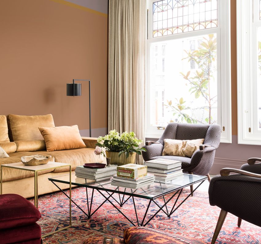
2

        THE
      GLOBAL
     AESTHETIC
      CENTRE
         25 YEARS OF
      COLOUR EXPERTISE

    Based in the Netherlands, the AkzoNobel Global
    Aesthetic Centre leads the company’s trend
    analysis, colour research and design and art
    direction. This creative team – led by Creative
    Director Heleen van Gent – is now in its 25th year
    and supports 80 markets around the world in
    empowering professional clients as well as private
    consumers to make paint colour choices with
    confidence. Colour design and forecasting is the
    primary role of the Global Aesthetic Centre. To
    ensure the team remains one step ahead of
    clients’ needs, it continuously monitors global
    social, design and consumer trends as they
    emerge. By rooting the insights in the everyday
    world, the team provides credible and informed
    direction for its markets, and designs colour
    palettes that are perfectly suited to all clients’
    needs. ColourFutures™ is at the heart of the
    team’s work, which involves identifying the annual
    Colour of the Year and four trend palettes.
    Naturally, these trends apply to both professional
    and consumer markets and can be articulated in a
    wide variety of industry-specific coatings and
    paint products. That is why this ColourFutures™
    2018 Colour trend guide presents you, as a
    designer, architect, developer or project manager,
    with a set of smart, interconnected colour
    schemes that are perfect for residential as well as
    commercial projects.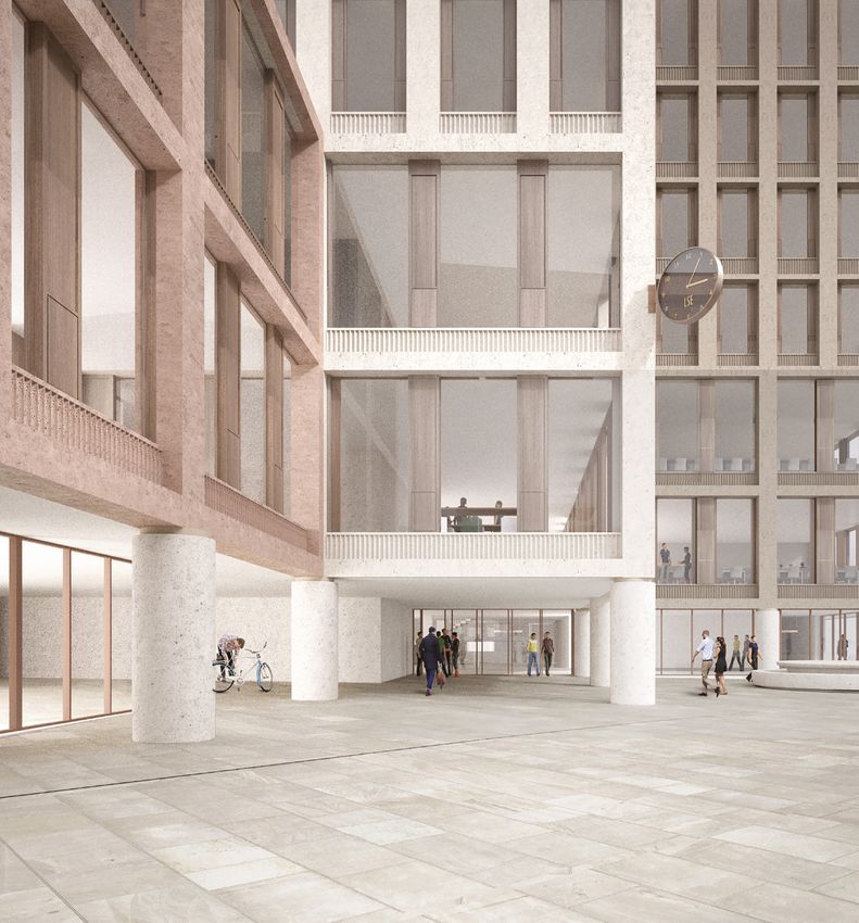
3

     TRANSFORMING
      TRENDS INTO
    COLOUR FOR 2018

                                 GLOBAL    GLOBAL
  SOCIAL   ECONOMIC    DESIGN
                                 DESIGN    COLOUR
  TRENDS    TRENDS     TRENDS
                                 TRENDS    TRENDS

As part of our industry-leading colour research,
each year we select independent experts to join us
in Amsterdam, where we forecast the emerging
global design trends for the next 12 months.
Bringing together designers and trendwatchers
from all over the world with AkzoNobel’s own
colour experts from the Global Aesthetic Centre
gives us a unique mix of perspectives from a broad
range of disciplines and cultures. This ensures
that when we nominate the key trends and an
overarching theme for each year, we are confident
that they will have universal relevance and truly
capture the mood of the moment. The next step of
the process is for the Global Aesthetic Centre to
identify a leading paint colour that will bring the
overarching theme to life, and a range of
complementary colour palettes that offer
versatility in how to use that paint colour.

Our internal colour experts, who are finely tuned in
to your sector-specific needs, then communicate
the trends to you as professional interior
designers, architects, painting professionals and
project developers, in the form of smart colour
schemes that can be applied in various ways.
AkzoNobel takes pride in providing highly durable
coatings and paint products that are cost-effective
to apply. Choosing AkzoNobel products to
implement 2018’s new trend colour palettes
therefore is the all-in-one guarantee for top
results.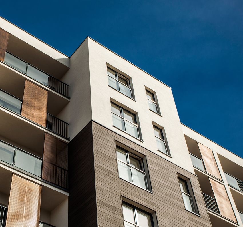
4

                      GLOBAL
                      TRENDS
    Navigating modern life, with all its options and choices,
        today seems more demanding than ever before.
     Moreover, we live in a world where people don’t know
    what the news will bring from day to day, and their usual
       sources of reassurance can’t be relied upon. This
       means their daily environment needs to be a place
      where they can turn down the noise, where they can
    nurture their values and recharge. Colour is an essential
     tool in creating an environment that people will enjoy.

           HOW THIS GUIDE
              WORKS
      On the following pages you’ll find a description of the
    Colour of the Year, Heart Wood, with its own palette and
     a range of images that illustrate its many possibilities.
      Next, three trend palettes are presented that are built
     around the Colour of the Year: The Comforting Space,
      The Inviting Space and The Playful Space. These too
    come with inspirational images representing everything
    from office and healthcare to leisure applications. Every
      palette has a no-fail mix-and-match set up – colours
        can be combined as you and your clients see fit.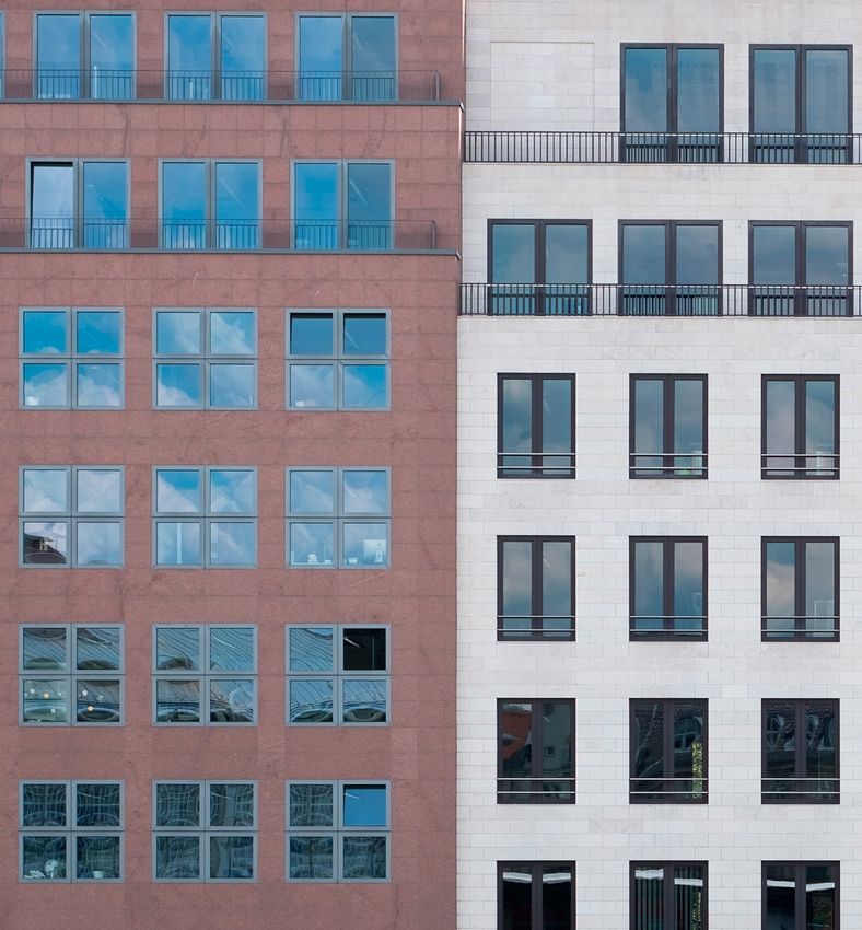
5

24/7
  TECHNOLOGY/
        BIG DATA
 SOCIAL MEDIA /
ALGORITHMS/A.I.
          /CCTV
     FAKE NEWS/
   INFORMATION
    SATURATION
6

                     COLOUR OF
                    THE YEAR 2018

    HEARTWOOD
    The Colour of the Year for 2018 is Heart Wood.
    A smoky warm neutral with a hint of heather.
    The name was inspired by the nourishing warmth
    of wood and tactile comfort of leather.

    To communicate the concept and the harmonious
    mood intended, the Aesthetic Centre created an
    interior, The Heart Wood Home, designed to
    illustrate the concept. It depicts a place where
    people can feel connected to nature, yet be
    reassured by the certainty of safe surroundings.
    Where delicately textured fabrics offer a subtle
    contrast to smooth marble and copper, and well-
    worn furniture sits alongside newer pieces.

    Within this concept, balance is key. The
    supporting Heart Wood Home palette reflects this
    balance and versatility, with soft cocoa flowing
    into bolder shades ink blue and purple. All colours
    from the palette below are chosen for mix-and-
    match purposes, with examples of applied colour
    schemes on the following pages.

                                          COLOUR OF THE YEAR
      PINE CONE        WOODED SOLACE            HEART WOOD       FALLEN BURR     BLOSSOM TREE
    50YR 08 / 038         30RR 22 / 031          10YR 28 / 072   70YR 50 / 086     10YR 73 / 038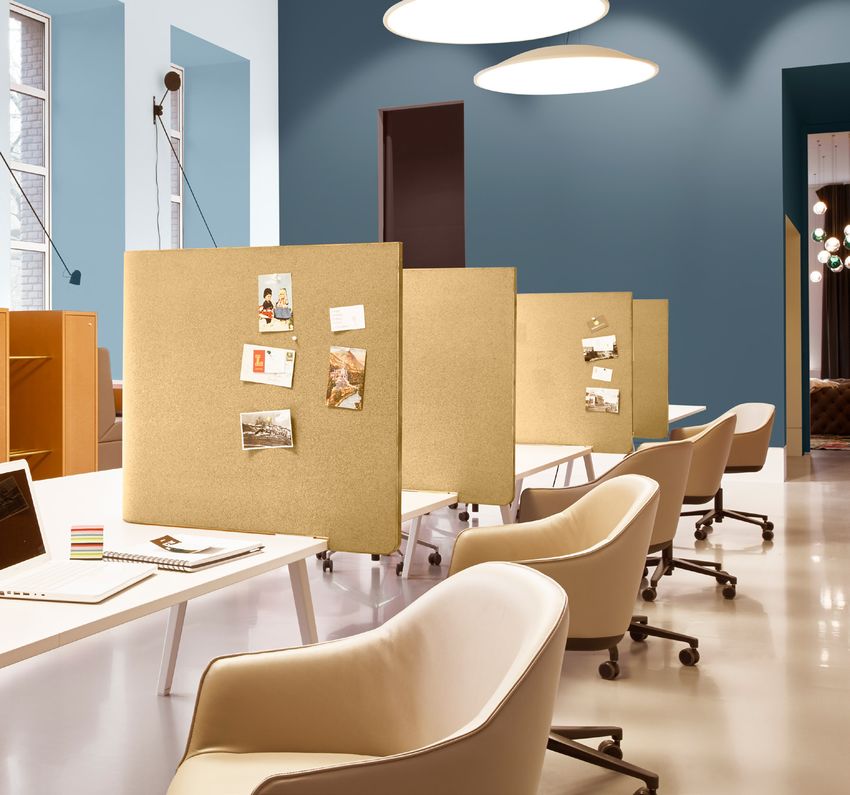
7

                    COLOUR OF THE YEAR
                          HEART WOOD                                                 ROSE BARK
                           10YR 28 / 072                                            90RR 16 / 095

PINK PARCHMENT          WOVEN WILLOW        ROSE BARK      BLACKBERRY BUSH      SAPPHIRE SALUTE
    30YR 49 / 097         60YR 20 / 117    90RR 16 / 095        46RB 06 / 074       50BB 08 / 171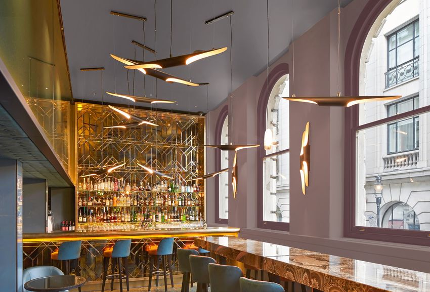
8

                    COLOUR OF THE YEAR
     ROSE BARK            HEART WOOD       PINK PARCHMENT      WOODED SOLACE      BLACKBERRY BUSH
    90RR 16 / 095          10YR 28 / 072       30YR 49 / 097      30RR 22 / 031        46RB 06 / 074
9

RESIDENTIAL
WELCOME HOME
Everyone enjoys coming home to a welcoming place
that makes them feel at ease. When we shut the door
on the outside world, we step into a space that is
uniquely ours. Here, we can be ourselves.

Due to its gentle character, the Heart Wood palette is
perfectly suited to residential projects. It channels the
current commercial interest in the colour pink and
presents it as an accessible set of almost-neutrals.
These create a sense of reassurance and form a great
match with different kinds of architecture styles.

A recurring theme in residential projects is the daily
maintenance of communal spaces and whether occu-
pants ‘read’ them as part of their living space. Well-
maintained communal spaces boost residents’ sense
of belonging and safety and have a positive effect on
how they value their surroundings. Equally important
are factors such as cost-effectiveness and durability.
To meet these requirements, AkzoNobel offers a variety
of paint products that are ultra-resistant to stains,
scuffs, UV-light and moisture.
10

     LEISURE
     STAY A WHILE
     For the hospitality and leisure industry, a welcoming
     atmosphere is what it’s all about – it’s the ultimate core
     value. And with visitors and guests these days freely
     sharing their opinions online, great impressions matter.
     Knowing how to tap into current decorating and design
     trends helps, and the right paint colours make all the
     difference.

     AkzoNobel presents the Heart Wood palette. It works
     marvellously as a subtle background décor, yet is full of
     character. The palette plays well with popular modern
     design details such as walnut, brushed brass, marble and
     matt-black surfaces, and infuses large or high spaces
     with an instant cosy mood.

     Because minimising downtime is critical in businesses
     that depend on occupancy rates, AkzoNobel has
     developed a wide range of paint products that deliver on
     that promise. Low odour, water-based, quick-drying
     paints truly limit downtime. With easy maintenance in
     mind, all products are durable and stain-resistant.
11
“TEXTURES SUCH AS BRUSHED COPPER
AND BLACK LEATHER ENHANCE
THE TONAL WARMTH OF HEART WOOD”
Heleen Van Gent, Global Aesthetic Centre
COLOUR OF THE YEAR
PINE CONE WOODED SOLACE HEART WOOD FALLEN BURR ROSE BARK
50YR 08 / 038 30RR 22 / 031 10YR 28 / 072 70YR 50 / 086 90RR 16 / 09512
THE
COMFORTING
SPACE
Compared to the Heart Wood palette, which is
based on the Colour of the Year Heart Wood,
the Comforting palette is even more about
shutting out the noise and creating restorative
rooms that revolve around finding balance.
The palette you see below radiates warmth
and holds its own in the company of materials
with rich textures, such as warm woods,
leather, silk and velvet.
The Comforting palette pairs Colour of the
Year Heart Wood with heritage hues, such as
terracotta and antique gold, thereby creating
an elegant overall effect. Yet select a few of
the lighter tones, and something new emerges
out of this palette – an energizing, unifying
colour scheme that is ideal for public spaces.
As before, the full palette below allows for a
variety of combinations, with examples on the
following pages.
FIRE WOOD
80YR 21 / 226
TEMPERED COLOUR OF THE YEAR CINNAMON
CHOCOLATE HEART WOOD SPRINKLE FIRE WOOD SUMMER PECAN 1
13YR 07 / 157 10YR 28 / 072 50YR 21 / 318 80YR 21 / 226 00YY 21 / 32113
COLOUR OF THE YEAR
HEART WOOD SUMMER PECAN 1
10YR 28 / 072 00YY 21 / 321
BEACH WALK MALTED CARAMEL PRESSED PETAL CORAL CHARM NATURAL TAUPE 2
20YY 55 / 151 90YR 36 / 203 10YR 37 / 143 10YR 27 / 323 90YR 55 / 05114
“THE COMFORTING HOME SHOWS AN EYE FOR DETAIL
WHERE THE DEDICATED USE OF COLOUR ENHANCES
THE ARCHITECTURAL FEATURES OF THE HOME”
Heleen Van Gent, Global Aesthetic Centre
TEMPERED COLOUR OF THE YEAR
CHOCOLATE HEART WOOD NATURAL TAUPE 2 FIRE WOOD SUMMER PECAN 1
13YR 07 / 157 10YR 28 / 072 90YR 55 / 051 80YR 21 / 226 00YY 21 / 32115 RESIDENTIAL LIVING THE GOOD LIFE Paint colours are a wonderful tool to bring out the best in the architectural details of a building. Such attention to details greatly enhances the perceived value of a space. Above and to the right, subtle trim lines along the crown mouldings emphasize the architectural details, while adding a punchy colour accent that residents can incorporate in their interior design. The colours in the palette on the left all have a muted quality. Not only does that make them easy to combine into a colour scheme of your choice, it also provides an instant impression of luxury, as well as a neutral base for residents who want to personalise their surroundings. AkzoNobel ensures trimwork looks good for the long haul, with wood and metal paints that last up to 8 years, and woodstains lasting up to 10 years.
16

     OFFICES
     A GREAT PLACE
     TO WORK
     By nature, office buildings tend to be impersonal. Not a
     bad thing, because it provides future tenants or owners
     with a simple base upon which to express their vision. A
     well-chosen colour scheme is the most effective way to
     add character instantly and take up residence.

     With its warm character, the Comforting palette creates a
     welcoming setting. As society’s bounderies between work
     and home gradually fade, it presents employees with a
     pleasant workspace, which plays an important part in job
     satisfaction and productivity. The Comforting palette can
     easily be tweaked to express a unique business concept,
     create accent walls, and earmark hallways and
     designated areas.

     AkzoNobel has developed technologies that improve the
     reflectiveness of painted surfaces, reducing glare and mak-
     ing offices more visually comfortable. Sustainability and
     healthy work environments are a key consideration as well.
     Our local representatives will gladly give you all the details.
17
“HERITAGE HINTS COMBINE WITH NATURAL
MATERIALS AND WARM-TONE WOODS
TO CREATE A RELAXED, GROWN-UP LUXURY”
Heleen Van Gent, Global Aesthetic Centre
TEMPERED COLOUR OF THE YEAR CINNAMON
CHOCOLATE HEART WOOD SPRINKLE NATURAL TAUPE 2 BEACH WALK
13YR 07 / 157 10YR 28 / 072 50YR 21 / 318 90YR 55 / 051 20YY 55 / 15118
THE
INVITING
SPACE
The Inviting palette shows an easy use of colour. Cool
shades of blue encourage a clear-headed approach to
life, while easy-going neutrals and sea-green support
a need for connection. Heart Wood, the Colour of the
Year, functions as the subtle contrast at the centre.
The palette is well-suited for use in healthcare
facilities, as well as work-related spaces and offices
- places where people gather.
As the pictures on the next pages show, proportions
of coloured surfaces can be used to indicate the
purpose of a room, or signal a transition to a different
area. For instance, softer pastel shades may be
framed by graphic borders of coal and dark blue to
create an airy mood, yet enhance spatial awareness.
Similarly, consecutive rooms painted in several
shades of green impart a sense of logic.
The Inviting palette is the perfect choice for any
interior with lots of natural materials, chosen for
convenience as well as beauty.
DRIFTING CLOUD
72BG 75 / 023
GREY SPLENDOR STEEL SYMPHONY 3 SILVER SHORES MISTY MORNING DRIFTING CLOUD
30BB 21 / 056 90BG 35 / 068 50YR 53 / 011 30BG 56 / 045 72BG 75 / 02319
COLOUR OF THE YEAR
MISTY MORNING FADED INDIGO HEART WOOD
30BG 56 / 045 90BG 17 / 090 10YR 28 / 072
COLOUR OF THE YEAR
RIVER BED FRESH FOLIAGE HEART WOOD FADED INDIGO COBALT NIGHT
40YY 51 / 084 50GG 40 / 064 10YR 28 / 072 90BG 17 / 090 30BB 05 / 02220
OFFICES
ROOM FOR
NEW IDEAS
While some office spaces simply need a colour
scheme that provides a larger group of employees with
a pleasant day-to-day work environment, other spaces
have their own purpose, such as meeting and
conference rooms, or private, even silent work areas.
A private work area or board room becomes more
grounded with a set of cool neutrals that add gravitas,
whereas a meeting room meant to spark creativity
benefits from sea-greens and lofty blues. These play
well with natural light and allow the mind to roam free.
However long the wishlist, the colours in the Inviting
palette support a wide variety of options. Plan to cover
large surfaces with some of the darker hues? No
problem: AkzoNobel manufactures paint with improved
opacity. This means less paint is required for the same
excellent results, leaving the renovation well within
budget.21
@ Brigida González for Allmann Sattler Wappner Architekten
“IT’S ABOUT EASY USE OF COLOUR, WITH
LARGE BLOCKS OF SEA-GREEN USED TO CREATE
SUBTLE TONAL SHIFTS ACROSS EACH ROOM”
Heleen Van Gent, Global Aesthetic Centre
COLOUR OF THE YEAR
FRESH FOLIAGE MISTY MORNING HEART WOOD FADED INDIGO GREY SPLENDOR
50GG 40 / 064 30BG 56 / 045 10YR 28 / 072 90BG 17 / 090 30BB 21 / 05622
“SOFTER PASTEL SHADES
ARE FRAMED BY GRAPHIC BORDERS
OF COAL AND DARK BLUE”
Heleen Van Gent, Global Aesthetic Centre
COLOUR OF THE YEAR
DRIFTING CLOUD COBALT NIGHT MISTY MORNING HEART WOOD FRESH FOLIAGE
72BG 75 / 023 30BB 05 / 022 30BG 56 / 045 10YR 28 / 072 50GG 40 / 06423 HEALTH CARE ZEST FOR LIFE A colour palette for healthcare facilities needs to meet specific requirements. Safety is key. Both patients and visitors benefit from the application of carefully selected colours that assist navigation and wayfinding. Shades and hues with sufficient contrast are necessary to help the visually impaired distinguish doors from walls. The muted pastels in the Inviting palette are particularly well-suited to enliven spaces with little natural light and fewer windows. The Inviting home palette has calming, neutral blues and greens that are ideal for entrances and corridors. This palette creates a restful and reassuring atmosphere for patients and visitors as they transition from consultations and treatment rooms around the building. Healthcare facilities have to be operational all day, every day. To minimise disruption during maintenance and renovation, AkzoNobel offers low-odour paints that dry quickly. Many have silver as a component, a bactericide that actually becomes more effective each time the surface is cleaned, thus helping maintain health standards.
24

              THE
            PLAYFUL
             SPACE
       The Playful palette for 2018 draws the Colour of the
       Year, Heart Wood, into sunny and warm territory.
       Pops of fresh colour add a sense of fun and energy,
       including shades of green inspired by nature. This
       palette turns any space into a launchpad for
       possibility, rendering it invigorating and full of life.

       Yellow-toned green and gold help spark the
       synapses and encourage a creative approach to
       whatever question might present itself, while a
       buttery cream softens the edges of any hard
       surface, be it concrete, wood or plaster.

       But these yellows and greens do more: they bring
       out new characteristics in the Colour of the Year,
       revealing a happy, floral undercurrent. Overall
       cheerful in tone, the palette is ideal for school
       buildings as well as the leisure industry.

                                                                                         COLOUR OF THE YEAR
                                                                                               HEART WOOD
                                                                                                10YR 28 / 072

 COLOUR OF THE YEAR                                       SALISBURY
       HEART WOOD              ENGLISH ELM                 STONES 5        DRUM HIDE         GOLDEN SANDS
        10YR 28 / 072           10YY 41 / 175            45YY 75 / 110   30YY 47 / 236         40YY 49 / 408
25
GOLDEN SANDS SALISBURY STONES 5
40YY 49 / 408 45YY 75 / 110
GOOSEBERRY
CHERISHED GOLD CELTIC FOREST 2 FRESH ARTICHOKE FOOL 1 PINE NEEDLE
20YY 36 / 370 90YY 35 / 169 90YY 52 / 138 70YY 18 / 152 07GG 07 / 14326
EDUCATION
A PLACE TO GROW
Schools and other learning environments are places to
grow. From the earliest years in a child’s education, when
colours are about fun, play, and offering a reassuring
environment away from home; to later in life, when the
emphasis lies on teaching and encouraging original
thought.
In every situation, clean and fresh hues combined with
uplifting accent colours are essential to create a
stimulating atmosphere, while muted tones can ease
tension and improve concentration. It’s important not to
forget about the areas that staff regularly use in between
learning sessions. These are ideal spaces where you can
allow colour schemes to be that bit more freehand and
individual - where staff can relax and regroup in space
that feels like a home from home.
The Playful palette is designed to facilitate the creation of
unusual and unexpected contrasts, suitable for various
age groups. No need to stop there – freehand shapes and
organic circles do wonders to jazz up a long stretch of
wall, inside or outside.27
“CLEVER USE OF COLOUR CREATES DIFFERENT
ZONES IN SMALLER SPACES, WHILE CLUSTERS
OF HAND-DRAWN SHAPES ADD INTEREST”
Heleen Van Gent, Global Aesthetic Centre
SALISBURY COLOUR OF THE YEAR GOOSEBERRY
STONES 5 CHERISHED GOLD HEART WOOD FRESH ARTICHOKE FOOL 1
45YY 75 / 110 20YY 36 / 370 10YR 28 / 072 90YY 52 / 138 70YY 18 / 15228
GOOSEBERRY COLOUR OF THE YEAR
FOOL 1 ENGLISH ELM GOLDEN SANDS CHERISHED GOLD HEART WOOD
70YY 18 / 152 10YY 41 / 175 40YY 49 / 408 20YY 36 / 370 10YR 28 / 07229 HOSPITALITY ENTER THE HAPPY ZONE It’s hard to overestimate the mood-enhancing qualities of cheerful colours. The genius of the Playful palette, as devised by the AkzoNobel Aesthetic Centre, is that these particular colours have a natural, almost botanical component to them. Herbal greens and warming yellows bring out the best in each other. What’s more, when contrasted with yellow or green, subtle hints of mauve and lilac emerge from Heart Wood, the Colour of the Year. Yet creamy pastels and shadowy grey-greens bring out its neutral origins. It’s exactly this versatility that allows you to create myriad styles and effects with the Playful palette, while maintaining unity throughout the facility. To reduce maintenance costs and disruption, AkzoNobel manufactures masonry paints that last up to 15 years, ensuring that a great first impression really goes the distance.
30

     COLOUR OF THE YEAR FOR
       COMMERCIAL SPACES
31
Content – AkzoNobel Global Aesthetic Centre +31(0)71 308 2100
                                                                                                                                                                  Design – Redwood London +44 (0)20 3787 7000

AkzoNobel Decorative Paints
Global Aesthetic Centre
Rijksstraatweg 31, 2171 AJ
Sassenheim, The Netherlands
Tel + 31 (0)71 308 2100

Sikkens, Dulux Professional, Dulux Trade, the AkzoNobel logo and all distinctive colour names are trademarks of the AkzoNobel
Group of Companies © and Database Right 2015.

This ColourFutures reference manual is and remains the property of AkzoNobel N.V. and is loaned on condition that it is used
solely to specify products manufactured/or supplied by AkzoNobel N.V. (and other companies in the AkzoNobel Group) and on
condition that it shall be returned to AkzoNobel N.V. on demand. The contents of this reference manual are for information only.             www.akzonobel.com/
No representation or warranty is given, nor liability accepted, regarding the information given. We have reproduced paint colours              planetpossible
as faithfully as printing will allow. However, the shape, size and lighting of a surface can influence the appearance of the final colour.
You can also read