Presence and mobility of the population during Covid-19 outbreak and lockdown in Italy
←
→
Page content transcription
If your browser does not render page correctly, please read the page content below
Munich Personal RePEc Archive

Presence and mobility of the population
during Covid-19 outbreak and lockdown
in Italy

Beria, Paolo and Lunkar, Vardhman

Politecnico di Milano

5 June 2020

Online at https://mpra.ub.uni-muenchen.de/100896/
MPRA Paper No. 100896, posted 10 Jun 2020 07:44 UTC
Presence and mobility of the population during Covid-19 outbreak
 and lockdown in Italy
  Paolo Beria, Vardhman Lunkar

       Presence and mobility of the population during Covid-19 outbreak and
                                 lockdown in Italy
                                                WORKING PAPER

                                       Paolo Beria1*, Vardhman Lunkar1

                         1
                          Dipartimento di Architettura e Studi Urbani, Politecnico di Milano
                            * corresponding author: Paolo Beria (paolo.beria@polimi.it)

 Abstract

 The non-medical policies implemented to “flatten the curve” and to reduce the stress on the health
system during the COVID-19 outbreak represents a critical event in the history of Italy. This kind of
“lockdown” has left people stranded in their homes and, for some, out of their homes unable to return
to their region of residence due to the disruptions in the mobility network. As a consequence, a vast
scale of research is being performed to understand the patterns of mobility of people during the
emergency. The availability of rich datasets has made it possible to quantify the dynamics of spatial
distribution of people as a response to the strict measures. With the help of the data provided by the
Facebook – Data for Good program, an effort is made to describe and to reason on the presence and
of mobility patterns of the population at a regional and provincial scale during the lockdown. Our
interpretation is that, initially, tourists left the country and later Italians abroad managed to return
from abroad stabilising the population. Concerning internal mobility, it is evident that the earliest
affected Regions see a higher number of stationary users in the initial days of the outbreak. On the
other hand, the central and the southern regions does not display a positive relative change of staying
home until the official lockdown is announced on the 9th of March, 2020. Before the stricter lockdown
started there was not a significant exodus of people from the North to the rest of the country. To the
contrary, a visible relocation of people occurred between the cities and their urban belts.

 keywords: covid-19; outbreak; lockdown; mobility; Facebook data for good; location based mobility, big data; social
network; Italy

       1.     Introduction
The outbreak of COVID-19 has resulted in a health crisis on an unprecedented global scale. It has
induced stress on the national health systems and has consequently led to extreme measures from the
respective governments to contain the virus. The “lockdown” measures adopted to mitigate the
spreading coverage of the virus in Italy has frozen almost every social and economic aspect of the
nation. Thus, it is of paramount importance to estimate how the patterns of mobility have been altered
during the emergency. Several researchers are now using data provided by social networks to assess
the situation and monitor the short- and long-term effect of this disaster. This paper is an application
of the Facebook disaster prevention maps (a part of the Facebook – Data for Good programme),
which is a collection of method for processing Facebook data into dynamic spatial-temporal maps
that illustrates how populations are preparing for, impacted by, and coping with a crisis situation. The
maps utilise anonymized and aggregated data, with focus on current and historic location sensing,
information on cell connectivity accompanied with privacy and security maintenance by adding
random noise and filtering out small values, are shared with humanitarian organizations in the days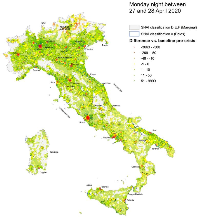
Presence and mobility of the population during Covid-19 outbreak
 and lockdown in Italy
  Paolo Beria, Vardhman Lunkar

and weeks following a crisis. Comparing the public response to the interventions in terms of the rate
of mobility on a spatial-temporal scale, measured relative to the baseline (pre-crisis conditions), can
unarguably provide an insight into the effectiveness of emergency interventions. Consequently, it will
help attain better efficiency in case of a resurgence of emergency situations. Thus, an effort is being
made to analyse this aggregated data and deduce the presence and movements of people during this
period.
  The paper starts, in Section 2, with the literature available on mobility disruptions during such crisis
situations. Section 3 gives a brief description of the datasets adopted by us by defining the metrics
used for performing the analysis. Section 4 introduces the COVID-19 outbreak in Italy and the
timeline of the salient events that took place afterwards.
  Three principal research questions have been addressed in the remainder of the paper. The first one
(Section 5) is how much and to what extent people “stayed at home” before, during and at the opening
of the lockdown. Despite the media narration of people ignoring the lockdown, data clearly show that
since March (the lockdown was declared on March 11th) the share of people moving and the range of
movement fell dramatically to a nearly physiological level (supplies, health workers, necessary trips).
  The second one (Section 6) is if there was an “exodus” of population during the weekend between
the announcement of the national lockdown and its actual start. In particular, if a significant
movement of people can be observed between the North and the rest of the Country.
  The third one (Section 7) is about the relocation of people’s residence during lockdown. In particular
we are interested to verify if cities have emptied and where population has moved: far away, in the
periphery, towards second houses at the sea or countryside or abroad (tourists or expats/migrants and
the corresponding return of Italians from abroad).

       2.    Studying real time mobility during crises
 In the nearly two years since Disaster Maps launched, the datasets have been used during major
disasters in nearly every region of the world. During the Thomas, Carr, Mendocino Complex, and
Camp wildfires in the USA, the non-profit organisation Direct Relief used the maps to monitor how
populations affected were moving and then used this to guide distribution of hundreds of thousands
of respiratory masks, as well as to coordinate with networks of health centres to alert hospitals that
might see increased volumes (Snibbe, 2018). In August of 2018, Kerala, India experienced severe
flooding that displaced over a million people. SEEDS India used the Facebook Population and
Displacement maps to appropriately time and calibrate their works on relief, recovery, and
rehabilitation operations. After identifying when people appeared to begin to return home, SEEDS
(Sustainable Environment and Ecological Development Society) launched a nationwide collection
drive for widely needed items (Gupta, 2018). The Facebook population change maps were used to
understand the patterns of displaced population and identified hot and cold spots of population change
during the California fires (Shenyue Jia, 2020).
 More recently, during COVID-19 outbreak, the use of Facebook data has reached a broader extent,
with scholars and institutions working nearly real-time on numerous aspects of the outbreak and of
the lockdown. In their ongoing research combined the Movement data from Facebook and the
economic data from official statistics to understand the economic downturn of mobility restriction
arising from the lockdown in Italy, the first European country affected (Bonaccorsi et al., 2020). It
was demonstrated that the impact of the lockdown depends on the country’s internal mobility
structure (Galeazzi et al., 2020). They compared Italy, France and Italy and found that the mobility
network after the lockdown was more concentrated for UK and France but distributed in the case of
Italy. In exploring how variation in mobility relate to some fundamental economic variables, it is
found that reduction in connectivity tends to be stronger for high-income inequality municipalities.
The first quantitative assessment of the impact of measures on the mobility and the spatial proximity
of Italians, was done through the aggregated data provided by Cuebiq (Pepe et al. , 2020). They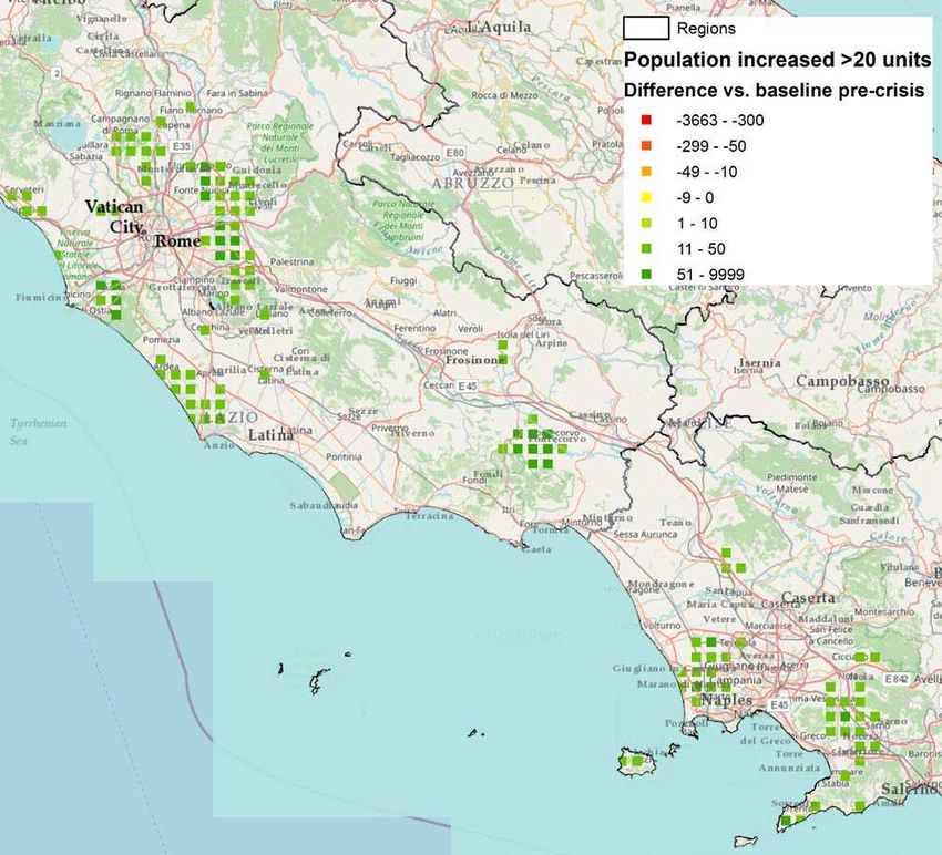
Presence and mobility of the population during Covid-19 outbreak
 and lockdown in Italy
  Paolo Beria, Vardhman Lunkar

estimate a reduction of 50% of the total trips between Italian provinces, following the lockdown. In
the same week, the average users’ radius of gyration has declined by about 50% and the average
degree of the users’ proximity network has dropped by 47% at national level.
 Out of Italy, the changes in mobility of United States through different proxy signals using the
mobility data also provided by Cubeiq (Brennan Klein et al, 2020). They quantified the reduction in
mobility at the macro, meso- and microscopic level to examine the degree of social distancing and to
answer questions on the trajectory of the pandemic. Kissler, 2020 used the aggregated movements
map and associated reductions in mobility in and out of the New York boroughs with the prevalence
of the SARS-CoV-2 infection. Denis et al., 2020 have used the Facebook Movement data to clearly
show that lockdown was effective in reducing overall mobility in India and to further realise that
cities lost between 4% and 11% of their population, while rural population increased by 7%. In
addition to this, some long-distance mobility was observed during the first week of the
implementation of the lockdown. Facebook mobility and movement range data was used to
understand the impact of the social distancing policy measures on the spread of the SARS-CoV-2
virus in the greater Seattle Area (Burstein, 2020). The impact of human mobility and travel
restrictions on the potential spread of COVID-19in Taiwan was modelled (Chang et al, 2020). They
compared the impact of intra-city vs. intercity travel restrictions on both the total number of infections
and the speed of outbreak spread and developed an interactive application that allows users to vary
inputs and assumptions. They found that intra-city travel reductions have a higher impact on overall
infection numbers than intercity travel reductions, while intercity travel reductions can narrow the
scope of the outbreak and help target resources.
 This research is an addition to this list, providing a better understanding of local and intercity
mobility patterns during the outbreak in one of the most hit countries. It is also a step towards
validating that Facebook disaster maps, coupled with other tools, can be an effective way of
comprehending crisis ground realities and could be of potential help to decision-makers in managing
them.

      3.     The datasets
 The programme Facebook Data for Good made available numerous datasets, also called Facebook
Disaster datasets, for entire countries and/or for single regions/cities (described in Maas et al., 2019).
In the case of Italy, the data is available at the country-scale (“Italy Coronavirus Disease Prevention
Map package”), with some more detailed focuses on single cities. For this paper we focus on country-
scale data. We will use three of the available datasets:
 a. the Movement Range;
 b. the Movement between administrative regions – NUTS-3 provinces, in the case of Italy;
 c. the Facebook Population (Tile Level).
 All datasets used contain spatial and temporal information based on the behaviour of Facebook users
with active GPS and active Location History (in the case of Italy, approximately 5-6% of the
population) with up-to-date information. The data is detected passively and is fully anonymised
without individual information of the users. Individual information is aggregated spatially (either
using tiles or administrative borders) and temporally (every eight hours: 00:00AM, 8:00AM and 4:00
PM, corresponding in Italy to 02:00 AM ±4h, 10:00 AM ±4h, 06:00 PM ±4h and perfectly fitting
with night, morning and afternoon).
 The datasets have the potential to replicate a picture of crisis situations with a certain level of detail
and global coverage. However, such type of Location based Social Network data has its limitations
and caveats. The Facebook population is not fully representative of all demographic and socio-
economic groups within a population. This is valid to municipalities having low Facebook
penetration. Due to usage habits, old people are typically underrepresented in such data. Since such
kind of data requires the user to keep their location services on and not everyone allows Facebook to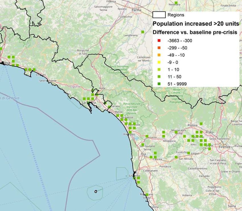
Presence and mobility of the population during Covid-19 outbreak
 and lockdown in Italy
  Paolo Beria, Vardhman Lunkar

access their location, a further population bias is introduced which can lead to skewed results relative
to what is happening in reality. In addition, the baseline information refers to 45 (movement) or 90
(presence) days prior to the event and the period could not be a “real” baseline when describing long
events. For example, the outbreak started during Winter but deployed during Spring; consequently,
any crisis vs. baseline comparison is biased also of the seasonal change.
 In the following, all these unavoidable biases will be considered when describing the mobility-
related patterns observed during the outbreak. As a counterpart, these datasets provide a unique
material to study nearly-real-time events, at a global scale and based on a huge population base.
    3.1 Movement Range
 In order to quantify the effect of lockdown to pre-crisis level, Movement Range trends datasets are
available. There are two types of metrics that are elaborated in this section.
    a. Travel Range: This explains the average number of level 16 Bing tiles (0.6km x 0.6km) that
        a Facebook user (with location services on) was present during a 24-hour period relative to
        the pre-crisis levels. Thus, it can be used to measure the degree of change of mobility range.
    b. Staying Put map: This metric explains the percentage of Facebook users (with location
        services on) that stay on one such tile at 3 different hours of the day. Thus, a stationary user
        is analogous to staying put or staying home.
    3.2 Movement between administrative regions
  The Movement between administrative regions aggregates dynamic movements of users in terms of
geographical coordinates. It takes into account who moved from a given cell to another between the
time periods. The data is then aggregated at Italian provincial level (corresponding to NUTS-3). Such
maps provide insights into understanding movement patterns, whereby response organisations can
predict where resources are needed, evacuation patterns or even predict congestion spots. The metrics
that are provided by this dataset include:
   a. Baseline: This indicates the total number of users moving from their origin to their destination
        calculated as an average over the 45 days prior to the beginning of the crisis.
   b. Crisis: This indicates the total number of users moving from origin to destination during the
        specified time-period. A measurement is taken into consideration (and the entry is present in
        the dataset) only if this value is greater than the threshold (10 movements), otherwise it is
        discarded. This introduces an underestimation of flows especially between sparse or very far
        destinations.
   c. Difference: This indicates the difference (in percentage) between the number of people
        moving from origin to destination during crisis with respect to the baseline.
   d. Standard (Z) Score: The number of deviations by which the count of people moving during
        the crisis differs from the number of people moving anytime during the baseline.
     3.3 Facebook population (tiles)
  The Facebook population (tile level) provides the number of active Facebook users spatialised in a
tile matrix. We use the national scale dataset, where the tile size is approx. 4800 metres of edge and
aggregate basic tiles. The data provided is the number of geo-localized Facebook users every 8 hours
present in the tile during the crisis and in the corresponding day/hour of the baseline.
  The metrics that are provided by this dataset include:
    a. Baseline: This indicates the average number of Facebook users present in the location during
         the last 90 days prior to the event (in this case 24th of February 2020). The baseline value is
         segmented by the day of the week and the time window for the metric, to be comparable.
    b. Crisis: This indicates the average number of Facebook users present in the location during the
         crisis.
    c. Difference - The difference between the population at the time of the crisis and the population
         during the baseline.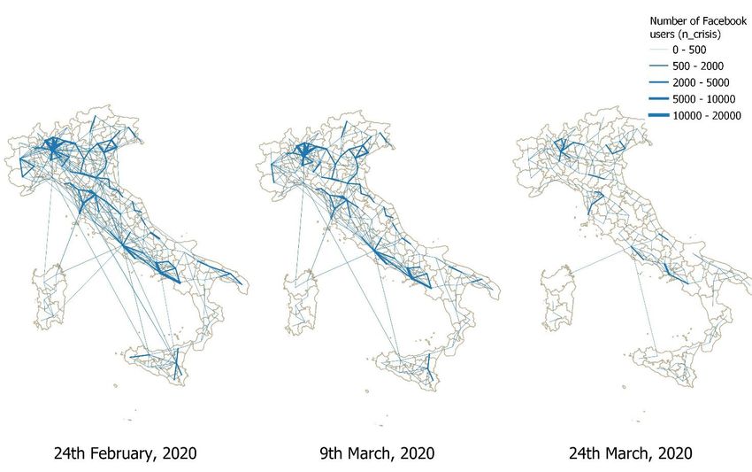
Presence and mobility of the population during Covid-19 outbreak
 and lockdown in Italy
  Paolo Beria, Vardhman Lunkar

      4.    The COVID-19 outbreak in Italy
 Italy was the first European and Western country where the 2020 COVID-19 outbreak developed
locally. The first confirmed cases were separately found in Codogno area (south of Milan) and in
Veneto near Padua, both on February 21st. Two cases were already found in Rome on January 31st,
but they were Chinese tourists that contracted the virus in China. Other cases probably spread in
Europe even before the Italian ones, but they were not recognised or were isolated.
 On February 22nd Italian government established a local lockdown in 11 municipalities (10 in
Lombardy and one in Veneto). On March 4th all schools and universities in the country were closed.
In Northern Italy mobility already dropped since the 24th of February, with companies starting moving
to smart-working and people avoiding public transport.
 The country-scale lockdown, the first in Europe, started on March 11th: all working places, except
essential ones, were closed and people was requested to stay home except for food purchasing. The
lockdown was anticipated on March 7th, when a draft of the decree circulated, talking about a possible
closure of most of Northern Italy since 9th, but this measure was overpassed few days later by the full
lockdown started. However, according to media, many people left the cities of Northern Italy towards
the South. Those who remained in their location cannot move anymore until the end of the measure
(not even among neighbouring municipalities and theoretically also within). At that moment of
lockdown, Italy had about 12.000 official cases and more than 800 deaths. This first phase of
lockdown lasted until May 5th, when a progressive relaxing of closures started, including industry and
most of retail. To date, movements between regions remain not allowed, but this is due to end, at least
for some, on June 3rd 2020.
 The pandemic in Italy hit most Northern Italy, and Lombardy in particular. The outbreak spread
from four locations: Codogno, Vò (Padua), Bergamo and Pesaro. In short other provinces are included
among the most hit, namely Milan and Brescia. Apart population and effectiveness of the response,
which both play a role, Central and Southern Italy were less hit because the lockdown started before
a significant number of cases occurred, while in the North lockdown was definitely late, when
diffusion was enormous. This put some regions among the ones with in the highest per-capita rates
in the World.

      5.     The decline of local mobility
Exploring the relation between the Movement Range metrics on a scatter plot from the period 21st
February 2020 to 30th April 2020 it seems clear and logical that the more stationary a region is, the
lesser the travel range. We notice in Figure 1 how the restrictions and the populations adherence to
the lockdown intensifies temporally in the month of March and April. Though, this figure is
principally to demonstrate the evident correlation between the two metrics, Figure 2 shows a more
disaggregate temporal variation of the travel range metric for the respective macro-regions. We
observe how the implementation of early restrictions reduces the North-West (Lombardy being
epicentre region) and the North-East (Veneto being the second outbreak region) relative to the other
macro-regions. The travel range has drastically reduced during weekends and we can note the sharp
decline in the mobility behaviour after the official announcement of the lockdown on the 9th of March,
2020 after which the behaviour of all regions become analogous and convergent to each other. On
the same graph we can also observe the Share of people staying home metric, which is nearly a mirror
of the former, but with less macro-regional differences.
Presence and mobility of the population during Covid-19 outbreak
 and lockdown in Italy
  Paolo Beria, Vardhman Lunkar

      Figure 1 Correlation between variation in Travel Range and share of people Staying home – regional averages.

Figure 2 Relative number of total tiles for macro-regions (Travel Range)

Further, the relative change with respect to the national average for three significant days (24th
February, the start of the dataset, 9th March, the start of national lockdown,and 24th March, 2020, the
lowest point in presence, see Figure 8) in particular are elaborated above in Figure 3 . It is evident
that the earliest affected Regions see a higher number of stationary users in the initial days of the
outbreak. Lombardy which is the epicentral region of the outbreak experiences a 37% higher than
national average of users staying put at home followed by neighbouring regions of Liguria (23%),
Emilia Romagna (15%), Friuli-Venezia-Giulia (14%), Piemonte (12%) and Veneto (9%). The regions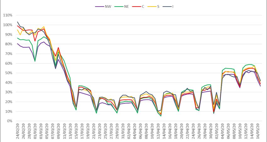
Presence and mobility of the population during Covid-19 outbreak
 and lockdown in Italy
  Paolo Beria, Vardhman Lunkar

of Aosta valley and Trentino Alto Adige which are popular ski destinations observe movements
which might be due to tourists leaving the region. On the other hand, the central and the southern
regions does not display a positive relative change of staying home until the official lockdown is
announced on the 9th of March, 2020. This progressive reduction of the movements and more of
percentage of people confining themselves in their homes after the official announcement is validated
further in Figure 6. While the overall percentage of people staying at home on a national scale rises
towards the end of March, the relative change in the Central and Southern regions becomes relatively
higher than that of North-East and North West Italy.

 Figure 3 “Staying Home" relative change with respect to national average for regions

       6.    The start of lockdown: the tale of an exodus (that did not happen)
 The spread of the outbreak, but especially the national lockdown started on March 9th, has pushed
part of the population to relocate before getting “locked” into their current position. A recent research,
applied in the totally different context of India (Denis et al, 2020), has shown quite clearly a dynamic
of “escape” from cities towards the rural areas. More precisely, rural population increased by 7%
while cities lost between 4% and 11% (from metropolis to small census towns). This effect is
attributed both to the decrease of everyday/weekly commuting, but also – locally – to a consistent
movement of migrant workers towards locations whose lower density was considered as safer. This
is the case of flows from Delhi to Northern India, and of Rajasthan, Odisha, Bangalore and Chennai
towards smaller localities of origins of migrants.
 In the case of Italy, media has given a lot of evidence to a sort of “exodus” occurred especially in
the night of 8-9 March 2020, when the last night train from Milano to the South had been “assaulted”
by people that feared to remain locked in the northern capital. This tale has shaped significantly the
debate on media and social media, assuming that the exodus has happened and the spread of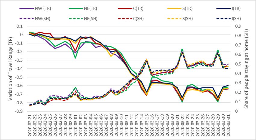
Presence and mobility of the population during Covid-19 outbreak
 and lockdown in Italy
  Paolo Beria, Vardhman Lunkar

potentially infected people from the North to the South would have caused further outbreaks and
collapsed the health system.
  The Movement between Administrative Regions dataset – that in Italy correspond to NUTS-3
Provinces – allows to verify if and to what extent such displacement happened. We have considered
the entire period available, starting from February 24th to the mid of May, after lockdown was
relieved. Figure 4 considers all movements between Italian provinces (i.e. excludes internal trips).
During the first two weeks of the outbreak – before the lockdown was declared – the decrease with
respect to baseline was negligible (90%). Only weekends’ trips were well below the expected,
showing that the behaviour was modified first for personal trips rather than for work trips. During the
1st week of lockdown, the mobility felt suddenly and reached level of 30%/20% of normal. Weekend
trips basically disappeared until May. Interestingly, starting from end of March ratio crisis/baseline
increases more during nigh time than daytime: it means that people is still not going to work, but is
restarting to go out for leisure.

 Figure 4. Total movements between provinces (NUTS-3) and share of baseline.

 Regional differences are interesting too (Figure 5). As expected, in the North interprovincial trips
were already below the normal level since the beginning (also confirmed in Figure 3), when in the
South the difference with baseline is negligible. In the Centre some reduction was already present
during the first weekend of March. The macro-regional series start matching since March 9th, when
Central and Southern regions are even slightly below the North-East. Later we see only some daily
fluctuations, with the exception of North-West – where the risk was higher, and the lockdown
perceived as more severe. At the end of March, trips begin to rise again, ranging from 20% to 40%
of baseline almost everywhere, including North-West. In the North-East, where the outbreak, despite
severe, was very well controlled since the beginning, trips restarted earlier than the national average.
Presence and mobility of the population during Covid-19 outbreak
 and lockdown in Italy
  Paolo Beria, Vardhman Lunkar

 Figure 5. Total movements between provinces (NUTS-3) grouped by macro-regions. Share of baseline.

 Mapping these flows shows again the progressive end of movements across the country, which in
the 2nd half of March looks disconnected (Figure 6). While initially we can recognize the usual
patterns, with most of the flows within the North and along the coasts, plus some long-distance ones
for example connecting Milan with Sicily, Already on March 9th they were substantially reduced. On
March 24th the connections are basically absent, with the exception of some local trips among
neighbouring provinces. Some connections between Rome and Sardinia and Sicily remain, probably
connected with cargo movements.

 Figure 6. Interprovincial flows before and during lockdown.
Presence and mobility of the population during Covid-19 outbreak
 and lockdown in Italy
  Paolo Beria, Vardhman Lunkar

  By means of these observations, we can also verify if there were anomalous trips between the North
and the Centre and South, especially at the moment of declaration of lockdown, as perceived by public
opinion. Figure 7, for example, plots the outgoing trips from the entire Lombardia 1 to the rest of the
country. Not all destination regions are represented since there no OD pairs with more than 10 trips
(which is the threshold of the original data). Emilia Romagna and Piedmont account for the largest
flows, which is natural being at the same time large and neighbouring. Typically, during weekends
these flows fall, as leisure connections are more limited than working ones. To the contrary, in
direction of Liguria, Val d’Aosta and Trentino Alto Adige – despite on a different scale – we see
some increase during weekend, in particular starting Friday 6th March and the following Saturday.
The highest point of these flows is around 250 users, which should correspond to approx. 5000 people,
per day per region. Therefore, in conclusion, we can affirm that, even from Lombardia no significant
pour of population from North to South or elsewhere can be observed, or is in the order of thousands
of people.

 Figure 7. Total interprovincial movements from Lombardia to the rest of the country (internal trips in Lombardia excluded).

      7.    Away from cities, away from contagion
 After showing that no significant exodus occurred, it is more interesting to verify if cities have
emptied and where population has moved: far away, in the periphery, towards second houses at the
sea or countryside or abroad (tourists or expats/migrants and the corresponding return of Italians from
abroad).
 In this case we use the tile-level Facebook population data. At the national scale tiles measure
approx. 4800 metres of edge and aggregate more basic tiles. The users present during crisis are
compared with the baseline calculated on the presences during the 90 days prior to the event (in this
case 24th of February 2020). As already underlined before, also this data is not statistically
representative and cannot be properly expanded to the entire Italian population, but is very meaningful
to show trends and to describe the behaviour of the large subset of population. Overall, the dataset

 1
   Lombardia is the largest region (10M inhabitants), the most hit and the one from where media described the exodus.
Figures from other regions were even less significant.
Presence and mobility of the population during Covid-19 outbreak
and lockdown in Italy
Paolo Beria, Vardhman Lunkar
includes about 3,3 to 3,4 Million people, corresponding to about 6% of Italian population (but
including also non-Italians temporarily present in the country).
We aim at responding to two basic questions:
1) Can we observe a significant regional relocation, in particular between North (where the
outbreak started) and the Centre/South, not catch by Movement dataset?
2) Or is there a relocation between dense cities and low-density areas, meaning either countryside,
remote areas or simply second houses areas and seaside?
To do that, we work at the tile level to produce difference maps and then we attribute every tile to
the corresponding region (NUTS-2 level) and to the official classification of core and remote areas in
use in Italy (called SNAI: Barca et al., 2014) 2. We work using the nighttime slot (10PM to 6AM), to
avoid measuring the effect of commuting.
The first relevant result is related to totals. Differently from India – where total population was
constant (Denis et al., 2020) – in Italy during the analysed period we observe Figure 8 a sharp decline
in population starting from March 10th (after the 1st day of lockdown). Facebook users pass from
3.370.161 individuals (almost equal to baseline) of March 10th to 3.241.722 of March 10th (-4%). In
3-4 weeks, this figure rises again. Our interpretation is that initially foreigners and especially tourists
left the country (we will go back on this later on), and later Italians abroad succeeded to re-enter 3.
The figures of the 28 April are the most interesting as represent a sort of picture freezing the position
of Italians during lockdown and can also be used as a reference to calibrate the sample matching it
with census data (typically biased by commuting and temporary touristic presences).
Figure 8. Total population observed during nighttime (10:00 PM of Monday to 6:00 AM of Tuesday), referred to baseline.
To respond to the first question, if there was a significant relocation between regions (invisible in
the Movement figures of Section because spread across many OD pairs below the threshold), we
attribute the population tiles to regions, as in Figure 9. It is related to the most stable observation,
namely the night of 27-28 April. With few exceptions, population of regions is basically constant.
Only Valle d’Aosta and Trentino Alto Adige lose a significant share of population (around 10%).
2
The six classes are: Hub, Inter-‐municipal, Outlying, Intermediate, Peripheral and Ultra‐peripheral. The classification
is a service-based accessibility indicator, based on three variables: time to access high-schools, hospitals and main train
stations.
3
it must be remembered that during lockdown airlines and train stopped operations and returns were managed by the
Ministry of Foreign Affairs.Presence and mobility of the population during Covid-19 outbreak and lockdown in Italy Paolo Beria, Vardhman Lunkar This figure can be easily explained noticing that they are small mountain regions where the previous weeks were the full winter ski season. Figure 9. Percentage difference between crisis and baseline observation, by region. Night between 27 and 28 April 2020. Figure 10 gives the absolute numbers. Lombardia and Lazio (the regions of Milano and Rome, respectively) lose 5-10.000 Facebook users (which should correspond to approximately to 80- 160.000 persons). Another 5.000 leave Trentino-Alto Adige, most likely Italian and foreign tourists. Remaining regions show variations between 0 and 3.000 users, with. Central ones (Liguria to Abruzzo) gain population and Southern regions (Molise to Sardegna) lose some. Regional
Presence and mobility of the population during Covid-19 outbreak
 and lockdown in Italy
  Paolo Beria, Vardhman Lunkar

differences, overall, say that we cannot observe significant displacements, especially from North to
South, except the sudden end of the ski season in the Alps.

 Figure 10. Difference between crisis and baseline observation, by region and by SNAI classes. Night between 27 and 28 April 2020.

 Figure 10 is helpful also to respond to the second question, if there was a relocation from cities to
“outside”, whatever this means. Following maps will be more detailed in this, but the national
classification of remoteness is already meaningful (Barca et al., 2014). Again, with the exception of
the two small Alpine regions where remote areas that get empty are ski resorts, the pattern is a clear
escape from cities, in particular the “poles” or “hubs” (usually provincial capitals and surroundings
that lose 4,1% of their population), in the direction of Intermediate territories (that gain 1,8% of
population), that could be described as the mid-density non-urban areas. The three peripheral classes
(D to F) gain population, but in the order of few thousands overall.
 This pattern means that the loss of population of cities must be attributed to the escape of tourists
and the lack of weekly commuters 4 that now stay at home often within the region, but limitedly to
the movement of people towards remote areas.

 4
   daily commuters should be excluded because the time slot is 10PM to 6AM, when normally commuting is still very
limited.
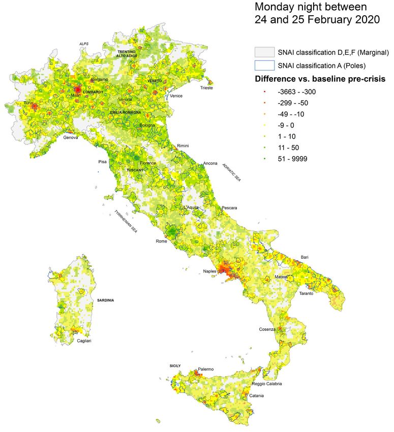
Presence and mobility of the population during Covid-19 outbreak
 and lockdown in Italy
  Paolo Beria, Vardhman Lunkar

 The map of Figure 11 represents the first week of the outbreak (night between 24 and 25 February
2020). It clearly shows that there is a fall in population only in some cities in the North. Naples and
Palermo, in the South, should not be attributed to the outbreak but to seasonal movements. Urban
areas of Emilia Romagna, Tuscany and central Italy – whose climate is similar to the North – do not
show any decline in presences. Rome and Florence are more crowded than before, sign of the start of
the city-focused spring touristic season.

 Figure 11. Population difference vs. baseline. Night between 24 and 25 February 2020 (first week of outbreak).
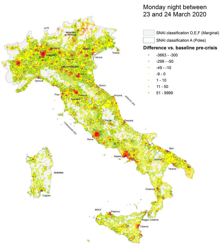
Presence and mobility of the population during Covid-19 outbreak
 and lockdown in Italy
  Paolo Beria, Vardhman Lunkar

 During the peak of outbreak at the end of March (Figure 12), the fall of population is the largest in
all parts of the country. All “poles” got emptier but almost nowhere population significantly
increased, including remote areas. Again, this shows that there was not a pouring of population from
one to another (very few “green” tiles), but a net loss, particularly pronounced in cities. It is interesting
to notice the dramatic decrease of presences in Trentino-Alto Adige and Lombard valleys, from where
all ski tourists departed.

 Figure 12. Population difference vs. baseline. Night between 23 and 24 March 2020 (outbreak peak).
Presence and mobility of the population during Covid-19 outbreak
 and lockdown in Italy
  Paolo Beria, Vardhman Lunkar

 Finally, the most stable day is the night of 27-28 April 2020, shown in Figure 13. Most of Italians
abroad returned and most likely occupied their place of origin. Cities are totally blocked – no
economic activities – with their resident population locked in. Here we can appreciate that, with few
exceptions, the largest population increase are in urban belts (around Milan, between the cities of
Veneto, along the Adriatic coast, between Florence and Pisa, around Rome, Naples and Bari. In other
words, the most inhabited part of Italian territory out of cities.

 Figure 13. Population difference vs. baseline. Night between 27 and 28 April 2020.
Presence and mobility of the population during Covid-19 outbreak
 and lockdown in Italy
  Paolo Beria, Vardhman Lunkar

 There are some exceptions and they often belong to the areas – not all, however – where second-
houses concentrate. For example, as mapped in Figure 14 filtering tiles with an increase of more than
20 Facebook users, some well-known touristic sites appear, such as Ligurian coast between Genova
and Santa Margerita; the Versilia area and part of Tuscan coast; the “litorale romano” (the beaches
south of Rome); Ischia, Costiera Amalfitana and Lago Patria near Naples. The remaining tiles all
belong to urban belts. 5

 Figure 14 Population difference vs. baseline higher than +20 users. Night between 27 and 28 April 2020. Detail of the Levante
Ligure and of Tuscan coast (left) and of the area between Rome and Naples (right). Background map: Openstreetmap.

       8.    Conclusions
  The COVID-19 outbreak had (and will have) enormous consequences in the mobility of entire
countries, including country-scale lockdowns. Italy was the first-hit country in Europe and among the
ones where it resulted more severe. In this paper we provide an in-depth analysis of mobility during
COVID-19 outbreak and lockdown in Italy using the data provided by Facebook Data for Good
programme. These dataset are used to trace almost real-time the movements and the presence of
people during disaster and disease events.
  In this work we mainly tried to answer to three research questions. The first one is how much and
to what extent people “stayed at home” before, during and at the opening of the lockdown. Despite
the media narration of people ignoring the lockdown, data clearly show since March (the lockdown
was declared on March 11th) the share of people moving and the range of movement fell dramatically
to a nearly physiological level (supplies, health workers, necessary trips).
  The second point was about the movement of population just before the lockdown, especially from
the northern provinces, the most hit, and central and southern Italy. This movement happened very
marginally, with few thousands of people crossing the country to avoid remaining locked. Some non-
local trips remained, but they are substantially confined to neighbouring provinces. Long-distance
trips remain nearly always below the measurement thresholds.
  The last aspect deals with the location of people during lockdown. The most visible phenomenon is
the fall of population in largest cities, starting from the North but soon happened also elsewhere.
People did not relocate (except few, of course) in marginal areas, but basically concentrated in the
rest of urbanised areas. This fact has a twofold explanation: commuters and city users stopped moving
into urban poles and out-of-home workers went back to the place of origin, which is often inside the
region.

 5
     The area of Cassino, well visible, should be an effect of the baseline as documented by data developers.
Presence and mobility of the population during Covid-19 outbreak
and lockdown in Italy
Paolo Beria, Vardhman Lunkar
In conclusion, the Facebook data resulted extremely useful to provide a picture of real mobility and
location behaviour of people, allowing to go beyond the perception and possibly to correctly support
public decisions.
Acknowledgements
The paper is based on the datasets made available by Facebook through the Facebook Data for Good
programme https://dataforgood.fb.com/.
Bibliographical refecences
Snibbe, K. (2018). How technology is helping responders save lives during disasters like the California wildfires. The
Orange County Register. https://www.ocregister.com/2018/08/21/how-technology-is-helping-those-responding-to-
disasters-like-the-california-wildfires-save-lives/
Gupta M (2018). Shedding light on displacement trends in disasters through technology?
https://www.linkedin.com/pulse/shedding-light-displacement-trends-disasters-through-technology-manu/
Jia, S., Kim, S.H., Nghiem, S.V., Doherty, P. and Kafatos, M.C., (2020, in press). Patterns of population displacement
during mega-fires in California detected using Facebook Disaster Maps. Environmental Research Letters.
https://doi.org/10.1088/1748-9326/ab8847
Bonaccorsi, G., Pierri, F., Cinelli, M., Porcelli, F., Galeazzi, A., Flori, A., Schmidt, AL., Valensise, M., Sacala, A.,
Quattrociocchi, W., and Pammolli, F.. (2020). Economic and Social Consequences of Human Mobility Restrictions
Under COVID-19 – The case of Italy. https://papers.ssrn.com/sol3/papers.cfm?abstract_id=3573609
Galeazzi, A., Cinelli, M., Bonaccorsi, G., Pierri, F., Schmidt, A.L., Scala, A., Pammolli, F. and Quattrociocchi, W. (2020).
Human Mobility in Response to COVID-19 in France, Italy and UK. arXiv preprint arXiv:2005.06341.
Pepe, E., Bajardi, P., Gauvin, L., Privitera, F., Lake, B., Cattuto, C. and Tizzoni, M. (2020). COVID-19 outbreak response:
a first assessment of mobility changes in Italy following national lockdown. medRxiv.
Klein, B., LaRocky, T., McCabey, S., Torresy, L., Privitera, F., Lake, B., Kraemer, M.U., Brownstein, J.S., Lazer, D.,
Eliassi-Rad, T. and Scarpino, S.V., (2020). Assessing changes in commuting and individual mobility in major
metropolitan areas in the United States during the COVID-19 outbreak.
https://www.networkscienceinstitute.org/publications/assessing-changes-in-commuting-and-individual-mobility-in-
major-metropolitan-areas-in-the-united-states-during-the-covid-19-outbreak
Kissler, S., Kishore, N., Prabhu, M., Goffman, D., Beilin, Y., Landau, R., Gyamfi-Bannerman, C., Bateman, B., Katz, D.,
Gal, J. and Bianco, A., (2020). Reductions in commuting mobility predict geographic differences in SARS-CoV-2
prevalence in New York City. http://nrs.harvard.edu/urn-3:HUL.InstRepos:42665370
Denis, E., Telle, O., Benkimoun, S., Mukhopadhyay, P., & Nath, S. (2020). Mapping the lockdown effects in India: how
geographers can contribute to tackle Covid-19 diffusion. The Conversation. https://theconversation.com/mapping-
the-lockdown-effects-in-india-how-geographers-can-contribute-to-tackle-covid-19-diffusion-136323
Burstein, R., Hu, H., Thakkar, N., Schroeder, A., Famulare, M. and Klein, D. (2020). Understanding the impact of
COVID-19 policy change in the greater Seattle area using mobility data. Institute for Disease Modeling.
https://covid.idmod.org/data/Understanding_impact_of_COVID_policy_change_Seattle.pdf
Chang, M.C., Kahn, R., Li, Y.A., Lee, C.S., Buckee, C.O. and Chang, H.H. (2020). Modeling the impact of human
mobility and travel restrictions on the potential spread of SARS-CoV-2 in Taiwan. medRxiv.
Maas, P., Iyer, S., Gros, A., Park, W., McGorman, L., Nayak, C. and Dow, P.A. (2019), May. Facebook Disaster Maps:
Aggregate Insights for Crisis Response and Recovery. In Proceedings of the 16th International Conference on
Information Systems for Crisis Response and Management (ISCRAM), Valencia, Spain (pp. 19-22).You can also read


