Innovation and Top Income Inequality
←
→
Page content transcription
If your browser does not render page correctly, please read the page content below

Innovation and Top Income Inequality∗

             Philippe Aghion              Ufuk Akcigit             Antonin Bergeaud
                           Richard Blundell               David Hémous

                                              June 2015

                                                Abstract
           In this paper we use cross-state panel data to show a positive and significant cor-
       relation between various measures of innovativeness and top income inequality in the
       United States over the past decades. Two distinct instrumentation strategies suggest
       that this correlation (partly) reflects a causality from innovativeness to top income
       inequality, and the effect is significant: for example, when measured by the number
       of patent per capita, innovativeness accounts on average across US states for around
       17% of the total increase in the top 1% income share between 1975 and 2010. Yet,
       innovation does not appear to increase other measures of inequality which do not fo-
       cus on top incomes. Next, we show that the positive effects of innovation on the top
       1% income share are dampened in states with higher lobbying intensity. Finally, from
       cross-section regressions performed at the commuting zone (CZ) level, we find that:
       (i) innovativeness is positively correlated with upward social mobility; (ii) the positive
       correlation between innovativeness and social mobility, is driven mainly by entrant in-
       novators and less so by incumbent innovators, and it is dampened in states with higher
       lobbying intensity. Overall, our findings vindicate the Schumpeterian view whereby the
       rise in top income shares is partly related to innovation-led growth, where innovation
       itself fosters social mobility at the top through creative destruction.

   JEL classification: O30, O31, O33, O34, O40, O43, O47, D63, J14, J15
   Keywords: top income, inequality, innovation, patenting, citations, social mobility,
incumbents, entrant
   ∗
    Addresses - Aghion: Harvard University, NBER and CIFAR. Akcigit: University of Pennsylvania and
NBER. Bergeaud: Banque de France. Blundell: University College London, Institute of Fiscal Studies,
NBER and CEPR. Hémous: INSEAD and CEPR. We thank Daron Acemoglu, Pierre Azoulay, Gilbert
Cette, Raj Chetty, Mathias Dewatripont, Thibault Fally, Maria Guadalupe, John Hassler, Elhanan Helpman,
Chad Jones, Pete Klenow, Torsten Persson, Thomas Piketty, Andres Rodriguez-Clare, Emmanuel Saez,
Stefanie Stantcheva, Francesco Trebbi, Fabrizio Zilibotti and seminar participants at MIT Sloan, INSEAD,
the University of Zurich, Harvard University, The Paris School of Economics, Berkeley, the IIES at Stockholm
University, and the IOG group at the Canadian Institute for Advanced Research for very helpful comments
and suggestions.

                                                     1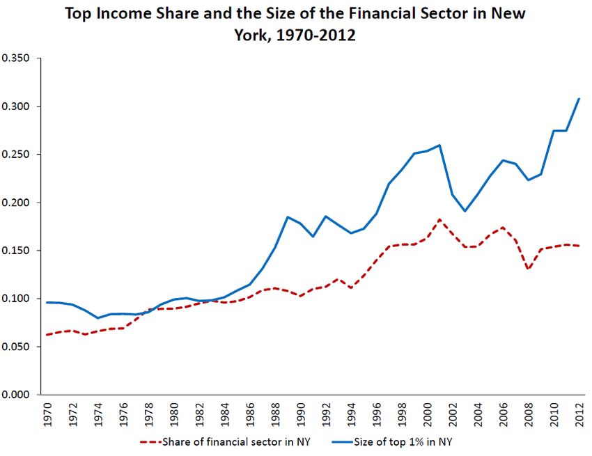
1       Introduction
That the past decades have witnessed a sharp increase in top income inequality worldwide
and particularly in developed countries, is by now a widely acknowledged fact.1 However no
consensus has been reached as to the main underlying factors behind this surge in top income
inequality. In this paper we argue that, in a developed country like the US, innovation is
certainly one such factor. For example, looking at the list of the wealthiest individuals across
US states in 2015 compiled by Forbes (Brown, 2015), 11 out of 50 are listed as inventors
in a US patent and many more manage or own firms that patent. More importantly, if we
look at patenting and top income inequality in the US and other developed countries over
the past decades, we see that these two variables tend to follow parallel evolutions. Thus
Figure 1 below looks at patenting per 1000 inhabitants and the top 1% income share in the
US since the 1960: up to the early 1980s, both variables show essentially no trend but then
since the early 1980s and starting at about the same time these two variables experience
sharp upward trends.

Figure 1: Evolution of the top 1% income share and of the total patent per capita in the US. 1963-2013.

    In this paper, we use cross-state panel data over the period 1975-2010 to look at the
effect of innovativeness on top income inequality, where innovativeness is measured by the
flow and/or quality of patented innovations in the corresponding US state, and top income
inequality is measured by the share of income held by the top 1%.
    In the first part of the paper, we develop a Schumpeterian growth model where growth
results from quality-improving innovations that can be made in each sector either from the
incumbent in the sector or from potential entrants. Facilitating innovation or entry increases
the entrepreneurial share of income and spurs social mobility through creative destruction
    1
   The worldwide interest for income and wealth inequality, has been spurred by popular books such as
Goldin and Katz (2009), Deaton (2014) and Piketty (2014).

                                                  2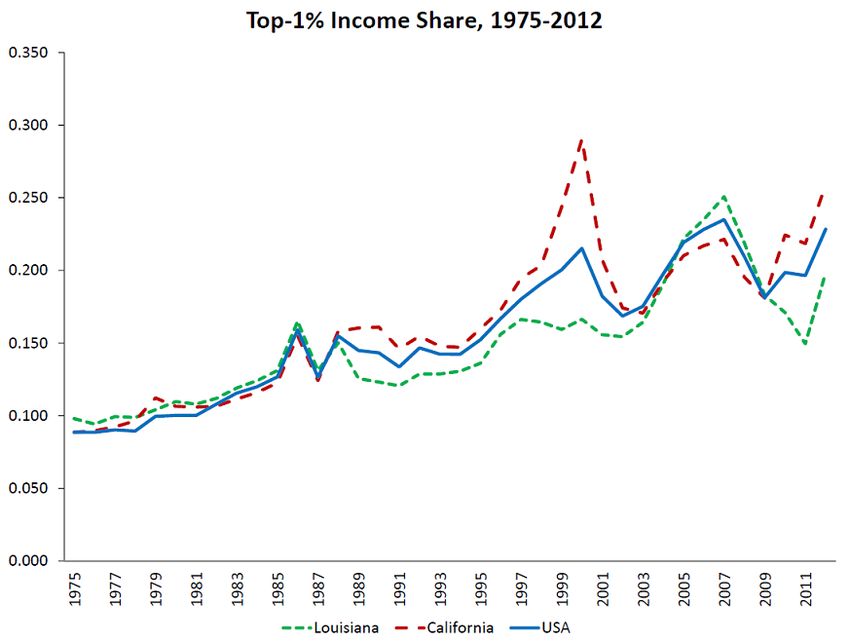
as employees’ children more easily become business owners and vice versa. In particular,
this model predicts that: (i) innovation by entrants and incumbents increases top income
inequality; (ii) innovation by entrants increases social mobility; (iii) entry barriers lower the
positive effects of entrants’ innovations on top income inequality and social mobility.
    These predictions are not unreasonable at first sight: for example California is the most
technologically advanced and the most innovative state in the US; but it is also a state where
the richest 1% receives more than 20% of total income in 2010 and it lies among the US
states with the highest levels of social mobility (see Chetty et al, 2015); whereas Southern
states like Alabama are less innovative, with also lower top 1% income shares (for instance
15.8% in 2010 in Alabama) and lower levels of social mobility. Similarly, in Scandinavian
countries, innovation-led growth has accelerated and top income shares have increased in the
decade after the mid 1990s relative to the previous decade, while in the meantime, social
mobility has not decreased. In this paper we go one step further and confront the above
predictions to more systematic cross state panel evidence and also to cross-commuting zone
(CZ) and cross-Metropolitan Statistical Areas (MSA) evidence.
    Our main findings can be summarized as follows. First, the top 1% income share in
a given US state in a given year, is positively and significantly correlated with the state’s
degree of innovativeness, i.e. with the quality-adjusted amount of innovation in this state in
that year—computed using citations data. Further, we show a causal effect of innovation-
led growth on top incomes. We establish this result by instrumenting for innovativeness
following two different strategies, first by using data on the appropriation committees of the
Senate (following Aghion et al., 2009), and second by relying on knowledge spillovers from
the other states. Both instruments deliver similar coefficients and the effects are significant:
for example, when measured by the number of patents per capita, innovativeness accounts
on average for around 17% of the total increase in the top 1% income share between 1975
and 2010. We also find that in cross-state panel regressions, innovativeness is less positively
or even negatively correlated with measures of inequality which do not emphasize the very
top incomes, in particular the top 2 to 10% income share (i.e. excluding the top 1%), or
broader measures of inequality like the Gini coefficient or the Atkinson index. Next, we show
that the positive effects of innovation on the top 1% income share are dampened in states
with higher lobbying intensity. Finally, from cross-section regressions performed at the CZ
level, we find that: (i) innovativeness is positively correlated with upward social mobility;
(ii) the positive correlation between innovativeness and social mobility, is driven mainly by
entrant innovators and less so by incumbent innovators, and it is dampened in states with
higher lobbying intensity.
    Our results pass a number of robustness tests: in particular the positive and significant
correlations between innovativeness and top income shares in cross state panel regressions,
is robust to controlling for the share of the financial sector in state GDP and to including
top marginal tax rates as control variables (whether on capital, labor or interest income).
Moreover, the impact of innovation on top income inequality is the strongest when consid-
ering three-year lagged innovation, but it fades when considering innovation with more than
a six-year lag, which in turn indicates that a given innovation increases top inequality only
temporarily.
    Overall, our findings are in line with the Schumpeterian view whereby more innovation-

                                               3
led growth should both, increase top income shares (which reflect innovation rents) and social
mobility (which results from creative destruction and associated firm and job turnover).
The analysis in this paper relates to several strands of literature. First, to endogenous
growth models: thus Rebelo (1991) developed an AK model to argue that (over)taxing
capital can be detrimental to growth as capital accumulation amounts to knowledge accu-
mulation in AK models. Similarly, a straightforward implication of innovation-based growth
models (Romer, 1990; Aghion and Howitt, 1992) is that, everything else equal, taxing inno-
vation rents is detrimental to growth as it discourages individuals from investing in R&D and
thus from innovating. On the other hand, Banerjee and Newman (1993), Galor and Zeira
(1993), Benabou (1996) and Aghion and Bolton (1997) argue that once credit constraints
are present, reducing wealth inequality can actually have a stimulating effect on growth, as
it allows credit-constrained individuals otherwise subject to credit-rationing to finance inno-
vative projects. We contribute to this literature, first by introducing social mobility into the
picture and linking it to creative destruction, and second by looking explicitly at the effects
of innovativeness on top income shares. Hassler and Rodriguez-Mora (2000) analyze the
relationship between growth and intergenerational mobility in a model which may feature
multiple equilibria, some with high growth and high social mobility and others with low
growth and low social mobility. Multiple equilibria arise because in a high growth environ-
ment, inherited knowledge depreciates faster, which reduces the advantage of incumbents. In
that paper however, growth is driven by externalities instead of resulting from innovations.
More recently, Jones and Kim (2014) model an economy where incumbents exert efforts to
increase their market share while entrants can innovate to replace the incumbents. The
interplay between these two forces ensure a Pareto distribution of income, where top income
inequality is negatively correlated with innovation and with social mobility, a prediction at
odds with our empirical results.2
Second, our paper relates to an empirical literature on inequality and growth. Thus,
Banerjee and Duflo (2003) find no robust relationship between income inequality and growth
when measuring inequality by the Gini coefficient, whereas Forbes (2000) finds a positive
relationship between these two variables. However, these papers do not look at top incomes
nor at social mobility, and they do not contrast innovation-led growth with non-frontier
growth. More closely related to our analysis, Frank (2009) finds a positive relationship
between both the top 10% and top 1% income shares and growth across US states; however,
Franck does not establish any causal link from growth to top income inequality, nor does he
consider innovation or social mobility.3
Third, a large literature on skill-biased technical change aims at explaining the increase
in labor income inequality since the 1970’s. In particular, Katz and Murphy (1992) and
Goldin and Katz (2008) have shown that technical change has been skill-biased in the 20th
century. Acemoglu (1998, 2002 and 2007) sees the skill distribution as determining the
direction of technological change, while Hémous and Olsen (2014) argue that the incentive to
automate low-skill tasks naturally increases as an economy develops. Several papers (Aghion
2
To be more specific, the negative correlation between top income inequality and innovation hinges on
the fact that Jones and Kim define “innovation” as the result of the innovative efforts by entrants only.
3
Parallel work by Acemoglu and Robinson (2015) also reports a positive correlation between top income
inequality and growth in panel data at the country level (or at least no evidence of a negative correlation).
4and Howitt, 1997; Caselli, 1999; Galor and Moav, 2000) see General Purpose Technologies
(GPT) as lying behind the increase in inequality, as the arrival of a GPT favors workers who
adapt faster to the detriment of the rest of the population. Krusell, Ohanian, Rı́os-Rull and
Violante (2000) show how with capital-skill complementarity, the increase in the equipment
stock can account for the increase in the skill premium. While this literature focuses on
the direction of innovation and on broad measure of labor income inequality (such as the
skill-premium), our paper is more directly concerned with the rise of the top 1% and how it
relates with the rate and quality of innovation (in fact our results suggest that innovativeness
does not have a strong impact on broad measures of inequality compared to their impact on
top income shares).
Finally, our focus on top incomes links our paper to a large literature documenting a
sharp increase in top income inequality over the past decades (in particular, see Piketty
and Saez, 2003). We contribute to this line of research by arguing that increases in top 1%
income shares, are at least in part caused by increases in innovation-led growth.4
The remaining part of the paper is organized as follows. Section 2 outlays a simple
Schumpeterian model to guide our analysis of the relationship between innovation-led growth,
top incomes, and social mobility. Section 3 presents our cross-state panel data and our
measures of inequality and innovativeness. Section 4 presents our core regression results.
Section 5 discussed three extensions of our analysis: first, it looks at the relationship between
innovativeness and social mobility; second, it distinguishes between entrant and incumbent
innovation when looking at the effects on top incomes and on social mobility; third, it looks
at how local lobbying impacts on the effects of innovativeness on top income and on social
mobility. Section 6 concludes.
2 Theory
In this section we develop a simple Schumpeterian growth model to explain why increased
R&D productivity or increased openness to entry increases both, the top income share and
social mobility.
2.1 Baseline model
Consider the following discrete time model. The economy is populated by a continuum
of individuals. At any point in time, there is a measure 2 of individuals in the economy,
half of them are capital owners who own the firms and the rest of the population works
as production workers.5 Each individual lives only for one period. Every period, a new
4
Rosen (1981) emphasizes the link between the rise of superstars and market integration: namely, as
markets become more integrated, more productive firms can capture a larger income share, which translates
into higher income for its owners and managers. Similarly, Gabaix and Landier (2008) show that the increase
in the size of some firms can account for the increase in their CEO’s pay. Our analysis is consistent with this
line of work, to the extent that successful innovation is a main factor driving differences in productivities
across firms, and therefore in firms’ size.
5
One can extend the analysis to the more general case where workers’ population differs from business
owners’ population. All our results go through except that we then have to carry around the mass of workers
5generation of individuals is born and individuals that are born to current firm owners inherit
the firm from their parents. The rest of the population works in production unless they
successfully innovate and replace incumbents’ children.
2.1.1 Production
A final good is produced according to the following Cobb-Douglas technology:
Z 1
ln Yt = ln yit di, (1)
0
where yit is the amount of intermediate input i used for final production at date t. Each
intermediate is produced with a linear production function
yit = qit lit , (2)
where lit is the amount of labor used to produce intermediate input i at date t and qit is the
labor productivity. Each intermediate i is produced by a monopolist who faces a competitive
fringe from the previous technology in that sector.
2.1.2 Innovation
Whenever there is a new innovation in any sector i in period t, quality in that sector improves
by a multiplicative term ηH so that:
qi,t = ηH qi,t−1 .
In the meantime, the previous technological vintage qi,t−1 becomes publicly available, so that
the innovator in sector i obtains a technological lead of ηH over potential competitors.
At the end of period t, other firms can partly imitate the (incumbent) innovator’s tech-
nology so that, in the absence of a new innovation in period t + 1, the technological lead
enjoyed by the incumbent firm in sector i shrinks to ηL with ηL < ηH .
Assuming away any further imitation before a new innovation occurs, the technological
lead enjoyed by the incumbent producer in any sector i takes two values: ηH in periods with
innovation and ηL < ηH in periods without innovation.6
Finally, we assume that an incumbent producer that has not recently innovated, can still
resort to lobbying in order to prevent entry by an outside innovator. Lobbying is successful
with exogenous probability z, in which case, the innovation is not implemented, and the
incumbent remains the technological leader in the sector (with a lead equal to ηL ).
Both potential entrants and incumbents have access to the following innovation technol-
ogy. By spending
x2
CK,t (x) = θK Yt
2
an incumbent (K = I) or entrant (K = E) can innovate with probability x. A reduction in
θK captures an increase in R&D productivity or R&D support, and we allow for it to differ
between entrants and incumbents.
through all the equilibrium equations of the model.
6
The details of the imitation-innovation sequence do not matter for our results, what matters is that
innovation increases the technological lead of the incumbent producer over its competitive fringe.
62.1.3 Timing of events
Each period unfolds as follows:
1. In each line i, a potential entrant spends CE,t (xi ) and the offspring of the incumbent
in sector i spends CI,t (x̃i ) .
2. With probability (1 − z) xi the entrant succeeds, replaces the incumbent and obtains
a technological lead ηH , with probability x̃i the incumbent succeeds and improves its
technological lead from ηL to ηH , with probability 1 − (1 − z) xi − x̃i , there is no
successful innovation and the incumbent stays the leader with a technological lead of
ηL .7
3. Production and consumption take place and the period ends.
2.2 Solving the model
We solve the model in two steps: first, we compute the income shares of entrepreneurs
and workers and the rate of upward social mobility (from being a worker to becoming an
entrepreneur) for given innovation rates by entrants and incumbents; second, we endogeneize
the entrants’ and incumbents’ innovation rates.
2.2.1 Income shares and social mobility for given innovation rates
In this subsection we take as given the fact that in all sectors potential entrants innovate at
some rate xt and incumbents innovate at some rate x̃t at date t.
Using (2), the marginal cost of production of (the leading) intermediate producer i at
time t is
wt
M Cit = .
qi,t
Since the leader and the fringe enter Bertrand competition, the price charged at time t by
intermediate producer i is simply a mark-up over the marginal cost equal to the size of the
technological lead, i.e.
wt ηit
pi,t = , (3)
qi,t
where ηi,t ∈ {ηH , ηL }. Therefore innovating allows the technological leader to charge tem-
porarily a higher mark-up.
Using the fact that the final good sector spends the same amount Yt on all intermediate
goods (a consequence of the Cobb-Douglas technology assumption), we have in equilibrium:
Yt = pi,t yit for all i. (4)
7
For simplicity, we rule out the possibility that both agents innovate in the same period, so that innova-
tions by the incumbent and the entrant in any sector, are not independent events. This can be microfounded
in the following way. Assume that every period there is a mass 1 of ideas, and only one idea is succesful.
Research efforts x and x e represent the mass of ideas that a firm investigates. Firms can observe each other
actions, therefore in equilibrium they will never choose to look for the same idea provided that x∗ + x̃∗ < 1,
which is satisfied for θK sufficiently large.
7This, together with (3) and (2), allows us to immediately express the labor demand and
the equilibrium profit in any sector i at date t. Labor demand by producer i at time t is
given by:
Yt
lit = .
wt ηit
And equilibrium profits in sector i at time t are equal to:
ηit − 1
πit = (pit − M Cit )yit = Yt .
ηit
Hence profits are higher if the incumbent has recently innovated, namely:
ηH − 1 ηL − 1
πH,t = Yt > πL,t = Yt .
ηH η
| {z } | {zL }
≡πH ≡πL
Now we have everything we need to derive the expressions for the income shares of workers
and entrepreneurs and for the rate of upward social mobility. Let µt denote the fraction of
high-mark-up sectors (i.e. with ηit = ηH ) at date t.
Labor market clearing at date t implies that:
1 − µt
Z Z
Yt Yt µt
1 = lit di = di = +
wt ηit wt ηH ηL
We restrict attention to the case where the ηit ’s are sufficiently large that
wt < πL,t < πH,t ,
so that top incomes are earned by entrepreneurs.
Hence the share of income earned by workers (wage share) at time t is equal to:
wt µt 1 − µt
wages sharet = = + . (5)
Yt ηH ηL
whereas the share of income earned by entrepreneurs (entrepreneurs share) at time t is equal
to:
µt πH,t + (1 − µt ) πL,t µt 1 − µt
entrepreneur sharet = =1− − . (6)
Yt ηH ηL
Since mark-ups are larger in sectors with new technologies, aggregate income shifts from
workers to entrepreneurs in relative terms whenever the equilibrium fraction of product lines
with new technologies µt increases. But by the law of large numbers this fraction is equal
to the probability of an innovation by either the incumbent or a potential entrant in any
intermediate good sector.
More formally, we have:
µt = x̃t + (1 − z) xt , (7)
which increases with the innovation intensities of both incumbents and entrants, but to a
lesser extent with respect to entrants’ innovations the higher the entry barriers z are.
8Finally, we measure upward social mobility by the probability Ψt that the offspring of a
worker becomes a business owner. This in turn happens only if this individual manages to
first innovate and then avoids the entry barrier; therefore
Ψt = xt (1 − z) , (8)
which is increasing in entrant’s innovation intensity xt but less so the higher the entry barriers
z are. This yields:
Proposition 1 (i) A higher rate of innovation by a potential entrant, xt , is associated with
a higher entrepreneur share of income and a higher rate of social mobility, but less so the
higher the entry barriers z are; (ii) A higher rate of innovation by an incumbent, x et , is
associated with a higher entrepreneur share of income but has no impact on social mobility.
Remark 1: That the equilibrium share of wage income in total income decreases with
the fraction of high mark-up sectors µt , and therefore with the innovation intensities of
entrants and incumbents, does not imply that the equilibrium level of wages also declines.
In fact the opposite occurs, and to see this more formally, we can compute the equilibrium
level of wages by plugging (4) and (3) in (1), which yields:
Qt
wt = µt 1−µt , (9)
ηH ηL
R1
where Qt is the quality index defined as Qt = exp 0 ln qit di. The law of motion for the
quality index is computed as
Z 1
µt
Qt = exp [µt ln ηH qit−1 + (1 − µt ) ln qit−1 ] di = Qt−1 ηH . (10)
0
Therefore, for given technology level at time t − 1, the equilibrium wage is given by
wt = ηLµt −1 Qt−1 .
This last equation clearly shows that the overall effect of a current increase in innovation
intensities is to increase the equilibrium wage for given technology level at time t − 1, even
though it also shifts some income share towards entrepreneurs.8
Remark 2: Equation (9) shows that if the equilibrium innovation intensities x∗ and x e∗
of the entrant and incumbent are constant over time (which we show below) the growth rate
of aggregate variables such as aggregate output and the wage rate is equal to the growth rate
of the quality index Qt . Using the law of motion for Qt (10), we get that the equilibrium
growth rate is a constant given by
(1−z)x∗ +x̃∗
g ∗ = ηH − 1,
which is increasing in the entrant innovation rate x∗ (but less so the higher entry barriers z
are) and in the incumbent innovation rate x̃∗ .9
8
In addition, note that the entrepreneurial share is independent of innovation intensities in previous
periods. Therefore, a temporary increase in current innovation only leads to a temporary increase in the
entrepreneurial share: once imitation occurs, the gains from the current burst in innovation will be equally
shared by workers and entrepreneurs.
9
We looked at an extension of the model where only some high-ability incumbents can potentially innovate
92.2.2 Endogenous innovation
We now turn to the endogenous determination of the innovation rates of entrants and incum-
bents. The offspring of the previous period’s incumbent solves the following maximization
problem:
x̃2
∗ ∗
max x̃πH Yt + (1 − x̃ − (1 − z) x ) πL Yt + (1 − z) x wt − θI Yt .
x̃ 2
This expression states that the offspring of an incumbent can already collect the profits of
the firm that she inherited (πL ), but also has the chance of making higher profit (πH ) by
innovating with probability x̃.
Clearly the optimal innovation decision is simply
∗ ∗ πH − π L 1 1 1
x̃t = x̃ = = − , (11)
θI ηL ηH θI
which decreases with incumbent R&D cost parameter θI .
A potential entrant in sector i solves the following maximization problem:
x2
max (1 − z) xπH Yt + (1 − x (1 − z)) wt − θE Yt ,
x 2
since an entrant chooses its innovation rate with the outside option being a production worker
who receives wage wt .
Using the fact (see above) that
wt µt 1 − µt
= + ,
Yt ηH ηL
taking first order conditions, and using our assumption that wt < πL,t , we can express the
entrant innovation rate as
∗ ∗ µt 1 − µt (1 − z)
x t ≡ x = πH − + . (12)
ηH ηL θE
Then, using the fact that in equilibrium
µ∗ = (1 − z) x∗ + x̃∗ ,
the equilibrium innovation rate for entrants is simply given by
πH − η1L + η1L − η1H x̃∗ (1 − z)
x∗ = . (13)
2 1 1
θE − (1 − z) ηL − ηH
while the other, low-ability, incumbents cannot. In this extension, a high rate of entrant’s innovation and low
entry barriers further increase growth by ensuring a higher share of high-ability incumbents in steady-state.
10Therefore lower barriers to entry (i.e. a lower z) and less costly R&D for entrants (lower
θE ) both increase the entrants’ innovation rate (as 1/ηL − 1/ηH > 0). Less costly incumbent
R&D also increases the entrant innovation rate since x e∗ is decreasing in θI .10
Intuitively, high mark-up sectors are those where an innovation just occurred and was
not blocked, so a reduction in either entrants’ or incumbents’ R&D costs increases the share
of high mark-up sectors in the economy and thereby the entrepreneurs’ share of income.
And to the extent that higher entry barriers dampen the positive correlation between the
entrants’ innovation rate and the entrepreneurial share of income, they will also dampen the
positive effects of a reduction in entrants’ or incumbents’ R&D costs on the entrepreneurial
share of income.11
Finally, equation (8) immediately implies that a reduction in entrants’ or incumbents’
R&D costs increases social mobility but less so the higher the barriers to entry are.
We have thus established:
Proposition 2 An increase in R&D productivity (whether it is associated with a reduction
in θI or in θE ), leads to an increase in the innovation rates x∗ and x̃∗ but less so the higher
the entry barriers z are; consequently, it leads to higher growth, higher entrepreneur share
and higher social mobility but less so the higher the entry barriers are.
2
Proof. The only claim we have not formally proved in the text is that ∂θ∂K ∂z (1 − z) x∗ > 0
(which immediately implies that the positive impact of a increase in R&D productivity on
growth, entrepreneurial share and social mobility is attenuated when barriers to entry are
high). Differentiating first with respect to θE , we get:
∂ (1 − z) x∗ (1 − z) x∗
=− ,
∂θE θE − (1 − z)2 η1L − 1
ηH
∗
i in z since x and (1 − z) both decrease in z and the denominator θ +
which ishincreasing
(1 − z)2 η1H − η1L increases in z (recall that η1L − η1H > 0). Similarly, differentiating with
respect to θI gives:
1 1
∂ (1 − z) x ∗
ηL
− ηH
(1 − z) ∂ x̃∗
= ,
∂θI θ − (1 − z)2 1 − 1 ∂θI
E ηL ηH
∗
which is increasing in z since ∂∂θx̃I < 0, and 1 − z and the denominator both decrease in z.
This establishes the proposition.
2.2.3 Impact of mark-ups on innovation and inequality
Our discussion so far pointed to a causality from innovation to top income inequality and
social mobility. However the model also speaks to the reverse causality from top inequality to
10
That x∗ increases with x
e∗ results from the fact that more innovation by incumbents lowers the equilibrium
wage which decreases the opportunity cost of innovation for an entrant. This general equilibrium effect rests
on the assumption that incumbents and entrants cannot both innovate in the same period.
11
See the proof of Proposition 2 below.
11innovation. First, a higher innovation size ηH leads to a higher mark-up for firms which have
successfully innovated. As a result, it increases the entrepreneur share for given innovation
rate (see (6)). Second, a higher ηH increases incumbents’ (11) and (13) entrants’ innovation
rates, which further increases the entrepreneur share of income.
More interestingly perhaps, a higher ηL increases the mark-up of a non-innovator and
thereby also the entrepreneur share, while discouraging incumbent’s innovation.12 This in
turn may dampen the positive correlation between innovation and the entrepreneur share of
income.
2.3 Predictions
We can summarize the main predictions from the above theoretical discussion as follows.
• Innovation by both entrants and incumbents, increases top income inequality;
• Innovation by entrants increases social mobility;
• Entry barriers lower the positive effect of entrants’ innovation on top income inequality
and on social mobility.
We now confront these predictions to the data.
3 Data and measurement
Our core empirical analysis is carried out at US state level. Our dataset covers the period
1975-2010, a time range imposed upon us by the availability of patent data.
3.1 Inequality
The data on the share of income owned by the top 1% of the income distribution for our
cross-US-state panel analysis, are drawn from the US State-Level Income Inequality Database
(Frank, 2009). From the same data source, we also gather information on alternative mea-
sures of inequality: namely, the top 10% income share, the Atkinson Index (with a coefficient
of 0.5), the Theil Index and the Gini Index. We thus end up with a balanced panel of 51
states (we include Alaska and Hawaii and count the District of Columbia as a “state”) and a
total of 1836 observations (51 states over 36 years). In 2010, the three states with the highest
share of total income held by the richest 1% are Connecticut, New York and Wyoming with
respectively 21.7%, 21.1% and 20.1% whereas West Virginia, Iowa and Maine are the states
with the lowest share held by the top 1% (respectively 11.8%, 12% and 12%). In every US
state, the top 1% income share has increased between 1975 and 2010, the unweighted mean
value was around 8% in 1975 and reached 21% in 2007 before slowly decreasing to 16.3% in
12
In the Appendix, we show that an increase in ηL also decreases total innovation when θI = θE , but yet
its impact on the entrepreneur share remains positive for a sufficiently high R&D cost (i.e. for θ sufficiently
high).
122010. In addition, the heterogeneity in top income shares across states is larger in the recent
period than it was during the 1970s, with a cross-state variance multiplied by 2.7 between
1975 and 2010. Figure 2 shows the evolution of the top 1% share for the states of California
and Louisiana, and in the US as a whole.
Figure 2: Evolution of top 1% income share in California, in Louisiana and in the US.
Note that the US State-Level Income Inequality Database provides information on the
adjusted gross income from the IRS. This is a broad measure of pre-tax (and pre-transfer)
income which includes wages, entrepreneurial income and capital income (including realized
capital gains). Unfortunately it is not possible to decompose total income in the various
sources of income (wage, entrepreneurial or capital incomes) with this dataset. In contrast,
the World Top Income Database (Alvaredo et al., 2014), allows us to assess the composition
of the top 1% income share. On average between 1975 and 2010, wage income represented
50.7% and entrepreneurial income 19.1% of the total income earned by the top 1% (with
entrepreneurial income having a lower share in later years), while for the top 10%, wage
income represented 71.1% and entrepreneurial income 11.7% of total income. In our model,
entrepreneurs are those directly benefitting from innovation. In practice, innovation bene-
fits are shared between firm owners, top managers and inventors, thus innovation affects all
sources of income within the top 1%. Yet, the fact that entrepreneurial income is overrepre-
sented in the top 1% income relative to wage income, suggests that our model captures an
important aspect in the evolution of top income inequality.
3.2 Innovation
When looking at cross state or more local levels, the US patent office (USPTO) and the
HBS patent database from Lai et al. (2013) provide complete statistics for patents granted
13between the years 1975 and 2010. For each patent, it provides information on the state of
residence of the patent inventor, the date of application of the patent and a link to every
citing patents granted before 2010. This citation network between patents enables us to
construct several estimates for the quality of innovation as described below. Since a patent
can be associated with more than one inventor and since coauthors of a given patent do
not necessarily live in the same state, we assume that patents are split evenly between
inventors and thus we attribute only a fraction of the patent to each inventor. A patent is
also associated with an “assignee” that owns the right to the patent. Usually, the assignee is
the firm employing the inventor, and for independent inventors the assignee and the inventor
are the same person. We chose to locate each patent according to the US state where its
inventor lives and works. Although the inventor’s location might occasionally differ from
the assignee’s location, most of the time the two locations coincide (the correlation between
the two is above 92%).13 Moreover, we checked that all our results are robust to locating
patents according to the assignee’s address instead of the inventor’s address. And we also
checked the robustness of our results to removing independent inventors from the patent
count. Finally, in line with the patenting literature, we focus on “utility patents” which
cover 90% of all patents at the USPTO.14
3.2.1 Truncation bias
The so-called truncation bias in patent count stems from the fact that the process of granting
a patent takes about two years on average following patent application. As the individual
USPTO database contains only patents that have been granted before 2010, simply grouping
by state for each year will lead to underestimate the intensity of innovation as we approach the
end period of the sample (as many patents with application dates close to 2010 are unlikely to
be granted by 2010, and therefore to appear in the database). Since we restrict attention to
patents with application dates between 1975 and 2010, the truncation bias is not an issue at
the beginning of the time period (correcting for patents that were granted after 1975 but with
application dates before 1975). To account for truncation, we use aggregate data on patent
granted by application date at the state level from the USPTO website. These data have
been updated in 2014 and therefore in principle they should not suffer too much from the
truncation bias problem over the period 1975-2010. However, even before 2010, we observe
a decrease in the number of granted patents as distributed by their application date.15 Two
main factors seem to account for the decreasing trend in the number of granted patents.
First, the information technology bubble has led many inventors to create a company in
the high tech sector during the 90s and to innovate faster than their competitors. This
13
For example, Delaware and DC are states for which the inventor’s address is more likely to differ from
the assignee’s address.
14
The USPTO classification considers three types of patents according to the official documentation: utility
patents that are used to protect a new and useful invention, for example a new machine, or an improvement
to an existing process; design patents that are used to protect a new design of a manufactured object; and
plant patents that protect some new varieties of plants. Among those three types of patents, the first is
presumably the best proxy for innovation, and it is the only type of patents for which we have complete
data.
15
This is not the case when looking at the number of patents distributed by their granting year.
14generated a patent race that stopped after the crisis in 2000. Second, the USPTO has faced
a large surge in the number of patent applications since the past decade as evidenced by
the official statistics on the number of applications (regardless of whether these patents will
ultimately be granted or not). Consequently, a growing share in the number of applications
filed are still pending because they have not yet been examined (for more information about
this “backlog”, see De Rassenfosse et al. (2013)). To address this problem, we completed
the series after 200616 with the adjusted number of patent applications by the various states
(regardless of whether the patents were to be granted or rejected) from the Strumsky Granted
Patent and Patent Application Database17 assuming a constant and homogeneous rate of
acceptance for the years 2007, 2008, 2009 and 2010. This assumption is not unreasonable
when looking at past data. This method has its shortcomings though: the measure is noisy
for the last three years as it may involve including many insignificant patents. An alternative
would be to assume that the backlog accounts for the same share of patents across all states,
which in turn is consistent with the shape of the lag distribution being very similar across
states. Then, the backlog would be captured by our fixed effects. Fortunately, these two
approaches yield very similar results and therefore we shall only present results using the
first approach.18
Similarly, we correct for truncated citation bias using the quasi-structural approach pro-
posed by Hall, Jaffe and Trajtenberg (2001) and extend their HJT corrector until 2010. This
method allows us to generate corrected citation data that can be compared over time and
technologies. Here again, because of the inaccuracy of the correction variable for the last
three years, corrected citation counts can mainly be used before 2008.
There is a substantial amount of variation in innovativeness both across states and over
time. Between 1975 and 1990, Delaware, Connecticut, New Jersey and Massachusetts were
the most innovating states (with 0.55, 0.4, 0.39 and 0.29 patents per 1000 inhabitants re-
spectively), while Arkansas, Mississippi and Hawaii were the least innovative states with
less than 0.05 patents per thousands inhabitants. Between 1990 and 2009, however, the
most innovative states were Idaho (0.99 patents per 1000 inhabitants), Vermont (0.86), Mas-
sachusetts (0.63), Minnesota (0.61) and California (0.61), whereas Arkansas, West Virginia
and Mississippi all had less than 0.06 patents per 1000 inhabitants.19
16
According to the USPTO website: “As of 12/31/2012, utility patent data, as distributed by year of
application, are approximately 95% complete for utility patent applications filed in 2004, 89% complete for
applications filed in 2005, 80% complete for applications filed in 2006, 67% complete for applications filed
in 2007, 49% complete for applications filed in 2008, 36% complete for applications filed in 2009, and 19%
complete for applications filed in 2010; data are essentially complete for applications filed prior to 2004.” By
the same logic, in 2014 nearly all patents from 2006 should be included.
17
https://clas-pages.uncc.edu/innovation/
18
Yet another approach is to delete the time component by considering only the share of total patents
application in each state. We checked the robustness of our results to using this alternative approach.
19
Idaho’s place at the top of this list may look surprising, but it is home to several tech companies
(particularly in semiconductors). Our results carry through if one excludes Idaho.
153.2.2 Quality measures
Simply counting the number of patent granted by their application date is a crude measure
of innovation as it does not differentiate between a patent that made a significant contri-
bution to science and a more incremental one. The USPTO database, provides sufficiently
exhaustive information on patent citation to compute indicators which better measure the
quality of innovation. We consider four measures of innovation quality:
• 3, 4 and 5 year windows citations counter : this variable measures the number of
citations received within no more than 3, 4 or 5 years after the application date. This
measure has the advantage of being immune from the citation truncation bias problem
described above as long as we correct for the number of patents and provided we stop
our data sample at patents applied in 2006, 2005 and 2004 respectively.
• Is the patent among the 5% most cited in the year by 2010? This is a dummy variable
equal to one if the patent applied for in a given year belong to the top 5% most cited
patents. Because most of the patents are not yet cited, or at most once, in 2008, 2009
and 2010, we stop computing this measure after the year 2007.
• Total corrected citation counter: This measures the number of times a patent has been
cited, once this number has been corrected for the truncation citation bias as explained
above.
• Has the patent been renewed? This is a dummy variable equal to one if the patent
has been renewed (at least one) before 2014. Indeed, USPTO require inventors to
pay maintenance fees three times during the lifetime of the patent, the first payment
being made three years after the date of issue. Hence this measure is immune from
truncation bias issues. Unfortunatly, these data are only available from 1982.
These measures have been aggregated at the state level by taking the sum of the quality
measures over the total number of patents granted for a given state and a given application
date and then divided by the number of inhabitants. Most of our quality measures can thus
be considered as citation weighted patents counts. These different measures of innovativeness
display consistent trends: hence the four states with the highest flows of patents between
1975 and 1990 are also the four states with the highest total citation counts, and similarly
for the five most innovative states between 1990 and 2009.
3.3 Control variables
When regressing top income shares on innovativeness, a few concerns may be raised. First,
the business cycle is likely to have direct effects on innovation and top income share. Second,
top income share groups are likely to involve to a significant extent individuals employed by
the financial sector (see for example Philippon and Reshef, 2012). To evidence this strong
correlation, Figure 3 shows the evolution of the share of the financial sector and of the size
of the top 1% income share group in the state of New York. In turn, the financial sector
is sensitive to business cycles and it may also affect innovation directly. To address these
16two concerns, we control for the output gap and for the share of GDP accounted for by the
financial sector per inhabitant. In addition, we control for the size of the government sector
which may also affect both top income inequality and innovation. To these we add usual
controls, namely GDP per capita and the growth of total population.
Figure 3: Evolution of the share of financial sector and on the top 1% share in the state of New York.
1970-2012.
Data on GDP, total population and the share of the financial and public sectors can be
found in the Bureau of Economic Analysis (BEA) regional accounts. Finally, we compute
the output gap defined as the relative distance of real GDP per capita to its filtered value
computed with a HP filter of parameter λ equal to 6.25. To deal with the issue of extreme
values at the beginning and the end of the period, we calculated this filter over the period
1970-2013.
4 Main empirical analysis: the effect of innovativeness
on top incomes
4.1 Estimation strategy
We seek to look at the effect of innovativeness measured by the flow of patents granted by
the USPTO per thousand of inhabitants and by the quality of innovation on top income
shares. We thus regress the top 1% income share on our measures of innovativeness. Our
estimated equation is:
log(yit ) = A + Bi + Bt + β1 log(innovi(t−1) ) + β2 Xit + εit , (14)
17where yit is the measure of inequality, Bi is a state fixed effect, Bt is a year fixed effect,
innovi(t−1) is innovativeness in year t − 1,20 and X is a vector of control variables.21 By
including state and time fixed effects we are eliminating permanent cross state differences
in inequality and also aggregate changes in inequality. We are essentially studying the
relationship between the differential growth in innovation across states with the differential
growth in inequality.
4.2 Results from OLS regressions
Table 2 presents the results from regressing top income shares and other inequality measures
on the flow of patents. The relevant variables are defined in Table 1. As explained in the
previous section, the number of patents granted by the USPTO for a given application date
has been corrected for the truncation bias.
From Table 2 we see that the effect of the flow of patents per capita on the top 1% income
share is always positive and significant at the cross state level. The effect is robust to adding
the control variables even when we control for the size of the financial sector and for the size
of the government.
Table 3 shows the effect of our various measures of innovation quality on the top 1%
income share. The first three columns present our results when using the 3, 4 and 5 year
window citation number as our innovation quality measure. As argued above, this measure
has the advantage of being immune to the citation truncation bias problem as long as we
restrict our observations to before 2007, 2006 and 2005 respectively for these three measures.
The results from Table 3 show that these measures of innovation quality are positively
correlated with the top 1% income share. Columns 4, 5 and 6 from the same table consider
the other three measures of innovation quality. Column 4 regresses top income share on the
corrected number of citations per capita, column 5 regresses top income share on the number
of patents among the 5% most cited in the same application year, and column 6 regresses
the top income share on the number of patents per capita but counting only those that have
been renewed at least once. In all instances, we find a positive and significant coefficient for
innovation on the top 1% income share. Moreover, the coefficients are quite similar across
the different measures of innovation.
4.3 Results from IV regressions
To deal with endogeneity issues in the regression of top income inequality on innovativeness,
we construct two instruments: the first instrument relies on states’ representation in the
Appropriation Committees of the Senate and the House of Representatives. The second
instrument exploits knowledge spillovers across states.
20
We discuss the choice of lagged innovation variable(s) below.
21
When y is equal to 0, computing log(y) would result in removing the observation from the panel. In such
cases, we proceed as in Blundell et al. (1995) and set the left hand variable to 0 and add a dummy equal to
one if y is equal to 0. All the results of this paper are consistent with simply removing the observation and
the magnitudes are only very slightly altered. This dummy is not reported.
184.3.1 Instrumentation using the state composition of appropriation committees
Following Aghion et al (2009), we consider the time-varying State composition of the ap-
propriation committees of the Senate and the House of Representatives. To construct this
instrument, we gather data on membership of these committees over the period 1969-2010
(corresponding to Congress numbers 91 to 111).22 The rationale for using this instrument
is analyzed at length in Aghion et al. (2009): in a nutshell, the appropriation committees
allocate federal funds to research education across US states.23 A member of Congress who
sits in such a Committee often pushes towards subsidizing research education in the state in
which she has been elected, in order to increase her chances of reelection in that state. Con-
sequently, a state with one of its congressmen seating on the committee is likely to receive
more funding and to develop its research education, which should subsequently increase its
innovativeness in the following years.
For the years 1969-2010, the number of seats in this committee has slowly increased
from around 50 to 65 for the House and from around 25 to 30 for the Senate. The State
composition of the Appropriation Committees is potentially a good instrument for research
education subsidies and thus for innovativeness, because changes in the composition of the
appropriation committees have little to do with growth or innovation performance in those
states. Instead, they are determined by random events such as the death or retirement of
current heads or other members of these committees, followed by a complicated political
process to find suitable candidates (although the committees are renewed every two years,
in practice committee members stay for several terms in a row, particularly in the Senate).
This process in turn gives large weight to seniority considerations with also a concern for
maintaining a fair political and geographical distribution of seats (as described with more
details in Aghion et al., 2009). In addition, legislators are unable to fully evaluate the
potential of a research project and are more likely to allocate grants on the basis of political
interests. Both explain why it is reasonable to see the arrival of a congressman in the
appropriation committee in the Senate or the House of Representatives, as an exogenous
shock on innovativeness (a decrease in θE and θI in the context of our model).
Based on these Appropriation Committee data, different instruments for innovativeness
can be constructed. We follow the simplest approach which is to take the number of senators
(0, 1 or 2) or representatives who seat on the committee for each state and at each date.24
22
Data have been collected and compared from various documents
published by the House of Representative and the Senate, namely:
http://democrats.appropriations.house.gov/uploads/House Approps Concise% History.pdf. and
http://www.gpo.gov/fdsys/pkg/CDOC-110sdoc14/pdf/CDOC-110sdoc14.pdf. The name of each con-
gressman has been compared with official biographical informations to determine the appointment date and
the termination date.
23
Even though these appropriations committees are not explicitly dedicated to research education, de
facto an important fraction of their budget goes to research education. As explained in Aghion et al (2009),
“research universities are important channels for pay back because they are geographically specific to a
legislator’s constituency. (...) Other potential channels include funding for a particular highway, bridge,
or similar infrastructure project located in the constituency”. We control for highway, infrastructure and
military expenditures in our regressions, as explained below.
24
We checked that our results are consistent with two other measures: one which focuses on the subcom-
mittees which are the most active in allocating federal spending: Agriculture, Defense and Energy (following
19Next, we need to find the appropriate time-lag between a congressman’s accession into the
appropriation committee and the effect this may have on innovativeness. According to
Aghion et al. (2009), many politicians in the United States are on a two year cycle. When
appointed to the committee, they must do everything in order to show their electors that they
are capable of doing something for them, and will thus allocate funds to universities located
in his/her states of constituency. For this reason, we decided to set the lag to two years, but
one and three year lags are also considered because of the time before the allocation of new
funds and the filling of a patent application.
Although changes in the composition of the Appropriation Committees can be seen as
exogenous shocks on innovativeness there is still a concern about potential effects of such
changes on the top 1% income share that do not relate to innovation. There is not much
data on appropriation committee earmarks; yet, for the years 2008 to 2010, the Taxpayers
for Common Sense, a nonpartisan budget watchdog, reports data on earmarks in which we
can see that infrastructure, research education and military are the three main recipients for
appropriation committees’ funds. In addition, when looking more closely at top recipients,
we see that most are either universities or defense related companies.25
One can of course imagine a situation in which the (rich) owner of a construction or
military company will capture part of these funds. In that case, the number of senators
seating in the committee of appropriation would be correlated with the top 1% income
share, but for reasons having little to do with innovation. To deal with such possibility,
we use data on federal allocation to states by identifying the sources of state revenues (see
Aghion et al., 2009). Such data can be found at the Census Bureau on a yearly basis. Using
this source, we identify a particular type of infrastructure spending, namely highways, for
which we have consistent data from 1975 onward. We thus control for highways and also for
the share of the federal military funding allocated to the various states.
Our results for the effect of innovativeness on the top 1% income share in the correspond-
ing IV regressions are shown in Table 4.26 We chose to present the results only for the top
1% and for the instrument using the number of seats at the Senate. Adding the number
of seats occupied at the House of Representative shows consistent results but decreases the
first stage F stat.27
Columns 1 to 3 show the effect of the number of patents per capita (variable patent pc)
on top 1% income share while columns 4 to 6 use the number of citations in a 3 year windows
per capita (variable 3YWindow ).28 The effect is positive and significant whether we consider
1, 2 or 3 year lags. First stage regression F-statistics are reported at the bottom of Table
4.29
Aghion et al., 2009), and another one which only considers the number of members whose seniority is less
than 8 years (as these members are more likely to direct funds to their states for political reasons).
25
Such data can be found on the Opensecrets website : https://www.opensecrets.org/earmarks/index.php
26
As we have a long time series for each state, we are not concerned about ’short T ’ bias in panel data
IV. We apply instrumental variables estimator directly to equation (14).
27
Looking at earmarks data, we can see that the Senate Appropriation Committee (although smaller than
the House of Representative’s Committee) send more earmarks. This might be one reason for why using the
Senate Appropriation Committee variable yields better first stage results.
28
Results for other measures of innovativeness are consistent and available upon request.
29
It may seem surprising that an appointment on the appropriation committee should already have an
20You can also read


