Period Paint Schemes & Color Selection - Landmark ...
←
→
Page content transcription
If your browser does not render page correctly, please read the page content below
Period Paint Schemes & Color Selection
Composition and Purpose
• It’s important to have a basic understanding of the composition
  and purpose of paints.
• All building materials inevitably deteriorate when exposed to the
  elements.
• Paint was originally intended to provide a protective coating or a
  sacrificial surface from the direct attack of the elements.

                                                                       2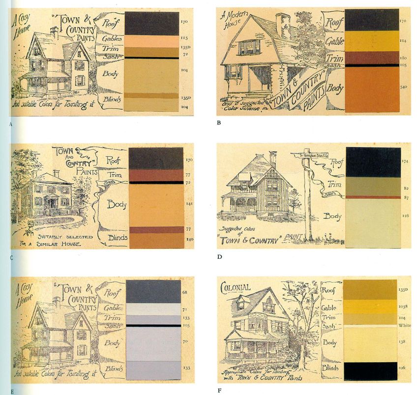
Pigments
• Pigments are the basis of all paints.
• Pigments have been used for thousands of
  years.
   o   Evidence suggests that the Greeks painted
       their temples, including the Parthenon, in a
       variety of colors.
• Ground or powdered colored materials both
  organic and inorganic obtained from nature
  such as:
   o   Ochres, siennas, umbers made from iron-oxide
       containing clay, copper carbonates, vegetable
       such as berries or roots, or minerals like lapis
       lazuli, and a few synthesized colorants such as
       Prussian blue, or mercuric sulfide

                                                          3
Pigments
• Make the paint opaque, thus protecting the
  substrate from deterioration caused by
  ultraviolet light.
• Add color and body to the paint, thus
  making the paint attractive.
• It’s rare that a single pigment is used.
   o   Instead, a mixture of pigments is combined
       to produce the desired color, body, and
       covering power.
• For more than 200 years, white lead, a whitish corrosion product of lead, was used
  to provide opacity and durability.
• The white pigment in a colored paint is often called the “hiding” pigment.
• Originally, the biggest objection to white lead in paint was that it chalked or
  powdered off the surface after a few years, although this could be avoided by
  adding colored pigments and a small percentage of zinc oxide.
• Since the late 1970s, white lead has been omitted from paint mixtures because of
  the health hazards related to airborne lead dust.

                                                                                       4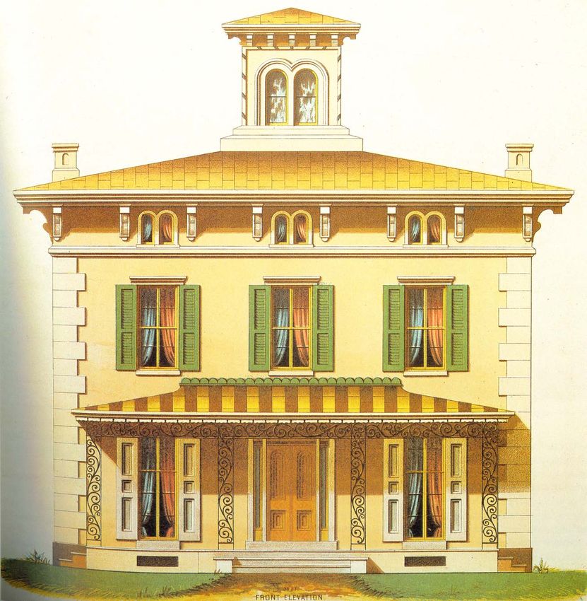
Pigments
• Not until early in the 20th century was a successful substitute, titanium
  dioxide (TiO2), patented, and even then, it did not come into prevalent use
  by itself until the mid-20th century.
• Zinc oxide was used briefly as a hiding pigment after 1850 and more so in
  making enamels because it added hardness in the paint film.
• From the early 1800s on, more synthetic pigments were developed and
  used to offer a wider and brighter variety of hues such as chrome yellow,
  chrome green, and shades of red.

                                                                                5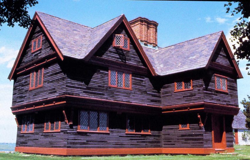
Binders
• Binders are material that hold the powdered
  pigments in suspension in paint film so they may be
  applied evenly to a surface.
• Binders are typically composed of a combination of
  oils and resins.
   o   Quality and conditioning of these oils and resins greatly
       affects film adhesion and determines the protective
       quality and durability of the coating.
   o   Fine, long oil binders are critical for ease of brushing,
       flexibility, and smoothness of finish.
   o   Durability and color retention are also greatly enhanced
       when premium binders are employed.
   o   Chalk was sometimes added to water-based paints to
       help bind the pigment particles together.
   o   Other common binders included hide glue and gelatin.
   o   The most common oil used historically was linseed oil.

                                                                   6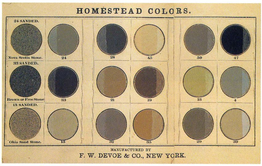
Vehicles or Thinners
• Solvents are the volatile evaporating liquids
  that typically serve as vehicles.
• Solvents are employed to dissolve or break
  down the binder and reduce its viscosity so that
  the paint may be applied in a thin, even coat.
• The integrity of the paint film, as well as the
  appearance, application, and leveling, are
  significantly affected by the nature of the
  solvents used.
• Historically, vehicles included turpentine in oil
  paints and water in water-based paints.
   o   The desirable properties of turpentine would
       caused the paint to thin, flow evenly, and dry with
       a little gloss.
   o   It added brushing quality and also aided drying.

                                                             7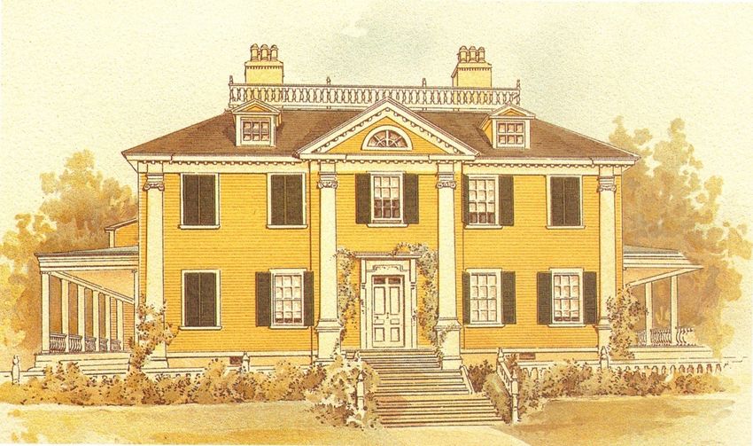
Historic Paint Mixtures
• Historic paints mixtures were often made with what was available,
  rather than adhering to strict formulas (lime washes, milk paints, etc.).
• Recipes for successful formulas can be found in historic documents,
  such as newspapers or building guides, illustrating the combinations
  of ingredients that could be used to produce an effective paint.

                                                                          8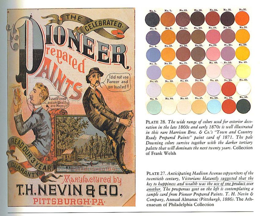
Historic Paint Mixtures
• According to books published in the early 1800s on house and
  ship painting, an early process for creating paint was:
  o   First the painter would clarify his linseed oil by boiling it in a brass or
      copper pot with red lead.
  o   Then in a medium-sized kettle, he would put 4 to 6 pounds of dry
      medium (presumably white lead) and with an iron ball would grind it
      until thoroughly pulverized.
  o   After sufficient quantity of paint medium is ground dry, oil would be
      added to the kettle until the grinding ball would stir or move easily.
  o   The dry pigments had to be ground in oil to form a paste and the
      paste had to be successively thinned with more oil and turpentine
      before the paint was ready for application.
  o   Before the industrial era, using a stone slab, a muller, and a trough,
      the painter would grind white lead or any desired color pigments into
      the oil binder.

                                                                                    9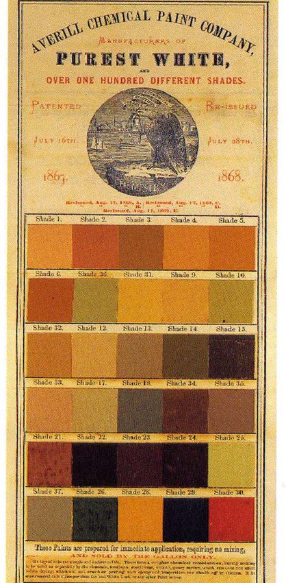
Historic Paint Mixtures
• By late 19th century, the painter could buy
  fully prepared and tinted oil paints or
  partially prepared paint called white lead
  paste.
• White lead paste consisted of a thorough
  dispersion of white lead in a minimal
  amount of linseed oil.
• It was available from house paint suppliers
  until the 1970s.
• With the lead paste, a painter would add
  his own color pigments, extra oil,
  turpentine, and driers to formulate and tint
  paints for every conceivable appliance—
  interior, exterior, matte, or glossy.

                                                 10
Historic Paint Mixtures
• The typical paint colors produced with this
hand-mixing process were white, off-white or
cream, straw (pale yellow), orange, pea,
parrot, grass greens, red, slate blue, and black
(essentially a choice of maybe 30 colors).
• Given what we know about the labor-intensive
early paint-mixing techniques, it’s not hard to
understand why Americans in the years before
the Civil War preferred white for their
residential and public buildings.
• White was by far the easiest color for the
painter to mix and to avoid variations between
batches.
11Ready-mixed Paints
• Up until the Civil War, producing commercial quantities of paint was
labor intensive and cost prohibitive, not to mention bulky to store and
ship.
• Particular problems involved bulkiness of the containers, shelf life,
and inconsistencies within inventories.
• By the 1870s, machinery was developed for grinding pigments in
white lead and oil.
• Putting the paint in containers to allow the safe shipping of
ready-mixed products began.
• A growing transportation network made the nation more accessible
after the Civil War.
12Ready-mixed Paints
• Paint manufacturers created new markets by printing and distributing
colorful advertising brochures and architectural pattern books—they
reached thousands of building owners.
• The first successful ready-mixed oil paint in America was green,
which was marketed for window shutters.
o Green offered the most promise to a manufacturer that wanted to test the
market due to its universal application.
• F.W. Devoe, whose paint chart is shown on the next page, was the
first manufacturer to offer ready-mixed green oil paint. They later
expanded the line with a variety of earth and stone colors.
• In addition to the industrial advances, the Post-Civil War period saw
the American population increase ten-fold.
• The result was a huge growth in residential and commercial
construction.
13Ready-mixed Paints
14Ready-mixed Paints
• With the introduction of ready-mixed paints and
increased written publications, came much criticism
for previous and continued use of the color white.
• Andrew Jackson Downing, a prolific writer on
architecture and dubbed the Apostle of Taste for
shaping 19th century middle-class taste, wrote the
following:
o “There is one color frequently employed by house
painters which we feel bound to protest against as
entirely unsuitable and in bad taste. This is WHITE,
which is so universally applied to our wooden houses
of every size and description.” The glaring nature of
this color when seen in contrast with the soft green
foliage renders it extremely unpleasant to an eye
attuned to harmony of coloring. Nothing but its very
great prevalence in the United States could render
even men of some taste so heedless of its bad effect.”
15Ready-mixed Paints
• Downing continued to say “the exterior colors
of a house is of more importance than is
usually supposed, since next to the form
itself, the color is the first impression which
the eye receives in approaching it.”
• He suggested houses be painted colors
found in nature to harmonize with their
surrounds.
• He favored colors that replicated stone, a
fawn color, and warm grays.
o These colors were easily achieved with the
earlier paint mixed techniques.
• The colors to the right are from Downing’s
hand-colored 1842 publication “Cottage
Residence”—one of the first books in
America that included actual colors.
16Color Theory
• As use and variety of color became more complex, architects/paint
manufacturers began to specify rules based on the growing body of
“color theory.”
• These theories followed the work of David Ramsay Hay of
Edinburgh, Scotland, the author of “The Laws of Harmonious
Coloring,” which was published in 1828.
• Two major approaches to color harmony:
o Harmony by analogy (using colors next
to each other on the color wheel)
o Harmony by contrast (using colors
opposite one another on the color wheel
or complementary colors)
17Color Theory
• One theorist went so far as to state that:
o “It is an error to suppose that the art of
arranging color so as to produce the best
effects in painting is entirely dependent
on the taste of the operator; for harmony
of coloring is determined by fixed natural
laws.”
• He meant that even if one thinks a
combination of colors looks good
together, it may not be so, depending on
whether this combo met the laws of
nature!
• He was making a case for compatibility
of colors, instead of random selection.
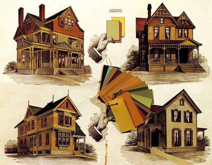
18Color Cards
• Not surprisingly, the use of richer and more variety of colors was
promoted by the manufacturers that were producing them.
• A proliferation of paint companies popped up in the United states
after the civil war such as Lucas, Devoe, Pioneer Paints, Seeley
Brothers, and Sherwin-Williams.
• The extensive distribution of their color cards and lithographs of
buildings in full color were used to create a new market for their
ready-mixed paints.
19Color Cards
20Color Cards
• The goal of these color cards and lithographs was to illustrate and
aid the suitable selection of proper colors to replace the simple white
house with green shutters with one that exhibited the many pleasing
shades of color that had become readily available.
• The American public embraced this
new technology.
• Shades and tints of color could be
prepared and used in a variety of
applications where before they were
beyond the painter’s ability.
• The publication of sample cards also
allowed these new tints and shades
to be seen prior to the application on
a building.
21Shift in Colors
• The of architecture grew as America moved away from the Gothic,
Italianate, and Greek Revival periods and styles towards Queen
Anne, and Stick and Shingle styles buildings.
22Shift in Colors
• Two particular events encouraged the switch to the rich colors of the
Post-Civil War years:
o There was a shift encouraged by the Arts and Crafts movement towards an
emphasis on materials, texture, and exposed structure, which required richer
colors.
o Paint manufacturers such as F.W. Devoe embraced the Queen Anne styles
because they provided an opportunity for the greatest display of taste in coloring
and exterior decoration.
• The many surfaces, material textures, and visible framing and features such
as porches and bracketry allowed for all means of multi-colored effects that
the old box-patterned house with its plain flat front did not afford.
• The old ideas of paint colors were out of place where new lines and surfaces
were now present.
23House Styles
• With some history on the evolutions of paint colors, now is an appropriate time to cover various
periods and house styles.
• Keep in mind what was happening in terms of paint manufacture.
• Paint color can be seen as a simple, direct expression of the time, and of taste, values, and mood
of society.
24Colonial Style – Mid 1600s to 1780
• The early colonists brought with them the prevailing
architectural styles and building practices of their
native countries.
• Most colonial dwellings built during the 1600s were
built before the era of industrialization, and those
examples that remain intact have a characteristic
“handmade” quality in such details as doors, windows,
brickwork, or siding.
• The most characteristic Colonial house is usually a
one- or two-story box, two rooms deep with
symmetrical windows.
• While the earliest rural house remained unpainted, the
later Colonial color schemes tended to consist of rich
earth tones and were typically one color.
• Paint evidence on the earliest 18th century New
England houses revealed that paint was confined to
the trim only; the clapboards were probably oiled or
stained.
25Colonial Style – Mid 1600s to 1780
• If the whole house was painted, typically the trim and windows were
the same color as the body of the house, and usually only the front
door was called out in different color.
26Georgian and Federal – 1730 to 1830s
• Georgian ideals came to New England via pattern books, and became a
favorite of well-to-do colonists who wanted their homes to convey a sense of
dignity and prestige.
• The Federal style with its
subtle differences was the
dominant style of the new
Republic.
• Both styles were square and
symmetrical in shape.
27Georgian and Federal – 1730 to 1830s
• Door trim may include thin
columns or pilasters.
• There are typically five windows
across the front.
• The roof is often concealed
behind a balustrade.
• It’s typical to see yellows, blues,
and gray with trim, and windows
painted white or cream.
• The only accented features
would be front doors or shutters.
Dark green or black was a
common color for these features.
28Greek Revival – 1825 to 1855
• Greek Revival homes reflect a
fascination with Greek and Roman
antiquity.
• Exteriors of these temple forms were
clapboard with bold, simple lines.
• The front door is typically surrounded
by narrow sidelights with a row of
transom lights above.
• The most common types of ornament
are wide pilasters and deep, heavy
cornices.
• Wooden buildings were invariably
painted white, or light grey or cream
in an attempt to mimic the stone of
the Ancient Greek structures.
29Greek Revival – 1825 to 1855
• Greek Revival is the one style where white is appropriate and encouraged because it
conveyed monumentality (but think about the paint industry at this time—painters
were still laboriously hand mixing pigments into white lead).
30Italianate – 1860 to 1880
• The Italianate style developed in England out of the picturesque movement of the
1840s.
• It was a rebellion against the simplistic yet formal classical styles that had dominated
art and architecture for the previous 200 years.
• It was a reinterpretation of Italian Renaissance
country villas and it coincided with the
industrial revolution and the beginnings of
mass production of building materials.
• This was also the time period when the
writings of Architect Andrew Jackson Downing,
despite his untimely death, played a significant
role in not only the shift towards the Romantic
styles of the Gothic Revival and Italianate but
also towards the use of elegant and
sophisticated colors schemes that were found
in nature.
31Italianate – 1860 to 1880
• With a variety of building materials, textures, and surfaces, there grew new
opportunities for color placement and variation.
• Color schemes typically included no less than two different colors and often up to four
colors.
• Typically, the body of the house was light with
trim paint a darker but similar shade.
• Windows and doors were painted a dark color
to help them recede into shadow and to draw
attention away from the muntins, suggesting
larger expanses of glass, another sign of wealth.
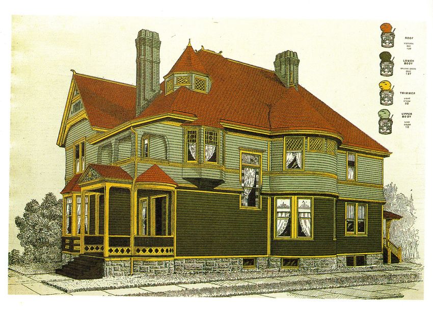
32Queen Anne/Victorian – 1880 to 1900
• Beginning in the late 1870s, the popularity of Italianate style fell in favor of late
Victorian styles like Queen Anne.
• The Victorian era dated from 1880 through the 1890s, while the Industrial Revolution
was really building up steam.
• America was caught up in the excitement of new
technologies such as mechanized saws and lathes,
which led to a profusion of wooden ornamentation.
• Factory-made, pre-cut architectural parts were
transported all across the country on a rapidly
expanding train network.
• Exuberant builders combined these pieces to create
innovative, and sometimes excessively detailed, homes.
• Characteristics such as multicolored walls,
asymmetrical facades, and steeply pitched roofs
were common features.
33Queen Anne/Victorian – 1880 to 1900
• Dwellings were built with every conceivable type of trim
including wooden latticework, patterned shingles, porches,
and towers with conical roofs.
• Roofs were often complex with cross gables, conical turrets,
dormers, and decorative brackets beneath eaves.
• The use of multiple colors coincided with the fact that a large
variety of colored paints were available.
• This was a period where the complexity of your house
indicated your financial status (the more colors the higher
your status).
• Paint schemes included upwards of four colors, in rich dark
shades.
• Windows were painted dark colors (e.g., deep red, chocolate
brown, dark green, olive, or even black) with the intention of
causing them to recede.
• Trim details and textures called out with a variety of colors.
34Colonial Revival – 1900 to 1940
• By the turn of the century, Queen Anne style had fallen out of favor as being
excessive, cluttered, or tacky.
• In the early 1900s, architects returned to the simplicity of classical
architectural styles, which were smaller and more austere.
• Reflecting American patriotism
and a desire for order, the
Colonial Revival house style
remained popular until
the mid-1950s.
• Features commonly identified
with Colonial Revival houses
include a balanced façade, front
doorways with sidelights, fanlights,
crown moldings, and pediments.
35Colonial Revival – 1900 to 1940
• The use of colors reverted back to a minimal number—a body color and a
trim color.
• Occasionally, details like shutters or front doors were called out in a third
color.
• Body colors moved towards
pastels replacing the bold dark
colors of the Victorian era (body
colors tend to be whites, yellows,
grays, and blues).
• White once again became the
most popular trim color, even
used on a sash.
36Arts and Crafts – 1905 to 1930
• During the first quarter of the 20th century, we also had the Arts and Crafts movement
with the bungalow style.
• The Craftsman bungalow is an all American housing style and represents structural
simplicity, efficient use of space, and understated style.
• The use of colors continued the interest in calling out various textures and trim that
was popular with the Queen Anne style.
37Arts and Crafts – 1905 to 1930
• Colors used with the arts and crafts style reflected rich earth tones, like
moss green, woody browns, golds, and the color of terra cotta.
• Structural details like exposed framing (such as ground boards for
stucco), rafter tails, and porch piers trusses were called out in different
colors.
38Suburban Ranch – 1940 to Present
• One-story, Ranch-style homes are so
simple, some critics say they have no style.
• The style is also dismissed because it has
become so common.
• “Ranches” are found in the suburbs
throughout North America, making the
style synonymous with the concept of tract
housing: fast-built, cookie-cutter homes.
• They were the first building type to
predominantly use artificial siding
materials, such as aluminum, asbestos,
simulated stone, vinyl, etc.
• As a result, their color schemes are
relatively simple—generally one or two
colors (often pastel or light colors).
• Often trim was not a different color than
the body.
39Color Selection
• Choosing colors can be very subjective.
• Today, almost every paint manufacturer from Benjamin Moore to Valspar to California Paints to
Behr all have a line that they claim are historic colors.
o It is unlikely these commercial paints are made
with the same pigments that true historic paints were.
o Paints today have a very different composition due
to federal environmental laws, chemical
advancements, and consumer expectations.
40Color Selection
• If you own a house built more than 100 (or even 75) years ago, we encourage you to
select colors that are historically appropriate for the age of the structure, and to place
the colors in a way that correctly emphasizes the character and design intended by the
original architect and/or builder.
41Pre-1860 Color Palette
• The previous slides and discussion were meant to help you identify
where your house might fall in the history of paint color development.
o For example, if it was built in the 1820s, you can be certain that your color
scheme will not involve four or more colors, and will most likely will involve
lighter colors that were easier to mix by hand during that period.
• Buildings constructed prior to the Civil War and the wide distribution
of ready-mixed paints would general follow the colors suggested by
Downing and his contemporaries. They would be a variation on the
following colors:
o Fawn o Gray stone o Buff
o Drab o Slate o Bronze Green
o Straw o Brownstone o Shutter Green
42Post-1870 Color Palette
• Buildings erected after 1870 would have been painted any of the previous colors, in
addition to rich tertiary colors such as:
o Old Gold
o Olive
o Olive yellow
o Amber
o Terra cotta
43Colonial Revival Color Palette
• Lastly, for a late 19th century building in the Colonial Revival style, the paint colors
would be one of the lighter colors that became popular again such as:
o Blue
o Gray
o Ivory
o Yellow
44Hints for Selecting Colors
• Start with the main body color. If your house is detailed like a Queen Anne or
Arts and Crafts bungalow, perhaps pick two analogous colors to start with.
o Always look at color swatches in natural daylight.
o Keep in mind that what you see in the store under fluorescent lights will look very
different on the side of your house in natural light.
o You will even see a difference
depending on the angle you hold
the swatch.
• With your house body color
chosen, and the general number
of colors understood depending
on the house style and period,
you can chose a trim color that
complements the body color.
45Hints for Selecting Colors
• If you have an early 20th century Colonial Revival and you chose Colonial gray for your body color,
you might pick ivory for a trim color.
• If you have an 1870s Italianate house, you might pick a buff/light gold color for the body and
choose a stone color for the trim, and dark brownstone for the sash and details. You may also
possibly have black or bronze green for shutters.
• Keep in mind that there are certain colors that were universally used for specific features; for
example, bronze green was always used for stripes on roofs and ironwork, and on occasion for
shutters.
• Shutter or chrome green
was always used on
shutters in the 19th century.
• Indian Red was commonly
used to call out detailing.
• A general rule is that
buildings of modest
detailing look best with
simple paint schemes
with few colors and not
too much trim detail.
46Hints for Selecting Colors
• There are some details that can cause confusion
or debate when trying to decide what colors to
paint where.
o If you have wood shingles only in the gable ends
on your house, then they should be painted a
different but complementary color from the rest
of the body.
• This is meant to draw attention to the fact that there is
a different material and texture.
o Generally, the rule of thumb is lighter colors are used
for higher locations and darker colors at the bottom to be consistent with the illusion that dark
colors are heavy and grounding and lighter colors have less weight.
o The gable end shingles should be painted a lighter shade so as not to make the house or roof
seem top heavy.
o Bargeboards, or as most people refer to Gingerbread, are yet another surface that may be
painted differently.
• If they are simple then they should be painted the color of the main trim color to match the cornice, corner
boards, and window surrounds.
• If decorated with panels or other moldings you might want to reintroduce the principal body color for those
details against the trim color.
47Preparation
• A new paint job can significantly increase your property’s
value in addition to increasing your pride of place.
• Embarking on an exterior painting project can be a
daunting task, but painting is the most profitable
improvement you can make to your home if done
correctly.
• Generally, material costs are substantially less than
$1,000 with a gallon of paint costing anywhere from $20
to $120 per gallon, depending on the name brand, color,
and warranty.
• Like any home improvement project, a good paint job
requires:
o The right knowledge
o Skilled labor with the appropriate tools
o Proper preparation to achieve a lasting product
48Preparation
• Whether you “do it yourself” or hire a qualified painting
contractor, these are a few things to take into consideration
when taking on a exterior painting project:
o A multi-colored scheme that calls out the details and trim from
the body of the building is more historically correct and will be
more aesthetically successful and thus is worth the
cost of buying the extra paint.
o Surface preparation, such as sufficient paint removal,
sanding and priming is the most important step and
should encompass 75% of the project time. If it doesn’t,
you can expect to need to paint again in a few years.
o Lastly, you get what you pay for in terms of your painting
products from scrapers, to brushes, to paint, and of course
contractors.
• A little extra money spent now on the materials will save you a lot down
the road with the durability of your paint job.
• If you are hiring a painting contractor, ask them about their products
and materials, or—better yet—specify that they use the materials you
would if you were doing the project yourself in order to ensure the
quality and durability of the paint job.
49Preparation
• With the right painting contractor and materials the return will be very rewarding—both
aesthetically and financially. Your home will look great, your curb appeal and value of
your property will be increased, and more importantly, you will be confident that your
paint job will last for many years.
Before After
50Exterior Painting
Before After Before After
Before After
51Thank you! Contact Landmark Consulting for a paint color consultation.
You can also read


