PREPARING AND PRESENTING POSTERS FOR CONFERENCES - May 2016 - Royal ...
←
→
Page content transcription
If your browser does not render page correctly, please read the page content below
PREPARING AND
PRESENTING
POSTERS FOR
CONFERENCES
May 2016
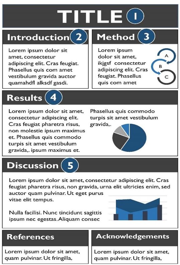
Table of Contents
        Introduction ................................................................................................................................................................................................ 3
        Why do a poster presentation?...................................................................................................................................................... 3
        How to design a research poster.................................................................................................................................................. 4
    The right level of detail.............................................................................................................................................................................. 4
    Designing the layout of your poster .................................................................................................................................................. 4
    The main features to include in your research poster ........................................................................................................... 6
    Using PowerPoint to develop posters ............................................................................................................................................. 6
    Formatting your poster ............................................................................................................................................................................. 7
    Preparing your images................................................................................................................................................................................ 8
    Choosing the colour scheme ................................................................................................................................................................ 8
    “Dos and don’ts” of poster design..................................................................................................................................................... 9
        Presenting your poster...................................................................................................................................................................... 10
    Maximising the chance of engagement......................................................................................................................................... 10
        How will your poster be assessed? ........................................................................................................................................... 12
        Further Reading ..................................................................................................................................................................................... 13

2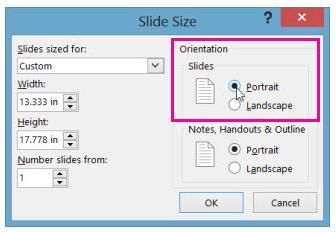
Introduction
The aim of research and evaluation is to generate evidence that can be used to inform best practice.
However, this can only be achieved if findings and evidence are shared effectively with audiences in a
variety of forums. Widespread dissemination of research and evaluation, if undertaken, can improve
patient care and raise the profile of the researcher, their organisation and the profession. A conference
poster is one method of sharing valuable findings. This guidance briefly outlines how to create and
present a research poster to convey study objectives, methods, findings and implications.

    Why do a poster presentation?
It is important to recognise that not everyone will conduct pioneering research which will be published
in a high impact journal. However, the publication of smaller studies and incremental improvements in
care can be just as valuable. It is essential that this information is also shared with others, and a
conference poster is often the ideal platform to present new work. Not only is this a less intimidating
method for authors to display their work, it also provides an ideal opportunity for professionals to
network and allows you to interact more meaningfully with people who are interested in your topic.
Feedback and experience gained through conference dissemination can also prove invaluable for the
progression to presenting and disseminating to wider audiences.

    The importance of sharing knowledge should never be underestimated. When designing your
    poster highlight what benefit the audience will get from your work. Think carefully about who your
    audience is. This may well vary if the event is predominately professional / practice-based or
    academic. Remember a poster is a summary of the headline findings, ideally it should take no
    longer than two minutes to read and inspire your audience to want to read it from a distance.
    Dr Matthew Boyd, Assistant Professor in Pharmacy Practice
    University of Nottingham School of Pharmacy
    2017 Health Services Research & Pharmacy Practice Conference Chair

3
How to design a research poster
The right level of detail
The poster should act as the starting point for discussion about your work so it is important to think
about what the audience needs to know rather than what you want to say about your project. Consider
the following:
The poster should not be a larger-sized version of your full abstract.
A poster is a quick way of visually conveying information about your work.
It is important to highlight certain areas of your research or evaluation to encourage the
audience to find out more. The text should communicate what has happened and allow people
to determine if the findings are valid.
It should be interesting and easy for a person who is not familiar with the project to understand
quickly.
It is important to strike a good balance in terms of the poster being visually appealing (which
often means using less text and more graphics and good use of white spaces, etc.) but there still
being enough information to work out what was done and what the implications are. It can take a
good few iterations and feedback from colleagues to get this right.
Professor Bryony Dean Franklin, Executive Lead Pharmacist Research & Director, Centre for
Medication Safety and Service Quality | Imperial College Healthcare NHS Trust
2015 Royal Pharmaceutical Society Conference Research Theme Lead
Designing the layout of your poster
Your poster should have visual impact and the layout should to be designed so that the audience can
easily understand the sequence of the information presented. A poster can adopt a wide variety of
layouts, however, the content should be arranged logically to make it easy for the viewer to navigate
through (ideally, read from top left to bottom right) as figures 1 and 2 below show.
As long as you maintain sufficient white space, keep column alignments logical and provide clear cues to
your readers on how they should navigate through your poster elements, you can be fairly creative with
the design.
4Figure 1: Example of a landscape poster1.
Figure 2: Example of a portrait poster.
1
Adapted from Malson, G. Preparing a research poster for a conference, Clinical Pharmacist, April 2015, Vol 7, No
3, online | DOI: 10.1211/CP.2015.20068193.
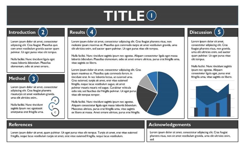
5The main features to include in your research poster
1. Title: It should be ‘catchy’ and clearly convey the issue that you are trying to solve.
2. Introduction: It should clearly explain why it was necessary to conduct the research and get
your audience interested in the topic or question.
3. Method: It should include what, when and how the research was conducted. Consider the use
of a flow chart if this makes it clearer.
4. Results: Wherever possible use graphs, charts and tables to present your results. However, it is
important to include some narrative that links the graphics to tell at ‘story’, rather than having a
section full of images. These should also highlight key messages.
5. Discussion: Are your results consistent with previous findings, or are they new? You should put
your results into context by describing their implications, acknowledging any limitations, and
include the next steps for the research.
6. Include References and Acknowledgements and the date and location of your project.
Top tip
Ensure your conclusion matches the data you have presented. It is easy to draw
conclusions from wider work that you are fully aware of but the poster audience is
not.
Using PowerPoint to develop posters
There are a number of programs available for designing posters, such as QuarkXpress, InDesign, LaTex
and Scribus. Microsoft PowerPoint is often used because it is readily available and most people are
already familiar with the application. Please note: the instructions below apply to PowerPoint 2013 and
2016.
Start PowerPoint and begin with a blank presentation. The first step is to set the paper size.
Table 1 – List of ISO A Paper Sizes
Height (cm) Width (cm)
A0 118.9 84.1
A1 84.1 59.4
A2 59.4 42.0
A3 42.0 29.7
A4 29.7 21.0
A5 21.0 14.8
61. Click on the Design tab to bring up the design ribbon, then click on Slide Size and select
Custom Slide Size.
2. Click on the downward arrow to the right of the box under Slides sized for and select custom
by clicking on it. Then type in the Width and Height of your posters in cm. Next, select the
orientation of your poster.
More detailed guidance on how to create a poster using Microsoft PowerPoint is available online and
from most academic institutions.
Formatting your poster
When formatting the type for your poster it is important to consider the following points:
The title should be large and set in bold so that it can be read from a distance.
The main headings should be the next largest sized text on the page and be set in bold.
As the majority of the text on the poster will be body text it is important to ensure that it is it
is large enough to be read from a distance of 1.5 metres.
Break up any large areas of text with subheadings and consider using bullet points to convey
short sentences.
Blocks of text in a small font can be made easier to read by increasing the line spacing.
Left justified text is the best alignment for the body text of your poster.
Use a maximum of two font styles for your poster.
7Top tip
Can the poster easily be read at 1.5 metres? Most printers will allow you to print
your poster over multiple pages, A4 spread over eight pages is similar to A1 and
over 16 pages is a similar size to A0.
Preparing your images
If you use any imagery, make sure it is relevant to what you are presenting. The ideal image resolution
for posters is 300 pixels per square inch. See figure 3 below for an example of the same image in high
and low resolution. When creating charts and tables for posters, you need to think carefully about how
you format them. Keep them simple, enlarge the text and thicken the lines so that any trends are easily
identified. They should be clearly labelled and highlight the key results in a different colour to help them
stand out. Use photographs, where appropriate, to illustrate a component of the work because these
are particularly eye-catching.
Top tip
Figures should be intelligible on their own, ensure the caption is sufficiently
detailed.
Figure 2: Example of the same image in high (top) and low resolution (bottom).
Choosing the colour scheme
Just a little creativity will go a long way in attracting conference delegates to your poster. Try to use a
maximum of 2-3 different colours, plus black, which is always best for the body text. Do ensure you
select colours with plenty of contrast. Avoid using light and bright coloured text on a white background,
or using any form of strongly patterned background. The more contrast the easier it will be for people
to read what you have written.
8Remember, there is a lot of support available to you for advice. If you work at an academic
institution ask peers and academics for their opinion. Advice is also available from peers in
the form of professional groups such as the Royal Pharmaceutical Society local practice
forums. Feedback can take time so do plan early.
Dr Matthew Boyd, Assistant Professor in Pharmacy Practice
University of Nottingham School of Pharmacy
“Dos and don’ts” of poster design
Do:
Check and adhere to the conference guidelines carefully. It will normally specify the maximum
word count, size, and orientation;
Use a text size that can be easily read from a distance, and ensure the font and spacing is
consistent;
Avoid the use of jargon;
Include accurate references and acknowledgements;
Perform a spell and grammar check
Spell out acronyms if used;
Label all charts, graphs and tables;
Ask a colleague to critique the contents and layout of your poster.
Speak to your printers early. What formats do they accept? What is the lead time for printing?
Will you get a proof copy first?
Don’t:
Cram in too much information. Only present the headline information, it is unlikely that you will
present substantially more than you included in the abstract;
Design your poster without checking the dimensions of the conference poster board;
Copy and paste your abstract on to the poster;
Use low-resolution images.
My main top tip would be to proof read, at least twice, on two different days. You become
“blind” to any problems, and need to read it critically as if you have never seen it before.
Ideally printed out, rather than on screen.
Professor Bryony Dean Franklin, Executive Lead Pharmacist Research & Director, Centre for
Medication Safety and Service Quality | Imperial College Healthcare NHS Trust
9Presenting your poster
Whether, or not, you will be expected to deliver a formal presentation on the day will very much
depend on the conference. However, most (but not all) will at least expect you to stand by your poster
at a specified time so that conference attendees can ask questions. Having to do a deliver a formal oral
presentation is much less common, although some conferences will require you to do this. Therefore, it
is important to be aware of what will be expected of you at the conference you are attending. Some
preparation can help things run more smoothly on the day and engage your audience:
Try to review your work objectively and think about how you would respond to any criticisms
the audience might have.
No-one will expect your research to be perfect and as long as you are open about, and
acknowledge, any limitations, people will respect that.
Will the conference provide fixings? Find out in advance how posters will be mounted so you
can bring the right accessories and bring something to carry your poster.
Be on time for the poster sessions and make sure you remain at your poster as much as
possible.
Think about what the key points are that you would like to get across if asked for a summary.
Prepare a brief oral synopsis of the purpose, findings, and implications of your work – the one
sentence version, the three sentence (“elevator pitch”) version and a two-minute version (for
people who want more information).
Prepare short answers to likely questions about your work (this is where feedback from
colleagues can come in handy).
As mentioned earlier, not all conferences will require you to deliver a formal presentation,
however, if you are asked to present, practice your oral presentation in front of a test audience
in advance and ask them to critique it.
The audience will be genuinely interested in your research so do not be intimidated.
Maximising the chance of engagement
Hashtags (#) can also be a useful way to follow activity and participant reactions at research
conferences. Most conferences will have a dedicated hashtag you can follow. However, don’t
forget to tweet at your funder if you have one.
QR (Quick Response) codes can be used to bring mobile phone users to websites, which use
QR readers to automatically open websites on a smartphone or tablets. Putting a QR code on
a poster provides a simple way of merging printed material with web and video content. There
are plenty of free QR code generators online and it is possible to save the code in a variety of
image formats for printing.
Include contact information on the poster, or take smaller A4 printouts of your poster and
some business cards.
10I saw a very good poster at a psychology conference last year and have kept a paper copy of the
layout for my own reference. The poster used just three colours consistently, and although text-heavy
(I think it's important to include the detail of work within large posters), used the SmartArt feature of
Microsoft to excellent effect. Finally, rather than presenting the poster in two columns, this particular
one split the sections horizontally, which worked to organise the content to really good effect.
Needless to say that I have since tried to mimic the style in posters produced by my own team.
Dr Parastou Donyai, Associate Professor of Social and Cognitive Pharmacy, Director of
Pharmacy Practice, Reading School of Pharmacy
11How will your poster be assessed?
It is important to note that not all conferences have poster competitions and, therefore, not all posters
will be assessed. Conferences will vary on whether posters are judged/ assessed and how this is done.
Poster assessment criteria will vary from one organisation to another, however, some general points to
consider are outlined below:
For some conferences, for example, the Royal Pharmaceutical Society’s annual conference and
the Health Services Research & Pharmacy Practice (HSRPP) conference, it is a requirement that
submissions relate to original, previously unpublished work. However, this is not necessarily the
case for all conferences. Therefore, it is important that you carefully consider your target
audience and ensure you read through the conference requirements when selecting a
conference.
Ensure your poster adheres to the guidance and presentation requirements provided by the
conference organisers. A poster that does not adhere to the correct format (for example, A0
portrait or A1 landscape) may not be accepted for display on the day.
The presentational qualities of the poster are as important as its scientific merit.
Areas most often included in guidelines to score posters include presentation, factually correct
content, originality, scientific merit, a quickly understandable message, and star quality. See table
1 below for an example of poster scoring sheet. Again, it is important to note that conferences
will vary as to if, and how, poster assessments will be undertaken.
Table 1: Example of poster scoring sheet
Lead author Novelty (5) Rigour (10) Visual impact Presentation Total (25)
(5) skills (5)
Author 1
Author 2
Author 3
There are a few elements to poster judging, with different weighting allocated to each, depending on
the conference. Posters with very good visual impact will attract attention in the first instance, and will
then be judged on scientific rigour and novelty. Make sure there is a good mixture of figures and text,
and be sure to follow the guidance provided by the conference committee on poster production.
Dr Cristin Ryan, Senior Lecturer, School of Pharmacy, Royal College of Surgeons in Ireland and
Chair of 2016 RPS Conference Panel
12Further Reading Malson, G. Preparing a research poster for a conference, Clinical Pharmacist, April 2015, Vol 7, No 3, online | DOI: 10.1211/CP.2015.20068193 Miller, JE. (2007). Preparing and Presenting Effective Research Posters. Health Services Research. 42 (1), 311-328. The Royal Pharmaceutical Society. Research and Evaluation Handbook. RPS: London. 2016. The Royal Pharmaceutical Society. Social Medial and Research Toolkit. RPS: London. 2016. The University of Leicester. 2007. Designing a poster. [ONLINE] Available at: https://connect.le.ac.uk/posters. 13
Copyright © Royal Pharmaceutical Society 2016

14
You can also read