Enhancing Students' Inferential Reasoning: From Hands-On To "Movies"
←
→
Page content transcription
If your browser does not render page correctly, please read the page content below

Journal of Statistics Education, Volume 19, Number 2(2011)

Enhancing Students’ Inferential Reasoning: From Hands-On To
“Movies”
Pip Arnold
Cognition Education, New Zealand

Maxine Pfannkuch
Chris J. Wild
Matt Regan
Stephanie Budgett
The University of Auckland, New Zealand

Journal of Statistics Education Volume 19, Number 2(2011),
www.amstat.org/publications/jse/v19n2/pfannkuch.pdf

Copyright © 2011 by Pip Arnold, Maxine Pfannkuch, Chris J. Wild, Matt Regan and Stephanie
Budgett all rights reserved. This text may be freely shared among individuals, but it may not be
republished in any medium without express written consent from the authors and advance
notification of the editor.

Key Words: Animations; Cognitive theories; Comparing groups; Informal inferential reasoning;
Statistical inference.

Abstract
Computer simulations and animations for developing statistical concepts are often not
understood by beginners. Hands-on physical simulations that morph into computer simulations
are teaching approaches that can build students’ concepts. In this paper we review the literature
on visual and verbal cognitive processing and on the efficacy of animations in promoting
learning. We describe an instructional sequence, from hands-on to animations, developed for 14
year-old students. The instruction focused on developing students’ understanding of sampling
variability and using samples to make inferences about populations. The learning trajectory from
hands-on to animations is analyzed from the perspective of multimedia learning theories while
the learning outcomes of about 100 students are explored, including images and reasoning
processes used when comparing two box plots. The findings suggest that carefully designed
learning trajectories can stimulate students to gain access to inferential concepts and reasoning
processes. The role of verbal, visual, and sensory cues in developing students' reasoning is
discussed and important questions for further research on these elements are identified.

                                                                                                       1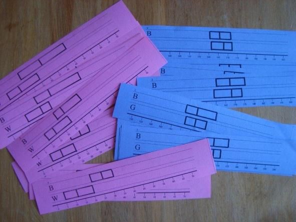
Journal of Statistics Education, Volume 19, Number 2(2011)

1. Introduction
This paper forms part of a large program of work on the staged development of the big ideas of
statistical inference over a period of years. It was prompted by the authors’ need to make
inferential ideas accessible to New Zealand high school students in response to the learning goals
of the new high school statistics curriculum in New Zealand. Much of this paper’s discussion is
also relevant, however, to adult education and introductory statistics courses at colleges and
universities. Papers on this work that have already appeared include Wild, Pfannkuch, Regan and
Horton (2011) proposing conceptual pathways to inference for novices and Pfannkuch, Regan,
Wild, and Horton (2010) addressing verbalizations and story telling about data. The current
paper deals with some of the work done on translating our conceptual pathways into learning
trajectories for students. Computer animations perform a pivotal role in our learning trajectories.
It is well known that computer animations are no panacea and that often students simply do not
see the things they are meant to see (Wild 2007). This issue led us into a careful review of the
literature on cognition as it relates to animations. The particular learning trajectories described
were devised for and trialed on students aged about 14.

The paper is organized as follows. Section 2 presents the problem that was occurring in New
Zealand classrooms when students and teachers compared two box plots. Section 3 sketches how
we went about solving this problem and the new problems that arose as a consequence. Section 4
discusses some of the research literature that should inform designers of animations. The
research component of this paper relates to action research involving students aged
approximately 14. Section 5 presents our research plan while Section 6 reports on analyses of our
evaluation data. Section 6.1 focuses on the reasoning domain of providing evidence for making a
claim when comparing two box plots. In relation to the literature, we describe and analyze the
research design and its implementation of a learning trajectory for a Year 10 class (approximate
age 14). Section 6.2 deals with pre- and post-test learning outcomes of students from four classes
(13 to 16 year-olds) and pre- and post-interviews of 14 students. Lastly, in Section 7 we discuss
our findings and pose further questions about developing students’ inferential reasoning using
technology such as dynamic animations together with broader cognitive questions.

2. The Problem

In a classroom of Year 11 (15 year-old) students a teacher was comparing male and female
university students’ Verbal IQ, which she referred to as IQ (Fig. 1).

                                                                                                       2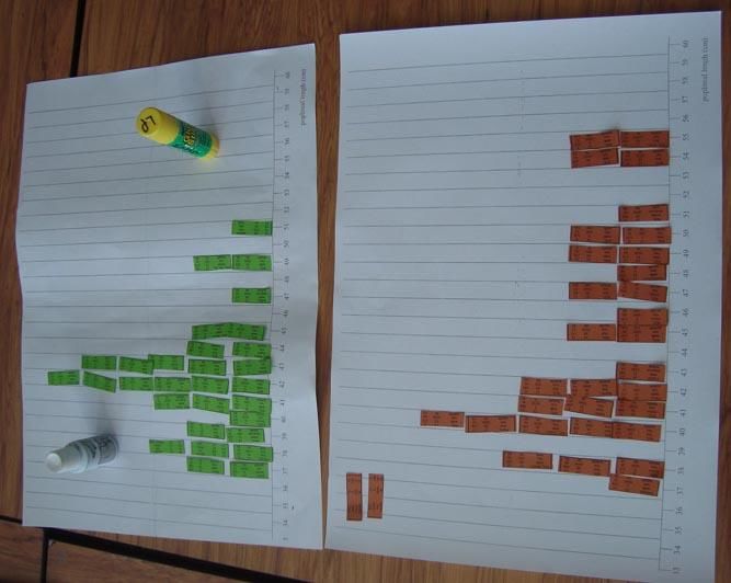
Journal of Statistics Education, Volume 19, Number 2(2011)

         Figure 1. Comparison of male and female university students’ verbal IQ scores

She said (all quotations verbatim): “I’ve got some conflicting information, the median – females
are more clever, but when I look at the whole graph, the whole graph’s a bit higher for males …
so I’m not ready to say, yes, males have a higher IQ than females.” Since the situation appeared
to be inconclusive the teacher wrote down: “Based on these data values we are not certain that
males have a higher IQ.” However, in response to a student who queried this statement with, “but
couldn’t you say, from the graph, that males do have a little bit higher IQ than females,” she
added: “there is some evidence to suggest that males have a higher IQ for these Uni. students.”

Her first written statement drew a conclusion about populations whereas her second statement
drew a conclusion about the samples. Furthermore, the student’s focus appears to be on the fact
that the male box is higher up the scale than the female box. Such a situation is typical in New
Zealand classrooms. Students and teachers are expected to draw a conclusion with evidence in a
national assessment standard yet they do not know what features of the graphs will provide
evidence for their conclusions and they do not know what they are drawing a conclusion about –
the data in hand or the populations from which the data were sampled. Only the latter type of
reasoning will lead students towards statistical inference and assist them to be enculturated into
statistical practice by learning how and why statisticians make decisions based on data. The
situation observed in the Year 11 classroom also led us to question why the focus of the school
curriculum was on descriptive statistics and why the concepts underpinning statistical inference
were not being laid down in the junior secondary school in preparation for their introduction to
formal statistical inference such as confidence intervals and t-tests in the last year of school.
Some research evidence (e.g., Chance, delMas, & Garfield 2004) pointed to the fact that a limited
conceptual base was a factor in students’ inability to understand inferential ideas such as the
sampling distribution in introductory undergraduate courses. Other researchers have also explored
how to promote students’ inferential reasoning (e.g., Pratt & Ainley 2008).

Since 2003 members of our group have been concerned about how students and teachers were
drawing inferences from the comparison of box plots and the justifications that they were giving
for their conclusions (Pfannkuch 2006). Through exploratory research in junior secondary
classrooms we took gradual steps to understand the problem, explore possibilities, and reflect on
the outcomes. Pfannkuch (2007) believed that lack of appreciation of sampling variability was
limiting the students’ informal inferential reasoning. Therefore, in the next two years she
experimented with developing Year 10 (14 year-olds) students’ concepts of sample, population,

                                                                                                      3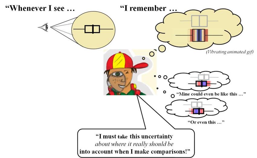
Journal of Statistics Education, Volume 19, Number 2(2011)
and sampling variability using two web applications (Pfannkuch 2008). These seemed to
stimulate in students some awareness of variability in both categorical and numerical data, of the
effect of sample size, and of a connection between sample and population. Dynamic visual
imagery, tracking the history of the variability of medians and proportions, and the discourse of
the teacher were considered important in stimulating these concepts. But the problem of judging
whether A tended to have bigger values than B still remained as the students and teacher
continued to draw conclusions based on the difference between the medians without considering
sampling variability (Pfannkuch 2011). The problem was that even though they were aware of
sampling variability, samples and populations, they had no rational basis such as a “test” on
which to make a judgment.
3. Resolutions and New Problems
Our group set about developing conceptual pathways including guidelines about how to make a
call on group differences incorporating visual animations. Some appreciation of the nature of
these animations can be gained from a 1.5 minute movie clip at:
click on camera or below link – you need a Flash player plugin to play this video.
http://www.amstat.org/publications/jse/v19n2/09.USCOTS.excerpt.swf. These are described in
Wild et al. (2011). Although we sketch some of the main principles in the paragraphs that follow,
the discussion will be much easier to understand if you look at the animations webpage:
www.censusatschool.org.nz/2009/informal-inference/WPRH/. Further information is available in
the screen capture video of Chris Wild’s 2009 USCOTS Plenary address at
http://www.causeweb.org/uscots/uscots09/program/uscots09_wild.php.
Some important principles behind the development of the “tests” were that the approach should:
Allow students to make a decision or call about whether one group tends to have bigger
values than another group by providing a pathway of increasingly more complex heuristics
that seek to deepen students’ understanding of sampling variability (see Fig. 2).
Work from a minimal set of inferential ideas that can gradually be built upon.
Connect to more formal statistical inferential methods.
Encourage students not to take their eyes off their plots (see Fig. 3).
For a more complete discussion about how well these heuristics for making a call work, their
rationale and justifications, and on further issues and technical aspects associated with our
approach, see Wild et al. (2011).
The major aim behind our development of the visual animations is to ensure that whenever
students see a box plot they will visualize a vibrating box plot (Fig. 3 and the dynamic images
referred to above), recall the words “what I see is not really the way it is back in the populations”
and remember to take sampling variability into account before making a call. The desire is for
this embedded visual imagery in their minds to be associated with concepts of sample,
4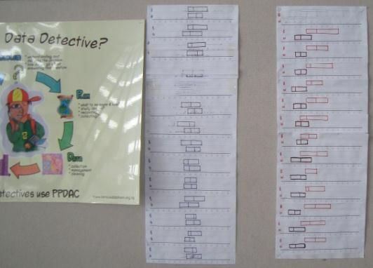
Journal of Statistics Education, Volume 19, Number 2(2011)
population, sampling variability and sample size effect and with a heuristic that is appropriate for
their age or developmental level for making a call (Fig. 2).
“How to make the call” by Age Level
At all Ages: A
B
If there is no overlap of the boxes, or only a very small overlap
make the call immediately that B tends to be bigger than A back in the populations
Apply the following when the boxes do overlap ...
A
Age-14: the 3/4-1/2 rule
B
If the median for one of the samples lies outside the box for the other sample
(e.g. “more than half of the B group are above three quarters of the A group”)
make the call that B tends to be bigger than A back in the populations
[Restrict to samples sizes of between 20 and 40 in each group]
Age-15: distance between medians as proportion of “overall visible spread”
A
B
dist. betw. medians
“overall visible spread”
Make the call that B tends to be bigger than A back in the populations
if the distance between medians is greater than about ...
1/3 of overall visible spread for sample sizes of around 30
1/5 of overall visible spread for sample sizes of around 100
[Could also use 1/10 of overall visible spread for sample sizes of around 1000]
Age-16: based on informal confidence intervals for the population median
Draw horizontal line
IQR = interquartile range
IQR IQR = width of box
Med 1.5 Med 1.5 n = sample size
n n
Make the call that B tends to be bigger than A back in the populations
A
B
if there is compete separation between the added intervals (i.e. do not overlap)
Age-17: on to formal inference
Figure 2. How to make a call at each age or developmental level
We had developed plausible conceptual pathways whereby teachers and students could make
inferences about populations from samples and visualize sampling variability but now we were
faced with a new set of problems.
5Journal of Statistics Education, Volume 19, Number 2(2011)
How could we scaffold students’ conceptions to understand the animations and make sense
of them?
What learning trajectories could assist students to re-invent, for themselves, the “tests” we
had developed?
We were aware that the animations would make sense to an expert but may not to a novice
(Lovett 2010), were underpinned by a multitude of concepts such as sample, population, sample
size, and sampling variability, and used a conceptually demanding abstraction, the box plot
(Bakker 2004). The understanding of the “tests” (Fig. 2) and the animations were cognitively
demanding. Our hope was that the animations would be memorable enough that when students
saw a boxplot they would remember a vibrating box plot, which would act as a catalyst to
retrieve a connected set of ideas about inference including the informal decision rules for making
a claim.
Figure 3. The desired habit of mind
From our previous research and the literature we recognized that students do not see what
experts see and that prior knowledge such as hands-on learning experiences are essential for
understanding abstract dynamic imagery (delMas 1997; Rossman 2008). Also essential for
concept development through imagery is the concurrent development of language and discourse
that communicates the essence of what is being captured in the visuals. (See Pfannkuch et al.
(2010) for a discussion on the language and verbalization issues we considered.)
Our two-year research project, which involved a team of two statisticians, two statistics
education researchers, and nine secondary teachers, was about how to resolve these new
problems. The resolution of these problems needed to take into account: the current technology
constraints of the New Zealand learning environment, where many secondary classrooms have
access to only one computer and a data projector; the time constraints imposed by the school
6Journal of Statistics Education, Volume 19, Number 2(2011)
program; and the national assessment constraints, which occur at Years 11, 12, and 13. Although
we developed learning trajectories for Years 10, 11, and 12, this paper will describe the teaching
and learning trajectories that were developed for Year 10 students (14 year-olds) through a case
study of one class.
The focus of the paper is on building the concepts of sampling variability for inference in
comparison situations. This is only an extremely small part of the many ideas, such as posing
statistical questions, how to capture relevant measures and variables, how to select samples, how
to obtain good quality data, how to design experiments, and how to reason from scatter plots,
which need to be developed for exploring data and doing investigations.
Before we describe the designed learning route we used and the resultant learning outcomes we
discuss the literature related to the use of animations and how students’ understanding of
animations can be facilitated.
4. Literature Review
Technological advances are facilitating a change to the way we think and communicate as a
visual culture starts to dominate over a print culture (Arcavi 2003). Such a shift has profound
implications for education and in particular for statistics. A single visual image can contain more
than “a thousand words” because it is two or three-dimensional and has a non-linear or even
dynamic organization as opposed to the logical sequential exposition of the printed word. Often
concepts underpinning the sequential manipulation of symbols remain obscure to many students.
These concepts are now becoming accessible through visual representations, which allow a new
way of engaging with abstractions. There is evidence that student understanding can be enhanced
by the addition of visual representations and that encouraging students to generate mental images
improves their learning (Clark & Paivio 1991). Ware (2008) predicts that pictorial forms of
teaching will continue to grow and complement verbal forms of teaching. Two theories in
particular, the dual coding theory and cognitive load theory are being used to support research
into ways to enhance students’ learning and reasoning from dynamic visualizations.
4.1 Dual Coding Theory
Dual coding theory divides cognition into two processing systems, verbal and visual (Clark &
Paivio 1991). Within and between these verbal and visual systems are three separate levels of
processing – representational, associative, and referential. In the verbal system the mental
representations for words such as book, learn, statistics, and anxiety are verbal codes that denote
concrete objects and events as well as abstract notions. The visual system includes the mental
representations for shapes, sounds, actions, sensations, and other non-linguistic artifacts. In what
Clark and Paivio call the imaginal structure, a shape such as a triangle can be mentally rotated
and transformed, which is not possible with verbal representations. The associative connections,
according to the dual coding theory, join words to other related words in the verbal system, and
images to other images in the visual system. For example, the words PPDAC (problem, plan,
data, analysis, conclusion) may be linked in a statistics lesson as an associative chain. The image
of a dot plot of heights of a sample of Year 10 students may be linked to an image of a
population distribution of heights of Year 10 students.
7Journal of Statistics Education, Volume 19, Number 2(2011)
The links between the verbal and visual systems are called referential connections. The word
population might invoke an image of all people in New Zealand or an image of a population
distribution of a particular attribute such as height. The dual coding theory predicts that learning
is enhanced when information is coded in both systems and connected between them. Rieber,
Tzeng, and Tribble (2004) showed that the integration of information is most likely to occur if the
learner has corresponding pictorial and verbal representations in the working memory at the same
time. However, if time is not provided for the learner to reflect on the principles being modeled
then referential processing might not occur. This theory seems to fit well with Bakker and
Gravemeijer (2004) who noted that students’ conceptual growth in understanding distribution was
predicated on the images (individual cases to clumps to distributional notions) and the classroom
discourse. The classroom discourse allowed time for the students together with the teacher to
actively reflect on and draw out the main ideas underpinning their lesson experiences.
Although Clark and Paivio (1991) divide cognition into two systems, verbal and visual, Radford
(2009) has proposed that “sensuous cognition” needs to be taken into account in the learning
process, particularly for novices. He believes thinking is facilitated in and through speech
(language), body, gestures, symbols and tools. To Radford, gestures and actions are genuine
constituents of thinking and may be a source for pre-linguistic conceptual formation and abstract
thinking. He describes how learners processed and understood information from a mathematics
graph task using gestures and actual actions with signs and artifacts. After they conceptualized
the information the gestures diminished and the verbal interactions became dominant as the
students discussed the graph. Such research lends support to the ideas that tactile, kinesthetic,
hands-on tasks are invaluable for novices (delMas 1997; Lovett 2010; Rossman 2008). Hence we
believe that verbal, visual, and sensory cognitions need to be addressed when designing learning
trajectories to scaffold students’ statistical thinking.
4.2 Cognitive Load Theory
Another learning theory that has caught the attention of researchers into learning with animations
is the cognitive load theory originally proposed by Sweller (1988). Since learners’ working
memory capacity is extremely limited and a major bottleneck in cognition, we transcend such
limitations of the mind by providing external visual aids (Ware 2008). However, to process new
information takes a great deal of attention and learners’ attentional capacity is limited (Lovett
2010). The three sources of cognitive load are intrinsic, extraneous, and germane.
Intrinsic load is determined by the complexity of the application domain and by the learners’
prior knowledge (the approach is to increase prior knowledge before learning from computer
simulations).
Extraneous load is the mental effort imposed by the way information is presented externally
(the approach is to reduce this).
Germane load is the result of mental activities that are directly relevant to learning. These
activities contribute to learning and are relevant to the construction and automation of
knowledge in the long-term memory (the approach is to increase this).
Because germane load is the most important factor in learning there have been studies on how to
reduce the extraneous load of visual animations and increase prior knowledge before using them.
Initially there was a general belief that dynamic media tools had enormous potential for
8Journal of Statistics Education, Volume 19, Number 2(2011)
instruction but research showed that animated displays were no better than static displays for
learning (Hegarty 2004). Researchers are now finding out the conditions for animations to be
effective in learning, that is, how to reduce the extraneous load.
4.3 Processing Visual Information
The design of dynamic visualizations requires not only an appreciation of the cognitive
mechanisms that underlie complex thought (Chandler 2004) but also an understanding of how
visual information is processed (Ware 2008; Canham & Hegarty 2010). In particular, for graphics
comprehension there is a constant interaction between bottom-up perceptual processes of
encoding information, which drives pattern building, and top-down inferring processes that are
based on prior knowledge. Prior knowledge affects which parts of the graphic are fixated on and
encoded, which then influences inferences. Some eye-tracking studies (Mayer 2010)
demonstrated how the comprehension of graphics and learning outcomes are significantly
affected by the display format. Improved student performance was noted and linked to eye
fixations for designs following the signaling, prior knowledge, and modality principles but not for
the pacing principle. The signaling principle states that visual cues such as color should be used
to highlight the relevant features to attend to, and fading should be used for irrelevant features.
The prior knowledge principle states that the more relevant prior knowledge students have before
viewing an instructional graphic the better they will perform. The modality principle states that
only two modes, visual and spoken, should be used to avoid overload. Accordingly, Mayer and
Moreno (2002) maintain that the visual and spoken must occur together, that extraneous words,
sounds, and videos should be excluded, and that spoken words should be personalized and be in a
conversational style. That is, avoid overloading a single channel and process information in
parallel not sequentially. Hegarty (2004) noticed that the pace of dynamic displays could affect
comprehension. She proposed that learners should be able to speed up or slow down a display to
match their comprehension speed and view or review different parts of a display in any sequence.
This pacing principle was not corroborated in the eye-tracking studies but nevertheless should be
a consideration for learners.
Other research has suggested further ways to support learners dealing with complexity such as
giving them an opportunity to process static information before viewing dynamic visualizations.
This gives learners time to identify and become familiar with relevant structures in
representations. That is, animations should offer the learner a small number of changes against a
familiar expected background. Once an animation finishes it is no longer available to the viewer.
Therefore, static visual displays of the animation allow learners to re-inspect parts of the display.
The eye-tracking research (Mayer 2010) indicates that viewers re-inspect parts of graphics many
times in the process of comprehension.
Research is starting to elucidate the conditions for animations to be effective in learning.
Conditions include reducing extraneous cognitive load and increasing prior knowledge before
learning from visual animations and recognizing the importance of promoting visual and sensory
cognition alongside verbal cognition. What is missing from the literature is evidence about
improved learning outcomes for some of the methods we used for our visual displays. For
example, we used both color and motion cues to foster understanding of variability. We pondered
many questions, such as: Do motion cues improve the learning of concepts since we know that
9Journal of Statistics Education, Volume 19, Number 2(2011)
motion attracts attention (Ware 2008)? Does motion affect “memorability”? Does using body
movements together with visual and auditory stimuli result in cognitive overload due to
competition with one of the other channels or is it a separate channel? Is it possible to work in
these three modes simultaneously? Greer (2009, p. 701) commenting on an earlier version of our
tools remarked: “it is notable that the sample values are not represented numerically which may
well be very significant since numerical values could cue computation, whereas the visual
counterpart invites comprehension. Consider also how the process unfolds in time, and leaves a
history … that could stimulate episodic memory of the process that gave rise to it.” Further
questions arise such as: Do numeric cues hinder concept formation? Do visual representations of
numeric values assist the building of concepts? How does the tracking feature that leaves a
history of the variability influence learning outcomes? Is it possible to design visual and auditory
experiences for memorable moments that will act as catalysts, links, triggers, or pathways to
recall other sets of memories that facilitate reconstruction of the original ideas associated with
memorable moments?
Statistical graphs, static and dynamic, are visual thinking tools. They are more than illustrative
images; they are tools for reasoning and thinking. Visualization processes are key components of
that reasoning through “deeply engaging with the conceptual and not the merely perceptual”
(Arcavi 2003, p. 235). Since access to statistical concepts is strongly related to representational
infrastructure, there is evidence that with good design technology may allow students to engage
with concepts previously considered too advanced for them (Sacristan, Calder, Rojano, Santos-
Trigo, Friedlander, & Meissner 2010). Technology also seems to facilitate transitions in students’
thinking such as from the concrete to the abstract (Shaughnessy 2007). Since the way information
is presented matters in the learning process, an instructional route to a desired goal needs to be
designed.
The hypothetical learning trajectory (HLT) is a construct that underpins good task designs by
characterizing and identifying an instructional route to develop students’ thinking and reasoning
processes (Simon 1995). The generation of an HLT is based on the prior knowledge of the
students, identifies learning processes and tasks that will assist concept formation, and aims to
guide and scaffold student learning towards the goal of what we want students to learn. There are
several learning theories aligned with HLTs such as the scaffolding and abstraction theory, which
suggests starting with the concrete situation and moving towards abstraction, and the webbing
and situated abstraction theory, which involves abstracting within, not away from, the situation.
Both of these theories involve giving students support towards new ideas and concepts in an
abstraction process. Even though “research into DT [digital technology]-based learning
trajectories is still in its infancy” (Sacristan et al. 2010, p. 220), our conjecture is that the devising
of learning trajectories that include conceptually accessible visualizations together with new
verbalizations (cf. Pfannkuch et al. 2010), without the need for mathematical manipulations, will
allow students to understand and use inferential reasoning successfully.
5. Research Plan
The research reported in this paper is part of a large two-year project. The research method is a
mixed methods approach of pre- and post-tests, interviews and design research principles (Roth
2005) for a teaching experiment in a classroom. Such research engages researchers in improving
10Journal of Statistics Education, Volume 19, Number 2(2011)
education and provides results that can be readily used by practitioners (Bakker 2004). There are
three main features of design research (Cobb, Confrey, diSessa, Lehrer, & Schauble 2003;
Edelson 2002). The first feature is the aim to develop theories about both learning and the
instructional design that supports that learning. The second feature is the interventionist nature of
the methodology whereby instructional materials are designed in an attempt to engineer and
support a new type of learning and reasoning. The third feature is the iterative nature of the
research whereby attention to evidence about learning and reasoning results in revision of
learning trajectories and trialing of new designs. In the preparation and design stage the research
project team, consisting of nine teachers, two statisticians, and two researchers, worked together
to develop the teaching and learning materials to use in the teaching experiments. The learning
trajectories were evaluated and critiqued in a series of six meetings before, during, and after
implementation with follow-up discussions continuing over many days.
The research, conducted over two years, went through two developmental cycles. In both years four
classes participated from Decile 1 to 9 schools (Decile 1 is the lowest socio-economic level while 10 is
the highest). Classes were: First year – two Year 10s, one Year 11, one Year 12; Second year – two Year
9s, one Year 10, one Year 11. The students participating in the research were selected because their
teacher was in the research project team, their teacher agreed to conduct the research, and the school was
teaching the statistics unit during the data collection period. The intention was to have only Year 10 and
11 classes, as box plots are not part of the Year 9 curriculum, but this proved not to be possible. In the
implementation teachers were free to adapt and modify the designed resources and proposed learning
trajectory to suit their students and approach to teaching. The main data collected were: pre- and post-
tests, videos of four classes implementing the teaching unit (selected on the basis of researcher
availability when the statistics unit was taught), pre- and post-interviews of some students from these
video taped classes, and teacher reflections.
In the domain of making a call or decision about whether one group tends to have bigger values than
another group we were particularly interested in the following:
1. How can students be stimulated to start developing concepts about statistical inference?
2. What type and level of informal inferential reasoning can students achieve?
6. Analyses
The first part focuses on the implementation in a Year 10 class, the second part on the learning
outcomes of students.
6.1 Analysis Part One: Class Implementation
The data used were drawn from the implementation in a Year 10 class (14 year-olds) in the first
year. This teacher had a researcher with her in the classroom. Reflective discussion followed each
lesson, which allowed adjustments to be made to the hypothetical learning trajectory. The 26
students in the class were average in ability and were from a mid-size (1300 students),
multicultural (about 35% New Zealand European, 45% Pacific Island and Maori, and 20%
Other), Decile 5 socio-economic inner city girls’ secondary school.
The retrospective analysis of the implementation is focused on three lessons (lessons 12 to 14 in a
15-lesson teaching sequence) where students learned about sampling variability for samples of
about size 30 and what “calls” or claims they could make about populations from samples when
11Journal of Statistics Education, Volume 19, Number 2(2011)
comparing box plots (All resource material is available at: www.censusatschool.org.nz/making-
the-call-year-10/). Prior work in the teaching sequence focused on: posing different types of
questions, describing summary and comparative distributions, learning about taking samples from
populations, constructing box plots from dot plots, and conducting investigations involving the
comparison of groups using dot plots and box plots. Students’ prior knowledge is discussed and
then the type of learning experiences the students had in three main phases in lessons 12 to 14 is
described and analyzed in relation to the literature discussed in Section 4 to understand why this
particular approach might assist students to develop sampling variability concepts. A fourth phase
implemented only in higher level classes is briefly described.
6.1.1 Prior knowledge
The prior knowledge that students developed before the lessons, described in Sections 6.1.2 to
6.1.5, had many strands. Students were familiar with the CensusAtSchool survey data and how
they were measured. They had participated in the actual survey and had good general knowledge
of the context. Because the idea of a population is abstract we decided to give a concrete
representation of a population of students from which the students physically drew a sample. In a
bag were 616 students’ datacards from a fictitious college, Karekare College. The data recorded
on the cards for the students came from the CensusAtSchool 2009 database. A further rationale
for the use of the population bag (Fig. 4(a)) was that it gave a single image or conception of a
population. While it would be desirable for the focus to be on the CensusAtSchool database as a
population from which samples were drawn, it would bring complications. The students would
know that the database itself was a sample drawn from a population and this could lead to
confusion. Use of the population bag circumvents this issue.
Questions then arise about why one should sample and whether samples are able to give
information about populations. We believed that we should first create a need to sample. Hence
students were given the question: “What is the typical time it takes for Karekare College students
to get from home to school?” Using the datacards themselves as symbols for the data points (Fig.
4(b)), the students created plots on their desks and did not say anything until they ran out of
space. (Another class in a different year level decided to find the mean and after some time
stopped and said there must be an easier way.) The class then had a discussion on an easier way
to find the typical time and conceived the idea of taking a sample relating the idea to practicality
and costs in real situations. No mention was made of random sample in order to keep the focus
on a few central concepts.
The next question was: “How big a sample?” We considered just asking students to grab a
handful of datacards and then to decide on the basis of observation of plots of other samples
from the same population what would be a reasonable size. However, the teachers decided not to
address this issue at this level. They simply asked students to take a sample of size 30. Students
drew dot plots and box plots, compared each group’s plots considering what was similar, what
was different, what messages were consistent from the samples about the population, Karekare
College, and whether a sample of 30 was a reasonable size. Therefore, before the first phase of
the lessons described in the next section, a foundation for inferential reasoning was set up, as
students had prior knowledge and ideas about population, sample, sample size, sampling
variability, and that different samples give similar messages about the population. With so many
12Journal of Statistics Education, Volume 19, Number 2(2011)
concepts underpinning inference we came to a consensus about what would be too much
information that may overwhelm students (e.g., the intricacies about how to take a random
sample or deciding on a suitable sample size for inference) and what were essential ideas that
students were capable of grasping.
6.1.2 Analysis of phase one of lessons
The first phase of the lessons was preparation for building the concept of sampling variability
and making a claim about whether group A tended to have bigger values than group B. Each pair
of students had a population bag (Fig. 4(a)) from which they selected samples of size 30 to
explore the following two questions: Do the heights of boys at Karekare College tend to be
greater than the heights of girls at Karekare College? Do Karekare College students who walk to
school tend to get there faster than Karekare College students who take the bus? For example,
the students were asked for the first question to take a sample of size 30 from the girls’ cards and
a sample of size 30 from the boys’ cards. By physically taking 30 girls’ datacards and 30 boys’
datacards we hoped to build imagery of comparing two groups; that is, comparing two
distributions.
When students plotted the data they did a quick dot plot and then recorded the box part only on
pre-prepared graph outlines. The whiskers were excluded as this information is extraneous to
building inferential concepts and as Pfannkuch (2008, 2011) noted, diverts attention on to
anomalies in the data. The students used blue for the median and red for the box part (not all
teachers followed this color code in the implementation). This application of the signaling
principle (Mayer 2010) focused students’ attention on the relevant structures in the
representations in order to reduce cognitive load. The same color cues were used in the
animations. Altogether 14 different samples were taken for each question.
13Journal of Statistics Education, Volume 19, Number 2(2011)
(a) Population bag and data cards (b) Using data cards as plotting symbols
(c) Thinking about sampling variability
Figure 4. Hands-on simulations towards making a call
6.1.3 Analysis of phase two of lessons
Each group of students was given a copy of all the graphs from the class samples (Fig. 4(c)). The
students were simply asked to sort the samples for the heights question and sort the samples for
the time-to-school question. The students looked for patterns among the box plots for the two
questions. After some time they were directed to sort on shift and median properties of the
representations. According to Bodemer, Ploetzner, Feuerlein, and Spada (2004), leaving students
to generate hypotheses about relationships on their own is very hard and as Canham and Hegarty
(2010) found they will not pay attention to salient features. Bodemer et al. (2004) suggest that
learners’ interactions with learning materials should be structured so that hypotheses are
formulated only on one relevant aspect of the visualization at a time, which the students did in
this study by first focusing on the distributional shift and then on which median was bigger.
After the students sorted their samples for each question the teacher and class actively reflected
on the process. They described and abstracted the patterns and criteria for making a claim back
in the two populations. This allowed students an opportunity to extract principles (Bakker &
Gravemeijer 2004) and in terms of the dual coding theory allowed time for referential processing
14Journal of Statistics Education, Volume 19, Number 2(2011)
to occur (Clark & Paivio 1991). The students noticed that in the samples for the heights the
boxes were close together, whereas in the samples for time-to-school the boxes were apart. They
named these two situations about the relative location of the boxes Situation One and Situation
Two, respectively. They also noticed that in Situation Two the 14 suggested messages about the
direction of the two medians back in the populations were consistent, allowing them to determine
the larger of the two population medians. This was not the case in Situation One. Through
recognizing and reasoning from the patterns in the two situations they “discovered” collectively
the criteria for making a call when two box plots are compared:
Teacher: So in our first situation we’ve got the boxes; they’re all overlapping some of them are going this
way and some of them are going the other way. The medians are very close together and the
medians are also within the overlap of the boxes. In the second situation how is it different?
What’s different about the overlap here? Is there no difference between the overlap on these
boxes and these boxes?
Student: They’re not overlapped so much.
Teacher: They’re not overlapped so much. No, they’re not. Okay do they all overlap?
Student: No.
Teacher: No, so when they do have an overlap they don’t overlap much and otherwise they don’t overlap
at all. What can you tell us about the medians in this one?
Student: They’re not overlapped.
Teacher: They’re not in the overlap.
Visually and verbally the students and teacher described the differences in the two situations in
terms of shift, overlap, and the location of the medians. Students and teacher started to develop
the criteria for making a claim. Collectively they used hand gestures to describe the two
situations, close and apart, with vibrations, which according to Radford (2009) is a precursor to
verbal conceptualization.
6.1.4 Analysis of phase three of lessons
The third phase involved using “movies” or animations to reinforce the message from the two
situations. Situation One occurs when the boxes indicate little or even no distributional shift.
There is a great deal of overlap of the boxes, and the medians are within the overlap and can
swap positions relative to one another. That is, one median might be higher in one sample, but
the other median higher in the next sample. In this situation the ideas that are consolidated are
that when there is a large overlap and the medians are within the overlap, the suggested message
across many samples is inconsistent about the pattern back in the populations. For Situation Two,
the boxes indicate a large distributional shift. The overlap of the boxes is small or even non-
existent, and at least one of the medians is outside the overlap. In this situation the location of the
boxes and the position of the medians relative to one another stays consistent across many
samples and, therefore, the suggested message about the pattern back in the populations is
consistent.
To reinforce the messages of the two situations about what is happening back in the two
populations students viewed animations of a large number of samples for the two questions (see:
www.censusatschool.org.nz/2009/informal-inference/teachers/workshop2/heights_2samp_dots_30.pdf and
www.censusatschool.org.nz/2009/informal-inference/teachers/workshop2/times_2samp_dots_30.pdf ). (Note:
Repeatedly clicking on or holding down the down arrow advances the animation.) The population
bag was linked to the database, and instead of the student drawing samples, the computer did.
Originally the animations operated in a gif format but we changed this to a pdf format, which
15Journal of Statistics Education, Volume 19, Number 2(2011)
allowed the teacher to control the pace of the animations (Hegarty 2004) and time to integrate
verbalization and visual imagery. By controlling the pace, the comparisons can be initially shown
one at a time, giving students time to make sense of what they are seeing, and once comprehended
the animation can be sped up. The animations start with two population distributions, which are
then faded out with the slogan “unfortunately we do not get to see this” (Fig. 5). De Koning,
Tabbers, Rikers and Paas (2010) mention fading out is a good design principle in order to draw
attention to other features.
Figure 5. Fading the population into the background
For each set of box plot comparisons perceptual attention was drawn to the medians, a thick
black line. Students raised either their left or right hand depending on which median was higher.
In Situation One they were swapping their raised hand constantly (e.g., Fig. 6) whereas for
Situation Two the same hand remained raised (Fig. 7), thus reinforcing physically inconsistent
and consistent messages, respectively, about what was happening back in the two populations.
The deliberate use of gestures or body movements was to encourage further sensory perceptions,
perceptual attention, and engagement. Since dynamic visual imagery is ephemeral, static wall
displays (Fig. 8, cf. photo at bottom of Anthony Harradine’s (2008) page at
http://www.censusonline.net/bears.html) of the multiple samples (Fig. 4(c)) were constantly
visible and used along with gestures to remind the students of the two situations. As Hegarty
(2004) stated, static displays are necessary to allow learners to revisit ideas.
16Journal of Statistics Education, Volume 19, Number 2(2011)
........................................................................
Below is the bottom half of a subsequent frame
........................................................................
Figure 6. Samples telling opposite stories
17Journal of Statistics Education, Volume 19, Number 2(2011)
Figure 7. Students in class raising ands Figure 8. Teacher wall display
6.1.5 Phase Four (Not in class described, only with Year 11 and 12)
Phase Four, which time did not allow with the class described, was to engage the students’
attention on the animations that track the history of the variability for these two situations (see:
www.censusatschool.org.nz/2009/informal-inference/workshops/heights_2samp_mem_30.pdf and
www.censusatschool.org.nz/2009/informal-inference/workshops/times_2samp_mem_30.pdf). First the
animations were projected onto a whiteboard and a student recorded with a blue pen the position
of the median as random samples were drawn. In this way a student could physically experience
the extent of the variability in the median and the rest of the students’ attention were drawn to
focus on the variability in the median. Second, the animations were shown to assist students to
appreciate fully and develop the visual imagery for the extent of sampling variability with
samples of size 30 (Fig. 9). Other learning experiences included the sample size effect. In an
interview with a Year 12 student, three weeks after the teaching of the unit, the visual imagery of
sample size effect was still present (Fig. 10).
Figure 9. Tracking the history of sampling variability
18Journal of Statistics Education, Volume 19, Number 2(2011)
Figure 10. Visual imagery retained by Year 12 student
The analysis of the learning trajectory, according to the literature reviewed, seems to confirm
that the sequence of instruction provides effective learning conditions. The trajectory may be
conducive to learning but the question remains about the resultant learning outcomes of the
students, which are now addressed in part two of the analysis.
6.2 Analysis Part Two: Student Learning Outcomes
This brief précis of the analysis addresses: the pre- and post-interviews of 14 students from the
first and second years of the project; the pre- and post-test results of four classes who
participated in the second year of the project (two year 9s, 10 and 11) from Decile 1, 4, 5, and 8
schools. Only the test results in the second year are given because at the end of the first year we
improved and clarified the types of reasoning and verbalizations for communicating the
messages we were seeing when comparing box plots. We also modified and clarified the
assessment framework.
The pre- and post-interviews, based on the pre- and post-tests, were analyzed qualitatively
focusing on the following domains: reasoning about samples, populations, and sampling
variability. For the pre- and post-tests, assessment frameworks were developed for five domains
of reasoning, namely, making a call, shape, spread, unusual patterns, and context. In this paper,
however, we focus only on the domain of making a call. A researcher and an independent person
coded the data separately and then came to a consensus on the final codes and scores.
In the pre-interviews students’ initial conceptions of a sample were typically about a product
sample: “like those shopping stores that give you out free samples but you only get a little bit and
it’s kind of a sample” or a part of a whole, similar to Watson’s (2006) findings. Their
conceptions of population were mainly centered on the number of data values, akin to thinking
they were being asked: “What is the population of New Zealand?” Typically students thought a
random sample was taken to get a variety of different measurements and a sample of size 30 was
insufficient to make a statement about all New Zealand students. Worrying but classic, one
student said that a sample was taken to find out the average. When asked to elaborate, she said,
“well you know how when you get a whole set of data you can find out the highest and the
lowest and the upper and lower quartiles. And the average, because the average is normally used
to generalize the heights.” Generalize, however, to her meant just for the data collected, as she
did not think you could make a statement about all boys’ heights in New Zealand. Despite some
probing there was no evidence any of the students understood the relationship between samples
and populations. They believed they were reasoning about sample distributions not reasoning
about population distributions using samples.
19Journal of Statistics Education, Volume 19, Number 2(2011)
In the post-interviews most students showed a better understanding of the relationship between
samples and populations. Previously the term population was not part of their verbalizations but
now it was: “[a sample] will give you an idea of what the population will look like, but it might
not always be the same.” They were clearer about how populations were defined in statistics and
that they were reasoning about all New Zealand Year 11 students (Fig. 11(b)). They were also
now fairly confident for situations similar to Figure 11(b) that they could make a call about the
populations using a sample of size 30. Teachers in the project reported that the population bags
acted as a useful prop to remind students that they were reasoning about the populations.
With regards to sampling variability all students knew prior to the teaching intervention that
another sample would produce slightly different plots. What they did not know was the extent of
the sampling variability or that the relative position of the medians in a situation such as Figure
11(a) could swap around from sample to sample. In the post-tests and interviews for this
situation some students were able to verbalize “another sample could show the medians were the
other way around” or show with their hands how the box plots would jiggle (Fig. 11 (c) ). In fact,
these images seemed to endure. The teacher and researcher reported that the Year 11 students
who had been introduced to the topic in the previous year immediately raised their hands to show
the two situations when comparing box plots (Figs. 11(c, d)).
Random sample of 30 Year 8 NZ boys and 30 Year 8 NZ girls
(a) Situation One: Small shift, large overlap (c) Enduring vibrating hands
image for Situation One
Random sample of 30 Year 11 NZ boys and 30 Year 11 NZ girls
(b) Situation Two: Large shift, small overlap (d) Enduring vibrating hands
image for Situation Two
Figure 11. Box plot examples
In the domain of making a call, a pre- and post-test assessment framework was developed based
on the student responses. The framework was a six-level hierarchy with qualitative descriptors
for each level of reasoning (Fig. 12). A student response was scored from 0 to 11 using this
framework. For example, a student who made a call on the medians and partially verbalised one
element of evidence was given a score of 5, while a student who fully verbalized three or four
elements of evidence was given a score of 9. An example of a relevant evidence (RE) response,
score 9, for the second item in the post-test (see Appendix) from a Year 11 student is:
Yes, I would make the same claim as Matt (Yr 9 NZ girls rate themselves better at dancing than Yr 9 NZ
boys). This is because in the overall visual spread the medians are more than 1/3 apart with the girls’
median being higher. This means that if I was able to take another sample the medians may move a little
20Journal of Statistics Education, Volume 19, Number 2(2011)
but would not swap (the girls would stay higher). There is also no overlap and the girls’ middle 50% is
clearly shifted more to the right.
Since the student fully verbalized the four elements of evidence of shift, overlap, decision
guideline and sampling variability she scored 9 rather than 8 in the RE category. To obtain a
score of 10 or 11, the student would need to state that she was fairly confident that another
sample would give the same message and she was going to conclude from these samples that
back in the populations Year 9 NZ girls tended to rate themselves better at dancing than Year 9
NZ boys, but she could not be 100% certain about this conclusion. Note that Year 11 had a
different decision guideline (Fig. 2) to Year 10 who would state that the median of the girls’
rating for dancing was outside the box of the boys.
Category Score Descriptor
Idiosyncratic (I): 0 No response or makes a statement not based on the data or any feature
of the data.
Irrelevant evidence 2 Makes a call on any feature that appears bigger (e.g., maximum, box
(IE): length, Upper Quartile).
Transitional (T): 4 Compares centres, the medians or central 50 percent.
Towards relevant 6 Makes correct call and fully verbalises one element of evidence and
evidence(TRE): partially verbalises some other elements (shift, overlap, decision
guideline and sampling variability) for justifying decision.
Relevant evidence 8 Makes correct call and fully verbalises at least two elements of
(RE): evidence.
Full evidence (FE): 10 Fluent response with four elements of evidence and mentions samples,
populations, and level of confidence where appropriate.
Figure 12. Categories for providing evidence for making a call
In both the pre- and post-tests (see
www.censusatschool.org.nz/2009/documents/ProjectPreTestFINAL2010.pdf and
www.censusatschool.org.nz/2009/documents/ProjectPosttestFINAL2010.pdf) three items
assessed making a call. The items, different in context, were similar in both tests. The first two
items gave a claim and required students to discuss whether they would make the same claim and
why (see Appendix for these pre- and post-test items). The third item was set in an investigative
context, gave background on the data, and gave box plots, dot plots, and a table of summary
statistics. Students were required to make their own claim and provide evidence for their
conclusion. Each item was scored out of 11 and then the average of these three scores
determined a student’s level of reasoning for each test. Using a paired comparison t-test, there
was extremely strong evidence that students had improved their average reasoning score for
making a call ̅ diff = 2.82, 95% C.I. = [2.52, 3.12], P-value ≈ 0). It should be noted that the Year
10 and 11 students improved their reasoning scores slightly more than the Year 9s, which was
not unexpected as box plots are usually introduced to students in Year 10 and the required
verbalizations demand a greater level of literacy.
To convey more insight into these improved scores, the comparison of pre- and post-test average
scores for making a call is presented in Table 1. Note that no student had an average score in the
FE category.
21You can also read