Nights of neon - Issue 1, 2018
←
→
Page content transcription
If your browser does not render page correctly, please read the page content below
news
1/18
nights of neon
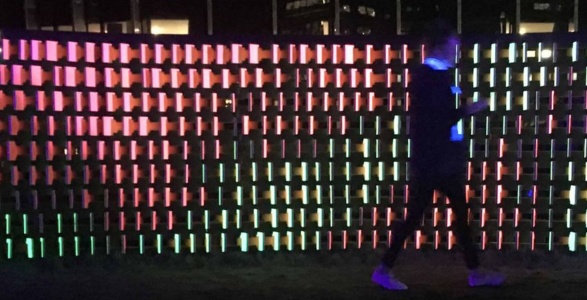
‘Passing Me By’ is a performative timber lattice to be directional, enabling the shifting fins to be
installation that takes the form of a 1.9m high x clearly experienced and read through movement
8m long wall. The work was shown at the last when passing by. Fluorescent colour was the most
Wellington Lux Light Festival for ten days for the attractive choice due to its ability to glow and
duration of the festival. become accentuated when illuminated by black
light. It still also allowed the installation to look good
The complex fin pattern was inspired by cloud
during the daylight hours as well.
imagery, where the pattern evokes movement, depth
and change. Each timber component is unique and Metro were consulted around the best lighting to
is digitally cut out using CNC fabrication technology. allow the colour to glow and be read effectively.
This allows each piece to vary slightly in height, angle When the black light was introduced the glowing
and surface treatment. fins became transformed and were interpreted with
fineness, becoming beautiful and effective.
During the night, this means that from certain angles,
the fluoro timber fins alter and shift sightlines so as Two prototypes were undertaken to check the the Resene FX Fluoro Pink and FX Fluoro Yellow
the observer walks past, the fluorescent fins appear plywood timber fins and structural lattice jointing topcoats. Resene Lumbersider Black was used as a
to flutter and move, transitioning from pink to yellow tolerances. This enabled the installation components backdrop colour to the structural lattice, allowing
or vice versa; this is an illusion as the structure is to be assembled with frictional jointing and glue as the fluoro finished areas to stand out effectively.
fixed in form. opposed to mechanical or screw fixings.
Passing By Me by Makers of Architecture was
The installation was conceived out of continued/ Trial swatches of the Resene FX Fluoro colours were awarded the Resene Total Colour Product –
iterative research, originating in 2013 when applied to the prototypes to test colour effectiveness Installation – Experiential Exterior award.
makers, Chris and Jae, were awarded Victoria and the optimal number of coats required.
The judges said “created for the LUX festival, this
University Scholarships in research for Timber CNC The timber plywood sheets were painted before project plays to the darkness. Usually paint colours
jointing technology through the implementation being cut on the CNC machine, creating a very crisp would be lost to the darkness, but using blacklit
of parametric digital design tools. edge to each cut fin. Each fin and structural lattice fluoro paint, this static installation appears to
‘Passing Me By’ is their latest collaborative work component was code tagged individually (using CNC come to life as the night descends. Using just three
as part of Makers of Architecture, proving that via etching) to identify where it belonged within the colours and a cleverly crafted concave design, the
digital design and manufacturing tools, complex greater structure. installation seems to flutter. Harnessing a ‘Mona
installations can be manufactured and assembled The installation’s specific location meant it could not Lisa’ effect curve it gives you the sense you
in a previously thought unattainable way. ‘Passing be fixed into the ground, so structural engineering are seeing something different as you move by."
Me By’ as a result provides an experience; one that was needed to ensure stability, structural timber and
Architectural specifier: Makers of Architecture
promotes movement interaction through light and weights for bracing were integrated behind the wall www.makersofarchitecture.co.nz
colour interpretation, engagement, observation, to support it. Building contractor: Makers Fabrication www.makersfabrication.co.nz
and imagination. Client: LUX Light Festival www.lux.org.nz
Resene paints were used on every part of the Photographer: Jae Warrander
‘Passing Me By’ was designed to be a luminous installation except for the CNC cut fin edges Other key contributor - lighting: Metro Lighting www.metro.co.nz
Other key contributor - plywood: Summit Ply www.summitply.co.nz
and captivating illusion based experience. The which were left uncoated. Undercoating in Resene Other key contributor – structural engineer: Silvester Clark Consulting
introduction of contrasting colour allowed the fins Lumbersider white enabled the optimum glow from Engineers, supplied by LUX Light Festival www.silvesterclark.co.nz
In Australia, PO Box 924, Beenleigh, Qld 4207 In New Zealand, PO Box 38242, Lower Hutt 5045
Call 1800 738 383, visit www.resene.com.au Call 0800 RESENE (737 363), visit www.resene.co.nz
or email advice@resene.com.au or email advice@resene.co.nz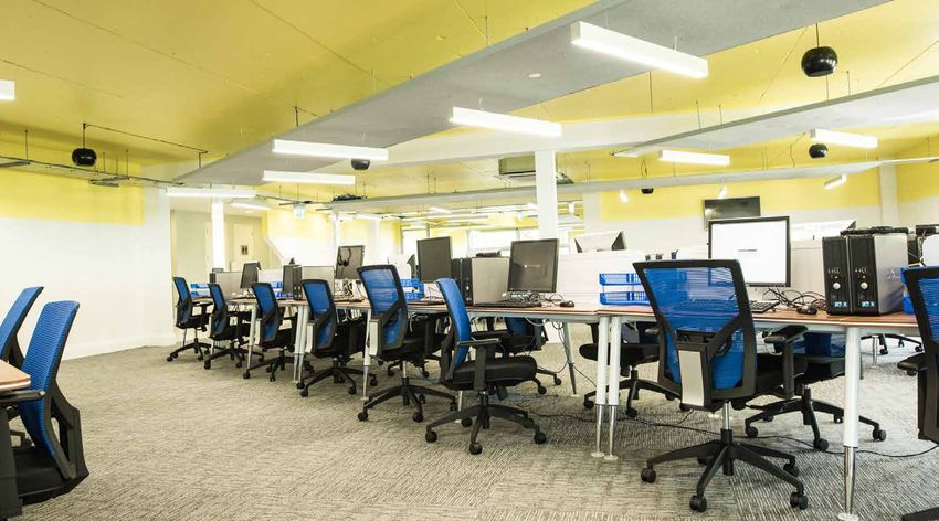
fit for a princess

This old villa, aka The Fairy Tale House, was built      colours from nature, like the golden glow of the       15-20 years it’s been up. It’s a favourite with the
in 1906, in Aro Valley, and has been lovingly tidied     sun, flowers, trees and the sea, all the colours       neighbourhood.
over the decades by many owners. The current             Wellington is surrounded by.
                                                                                                                The unusual height of the house means that the
owners bought the house over a decade ago
                                                         Many testpots of paint and comments from               house needs to be completely scaffolded and
falling in love with its quirky height, the various
                                                         neighbours and passers-by followed. A selection of     certified, and erected on terraces. The owners
bits sticking out and the interesting angles.
                                                         colour schemes of a drawing of the house were          decided to paint the house in autumn, and worried
A traditional looking house in many respects, a          even posted to Facebook so friends could vote on
                                                                                                                they had left it too late to paint without going
former owner added another floor on top. This has        the best combination.
turned it into a very tall house on a small footprint.                                                          broke renting the scaffolding for weeks on end.
                                                         The next step was the front door. The owners knew      However, the painters were marvellous, and made
The house is built on a slope, and the back of the
                                                         they wanted a bright red front door for good feng      the most of the good days so the painting was
house also has a basement, which makes it a four
                                                         shui. It needed to be a lovely bright deep flowery     completed in a reasonable time even with winter
storey house from the back, so it seems even taller
                                                         red – Resene Poppy (bright red) in Resene              nipping at their heels. In the end, it was the double
from across the valley.
                                                         Lustacryl was the perfect contrasting colour to
When the current owners decided to paint the                                                                    glazing on the ground floor and the bathrooms
                                                         make the colour scheme pop. It proved so popular
house, they realised the last paint job took place                                                              that held up the painting completion.
                                                         it was then used on all the house doors – the front,
in 1995! The Resene paint job had held up well.          deck and basement doors.                               The owners found it a “fun experience selecting
The owners adored rich bright colours but were           Initially the corbels and heritage detailing were      the colours, watching the paint go on, and now
wary about the effects of the sun on the paint.          to be painted in the same colour as one of the         enjoying the finished Fairy Tale House. Everyone
When they last painted the house in 1995, they           window colours, but after suggestions from a           who passes by say they love it. Perhaps those that
were advised against using some of the colours           Resene Colour Expert, Resene Poppy was also            don’t keep quiet! Luckily the home is in Aro Valley,
selected as they had a low reflectance index and         extended to these areas.                               a fairly arty bohemian neighbourhood, where a
may not last. It was important to avoid selecting a                                                             unique colour palette like this is easily accepted.”
colour that would weather too quickly and require        The previous roof colour was Resene Red Oxide.
a new paint job too soon. The whole house needed         Various test patches of other grey and green roof      The judges awarded The Fairy Tale House by
priming and two topcoats.                                colours were tried but nothing beat the tried and      Daphne Carvalho the Resene Total Colour
                                                         true Resene Red Oxide (colonial red), so this          Residential Exterior Award and said: “this
Aro Valley is renowned for being cold and damp.          was painted on using Resene Summit Roof as it
The house itself isn’t. The owners wanted to                                                                    home is a celebration of colour and the fairy
                                                         complements the rich warm house colours well.          tale home young children dream of. With an
paint the house in warm, bright colours to cheer
people up and bring a smile as they passed by.           The new house colours also needed to reflect the       oddly shaped design to work with, most would
They wanted kids to pass by and think a princess         colours of nature. The house is surrounded by trees    simply use paint to camouflage. Not on this
lives in this house, something that has literally        and bushes, and the sea is visible in the distance.    home. Situated in Aro Valley, this neighbourhood
happened when a little girl was heard to tell her        After experimenting with various combinations          is perhaps more comfortable with homes having
dad when they passed by one day that, “This is           of orange and blue, orange and green, blue and         their own distinct personality. With a nod to arty
where the Princess lives, Dad.” A successful colour      green, and green and green, the blue and green
                                                                                                                bohemian, homes shouldn’t have to toe the line.
scheme would mean the tall house would glow              combination fitted the blue sea and the luscious
                                                                                                                The palette is brave and whimsical, with a sense
like sunshine when seen from across the valley in        green surrounds best using Resene Allports
                                                                                                                of opening a child’s paintbox for the first time.
Aro Valley.                                              (cerulean blue) and Resene Limerick (Irish green)
                                                         in Resene Lustacryl.                                   Once you’ve experienced and enjoyed this colour
Armed with this slightly mad agenda, the first step                                                             you can never go back to neutral.
was to find a sunny golden main colour on the            Even the letterbox fits the colour theme, primed
house, something that glowed like butter. Resene         with Resene Vinyl Etch and topcoated with Resene       Cheerful and fun, this colourful home is guaranteed
Sonyx 101 semi-gloss in Resene Golden Sand               Enamacryl Bright Red (pure red). Snoopy and            to bring a smile.”
(buttery yellow) was chosen – it’s a happy warm          Woodstock are cut from plywood and painted.
                                                                                                                Colour selection: Daphne Carvalho, advice was also provided by Sarah
glowing colour that stands out amongst all the           Snoopy’s ears are made from black leather scraps.      Hawkins
pale house colours and trees. The owner adores           The mailbox has had a revamp once in the last          Painting contractor: Tao Painting Limited, Wellington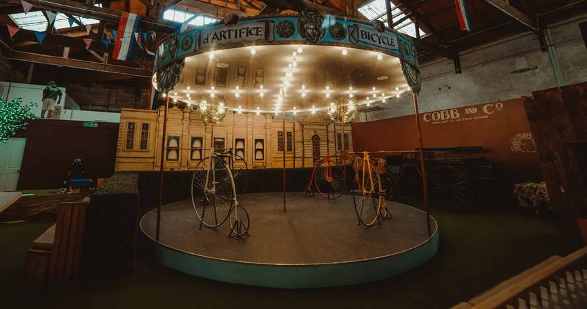
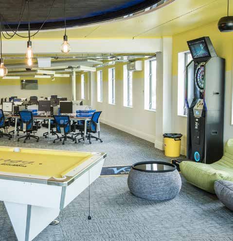
brighten up

Originally consisting of multiple tenancies, this first   also unifying the space and downplaying the rough    This Call Centre Fitout by Mary Jowett Architects
floor has undergone renovation and re-division.           finish left in parts of the original structure.      Ltd was awarded the Resene Total Colour
During the initial stages, the building owners            Refreshment and utility spaces were left to be       Commercial Interior Award. The judges said:
identified that there was a chance the complete           more subtle with the white providing a fresh,        “working with an existing tired space, colour
floor would be taken by one tenant, presenting the        clean looking background finish.                     was used as a hero on this project to bring
opportunity to completely rethink the concept.            The ceiling, though low, painted a fresh yellow –    the space to life. A once grungy area has now
They concentrated efforts on simplifying the              Resene Paris Daisy (clear yellow) - was the key      become a fresh, light and optimistic space with
visual approach while repairing the underlying            to the renovation.                                   yellow bringing in a sense of sunshine. Life in
building fabric to allow more flexibility in the                                                               a call centre can be high stress. Bringing in
                                                          Returning down the wall helped blur the ceiling to
future. An exposed but low rough concrete ceiling         wall junction. Acoustic panels and lighting trays    uplifting warm yellow, gives staff a fresh hit of
presented itself as an exciting opportunity to use        crisscross just under the ceiling defining work      energy when they look skywards, providing a
colour for identity and delight while also needing        areas. The white chosen for the walls – Resene       soothing atmosphere and helping with memory.
to satisfy important acoustic and lighting needs          Double Alabaster (grey white) – acted as a           Rather than stopping the colour at the ceiling
stipulated by the new tenant.                             background for the yellow to launch from, with       edge, the yellow is continued onto the top of
It was identified that the new tenant, a Call             selected areas in a custom mixed grey and the        the wall, so the sunshine feels like it is warmly
Centre, was looking for a fitout that provided a          plain grey carpet providing a solid base. Resene     embracing the staff and the space.
fresh and fun environment for the staff, with well-lit    Zylone Sheen was used as from past experience        It’s amazing the difference colour has made to
and acoustically damp working spaces as well as           it provided a hard wearing final wall coating with   this fitout.”
inviting break out and refreshment stations.              the desired look.
                                                                                                               Building contractor: Alpine Group Construction Ltd
Working with the owners locally and the tenant            The existing space, after many small and varied      www.alpineconstruct.co.nz
remotely, the concept for a bright ceiling to             tenancies, had multiple floor and ceiling heights    Client: Coronet Property Management Ltd
                                                                                                               www.coronet-propertymanagement.com
provide the main colour came once the space was           and finishes. Once the contractor finished           Colour selection: Mary Jowett Architects Ltd
opened up and the main interior dividing walls            demolition and repair the space opened out           www.mary@jowett.co.nz
                                                                                                               Painting contractor: Craig McIlroy Painters and Decorators
removed. While not wanting to make the space              immensely and presented itself as an exciting        Queenstown www.cmacpainters.co.nz
feel like a warehouse, the colour provided impact,        canvas for remodelling.                              Photographer: Julian Apse www.apse.co.nz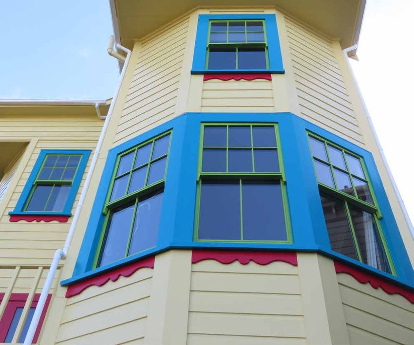
past to present

Tourism Waitaki, the Ministry of Business and          Visitors arrive at Whitestone City to character hosts        Oamaru was famed for its bars, banks and brothels
Innovation (MBIE) and the Oamaru Whitestone            at an immigration counter where they receive their           so the visitor is then taken into a space behind red
Civic Trust (OWCT) recognised that the history of      passport to the experience. Past the Oamaru stone            velvet curtains that has a mock bar clouded in a
North Otago is a unique national story and together    façade, they enter a full streetscape of a General           smoke effect with historic bar games including
contributed financially towards the development        Store, Barber, Chemist and Architect’s office. There is      bagatelle and a movie screening of the history of
of the Whitestone City heritage project. Design        a paper boy hologram that welcomes visitors to the           the area.
Federation were engaged as the head designer           experience spoken in Victorian language. A model
                                                                                                                    The next area is a school room where visitors are
and project management team to bring together          of the Criterion hotel created by a local craftsman,
                                                                                                                    taught like they would have been in Victorian times
the heritage and stories of North Otago into a         includes a layered multimedia projection that shows
                                                                                                                    including dunce cap, cane and a strict lesson from
live interactive experience based in the Victorian     a day in the life with Victorians moving within the
                                                       building and outside.                                        the character hosts.
precinct in Oamaru.
                                                       Following the streetscape, visitors enter the dressing       Finally the visitor is able to don Victorian clothes and
The brief was to utilise a variety of new media                                                                     walk into a parlour for high tea and etiquette lessons.
                                                       experience area where a theatre was built to show how
and traditional exhibition displays to produce
                                                       to dress like a Victorian from the drawers up. The theatre   When developing the colour palette the first
an experience where the visitor was completely
                                                       is surrounded by catwalks of original Victorian and          consideration was the historical knowledge of the
immersed in the experience. High participation and
                                                       Edwardian garments and hats and over 100 portraits           time, the colours that were used during the Victorian
original, innovative experiences were paramount.
                                                       from the Early Settlers Association of North Otago.          and Edwardian periods specifically in the North
Based in an old grain store the key interior design    Visitors then enter the games and pastimes area              Otago region. Historic homesteads and buildings
consideration was working within a challenging         which includes a world first – a penny farthing              throughout the region were visited where original
built environment with over 120 year old Oamaru        carousel. The carousel was designed and built in             paint colours were still shown, spaces were discussed
stone walls, a 10 metre high stud and a mix of rough   liaison with local engineers and artists and provides        with local historians and the OWCT liaison.
concrete flooring.                                     the centrepiece of the experience. Other games               Alongside the research it was determined that
Research and development of this project was           include croquet, skittles, marbles, quoits, and a            the overall colour palette would be strong, bold,
immense, working closely with the North Otago          historic children’s mock farmyard table.                     moody and all encompassing. Ensuring that every
Museum and Archives to ensure the project spoke        Working with a local collector, there is a broad             space had its own character to take the visitor on
of clear storylines of the region. Once planning       agricultural display that includes a faux farm shed          a journey, from the more working class scenes right
was complete, implementation took just over nine       with projections on a 3D map of the different maps           through to the upper class parlour space, colour was
months to achieve.                                     throughout the decades.                                      a defining design element.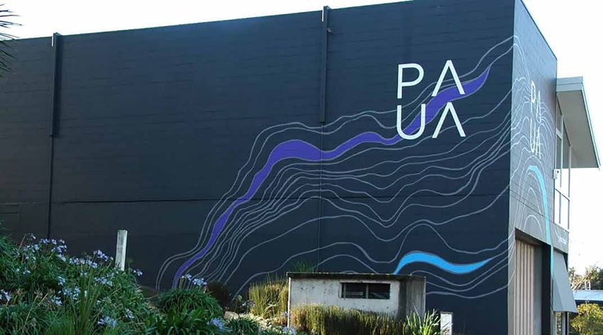
A key objective of Design Federation was to work           On entering the dressing experience a large hat              Timber and Furniture Gel in Resene Jarrah Tree
within a New Vintage space, taking colours and             display is painted in hardwearing Resene Lustacryl           (warm red brown) to bring it back to life.
design cues from the past and then interpreting them       Ringo (earthy beetroot) to keep it looking good, as          The retail space was painted in Resene SpaceCote
in a modern, fresh way. A majority of the colours          this is a key feature leading to the next stage. The
                                                                                                                        Low Sheen Green Meets Blue (soft grey green) and
chosen came from the latest Resene The Range               fashion catwalks are painted in Resene Lustacryl
                                                                                                                        features a range of wooden display units that work
fashion collection, colours that while fashionable         Chalk Dust to enhance the garments on them.
                                                                                                                        seamlessly with the colour chosen.
also spoke of times past.                                  A local artist painted the wall mural showing the
                                                                                                                        The complete colour palette includes 25 different
New entry and exit vestibules were designed and made,      variety of Victorian dress through the years, using
                                                                                                                        Resene colours to create a coordinated, bold scheme
undercoated in Resene Quick Dry waterborne primer          Resene Barometer as the backdrop colour, framed in
                                                                                                                        that enhances the overall experience.
undercoat then painted Resene Lustacryl Half               Resene Harvest Gold (yellow orange) and a variety
Spanish White (complex neutral) to complement the          of Resene colours in the mural.                              This project was designed within a very challenging built
Oamaru stone exterior and original exterior mid tone                                                                    environment. All internal displays, entrance and exit doors,
                                                           The centrepiece of the attraction, the penny farthing
green store doors.                                                                                                      bathrooms and stages had to be built from scratch.
                                                           carousel, was designed with local artist Donna
                                                           Demente who provided the graphics around the top.            The most positive aspect of the project was the community
At the immigration counter, an original boat is
                                                           Resene Walk-on Foundry was used for the floor colour         focus, liaising and working with a variety of groups and
displayed as if docked. The seascape in the harbour
                                                           and Resene Lustacryl Reflection (pastel blue) as the         individuals throughout the region with items, displays
in Oamaru prompted the choice of Resene Walk-on
                                                           carousel skirt colour to complement the artwork above.       and artworks. This project became North Otago’s; the
flooring paint in Resene Barometer (deep blue)
                                                                                                                        buy in from the community ensured its success.
as the paint colour beneath the boat.                      Within the agriculture section a faux farm shed was
                                                           built to house a projection of the variety of historical     Whitestone City by Design Federation was awarded the
The streetscape gave the opportunity to be more
                                                           maps of the greater region. The timber within the            Resene Total Colour Commercial Interior Public +
creative with the colour palette; each shop had an
                                                           shed was stained with Resene Colorwood Bark                  Retail Award. The judges said: “an extensive palette of
original look but needed to complement the rest of
                                                           and finished in clear Resene Aquaclear to ensure it          colours is carefully wrapped into this project to celebrate
the buildings. The shop exteriors were finished in
                                                           resonated with the look of the time.                         antiquity and support the story telling of history. Visitors
Resene Mission Brown (rich traditional brown),
                                                                                                                        are led on a journey of experiences, meandering through
Resene Dark Side (midnight blue), Resene                   To bring darkness and intrigue to the bar and brothel
                                                                                                                        a look back in time with something to discover around
Seaweed (bitter brown) and Resene Quarter                  space painted wall hung pressed tin was prepped
                                                                                                                        each corner and interactive activities to enjoy. The colour
Bokara Grey (warm ashen grey) all painted in               with Resene Vinyl Etch before topcoating in Resene
                                                                                                                        palette brings a richness to the exhibition that couldn’t
Resene SpaceCote Low Sheen as they were still              Lusta-Glo Nero (blue black), the colour repeated on
                                                                                                                        have been achieved with duller antique shades.
housed inside.                                             the bar.
                                                                                                                        With such a wide colour range, it would be easy for
The original floor was over 100 year old concrete.         The school room interior featured a rough concrete
                                                                                                                        the elements to compete, but instead they all come
A local artist was engaged to paint cobblestones           floor, painted by a local artist to look like floorboards.
                                                                                                                        together supporting each other, gently evolving as
directly onto the concrete using Resene Foundry            This paint feature was done with Resene Walk-on in
                                                                                                                        you move through.
(shadowy charcoal) and Resene Triple Rakaia                Resene Wolverine, Resene Castaway and Resene
(stony grey beige) to produce a realistic effect.          Triple Canterbury Clay. It is a stand out feature in         Moody, intriguing and a perfect melding of history
                                                           the space; the artistry and paint colours blend well         and colour.”
Each shop provides a unique colour experience. The         together to create a realistic floor. Walls were painted
General Store floor was painted in Resene Walk-on          in complementary Resene SpaceCote Low Sheen
Wolverine (browned taupe), with walls in Resene            Rivergum (grey green).
SpaceCote Low Sheen Triple Canterbury Clay
(clay ochre). These complemented the vast range of         A key aspect of the facility design was creating
historical store items and timber shelving.                realistic looking traditional Victorian bathrooms for
                                                           the visitors. The bathroom exterior is Resene Scoria
The architect’s office that has a projection was painted   (copper red brown) and the lobby Resene Half
in Resene SpaceCote Low Sheen Dark Side inside and         Spanish White. The intention was to utilise daring,
out to ensure the visitors focus on the multimedia         deep tones to relate directly to the Victorian brief
display. Resene Dark Side also complemented the            as well as provide a bold impact. For the female
dark timber desk and display elements.                     bathrooms deep purple Resene SpaceCote Low                   Architectural specifier: Bruce Parker and Ian Perry

The exterior of the Barber’s shop was painted              Sheen Sumptuous (deep purple) is used on both                Building contractor: Breen Construction www.breen.co.nz
                                                                                                                        Client: Tourism Waitaki www.waitakinz.com
in Resene SpaceCote Low Sheen Seaweed. A                   walls and tongue and groove panelling. In the male           Client – Operations Manager: Wendy Simpson,
combination of complementary colours in Resene             bathrooms Resene SpaceCote Low Sheen Atlas                   Tourism Waitaki www.waitakinz.com
                                                                                                                        Interior designer: Annabel Berry, Design Federation
Barometer, Resene Triple Canterbury Clay and               (hazy forest green) sets the scene. Combined with            www.designfederation.co.nz
Resene Chalk Dust (limestone white) highlight              gold gilt mirrors, leather and velvet furniture and          Painting contractor: Colourpalace, Century Painting

the barber’s implements and accessories. Tongue            traditional artworks the bathrooms certainly make a          Other key contributor - stylist: Meghan Nockels,
                                                                                                                        Design Federation www.designfederation.co.nz
and groove is finished in Resene Barometer, with           bold colourful impact.                                       Other key contributor – graphic designer:
                                                                                                                        Kate O’Connell, Design Federation www.designfederation.co.nz
Resene Quarter Truffle (taupe) on the wall and             In the parlour a second hand mantelpiece was                 Photographer: Rachel Wybrow Photography
Resene Triple Canterbury Clay decorating the rail.         attached to the wall rejuvenated with Resene                 www.rachelwybrowphotography.co.nz
pattern a la paua

                                                                                                                                          hello yellow
                                                          in the colours, so that each highlight of colour has
                                                          presence and impact.
                                                          The big challenge of painting this building was
                                                          access. The boom lift had to be positioned in just
                                                          the right spots to reach all of the parts of the
PAUA architects was previously Antanas Procuta            building that needed to be painted.
Architects. The company name change followed              The base colour Resene Double Cod Grey (black
in the footsteps of the Hamilton City Council’s           charcoal) uses Resene Lumbersider CoolColour
decision to rename the road the company building          to reflect more heat than a standard version of the
is located on; Bridge Street became ANZAC Parade          colour would, with the roof in Resene Summit
in honour of the 100 year commemoration of the            Roof CoolColour Half Delta (stone grey) due to
Anzacs at Gallipoli.                                      its location and exposure. This Resene Half Delta
This was the perfect time to rebrand the company          is continued onto the fascia and barge board in
and this included a repaint of the building exterior      Resene Lumbersider CoolColour, and repeated on
to reflect this new direction. PAUA is an acronym for     the exterior timber joinery. The soffits are light
Procuta Associates Urban + Architects. Paua is the        in colour and hue using Resene Lumbersider in
Maori name given to a species of abalone and when         Resene Quarter Villa White (yellow white).
the shells are highly polished it emphasises their        Fiery Resene Ayers Rock (sunset orange) frames
striking blue, green and purple iridescent colour.        the door and welcomes you in teamed with
The paua shell is seen as an iconic New Zealand           Resene Double Cod Grey.
symbol and the colours define this. The base colour       PAUA Re-branding by PAUA Architects was awarded
was selected to modernise the building and to act         a Resene Total Colour Commercial Exterior
as a background ground to enhance the paua                Colour Maestro Award. The judges said: “Telling
mural colours.                                            the brand story in imagery and colour makes this
                                                          project ever the more memorable. The brand is not
Working with mural artist Paul Bradley the paua
                                                          just placed on the building, but is wholeheartedly
colours and form were developed into an inspiring
                                                          wrapped around it. The colours are reminiscent of
artwork that wraps the building and the associated
                                                          the flow of a river as it meanders along and a clever
retaining walls of the carpark.
                                                          interpretation of the interior of a paua. The design
The aim of the project was for the repaint to act not     and colour palette works on both a practical and
only as signage but also as a piece of art to enhance     aesthetic level. The paua contours act as a wayfinding
the surrounding environment.                              device directing you towards the carpark and into the
Paul Bradley is an artist based in Hamilton and is        office. Embracing the brand, it’s lovely, whimsical and
part of Creative Waikato. Paul Bradley and PAUA           a perfect reflection of the creativity that lies within.”
architects have worked together on other public
                                                          Client: PAUA Architects (previously Antanas Procuta) www.pauaarchitects.co.nz
buildings and spaces making Paul an obvious choice        Colour selection: Jess Clarkin, PAUA Architects www.pauaarchitects.co.nz and
when looking for an artist to develop an artwork to       Paul Bradley, www.paulbradley.co.nz
                                                          Mural artist: Paul Bradley, www.paulbradley.co.nz
reflect the new name and re-branding.                     Painting contractor: Nigel Kovacevic
                                                          Photographer: Andrea O’Connor www.pauaarchitects.co.nz
The design for the mural was based on the
typographic maps that architects use to understand
a site they are designing for. Paul took inspiration
from this and also from the lines of pattern in the
paua shell. The colours chosen – Resene Lumbersider
in Resene Christalle (strong purple), Resene
Havelock Blue (summer blue), Resene Java
(intense turquoise), Resene Mantis (bright green)
- all reflect the amazing range of colours and vibrancy
of the polished shell. These blues, greens and purples
really pop against the neutral dark grey background
and the mid-grey outlines. Paul aimed for restraint
After building their own house 30 years ago and artwork based on a Michael Smither's artwork
watching the family grow and change, the clients with permission from the artist.
(an historian and an artist) were keen on fresh
The entry door is welcoming in Resene Lustacryl
beginnings. A love of craft and an appreciation
tinted to Resene Bright Red (pure red).
of the practical, compact plans of certain state
houses were some of the things that formed Internally the wall paint colour, Resene SpaceCote
part of initial design conversations with Lovell & Low Sheen in Resene Double Alabaster (grey
O’Connell Architects. white), is neutral to let the owner’s collection of
Spitaki House is the outcome and perches just sculpture and art and the rippled ply ceiling sing.
above where they first built, replacing one of the Spitaki House by Lovell & O’Connell Architects
small workingman’s cottages that face Island Bay won the Resene Total Colour Residential
beach. The house has a sculptural form and roof Exterior Maestro award. The judges said:
that stealthily hugs against the hill. A rippled ply “this colour palette is inspired by the Michael
ceiling cradles the jewel box spaces below. Pared Smithers’ artwork, which uses colours as
back with simple lines and cedar cladding, the musical notation. Wrapped into a more neutral
house orientates to the sun with split level living exterior, it’s like a bold jewel box that is enjoyed
spaces that frame views to the north and east. by its owners, a welcoming torch light inviting
The stained cedar cladding matches coastal warmth into the heart of the home. The hue on
weathered timber. Colour is injected into the this home’s exterior provides a gentle halo glow
design via the walls and soffit of the two of yellow to the interior, bringing a sense of
enclosed deck areas, using Resene Lumbersider sunshine indoors regardless of the weather.
tinted to Resene Wild Thing (bright yellow gold).
It’s a warm and inspired use of colour.”
Colour matched by Resene to the local kowhai
flower, the walls and soffit of the decks create
a lively contrast to the subdued cedar cladding. Architectural specifier: Lovell & O’Connell Architects
Building contractor: Peter Camp Builders
Blurring the boundaries of architecture and art, Other key contributor – artist for feature:
the dining room deck has a large scale painted Michael Smither www.michaelsmither.co.nz
formal setting enclosed on three sides. The deck the palette contributes to a warm and comfortable
was extended to give views out to the Waitemata, home which encompasses art and family life.
and a new stair from the deck connects the living
The project went smoothly due to a wonderful
areas to the garden, which slopes down into a
builder, Mark Conway, and the clients write that
green verdant valley.
they wouldn’t change a thing.
The husband is a scientist, the wife is an artist and
This Bassett Road Renovation by Emma Morris
lawyer, and together they brought a wonderfully
Architecture won the Resene Total Colour
rigorous attention to detail, especially regarding
Neutrals Award. The judges said:
the efficiency of the kitchen and storage elements.
“Most see neutrals as the easy option, but choosing
There was a clear vision to use a strong colour for
a feature wall on which to display the client’s the right neutral colours can really make a home
artwork. Colours were tested on a 3D digital model sing. Interesting shadowing and light in this home
of the villa, prior to specifying the final colours. play with the neutral palette, adding an extra layer of
interest. Your eyes wander comfortably through the
The inspiration for the feature wall came from the space, the perfect backdrop to showcase favourite
deep, dark colour choices used in galleries such as possessions. Different colours on the horizontal and
the National Gallery and John Soane Museum in vertical planes provide a soft contrast.
neutral know-how London, which allows the colours of the art to glow
brilliantly against the sombre background. This home is simply beautiful in neutral – with
a soothing and calming ambiance that many
The main art wall is painted in Resene SpaceCote
homeowners would love to have in their own home.”
Low Sheen in Resene Timekeeper (blue green),
a striking dark colour along an internal wall which
faces south. The artwork is protected from direct
As part of a modest renovation to the rear of a sunlight, and lit by adjustable artificial lighting
1900s villa in Remuera, the aim was to create in the evening. The remaining walls are Resene
a modern kitchen sitting harmoniously within Tasman, a calming blue green which beautifully
the historical villa, and to showcase the client’s complements the natural stone benchtop and
restored Kauri flooring. Resene Tasman (soft aqua
collection of art and objects.
grey) also works with the various blue objects
A few simple design elements bring light and space and glass artworks which are displayed on white
to the kitchen, living and dining. The kitchen wall was shelves painted in Resene Half Rice Cake (starchy
slightly extended to allow a larger kitchen in which the white), and in a painted alcove with glass shelves.
husband-and-wife clients can comfortably cook side The height of the ceilings is accentuated by Resene
by side. The kitchen opens to the living area across SpaceCote Flat in Resene Eighth Rice Cake (noodle Architectural specifier: Emma Morris Architecture Ltd www.emmamorris.studio
Building contractor: Mark Conway
a breakfast bar to easily entertain large family groups. white), a white also used on the window trims and Colour selection: Lucy McGillivray and Nikki Morris
A wall was removed to relocate the dining into a more cabinetry to reflect the light around the space. Together Photographer: Sam Hartnett www.samhartnett.com
better and better
The Resene technical
team are always on
the lookout for ways
the right white to improve Resene
products. Two of the
products to enjoy
While we all see the colour trends go from red,
recent updates are Resene Lustacryl and
orange, to pink, blue to green and back to teal,
Resene Woodsman Decking Oil Stain.
what is less obvious is how much the whites
and neutrals move too. We know colour The individual whites and neutrals Updated Resene Lustacryl semi-gloss waterborne
choices are always evolving and changing, palettes will also be updated this enamel, has been designed to be faster to dry
which is why we regularly update our The year to bring the new colours and favourites and easier to apply. This will speed up application
Range whites and neutrals fandeck. into those handy takeaway palettes. time and also give a better quality finish. It’s
The latest fandeck includes a few new colours Remember we also have the Habitat plus available in a huge range of Resene colours,
and introduces favourites from other colour – whites and neutrals booklet, which including Resene CoolColours for exterior projects.
ranges to give you the best of the best in one covers off tips and tricks to think about Resene Woodsman Decking Oil Stain has moved
handy fandeck. With the popularity of grey, when choosing whites and neutrals. It’s ideal to a waterborne alkyd version, with improved
the range of options has been expanded also. for use with clients who are keen on whites foot traffic durability and weathering durability.
The new fandeck is available from and neutrals but are finding it tricky to settle It penetrates better reducing the risk of tracking,
your Resene representative or Resene on an option that suits. Available free from to help keep it looking good for longer. It’s
ColorShop or specifiers can order online at Resene ColorShops or reseller, or view online, available in a wide range of exterior stain
www.resene.com/specifierorder. www.resene.com/habitatplus. colours, including Resene CoolColour options.
top of the colour pops tip spray top
If you think you know the most popular Resene colour you might be surprised to find out it’s not New Resene Summit Roof
Resene Alabaster. While Resene Alabaster is a very close second, Resene Black White has snuck Commercial Spray Satin is
in front to be crowned Resene’s top colour. designed specifically for airless
Chances are you have seen many of these colours already adorning walls. These colours share a spray application. By focusing
common trait – they are very versatile and easy to dress up, or dress down in a colour scheme by the product just on spray application, the
the addition of other features. technical team have been able to optimise
the application process. The new product
1 Resene Black White 11 Resene Half Alabaster will be available in 4L and 10L packs in the most
popular tones, and many CoolColour options too.
2 Resene Alabaster 12 Resene Half Sea Fog
Resene Summit Roof Commercial Spray Satin
3 Resene Sea Fog 13 Resene Half White Pointer
joins Resene Summit Roof Semi-Gloss, which
4 Resene Double Alabaster 14 Resene Pitch Black (wood stain) is designed for brush and roller application, and
5 Resene Half Black White 15 Resene Merino MIOX and Aluminium finishes available for those
6 Resene White Pointer 16 Resene Quarter Spanish White who prefer a metallic finish. This gives you and
your clients more choice for their roof finishes,
7 Resene Quarter Tea 17 Resene Half Spanish White and allows painters to choose the product
8 Resene Half Tea 18 Resene Black that best suits the application method.
9 Resene Rice Cake 19 Resene Half Rice Cake
10 Resene Quarter Black White 20 Resene Eighth Thorndon Cream
These colours are in the Resene whites and neutrals A4 colour chart, and Resene
Pitch Black is from the Resene Exterior wood stains colour chart. If your clients are
the funny side of paint
asking you for neutral colour options the Resene whites and neutrals A4 colour chart is “A number of years ago I was working for a painting firm which was
the best place to start so they have a good range of the most popular options without owned by a Dutch gentleman. My workmate and I were discussing
being overwhelmed with too many choices. paint finishes while our Dutch boss was nearby. We talked about a
certain roller sleeve which would leave an 'orange peel' texture on the
If they decide they like a colour but would like to see other variants, they can use the individual wall. Sometime later we heard our boss tell our other workmate who
whites and neutrals palettes or The Range Whites & Neutrals fandeck for more options. had just returned from an errand not to use this certain roller sleeve
All of these options are also available in Resene A4 drawdown swatches, which can as we had discussed as it would leave a 'banana skin' texture!”
be ordered online www.resene.com/drawdowns or via your Resene ColorShop. Thanks to Adrian.
I n c o r r e c t m a i l i n g: If you are receiving multiple mailings or you would like us to change your mailing details, please call:
In Australia phone 1800 738 383, in New Zealand phone 0800 RESENE (737 363) or email update@resene.co.nz.
Resene News is published by the Resene Marketing Department. Every effort has been made to ensure accuracy in this publication, but Resene accepts no liability for any errors of fact or opinion
expressed herein. Some products or services may not be offered in your area or country. Please check with your local Resene ColorShop for availability. Most products can be ordered in though lead times
and minimum order quantities may apply. Resene News is printed on environmentally responsible paper which complies with the requirements of environmental management systems EMAS and ISO14001, using vegetable-based inks. Please recycle.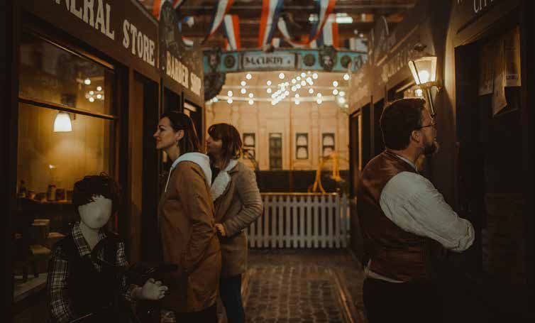
You can also read