So, how did we end up with this government? - Danny Dorling
←
→
Page content transcription
If your browser does not render page correctly, please read the page content below
Dorling, D. (2020) So, how did we end up with this government? Public Sector Focus, January/
February, pp.14-17, https://flickread.com/edition/html/index.php?pdf=5e56a367a7601#17
So, how did we end up with
this government?
Danny Dorling
On December 14th the Telegraph newspaper reported that “In a sign of the damage Mr
Johnson's Tories have done to Labour, there are 24 constituencies that have voted Tory for
the first time in decades. The new Conservative majorities in three of these constituencies is
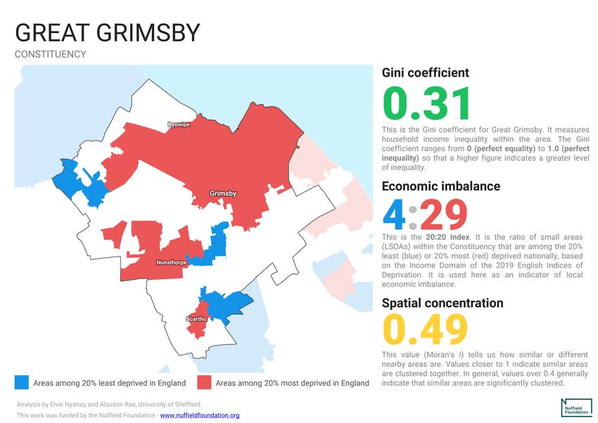
more than 20 percentage points: Dudley North (31.3 per cent), Bassetlaw (27.6 per cent) and
Great Grimsby (22.2 per cent). All of these seats saw double-digit swings from Labour to the
Tories. The seat with the longest history of backing Labour is Rother Valley, that had elected
a Labour MP since Thomas Walter Grundy won the seat with 55 per cent of the vote in
1918....”1 So what happened?
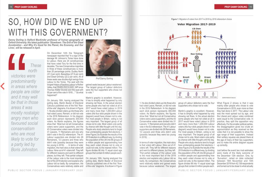
Figure 1: Migration of voters from 2017 to 2019 by 2016 referendum choice
1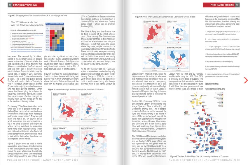
On January 16th, having analysed the polling data, Martin Baxter of Electoral
Calculus published one of the first “flow-of-the vote” diagrams. It is shown in
Figure 1. He also divided voters up into those who had voted Leave, Remain, or
did not vote in the 2016 Referendum. In his diagram each stick person
represents 300,000 voters. As Martin explains, the figures shows that: ‘Most
but not all Conservative voters were Leave supporters, and the 43 Conservative
voters were divided into 31 Leavers, 11 Remainers and one who didn't vote in
the EU referendum. The 41 Labour supporters are divided into 26 Remainers,
12 Leavers and three who didn't vote (possibly because they were too young in
2016). … In terms of voter migration, the main story is that voters left Labour.
Nine out of 41 voters left. They left for different reasons and went to different
places, but they left. That partial collapse of the Labour vote is the most
important fact of the 2019 election and explains why Labour did so badly. By
comparison, the Conservatives were relatively stable and gained seats because
Labour weakened. The largest group of Labour defectors were the four
supporters who chose not to vote.’ 2

Martin’s graphic is excellent. However, it has to simplify what happened by
only showing net flows. In the actual election some people who had not voted
at all 2017 would have voted Labour in 2019 and many more than 1,200,000
Labour voters (the four stick people shown in the diagram) would have chosen
not to vote. For most people in Britain voting is not very important. The largest
group of all chose not to vote. Most voters vote partly by chance with little
thought until the day. People who study elections tend to forget how
uninteresting people find elections. I drew Figure 2 below to illustrate the
results of the 2019 election in a different way, by dividing the population of the
UK into 66 groups of a million people and approximating how they each voted
choose not to vote or could not vote, to the nearest million. The figure divides
66 into 11 equal sized age groups that contain 6 million people each.

What Figure 2 shows is that it was mainly older people who chose to vote
Conservative in 2019, even more so than they had done in 2017. The Labour
vote was the most spread out by age, and the Liberal and Labour votes
combined were equal to the Conservative vote. In practise that split the
opposition very effectively. For the smaller political parties, the disaggregation
gives a too crude an approximation as they received so few votes that it is not
possible to show the age rage of their supporters. Instead their solitary squares
are placed their at the age of many of their key supporters; and to make the
entire diagram square up correctly.

                                        2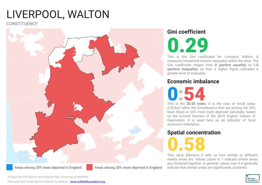
Figure 2: Disaggregation of the population of the UK in 2019 by age and vote

   The 2019 General election                                                   Age     1 square is 1 million people
   was the Brexit deciding election                                            0-6

                                                                               7-14
  Of the 66 million people living in the UK                                    15-22

  • 20 million did not vote or were eligible but not registered to vote ●      23-28
  • 14 million voted Conservative (365 seats of 650) ●●●●● ●●●●● ●●            29-35
  • 12 million were children (and UK citizens) ●
  • 10 million voted Labour (203 seats) ●●●●● ●●                               36-42
  • 4 million voted Liberal (11 seats) ●                                       43-49
  • 3 million were not UK citizens●
  • 1 million voted in Northern Ireland (18 seats) ●                           50-56
  • 1 million voted Scottish National Party (48 seats) ● ●                     57-64
  • 1 million voted Green/Plaid or other (5 seats) ●
  These 9 groups approximately assigned to 11 equal sized age groups           65-73
   https://www.ipsos.com/ipsos-mori/en-uk/how-britain-voted-2019-election      74+
   https://blogs.lse.ac.uk/politicsandpolicy/young-cosmopolitans-and-ge2019/

Just before the event two rival estimates were made of the likely outcome of
the December 12th election. One, by ‘Survation’, relied on date collected
between 16th November 2019 and 10th December from 42,138 respondents
and turnout to be closer to what actually happened. The second, by ‘YouGov’,
polled a much larger group of people nearer to the date of the actual election
and reported (with a great flourish) that ‘After much anticipation, YouGov’s
second and final MRP poll of the 2019 general election is here. The model
which correctly called 93% of seats in 2017 currently shows that a small
Conservative majority is likely. This is the final public polling YouGov will
conduct before Thursday’s vote’.3 The result, which was not a small
Conservative majority, surprised everyone who had been paying attention.
Either voters had been lying to pollsters in ways they had not lied before, or a
larger than usual number of voters changed, or actually made up their minds,
on the day of the election or the day before.

On January 27 the Guardian’s John Harris wrote that ‘a lot of people on the left
… [believe] that Labour’s lost heartlands are synonymous with angry men,
nostalgia and “social conservatism”. They are not really like that at all’.4 Of
course, all six word summaries are approximations – but if we were to assess
the degree to which Labour switchers to abstention were more often nostalgic
angry (often also old and white) men who favoured social conservatism, then
we would have to look at the data rather than base our assumptions on our
travels.

                                                                   3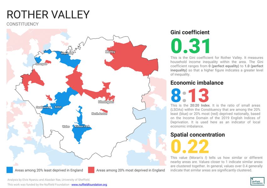
Figure 3 shows how we tend to make assumption about places from the names
of their constituencies and their history. All four of the seats which most
dramatically turned away from Labour (and were listed by the Telegraph at
that start of this short piece) contain significant pockets of very low poverty.
Figure 3, uses the very recent work of Alasdair Rae and Elvis Nyanzu to reveal
that each has at least three large neighbourhoods counted in the fifth of least
deprived areas in all of England.5

Figure 3: Areas of very high and low poverty in the four iconic 2019 seats

                                       4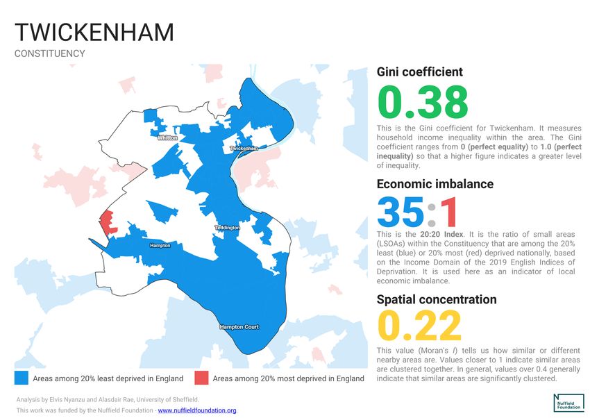
Figure 4 contrasts the four seats above for four others: the seat with the
highest Labour vote in 2019, where 85% of voters chose Labour in Walton in
Liverpool; the seat with the highest Conservative vote (77% in Castle Point in
Essex); with where the Liberals did best in Twickenham in London (56%); and
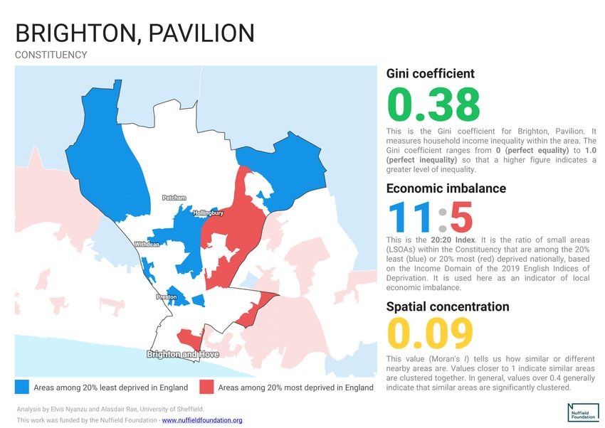
where the Greens polled most – which was in Brighton Pavilion (57%).6
Figure 4: Areas where Labour, the Conservatives, Liberals and Greens do best
5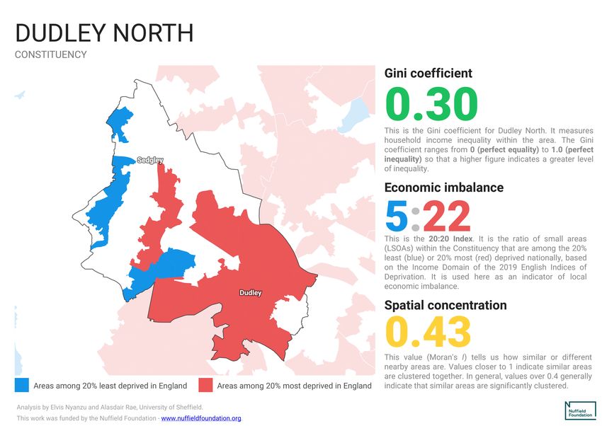
The Liberal party and the Greens now do best in some of the most affluent
parts of the country. The Conservatives are no long confined to the most leafy
suburbs; but where they do best – in parts of Essex – is not that unlike the
places where they have just (for one election at least) secured their new MPs
in the North. These north victories were predominantly in areas where people
are older and it may well be that in those areas it was mostly nostalgic angry
men who favoured social conservatism who are most likely to vote for a party
lead by Boris Johnston.

As to why Labour lost it net 1,200,000 voters to abstentions, understanding
why people who had voted for a party lead by Jeremy Corbyn in 2017 did not
do so in 2019 might take longer to determine; but it is worth remembering
who thought they had most to lose from a Corbyn led Labour victory – the
best-off 5%. It was the highest-income 5% in the UK who were told that they
would have to pay more tax and who will have worried over paying the schools
fees that almost all of that group do pay (mostly with some difficulty). Almost
none of that 5% live in Essex or the north of England, but they do have a
disproportion power to influence the views of people who do.

On the 28th of January 2020 the House of Commons Library7 produced the
image shown below. Tyne and Wear is still solidly red, Dorset still entirely blue.
This is despite pockets of affluent on the banks of the Tyne and much poverty
to be found in parts of Dorset. A ‘red wall’ can still be traced from East
Yorkshire, through South Yorkshire, across Greater Manchester and Cheshire.
But it now faces a solid blue wall stretching from Lincolnshire, through
Nottinghamshire, Derbyshire, Staffordshire and Shropshire.

The 2019 General election was painted as the worse defeat for Labour in many
years, and yet Corbyn’s 32% share of the vote was higher than the 30% gained
when the party was led by Ed Miliband in 2015; or the 29% won by Gordon
Brown in 2010; the 31% won by Neil Kinnock in 1987; the 27% Michael Foot
secured in 1983; or the 31% won by Arthur Henderson’s Labour party in 1931
and by Ramsay MacDonald’s party in 1923. That 32% is probably a solid base of
support. The key questions that remain include how well people in the blue
squares in Figure 5 will think the new government has improved their lives,
and those of their children’s and grandchildren’s –– and what happens to the
country and province of the UK that have both, in effect, already left
mainstream UK politics some time ago: Scotland and Northern Ireland.

                                        6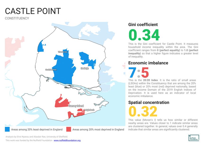
Figure 5: The New Political Map of the UK: drawn by the House of Commons

1
  https://www.telegraph.co.uk/politics/2019/12/13/stunning-tory-seat-victories-2019-general-election/
2
  https://www.electoralcalculus.co.uk/pseph_transition2019.html
3
  https://yougov.co.uk/topics/politics/articles-reports/2019/12/10/key-findings-our-final-mrp-poll
4
  https://www.theguardian.com/commentisfree/2020/jan/27/labour-party-leadership-keir-starmer-rebecca-
long-bailey
5
  http://ajrae.staff.shef.ac.uk/atlasofinequality/
6
  https://researchbriefings.parliament.uk/ResearchBriefing/Summary/CBP-8749
7
  https://visual.parliament.uk/research/visualisations/general-election-2019-constituencies/

                                                  7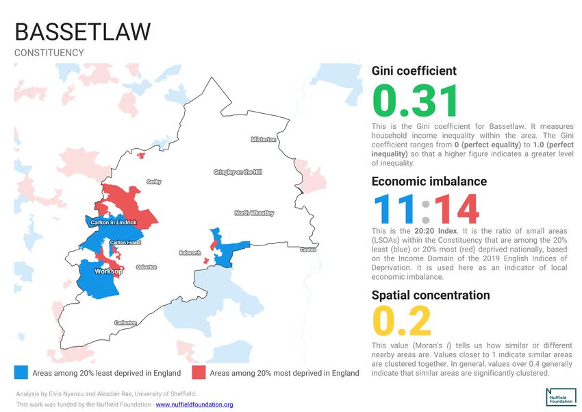
8
You can also read