7 BRAND STORIES FROM THE DESIGN FRONT LINES - THE NIELSEN DESIGN IMPACT AWARD CHRONICLES: 2017 EDITION
←
→
Page content transcription
If your browser does not render page correctly, please read the page content below
THE NIELSEN DESIGN IMPACT AWARD CHRONICLES:

7 BRAND STORIES
FROM THE DESIGN
FRONT LINES
2017 EDITION

Copyright © 2017 The Nielsen Company
INTRODUCTION
            If you ask a brand manager to name the highest-impact marketing lever she knows, odds are
            that she won’t choose package design. In fact, it may not even make it into her consideration
            set. Why?

            For starters, packaging seems analog in an increasingly digital world. It feels antiquated, and
            marketers are naturally inclined to believe that newer is better—surely we’ve come up with
            innovative digital campaigns that are light-years ahead of a package redesign. This is true
            in some respects, but patently false in others. For example, there is still no other marketing
            medium that reaches 100% of category buyers at the retail shelf—in the moment when
            they are deciding what to purchase. In today’s increasingly fragmented, time-shifted media
            environment, this fact alone should encourage marketers to rethink the potential of package
            design.

            Secondly, the impact of package design is notoriously difficult to quantify. Unlike with
            advertising, it's not possible to measure packaging impressions—and, even if it was, package
            design would still be inseparable from your other marketing efforts; it’s often the hero of
            your TV commercial, magazine advertisement, and social media posts. Regardless, these
            complicating factors don’t mean that package design fails to deliver business value—far from
            it. In fact, one could argue that great packaging only amplifies the effectiveness of nearly all
            your other marketing efforts.

            Over the past few years, Nielsen has taken strides to measure and demonstrate the power
            of package design. Our recent research found that optimized package redesigns generate an
            average 5.5% lift in forecasted sales revenue when compared to current designs.1

            THE NIELSEN DESIGN IMPACT AWARD
            In 2017, we created The Nielsen Design Impact Award in collaboration with The Dieline as
            another avenue to demonstrate the considerable impact that effective package design can
            have, and to celebrate brands that are elevating the role of packaging in the marketing mix.

            Specifically, the award recognizes seriously successful package redesigns in the fast-moving-
            consumer-goods space—ones that have helped to drive significant increases in brands’
            bottom lines.

            In February, we invited brand marketers and design agencies to submit their projects for
            consideration. During the four-week window that followed, we received hundreds of entries
            describing successful package redesigns launched between January 1, 2014 and March 1,
            2016. From there, we conducted a blinded review of the in-market performance for these
            initiatives, identifying those associated with a demonstrable increase in retail sales dollars
            and units in the year after the redesign when compared to the year prior. Next, for this subset

Copyright © 2017 The Nielsen Company                                                                           2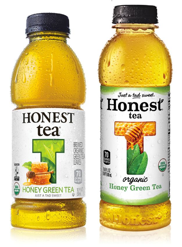
of initiatives, Nielsen surveyed thousands of consumers to assess how well each redesign
            conveyed its core strategic message and to gauge purchase preference for the new packages
            over the old ones.

            Based on our analysis, we selected seven initiatives—five winners and two honorable
            mentions—that leveraged package design to truly remarkable effect. They represent a
            wide range of business situations: a category giant in rapid decline, a timeless brand whose
            packaging had run out of time, an iconic favorite that embraced the upside, a niche brand that
            managed to win over the masses, and more.

            While our winners certainly aren’t the only entries we received that made a meaningful impact
            on brands’ bottom lines, they are some of the more extraordinary cases. Read on—we think
            you’ll see what we mean.

Copyright © 2017 The Nielsen Company                                                                         3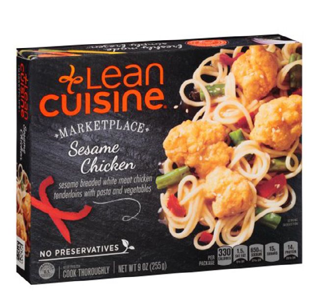
CONGRATULATIONS TO THE 2017
NIELSEN DESIGN IMPACT AWARD
WINNERS
GRAND PRIZE WINNER
Lean Cuisine Marketplace
WINNERS
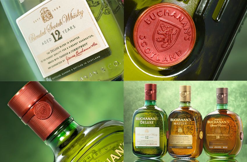
Buchanan’s Scotch Honest Tea California Olive Ranch PERDUE® SHORT CUTS®
Whisky Olive Oil
HONORABLE MENTIONS
CHEEZ-IT Black Ink Red Wine
Copyright © 2017 The Nielsen Company 4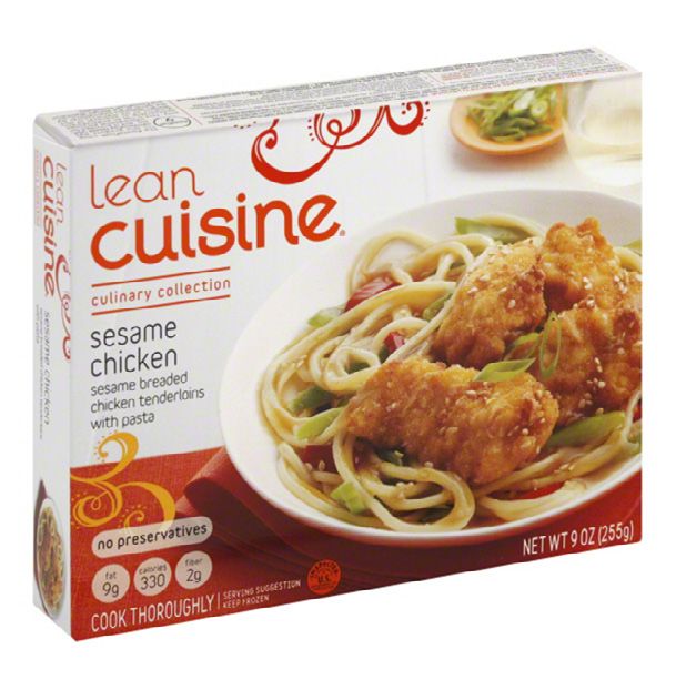
IN WINNERS’ OWN
 WORDS: STORIES
 OF EPIC DESIGN
 SUCCESS

5Copyright © 2017 The Nielsen Company   5
GRAND PRIZE WINNER

                        LEAN CUISINE MARKETPLACE
                        How one brand’s new design revived an entire category

                                          BEFORE                                                    AFTER

                         The early 2010s marked the beginning of the “fresh Renaissance” for American consumers.
                         Veggies were suddenly in vogue; “fresh, never frozen” claims on meat packaging became
                         veritable consumer magnets; and convenient “grab and go” salads were godsends for health-
                         conscious shoppers on busy days. To put it another way, the frozen aisle was beginning to
                         look a little deserted.

                         From 2013 to 2015, unit sales in the frozen entrée category declined 7%. As a major player
                         in the category, Lean Cuisine suffered a significant blow. “The brand had been declining for a
                         few years; we’d lost hundreds of millions of dollars and a significant chunk of market share.
                         Consumers thought about frozen food as very processed—not very healthy or tasty compared
                         to fresher options. Additionally, Lean Cuisine was known as a ‘diet’ brand, an association
                         which had fallen out of favor with consumers,” explained Daniel Jhung, vice president of
                         marketing at Nestlé USA.

                              “WE KNEW THAT IF WE WANTED TO MAKE A REAL
                              STATEMENT, PACKAGING WOULD BE THE MOST
                              EFFECTIVE MEDIUM.”
                              DANIEL JHUNG, VICE PRESIDENT OF MARKETING AT NESTLÉ USA

                         In an attempt to pivot away from this ‘diet’ association, the brand had attempted two
                         relaunches in previous years, but the execution was too subtle to make a lasting impression
                         on consumers. “We knew that if we wanted to make a real statement, packaging would be the
                         most effective medium. We could convey the new positioning through TV, but not everyone
                         sees a TV spot, especially in this day of media fragmentation. Everyone sees the packaging
                         though,” said Jhung.

Copyright © 2017 The Nielsen Company                                                                                      6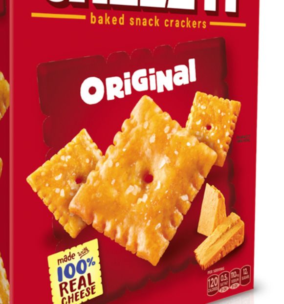
“The other reality is that, if your brand has lost hundreds of millions of dollars, you’re not going to have
            the same marketing budget that you did four or five years before. My budget was about half of what
            it used to be so, in my mind, packaging was probably the number one touchpoint over TV, digital, and
            everything else we were doing,” he continued.

            The brand was in a free-fall, and the team had significantly fewer resources with which to turn things
            around, but there was a silver lining: “Because of the state of the business, we were able to really
            tear down the brand completely and build it back up again, one piece at a time. Everything was very
            thoughtfully researched and executed—I don’t see that with every redesign,” said Debbie Bester, design
            manager at Nestlé, who led the project.

            From a pool of eight design agencies, the brand team selected Pearlfisher as its partner. “Prior to
            bringing us in, Lean Cuisine had done a lot of testing about how consumers perceived the brand—it’s a
            very large, complex portfolio, the architecture didn’t make any sense, and consumers just didn’t know
            what Lean Cuisine stood for anymore,” recalled Hamish Campbell, creative director at Pearlfisher’s New
            York office. “The first thing we did was to put in place a strong strategic foundation for the brand. We did
            an intensive immersion over a couple of days, working with Nestlé’s internal chefs and our own Futures
            team to understand the types of food and where food trends are going. We quickly realized that not only
            did we need to change people’s perceptions of the brand, we needed to change their perceptions of the
            entire category,” he continued.

            In these immersive sessions, the concept of “food moods” emerged as one way to segment the portfolio
            and create meaning for consumers. The team eventually defined four moods, planning to
            provide each one of them with a distinct visual identity. They were:

            •    Marketplace: modern, restaurant-quality recipes made with trendy ingredients

            •    Comfort: familiar, go-to meals that deliver savory flavors and desirable benefits

            •    Favorites: classic and simple dishes

            •    Craveables: delicious bar-food made to satisfy a craving without overindulging

            “At the time, Lean Cuisine packaging had a white background with orange typography, and
            everything was very plug-and-play—there was no difference between the varieties and no
            relation to culture and how we live life. The new visual architecture made consumers feel
            that Lean Cuisine understood their world. ‘They know that I’m rushing to pick up the kids
            from football practice or violin lessons. They know I need to get food on the table, and
            they’re making my life easier for me,’” explained Campbell.

            Ultimately, Pearlfisher presented three different design routes to the brand team based
            on the “food mood” segmentation, ranging from relatively safe to bold. Consumer testing
            affirmed the team’s hunch: the design representing the biggest, most dramatic departure
            from the category—and the one that represented the greatest pivot away from “diet”
            food—was the clear winner.

            “Often brands have an equity—a color or some other visual element—that they feel is a
            sacred cow. Lean Cuisine had used a white box for more than 30 years with orange as a
            secondary color. Many brands would think you can’t walk away from that. In the case of
            Lean Cuisine, it was a hard pill for some stakeholders to swallow,” recalled Jhung.

Copyright © 2017 The Nielsen Company                                                                                       7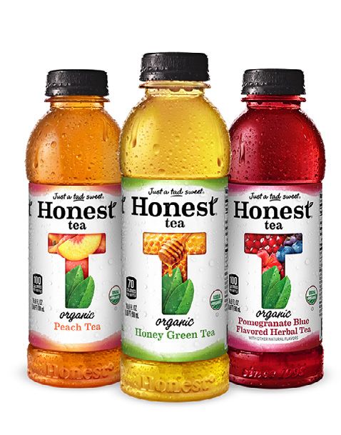
Nevertheless, Pearlfisher succeeded in convincing the brand team that, while the white box was an
            equity, it had become a negative one; as a frozen brand, Lean Cuisine needed to warm up its packaging.

            “If you just completely throw out all your equities, yes, you’re going to have a dramatic failure. However,
            identifying and building on your foundation can give you more freedom in the areas where you’re failing.
            In the case of Lean Cuisine, going from a white box to a black box was one of the most dramatic changes
            we could make, but we did it in a way that took their core consumers along on the journey and helped
            them to discover SKUs that had always been in their portfolio but had previously failed to be noticed
            because they looked too much like everything else. Ultimately, if we’re working on a declining brand
            and doing something that everyone’s comfortable with, we’re probably not pushing hard enough,” said
            Campbell.

            In addition to the new color scheme and brand architecture, the food photography played a critical role
            in differentiating Lean Cuisine from competitors and increasing appetite appeal. “We needed the box to
            look so appetizing that people felt compelled to eat the packaging,” remarked Jhung.

            “With the photography, we tried to break category conventions. All the existing offerings in the frozen
            aisle had the food styled perfectly on a white plate. For the Marketplace line, we did away with plates;
            the food sits directly on a black restaurant slate—which reminds consumers of a chalkboard where daily
            specials are written—and it looks much more authentic and less staged, like a real chef would make
            it. Each image was true to the mood we were shooting for, right down to the last detail—including the
            textiles, utensils, ingredients placed off to the side, and so on,” explained Bester.

            Lean Cuisine’s bold attempts to change category perceptions attracted an unusual amount of attention
            from their retail partners. “It wasn’t just Lean Cuisine that was declining—it was the entire category, and
            retailers were eager to find a way to turn things around. In addition to competition from other areas
            of the store, frozen was losing share to out-of-home options such as healthier quick-serve restaurants.
            A lot of those category dollars were walking out of the store, and that really concerned retailers,” said
            Jhung.

                  “WE EVEN HAD RETAILERS COME TO OUR PACKAGING
                  FOCUS GROUPS JUST TO HEAR WHAT CONSUMERS WERE
                  SAYING.”
                  DANIEL JHUNG, VICE PRESIDENT OF MARKETING AT NESTLÉ USA

            “We had a strong partnership based on our great shopper and consumer insights, and even had retailers
            come to our packaging focus groups just to hear what consumers were saying. They changed aspects
            of their shelf architecture to match up where they were going with our ‘food moods,’ and aligned their
            reset windows with our launch timing. Additionally, we launched a lot of new SKUs at the same time, and
            retailers took all of them. Bringing that volume back to the store and making those frozen doors—which
            are fixed assets for retailers—productive again was huge for them,” added Jhung.

            Lean Cuisine launched its new packaging in April 2015. The brand’s dollar volume went from a decline of
            -16.9% in the year prior to the re-launch to an increase of +3.7% in the following year. The Lean Cuisine

Copyright © 2017 The Nielsen Company                                                                                      8
Marketplace line alone generated an extra $58 million in retail sales during the year after the new design
            was launched. According to Nielsen research, 73% of consumers indicated that they would purchase
            the new design over the old one—making it the most preferred redesign in Nielsen’s Design Impact
            Award analysis. Additionally, 78% of consumers felt that the new design successfully addressed the key
            strategic objective: to position Lean Cuisine as a modern health and wellness partner, rather than a
            “diet” brand. The brand’s performance drove an incredible turnaround for the frozen nutritional meals
            category overall, reversing a declining sales trend of -9.9% in the year prior to re-launch to a near-stable
            -1.3% in the year following.2

                  “I THINK THE NEW DESIGN WAS LIKELY THE NUMBER ONE
                  REASON THAT THE BRAND WAS ABLE TO TURN ITSELF
                  AROUND; IT CHANGED THE BRAND’S EQUITY AND ITS
                  FORTUNE.”
                  DANIEL JHUNG, VICE PRESIDENT OF MARKETING AT NESTLÉ USA

            “I knew the packaging was responsible for turning things around because there were three months
            where we only had the packaging on shelf—we had no TV or digital advertising during that time, and
            we started to see a significant lift in volume. Then the marketing we did afterwards really supported the
            packaging. I think the new design was likely the number one reason that the brand was able to turn itself
            around; it changed the brand’s equity and its fortune,” reflected Jhung.

Copyright © 2017 The Nielsen Company                                                                                       9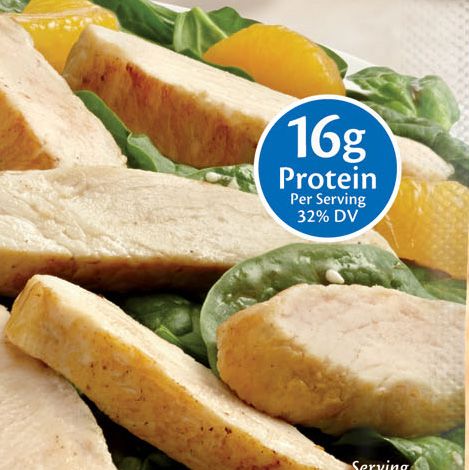
WINNER

                         BUCHANAN’S SCOTCH WHISKY
                         Bringing an iconic brand into the 21st century

                                             BEFORE                                                          AFTER

                         Truly timeless brands are rare—but truly timeless packaging is a virtual impossibility.
                         “Buchanan’s had been a celebrated part of people’s lives for a long time, but one generation
                         doesn’t want exactly what the previous generation did—and this is especially true with the
                         younger generation today,” explained James Hernandez, global brand director for Buchanan’s
                         at Diageo. By 2013, the iconic whisky brand had been sporting the same package design for
                         more than 20 years. Not surprisingly, it had begun to feel a little dated when compared to
                         other premium competitors.

                         “Some consumers would say, ‘it’s a great brand, but it’s not for me.’ Well, why is that? We kept
                         digging and, of course, we discovered that there was some dust. It was starting to be seen as
                         ‘my father’s whisky,’ ‘a little bit dated,’ ‘a little bit classic,’” explained Hernandez.

                         To win over the up-and-coming generation of consumers—who are notoriously aspirational
                         and increasingly choosy—the brand needed a fresher look. However, the team made an
                         important distinction: “We decided to make it up-to-date and modern, but not younger. The
                         idea was to stay true to the roots while fully entering the 21st century.”

                              “WE NEEDED TO TAKE A BIGGER CHANCE, OR WE
                              WOULD’VE BEEN BACK IN THE SAME POSITION IN A FEW
                              YEARS’ TIME.”
                              JAMES HERNANDEZ, GLOBAL BRAND DIRECTOR FOR BUCHANAN’S AT DIAGEO

                         Additionally, the brand team had also observed a trend toward premiumization in the whisky
                         category. The Buchanan’s name possessed the quality and credibility to capitalize on the
                         trend—they simply needed a package that would further elevate premium perceptions, ideally
                         justifying a slight price increase.

Copyright © 2017 The Nielsen Company                                                                                        10
With these objectives in mind, the Buchanan’s team engaged forceMAJEURE, a New York-based design
studio, as their agency partner. “When initiatives end well, it’s often because they start well,” mused
Laurent Hainaut, CEO at forceMAJEURE. “My entire team was invited to join Buchanan’s cross-functional
team in Scotland for deep-dive meetings. We visited the Dalwhinnie distillery, the archives and the
bottling facility—we understood things from a branding perspective, a structural design perspective, a
consumer perspective, and so on. There was an incredible openness from the Buchanan’s team to share
all relevant information up-front,” he recalled.
This in-depth briefing enabled the forceMAJEURE team to navigate a delicate and incredibly complex
problem: how to modernize an iconic brand without alienating it from its heritage—or its current buyers.
“We hadn’t done anything to the Buchanan’s packaging in nearly 25 years. There’s only so close you can
stay to what you are now if you want to be able to live with the result for another 20 years. We needed
to take a bigger chance, or we would’ve been back in the same position in a few years’ time. So we told
Laurent and his team that we wanted the design to be all new and different, but not to touch anything
critical. Basically, we were asking for a hot ice cream,” said Hernandez.
“To find the right balance, we crossed the information we got from consumers and the information from
the brand’s rich history, and tried to reconcile those. We said, ‘This element is important because it’s
doing this and that at the consumer level, but it’s also true to the brand’s history—we can develop that
story further. If something wasn’t serving both the consumer and the brand’s authenticity, then it wasn’t
important,” explained Hainaut.
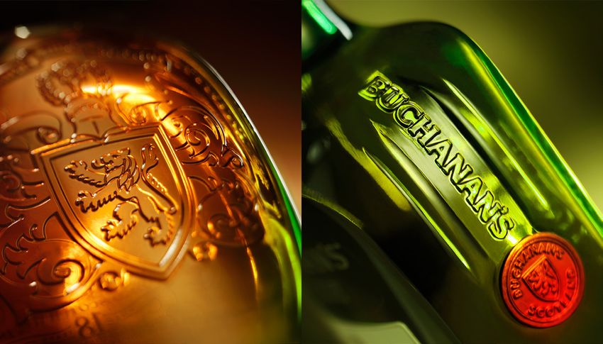
Through this process, the team identified four key visual assets that were integral to the brand, then
worked to modernize their execution.
• The original label took its inspiration from the legal contract naming James Buchanan as whisky
supplier to the House of Lords; it reflected Buchanan’s confidence in his product quality and his
commitment to the consumer. The new label
continued to feature Buchanan’s signature,
but was modified to appear cleaner and
more modern, with updated typography.
• The canteen-shaped bottle, reminiscent of
World War I water canteens, symbolized
sharing. The new design preserved the
overall shape, but adopted a smoother, more
rounded bottle.
• The James Buchanan seals on the sides
of the bottle communicated quality and
authenticity. The new seals were refined and
adorned with ribbon—both of which were embossed into the glass itself.
• The color green evoked lush Scottish landscapes and strengthened the connection to the brand’s
heritage. For the new design, variants were still distinguished by glass color, but the glass was
infused with a tinge of green to bring this element into the Deluxe Master Blend and Special Reserve
designs.
Copyright © 2017 The Nielsen Company 11In narrowing down the potential design routes, the brand made a point of collecting feedback from
consumers who were light users, reasoning that this audience would drive the greatest incremental
growth. “When we started seeing that the design was particularly attractive to light users, we decided to
take a gamble with our regular consumers—we wanted to focus on bringing new buyers into the brand,”
said Hernandez.
After seven months, the team had completed the bulk of the design work. However, bringing their
rendering to life required months of additional work, including developing outer packaging and a
counterfeit-proof cap, as well as working closely with the supply and production teams to perfect the
result. Eventually, in October 2015, the new Buchanan’s packaging launched.
“THE PACKAGE WAS THE CENTERPIECE—AND PRACTICALLY
THE ONLY PIECE—OF OUR TV ADVERTISEMENT.”
JAMES HERNANDEZ, GLOBAL BRAND DIRECTOR FOR BUCHANAN’S AT DIAGEO
After more than two decades without a packaging change, Buchanan’s new look demanded a total 360
media campaign. Advertisements showed off the modernized packaging while reassuring consumers
that the product itself was still the same Buchanan’s they loved. “The package was the centerpiece—
and practically the only piece—of our TV advertisement for Buchanan’s. It was very similar to a car
commercial that shows you the beautiful wide shot and then takes you through all the little details. From
beginning to end, our ad was focused on the bottle. It not only helped us to present the new design, but
it actually strengthened core brand perceptions,” said Hernandez.
In the United States, the Buchanan’s brand
experienced a 9% growth in dollar sales in
the year after the redesign. The packaging
fared extremely well in Buchanan’s other
markets as well—including Mexico, Colombia
and Central America—bringing the average
value growth across markets to 20%. “The
recruitment figures were strong in all
markets, and this trend is still continuing
today. We were expecting this launch to
fare well, but I don’t think anyone expected
the level of impact it has made,” concluded
Hernandez.
Copyright © 2017 The Nielsen Company 12WINNER
HONEST TEA
Bringing a beloved brand into the big leagues
BEFORE AFTER
In 2011, Coca-Cola acquired Honest Tea—a small, but rapidly growing brand. Like many
ambitious companies who’ve attracted high-powered benefactors, Honest Tea began to ask
itself: “So, how do we become a billion-dollar brand?”
It was around this time that Ami Mathur, currently general manager and head of marketing,
joined Honest Tea. To scale the brand, she knew that it would need to win over mass-market
audiences. Honest Tea had fared very well at Whole Foods Market and was growing in
mainstream grocery stores, but the team knew it had the potential to grow faster. “Initially,
Honest Tea had been focused on highly engaged, health-conscious consumers—the people
who read labels and prefer the cleanest ingredients. While this segment was important, we
needed to expand to ‘first steppers’: consumers who care about what they’re eating and
drinking, and want to be a little bit healthier—but not to the extent of our core buyers at the
time. Balance was key,” said Mathur.
“MOST OF US KNOW HOW MUCH A GREAT PACKAGE
CAN ACTUALLY IMPACT YOUR SALES, BUT NO ONE
USUALLY PUTS A NUMBER TO IT.”
AMI MATHUR, GENERAL MANAGER & HEAD OF MARKETING AT HONEST TEA
“From our initial research, we knew that our value proposition wasn’t resonating with these
audiences. Honest Tea wasn’t viewed as delicious, which is a problem in a category where
taste is absolutely the most important factor. The fact that it’s organic, while important,
wasn’t the driving force for mainstream consumers. Additionally, from a shelf standpoint, the
packaging didn’t really pop or persuade consumers to choose Honest Tea over competitors,”
explained Mathur.
Copyright © 2017 The Nielsen Company 13Despite Coca-Cola’s investment, Honest Tea was still relatively small with a proportionately-sized
marketing budget. “We knew that there was an opportunity to broaden the ‘reach me’ appeal of Honest
Tea, and my CPG experience told me that, when you have very few media dollars to spend, packaging
can be the main way to drive awareness and stopping power. Most of us know how much a great
package can actually impact your sales, but no one usually puts a number to it,” said Mathur.
The team agreed to move forward with a package redesign, and assembled a clear brief that focused
on four goals: appeal to a mass consumer audience, improve visibility on shelf, better differentiate from
competitors, and create a stronger linkage to the brand’s core values and benefits.
“I think the briefing is probably the most important stage of the
design process. If we’re not clear on the communication objectives
and success criteria, there’s no way to judge if we’ve reached our
goals—it just becomes too subjective,” said Mathur.
As the agency that worked on the project, Beardwood&Co
confirmed Mathur’s sentiment. “Even the initial RFP document
that we received was crystal clear on the consumer situation and
what it would take to grow the brand. Our team was invited down
to Atlanta for a day-long session with a large group of people who
were going to be involved in dramatically growing the brand. It
wasn’t a half-hour meeting or just something done over the phone.
There was definitely a sense that this was a big deal and that we
were in it together,” recalled Julia Beardwood, founding partner at
Beardwood&Co.
Beardwood&Co, a strong believer in the power of a clear, informed creative brief, uses a visual tool to
encourage clarity and alignment at the start of a project. “Once the client provides us with a written
brief, we bring together a large set of images and do a sorting exercise with the team. For this project,
we said, ‘Alright, we’re saying it needs to convey tasty, but what tasty is Honest Tea tasty? We’re saying
approachable. What kinds of approachability are we talking about for Honest Tea?’ This process helps
the designers better understand what’s on-brand and what’s not,” explained Beardwood.
Beardwood&Co came up with eight initial design directions, ranging from close-in options to more
dramatic departures from the current packaging. “One of the things that I’ve learned is that, if you’re
launching a new product or if your existing product isn’t working well, then you have a lot more creative
leeway when designing your pack. When your product is actually performing well and you want to keep
your users, there’s only a certain level of change that you want to make. You need to ensure that your
product is still findable and reflective of your current brand,” said Mathur.
“I REMEMBER WHICH DESIGN WAS MY FAVORITE BECAUSE
IT DIDN’T WIN! I THOUGHT, ‘YES, LESSON LEARNED. THIS
IS WHY WE DO RESEARCH.’”
AMI MATHUR, GENERAL MANAGER & HEAD OF MARKETING AT HONEST TEA
Copyright © 2017 The Nielsen Company 14“We ended up taking four designs into consumer testing, including qualitative research and virtual
shelf testing. The ones that we ended up testing represented a fairly broad range. We played around
with the background color, the amount of ingredients, which fruits were shown on the label, and the
overall simplicity of the label. I felt like having a pretty wide range ensured that the process would yield
something good.”
“I remember which design was my favorite because it didn’t win! I thought, ‘Yes, lesson learned. This is
why we do research.’ We learned through the testing—and we should have known this going in—that, if
our number one communication objective is to convey ‘tasty’ and ‘delicious,’
we need to select the design that delivers the best on those attributes,”
added Mathur.
“In the end, we conducted quantitative consumer research on a few
designs. We wanted to ensure that the design we landed on wasn’t just a
win based on qualitative feedback or internal consensus. We wanted the
numbers to prove we’d chosen correctly—because, in reality, that’s what’s actually
going to drive your sales. So, based off of that research, we chose the final design.
There was some minor stakeholder feedback, but we refused to give in on the
construct of the design—the label, the colored banding and the ‘T.’ Miraculously, after
our testing was done, the numbers were so strong that we were able to get everyone
on board,” said Mathur.
The chosen design included a few significant changes: a taller, narrower bottle to
bolster premium perceptions and drive shelf stand-out; a friendlier logo font with a
leaf icon and additional leaf imagery in the “T” to reinforce real tea ingredients; an
elongated “T” to make the packaging more iconic and recognizable at shelf; delicious ingredient imagery
inside the “T” to drive taste appeal; and colored bands at the top and bottom of the label to reinforce
flavor appeal. The textual communication was also simplified so that “Organic” and “Just a Tad Sweet”
stood out.
In March 2015, the new design launched. “The results were phenomenal. They blew our expectations
out of the water. I think the impressive thing is that we grew distribution as well as velocity. We were
doing better, and I attribute much of that to the packaging because there wasn’t a significantly increased
media investment,” explained Mathur.
THE BRAND’S INCREMENTAL SALES FOLLOWING THE
REDESIGN EXCEEDED THOSE ACHIEVED IN 2008 WHEN
COCA-COLA FIRST INVESTED IN HONEST TEA.
“The amount of positive comments from consumers was really impressive as well—they wrote to say, ‘It
looks great—I can’t wait to drink it,’ ‘It’s so refreshing,’ ‘It makes me feel like it’s clean, and I can trust it,’”
added Mathur. The Nielsen Design Impact Award analysis confirmed a spike in consumer preference for
the new design, with nearly two out of three consumers preferring the updated package to the old one.
The year following the redesign, Honest Tea’s dollar sales grew by 64%. The brand’s incremental sales
exceeded those achieved in 2008 when Coca-Cola first invested in Honest Tea. “I think that’s just amazing
for this brand,” said Mathur.
Copyright © 2017 The Nielsen Company 15WINNER
CALIFORNIA OLIVE RANCH
OLIVE OIL
A modern design puts the “grow” in homegrown
BEFORE AFTER
Inspired by the spirit of the California wine movement, California Olive Ranch began creating
premium, domestically-produced olive oil in 1998. Eventually, it climbed the ranks to become
the top-selling U.S. brand that is actually manufactured in America.3 By 2014, the company
had undoubtedly come a long way; California Olive Ranch products could be found on the
store shelves of major retailers where they generated tens of millions of dollars per year—but
their packaging had yet to catch up.
“Consumers would tell us that our packaging still looked like it was from 1998, so we definitely
needed some updating in terms of style,” said Grace Rusch, marketing manager at California
Olive Ranch. “From consumer emails and social media posts, we also realized that some
people were confused about key messages that we wanted to get across. The main one was
that our product is grown and crafted in California. The second one is that we’re a vertically-
integrated company that uses sustainable farming practices—we develop the product from
the ground up, and we have a strong connection to the land and to family farmers throughout
California. Relatedly, we wanted to make it clear that this is premium, extra virgin olive oil,”
she continued.
The brand had already grown tremendously by 2014 with no signs of slowing down. At that
point, the team knew they wanted to refresh the brand’s look and feel—and what better time
than the present?
“As we continued to gain new distribution, we thought it was a great time to ensure that we
were being represented by a package and a logo that set us up for success. We did a survey of
brand recognition—and while we’re certainly not Nike or Apple by any means—people were
beginning to recognize our brand, and this seemed like a perfect window of opportunity to
Copyright © 2017 The Nielsen Company 16update the look and feel of the package without losing the momentum we had created,” explained
Rusch. She noted that a packaging change would also unify the brand’s current varieties and product
lines, paving the way for future additions.
“THIS SEEMED LIKE A PERFECT WINDOW OF OPPORTUNITY
TO UPDATE THE LOOK AND FEEL OF THE PACKAGING
WITHOUT LOSING THE MOMENTUM WE HAD CREATED.”
GRACE RUSCH, MARKETING MANAGER AT CALIFORNIA OLIVE RANCH
“First, we did some shelf research to understand the competitive landscape. What colors and bottle
shapes were our competitors using? What are their key messaging points? We saw that we were already
standing out against competitors because our color scheme was pretty different. This gave us the sense
that we didn’t want a radical departure from our current packaging,” said Rusch.
The team engaged Design Womb, a Chicago-based creative agency, as their partner to develop several
options for their new packaging. “The most interesting and challenging part of the project was putting
a fresh take on their brand assets without compromising their core equities—quality, passion and
sustainability—or alienating their current buyers. There’s a fine line between taking things too far and
not taking them far enough,” said Nicole LaFave, principal, designer and creative director at Design
Womb.
Ultimately, Design Womb explored various design directions while staying true to the brand’s objectives
and key messages. “It can be challenging to show one concept we feel is our ultimate recommendation
for a project. Someone might not be as visually well-equipped as we are as designers, and to have them
feel really good about a solution, they often need to see something that isn’t quite right to know what is,”
said LaFave.
“However, showing too many directions can be problematic in certain situations. Typically, I might aim
to show clients one design—and up to three at most—for a packaging project. I do this because, if
someone isn’t particularly visual or doesn’t have a strong marketing team behind them that can test
things, they can get too tied to something that a friend or coworker said, and the process becomes very
biased. On the other hand, if I think that my client can be more objective and a more organic part of the
process, I might share initial ideas and concepts earlier so that they can be a more integrated part of the
creative process,” she continued.
As part of the creative exploration process, LaFave and the brand team carefully considered which
elements they wanted to push and which they shouldn’t. They discovered that a few of the existing
assets worked well for the brand—namely, the blue sky and green landscape, the green square bottle,
and the olive-shaped grips on the bottle.
For the elements that weren’t resonating as well with consumers, the team explored a number of new
configurations. “We played with color, label shape, typography, logo, and the style of the rancher image.
We knew we wanted to keep the rancher, but the older artwork was overly-detailed, and the man felt
Copyright © 2017 The Nielsen Company 17far away and a little abstract. Eventually, we landed on something that was modern and geometric, but
didn’t make it difficult to discern what the image was showing,” explained LaFave.
“The original artwork was themed after Atlas holding up the world,
but some people interpreted it as the olive actually being a weight on
the rancher. We wanted to reimagine his relationship to the olive, and
show how much care and passion goes into the farming of the olives,
then suggest how that travels down into the actual production of the
product,” added Rusch.
The team also focused on strengthening the “California” equity of the
brand. “A key insight from our initial consumer research was that,
although we clearly stated ‘California’ on our packaging, it still wasn’t
coming across clearly to the consumer because the design didn’t really
say ‘California,’” said Rusch. To remedy this, the agency chose a modern,
easy-to-read font and changed the fields in the original illustration to be
more representative of the hilly, Northern California landscape.
Next, the agency developed a visual language to differentiate flavor
variants and product lines within the portfolio. To set California
Olive Ranch’s more premium “Reserve Collection” line apart from its
“Everyday” line, Design Womb employed a secondary color palette and
special effects such as a gold foil, metallic ink, embossing, and premium
papers.
To arrive at a final decision, the brand team collected feedback from colleagues, as well as from
consumers. “We definitely did some in-store testing, especially on the Reserve Collection line, because
our marketing team was divided on two different design routes for that line. Getting the consumer
perspective was very helpful and served as a tie-breaker,” recalled Rusch. “That line had less distribution
than the Everyday line, and I really wanted a departure from the old Reserve Collection design—I wanted
to see how far we could take it. The consumer research was clear that the farther-out design was still
recognizable and conveyed the right brand equities, but consumers really preferred the one that was
closer-in. We made some minor adjustments to that initial design, but we stayed true to what consumers
were telling us,” she added.
“THESE DESIGN DECISIONS AFFECT WHAT CONSUMERS
NOTICE IN A STORE AND ULTIMATELY WHAT THEY BUY.”
NICOLE LAFAVE, PRINCIPAL, DESIGNER AND CREATIVE DIRECTOR AT DESIGN WOMB
Reflecting on the importance of consumer response, LaFave commented: “Many designers want to
make something amazing, but then they just don’t understand that it still needs to sell in the store. I
used to design women’s luxury shoes from start to finish, and I saw the whole spectrum from design to
commercialization. I learned that these design decisions affect what consumers notice in a store and
ultimately what they buy—and some companies have to learn that the hard way. To junior designers, I
sometimes find myself saying, ‘This drawing looks beautiful, but is it going to work in that situation? Is
Copyright © 2017 The Nielsen Company 18this going to be too similar to everything else on the shelf with it? Is there a reason it should be different
or similar?’”
Not surprisingly, LaFave routinely takes her test designs to the shelf so she can understand how the
actual retail environment might affect their standout potential or differentiation in key areas. “When I
was initially working on the design, I spent time at Target, Whole Foods Market, Costco—lots of places—
just thinking about how the design would actually be viewed there. When we were at the stage of
reviewing different design concepts, I would print it out and see how it looked on shelf,” recalled LaFave.
After conducting multiple shelf tests, the team selected the final design route and moved forward with
confidence. “Once the decision was made, it was very clear that was where we were headed. One of the
benefits of consumer research is that it helps drive consensus on the right direction,” said Rusch.
In January 2016, the new design launched, not only performing well with consumers, but also with
retailers. “The Reserve Collection definitely received more interest from retailers because it was a more
effective package than we’d had before. The Everyday line was already well-distributed, but we had
launched two new varieties to that line prior to the redesign—‘Mild and Buttery’ and ‘Rich and Robust’—
and I think the packaging helped gain distribution for those items because we had a more unified family
feel,” explained Rusch.
IN THE ABSENCE OF MASS MARKETING MUSCLE,
CALIFORNIA OLIVE RANCH'S DOLLAR SALES GREW 54%.
Following the redesign, the brand relied primarily on the new packaging to drive incremental awareness
and trial. “In terms of marketing support, we promoted the new packaging on our social media accounts,
and we worked with a handful of food bloggers who are our brand ambassadors. We sent them the
product so there was some imagery of the new packaging on influencers’ social media accounts, but
that’s pretty much it,” said Rusch.
Remarkably, in the absence of mass marketing muscle, California Olive Ranch’s dollar sales grew 54%—a
difference of nearly $15 million—in the year following the redesign compared to the year before. This
reflects more than a 40% increase in market share from 2015 to 2016.
“Consumer feedback has been overwhelmingly positive. I think this was a fairly bold change that has
cemented a great new direction for the brand. We’ve just had an amazing response,” concluded Rusch.
Copyright © 2017 The Nielsen Company 19WINNER
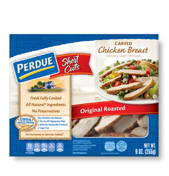
PERDUE® SHORT CUTS®
How a new package form put one brand back on top
BEFORE AFTER
In 1994, Perdue introduced Perdue Short Cuts—strips of fully cooked chicken breast—to the
refrigerated aisle, creating a new category of meal ingredients. Despite a steady stream of
competitive launches over the years, Perdue remained the category frontrunner for nearly
two decades. However, around 2012, Perdue began losing 3-4% market share per year—and
eventually lost its first-place standing too.
“After two years of declining sales, we really started questioning what was going on in
the category. Was our product still delivering on consumers’ needs? Through consumer
research, we discovered that our buyers were satisfied with the product quality and taste.
Our weakness was our packaging—consumers felt it wasn’t as convenient or easy-to-open
as they would’ve liked. They also viewed the product as over-packaged; it was bulky, and it
took up precious real estate in their refrigerators,” explained Gail McWilliam, vice president of
marketing at Perdue.
In addition to wanting to delight its current buyers, the brand had aspirations to reach new
consumers. “Through focus groups, we discovered that the current packaging was inhibiting
us from attracting new buyers. To do that, we needed our package claims—such as the high
protein content—to be stronger,” said McWilliam. Moreover, although Perdue Short Cuts
carved breast strips was the only brand that offered resealable packaging at the time, non-
buyers weren’t aware of this benefit. The resealable bag was obscured by the outer box, and
the visual design did little to communicate this feature.
While a package update seemed like the obvious solution, the team still needed to ensure the
rest of the organization was on board. “Any time you’re making a package structure change,
it’s considered risky. It required our operations team to really get behind the idea—we needed
them to streamline the process to ensure we wouldn’t be adding costs. First and foremost, we
wanted to meet the consumer need, but we needed to show that there was greater reward
than there was risk. The consumer research we had done also played a big role in making
all stakeholders comfortable with what was perceived to be a dramatic change in format,”
explained McWilliam.
Copyright © 2017 The Nielsen Company 20Once the team secured the green light, they engaged an agency partner to develop
a range of packaging options. “We took five different packages into quantitative
consumer testing, both online and in-store. There were different form options—
we looked at trays where you can peel and reseal the top, we looked at the
tub form used for lunch meats, along with some other configurations. What
we found was that these forms weren’t as convenient as the bag because they
took up too much space in the refrigerator, a big issue since many consumers
were storing the product in a meat drawer,” explained McWilliam.
“Reflecting back on the research, the online eye-tracking studies that we conducted
with consumers were probably the most valuable piece. In addition to overall standout
performance, we were able to really understand what consumers were noticing first on our
package compared to what they were noticing first on key competitors’ designs. That allowed us to
ensure our changes would naturally draw consumers’ eyes to the information that was important when
making purchase decisions,” she continued.
Based on these findings, the team confirmed that there were three key areas for improvement: package
structure, claims, and improving the appetite appeal of the product. “Resealability was the number one
advantage that we had, and we needed to play it up. For the new package, we called out the high protein
content and the fact that we offered more product than competitors to enhance price-value perceptions.
We also emphasized the product’s taste and texture—we really focused in on that product shot, but we
also enhanced the transparent window so consumers could appreciate the product quality. The older
package had a window, but the contents were hidden behind a glossy bag and you had to shake the box
to see the product, so the new design brought it to the forefront,” said McWilliam.
Leveraging their consumer research, Perdue’s sales team was able to protect their distribution and
shelf position by demonstrating to retailers that the new Perdue Short Cuts packaging could grow the
category. In 2014, the new package hit store shelves.
“OUR YEAR-OVER-YEAR DOLLAR SALES INCREASED BY 20%.
WITHIN FOUR TO SIX MONTHS, WE HAD RECLAIMED OUR
CATEGORY LEAD.”
GAIL MCWILLIAM, VICE PRESIDENT OF MARKETING AT PERDUE
Soon after launch, the brand noticed an uptick in sales. “Our panel data showed that we were not only
bringing in more consumers, but our current users were actually increasing the number of packages
they were purchasing, which we attribute to the space-saving benefits of the new package,” explained
McWilliam. The Nielsen Design Impact Award analysis confirmed that the new structure was a hit with
consumers, with nearly three times as many consumers preferring the new package to the old one.
Originally, the team had set a goal to grow the brand by at least 4% in the year following the redesign—
but it quickly became clear that the redesign would dramatically over-deliver. “The results in the first
year were phenomenal; our year-over-year dollar sales increased by 20%. Within four to six months,
we had reclaimed our category lead. The year after that, we continued to see double-digit growth,” said
McWilliam.
Copyright © 2017 The Nielsen Company 21HONORABLE MENTION
CHEEZ-IT
The value of embracing the upside, rather than minimizing the risk
BEFORE AFTER
Every brand manager knows a few cautionary tales of iconic brands who changed their
packaging and suffered catastrophic consequences. As a result, redesigning one’s package is
considered a high-risk move—a Hail Mary reserved for fast-declining brands that badly need
to reboot. But what about making changes to a brand that’s still thriving? That’s a different
story altogether.
By the mid 2010s, CHEEZ-IT had experienced more than 30 consecutive years of growth,
getting closer and closer to becoming a one-billion-dollar brand. Notably, CHEEZ-IT’s
packaging hadn’t seen any major upgrades in approximately three decades. The team would
be barking mad to even consider a packaging change now… wouldn’t they?
“Ever since I joined the company six years ago, I knew I wanted to revamp the CHEEZ-IT line,
both strategically and visually. It’s a great brand and was doing well at the time, but I thought
we could bring it into the 21st century, align the packaging more with the current consumer,
and broaden our base,” recalled Lisa Einat Day, Design Leader at Kellogg’s. CHEEZ-IT’s core
buyers were families with children, but an updated look would potentially broaden the
brand’s appeal, bringing in more teenagers and adults.
“THERE’S DEFINITELY A FEAR WITH BIG, ICONIC BRANDS
THAT IF YOU BREATHE ON THEM THE WRONG WAY, YOU
COULD BE LOSING MILLIONS OF DOLLARS.”
LISA EINAT DAY, DESIGN LEADER AT KELLOGG’S
Copyright © 2017 The Nielsen Company 22Not surprisingly, Day’s desire to reinvent this iconic brand's visual and package identity was met with
strong resistance. After all, CHEEZ-IT was one of Kellogg’s flagship brands, and leadership wasn’t
particularly disappointed by its performance. “But we can do so much more,” Day had insisted.
“There’s definitely a fear with big, iconic brands that if you breathe on them the wrong way, you could be
losing millions of dollars. It took about two years to convince senior leadership and the brand teams to
consider the idea seriously,” Day recalled.
It wasn’t just Day’s persistence that changed minds. The CHEEZ-IT brand had recently launched other
highly successful innovations—such as CHEEZ-IT Grooves, which represented a fairly bold departure
from the brand’s traditional look. These launches helped CHEEZ-IT become a billion-dollar brand and
provided the proof-of-concept that Day needed to convince stakeholders that the entire CHEEZ-IT line
could grow through design. “People looked at Grooves’ success and said, ‘Wow, that’s Kellogg’s most
successful innovation ever—yes, we can trust that,’” recalled Day.
“We learned a lot from these other launches, which helped serve as a bridge from where we were as a
brand to where we could go. Once we decided to redesign the entire brand, it was important that we
do it right; we started with a strong brand and design architecture, created a strong innovation pipeline,
updated our brand identity, and ultimately created visual brand guidelines for all channels and media to
use,” said Day.
“We also did a lot of consumer research up-front and throughout the process. We talked to consumers
at the shelf and organized creative workshops in multiple cities to understand what consumers were
buying, their purchase criteria, what they liked and disliked about different brands—including brands
that they did use at the time, as well as those they didn’t. We had them express thoughts about packages
in and out of the category, and sought to understand what the CHEEZ-IT brand could and couldn't
change—both strategically and visually—starting with our brand identity and ultimately ending with the
package. It was also essential to understand what shoppers see when they browse the shelf, so we did
a lot of eye-tracking research before we even began the design process. Lastly, we did a deep-dive into
the category and the competitive context. Visually, what’s happening in the category? What do different
colors mean to consumers? We looked at every angle,” explained Day.
“[THE BROAD CREATIVE EXPLORATION WE DID] SERVED
IN HELPING US TO UNDERSTAND HOW MUCH CHANGE WE
COULD ACTUALLY MAKE.”
LISA EINAT DAY, DESIGN LEADER AT KELLOGG’S
Day engaged her creative team to help define concrete design routes. “In the beginning, we had versions
and versions, but eventually narrowed it down to eight to ten potential design directions. This project
called for broad exploration because there’s always going to be risk when you’re making changes to an
iconic brand, and this degree of exploration served in helping us to understand how much change we
could actually make. We also needed to understand what our competitors were doing in order to help
us better know where we could and couldn't play both strategically and visually,” said Day. For example,
the CHEEZ-IT team knew they didn’t want to change the red color of the box, but was this the right move
Copyright © 2017 The Nielsen Company 23given the category context? If they kept the red, should it be the same red or a
different one?
“So, all of a sudden, the red component becomes a much bigger issue.
You might have two or three designs where the shade of red is the
variable, and another set that focuses on how much food to show on
the package—do you show a serving size or a single cracker?” In other
words, the number of potential design routes increases exponentially as
the number of variants rises. When making significant design changes
to an iconic brand, all of these considerations are important and warrant
exploration.
“For the food imagery, the existing design showed a large number of plain
crackers. That was very fitting for the 50s, 60s and 70s—it showed abundance, and
it symbolized sharing. In today’s marketplace however, given that there are so many different brand
options, we wanted to prioritize simplicity and appetite appeal. In the first moment that our consumers
look at our package we want them to be confronted with a big, yummy cracker,” said
Day.
Day also wanted to bring an emotional component to the brand mark, while
leaving the brand’s iconic block type untouched. She convinced the brand to
replace the hyphen in “CHEEZ-IT” with a small cracker image, which added a
sense of friendliness and approachability. “At first, the brand mark was off-
limits. Then we tested a few versions of it with consumers and found that it didn’t
interfere with the overall brand feel. The research we did was particularly effective in
convincing the brand team—because if they’re not losing anything, then they can only gain, right?” said
Day.
The CHEEZ-IT Team leveraged consumer feedback to further narrow down the design options. Finally, in
2015, the new design launched. In the year following the redesign, dollar sales grew 6% compared to the
year prior—which translates to an increase of more than $50 million in retail sales. With no increase in
media spending, the new package design served as a major growth driver.
“TODAY THE MOST TIME YOU HAVE WITH CONSUMERS—
AND IT’S NOT MORE THAN A FEW SECONDS—IS WHEN
THEY’RE SHOPPING IN THE STORE.”
LISA EINAT DAY, DESIGN LEADER AT KELLOGG’S
“We used to live in a world where advertising was the centerpiece, and from there you would work on
your brand design identity and packaging. However, today the most time you have with consumers—and
it’s not more than a few seconds—is when they’re shopping in the store. It’s essential in today’s world
to have a strong brand and design architecture that all touchpoints work from to create a holistic brand
experience for consumers. This will allow for a much stronger connection with our consumers at the first
Copyright © 2017 The Nielsen Company 24moment of truth—at the shelf—and will also allow our brands to leverage different media in a stronger
way,” said Day.
Reflecting back on the initiative, Day concluded: “For me, the biggest learning was that if you have a
strong strategic vision, a great team, a clear path and a lot of guts, then anything can happen. I didn’t
know what was possible until it was possible—I didn’t really understand how much growth you can
have on a big, already-successful iconic brand until I was part of making it happen. I think others are
beginning to realize it too. At Kellogg’s, other brands are coming out and saying, ‘We want change for
sure.’”
Copyright © 2017 The Nielsen Company 25HONORABLE MENTION
BLACK INK RED WINE
A mainstream makeover leads to massive growth
BEFORE AFTER
In 2014, Guarachi Wine Partners asked itself the weighty, time-honored question, “What’s in a
name?” An enormous growth opportunity, it would soon discover.
“After 30 years in business, the company decided to make a dramatic strategic shift. We
had been known primarily for South American imported wines—we had no mass-market
domestic products at a value price point—and we knew this was a space that we wanted to
play in. We looked at our portfolio to explore different strategies and creative concepts that
would resonate with a mass-market audience. There was a brand called Black Ink: a boutique-
production, high-end Napa Valley cabernet sauvignon. We looked at that intellectual property
and said, ‘Black Ink is a cool name. Why don’t we do something with that?’” recalled Travis
Arnesen, vice president of marketing at Guarachi Wine Partners.
“At the time, Black Ink had a $40 retail price point. It was only distributed in the state of
California, primarily through independent bottle shops. Production was anywhere from 50-
100 cases per year—it was high-end, but very small in terms of overall volume and revenue,”
he explained.
Guarachi Wine Partners decided that the Black Ink name would provide a promising
foundation for their foray into the mass-market, domestic wine segment. They simply needed
an updated product and a label design that would do the moniker justice.
“For the product, we pulled a lot of data and looked at which segments were growing. Red
blends in the $9-12 range were experiencing an uptick in sales, so we decided that was the
place to be,” said Arnesen.
The team began to develop the product and packaging in tandem—but there was something
highly unusual about the arrangement; for most initiatives, the product’s key attributes are
pre-determined and they inform the package design but, in the case of Black Ink, the label
design strongly influenced the development of the wine itself.
Copyright © 2017 The Nielsen Company 26You can also read