Accidental Colour, Performative Colour: Video Art's New Disruptors - Tübingen Open ...
←
→
Page content transcription
If your browser does not render page correctly, please read the page content below

ColourTurn 2020
An Interdisciplinary and International Journal

            VI. Colour in Art & Media

            Accidental Colour, Performative Colour:
            Video Art’s New Disruptors
            Carolyn L. Kane

Abstract
Colour is flippant; unreliable and notoriously difficult to work with. It resists being placed
in a static chart, frame, or dyed into a “colourfast” fabric, giving way to oxidization, fading,
and changing their appearance based on their surroundings. However, in an age of HD
digital video, working with colour – from the perspective of an artist – has never been
more convenient and user friendly. Thus, one may wonder how disruptive colours show
their face today? This article answers this by turning to the work of American video artist
Ryan Trecartin. Trecartin’s fashionable use of digital media, fast-paced editing, belligerent
makeup and costume, and broken dialogue all echo his unforgiving colour juxtapositions
(making him a “grinder and mixer of multicolour drugs,” as Plato put it in reference to
artists in general). This article discusses Trecartin’s work and the way in which it sanctions
the disruptive colours of a newer world of selfies, social media apps, the Internet, and
automated effects plug-ins through three strategies rooted in categorical transgression (in
favour of noise and ambiguity); an aesthetic category I theorize as “accidental colour”; and
a use of whacky stops and pauses – in the tradition of the avant-garde – to incite subject
disorientation and criticality.

DOI: 10.25538/tct.v0i2.825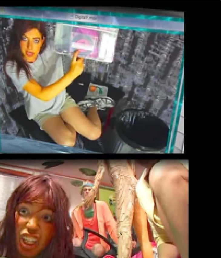
Kane: Accidental Colour, Performative Colour

                                                           I. The Video Colourist
                  Carolyn L. Kane                      Video Art, according to the annals of
                  Associate Professor, Professional
                  Communication
                                                       art and media history, began with the
                  Ryerson University, Toronto          commercialization of the Portapak video
                  carolyn.kane[at]ryerson.ca           camera in 1967. The device was, as its
                                                       name suggests, portable. It was also an
                        affordable, easy-to-use, self-contained analogue video recording
                        system that artists quickly took to. Today such devices can be found
                        on most of our cell phones in high definition colour.
                        Colour is key. For several years after the introduction of the Portapak,
                        video art remained black and white. A precarious kind of inconsistent,
                        analogue video colour became available to artists and consumers in
                        the late 1970s, but still, it was nothing like the crisp kind of digital
                        colour we now expect from all our electronic screens. Circa 2020, one
                        can record HD digital video on their cell phone “in millions of colours”
                        and then edit, distribute and create special effects for it to an even
                        greater capacity. What then is a video artist who seeks to use colour to
                        break social conventions and confront gender and racial stereotypes to
                        do with these crisp, technologically advanced digital colour systems?
                        Elsewhere I have discussed a slew of contemporary artists who have
                        turned to “glitch art.”1 The genre is marked by garish and loud digital
ColourTurn 2020

                        colours, used to stylize a new visual vernacular of digital noise, error
                        and accident. Glitch art emerged through the work of people like John
                        Cates, Rosa Menkman, Takeshi Murata and the net art duo Jodi in the
                        late 1990s and early 2000s and bears strong links to the avant-garde.2
                        For these artists, computer errors, failures and glitches provide the
                        fodder for a new style of art-making that has the potential to break
                        with illusions of technological transparency and efficiency. In this
                        article, I move away from this work to consider digital video colour
                        in contemporary media art as another kind of disruptor. That is, the
                        ways in which automated and easy-to-use digital colour can act still
                        as a destabilizer by overturning cultural symbolism and convention
                        through eccentric, campy colours brought forth in American artist Ryan
                        Trecartin’s video art from the 2000s. Before delving into his work, it is

                        1
                            See Kane, High-Tech Trash
                        2
                            See Kane, “Glitch Art.”

                                                                                                  VI–2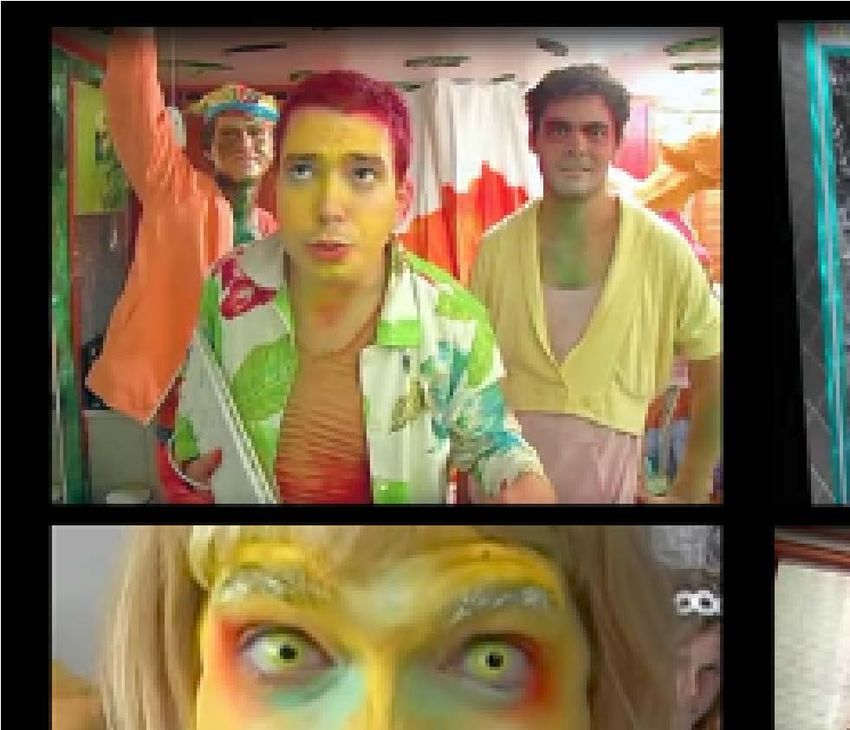
Kane: Accidental Colour, Performative Colour

                  first necessary to establish a set of concepts for understanding colour
                  in relation to design harmony, memory and standardized “taste.”

                  II. Colour as Symbol Versus Colour as Disruptor
                  Colour is intrinsically flippant. This is one reason why it takes so
                  long to stabilize colour in any new technology. Colour is notoriously
                  unreliable and difficult to work with. By nature, colour resists being
                  placed in a static chart, frame, or dyed into a “colourfast” fabrics, giving
                  way to oxidization, fading and changing their appearance based on
                  their surroundings.3 Even the colours of everyday objects in the world
                  are perceived differently by different people. Bauhaus colourist Josef
                  Albers thus explains:

                          If one says “Red” (the name of a colour) and there are 50 people listening,
                          it can be expected that there will be 50 reds in their minds. And one can
                          be sure that all these reds will be very different… When we consider
                          further associations and reactions which are experienced in connection
                          with the colour and the name, probably everyone will diverge again in
                          many different directions.4

                  To make matters worse, colour and memory are also inconsistent. After
                  exposure to a bright red dress, for example, when one later attempts
                  to recall the colour of the dress through memory, it is usually recalled
ColourTurn 2020

                  in a hue darker than it actually was.5 Language and nomenclature
                  also exacerbate colour problems. Ludwig Wittgenstein argued that
                  the English phrase “red-green” denoted a fundamentally insecure
                  relationship between colour and language by invoking a colour reality
                  that could not possibly exist. Colour was, and is, an elusive “language
                  game” where one assumes a colour consistently denotes a hue like
                  “grey-green,” but what this term actually means is “indeterminate and
                  relative to specific contexts and situations.”6
                  And yet, regardless of disparate genres, platforms, or subjective
                  discrepancies, colour media have persisted through long histories
                  and countless attempts to adapt, harness or control them as a stable

                  3
                      See Kane, Chromatic Algorithms, chapter 1.
                  4
                      Albers, Interaction of Colour, 3.
                  5
                      Kane, Chromatic Algorithms, 24.
                  6
                      Wittgenstein, Remarks on Colour, 3.

                                                                                                        VI–3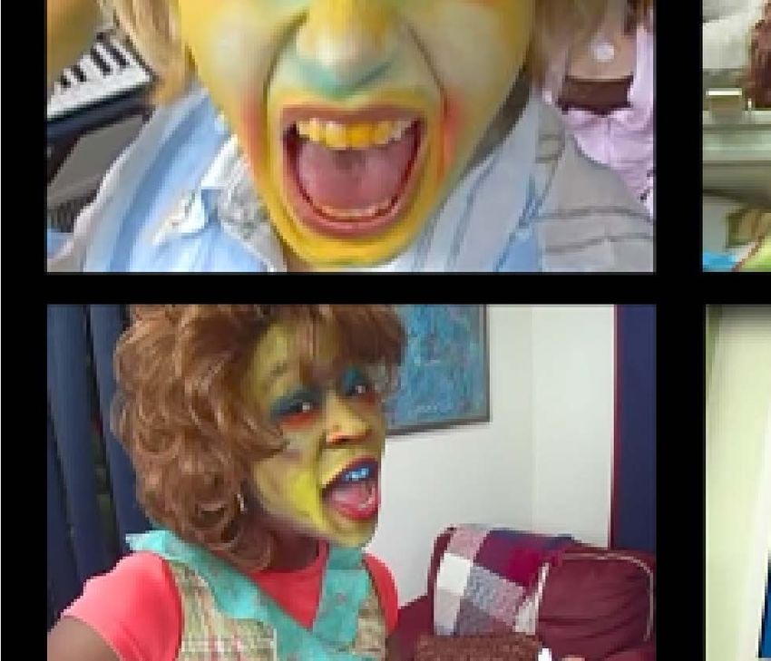
Kane: Accidental Colour, Performative Colour

                  object of inquiry.7 Such efforts inevitably fail because, as noted,
                  colour is always on the move, shifting, transforming, or escaping the
                  rules and protocols that attempt to contain it. In the modern era, a
                  strain of artists, philosophers and scientists gravitated towards this
                  understanding of colour as a complex phenomenon, with the potential
                  to destabilize convention, single historical narratives and especially,
                  so-called a-historical norms.8 For others, all of these “colour problems”
                  have amounted to its mass fear and distrust. For them, and ultimately
                  all of us who have inherited traditions in the “West,” have witnessed
                  and experienced how colour, for centuries, has been subject to a
                  secondary, subordinate “Other,” linked to falsity, defect and décor or,
                  to quote David Batchelor, “some ‘foreign’ body – “usually the feminine,
                  the oriental, the primitive, the infantile, the vulgar, the queer or the
                  pathological.”9
                  Through more banal forms of cultural convention and communication
                  practices, colour has also been moulded into a series of vernacular
                  symbols. For example, when encountering a red stop sign while
                  driving, one slows to a stop, and then continues driving. This is colour
                  as prosaic symbol. The communicative meaning of the red is clear.
                  Because red stop signs are cross-cultural and pervasive, decoding
                  them tends to be more automatic than deliberate.10 When the sign is
ColourTurn 2020

                  not a normative red but instead, purple, one may still stop because
                  the sign bears the same octagonal shape, text, and positioning on the
                  road, but the odd colour introduces a temporary disorientation in the
                  experience, a kind of visual noise that disrupts our cultural knowledge
                  and automation of behavioural conventions. It is unclear to the driver
                  how it can or should be interpreted through pre-existent conventions.
                  This is how colour operates as a disruptor of convention, at least in
                  this first, naïve encounter.

                  7
                       See Kane, Chapter 1 of Chromatic Algorithms.
                  8
                    For example, see the strain of colour discussed in the work of Goethe, Derrida,
                  Deleuze, Benjamin and Barthes. Reader may also find a synopsis of this history of
                  thinking about colour in the introduction of Chromatic Algorithms.
                  9
                       Batchelor, Chromophobia, 22.
                  10
                     Neo-Marxist Louis Althusser in the late 1960 coined this process “interpellation,”
                  denoting the way in which bodies and subjects are “hailed” to undertake certain
                  actions or ideas such as the command: “STOP!”

                                                                                                    VI–4
Kane: Accidental Colour, Performative Colour

                  At the same time, colour as a disruptor of cultural conventions can just
                  as easily prevent critical questioning or self-reflexive pauses. Consider
                  certain print and television advertisements. If the goal is to capture
                  and sustain attention, then the use of bold, abstract and often non-
                  codified colour shapes becomes one of the most effective strategies
                  for maintaining “eyeballs” and stringing a viewer along. Colour still
                  operates as colour, which is to say “liberated” from narrative, code, or
                  structure, but unlike avant-garde techniques, the goal is much less to
                  call attention to the materiality of the media apparatus, or the politics
                  of viewing, than it is to simply project as many images, logos and brand
                  names in as short and quick a time as possible. Colour’s disruptive
                  power is unleashed for commercial gain.
                  Lastly, the difference between colour as symbol versus colour as
                  disruptor of convention, is in no way fixed or universal. In order to be,
                  become and sustain itself as a disruptor, colour must be worked and
                  reworked; released and liberated from subordination to line, form and
                  convention, using deliberate and medium-specific strategies. Once a
                  cipher for decoding meaning is provided, colour can communicate as
                  a vernacular cultural symbol. In the purple stop sign scenario, a driver
                  might take into account where the sign is placed (in a graffiti-strewn
                  neighborhood) and why and to what purpose the change serves (is there
ColourTurn 2020

                  a special occasion that day––like Pride or Halloween?). If such symbolic
                  connections can be re-established, the new affiliation catapults a once-
                  disruptive colour back into its role as a sign. Definitive meaning is
                  restored and colour communicates exactly what one intended. In the
                  case of Ryan Trecartin’s disruptive colours, we encounter them on the
                  cusp of their appropriation into mainstream social media culture.
                  In the next section, I analyze selections of Trecartin’s work and
                  identify three key stylistic tenets that, together, lend themselves to
                  an overall use of colour that acts as a destabilizer of convention and
                  identity politics in particular. These three are: a) a transgression of
                  categories and ways of classifying the world in favour of ambiguity;
                  b) an aesthetic concept I introduce and theorize as “accidental
                  colour”; and c) a whacky use of stops and pauses––in the tradition
                  of the avant-garde–– to incite subject disorientation and criticality. I
                  conclude by discussing how colour in Trecartin’s work corresponds
                  with a broader aesthetic paradigm of incongruence, marked by

                                                                                         VI–5
Kane: Accidental Colour, Performative Colour

                  cross-disciplinarity, post-media, pansexual, poly-cultural everything,
                  including traditionally queer, class-based and gendered subjectivities.
                  Trecartin’s work embodies this landscape of imploding axioms and
                  for this reason it provides the most potent case study for an analysis
                  and questioning of colour as an effective disruptor.

                  III. Ryan Trecartin’s Disruptive Colours
                  In his 2009 essay on Trecartin’s video work, director of New York’s
                  New Museum of Contemporary Art, Massimiliano Gioni described the
                  artist’s style as one where “Information is speaking the characters,
                  rather than the other way around.”11 Gioni’s witty reversal of the
                  normative assumption that people utter information appeals to the
                  nonsense-making at the core of Trecartin’s work, but to my mind, it is
                  much more that the characters speak a critical language of disruption
                  in the midst of their multilayered, chronologically overlapping
                  universes. This is illustrated early on in Trecartin’s work. A Family
                  Finds Entertainment (AFFE), for example, presented as his 2004 BFA
                  thesis at the Rhode Island School of Design (RISD) demonstrates such
                  incongruities in its narrative and cast of characters.
                  We begin with the plot. Scholar Ricardo Zulueta analyzes it as a parody
                  of the classical family melodrama, while Roberta Smith argues it is
ColourTurn 2020

                  a coming out narrative and Dennis Cooper claims it is a story about
                  “Skippy, a clownish but terrifyingly psychopathic boy.”12 It is this
                  ambiguity that keeps the work alive; it is unclear and disruptive on
                  multiple registers. This same incapacity to find any stable symbolic
                  meaning for the plot is illustrated in Trecartin’s 108-minute single
                  channel video I-Be Area (2007). In one early section from the larger
                  work, the character named Pasta (played by Trecartin) drives with
                  her friend Wendy MPEGgy / sen-teen (played by Alison Powell) to the
                  characters Amanda / Hunter (Kelly Pittenger) and a character who
                  appears to be named Charity’s house (actor unknown). So far the
                  viewer is given a loose narrative structure—Pasta gets in a car, drives
                  to a house, parks, gets out—but what is actually shown is something
                  else entirely.

                  11
                       Gioni in Kennedy, “His Nonlinear Reality.”
                  12
                       Zulueta, Queer Art, 134; Cooper “A Family”; Smith, “Like Living.”

                                                                                            VI–6
ColourTurn 2020                                           Kane: Accidental Colour, Performative Colour

                  Figure 1. Ryan Trecartin, I-BE AREA, 2007 compilation of video stills. Duration 1 hour, 48 minutes

                          Rewind and replay: from out of nowhere the video jumps back in
                          time to the inside of the character named Pasta’s car (played by Ryan
                          Trecartin). Pasta, like the protagonist I-BE 2 (also played by Trecartin),
                          is an “ambiguously gendered…mixed-media humanoid.”13 Pasta’s face
                          is painted opaque yellow with blue, purple, red and white smudges
                          circling her eyes and nose. Her irises are also yellow, resembling a
                          human-jackal who is both scary and smiling in a hyperactive trance.
                          Retro 1990s computer-generated snowflakes dance across the screen
                          as pink and purple lines recede toward a floating vanishing point to
                          the pop song “Kiss Me” by Sixpence None the Richer (1998). The song,

                          13
                               McGarry, “Ryan Trecartin”; also cited in Zulueta, Queer Art, 159.

                                                                                                                 VI–7
Kane: Accidental Colour, Performative Colour

                  for its part, is synthesized to a barely recognizable pitch, matching
                  the over-the-top makeup, both of which are then juxtaposed with the
                  exceedingly conservative suburban outfit Pasta sports: light blue mom
                  jeans with a crisp, white, short-sleeved, button-down shirt tucked into
                  them.
                  Zulueta and Kevin McGarry shed light on Pasta’s origin story: stolen as a
                  child named “Jango,” Pasta has since “developed herself” into another
                  person. And yet, McGrary continues, “Jango the child continues to live
                  in temporal coexistence with Pasta the adult, perhaps unaware of
                  Pasta yet destined to one day invent her.”14 Zulueta offers a somewhat
                  distinct take on the narrative logic:

                          I-BE Area follows the peripeteia of I-BE 2, a self-claimed ‘real life mixed
                          media,’ clone of I-BE, the first ‘total original.’ [I-BE 2] is in the midst of
                          an existential crisis as he desperately seeks to abandon his original
                          incarnation in pursuit of other identities to assume.15

                  The plot, whether explained accurately or not, matches the confusing
                  and genre-defying mixture of graphics, CGI, video document and
                  characters (actors, performers, and/or real life characters). Some
                  fragments and phrases are familiar, but for the most part, the combined
                  whole is deliberately estranged.
ColourTurn 2020

                  In this consistent transgression of pre-established categories and
                  worldly conventions, Trecartin’s disruptions becomes literal and
                  conceptual. They are campy in the way they undo cinematic convention
                  and, as critics like Zulueta note, the merging of perspectives, timelines
                  and subjectivities compound into a multisensory “cacophony of
                  cyberqueer” fit for the Internet age.16 As Trecartin describes it, “It’s
                  important to me that the work invent new or alternate meanings in
                  the context of something familiar, rather than merely demonstrate
                  something already known.”17 This is key because, in making art, one
                  does not want to make a piece too strange and too chaotic, so no
                  foothold is left for a viewer to grab onto, and thus one simply dismisses
                  the work altogether.

                  14
                       McGarry, “Ryan Trecartin,” Zulueta, Queer Art, 163.
                  15
                       Zulueta, Queer Art, 134.
                  16
                       Zulueta Queer Art, 133-135; McGary, “Press Release.”
                  17
                       Trecartin in conversation with Sherman, Any Ever, 143.

                                                                                                           VI–8
Kane: Accidental Colour, Performative Colour

                  To return to I-Be Area, as Pasta’s car moves, highways and streets are
                  nowhere to be seen. Car windows open to a depthless, perspectival-
                  less computer maze of animated graphics and QuickTime files. High-
                  speed aerial zooms show computer generated mountain ranges,
                  mixed with abstract colour lines and tiled images of Amanda and
                  Charity, floating backwards and forwards in a no-space space, played
                  on an outdated QuickTime.18 As Pasta jerks forwards and backwards
                  in her car, she laughs. The laughter echoes through the synthetic
                  maze and an (otherwise) uneventful drive to the house is transformed
                  into a hallucinogenic trip through a hybrid world of photography,
                  infomercials, video game glitches and rudimentary computer
                  animations (already offering a blueprint for what will become a
                  Snapchat segue in an episode of Keeping up with the Kardashians).19
                  It is night outside when Pasta arrives at the house to greet Wendy
                  MPEGgy, who makes a brief appearance in the car along the way,
                  but disappears before Pasta reaches the destination. Wendy MPEGgy
                  sports thick green eye shadow with blue around the edges of her
                  teeth. Once inside Amanda and Charity’s house, the girls, who appear
                  to be “normal,” unadorned, but highly affected American preteens,
                  announce the “media people are here,” by which they mean the
                  Internet, or the video they will be producing for it (one must cease
ColourTurn 2020

                  looking for singular meanings). Pasta and Wendy MPEGgy perform for
                  us, the camera, the media people and the young girls. The ambiguity,
                  again intentional, complements the blurring of boundaries between
                  genders, genres and dataspace versus physical space. Trecartin calls
                  this a “continuous 360-degree situation,” inferring an obfuscation of
                  temporalities, epistemologies and just about anything and everything
                  in between.20 Thus Pasta, also the girls’ former baby sitter, now
                  turned media producer and hired here by the girls along with Wendy
                  MPEGgy, announce themselves as cofounders of “Instant action… Life
                  reproductions.” The drama hits the heightened pitch of an afternoon
                  talk show. The team boast being “On top of shit. Always in the
                  moment. Always. Always. Always… Right now,” in the style of a cliché
                  infomercial, they repeat their “instant” proclamations in Trecartin’s

                  18
                       Tiling is an effect where the same image can be repeated on the screen or desktop.
                  19
                       Trecartin, I-Be Area (41:00-46:00)
                  20
                       Lehrer-Graiwer, “In the Studio” Also in Zulueta, Queer Art, 243.

                                                                                                      VI–9
Kane: Accidental Colour, Performative Colour
signature staccato style, never resting on a scene, face, persona, or
sound bite for longer than a couple seconds.21
The dialogue further echoes this bellying of linguist categories.
By inverting nouns and verbs, using props as characters and re-
making behaviours into objects, one begins to question unconscious
assumptions about things and their relationship to one another.22 In
I-Be Area, examples abound: from the title of the movie itself, which
implies a person is a space; to the character Pasta, which is something
we eat, not a person we know, and Wendy MPEGgy, whose last name
is an acronym for an algorithmic compression scheme; and casual
expressions like “I don’t know; you need to delete your birth mom”
or “no it’s not, it’s about how the world ended 3 weeks ago. Starting
now,” uttered in I-Be Area a few scenes later. “Maintenance” is the
term Trecartin uses to describe this technique where categories and
classes of things are emptied out just enough to open them up to
questioning—like the convention disruption engendered by the purple
stop sign alluded to above.23 While working, “we might try to interpret
a car commercial as a hairdo,” Trecartin explains in conversation
with Cindy Sherman, “an ideology as a designer skin tone, a banking
situation as a cheekbone, copyright issues as a jaw line or maybe
an application as a facial agenda.”24 Nouns become adjectives and
ColourTurn 2020
verbs become both and vice versa. The deliberately crafted mumbo-
jumbo prevents sustained attention, at least on the level of logic.
On the level of surface experience, however, it enhances it. Citing
Wayne Koestenbaum, Norden notes, “Trecartin understands how a
concentration on distraction can ironically enhance absorption.”25
Distraction, in so many forms and formats, becomes the germ and
seed for a new order and rhythm. I return to this in my conclusion on
the “pacified sublime.” For now, let us consider how the quality of this
21
Trecartin, I-Be Area (48:00-50:00)
22
Trecartin refers to the technique as “substitution,” by which we can infer a
substitution for one class or kind for an entirely different one. Ulbrist interview
with Trecartin.
23
Norden, “When the Rainbow,” in Any ever, 12. Norden writes, “The trick is to
maintain a word long enough to let it lodge without depleting its creative potential.”
12; Trecartin, I-Be Area (48:00-50:00)
24
Trecartin in conversation with Sherman, Any Ever, 144
25
Norden in Any Ever, 12.
VI–10Kane: Accidental Colour, Performative Colour
kind of empty but persistent absorption echoes models of mainstream
media consumption.
Political philosopher Jodi Dean theorizes the contemporary social and
political landscape as one of “communicative capitalism,” a paradigm
chock-full of failed communications. This system is fundamental to
our communication infrastructures, but it is also the very thing that
hinders actual communication from occurring.26 Her paradigmatic
example is the “democratic” Internet with its ubiquitous data
flows, all falling under the guise of “communication”,27 but failing
to communicate anything of substance. She recounts the contesting
discussions surrounding the second Iraq war. Insightful reports,
commentary and critical voices were seen and heard from independent
news media to blogs and beyond. As the march to war grew closer, she
explains, thousands more bloggers commented on each step. And yet,
mainstream US news outlets failed to cover the mass demonstrations
and protests.28 The White House and U.S. president, for their part,
acknowledged the existence of such voices, but failed to directly
respond to their critical content. The mere acknowledgment that
such disparate and disruptive voices existed, constituted for them a
sufficient response. All had the “democratic opportunity” to voice their
opinion but no actual “messages were received” by the people they
ColourTurn 2020
aimed to communicate with. Trecartin’s work echoes this dynamic of
communicative capitalism, with its broken dialogue, stilted relations
and vapid characters who seem to respond not to the person who spoke
before them, but instead to their own solipsistic, internal agendas. The
difference is that with Trecartin’s colourful disturbances, once subject
to analysis as is done here, can be reconstructed as a critical symbol.
Unfortunately, no such process appears on the horizon for politics or
the popular press.
26
Dean, “Communicative Capitalism”
27
Granted this claim of information overload is not unique to the Internet. It is a
global condition that is merely exacerbated by and through it. For more on this, see
Paul Stephens’ “The Poetics of Information Overload.”
28
Dean, “Communicative Capitalism”
VI–11Kane: Accidental Colour, Performative Colour
Accidental Colour Aesthetics
The second facet of Trecartin’s style deals with “accidental colour,” a
turn of phrase used in an entirely different context by David Shah, editor
of the Pantone View Colour Planner and present at the 2017 Pantone
colour planners’ meeting in London. The phrase is here borrowed from
a report of this meeting and extrapolated into an aesthetic concept.29
According to Bruce Flaconer, whose account of the event in the New
York Times Magazine I closely follow, colour forecasters from around
the world gathered at this meeting, the majority of them from Europe
and North America. As the group turned to discuss the theme of “love”
for Spring/Summer 2019, Shah queried the “American forecaster” (A)
in the room:
Shah: What is the zeitgeist going on in the United States? Are they
big colours? Are they strong colours? Prime colours?
A: I think what’s going on in the United States now is that it’s
all happening… It’s almost reflective of the conflict going on
around us—where you’re not having one definite colour
correction, but you’re seeing examples in various areas. I
think it’s mostly about mixes.
Shah: So it’s not about solids, it’s about how you put colours
together?
A: Exactly, and different from what it’s been before… It’s almost
ColourTurn 2020
like a counterculture type of a feeling—you deliberately use
colours that would not ordinarily work together.
Shah: Accidental colours
A: That’s a good way of putting it, yes.30
It is possible that Shah had nothing more in mind than echoing what
he heard, and the discussion of accidental colour went no further.
Regardless, the turn of phrase is suggestive and I build on it here to
develop an aesthetic theory of “accidental colour,” indicative of colour
use in contemporary art, media and fashion trends.
In the context of this discussion, it is important to keep accidental
colours distinct from mismatched patterns. The distinction is that the
latter bears colour secondarily and by default, whereas accidental
colours mix colour as colour, not as mismatched lines and designs that
also happen to have colour filling in the lines between them. Second,
accidental colours are disruptive colours. At least they begin this
29
Falconer “What Is.”
30
Falconer “What Is.”
VI–12Kane: Accidental Colour, Performative Colour
way. Disruptive colour is then skilfully transformed into an ordered
or stylized set that retains an aura of accident. In other words, the
strategy aims to make colours appear off, wrong, ad-hoc, gauche,
disruptive or unexpected. Intention is key as it differentiates an
actual colour accident with the deliberate and consciously produced
appearance of one. For example, one might encounter a purple stop
sign and experience what I refer to as above as “colour as disruptive
of convention.” This, however, does not count as accidental colour
because it is (presumably) not designed as an aesthetic object. Herein
lies the contradiction at the heart of the concept of accidental colour
aesthetics: there is nothing accidental about it. I provide some concrete
examples after we review what a conventional colour system is.
In art, science and the world at large there are numerous conventional
colour systems, all established through long histories of media (film
colours, televisual colours, etc.); fashion and interior design (textile
standards, Pantone colours); physics (the seven spectral colours of the
rainbow) or any discipline that involves visual perception. In most
art and design curricula, the standard 12-hue colour circle explicates
these basic complementary pairs: purple appears opposite green,
and orange appears opposite to blue, forming complementary pairs.
Trichromatic colour is another example. It is normative in humans
ColourTurn 2020
and the vast majority of electronic devices. The three trichromatic
primaries are: red, green and blue, where all other possible colours
derive from a combination of these three. Such conventional colour
systems extend across media and, over centuries of practice and habit,
have engrained themselves in symbolic culture.
In contrast, accidental colours are marked by an unconventional
or mistaken appearance. Their seemingly haphazard design choice
in some ways works to dismantle conventional colour systems by
opening up a possibility for new formations. This is also why I refer
to accidental colours as a set and not a system or fixed symbol. It
should also be noted that accidental colour’s capacity to disrupt is
not guaranteed. It is always contingent on context. One example of
accidental colour could include light pink and baby blue placed with
the strong contrast of black and white. The set uses two pastel colours
paired with a monochromatic contrast, it is acceptable but slightly
off as the two different systems (pastel and monochrome black and
VI–13Kane: Accidental Colour, Performative Colour
white) don’t necessarily belong to any recognizable colour system or
conventional use. In this way, accidental colours are also antithetical
to colour matching. Accidental colours are undefined, unexpected and
incomprehensive as a unified system. In essence, the set is an anti-
system, and in this way, it is also anti-modern.
To identify where and how accidental colour exists in the world, one
can do this test: does this group of colours fit with pre-established
colour conventions in colour theory, biology or the environment, etc.?
If the answer is no, then we can press on to analyze the groupings for
additional correlations. A second set of qualities to consider concerns
context. While accidental colour panders to a façade of accident and
happenstance, like glitch art, it maintains tight precision and control
over design choices, from start to finish. Further, once accidental colours
(also like glitch art) lose their novel front, they become a mainstream
trend. So-called accidental colours fade into standardized colours as
they find their permanent home in a slot as one of the “64 colours
arranged into nine distinct palettes” in the Pantone Colour Planner,
targeted for reuse by designers and cultural producers in the years
to come. No longer deemed accidental at all, they are now formulaic.
Until this occurs, however, accidental colours can operate as a low-
level disruption in the background of media culture. As practitioners
ColourTurn 2020
and theorists, it is our responsibility to pay attention to these constant
transitions in the media landscape. Doing so allows us to see how and
when a new set of colour relations is deemed too edgy versus those on
the brink of cliché. Because accidental colour aesthetics are endemic
to Trecartin’s work, this definition provides a fruitful entry point for
further investigations into his work.
Trecartin’s Accidental Colour Aesthetic
Even though almost any scene of any one of Trecartin’s works (which
he calls “movies”) could be used to illustrate the concept of accidental
colour, I focus here only on A Family Finds Entertainment (2004, 42
min, colour, sound), an epic horrification of the “after school special”
genre. In almost every scene of every one of his works, one finds bizarre
colour combinations: a haphazardly painted yellow face, a white
wall attacked with red, a mismatched outfit, white teeth that bleed
blue, yellow skin, yellow eyes, etc. All of these constitute deliberately
VI–14Kane: Accidental Colour, Performative Colour
stylized, accidental colour, used to stun, shock or undermine colour
convention.
Figure 2. Ryan Trecartin, A Family Finds Entertainment (2004). Campy and unhinged color
relations features in the set design of the opening scenes.
ColourTurn 2020
Figure 2. Ryan Trecartin, A Family Finds Entertainment (2004). Campy and unhinged color
relations features in the set design of the opening scenes.
In one of the opening scenes of AFFE, we find four Caucasian twenty-
somethings sitting in a living room.31 The room’s interior is decorated
in a lime green and dark yellow colour scheme, alluding to the folksy
get-together culture of a 1960s family interior. One boy not wearing
makeup or a costume sits on a stool while another, equally unadorned
white male in cosy red socks rests on the arm of the couch, knees
tucked in and guitar in hand. He begins to play as the first boy begins to
31
Trecartin, AFFE (4:00-6:00)
VI–15Kane: Accidental Colour, Performative Colour
sing, “… I will hold on, I will hold on…” The character named Veronica
(played by Veronica Gelbaum) gazes longingly at him and when he is
done responds, “oh Ben that was so romantical… I love that more than
anything.”32 The melodrama is both forced and raw.
The strangeness is echoed in parts of Veronica’s makeup which does
not predominately consist of colour, but instead a series of black-and-
white outlines of where colour would normatively be found. A close-
up of her face shows her opaque white lips, outlined in a thick black
pencil, echoed by a white teardrop below her right eye, also outlined
in thick black and a streak of white (grey) on one side of her black
head of hair. The technique undoes the normative role of makeup as
filling in and colouring over, replacing it with an outline indicating
colour’s absence. This bad makeup covers nothing save to reveal its
role as an empty artifice.
There is also the strategically developed bad accident of colour
matching. Veronica is sitting on the couch in this scene, wearing a
lime green velvet dress to match the lime green and yellow interior
of the room and couch pattern behind her. The matching is far from
subtle, seeming more wrong than right. If “matching” by definition
is an attempt to fit things together in likeness and kind, according to
the dictates of “good design,” then here we encounter its inversion:
ColourTurn 2020
matching catapulted to such an extreme it becomes a mockery of
“good taste.” The matching becomes so “off,” it defies convention and
forces a viewer to re-focus attention from the drama to the surface
of the screen, allowing the visual motifs to perform their comic relief
alongside the eccentric characters.33
One quickly notices the characters all act like zombies. Their lines
are delivered in stilted isolation, even though they are sitting in the
same room together, sharing the same intimate space of the velvet
couch and stool. After the singing has ended and the band members
inform Veronica they are going on tour, the camera cuts to a close of
Veronica, whose response involves her turning to the red-and-white
clad character beside her to say, “Penny May, I hate you so much.” Not
only is the communal after school special genre turned on its head, but
so too any allusions to a linear narrative or social connection, primed
32
Veronica in Trecartin, AFFE (5:00)
33
Trecartin, AFFE (6:00-7:00)
VI–16Kane: Accidental Colour, Performative Colour
at the pinnacle of the 1960s folk world. Instead of warm and friendly
singing and emotional bonding, we witness bitterness, jealousy and
the characters’ alienation from one another. This peculiar lack of
belonging is iterated again when we next cut to an image of Skippy
who has “locked himself in the bathroom” to parody a series of suicidal
bloodbath incidents, refusing to go downstairs to meet the others.
Taken together, the incidents read as both parodies of a serious
adolescent “coming out” narrative and a kitschy first year film student
project, with its excessive use of fake blood and gore. “It’s not blood,
its red,” Jean-Luc Godard declared in a 1965 interview,34 by which he
meant cinematic blood is one facet of a larger cinematic apparatus
that is itself artifice, generating an entire set of seemingly coherent
and “transparent” signifiers in the mind of a viewer. Here, though, it
is red (or fuchsia) that is meant to signify not-blood, not the other way
around. Transparency is undone and artifice laid out to dry. Further,
instead of cliché nostalgic flashbacks in washed-out “super-8” colour,
typical of such historically “retro” styled pieces, Trecartin delivers an
uncomfortable eeriness that pervades his “real” characters as they
deliver broken lines, seem dazed and confused by the guitar and each
other. Aside from some mania and bitterness, they are otherwise
bored and vacant. Veronica’s white lips with black outlines speak
ColourTurn 2020
the same language of boredom as her zombie-like character does:
anything laying claim to the authentic or serious catapults her and
these “family” members into attention deficiency.
Accordingly, the next scene cuts to the character named “Snow White
Girl” (also played by Trecartin). Snow White Girl is falling down a
snowy hill, outfitted with opaque white hair and face paint, save for
blotches of fuchsia (presumably meant to signify blood, but so off
from the actual colour of blood the effect is comic) and white and
light yellow clothing (again, a comic affront to the ostensible purity
of snow white).35 The screen splits into four quadrants, each one
depicting a variation of Snow White Girl in her white costume and
makeup, simultaneously engaging in different activities with different
people. Each quadrant also has a soundtrack. Mostly screeching and
34
Godard, “Let’s Talk About”
35
Zulueta suggests Snow White Girl is a dream sequence. This may provide another
interesting interpretation of the plot.
VI–17Kane: Accidental Colour, Performative Colour
screaming is heard—or is it singing? One can barely make out the
words to Bonnie Tyler’s 1983 pop hit, “Total Eclipse of the Heart.” One
hears faint screeching, “...Forever’s going to start tonight… Forever’s
going to start tonight...” The voices overlap, but even together, the
audio is barely intelligible. The sequence then cuts to Snow White Girl
alone inside a room. The mood grows somber. She is bent over on
the carpet, still donning opaque white face and an off-white top and
yellow skirt. She appears to be having some sort of hallucinogenic trip,
or is it a transcendental religious awakening? She slowly rises up from
the floor in a slow-motion gesture, her eyes rolling back in ecstatic joy,
her hands and arms slowly reach upward as she reaches Nirvana-qua-
psychosis.36
On the one hand, Snow White Girl’s colourful accidents need no further
explanation. There is nothing pure or white about this character,
drenched in fake blood and psychosis. All colours appear, at least at first,
to be inconsistent with what or how we expect to see representations
of blood, transcendental experience, or the iconic Snow White. Taken
a step further, the sullied and accident-prone Snow White Girl (and
the obsessive limes and greens in the “family” room), feed back
into the piece’s broader meta-reflection on the failures of utopian
mythologies, from hippie folk cultures to youthful, transcendental
ColourTurn 2020
awakenings or “serious” drama. The celebrated artifice of colour and
these deliberately staged “bad accidents” boldly proclaim the older
paradigm of single genres and authentic relations dead. Witnessing
these pretentious edifices fall to the ground is how and where this
family finds entertainment.
One final example of accidental colour in AFFE is found midway
through the piece. Cliché colour matching techniques are again
pushed to such an extreme they invert. In other words, and as I have
hinted at above, an obsessive matching results in a lack of matching
altogether. This occurs through a series of brief cuts through three
different characters: Linda (Lizzie Fitch), Phalangena / Coughdrop
(Alison Powell) and Shin (Ryan Trecartin). The scene cuts from one
face to the next and each character utters brief soundbites. Shin, a
character with no apparent gender or sexuality, takes the lead. Shin
wears a red wig with a face painted in entirely opaque yellow, red and
36
Trecartin, AFFE (8:00-10:00)
VI–18Kane: Accidental Colour, Performative Colour
blue. Faint traces of green can be seen around the upper eyelids and
the character’s hair is orange, all strangely complemented by a purple
and white plaid shirt. Shin also holds a bottle of Naked Juice. With
the label facing forward, it is an obvious tie-in to match Shin’s garish
colour scheme. The background—is it wallpaper or a bedspread?––
also conveys the same mix of hyper-saturated yellows, reds, blues and
greens. An animated zig-zag line suddenly cuts across the centre of
her face. Not surprisingly, these animated colours also bear the same
bold hues demarcated by black and white boundaries, like the face, the
backdrop, the wig, the bottle and the shirt. When this degree of over-
matching is used throughout the work, it becomes a stylistic device
that could not be further from an accident. As a staged accident by
design, it undoes preconceived notions of what is implicitly deemed
“tasteful.”37
In sum, the accidental colour aesthetic discussed in these scenes
deliberately defy norms of visual representation and cultural practice
(that an image should be clear; makeup should not be noticed on the
face; matching should be subtle; folk culture is intrinsically communal
and friendly, etc.). The aesthetic of failure is deliberate, and herein lies
the internal contradiction of glitch art and related colour-as-disruptor
visual art genres: it dons the veneer of error all the while maintaining
ColourTurn 2020
the opposite. Indeed, the a majority of Trecartin’s colours, costumes,
make up and editing effects are planned out in advance.38 The work
is not a random free-for-all or happenstance documentation of last
night’s party (one of the artist’s critiques of a common reception of his
work). Rather, they are designed to work in the guise of anti-design.
In this way, Trecartin’s designed accidents connect him to a legacy
of once-disruptive colourists from Turner, Van Gogh, Monet, Seurat,
Signac and Bacon, to Paul Sharits, Pipilotti Rist, Jeremy Blake and
Paper Rad. For them, colours speak as rupture, or at least they did so
in one moment in the history of visual art and media. Today many of
these artists’ colours no longer seem disruptive or garish, as they have
been acclimated through decades of canonization. Trecartin’s colours
37
Trecartin, AFFE (21:00-24:00)
38
Granted some room must be left for spontaneous, intuitive choices. I thank
the faculty and students at Stanford University for their insightful comments and
questions during my visit to the school for the 2018 digital aesthetics workshop.
VI–19Kane: Accidental Colour, Performative Colour
have also begun their move into the prosaic. With so many social
media apps and plug-ins (Snapchat, Instagram filters, etc.), what was
once gauche about his monstrous deformations of image and sound
have already entered mainstream culture as kitsch less than a decade
out the gate.
Stops, Pauses and Ruptures
This brings us to the third and final facet of Trecartin’s work: stops,
zany pauses, brakes and ruptures as a critique of contemporary
subjectivity. On the one hand, this repertoire of devices can all be
classified as producing an aesthetic of failure, in so far as one aims for
continuity, seamless editing and narrative cohesion. In so far as one
does not follow the dictates of Hollywood or mainstream narrative
media, but instead draws from precursors in the avant-garde breaks,
pauses and fragmentation in the temporal flow instead become a
vehicle for successfully exploring the materiality of the medium and
critical questioning. To be clear, a critical pause does not automatically
result in any one of these things, it is merely a possibility inserted
into an otherwise conventional use of the medium. It should also be
noted that Trecartin is not interested in formal or medium–specific
experimentation, but instead with the destruction and stopping power
ColourTurn 2020
of the absurd and zany, even as his visual strategies foreground our
(human) failure to keep up with our media.
The first example is taken from the 2006 saga, Tommy-Chat Just
E-mailed Me, also produced as an advertisement for the 2006 New
York Underground Film Festival. The characters named Beth (played
by Lizzie Fitch) and Tammy (played by Ryan Trecartin) appear in their
messy, but abstract art-clad apartment. Tammy, dressed in the epitome
of accidental colour sets: a blue dress, blond wig, and white face
paint with blood-coloured makeup smeared across the left side of her
neck, gets an email from Tommy (also played by Trecartin) who has
conflicting plans for the evening. Beth inquires if they should invite
Pam instead, but Tammy hates her. The solution? Beth and Tammy do
a Google search.39
The mere suggestion of online activity triggers camp hysteria.
Graphics begin to fly across the room to upbeat music. They enter the
39
Trecartin, Tommy Chat (1:07)
VI–20Kane: Accidental Colour, Performative Colour
keywords: “great lesbian subversive underground ugly…” into the
Google prompt. Tammy asks Beth: “Why don’t you become a lesbian
for me?” “You know why,” Beth replies in a high-pitched synthesized
voice. Tammy looks directly into the camera, the pace slows as Beth
with boyish grin pleads, “I don’t know why.” And then we catapult
back to rapid-paced cuts, complemented by haphazard exchanges
and bad accident sartorial choices. Being a lesbian for Beth, Tammy
implies in this isolated instant, is as seamless and impossible as
finding something on Google. This is not so much a performance of
“clip-on identities”40 as it is an articulation of what is already multiple.
Media-savvy socially engineered millennials do not––cannot–– revert
to essential or existential notions of a “self” in any singular, static
or non-mediated way. Who they are is how they use their media.
In Tommy-Chat, Trecartin plays three roles simultaneously: Pam,
a lesbian librarian with a screaming baby in an ultra-modern hotel
room; Tammy who lives in an apartment filled with installation art
with Beth (who also plays the character Bolivia) and Tommy, who
is “only seen in a secluded lake house in the woods.”41 The ability to
inhabit multiple identities, sexual preferences and gender roles and
to put them on public display for each other through social media
becomes an accurate reflection of the multi-channel environment
ColourTurn 2020
young people inhabit today. At the same time, Trecartin’s work is not
only multi-channel disruption. Rather, his stops and stutters push
away meaning up to the point when they open up an alternative route
for reformation.
Two final examples from K-CoreaINC. K (section a) (2009) and Center
Jenny (2013) illustrate this point. K-CoreaINC. K (section a) is a 33-minute,
single-channel video where we encounter another campy plot circling
around an “unending business meeting.”42 The participants are a
group of young actors known as “Koreas,” pronounced “careers,” and
held together in a “lightly allegorical cloud,” as McGrary puts it. They
wear blond wigs, ample face powder and tongue-in-cheek office casual
40
Namely, Judith Butler’s pivotal observation that while gender is performed, it is
also “congealed” through life-long acts of repetition. Much of Trecartin’s work takes
stabs at this now classic theory, or rather, at the many ways it has been misinterpreted
as equating gender identity with mere performance.
41
Trecartin, Tommy Chat
42
EAI, “K-CoreaINC. K (section a)”
VI–21Kane: Accidental Colour, Performative Colour
attire (Trecartin refers to the look as “work face”). The Koreas perform
as exaggerated, hyper-professional characters immersed in corporate
carnival scenes held in offices and airplanes that seem less like any
traditional office environment than a “bump and grind” party.43
Accordingly, the Koreas’ aim is to “assimilate cultural stereotypes and
reductive international relationships as individual basic operating
procedures.”44 But their jargon-clad business-speak, repeated at the
highest of possibly bearable pitches, and cut to Trecartin’s trademark
staccato editing, thwarts the pretence of any actual business occurring.45
As McGarry describes it, each of the Koreas’ individuality is “subsumed
into the group” and collectively reflected as a homogenous drive for
“diversity.”46 The characters are so deeply immersed in this world of
constant change and professionalisation, they conform to the rhetoric
of diversity in order to accomplish sameness. The phrase “my career”
is repeated so many times, it begins to morph into a darkly humorous
battle cry for the ways in which individual subjectivity is inevitably
subsumed by the “diversifying” discourses of the global economy.47
For Sianne Ngai, Trecartin’s work embodies the aesthetic category of
the zany. Ngai theorizes the zany as first and foremost based in an
intensely affective character associated with camp and theatricality.
Key examples include Charlie Chaplin, Lucille Ball and Jim Carey’s
ColourTurn 2020
character in The Cable Guy.48 The character type derives from the
Italian, “Zanni,” denoting a comic character associated with the
working or immigrant classes. The type emerged in the fourteenth
century Italian theatre, she notes, and has since developed into these
more familiar media icons.49 For Ngai, Porte recounts in her review of
this work, the zany has evolved in contemporary media culture as a
direct response to new demands for worker flexibility, apropos to the
43
EAI, “K-CoreaINC. K (section a)”
44
EAI, “K-CoreaINC. K (section a)”
45
EAI, “K-CoreaINC. K (section a)”
46
McGarry, Press Release EAI
47
McGarry, Press Release EAI; Ngai, Aesthetic Categories, 12.
48
Though she also includes less common examples like the Dada cabaret of Hugo
Ball and the commercials of Crazy Eddie; Ngai, Our Aesthetic, 14-15, 182. Also see
Porte, “The Zany,”
49
Porte, “The Zany”; Ngai, Our Aesthetic, 14-15.
VI–22Kane: Accidental Colour, Performative Colour
needs of the post-industrial economy.50 In Lucille Ball’s I Love Lucy,
Porte explains, the character Lucy Ricardo quixotically transforms
from episode to episode, from ballerina to saleswoman to bellhop in
“an undifferentiated, chaotic swirl.”51 The zany character is a natural
response to a set of rapidly changing social and political conditions.
For us, it is this impossible demand to seamlessly shift between things
and states (channel surfing, multitasking, overlapping identities, etc.)
in order to survive in an increasingly algorithmically-driven world. As
error-prone humans, we must fail. Trecartin reflects this contemporary
inevitability in the tension between our culture’s demands to do too
much, too fast and in too many “innovative” and “diverse” ways, while
also somehow being “true to oneself.”52 The result? “One” becomes
like every other cookie-cutter office-worker, seeking “outside the box”
solutions to “creative destruction” strategies that all end up looking
and sounding the same.
The last example of this is taken from Center Jenny (2013, 53 mins),
the first piece created by the artist after moving with his troupe to
Los Angeles. The influence of the city and Hollywood in particular
bears an unspoken presence in the work. Hollywood, with its focus
on actors, beauty and living one’s life for the camera (as Warhol
ingeniously depicted it), become the central tropes of Center Jenny.
ColourTurn 2020
Instead of depicting a group of attractive young female actresses who
naturally find fulfilment on screen and incite the attention of a (male)
director, however, Trecartin inverts the trope to show its underside
as cliché: a black comedy of vapid females vying like wolves in a pack
for the (unavailable) attention of a solipsistic director. The set design,
with its lack of polish and half-built walls and furniture, reinforce this
X-ray glimpse into Hollywood’s underworld.
The Jennys’ common goal is to differentiate themselves from each
another to attain idealized beauty and stardom, but the result, again,
is homogenization. As they compete, they all look the same, all equally
50
Porte, “The Zany,”
51
Porte, “The Zany”, also in Ngai, Our Aesthetic, 9, 182.
52
At this point, it is interesting to note Trecartin’s own working-class origins. As
his comic critiques fire at everyone from the “gauche” tastes of the working class to
solipsistic narcissism of the millennial-bourgeois, it would thus be unfair to argue
his work is itself a classist mockery of so-called “low-culture.” I thank Fred Turner
and the graduate students at Stanford University for discussing this with me.
VI–23Kane: Accidental Colour, Performative Colour
unattractive in their selfish ambitions. The male leaders/directors
of the Jennys are equally self-involved: stereotypically misogynistic,
they preach self-righteous platitudes to the Jennys, void of substance
or context. In Center Jenny, as in Hollywood, differentiation is based
on nothing in particular, but used to justify everything. Every Jenny
always fails to be unique, being instead “basic” just like everyone else,
who also wishes to be unique. The contradiction to embody both is
admittedly zany and tragic, if it were not given such comic relief.
IV. Conclusion: Ephemeral, Disruptive Colour is Here to
Stay
This article drew from Ryan Trecartin’s work to offer a set of metaphors
and aesthetic concepts to make sense of the images and practices
of a noisy and chaotic present. It argued that Trecartin’s work is
shaped by these three aesthetic tenets: the undoing of conventional
epistemologies, a deliberately forced accidental colour aesthetic
and overlapping, multiple identities. Working together, they help to
manifest the uncomfortable realization that ongoing confusion and
uncertainty colours the state of almost all our affairs today. At the
same time, the effects of colour as disruptor, as we now know, is never
permanent or eternal. Seeing colour and allowing its inherent madness
ColourTurn 2020
to do some damage, in the end, opens up only a brief game one that
will soon dissipate into mainstream commerce and convention. Thus,
one set of arguments in this article proposed Trecartin’s over the top
aesthetic from the 2000s acts as a precursor to the now ubiquitous social
media apps and automated digital offerings––from Snapchat to Auto-
Tune––allowing once-gauche and disruptive colour combinations to
become prosaic as pop culture kitsch. At the beginning of the twenty-
first century, Trecartin’s disruptive colourism offers a refreshing
strategy for coping in a world subject to progressive forms of digital
compression, however short-lived his campy colour defiance may last.
To paraphrase Raymond Williams, the avant-garde acts as the forearm
of capitalism.53 Future aesthetic innovation depends on identifying
and extracting similar moments of colour as disruptor, prior to their
appropriation as monolithic symbol.
53
See Raymond Williams, Marxism and Literature.
VI–24You can also read