Artwork description for NRW2020
←
→
Page content transcription
If your browser does not render page correctly, please read the page content below
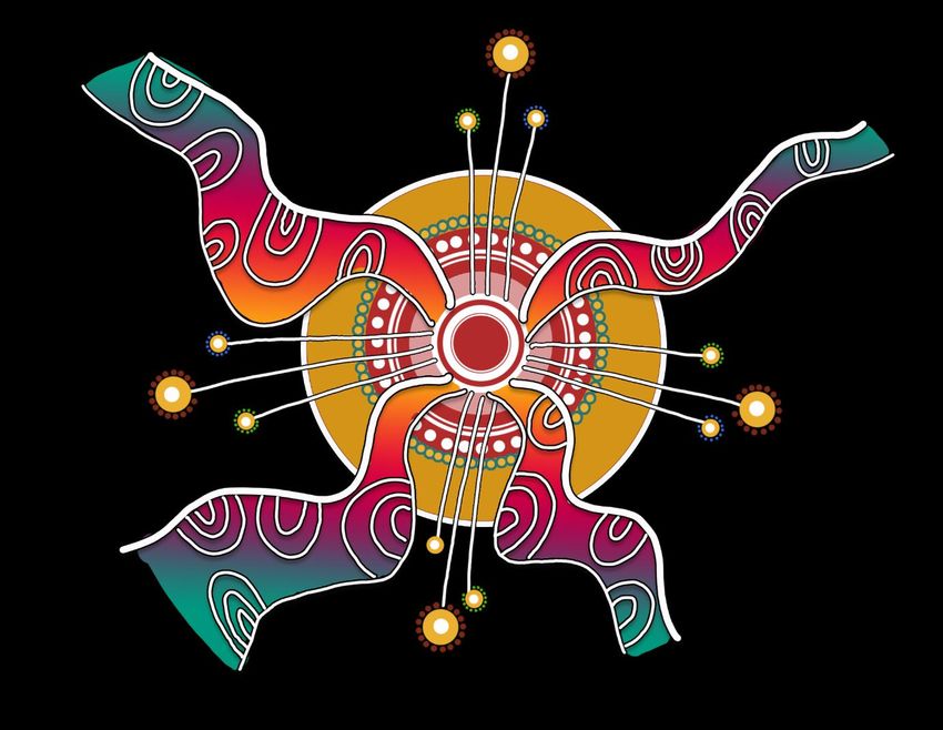
Artwork description for NRW2020

Artwork Title:

“Reconciliation, a never-ending journey of growth and togetherness”

Summary: Overall all the design elements and colours created are a representation of the all
communities of Australia, joining in unison on a journey of reconciliation while paying homage to
history both past and present.

While most may see a plethora of beautiful colours and patterns, many of the colours used within
the art pieces consist of a multi-layered meaning.

Firstly, the colours used have a traditional and modern representation. Paying respects to times of
old of this country’s first nations people, they represent the vast array of colours across this great
land of Australia that can be found in nature in all its Flora and Fauna that were utilised and
honoured by Aboriginal People. From the vibrant purples and reds of wild bush berries found in the
top end of Australia, to the earthy browns and yellows- the colours of flowers whose seeds are
gathered by Aboriginal women to grind down for damper to provide sustenance to their tribe. To the
deep and vibrant colours of ochres used for ceremony to keep culture strong and thriving, to the
colours found garnishing the patterns etched over hundreds of years within the walls of Australian
seashells encompassing this land. To the turquoise, deep blues and crystal-clear blue waters, a vast
ocean and systems of rivers that holds millions of stories of culture, travels and history. An ocean
and water ways that keeps the coastal and in land tribes’ lands ever so lush and fertile for its people
and wildlife. Blacks and browns, colours that frequent the furs, scales and claws of animals both land
and ocean bound whose bodies ensured the survival of a nation of people through their meat.

Secondly, on a more modern aspect, the featured tones of colour emulate the varying colours that
grace the flags of the thousands of people from across the world that now call Australia home, stand
in strength and unity alongside Aboriginal people in the fight for Reconciliation. Reds the colours of
strength and passion for the cause. Blue for being ‘true blue’ and helping a fellow Aussie in need and
‘having a go’, green to represent growth of progression of the generations that have lived in
Australia and the many generations to follow them in future in the respects that we collectively can
make a difference. Pinks to represent the many woman who fight for women’s rights within the
country and meaning ‘love’ for without that in our hearts in our reconciliation journey we can not
continue to understand nor heal together.

Having one colour to portray what Reconciliation truly is would not do it justice. Reconciliation does
not have one representational colour, but a colour palette that is used for all its meaning across the
canvas that is Australia and history like the paints that has featured on the canvases of many great
Australian artists throughout time.

                                       By Nikita Ridgeway 2020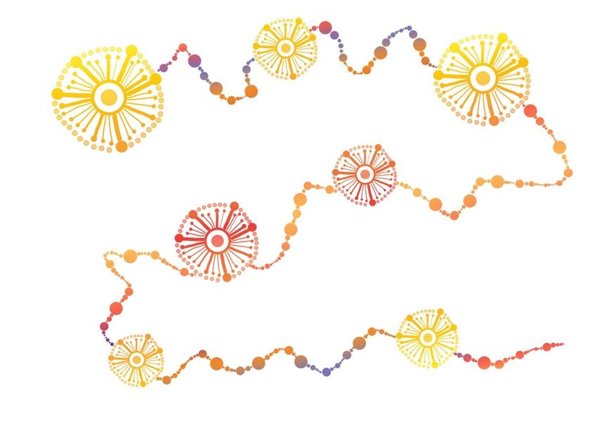
An In-Depth look at the symbols and their meaning:

In Aboriginal culture this symbol in its varying forms of art represents community. Each individual
line is a person. Larger lines with dots at the end represent an Elder, an older person who is a giver
of wisdom and knowledge. The smaller lines with dots at the end represent individuals from all walks
of life, from all generations and from all backgrounds, alongside the elders, receiving the knowledge
and walking alongside one another in the strength of community and Reconciliation.

The outer, upper dots that create a whole circle around the middle design elements bring together
the circle of knowledge within the community of people.

                                      By Nikita Ridgeway 2020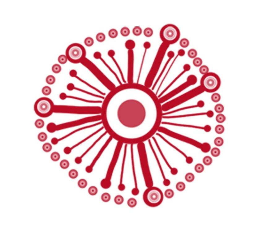
This unison of symbols represents Travel and journey. While there are many who have been a
traveller amongst the journey of reconciliation over the years, there are many who have yet to find
out, learn and get involved on what it truly means to be an Australian who wants to contribute their
bit within their states, regions, cities and homes to Reconciliation. Therefore, many of the circular
symbols within the travelling dotted track are small and big to present their journey of growth but
we all remain connected none the less in this journey.

The dotted track and its varying size of dots represent a story, a triumph and all the many ways
reconciliation is promoted and celebrated throughout Australia

                                      By Nikita Ridgeway 2020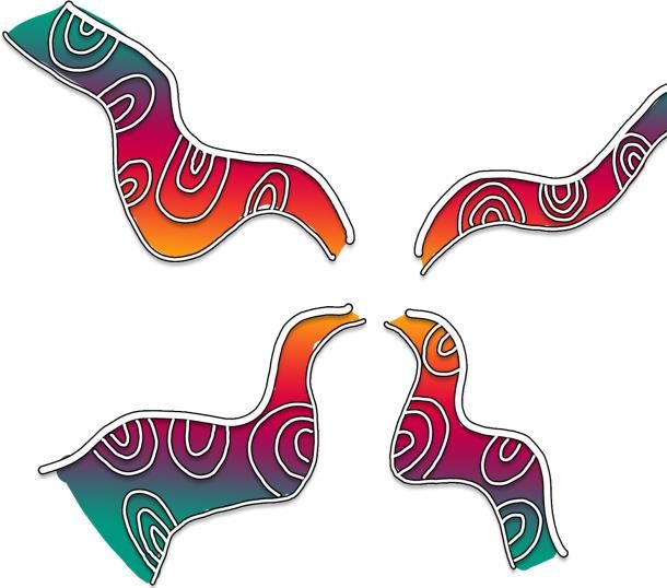
This symbol I call “Reconciliation, a ripple effect through education”

This symbol encompasses the entire purpose of Reconciliation Australia and what their goals and
aspirations are as an organisation. The amount of life changing work that RA does all throughout
Australia has and is creating a ripple effect throughout the country.

The middle symbol represents Reconciliation Australia the organisation itself.

                                      By Nikita Ridgeway 2020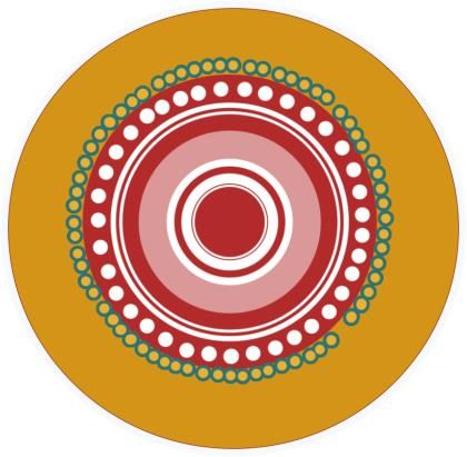
This element of the symbol represents travelling also, it represents the various avenues travelled in
which Reconciliation Australia do its strong and positive work. Reconciliation starts from education;
and, Reconciliation Australia are the leaders at the forefront of this journey. The journey will always
be a forever fluctuating journey that always changes and adapts to the many people and thousands
of organisations who create a RAP Plan and meet their KPI’s set within them furthermore creating a
positive ripple effect, those who celebrate Reconciliation week, those who speak up in the midst of
discrimination and those who make a conscious decision to stand alongside others who want
Reconciliation to continue throughout the ages and these are represented by the Curved lines within
the travelling track.

These combined symbols represent the unity that is a result of the works of Reconciliation Australia.
Like a pebble that is thrown into a pond or river, it creates a ripple effect that affects the next ripple
line it touches and so on. The longer lines stemming outwards are those very ripple effects that have
resulted in ‘Soldiers of change, Ambassadors of reconciliation.’ And the U shapes represent others
drawn into the presence of those ‘Ambassadors’ to yarn with, to sit down with, have a conversation
and to learn a thing- ‘or two’ about Reconciliation, so they too, can go home and contribute to the
always generating cycle of Reconciliation Australia’s amazing work

                                        By Nikita Ridgeway 2020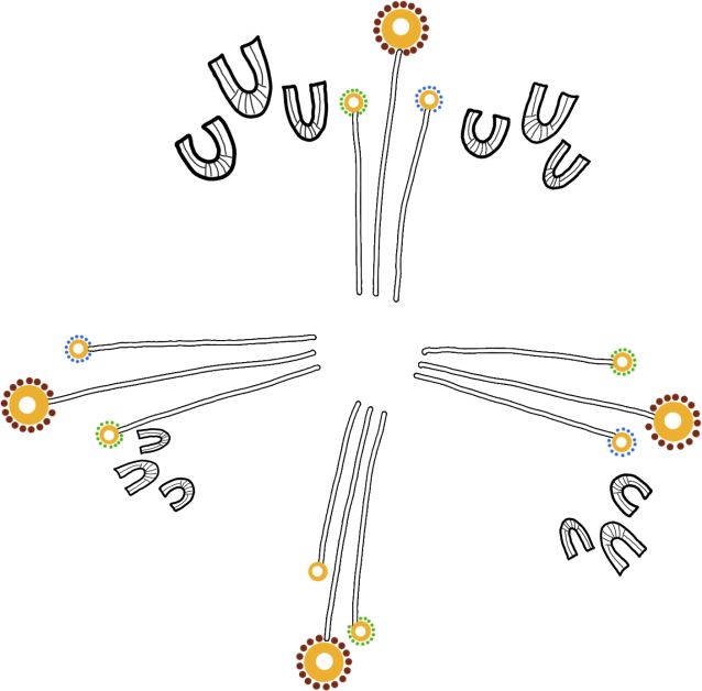
You can also read