Color design in It's The Great Pumpkin, Charlie Brown
←
→
Page content transcription
If your browser does not render page correctly, please read the page content below
Color design in
It’s The Great Pumpkin, Charlie Brown

Justin Hilden
www.sluganimation.com

All images are copyright their respective owners and are used here for educational purposes.

Bill Melendez’s 1966 television animated special It’s The Great Pumpkin, Charlie
Brown may not seem the obvious choice for a study in color theory. The Peanuts
shorts from that era are usually considered beloved yet simple children’s fare. In
animation circles these specials are often footnoted as being produced quickly and
on the cheap. While it is certainly true that The Great Pumpkin is not high art, it
has endeared itself into the collective holiday psyche of Americans since the late
1960s. Such an emotional attachment stems from the familiarity of the characters,
the breezy quality of the music, the innocence of the voice acting, and also – I
believe – the use and direction of color.

Since the vast majority of artists credited to this holiday special are listed under the
generic title of “graphic blandishment”, it is difficult to surmise who directed the
color choices in this short. My best guess is that it was Dean Spille. This study does
not presume to know why all of the color choices were originally made, but instead
gleans what it can by analyzing the image and noting impressions and observations.
In short: I am simply studying the result, not the intent.

It should also be noted that I am not working from an original print of the film but
from a digital copy made for DVD, therefore the colors that I study today may not be
(and most likely are not) completely accurate to the original. While the remastered
video has revealed textures and details that were lost on broadcast television, I
suspect that the color saturation has been increased to suit modern tastes.
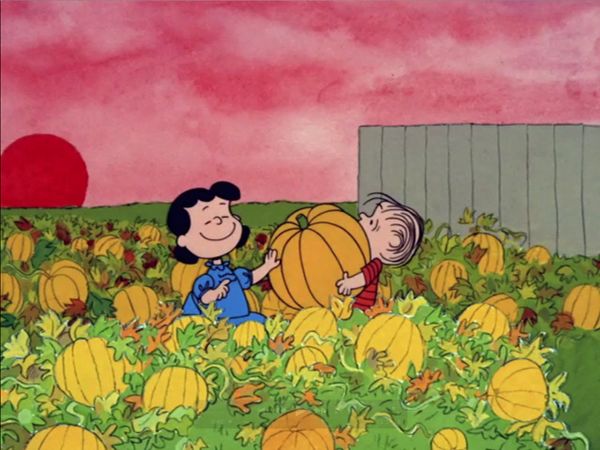
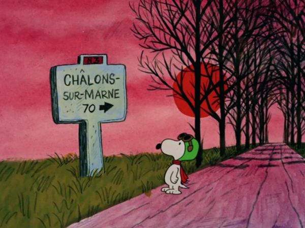
It’s The Great Pumpkin, Charlie Brown begins with a sequence of Linus and Lucy
selecting a pumpkin. As they walk from their house to the patch and back again,
the mood of the film is subtly introduced. Near their front steps, the sky is a dusty,
rose pink with very low saturation. The ground is primarily a yellow-green, with
intense spots of red and orange autumnal foliage. Buildings and light poles contain
pink and purples mixed down with a bluish grey, all reinforcing that the time of day
is dusk.

                               Pinks, purples and blues.

Although the sun is part of the painted background, it appears three different
times, always a little lower on the horizon and always a slightly darker, more
intense red-orange. The changing sun alters the tone of the painted sky, which
becomes increasingly more saturated and textured, ultimately becoming fuchsia,
and then a deep purple.

            As the sun becomes more saturated, the sky and ground grow dark.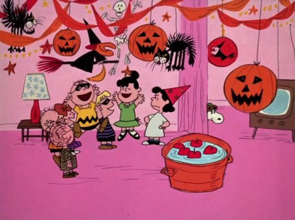
Note the increase in value contrast between ground and sky, adding drama.

Fences change from warm browns to cool blues. The green grass loses its yellow
tinge and becomes more saturated. While we have been busy watching Linus
wrestle his pumpkin homeward, the very air around the characters has changed
and we can feel the coolness of night and a hint of the excitement that darkness will
bring to Halloween.

   Fences and homes have become more blue. Everything else is much more saturated.

                   The changing colors of the sky in each of the above
                             shots, also with their values.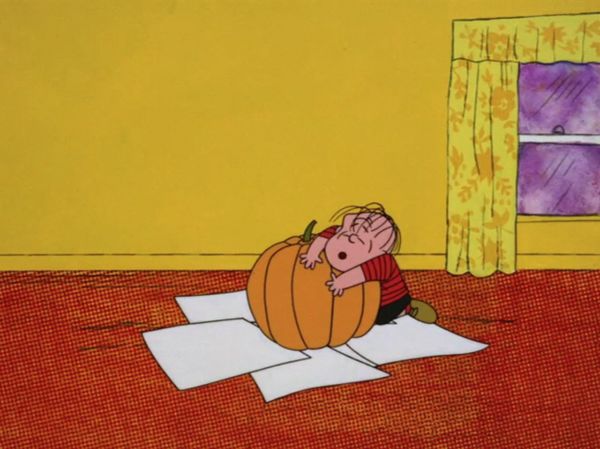
When we step inside the Van Pelt home, we are blasted with hot color. The textured
carpeting burns in a saturated red-orange, the walls radiate a deep mustard,
emphasized by the cool purple hiding outside the window. Securely framing the
action of pumpkin carving in the middle of the frame, neutral white sheets of paper
provide a cool island in the lava-like carpeting, holding our eyes on the characters
and further accentuating the warmth of the room.

     Hot color overwhelms the frame.      The paper’s contrast keeps our attention on
                                                          the action.

By over-emphasizing the color temperature of the home in this scene, subsequent
scenes outdoors feel much cooler. This is clearly seen in the very next shot of the
title sequence, where deep, chilly indigos and blacks literally surround the
frightened characters dressed in white.

        Happy, warm home time...                             Boo!

After the first commercial break we find the Peanuts outside raking leaves, jumping
into leaf piles, and kicking footballs. The color choices for these sequences are not
very unusual or notable. The sky is a light blue, the ground is a pale mustard.
While clearly stating that the time of year is Autumn, it does little else but create a
stage for gags and character plot points.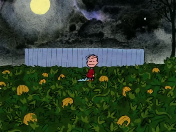
A clear stage for action.

Yet even these rather bland choices are emphasizing the excitement of Halloween
night. By contrasting these staid tones with the bold colors to come, an unconscious
expectation is growing. This is also achieved in subsequent interior scenes of the
gang getting ready for Halloween night. Linus writes a letter against pale pink.
Lucy watches television in an almost monochromatically tan room. The Peanuts
gather to go trick-or-treating in a pink hallway, with slightly darker pink carpeting.

These interiors are bland and warm, again creating a clear, uncluttered stage for
expositional dialogue as well as preparing us for something more dramatic later on.
When Snoopy marches down the hallway to head outside, this drama fairly leaps
through the doorway with heavy indigo, brightly contrasted by the hot mustard-
colored door.

    Yellow and indigo electrify the frame.                    What is out there?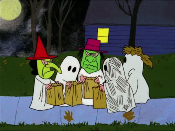
And then we are outside on Halloween night! The sky is black, blue and purple –
heavily textured and stormy – and dark, dark, dark! The grass is a saturated blue-
green, the pumpkins in the patch glow orange. The Peanuts pop off of the screen in
their white costumes. The color contrast of these scenes is exciting to the eye, and
brings an excitement to Halloween night.

                        Moody, saturated indigos, greens, and blacks.

The kids are surrounded and buried in these deep, dark tones with two exceptions.
The kids who go trick-or-treating are anchored onto a baby blue sidewalk in the
same value as the boring house interiors, in contrast to Linus and Sally who remain
half covered by the Halloween intensity. This makes trick-or-treating feel less
exciting than waiting in the pumpkin patch for the Great Pumpkin.

              The trick-or-treaters are anchored by a similarly valued sidewalk.

When Sally is deciding whether or not to stay with Linus, her view of him
surprisingly isolates him in the blue of a nearby fence, rather than the black sky.
Perhaps this presentation of Linus was meant to look more inviting and safe, rather
than exciting and scary – something that would be appealing to Sally.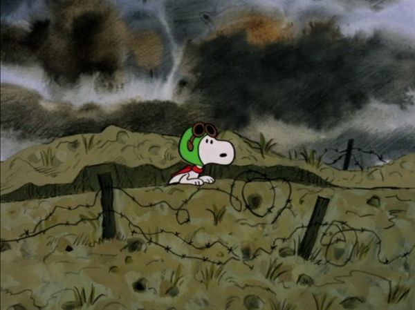
Linus is isolated against blue, instead of black.

The Great Pumpkin’s boldest use of color arrives in the Flying Ace sequence, which
startlingly begins with a creamy yellow sky, apparently not in the same time frame
as the trick-or-treaters. The fantasy of Snoopy’s dogfight with the Red Baron is told
almost exclusively with color choices. At take off, Snoopy’s house is a bright orange
instead of the customary red, fitting warmly with the color of the surrounding sky,
and allowing Snoopy’s contrast to hold our attention.

As his doghouse takes off, the background colors and textures shift from yellow to
dark blue, then to a pale pink (as he passes the sun), and finally to an intense
orange-- almost matching the color of the doghouse itself. Through the use of this
color journey and its increased saturation, the air around Snoopy feels thicker and
more exciting.

                              Take-off created through color.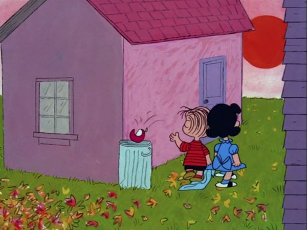
Suddenly Snoopy is attacked and the entire frame is buried in purple, shifting to a
stylized, monochromatic palette, punctuated by deep black bursts of enemy gunfire.
The energy and excitement of the dog-fight that follows is not depicted through
animation of the two combatants, but with a nearly continuous shot of shifting
colors. When Snoopy mocks the Red Baron, both he and the doghouse shift to a rich
navy blue. When he must pull up from a dive they shift to an intense fuchsia. It
should be noted that these hue choices, while dramatic to the eye, all contain a
similar value.

                               Exciting hues, yet similar values.

This sequence is cycled a few times in the animation, and intercut periodically with
Snoopy’s normal coloring, presumably to help sell the comic take he makes toward
the screen. Only when Snoopy is shot down does this epic and wild color sequence
end.

       Normal coloring returns for Snoopy’s comic take, and when he is shot down.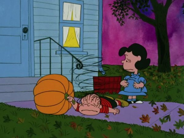
When Snoopy heads “behind enemy lines”, the fantasy returns to the screen
through dramatically painted backgrounds that routinely hold Snoopy isolated in
the middle of the frame, emphasizing his apparent danger. Each background is
painted in its own unique color palette to suggest a long journey over many nights
and over varied terrains. Moody skies marked with purple, blue, brown, and blood-
red menace desaturated barns and trenches, jarringly intercut with scenes of the
kids’ bright Halloween party.

              Snoopy’s long, dangerous journey told through framing and color.

           Cold and lonely.                               Warm and fun!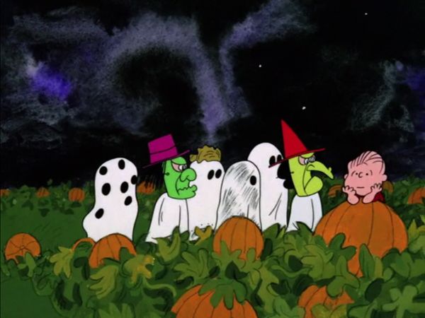
The Halloween party itself is another interior dressed in warm pink, only this time
spiced with the hues and values of the outside, as decorations loom over the
children’s heads. The inside has become just as exciting as the outside, if not more
so, as we see Sally discover that she has missed tricks-or-treats. Her rage at Linus
is set against the explosion of a pale yellow moon, isolating her tantrum and
making her seem bigger in the frame.

                             Sally’s rage looms large in the frame.

Returning from the last commercial break we find Lucy asleep in her room – a scene
completely dressed in purple and gray-brown, save for the clock’s and Lucy’s faces.
While bringing a quiet, middle-of-the-night quality to the image, it also quickly lets
us know what is important in the shot – namely that we are watching Lucy, and the
hour is late.

     A narrow color palette creates quiet.      The values of the faces draw our attention.
Linus’ room is more saturated as Lucy walks down the hall, drawing our eyes to
what is important now: Linus is not in bed. The deep red tones of his empty bed
stand out in contrast to the rest of his room – the white sheets clearly indicating
that no-one is there.
Efficient, wordless storytelling using color saturation and hue.
When Lucy heads outside to fetch her freezing brother, the sky is pitch black
without a trace of color or texture. It is still evening, but a little of the magic of
Halloween night is gone – this could be any night. It adds a somber tone to this
quiet scene, emphasizing Linus’ failure and Lucy’s secret compassion.
Any other night. Colors are normalized, Halloween is over.
All evidence of Halloween night is gone for the final scene of Charlie and Linus
reminiscing on the wall. The sky is a grayish blue, the wall is yellow and salmon.
As Charlie Brown says: “another Halloween has come and gone”, and we
unconsciously feel the lack of any holiday energy because the previous, celebratory
colors are now absent. Likewise, we have unknowingly been emotionally affected
during the entirety of It’s The Great Pumpkin, Charlie Brown, simply through the
use of color.You can also read