And Breathe Exploring the relationship between art and mindfulness - Manchester Art Gallery
←
→
Page content transcription
If your browser does not render page correctly, please read the page content below
And Breathe… Exploring the relationship between art and mindfulness March 2018 – 19 January 2020 Further information about each artwork and transcript of audio meditations You can download the information from this booklet at: manchesterartgallery.org/exhibitions-and-events/exhibition/ and-breathe/ Please return this booklet to the holder after use for other visitors to enjoy
Introduction
And Breathe…
Exploring the relationship between art and mindfulness

Manchester Art Gallery is committed to using our collections
and programmes to promote creativity, imagination, good
health and positivity for everyone that uses the gallery and the
city’s collections.

We believe that our mental and emotional wellbeing is
something that can be nurtured through interacting with art.
Taking time to savour pleasant experiences, such as looking
at art, can increase our mental wellbeing. In this space, we
invite you to slow down and connect with art mindfully,
moment by moment.

Mindfulness can help us become more aware of thoughts,
feelings and emotions, as well as our surroundings by taking
time to just pay attention through our senses. Over time,
mindfulness can bring about long-term changes in mood and
levels of happiness and wellbeing. Some scientific studies
have shown that it can significantly reduce the symptoms of
stress, anxiety and depression as well as improve our ability to learn and be creative. Working with communities we have explored how we could support their wellbeing, as well as that of the public, by creating a space that would enable this slowing down and mindful connection to take place. The artworks and the way they are presented were inspired by our community participants and their responses in a series of mindfulness sessions. Furniture, the colour scheme, height of art works, text and audio have all been carefully selected to enhance wellbeing. There is no right or wrong way to engage with art but we hope that, should you choose to, your experience is complemented by these considerations. For the current showing of And Breathe… we have considered the theme of care, how we care for ourselves and our communities. To grow our understanding of the role a gallery can play in supporting carers, we have co-curated the display with staff from Depaul UK, a charity to help young people who are experiencing homelessness. We have also worked with friends of the artist Kate Davies, who had a studio at her home in Old Trafford and had worked with us here at the gallery teaching the ESOL programme. W e’re delighted to include one of Kate’s large-scale landscape paintings in the exhibition.
Manchester Art Gallery would like to thank all of our friends who have helped to shape this and previous versions of And Breathe... March 2018 - September 2019 Start in Manchester, Manchester Mind Year 5 and 6 pupils from Charlestown Community Primary School. September 2019 - January 2020 Friends of the artist Kate Davies Staff from Depaul UK in Greater Manchester Share with us: #MAGAndBreathe
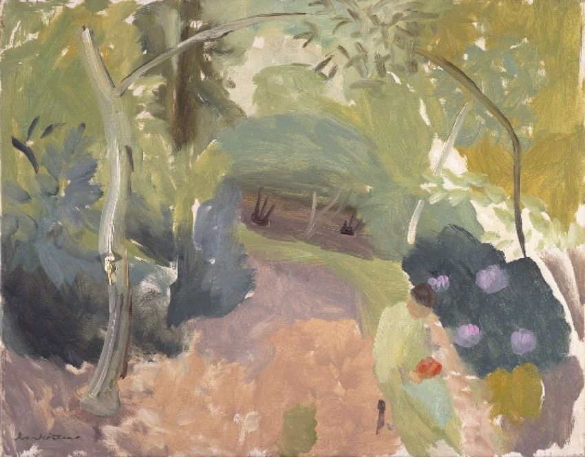
Spring Woodland c. 1935 Ivon Hitchens 1893-1979 Oil on canvas Ivon Hitchens is known for semi-abstract panoramic paintings of the British countryside, particularly woodland. He would immerse himself in such landscapes in an attempt to capture and evoke the whole experience of being in nature, from colour, light and movement to the sounds he was experiencing. The writer Peter Khoroche describes Hitchen’s approach, almost like meditative state, as an ‘alert state of receptivity’: ‘His painting came out of a total absorption in nature and an acute sensitization of all his senses, not only his eyes’. This included ‘listening – straining one’s ears so as to find, or feel one’s way into the hidden nature of things – a process of intimate understanding from within’.
Hitchens himself titled one series of paintings Eye Music and noted in 1940, “I seek to recreate the truth of nature by making my own song about it (in paint).” Contemporary Art Society Gift 1977.84 Image: courtesy The Estate of Ivon Hitchens Why we chose the painting - "It is calming and relaxing. The colours and the way they are softly blended, along with the natural scene convey peacefulness. My favourite colour is green which makes me feel attracted to it but also the natural elements in it are something which I associate with wellbeing." Cathie, De Paul UK
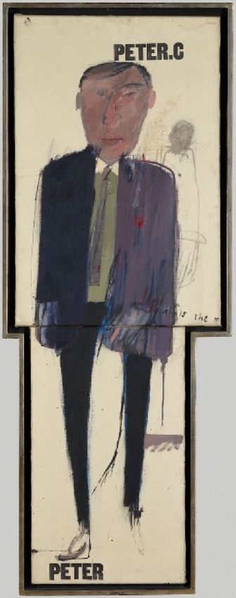
Peter C 1961 David Hockney 1937- Oil on two boards This early painting by David Hockney is a love letter to Peter Crutch, a fellow student at the Royal College of Art, on whom Hockney had an unrequited crush. It was painted around the time that the artist was coming out publically as gay and shows him at his most intimate and tender. Hockney’s letters of the time (before the decriminalisation of homosexuality), refer to Crutch as TMBBITW, a code he begins to spell out in this painting in the text ‘who is the m’(ost beautiful boy in the
world). He also expressed his affection through the use of the
red heart shape.

This heart shape, graphic stencilled lettering and
contemporary clothing show the influence of Pop Art, which
Hockney fuses with his interest in the French artist Jean
Dubuffet (1901-1985) through the use of graffiti, the stick like
figure and loose, expressive brush strokes.

Purchased with the assistance of the Victoria & Albert
Museum Purchase Grant Fund 1985.32
Image: Courtesy the artist

What the group felt about the painting -

"Initially it made me think about politics and that the character
portrayed resembled an untrustworthy politician looking smug.
However, now that I know the story behind the painting, it
makes me feel a bit sad, but intrigued - I have warmed to it."
Bethany, De Paul UK
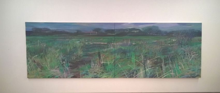
Green Field 2018/19 Kate Davies 1954 - 2019 Oil on canvas Kate Davies paints unremarkable, peripheral places. Sometimes people are present in the landscape, at other times merely traces, of journeys, pathways, fences or litter. These are paintings which look for beauty in the unexpected, the ordinary and the overlooked. In her own words: “When in the countryside I am often struck by the muddy, fertile, difficult stuff I am walking through, the tangles and mess underfoot, and the contrast with distant views and changing light and weather. I am also interested in what links the human with the landscape, the body, the ground, the mind, weather, light. The selectivity of memory intrigues me as does the possibility that two people who share the same experience may remember it differently… Courtesy Helen Simpson and Louise Vines Image: courtesy the family of Kate Davies
What the group felt about the painting -
"Sitting low, in the thicket, in the thick of it... Freshness of mud,
rain and wind... Memories came flooding back, and
imagination rushes forward (her sheer physical labour on
these canvases...) To one who cared, one who cultivated and
created: thank you Kate."
Friend of Kate Davies.
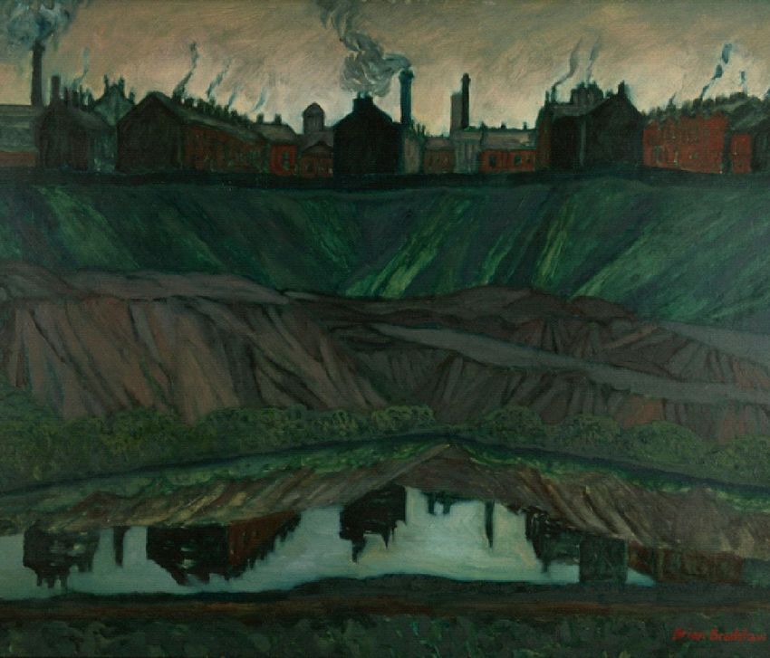
Reflections 1954 Brian Bradshaw 1923 – 2016 Oil on canvas This thickly painted industrial scene is of Rose Hill in Bolton, Lancashire. Streets of terraced houses nestle amongst factories with chimneys bellowing out smoke. The buildings stand upon a hillside, and below, a canal towpath is visible. In the foreground, a pond reflects the industrial buildings above. Bolton born Bradshaw attended the Manchester School of Art and eventually settled in South Africa, where he was a Professor of Art. His early paintings were of Northern industrial towns of the post-World War II period, reflecting working men and women and their surroundings in monochromatic tones. Later creating more vibrant, colourful paintings influenced by his new home in Africa depicting the brightness of the sun and the natural environments of the continent.
Purchase 1954.1136
Image: courtesy the artist

Why we chose the painting -
"It makes me feel comfortable, the colour green and the water
means hope. I am reminded of families and my childhood. I'm
drawn to the smoking chimneys and the cosy warm homes,
the busi-ness of family life."
Motia, De Paul UK
Up, Down, Charm, Strange (Truth and Beauty): Feather from a Wandering Albatross (With thanks to the British Atlantic Survey, Cambridge) 1997/1998 Cornelia Parker 1956 - Photogram Edition 5/5 These images are part of a series of six of individual feathers. Photograms are made in the darkroom without using a camera. The feathers are placed on light-sensitive paper and briefly exposed to light. They appear skeleton-like against the rich, dark background. The series title refers to the properties physicists assign to quarks, the elementary particles which form matter and make up the fundamental building blocks of life. Feathers found on our travels are generally regarded insignificant and ephemeral, but each feather in Parker’s series has an extraordinary tale of historical or special significance to tell, pointing to wider concepts of time and
place, which are revealed in their sub-titles. The image works with the title to invite the viewer into the realm of imagination. Feather from a Wandering Albatross recalls the famous albatross in Samuel Taylor Coleridge's poem Rime of the Ancient Mariner (1798), where the bird carries numerous associations: acting as a symbolic connection between the natural and spiritual world, it is regarded initially as a good omen by the sailors, but when killed by the mariner is viewed as a mark of sin which he must carry as a burden. Parker is interested in the symbolic associations carried by what appear to be ephemeral objects. Ironically the feather is associated with lightness, with white ones traditionally symbolic of cowardice. However, in this series she draws our attention to their significance and association with greatness or bravery. Purchased through the Contemporary Art Society Special Collection Scheme, supported by funds from Arts Council Lottery and Manchester City Galleries Corporate Patrons, 2003 Why we chose the photograph - "The group from De Paul mentioned that they would like to include some photographs in the exhibition, so we had a look through our collection to see what would work in a mindful looking space. We were drawn to these photograms because of their simple peacefulness, and the fact that you have to really look to see their beauty." Niki, Health and Wellbeing Manager, Manchester Art Gallery
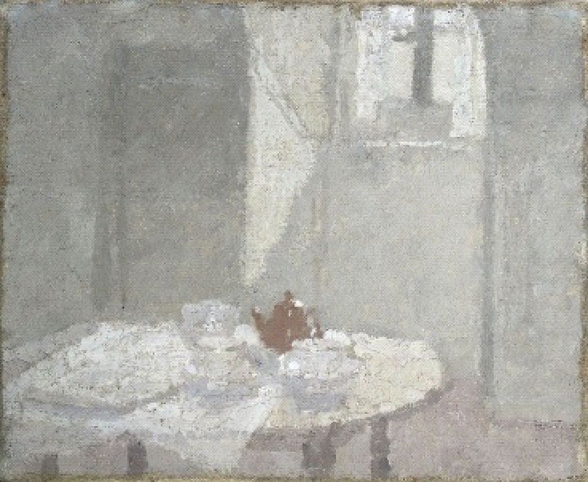
Interior 1924 Gwen John 1876-1939 Oil on canvas This interior shows the top floor of 29 Rue Terre Nueve I Meudon, Gwen John’s own residence on the outskirts of Paris. John often painted her own sparsely furnished room, treating her own environment as her refuge. She said ‘it seems I am not myself except in my room.’ John uses a controlled painting method with a harmonious blend of muted colours in a close range of tones. This approach highlights the subtleties and gradients of colour. The result is the effect of a diffused light illuminating her attic room and the objects appear to be viewed through a soft veil. She developed a quiet and contemplative approach to her art which alludes to a meditative and interior life. John cherished her privacy, living a solitary existence, even reluctant to exhibit or sell her work. She mastered the expression of a mood of
quiet contemplation, and wrote to a friend ‘I may never have anything to express, except this desire for a more interior life.’ In his book on Gwen John, Passion and Method, Christopher Neve wrote that this degree of isolation and introspection ‘seems always to have produced a form of self-portrait, whether or not she was painting herself.’ Charles L Rutherston gift 1925.262 Why we chose the painting - “This is one of the smallest works in the exhibition, but for me expresses a great deal. Gwen John enjoyed solitude, something a lot of us seek in our frenetic lives and her work celebrates the beautiful in the everyday. This work captures a glimpse of a moment of peace and tranquility in a beautiful way, focussing on the way a shaft of light illuminates her room - something we can all take time to notice in our busy day.” Fiona, Curator: Art & Design, Manchester Art Gallery
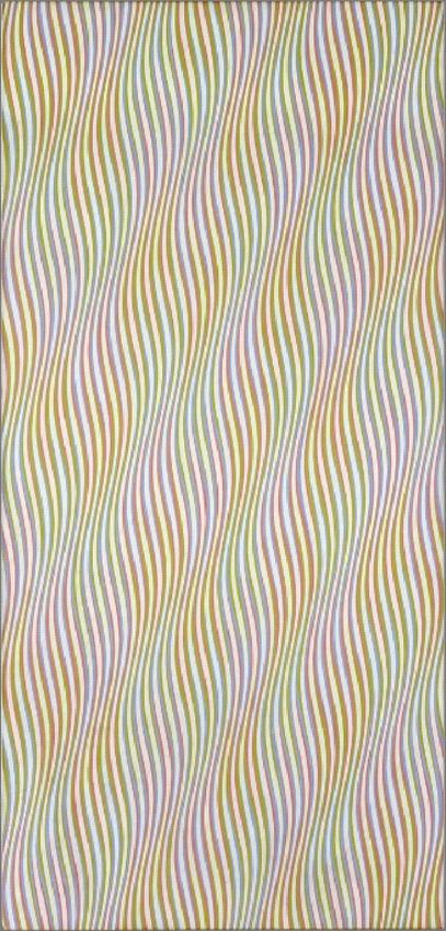
Zephyr 1976 Bridget Riley 1931 - Linen on Canvas This optically illusory or 'Op-Art' painting is composed of pale yellow, blue, orange and white wavy strips of colour, which broaden and narrow slightly to give the impression of diagonal ripples. Bridget Riley is the foremost exponent of this style, composing patterns and colours in such a way as to create movement, not actually on the canvas but in the retina of the viewer’s eye. The title refers to Zephyrus, the Greek god of the west wind and the personification of the warm wind that brings life after winter, only visible in its effect on other things such as the rustle of leaves or ripples on water. In this respect, we can view the painted undulations as metaphors for wind pattern or movement. Bridget Riley's titles are carefully selected and often extend the meaning of the works; in this case they refer
to the effect or sensation produced by natural phenomena, in
referencing the immaterial but sensory movement of the wind.

Riley speaks fondly of growing up in Cornwall and views the
patterns and effects of nature as having a strong impact on
her work. However, rather than seeking to depict
straightforward representations of things or places, she seeks
to create the sensations or effects they produce.

Purchased with the assistance of the Wilfred R. Wood Bequest Fund
1977.3
Image: copyright Bridget Riley 2017. All Rights Reserved.

Why we chose the painting -

"My first response to the image is that it makes me feel happy,
it makes me smile. I am drawn to the image because of it's
movement, the curved lines give the impression of depth and I
enjoy the coloured lines that move side to side.

The more that I look at the painting, the more it reveals to me,
at the beginning I saw the seaside, deckchairs and sand
dunes, candyfloss maybe... after looking for a while I saw the
darker sessions, a desert and fire."

Paul, De Paul UK
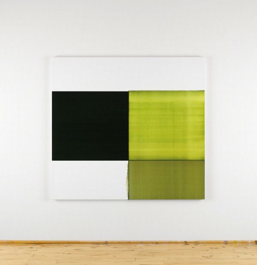
Exposed Painting Green Lake 2012 Callum Innes 1962 - Oil on linen ‘As photography freezes moments in time, so I work with time more than anything else’ – Callum Innes. Callum Innes both reveals and conceals the different techniques that make up this abstract painting. After applying layers of paint in a geometric form, sections of the surface are then removed by a process referred to as ‘unpainting’. He repeats this activity over and over again until he arrives at the decision that the painting is finished. Rather than represent actual things, the painting evokes the nature of things. The act of subtraction is crucial to Innes. It is the visible trace of gestures made by a turpentine-soaked brush to dissolve the image rather than one laden with paint that provide the picture’s key details. Here, ‘unpainting’ is more important than painting. It removes the painting’s past. It places the focus on what is absent. It leaves a ghostly presence of what is not there.
Purchased with the aid of a donation from Dr. Geoffrey Nicholson
2014.112

Image: Courtesy the artist and Frith Street Gallery
Photography Heidi Kosaniuk Innes.

Why we chose the painting -

"I can't fully explain why, but there is a warmth to this
painting... it looks like it would be lovely to touch. I love green
and I find it a comforting colour, I would be happy to have this
up in my living room.

The black rectangle catches my attention first, because it's so
stark, almost like a black hole. The green rectangle opposite
then seems to almost sit above it. Somehow the four
rectangles seem to suit each other."

Imelda, De Paul UK
Up, Down, Charm, Strange (Truth and Beauty): Feather that went to the South Pole (In the sleeping bag of Sir Ranulph Fiennes on his trip across Antartica) 1997/1998 Cornelia Parker 1956 - Photogram Edition 5/5 These images are part of a series of six of individual feathers. Photograms are made in the darkroom without using a camera. The feathers are placed on light-sensitive paper and briefly exposed to light. They appear skeleton-like against the rich, dark background. The series title refers to the properties physicists assign to quarks, the elementary particles which form matter and make up the fundamental building blocks of life. Feathers found on our travels are generally regarded insignificant and ephemeral, but each feather in Parker’s series has an extraordinary tale of historical or special significance to tell, pointing to wider concepts of time and
place, which are revealed in their sub-titles. The image works with the title to invite the viewer into the realm of imagination. Feather that went to the South Pole is taken from the sleeping bag used by Sir Ranulph Fiennes on his Antarctic expedition. It is almost a relic, providing an entry point for us into the experience, as well as reminding us of the warmth it provides to help make such exploration possible. Parker is interested in the symbolic associations carried by what appear to be ephemeral objects. Ironically the feather is associated with lightness, with white ones traditionally symbolic of cowardice. However, in this series she draws our attention to their significance and association with greatness or bravery. Purchased through the Contemporary Art Society Special Collection Scheme, supported by funds from Arts Council Lottery and Manchester City Galleries Corporate Patrons, 2003 Why we chose the photograph - "I find this image to be delicate, gentle and ghost like, it makes me think of serenity, solace and hope. I am drawn to the contrast of the white on the black background. When you look closer you can see the details, the feather is not immaculate, it has strands missing. After I had been looking for a while I saw a female figure, in a long evening dress." Motia, De Paul UK
Audio meditations

The following pages are transcripts of the free mindful audio
guides available at the exhibition entrance. The audios range
from 1 minute to just over 7 minutes in length.

You can listen to the audio meditations through your phone or
mobile device by scanning the codes on the freestanding wall
in the exhibition or you can access them here:
http://audio.manchesterartgallery.org/andbreathe-audio-guide/

If you require headphones please ask at our reception desk on
the ground floor.
Introduction (1.45) Exposed Painting Green Lake by Callum Innes Mindfulness is a simple form of meditation that involves us being aware of our thoughts, feelings and emotions as well as our surroundings, moment by moment. A typical mindfulness meditation consists of paying attention to one of three things - your breathing, physical sensations in the body or a sensory experience and bringing your attention back whenever the mind starts to wander. Over time, mindfulness can bring about long-term changes in mood and levels of happiness and wellbeing. Some scientific studies have shown that it can significantly reduce the symptoms of stress, anxiety and depression as well as improve our ability to learn and be creative. In these short audio guides we invite you to notice when your mind has drifted away from looking at the painting and gently escort your attention back. If your mind wanders off once or one hundred times during this process, it doesn’t matter. It’s the returning of our attention that counts. So do this as many times as necessary. Stop, look at the painting in front of you, notice colour, textures, shapes, light and shadow - and when your attention drifts away, which it inevitably will, notice that this has happened and gently escort it back to the painting. To looking. To begin again. This is the art of mindfulness.
Meditation 1 (1.09) Zephyr by Bridget Riley Art can inspire a lot of thoughts in our minds, very often when we look at a painting our mind immediately tries to make sense of it. What does it mean?, we might ask ourselves. Who painted it and why? Analysing, interpreting, critiquing; in other words thinking about it. Of course, there is no right or wrong way to experience art but in this short mindful practice I invite you to simply be with the artwork. Looking, noticing it, savouring this experience of sitting in this gallery, looking at this painting, in this moment. And for however long you choose to sit here asking yourself the question: what can I notice about this painting? What can I notice about this experience.
Meditation 2 (2.45)
y David Hockney
Peter C b
Starting at the top and working your way clockwise around the
painting, I invite you to take a moment or two to look and
notice what you see.
Simply taking the time to really notice, taking it all in.
And whatever speed you did this, what’s it like now to go back
to the top and begin again, only this time looking more slowly
than before.
Attending to each area of the artwork.
Noticing the different brushstrokes.
Marks, lines, smudges and impressions. These act as a
record of the movement of the artist.
Wide, broad sweeping brush strokes. Fine lines and thick
ones.
Smooth contours and jagged spikes. Where can you notice
these?
As we bring this short practice to a close, I invite you to sit or
stand and spend some more time looking and noticing
textures and lines in this painting. Taking your time, savouring
this experience.Meditation 3 (7.07)
y Gwen John
Interior b
When we’ve done mindfulness sessions here at Manchester
Art Gallery something that comes up again and again from
people is this idea of not having enough time to practice
mindfulness. Finding it difficult to fit it in an already busy and
demanding day. Time is something many of us feel short of,
modern life can be over-stimulating and challenging and we
might, quite understandably think to ourselves: I don’t have an
extra ten minutes a day to meditate! And even if I did have an
extra ten minutes a day I would spend it with my family,
catching up with friends or meeting a work deadline. Taking
ten minutes for ourselves may, for some, feel self-indulgent or
even just impossible to achieve.
However, mindfulness is a technique that can be applied to
everyday moments, actions, to things we are already doing.
So instead of feeling the pressure to create yet more time to
practice, we gently encourage people to experiment with
taking a more mindful approach to the things that they already
do.
Something I like to do in my mindfulness practice is what I like
to call ‘mindful moments’. Little moments throughout the day
that I bring a few seconds of mindful awareness to. These are
everyday, ordinary events. But just for a few seconds at a time
they become a little bit more mindful.The painting Interior by Gwen John reminds me of one of those moments. We notice a table draped with a white tablecloth on top of which are some objects. A tray or is it a newspaper, a tea cup and of course, a little brown teapot. What we’re looking at here is an ordinary and familiar domestic scene. And it is within these very ordinary everyday moments that we can bring mindfulness. So perhaps the next time you sit at a table like this, what would it be like to take just a few seconds to notice shadows or reflections of light on the objects on the table, like we see here on the brown teapot. Little specks of light. As you pour hot tea from the pot, noticing the sounds as the liquid hits the cup, the different tones and colours of the tea - , the rise of the steam, the scent of the tea leaves. Perhaps placing your hand on the side of the cup, noticing the temperature through your sense of touch. Lifting the cup, as you bring it up to your mouth, noticing the weight, it’s heaviness and the way our fingers feel wrapped around it. Noticing the sensation of the steam as we draw it closer to our lips. And finally as we take that first sip, the taste. And by doing this we bring a little moment of mindfulness into an action that we were already going to do. They can be a few seconds at a time but these little pockets of pause throughout the day have been proven to gently reduce stress. And we didn’t have to calve out the time to do it, somehow find more
time in our already busy day, we simply applied mindfulness to
things that we already do.

When you leave the art gallery today maybe you could think of
other everyday activities that you do that you might be able to
do just a bit more mindfully. Stopping, slowing down, bringing
your full awareness to the sensations of the experience even if
it’s just for that first taste of tea.
You can also read