FINDING THE STORY IN YOUR DATA - Karen Richey Mislick, Senior Lecturer Presented to Joint Software and IT Cost Forum
←
→
Page content transcription
If your browser does not render page correctly, please read the page content below
FINDING THE STORY IN YOUR DATA

      Presented to Joint Software and IT Cost Forum
              Wednesday, September 16, 2020

        Karen Richey Mislick, Senior Lecturer
            Department of Operations Research
A COST ESTIMATE
CONTAINS MANY
    STORIES

                  2
POLL QUESTION

• What type of data visualization would
  be most effective for telling this story?

    • Table

    • Bar chart

    • Pie chart

    • Heat map

                                              3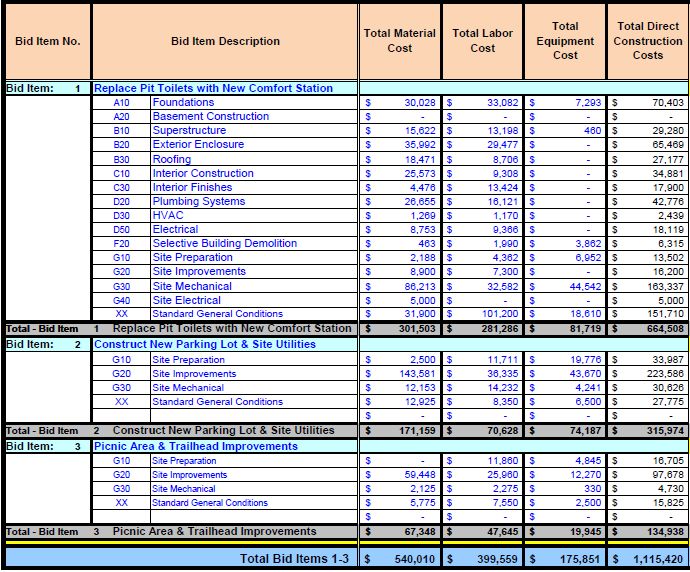
COST DRIVER STORY – USING A TABLE

                                                                                Materials              Labor            Equipment
Bid Item 1 - Replace Pit Toilets with New Comfort Station                 $301,503       70%   $281,286      76%   $81,719      86%
                                                        Site Mechanical   $86,213       29%    $32,582      12%    $44,452     54%
                                                     Exterior Enclosure   $35,992       12%    $29,477      10%       $0       0%
                                           Standard General Conditions    $31,900       11%    $101,200     36%    $18,610     23%
                                                            Foundations   $30,028       10%    $33,082      12%     $7,293     9%
                                                     Plumbing Systems     $26,655       9%     $16,121      6%        $0       0%
Bid Item 2 - Construct New Parking Lot & Site Utilities                   $171,159      92%    $70,628      88%    $74,187     91%
                                                    Site Improvements     $143,581      84%    $36,335      51%    $43,670     59%
                                                       Site Preparation    $2,500       1%     $11,711      17%    $19,776     27%
                                                        Site Mechanical   $12,153       7%     $14,232      20%     $4,241     6%
Bid Item 3 - Picnic Area & Trailhead Improvements                         $67,348       88%    $47,645      54%    $19,945     62%
                                                    Site Improvements     $59,448       88%    $25,960      54%    $12,270     62%

                                                                                                                                      4
TOP WBS COST DRIVER STORY – USING
    A HORIZONTAL BAR CHART

                                    5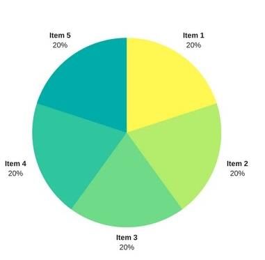
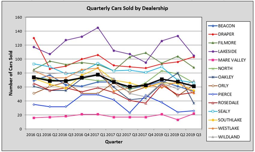
DIFFERENT STORY – SAME DATA!

                               6
SAME STORY DIFFERENT VISUAL – USING
            SIMPLE TEXT

                                      7
POLL QUESTION
• What data visualization tools are you
using?
• Tableau
• Power BI
• Google charts
• Excel
8STORYTELLING WITH DATA
9INTRODUCTION
• These books were written for anyone
who plans to use data to communicate
something to others with the goals of
• Creating effective data visuals,
• Keeping your audience’s attention on
your presentation, and
• Influencing decisions using your data
story
10THE IMPORTANCE OF STORYTELLING
• People love to hear stories!
• They are useful for both entertaining as well as educating by providing a fun way to
share knowledge and experiences
• Storytelling helps your audience to connect with your data and care about your
message
• https://www.youtube.com/watch?v=mSi0kmqOBu4
• The world is getting inundated with information
• Data is the new “oil”
• Determining meaningful ways to sift the gold nuggets from all the dirt requires new skills
11STORYTELLING WITH DATA OVERVIEW
• Understand the context
• Know with whom you will be communicating Show the numbers
to, what they need to know, and how you will directly
deliver your message
• Employ the 3-minute story, the Big Idea, and
storyboarding to articulate your findings
• Choose an appropriate visual display Use a simple bar graph
• When highlighting a number or two, simple when comparing two
text is best things
• Keep them close
• Line charts work well with continuous data together
• Bar charts are perfect for showing categorical • Align them to a
data, but must have a zero baseline common baseline
• Avoid 3D, pie charts, and secondary axes
Knaflic, Cole. Storytelling With Data: A Data Visualization Guide for Business Professionals, Wiley, © 2015 12STORYTELLING TECHNIQUES
• Eliminate clutter!
• Anything that does not
support your message
should be excluded
• Leverage Gestalt principles
for how people see things
and use contrast
strategically
• Align all elements and
maintain adequate white
space
Knaflic, Cole. Storytelling With Data: A Data Visualization Guide for Business Professionals, Wiley, © 2015 13STORYTELLING TECHNIQUES
• Focus attention where you
want it
• Rely on the power of preattentive
attributes to signal where to look
• Think like a designer
• Include visual affordances that tell the
audience how to read your graphic
• Use highlighting and text to label and
explain the story
Knaflic, Cole. Storytelling With Data: A Data Visualization Guide for Business Professionals, Wiley, © 2015 14PACK L OT S OF
DATA I NTO A
STACK E D
H OR I Z ONTAL B AR
G R APH
Knaflic, Cole. Storytelling With Data: A Data Visualization Guide for Business Professionals, Wiley, © 2015 15SIMPLIFY THE DATA
16
Knaflic, Cole. Storytelling With Data: A Data Visualization Guide for Business Professionals, Wiley, © 2015CREATE A VISUAL
HIERARCHY
Use color, create super
categories to bucket data sets,
and apply shading to highlight
forecasted data
Knaflic, Cole. Storytelling With Data: A Data Visualization Guide for Business Professionals, Wiley, © 2015 17TELL A STORY USING ANIMATION
• Have a plot, some twists, and a call to action in order to create tension
• Live presentations allow you to “walk” the audience through the story of the visual
• You build up to the overall results and conclusions over a series of slides or animation
• However, a standalone annotated version is necessary
• Tells the story without the voiceover
• Ignoring these different needs can result in “slideument”
• Challenge is when you provide too much data at once, you lose your audience’s attention
• Leveraging animation to walk the audience through the story is better
• First step is to start with just a view of the blank graphic
• Audience will have to listen to you to understand the finer details of what they are seeing
18Build anticipation and retain audience’s attention Users increased due to friends and family promotion
STORY
PROGRESSION
Blue dot is starting point for the story Growth flattened during time when game was updated
Revamped game and social media partnerships
Despite no marketing, # of users doubled
helped game to go viral
19
Knaflic, Cole. Storytelling With Data: A Data Visualization Guide for Business Professionals, Wiley, © 2015Annotated version captures salient points made during live story telling
DETAILED
ANNOTATED
VERSION
Knaflic, Cole. Storytelling With Data: A Data Visualization Guide for Business Professionals, Wiley, © 2015
20TIPS FOR FINDING THE STORY IN YOUR DATA
• Data storytelling is part science and part art (like cost estimating!)
• There are several best practices and guidelines to follow including
• Knowing your audience and composing your story to meet their needs
• Leveraging Gestalt design principles, using preattentive attributes, etc.
• Rely on your artistic side to be creative and embrace diversity
• There are multiple options for how you can communicate with data and have fun
• Explore your data in many ways so you can discover the stories you need to tell
• Declutter your visuals so that you draw attention to only what is most important
• Push data to the back so it does not compete for the main message
• Include only what is needed to tell the story making sure it is easy to see and understand
• Iterate and seek feedback from peers
21SEEK INSPIRATION THROUGH GOOD EXAMPLES
• Use these websites to inspire you as you create your presentations
• Chart Chooser http://labs.juiceanalytics.com/chartchooser/index.html
• Download as Excel or Powerpoint templates and insert your own data
• Chartmaker Directory http://chartmaker.visualisingdata.com/
• Explore the matrix of chart type by tool and click the circles to see solutions and examples
• Graphic Continuum https://policyviz.com/?s=graphic+continuum
• The poster includes more than 90 graphic types grouped into six categories
• Also, check out the related Match It Game and Cards as well as three ways to annotate your graphs
• Interactive Chart Chooser https://depictdatastudio.com/charts/
• Explore the interactive chart chooser using filters
22EXPLORE ADDITIONAL RESOURCES
• With Datawrapper, you can create visualizations like the one below from Let’s Practice in
minutes instead of hours!
• https://www.datawrapper.de/_/FqaTB/
• It's free to use and no sign-in is needed to try it out yourself
• With Flourish, explore and explain your data with stunning visualizations and stories
• https://flourish.studio/features/
• Publish, present or download a free public version (No need to code or install software)
• With Google Data Studio, unlock the power of your data with interactive dashboards and
beautiful reports that inspire smarter business decisions
• https://datastudio.google.com/overview
• It is easy and free!
23You can also read