Make a Presentation - STUDENT HANDOUT - BSBCMM401 - Academique
←
→
Page content transcription
If your browser does not render page correctly, please read the page content below

Certificate IV of Business BSB40215
     Study Support materials for

    Make a Presentation
          BSBCMM401

    STUDENT HANDOUT

              STUDENT HANDOUT Make a Presentation BSBCMM401 9Jun2016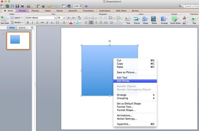
BSBCMM401 Make a presentation
This unit covers the skills and knowledge required to prepare, deliver and review a
presentation to a target audience.

This unit applies to individuals who may be expected to make presentations for a range of
purposes, such as marketing, training and promotions. They contribute well developed
communication skills in presenting a range of concepts and ideas.

Elements and Performance Criteria
                            PERFORMANCE CRITERIA
ELEMENT
                            Performance criteria describe the performance needed to
Elements describe the
                            demonstrate achievement of the element.
essential outcomes.
                            1.1 Plan and document presentation approach and intended
1 Prepare a presentation
                            outcomes
                            1.2 Choose presentation strategies, format and delivery methods that
                            match the characteristics of the target audience, location, resources
                            and personnel needed
                            1.3 Select presentation aids, materials and techniques that suit the
                            format and purpose of the presentation, and will enhance audience
                            understanding of key concepts and central ideas
                            1.4 Brief others involved in the presentation on their
                            roles/responsibilities within the presentation
                            1.5 Select techniques to evaluate presentation effectiveness
                            2.1 Explain and discuss desired outcomes of the presentation with
2 Deliver a presentation
                            the target audience
                            2.2 Use presentation aids, materials and examples to support target
                            audience understanding of key concepts and central ideas
                            2.3 Monitor non-verbal and verbal communication of participants to
                            promote attainment of presentation outcomes
                            2.4 Use persuasive communication techniques to secure audience
                            interest
                            2.5 Provide opportunities for participants to seek clarification on
                            central ideas and concepts, and adjust the presentation to meet
                            participant needs and preferences
                            2.6 Summarise key concepts and ideas at strategic points to facilitate
                            participant understanding

3 Review the presentation 3.1 Implement techniques to review the effectiveness of the
                          presentation
                          3.2 Seek and discuss reactions to the presentation from participants
                          or from key personnel involved in the presentation
                          3.3 Utilise feedback from the audience or from key personnel
                          involved in the presentation to make changes to central ideas
                          presented

                                      STUDENT HANDOUT Make a Presentation BSBCMM401 9Jun2016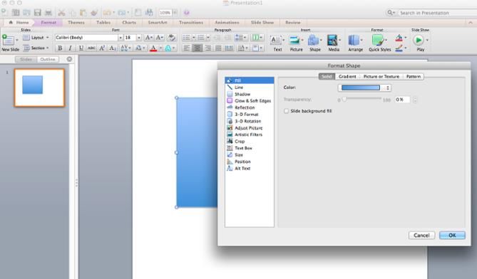
Nerves! Nerves are caused by lack of knowledge, lack of preparation and lack of confidence. You
can overcome all three when you know your material thoroughly, prepare carefully and put in
plenty of practice.

Managers make many types of presentations, here are four of the main types you are likely to find
yourself giving.

    1. To customers and suppliers, to explain your organisation’s or team’s offerings or needs.
    2. To industry groups and conferences, to represent your organisation and offer your
       experiences and insights.
    3. To other managers, to present proposals or your team’s results.
    4. To your work team, to announce an important corporate decision event or change.

While presentations vary in their degree of formality and the size of the audience, preparing and
delivering any presentation follows the same process.

    1.   Determine your objectives
    2.   Analyse your audience
    3.   Decide what to cover
    4.   Develop an outline
    5.   Write your talk
    6.   Practice your presentation
    7.   Deliver your presentation
    8.   Plan to keep improving

Management: Theory and Practice, Kris Cole

Preparing the Presentation
After considering your audience and the context, identifying your main purpose and topics,
researching your material and organising it, you must write the speech.

There are now four steps to complete:

    1.   Write the presentation
    2.   Rewrite it for the ear
    3.   Practise and revise it
    4.   Organise the visual aids

Your aim at this stage is to organise your presentation in a logical sequence, and in clear, concise
language. While it is important to suit the needs of your audience, you must also prepare the
material in a way that suits your own particular needs as a speaker.

Write the Presentation

Once you have an outline of your main points, write the presentation. Each part of it should
progress to and clearly connect with the next part. An oral presentation has three main parts:

         1. The introduction states the topic and catches the audience’s attention. It gives the
            audience a preview of the presentation, so it is important to stimulate their interest at
            this stage.

                                          STUDENT HANDOUT Make a Presentation BSBCMM401 9Jun2016
2. The body develops the theme and supports this with information. The body is the
central part of the presentation in which you inform, persuade or entertain the
audience.
3. The conclusion reinforces and summarises the main points. It is a brief overview that
gives listeners a second chance to hear them.
Introduction
The introduction should be brief as it simply prepares the audience for what you are going to say. It
leads them into the body of the talk by identifying your aim or main theme. Strategies to use in your
presentation are:
Pose a question
Use humour appropriate to the audience and topic
Relate a short anecdote
Present an interesting fact
Body
Acknowledge a typical listener’s span of attention by presenting no more than three or four main
points. Organise these under headings and subheadings. Emphasise the main points and expand
them with supporting material such as:
Personal experiences
Examples and illustrations
Facts
Statistics
Make the presentation lively and interesting by including your own or other people’s experiences. A
relevant personal story or example can make all the difference between a dry presentation and a
memorable one. Compile or collect examples from friends, business associates, newspapers,
television and radio.
Be sure to choose appropriate language. When in doubt about the exact meanings of words, use a
dictionary. A thesaurus can provide the best word and alternatives. Other reference books such as
encyclopaedia will give factual information, and a dictionary of quotations is useful for making
introductions and conclusions more interesting.
Conclusion
To let the audience know you are about to end the talk, use signal phrases such as:
In conclusion
To summarise
In closing
For a long presentation, it may be easier to review or summarise each section separately.
The conclusion rounds up the arguments or information you have presented in the main body of the
speech. As a rule it contains no new material. It is sometimes the most memorable part of the
presentation, and should always make an impact. Use:
A relevant anecdote
STUDENT HANDOUT Make a Presentation BSBCMM401 9Jun2016 A quotation
An example
A recommendation.
You may also conclude by inviting your audience to take some action, or by challenging them, or by
asking for their cooperation or support. Thank them for their interest.
Once you have written the first draft of the speech, practice the speech. You could record it then
replay it and decide whether it needs rewriting for the ear.
PowerPoint Presentation Style Tips
Step 1: Don’t let PowerPoint decide how you use PowerPoint.
Microsoft wanted to provide PowerPoint users with a lot of tools. But this does not mean you should
use them all. Here are some key things to look out for:
Make sure that preset PPT themes complement your needs before you adopt them.
Try to get away from using Microsoft Office’s default fonts, Calibri and Cambria. Using these
two typefaces can make the presentation seem underwhelming.
Professionals should never use PPT’s action sounds. (Please consider your audience above
personal preference).
PowerPoint makes bulleting automatic, but ask yourself: Are bullets actually appropriate for
what you need to do? Sometimes they are, but not always.
Recent PPT defaults include a small shadow on all shapes. Remove this shadow if it's not
actually needed. Also, don’t leave shapes in their default blue.
Step 2: Create custom slide sizes.
While you usually can get away with the default slide size for most presentations, you may need to
adjust it for larger presentations on weirdly sized displays. If you need to do that, here's how.
1. In the top-left corner, choose "File."
2. Select "Page Setup."
3. Type the height and width of the background you'd like, and click "OK."
4. A dialogue box will appear. Click "OK" again.
5. Your background is resized!
Tip: Resize your slides before you add any objects to them or the dimensions of your objects will
become skewed.
STUDENT HANDOUT Make a Presentation BSBCMM401 9Jun2016Step 3: Edit your slide template design.
Often, it's much easier to edit your PowerPoint template before you start -- this way, you don't have
design each slide by hand. Here's how you do that.
1. Select "Themes" in the top navigation.
2. In the far right, click "Edit Master," then "Slide Master."
3. Make any changes you like, then click "Close Master." All current and future slides in that
presentation will use that template.
STUDENT HANDOUT Make a Presentation BSBCMM401 9Jun2016Step 4: Make sure all of your objects are properly aligned.
Having properly aligned objects on your slide is the key to making it look polished and professional.
You can manually try to line up your images ... but we all know how that typically works out. You're
trying to make sure all of your objects hang out in the middle of your slide, but when you drag them
there, it still doesn't look quite right. Get rid of your guessing game and let PowerPoint work its
magic with this trick.
How to align multiple objects:
1. Select all objects by holding down "Shift" and clicking on all of them.
2. Select "Arrange" in the top options bar, then choose "Align or Distribute."
3. Choose the type of alignment you'd like.
STUDENT HANDOUT Make a Presentation BSBCMM401 9Jun2016How to align objects to the slide:
1. Select all objects by holding down "Shift" and clicking on all of them.
2. Select "Arrange" in the top options bar, then choose "Align or Distribute."
3. Select "Align to Slide."
4. Select "Arrange" in the top options bar again, then choose "Align or Distribute."
5. Choose the type of alignment you'd like.
STUDENT HANDOUT Make a Presentation BSBCMM401 9Jun2016Step 5: Get more control over your objects' designs using "Format" menus.
Format menus allow you to do fine adjustments that otherwise seem impossible. To do this, right
click on an object and select the "Format" option. Here, you can fine-tune shadows, adjust shape
measurements, create reflections, and much more. The menu that will pop up looks like this:
Although the main options can be found on PowerPoint’s format toolbars, look for complete control
in the format window menu. Other examples of options available include:
Adjusting text inside a shape.
Creating a natural perspective shadow behind an object.
Recoloring photos manually and with automatic options.
Step 6: Take advantage of PowerPoint's shapes.
Many users don’t realize how flexible PowerPoint’s shape tools have become. In combination with
the expanded format options released by Microsoft in 2010, the potential for good design with
shapes is readily available. PowerPoint provides the user with a bunch of great shape options
beyond the traditional rectangle, oval, and rounded rectangle patterns, unlike even professional
design programs like Adobe Creative Suite or Quark.
Today’s shapes include a highly functional Smart Shapes function, which enables you to create
diagrams and flow charts in no time. These tools are especially valuable when you consider that
PowerPoint is a visual medium. Paragraphing and bullet lists are boring -- you can use shapes to help
express your message more clearly.
STUDENT HANDOUT Make a Presentation BSBCMM401 9Jun2016Step 7: Create custom shapes.
When you create a shape, right click and press "Edit Points." By editing points, you can create
custom shapes that fit your specific need. For instance, you can reshape arrows to fit the dimensions
you like.
Another option is to combine two shapes together. When selecting two shapes, right-click and go to
the "Grouping" sub-menu to see a variety of options.
Combine creates a custom shape that has overlapping portions of the two previous shapes
cut out.
Union makes one completely merged shape.
Intersect builds a shape of only the overlapping sections of the two previous shapes.
Subtract cuts out the overlapping portion of one shape from the other.
By using these tools rather than trying to edit points precisely, you can create accurately measured
custom shapes.
Step 8: Crop images into custom shapes.
Besides creating custom shapes in your presentation, you can also use PowerPoint to crop existing
images into new shapes. Here's how you do that:
1. Click on the image and select "Format" in the options bar.
2. Choose "Crop," then "Mask to Shape," and then choose your desired shape. Ta-da! Custom-
shaped photos.
STUDENT HANDOUT Make a Presentation BSBCMM401 9Jun2016Step 9: Present websites within PowerPoint.
Tradition says that if you want to show a website in a PowerPoint, you should just create link to the
page and prompt a browser to open. For PC users, there’s a better option.
Third party software that integrates fully into PowerPoint’s developer tab can be used to embed a
website directly into your PowerPoint using a normal HTML iframe. One of the best tools is LiveWeb,
a third-party software developed independently.
By using LiveWeb, you don’t have to interrupt your PowerPoint, and your presentation will remain
fluid and natural. Whether you embed a whole webpage or just a YouTube video, this can be a high-
quality third party improvement.
Unfortunately, Mac users don’t have a similar option. A good second choice is to take screen shots
of the website, link in through a browser, or embed media (such as a YouTube video) by
downloading it directly to your computer.
Step 10: Embed your font files.
One constant problem presenters have with PowerPoint is that fonts seem to change when
presenters move from one computer to another. In reality, the fonts are not changing -- the
presentation computer just doesn’t have the same font files installed. If you’re using a PC and
presenting on a PC, then there is a smooth work around for this issue. (When you involve Mac
systems, the solution is a bit rougher. See Tip #11.)
Here’s the trick: When you save your PowerPoint file (only on a PC), you should click Save Options in
the "Save As …" dialog window. Then, select the "Embed TrueType fonts" check box and press "OK."
STUDENT HANDOUT Make a Presentation BSBCMM401 9Jun2016Now, your presentation will keep the font file and your fonts will not change when you move
computers (unless you give your presentation on a Mac).
Step 11: Save your slides as JPEGs.
In PowerPoint for Mac 2011, there is no option to embed fonts within the presentation. So unless
you use ubiquitous typefaces like Arial or Tahoma, your PPT is likely going to encounter font
changes on different computers.
The most certain way of avoiding this is by saving your final presentation as JPEGs, and then
inserting these JPEGs onto your slides. On a Mac, users can easily drag and drop the JPEGs into PPT
with fast load time. If you do not use actions in your presentation, then this option works especially
well.
If you want your presentation to appear "animated," you'll need to do a little tinkering. All you need
to do is save JPEGs of each "frame" of the animation. Then, in your final presentation, you'll just
display those JPEGs in the order you'd like the animation to appear. While you'll technically have
several new slides in place of one original one, your audience won't know the difference.
An important consideration: If your PPT includes a lot of JPEGs, then the file size will increase.
Step 12: Embed multimedia.
PowerPoint allows you to either link to video/audio files externally or to embed the media directly in
your presentation. You should embed these files if you can, but if you use a Mac, you cannot actually
embed the video (see note below). For PCs, two great reasons for embedding are:
1. Embedding allows you to play media directly in your presentation. It will look much more
professional than switching between windows.
2. Embedding also means that the file stays within the PowerPoint presentation, so it should
play normally without extra work (except on a Mac).
Note: Mac OS users of PowerPoint should be extra careful about using multimedia files.
If you use PowerPoint for Mac, then you will always need to bring the video and/or audio file with
you in the same folder as the PowerPoint presentation. It’s best to only insert video or audio files
once the presentation and the containing folder have been saved on a portable drive in their
permanent folder. Also, if the presentation will be played on a Windows computer, then Mac users
need to make sure their multimedia files are in WMV format. This tip gets a bit complicated, so if
you want to use PowerPoint effectively, consider using the same operating system for designing
and presenting, no matter what.
Step 13: Bring your own hardware.
Between operating systems, PowerPoint is still a bit jumpy. Even between differing PPT versions,
things can change. One way to fix these problems is to make sure that you have the right hardware -
- so just bring along your own laptop when you're presenting.
STUDENT HANDOUT Make a Presentation BSBCMM401 9Jun2016Step 14: Use "Presenter View."
In most presentation situations, there will be both a presenter’s screen and the main projected
display for your presentation. PowerPoint has a great tool called Presenter View, which can be found
in the "Slide Show" tab of PowerPoint 2010 (or 2011 for Mac). Included in the Presenter View is an
area for notes, a timer/clock, and a presentation display.
For many presenters, this tool can help unify their spoken presentation and their visual aid. You
never want to make the PowerPoint seem like a stack of notes that you use a crutch. Use the
Presenter View option to help create a more natural presentation.
Pro Tip: At the start of the presentation, you should also hit CTRL + H to make the cursor disappear.
Hitting the "A" key will bring it back if you need it!
Conclusion
With style, design, and presentation processes under your belt, you can do a lot more with
PowerPoint than just presentations for your clients. PowerPoint and similar slide applications are
flexible tools that should not be forgotten.
http://blog.hubspot.com/marketing/easy-powerpoint-design-tricks-
ht#sm.001hqxcg718tbe2cs4o1ahmstnra0
Some Rules for Making a Presentation
Human attention is very limited. Don't cram too much information, either in each slide, or in the
whole talk. Avoid details: they won't be remembered anyway.
Organization
Have a very clear introduction, to motivate what you do and to present the problem you
want to solve. The introduction is not technical in nature, but strategic (i.e. why this
problem, big idea).
If you have a companion paper, mention it during the talk and recommend it for more
details. Don't put all the details in the talk. Present only the important ones.
Use only one idea per slide.
Have a good conclusions slide: put there the main ideas, the ones you really want people to
remember. Use only one "conclusions" slide.
The conclusion slide should be the last one. Do not put other slides after conclusions, as this
will weaken their impact.
Having periodic "talk outline" slides (to show where you are in the talk) helps, especially for
longer talks. At least one "talk outline" slide is very useful, usually after the introduction.
Don't count on the audience to remember any detail from one slide to another (like color-
coding, applications you measure, etc.). If you need it remembered, re-state the information
a second time.
Especially if you have to present many different things, try to build a unifying thread. The
talk should be sequential in nature (i.e. no big conceptual leaps from one slide to the next).
STUDENT HANDOUT Make a Presentation BSBCMM401 9Jun2016 Try to cut out as much as possible; less is better.
Help the audience understand where you are going. Often it's best to give them a high-level
overview first, and then plunge into the details; then, while listening to the details they can
relate to the high-level picture and understand where you are. This also helps them save
important brain power for later parts of the talk which may be more important.
Mechanics
Use a good presentation-building tool, like MS PowerPoint. Avoid Latex, except for slides
with formulas (Leslie Lamport himself says that slides are visual, while Latex is meant to be
logical). Good looks are important. If you need formulas, try TeXPoint, George Necula's Latex
for Powerpoint.
Humor is very useful; prepare a couple of puns and jokes beforehand (but not epic jokes,
which require complicated setup). However, if you're not good with jokes, better avoid them
altogether. Improvising humor is very dangerous.
The more you rehearse the talk, the better it will be. A rehearsal is most useful when carried
out loud. 5 rehearsals is a minimum for an important talk.
The more people criticize your talk (during practice), the better it will be; pay attention to
criticism, not necessarily to all suggestions, but try to see what and why people
misunderstood your ideas.
Not everything has to be written down; speech can and should complement the information
on the slides.
Be enthusiastic.
Act your talk: explain, ask rhetorical questions, act surprised, etc.
Give people time to think about the important facts by slowing down, or even stopping for a
moment.
Do not go overtime under any circumstance.
Listen to the questions very carefully; many speakers answer different questions than the
ones asked.
Do not treat your audience as mentally-impaired: do not explain the completely obvious
things.
Text
Slides should have short titles. A long title shows something is wrong.
Use uniform capitalization rules.
All the text on one slide should have the same structure (e.g. complete phrases, idea only,
etc.).
Put very little text on a slide; avoid text completely if you can. Put no more than one idea per
slide (i.e. all bullets should refer to the same thing). If you have lots of text, people will read
it faster than you talk, and will not pay attention to what you say.
Don't use small fonts.
Use very few formulas (one per presentation). The same goes for program code (at most
one code fragment per presentation).
Do not put useless graphics on each slide: logos, grids, affiliations, etc.
Spell-check. A spelling mistake is an attention magnet.
Illustrations
Use suggestive graphical illustrations as much as possible. Don't shun graphical metaphors.
Prefer an image to text. In my presentations I try to have 80% of the slides with images.
STUDENT HANDOUT Make a Presentation BSBCMM401 9Jun2016 Do not put in the figures details you will not mention explicitly. The figures should be as
schematic as possible (i.e. no overload of features).
Do not "waste" information by using unnecessary colors. Each different color should signify
something different, and something important. Color-code your information if you can, but
don't use too many different colors. Have high-contrast colors.
A few real photos related to your subject look very cool (e.g. real system, hardware, screen-
shots, automatically generated figures, etc.). Real photos are much more effective during
the core of the talk than during the intro. I hate talks with a nice picture during the
introduction and next only text; they open your appetite and then leave you hungry.
For some strange reason, rectangles with shadows seem to look much better than without
(especially if there are just a few in the figure).
Sometimes a matte pastel background looks much better than a white one.
Exploit animation with restraint. Do not use fancy animation effects if not necessary.
However, there are places where animation is extremely valuable, e.g., to depict the
evolution of a complex system, or to introduce related ideas one by one.
Use strong colors for important stuff, pastel colors for the unimportant.
Encode information cleverly: e.g. make arrow widths showing flows proportional to the flow
capacity.
Use thick lines in drawings (e.g. 1 1/2 points or more).
Results
Don't put useless information in result graphs (e.g. the 100% bar for each application).
Label very clearly the axes of the graphs. Explain the un-obvious ones. Use large fonts for
labels; the default fonts in Excel are too small.
Discuss the results numbers in detail; "milk" them as much as possible.
https://www.cs.cmu.edu/~mihaib/presentation-rules.html
How to Create Presentations that Don't Suck
Bad presentations are painful—for both the presenter dying a slow death in front of a crowd and the
bored audience members who have to sit through it. If your task is to create or deliver presentations
that don't suck, here are five common presentation pitfalls to avoid and tips on making
presentations that can instead inspire and inform.
What is a sucky presentation?
We all know the classic signs and symptoms of a presentation flop—it feels like it's running on too
long and you're wasting your time (either as the presenter or an audience member). At their core,
sucky presentations fail to resonate with the audience, and therefore they fail in their mission to
persuade or teach.
Anyone can learn to make better presentations
It's easy to blame the tools. Vast libraries of awful clipart and boomerang animations don't help
anyone. It's also easy to convince yourself that giving presentations just isn't your thing. But we all
have to present at some point or another, whether you're asking for a raise or presenting a proposal
to a client. That said, most people haven't studied presentation design or how to communicate
effectively.
STUDENT HANDOUT Make a Presentation BSBCMM401 9Jun2016So I talked to someone who has. Nancy Duarte and her amazing Duarte design firm have created
over a quarter of a million presentations in the last 23 years (they're the group that helped Al Gore
develop "An Inconvenient Truth," and they also support several TED and PopTech conferences).
Duarte says that we've definitely reached a tipping point in the last few years when it comes to
presentation design: audiences want more and expect more from us as presenters. The good news is
it's not hard to learn some basic principles.
At Duarte workshops, attendees re-sketch slides—offline, without PowerPoint getting in the way—
to learn things like arranging things in a grid and creating contrast and emphasis. Here are a few
"before" slides that I've gathered from around the web as examples of what not to do.
Problem 1: Too many ideas on one slide
Some presenters put everything on a slide to help them remember what they need to say, Duarte
says, forgetting that you could use slide notes instead. Dense, document-like slides are best for
presentations that are going to be distributed (e.g., emailed to a recipient for reading on their own
time), not actually presented.
Solution: Simplify. Stick to one idea per page, letting that one concept really stick into the minds of
the audience members. They'll focus on your voice and what you're saying more than reading
(staring at) the bullets. See the before and after example from Duarte at left.
This will mean less reliance for you on the slide itself, which is a good thing even though it might be
scary at first. You'll need to prepare at lot more, but not sucking at PowerPoint often boils down to
preparation.
Five Ways to Not Suck at PowerPoint
As a general rule, one should not use PowerPoint as a teleprompter. If an image is worth a thousand
words, show the audience that one image, and speak the thousand words if you must, but please do
not display and speak the thousand words.
Problem 2: Cliches and Clipart
It’s easy to fall back on the cliche images or concepts (handshake plus globe, anyone?) and clipart,
especially when you're pressed for time, as most of us are. But higher-quality presentations require
less automatic thinking. If you fall back on the first thing that comes to mind, chances are your
competitors are doing that too.
Solution: Lose the cliches. Brainstorm with others to find more clever ways to communicate your
ideas. Try three or four or more options to explore the nuances of your message and relationship.
Problem 3: Lack of emphasis
If you have a slide that takes longer than 10 seconds for the audience to comprehend, it's too
complex, Duarte says. Your slides should communicate your ideas and enhance what you're saying,
rather than add more noise.
Solution: Information needs emphasis. Slides should only take 3 seconds to process. So even with
very complex ideas, boil down the findings from that slide or split it up across multiple slides. Don't
STUDENT HANDOUT Make a Presentation BSBCMM401 9Jun2016be afraid to use more slides; they're free. It's better to flow through your slides, allowing people to
process them better, than to stay stagnant on one for too long.
Chances are the audience is under-caffeinated, restless, and over-saturated with information
already. Assume that many are in stealth mode, responding to texts and e-mails on their
smartphones during the speech. But if the image (or the concise quote) on screen behind the
podium has some real impact, you'll keep their attention and they'll listen to what you have to say.
Problem 4: Random design choices
Duarte says the difference between a regular business person and a designer is that the designer has
learned to place and scale elements appropriately for the best impact. That means no photos of
bunnies or hot dogs on your slides unless they belong there, please! This also goes for random
animations.
Solution: Designate elements purposely. Don't decorate slides for the sole purpose of decorating
them. Duarte has a helpful checklist for testing if your presentation is more signal or noise. Also see
Garr Reynold's Graphic Design Fundamentals to learn more about design basics like unity,
whitespace, and color.
Problem 5: No relationship to the audience
Finally, it doesn't matter how beautiful your presentation design is if it doesn't have a message that
your audience can connect to. Many presenters out of nervousness talk to the slides, but your goal is
to build a bridge between your message and the audience (and not waste their time).
Solution: Empathy for the audience. John Brubaker, an adjunct professor of public speaking and
communications at Maine Community College, writes that the topmost practice he teaches is to
begin your presentation outline by answering from the audience's perspective: "W.I.I.F.M. - what's
in it for me?"
Did you notice Duarte's mnemonic device snuck in there in the solutions? It may help you when
developing future presentations:
Simplify
Lose the cliches
Information needs emphasis
Designate elements
Empathy for the audience
Incorporate Storytelling Structure into Presentations for Added Drama and Effectiveness
The best presentations and speeches share a lot in common with stories: they move you with a mix
of drama and tension, taking you from the status quo to what could be—your ideas blissfully
realized. You can see more about how this works from Duarte's talk at TEDx, but basically you can
make your presentation more engaging—even cinematic—by using a storytelling framework.
Amplify the gap between what is now (e.g., other company's piddling phones) and what could be
(e.g., the iPhone). (We've noted Steve Jobs' presentation style before, and it turns out his technique
really follows the same pattern as other storytellers/speech makers.)
http://lifehacker.com/5810271/how-to-create-presentations-that-dont-suck
STUDENT HANDOUT Make a Presentation BSBCMM401 9Jun2016How can you make a good presentation even more effective?
This page draws on published advice from expert presenters around the world, which will help to
take your presentations from merely ‘good’ to ‘great’.
By bringing together advice from a wide range of people, the aim is to cover a whole range of areas.
Whether you are an experienced presenter, or just starting out, there should be ideas here to help
you to improve.
1. Show your Passion and Connect with your Audience
It’s hard to be relaxed and be yourself when you’re nervous.
But time and again, the great presenters say that the most important thing is to connect with your
audience, and the best way to do that is to let your passion for the subject shine through.
Be honest with the audience about what is important to you and why it matters.
Be enthusiastic and honest, and the audience will respond.
2. Focus on your Audience’s Needs
Your presentation needs to be built around what your audience is going to get out of the
presentation.
As you prepare the presentation, you always need to bear in mind what the audience needs and
wants to know, not what you can tell them.
While you’re giving the presentation, you also need to remain focused on your audience’s response,
and react to that.
You need to make it easy for your audience to understand and respond.
3. Keep it Simple: Concentrate on your Core Message
When planning your presentation, you should always keep in mind the question:
What is the key message (or three key points) for my audience to take away?
You should be able to communicate that key message very briefly.
Some experts recommend a 30-second ‘elevator summary’, others that you can write it on the back
of a business card, or say it in no more than 15 words.
STUDENT HANDOUT Make a Presentation BSBCMM401 9Jun2016Whichever rule you choose, the important thing is to keep your core message focused and brief.
And if what you are planning to say doesn’t contribute to that core message, don’t say it.
4. Smile and Make Eye Contact with your Audience
This sounds very easy, but a surprisingly large number of presenters fail to do it.
If you smile and make eye contact, you are building rapport, which helps the audience to connect
with you and your subject. It also helps you to feel less nervous, because you are talking to
individuals, not to a great mass of unknown people.
To help you with this, make sure that you don’t turn down all the lights so that only the slide screen
is visible. Your audience needs to see you as well as your slides.
5. Start Strongly
The beginning of your presentation is crucial. You need to grab your audience’s attention and hold it.
They will give you a few minutes’ grace in which to entertain them, before they start to switch off if
you’re dull. So don’t waste that on explaining who you are. Start by entertaining them.
Try a story (see tip 7 below), or an attention-grabbing (but useful) image on a slide.
6. Remember the 10-20-30 Rule for Slideshows
This is a tip from Guy Kawasaki of Apple. He suggests that slideshows should:
Contain no more than 10 slides;
Last no more than 20 minutes; and
Use a font size of no less than 30 point.
This last is particularly important as it stops you trying to put too much information on any one slide.
This whole approach avoids the dreaded ‘Death by PowerPoint’.
As a general rule, slides should be the sideshow to you, the presenter. A good set of slides should be
no use without the presenter, and they should definitely contain less, rather than more, information,
expressed simply.
If you need to provide more information, create a bespoke handout and give it out after your
presentation.
7. Tell Stories
Human beings are programmed to respond to stories.
STUDENT HANDOUT Make a Presentation BSBCMM401 9Jun2016Stories help us to pay attention, and also to remember things. If you can use stories in your
presentation, your audience is more likely to engage and to remember your points afterwards. It is a
good idea to start with a story, but there is a wider point too: you need your presentation to act like
a story.
Think about what story you are trying to tell your audience, and create your presentation to tell it.
Finding The Story Behind Your Presentation
To effectively tell a story, focus on using at least one of the two most basic storytelling mechanics in
your presentation:
1. Focusing On Characters – People have stories; things, data, and objects do not. So ask
yourself “who” is directly involved in your topic that you can use as the focal point of your
story.
For example, instead of talking about cars (your company’s products), you could focus on
specific characters like:
o The drivers the car is intended for – people looking for speed and adventure
o The engineers who went out of their way to design the most cost-effective car
imaginable
2. A Changing Dynamic – A story needs something to change along the way. So ask yourself
“What is not as it should be?” and answer with what you are going to do about it (or what
you did about it).
For example…
o Did hazardous road conditions inspire you to build a rugged, all-terrain jeep that any
family could afford?
o Did a complicated and confusing food labelling system lead you to establish a colour-
coded nutritional index so that anybody could easily understand it?
8. Use your Voice Effectively
The spoken word is actually a pretty inefficient means of communication, because it uses only one of
your audience’s five senses. That’s why presenters tend to use visual aids, too. But you can help to
make the spoken word better by using your voice effectively.
Varying the speed at which you talk, and emphasising changes in pitch and tone all help to make
your voice more interesting and hold your audience’s attention.
9. Use your Body Too
It has been estimated that more than three quarters of communication is non-verbal.
STUDENT HANDOUT Make a Presentation BSBCMM401 9Jun2016That means that as well as your tone of voice, your body language is crucial to getting your message
across. Make sure that you are giving the right messages: body language to avoid includes crossed
arms, hands held behind your back or in your pockets, and pacing the stage.
Make your gestures open and confident, and move naturally around the stage, and among the
audience too, if possible.
10. Relax, Breathe and Enjoy
If you find presenting difficult, it can be hard to be calm and relaxed about doing it.
One option is to start by concentrating on your breathing. Slow it down, and make sure that you’re
breathing fully. Make sure that you continue to pause for breath occasionally during your
presentation too.
If you can bring yourself to relax, you will almost certainly present better. If you can actually start to
enjoy yourself, your audience will respond to that, and engage better. Your presentations will
improve exponentially, and so will your confidence. It’s well worth a try.
http://www.skillsyouneed.com/present/presentation-tips.html
STUDENT HANDOUT Make a Presentation BSBCMM401 9Jun2016You can also read