Simply Put A guide for creating easy-to-understand materials - CDC
←
→
Page content transcription
If your browser does not render page correctly, please read the page content below
Simply Put A guide for creating easy-to-understand materials

What’s in this guide?
    Communication that is Clear and Understandable………………................................3

    Where this Guide Fits into an Overall Communication Plan…………………….......4

    Make Your Message Clear ........................................... ..............................................5

    Text Appearance Matters ……….............. .................................................................9

    Visuals Help Tell Your Story ....................................................................................10

    Layout and Design………………………………….................................................17

    Consider Culture…………………………...………………………………….…….23

    Translations Take Your Message Further ..................................................................25

    Testing for Readability ...............................................................................................27

    Appendix A - Checklist for Easy-to-Understand Print Materials...............................29

    Appendix B - Resources for Communication Planning .............................................30

    Appendix C - Formulas for Calculating Readability .................................................31

    Appendix D - Resources ............................................................................................38

    Acknowledgements………………………………………………………………….43

                                 Strategic and Proactive Communication Branch
                                           Division of Communication Services
                                    Office of the Associate Director for Communication
                                        Centers for Disease Control and Prevention
                                                      Atlanta, Georgia

                                                          April 2009
                                                         Third Edition

2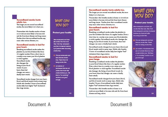
Communication that is Clear and Understandable

Communicating a broad range of health messages to a wide variety of audiences can be challenging.
Differences among audiences make it necessary to avoid the one-size fits-all mindset when developing
effective health communication materials. Culture and literacy skills are two important factors, among
others, to consider when designing health communication materials that will capture the intended
audience’s attention.

According to the National Assessment of Adult Literacy
(NAAL), released in 2006 by the U.S. Department of                                                      One-third of
Education, 30 million adults struggle with basic reading
                                                                                                      U.S. adults have
tasks. The NAAL also found that only 12 percent of
                                                                                                      trouble reading
consumers have proficient health literacy skills1—
suggesting that nearly nine out of ten adults may lack                                                 and acting on
many of the skills necessary to sufficiently manage their                                              health related
health. Low health literacy can affect a person’s ability to                                            information
locate health care providers and services, fill out health
forms, share personal health information with providers,       Source: National Center for Education Statistics,
manage chronic diseases and engage in self-care.               2003 National Assessment of Adult Literacy

It is important to remember; however, that even those with higher health literacy skills want health
information that is understandable, meaningful to them, and easy to use.

In This Guide:
The guidance in Simply Put helps you transform complicated scientific and technical information into
communication materials your audiences can relate to and understand. The guide provides practical
ways to organize information and use language and visuals. This guide will be useful for creating fact
sheets, FAQ’s, brochures, booklets, pamphlets, and other materials, including web content.

                                                                                                                   3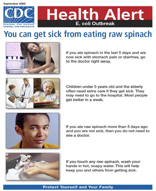
Where this Guide Fits into an Overall Communication Plan

Developing a communication plan involves many steps. This guide will help you accomplish just one
of them – designing your health communication materials.

There are several things to do before you start:                       Steps for Developing Health
                                                                       Communication Materials
    •   Identify the intended audience and define the key health       That Are Evidence-Based and User
        problem/s or interest/s.                                       Friendly

    •   Get to know the intended audience to help determine            1. Identify intended audience and
        their key characteristics, including gender, race/ethnicity,      define/research the key health
        location, beliefs, behaviors, culture, literacy skills, and       problems or interests
        current knowledge about the identified topic.                  2. Engage the intended audience-
                                                                          determine what their needs,
    •   Determine key messages. Be sure to test them with the             beliefs/values, and interests are,
        intended audience to ensure they will be received                 and their level of knowledge of the
        appropriately.                                                    identified health topic
    •   Determine the best way to communicate messages to the          3. Determine key concepts and
        audience (i.e., print, audio, video).                             messages based on knowledge of
                                                                          the audience
    •   Decide how to distribute the materials to the audience         4. Design a draft of the material
        (i.e., mail, brochure display, web page).                      5. Pretest materials with intended
                                                                          audience
                                                                       6. Tweak draft according to feedback
An early step in the development process is determining                   from the audience
whether the intended audience needs or wants the information           7. Publish and distribute materials
your material will provide. This ensures that funds and staff          8. Evaluate the audiences’ satisfaction
time will be used wisely. Learning about the interests, needs,            and understanding
and values of the intended audience allows for more targeted
materials. Knowing the best ways to reach your audience will
help to decide on the most effective format and design for your materials.

Once you have developed a draft of your material, be sure to pretest it with the intended audience.
Pretesting helps ensure that the message you send is the message your intended audience receives,
rather than some other interpretation. Make appropriate revisions to your materials according to the
findings of the pretest.

The final steps in developing health communication materials are to market it and distribute it, and re-
evaluate its effectiveness in communicating key messages to your intended audience. This guide does
not discuss all of these steps, but Appendix B contains a list of resources to help you through many
aspects of communication planning.

4
Make your Message Clear

Creating materials that lead to increased knowledge or a change in beliefs, attitudes, or behaviors
requires messages that are clear, relevant, and appropriate for the intended audience. This section gives
tips for deciding what to say and how to say it so the audience will understand, remember, and act on
your message.

   1. Give the most important information first
          To quickly engage the audience:
                • Give the most important information first
                • Tell them what actions to take
                • Explain why it is important to them

              For example:
              Always wash hands with soap and warm water for 20 seconds before and after handling
              food. Food and water can carry germs that may make you and your family sick.

   2. Limit the number of messages
       Give your audience no more than three or four main ideas per document or section of your
       document.

              Focus on what your audience needs to know and do. Skip details that are only nice to
              know. If you are writing a brochure on how to prevent Lyme disease, you don’t need to
              tell the audience how and when Lyme disease was discovered. Tell
              them what to do to prevent it instead.                                Stick to one
                                                                                             idea at a
              Stick to one idea at a time. Develop one idea fully before moving
              to the next idea. People are confused when materials skip back and
                                                                                               time
              forth between topics.

              Avoid lengthy lists. Create short lists (3-7 items) with bullets, not commas. People with
              limited reading skills tend to forget items in longer lists. If you have a long list, break it
              into subheads.

   3. Tell audiences what they need to do.

              Clearly state the actions you want your audience to take.
              Use concrete nouns and an active voice. Active voice is where the subject does the
              action.

                     Say: Follow these rules to avoid getting sick from food:
                                • Cook meat until it is not pink in the middle.
                                • Wash your hands after touching raw meat.
                                                                                                               5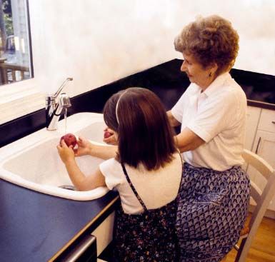
• Wash fresh fruits and vegetables before eating them.
                              • Keep hot food hot and cold food cold.

                   Not: Following safety precautions can reduce food-borne disease transmission.

            Highlight the positive.
            Tell your audience what they should do rather than what they should not do.

                   Use: Wear your helmet every time you ride your bicycle.
                   Instead of: Do not ride your bicycle without wearing a helmet.

    4. Tell your audience what they will gain from understanding and using the material .
      Tell your audience how your materials will benefit them. Answer the question, “What’s in it for
      me?”

            For example: You will learn what to do to have a healthy pregnancy and ways to
            prevent possible complications.

    5. Choose your words carefully.

            Keep it short. Use words with one or two syllables when you can. Keep most sentences,
            if possible, between eight to ten words and limit paragraphs to three to five sentences.

            Communicate as if you were talking to a friend. A
            conversational style has a more natural tone and is easy to             Write as if you
            understand.                                                            were talking to a
                                                                                        friend
                   Say: You could get sick if you are near the
                         chemical.

                   Not: Exposure to the chemical could cause adverse health effects.

            Respect and value your audience. Don’t talk down or preach. People are less likely to
            act on information if they are made to feel bad about their current behavior or health
            situation.

            Use a tone that encourages the audience. Emphasize small, practical steps. Offer
            concrete examples of successful action steps.

6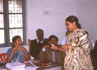
Limit use of jargon, technical, or scientific language. Define necessary jargon or
technical terms first. Then explain them in language your audience will understand.

       Say: high blood pressure
       Not: hypertension

       Say: birth control
       Not: contraception

Choose words with a single definition or connotation. People with limited literacy
skills may not be able to figure out the meaning from the context.

       For example: “Poor workers” could mean workers with
       poor performance or workers with limited income.             Be consistent
                                                                    with word use
Be consistent with word use. Pick the most familiar words
and use them throughout your text.

       For example: Mad cow disease and bovine spongiform encephalitis may be the
       same thing, but your audience may think they are two different diseases.

Use analogies familiar to your audience. When making comparisons, use references
that your audience will recognize.

       Say: Feel for lumps about the size of a pea.
       Not: Feel for lumps about 5 to 6 millimeters in diameter.

Avoid unnecessary abbreviations and acronyms. Provide the acronym first and then
spell the word (s) out in parentheses when using a familiar abbreviation or acronym.
Apply this rule also when creating content that will be spoken in video or audio materials.

       For example: In the early stages of infection, HIV (human immunodeficiency
       virus) often causes no symptoms.

Provide the term before the acronym when using unfamiliar abbreviations.

       For example: Breathing secondhand smoke is a known cause of sudden infant
       death syndrome (SIDS).

Limit use of statistics and use general words like most, many, half. If you must use
statistics, try putting them in parentheses.

      Say: Researchers found that almost all Americans (90%) believe the possible
      harm from vaccines is very small.

                                                                                         7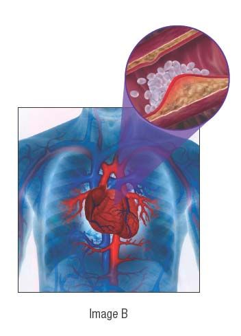
Not: Researchers found that 90% of Americans believe the risk from vaccines is
          very small.

    Mathematical concepts, such as risk, normal, and range, may not have meaning to your
    audience. If possible, use words such as “chance” or “possibility” instead.

          Use: Most Americans believe the chances that something bad can happen to them
          after getting a vaccine is small.
          Instead of: Most Americans believe there are very few risks associated with
          vaccines.

    Limit the use of symbols. What is meaningful and natural for
    one audience may be confusing or misleading to others. Pretest       Use symbols
    any use of symbols.                                                   sparingly

          For example: The following symbols may not be familiar
          to or have the same meaning for everyone:

    Limit use of quotation marks. Choose other formats to show who is speaking when
    writing dialogue.

          For example:
                Jane: How hard can it be to stop smoking?
                 Ann: Most people have a very hard time quitting. I had to try three times
                 before I quit for good.

8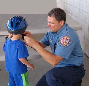
Text Appearance Matters

 The way your text looks greatly affects readability. Choosing the appropriate font style and size is
 important in creating health communication materials that are easy to read.

    1. Use font sizes between 12 and 14 points.
        Anything less than 12 points can be too small to read for many audiences. Older people and
        people who have trouble reading or seeing may need larger print.

    2. For headings, use a font size at least 2 points larger than the main text size.

                                    Examples of font sizes:
                                    This is 8 point.
                                    This is 10 point.
                                    This is 12 point.
                                    This is 14 point.
                                    This is 16 point.
                                    This is 18 point.
    3. Font Style

               For the body of the text, use fonts with serifs, like the one used in this line. Serif fonts
               are usually easier to read than sans-serif fonts. This is because the serif makes the
               individual letters more distinctive and easier for our brains to recognize quickly. Serifs
               are the little “feet” on letters.

                                               S        Serif
                                                                    S         Sans Serif

               Use sans serif fonts in headings and subheadings. Sans serif is more readable when your
               type must be small or when used on a web site.

               Keep the following style tips in mind:                                 Do not use ALL
                  • Do not use FANCY or script lettering.                                 CAPS
                  • Use both upper and lower case letters. Do not use ALL CAPS. ALL CAPS ARE
                    HARD TO READ.
                        • Use grammatically correct punctuation.
Limit use of light      • Use bold type to emphasize words or phrases.
 text on a dark         • Limit the use of italics or underlining. They are hard to read.
  background.           • Use dark letters on a light background. Light text on a dark background is
                  harder to read.

                                                                                                          9
Visuals Help Tell Your Story

Visuals can improve your communication materials when used correctly. This section provides tips to
help you choose effective, appealing visuals. Pictures help grab an audience’s attention and help tell a
story. Be sure to test visuals to ensure there are acceptable with the intended audience.

     1. Choose the best type of visual for your materials
              Photographs work best for showing “real life” events,
              people, and emotions. Photographs tend to be more
              compelling to audiences. When choosing a photo, be sure
              any background images will not distract your audience
              from the image you wish to highlight.

              Simple illustrations or line drawings may work best in
              some instances. An illustration or drawing can simplify
              complexities and highlight key components of an idea.
              Drawings work best for:
                                                                              Photos are best for illustrating
                 • showing a procedure (drawing blood)                        life events

                 • depicting socially sensitive issues (drug addiction)
                 • explaining an invisible or hard-to-see event (airborne transmission of tuberculosis).

              Use simple drawings and avoid unnecessary details. Steer clear of abstract illustrations
              that could be misinterpreted. Simple drawings are useful for showing desired actions or to
              address abstract subjects. They can be useful among disparate audiences, especially
              mixed cultural groups.

              Cartoons may be good to convey humor or set a more casual tone.
              Use cartoons with caution; not all audiences understand them or take them seriously.

     2. Use visuals to help communicate your messages
10
Present one message per visual. When you show several messages in one visual,
audiences may miss some or all of the messages.
Present one
Label visual with captions. Be sure visuals and captions are message per
placed near related text.
visual
Use visuals that help emphasize or explain the text.
Consider the space available and potential use of the visual. Steer clear of visuals that
merely decorate or are too abstract.
For example: Images A and B are both meaningful. Image A would work better
with public health professionals. Image B works better as an illustration for the
general public. Both documents use visuals that are audience appropriate.
Image A Image B
Show the actions you want your audience to take. Avoid choosing images that show
what the audience should not do.
For example: If you are telling people to choose healthy snacks, such as fruit,
Image A is effective because it shows them what to eat. It reinforces your
message. Image B shows them what they should not eat, but on its own it gives
them no visual link to what they should eat. Also, “X” is not universally known to
mean “no”.
Image A Image B
113. Make visuals culturally relevant and sensitive
Use images and
Use images and symbols familiar to your audience. symbols familiar to
your audience
Not all cultures understand that this image means “no smoking”
Include illustrations that are inclusive and appealing to people
who may have physical challenges or constraints.
If you show people in your visuals, try to make them of the
same racial or ethnic group as your intended audience.
Select images that are familiar and that the audience will
be able to relate to. For materials designed for diverse
audiences, show people from a variety of ethnic, racial,
and age groups. Photographs may help certain audiences
identify with your message.
4. Make visuals easy for your audience to follow and understand.
Place visuals near the text to which they refer. Audiences may not be able to connect
a drawing placed in the top, right-hand corner of a document to text found in the lower,
left-hand corner. Be sure all visuals connect directly to written messages.
Place visuals
near the text to
which they
refer.
12Use brief captions that include your key message. Some people may read only your
captions. Make them count by including your key message. Use brief, complete sentences
with correct punctuation. A caption can tell exactly what the visual is trying to convey.
The caption also repeats a sentence found in the body of the document to reinforce the
message.
Wear gloves to keep from spreading germs.
Some captions are successful because they use a narrative to involve the audience.
Captain Santos helps a child
put on his bicycle helmet
correctly.
When showing a sequence, number the images.
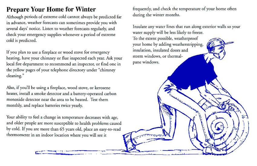
13Use cues like arrows and circles to point out key information in your visuals.
For example: The image below is from a brochure on how to avoid injuries at a
construction site. The arrow highlights the hard hat, the most important item in the
image.
Always wear a hard hat at the job site.
5. Sometimes drawings alone can help your audience understand.
Pictographs are pictures that represent words or ideas. Pictographs can convey
information quickly and help a person understand and remember the intended message(s).
They are most effective when focusing on a specific action and require thorough pre-
testing to ensure effectiveness.
Pictographs can
convey a lot of
information
quickly
This pictograph communicates, without text, how the medication should be taken.
14Photos can also work as pictographs
For example: The most effective pictographs involve a person performing an
action. This helps people understand what actions need to be taken.
.
6. Use realistic images to illustrate internal body parts or small objects
Use realistic images for context. To highlight internal body features, show the entire
body for context. Audiences may not understand the intended meaning of the visual if
taken out of context.
For example: Image B provides context to more effectively show plaque build-up
within the heart blood vessel. This may not be as clear with Image A.
Image A Image B
15For a sense of scale, draw small objects larger to show detail. Also show something
familiar to give your audience a sense of scale.
For example: The mosquito depicted below is drawn several times larger than
actual size to show what it looks like. Then it is shown next to a penny to
demonstrate how big it really is.
Enlarged to show detail Shown to scale
7. Use high quality visuals
Visuals should have a sharp resolution, true color and contrast, and good
composition. High-quality visuals make your messages more credible. Furthermore,
adults may not even pick up your materials if they contain childish or “cutesy” visuals.
Seek professional design help in creating materials that attract and inform your audience.
Need help creating effective visuals?
The Centers for Disease Control’s Public Health Image library has a variety of images relating
to public health. http://phil.cdc.gov/Phil/default.asp
Other visual resources are listed in Appendix D.
16Layout and Design
Present your information and visuals in ways that make your materials easier to understand and more
appealing to your audience.
1. Design an effective cover
Make the cover attractive to your intended audience. If the cover does not include
images and colors your intended audience likes, they may
not pay attention to it. Make the cover attractive
to your intended audience
Show the main message and audience. Health
communication materials, such as brochures, web pages, flyers, posters, should be
designed so that people are able to grasp your main idea and know who the material is
speaking to just by looking at it.
For example: Cover A is much more effective than Cover B in getting the
attention of your audience and in telling them what they can expect to find inside.
Bone Health
and
Osteoporosis
Cover A Cover B
2. Organize your messages so they are easy to act on and recall
Present one complete idea on one page or two facing pages. If people have to turn the
page in the middle of your message, they may forget the first part of the message.
Place the most important information at the beginning and restate it at the end of
the document. It is best to state your main message first, expand on your message with
straight-forward language and then repeat the main message at the end, usually with a
call for change or action.
173. Organize ideas in the order that your audience will use them
For example:
What to do if you find a chemical spill:
1. Leave the area right away.
2. Remember where the spill is so you can avoid it.
3. Report the spill to the police or fire department.
4. Warn others to stay away from the area.
Use headings and sub-headings to “chunk” text. Headings are a cue to upcoming
message content. Use headings that express a complete idea, rather than just a word or
two.
For example: Heading A communicates much more information than
Use headings and Heading B.
sub-headings to
“chunk” text Heading A: Wear your seatbelt — it could save your life.
Heading B: Seat Belts
Questions can be successfully used as subheadings. People can skim the questions to
see what applies to them or are of greatest interest. Also, questions can make your
materials more interactive. People tend to think about answers.
Make sure that you ask questions that lead your audience in the right direction. If they are
not interested in the question at the beginning of a section, they may not read the
information that follows.
Leave more space above headings and subheadings than below them. This gives a
stronger visual link between the heading and the text that follows.
Leave lots of white space
White space is the absence of text or visuals on a page. It keeps a page from being
cramped, overwhelming, or amateurish. Many professional graphic designers recommend
10 to 35 percent white space per page for print materials.
Leave at least 1⁄2 inch to 1 inch of white space around the margins of the page and
between columns. Limit the amount of text and visuals on the page.
18For example: Document A is easier to read than Document B because it has more
white space.
White space takes on an added importance on the web because more of a strain is placed
on the eyes than with print material. Information on web design principles can be found
at http://www.usability.gov/pdfs/chapter6.pdf.
4. Make the text easy for the eye to follow
Break up text with
Break up text with bullets bullets
For example: The bullets used in Example A make the items in the list easier to
read than in Example B. People are encouraged to participate when the bullets are
boxes that can be checked off.
Example A Example B
Children should get six shots by age 2: By age 2, children should get
measles, mumps, rubella shots against
Haemophilus influenzae type b measles/mumps/rubella;
polio Haemophilus influenzae type
diphtheria, tetanus, pertussis b; polio; diphtheria, tetanus,
hepatitis B pertussis; hepatitis B; and
varicella varicella.
Use right edge “ragged” or unjustified for the best readability.
19Use columns. Columns with line lengths of 40 to 50 characters are easiest to read.
Compare Paragraphs A, B, and C below.
Paragraph A
This column is only 20 to
25 characters long and is
hard to read. Your eyes
jump back and forth too
much and quickly get
tired.
Paragraph B
This column is the best length. It is 40 to 50
characters long. Your eye can return to the
beginning of the next line easily, and it doesn’t
jump back and forth very much. Try to design
your materials like this one
Paragraph C
This paragraph is hard to read because the lines are too long. After reading
one line, your eyes have to move back across the entire page to find the
start of the next line. Paragraphs that run across the whole page also look
very dense and don’t allow for much white space on the page.
20Place key information in a text box. Text boxes make it easier to find the most
important information on the page.
For example: The eye is drawn to the shaded box on this sample page.
5. Invite your audience into the text. When your audience
Interaction is an effective way to increase the success of interacts with the
your teaching materials. When the audience interacts with information, they are more
the information provided, they are more likely to likely to remember and act
remember and act upon the information. Below are a few
ideas on ways to engage
upon the information.
your audience.
Ask questions. Write a short question and leave a blank line to write in the answer.
For example:
What is your best weight? Write it here. My
best weight is _______ pounds.
Ask your audience to problem solve. Pose a problem and ask your audience to write or
say how the problem can be resolved.
For example:
What are you going to do when you are craving a
cigarette? Write down some ideas here.
1. _________________________________
2. _________________________________
3.
21Include word/picture association opportunities. Ask the audience to circle one among
several pictures to associate an abstract concept such as “physical activity” with a
concrete action.
For example:
Circle what you will do to get aerobic exercise
.
22Consider Culture
Culture affects how people understand and respond to health messages. The best way to ensure that
your materials are culturally appropriate is to engage members of the target audience early on in the
communication planning phase. They can assist in identifying messages and images that are likely to
work best within their culture.
1. Use terms that your audience uses and/or is comfortable with.
For example: If your audience of elderly people with diabetes usually goes to the health
department to see a doctor, ask them if they say “clinic,” “doctor’s office,” or something
else to ensure that the words being used in your materials will be familiar to the intended
audience.
If you need to identify a group of people by race or ethnicity, use a term preferred by that
group. Preferred terms may vary even within an ethnic or racial group. Ask a sample
audience.
The best way to make sure
your materials are culturally
appropriate is to talk with
members of the audience you
are trying to reach
For example: One group may want to be identified as “African American,” while
another group may prefer to be identified as “Black.”
OR
One group may want to be identified as “Native American,” while another prefers
“American Indian.”
232. Target messages to each cultural or ethnic group or subgroup.
Groups may have different needs, values, and beliefs that will affect how they interpret your
message. Minority groups often have subgroups that differ greatly from one another. What is
effective for one minority group or subgroup may not work at all for another.
Using culturally appropriate images, concepts, and language is not enough. Messages should
always be tested with the intended audience.
Sabemos (Spanish for “we know” is a bilingual, culturally
appropriate toolkit developed by HHS/CDC to support the efforts
of Hispanic parents and community leaders in protecting children
from secondhand smoke. The kit was developed based on research
acquired during focus groups with parents and leaders from the
Hispanic community and key informant interviews. The findings
from were used to develop key messages and tools for community
leaders working with Hispanic/Latino populations.
24Translations Take your Message Further
It is best to develop your materials in the language of your intended audience. However, translating
them from English (or another language) is often necessary due to time limitations and/or available
resources. This section will provide tips to help ensure that translations of your materials are both
culturally and linguistically appropriate.
1. Messages that work well with an English-speaking audience may not work for audiences
who speak another language. Find out about your audience’s values, health beliefs, and
cultural perspectives. You can do this by conducting individual interviews, focus groups, or
other kinds of audience research, including secondary research (i.e., literature reviews).
2. Design material for minority populations based on
subgroups and geographic locations. All members of a Messages that work well with
minority population are not alike. Mexican Americans, for an English speaking audience
example, may respond differently than Cuban Americans to may not work for audiences
certain words, colors, and symbols. Likewise, Korean who speak another language
women living in New York City may view a health issue
very differently from Korean women living in Los Angeles.
3. Get advice from community organizations in the areas you wish to reach. Local groups that
work regularly with your audience can give you valuable insight about your audience. They can
also recruit participants for surveys or focus group testing and help you gain the trust of your
audience.
4. Carefully select your translator. Choose a qualified translator who is familiar with your
intended audience. A qualified translator is typically a native speaker of the target language,
has ten or more years experience in translation, and is preferably certified by a recognized
institution. A qualified translator will produce documents that reflect the message and content
of the source document. It is important to keep in mind that if the source document is not
written clearly or in plain language the translated document will maintain this same attribute.
When materials are used for intended audiences with more than one linguistic variation (for
example, Mexican-American and Cuban-American) have multiple translators check the
translation.
5. Avoid literal translations. Allow your translator to select from a wide range of expressions,
phrases, and terms used by the audience. This flexibility will result in more culturally
appropriate material.
256. Use the back-translation method. Once the material has been translated to the intended
language, translate it back to English. (This step should be done by someone other than the
original translator.) Check to see if the meaning and tone of the message have stayed the same.
7. Field test draft materials with members of your intended audience. Field testing will allow
you to get feedback from your members of your intended audience and to make changes based
on their comments and suggestions.
Beware of these common pitfalls:
• Do not translate English slang phrases or idioms literally.
• Do not translate into a dialect unless it is used by your audience.
• Do not omit foreign language characters or accent marks when publications are written in
languages that use those elements. Missing characters or punctuation marks can change the
meaning of a word or sentence. Make sure your word processing software and desktop
publishing software have all the punctuation used in the intended audience’s language.
• If you list a phone number to call for more information, make sure staff fluent in the intended
language is available. Or add a qualifier; such as, “Spanish speakers are available between 1:00
to 5:00 pm EST.”
26Testing for Readability
Readability formulas are useful tools. They provide a general idea of how hard a document will be to
read based on the average syllables per word and average words per sentence. However, they do not
measure a persons’ level of comprehension. Comprehension levels are often two or more grades below
reading or education level. Comprehension drops even more when a person is under stress.
Readability formulas do not take into consideration the effects of layout or design elements. They
cannot predict how well your audience will accept or act upon your message. The use of readability
formulas alone does not guarantee well-written, understandable text. They should be used only in
conjunction with other means of assessing effectiveness.
1. Reduce reading level before using formulas.
There are several basic techniques to lower the reading level of your document. Begin by
reducing the number of words per sentence and by using one and two syllable words when
possible. Reducing these numbers can improve reading ease.
Also look for the number of times passive voice is used in your document. Change to active
voice when possible. Active voice improves readability.
For example:
This sentence is written in passive voice:
“Heart disease and lung cancer are caused by smoking.”
Using active voice is better:
“Smoking causes heart disease and lung cancer.”
If you think the reading level of your document is too high because of long names of
organizations, diseases, or other proper nouns, use a readability formula without
those words. It may be that the readability is at the right level, except for the long words.
If this is the case, revise your text to remove longer words
If you find that the reading level is still too high even when you don’t count the long
words, write in “plain language” or use “everyday” language that people are most
likely to understand. For ideas on substituting easier words and phrases, take a look at
the reference library found at www.plainlanguage.gov/howto/wordsuggestions/index.cfm
One of the best ways to see how a “plain language” approach can improve a
document is to look at examples of documents before and after they were edited into
plain language. For before and after examples go to:
www.plainlanguage.gov/examples/before_after/index.cfm
272. Testing a document’s readability level.
There are several ways to determine reading level. The best way to judge if
You can test a document’s reading level by hand or by your material will be
using computer software. Also, you can achieve understood is to pre-test it
consistency in your evaluations by using the same with a sample group from
readability formulas through every draft stage. The
your audience
Flesch-Kincaid Readability Test, the Fry Readability
Graph, the Gunning ‘FOG’ Readability Test (FOG),
and the Simple Measure of Gobbledygook Readability Formula (SMOG) are several
good tools. See Appendix C for help in using them.
Several word processing software programs, including Microsoft Word® and Corel
WordPerfect®*, include reading level assessment capabilities. Plain language experts,
however, do not consider these computer tests reliable or valid for readability analysis
and recommend:
• free-standing software, including Readability Calculations* or Readability
Plus* from Micro Power & Light (www.micropowerandlight.com)
• a website using SMOG formula: www.harrymclaughlin.com/SMOG.htm*
• additional tools are listed in Appendix C.
However, remember that readability tests are only one Readability tests are
useful tool in assessing readability. The best way to judge only one useful tool for
if your material will be an effective communication tool is assessing readability of
to pre-test it with a sample group from your intended
written materials.
audience.
Material testing and analysis are important considerations. For health communication
efforts to succeed, learn what your audience knows or thinks about a subject, and
anticipate how they may interpret new ideas. For example, by conducting usability testing
focus groups or individual interviews with people from your intended audience before
your first draft, you can gauge what they already understand about the topic. And you can
test several possible approaches to presenting information. This testing should begin
before you write the first word and continue until the final draft.
Find more information on how to conduct usability testing.
Most programs need more than one research method, including pre- and post-testing methods. Many of
these methods are thoroughly described in Making Health Communication Programs Work, U.S.
Department of Health and Human Services, and in Methodological Review: A Handbook for
Excellence in Focus Group Research, M. Debus.
Usability testing is also defined by the Plain Language Association INternational at
www.plainlanguagenetwork.org/plaintrain/Testing.html
* Note: Mention of the software products does not constitute an endorsement by the CDC
28Appendix A: Checklist for Easy-to-Understand Print Materials
Message Content If you read only the captions, would you learn
the main points?
Have you limited your messages to three to Have you post-tested your materials?
four messages per document (or section)?
Have you taken out information that is “nice to Layout and Design
know” but not necessary?
Is the most important information at the Is information presented in an order that is
beginning of the document? logical to your audience?
Is it repeated at the end? Is information chunked, using headings and
Have you identified action steps or desired subheadings? Do lists include bullets?
behaviors for your audience? Have you eliminated as much jargon and
Have you post-tested your materials? technical language as possible?
Is technical or scientific language explained?
Have you used concrete nouns, an active voice,
Text Appearance and short words and sentences?
Is the style conversational?
Does your document have lots of white space? Have you post-tested your materials?
Are margins at least 1⁄2 inch?
Is the print large enough (at least 12 points)? Translation
Does it have serifs?
Have you used bold, italics, and text boxes to Are the language and content culturally
highlight information? appropriate?
Have you avoided using all capital letters? Are the visuals culturally appropriate?
Is text justified on the left only? Have you had the piece back translated?
Did you use columns with a line length of 40 Is the translator fluent in the same linguistic
to 50 characters of space? variation as the intended audience?
Have you post-tested your materials? Have you post-tested your materials?
Visuals
Understandability
Is the cover attractive to your intended
audience? Does it include your main message Have you tested the complexity of the
and show who the audience is? language used in your material for
Are your visuals simple and instructive rather comprehension?
than decorative? Have you pre-tested your materials with
Do visuals help explain the messages found in members of your intended audience?
the text? Have you post-tested your materials with
Are your visuals placed near related text? Do members of your intended audience
they include captions?
29Appendix B: Resources for Communication Planning
Here are some additional resources for doing effective communication planning.
1. CDC’s National Center for Health Marketing offers clear and audience-centered products and
services at www.cdc.gov/healthmarketing/
2. CDCynergy― This is an interactive CD-ROM health communication planning tool, developed by
CDC. It includes the following:
• an on-line workbook for developing a communication plan
• information and examples to guide you in making choices about audiences, messages, channels,
implementation, and evaluation
• a glossary of health communication terms
• a quick training guide to using the software
For more information about CDCynergy, visit our website at
www.cdc.gov/healthmarketing/cdcynergy/
3. Making Health Communication Programs Work― “Pink Book”- The “Pink Book” provides
comprehensive instruction on communication planning, from formative research to communication
principles to product evaluation. It is available at http://www.cancer.gov/pinkbook.
30Appendix C: Formulas for Calculating Readability
Using SMOG
Perhaps the quickest way to check a reading level manually is to use the SMOG estimating formula. G.
Harry McLaughlin created SMOG (Simply Measure of Gobbledygook) in 1969 to estimate they years
of education needed to understand a piece of writing.
Here’s a quick way to estimate reading level.
• Simply count the number of words with three or more syllables in three chains of 10 sentences in
difference parts of your draft.
• Then look up the approximate grade level in this chart.
• The SMOG formula can predict the grade level difficulty within 1.5 grades in 68 percent of passages.
McLaughlin worked with programming expert Alain Trottier to produce a free SMOG calculator. The
online calculator can service 30 to 2000 words at this link: www.harrymclaughlin.com/SMOG.htm.
31Appendix C: Formulas for Calculating Readability (continued) Using Fry Formula In 1977, Dr. Edward Fry created one of the most widely used readability formulas. Fry calculates the grade reading level by averaging the number of sentences and syllables per hundred words. Steps for you to follow: • Randomly choose three samples from your document with 100 words each. • Count the number of sentences in the hundred words, estimating length of the fraction of the last sentence to the nearest 1/10th. • Count the total number of syllables in the 100-word passage. Do not count numbers. Do count proper nouns. If you don’t have a hand counter available, an easy way is to simply put a mark above every syllable after the first syllable in each word. Then, when you get to the end of the passage, count the number of marks and add 100 to include the first syllable in each word that you did not mark. • Find the average number of sentences and the average number of syllables for the three samples by dividing the total of all three samples by three. • Use the graph on the next page to plot the average sentence length and number of syllables. The two lines will intersect at the approximate grade level. If a great deal of variability is found, try putting more sample counts into the average 32
Appendix C: Formulas for Calculating Readability (continued)

                                Fry Graph* for Estimating Grade Levels
  Average Number of Sentences
        (Per 100 words)

                                            Average Number of Syllables
                                                 (Per 100 words)

* From: Fry, Edward. Elementary Reading Instruction. 1977, McGraw-Hill

                                                                          33
Appendix C: Formulas for Calculating Readability (continued) Using Fry on Short Documents When your document has fewer than 300 words, you can use an adaptation of the Fry method. 1. Count total words, total sentences, and total syllables for the entire text. (Note: hyphenated words count as one word.) 2. Do these calculations: - Multiply the number of sentences by 100 and divide by the total number of words. This will give you the average number of sentences per 100 words. - Multiply the number of syllables by 100 and divide by the number of total words. This will give you the average number of syllables per 100 words. 3. Plot the averages on the Fry graph to find the readability score. Here is an example with fewer than 100 words. 34
Appendix C: Formulas for Calculating Readability (continued)

Here are two examples testing 100 words:

 Example 1:

 Example 2:

                                                               35
Appendix C: Formulas for Calculating Readability (continued)
Using Lexile Readability Analyzer
Lexile Analyzer®, produced by MetaMetrics®, allows you to test the readability of your text by generating a
Lexile® measure. (A free, limited version is available at www.Lexile.com.) The Analyzer measures sentence
length and the familiarity of words used. Your word choice will be compared to word frequencies within a large
database of literature.
The Lexile® measure is a text difficulty score followed by an “L”. The scale ranges from below 200L for
beginning-reader material to above 1700L for advanced text.
®
Lexile Value Grade Level
300L 2nd grade
400L 3rd grade
1300L 12th grade
Using PMOSE/IKIRSCH Document Readability Formula
Researchers Mosenthal and Kirsch developed a measure for assessing document complexity, called the
PMOSE/ IKIRSCH document readability formula. The PMOSE/IKIRSCH formula measures complexity based
on three factors:
• The structure of the document,
• The density of the information,
• The relative dependence on information from other documents.
This tool is particularly useful for documents that include forms, tables, graphs, charts, and lists.
PMOSE/IKIRSCH measures the readability of information organized in rows and columns. The formula uses
the number of rows and columns, the structure, and the number of labels and items to assess the chart or table.
Scores range from Level 1 to Level 5 Proficiency. The Proficiency Level can be translated into a grade-level
equivalent.
Proficiency Grade Level Equivalent
Level 1 Grade 4 >8 years of schooling
Level 2 Grade 8 to high school diploma
Level 3 Grade 12 some education after high school
Level 4 15 years of schooling college degree equivalent
Level 5 16 years of schooling or advanced post college degree
more
The next page is the Mosenthal and Kirsch’s worksheet that you can apply to your text. Please note that the
complexity of word choice is not a consideration in this tool.
36Appendix C: Formulas for Calculating Readability (continued)
37Appendix D: Resources Books Bigwood S, Spore M. Presenting Numbers, Tables, and Charts. New York: Oxford University Press; 2003. Debus, M. Methodological Review: A Handbook for Excellence in Focus Group Research, Academy for Education Development; 1988. Doak C, Doak L, eds. Pfizer Principles for Clear Health Communication: A Handbook for Creating Patient Education Materials that Enhance Understanding and Promote Health Outcomes, Pfizer; 2nd Edition, 2004. (www.pfizerhealthliteracy.com/pdf/PfizerPrinciples.pdf) Doak C, Doak L, Root J. Teaching Patients with Low Literacy Skills. 2nd ed. Philadelphia, PA: J.B. Lippincott Company; 1996. (www.hsph.harvard.edu/healthliteracy/doak.html) Graham L. Basics of Design: Layout and Typography for Beginners. Albany, NY: Delmar; 2001. Kirsch I, Jungeblut A, Jenkins L, Kolstad A. Adult Literacy in America: A first look at the findings of the National Adult Literacy Survey. 3rd edition. Vol. 201. Washington, DC: National Center for Education, U.S. Department of Education; 2002. Kutner M, Greenberg E, Jin Y, Paulsen C. The Health Literacy of American’s Adults: Results from the 2003 National Assessment of Adult Literacy (NCES2006-483). Washington, DC: U.S. Department of Education; 2006. Lohr, Linda. Creating Graphics for Learning and Performance: Lessons in Visual Literacy. NJ: Merrill Prentice Hall; 2003. Lynch P, Horton S. Web Style Guide, 2nd edition; 2005. National Cancer Institute. Clear & Simple: Developing Effective Print Materials for Low-literate Readers. Pub. No. NIH 95-3594. Washington, DC: DHHS; 1995. National Cancer Institute. Making Health Communication Programs Work.(aka “Pink Book”) U.S. Department of Health and Human Services; National Institutes of Health; 2004. Nelson R. Consumer Informatics: Applications and Strategies in Cyber Health Care (Health Informatics). Springer; 2004. Nielsen-Bohlman L, Panzer A, Kindig D, eds. Health Literacy: A Prescription to End Confusion. Committee on Health Literacy, Board on Neuroscience and Behavioral Health, Institute of Medicine of the National Academies. Washington, DC: The National Academies Press; 2004. Osborne H. Overcoming Communication Barriers in Patient Education. NAL Call No.: R118 O83 2001 ISBN: 083422030X. Gaithersburg, MD: Aspen Publishers, Inc; 2001. Rudd RE, Anderson JE, Oppenheimer S, Nath C. Health Literacy: An Update of Public Health and Medical Literature. Chapter 6 in Comings JP, Garner B, Smith C. (eds.) Review of Adult Learning and Literacy, Vol. 7. Mahway, NJ: Lawrence Erlbuam Assoc., pp. 175-204, 2007. Southern Institute on Children and Families. The Health Literacy Style Manual. Covering Kids and Families National Program Office. Columbia, SC: Maximus (Reston, VA); 2005. Strunk W. Jr., White E. The Elements of Style. New York, NY: MacMillan; 1979. Thompson T, Dorsey A, Miller K, Parrott R, eds. Handbook of Health Communication. Mahwah, NJ: Lawrence Erlbaum Associates; 2003. 38
Appendix D: Resources (continued)

Journal Articles, Reports, Brochures, Pamphlets, and Miscellaneous Publications
Albright J, de Guzman C, Acebo P, Paiva D, Faulkner M, Swanson J. Readability of patient education materials: Implications for
clinical practice. Applied Nursing Research 1996; 9(3):139-43.

Baker G. Writing easily read patient education handouts: A computerized approach. Seminars in Dermatology 1991; 10(2):102-6.

Baker L, Wilson F. Consumer health materials recommended for public libraries: Too tough to read? Public Libraries 1996;
35(2):124-30.

Baker L, Wilson F, Kars M. The readability of medical information on InfoTrac: Does it meet the needs of people with low literacy
skills? Ref User Serv Q 1997; 37(2):155-60.

Baker S. Who can read consumer product information? American Journal of Health-System Pharmacy 1997; 27(2):126-31.

Baker D, Parker R, Williams M, Clark W, Nurss J. The relationship of patient reading ability to self-reported health and use of health
services. American Journal of Public Health 1997; 87:1027-30.

Basara L, Juergens J. Patient package insert readability and design. American Pharmacy 1994; NS34(8):48-53.

Brownson K. Education handouts. Are we wasting our time? Journal for Nurses in Staff Development 1998; 14(4):176-82.

Carmona R. Improving Americans’ health literacy. Journal of the American Dietetic Association 2005; 105:1345.

Cardinal B, Seidler T. Readability and Comprehensibility of the Exercise Life (brochure). Perceptual and Motor Skills 1995; 80:399-
402.

Coey L. Readability of printed educational materials used to inform potential and actual ostomates. Journal of Clinical Nursing 1996;
5:359-366.

Davis R, Jackson R, Bocchini J, Arnold C, Mayeaux E, Murphy P. Comprehension is Greater Using a Short Vaccine. Information
Pamphlet with Graphics and Simple Language. Journal of General Internal Medicine 1994; 9(Supp. 2):103.

Davis, T, Bocchini J, Jr, Fredrickson D, Arnold C, Mayeaux E, Murphy P, Jackson, RH, Hanna, N, Paterson, M. Parent
Comprehension of Polio Vaccine Information Pamphlets. Pediatrics 1996; 97(6):804-10.

Davis T, et al. Improving Vaccine Risk/Benefit Communications with an Immunization Education Package: A Pilot Study.
Ambulatory Pediatrics 2002; 2(3):193-200.

Feldman S, Quinlivan A, Williford P, Bahnson J, Fleischer A, Jr. Illiteracy and the readability of patient education materials. A look at
Health Watch. North Carolina Medical Journal 1994; 55(7):290-2.

Gabriel V, Stephenson T. Readability of patient information leaflets. Journal of Pediatric Pharmacy Practice 1998; 3(1):29-32.

Grotsy R. Plain Language: It’s effect on organizational performance. Clarity. May 2004; 51:17-19.

Hobbie C. Maximizing healthy communication: Readability of parent educational materials. Journal of Pediatric Health Care 1995;
9(2):92-3.

Hospital Case Management, It’s on paper but do they understand it? Simple testing gets written handouts on target. Hospital Case
Management 1999; 7(4):75-6, 80.

                                                                                                                                      39
Appendix D: Resources (continued) Houts p, Doak C, Doak L, Loscalo,M. The role of pictures in improving health communication: a review of research on attention, comprehension, recall, and adherence. Patient Education and Counseling 2006; 61:173-190. Johnson H. Readability study of client health education materials: A resource for assuring the effectiveness of written materials. Raleigh (NC): North Carolina State Dept. of Environment, Health, and Natural Resources. May, 128 p. Available from: ERIC Document Reproduction Service, Springfield, VA 1994; No. ED382934. Katz M, Kripalani S, Weiss B. Use of pictorial aids in medication instructions: A review of the literature. American Journal of Health- System Pharmacists. December 1, 2006; 63:2391-2397. Kleimann S, Enlow B. Is plain language appropriate for well-educated and politically important people? Results of research with congressional correspondence. Clarity. November 2003; 50:4-11. Koba H. Putting it plainly becomes communications. Mission of Ontario, Ministry of Health. Journal of the Canadian Medical Association 1993; 148(7):1202-03. Kreuter M, Strecher V, Glassman B. One size does not f t all: The case for tailoring print materials. Society of Behavioral Medicine 1999; 21:276-83. Kripalani S, Weiss B. Teaching about health literacy and clear communication. Journal of General Internal Medicine 2006, 21(8):888- 90. Massett, H. Evaluation of CDC Print Materials. Presentation to the Office of Communication, CDC. December; 1996. Meade C, Howser D. Consent forms: How to determine and improve their readability. Oncology Nursing Forum 1992; 19(10):1523- 28. Meade C, McKinney W, Barnas G. Educating patients with limited literacy skills: The effectiveness of printed and videotaped materials about colon cancer. American Journal of Public Health 1994; 84(1):119-21. Michielutte R, Bahnson B, Beal P. Readability of the public education literature on cancer prevention and detection. Journal of Cancer Education 1990; 5(1):55-61. Michielutte R, Bahnson J, Dignan M, Schroeder E. The use of illustrations and narrative text style to improve readability of a health education brochure. Journal of Cancer Education 1992; 7(3):251-60. Montori V, Rothman R. Weakness in numbers: the challenge of numeracy in health care. Journal of General Internal Medicine 2005; 20:1071-1072. Neuhauser, L. & Kreps, G. Online cancer communication interventions: Meeting the literacy, linguistic and cultural needs of diverse audiences. Patient Education and Counseling. Available online: doi:10.1016/j.pec.2008.02.015 Parker R, Gazmararian J. Health literacy: essential for health communication. Journal of Health Communication 2003; 8:S116-8. Plimpton S, Root J. Materials and strategies that work in low literacy health communication. Public Health Reports 1994; 109(1):86- 92. Rice M, Valdivia L. A simple guide for design, use, and evaluation of educational materials. Health Education Quarterly 1991; 18(1):79-85. Riche J. Text and reader characteristics affecting the readability of patient literature. Reading Improvement 1991; 28(4):287-92. 40
Appendix D: Resources (continued)
Root J. Effective materials for the low-literacy population. California AIDS Clearinghouse Reviewer 1990; 2(3):1&3.

Rudd RE, Kaphingst KA, Colton T, Gregoire J, Hyde J. Rewriting Public Health Information in Plain Language. Journal of Health
Communications, 9: 195-206. 2004.

Sentell T, Halpin H. Importance of adult literacy in understanding health disparities. Journal of General Internal Medicine 2006;
21(8):862-6.

Shield J, Mullen M. Developing client education materials. In: Communicating as Professionals. Chernoff R, ed. Chicago, IL:
American Dietetic Association; 1994.

Siminerio L, Frith M. Need to assess readability of written materials for diabetes education curricula. Diabetes Care 1993; 16(1):391-
93.

Spyridakis J, Wegner M. Writing for Human Performance. Relating Reading Research to Document Design. Technical
Communications, 2nd quarter 1992; 202-15.

Stephens S. Patient education materials: Are they readable? Oncology Nursing Forum 1992; 19(1):83-5.

Substance Abuse and Mental Health Services Administration, DHHS. You Can Prepare Easy-to-Read Materials, “The Fact Is....”
Communication Series; 1992.

Tips for improving patient education materials: The right readability level is one key to success. Health Care Food and Nutrition
Focus 1997; 14(2):1, 3.

Zimmerman M, Newton N, Frumin L, Wittet S. Program for Appropriate Technology in Health (PATH). Developing Health and
Family Planning Materials for Low-Literate Audiences: A Guide. Oxford University Press 1996.

Web Sites

AMA Foundation Health Literacy Initiative
http://www.ama-assn.org/ama/pub/category/8115.html
The AMA Foundation is working to raise awareness among health care providers about the link between health and literacy. Their
web site includes a toolkit, a train-the-trainers seminar, and a grants program.

Current Bibliographies in Medicine/Health Literacy http://www.nlm.nih.gov/pubs/cbm/hliteracy.html
This site is part of the National Library of Medicine Database and has a large amount of background information about health literacy.

Health Literacy Studies/Harvard School of Public Health http://www.hsph.harvard.edu/healthliteracy
This site has information for researchers and practitioners in the public health, medical, and adult education fields. You can find the
following health literacy materials: PowerPoint overview, preview of a new video, curricula, literature review, annotated bibliography,
and links to related sites. Of special interest to literacy teachers and learners is a listing of links to easy-to-read health information
sites, grouped by health topic.

Medical Library Association Health Information Literacy http://www.mlanet.org/resources/healthlit/tfhil_info.html
This site includes resources for health information professionals and consumers.

                                                                                                                                       41
You can also read