The geography of the COVID-19 crisis in England - Alex Davenport Christine Farquharson Imran Rasul Luke Sibieta George Stoye - Institute ...
←
→
Page content transcription
If your browser does not render page correctly, please read the page content below
The geography of
the COVID-19 crisis
in England
  Alex Davenport
  Christine Farquharson
  Imran Rasul
  Luke Sibieta
  George Stoye

 An IFS initiative funded by the Nuffield Foundation
The geography of the COVID-19 crisis in England

Alex Davenport
Christine Farquharson
Imran Rasul
Luke Sibieta
George Stoye

Copy-edited by Judith Payne

Published by

The Institute for Fiscal Studies

ISBN 978-1-912805-82-2

An IFS initiative funded by the Nuffield Foundation

The Nuffield Foundation is an independent charitable trust with a mission to advance social well-
being. It funds research that informs social policy, primarily in Education, Welfare, and Justice. It
also funds student programmes that provide opportunities for young people to develop skills in
quantitative and scientific methods. The Nuffield Foundation is the founder and co-funder of the
Nuffield Council on Bioethics and the Ada Lovelace Institute. The Foundation has funded this
project, but the views expressed are those of the authors and not necessarily the Foundation.
Visit www.nuffieldfoundation.org

Co-funding from the ESRC-funded Centre for the Microeconomic Analysis of Public Policy at IFS
(grant number ES/M010147/1) is also very gratefully acknowledged.
Executive summary
The COVID-19 crisis has affected every part of the country – and indeed many other countries.
What sets this crisis apart is the many different ways that it is impacting families: while the virus
itself is primarily a public health issue, the unprecedented responses it has necessitated mean
that this is also very much an economic and a social crisis.

This is not to say that it is equally all of these things to all people – some families, and some areas,
will be particularly vulnerable to the virus’s health impacts, while others look to be hit particularly
hard on economic or social dimensions.

In this report, we analyse how these different dimensions of the crisis vary around England. We
document the geography of the COVID-19 crisis along three dimensions: health, jobs and families.
We explore which local authorities (LAs) have residents who are more vulnerable to severe
COVID-19 symptoms, because of their age or pre-existing conditions; which LAs have a greater
share of workers in shut-down sectors such as retail or hospitality; and which LAs have a greater
share of children either eligible for free school meals or receiving children’s social services, who
might be at particular educational or social risk from the crisis. We show how these dimensions
of vulnerability in health, jobs and families relate to each other. We bring these findings together
to document the extent to which local areas might be affected along multiple dimensions of the
crisis.

The issue of interrelated vulnerabilities should remain at the forefront of policymaking.
Government’s approach to easing the lockdown needs to protect public health while enabling
economic activity and minimising the real social costs of isolation. Our results suggest that the
balance between these different goals might look very different around the country.

2                                                                                     © Institute for Fiscal Studies
Key findings

          There is no one measure of vulnerability that can summarise which areas will be hardest
          hit during the crisis. The pandemic will have health, economic and social costs, and on
          average areas that are more vulnerable along one dimension are relatively less
          vulnerable along the others. Standard measures of local socio-economic deprivation do
          not identify well areas most vulnerable to the crisis.

          However, some local authorities (LAs) are more vulnerable than average on health,
          economic and social lines. These nine LAs are spread around the country and include both
          urban areas (such as Blackpool) and rural places (such as Dorset). Torbay and the Isle of
          Wight stand out even among this group; they are in the top 20% most vulnerable on each
          index, reflecting their elderly populations, economic reliance on tourism and hospitality,
          and pockets of local socio-economic deprivation. There are also 17 LAs that appear
          relatively unaffected along all three dimensions; these areas are concentrated in the
          South East and East of England.

          Many coastal areas are notably vulnerable along both health and jobs dimensions. Coastal
          towns already rank highly in terms of overall deprivation, and the crisis could be set to
          make these inequalities with non-coastal areas even wider.

          Areas in the northern spine of England are more vulnerable than average along health
          and family dimensions: these include South Yorkshire, Derbyshire and Nottinghamshire,
          which have relatively older, more deprived populations. Other such areas are clustered in
          the West Midlands (particularly around Birmingham) and in the cities of the North West
          and North East.

          While London has seen some of the highest rates of COVID-19 so far, its population is less
          vulnerable to experiencing serious symptoms from the disease. Within London, boroughs
          with younger, healthier populations have seen many fewer confirmed COVID-19 cases and
          deaths. However, many London boroughs will face significant economic and social costs,
          as shut-down sectors such as hospitality and tourism are important employers and many
          schoolchildren are from disadvantaged families, where home learning is on average more
          difficult.

          While there are some regional patterns in vulnerabilities, in many cases neighbouring LAs
          look set to have very different experiences of the crisis. For example, Nottinghamshire
          has very different exposure from that of neighbouring Leicestershire on all three
          dimensions of vulnerability.

          The types of trade-offs policymakers will face in easing lockdown will vary between
          different kinds of areas, but the existence of trade-offs largely will not. The trade-offs
          might be compounded as different dimensions of vulnerability come with different
          timescales; for example, health vulnerabilities might come to the fore in the next year,
          while it could take years or even decades for the full impact of children’s vulnerability to
          school closures to be felt.

          Policymakers at different levels of government will have to coordinate to respond
          effectively to these different types of need. Different areas of vulnerability will fall within
          the remit of different levels of government, meaning that a joined-up approach will be
          necessary for effective policymaking. National policymakers should also be alert to
          differences in local needs when making policy in these areas.

© Institute for Fiscal Studies                                                                              3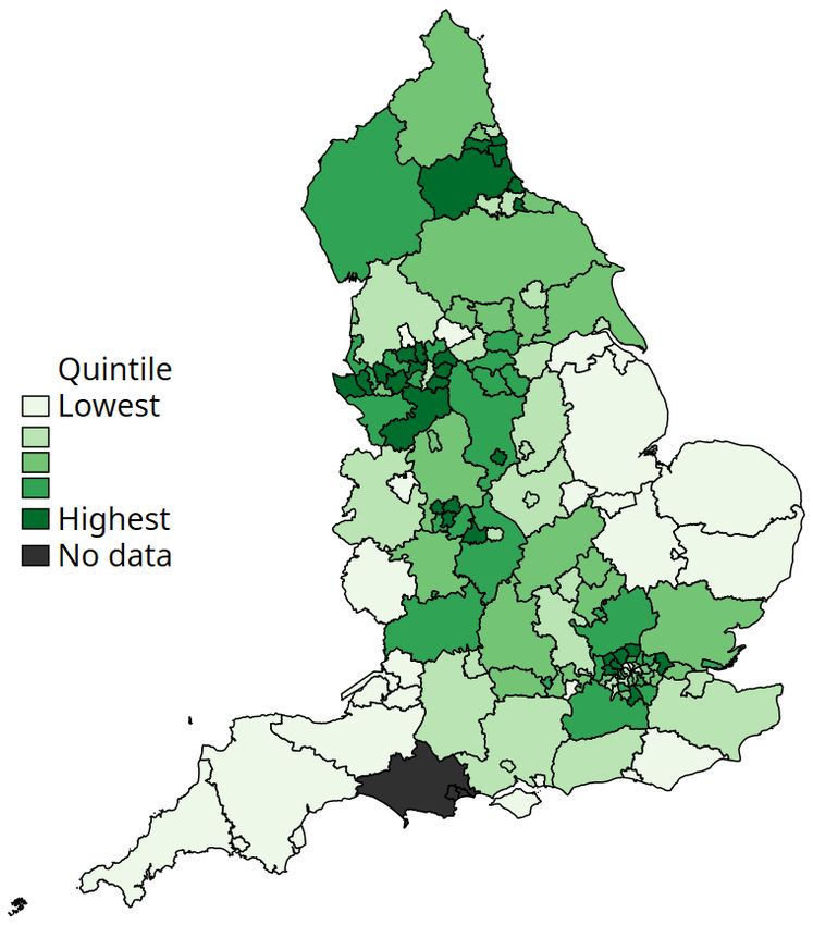
1. The geography of COVID-19 cases and
deaths
As of 9 June, there have been 289,140 confirmed cases of COVID-19 infection and 40,883
confirmed deaths from COVID-19 across the UK (Department of Health & Social Care and Public
Health England, 2020). Of these deaths, 36,521 (89%) have been in England. Among local areas in
England, there is considerable variation in the numbers of cases and deaths. To summarise the
geographic patterns of where COVID-19 appears to have hit hardest so far, we consider three
indicators: the case rate (number of confirmed cases per 10,000 people); the death rate (number
of deaths where COVID-19 is listed as a cause, per 10,000 people); and the case fatality rate
(number of COVID-related deaths per 100 confirmed cases).
To be clear, cases and deaths from COVID-19 paint an incomplete picture of the viral spread.
Official case rates depend on the prevalence of testing. So far, tests in England have been
rationed and generally only offered to those with the most severe symptoms and to front-line key
workers. This suggests the number of confirmed cases per head of population likely understates
the true extent of viral infection in the population (while the number of confirmed cases per test
done will likely overstate it). Just how much of an understatement remains an active area of
scientific research; results published by the Office for National Statistics (ONS) on 28 May suggest
that around one in fifteen people in England (outside hospitals and care homes) tested positive for
COVID-19 antibodies, suggesting they have had the virus. The share of deaths where COVID-19 is
recorded as a cause of death depends on the share of seriously ill patients who have a COVID-19
infection confirmed. While this might be relatively accurate for deaths in hospitals, deaths
elsewhere – such as in care homes or personal residences – are less likely to count towards the
official COVID-19 death toll. Furthermore, data on the local distribution of cases within England
account for only around 70% of the total confirmed cases.
Which areas have been hardest hit by COVID-19 so far?
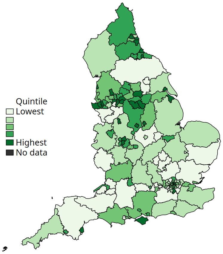
With these caveats in mind, Figure 1 shows the geographic variation in COVID-19 case rates in
England: the number of confirmed cases per 10,000 people (up to and including 7 June 2020).
There is variation across the country in the extent to which local populations appear to have been
exposed to the virus: local areas in the highest fifth of case rates have experienced 2.7 times more
cases per 10,000 of the population than local areas in the lowest quintile. 1
Figure 2 shows the geographic variation in the COVID-19 death rate: the number of deaths per
10,000 people where COVID-19 is mentioned on the death certificate. Local areas in the highest
quintile of death rates have experienced 2.4 times more deaths per 10,000 of the population than
local areas in the lowest quintile.
As in other countries, the highest case and death rates have been in urban areas. This reflects
some characteristics of urban centres that made them particularly susceptible to the initial
outbreak: they are internationally well-connected, they have high population densities and their
populations have a greater reliance on public transport. More rural areas of the country in the
South West and East of England, as well as the less-dense East Midlands, have so far seen much
lower rates of (confirmed) infections and deaths. However, the predominantly rural areas of
Cumbria and County Durham in the North of England have seen large outbreaks.
1 The ONS has recently released data on how COVID-19 deaths vary by age, gender and deprivation levels across local
authorities –
https://www.ons.gov.uk/peoplepopulationandcommunity/birthsdeathsandmarriages/deaths/bulletins/deathsinvolvin
gcovid19bylocalareasanddeprivation/deathsoccurringbetween1marchand17april.
4 © Institute for Fiscal Studies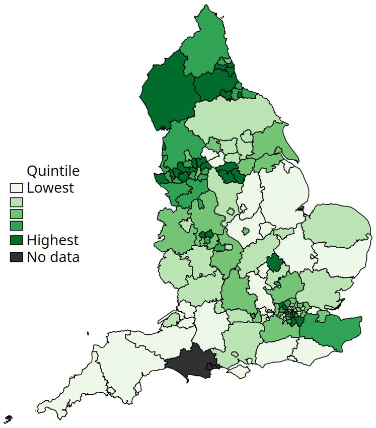
The third measure we consider is the case fatality rate (CFR), the number of COVID-related
deaths per 100 confirmed cases. All else equal, this measure gives an indication of how lethal the
virus has been in particular areas. However, it is important to stress that – at least so far – all else
has not been equal: limits on testing mean that tests are primarily carried out only for some key
workers and for those who become seriously ill (who are more likely to be in vulnerable groups).
This means that the CFR in our data is almost certainly an overestimate of the true figure, though
absent much wider testing it is very hard to know how much of an overestimate.

Figure 1. Distribution of COVID-19 infections per 10,000 in England
(as of 7 June 2020)

                           London                                           North West

Source: Public Health England ‘Coronavirus (COVID-19) in the UK’ Data Dashboard, latest cases data as of 7 June 2020,
https://coronavirus.data.gov.uk/.

© Institute for Fiscal Studies                                                                                          5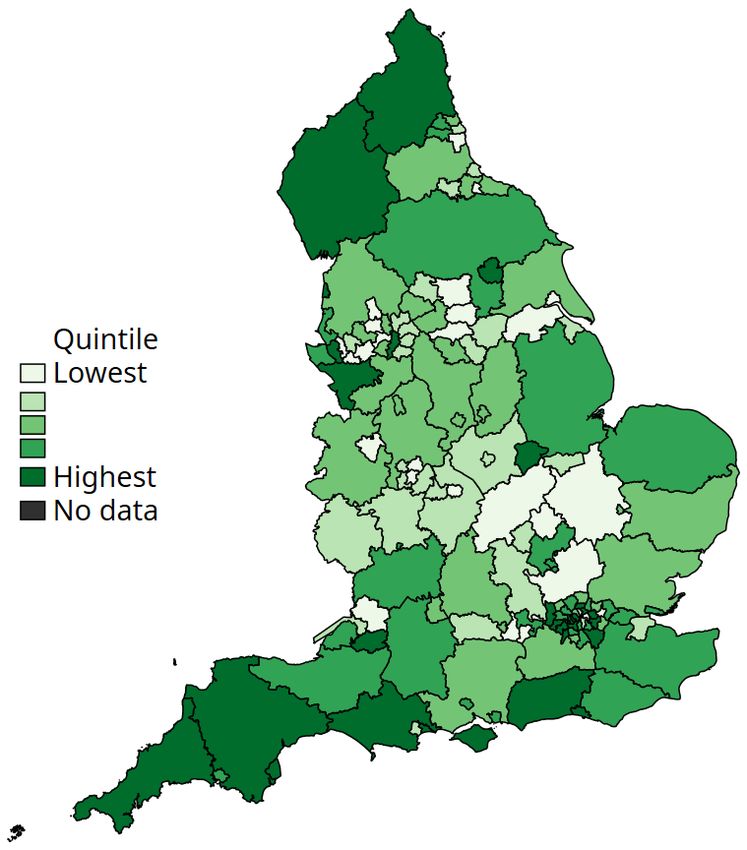
But while the levels of the measured CFR will not perfectly reflect reality, its distribution around
the country will be more informative (as long as testing criteria in different areas are broadly
similar, so that the cases confirmed are of similar levels of severity). Figure 3 shows how this CFR
varies across the country. As expected, we see less variation in this than for cases or deaths: local
areas in the highest quintile of the CFR have an average CFR around twice as high as local areas
in the lowest quintile.

Figure 2. Distribution of COVID-19 deaths per 10,000 in England
(as of 29 May 2020)

                   London                                                     North West

Source: Office for National Statistics, ‘Death registrations and occurrences by local authority and health board: up to
week ending 29 May 2020’ (released 9June 2020),
https://www.ons.gov.uk/peoplepopulationandcommunity/healthandsocialcare/causesofdeath/datasets/deathregistratio
nsandoccurrencesbylocalauthorityandhealthboard.

6                                                                                                 © Institute for Fiscal Studies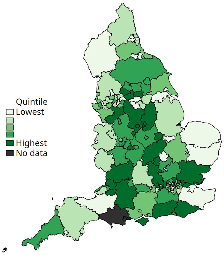
We find relatively few clear patterns in the CFR. Some boroughs in northern outer London, as well
as some local authorities (LAs) in the Midlands, have seen disproportionately high death rates
compared with confirmed cases. Equally, many areas – particularly those more distant from
London – have a much lower CFR. This is particularly true of the North West, the South West and
parts of East Anglia. This reflects the more recent outbreaks of cases in these areas; given the
time between infection and death, more recent outbreaks of cases will – at least temporarily –
push down the CFR.

Figure 3. Distribution of COVID-19 case fatality rates across England
(as of 29 May 2020)

                         London                                             North West

Note: Case fatality rate is number of confirmed deaths (as of 29 May) divided by number of confirmed cases by same date.

Source: Office for National Statistics, ‘Death registrations and occurrences by local authority and health board: up to
week ending 29 May 2020’ (released 9 June 2020),
https://www.ons.gov.uk/peoplepopulationandcommunity/healthandsocialcare/causesofdeath/datasets/deathregistratio
nsandoccurrencesbylocalauthorityandhealthboard. Public Health England ‘Coronavirus (COVID-19) in the UK’ Data
Dashboard, cases data as of 29 May 2020, https://coronavirus.data.gov.uk/. Some area data were missing from the latter
source, so case rates were imputed from the trend across various surrounding dates.

© Institute for Fiscal Studies                                                                                         7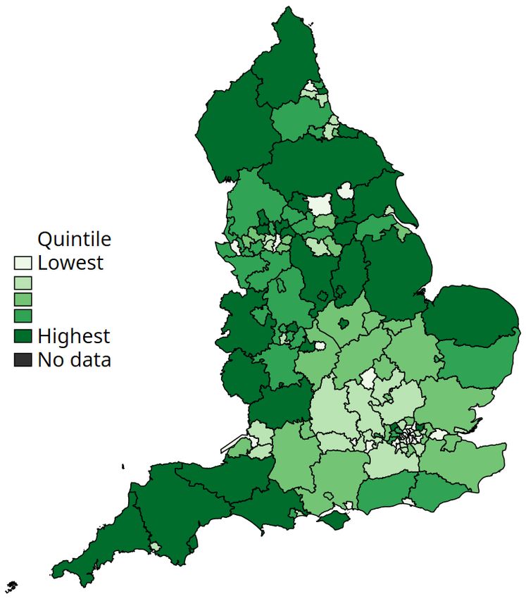
Outside of areas with earlier and more aggressive outbreaks of the virus, a higher CFR is of more
concern: it suggests that the local population who are getting sick are particularly likely to die
from the virus.
How has COVID-19 spread over time?
These snapshots of the geographic variation in caseloads or death rates across the country hide
information on the dynamics of the crisis. These dynamics are important to understand both
where the virus diffused before lockdown policies were enacted in the UK (23 March) and where
the threat of a subsequent wave might be more acute given rising caseloads as lockdown policies
are eased.
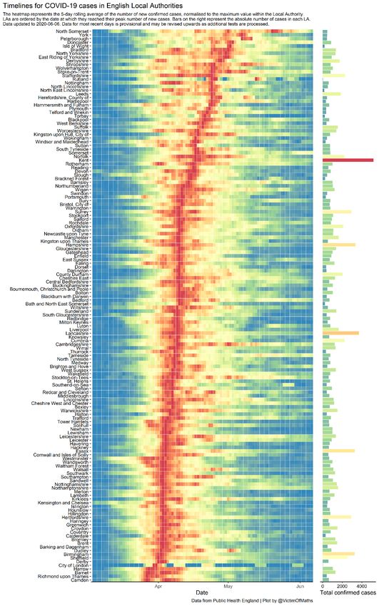
Figure 4 shows a ‘heat map’ of when each local authority (LA) reached its current number of peak
cases, as of 6 June. It constructs, for each LA, a five-day rolling average of the number of new
confirmed cases. It then shows in dark red the day on which the LA reached its own peak. Other
dates are coloured based on how close their five-day average is to the LA’s peak, with cooler
colours representing fewer cases compared with the peak. Local authorities are ordered based
on when they reached their peak new cases, with those at the bottom of the figure peaking earlier
in the pandemic. London boroughs are concentrated in this earlier group, with many reaching
peak new cases in late March and early April, just after the lockdown began. In contrast, local
authorities at the top have seen increasing rates of new cases up until early May. 2
By the start of June, most LAs are coloured blue or green, with daily new cases at a similar level to
early March, before lockdown policies were introduced.
Taken together, these figures show that COVID-19 has so far spread most widely in urban areas
and – more recently – in the North West, with deaths concentrated in the urban areas where the
virus first diffused. However, this does not mean that these are the areas where individuals most
vulnerable to the virus reside.
At the same time, the pandemic is much more than a public health crisis, with many different
dimensions of vulnerability. In this report, we analyse three measures of vulnerability and assess
how they vary by geography: health vulnerabilities (a measure of where local residents might be
more at risk of severe symptoms, should they be exposed to the virus); labour market
vulnerabilities (the share of local workers who work in industries directly shut down during the
lockdown); and family vulnerabilities (a measure of where children might be more at risk of falling
behind during school closures or more at risk of harm).
Section 2 describes how we construct each of these measures and compares the geographic
variation in health vulnerabilities with that for COVID-19 cases and deaths. It also examines the
relationship between these COVID-specific indicators of vulnerability and standard measures of
the socio-economic deprivation of local areas. Section 3 explores the extent to which, within the
same local authority, these different dimensions of vulnerability are related to one another.
Section 4 presents maps to show the spatial patterns in these dimensions of vulnerability across
local areas. Section 5 combines the information across dimensions to document which local
areas are most vulnerable along multiple dimensions. Finally, Section 6 discusses how our
findings can help to inform policymakers as they begin to implement policies to ease the
transition out of the lockdown, getting people back to work and children back to school, all while
not causing a second wave of infection.
2 The far-right panel of Figure 4 shows that some areas with late peaks are also those with lower numbers of total
confirmed cases.
8 © Institute for Fiscal Studies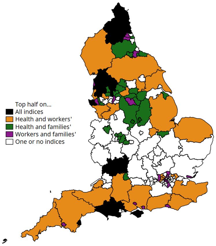
Figure 4. Timelines for COVID-19 cases by local authority in England as of 6 June

Source: Angus, 2020.
2. Dimensions of vulnerability
We analyse three distinct dimensions of vulnerability:
Health-related vulnerability: This measure captures the prevalence of risk factors for
experiencing severe symptoms from COVID-19. The indicators we consider are the share of
people aged 70 or older, and the shares with certain pre-existing health conditions (coronary
disease, hypertension and diabetes). 3 Absent any policy response or changes in social
distancing behaviour, local areas with higher shares of more vulnerable people will potentially
have greater numbers of people who require (intensive) hospital treatment as a direct
consequence of COVID-19.
Labour market vulnerability: A number of sectors – such as restaurants, hospitality and
personal services – have been entirely closed down as part of social distancing. Workers in
these shut-down sectors could face lower earnings during the crisis and uncertain
employment prospects even as the lockdown eases. 4 Local areas with a greater share of
workers in these sectors are likely to experience greater economic distress because of the
crisis.
Family vulnerability: Schools are a vital part of the safety net for families with children, and
school closures will affect not just children’s educational prospects but also the ability to
identify vulnerable children and families. We construct a measure of this dimension of
vulnerability using local area information on the number of children entitled to free school
meals, the rate of referrals to children’s services, and the number of children on child
protection plans. These dimensions capture children from disadvantaged families who might
fall further behind in their education, and children at risk of harm or neglect. 5 Local areas with
a greater share of such children might particularly suffer long-lasting impacts on children’s
well-being as a result of the crisis.
Other dimensions of vulnerability: There are, of course, many other dimensions through which
the crisis can impact households beyond the components of health, jobs and families that we
consider here. For instance, we recognise that these measures also capture elements of social
geography. For example, the geographic distribution of ethnic minorities, who might be more
susceptible in terms of pre-existing health conditions, will in part be reflected in the spatial
variation in the health vulnerability measure.
However, we do not, and cannot, comprehensively cover all possible vulnerabilities, and so our
findings will necessarily be limited to the three dimensions of vulnerability that we explore in this
report. Our aim is to inform debate on the extent to which the health, labour market and family
dimensions of vulnerability to the crisis might be geographically concentrated or dispersed. The
methods we set out can easily be expanded to cover more indicators.
Methodology
For each dimension of vulnerability, we analyse data collected at the level of the upper-tier local
authority in England (county, unitary authority, or London or metropolitan borough). These
authorities are also responsible for children’s services and (jointly with academies) for education,
and they play a meaningful role in policy (see Ogden and Phillips (2020) for further detail). 6 Since
in the majority of cases the most recent data available are from 2019, we analyse LAs based on
3 For example, see Verity et al. (2020) and Zhou et al. (2020). See Appendix Table A4 for details of the health data.
4 We follow the definition of workers in shut-down industries set out by Joyce and Xu (2020).
5 Before the crisis, around 18% of referrals to children’s services went through schools and a further 15% through the
health services; both channels will be impacted by the crisis. Figures are taken from the local authority interactive tool
(https://www.gov.uk/government/publications/local-authority-interactive-tool-lait).
6 In this piece, we focus on a common unit of geography to better compare across vulnerability indices. Of course, for
some of the indices that we measure, other units of geography might also be relevant; for example, travel-to-work
areas could be an important unit of analysis when thinking about workers’ vulnerabilities.
10 © Institute for Fiscal Studiestheir January 2019 boundaries. We drop the Isles of Scilly and the City of London as their small
populations mean that measures such as rates are less informative than they are in more
populous LAs. 7
Our measure of labour market vulnerability is the share of people working in an LA area who
work in shut-down sectors, which include non-food/pharmaceutical retail, much of the hospitality
sector and the arts and leisure sector (the full list of sectors is provided as a note to Appendix
Table A4). Note that this measure is based on people working in a particular LA; particularly in
urban areas such as London, these might not be the same people as live in that area.
The health and family dimensions of vulnerability have several different, but related, indicators.
For each dimension, we construct a single index based on these different indicators. 8 The index
creates a weighted average of the different indicators. Indicators that are more similar to each
other have lower weights (as they bring much of the same information), while those that are less
similar carry a greater weight. This methodology lets us capture as much of the information from
the different indicators as possible while constructing a single measure for each dimension of
vulnerability. The method does not try to weight the importance of individual indicators for any
outcome (such as cases of or deaths from COVID-19).
In order to express the three different indices in common units, we standardise them so that they
are all on the same scale. For each index, the average score is zero; local authorities that score
above zero are deemed to be more vulnerable on that dimension, while those with negative
scores are deemed to be less vulnerable.
How do health vulnerabilities relate to COVID-19’s impact so far?
We first establish how our measure of potential vulnerability to the virus on health dimensions
relates to the actual number of recorded cases so far. Figure 5 shows how the health vulnerability
index correlates to: (i) confirmed COVID-19 cases per 10,000 people (left-hand panel); (ii) deaths
per 10,000 people with COVID-19 listed as a cause (middle panel); and (iii) residualised COVID-19
death rates (right-hand panel). We construct the residualised death rate by stripping out
differences between LAs related to their population density and their COVID-19 case rate. Each
panel of Figure 5 separately highlights local authorities in London (green) and those outside of
London (black). Appendix Table A1 shows the corresponding slopes of the line of best fit for
London and for non-London areas.
Two findings emerge. First, within local areas in London, there is a positive relationship between
our measure of health vulnerability and actual COVID-19 case rates, death rates, and death rates
even after population density is controlled for. So far in the crisis, local areas in London have been
most impacted in terms of cases and deaths (Figures 1 and 2), but these were also the areas
affected earliest in the pandemic (Figure 4), with many infections before lockdown policies were
introduced. It seems reasonable to assume therefore that the disease was most widely spread in
London before lockdown measures were introduced. As such, our health vulnerability index picks
up the underlying susceptibility of the local population to COVID-19 absent major policy responses
or significant behavioural responses of households. This matters both as a measure of the
potential demand for intensive healthcare treatment should the virus take hold in an area and as
an indicator of the share of workers and consumers who might need to maintain stricter forms of
social distancing for a longer time.
Outside of London, the relationship between the health vulnerability index and measures of
COVID-19 impacts so far is much weaker. There is no statistically significant relationship between
our health index and any of the measures of COVID-19 impacts so far. One reason for this is the
measurement issues discussed above. It also reflects the fact that, in areas where the virus had
not yet taken root by mid March, the combination of policy response (for example, lockdown) and
7 See Appendix Table A4 for a full list of data, the year in which each indicator is measured and sources.
8 We construct Anderson indices; see Anderson (2008) for details on the methodology. The code to create these indices
is based on a program written by Cyrus Samii (http://cyrussamii.com/?p=2656).
© Institute for Fiscal Studies 11Figure 5. Relationship between health vulnerability index and measures of COVID- 19 incidence (highlighting London) Note: Higher values of the vulnerability index indicate more vulnerable areas. Since the COVID-19 impacts are only available on current LA boundaries, the figure does not include Dorset, Bournemouth and Poole, whose boundaries changed in April 2019. COVID-19 residualised death rate is predicted from the residuals of a regression of the (confirmed) death rate on the (confirmed) case rate and population density of each LA. Dates and sources for the data are listed in Appendix Table A4. behavioural change (for example, voluntary social distancing and staying at home) has meant that more vulnerable groups have been somewhat shielded from the virus, at least so far. Indeed, the slight negative slope might suggest that areas with the most vulnerable populations in terms of health have seen the largest behavioural responses to the crisis, as people aim to shield themselves and their neighbours from exposure. However, these areas remain the places where any subsequent wave of infections might hit hardest, especially given that for many local areas, COVID-19 cases only recently reached their peak (as shown in Figure 4). This pattern of results is not just a division of London versus non-London areas. To see this, in Appendix Figure A1 we repeat the exercise but split areas into high- and low-case-rate local authorities. High-case-rate LAs are defined to be those with a case rate that is higher than the lowest case rate in any London local authority. We see the same pattern emerge: among local authorities experiencing higher caseloads, there is a positive relationship between our health vulnerability index and their case rates, death rates and residualised death rates. In areas not as impacted as London areas, there is a pronounced negative relationship between health vulnerability and actual health-related COVID-19 outcomes. Again this suggests that, within areas where the virus is yet to spread, the combined policy impact and behavioural response of more vulnerable areas has been greatest. How do health, job and family vulnerabilities relate to traditional measures of local area disadvantage? The indices constructed relating to health, job and family vulnerabilities are specific to the COVID- 19 crisis. An important question for policymakers is the extent to which these pandemic-specific 12 © Institute for Fiscal Studies
measures capture more traditional markers of socio-economic disadvantage. The standard
measure used across local areas in England is the 2019 Index of Multiple Deprivation (IMD),
which includes measures related to health, income and employment, among others. 9

Figure 6 compares our indices with a measure based on the 2019 IMD, capturing the share of
neighbourhoods in an LA that are in the 20% most deprived nationally. 10 We again highlight the
split of local areas by those in London and those outside London.

The left-hand panel shows that there is only a weak relationship between the health vulnerability
index and the IMD-derived measure of local area deprivation. Those areas that are more
susceptible to COVID-19 on health grounds are not generally the most deprived areas – this holds
within and outside London. While this might appear surprising at first, it partly reflects the fact
that our health vulnerability index is narrowly focused on those factors that have the strongest
clinical relationship to severe COVID-19 symptoms, and not some broad measure of how healthy
(or not) the population is.
The central panel of Figure 6 shows a negative relationship between our worker vulnerability
index and the IMD-derived measure of local area deprivation. 11 This negative relationship is even
more pronounced outside London, perhaps because workers in London are more likely to work in
a different LA from where they live (and so would be counted in different LAs on the residency-
based IMD measure and the workplace-based worker vulnerability index).

Figure 6. Relationship between vulnerability indices and the 2019 Index of Multiple
Deprivation (highlighting London)

Note: Higher values of the vulnerability indices indicate more vulnerable areas. The vertical axis measures the share of
lower-level super output areas (LSOAs) in each upper-tier local authority that are in the 20% most deprived based on
national rankings on the 2019 Index of Multiple Deprivation. Dates and sources for the data are listed in Appendix Table
A4.

9    The IMD is formed of seven subdomains: income, employment, education, health, crime, barriers to housing and
     services, and the living environment. See https://www.gov.uk/government/statistics/english-indices-of-deprivation-
     2019 for further detail.
10   Appendix Table A2 quantifies the relationships shown in Figure 6.
11   This relationship also holds when we consider other measures of deprivation, such as the share of neighbourhoods in
     the 10% or 50% most deprived nationally.

© Institute for Fiscal Studies                                                                                             13
This does not mean that it is better-off workers who are more exposed to the crisis; on the contrary, it is relatively lower-wage workers (especially those within shut-down sectors) who have been most impacted, since they are less able to work from home (Costa Dias et al., 2020). But we do find that, looking at areas rather than individuals, it is more affluent LAs that might face a bigger challenge in their labour markets. These are not the same local areas that are usually most vulnerable to macroeconomic shocks. This poses two challenges for local policymakers: first, how best to support their local population in finding new jobs; and second, LAs will need to collaborate – if many workers in shut-down sectors live in a different local area from where they work, it is possible that the economic hit will be felt in a different place from the need for social support. One effect of this crisis will be to expose many workers to the means-tested benefits system for the first time. The extent to which it meets their expectations – and the extent to which exposure changes their preferences for generosity in the benefits system or the extent to which they self- insure in fear of subsequent periods of unemployment – remains to be seen but could be a long- run consequence of the pandemic. The right-hand panel of Figure 6 shows that the family vulnerability dimension to the crisis is very similar to the IMD-derived measure of local area deprivation. As Appendix Table A2 shows, the family vulnerability index – based on three measures of social vulnerability – explains over half of the differences between local authorities in their IMD ranking once region and population density have been taken into account. This is unsurprising as a key component of our family vulnerability index (eligibility for free school meals) is closely linked to deprivation. Taken together, Figure 6 shows that this pandemic will exacerbate existing inequalities between areas (for example, more strongly affecting families who live in more deprived local areas), and also create new inequalities on other dimensions, such as health or employment. 14 © Institute for Fiscal Studies
3. Dimensions of vulnerability within local
   areas
Key to understanding the geography of vulnerability to the COVID-19 crisis is the extent to which
our three dimensions of vulnerability relate to one another. If the local areas that are most
vulnerable to the virus on health grounds also have a greater share of workers whose industries
have had to close down, or a greater number of children at risk, policymakers could concentrate
on these areas when designing policy for the crisis.

Overall, we find no evidence that this is the case. Indeed, within local areas, there is actually a
slight negative relationship between each of the three dimensions of vulnerability. This means
that the local authorities that are most vulnerable on health grounds have fewer workers in
highly affected industries, and fewer children at risk of harm or of falling behind in school.

Figures 7–9 show the relationship, within any given local authority, between pairs of the three
dimensions of vulnerability. Appendix Table A3 summarises the overall relationships between
these dimensions. This shows that the indices within each pair are weakly correlated with each
other, meaning that each picks up distinct dimensions to the crisis within the same local area.

Figure 7 shows the relationship between health and labour market dimensions of vulnerability.
Both in London and in the rest of the country, there is almost no relationship between these two
dimensions on average (the lines of best fit are relatively flat).

Whilst there is no strong average relationship, we can see that some local authorities will be hit
hard in both health and labour market dimensions (those in the upper-right part of the figure). If
the two measures were entirely unrelated to each other, we would expect around a quarter of
the 150 local authorities in our analysis (38) to be in the upper-right section of the graph. In
practice, there are just 27 local areas that have above-average vulnerability on both the health
and workforce dimensions. These include areas such as the Isle of Wight and Torbay, which have
high concentrations of elderly residents and are also relatively reliant on tourism and hospitality.

London boroughs are concentrated in the bottom-right quadrant, with relatively younger
populations but more reliance on hospitality and accommodation. In the top-left quadrant are
more rural areas, particularly in the West Midlands and Yorkshire, with a greater share of older
residents but local economies more weighted towards manufacturing.

Figure 8 repeats this analysis for health and family dimensions of vulnerability. Outside London
there is a slight negative relationship between these two dimensions of vulnerability, with a
stronger negative relationship existing within London. For this pair of vulnerabilities, 38 local
areas, or almost exactly a quarter, have above-average vulnerability on both health and family
dimensions, and 35 are in the bottom-left part of the figure with below-average vulnerability on
both indices. Those in the top-right quadrant are primarily more rural authorities, including
several in the North West, West Midlands and Yorkshire. London boroughs and counties in the
South East are clustered in the bottom half of the graph, with lower health vulnerabilities but a
broad range of social vulnerabilities.

Finally, Figure 9 shows the relationship between the worker and family dimensions of
vulnerability. Again, the overall pattern is that there is very little relationship outside of London,
and a small negative relationship between the two in the capital. Relatively few local areas are
vulnerable on both worker and family dimensions: there are only 19 LAs in the upper-right part of
the figure. These are predominantly urban areas, including Liverpool, Manchester, Newcastle and
parts of London.

© Institute for Fiscal Studies                                                                        15
Figure 7. Relationship between dimensions of vulnerability: health and workers

Note: Higher values of the vulnerability indices indicate more vulnerable areas. Dates and sources for the data are listed in
Appendix Table A4.

Figure 8. Relationship between dimensions of vulnerability: health and families

Note: As for Figure 7.

16                                                                                                     © Institute for Fiscal Studies
Figure 9. Relationship between different dimensions of vulnerability: workers and
families

Note: As for Figure 7.

Overall, these results imply that focusing on one dimension of vulnerability in isolation provides a
very different picture of where in the country is likely to be hardest hit by the COVID-19 crisis
compared with when multiple dimensions are considered.

This also means that trying to construct a single overall measure of ‘vulnerability’ to the crisis will
be simplistic and could lead to mis-targeting resources and policy responses. In a crisis with so
many different vulnerabilities, no one number can capture the disparate ways in which
households and local communities will be affected.

© Institute for Fiscal Studies                                                                         17
4. Vulnerabilities across local areas
We now present maps of England showing how vulnerable different local areas are to the crisis
along the dimensions considered. Figures 10–12 show these maps, where we shade local areas
into five groups based on their ranking on each dimension of vulnerability. 12

Figure 10, which shows our measure of health vulnerabilities, paints a very different picture from
the maps in Section 1 on where COVID-19’s impacts have been felt most so far. Figure 10
highlights the potential vulnerability of areas such as the South West and parts of Yorkshire,
which have older populations with more pre-existing conditions. Caseloads in these areas have
so far been low, so areas with more susceptible populations have not had as much exposure yet
to the virus.

But this does mean that there is potential to see much more serious impacts in the future, should
any subsequent wave of infection hit those areas more severely. It also means that some of the
areas where the health impacts of the virus have so far been lower will be places where the
continued need for stricter forms of social distancing will be higher. Policymakers will have to
communicate these risks carefully.

Some other clear patterns emerge from these maps. For example, populations in London and the
South East are generally at lower risk of severe symptoms from COVID-19 (based on their age
and pre-existing conditions), but they are much more likely than in many other areas to work in
industries that have been closed in the lockdown (Figure 11). In other places, such as the North
West and South West, higher health vulnerability goes hand-in-hand with more economic activity
in closed sectors (such as tourism and non-food retail). Vulnerable families tend to be clustered in
urban local authorities, especially northern cities such as Blackpool, Newcastle, Middlesbrough
and Greater Manchester (Figure 12).

One of the most striking findings is that, in many cases, neighbouring local authorities look set to
have very different experiences of the crisis. For example, inner London boroughs have similar
health risks, but vary widely in their workers’ and families’ vulnerability. And this is not just an
urban issue; for example, Nottinghamshire has quite different exposure from neighbouring
Leicestershire’s on all three dimensions of vulnerability. These are significant differences: for
example, based on our index of families’ vulnerability, Leicestershire is the eighth-least vulnerable
LA in England while Nottinghamshire is in the top half.

12   Previous analysis has investigated how specific measures of vulnerability vary across different parts of England. For
     example, the Office of the Children’s Commissioner has created local area profiles of child vulnerability across various
     dimensions (https://www.childrenscommissioner.gov.uk/publication/were-all-in-this-together/).

18                                                                                                      © Institute for Fiscal Studies
Figure 10. Geographic variation in vulnerability: health
London North West
Note: Local authorities are divided into five equal-sized groups (quintiles) based on their vulnerability. Data are not
available for the City of London or Isles of Scilly. Data sources are listed in Appendix Table A4.
© Institute for Fiscal Studies 19Figure 11. Geographic variation in vulnerability: workers
London North West
Note: As for Figure 10.
20 © Institute for Fiscal StudiesFigure 12. Geographic variation in vulnerability: families
London North West
Note: As for Figure 10.
© Institute for Fiscal Studies 215. Which local areas are vulnerable on
multiple dimensions?
So far, this report has emphasised that different parts of the country will be vulnerable to the
crisis in different ways. Overall, areas that are more vulnerable in one way look likely to be more
resilient to the crisis in a different dimension. The lesson for policymakers is that they will need to
design interventions with specific aims in mind, and target them based on the appropriate
dimension of vulnerability. However, while the overall relationship between different dimensions
of vulnerability is weakly negative, some areas do look especially vulnerable in several
dimensions.
To show these cases of exposure to vulnerability on multiple dimensions, we identify local
authorities that are ranked in the top half (more vulnerable than average) along each dimension.
We then categorise areas by the number of dimensions on which they are more vulnerable than
average (and which dimensions those are). These results are shown in Figure 13.
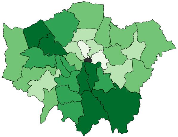
Nine local authorities – Torbay, the Isle of Wight, Blackpool, Northumberland, Dorset, Wirral,
Gloucestershire, Bury and Lancashire – are more vulnerable than average across all three
domains (shown in black on Figure 13). Torbay and the Isle of Wight stand out even among this
group; they are in the top 20% most vulnerable on the health, worker and families indices. This
likely reflects their relatively elderly populations, economic reliance on tourism and hospitality,
and concentrated pockets of local socio-economic deprivation.
Thirty-six local areas are highly vulnerable on both the health and worker indices (as shown in
orange on Figure 13). Many of these are coastal areas – they have higher shares of elderly people
who have moved to the coast for retirement, and more jobs in tourism and hospitality. Many
coastal towns already rank highly in terms of overall deprivation, and the crisis could be set to
make these inequalities with non-coastal areas even wider.
Local areas in the more northern spine of England are more vulnerable than average along
health and family dimensions (shown in green on Figure 13): these areas include South Yorkshire,
Derbyshire and Nottinghamshire, where the population is relatively old and which are fairly
deprived (going back to mining closures which may also link to poor health). These same points
apply to the green areas of the North East (Durham area).
Thirty-six other local areas combine populations that are highly vulnerable in health terms with
vulnerable children and families. These areas are clustered in the West Midlands (particularly
around Birmingham) and in the cities of the North West and North East.
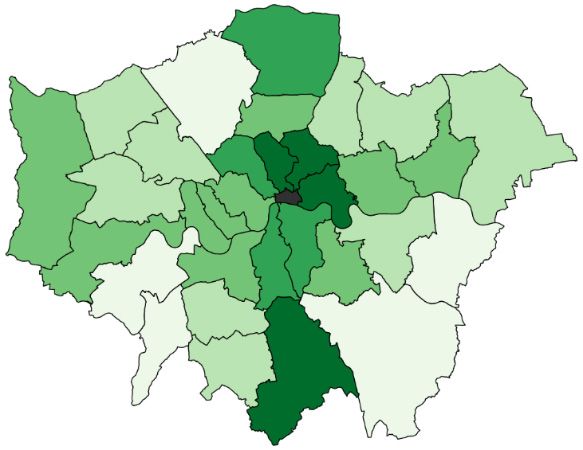
London remains different from the rest of the country in terms of its dimensions of vulnerability.
Within London, there is a north–south spine of local authorities – Enfield, Haringey, Camden,
Hackney, Hammersmith & Fulham, Kensington & Chelsea, Wandsworth, Lambeth and Croydon –
that have higher-than-average vulnerabilities in terms of jobs and families (shown in purple on
Figure 13).
As London is the most densely populated part of the country with the most reliance on public
transport for commuting to work, maintaining social distancing measures as people go back to
work might be especially hard here.
The counterpoint to the relatively small number of LAs that are hard-hit on all measures of
vulnerability is that there are also relatively few areas that are relatively less vulnerable on all
counts. There are only 17 LAs that are in the less-vulnerable half on all three dimensions of
vulnerability. 13 Many of these are counties in the South East or East of England, such as
13 These are Barking & Dagenham, Bexley, Bracknell Forest, Buckinghamshire, Cambridgeshire, Hertfordshire, Leeds,
Milton Keynes, Northamptonshire, Oxfordshire, South Gloucestershire, Stockport, Surrey, Trafford, Warwickshire,
West Berkshire and Wokingham.
22 © Institute for Fiscal StudiesOxfordshire, Buckinghamshire, West Berkshire and Cambridgeshire. These are relatively affluent
areas where industries such as tourism and hospitality make up a smaller share of the local
economy and residents are relatively healthy. Taking a more stringent definition of ‘less
vulnerable’, we find that there are no LAs that are in the 20% least vulnerable on all three
dimensions.
Figure 13. Areas with overlapping vulnerabilities
London North West
Note: Data are not available for the City of London or Isles of Scilly. Data sources are listed in Appendix Table A4.
© Institute for Fiscal Studies 23Vulnerability and inequality Policymakers should also be aware that our indices are focused on capturing unequal vulnerabilities between areas, rather than within them. There is a fast-growing body of work studying inequalities in how the pandemic is affecting particular groups (for example, Joyce and Xu (2020), Banks and Xu (2020) and Blundell et al. (2020)). Other research has found that LAs are far from homogeneous; most contain some neighbourhoods in the 20% most deprived nationally and some in the 20% least deprived (Rae and Nyanzu, 2019). Our results hint that these local inequalities might be important; for example, we find neighbouring LAs often have starkly different vulnerabilities, and it is more affluent areas where a greater share of the workforce is employed in shut-down sectors. 24 © Institute for Fiscal Studies
6. Implications for easing the lockdown
These findings on the geography of the crisis suggest policymakers and politicians are in for a
difficult time. Vulnerability to the COVID-19 crisis is varied across local areas, with residents in
one local authority seeing very different outcomes from the crisis so far from those in
neighbouring local authorities. Neighbouring local authorities also appear to face very different
trade-offs and pressures in terms of the health, job and family vulnerabilities of their populations
going forward.

As the government considers when and how to ease the lockdown, it is also facing an enormous
range of trade-offs. The guidance the government has issued so far suggests that it will focus first
on facilitating work for people who are not able to work from home and who do not work in the
riskiest sectors (such as hospitality). It has also asked schools to reopen to some more students
from 1 June.

Government’s approach to easing the lockdown needs to protect public health while enabling
economic activity and minimising the real social costs of isolation. These dimensions are
interrelated; getting people back to work depends on ensuring they have access to schools and
childcare and on helping them to feel safe in leaving their homes. Ensuring individuals remain in
work or can get back to work effectively can also potentially impact their mental health.

Our results suggest that the balance between these different goals might look different around
the country. More urban areas with younger populations have a smaller share of the people most
vulnerable to the virus. But their workforces are more concentrated in shut-down industries,
which might not be able to return safely to anything like normal activity for months. Children in
more disadvantaged areas are more susceptible to the social costs of the pandemic; reopening
schools will help to prevent these negative impacts from growing even larger, but these children
will still be disadvantaged by the negative economic shock their area has seen. Coastal areas
have many residents who will likely need to social distance more strictly and for longer, as well as
a reliance on tourism and hospitality – where demand from overseas could continue to be
depressed in the medium term, but potentially be offset as UK citizens become more likely to
switch to domestic holidays.

In short, the types of trade-offs that policymakers will face in easing lockdown will vary between
different kinds of areas. But the existence of trade-offs largely will not.

Is there a role for locally based policy?

This of course begs the question of whether and how there should be geographic variation in
when and how lockdowns are eased around the country. There has already been a slight
divergence in policy announcements between the nations of the UK. All this raises larger
questions about whether the available policy levers are sufficient and the extent to which
responsibilities need to be balanced between national and local government.

How much of this geographic variation in the crisis can be addressed by local authorities? The
structure of local government differs around the country, with different authorities responsible
for different services in different places. At the same time, local authority finances will be
significantly impacted by the crisis, albeit to differing degrees and in different ways in different
parts of the country, meaning they could require additional and ongoing financial support and
flexibility. These issues will be discussed in greater detail in future research at IFS (Ogden and
Phillips, 2020).

For national government, a key challenge will be working out how best to target additional
support. Our results show that standard measures of disadvantage – such as the Index of
Multiple Deprivation – or standard proxies through which to target policies – such as by region or
rurality – do a poor job in identifying the kinds of locations that will be most impacted by the crisis
and in which dimensions the crisis will be most acute for them.

© Institute for Fiscal Studies                                                                         25
These issues might be compounded because different dimensions of vulnerability come with
different timescales. For example, in the short run, one of the biggest concerns is the risk of
severe illness or death for older people and those with pre-existing conditions. In the short and
medium term, the financial consequences from job losses and firm closures (partly smoothed by
government) will build, and their consequences are likely to compound over time. In the medium
and long term, the impacts on children who face harm or from lost schooling – and the
consequences this has for inequality – will start to be realised. 14

The COVID-19 crisis has affected every part of the country, but the effects have looked and will
continue to look different in different areas. Dealing with these multiple dimensions of the crisis
across locations will require policy responses tailored to these circumstances and likely not seen
before in the UK.

14   For example, Andrew et al. (2020) find that children in the top quintile of pre-pandemic family earnings spend 30%
     more time on home learning than those in the poorest fifth. Among many others, Burgess and Sievertsen (2020) and
     Vignoles and Burgess (2020) explore the scarring effects that these inequalities have and propose potential policy
     responses.

26                                                                                                  © Institute for Fiscal Studies
Appendix. Additional results and data sources In this appendix, we present additional results referred to in Sections 2 and 3. We also provide further information on and sources for the specific indicators underlying our vulnerability indices. Additional results Figure A1 replicates Figure 5, but highlights local authorities where there is a high current case rate (rather than those in London). We define a ‘high current case rate’ as any LA that has had as many confirmed COVID-19 cases per 10,000 as the London borough with the lowest case rate. This classification includes 122 of the 150 LAs for which data are available. As in Figure 5, we see that there is a positive relationship between our health vulnerability index and measures of how hard LAs have been hit so far by COVID-19, among those areas (shown in green) that have been more exposed to the virus so far. This confirms that, among a large group of LAs, those with populations that we identify as more vulnerable in health terms have seen worse COVID-19 outcomes so far. Figure A1. Relationship between health vulnerability index and measures of COVID-19 incidence (cutting by high current case rate; high = at least as high as lowest London borough) Note: As for Figure 5. © Institute for Fiscal Studies 27
Table A1 provides further information on the relationship between our health index and COVID-19
impacts so far. Separately within London and in the rest of England, we use linear regression to
estimate the relationship between our health index and the three measures of COVID-19 impacts
so far (case rate, death rate and residualised death rate). We do this first without any additional
controls, and then controlling for population density and (in Panel B) region fixed effects. The
coefficient reported in the unconditional regressions (the first column in each pair) is the raw
correlation between our health index and the comparator measure, which is also the slope of the
line of best fit plotted in Figure 5.

As discussed in the main text, there is a positive and – for two of the comparator measures –
statistically significant relationship between our health vulnerability index and COVID-19 impacts
within London, and no relationship or a negative (but not statistically significant) relationship in
the rest of England.

Table A1. Relationship between health index and COVID-19 impacts so far
Panel A. London boroughs

                              Health index                    Health index                     Health index
                                versus                          versus                      versus residualised
                             cases/10,000                    deaths/10,000                      death rate
 Coefficient              0.056*           0.033         0.390***         0.308***         0.468***             0.361***
 Std. error               (0.030)         (0.026)         (0.064)          (0.069)          (0.083)             (0.088)
 Observations                32              32              32               32               32                    32
 R-squared                 0.104           0.401           0.554            0.626            0.515               0.602
 Controls                                     X                                X                                      X

Panel B. Outside London

                              Health index                    Health index                     Health index
                                versus                          versus                      versus residualised
                             cases/10,000                    deaths/10,000                      death rate
 Coefficient               0.004           0.011          –0.006           –0.018           –0.043              –0.064
 Std. error               (0.008)          (0.011)        (0.033)          (0.037)          (0.051)             (0.045)
 Observations                115             115             115              115              115                  115
 R-squared                 0.002           0.325           0.000            0.320           0.006                 0.331
 Controls                                     X                                X                                      X

Note: Table shows the coefficient from a regression of the health index on the measure of COVID-19 impacts indicated in
the column title. Within each pair of columns, the first column shows the unconditional correlation between the measures.
The second column shows the coefficient from the regression of our health index on the comparator measure, including
region fixed effects (outside London) and population density. Residualised death rate is predicted from the residuals of a
regression of the (confirmed) death rate on the (confirmed) case rate and population density. Since the COVID-19 impacts
are only available on current LA boundaries, regressions drop Dorset, Bournemouth and Poole, whose boundaries
changed in April 2019. Statistical significance is denoted by asterisks: * = statistically significant at 10% level; ** =
statistically significant at 5% level; *** = statistically significant at 1% level.

28                                                                                                   © Institute for Fiscal Studies
Table A2 similarly provides further detail on the size and statistical significance of the
relationships between our indices and the 2019 Index of Multiple Deprivation (this relates to
Figure 6 in the main text). As in Table A1, we report results separately within and outside of
London and from regressions with and without additional control variables. The coefficient in the
unconditional regressions (the first in each pair of columns) gives the slope of the line of best fit in
Figure 6.
These unconditional relationships are negative (but not statistically significant) for the health
index; negative and significant outside of London for the worker index; and positive and
statistically significant within and outside of London for the families index. The results for the
latter two indices remain qualitatively similar after controlling for population density and region
fixed effects, but the relationship between the health index and IMD becomes positive (i.e.
counties with a greater share of deprived neighbourhoods are more vulnerable in health terms)
once we control for these factors (though it is still not statistically significant).
Table A2. Relationship between vulnerability indices and 2019 Index of Multiple Deprivation
Panel A. London boroughs
Health index Worker index Families index
versus IMD versus IMD versus IMD
Coefficient –2.459 0.426 –2.093 –2.644 3.547*** 1.861**
Std. error (1.535) (1.574) (1.641) (1.978) (0.836) (0.832)
Observations 32 32 32 32 32 32
R-squared 0.079 0.339 0.051 0.060 0.375 0.578
Controls X X X
Panel B. Outside London
Health index Worker index Families index
versus IMD versus IMD versus IMD
Coefficient –0.191 0.773 –1.066** –1.161* 4.909*** 4.856***
Std. error (0.441) (0.634) (0.433) (0.666) (0.303) (0.472)
Observations 118 118 118 118 118 118
R-squared 0.002 0.277 0.050 0.213 0.693 0.739
Controls X X X
Note: Table shows the coefficient from a regression of the vulnerability index indicated in the column title on the share of
lower-layer super output areas (LSOAs) in the local authority in the 20% most deprived of the national ranking. Within
each pair of columns, the first column shows the unconditional correlation between the measures. The second column
shows the coefficient from the regression of our vulnerability index on the deprivation measure, including region fixed
effects (outside London) and population density. Statistical significance is denoted by asterisks: * = statistically significant
at 10% level; ** = statistically significant at 5% level; *** = statistically significant at 1% level.
© Institute for Fiscal Studies 29You can also read