Torn between Chromophobia and Colour Mania: Developments of Early Technicolor - Tübingen Open Journals
←
→
Page content transcription
If your browser does not render page correctly, please read the page content below
ColourTurn 2018
An Interdisciplinary and International Journal

            VI. Colour in Art and Media

            Torn between Chromophobia and Colour Mania:
            Developments of Early Technicolor
            Barbara Flueckiger

Abstract
From the mid-1910s to the early 1930s, the Technicolor company invented three different
technical processes for colour film, all based on two colours. This innovation was marked
by many set-backs, before the now famous Technicolor No. IV dye transfer process was
introduced in 1932.
This article describes the technical and economic struggle during this early period of
colour films that is largely unknown to the general audience. Based on the investigation
of numerous historical film prints in European and American film archives, the author
analyses the colour design and aesthetics of these films and relates these insights to the
technical properties of the processes, including the challenges for the digitisation of these
rare and precious films.

DOI: 10.25538/tct.v0i1.672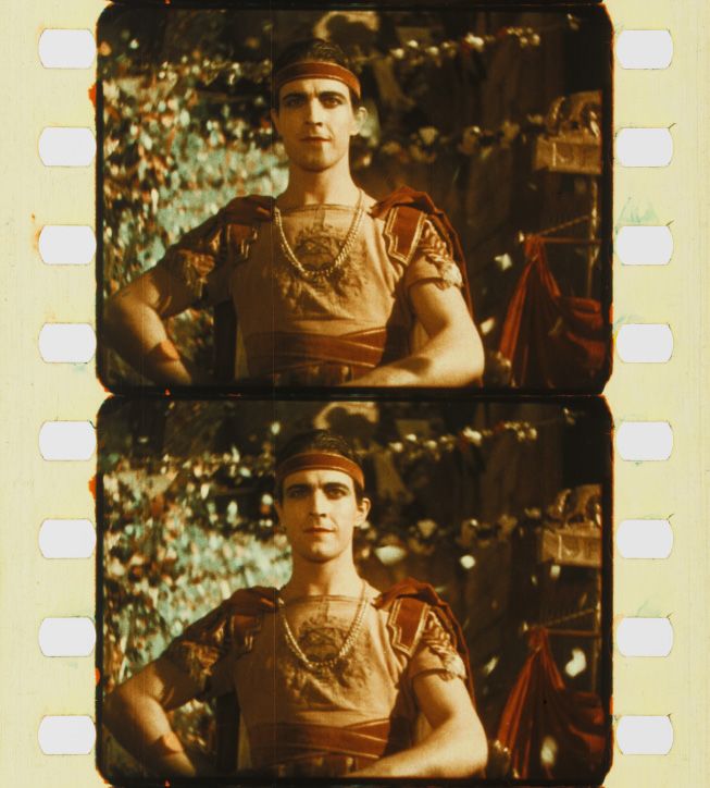
Flueckiger: Torn between Chromophobia and Colour Mania

                                                    We imagine the history of early film in
                  Prof. Dr. Barbara Flueckiger      black and white. Most silent films have
                  Department of Film Studies
                  University of Zürich, Switzerland
                                                    come down to us without colour. But this
                  baflueckiger[at]gmail.com         does not reflect the historical facts. From
                                                    early on numerous attempts were made to
                                                    enrich film with colour. Two very different
                        strategies may be distinguished, the applied colours that had to be
                        added to each separate film print and the so-called ‘natural colours’.
                        ‘Natural colours’ – which in this text I will term mimetic colours – rely
                        on an apparatus-based correspondence to colour perception.
                        The thinking was to develop a camera that, like the human eye,
                        would refract visible light into three primary colours that could be
                        recombined later, either on the film stock itself or through a mechanical
                        device in the cinema. Predecessors of these ideas had already existed
                        in the photography of the nineteenth century. The physicist James
                        Clerk Maxwell postulated and demonstrated around 1855 that colour
                        photography was possible1 by obtaining three colour extracts through
                        filters and projecting them back onto a screen. Numerous experiments
                        followed. In 1869 the Frenchmen Charles Cros and Louis Ducos
                        du Hauron hypothesised and to some extent implemented nearly
                        every possibility that would later lead to practical applications. As
ColourTurn 2018

                        so often in the development of audio-visual media, insights from
                        psychophysics and epistemology were the impetus for new technical
                        processes. This article is not the place, however, to record a detailed
                        history of all these techniques. They are described with texts and
                        images in the online resource Timeline of Historical Film Colors2.

                        1
                         See James Clerk Maxwell. ‘Experiments on Colour, as Perceived by the Eye, with
                        Remarks on Colour-Blindness,’ Transactions of the Royal Society Edinburgh XXI, no.
                        2 (1855): 275–298.
                        2
                          Barbara Flueckiger, ‘Timeline of Historical Film Colors,’ accessed August 27, 2018,
                        http://zauberklang.ch/filmcolors/. The database was published by the author online
                        in 2012 in an initial version. It has been in continuous ongoing development since
                        that time. The databank currently contains around 430 individual entries with
                        primary and secondary sources, illustrated with more than 10,000 photographs from
                        historical films. For background information on the project, see also ‘Filmcolors: An
                        Interdisciplinary Approach,’ accessed August 27, 2018, http://filmcolors.org/.

                                                                                                       VI–2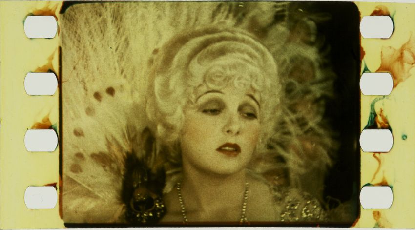
Flueckiger: Torn between Chromophobia and Colour Mania

                  Figure 1. Technicolor No. III, Corrine Griffith in The Garden of Eden (USA 1928, United
                  Artists, Lewis Milestone, 35 mm film). Images courtesy of the Margaret Herrick Library,
                  photograph by Barbara Flueckiger.

                  A bow to alma mater
                  When Herbert T. Kalmus founded the Technicolor company together
                  with Daniel Frost Comstock and W. Burton Westcott in 1915, the
                  founders’ first choice was a mimetic approach. Kalmus – like his
                  co-founder Comstock, a graduate of the Massachusetts Institute of
                  Technology, to which they showed their reverence in the company
ColourTurn 2018

                  name3 – had the insight that the development of a practical colour film
                  process was a promising endeavour early on. From today’s perspective,
                  it is astonishing that the company first chose an approach that had
                  enjoyed an early flowering in the Kinemacolor colour process, but
                  which already found itself in crisis around 1915. It is even more
                  surprising that Technicolor as a company had to go through a nearly
                  twenty-year period of setbacks before it could assert itself on the
                  market. It is a story of outrageous reversals as well as an exemplary
                  lesson in how a technological development can establish itself, or
                  fail, in a field determined in equal measure by cultural and economic
                  factors, namely the American film industry in the years of the classical
                  Hollywood era. As is so often the case, it can be seen that the success
                  of a technical innovation was less the result of brilliant engineering

                  3
                    Richard W. Haines, Technicolor Movies: The History of Dye Transfer Printing,
                  (Jefferson NC: McFarland & Co. 1993).

                                                                                                   VI–3
Flueckiger: Torn between Chromophobia and Colour Mania

                  work than of a clever strategy drawing on cultural, institutional and
                  economic tendencies to generate and satisfy needs at the same time.
                  In his witty essay ‘Technicolor Adventures in Cinemaland’, Kalmus
                  traced the company’s history with ironic interjections:

                       Webster defines adventure as chance of danger or loss; the encountering
                       of risks; a bold undertaking, a daring feat; a remarkable occurrence or
                       experience, a stirring incident; a mercantile or speculative enterprise of
                       hazard; a venture. The excursions of Technicolor into the domain of the
                       producers, distributors, and exhibitors of motion pictures have been all
                       of these4.

                  Writing in 1938, when the phenomenal success of the Technicolor three-
                  color process was becoming apparent, Kalmus could permit himself an
                  ironic distance as the victor in the competition around colour film.
                  Shortly before the breakthrough of Technicolor in the mid-1930s,
                  the article ‘What? Color in the Movies Again’ appeared in Fortune
                  magazine, commenting on the economic conditions of the company’s
                  crisis-shaken early years5. Kalmus, Comstock and Wescott had initially
                  founded a consulting company in the technology sector. This was
                  the context in which they were advising a client, William Coolidge,
                  a lawyer faced with an unsuccessful invention. One day Kalmus
                  suggested to Coolidge that he would do better to invest his money in
ColourTurn 2018

                  the development of a colour film process. Coolidge agreed. He was the
                  first of a series of investors to lose hundreds of thousands of dollars
                  before the first colour film was ever produced in Technicolor.
                  Apparently Kalmus had a fantastic gift for communicating the
                  company’s plans, inspiring enthusiasm and spreading optimism. In
                  the face of every difficulty, he always seemed to have new solutions
                  to pull out of his hat, motivating the Technicolor engineers to
                  develop unusual ideas together with their team. One of these ideas
                  was a mobile film lab built into a train car, fully equipped with the
                  technological infrastructure to sensitise, develop, test, measure, and
                  print film stock, including a power generator, office and fireproof safe

                  4
                   Herbert T. Kalmus, ‘Technicolor Adventures in Cinemaland,’ Journal of the Society
                  of Motion Picture Engineers 31, no. 6 (December 1938): 564.
                  5
                   See ‘What? Color in the Movies Again,’ Fortune, no. 10, October 1934, 92–97, 161–
                  162, 164, 166, 168, 171.

                                                                                                    VI–4
Flueckiger: Torn between Chromophobia and Colour Mania

                  for storing explosive nitrate film. In 1917, Kalmus and his team took
                  the railway car to Jacksonville, Florida, where they produced the first
                  Technicolor feature film, The Gulf Between (USA, Technicolor Motion
                  Picture Corporation, 1918, 35 mm film), directed by Wray Physioc
                  using Technicolor No. I. Only a small number of highly faded frames
                  are extant from the film.

                  Technicolor no. I: The first film, the first defeat
                  The early history of Technicolor began with colour pioneer Herman
                  Isensee’s idea to use a rotating filter disc, patented in 1897, in the
                  primary colours of red, green and blue. This allowed three film images
                  to be exposed in a row and recreated in colour when projected via
                  a corresponding filter device. Such an apparatus yielded the first
                  successful colour film process in mimetic colours, the Kinemacolor
                  process. Because three different primary colours required tripling the
                  speed of the camera and of the projector, the inventors George Albert
                  Smith and Charles Urban decided to go down to two colours, namely
                  red and green. This did not reproduce the entire colour spectrum, with
                  blue left out entirely, but it was a workable compromise.
ColourTurn 2018

                  Figure 2. Technicolor lab in a train car.

                                                                                    VI–5
Flueckiger: Torn between Chromophobia and Colour Mania

                  The first Technicolor process, Technicolor No. I, was an additive two-
                  colour process with a beam splitter. Additive processes are processes
                  that combine coloured light with the sum of all colours resulting in
                  white. A beam-splitter separated the incoming light through two filters,
                  one green and one red, exposing two images to be captured at the
                  same time in the camera. Certain sources refer to two negatives, but
                  according to the patent documents a single negative was used, exposing
                  the frames with a three-frame interval6. These black and white frames
                  were then reassembled in projection through another beam-splitting
                  prism into a single image, now an additive colour combination of red
                  and green, so that yellow could be reproduced but not blue.
                  The development team at Technicolor rightly believed that a spatial
                  separation of the beams – also termed spatial synthesis – could solve
                  one of the biggest problems of the Kinemacolor process and of all
                  processes using temporal synthesis, namely the colour fringes that
                  always arose when objects, animals or people moved. This is because
                  the sequential photography created a slight time mismatch, a temporal
                  parallax between the red and the green image.

                          Since Kinemacolor photographed the color components by successive
                          exposure, it was nothing for a horse to have two tails, one red and one
                          green, and color fringes were visible whenever there was rapid motion.
ColourTurn 2018

                          The Technicolor slogan was two simultaneous exposures from the same
                          point of view, hence geometrically identical components and no fringes7.

                  But Technicolor had underestimated the immense problems
                  that would arise in projection. When in 1918 Kalmus presented
                  Technicolor’s first film, The Gulf Between, to an important audience
                  and promised that he would offer them an unprecedented quality,
                  he suffered a harrowing setback. The projectionist had misadjusted
                  the projector during Kalmus’ opening remarks, so that the colour
                  fringes were worse than ever. The press, however, was merciful. For
                  example, The Moving Picture World wrote under the headline ‘First
                  Showing in Technicolor’:

                  6
                   See James Layton, and David Pierce, King of Jazz: Paul Whiteman’s Technicolor
                  Revue, (Severn MD: Media History Press), 2016, 37.
                  7
                      Kalmus, ‘Technicolor Adventures in Cinemaland,’ 565–566.

                                                                                                     VI–6
Flueckiger: Torn between Chromophobia and Colour Mania

                          The new process throws upon the screen a continuous succession of
                          pictures in natural colors that copy nature with the fidelity of a finely
                          executed oil painting. Many of the landscapes and water scenes are of
                          remarkable coolness. The interiors and human element are not so well
                          done, the men and women in particular having a more or less painted
                          or chromo effect8.

                  The fan magazine, Photoplay, was somewhat more critical:

                          The Gulf Between … is done throughout in tints that approximate at
                          least the natural colors. But, without actual knowledge of the process,
                          it appears that thus far the manufacturers have been compelled to
                          translate all colors into terms of reds and greens. This, of course, includes
                          yellows, pinks, something like blue, and other derivatives. But while it is
                          a tremendous step forward, it is not always satisfactory9.
ColourTurn 2018

                  Figure 3. Technicolor No. II, The Gulf Between (Wray Physioc, USA, Technicolor Motion
                  Picture Corporation, 1918, 35 mm film). Images courtesy of the Margaret Herrick
                  Library, photograph by Barbara Flueckiger.

                  Technicolor was quick to see that there was no future for additive
                  processes. Not only did these techniques require increased speed and
                  consumption of film stock – at least twice as many photographs had to
                  be taken, printed and projected – but they also required more powerful
                  light sources to compensate for the loss of light through the filters. The
                  greatest difficulty of all was the projection, because the projectors had
                  to be modified and the projectionists faced a tremendous challenge
                  that Kalmus described as follows: ‘During one terrible night in Buffalo
                  I decided that such special attachments on the projector required an

                  8
                      ‘First Showing of Technicolor,’ The Moving Picture World 34, no. 1, 1917, 61.
                  9
                   Randolph Bartlett and Kitty Kelly, ‘The Shadow Stage: The Gulf Between,’ Photoplay
                  13, no. 1, December 1917, 118.

                                                                                                          VI–7
Flueckiger: Torn between Chromophobia and Colour Mania

                  operator who was a cross between a college professor and an acrobat,
                  a phrase which I have since heard repeated many times’10.
                  It was not only a challenge for the projectionist but a fundamental
                  problem of additive processes that cinema owners had to invest in a
                  new technology that would not necessarily succeed – on the contrary.
                  Cinema owners were not only sceptical of innovations with an
                  economic value that was not immediately apparent. They also received
                  films from different distributors and as a consequence would have
                  had to install multiple sets of equipment in the absence of a general
                  standardisation of formats and technologies. This economic obstacle
                  to innovation was eliminated by increasing vertical integration in the
                  1920s: The studios took over distribution alongside production and
                  ran their own theatres.
                  A universal principle thus emerged in this early struggle for market
                  dominance, namely that a supplier could win this struggle only if
                  its colour films could be shown on established projection systems.
                  This also meant that the complexity of a colour process had to move
                  away from projection and towards the industrial manufacturing and
                  development of the colour film stock to companies where specialists
                  could establish and implement a standardised process within the
                  structure of a highly professional institution. Ultimately, a group of 45
ColourTurn 2018

                  prominent businessmen came together in a consortium and invested
                  one million dollars in developing and perfecting a colour film process
                  through Technicolor. At the same time, this consortium proposed strict
                  quality control on the screenplays to be filmed in colour. This, too, was
                  a lesson from the disaster with The Gulf Between, of which Photoplay
                  wrote: ‘The unfortunate thing about this picture is that the story is
                  dull, trite, and drawn out interminably. A good, tense tale would have
                  forced one to forget occasionally the close scrutiny of the colors.’11

                  Technicolor no. II: First success and another disaster
                  In spite of Technicolor No. I’s catastrophic track record, there was one
                  corner stone that survived every major setback and catastrophe in
                  the further development of Technicolor’s colour processes: the beam-

                  10
                       Kalmus, ‘Technicolor Adventures in Cinemaland,’ 566.
                  11
                       Bartlett and Kelly, ‘The Shadow Stage,’ 118.

                                                                                      VI–8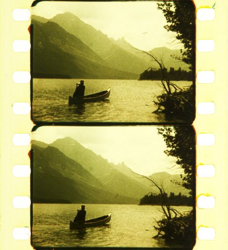
Flueckiger: Torn between Chromophobia and Colour Mania

                  splitter. For Technicolor No. II, a new camera recorded mirror-inverted
                  images of the two black and white separations onto one negative film
                  strip. No longer keeping the chain of photography and printing in black
                  and white and reinserting colour in projection, the new Technicolor
                  No. II process employed the subtractive principle. Subtractive means
                  that light is filtered out, such that the sum of all colours results in
                  roughly black. This principle is much more familiar from everyday
                  life than the additive principle. For example, the mixing of paints also
                  functions subtractively.
ColourTurn 2018

                  Figure 4. Technicolor No. II negative. George Eastman Museum, Moving Image
                  Department, photograph by Barbara Flueckiger.

                  Louis Ducos du Hauron had already described subtractive colour
                  processes in 1869. In theory these processes were very well suited for
                  the moving image. The difficulty – as with the additive processes – was
                  in getting two images to match exactly, now not in projection but in
                  the printing process. The inventor Arturo Hernandez-Mejia described
                  such a process of capturing and printing in 1912 and showed with
                  tests that his arrangement worked. Although his company Colorgraph
                  did not get beyond the test stage, his process was so influential that
                  Technicolor had to rely on his patent. Other early processes with this
                  technology included two-colour Kodachrome (1915) from the Eastman
                  Kodak Company and Prizmacolor (1918) by the American William Van
                  Doren Kelley. Prizmacolor was used for the first full-length feature
                  film, The Glorious Adventure (J. Stuart Blackton, GB, Stoll Film Studios

                                                                                       VI–9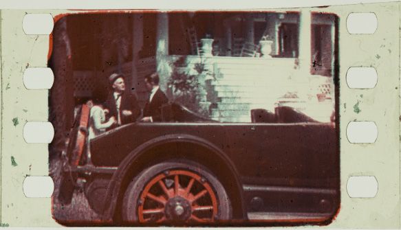
Flueckiger: Torn between Chromophobia and Colour Mania

                  (UK), and United Artists (US), 1922, 35 mm film), a fairly cliché story
                  about a naïve, heavily indebted aristocratic lady of society in glowing
                  turquoise and orange hues, with heavy colour fringes and grotesque
                  make-up.
                  It follows that Technicolor was in no way a pioneer of this technology,
                  which makes it all the more astonishing that Technicolor chose an
                  approach so complicated and impractical. Unlike other inventors,
                  who had printed the two colour extracts onto two emulsion layers on
                  both sides of the film, Technicolor came up with the idea of producing
                  two very thin films and cementing the two colour extracts onto one
                  another. This arrangement had drastic consequences because the
                  two film strips shrank unevenly under the influence of heat from the
                  projector bulb. This caused the entire film to bend (‘cupping’) in an
                  entirely unpredictable way, with each change shifting the image out of
                  focus on screen. It was generally difficult to get the two image planes
                  into focus, and the two emulsions scratched significantly due to the
                  increased thickness.
ColourTurn 2018

                  Figure 5. Technicolor No. II frame from King of Jazz (John Murray Anderson, USA,
                  Universal Pictures, 1930, 35 mm film). Images courtesy of the Margaret Herrick Library.,
                  photograph by Barbara Flueckiger.

                  Two-colour processes typically applied two complementary colours
                  that together yielded black. Technicolor decided on a combination
                  of red and green, with an orange-red tone and a green tone tending

                                                                                                   VI–10
Flueckiger: Torn between Chromophobia and Colour Mania
towards blue-green, but nonetheless clearly on the green spectrum,
in contrast to other processes’ turquoise to cyan-coloured tones. It is
difficult to determine the correct colour tones from a historical distance,
because, as already mentioned, nearly all prints of films made in
Technicolor No. II are completely faded, the green layer in particular.
The analysis of the few frames that are not completely faded suggests
the possibility that at most the early tests with film material from
The Gulf Between, also analysed by Ulrich Ruedel in his study of the
Technicolor Notebooks,12 may have applied blue-green. By contrast,
both the best-preserved frame from the Margaret Herrick Library,
a frame from King of Jazz (John Murray Anderson, USA, Universal
Pictures, 1930, 35 mm film), the fragment from the film Lights of Old
Broadway (Monta Bell, Metro-Goldwyn-Mayer, USA, 1925, 35 mm film)
and Stage Struck (Allan Dwan, USA, Paramount Pictures, 1925, 35 mm
film) show a moss-green tone with only a slight tinge of blue.
The exact knowledge of the colour tones used has direct and wide-
ranging significance. On the one hand, it permits understanding the
film on which contemporary reactions were based. On the other, this
knowledge is decisive for reconstructing film colours when digitising
films that survive only in faded nitrate prints or black and white
negatives, such as Technicolor No. II.
ColourTurn 2018
To spread its colour process, Technicolor and its investor consortium
produced the film The Toll of the Sea (Chester M. Franklin, USA,
Metro Pictures Corporation, 1922, 35 mm film), a loose adaptation of
Giacomo Puccini’s opera Madama Butterfly with a runtime of about 50
minutes, cinematography by J. Arthur Ball, a member of the company’s
development team and in charge of the two-colour camera. Although
The Toll of the Sea celebrated its premiere in New York in 1922, it took
almost a year until the film arrived in theatres. The Technicolor lab’s
insufficient infrastructure caused massive delays in delivering prints.
The press responses to the first showing were more often than not
positive. The critic of the magazine Moving Picture World wrote:
In a great many instances the effect is all that could be desired, especially
some in which the human characters predominate, they appear like
12
See Ulrich Ruedel, ‘The Technicolor Notebooks at the George Eastman House,’ Film
History 21, no. 1 (2009): 47–60.
VI–11Flueckiger: Torn between Chromophobia and Colour Mania
exquisite paintings endowed with life, the effect of the natural colors
giving them more of the semblance of reality. There was no fluttering
or fringing of colors discernible. … Judging from the applause which
followed the showing of this picture … it is destined to be a big success
and its sponsors should feel highly gratified13.
Here we may discern multiple positive positions expressed on
mimetic film colours, namely their painterly quality, their tendency
to depict reality in a more true-to-life manner, an ennobling of film
in harmony with visual art, and an essential quality of film itself and
of its heightened effect of reality. Against these positions, the colour
spectrum was not entirely satisfactory:
The main defect appears to be in the fact that the green of the trees and
plants appears as more of a brown, while in some instances there is an
over-vividness in the reds and orange, and a sort of massing of color in
some of the scenes where there is a wealth of flowers and foliage14.
The critic of the New York Times was convinced that experts regarded
the problem of colour film to have been solved through the
achievements of Technicolor No. II15. Yet the reproduction of skin tone
did not seem to convince the critic for Variety:
The coloring runs without streaks, the camera catching the natural colors
apparently, although what seemed something of a freak in this process
is that the pallid color given to the complexion of the Chinese extended
ColourTurn 2018
to the faces of the Americans as well … Still, though, the natural colors
or the coloring in this Technicolor product is attractive16.
Skin tone, and in particular the skin tone of whites, was the colour
tone that film manufacturers always used for their standard reference
– a notion that has been critically evaluated in recent years17.
The University of California Los Angeles (UCLA) carried out a
restoration of The Toll of the Sea in 1985 on the basis of the camera
negative, a very rare undertaking because the camera negatives for
many films have been lost. Thanks to this outstanding source material,
the resolution is very high, surely higher than what contemporary
13
The Moving Picture World 59, no. 6, December 9, 1922, 573.
14
Moving Picture, 573.
15
See The New York Times, September 22, 1922, 9.
16
‘The Toll of the Sea,’ Variety 69, no. 2, December 1, 1922, 35.
17
See Richard Dyer, White. Essays on Race and Culture, (London and New York, 1997).
VI–12Flueckiger: Torn between Chromophobia and Colour Mania
audiences could have seen. The green tone in this restoration is more
of a petrol green, and the red-orange rather pink, causing the skin tone
to seem quite brownish. The exotic setting and the protagonist (Anna
May Wong) justify an ostentatiously ornamental décor with geometric
patterns in the costumes as well. The silks with Jacquard patterns
emphasise the ornamental components with their shimmering
appearance. Although the racist and sexist attitudes of The Toll of the
Sea appear problematic today, contemporary audiences seem to have
been enthusiastic, the economic success great. ‘It grossed more than
$250,000, of which Technicolor received approximately $165,000 [the
latter figure, adjusted for inflation, around $2.4 million].’18
In the coming years the primary choice remained colour inserts in
tinted and hand-coloured films. Ben-Hur: A Tale of the Christ (Fred
Niblo, USA, Metro-Goldwyn-Mayer, 1925, 35 mm film) is representative
both of this practice and of the break in narration made through the
discontinuity in the insertion of colours. With a few exceptions, such
as the entry of Ben-Hur into Rome, the sections realised in Technicolor
were all biblical scenes. In contrast to the sequences in black and white,
tinting or hand colouring, many composed in an extremely dynamic
way making use of depth of space, the Technicolor fragments are
constructed frontally as tableaux. They employ traditions in pictorial
ColourTurn 2018
composition familiar from sacred art, with spiritual symbolism
determining the visual arrangement. As with later Technicolor films,
light is not used in a very expressive way, instead supporting the
painterly, surface-oriented effect of the image. Ben-Hur remains to this
day a monumental fascination, a grand spectacle into which mimetic
colours bring a remarkable aesthetic layer. But the colours are a
foreign matter in the film, even if a foreign body with an attractive
appearance. Ben-Hur remained a success for years. Later prints were
made in Technicolor No. III and Technicolor No. IV. By 1934, the film
had brought in box office receipts of four million dollars (76 million,
adjusted for inflation).
18
Kalmus, ‘Technicolor Adventures in Cinemaland,’ 567.
VI–13Flueckiger: Torn between Chromophobia and Colour Mania
Figure 6. Technicolor No. III dye-transfer print with sound of Ben-Hur: A Tale of the Christ
(Fred Niblo, USA, Metro-Goldwyn-Mayer, 1925, 35 mm film). Národní filmový archiv/
National Film Archive, Prague, photograph by Barbara Flueckiger.
Hollywood still remained sceptical for two reasons. First, producers
found the film developing and printing prices too high. They insisted
ColourTurn 2018
on a massive reduction in price to one-third, from 27 cents to 8 cents
per foot. Second, the Technicolor lab was still in Boston, and therefore
unable to develop dailies or rushes to check on filming in progress.
More pressing than the practical problems may have been fundamental
reservations about colour, as expressed by Cecil B. DeMille in a manner
representative for many others:
I believe that color photographed at its full value will call attention to
itself and thereby detract from the theme of the photoplay … Anything
that calls attention to the technical or mechanical features of a screen
production is a handicap to its success. Not only will color photography
at its full value detract from the subject matter of the photoplay, but it
will, it seems to me, tend to cause eye strain. If you have ever sat at the
window of a fast moving train and watched the brightly colored scenery
move by you will be able to realize how tiring it is to the eyes to watch
colors move19.
19
Cecil B. DeMille, ‘The Chances of Color Photography in Motion Pictures,’ American
Photography, no. 17 (January 1923): 15.
VI–14Flueckiger: Torn between Chromophobia and Colour Mania
Invocations of ‘eye strain’ or ‘eyesore’ run through the negative
assessment of film colour in the 1920s and 1930s like a recurring
mantra. Was moving colour rejected because it represented a break
with traditional aesthetic experience, as DeMille argued by reference
to the train? Or was it the defensive reflex against colour in Western
culture that David Batchelor has termed chromophobia? In Batchelor’s
view, colour is assessed as an expression of the ‘Other’, as feminine,
oriental, primitive, childish and vulgar, as well as superficial,
superfluous and cosmetic20. All of these explanations could have
contributed to the reluctance to adopt colour for film production.
What might predominate over them, however, could have been a
cultural and institutional rule that governed the style of the classical
studio era: the idea of the continuity system, according to which
the formal elements of narration must be subordinate and achieve
value only when they are in the service of the narration and assume
a clear function in it. In professional discourses in all areas of film
form, anything else was regarded as superfluous and excessive. This
ideology also became apparent in Technicolor’s company strategy
when its colour consultants began to develop restrictive colour
schemes consistent with Natalie Kalmus’ text, ‘Color Consciousness’,
which can be understood as a manifesto of sorts21. Natalie Kalmus,
ColourTurn 2018
head of Technicolor’s Color Advisory Service and Technicolor’s
Color Consultant, was an art historian – this was in any event what
Technicolor always stated, although according to James Layton no
evidence can be found to support the claim – and presumably brought
with her an idea from academic art that a restrictive use of colours is
tasteful. Natalie Kalmus sought to enhance the status of film colours by
using artistic concepts borrowed from painting. She proposed taming
colour stimuli into restrictive, precisely controlled colour schemes.
Three sets of goals were central to this effort, namely naturalness of
colour in keeping with the continuity system, so that colours would
seem as inconspicuous and natural as possible, narrative functions,
assigning a direct narrative use to colours, and, in connection with
20
See David Batchelor, Chromophobia, London, 2000, 64.
21
See Natalie M. Kalmus, ‘Color Consciousness,’ Journal of the Society of Motion
Picture Engineers 25, no. 2 (August 1935): 139–147.
VI–15Flueckiger: Torn between Chromophobia and Colour Mania
this, conventions that referenced established colour symbolisms such
as red for passion and love22.
Technicolor said that it invited DeMille to test the use of colour with
Technicolor for his film The Ten Commandments (Cecil B. DeMille, USA,
Paramount Pictures, 1923, 35 mm film) free of charge. As film historian
Rudy Behlmer has retraced, DeMille accepted the offer and allowed
Technicolor’s cameraman Ray Rennahan to film the biblical exodus
sequences in parallel with two-colour cameras23. In contrast to Ben-
Hur, the scenes of the masses inserted in Technicolor are composed in
deep staging when the streams of Israelites cross the desert in a setup
with an epic effect. It is evident that this composition was not chosen by
Technicolor’s restrictive control, and so not reduced to an intimate play
tableau, but instead showing a vastly expansive spatiality. This strategy
appears to have paid off, since the Technicolor scenes were met with
great enthusiasm: ‘There are many impressive colorful scenes of the
Israelites in the desert, some of them appearing better and more natural
than other such effects we have witnessed on the screen.’24
Thereafter the Famous Players-Lasky Corporation, later to become
Paramount, produced their film Wanderer of the Wasteland (Irvin Willat,
USA, Paramount Pictures, 1924, 35mm film), a Western based on the
novel by Zane Grey, in Technicolor. According to Irvin Willat, whose
ColourTurn 2018
brother worked at Technicolor, he as the director had to convince
Famous Players-Lasky to produce the merely middling screenplay in
Technicolor25. Producers remained sceptical and, in Willat’s opinion,
extremely risk-averse. Willat worked to obtain an optimal impact
from the colours through mise-en-scène.
Kalmus received a nasty letter from Famous Players-Lasky all the
same after the film had been shown in theatres:
We have concluded not to do more Technicolor pictures for the present,
for two reasons: first, because we have had a great deal of trouble in our
exchanges due to the fact that the film is double-coated and consequently
22
Kalmus, ‘Color Consciousness,’ 139–147.
23
See Rudy Behlmer, ‘Technicolor,’ Films in Review 15, no. 6 (June/July 1964): 339.
24
The New York Times, December 22, 1923, 8.
25
See Robert S. Birchard, ‘Conversations with Irvin V. Willat,’ Film History 12, no. 1
(2000) 44.
VI–16Flueckiger: Torn between Chromophobia and Colour Mania
scratches much more readily than black and white, with the necessity
of having to order more replacements, and it is an added bother to our
operators; and, second, because the cost is out of all proportion to its
added value to us. We paid $146,000 additional for Wanderer prints. We
understand that you need volume to get your costs down. At an 8-cent
price we would be interested to talk volume26.
Kalmus wrote that Famous Players-Lasky was right, and the production
had been a nightmare for Technicolor itself, with its limited capacity
causing difficulties in processing 175 prints for the US release. As though
that were not enough, the prints had to be replaced on an ongoing basis
due to the aforementioned problems with the cemented film stock. Even
so, there were delighted responses from journalists and moviegoers.
When seeing The Wanderer of the Wasteland, they … start raving about this
production. It is a work of art. That is the only expression to describe it.
There have been color processes before, but none has given the screen
anything of the perfect tones that are here. There are shots that one
would swear were by Remington done in colors ... It is the biggest step in
picture since the close-up was first used27.
Building on this hype, Douglas Fairbanks proposed producing his
next movie, The Black Pirate (Albert Parker, USA, United Artists, 1926,
35 mm film), in Technicolor. Fairbanks’ plan was to shoot a pirate
story in the style of Dutch painting and French Impressionism. In
ColourTurn 2018
this way, he wanted to create an explicit repudiation of the hardened
prejudices that colour was not suitable for feature films. Technicolor
had carried out tests with different levels of saturation to optimise
its reproduction of colour. According to Rudy Behlmer, Fairbanks
tested equipment, costumes, make-up and the landscape of Catalina
Island off the coast of California for six months, ultimately deciding
to do 95 percent of the production with studio filming, since the
landscape and vegetation could not be reproduced on film to his
satisfaction28. This account differs from that given by Herbert T.
Kalmus, who described shooting with four Technicolor cameras
26
Kalmus, ‘Technicolor Adventures in Cinemaland,’ 571.
27
‘Work of Art, Is Color Film, F. P.-L. Product by Willat. The Wanderer of the Wasteland,’
Variety 75, no. 1, May 21, 1924, 26.
28
See Rudy Behlmer, ‘Technicolor,’ 340-341; see also Layton and Pierce, King of Jazz
2016, 131.
VI–17Flueckiger: Torn between Chromophobia and Colour Mania
on Catalina Island29. To avoid the ‘eye strain’ feared by DeMille, the
director slowed down the action and reduced the colour scheme to a
small number of colour values. Colour was intended to give lustre to
images and to have low saturation.
The color scheme decided upon was green and brown, with the emphasis
on multiple shades and tones of each color within the frame. ‘Greens of
all the softer shades,’ director Albert Parker noted, ‘and brown running
the whole gamut from the lightest tint of old ivory to the deepest tone of
mahogany.’ There were only two exceptions for brilliant color – a green
parrot and a red flash for an explosion30.
Mordaunt Hall of the New York Times praised the muted use of colour
in the highest terms:
Mr. Fairbanks realized that color must be subordinated to the action
of the episodes, and therefore, although the telling prismatic effects
occasionally reap their full reward, they are put forth with deliberation
and restraint… For the most part modulated shades are employed,
such as sepia, the dominating tone which is far more effective than
a lavish scattering of reds and greens. In fact, decisive red is only
depicted to show the blood on the hands of a man or on his sword31.
Much as colour’s opponents dismissed colour with a relatively
limited arsenal of arguments to legitimate their reservations, colour’s
ColourTurn 2018
supporters notoriously used the discursive pattern of ennobling
film by reference to paintings of old masters. The composition of
the images is in fact quite striking. The masterly camerawork was
overseen by Technicolor cameraman J. Arthur Ball, who created
wonderfully modelled images in chiaroscuro style that imbue the
film with a historical and timeless quality. Ball himself described
the exceptional difficulty of capturing a modelled, nuanced light in
Technicolor32. Interior and exterior shots in daylight and artificial light
are interwoven into a varied body of images full of adventurous plot
29
Kalmus, ‘Technicolor Adventures in Cinemaland,’ 570.
30
David Pierce, entry on ‘The Black Pirate,’ in the catalogue of Le Giornate del Cinema
Muto, Pordenone, 2014, 103.
31
Mordaunt Hall, ‘The Black Pirate,’ The New York Times, March 9, 1926, 21.
32
See J. A. Ball, ‘The Technicolor Process of Three-Color Cinematography,’ Journal of
the Society of Motion Picture Engineers 25, no. 2 (August 1935): 134.
VI–18Flueckiger: Torn between Chromophobia and Colour Mania
twists, including romance and comedy. Douglas Fairbanks’ astounding
physique allowed for stunts that fascinate to this day.
It is very hard to judge how the colours really looked in The Black Pirate
on the basis of the source material available today. The chromogenic
print made by the National Film Archive in 1984 under the direction of
Harold Brown shifts the green tones into a metallic blue with a hint of
turquoise but no hint at all of the green apparently originally conceived
according to the Technicolor dyes. What is especially striking on the
DVD versions in circulation is the total inconsistency of the colours. The
sea, the blue tone of which could not be reproduced at all with the two
primary colours used in Technicolor No. II, causing both sky and water
to generally look green, appears in the DVD versions in a dark blue tone.
It is extremely regrettable that this silent film, which is still exciting and
entertaining even today, has not survived in its original appearance.
ColourTurn 2018
Figure 7. Technicolor No. III print of The Black Figure 8. DVD screenshot of The Black Pirate
Pirate (Albert Parker, USA, United Artists, 1926, (Albert Parker, USA, United Artists, 1926, DVD).
35 mm film). George Eastman Museum, Moving DVD: Park Circus, 2011.
Image Department, photograph by James Layton.
Technicolor no. III: A colour mania in the late 1920s
Unlike with the two processes that preceded it, the products of which
are either entirely lost or faded, it is finally possible with Technicolor
No. III to investigate aesthetic characteristics more precisely because
many films have come down to us in historical nitrate prints that
preserve the original colours. Research at the Academy Film Archive
in Los Angeles, the George Eastman House in Rochester, the Czech
National Film Archive in Prague, the Library of Congress in Culpeper
and the UCLA Film & Television Archive has involved the inspection
VI–19Flueckiger: Torn between Chromophobia and Colour Mania
and photographic documentation of about 30 well-preserved prints
from the years between 1927 and 1932. Some of these films are
available as safety film prints or are in circulation as DVDs, although
often in highly questionable quality. Through the study of Technicolor
No. III, it is possible to identify certain idiosyncrasies and strategies
of the process and the company’s normative aesthetic control that
were later to play a decisive role with three-color Technicolor, namely
Technicolor No. IV.
In his remarks in the Journal of the Society of Motion Picture Engineers,
Herbert T. Kalmus claimed to have had a dye-transfer process in mind
from the very start of the switch to subtractive colour processes. What
is certain is that Technicolor had great difficulties in transferring to
film a process that had long been established for still photography.
This is because real-time film photography, even at the lower speeds
of 16 to 18 frames per second, as were typical in the silent period,
requires a much greater amount of film stock and shorter exposure
times than does still photography, not more than 1/32 second with
a shutter angle of 180°. In brief, a relief printing process is based
on the same black and white colour separation negative as in the
previous Technicolor process. The same camera with a beam-splitter
was used as with Technicolor No. II, recording two black and white
ColourTurn 2018
mirror-inverted images on one negative. Unfortunately, one often
sees the term ‘two-strip Technicolor’ even in otherwise well-informed
literature, but the term is absolutely misleading, since neither in the
camera nor in the print does this process use two film strips. After
exposure and development, the black and white negative is printed
to produce matrices for the dye-transfer. Matrices are film positives
on which the silver image is tanned, hardening the exposed parts of
the images. In the next stage of the process, the unexposed, thus soft
parts of the image are washed off with warm water, creating a wash-
off relief on which only the exposed parts are raised. Lastly the silver
is bleached, creating colourless matrices for printing that then absorb
the dyes. Green and orange-red hues were applied for Technicolor No.
III. The actual dye transfer process took place on a ‘pinbelt’, a metal
belt with pins aligning the film position, with the printing colours
VI–20Flueckiger: Torn between Chromophobia and Colour Mania
diffusing into the emulsion in a step that took multiple minutes33. The
greatest difficulties in this process related to the exact alignment of
the two layers, since the slightest deviations resulted in colour fringes
and reduced resolution and perceived sharpness, as had also been the
case with Technicolor No. II. Another difficulty – and as film archivist
James Layton has written, it took years to address this problem – was
in achieving utmost precision in transferring the dyes, which tended
to diffuse in the emulsion (‘colour leaking’). The emulsion thus had to
be treated with a specific mordant to make it colourfast.
Resulting from this technological background are a series of aesthetic
consequences that are applicable for Technicolor No. IV as well. These
consequences have rarely been discussed, because the discussion
requires a precise knowledge not only of the technical and material
background but also an in-depth study of the epistemological
foundations, institutional practices and historical aesthetics of their
application. In consequence, the weaknesses of the relief printing
process caused Technicolor to avoid small-scale colour compositions
and instead privilege flat, graphical distributions of colour. Perhaps
the most serious influence of Technicolor’s characteristics of material
aesthetics resulted from the application of colour, which differs
dramatically from the later chromogenic colour processes typically
ColourTurn 2018
used since the mid-1950s. These more recent film stocks use colour
clouds with fine-grained structures, scattering light like thousands of
little diffusion filters to create transparent luminosity. In comparison,
Technicolor has a dense and darkly saturated appearance. These
characteristics of material aesthetics have their roots in the
epistemological foundations of the process.
As a printing process, Technicolor is tied to a mechanistic worldview,
in other words to the primacy of the material and the natural laws it
obeys. The source of this worldview lies in the mechanistic conception
of perception embodied in the psychophysics of the nineteenth century,
in which James Clerk Maxwell, building on Thomas Young’s theory of
three-color vision, first applied, as we mentioned in the introduction, a
physical imitation of this principle to colour photography in 1861. This
mechanistic, arbitrary translation of colours in Technicolor is not very
33
See Ball, ‘Technicolor Process,’ 144.
VI–21Flueckiger: Torn between Chromophobia and Colour Mania
true to perception and generates non-linearities that correlate only
weakly with human visual perception. Thus the result is a pronounced
transformation of the object depicted, especially for coloured lights,
which in Technicolor develop a shift to autonomous colours that
can be controlled only with difficulty. Therefore, Technicolor has
idiosyncratic colour characteristics – a very special Technicolor look
– and these characteristics are even more pronounced in the two-
colour process than in the later three-color process. As a result of the
relief printing process Technicolor creates a dye layer with an opaque,
weakly structured appearance. An analogy could be made – though the
comparison should not be taken too far – to thick, light-absorbent oil
paints.
Another deficit of Technicolor is the loss of detail in the highlights, the
brightest parts of a frame, that contain minimal structure and tend
to become almost entirely transparent. To avoid this limitation, the
company secured the dominance of a highly controlled, low-contrast
lighting, which further strengthened the flat, two-dimensional character
of the Technicolor image. At the same time, it becomes clear how
proactively Technicolor, through its company strategy with the Color
Advisory Service, sought to exercise a normative control to prevent
these problems from the outset. Further aesthetic analyses of certain
ColourTurn 2018
exemplary two-colour productions will show which peculiarities
resulted from the interplay of technology and institutional control.
According to Kalmus the insight that such a control of aesthetic
production could be one of the most important strategies in the
successful implementation of a colour film process emerged when they
were introducing Technicolor No. III:
I wanted … to prove to the industry that there was nothing mysterious
about the operation of Technicolor cameras, that the transition from what
the eye saw to what the emulsion recorded was susceptible of reasonable
control through understanding, that black and white cameramen could
easily be trained to light for Technicolor cameras, that talented art
directors could readily begin to think in terms of color34.
Later, Technicolor was to expand this strategy systematically, not
only reviewing the design of scenes, costumes and make-up but also
34
Kalmus, ‘Technicolor Adventures in Cinemaland,’ 570.
VI–22Flückiger: Torn between Chromophobia and Colour Mania
forcing their own camera crew onto productions along with the
special Technicolor camera. The company thereby kept control over
all aspects of technology and design from the film stock through to
post-production.
Kalmus first produced twelve short films, the series Great Events, to
establish Technicolor No. III in Hollywood with historical subject
matter and to showcase the advantages of the new relief printing
process. Natalie Kalmus designed the colour concept and Technicolor
cameramen Ray Rennahan and George Cave composed the images.
The inspection of historical nitrate prints of these films, including
Buffalo Bill’s Last Fight (John W. Noble, USA, 1927, 35 mm film),
Cleopatra (Roy William Neill, USA, 1928, 35 mm film), and The Heart
of General Robert E. Lee (Roy William Neill, USA, 1928, 35 mm film)
confirms the supposition that these productions’ colour aesthetics
was not in any way ostentatious, instead they were applying very
restrictive colour schemes that translated the process’ idiosyncrasies
into pastel hues and earth tones. Often, the film base is tinted with
a bright yellow, which expands the colour spectrum and endows
the images with a soft and warm golden basic tint. Instead of
saturated orange-red and green tones, there are softly shimmering
gold colours, light shades of chestnut red or velvety lime green,
ColourTurn 2018
and desaturated earth tones, fully in harmony with Natalie Kalmus’
call for natural colours. Art historian Rolf Sachsse describes such a
colour set as typical of spiritually oriented movements in Europe of
the 1920s: ‘Nature-oriented groups like the Anthroposophists chose
as their main colors the warm shades from yellow to orange and
from lime green to pine green. Brown became the preferred color
of anti-modern movements.’35 Although it is improbable to infer a
direct interaction between Natalie Kalmus and these movements, the
spiritual to mystical underpinnings can be found in colour theories
from antiquity to Johann Wolfgang von Goethe to Philipp Otto Runge
and later to the theorists of the Bauhaus.
35
Rolf Sachsse, ‘Weissbunt,’ Rolf Sachsse, Wilhelm Ostwald: Farbsysteme: Das Gehirn
der Welt. Peter Weibel, ed. (Ostfildern, 2004), 15.
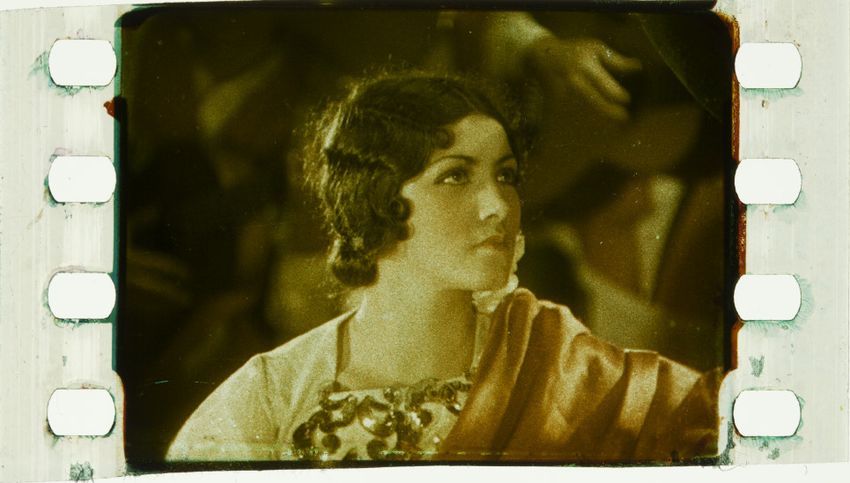
VI–23Flueckiger: Torn between Chromophobia and Colour Mania
Figures 9, 10, and 11. Cleopatra (Roy William Neill, USA, 1928, 35 mm film). George Eastman Museum,
Moving Image Department, photograph by Barbara Flueckiger.
Technicolor sought to counteract the wide-spread critique of film
colours as garish and tasteless by selecting a more painterly approach.
This was particularly underscored in the film Cleopatra, with its
majestically ornamental art nouveau set design with numerous tulle
elements, wrought-iron decorative grates, peacock and ostrich feathers,
and gemstones and pearls. As with later films produced in Technicolor
No. IV, design was placed entirely in the service of a planar, graphical
composition. Small-scale patterns that would reveal problems in
resolution and insufficient registration of the dye layers are consciously
ColourTurn 2018
avoided. The title design for Cleopatra shows a lightly structured brown
background. Earth tones and green tones predominate, by contrast, in
The Heart of General Robert E. Lee. Buffalo Bill’s Last Fight: it is the most
daring in its use of colour, with a saturated red tone for the soldiers’
uniforms and the Native Americans’ feather trimming. With certain
unusual light effects – night shooting and an iconic silhouette of horse
and rider – this Western-style film stands clearly apart from the other
two productions with their uniform high-key lighting. It is precisely
in Buffalo Bill’s Last Fight that the limitation of the gamut, meaning
the reproducible colour spectrum, becomes apparent, because the
sky and the water are always shown in a specific pale green tone
tending towards the turquoise resulting from the absence of blue in
this spectrum. Yellowish titles on a brown background with a slightly
shiny organic texture reminiscent of leather are also striking.
VI–24Flueckiger: Torn between Chromophobia and Colour Mania
Figure 12. Buffalo Bill’s Last Fight (John W. Noble, USA, 1927, 35 mm film). George
Eastman Museum, Moving Image Department, photograph by Barbara Flueckiger.
ColourTurn 2018
Figures 13a and 13b. Twelve Minutes in Glacier National Park (USA 1928, 35 mm film).
Library of Congress, photograph by Barbara Flueckiger.
A quite spectacular film is Twelve Minutes in Glacier National Park (USA
1928, 35 mm film), recently rediscovered in the Library of Congress,
one of the few documentaries not to have been made in a studio and
thus without complete colour control. Alongside landscape images,
representatives of the Blackfeet tribe contribute to the production’s
VI–25Flueckiger: Torn between Chromophobia and Colour Mania
exotic colour, a depiction which, as Jennifer Lynn Peterson36 has
shown, does not provide a very accurate document of the time.
Technicolor went further, not only producing the series of short films
itself but also with The Viking (Roy William Neill, USA, Metro-Goldwyn-
Mayer, 1928, 35 mm film), a feature film to show the industry the
superiority of its technology and that audiences could get excited
about films made entirely in colour. MGM bought the film, which
covered all production costs for Technicolor, but the film was not a
success and was, in spite of Technicolor’s expectations, unable to build
on the popularity of The Black Pirate. Kalmus offered two possible
explanations:
There seemed to be two principal troubles with The Viking, both of which
I suspected but without certainty. First, it came out among the very last
silent pictures in 1929 and, second, whiskers. Leif Erickson, the Viking
hero, true to character, had a long, curling mustache, whereas American
audiences prefer their lovers smooth-shaven. At times the whole screen
seemed filled with viking whiskers. But the picture was a good color job
and the first to be synchronized with music and sound effect37.
In 2012, the silent film festival Le Giornate del Cinema Muto in Pordenone
showed a version of The Viking made from a colour reversal intermediate
(CRI), since the negative had been lost. With its harsh contrasts, this print
ColourTurn 2018
unfortunately could not do justice to the specific softness of Technicolor
No. III, even though the hues seemed to some extent accurate as James
Layton noted in the catalogue. Mordaunt Hall, critic of the New York
Times, found the film’s colour quality inadequate, an interesting change
from his reviews of the Technicolor No. II films:
The prismatic effects in this production may not always be the desired
quality, especially when it concerns fire and water, but they are none
the less agreeable. There is the glint of metal and the flashing of semi-
precious stones on the wristbands of the horned or wing helmeted,
flaxen-haired warriors of bygone ages. Occasionally there are scenes
that are like beautiful paintings, but here and there the colors, while
they do not fringe or mix, are not quite true38.
36
Jennifer Lynn Peterson, Education in the School of Dreams: Travelogues and Early
Nonfiction Film (Durham NC: Duke University Press, 2013), 256–257.
37
Kalmus, ‘Technicolor Adventures in Cinemaland,’ 573.
38
Mordaunt Hall, ‘A Picture in Colors,’ The New York Times, November 29, 1928.
VI–26Flueckiger: Torn between Chromophobia and Colour Mania
In spite of the restrained reception of The Viking, Jack L. Warner, co-
founder and head of production at Warner Brothers Pictures, embraced
the spirit of change surrounding Hollywood’s switch to sound and
produced, with the musical On With the Show (Alan Crosland, USA,
Warner Bros., 1929, 35 mm film), the first sound film in colour. It
garnered devastating reviews,39 but was a major success with audiences.
This presentation, known as On With the Show, is to be felicitated on
the beauty of its pastel shades, which were obtained by the Technicolor
process, but little praise can be accorded its story or to the raucous
voices. Nobody in the course of this picture speaks with anything but
harsh notes, and therefore one looks upon the prismatic effects as the
heroine of the production40.
With the next musical Gold Diggers of Broadway (Roy Del Ruth, USA,
Warner Bros., 1929, 35 mm film), also from Warner Bros., an incredible
colour mania began in Hollywood at the end of the 1920s. The audiences
and this time the critics, too, were excited.
‘The Gold Diggers of Broadway,’ … coupled with the lovely pastel shades, the
tuneful melodies, a sensible narrative, competent acting and elaborate
stage settings, resulted in an extraordinarily pleasing entertainment. It
caused one to meditate in the end on the remarkable progress of the
screen, for not only are the voices reproduced with rare precision, but
ColourTurn 2018
every opportunity is taken of the Technicolor process in producing the
hues and glitter of a musical comedy41.
To the extent a judgment can be made on the basis of the meagre quality
of the DVD version in circulation, the colour concept of Gold Diggers of
Broadway used muted pastel tones in flamingo and gentle green tones
optimally aligned with the colour spectrum of Technicolor No. III. As
in Cleopatra, there are many shimmering fabrics on display, feathers,
tulle and pearls of every kind, in short all of those materials with a
soft glow that brought a bit of structure and play into the textureless
surfaces of the Technicolor universe. Another one of the few films that
stood out amidst the mediocre productions was Whoopee! (Thornton
39
See Robert A. Nowotny, The Way of All Flesh Tones: A History of Color Motion
Picture Processes, (New York, 1983), 1895–1929.
40
The New York Times, May 29, 1929, 28.
41
Mordaunt Hall, ‘Gold Diggers of Broadway,’ The New York Times, August 31, 1929.
VI–27You can also read