Way with colour - Issue 1, 2019
←
→
Page content transcription
If your browser does not render page correctly, please read the page content below
1/19

way with colour
Wellington Girls’ College is a large inner city school     new signage embodies the school’s commitment
nestled in the heart of Thorndon, home to nine different   to Te Reo by incorporating both Maori and English
buildings including three multi-level buildings and        into all building naming panels.
two gymnasia across the 2.5 hectare site.                  Black boards and white chalk have long gone
There is an extraordinary variety of architectural         from the learning environment, but like white
styles from a Victorian house, to a 1940s deco             chalk on asphalt and black charcoal on white
type block with 1950s rooftop addition, a 1960s            paper they have an enduring quality. The core
‘brutalist’ 6 level block and hall, an example of          colour selection of three neutral tones, Resene
1980s ‘post-modern’ style, various prefabs, an old         Sea Fog (greyed white), Resene Quarter
1940s brick gym, and a new 1970s gym, and the              Fuscous Grey (taupe grey) and Resene Double
most recent building in corrugated steel from this         Foundry (hot charcoal), came from the desire to
century. The school site has a permeable boundary          create interest through pattern and disposition
and out of school hours offers facilities for use by       of the selected ‘tones’ as a background to the
                                                                                                                      contrast, from Resene Sea Fog to Resene Double
the wider community both through formal booking            flamboyant ‘identity colours’.
                                                                                                                      Foundry, or reduced contrast (Resene Sea Fog to
and informally as open greenspace.
                                                                                                                      Resene Quarter Fuscous Grey and Resene Quarter
                                                                                                                      Fuscous Grey to Resene Double Foundry).
"T he brief was to create a colour scheme for all                                                                    The south east corner of Brook/Manga has three
  buildings on site that would unify the campus"                                                                      tall elements of varying height which are expressed
                                                                                                                      using the three tones to enhance the deco design.
                                                                                                                      The Resene Hyperactive (frenetic orange)
The brief was to create a colour scheme for all            As a state school project budget is always a significant
                                                                                                                      naming panel further reinforces the verticality
buildings on site that would unify the campus and          determinant in selection of design. The team chose
                                                                                                                      of the building element.
embody the idea of school as providing a vibrant           large panels, stripes/bands, and blocks of colour in
exciting learning environment as well as provide a         relatively simple areas to meet this requirement.          On the northern wall of Brook/Manga existing
neutral but animated canvas for the identity colours                                                                  horizontal details have been incorporated into wide
                                                           Resene Quarter Fuscous Grey was chosen as
and signage to sit against. Size and disposition of                                                                   horizontal bands of Resene Sea Fog and Resene
                                                           a neutral mid-grey that would remain neutral
the colourful naming panels and components was                                                                        Quarter Fuscous Grey that give some style and
                                                           in early morning and late evening light. It was
undertaken as a collaborative process between Neil                                                                    exaggerate the horizontality of the long slab building.
                                                           important that it worked with all the identity
Pardington Design and McKenzie Higham Architects.          colours. Combined with the lighter Resene Sea Fog          International House/Te Pae has a Victorian façade
The wayfinding design proposed creating ‘identity’         and darker Resene Double Foundry it was possible           which is rendered with Resene Quarter Fuscous Grey
colours for the buildings or building uses. The            to articulate aspects of the individual buildings          and Resene Stack (serious grey) to acknowledge
wayfinding design also proposed combining the              enhancing and respecting their character. The              the historical detail and then enlivened with the
naming of buildings with the identity colours. The         selected colours provide the scope to create high          entry doors in Resene Seance (purple).
                                                                                                                                                           Continued inside >>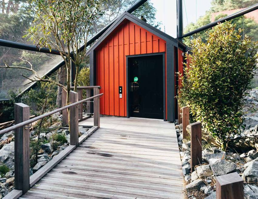
kea
                                                              proof

                                                              Architectural specifier: Isthmus Group www.isthmus.co.nz
                                                              Building and painting contractor: Hawkins Construction
                                                              www.hawkins.co.nz
                                                              Client: Wellington Zoo www.wellingtonzoo.com
                                                              Photographer: David St. George
                                                              www.dstgeorgephoto.smugmug.com

                                                              New Zealand is home to a diverse range of
                                                              environments which support a stunning array
Continued from cover >>
                                                              of plants and habitats, each with its own
                                                              unique combination of species. Opened in
Feature colours are also used on other                        early 2018 the Kea Enclosure at Wellington
buildings, with Resene Pohutukawa (spicy                      Zoo enables visitors the opportunity to interact
rich red), Resene Java (intense turquoise) on                 with New Zealand’s only native parrot.
Tower/Whare Tuteitei and custom made Resene                   The project’s final stage, Mountain Encounter, the
colours on New and Old Gyms and Pavilion/                     zoo’s first walk-through alpine aviary, is a place
Whare Hakinakina and Library Arts/Whare Toi.                  for guests to enjoy the aerial antics of Kea as they
Resene Lumbersider was selected for                           fly above and interact within their environment.
its excellent adhesion properties to a
variety of substrates, superb durability and
environmental credentials with Resene
                                                              "N atural darker colours were chosen to make
Lustacryl semi-gloss waterborne enamel                          the Kea feel at home..."
for exterior joinery. Resene Sonyx 101
semi-gloss and Resene Summit Roof were
                                                              Kea are endemic to New Zealand and the                     The Kea aviary is the alpine experience to end
also used, along with Resene Woodsman
                                                              world’s only alpine parrot; however due                    the Meet the Locals visitor experience. Colours
in Resene Dark Oak (mellow brown).
                                                              to threats from introduced predators and                   and plants in this area were drawn heavily from
Due to the age range of the buildings, the variety            conflict with humans, they are considered                  the New Zealand alpine environment. Natural
of substrates to coat was extensive. Work was                 nationally endangered in the wild.                         darker colours were chosen to make the Kea feel
spread over an 11 month period focused on                                                                                at home, and also help to hide any damage
holiday periods for minimal disruption.                       The entrance to the aviary was designed
                                                              to function as an airlock because of the                   the Kea might cause. Resene Woodsman in
This project won the Resene Total Colour                      mischievous nature of the parrots. The security            Resene Dark Oak (mellow brown) is used on
Education Post-Primary Award. The judges                      features don’t end there with the aviary                   roost additions, Resene Sonyx 101 semi-gloss
said: “connecting through colour, the bold                    netting constructed from high-tensile                      in Resene Redwood (warm brown), Resene
colour entry highlights bring disparate                                                                                  CoolColour Black on Hardiboard and external
                                                              metal, and every joint 100% Kea-proof.
buildings together for a sense of cohesion.                                                                              doors and Resene Uracryl in Resene Fuscous
                                                              The aviary has proven successful with high
Selected carefully the colours are of a similar                                                                          Grey (charcoal grey) on exterior structural steel.
                                                              visitor numbers. A second aviary accessible
intensity, bold but not shrieking. Neutral
                                                              through a small hatch allows the Kea to                    The exit trap was chosen as bright Resene
greys and whites clean up the architecture
                                                              have some quiet time if crowd volumes are                  Thunderbird (racy deep orange) to match
allowing the wayfinding colours to take
centre stage. The mix of substrates provides                  too high.                                                  the stables in the Pohutukawa Farm and
added texture and shadowing. Both powerful                    As well as providing humans with an                        help reflect on the full experience and walk
and practical.”                                               environment to learn about the Kea another                 through of Meet the Locals.
                                                              function of the facility is to contribute to               All paints needed to be non-toxic paints as
                                                              Kea breeding efforts. With only 1000-5000                  the Kea love to get their beaks into anything
Architectural specifier: McKenzie Higham Architects
www.mckenziehigham.co.nz
                                                              wild Kea, the aviary hopes to produce three                and everything.
Client: Julia Davidson, Principal Wellington Girls’ College   offspring per year.                                        This project won the Resene Total Landscape
Board of Trustees www.wellington-girls.school.nz
Colour selection: Emma Alcock, McKenzie Higham Architects     The Isthmus design team undertook extensive                Award. The judges said: “The robustness of
www.mckenziehigham.co.nz                                      research of the elements in the Kea’s natural              products and colours aptly reflect the nature of
Painting contractor: Switched On Property Maintenance Ltd
www.switchedon.net.nz                                         environment and replicated these learnings                 the inhabitants, with a pop of colour anchoring
Photographer: Rex Bultitude, McKenzie Higham Architects       within the enclosure, as well as continuing                a focal point. The diversity and toughness of
www.mckenziehigham.co.nz
Wayfinding design: Neil Pardington and Joanna Madgwick
                                                              the local themes from the Meet the Locals                  materials and the depth of the colour palette
www.neilpardington.com                                        walk at Wellington Zoo.                                    brings an appreciation for life in the wild.”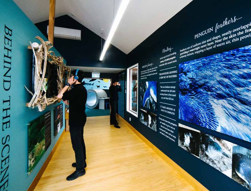
pretty
blue by you                                                                                            in pink
Sited in Christchurch, this project consists of    Resene Picton Blue (fun blue) was chosen       This 1890 hill station home cried out for a fresh look.
two cottages linked by a shared living and         to distinguish the flat roofed, central form   The existing interiors were very dark with a lot of
office space. Three generations of one family      as an abstract contemporary element.           timber so the number one priority was to lighten
live between the two houses and share              The interior is finished in Resene Double      up the spaces. The clients wanted a great injection
outdoor and indoor communal space. The             Alabaster (grey white) and Resene Aquaclear    of colour, to create a truly unique interior and to avoid
courtyard unites all three built elements but      waterborne urethane.                           plain white walls as much as possible.
can be separated by fencing for future use.                                                       Vibrant Resene colours were used to bring the home
                                                   Designing a shared space for several
Initially the project was for a single dwelling    generations that allows for adaptability       to life, in conjunction with a completely new soft
to replace an historic house demolished after      has been rewarding for the architects          furnishing scheme using layers of coloured, patterned
the earthquake. As the project developed           and their clients.                             and textured fabrics and new flooring to complete
a second house was added for the client’s                                                         the customised scheme. Every single surface in the
mother and the central shared area became          This project won the Resene Total Colour       property was refinished, all floors, walls, ceilings and
a flat for their son.                              Residential Exterior Award. The judges said:   inbuilt cabinetry, the home had a total transformation.
                                                   “Adventurous, bold, fun and completely
The form and scale is an acknowledgment            unexpected. The rural leanings of the          When the home was owned by leading Melbourne
to the heritage status of the area, while          streetscape acts as the gatekeeper to the      florists at the time, the dining room had been
also remaining contemporary. The two               colour within so that the bold blue is only    painted pink. Coote&Co were keen to reinstate
gabled roof houses are linked yet separated        enjoyed by those who make it past the          this pink dining space but with a contemporary
by the brilliant blue central form. The            front door. This is a totally unconventional   spin. The Resene Glamour Puss (siren pink) in high
front house opens to the street but also           and courageous colour combination to           gloss Resene Enamacryl is paired with the pale pink
provides screening for the private internal        come home to, perfect for a family that        John Stefinidis curtains to make the room bold and
courtyard beyond.                                  isn’t afraid to go bold.”                      contemporary, but with a nod to its history. The gloss
Resene Lumbersider low sheen in Resene                                                            gives extra light reflection in this small room and lifts
Scoria (copper red brown) was chosen to                                                           the space in combination with the Pierre Frey dining
offset the crisp geometry of the cottages          Architectural specifier: NOTT Architects       chairs and custom chandelier.
                                                   www.nott.co.nz
with a warm rustic colour for a monolithic         Building contractor: Clive Barrington
                                                                                                  Resene Glamour Puss was initially only to be applied
effect, which could be easily complemented         www.clivebarrington.com                        above the wainscotting. However, once painting
with the Dimondek roofing for a continuous         Client: Julie Pascoe                           commenced it was clear that the bold colour required
                                                   Interior designer: Annabel Cropper
colour. This red already existed in the historic   Photographer: Lumo Photography                 an all or nothing approach, moving to paint the walls
cottages of the area, so was also a nod to         www.lumo.co.nz                                 entirely as well as the window frames and skirting
those houses.                                                                                     boards. The ceiling is a mix of Resene Glamour Puss
                                                                                                  and Resene Bianca (cream off-white) to ensure the
                                                                                                  ceiling was slightly lighter than the walls but adding
                                                                                                  to the pink-on-pink no holding back effect.
                                                                                                  This project won the Resene Total Colour Residential
                                                                                                  Colourful Room Award. The judges said: “With a
                                                                                                  standalone room you can dare to go bold. No holds
                                                                                                  barred, it is whimsical, fun, beautiful and brave.
                                                                                                  This dining room has a sense of modern meets
                                                                                                  Victorian. The rich colour and varying sheen levels
                                                                                                  creates a rich atmosphere for dining. The walls feel
                                                                                                  like they are singing in the background.”

                                                                                                  Colour selection: Coote&Co www.cooteandco.com.au
                                                                                                  Painting contractor: The Lady Painters, Gray’s Painting and Maintenance
                                                                                                  Photographer: Simon Griffiths www.simongriffiths.com.au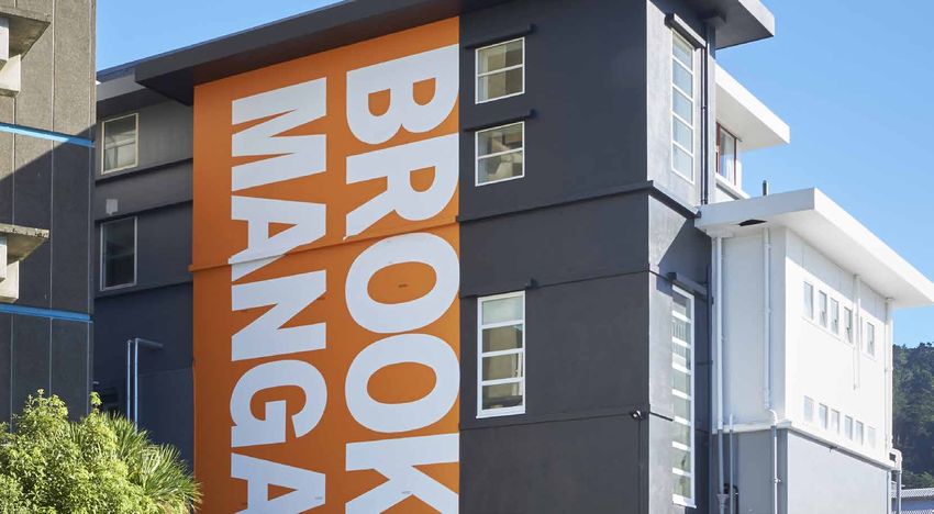
penguin approved
Tourism Waitaki operates North Otago’s most           One of the major developments was to create           required a specific photograph related to the
successful tourism attraction, the Oamaru Blue        a penguin underpass by the harbour to assist          penguin colony underwater for one of the displays.
Penguin Colony, which attracts over 80,000            penguins cross the road at night. The activity        A diving photographer was sourced and went into
visitors a year.                                      room now includes a faux penguin underpass            the coastline at the penguin colony and shot some
                                                      tunnel, finished in Resene Half Grey Chateau          stills of the underwater environment. From there
Due to space constraints and the need to offer        (silver stone grey), which leads children into a      another palette of colours were derived as options.
visitors more of an experience during the day time,   separate activity zone.
when penguins are at sea, a centre development                                                              Colour provides the key element to the displays
                                                      Two aspects dictated the colour selection – the
was proposed to include a daytime tour facility                                                             and visitor experience inside. Through working
                                                      plumage of the penguins and the ocean where
that would complement the day and night time                                                                with a coordinated and bold palette, different
                                                      the birds spend the majority of their lives. While
viewing of the little blues.                                                                                environments could be created.
                                                      it is obvious to be utilising blues it was only
Design Federation were engaged initially to come      when the plumage colours were studied that            Resene SpaceCote Low Sheen in Resene
up with a new spatial layout and to direct the        it was realised how broad a palette lay within        Elephant (deep green blue) and Resene Titania
interior design of the project. A new reception       their feathers. Working with high grade close         (grey off-white) in the reception area make a bold
area and retail space were proposed which             up photography of the plumage they reviewed           and professional impact on entry and bring a
                                                      colours using Resene’s Colour Palette Generator       sense of the deep sea to the entrance.
included the entry to the new day tour experience.
                                                      online tool, www.resene.com/picturepalette,
Construction was undertaken to add a new              looking across all collections and then reviewing     The tunnel experience called for a near black finish as
entrance to the north of the building while still     more contemporary colours in The Range fashion        this area is all about large lightboxes and strong audio
operating the business. While this was being          fandeck. This gave a broad range of over 40 colours   backdrop of penguin calls. True to the central palette
undertaken Design Federation developed a              from which to review and determine which were         of the project instead of using black, they chose the
commercial design plan and colour palette to          going to work best in this multipurpose facility.     deepest navy Resene Dark Side (midnight blue).
enhance the facility.
A ‘nest box’ entrance was created where visitors      "Working with high grade close up photography of
get a sense of walking into the penguin’s world.
Visitors enter a darkened tunnel to the surround
                                                        the plumage they reviewed colours using Resene’s
sound of penguin calls and lightboxes before            Colour Palette Generator,"
moving into a theatre room. An introductory video
gives visitors an overview of the colony before       Reviewing the ocean colour palette was more           Display walls were painted in Resene Hope
walking into display areas including interactive      problematic as while there is photography of          (muted aquamarine), Resene Nauti (chalky pastel
lightboxes, information panels, research overviews,   Australasian waterways the choices needed             blue) and Resene Coast (stark blue) to bring
statistics and information.                           to reflect the North Otago coastline. They also       a playful, bold backdrop to exhibition spaces.
                                                                                                            Working in unison with display panels, the colours
                                                                                                            were designed to complement not compete.
                                                                                                            The activity area uses a lighter palette of Resene
                                                                                                            Escape (pale blue), Resene Sea Crest (watery
                                                                                                            cerulean blue) and Resene Quarter Titania
                                                                                                            (ashen off-white), with penguins swimming along
                                                                                                            the ceiling, with activity area walls in Resene Coast
                                                                                                            to act as a solid backdrop to bookcases and puzzle
                                                                                                            displays. A feature wall of Resene Magnetic
                                                                                                            Magic and Resene Sea Crest means that objects
                                                                                                            can be easily moved around using high quality
                                                                                                            magnets to create an ever changing display.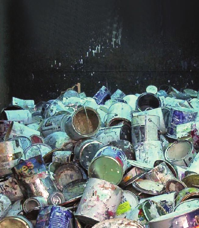
saved by colour
The custom design wave table houses key
environmental elements that the penguins
                                                                                "The new look gives a modern, commercially
interact with. This was painted in Resene Coast                                   serious, fresh look with a sense of richness..."
with drawers in alternative colours of Resene
Nauti and Resene Escape. A built in desk provides
a space for people of all ages to create and draw,                              The Club Grandstand at Riccarton Park,              for a modern contrast and highlighting the
and is painted in Resene Lustacryl in Resene                                    Christchurch had not been repainted since           existing column capitals with bold Resene
Quarter Titania to ensure longevity.                                            it was originally built 30 years ago. It was        Galliano (sweet yellow).
Activities for all ages give visitors a fully diverse                           very grey on grey and with age that look had
                                                                                dulled further. The brief was to ‘spruce it up’     Initially the project was just to paint finish the
experience into the life of the penguin before
they enter the outdoor experience.                                              to modern standard and contemporary style.          earthquake affected works areas. But once
                                                                                                                                    the clients saw the change to the parts of the
The range of blues and greens throughout the                                    Working with Resene colours, the Design
                                                                                Team presented two similar options of photo-        building painted they were keen to continue
space brings attention back to the shoreline and
continually reminds visitors they are within the                                shopped schemes which the clients approved          painting all other areas for maximum impact.
blue penguin colony. Painting display areas in                                  immediately. They loved the new life it gave the    The new look gives a modern, commercially
bold colours, as opposed to white, has shown                                    building just from the photoshopped schemes.        serious, fresh look with a sense of richness
that colour can be both the backdrop and front                                  The interiors provided the direction. They had      through the gold highlights worthy of a
runner in an exhibition space. The palette
                                                                                decided to replace the green tartan carpet          Racing Club Grandstand.
continues into the staff room finished in Resene
                                                                                and upgrade it with a palette of mixed grey
Half Kumutoto (soft coastal blue) and the research                                                                                  This project won the Resene Total Colour
                                                                                floors, crisp white walls and charcoal accent
office in Resene Tea (river boulder beige).                                                                                         Commercial Exterior Colour Maestro Award.
                                                                                lines to give modern definition with accent
The development had to take place while                                         colours thrown in to liven.                         The judges said: “Salvation by paint and colour,
operating the centre – the only day in the year                                                                                     the colour palette highlights the soaring
the penguin colony is closed is Christmas Day                                   This set the direction for the exterior, painting
                                                                                                                                    proportions through accentuated vertical lines
so the development was staged in order to                                       the grey walls Resene Double Black White
                                                                                (greyed white) to make them crisper, defining       and careful placement of colour that draws your
keep the visitor experience to a high level while
                                                                                the vertical columns with charcoal/grey using       attention into the design highlights. A clever
development was being completed.
                                                                                Resene Double Stack (armour grey) and               use of colour to camouflage and to celebrate.
This project won the Resene Total Colour                                        Resene Double Foundry (hot charcoal)                This building has been elevated with colour.”
Commercial Interior Public + Retail Colour
Maestro award. The judges said “delightfully                                    Architectural specifier: Alan Cowie, Design Team
authentic, this project is wrapped top to toe in                                Client: Riccarton Park
penguin friendly hues. The palette is inspired by                               Painting contractor: Dyer Decorating Ltd

the sea, captured through extensive underwater
exploration and photography, and penguin plumage.
The palette truly reflects the colours penguins
would see daily in their natural habitat and
brings this above sea level for visitors to enjoy.“

Architectural specifier: John McKenzie
Building contractor: DeGeest Construction
Client: Tourism Waitaki www.waitakinz.com
Colour selection: Annabel Berry, Design Federation www.designfederation.co.nz
Painting contractor: A1 Decorators, Darryn Stewart Painting and Decorating
Penguin colony scientist and key collaborator:
Philippa Agnew www.penguins.co.nz
Photographer: Rachel Wybrow Photography
www.rachelwybrowphotography.com
Stylist: Meghan Nockels, Design Federation www.designfederation.co.nz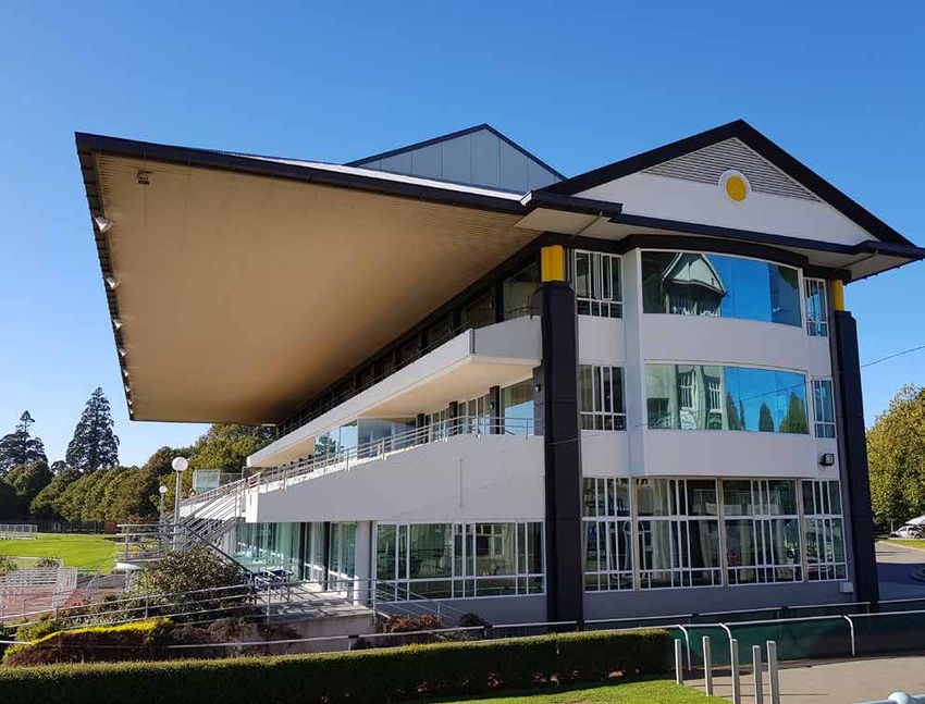
brushst rokes

                                       it 's a classic
                                       For all those that want the latest trends in their home, there are an equal number
                                       that know they want colour in their home, but they don’t necessarily want to
                                       follow the trends either.
                                       While there are plenty of colours to choose from already, Resene has gathered
                                       together a collection of many favourite Resene colours into a new Resene Classics
                                       collection. This colour range focuses on colours that outlast the trends, colours
                                       that have been popular for many years and will likely be popular for many more to
                                       come. The chart also includes a small collection of whites and neutrals so you can
                                       choose an entire colour palette using just one colour chart… or you can add extra
                                       accent colours or variations of your chosen neutral using the Resene palettes or
                                       other Resene colour ranges.
                                       Think favourites like Resene Pohutukawa, Resene Coast, Resene Duck Egg
                                       Blue, Resene Dusted Blue, the colours that pop up regularly in clients’ wishlists
                                       regardless of what the trends may say.
                                       We have also slipped in one new colour – Resene Quarter Dusted Blue – which
                                       we know will be a timeless favourite too.
                                       The new Classics Collection is available from Resene representatives,
                                       Resene ColorShops and resellers, or you can order a free copy online from
                                       www.resene.com/specifierorder.

Featured colours include:

   Resene            Resene   Resene     Resene                Resene                  Resene                  Resene
  Chocolate           Putty   Twizel   Pohutukawa               Coast                Dusted Blue            Duck Egg Blue

                                               celebrating 15 years
                                               Little habits, repeated often, can make a massive difference over time. Not
                                               so long ago, recycling paint containers wasn’t something most customers
                                               even contemplated. Today, for many, it’s part of their normal painting
                                               process to recycle the packaging when they have finished the project.
                                               It was 15 years ago that Resene PaintWise first started following nearly
                                               five years of development. In those days product stewardship was in its
                                               infancy so there was no easy path to follow to set up a programme. Every
                                               process was forging new ground.
                                               Since then, over a kilotonne, i.e. over 1,000,000 kilograms, of packaging and
                                               paint has been recycled. That equates to millions of packs being returned.
                                               The plastic packaging is recycled into 100% recycled Resene plastic pails,
                                               metal cans are recycled into other metal products, solventborne paint goes
                                               to solvent recovery for reuse and waterborne paint is donated for covering
                                               graffiti and used for manufacturing non-paint products. The donated paint is
                                               enough to cover over 2.5 square million metres.
                                               See www.resene.co.nz/paintwise for more details on how you
                                               can recycle. In Australia, Resene is part of the Paintback service, see
                                               www.paintback.com.au for details.
all about the grey
                                                                                               As many look for more relaxed finishes, the trend
                                                                                               to washed looks continues. Resene Colorwood
                                                                                               Whitewash and Greywash have been popular
                                                                                               options inside. Now Resene Woodsman Whitewash
                                                                                               has been extended to include two greywash

enviro for both
                                                                                               options also. Choose from a light or mid greywash
                                                                                               option for a new way to enhance timber finishes.
                                                                                               View timber samples at your Resene ColorShop, or
                                                                                               online at www.resene.com/woodsman.
Resene has an extensive range of Environmental Choice
approved products for everything from paints and stains,
to clear finishes, primers and sealers.
And now Environmental Choice New Zealand’s EC-07-
17 Paints specification has achieved Level A recognition by the Green Building Council
of Australia. Products that carry the EC-07-17 licence are eligible for GBCA Green Star
credits, as well as NZGBC Green Star and Homestar credits.

                         top quality times three                                               ea sier on the nose
                         Resene has received the Reader’s Digest Gold Quality Service          Resene Qristal Poly-Flat, Satin and Gloss are
                         Award for paint and decorating stores recognising exceptional         moving to a new lower odour formula so you
                         customer service, winning each year since these awards started        can clear finish your interior timber, without the
                         in 2016. Winners were identified in a survey conducted by             strong odours. Or choose Resene Aquaclear or
                         Catalyst Marketing and Research. Commissioned by Reader’s             Resene Qristal ClearFloor
                         Digest, the survey canvased a representative sample of 1,500          for waterborne options.
                         New Zealand adults.                                                   Interior timber is always
                                                                                               best protected to help it
                                                                                               keep looking its best.

naturally beautiful                                                                            the funny
When designing timber interiors, it can be tempting to leave
them uncoated, but this leaves the timber prone to wear and
                                                                                               side of paint
tear, dust and contaminants that can be impossible to remove                                   "My Father was put in charge of painting and
later. Clear coating timber provides a smooth seal and makes                                   decorating the lounge. My Mum was forced to take
it easier to wipe clean.                                                                       us out of the house because of all the swearing
And now with new Resene Aquaclear Natural you can apply a flat waterborne clear                coming from my Dad. We came back a few hours
finish that protects the timber while still allowing its natural beauty to show through.       later to a silent and calm Dad. We were all pretty
Resene Aquaclear Natural is designed for interior timber walls and ceilings to enhance         impressed by the job my Dad had done. Mum was
and protect timber from everyday wear and tear. The flat finish helps the timber retain its    relieved and we were off the hook. A couple of
natural just cut look.                                                                         days later my Mum went to retrieve some of her
                                                                                               favourite cookbooks from the newly decorated
If a little colour rejuvenation is needed, Resene Colorwood Enhance may be added to            lounge. She was dumbstruck when she took the
Resene Aquaclear Natural to add extra depth and colour.                                        books off the shelves to find my Dad had actually
See Data Sheet D59 for more details.                                                           painted around the books rather than take them
Resene Aquaclear is also available in satin, semi-gloss and gloss finishes for those looking   off the shelves. The swearing started again."
for a higher sheen effect.                                                                     Thanks to Kuljit.
the funny
paint side ofand
the town paint
be in to win
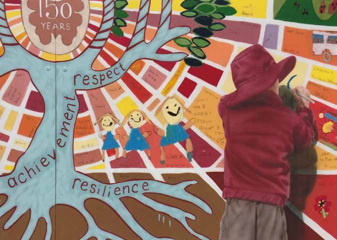
The Resene Mural Masterpieces 2019 is open for entry. Entry is easy - register online at www.resene.com/murals or drop into your local
Resene ColorShop and pick up a copy of the Mural Masterpieces Competition registration form.
Send your completed registration to Resene and you’ll receive an entry pack containing all the information you’ll need to get started.
There are four classes of entry:
• Best Professional Mural
• Best Community Mural
• Best School Mural (split into tertiary and primary sections)
• Best Mural Design
Gather together your favourite community group, school children or tackle a mural yourself.
Entry is open to all ages and all mural types, so get your creative juices and paintbrushes fired up. Entries close 8 November 2019.
Open to murals in Australia, New Zealand and the Pacific Islands.
2018 winners:
Forth Primary School - Sesquicentenary Celebratory mural Mount Albert Grammar School - Baskets of knowledge
Lansdowne mural - Viv Walker, Max Baylis and Jane Giles Colville School - Beach and Foreshore mural
View more winning entries online, www.resene.com/murals.
I n c o r r e c t m a i l i n g: If you are receiving multiple mailings or you would like us to change your mailing details, please call:
In Australia phone 1800 738 383, in New Zealand phone 0800 RESENE (737 363) or email update@resene.co.nz.
Resene News is published by the Resene Marketing Department. Every effort has been made to ensure accuracy in this publication, but Resene accepts no liability for any errors of fact or opinion
expressed herein. Some products or services may not be offered in your area or country. Please check with your local Resene ColorShop for availability. Most products can be ordered in though lead times
and minimum order quantities may apply. Resene News is printed on environmentally responsible paper which complies with the requirements of environmental management systems EMAS and ISO14001, using vegetable-based inks. Please recycle.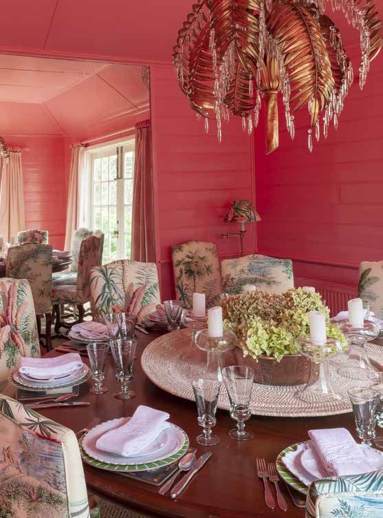
You can also read