CONTINUUM 119 A BELGIAN ART PERSPECTIVE - Nel 14512
←
→
Page content transcription
If your browser does not render page correctly, please read the page content below
CONTINUUM 119
                           A BELGIAN ART PERSPECTIVE

                                    OFF-PROGRAM GROUP SHOW

                                        15/04/19 TO 31/07/19

Art does not belong to anyone, it usually passes on from one artist to the next, from one viewer to the
next. We inherit it from the past when it served as a cultural testimony to who we were, and we share
it with future generations, so they may understand who we are, what we fear, what we love and what
we value. Over centuries, civilizations, societies and individuals have built identities around art and
culture. This has perhaps never been more so than today.

As an off-program exhibition, I decided to invite five Belgian artists whose work I particularly like, to
answer back with one of their own contemporary works to a selection of older works that helped build
my own Belgian artistic identity. In no way do I wish to suggest that their current work is directly
inspired by those artists they will be confronted with. No, their language is mature and singular. But
however unique it may be, it can also be looked at in the context of the subtle evolution from their
history of art, as mutations into new forms that better capture who these artists are, and the world
they live in. Their work can be experienced within an artistic continuum, in which pictorial elements
are part of an inheritance, all the while remaining originally distinct.

On each of these Belgian artists, I imposed a work from the past, to which they each answered back
with a recent work of their own. The exercise is as fictitious as it is deeply informative of certain
movements that have shaped the history of Belgian art in the XXth century, and therefore of the
echoes still reverberating in contemporary artistic creation, however more globalized it may have
become. Thus, looking at an arbitrary continuum spanning over 119 years since 1900, allow me to
briefly and chronologically introduce ten artists I admire.

                                                   1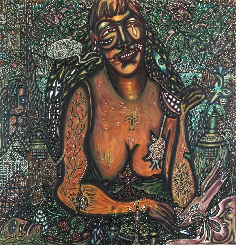
Gustave De Smet – The Eel Fisher (1900)                              Olivier Legrain – The Shelter (2017)

Let us first embark on a small wooden boat, floating at dusk in the middle of lake probably in the
region of East Flanders. The year is 1900. Gustave De Smet (1877-1943), a young painter from Ghent,
was about to come under the influence of Luminism and of the painter Emile Claus (1849-1924). De
Palingvisser (1900) depicts a local eel fisher, waiting for the perfect catch, blended into the crouching
darkness of the water and the trees, barely lit by a dying orange sun. The subject of the painting
however is clearly the twilight atmosphere bathing the beauty and the grandeur of Nature. De Smet
would indeed become famous a few years after he made this painting, at first with beautiful
impressionist renderings of women and landscapes, then after returning from exile during WWI, with
his own avant-garde take on what was to be labelled Flemish Expressionism.

His influence lives on, consciously or not, in the work of many Belgian artists today. Olivier Legrain
(1970) is one of them. He acknowledges that heritage. As an aficionado of De Smet and Permeke
especially, he allows his work to similarly let atmosphere and impression prevail, as in The Shelter
(2017). This recent painting is one of several landscapes by the Brussels-based artist and film maker,
whose work so far has been overly concerned with human figuration, at times relying on a cinema-
based iconographic process not so different from that of Antwerp-based artist Luc Tuymans (1958),
but representing his very own confrontation of human cynicism and fragility. Legrain’s The Shelter
serves both as a warning against the dangers of the wild, and as an invitation to take refuge, to save
ourselves. The title suggests there might be someone in that abandoned cabin. If not, the point of
view could be that of someone about to take shelter in the wooden house.

If De Smet creates the impression of orange sun beams dying into shades of green through numerous
overlays of paint texture to translate his vision of light, Legrain’s palette is decisively darker and more
monotonous. His work on paper mounted on a wood panel is even scarred with what resembles 35mm
negative scratches. Both works symbolically bare witness to a changing world. De Smet’s natural
harbor and peaceful way of life would soon enough be disrupted by the Great War, while Legrain’s
setting could as much be a homage to great American westerns of old, as it could depict a post-
apocalyptic stopover from the movie The Road (2009).

                                                    2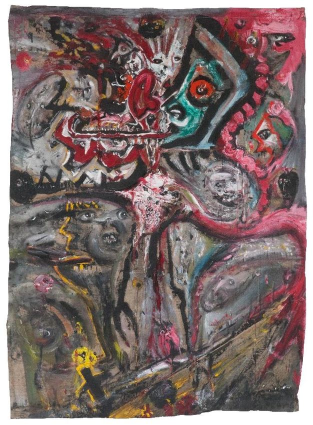
Prosper De Troyer – Sacred Heart of Jesus            Nel-14512 – Don’t let your Son hand around (2014)

among the People (1926)

Nel-14512 (1986), a pop-surrealist sculptor from Liege, was charged with the tricky task to rebound
on a very peculiar work by artist Prosper de Troyer (1880-1961), who developed a form of magical
realism in the 20s, inspired by the people, the bible and nature. His work Prelude (1925) is currently
prominently highlighted at the Tate Modern in London, as part of the Magical Realism: Art in Weimar
Germany 1919-33 exhibition which runs until July 14, 2019. While Sacred Heart of Jesus among the
People by De Troyer, born on Christmas Day near Gent, belongs to a rich period of figurative works
started in 1922, after a fauvist and later a more famous cubist period, its somewhat naïve style and
colorful expressionism often placed it along the lines of the German movement Neue Sachlichkeit
which took place between 1918-1933. In many ways, this period of De Troyer still needs to be
(re)discovered by the wider Belgian public.

Born more than a hundred years later, Nel-14512 has worked along the veins of pop art and
surrealism, in sculpture mostly. Yet her work is equally concerned with human figuration, social
consciousness and religious discourse. Recurring themes include feminism, sexuality, the climate and
religion, and she was immediately engaged when I showed her De Troyer’s The Sacred Heart of Jesus
among the People. While Proper De Troyer questions the role of religion and the church among the
people of Belgium in the years following WWI, touching on the intricate social struggles at play, Nel’s
sculpture is concerned with Christ as an individual, and his relationship to his Father. Laisse pas trainer
ton Fils (2014), a pun on the famous title of a rap song by NTM, is her contemporary take on the
responsibility of fathers to their children, of our generation to the next. Her Christ seems to be
accusing his father of denying him the very same values he wishes him to teach. Showing us an
abandoned son, bound to a tragic life on earth, the artist questions what the love of God (or universal
love) truly means. If we are made in God’s image, then why would his own failure at fatherhood not
get back at him in the form of a lonely disillusioned son, a Christ who is the opposite of the one
depicted by De Troyer, a dissocialized savior. The artistic continuum here lies more in the diversion of
popular religious images to comment on contemporary social issues, but their realistic approach also
follows similar iconography.

                                                    3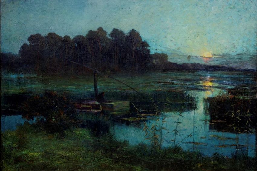
Pol Mara – Two Women in Mirrors (1975)                     Olivier Pauwels – Guestronauts (2013-2014)

I met Olivier Pauwels (1974) five years ago. He was busy making big machines out of scrap materials
in a huge hangar in Ostend, where he currently lives and works. Pauwels was also filling his unique
metallic universe with cyberbabies, unusually blessed with huge heads, often seen behind helmets.
The images and the art stuck with me. Around the same period Pauwels was lucky to collaborate with
George Miller on the movie Mad Max: Fury Road (2015), a visual next-level post-apocalyptic epic that
rocked me in my chair, and for which the art department where he worked won an Oscar in 2016.

That same year I came across an enigmatic work by another multifaceted artist, this time from
Antwerp. Born in 1920, Pol Mara navigated the Belgian seas of painting, making his way from
surrealism into lyrical abstraction, only to reach fame with his pop art work in the 1960s. His
compositions were concerned with popular culture as conveyed through magazines, television and
other media, which he distilled and rearranged into very personal portraits for which he won a prize
at the 1967 Tokyo Art Biennal. Like Pauwels, Pol Mara was a recycler of our popular iconographies.
Today his pop art works are considered iconic in the Belgian art scene of the 60s and are part of many
museum collections. They are also on display at the Pol Mara Museum in Gordes (France). Two Women
in Mirrors (1975) is a typical nude by Mara, who was then overwhelmingly concerned with female
portraiture. In a rather philosophically cubist fashion, he recomposed these twin portraits of the same
woman by splitting the perspectives of their upper and lower body parts, and imprisoning their beauty
in mirrors, perhaps as a warning of the increasing power magazines were to have on generations of
women reading them.

When I proposed Two Women in Mirrors to Olivier Pauwels, he quite naturally decided to answer with
two twins of his own. This time, the media mirror is replaced by TV heads imprisoned in space helmets
- and like Mara, Pauwels reuses materials to create his statues. His two Guestronauts are part of a
series of eleven clones created between 2013 and 2014. Through them, Pauwels questions the
influence of the media, science, and cloning in particular, as well as our survival on this planet. Through
his many depictions of female beauty as portrayed in the media, Pol Mara was also questioning his
contemporary world and particularly the emancipation of his sparkling young women through the
media. Although the work of both artists evolved in totally separate spheres, there is an artistic
continuum that can be observed in their approach to recycling materials to make their own figurative
portraits of popular culture.

                                                    4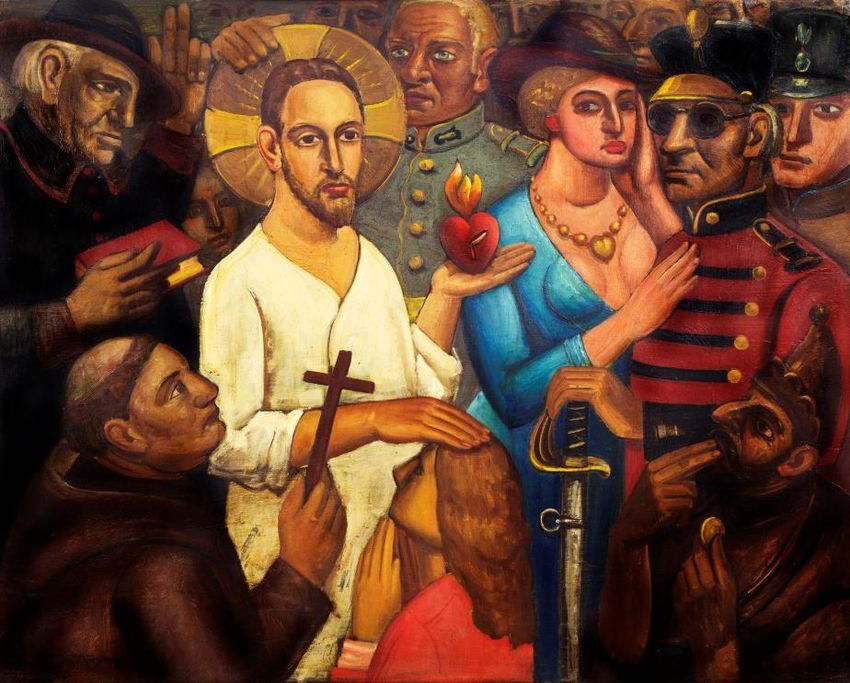
Fred Bervoets – Untitled (from the Cicatrice Series) (1987)                  Tom Liekens – Birds (2018)

I recently had the opportunity to make a film about Wilfried Pas (1940-2017), a distant family member
at first, who I became close to while making the documentary about his work, before his premature
and unfortunate passing. Through him I was introduced to the work of Fred Bervoets (1942), a
pioneering artist of the Antwerp scene of the sixties along Pas, Goossens and Cox. I later often came
across Bervoets’s work at De Zwarte Panter, the emblematic Antwerp gallery founded by Adriaan
Raemdonck more than fifty year ago. Bervoets was a friend of Maurice Wyckaert (1923-1996) who,
along Cox, certainly influenced his work. Tom Liekens (1977) studied painting under Bervoets at the
Academy in Antwerp, and although their work is seemingly far apart, there are elements that continue
from one generation to the next.

The two works in communion here are separated by some 30 years of art history, a lifetime for Tom,
a few periods for Fred. Both works are self-portraits. While the large untitled and unstretched canvas
by Bervoets gives space to a super-expressionist portrait-based narration, where a central bird-like
figure splits the pictorial plane into four distinct compartments populated by his typical beasts (as well
as family and friends perhaps), the birds chasing Liekens (or is he chasing them) obey a more
structured composition where the artist is central to a clean white space only disrupted by woodcut
overlays which fade into the background, creating the illusion of action. Both artists have worked in
very large formats, and in the latter part of the 1980s, Bervoets was slowly putting an end to what is
now called the Cicatrice paintings (Scar paintings). His untitled work here belongs to that period,
according to me one of his best, although I admire the whole body of work which keeps on expending
into new territories. It was made in late 1987 and shown at the Vlaams Cultureel Centrum de Brakke
Grond in Amsterdam (NL) early in 1988. The artist’s ironical and at times almost comical approach to
dramatic and tragic subjects like war or love make each of his paintings a journey of its own, with no
place for repetition. With Fred, humans are the main protagonists. Himself, usually the main actor in
his creations

Tom’s work was a discovery, an instant love story. His realm is the animal kingdom where humans
appear as rare guests, on occasion. In his work I found the same raw energy as in Bervoets’s
expressionist renderings, where color is free. Tom’s paintings often pay a ravishing chromatic homage

                                                    5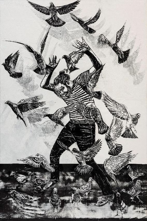
to old masters like Delacroix or Van Gogh, so it is an interesting and daring choice by the artist to
propose a black and white woodcut collage on canvas as an echo to his friend’s Cicatrice. Birds (2018)
nonetheless carries echoes of his mentor’s work, at times made of massive black and white etchings.
Although not taken from Alfred Hitchcock’s The Birds (1963), Liekens often uses film frames as a basis
on which he expands his own universe as in his recent King Kong Series, or as in his work based on Lust
for Life (1956), the Kirk Douglas biopic about Vincent Van Gogh.
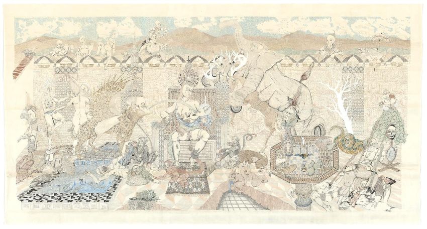
Pjeroo Roobjee – The Illness of P. (K. von S.) Peter Depelchin – Hortus Conclusus I (2014)
or the Tragical End of Silence (1988-1989)
The fifth and final artistic face-to-face is the one I proposed to Peter Depelchin. I confronted him with
one of Pjeroo Roobjee’s majestically complex canvases, in a typical green hue for the Gent-based
artist: The Illness of P. (K. von S.) or the Tragical End of Silence (with Reiner going to the Horses of
Knokke), dated 1988-1989. I must admit I secretly hoped Peter would answer back with what I consider
to be his masterpiece so far: Hortus Conclusus I (2014). Both works have in common that it is
impossible for the viewer to grasp their essence at first sight. They each require time, immersion and
engagement to dissect the pictorial elements, their linkages and the artistic process through which
they imbricate. To me both works projected sound first, like baroque compositions justifying the
richness of the motifs and decorations. They made me want to dance, to fly, to be in motion, which I
suddenly was, for I needed to zoom in, to walk closer, to step back to consider that the whole is only
made of details; that life is an endless sequence of fast and slow breaths which both artists express in
lines and colors, representing a disappearing world, with fear and hybridity in the case of Depelchin,
and with ostentation and nostalgia in the case of Roobjee.
Upon first laying my eyes on it, I sat down in front of the Peter’s Enclosed Garden, the first of a detailed
series, and tried to imagine how he spent years researching, inventing and drawing a universe of
characters who appeared as if they belonged to both our future and our past, at the crossroads of
civilizations, as if our icons and our gods all met in a limbo of despair, waiting for us to call them back
into our faiths. I could have stayed there, sitting in front of his 172 x 323 cm drawing for the rest of
my life. Its raw sexual power is hidden in lace-like ink patterns that draw the viewer into what looks
like the organized stage of a theatre of chaos, perhaps a visual metaphor for human existence, torn
between unlimited freedom and societal survival.
6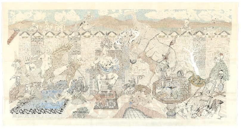
I first met Pjeroo through books of his paintings, and later in the flesh. Just like Peter after him, the
artist elaborated a personal universe of stories, images and colors that perfectly coexist on canvas. His
work investigates our history, our history of art, and his personal history, to then twist it all with irony
and wit. A master illusionist, a modern wizard, Roobjee’s paintings are open windows into a magical
world. In his Tragical End of Silence, the artist paints a smiling woman who seems to emerge from the
sea, like a siren, naked but wearing a double-faced monstrous scarf on her shoulders. All around her,
hundreds of creatures seem to be laughing, while her flaming fingers disappear into the mouth of a
red hare. And this is only the first layer of pictorial elements which one has to go through to start
grasping the ensemble. The continuum here lies in their approach to the multitude of elements making
the whole and perhaps also in the joyfulness of chaos which transpires in their works.

I hope this introduction will encourage you to jump into this continuum 119, as I call it. An exercise
that ends up making a lot of sense to me. It informs me on my tastes, my conceptions of visual
narration and of vital energy. It confirms that the history of art which we so often break down to better
understand it, is foremost a continuity, never interrupted, always reinvented.

                                          Klaus Pas, April 2019

                                                     7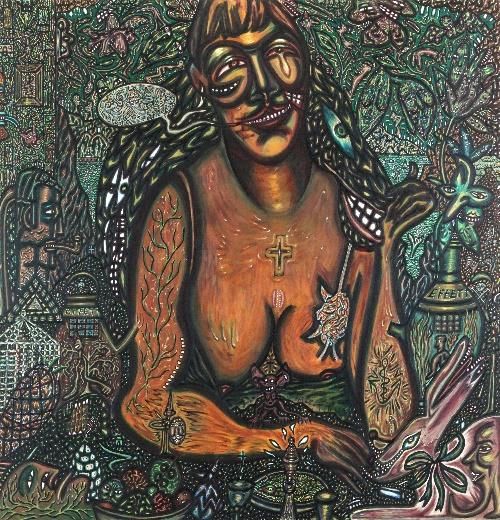
//

Gustave De Smet (1877-1943)

Gustave Franciscus De Smet was a Belgian painter. Together with Constant Permeke and Frits Van den
Berghe, he was one of the founders of Flemish Expressionism. His younger brother, Léon De
Smet (1881-1966), also became a painter.

Gus de Smet was born in Ghent in 1877. His father, Jules, was a set decorator and photographer. Both
Gustave and his brother began working in their father's studio, then attended the Royal Academy of
Fine Arts, where they studied under Jean Delvin. Unlike Léon, Gustave was considered to be an
indifferent student.
In 1908, he and his wife followed Léon to the artists' colony in Sint-Martens-Latem. There, they initially
came under the influence of luminism and the painter Emile Claus, who lived in nearby Astene. At the
beginning of WWI, he and his family joined his friend Van den Berghe, and fled to the Netherlands.
From 1914 to 1922, they moved about, visiting and staying at the art colonies in
Amsterdam, Laren and Blaricum. His meeting with the expressionist French painter Henri Le
Fauconnier (1881-1946) marked a turning point in his style which, up until then, owed much
to cubism.
It was in Deurne in the late 20s, that his mixture of expressionism and cubism peaked, with a series of
works depicting circus, fairground and village scenes. After his death in 1943, his house in Deurle was
preserved as a local museum. Gustave De Smet’s work is part of national museum collections in
Belgium and the Netherlands.

GUSTAVE DE SMET (1877-1943)
Title: De Palingvisser (The Eel Fisher)

Year: 1900

Dimensions: 122 x 181 cm (framed)

Technique: Oil on Canvas

                                                    8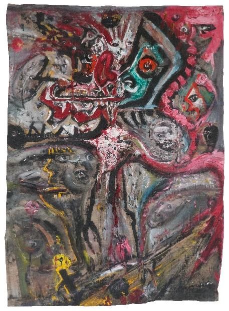
//

Olivier Legrain (1970)

Born in Brussels in 1970, Olivier Legrain is a painter, illustrator and storyboard artist. After studying at
Institut Saint Luc in Brussels, he begins to practice music and for a moment hesitates between
professional drummer and illustrator.

The storyboard of IP5 (a feature film by Jean-Jacques Beineix), published in 1992, helps his choice.
Soon enough, drawing, painting, music and cinema start being more intertwined in his different
professional experiences. He even makes heavy metal album covers for a while, before a few years of
lay-out at TBWA, Duval-Guillaume, Publicis and other advertising companies.

His first cinema break-through is as screenwriter of the now cult Dikkenek (2006), with its golden cast
and amazingly fresh and politically incorrect comedy that inspired so many films since. This first
collaboration with EuropaCorp soon leads Olivier to storyboard Go Fast (2008), while collaborating
with Michel Gondry’s Partizan at the same time.

Thus, storyboarding becomes Olivier’s specialty and he starts showing his work in galleries, notably at
Pierre Hallet in Brussels. He works on storyboards for several film directors, among which
Du Welz, Garbarski, Roskam and Polanski.

In 2014, Olivier Legrain’s paintings are noticed by the Belgian Gallery which soon organizes the first
exhibition of his work on canvas. His paintings are overly concerned with the treatment of light. Their
main subject is the human body, which Legrain tortures in fleshy compositions tainted by a violent
chiaroscuro. He is never afraid to use new techniques to draw and paint, ranging from ecoline, Indian
ink, bleach, pastel, fat, acrylic, walnut husk and oils.

OLIVIER LEGRAIN (1970)

Title: The Shelter

Year: 2017

Dimensions: 74 x 107 cm (with frame 85 x 120 cm)

Technique: Mixed Media on Paper mounted on Wood Panel

                                                     9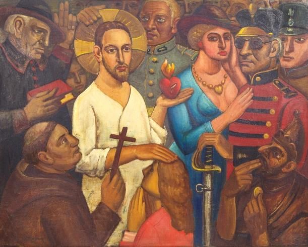
“Much like in the painting of Gustave De Smet, the work I here propose is at first sight a depiction of
calm and serenity. The title I gave it is no coincidence because it is a "refuge" (The Shelter). Although
mysterious through its light coming from nowhere, it refers to the night and to dreams. It is a Lynchian
light.

In The Eel Fisher, we find a more realistic light with the sun on the horizon. Yet we do not know if it is
dawn or the end of the day. There too, time does not precisely exist.

In The Shelter, we are moving forward in a sort of divine light that appears more surreal. Much like in
dreams, it shines on the snow that covers the ground in front of the cabin, which seems abandoned.
It is an isolated location like the pond of Gus De Smet. Whether in a cabin or on a boat, there is a
similar feeling of loneliness and a communion with nature.

In The Shelter, although poorly insulated, the cabin remains a place to protect oneself from the cold,
to hide. Sound is suffocated by the snow and one can barely perceive the wind blowing or footsteps
in the distance.

However, despite its immobility, the universe of The Shelter seems more hostile than that of The Eel
Fisher, because the night is much darker, and we have no information on the background. At any
moment, anything could come out of the dark. A little girl, a doe, a bear, a storm or a serial killer. Yet
we are drawn to this small wood house. From there we could see without being seen. It is a refuge, a
hiding place, just like the pond is for this man on a boat, in the middle of nature. This light makes us
feel like preys to the surrounding darkness and we can’t wait to get to that cabin. And just like the
darkness, the depths of the water also hide a calm and invisible secret in the large canvas by Gustave
de Smet. “

                                                   //

Prosper De Troyer (1880-1961)

Prosper de Troyer was born in Destelbergen in 1880 into a family of twelve children on Christmas day,
in a barn surrounded by water as a result of the break-up of the Scheldt river dike, which his father
was busy trying to repair. Prosper received his first artistic training at Saint-Luc in Oostakker but when
his mother died in 1894, he had to leave school to provide for his family and worked as a blacksmith.

The pictorial evolution of De Troyer obeyed an internal logic that lead him from realism to abstraction
in the 1920s. He then evolved towards neo-impressionism. During WWI, he painted close to the spirit
of Brabant Fauvism. He was part of the circle around Paul van Ostaijen (1896-1928) and attended
Brussels artistic circles.

He assimilated fauvism and cubism into his work at the end of the war, when he discovered Marinetti's
Manifesto of Futurism. It is Marinetti who made sure that De Troyer's drawings appeared at futuristic
exhibitions in Florence. With Paul Joostens and, before him, Jules Schmalzigaug, De Troyer is one of
the few Belgian artists to have adhered to this mode of expression. From 1920, he shortly moved fully
into abstraction and adopted the "pure expression", which he applied to abstract works where his
vision became more geometric. Malevich's supremacism particularly attracted him in those year.

1922 is the year that marked the artist’s return to figurative painting. With themes such as the mother,
the child, the man, landscapes and religion, De Troyer evolved towards a very personal expressionism
close to the German movement Neue Sachlichkeit (New Objectivity), the theories of which he applied

                                                   10
to powerful and monumental compositions, with simplified forms and themes borrowed from family
life and the Bible.
The work of the artist is part of museum and private collections notably in Brussels, Antwerp, Ghent,
Mechelen and Ostend.
PROSPER DE TROYER (1880-1961)
Title: Sacred Heart of Jesus among the People
Year: 1926
Dimensions: 123 x 154 cm (framed)
Technique: Oil on Panel
//
Nel-14512 (1986)
Born in Etterbeek, Nel-14512 is a Belgian symbolist-surrealist sculptor.
Her body of work is born out of the inventive blending of a figurative style tainted by pop art with the
deconstruction of the French language. At first sight, the viewer discovers works that play with
expressions and their mental projections to perpetually oscillate between the symbolism of a concept
and its literal representation.
What is the meaning of an image? Must it be one with its explanation? Thus being one with its title?
Following this very interrogation and this play on signifying and signified, Nel-14512’s work undeniably
adopts the visual style of surrealism, with the same attention to detail and resemblance, but her own
use of language does not translate into an absence of link between the word and the image. It is quite
11the opposite, for her sculptures dive deeper into the meaning of their title, gracefully exhausting its
symbolic meaning.
Nel-14512’s technical and documentary research all aim at creating a visual shock resulting from the
juxtaposition of images, words and objects, whereby she expresses herself almost philosophically,
shamelessly shaking some of our core beliefs.
NEL-14512 (1986)
Title: Laisse pas trainer ton fils (Don’t let your son hang around)
Year: 2014
Dimensions: 53 x 20.5 cm
Technique: Edition of 5 (3 in Polyester & Marble Powder and 2 in Polyester & Rust Powder)
“If time had not been running out so fast, a new work should have seen the light of day in response to
Prosper De Troyer’s Sacred Heart of Jesus among the People. It would have born the same title to
illustrate with irony a contemporary reinterpretation of the expression of faith, of sharing, or even of
the value of Christianity.
Here is a brief description of the work that should have been:
A bench, a metal bar, some evocative details, a graffiti... Gray/monochrome sculpture, except for a
sacred bright red heart. A seated Christ, in a subway, a young man almost lying on the bench, legs
spread under his dress, nonchalant air. A hand on his thighs, looking at his smartphone, absent ... On
the smartphone, a sacred heart, and no one to see it...
The objective with this piece would have been to capture of a great loneliness escaping from the
setting, highlighting the growing religious disinterest, or the disinterest for sharing, by extension. The
12work would have been the prequel of another piece that I made in 2014, titled Laisse pas trainer ton
fils (Don’t let your son hang around), in reference to the famous NTM song. An opposition approach
between the signified / signifiers as is almost always the case in my work.
In the end, this earlier existing work is the one I chose to treat the resonance of our respective pieces.
In my cultural lexicon, this sculpture evokes a disillusioned and/or honest vision of an abandoned
father/son relationship. It is a representation of a son abandoned to his fate by a father who seems
very poorly sensitized to the notions of support, education and trust.
"Don’t let your son hang around, if you do not want him to fall..." (lyrics of the song). If God is Love,
and especially in our image, why then would his lack of paternal involvement not get back at him, like
a boomerang, in the form of a disillusioned and dissocialized son? For me, it was a question of
humanizing the divine figure, and without a doubt to also humanize the paternal figure. Once made
human, God/father would be more likely placed on an equal footing, at times forgiven, perhaps
understood.
This dialogue between the work of Prosper De Troyer and mine was an opportunity for me to discover
the work of this artist. In fact, it seems that some of our semantic research have followed similar paths.
At least, as far as the treatment of Christian subjects is concerned.
In his work, I detected a touch of irony or at least a desire to distort reality so as to inspire in the viewer
an emotional reaction. It has to do with distorting a well-known and defined subject by drawing on its
symbols, however unconscious, to create a new expressive intensity. The result should be in an
invitation to decipher a superior reality that can be broken down into multiple levels of reading. And
even if the first layers might seem light, this process stems from a desire to see successive levels of
reading as steps going down, one after the other, to an ever more serious understanding of the
subject.
Moreover, if our artistic aesthetics are far apart, his work triggered in me the melancholy of the
Belgian landscapes, the coldness of this country that needed a long time to seduce me. But it is
precisely these melancholic sensations that remind me that our common country is deeply rooted
inside me, and that it nourishes the expression of a Belgianhood now fully claimed in my work.”
//
Pol Mara (1920-1998)
Pol Mara, a pseudonym for Louis Leysen, was a Belgian painter, draftsman and lithographer. Born in
1920 in Antwerp, he studied at the Royal Academy of Fine Arts and later at the National Higher
Institute of Fine Arts in Antwerp from which he graduated in 1948. He then started working as a
graphic designer for Janssen Pharmaceutica.
At the start of his artistic career, Pol Mara worked as a surrealist painter before moving on to lyrical
abstraction in the 1950s. In 1958, he founded the Antwerp avant-garde group G-58 Hessenhuis along
with Paul Van Hoeydonck, Mark Verstockt, Filip Tas and Dan Vanseveren.
In the 1960s, Pol Mara introduced photorealistic elements in his work, linking up with emerging mass
communication by interweaving elements from the world of television, film and illustrated magazines.
He thus ventured contemporaneously with Robert Rauschenberg into the pop art scene. Pol Mara
often painted a dream world in which beautiful young women were regularly found in light
undergarments. His figures clearly displayed a kinship with the world of fashion magazines and
13advertising. By creating this aesthetic world of illusions, Pol Mara wanted to criticize the injustice and
the repulsiveness of his contemporary society.
Along with Evelyne Axell (1935-1972), Pol Mara was at the forefront of the pop art movement in
Belgium. In 1974 he painted murals in the Montgomery metro station in Brussels. Since 1972, partly
for health reasons, he spent most of his time in Gordes (France), where the Pol Mara Museum opened
in the castle of Gordes in 1996, displaying two hundred of his works.
POL MARA (1920-1998
Title: Two Women in Mirrors
Year: 1975
Dimensions: 107 x 68 cm (framed)
Technique: Mixed Media on Paper
//
Olivier Pauwels (1974)
Olivier Pauwels, also known by his tag BOHI, is a Belgian artist. He started his career as a painter and
graphic designer, but quickly turned his attention towards three-dimensional assemblages. With an
eye for detail and a strong preference for old materials, combined with sweet little babies, Pauwels
creates an apocalyptic image track. This track seeks the balance between humor and threat, violence
and love, renewal and reconditioning.
14Famous for his cyber babies: android creatures, born from classic toy dolls and old machine parts,
Pauwel’s humanoid contraptions, which originally were given an undeniably steampunk look or
donned military attributes, are moving as well as fascinating. Through them, the artist guides us
towards a surreal world of “Cyber Babies” and futuristic machines. It’s an escape from reality, as well
as a statement about launching every baby, every new-born, into an outrageous world. A world in
which the mass hysteria of the constantly wanting more determines our rhythm of life. These babies
are the seed for the next generation. They’re a blank slate on which we can project our wishes, fears
and dreams of the future.
In his work, objects are decontextualized and are given a new dimension, a new identity, whereby
they lose all connection with their past. “Where the life of an object stops… the dream world of the
artist begins.” The artist’s specific way of assemblage got him in touch with film legend George Miller
in 2010 and he participated in shaping the image of the movie Mad-Max Fury Road (2015), which was
rewarded with 6 Oscars.
OLIVIER PAUWELS (1974)
Title: Guestronauts
Year: 2013/14
Dimensions : 63 x 25 x 25 cm (+ Basis 93 x 25 x 23 cm) TOTAL: 166 x 25 x 25 cm
Technique: Mixed Media with TV & DVD system, 220 Volt, Edition 1/11
“Apart from the fact that we received the same education and that I also started my career as a graphic
designer in the advertising world, there is no real link between my work and Mara's later global work.
15Although... Pol Mara (1920-1998) is part of generation in which many of my idols had their place in art
history such as Vic Gentils (1919-1997) and in particular Paul van Hoeydonck (1925).
Paul van Hoeydonck... through his inspiring work I started visual work, the fact that Paul van
Hoeydonck and Pol Mara were both members of the avant-garde group G58 Hessenhuis certainly
reinforces my connection to Mara’s work and especially the period.
There is clearly a certain link, call it a resemblance, between the work I proposed and Two Women in
Mirrors, in which two women are depicted with their heads trapped in an elliptical bubble. As a
spectator, it is not immediately clear what Mara means by this. Is it a kind of futuristic image? Are they
astronauts of some sort? Whatever his intention, it brought me immediately back to my Guestronauts,
where I also trap the faces (via TV) in a spherical helmet that is part of a bigger astronaut suit.
It is a strange feeling to see these faces, apparently trapped in a kind of sphere. Trapped in a static
robot that can come alive at any time. Trapped in a closed world. Our world. My intention is for the
face on this TV to be that of a guest, hence the title Guestronaut. Up to each collector to then choose
which guest to record and to trap into the space suit! The Guest becomes the artwork!”
//
Fred Bervoets (1942)
Fred Bervoets was born during WWII and grew up in the smoke of the factories in the port of
Zwijndrecht and in the shadow of the church of Burcht. He studied at the Royal Academy of Fine Arts
in Antwerp and at the Higher Institute of Fine Arts.
The oeuvre of Bervoets does not show homogeneity or continuity in the strict sense of the word. His
themes and style undergo many changes throughout the years and are thus often categorized in
"series". The period from 1964 to 1970 was characterized by influences of the CoBrA movement,
although the works were already closely relating to the life and ideas of Bervoets.
From 1970, snakes and intestinal figures often appear in his monumental paintings, coining the name
Spaghetti Canvases – busy tales in a psychedelic world. From 1972-1974 he abandons this detail
intensive process and creates Totems and Cabinets. In addition, he increasingly uses assembly
techniques, whereby he cuts and combines etchings, sticking them on fabrics, or fastening them with
nails and ropes. During this period, Bervoets mostly made use of gray, blue and green with aggressive
red intrusions, giving birth to what is now referred to as the Grays series.
In his following period, anger and sadness come to reflect the loss of his painter-brother Jan Cox in
1980 and the drama of Wounded Knee in 1973. In 1982, Bervoets exhibits at the KMSKA in Antwerp
and a year later receives the Lobende Anerkennung from the jury of the European Graphical Art in
Baden-Baden, after his participation in the 17th Biennal of São Paulo.
From 1987 his works are characterized by mutilated self-portraits and scars which were often made
in the darkness of the night with acrylic paint on unprepared canvases. That same year is also marked
by the Nevada series, made of impressions - mostly on brown wrapping paper or camouflage cloth -
of his trip to the Mojave Desert and his visit of his friend Albert Szukalski (1945-2000).
16In 1991, he receives the State Award for Fine Art and in 1994 exhibits his work besides that of Jean-
Michel Basquiat (1960-1988) under the title A Museum in the making at the Scottsdale Center for the
Performing Arts in Scottsdale (USA).
FRED BERVOETS (1942)
Title: Untitled (from the Cicatrice Series)
Year: 1987
Dimensions: 198 x 144 cm (framed)
Technique: Mixed Media on Canvas
//
Tom Liekens (1977)
Tom Liekens Tom Liekens has a completely unique position in the Belgian art landscape. Both his
subjects and the way in which he elaborates them into monumental paintings and collages make him
one of the most original painters of his generation. His interest in nature is striking. He is fascinated
by the unrealistic way in which fauna and flora are presented in paintings, in fairy tales or in films. The
artificial world of zoos, natural history museums and tropical greenhouses is also a permanent source
of inspiration. Again and again his work is overloaded with art and cultural-historical references.
Tom Liekens lives and works in Antwerp where he graduated in 1999 from the Royal Academy of Fine
Arts. Since then he has participated in numerous exhibitions, won the Camille Huysmans Prize for
Painting (2006), and was nominated for the Visual Arts Prize of the Province of Antwerp (2005). Three
large monographs of his work have already been published. His work is part of numerous private
collections as well as public collections such as the Museum of Contemporary Art (MUHKA), Bank
17Belfius, National Bank Belgium, Artesis Antwerp University, Antwerp University, Art collection Province
of Antwerp and Museum Van Bommel-Van Dam Venlo.
TOM LIEKENS (1977)
Title: Birds
Year: 2018
Dimensions : 152 x 102 cm (unframed)
Technique: Collage of Woodcuts on Canvas
“I studied at the Royal Academy of Fine Arts in Antwerp where Fred Bervoets (1942) was then a
teacher. Although our work is very different, there is undoubtedly common ground. Just like in Fred’s
work, my work is a mix of pathos and drama, topped with a relativizing irony. We obviously also share
a preference for monumental formats and crowded compositions.
In my self-portrait Birds (2018), birds play a violent leading role: dozens of pigeons are harassing me.
It looks like a scene from The Birds (1963) by Alfred Hitchcock. And just like in Fred’s self-portrait from
the Cicatrice series, I place myself in the leading role of a self-created universe.“
//
Pjeroo Roobjee (1945)
Pjeroo Roobjee, a pseudonym for Dirk De Vilder, is a Flemish artist who studied at the Royal Academy
of Fine Arts of Ghent, where he was born in 1945. He later attended the Rijksacademie in Amsterdam
(NL).
18Roobjee works as a painter, draftsman, graphic artist, actor, author, theater director, entertainer and
singer. His plastic as well as his literary works have earned him many awards, notably Le Prix de la
Jeune Peinture. He was a laureate of the Leo J. Kryn Prize for his debut novel De Nachtschrijver and in
1984 received the Eugène Baie Prize. In 1994, he was awarded the Louis Paul Boon Prize, the Ark Prize
of the Free Word in 1998 and in 2004 was a laureate of the Culture Award of the city of Ghent for the
ensemble of his literary work.
Roobjee was a co-founder of the Ghent branch of the Kabouter movement in 1970, for which he
participated as a leader in the municipal elections. From the early 1970s, he actively wrote in various
literary genres. His play Ubu Kaka Pipi premiered in 2000 at the Gravensteen in Ghent and was
published by Theater Taptoe. The theater group De Verrukking played his Omhelzingen the same year.
In 2011, Roobjee made his debut as an actor in the animated film De Veer van César, a melancholic
reverie about an orphan toy dealer. In 2019, Pjeroo Roobjee received the VUB Literature Prize.
His plastic work revolves around painting and drawing, where he expresses his passion for freedom
across artistic forms, revisiting European history, its great master painters, and its many demons in a
personal celebration of life through a richly painted universe.
PJEROO ROOBJEE (1945)
Title: The Illness of P. (K. von S.) or the Tragical End of Silence (with Reiner going to the Horses of
Knokke)
Year: 1988-89
Dimensions: 200 x 200 cm (framed)
Technique: Oil on Canvas
//
19Peter Depelchin (1985)
Peter Depelchin grew up at the Western Flemish sea side, spent some years in Italy and New York City
and nowadays lives in Brussels. His artwork witnesses of each of these places and unstoppably evokes
new places Peter wishes to discover and to interpret through art. This cultural gourmandize is the
motor behind his mentality, art and work.
Depelchin’s artistic practice is articulated in two main steps: first, a research phase, for which he
develops an amount of studies and small writings. These preliminary examinations result in series of
sketches or collages. In a second movement, after having studied his subject at length and after having
set-up the outlines of the intended artworks, he starts drawing, printmaking, filming or creating
installations. The initial sketches are clearly put to use either as a stable point of departure for later
artwork, or as autonomous artworks in their own right. Notwithstanding his interest and experience
with a variety of media, drawing makes up the core of his artistic practice. The materials he uses to
develop allegoric drawings are pen, Chinese ink, bistre and silk paper. This combination justly evokes
visionary images with both Eastern and Western cultural influences. Likewise does his grip on several
ancient printmaking techniques such as woodcut and intaglio.
Peter’s recognizable artistic universe comes into being thanks to an intense art-historical and literary
observation followed by a personal interpretation. As a matter of fact, he wants to create a new
intercultural imagery containing a symbiosis of art history and topicality and avoiding cultural
appropriation. To this end he explores art-historical characteristics of aesthetics and the power
originating from an image when reversing its beauty or toying with the significance of artistic subjects,
themes, archetypes and symbols: de-contextualization and neo-contextualization. As the recycled
images are part of our enormous visual culture, their reinterpretations consequently have a strong
effect on the spectator. He wants to break open the collective cross-cultural consciousness, starting
from the concept of the “human identity”. Hence, he searches for the “human being” and the “being
human” exploring humanity. Finally, he accomplishes step by step a new, more universal imagery that
draws from the past and reflects on the present.
Peter has been very active on the international art scene, with residencies in The Netherlands
(Vlissingen 2008-2009), in Italy (Rome 2014-2015) and in the USA (New York, 2015-2016), exhibitions
in Rome (MAXXI), Brussels (Kasteel van Gaasbeek) New York (Brilliant Champions Gallery) and London
(Young Masters). He is involved in an artistic P.hD. program and plans several new exhibitions and
residencies in its framework.
PETER DEPELCHIN (1985)
Title: Hortus Conclusus I (Enclosed Garden I)
Year: 2014
Dimensions: 172 x 323 cm (framed under glass)
Technique: Pen, Chinese Ink and Bistre on Chinese Silk Paper
20“I chose Hortus Conclusus I (2014) to confront the monumental painting De Ziekte van P (K.von S.) of
Het Tragische Einde van de Stilte (met Reinier naar de Paarden van Knokke) of Belgian artist Pjeroo
Roobjee. Roobjee’s 1988-1989 composition was made after a memorable day with the Dutch painter
Reinier Lucassen spent in Knokke. It appeared to have been a journey full of spleen and sadness, the
end of an era. Their farewell seemed for good (thus time has proven), especially when Reinier and
Roobjee shook hands and kissed goodbye. The used iconography in Roobjee’s painting evokes a lost
Arcadia. He included symbols of a desired universe.
Providentially, my monumental drawing is all about a lost Arcadia. However, I turn this mythical wood
into a horrendous enclosed garden where one doesn’t wish to get in, nor to get out. I wish to attract
and repel at the same time. And so does Roobjee. His central figure stands for all the Moirai (the Fates
in Greek mythology) and is inspired by a bourgeois lady of the beau monde of Knokke. My virgin is
originally a “Maria Lactans”, but likewise she is represented in a far more decadent way.
Next to these comparisons of content, there are lots of visible parallels between both our works; their
strong expressionist style, for example. I manipulate space to evoke this expressionist effect (as Robert
Wiene did in his all-time classic Das Cabinet des Dr. Caligari (1920)), whereas Roobjee paints in an
expressive, almost modernist way. Consequently, we both strongly refer to the past, use iconography
and sample art-historical imagery. Not to speak of our passion for small iconographic details as for
example, the crucifix in Roobjee’s painting, the gallipot, the still life, the snake around the lady’s neck
(Garden of Eden) or the skulls she speaks of. All kinds of similar visual elements are to be discovered
in my Hortus Conclusus I.”
//
www.kloserart.com
info@kloserart.com
© Kloser Contemporary Art – 2018-2019
21You can also read