DATA ANALYTICS, VISUALIZATION, AND STORYTELLING WEBINAR - TAMMIE BORDERS, PHD PHYLLIS KING, CHALLENGE ARCHITECT - UTAH FORGE
←
→
Page content transcription
If your browser does not render page correctly, please read the page content below
Data Analytics, Visualization, and Storytelling
                                 Webinar

U.S. DEPARTMENT OF                                              Tammie Borders, PhD
                                                                Phyllis King, Challenge Architect
ENERGY                                                          Idaho National Laboratory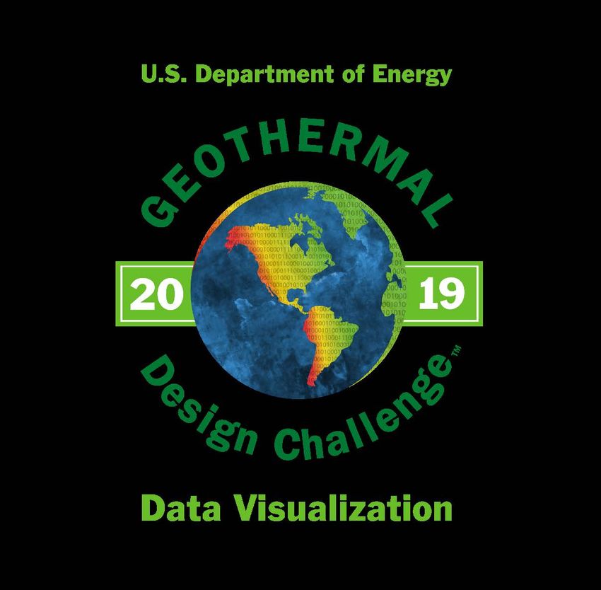
Data Science Workflow Geothermal Design Challenge 2019 What is a Data Scientist? Storytelling Data Acquisition and Cleaning Data Analytics Visualization Data Analytics Resources FORGE Data
Geothermal Design Challenge 2019
Geothermal Design Challenge 2019 - Data Visualization
Who
High school and university (undergraduates & graduates) teams of 2-3 members
What
Visualize the world of geothermal energy through compelling analytics, visualization & storytelling
Use provided data (or in combination with other open source data) to recommend a location
within the FORGE (Frontier Observatory for Research in Geothermal Energy) footprint for an
enhanced geothermal reservoir
When
January 7, 2019 – April 10, 2019 (10 PM ET)
How
There are standard methodologies to cite geothermal wells, such as geological interpretation,
geospatial analysis, etc. However other methods may offer opportunities and promise like
advanced data analytics and machine learning. This data visualization challenge could provide
opportunities that haven’t been explored yet.
But… I am not a geothermal expert
EXCELLENT!!! We are looking for unique perspectives. Ask questions, engage us. Your lack of
experience (which can be biased) is a strength in this competition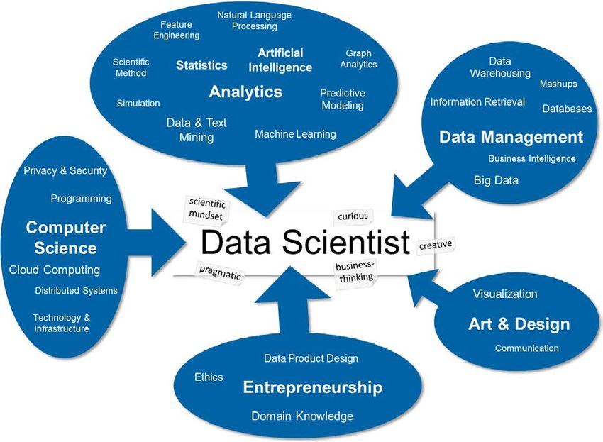
What is a Data Scientist?
Storytelling
Some Resources
Storytelling with Data (Cole Knaflic)
Tableau - Storytelling with Data
FORGE Earth Model
Data Visualization: How To Tell A Story With Data
How are stories different from visualization?
Maybe stories are just data with a soul. —
Brené Brown
In school, we learn a lot about language and math.
But no one teaches us to tell stories with numbers –
C. Knaflic
Tableau Gallery - Rainforests
Storytelling Basics
Understand the Context
Who is your audience? What do you need them to
know? What is the best communication
mechanism and desired tone?
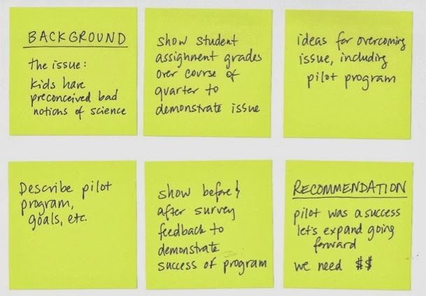
STORYBOARDING – use a whiteboard or stickie
notes to craft your structure
Choose an Appropriate Visual Display
What is the best way to show data you want to
communicate? What are the best graphs to use
and those to not use?
Clutter is your Enemy
Think Cognitive Load
How does each single element you add convey a
message?
Gestalt Principles of Visual Perception - how your
audience perceives order in the world around
them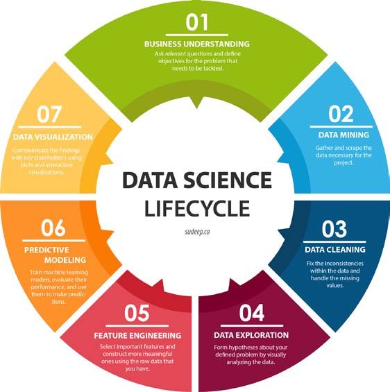
Storytelling Basics
Focus Attention Where You Want It
How people see and how to use that
Pre-attentive attributes (size, color, position)
Think Like a Designer
Form follows Function – YOU are a storyteller!
Affordances (highlight important stuff, eliminate distractions),
Accessibility (know your audience, don’t overcomplicate),
Aesthetics (be smart with color, alignment, leverage white space)
Tell a Story
Think about how visuals will be interpreted; dissect them
Stories stick with us, data does not
Use Big Idea, storyboarding to sequence and tell your story
Infographic Examples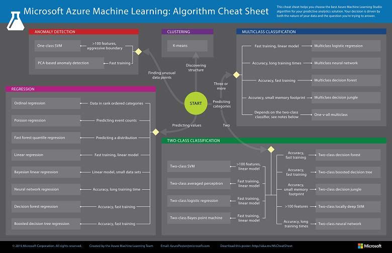
Data Acquisition & Cleaning
Data Mining / Acquisition
Data has been provided to you although you may chose
to combine with other open source data
Data Cleaning
Fix inconsistencies, handle missing values
Exploratory Data Analysis & Feature Engineering
Simple analysis to understand patterns and biases in data
to form a hypothesis
Selection (or creation) of important features from raw
data (or combination of raw data) – increase
interpretability, maintain accuracy of your models
Includes dimensionality reduction
Example: Food PyramidData Acquisition & Cleaning (50-80% of the task)
Acquisition (at Geothermal Design Repository)
Files are provided: csv and las file formats
Python liblas library; R package rlas; ArcGIS
Next webinar (Feb 19) goes into details on data
Data Cleaning
Identify incomplete, incorrect, inaccurate or
irrelevant parts of the data and then replace,
modify, and/ or delete dirty data
Example: Data & data types can be inconsistent
(e.g., 0 / 1 vs no / yes; integers or strings; case
sensitive)
Common packages
R - dplyr
Python – pandas
Tableau best practicesData Acquisition & Cleaning (50-80% of the task)
Exploratory Data Analysis
Brainstorming of data analysis; understand patterns
and bias in the data; simple visualizations, subset
evaluation, explore story behind outliers
Beginning of a hypothesis and your story
Feature Engineering (Selection & Construction)
Dimensionality reduction – increase clarity, reduce
complexity
Tutorial
Using domain knowledge to transform your raw
data into informative features that represent the
problem.
Common packages
Python Scikit-learn, featuretools
SAS automated feature engineeringData Analytics
Everything goes in a box or on a curve
Clustering (unsupervised learning)
Grouping similar objects together
Classification (supervised learning)
Putting objects in a specific class
Maps input-output pairs
Regression
Predicting an input-output quantity
Reinforcement Learning (not
covered)
Example: rock typesData Analytics – Common Software
Everything goes in a box or on a curve
SAS overview, algorithmsData Analytics - Validation Validation Critical to evaluate success Check your work!
Visualization
Introduction Most of us need to listen to the
Ted Talk - Beauty of Data Visualization music to understand how beautiful it
Tableau Gallery is. But often that’s how we present
statistics: we just show the notes,
Chart types
we don’t play the music – H. Rosling
Tableau chart types
Tableau getting started with visualization
My best advice is to not start in
Tableau training (free) PowerPoint. Presentation tools force
Examples: Bar, Line, Scatter plot, Gantt, you to think through information
Bubble, Histogram, Bullet, Heat map, Table, linearly, and you really need to start
Tree map, Bow & whisker
by thinking of the whole instead of
Be creative! Tell your Story the individual lines – N. DuartePython tutorial
Analytics Resources
The Art of Data Visualization
https://www.youtube.com/watch?v=AdSZJzb-aX8
Python - Real World Examples
https://www.youtube.com/watch?v=VI9R-QnDwNA
ArcGIS Basics
https://www.youtube.com/watch?v=N-5FCICaMyM
Tableau - Data Visualization Beginners Guide
https://www.tableau.com/learn/articles/data-visualization
Overview of SAS Visual Analytics
https://video.sas.com/detail/video/4420977648001/overview-of-sas-visual-analyticsAnalytics Resources Top 74 Data Visualization Software A 5-Step Guide to Data Visualization 10 Useful Ways to Visualize Your Data (With Examples) 25 Tips to Instantly Improve Your Data Visualization Design Tableau for Students Tableau for Students FAQs Tableau Student Resource Page Python Python Guides and Resources R Studio SAS University Edition (Free) Learn SAS Matlab Datacam
FORGE Data Geothermal Design Repository
You can also read