DESIGN INTERIOR - Natalia Miyar
←
→
Page content transcription
If your browser does not render page correctly, please read the page content below
INTERIOR
DESIGN

                                                   2021
YEARBOOK

Edited by Alexandra Bushby   Foreword by Lester Bennett, President, BIID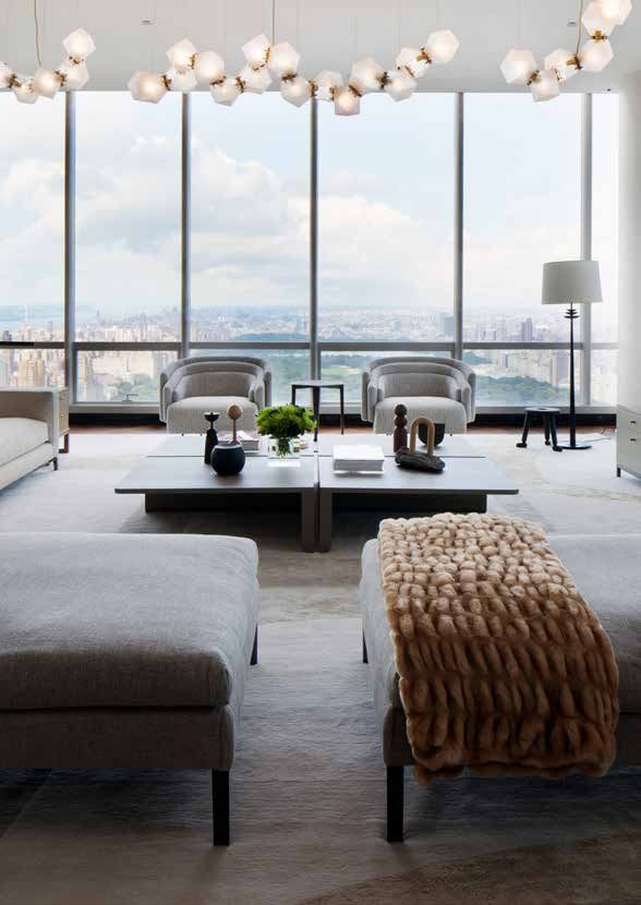
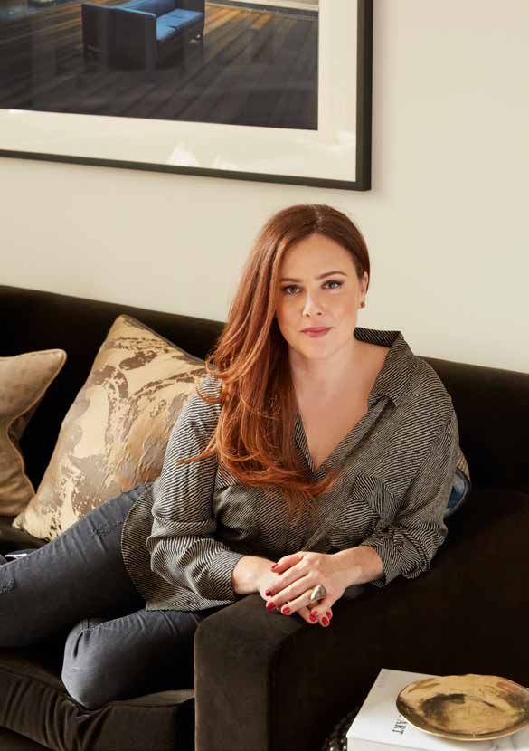
Natalia Miyar
Founder, Natalia Miyar

134 | 2021 | INTERIOR DESIGN YEARBOOK |

COLOUR AND TEXTURE IN DESIGN

                   COLOUR &
               TEXTURE IN DESIGN
                                        BY NATALIA MIYAR
                                                  Founder, Natalia Miyar

Natalia Miyar began her professional career as an architect working with notable architectural firms in Miami. During
eight years of study and six years in practice she developed a true love of materiality, space and proportion, which led
naturally into design of the interiors. Several years on, her eponymous interior atelier, launched in the Spring 2016,
showing a capacity for original, exciting design with the professional skill of leading practice. There are several factors at
play within Natalia’s designs. Born in Mexico to Cuban American parents then relocating to Miami at the age of seven,
travel and culture have always been central to her life. Her cultural identity is laden with inspirations that fuel a love of
texture, colour and the contrasts of the visual world.

W         hen it comes to putting
          colour combinations
together, I am very intuitive and I
go by what works for me and what I
think will work best in the space. I
am always inspired by nature in my
design schemes and colour
combinations, and in the natural
world, there are no rules.
I believe in timeless inspiration as
opposed to trends. I believe that
concepts and design schemes
should work individually for each
client and project.
The secret to a successful palette is
having balance, interest and variety.
Even in a monochrome scheme,
there are neutrals, colours and
textures that will bring interest but
not feel boring. For me innovation
comes from creating something
truly individual.
Blue is always a very popular choice
with clients and at the moment we
get a real variety of requests from
clients wanting something new and
unique for their homes. People are
being more adventurous with
                                                                           | INTERIOR DESIGN YEARBOOK | 2021 | 135
NATALIA MIYAR
colours. People want individuality in     enormous impact. I believe using          few months and unfortunately a lot
their projects, certainly no two          colour brings vibrancy and fun. I         of suppliers are still struggling. It
projects of mine ever look the same       like interiors to be joyful and           can be really frustrating when
as my clients have different requests     welcoming, when you add colour            suppliers are not able to help and I
and taste.                                you add warmth, and a home                think that the most responsive
A really good colour palette brings       should be warm and inviting.              suppliers are the ones who will be
life to a space. Flatness and             I really enjoy travelling and am          successful over the coming months.
monotony are boring, the eye is           always inspired by every country I        There are of course challenges for
drawn to contrast whether it be a         go to. I was recently in Morocco          so many industries at the moment.
collection of wonderful textures or       and was inspired by my
                                                                                    People more than ever want their
fabulously contrasting colours            surroundings. The colours are so
                                                                                    homes to address all their needs and
bringing vibrancy and life into a         wonderful and I found some really
                                                                                    due to spending so much time at
space. Pops of unexpected colour          beautiful glazed tiles which inspired
                                                                                    home, they are keen to have projects
will completely change the mood: if       me. I am spending a lot of my time
                                          in Miami at the moment and was in         completed quickly which can present
the room is to be used for work, it
                                          fact there throughout lockdown            challenges for designers trying to
will help to inspire, if the room is to
                                          working on a personal project - my        connect the dots from designing to
be an entertaining space, it will
                                          own home. Every day I felt inspired       sourcing to installation.
uplift and create a sense of
                                          by the bright blue sky, the rolling sea   I have been seeing a lot of red lately
celebration and vitality.
                                          and the lush greenery of the              and think that it could be a really big
Before beginning a design brief I
find it useful to learn about how my      gardens, it was a real contrast to        new colour wave in the industry. It is
clients live and in particular which      London, where I spend the other           bold and daring and I think people
rooms they will use most. I want to       half of my time - although there is       will be keen to make statements in
know where they entertain, where          still a lot of inspiration to be found    their homes and experiment with
they like to eat, where they will         in London of course.                      different shades.
spend the most time and generally         At the moment I am finding that
how they live day-to-day. I think it      client expectations haven’t changed,      www.nataliamiya.com
is always important to know which         despite the changes over the past         IG: @nataliamiyar

rooms will be more for utilitarian
use and which might be more ‘on
show’. For example, some clients
may never host a dinner in their
kitchen and would only like it to be
for family use, while their dining
room should be sophisticated. I also
like to know if they like spending
time all together as a family or if
they prefer to have separate ‘living’
spaces for the parents and the
children; every client is different.
I like adding colour everywhere. I
love adding colour in a sitting room
where I like to hang beautiful works
of art, find interesting lighting and
pad sofas and chairs with cushions
in interesting colours and textures. I
also love adding colour to
bedrooms in spaces which benefit
from colour; particularly on a
headboard which is only a small
amount of fabric but can bring
136 | 2021 | INTERIOR DESIGN YEARBOOK |
COLOUR AND TEXTURE IN DESIGN

Above: Natalia Miyar Atelier Textured

Above: Natalia Miyar Battersea Apartment

                                           | INTERIOR DESIGN YEARBOOK | 2021 | 137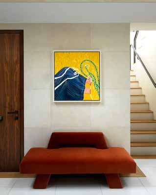
You can also read