RESOURCES BRANDING & GRAPHIC DESIGN - SHARE4RARE
←
→
Page content transcription
If your browser does not render page correctly, please read the page content below

Resources
Branding & Graphic Design
Guidelines | Graphic Design

Purpose
Branding and graphic design plays an important role in your branding and setting the right
expectations for your advocacy. From a logo to promotional material, the branding you show your
audience sets a first tone of what you bring. Even if you’re just starting out as one person, it’s
important to create a corporate branding to reflect your values.

Branding is the marketing strategy of how you shape your brand, and can be seen as a reflection of
how you want people to see you. Your corporate branding reflects your values and DNA of your
advocacy. For many organizations though, hiring a graphic designer can be a challenge.

Luckily, there are plenty of tips and tricks that help you get a professional look without too much
effort. These guidelines provide a short introduction to design principles, and gives structure on how
to create graphic designs for your advocacy.

Branding

Before you start designing a logo, leaflet or a social media banner, think about who you are as a
brand. You need to define your goals and strategy to align the look of your brand. Once you have
defined the basics of your strategy and plan, it is time to start shaping your brand.

   •   Who are you?
   •   What is my mission
   •   What are my values?
   •   What makes my work different than others?

Your brand is not just about what you show your target audience – it reflects the team culture and
how you connect with it. Do you encourage new ideas? Do you expect your team to roll up their
sleeves and get things done? Your branding affects the way people perceive you, so you want to get
the right first impression.

                                                                                                         2
             This project has received funding from the European Union’s H2020 research and innovation
             programme under grant agreement No 780262.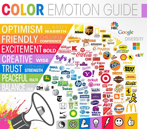
Guidelines | Graphic Design

Colour palette

People have strong aware and unaware associations with colours, and there is a lot of science
involved on influencing people by colour. Studies done by the internationally recognized Pantone
Color Institute® indicate that “consumers are up to 78% more likely to remember a word or phrase
printed in colour than in black and white.” Colour combined with text, as in a logo, impacts readers
of getting better recall, recognition and attention.

Often, a colour palette exists of three to four colours that supplement each other. Below, you can
find an overview of the different colours and how they can be implemented to support your brand
identity:

Reference: https://www.personadesign.ie/colour-psychology-cracking-the-colour-code-for-profitable-branding/

Tip: Use an online colour picker like Adobe Color CC or Design-Seeds to explore different tones and
hues for creating your colour palette.

                                                                                                              3
               This project has received funding from the European Union’s H2020 research and innovation
               programme under grant agreement No 780262.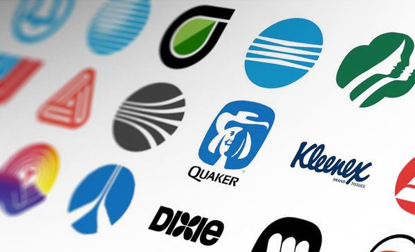
Guidelines | Graphic Design

Typeface/font

There are four types of font that all give a different look and feel of your brand:

Serif fonts have an anchor at the end of each letter. They give your brand a classic, solid and trusted
feel. Times New Roman and Georgia are examples of serif fonts.

Sans serif fonts (like this one or Helvetica) don’t have those anchors and have smooth edges. It often
gives a more modern look to a text and is often used on mobile and desktop versions.

Script typography makes it look like you’ve written the text by hand. If you want to make your brand
more sophisticated and feminine, it is recommended to use Lucida or Allura. However, this type of
font is not recommended on websites, since they are hard to read on a small screen (e.g. phones)

Display fonts are bold, sturdy and very specific, like the Army font. It gives your brand a special look
that makes you stand out in the crowd.

Reference: www.fonts.google.com

Tip: download fonts via Google Fonts or DaFont for free or a small prize. It’s a relatively small
investment to make your brand stand out!

                                                                                                          4
              This project has received funding from the European Union’s H2020 research and innovation
              programme under grant agreement No 780262.
Guidelines | Graphic Design

Logo

Once you defined your colour palette and chose a desired typography, you could go to a designer to
request a logo, or you can try it yourself. Another option is to ask a visual/graphic design student to
create one for you for a reduced price.

A good logo is:

    •   Clearly communicating who you are
    •   Easily readable from a distance, so should not contain too much detail
    •   Not be trend-sensitive
    •   Making sense in your field
    •   Easy to remember

Reference: https://www.brandingstrategyinsider.com/2017/03/the-process-of-credibility-based-logo-
design.html#.XBPmly9x_OQ

Tip: Keep in mind that a logo is not necessary, and you can always use your name as logo, just as Coca
Cola does. If you choose to do so, make sure your typography and colour palette remain consistent
throughout disseminations.

                                                                                                           5
               This project has received funding from the European Union’s H2020 research and innovation
               programme under grant agreement No 780262.
Guidelines | Graphic Design
Assets
Whenever you meet someone face-to-face, have a presentation, or create an event: having
communication materials (business cards, posters, presentations, a website, a letterhead) is key to
make your brand and message ‘stick’. Key here is consistency: the more often you see a certain colour
combination, typeface or logo, the easier it is to recall.
If you happen to have an Adobe Creative Cloud license, it’s a great opportunity to create your own
logo and assets. However, there are plenty of free websites that help you make the search for the
perfect social media banner a lot easier:
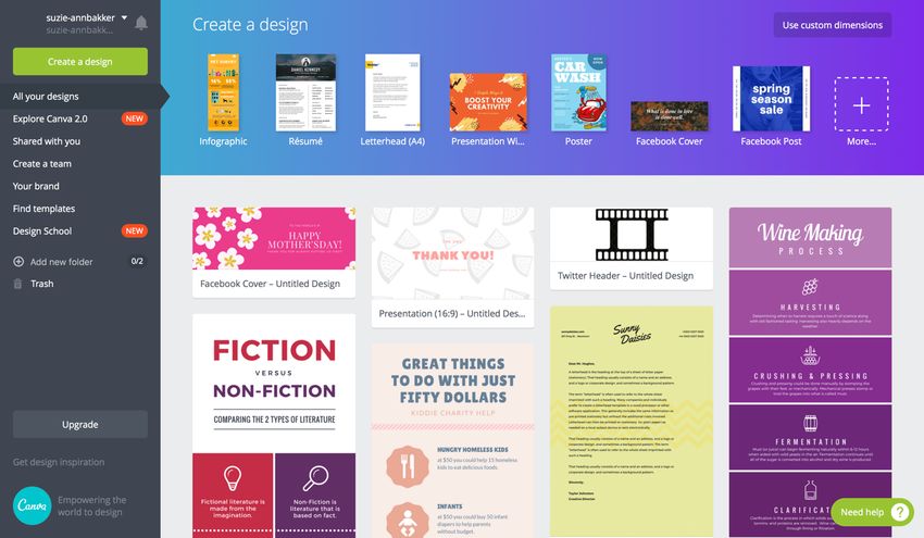
Design Templates
• Canva
• Desygner
• HubSpot
• StockLayouts
Images
• Pixabay
• Death to the Stock Photos
• Skitch
Reference: Canva
6
This project has received funding from the European Union’s H2020 research and innovation
programme under grant agreement No 780262.Guidelines | Graphic Design
References & Resources
https://www.canva.com
https://www.stocklayouts.com/Templates/Free-Templates/Free-Sample-Templates.aspx
https://desygner.com/marketing-materials/
https://fonts.google.com
https://www.dafont.com
https://deathtothestockphoto.com
7
This project has received funding from the European Union’s H2020 research and innovation
programme under grant agreement No 780262.You can also read