Just Do It UX Crunch March 2020 - Tech Circus
←
→
Page content transcription
If your browser does not render page correctly, please read the page content below
Just Do It UX Crunch March 2020
Heather Hepburn
Accessibility Lead

Just Do It
> Feel it
> Understand it
> Do it
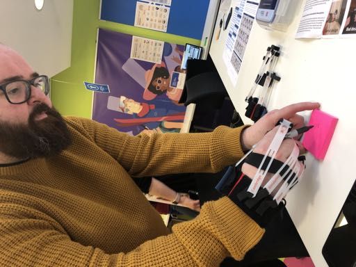
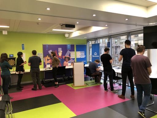
Feel it
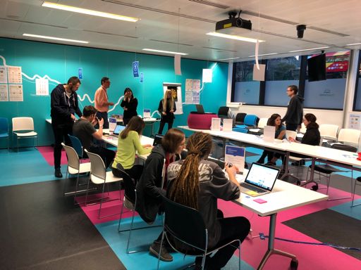
A range of devices, assistive
Empathy Labs   technologies and kit that
               simulate different impairments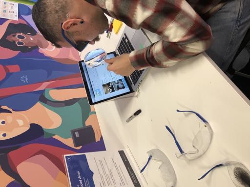
EDINBURGH
GLASGOW
LONDON
Loss of visual field
Reduced vision
Light perception only
Tunnel vision
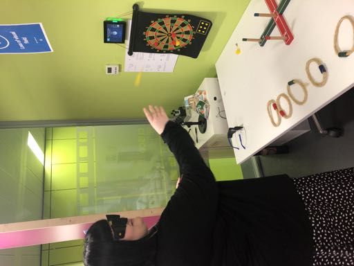
Arthritis
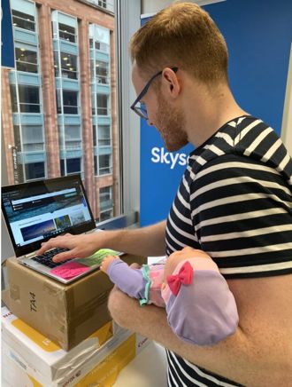
Loss of limb
(or holding a baby!)
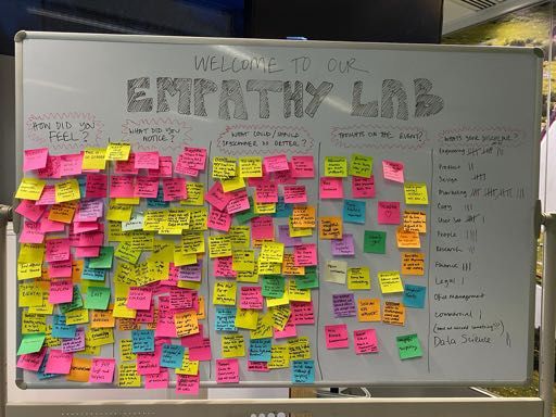
Feedback
A Chrome extension that lets you
          experience the web through the
          eyes of users with disabilities

Funkify
Blurred vision
Tunnel vision
Mini audit
My friend Adi
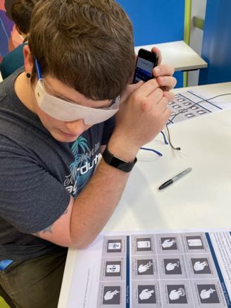
Screen readers
PlaySetting up Voiceover
Step 1 Step 2 Step 3Understand it
Accessibility:            Inclusive Design:
 The degree to which our       A methodology that      Truly inclusive products
products can be used by as   enables, and draws on,    that work for everybody
 many people as possible     the full range of human
                                      diversity
“The results of inclusive design for accessibility always leads to a better product for everyone.” Source: Head of Xbox, Phil Spencer
Disabilities can affect us
                  ALL

 Source: Microsoft’s Inclusive Design Kit
15% of internet users have access needs Source: Clickaway Pound 2020 Report
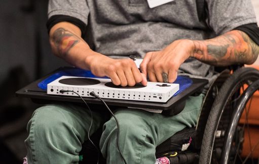
Alternative inputs
ü Build brand equity
                             ü Prepare to meet laws
We all know it’s the right   ü Enter a potentially huge market
thing to do… what else?
                             ü Great for SEO
                             ü Best to build it in from the start
                             ü It’s not as hard as we think
Do it
1 Colour
Colour contrast
AIM: Have high enough contrast between foreground and background colours

                                      Text contrast                 Non-text contrast
> Large text is larger or
  equal to 18pt or 14pt bold
  Minimum contrast ratio = 3:1

> Small text is smaller than
  18pt or 14pt bold
  Minimum contrast ratio = 4.5:1

> Meaningful graphic elements
  Minimum contrast ratio = 3:1
Our decorative graphics https://backpack.github .io/guidelines/colors
Our large text
& meaningful
  graphics

https://backpack.github
.io/guidelines/colors
Our small
    text

https://backpack.github
.io/guidelines/colors
Colour blindness AIM: Check designs are still clear for different types of colour blindness Deuteranopia Protanomaly
Colour alone                         Without key   With key

AIM: Use more than colour alone to
convey meaning

> Add text where possible to help
  explain meaning

> Provide additional cues like
  colour keys or icons
2 Content
Headings
AIM: Use headings to clearly structure a page

> Make headings clearly describe
  the content under them

> Use different heading styles to
  help visual users

> Mark up headings #H1 to #H4 to
  help screen reader users
Layout
AIM: Make your content easy to digest & give it room to breathe

> Break up large blocks of text into
  smaller chunks

> Use short sentences & bullets

> Build simple, logical & consistent
  layouts

> Align text to the left where
  possible
Links & CTAs
AIM: Make links & CTAs clearly describe what’s coming next

> Clearly describe where they will
  take you

> Ideally match the heading of the
  target page

> Don’t use generic descriptions like
  ‘click here’ or ’read more’

> If opening a new window, say so
ALT text                                                            Non-decorative image:
                                                                    ALT text = “Skyscanner founders Bonamy
                                                                    Grimes, Gareth Williams and Barry Smith”
AIM: Provide ALT text to describe non-decorative images

> Accurately describe images in a
  concise way

> Max 125 characters

> Don’t include “An image of…”

                                                          Decorative image: ALT text = “”
> Hide decorative images from a
  screen reader using ALT text = “”
ARIA labels Our new mobile website
“Change search”
AIM: Write ARIA labels to make widgets
work better with screen readers
“Returning on Friday, 3rd April
2020. Select to change.”
“Close message”
“Leaving on Wednesday, 1st
April 2020. Select to change.”
“Learn more about
green choices”Copy style AIM: Make copy simple, clear, and able to be understood by everyone > Use simple language > Use short sentences > Use a consistent tone of voice > Don’t use jargon
3 Interaction
Interactive elements
AIM: Allow good interaction with your design, no matter   Switch device used with a mobile
how someone is interacting with it

> Design clear focus indicators

> Make sure interactive elements
  are tabbed to in the right order

> Provide alternatives to gesture-
  based interactions

> Make navigation consistent
  between pages
Flight price map at 100%
Magnification
AIM: Use good, responsive design so it works at any size

> Web: Allow users to zoom in to
  400% without losing content or
  functionality

> App: Design for small screen sizes
                                                           Flight price map at 400% – no way to see map
> Leave space around text so other
  languages work well

> Don’t make text part of an image –
  always vector format
Form fields AIM: Make form field as easy to fill out as possible > Put labels next to the field > Make field labels clear & concise > Don’t let hint text disappear > Provide clear, actionable error messages
Home Office posters
• Visual impairment goggles:
               vinesimspecs.com

            • Arthritis gloves:
               inclusivedesigntoolkit.com/gloves/gloves.html

            • Funkify: funkify.org

            • Adi Latif video:
Resources      https://www.youtube.com/watch?v=QUZ091A73bk

            • W3C tips:
               https://www.w3.org/WAI/gettingstarted/tips/index

            • WCAG 2.1: https://www.w3.org/TR/WCAG21/

            • Stark plugin: https://www.getstark.co/

            • Home Office accessibility posters:
               https://ukhomeoffice.github.io/accessibility-
               posters/posters/accessibility-posters.pdf
One last thing…
You can also read