Is the Stock Market Cheap? - May 2, 2019 by Jill Mislinski of Advisor Perspectives
←
→
Page content transcription
If your browser does not render page correctly, please read the page content below
Is the Stock Market Cheap?
                                       May 2, 2019
                                     by Jill Mislinski
                                 of Advisor Perspectives
Here is the latest update of a popular market valuation method using the most recent Standard &
Poor's "as reported" earnings and earnings estimates and the index monthly average of daily closes for
the past month. For the earnings, see the table below created from Standard & Poor's latest earnings
spreadsheet.

     TTM P/E ratio = 21.7
     P/E10 ratio = 30.1
The Valuation Thesis

A standard way to investigate market valuation is to study the historic
Price-to-Earnings (P/E) ratio using reported earnings for the trailing
twelve months (TTM). Proponents of this approach ignore forward
estimates because they are often based on wishful thinking, erroneous
assumptions, and analyst bias.

TTM P/E Ratio

The "price" part of the P/E calculation is available in real time on TV and
the Internet. The "earnings" part, however, is more difficult to find. The
authoritative source is the Standard & Poor's website, where the latest
numbers are posted on the earnings page.

The table here shows the TTM earnings based on "as reported" earnings
and a combination of "as reported" earnings and Standard & Poor's
estimates for "as reported" earnings for the next few quarters. The values
for the months between are linear interpolations from the quarterly
numbers.

The average P/E ratio since the 1870's has been about 16.8. But the
disconnect between price and TTM earnings during much of 2009 was so
extreme that the P/E ratio was in triple digits — as high as the 120s — in the Spring of 2009. In 1999,
a few months before the top of the Tech Bubble, the conventional P/E ratio hit 34. It peaked close to 47

                           Page 1, ©2019 Advisor Perspectives, Inc. All rights reserved.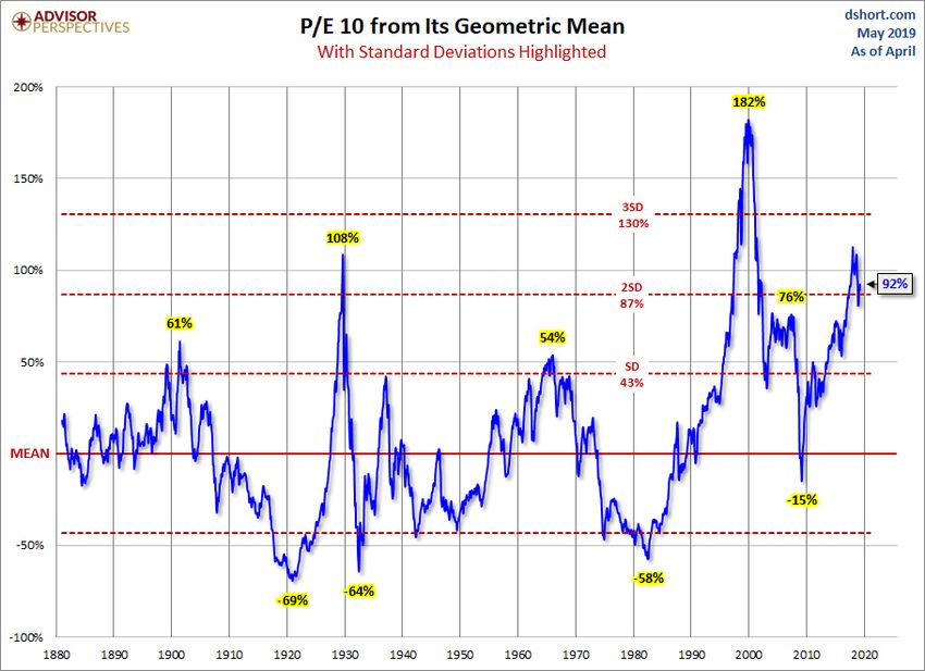
two years after the market topped out.
As these examples illustrate, in times of critical importance, the conventional P/E ratio often lags the
index to the point of being useless as a value indicator. "Why the lag?" you may wonder. "How can the
P/E be at a record high after the price has fallen so far?" The explanation is simple. Earnings fell faster
than price. In fact, the negative earnings of 2008 Q4 (-$23.25) is something that had never happened
before in the history of the S&P 500.
Let's look at a chart to illustrate the unsuitability of the TTM P/E as a consistent indicator of market
valuation.
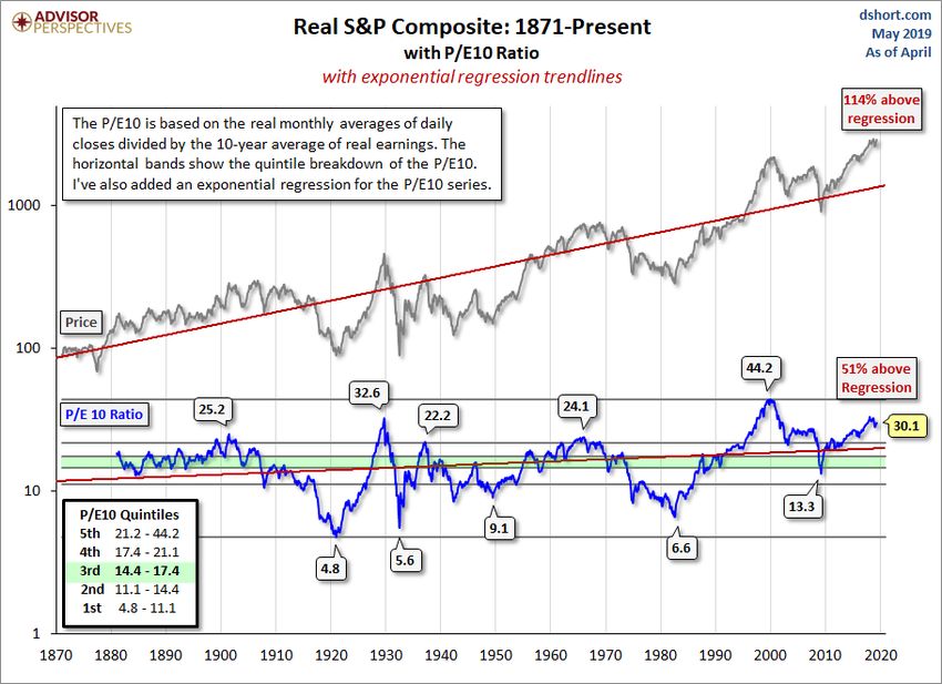
The P/E10 Ratio
Legendary economist and value investor Benjamin Graham noticed the same bizarre P/E behavior
during the Roaring Twenties and subsequent market crash. Graham collaborated with David Dodd to
devise a more accurate way to calculate the market's value, which they discussed in their 1934 classic
Page 2, ©2019 Advisor Perspectives, Inc. All rights reserved.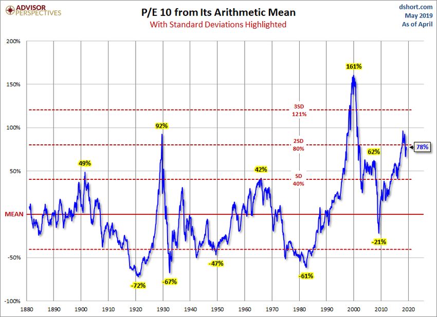
book, Security Analysis. They attributed the illogical P/E ratios to temporary and sometimes extreme
fluctuations in the business cycle. Their solution was to divide the price by a multi-year average of
earnings and suggested 5, 7 or 10-years. In recent years, Yale professor and Nobel laureate Robert
Shiller, the author of Irrational Exuberance, has popularized the concept to a wider audience of
investors and has selected the 10-year average of "real" (inflation-adjusted) earnings as the
denominator. Shiller refers to this ratio as the Cyclically Adjusted Price Earnings Ratio, abbreviated as
CAPE, or the more precise P/E10, which is our preferred abbreviation.

The Correlation between Stocks and Their P/E10

As the chart below illustrates, the P/E10 closely tracks the real (inflation-adjusted) price of the S&P
Composite. In fact, the detrended correlation between the two since 1881, the year when the first
decade of average earnings is available, is 0.9977. (Note: A perfect positive correlation would be 1 and
the absence of correlation would be 0).

The historic P/E10 average is 16.9. After dropping to 13.3 in March 2009, the ratio rebounded to a high
of 23.5 in February of 2011 and then hovered in the 20-to-21 range. It began rising again in late 2013

                           Page 3, ©2019 Advisor Perspectives, Inc. All rights reserved.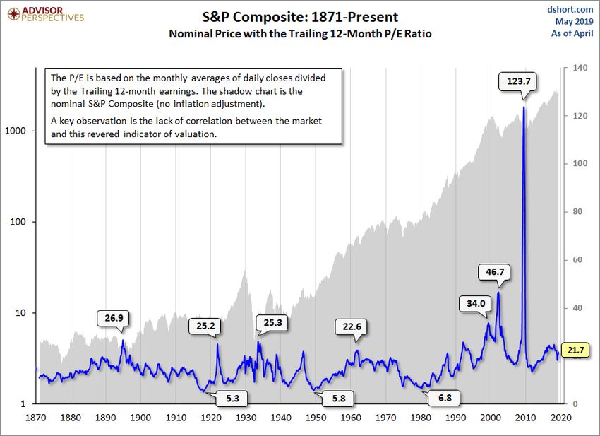
and is currently at 21.7.

Of course, the historic P/E10 has never flat-lined on the average. On the contrary, over the long haul it
swings dramatically between the over- and under-valued ranges. If we look at the major peaks and
troughs in the P/E10, we see that the high during the Tech Bubble was the all-time high above 44 in
December 1999. The 1929 high of 32.6 comes in at a distant second. The secular bottoms in 1921,
1932, 1942 and 1982 saw P/E10 ratios in the single digits.

The chart also includes a regression trendline through the P/E10 ratio for the edification of anyone who
believes the price-earnings ratio has naturally tended higher over time as markets evolve. The latest
ratio is 51% above trend, up from 48% above from last month.

Where does the current valuation put us?

For a more precise view of how today's P/E10 relates to the past, our chart includes horizontal bands
to divide the monthly valuations into quintiles — five groups, each with 20% of the total. Ratios in the
top 20% suggest a highly overvalued market, the bottom 20% a highly undervalued market. What can
we learn from this analysis? The Financial Crisis of 2008 triggered an accelerated decline toward value
territory, with the ratio dropping to the upper second quintile (from the bottom) in March 2009. The
price rebound since the 2009 low pushed the ratio back into the top quintile, hovered around that
boundary and has now moved higher.

A cautionary observation is that when the P/E10 has fallen from the top to the second quintile, it has
eventually declined to the lowest quintile and bottomed in single digits. Based on the latest 10-year
earnings average, to reach a P/E10 in the high single digits would require an S&P 500 price decline
below 900. Of course, a happier alternative would be for corporate earnings to continue their strong
and prolonged surge. If the 2009 trough was not a P/E10 bottom, when might we see it occur? These
secular declines have ranged in length from over 19 years to as few as three.

Percentile Analysis

We can also use a percentile analysis to put today's market valuation in the historical context. As the
chart below illustrates, latest P/E10 ratio is approximately at about the 96th percentile of this series.

                            Page 4, ©2019 Advisor Perspectives, Inc. All rights reserved.
Deviation from the Mean
Here is a pair of charts illustrating the historic P/E 10 ratio from its mean (average) and geometric
mean with callouts for peaks and troughs along with the latest values.
Page 5, ©2019 Advisor Perspectives, Inc. All rights reserved.Page 6, ©2019 Advisor Perspectives, Inc. All rights reserved.
Relative to the mean, the market remains quite expensive, with the ratio approximately 78% above its
arithmetic mean and 92% above its geometric mean.

The Longest Bull Market?...

March 2009 marked the beginning of the longest secular bull market in history if we use conventional
measures (failure of a 20%+ decline following a similar gain). It has been over 10 years since the
Lehman Brothers crisis and the market could still be charging upwards even with recent corrections.
Check out this infographic from FINRA on the longest bull markets.

Additional Notes

What Are the Impacts of Low-Interest Rates and Inflation on Market Valuations?

For more on this topic, see our monthly update:

                          Page 7, ©2019 Advisor Perspectives, Inc. All rights reserved.
Market Valuation, Inflation, and Treasury Yields: Clues from the Past
Wouldn't Valuations Be Much Lower If We Exclude the Financial Crisis Earnings Crash?
This is an often asked question, the assumption being that the unprecedented negative earnings of the
Financial Crisis skewed the P/E10 substantially higher than would otherwise have been the case.
While that may seem a reasonable assumption, a simple experiment shows that the earnings plunge
did not dramatically impact the ratio. Let's assume that the December 2007 TTM earnings of 66.18
remained constant for the next 29 months, totally eliminate the collapse in earnings of the Great
Recession. What impact does this have on the P/E 10? The mean (average) only drops from 16.6 to
16.5. The lower bound of the top quintile drops from 21.2 to 20.8.
Where Can I Find the Latest Earnings Data for the S&P 500?
Follow these steps to access the Standard & Poor's earnings spreadsheet:
1. Go to the S&P 500 page on the S&P Dow Jones Indices website. Here is a: direct link to the
page.
2. Click the "ADDITIONAL INFO" button in the left column.
3. Click the Index Earnings link to download the Excel file. Once you've downloaded the
spreadsheet, scroll down to the "As Reported Earnings" data in column L.
Exactly What Is the S&P Composite index?
For readers unfamiliar with the index, see this article for some background information.
Page 8, ©2019 Advisor Perspectives, Inc. All rights reserved.You can also read