JASON ROSENFELD - Ben Wilson
←
→
Page content transcription
If your browser does not render page correctly, please read the page content below
JASON ROSENFELD

BEN WILSON
FROM SOCIAL REALISM TO ABSTRACTION
BEN WILSON
FROM SOCIAL REALISM TO ABSTRACTION

                 Jason Rosenfeld

          September 6 – November 4, 2017

               George Segal Gallery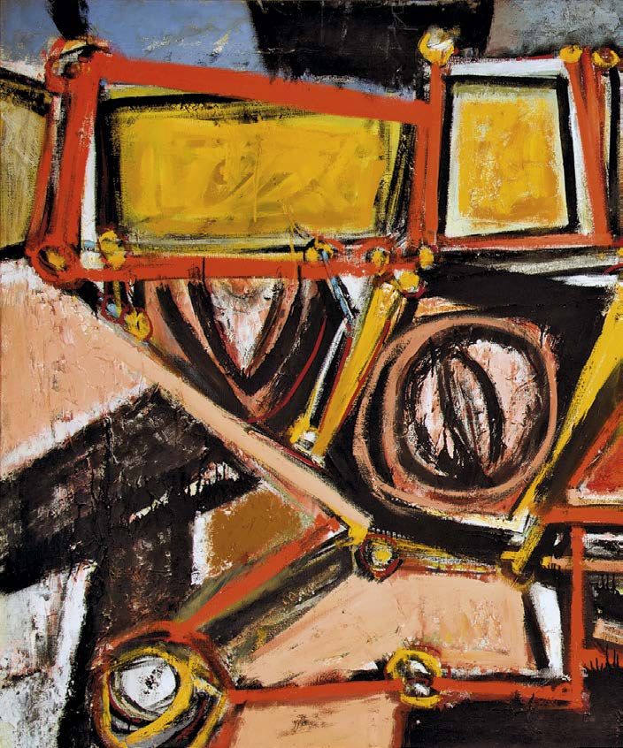
Upon request, information will be made available in
alternative formats such as large print. Accommodations
will be provided to all individuals with disabilities in order
to participate in George Segal Gallery services, programs,
and activities.

This catalogue is published in conjunction with the exhibition,
Ben Wilson: From Social Realism to Abstraction, and presented
from September 6 through November 4, 2017, at the George Segal
Gallery, Montclair State University.

ISBN: 978-9980093-2-2

Curator: Professor Jason Rosenfeld, PhD, Marymount Manhattan College

Publisher: George Segal Gallery
Montclair State University
1 Normal Ave., Montclair, NJ 07043
T (973) 655-3382/5113 F (973) 655-7665/3269
georgesegalgallery@gmail.com

Copyright © 2017 George Segal Gallery, Montclair State University
All rights reserved

benwilsonamericanartist.org

Editing: Ashley Park, California
Design: Russell Hassell, New York
Photography: Anthony Louis Rodriguez, New Jersey
Printing: Puritan Capital, New Hampshire

Front cover: In Plane Sight, 2000, detail, see plate 46
Inside front cover: Untitled, ca. 1973, detail, see plate 28
Pages 6–7: Corrida, 1965–66, detail, see plate 24
Page 28: Bypass, 1991–92, detail, see plate 43
Back cover: Victory, 1945, detail, see plate 13

Ben Wilson, Paris, ca. 1960
This exhibition is made possible in part by generous support from the

                    McMullen Family Foundation

                              and the

                New Jersey State Council on the Arts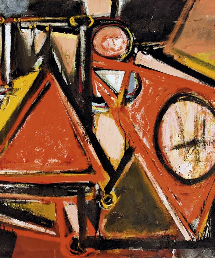
Acknowledgements

The estate of an artist is a world in itself, rich in documents, artifacts, memorabilia. If the
past is another country, an artist’s estate is a passport to that world. To have it preserved is
a great gift to future generations, guiding us into the life of someone who interpreted and
documented a place and time with a vision that transformed the human experience into art.
    When Joanne Wilson Jaffe presented the opportunity to the George Segal Gallery to
preserve the life’s work of her father Ben Wilson, we were excited not only because the
paintings are of great artistic merit but also because the evolution of his work over a long
and productive life reflects so many of the important trends that brought American art to
the forefront in the 20th century. We are deeply grateful to the Ben and Evelyn Wilson
Foundation for the gift of these wonderful works and especially to Joanne for her trust, her
guidance, and the wealth of information that she has provided about the artistic life and
achievements of both Ben and Evelyn Wilson.
    In addition to the Wilson works in the permanent collection of the George Segal Gallery,
we are fortunate to have paintings on loan from the Hebrew Union College–Jewish Institute
of Religion Museum, thanks to the assistance of Laura Kruger, its curator, as well as from
the Kepner family. Thanks also go to the Quogue Gallery and owners Chester and Christy
Murray for our new association and their enthusiastic support.
    We are also fortunate to have in the scholarly role Dr. Jason Rosenfeld, who brings a
wealth of experience to his appreciation of Ben Wilson’s achievement as an artist. Debra
Pesci of Hollis Taggart Galleries has been both generous and wise in her advice on the
Wilson Collection and this exhibition.
    The magnitude of the Wilson Collection requires the attention and care of professionals
whose experience and insight allow these works and artifacts to live and breathe. I especially
thank M. Teresa Lapid Rodriguez, Director of the George Segal Gallery, and her staff: Anthony
Rodriguez, Andrea Marshall, and Adam Swart. The dedication of these professionals allows
the George Segal Gallery to make a great contribution both to the field and to the state. I
offer special thanks to conservator Walter Nowatka and his staff at Gate House Galleries, Inc.
for their sensitive hands.
    It is a great pleasure to acknowledge Russell Hassell for his extraordinary design and
Jay Stewart and his staff at Puritan Capital for printing this beautiful catalogue. Much
appreciation also goes to our wonderful editor Ashley Park.
    I gratefully acknowledge the McMullen Family Foundation and the New Jersey State
Council on the Arts, whose generous ongoing support has helped to make exhibitions
like this one possible.
    Once more with thanks to all the above and many other supportive University staff,
I am delighted for this opportunity to expand the public’s knowledge and appreciation of
Ben Wilson and his very rich life in art.

Daniel A. Gurskis
Dean, College of the Arts
Montclair State University

4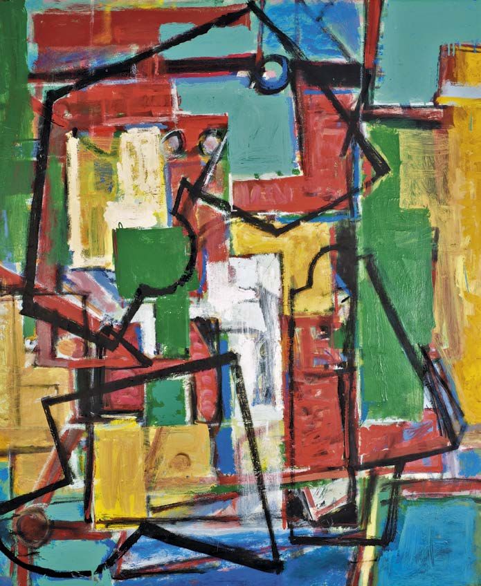
Message from the President

Central to the mission of Montclair State University is the creation and dissemination of
knowledge. Essential to that process are discovery and sometimes, as in the case of the artist
Ben Wilson, rediscovery. Wilson is a painter whose work and life reflect the arc of modern
art in the twentieth century. Although the level of recognition accorded contemporaries like
Jasper Johns, Mark Rothko, and Robert Rauschenberg eluded him in his lifetime, the breadth
of work on display in Ben Wilson: From Social Realism to Abstraction reveals a personal
aesthetic that boldly transcends artistic movements and prevailing critical currents.
    With the generous gift by the artist’s family of a substantial portion of his complete body
of work, Montclair State has been entrusted with safeguarding the legacy of Ben Wilson.
Together with his art, the University maintains an extensive archive of exhibition catalogues,
reviews, correspondence, and historical photographs as a part of the permanent collection of
the George Segal Gallery. In addition, several dozen of his finest paintings are on permanent
display in buildings throughout the University campus.
    Ben Wilson: From Social Realism to Abstraction represents the beginning of what promises
to be an extended period of rediscovery of the work of Ben Wilson through exhibition, study,
and critical analysis. We are pleased that you are here with us at the outset.

Susan A. Cole
President
Montclair State University

5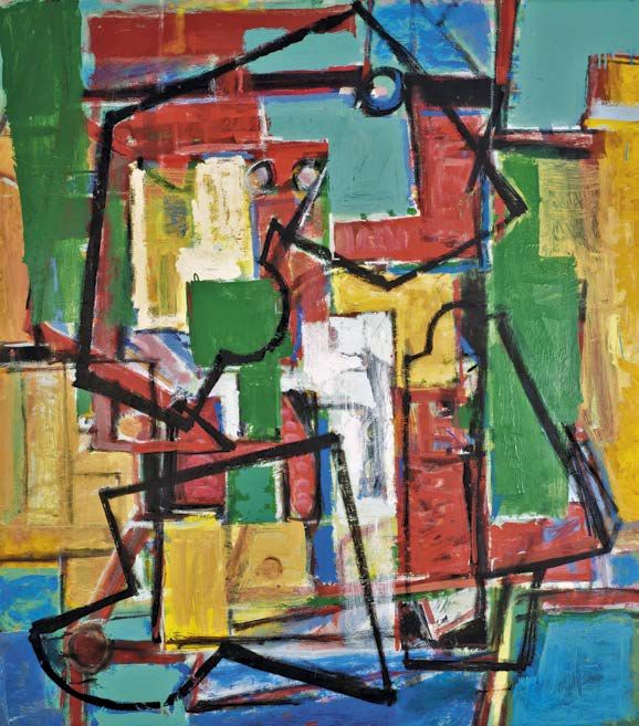
The Moon Cannot Be Stolen, 1987. Oil on canvas, 50 x 40
inches. Brenau University Galleries, Gainesville, Ga.
Purchase. This painting was published in multiple editions
of the seminal art history text
The Art of Seeing, edited by Paul Zelanski and Mary Pat
Fisher.
Foreword

    Lisa Bradley’s profound and evocative compositions paradoxically capture the spirit of
both stillness and motion. Her distilled formal vocabulary and signature shades of blue
and gray belie a tremendous sense of velocity and a deep emotional resonance. Early in
her career, Bradley’s work caught the eye of renowned dealer Betty Parsons who was a
pivotal advocate of such artists as Rothko, Pollock, Stamos, Still, Rauschenberg and
others. The legendary Parsons’ mentorship and friendship provided significant encour-
agement and public notice to the young Lisa Bradley. More recently, she was champi-
oned by the famously avid collectors Dorothy and Herbert Vogel, and many of her works
are counted among those distributed in the Vogels’ recent museum donations: Fifty
Works for Fifty States. This sustained enthusiasm for Bradley’s work is evidence of a
profound emotional connection that her paintings find with the viewer. Dorothy Vogel
described this effect in Bradley’s work: “It’s like when you fall in love. You can’t tell why
you fall in love, it’s just something you feel.”
    Awareness is paramount in Bradley’s work. Her paintings transcend the physical to
become spiritual statements, drawing the viewer in with their distinct visual and emo-
tional pull. Nothing is static. The elegant traceries exist in her turbulent compositions in
which expressionist brushstrokes create a sense of a continuum—of an elemental
motion—like standing in the eye of a storm. Yet, despite this tempestuousness, Bradley’s
canvases exude a sense of peace, and therein lies the timelesss and ethereal power of
her work.
    Hollis Taggart Galleries is delighted to present Lisa Bradley: The Fullness of Being in
which we explore the breadth of Bradley’s career through an engaging selection of both
recent and historical work. We would like to thankfully acknowledge the noted art critic
and author, Carter Ratcliff for the contribution of his thoughtful essay which truly cap-
tures the poetry and strength of Bradley’s oeuvre. Our exhibitions would be impossible
without our professional gallery team and we extend our appreciation to Stacey Epstein,
Martin Friedrichs, Dan Weiner, Samara Umschweis, and Ashley Park for their tireless
individual involvement in the exhibition. Thanks also to Russell Hassell and Jessie
Sentivan, whose design and editing expertise and behind-the-scene efforts have pro-
duced such an elegant catalogue. And lastly of course, we would like to thank Lisa
Bradley for sharing her talent and sensibilities with our audience and for working so
closely with us from the start of this project.
    The measure of the “success” of an artwork is the degree to which the viewer falls in
tune with, and shares the same emotional involvement of the artist. From the first
encounter with Lisa’s paintings one feels an immediate, deeply internal shift of aware-
ness, like a transcendental experience. We are certain that her paintings will touch those
who take a considered look. We invite you to see these marvelous creations first hand.

    Hollis C. Taggart, President
Debra V. Pesci, Director

                                                                                                7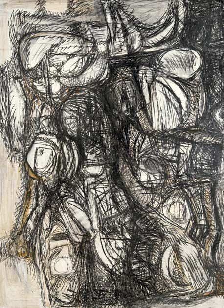
“The Moment of Recognition”               | Ben Wilson from Social Realism to Abstraction
jason rosenfeld

                                     Ben Wilson was an artist whose formative years spanned the Great Depression and the
                                     Second World War. He was a Jewish, Philadelphia-born New Yorker who in his late thirties
                                     left the city for Ridgefield, New Jersey, and then moved to Blairstown near the Delaware
                                     Water Gap. He taught painting throughout his career, in the most committed sense, first
                                     in the New Deal under the Works Progress Administration (WPA), then privately and for
                                     many institutions in the region. He made a go at the New York art world and then with-
                                     drew. He began as a card-carrying Social Realist with an axe to grind and ended as an
                                     American original, pursuing a unique kind of rigorous and emphatically painted abstrac-
                                     tion. This exhibition introduces the highlights of the Ben and Evelyn Wilson Foundation’s
                                     remarkable gift of an archive and vast cache of works by the artist to Montclair State
                                     University, and aims to reveal the whole of his singular career. The reader will find a
                                     chronology following this essay that gives a more concise picture of his life (p. 72).
                                         Wilson’s parents emigrated from Ukraine and he was born in Philadelphia in 1913.
                                     The family moved to New York City when he was three, and he began to take art lessons
                                     at a variety of enlightened institutions in the early 1930s. He studied at the prestigious
                                     but conservative National Academy of Design under Ralph Nelson and Gordon Samstag
                                     and won its Sydenham Silver Medal for drawing. In 1946 Art News wrote appreciatively if
                                     snidely that his “studies at the National Academy have not proved limiting.” Wilson was
                                     awarded the James R. Steers Prize in the Department of Art from City College in 1933 and
                                     graduated in 1935 with a BS in social science.¹ He studied under George William Eggers,
                                     Leon Kroll, and others and would later teach there. During college, he also earned a
                                     scholarship in painting to study at the Master Institute of United Arts.
                                         The evolution of Wilson’s art is at first not readily apparent. How did the WPA artist
                                     with an advanced figural style that was an amalgam of numerous variants of modernism
                                     end up developing into a geometric abstractionist with an unpredictable use of color? Early
                                     works provide perhaps a few clues. A pair of self-portraits from the 1930s (Pls. 1 and 5),
                                     exercises in identity framing, show his experience both of the old and the new. One is
                                     naturalistic, not photographic, and shows him in reverse, the right-handed painter looking
                                     at himself in the mirror. His arm is blurred—possibly unfinished, or perhaps shown in
                                     motion as he actively applies pigment to the support on his easel, which is not depicted.
FIG. 1 Wilson working on the         He wears a tie and suspenders with his sleeves rolled up and his thick hair brushed back:
frame of Muckrakers (Pl. 12) in
his studio at 38 West 22nd Street,
                                     an artist at work who closely resembles his likeness in contemporary photographs (Figs. 1
1946. Photo Harry Kronenberg         and 2). In Cubist Self-Portrait (Pl. 5), Wilson adopted the style that would impact much of

                                     8
FIG. 2 Wilson in front of Polish
Boy at Galerie Neuf, 1946. Photo
Alfredo Valente
his early work: the Analytic Cubism pursued by Pablo Picasso and Georges Braque
between 1909–12. Here, the body is broken down into constituent elements, the palette is
dominated by earth tones, and forms seem to arc and swirl around each other. Again, the
tools of the artist are missing (although there, at the right, is a waiting canvas), but now,
when likeness is less important, elements are treated schematically. Analytic Cubism and
its breaking down of form, as seen in drawings of the period (Pls. 6 and 7), would be a key
tenet in Wilson’s artistic philosophy until his maturity in the early 1970s (Pls. 26 and 27),
when his compositions begin to be built up using geometric elements, brushwork, and
color in a more synthetic approach, as discussed below.
A push and pull between realism and abstraction is thus present in his early work,
and even in works on paper such as a colorful sheet of the 1930s (Pl. 4), a study of a
male nude. It is clearly impacted by Cubism but also trades in a more American idiom:
Art Deco. To be an art student in New York in the 1930s was surely a bewildering
10experience. The deprivations of the Depression made life difficult, but skyscraping
Manhattan must have been a dizzying, and thrilling, thing to see. The twenty-something
Wilson would have witnessed great wonders rising from the bedrock: the Chrysler
Building (1930), the Empire State Building (1931), and, most spectacularly, Rockefeller
Center (1930–39), with its forest of skyward-thrusting buildings and public art featuring
abstracted figural works. The dynamic bodies by Isamu Noguchi, Lee Lawrie, and Paul
Manship that populate the Center, and that signal a modern American interpretation of
the past, seem reflected in this drawing, with its monumental pose and stylized hair in
parallel rows. Yet it is clear that the more realistic murals of the project made more of an
impact, those of Frank Brangwyn and Jose Maria Sert, such that Wilson could produce
an absorbing and sympathetic portrait of an old man in graphite (Pl. 10) that seems
remarkably grounded in close looking at reality. Similarly heavy features and wide open
eyes would recur constantly in Wilson’s Social Realist art of the 1930s and 1940s, trans-
formed in a more Cubist mode in a watercolor of desperate bald men pressed together by
architectural forms (Pl. 8), or in the soulful face of The Builder of ca. 1940 (Pl. 9). By 1936
the fairly straightforward realism of Wilson’s Self-Portrait and the drawing of the old man
(Pls. 1 and 10) gave way to a mischievous modernism in the portrait of Evelyn Perlman,
painted four years before he married her (Pl. 2). Here Paul Cézanne, famous for his
portraits of his wife, Hortense Fiquet, was added to the mix.
Frontal and prim in a blue blouse with a red bow, hair drawn back in a bob, Evelyn
stares off to her left and at first the picture seems direct to a fault. But then one notices
the left eye, raised above the right, smaller and less deeply colored. Here the vagaries
of modernism creep in: the multiple viewpoints of Cézanne and Picasso, the Surrealist
embrace of the odd. The restlessness of Wilson, his dissatisfaction with two dimensions,
is presaged in this seemingly sedate portrait of the woman who would be his closest
companion for the rest of his life. But look at The Builder of 1940 (Pl. 9) or the faces
in Victory of 1945 (Pl. 13)—eyes do not always match up, faces resist clarity, vision is
unsettled—this is a key trope in Wilson’s art.
Wilson consistently worked as an art instructor. He co-taught with the sculptor Milton
Hebald at the American Artists School on West 14th Street from the summer session of
1938 and was a member of the Cooperative University Studio and instructor at the
Queensboro Community Art Center.² The economy caught up to the American Artists
School in October 1939, and on the sixth of that month Wilson was informed that his
course would be canceled the next week, along with two-thirds of the classes offered.
There is no better illustration of the need for the WPA, set up by the Roosevelt adminis-
tration to employ young and practicing artists.
In April 1939 Wilson had a one-person exhibition at the Muhlenberg Branch of the
New York Public Library, on the north side of 23rd Street just west of 7th Avenue.
Paintings by Ben Wilson was scheduled to run from the 10th to the 30th. There were
six works in the show, including Pogrom (Fig. 3). Other titles tell similarly gritty and
grim stories: The Hunt, Before the Storm, The Cloud, Fleeing Children. They reflected the
11FIG. 3 Pogrom, 1936. Oil on canvas,
28 x 23 inches. MSU W2012.001.0062
FIG. 4 Untitled, c. 1940. Graphite and
charcoal on mat board, 12I x 7¹⁵⁄₁₆
inches. MSU 2012.001.470
FIG. 5 Apocalypse, ca. 1938.
Oil on canvas, 23L x 22 inches.
MSU 2012.001.121
historical moment—just five months before the beginning of World War II. Pogrom was
particularly related to the Jewish experience: the systematic violent persecutions endured
by Wilson’s and Evelyn’s parents’ generation in Ukraine, Hungary, or Russia.³ In this work
there are more of the large-scale Cubist heads, often with mismatched eyes, attached
to bodies that are only suggested; meanwhile clubs swing and horsemen direct misery
and wails emanate from soon-to-be-silent mouths. Painted in dark tones, Wilson’s work
was unsettling and intended as such. His show was censored. Branch Librarian Adele
C. Martin attempted to be diplomatic in a letter to the photographer Harry Kronenberg,
who was representing Wilson:
I am sure that you will understand that we must reserve the right to remove any painting
which may seem objectionable. I believe I mentioned this to you when we discussed
the exhibit at first. Since you think Mr. Wilson may be offended by the removal of one
picture, it seems to me that it would be best to discontinue his exhibit. His paintings
would show to better advantage in a brighter room than we have to offer here.
Yet his dark pictures, in the spirit of Francisco Goya’s Black Paintings of ca. 1819–23
(Prado, Madrid), that Spanish Romantic artist’s dystopian and symbolic responses to the
12Peninsular War, do not need brighter illumination—they need only to be seen and their
truths revealed. An anonymous response was published in This Week on August 18:
We discovered Ben Wilson’s exhibit hidden high up in the Muhlenberg Library . . .
We still do not know why Mr. Wilson tried to keep it a secret. His expressive color and
sensitive design together with his awareness of present day events, as expressed in his
paintings are a very stimulating combination. The censors snooped their way into the
show and had removed as “objectionable” for a public library exhibit, his picture called
“Before the Storm,” which satirically shows the role of the dictators and Chamberlain.
It is a very satisfying show and we recommend it to all the students.
But the following day all the pictures were removed.
Such sharply political work is also found in caricatural drawings of the period, such
as one of around 1940 (Fig. 4) with a diminutive Hitler clinging to the back of a bulbous
Mussolini, who sits on the shoulders of an image of an observant Jew wearing a hat
and spectacles, who then stands on a skeleton—a totem pole of fascist ascendance.
In Apocalypse of around 1938 (Fig. 5), Wilson seems to be amalgamating the end of
days imagery of Wassily Kandinsky with the broad forms of Marc Chagall to show flying
13FIG. 6 Ben Wilson outside A.C.A. soldiers and scenes of violence and chaos. This was a deeply political artist. In the Cubist
Gallery, 63 East 57th Street, 1946.
Photo Harry Kronenberg
drawing Arrest of the Picket (Pl. 3), two hulking police officers bodily remove a slender
protester. At the top left, Wilson sketched the same composition overlaid with zigzagging
lines that reveal the geometric armature of the image—eventually such abstract forms
would replace the figural work in his paintings.
Times were difficult all around, and Wilson tried to be nimble in finding meaningful work
and showing his pictures. By 1941 he was advertising private art classes in painting and
sculpture at his studio at 38 West 22nd Street, where he also held group exhibitions. He was a
founding member of the Bombshell Artists Group, who held their first show in March 1942 at
the Master Institute of United Arts, founded by Russian artists and intellectuals Nicholas and
Helena Roerich on Riverside Drive and 103rd Street where Wilson had previously taken
classes. The exhibition was a response to the dealer Samuel M. Kootz’s letter in the New York
Times complaining that contemporary artists lack originality and “rigor mortis has set in and
they don’t know it.” ⁴ In their manifesto the fifty-five Bombshell artists wrote: “This is a fight
against the smugness of established and smoldering taste. It loosens the grip of cultivated,
but stagnant, appreciation. The Bombshell invites the work of established men which is
ordinarily not shown because, spiced a bit differently, it affords prepared palates and lazy
digestion.” Less than three months after America’s entry into the war, this timely exhibit was
largely overlooked, although Edward Alden Jewell in the Times called it “a show that is spirited
and earnest and full of eager sincerity” and found Wilson’s Flight to be “vigorously designed.” ⁵
There was a second Bombshell show in January of the next year at the American British Art
Center: these independent art groups spawned by the collaborative activity of the WPA and in
response to the war are deserving of deeper scholarly exploration, and began an impulse to
show with like-minded artists that Wilson would pursue the whole of his career.
Wilson also had a relationship with the American Contemporary Art (A.C.A.) Gallery,
established in 1932 on West 8th Street and still going strong today (Fig. 6). He sent
Drummer Boy ⁶ to its Artists in War Production show (ca. 1943), which provided a venue for
forty artists who were engaged in war industries and who had little chance to show their
works. During the war Wilson worked as a draftsman for Eugene Printing Company in the
Bronx, International Telephone and Radio Corporation, and Birnbach Radio Company,
affiliated with the defense industry. He painted on Sundays. The Wasteland of 1942 (Pl. 11)
and Muckrakers of 1944 (Pl. 12) are good examples of his style in this period. Metallic blue
in overall tone, they are actively painted scenes of figures clumped together in calculatedly
minimal landscapes. Art News called The Wasteland “among the most moving protests
which this reviewer has seen,” noting the artist’s “vehement social protest” and comparing
his work to that of the Boston Social Realist Jack Levine (1915–2010).⁷ Retrospectively, in an
interview in 1991, Wilson spoke of this era:
My figurative days are long gone. They were necessary then both for the project and
me. I painted the agony and anger of the times. Not very pretty. I recorded what was
going on both in this country and overseas. The degradation that was Europe, the
hopelessness that was America. But I couldn’t stay in that vein. It was too circumscribed. I
needed to fill spaces with shapes, not people. People are limiting, shapes are not.⁸
14New York art critic Alfredo Valente wrote that the work was “exceptional in its profound
and revealing understanding of the great truth of our time. Here the contradictions, the
distortions, the misery, the incomplete victory, the gropings of our epoch are strongly
mirrored. . . . Muckrakers is especially forceful. It is the stuff and guts of the troubled era,
painted with a satirical power that reveals the inherent weakness of man whose own
bestiality defeats him.”⁹ There is a fine photo of Wilson working on Muckrakers’ frame in
his Chelsea studio (Fig. 1). The picture was inspired by his reading The Autobiography of
Lincoln Steffens. The story of that dirt-digging reporter who made his career in uncover-
ing government corruption clearly touched a chord in the young, politicized artist, though
the painting is less celebratory of the press.¹⁰
In 1946 Wilson had a well-reviewed solo exhibition at the Galerie Neuf, including the
monumental Victory (Pl. 13), a response to the celebration on August 14, 1945, in Times
Square of the victory over Japan. More colorful and grand in scale than previous works, it
conveys a conflicted message. There is victory, but there is also the sober realization of
its price. The Picassoid figures, heavily outlined in black as if designs for stained glass,
are crushed together in an arid landscape. An inverted trumpeter blows his instrument
with all his might, while a woman who peers down into the horn grasps an emaciated,
bound prisoner. At the right a woman in red raises her right hand like Christ in
Michelangelo’s Sistine Chapel Last Judgment, as if to swat the sinners down to hell, and
next to her another woman contemplates a bud, a small sign of life in a destitute milieu.
At this time Wilson was working at the Douglaston Art League Studio¹¹ and also the
City College Adult Education Program, giving classes on painting from nature at the
American Museum of Natural History, on pencil sketching at the High Bridge Library in the
Bronx, and on oil painting at the Tremont Library in the Bronx. It is unlikely that he was
promulgating the dour outlook of his own oils. Martin Silver, in a review picked up by the
national Jewish journals, called him a “Jeremiah in Paint.” Journalist Helen Carlson wrote,
“Can such pictures serve any purpose other than as a release for the artist’s overwrought
emotions, one wonders? The urge to run away from Wilson’s paintings is overpowering,
yet one never questions his sincerity in having painted them.” The theme of such works at
Wilson’s Artists’ Gallery show in the spring of 1949 was humankind’s search for security,
one far removed from the subject of triumphalist progress in Art Deco public art. The New
York Herald Tribune described his pictures as “pungent and sensitive.”¹² But by this time
Wilson was thirty-five, and his ideas were changing. This show featured what may be the
first audio guide in the history of art exhibitions. There was a phonograph player in the
gallery so that visitors could hear him describe three works on view, “not to startle or
challenge the audience, but rather to create closer understanding,” according to the artist.
The Builder (Pl. 9), Wilson said on the disc,
asks a question. Man the builder is also man the destroyer. Which of his opposing forces
will predominate? He is shown afloat . . . falling from his hands are his constructions. On
his right is a blindfolded figure, a symbol of lack of direction—lack of vision. In reverse,
reflected in the water, is the top of a death’s head peering upward over the edge.
16Wilson also was in the gallery on Wednesday evenings to speak to visitors, revealing an
early commitment to teaching and patient explication of his art in order to disseminate
his ideas. This he would consistently pursue in his exhibition choices once he moved to
New Jersey, in forming relationships with educational institutions, libraries, and Jewish
community groups, and in trying to build an artistic culture in the state. The Wilson
Foundation’s posthumous gift of his art and materials to Montclair State continued this
impulse to share his art and connect it to the world.
In the 1950s Wilson’s life and art changed. In 1942 Evelyn gave birth to their only
child, Joanne, and in 1948 she got a job with Fabergé Perfumes, which turned into a
career. From 1950 Wilson had a few solo shows at the Harry Salpeter Gallery in West
Midtown, and in 1951 the family moved across the George Washington Bridge to
Ridgefield, New Jersey. In 1953–54 they relocated to Paris for Evelyn’s work, arriving at
Le Havre on March 12, 1953, and Wilson took classes there at the Académie Julian and
kept a studio in Montparnasse. His letters from France are lively and show that while
their rented flats and studio may have had problems with heating and plumbing, the
artistic environs of Paris and also Spain made a great impact, although he found postwar
painting in the city underwhelming.¹³ Normandy Beach (Pl. 15) of this period bears the
new palette of iridescent greens, blues, and oranges also seen in Lazarus of 1950 (Pl. 14),
adding a sense of surrealist fantasy in mysterious forms and clotted paint.
How does an artist come to embrace pure abstraction? Wilson was born within a
decade of most of the Abstract Expressionists, but he came to non-figuration in a very
different way. Although Jackson Pollock, Mark Rothko, Willem de Kooning, Lee Krasner,
and others were also a part of the Federal Art Project division of the WPA, he did not have
direct contact with them. But with the exception of some works of the late 1950s and early
1960s, Wilson’s art is not expressive abstraction—it is not existentialist nor is it dependent
on emotional content. And he was openly scornful of the culture that promoted these
artists. In a letter of 1984 Wilson explained his position in relation to that era:
. . . Peggy Guggenheim in her gallery Art of this Century was the first to show Pollock
and others of the so-called New York School. Kootz picked up his own stable. These
two were the first of a breed of impresarios who came from a money & business
background. The more recent of like stripe—Castelli. They were arrogant manipulators
who pursued their own power-driven ends. They neither understood nor cared about
art or the artist.¹⁴
Wilson removed himself from this milieu, showing with smaller galleries or in artist-run
collectives. He ultimately sought retreat in the leafy byways of New Jersey and developed
a deep mistrust of the commercial aspect of the art world and its effect on artists:
“When the commerce of the world you live in becomes the dominant element you
get the most impersonal relationship between the artist and his work. In fact, the artist
might just as well not be there . . . [the artist should be] concerned with himself, his
comprehension of order, his feeling of things and how to express that. Now that’s the
17FIG. 7 Ben Wilson, 1969 most subtle thing, and the hardest thing to sell.”¹⁵ Yet Abstract Expressionism had an
impact on his career. A photo of 1969 shows him adopting a canonical, serious “Ab Ex”
pose, complete with pipe and standing in front of one of his large-scale gestural paint-
ings (Fig. 7). Pollock and Franz Kline and de Kooning had made it possible for postwar
painters to pursue abstraction as a personal style, and Wilson was obviously keen on
their art. He titled a class in 1963 “Abstract Expressionism: The Calligraphy of the
Unconscious/The Artist as Seismograph,” but in his own work he continued in a more
rigorous way the coloristic abstraction of Kandinsky and the geometric approach of
Mondrian, combined with the free brushwork of the Action-Type Painters. This synthesis
is what makes his work truly original.
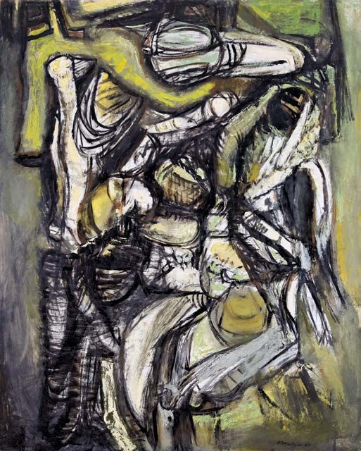
At the same time, one particular incident had a great effect on him. In 1956, two
years after returning from France, Wilson fractured his back when he fell while uprooting
a tree.¹⁶ He was in intense pain and could not paint, but he began to “draw ferociously,”
in Evelyn’s phrase.¹⁷ The result was a shift to abstraction, and works like the grand
drawing Totentanz of around 1958–60 (Pl. 19) signal Wilson’s concerns after this trauma.
He used a fierce crosshatching technique seen in other contemporary drawings (Pl. 18),
including the by comparison delicate Walking Men (Pl. 20), to evoke fetal figures
enmeshed in a chaotic skein of black lines, rendered with graphite and barely any trace
of color. Wilson was a great lover of music: the title refers to a Franz Liszt composition
from the 1850s and means “Dance of the Dead.” Liszt was himself inspired by Francesco
Traini’s or Buonamico Buffalmacco’s macabre frescoes in the Campo Santo in Pisa that
were possibly responses to the Black Death in the 1340s. Wilson’s creepy forms share a
similarly gruesome energy. It is physical work, on a large scale, and he translated this into
a strong series of pictures in the early 1960s that seem almost epic in their communica-
tion of human power and psychology, such as Anima and Shadow (Pl. 17). As the critic,
teacher, and artist Michael Lenson wrote at the time:
A new aspect of Ben Wilson’s painting, the reducing of his formerly richly colored
and encrusted surfaces to black and white, commands attention. Curiously, this lends
new force to such conceptions as . . . “Totentanze” [sic]. . . . Though spiked and
globular forms churn like medieval wagons through these, no hand wields them and
the violence is only massively implied.¹⁸
These were Wilson’s first large-scale works featuring gestural abstraction and represent
an expansion from smaller and more controlled works such as Miracle Kingdom (Pl. 16).
In this vein the impressive Prometheus (Pl. 21) seems to show a frontal hulking male
form, hunched over, burdened, and limbs akimbo, painted with emphatic black strokes
and various shades of green. Its seeming pendant Backward Glance (Pl. 23), ups the ante
in terms of color, with blue added to the mix, and even heavier and more thickly painted
black outlines of forms that hint at reality. Most resplendent in this period is Queen of
Hearts (Pl. 22), in which forms that resemble de Kooning’s abstract figuration of the 1950s,
with their cylindrical heads and slits for eyes outlined in black in the left center, sit hard by
19triangles that lie on the surface plane and do, indeed, resemble the schematic collapse
and flattening of geometric form, costume, and space in face cards. Once Wilson
embraced abstraction the titles of his works became more suggestive than literal, and he
sometimes added them after pictures were completed. Ultimately this period is about a
new conceptualization of how to render form, freed from the need to show reality.
In 1965 Wilson won the Ford Foundation Grant to be an artist-in-residence at the
Everhart Museum in Nay Aug Park in Scranton, Pennsylvania, from July 18 to August 18.
This enabled him to produce his most ambitious works to this point. When Wilson and his
family lived in Paris he travelled at least twice to Spain and, perhaps inspired by Ernest
Hemingway’s compelling writings on the subject, became a fan of bullfighting. His largest
painting in this exhibition, an oil on canvas titled Corrida (Pl. 24) of 1965–66, seems to
reflect that passion. He wrote to his friend Leo Packer on June 18, 1953 from Paris:
The entrance to Spain had an element of shock, for if France is essentially still
in the 19th century, Spain in many ways and places is still Stone Age.
We may except the capital like Madrid, the cities like Barcelona, which are
prettied up as tourist bait. Much of Spain looks starved to the bare bone, ossified
in misery, and the Spaniards are a warm, simple and friendly people, compared
with the subtlety and sophistication of the French. They are dominantly male,
the French are overrefined, and trail behind them the arts of the kitchen and the
boudoir, witness, wine perfume and bidets.
We saw two coredos [sic], one, as you surmised was composed of novilleros,
a farce in which the humans suffered shamefully by comparison with the perfor-
mance of the bulls.
But the second was a top rate affair, which our guide and friend a former
professional (well known) torero, claimed to be an unusually good fight. The
bulls were dispatched with skill and artistry with the exception of some cruel
business by the picadors, that had the crowd on its feet shouting “murderers.”
All in all I acquired a taste for things I would formerly have dismissed as
nonsense.¹⁹
Evelyn recalled of that time: “I almost lost him to Spain. . . . He fell in love with Mallorca,
the bull fights, the Flamenco dancers, and wanted to buy a windmill there for five
thousand dollars. I didn’t want to be his Sancho Panza so I made him come home.”²⁰
In a subsequent letter to Packer, he wrote:
So about the bullfight again—it is not enough to see this as a spectacle or a contest
between two species of animal. It has not only a theme of art—the pictorial, the
dance, the music. It has a religious note—primitive man against all the dangers of
nature, and conquest thru knowledge and skill, but it is wrapped in mysticism, the
acceptance of death as inevitable, and the deep feeling of both man’s heroic poten-
tial and his destructibility. The Spanish have retained an overwhelming sense of
tragedy and the gaiety of their dance & song is on the surface & the sorrow and
desperation lies immediately beneath.²¹
20FIG. 8 Evelyn, Ben, and Corrida retained a special importance for the artist—it hung in his studio in Blairstown
Joanne Wilson, 1960s
until his death.
Corrida is a fine and powerful work, roughly painted on an often visible lightly primed
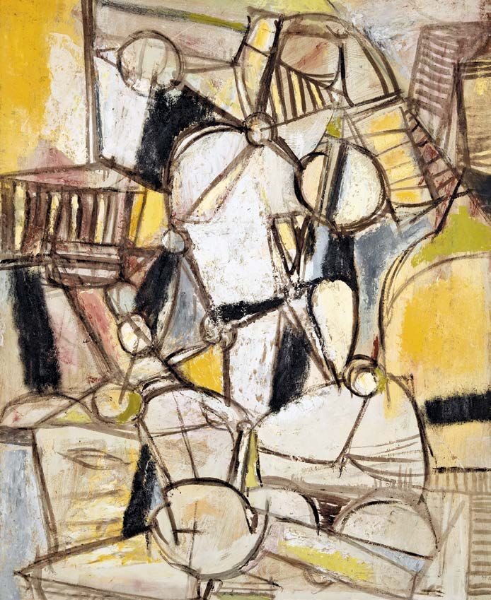
white canvas. Along with Tic-Tac-Toe of 1968 (Pl. 25), Fall of Ptolemy of 1971 (Pl. 26), and
The Past Disassembled of 1973 (Pl. 27), it shows his confidence and brio in working on
a large scale, in many different permutations of color and shape. With the exception of
Tic-Tac-Toe, these works have a central conglomeration of forms that hover against a
modulated background: light in Fall of Ptolemy and The Past Disassembled and darker
toned in Corrida. They presage the formal concerns of the rest of his career, and in them
he developed a series of shapes and motifs: T-square elements, empty rectangular
frames, round shapes with striations, and a clear progression of form and color built up
from the background/lower levels of glazes and ending with interlocking elements on the
surface, like the lattice of green lines in various combinations that sits atop the picture
plane in Fall of Ptolemy. In this picture there are also hot red openwork rectangles that
cross thick yellow and blue forms edged in brown that themselves appear to lie on top
of anchoring brown struts that go off the edge on three sides. Despite Wilson’s layering
process, he cleverly managed to avoid creating any depth. It is instead turned inside out,
with roughly calligraphic squiggles of white and pinkish paint covering much of the
surface of Fall of Ptolemy, but for the red and green topmost lines. As Wilson recalled,
21FIG. 9 Ben and Evelyn
Wilson working at
Blairstown, 1970s
As to method of work generally, I proceed with the elements in their simplest form,
building the line into pattern and volume, organizing and manipulating them intui-
tively until the moment of recognition. This is characterized by a sense of truth or
righteousness in the structure of the picture, which corresponds to a structural
internal equivalent.²²
“The moment of recognition” is a marvelous phrase. This level of complexity without
illusionistic depth is something often cited in Pollock’s mature drip and pour technique,
where skeins of color lie all over the surface, but in a work like Autumn Rhythm (Number
30) ²³ it is impossible to see discrete levels of paint on Pollock’s surface—all the colors
overlap each other. Wilson worked in a more sequential manner, but one that allowed
him, still, a considerable amount of freedom in his execution.
The openwork forms found in Fall of Ptolemy and the battleship gray-dominated
The Past Disassembled signal new concerns when viewed beside the heavier and more
compressed elements in Corrida and Tic-Tac-Toe, whose bold black lines resemble the
paintings of Abstract Expressionists Robert Motherwell or Kline, and, in Tic-Tac-Toe,
convey a sense of belonging to a larger, continuous, composition. Charles Giuliano,
director of the Spectrum Gallery at 54 West 57th Street where Wilson had a solo show in
May and June of 1966, described these works as “Big Brush symbolism,” continuing that
22FIG. 10 Machine Parts, 1973.
Oil on Masonite, 48 x 54H
inches. MSU 2012.001.244
there was “no masking tape or stencil here . . . not a return but rather a vigorous continu-
ation of the Action Spirit. Violently brushed symbols vibrate on his large surfaces.”²⁴
Subsequent pictures of the 1970s featured heightened color schemes, such as in comple-
mentary orange and blue of Untitled of 1974 (Pl. 29) and purple and lemon yellow
against a vivid green background in Compression of 1979 (Pl. 30). Both works feature
hatching in painted lines that fill largely triangular forms, a new element in his production
introduced in works like Untitled of around 1973 (Pl. 28), a refined piece of design that
bears a building up of forms towards the top of the panel, with one rounded peak at the
right and one spherical apex at the left. As with so many of these works, they demand
that they be considered in two ways: figuratively, as it is easy to try to make out bodies
as he transitioned into pure abstraction, and also abstractly, as if an artist’s wooden lay
figure with its tubular limbs and ball-like joints has been exploded into impossible pos-
tures and all link to figuration denied. The bodily disharmony is contrasted here by the
vaguely architectural forms resembling the colonnade and pediment of a Greek temple at
left, and at the bottom and on the top right in striations like flights of stairs. Color seems
to respect borders but does not fill the whole of the demarcated spaces. Yellows and
blacks shimmer as if considering freeing themselves from the surrounding armature. This
black, gold, and white color scheme was also used in Machine Parts (Fig. 10), combined
with an increased sense of movement evident in Wilson’s work of the 1970s. Machine
23Parts can be seen as gears awhirl in some undefined space, as if Piet Mondrian’s tight
and restricted geometric grids, with their similarly thick and controlling black lines, went
amok across the surface. Unlike in Untitled (Pl. 28), however, there is little sense of
orientation or ground. The panel seems to twirl about as its shapes do, and in fact
Wilson used to work on his paintings turned in up to four directions, often settling on the
proper orientation at the end, when he was satisfied with the work.
It is important to bear in mind that all this time Wilson was teaching, in various
capacities, in New Jersey and New York. Space in this catalogue does not permit a full
exploration of this essential aspect of his artistic life, but he clearly thought deeply about
how to teach students to paint abstraction, and this in turn impacted his own art and
approach. Here is a sample lesson plan from a class in Ridgefield on October 16, 1969:
1. Paint 7 to 36 black shapes at random
2. Construct a related series of lines & points
3. Superimpose a disjunctive meander
4. Introduce a number of amorphous spheres at the disjunctions of the meander
This is how he thought. And he put this formal approach into his own practice, a kind of
personal iteration of Hans Hofmann’s famed school of abstract art that had such a great
impact on the Abstract Expressionists of Wilson’s generation.²⁵ At the same time he was
looking at Abraham Walkowitz’s writings on teaching art—he owned a signed copy of that
Russian-born American modernist’s A Demonstration of Objective, Abstract, and Non-
Objective Art (1945). Wilson’s mature art can be thought of as a combination of baking
and cooking: he proceeded from a recipe for approaching a picture with the rigor of
baking and its basis in chemistry, but to that he added the improvisational feel of cook-
ing. His art is never fully prescriptive—in the most successful work the freedom of his
thought is beautifully evident.
In the most elegant phase of his career, and in smaller scale and sensitively colored
pictures such as Byzantium Revisited (Pl. 32) and Mycenae (Pl. 33), Wilson’s painting
practice reflected his obsession with drawing, a compulsion borne out in hundreds of
works that he made in spiral bound books (Pls. 34 and 35). They also seem a response
to the light, air, and colors that he began to experience in 1984 when he started wintering
in Florida. As he noted in an interview at the time, “The paintings I produce in Sarasota
are happier. It’s the light. The light, the water, the sand have all added something new.
My color is brighter—more reds and yellows—and the textures are richer.”²⁶ Cross-hatched
and vibrational, the drawings of this period were made with markers, and these spare
compositions led to a dalliance with pictorial poetry in a series of “Haikus” in 1985–87
(Pls. 36 and 37). These are fully abstract, poetic in name, but absent of words. Untitled
of ca. 1985 (Pl. 31) has no text but bears a mysterious image of a face, peering out from
a now-familiar Wilsonian gridded armature. It is a face from his Social Realist past,
suggestively looking into the abstract present, trapped but searching. In works like
24FIG. 11 Ben Wilson painting, 1980s
the assured and deftly colored Untitled of 1985 (Pl. 38) and The Studio (Pl. 39), two of
his most striking compositions, the refined Wilson fully emerges in tight and gracefully
interlocking forms.
     The final phase of Wilson’s art showed an increasing freedom in the use of abstract
elements. The elegant, settled armatures of the art of the 1980s gave way, in the 1990s,
to big, bold, and boisterous compositions with an unmoored sense of color (Pls. 40–43,
46). Painting in his studio overlooking the Poconos on Mount Hermon Road in
Blairstown, New Jersey, or in the brilliant Florida sunshine of Sarasota, Wilson worked
with increasingly complicated color planes and gnashing geometric forms. The Social
Realism of his courageous, firebrand youth seems thematically very far removed from
these late works. Yet this must be understood in the context of a retargeting of his
energies, away from protest art and amalgamations of European modernism into a
commitment in his maturity to teaching the freedom he found in abstraction, and to
exhibiting with groups that sought to promulgate the arts across a broad range of soci-
ety.²⁷ Wilson wrote a letter in 1963 thanking William W. Skinner for sponsoring the $50
prize he won in the New Jersey State Exhibition, and for:

     . . . your recognition of the need of emphasizing in all manners possible
     stimulation and encouragement to the life of the arts in contemporary society.
         These are values which today receive much lip service but very little of
     the constructive and concrete. As a member of a Bergen artists group [Modern
     Artists Guild] which is trying to interest the public in this part of Jersey in a
     museum such as the Montclair Museum, the degree of public apathy is very
     apparent to us. Our task would be much easier were there a number of people
     of your conviction in our community.²⁸

This is a ripe area for future study of the artist and his milieu.
     In his final years Wilson remained a fine tactician with the color blue, as he had been
in his youth (Pls. 11 and 12). Yet the alluring deep blues in works of around 1990 (Pls. 40
and 42) and lack of a clear orientation of the compositions are contrasted by the popping
yellows and reds in Bypass (Pl. 43) and In Plane Sight (Pl. 46). The latter, from 2000, the
year before the artist’s death, seems a compendium of all his ideas about abstraction.
Planes predominate while space is denied. Thinly painted areas abut densely worked
realms of emerald, and black outlined forms haphazardly hover on the surface. It is all
painterly delight. There is something for everyone, akin to the painter’s own “moment of
recognition.” You just have to look to see his world. That is the innate generosity in the
art of Ben Wilson.

26
Notes
The author would like to thank Joanne Wilson Jaffe for her generous assistance in the preparation
of this exhibition and catalogue, Debra Pesci for steering me towards this project, Teresa Lapid
Rodriguez, Director and Curator of the George Segal Gallery/University Art Galleries, for her
unflagging support, and Andrea Marshall, Anthony Rodriguez, and the rest of the Gallery team
for their help.
1. New York Times, June 30, 1933, p. 14.
2. Wilson taught Elaine de Kooning watercolor painting at the American Artists School. See Eleanor
Munro, Originals: Women Artists, 1979, p. 252.
3. For a fuller discussion of Jewishness in Wilson’s art, see Richard McBee, “Ben Wilson: The Roots of
Abstraction,” May 28, 2008: http://richardmcbee.com/writings/contemporary-jewish-art/item/
ben-wilson
4. Quoted in The New York Post, March 2, 1942.
5. The New York Times, March 4 and 22, 1942.
6. 1943, Collection of Hebrew Union College—Jewish Institute of Religion Museum.
7. 1946 review in written transcript, “Ben’s Poetry” file, Montclair State University Permanent Collection,
gift of the Ben and Evelyn Wilson Foundation.
8. Quoted in Pat Friedberg, “Neglected Treasures: The Art of the WPA,” Sarasota Arts Review, January/
February 1991.
9. Alfredo Valente, “Artist Ben Wilson,” Promenade, November 1946, see also Joan Altabe, “Depression
Artist Surveys the ‘30s,” Sarasota Herald-Tribune, March 3, 1991, pp. 1, 3.
10. “Laurel Hill Artist is Acclaimed after One-Man Painting Exhibit,” Long Island Star-Journal, November 8,
1946.
11. Now the National Art League, http://www.nationalartleague.org
12. The New York Herald Tribune, March 22, 1949.
13. Montclair State University Collections.
14. Letter to “C&C,” dated July 2, 1984, Montclair State University.
15. Cassette tape labeled April 12, 1972, Montclair State University.
16. In July 1962 he was X-rayed after exacerbating the old injury while playing basketball at a camp where
he was working, and it was revealed that he had a compression of the first lumbar vertebra.
17. Medical folder, dated 1962, Montclair State University.
18. Michael Lenson, “The Realm of Art,” Newark Sunday News, March 26, 1961.
19. Ben Wilson, 12 Passage Doisy, Paris, 17 ARR, France, to Leo Packer, 1530 Sheridan Avenue, Bronx 57,
N.Y., June 18, 1953, Montclair State University.
20. Attitudes Magazine, “The Art of Ben and Evelyn Wilson,” May 1993.
21. To Leo Packer, 1530 Sheridan Avenue, Bronx 57, N.Y., dated July 20, 1953, Montclair State University.
22. Quoted in Ben Wilson: The Margin as Center, with an essay by Jack Spector, William Paterson
University, 2008, inside front cover.
23. 1950, Metropolitan Museum of Art, NY.
24. Quoted in New Jersey Music and Arts, Volume 21, No. 10, June 1966.
25. See the thorough bibliography in the artist’s trust’s official website: http://www.hanshofmann.org/
selected-monographs/
26. Attitudes Magazine, “The Art of Ben and Evelyn Wilson.”
27. In particular he sought to expand the understanding of the arts in New Jersey with the
Association of Artists of New Jersey, and also the Modern Artists Guild, founded in 1960 with Evelyn,
Marius Sznajderman, and Sam Weinik, and he was active through the mid-1980s in the greater New
York region with the Vectors Group (from 1959) and the Spiral Group.
28. Wilson to Skinner, 54 Melrose Place, Montclair, NJ, November 17, 1963, Montclair State University.
He won it for Galatea ‘63, at the Thirty-Second Annual New Jersey State Exhibition, Montclair Art
Museum, November 3–December 8, 1963.
2728
PLATES

All works by Ben Wilson were generously donated by the Ben and Evelyn Wilson Foundation
              to the Montclair State University Permanent Collection unless otherwise noted.
1
Self-Portrait, 1935
Oil on canvas, 30 x 25 inches
MSU 2012.001.150
2
Portrait of Evelyn, the Artist’s Wife, 1936
Oil on canvas, 19M x 16 inches
MSU 2012.001.103
303
Arrest of the Picket, 1930s
Graphite on paper, 9 x 12 inches
MSU 2012.001.572
4
Untitled, 1930s
Watercolor on paper, 17 I x 11I inches
MSU 2012.001.320
5
Cubist Self-Portrait, 1930s
Oil on canvas, 32 x 25 inches
MSU 2012.001.141
326
Untitled, 1930s
Charcoal on paper, 12J x 9J inches
MSU 2012.001.250
7
Untitled, 1930s
Graphite on paper, 9M x 7H inches
MSU 2012.001.452
8
Untitled, 1930s
Pen and paint on paper, 12J x 13 K inches
MSU 2012.001.290
349 The Builder, ca. 1940 Oil on canvas, 24H x 16M inches MSU 2012.001.118
10
     Untitled, 1930s
     Graphite on paper, 8¹³⁄₁₆ x 5 ⁹⁄₁₆ inches
     MSU 2012.001.609

     11
     The Wasteland, 1942
     Oil on canvas, 24 x 36 inches
     Courtesy of Hebrew Union College—Jewish
     Institute of Religion Museum

     12
     Muckrakers, 1944
     Oil on canvas, 28 x 36 inches
     Courtesy of Hebrew Union College—Jewish
     Institute of Religion Museum

36
38
13
Victory, 1945, with detail, opposite
Oil on canvas, 48 x 36 inches
MSU 2012.001.192
14
     Lazarus, 1950
     Oil on Masonite, 20L x 14G inches
     MSU 2012.001.119

     16
     Normandy Beach, ca. 1954
     Oil on canvas, 14K x 23H inches
     MSU 2012.001.109

40
16
Miracle Kingdom, 1950s
Oil on canvas, 46 x 37 inches
MSU 2012.001.139
17
Anima and Shadow, 1958
Oil on Masonite, 72 x 48 inches
MSU 2012.001.181
4218
Untitled, ca. 1958–60
Charcoal on mat board, 14M x 13¹⁵⁄₁₆ inches
MSU 2012.001.276
19
Totentanz, ca. 1958–60
Graphite and gouache on panel, 48 x 36 inches
MSU 2012.001.159
4420
Walking Men, 1958–60
Mixed media, 18I x 24I inches
MSU 2012.001.104
21
Prometheus, 1960
Oil on Masonite, 60 x 48 inches
MSU 2012.001.089
4622
Queen of Hearts, 1960
Oil on Masonite, 60 x 48K inches
MSU 2012.001.067
4823 Backward Glance, 1962 Oil on Masonite, 60 x 48 inches MSU 2012.001.149
24
Corrida, 1965–66
Oil on canvas, 47 x 88 inches
MSU 2012.001.268

                                50
25 Tic-Tac-Toe, 1968 Oil on Masonite, 48 x 72 inches MSU 2012.001.071
26
Fall of Ptolemy, 1971
Oil on canvas, 51 x 72 inches
MSU 2012.001.180

                                52
27 The Past Disassembled, 1973 Oil on luan panel, 48 x 60 inches MSU 2012.001.184
28
Untitled, ca. 1973
Oil on Masonite, 48 x 35I inches
MSU 2012.001.152

                                   54
29 Untitled, 1974 Oil on Masonite, 42 x 48 inches MSU 2012.001.164
30
Compression, 1979
Oil on Masonite, 42 x 48 inches
MSU 2011.001.003

                                  56
31 Untitled, ca. 1985 Oil on Masonite, 23 I x 32 inches MSU W2012.001.0084
32
Byzantium Revisited, ca. 1984
Oil on panel, 23 ⁵⁄₁₆ x 29G inches
MSU 2012.001.129

                                     58
33 Mycenae, 1985 Oil on Masonite, 27 x 36 inches MSU 2012.001.230
34
Untitled, ca. 1985
Marker on paper, 10 M x 13 I inches
MSU 2012.001.375

35
Untitled, ca. 1985
Marker on matboard, 9 x 11I inches
MSU 2012.001.389

                                      60
36 Haiku, 1985–87 Paint and marker on composition board, 9M x 32 inches MSU 2012.001.105 37 Haiku, 1985–87 Marker on wooden panel, 9 x 13 I inches MSU 2012.001.216
38
Untitled, 1985
Oil on Masonite, 42 x 48 inches
MSU 2012.001.307

                                  62
39 The Studio, 1985–86 Oil on Masonite, 24 x 28 inches MSU 2012.001.143
40
Untitled, 1990
Oil on Masonite, 48 x 43 K inches
MSU 2012.001.069

                                    64
41 Emerging, 1990 Oil on Masonite, 48¹⁄₁₆ x 42¹⁄₁₆ inches MSU 2012.001.062
42
Untitled, ca. 1990
Oil on Masonite, 44 x 48 inches
Courtesy of the Kepner Family

                                  66
43 Bypass, 1991–92 Oil on board, 42G x 48G inches MSU 2012.001.136
44
     Caput, 1997
     Mixed media, 9H x 7 ³⁄₁₆ inches
     MSU 2012.001.113

     45
     Peterson Collage, 1998
     Mixed media with acrylic, 18H x 22G inches
     MSU 2012.001.059

     46
     In Plane Sight, 2000
     Oil on Masonite, 53 I x 47 L inches
     MSU 2012.001.077

68
Checklist of the Exhibition
Height precedes width.
All works by Ben Wilson (1913–2001) were generously donated by the Ben and Evelyn Wilson
Foundation to the Montclair State University Permanent Collection unless otherwise noted.
Arrest of the Picket, 1930s Apocalypse, ca. 1938 Totentanz, ca. 1958–60
Graphite on paper, 9 x 12 inches Oil on canvas, 23 L x 22 inches Graphite and gouache on panel, 48 x 36 inches
MSU 2012.001.572 MSU 2012.001.121 MSU 2012.001.159
Plate 3 Figure 5 Plate 19
Cubist Self-Portrait, 1930s The Builder, ca. 1940 Walking Men, 1958–60
Oil on canvas, 32 x 25 inches Oil on canvas, 24H x 16M inches Mixed media, 18I x 24I inches
MSU 2012.001.141 MSU 2012.001.118 MSU 2012.001.104
Plate 5 Plate 9 Plate 20
Untitled, 1930s Untitled, c. 1940 Untitled, ca. 1958–60
Charcoal on paper, 12J x 9J inches Graphite and charcoal on mat board, Charcoal on mat board, 14M x 13¹⁵⁄₁₆ inches
MSU 2012.001.250 12 I x 7 ¹⁵⁄₁₆ inches MSU 2012.001.276
Plate 6 MSU 2012.001.470 Plate 18
Figure 4
Untitled, 1930s Prometheus, 1960
Pen and paint on paper, 12J x 13 K inches The Wasteland, 1942 Oil on Masonite, 60 x 48 inches
MSU 2012.001.290 Oil on canvas, 24 x 36 inches MSU 2012.001.089
Plate 8 Courtesy of Hebrew Union College—Jewish Plate 21
Institute of Religion Museum
Untitled, 1930s Plate 11 Queen of Hearts, 1960
Watercolor on paper, 17 I x 11I inches Oil on Masonite, 60 x 48K inches
MSU 2012.001.320 Muckrakers, 1944 MSU 2012.001.067
Plate 4 Oil on canvas, 28 x 36 inches Plate 22
Courtesy of Hebrew Union College—Jewish
Untitled, 1930s Institute of Religion Museum Backward Glance, 1962
Graphite on paper, 9M x 7H inches Plate 12 Oil on Masonite, 60 x 48 inches
MSU 2012.001.452 MSU 2012.001.149
Plate 7 Victory, 1945 Plate 23
Oil on canvas, 48 x 36 inches
Untitled, 1930s MSU 2012.001.192 Corrida, 1965–66
Graphite on paper, 8¹³⁄₁₆ x 5 ⁹⁄₁₆ inches Plate 13 Oil on canvas, 47 x 88 inches
MSU 2012.001.609 MSU 2012.001.268
Plate 10 Miracle Kingdom, 1950s Plate 24
Oil on canvas, 46 x 37 inches
Self-Portrait, 1935 MSU 2012.001.139 Tic-Tac-Toe, 1968
Oil on canvas, 30 x 25 inches Plate 16 Oil on Masonite, 48 x 72 inches
MSU 2012.001.150 MSU 2012.001.071
Plate 1 Lazarus, 1950 Plate 25
Oil on Masonite, 20L x 14G inches
Pogrom, 1936 MSU 2012.001.119 Fall of Ptolemy, 1971
Oil on canvas, 28 x 23 inches Plate 14 Oil on canvas, 51 x 72 inches
MSU W2012.001.0062 MSU 2012.001.180
Figure 3 Normandy Beach, ca. 1954 Plate 26
Oil on canvas, 14K x 23H inches
Portrait of Evelyn, the Artist’s Wife, 1936 MSU 2012.001.109 Machine Parts, 1973
Oil on canvas, 19M x 16 inches Plate 15 Oil on Masonite, 48 x 54H inches
MSU 2012.001.103 MSU 2012.001.244
Plate 2 Anima and Shadow, 1958 Figure 10
Oil on Masonite, 72 x 48 inches
MSU 2012.001.181
Plate 17
70You can also read