Reimagining futures: Collaborations between artists, designers, and scientists as a roadmap to help solve the climate crisis
←
→
Page content transcription
If your browser does not render page correctly, please read the page content below
Tosca, MG, et al. 2021. Reimagining futures: Collaborations between artists,
                                                             designers, and scientists as a roadmap to help solve the climate crisis.
                                                             Elem Sci Anth, 9: 1. DOI: https://doi.org/10.1525/elementa.2021.00016

RESEARCH ARTICLE

Reimagining futures: Collaborations between
artists, designers, and scientists as a roadmap to
help solve the climate crisis
Mika G. Tosca1,2,*, Adrian Galvin2, Ilai Gilbert1, Kelvin L. Walls II1, Grant E. Tyler1,
and Abigail M. Nastan2

                                                                                                                                            Downloaded from http://online.ucpress.edu/elementa/article-pdf/9/1/00016/477537/elementa.2021.00016.pdf by guest on 17 November 2021
As the climate crisis intensifies amid some persistent public denial of the science, there exists a necessary
opportunity for scientists to engage in transdisciplinary collaborations, such as those with artists and
designers, in an effort to both improve the communication of climate science, but also to bolster the
production of scientific knowledge. We demonstrate how art and design can activate the human
imagination and promote collaboration across disciplines in a way that the post-Enlightenment scientific
endeavor has historically been unable to do and can provide a framework for developing sustainable
solutions to the climate crisis. Here, we describe 2 studies that involved collaboration between artists and
designers and climate scientists. The first study paired a team of designers and computer scientists with
climate and atmospheric scientists from the Jet Propulsion Laboratory in an effort to (re)build an exploratory
research interface for the Multi-Angle Spectroradiometer Plume Height Project dataset.This project not only
produced an aesthetic visualization interface with highly improved functionality, but it also demonstrated
how an improved interface can enable scientists to pursue more and “better” research hypotheses. For the
second study, we worked with artists at the School of the Art Institute of Chicago to create three sonic-
based art pieces that effectively communicated the science of climate change, appealed to human aesthetic
judgment, and expanded the scope of our “ecological awareness.” We show that, while collaborations between
artists and scientists are not necessarily novel, the integration of art, design, and science from a project’s
inception can improve both the production of knowledge and constitute an entry point for regular people to
understand and engage with their rapidly changing planet.

Keywords: Imagination, Climate crisis, Art and science, Human-centered design, Sustainable futures

1. Introduction                                                      limitless potentiality of human imagination in a way that
The science fiction novel Parable of the Sower, by Octavia           the post-Enlightenment scientific endeavor has histori-
Butler, follows a young woman as she remakes her life and            cally been less able to do can provide a framework for
rebuilds society in the wake of devastating climate change.          developing sustainable solutions to the climate crisis. In
In this work—and in all of her novels—Butler implores us             this article, we explore the ways that science, art, and
to use our imaginations as her characters construct new              design can be combined to accomplish this. After a brief,
worlds in the ruins of environmental disaster. As Pough              3-year stabilization of the increase in annual global green-
and Hood (2005) note, Octavia Butler often posits in her             house gas emissions offered hope for the climate crisis
public speeches that “science fiction is not only about the          (Jackson et al., 2016; Jackson et al., 2017), annual anthro-
problems of the world, but also about solving problems of            pogenic carbon emissions grew almost 3% in 2018 and
the world,” a sentiment, when expanded to include the                reached their highest recorded level in human history
broader art world, suggests an important role for art in             (Jackson et al., 2018; Le Quéré et al., 2018). Although the
confronting the urgency of climate change. We surmise                coronavirus pandemic, which began in late 2019 and en-
that the propensity of art and design to harness the                 gulfed the planet in 2020, catalyzed a historically unprec-
                                                                     edented reduction in carbon emissions (Liu et al., 2020),
1
    Department of Liberal Arts, School of the Art Institute of       researchers agree that because this reduction came pri-
    Chicago, Chicago, IL, USA                                        marily from the transportation sector, it is not likely to
2
    Jet Propulsion Laboratory, California Institute of Technology,   persist once the world recovers from the pandemic in
    Pasadena, CA, USA                                                2022 (Quéré et al., 2020).
* Corresponding author:                                                 The running mean globally averaged temperature is
Email: mtosca1@saic.edu                                              more than 1 C warmer than it was 120 years ago (Hansen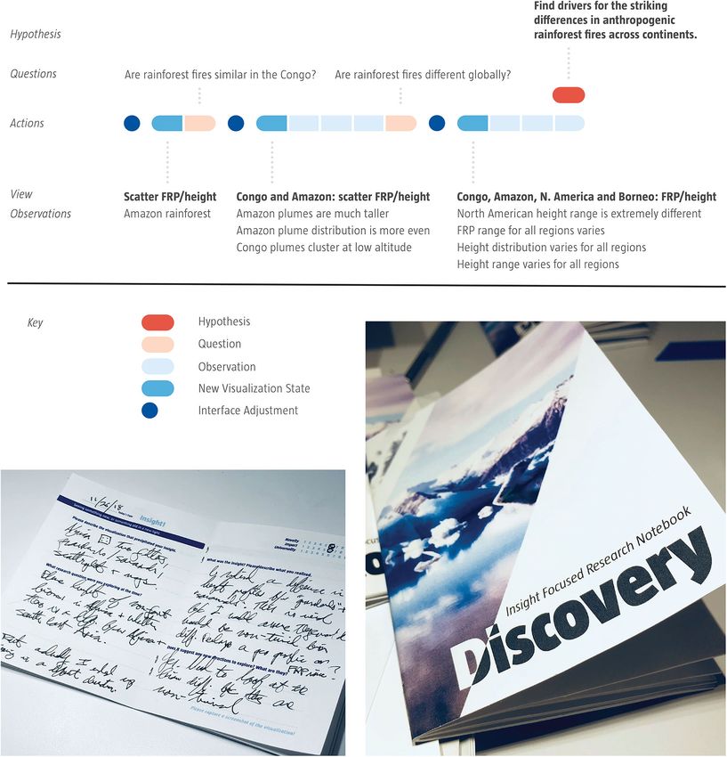
Art. 9(1) page 2 of 15                                        Tosca et al: Reimagining futures: Art, design, and climate science

et al., 2010; Hawkins et al., 2017; http://www.columbia.          hypothesize that the intersection of art, design, and sci-
edu/~mhs119/Temperature/) and continues to increase at            ence is likewise a similarly fruitful territory for exploration
rates never experienced by humankind (Hansen et al.,              and productivity. And while our approach in this work is
2006). Consequently, the impacts of climate change are            not entirely novel—designers have been working with
no longer the hypotheticals of future dystopian narratives.       scientists for years (e.g., Ito, 2016)—the collaborations
Sea levels are rising at accelerated rates (Church and            described in this article expanded on previous attempts
White, 2006; Cazenave and Llovel, 2010), disease is               in a comprehensive and unique way. We also note that
spreading (Rocklöv and Dubrow, 2020), extreme storms             interdisciplinary fields that are proximal to climate sci-
are becoming more common (Reidmiller et al., 2018),               ence—such as sustainability science—have long employed
drought is multiplying (Cook et al., 2018), and heat waves        interdisciplinary collaboration in pursuit of creative solu-
are becoming increasingly dangerous (Hayhoe et al., 2010;         tions to complex problems (Haider et al., 2018).
Mitchell et al., 2016), to name a few. The challenges pre-            Integral to our hypothesis is an augmentation of the
sented by these individual impacts, however, are com-             scientific method with principles from the design method
pounded by the complexity, unpredictability, and                  (Figure 1). A simplified model of the scientific method
nonlinearity of interactions (and cascading effects) among        (depicted in Figure 1) posits that the generation of scien-

                                                                                                                                    Downloaded from http://online.ucpress.edu/elementa/article-pdf/9/1/00016/477537/elementa.2021.00016.pdf by guest on 17 November 2021
and within the climate system (Rocha et al., 2018; Lenton         tific knowledge begins with a hypothesis, continues with
et al., 2019; Keys et al., 2019). A recent report by Spratt et    experimentation and analysis, and concludes with the
al. (2019) goes as far as to suggest that the climate crisis      publication and/or presentation of results. Despite the
may pose an existential risk for the continuation of              similarities between the design process and the scientific
human civilization.                                               method, artists and designers routinely initiate a new pro-
    And yet, much of this knowledge remains abstruse,             ject with a robust “understanding” phase where they
cumbersomely documented, and opaquely presented                   engage with stakeholders and users to empathize with,
(sometimes deliberately so by fossil fuel propagandists),         learn from, and listen to their concerns and desired out-
making engagement with it by nonscientists difficult. This        comes. This initial human engagement step is unique to
is likely one reason why many English-speaking people             the design process and is integral to the creation of a de-
across the globe remain convinced that human beings are           signed object. We contend, in this article, that it can be
not responsible for the observed 20th and 21st century            equally influential in the production of scientific knowl-
climate change (Goldberg et al., 2019; https://www.ipsos.         edge. If nothing else, collaborations across radically un-
com/en/global-trends-2020-understanding-complexity).              ique disciplines can inspire “out-of-the-box” thinking that
Perhaps this is also why a recent poll of Americans by Pew        results in improved outcomes. Commercial designers who
Research found that, while 89% of respondents thought             engage with scientists sometimes call this first step “front
scientists were “intelligent,” only 54% of respondents            end development,” and it has proven to be an effective
thought of them as “good communicators” (https://                 strategy. In the case of many large-scale environmental
pewrsr.ch/2Z2lX8S).                                               sensing platforms, such as satellites or meteorological net-
    Scientists, artists, and designers therefore have an excit-   works, the absence of this engagement can limit the utility
ing and necessary opportunity to collaborate. While much          and reach of the data beyond the technical experts in the
has been written of the benefits of effective visualization       field. Figure 1 is similar to—and inspired by—Figure 2
for the communication of scientific research—and there            from Purdy et al. (2019), an indication that this augmen-
appears to be some movement among scientific institu-             tation of the scientific method has been proposed by
tions to recognize the importance of storytelling and             other scientists and is a credible approach.
design—little has been published about the ways that de-              In this article, we describe 2 case studies that pursued
signers and artists may participate in and contribute to the      collaboration between artists, designers, and climate
process of scientific knowledge generation within the             scientists in support of our thesis. The first study, con-
framework of the scientific method (Board, 2018; Adam,            ducted between 2018 and 2020 under a grant awarded
2020). This article builds on previous work by Galafassi et       by the California Institute of Technology (Caltech),
al. (2018) and Pereira et al. (2019) and explores the me-         brought together a team of designers and computer scien-
chanisms by which design practice and artistic abstraction        tists with climate and atmospheric scientists from the
can be leveraged not just for improved communication              Multi-angle Imaging Spectroradiometer (MISR) instru-
but also for enriched production of scientific knowledge          ment group to collaboratively build a new exploratory
and stimulation of scientific imagination. Wetlands, as           research interface for the MISR Plume Height Project
a transition biome, are an appropriate metaphor to                (MPHP) dataset and then explored whether that process,
describe the possibilities that arise from collaborations         and the new interface, sparked more (and better) mo-
between artists, designers, and scientists. Wetlands are          ments of scientific insight. During the assembly of this
transition zones between permanently terrestrial and per-         interface, the principles of design and science were inte-
manently aquatic biomes and are known for their distinc-          grated from the project’s inception. For the second study,
tively high biodiversity, as well as their ability “to cleanse    we worked with young artists at the School of the Art
polluted waters, protect shorelines, and recharge ground-         Institute of Chicago (SAIC) in an effort to create three
water aquifers” (Mitsch et al., 1986). Wetlands are uniquely      distinct sonic art pieces that effectively communicated the
productive precisely because they occur at the intersection       science of climate change, appealed to human aesthetic
of radically different biomes (Gosz and Sharpe, 1989). We         judgment, and expanded the scope of what philosopher
Tosca et al: Reimagining futures: Art, design, and climate science                                          Art. 9(1) page 3 of 15

Figure 1. A comparison of the human-centered design process (top) and a simplified depiction of the

                                                                                                                                     Downloaded from http://online.ucpress.edu/elementa/article-pdf/9/1/00016/477537/elementa.2021.00016.pdf by guest on 17 November 2021
  scientific method (bottom). The design process begins with extensive conversation and collaboration with
  stakeholders and community members in what is described as the understand phase. This is followed by an
  ideation phase (ideate), a prototyping phase (prototype), and then finally a refinement (refine) and production
  phase (materialize). Similarly, the scientific method (depicted here in simplified form) begins with a hypothesizing
  phase, where preliminary research often leads to the formulation of a question, which is analogous to the Ideation
  step of the design process and typically entails scientists engaging with preliminary data to form a hypothesis,
  continues with an experiment phase (analogous to prototype) and ends with a conclude phase (analogous to
  refine). We argue that the scientific method would be better served if it also included an understanding phase as
  a precursor to hypothesizing (depicted here by the box with the question mark). DOI: https://doi.org/10.1525/
  elementa.2021.00016.f1

Timothy Morton calls our “ecological awareness” (Morton,             The main consideration for any researcher is discovery.
2013). In this article, we discuss that while collaborations         Arriving at an insight often sparks the critical break-
between artists, designers, and scientists are not necessar-         through that leads to discovery: suddenly seeing some-
ily novel, the integration of art, design, and science from          thing that previously passed unnoticed or seeing
a project’s inception can improve both the production of             something familiar in a new light. The primary function
knowledge and constitute an entry point for “regular”                of any visualization and analysis tool is to make it easier
people to intuitively understand the world in which they             for an investigator to glean insight.” Saraiya et al. (2005)
live. The examples presented in this article illustrate how          submit that effective visualization allows insight into da-
transdisciplinary collaborations can challenge and                   tasets that can seem impenetrable—or at least exceedingly
enhance the traditional ways that climate scientists have            impractical to comprehend analytically or numerically—
constructed and communicated vital information about                 and they describe a methodology for assessing the efficacy
the climate crisis.                                                  that a visualization system has to stimulate scientific
                                                                     insight. In this case study, we expanded the scope of these
2. Case Study 1: A design-driven reimagination                       conclusions and explored whether designers can spark
of climate data visualization software                               moments of insight for scientific researchers by creating
2.1. Background                                                      visual forms that literally show the researcher their data in
We posit that designers, as specialists in the visual repre-         a novel way.
sentation of data, can provide tangible support to a scien-             Researchers from the University of Washington Interac-
tific research team by creating visualizations that                  tive Data Lab conclude that significant interface latency
harmonize the way that climate researchers think and                 decreases user activity and dataset coverage by depressing
work with approachable aesthetics. This study, led by                rates of observation, generalization, and hypothesis dur-
designer A. Galvin, climate scientist M. Tosca, and applied          ing exploratory research tasks (Liu and Heer, 2014). This
science systems engineer Abigail Nastan (at the Jet Propul-          statement can seem obvious to some. It is unsurprising to
sion Laboratory [JPL]), extended the capacities of an exist-         conclude that slower visualization systems reduce explo-
ing data delivery system in the service of improved climate          ration; however, the authors argue for a deeper, more
research production. Follow-on qualitative experiments               impactful, and surprising conclusion. They demonstrate
suggested that this approach enabled researchers to ask              that the inverse of the previous statement is also true:
new and “better” questions of their data.                            Systems that respond at the speed of a researcher’s
    This study supports conclusions made by other visual-            thoughts enable greater dataset coverage by increasing
ization usability researchers operating in transdisciplinary         rates of observation, generalization, and hypothesis (O’Do-
spaces. Namely, Saraiya et al. (2005) establish fundamen-            noghue et al., 2018).
tal definitions for insight and discovery and conclude that             Human–computer interaction and visualization
“a primary purpose of visualization is to generate insight.          researcher Dr. Scott Davidoff, manager of the human-
Art. 9(1) page 4 of 15 Tosca et al: Reimagining futures: Art, design, and climate science
Downloaded from http://online.ucpress.edu/elementa/article-pdf/9/1/00016/477537/elementa.2021.00016.pdf by guest on 17 November 2021
Figure 2. Sketches made during contextual inquiry. These sketches were made by designer Adrian Galvin during the
“understand” phase (left column) and “ideation” phase (right column) of the design process (e.g., Figure 1 top). The
sketches on the left were made by the designer as he listened to climate scientists describe the Multi-angle Imaging
Spectroradiometer instrument. These sketches are Adrian’s interpretation of the information. The sketches on the left
were made by Adrian Galvin during the “ideate” and “prototype” phases of the design process. The top right panel is
a sketch of what the designers thought the final redesigned web interface could look like, and the middle right panel
is a revised sketch of what the web interface could look like based on feedback from the scientists to the top right
sketch. The bottom right photo is computer software engineer Jared Boone sketching the potential new web interface
on a whiteboard during the Prototype phase. DOI: https://doi.org/10.1525/elementa.2021.00016.f2
centered design group (https://hi.jpl.nasa.gov/) at the JPL, The MISR instrument team at the NASA JPL is a group
takes these conclusions a step further in both informal of scientists, engineers, and software specialists who col-
magazine articles (e.g., https://plasma-magazine.com/ lect, format, host, and distribute imagery data collected by
2019/06/12/visualize-your-science/) and personal corre- the NASA TERRA satellite (Diner et al., 1998). The instru-
spondence with the authors. He argues that improve- ment, which circles the entire planet from pole to pole
ment of a visualization system does not necessarily every 90 min, is a passive sensor that measures the
lead researchers to the same conclusions faster; rather, amount of solar radiation that is reflected from surface
it enables them to reach more—and “more novel”—con- and atmospheric features in each of 4 spectral bands cen-
clusions. This axiom supports the idea that there is a rich tered at 446 (blue), 558 (green), 672 (red), and 866 nm
territory of opportunity in which designers, through (near infrared, NIR) wavelengths from 9 distinct cameras.
novel visualization, can have a catalyzing impact on sci- The cameras are fixed to unique angles ranging from
entific research. directly overhead (nadir) to 70.5 forward and afterwardTosca et al: Reimagining futures: Art, design, and climate science Art. 9(1) page 5 of 15
of nadir. The MISR Interactive Explorer (MINX) software First, in spite of their expertise, the climate scientists knew
applies a stereoscopic algorithm (e.g., Figure 2) to these little or nothing about the design process, and, second,
multiangular data and calculates, among other things, the the amount of knowledge exchange necessary for effective
altitude of smoke plumes produced by landscape fires collaboration between a designer and a scientist was
(Nelson et al., 2008; Nelson et al., 2013). MINX has been greater than between a designer and a nonexpert. During
used to analyze smoke plumes in North America (Val Mar- the contextual inquiry/understanding phase, our de-
tin et al., 2010), equatorial Asia (Tosca et al., 2011; Zender signers had to process large volumes of information and
et al., 2012), Australia (Mims et al., 2010), and Alaska then identify the relevant information.
(Kahn et al., 2008) among others. Prior to performing Since this study extended the capacities of an existing
altitude calculations, MINX utilizes a graphical user inter- system in the service of researchers, A. Galvin and his
face (GUI) that requires a human being to make choices design team applied a multimodal course of discovery
about which smoke plumes should be digitized (Nelson et tactics in order to ascertain from their scientist collabora-
al., 2013). tors where they thought the opportunities were. Specifi-
Beginning in the summer of 2013 (and continuing cally, to overcome the challenge of deciphering the
through 2019), scientists at the JPL used MINX to manu- overwhelming quantity of specialized information, the
Downloaded from http://online.ucpress.edu/elementa/article-pdf/9/1/00016/477537/elementa.2021.00016.pdf by guest on 17 November 2021
ally collect the locations and properties (including alti- design team used a specialized type of sketching—called
tude) of more than 70,000 fire smoke plumes occurring “reflective sketching”—applied as a follow-up to any con-
around the globe in an effort to construct a comprehensive textual inquiry, interview, or codesign activity. The goal of
dataset of smoke plume heights (Val Martin et al., 2018). this approach was to categorically distill, interpret, and
This dataset, dubbed the Plume Height Project (MPHP; then reassemble the scientific information that the de-
https://.jpl.nasa.gov/getData/accessData/MinxPlumes2/), signers received from the climate scientists onto sketch-
begins in 2008 and currently includes over 4 full years of book pages which captured what the designer(s) believed
data. These data are critical for understanding the complex to be the key information. The left column of Figure 2, for
and regionally divergent relationship between smoke example, shows sketches made by A. Galvin depicting his
plumes and climate and how that relationship will evolve interpretation of the information he received from con-
in a warming world. versations with the scientists about the MISR instrument.
Prior to the initiation of this study, the MPHP, despite The sketches were then presented to the scientists in a fol-
its clear utility, was vastly underused by the global com- low-up conversation, a step that allowed the designer(s) an
munity of climate and atmospheric scientists because the opportunity to substantiate and clarify the accuracy and
data were stored in a difficult to access archive as individ- pertinency of the information received. This process al-
ualized, confusing text files. The interface for exploring lowed the team to not just make progress toward the
these data was old, designed by software scientists at JPL, redesign of the data delivery interface but also to under-
and did not provide sufficient visual feedback, filter con- stand how scientists construct knowledge about the phe-
trol, abstract high-level visualization, or download func- nomena that they study. As a result, this project expanded
tionality. To address these obvious deficiencies, first beyond the initial creation of a new visualization system
identified by scientists M. Tosca and A. Nastan, the science and subsequently catalyzed a series of insight-focused
team applied for (and received) a generous “Data to Dis- usability studies, an in situ longitudinal workflow analysis,
covery” art, design, and science grant from the California and a descriptive insight process questionnaire.
Institute of Technology, in partnership with California Sketching had several additional advantages and is
Institute of the Arts. Designer A. Galvin was then added something that can easily be replicated and employed
to the project and worked with a team of designers, com- by other research teams. First, visually articulating the
puter scientists, and climate and atmospheric scientists received information onto a sketchbook page helped the
during the summer of 2018 to build an effective explor- designers refine and codify the design team’s conceptual
atory research interface for this data product, which aimed understanding of the problem and eased the recall and
to improve on the existing interface in all of the previously application of the new knowledge at a later time in the
mentioned dimensions. The end result of this endeavor design process. Second, the sketchbook, as an external
was the creation of the Exploratory Research and Lookup artifact, provided the climate scientists with context into
Interface (MERLIN), which now joins a long and illustrious the design process and helped them offer more concrete
line of software named with nested acronyms (a NASA feedback on the progression of the project. This collabo-
specialty). ration showed that future users (aka the climate scientists)
of the designed object were more willing to critique a de-
2.2. Contextual inquiry, human engagement, and signer’s sketch than to critique a designer’s interpretation
reflective sketching of information in direct conversation. Third, the sketches
Designer A. Galvin and his team of 3 began this project by themselves focused the direction of the collaboration, so
first engaging in an exhaustive period of human engage- that the ongoing conversation between scientists and de-
ment and contextual inquiry (e.g., the first step in the signers did not divert from the narrowly defined task.
design process described in Figure 1). Climate scientists Fourth, the sketches provided users clear visual evidence
possess an immense breadth of information in order to of how the scientific information they shared was inter-
perform their work, but this specialized expertise pre- preted by the designer, perpetuating a feedback loop
sented 2 challenges to our collaborative design team: which was useful throughout the development andArt. 9(1) page 6 of 15 Tosca et al: Reimagining futures: Art, design, and climate science
progression of a close and long-term relationship between column of Figure 2) as the design team worked through
the scientists and designers. Finally, the sketches helped various iterations of how the new interface would look
build consensus among the design team and set a standard and work. At the conclusion of each iteration, the design
for what the team considered to be the most crucial in- team met with the science team to assess whether the
sights and information as the project moved on to subse- project was still on track to meet their needs, as well as
quent phases. to contextualize the harmony between the designed ele-
Lawson (2004) notes the importance of sketching for ments and their own research process. As the design
design and discusses 3 methods of sketching that closely became more detailed and appropriately adapted, it
correspond to the reflective sketching that A. Galvin and merged effective scientific utility with aesthetic beauty,
his team used for this project. Lawson (2004) first de- suggesting that the strict societal dichotomy between “art”
scribes presentation drawings, in which a designer and “science” is not based in reality.
“communicate(s) their work to clients and others from The ideation phase of design was intended to expand
whom they may need some agreement, consent or per- the solution space after the human needs and scientific
mission to continue.” This type of sketching similarly in- context had been sufficiently understood in the first step.
volves a conversation between designers and “users”
Downloaded from http://online.ucpress.edu/elementa/article-pdf/9/1/00016/477537/elementa.2021.00016.pdf by guest on 17 November 2021
The design team, led by A. Galvin, produced as many ideas
(analogous to the climate scientists in our work). However, as possible in ultralightweight whiteboard sketches, at-
reflective sketching is not meant to act as persuasion, and tempting to push the space of design as wide as possible
we worked tirelessly to ensure that they were, in fact, while maintaining connection to the core understanding
a nonpersuasive part of the dialogue. The right column of the climate scientists’ needs. Artifacts created during
in Figure 2 displays a few examples of reflective sketching this phase were as ephemeral as possible, allowing the
that might be considered similar to these “presentation team to move quickly, and define as large a territory as
drawings.” possible. The ideation phase used here was nearly analo-
Lawson (2004) also introduces “proposition drawings,” gous to the process that scientists engage in when they
which are similar to Donald Schön’s classical description generate and revise hypotheses before moving to more
of drawings as a space of conversation for the designer, detailed analysis (Figure 1). Following each ideation, the
which he refers to as “reflection-in-action.” The syntactic
design team met with the climate scientists in a modified
similarity is no mistake: Both the “reflective sketching”
continuation of the human engagement and contextual
used by A. Galvin and Schön’s reflection-in-action rely
inquiry process that preceded ideation.
on reflection as process. In Schön’s formulation, a designer
After the expansive ideation phase, the experimental
progresses through the design method by continuously
prototype phase aimed to iteratively increase the fidelity
adding information to an initial sketch and then consid-
of the most promising pathways while identifying the
ering whether the added information is in harmony or
flaws in the least effective ideas and eliminating them
conflict with the intent of the future designed object. If
from the pool of potential design candidates until a sci-
the added information is harmonious, the designer pre-
entifically meaningful and visually clear set of core
serves the sketch and continues to draw. This method
design propositions were selected. One of the most crit-
ensures that a conversation continues between designer
ical characteristics of these core design proposals was
and sketch; a conversation that becomes a kind of exper-
imental dance that, over time, builds a coherent image. that they must facilitate exploration and should help the
The sketches in Figure 2 can also function as analogies of science team glean insight from the data more rapidly
these “proposition drawings.” and effectively. In this project, these proposals served as
Ultimately, the intent of sketching—in this project and an intermediary between higher order analysis of physi-
for all future projects—was to maintain a conversation cal climate phenomena and the ability to interact with
between designer and scientist and to distill relevant sci- cumbersome and difficult-to-manage datasets. As com-
entific information into a coherent, agreed-upon aggrega- puting power and storage capacity have increased in
tion of knowledge that influenced the design. Close recent decades, the size and complexity of climate data-
collaboration between scientists and designers—especially sets has also grown. Most physical climate scientists are
in this initial stage—was the only way we could ensure that not explicitly trained to manipulate large datasets
the outcome would be acceptable to all stakeholders. The (though many do learn several computer programming
sketches described in this section are a low cost, simple languages and how to operate within a Unix operating
way that science teams can incorporate more system). The ever-expanding size of these datasets has
“understanding” into the initial step of the scientific made them impractical to explore and comprehend
method (as proposed in Figure 1). freely, which has substantially slowed the process of
insight formation (Saraiya et al., 2005). The design team’s
2.3. Ideation, prototyping, and refinement user-centered approach of understanding human needs,
Following the contextual inquiry phase, A. Galvin and his exploring as great a range of design propositions as pos-
design team assumed full control of the direction of the sible, and testing each proposition until the most prom-
project, progressing through the ideation, prototyping, ising candidates were identified (and made high fidelity),
and refinement phases described in Figure 1. Sketching allowed for the creation of a coherent set of solutions
was still utilized during ideation and prototyping, but it which, through their contextual clarity, simultaneously
became more focused and less abstract (e.g., the second achieved scientific validity and aesthetic beauty.Tosca et al: Reimagining futures: Art, design, and climate science Art. 9(1) page 7 of 15
Although the goal of this project was to produce can be found at A. Galvin’s project space: http://
a web-based data delivery interface, the first prototype adriangalvin.space/merlin. We show that a designer can
was completed using paper and pen only (Figure S2). function as a useful component of a research team, recur-
Generally speaking, a science research interface pre- sively introducing visual forms that have the potential to
sents unique challenges for a design team in the pro- spark novel or unexpected moments of insight. This state-
totyping phase because real data must be used in the ment was especially true when designers were involved at
prototype in order to gain any insight. For this project, the initiation of the research process. Generally speaking,
those challenges necessitated a close, flexible collabo- data visualizations of appropriate clarity and flexibility
ration between the designers and the computer scien- allow scientists to offload some of the cognitive work of
tists. Computer programmer Jarod Boone first created understanding complex datasets prior to more detailed
a flexible, searchable postgreSQL and Django database, analysis. This then allows for an examination of more
which, if queried appropriately, returned basic visualiza- complicated phenomena and eliminates the need for
tions, but had no GUI. After consulting the science abstruse and laborious data partitioning prior to any
team’s most prominent research papers, A. Galvin imag- climate-driven analysis.
ined realistic workflows and worked with J. Boone to Our initial hypothesis proposed that a visualization
Downloaded from http://online.ucpress.edu/elementa/article-pdf/9/1/00016/477537/elementa.2021.00016.pdf by guest on 17 November 2021
create hybrid prototypes that allowed the science team interface of appropriate clarity would allow researchers
to make real observations, detect interesting anomalies, to access understanding that they might not otherwise
and gain insights. This hybrid prototyping technique have been able to. After the initial construction of MERLIN
involved realistic data and interface components that in the summer of 2018, we tested whether more and
were often presented to the scientists using sticky notes “better” novel insights could be generated via the rede-
with permanent marker drawings. This removed aes- signed interface and whether scientists were able to con-
thetic distractions and allowed the scientists to focus nect those insights into a coherent story or hypothesis. To
entirely on the data, while the design team continued test this, we designed 3 qualitative investigations. First, we
to imagine and test those interface components that asked climate scientists who use the MPHP to substitute
would be most useful. Each new prototype became the new interface for the old one and then record their
increasingly and contextually specific and, over itera- daily research activity using MERLIN over a 2-week time
tions, evolved into a well-adapted interface. This process period and to note their moments of insight in a logbook.
facilitated an approachable collaboration with the sci- We present an example of this process in Figure 3, where
ence team, allowing them to glean more insight and the dark blue dots indicate when the user readjusted the
express their needs more completely to the designers. new MERLIN interface, the light orange bars specify when
This, in turn, helped the design team eliminate less the user was inspired to ask a new question of the data,
suitable choices. Once the interface elements were cho- and the dark orange bars denote when the user felt con-
sen and evolved to a point where the whole team felt fident enough in her data exploration to posit a fully-
confident, the refinement phase began. formed hypothesis.
During refinement, the design team improved on the We next performed a controlled environment “think
elements of the interface that were evolved and developed aloud” study where we observed climate scientists inter-
with the science team, a process that ensured that the acting with the newly designed interface and qualitatively
resulting interface could support each individual scien- measured when new moments of insight were reached.
tist’s unique research needs and be appropriately simple These studies are also still ongoing and summarized in
to use, especially for new users. This required a detailed Figure S3 (the diagram is similar to the diagram in Figure
examination (and reexamination) of every interactive pat- 3). Finally, we also asked 7 climate researchers, working at
tern, button, slider, type style, and color choice. The de- 4 distinct institutions, who are actively publishing in the
signers removed every extraneous detail and eliminated scientific literature, to describe in writing how they under-
any element that was distracting or unsuitable to the now stood their own process of insight and discovery in the
well understood needs of the science. This slow, careful context of their self-selected “most impactful paper.”
process of refinement ensured contextual accuracy and These summaries provided historical, longitudinal, and
produced the interface’s best version of scientific utility observational evidence that climate and atmospheric
balanced with aesthetic beauty. scientists construct knowledge through the complex non-
linear process of insight and discovery (Figure S4). Mean-
2.4. Results, discussion, and insights while, work at JPL is ongoing to publish an operational
The primary objective of the design team was to produce version of the MERLIN interface at the Atmospheric Sci-
a visualization interface with appropriate clarity and flex- ence Data Center that will replace the current MPHP data
ibility to allow scientists to offload some of the cognitive access hosted on the MISR website. MERLIN is expected to
work of understanding complex datasets, which helps go live in late 2021; this will aid, greatly, in the expansion
them to examine more complicated phenomena than of these qualitative studies.
pure abstract or numeric data analysis. The newly de- These initial results provide some qualitative evidence
signed data delivery interface—delightfully named the that thoughtful design can catalyze the production of
MISR Exploratory Research and Lookup Interface: MER- knowledge and that intentional collaborations between
LIN—successfully incorporated both functionality and aes- designers and scientists can augment the scientific
thetics (Figure S1); more detail on the finalized interface method in ways that improve its utility and output. It isArt. 9(1) page 8 of 15 Tosca et al: Reimagining futures: Art, design, and climate science
Downloaded from http://online.ucpress.edu/elementa/article-pdf/9/1/00016/477537/elementa.2021.00016.pdf by guest on 17 November 2021
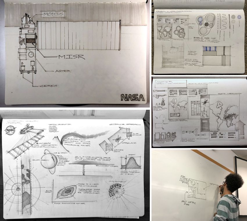
Figure 3. Insight process map created by A. Galvin interpreting and depicting the workflow of users
interacting with the new MERLIN interface. This “insight process diagram” tracks the workflow of an
atmospheric scientist utilizing the new MERLIN interface. The user’s original notes were made in logbooks
designed by A. Galvin (and depicted in the 2 images at the bottom). The dark blue dots represent moments when
the user/scientist readjusted the interface, and the royal blue bars represent those time periods when the user
interacted continuously with the new interface. The light orange bars correspond to periods when the user
conceived of a brand new question about the observations they made using the newly adjusted interface, and the
orange dots indicate when the user felt confident enough to declare a new hypothesis about the fire plume data.
These workflow diagrams (one of which is depicted here) conclude only when the user arrives at a novel hypothesis
(orange bar). DOI: https://doi.org/10.1525/elementa.2021.00016.f3
beyond the scope of this article—and our expertise as designers play an important and critical role in catalyzing
designers and physical scientists—to determine whether moments of insight that may prove beneficial to climate
the change was statistically significant, but we note that change research, and we encourage scientists to incorpo-
our qualitative results present a compelling case. Future rate reflective sketching and a robust “understanding”
work will continue both the qualitative and quantitative phase into the beginning of their scientific knowledge
assessments of our approach. Ultimately, we show that production process.Tosca et al: Reimagining futures: Art, design, and climate science Art. 9(1) page 9 of 15
Downloaded from http://online.ucpress.edu/elementa/article-pdf/9/1/00016/477537/elementa.2021.00016.pdf by guest on 17 November 2021
Figure 4. Self Patcher music video scenes (top row and bottom left) are shown alongside a frame from the
original source rendering of the city (bottom right). The music video (https://www.youtube.com/watch?
v¼H3Y7pmYTmRs) starts with an exposition explaining the setting, narrative, and function of the city, followed by
MTV-style music video opening credits (top). An air vehicle is shown approaching the Plastic City in an image taken
from the real-time 3D animation (bottom right). The skyscraper-like spires in view evoke a typical city skyline but
elude definition, perhaps not acting as buildings at all but rather as parts of the city’s ecological infrastructure. The
related frame in the final music video (bottom left) was produced by running the original animation through the
Sandin Image Processor, a modular analog video processing system and video synthesizer from the 1970s that
prototyped open-source technology ethics. DOI: https://doi.org/10.1525/elementa.2021.00016.f4
3. Case Study 2: Artists create sonic the future where people live sustainably in the ocean. In
abstractions of climate data this work, a speculative vision of a self-determined, sea-
This project, led by artists from the SAIC, was an aural bound city made from recycled plastic emerges depicted
investigation into how climate data can be rendered into through an electronic music album In Water, and its
sonic art in an effort to increase the access to—and com- peripheral multimedia works consisting of zines, ani-
prehensibility of—abstruse climate knowledge in the service mated music videos (Figure 4), and art software.
of engaging the public imagination. Here, we describe 3 Exclusively powered by renewable energy, the “Plastic
distinct works: The first, by Ilai Gilbert, is titled Plastic City; City” floats through the Earth’s oceans filtering and col-
the second, by Kelvin Wells, is titled Additive Synthesis of lecting plastics and microplastics from the water to repur-
a Climate Crisis; and the third was a panel discussion, orga- pose into infrastructure or convert into synthetic fuels.
nized and led by Grant Tyler, called Climate Technics: Dance The “Plastic City” operates on what the artist calls
Music as Climate Activism? All 3 pieces utilized the poten- “waste-to-energy and circular economics.” Since its infra-
tial afforded by music and sound to engage with the cli- structure is based on environmental restoration, the gov-
mate crisis and are publicly available for viewing and erning system is based on resource efficiency, ecological
listening on the internet. This case study is markedly differ- balance, and the residents’ quality of life.
ent from the first in that, for these 3 art pieces, public The city’s technology responds and adapts to natural
knowledge and engagement with the climate crisis was the cycles rather than manipulating them, in contrast to our
focus instead of the usability of climate data and robustness current way of life. The first song from the album In Water,
of the scientific method addressed in Case Study #1. titled Aquatic Mechanis, portrays the harmony between the
synchronous movements of the city’s machinery and the
3.1. Plastic City ocean’s amorphous waves by entangling driving rhythms
Plastic City, a multimedia piece by artist Ilai Gilbert (who with flowing synthesizer sounds. The city changes shape
uses the moniker “11ai”), portrays a fictional location in with modular computer-controlled tensor structures toArt. 9(1) page 10 of 15 Tosca et al: Reimagining futures: Art, design, and climate science
preserve or collect heat depending on the weather, while (CO2) as sinusoids which enhance the resolution of the
wind, solar, and water provide abundant energy. dire situation conferred by the climate crisis.
Songs with titles such as Subpass Racing and Hammer- Within the selected span of years of CO2 data—the
head Aquarium vividly illustrate the technological and rec- length of which is scaled to the duration of the audio
reational nature cultures that give the city life. The music recording—individual years can be heard as oscillations
video for Self Patcher tangents on the street-hover racing in total signal gain. Starting at zero and concluding with
subculture that develops alongside more efficient and a total of 71,955 million tonnes, each year’s cumulative
novel transportation methods. The zine references these sum of carbon emissions is rescaled to be represented by
flying machines as well, listing electrified road and rail a range of sinusoid quantities from 16 to 524,288. This
vehicles along with gliders as options for transit within piece’s audio synthesis uses the Fast Fourier Transform
the city, all powered by renewable energy or plastic- (FFT) algorithm. Because the number of sinusoids in an
derived ethanol. FFT window must be a power of 2, the relationship
As a playful experiment in hypothesizing and imagin- between tonnes of carbon and number of sinusoids is not
ing what a sustainable future could look like, this work precisely proportional. Instead, the relationship is con-
purposefully does not focus on the impossibilities of the veyed through the gradual passing of certain thresholds
Downloaded from http://online.ucpress.edu/elementa/article-pdf/9/1/00016/477537/elementa.2021.00016.pdf by guest on 17 November 2021
technological scope of such a city. Instead, it opts to defined by possible FFT sizes. At various moments during
remain immersed in the potential for a climate change– the audio’s playback, the time elapsed corresponds to
centered story that isn’t driven by pessimism. In this way, a year during which rescaled carbon levels are equal to
then, “Plastic City” could be considered a work of or greater than a previously unsurpassed power of 2. Dur-
“Solarpunk” art, similar to work by Dr. Andrew Merrie ing such an occurrence, the audio becomes represented by
(https://radicaloceanfutures.earth/oceans-back-from-the- a number of sinusoids equal to the just surpassed power
brink) and Gerson Lodi-Ribeiro (Lodi-Ribeiro et al., 2018). of 2. This quantity of sinusoids is maintained until the
Solarpunk, an emerging genre of science fiction-based art rescaled CO2 levels correspond to the next viable quantity
and literature, was recently defined by Reina-Rozo (2021) of sinusoids.
as a The recording of Jimi Hendrix’s interpretation of “The
Star Spangled Banner” at Woodstock was chosen for its
[ . . . ] movement [ . . . ] characterized by the creation political implications. Furthermore, the performance
of speculative worlds where social ecology, occurred in 1969 which, for a dataset that extends to
democratic technology, and solar, wind, and tidal 2019, delineates a convenient time span of 50 years. More
energy are crucial elements for collective well-being importantly, Hendrix’s performance offered a depiction of
that surpass the capitalocene and its roots in social the U.S.’s collective anxieties which, at the time, mostly
centered on the war in Vietnam. Additive Synthesis of
inequality and the extraction and burning of fossil
a Climate Crisis appropriates the core expression of Hen-
fuels.
drix’s “Star Spangled Banner” and applies it to the most
severe crisis facing our contemporary world: climate
By depicting an equitable and sustainable future that
change.
does not deny the reality of climate change but rejects the
Like “Plastic City,” “Additive Synthesis of a Climate
inaction of contemporary institutions, the “Plastic City”
Crisis” explores how music can function as a uniquely
project aims to embody new ways of imagining a response
powerful medium through which people can engage with
to the climate crisis.
recondite information. Music, as both an experiential and
In this way, the creation and existence of “Plastic City”
interpretative practice, can trigger human imagination in
is similar to the creation of MERLIN, described in Case
ways that graphs, figures, numbers, and even aesthetic
Study 1. Specifically, because nonscientists interpret scien-
imagery cannot (Bolderman, 2020). Through music, our
tific information differently than scientists, the visual and
minds can access abstract worlds and futures and, simul-
sonic artifacts created by artists in response to scientific
taneously, move toward an improved understanding of
information can foster a conversation between artists and
complex scientific concepts. This project adds to the grow-
scientists much like the “reflective sketches” that have
ing body of climate change–focused sound art.
been previously described.
3.3. Climate Technics: Dance music as climate
3.2. Additive Synthesis of a Climate Crisis activism
Additive Synthesis of a Climate Crisis is a digitally manip- “Climate Technics” was a panel conversation organized by
ulated recording, composed by artist Kelvin Walls, of Jimi authors Mika Tosca and Grant Tyler, which sought to illu-
Hendrix performing “The Star Spangled Banner’” at Wood- minate the potential of art—specifically techno music—to
stock in 1969. The number of sinusoids representing the affect climate change awareness and reform. The goal of
frequency content of this recording increases through this initiative was to initiate the formation of a collective
the duration of its playback at a rate corresponding to the of techno DJs, critics, and promoters that would organize
cumulative sum of carbon emissions emitted by the performances and events to fundraise and advocate for
United States as measured at the beginning of each year climate change reform. This panel, which also included
from 1969 to 2019. The piece aims to interpret Earth’s exclusive DJ sets inspired by the climate crisis (https://
atmosphere as a spectral domain and carbon dioxide soundcloud.com/clubchow/clubchow-mix-for-climate-Tosca et al: Reimagining futures: Art, design, and climate science Art. 9(1) page 11 of 15
technics-5_22_2020 and https://www.dropbox.com/s/ natural scientist, the panelists argued that, like techno,
ojb7selj6swlrcw/ARIEL%20C%20MINUS%20TV.m4v? the production of scientific knowledge was also an artifact
dl¼0), was the first step toward that goal. We had initially of its historical moment and an abstract representation of
intended for the panel to be a live event where attendees the complicated observations of our world. When colla-
could first listen to the panelists and then engage with the borations between art and science are successful, they can
exclusive mixes, but the Covid-19 pandemic forced us to demystify and provide access to the aesthetics that under-
hold the panel virtually, through Zoom. The panel, broad- lie all scientific knowledge, and they can mediate knowl-
cast during the spring of 2020, ultimately hosted a conver- edge and practice. The panelists stressed that techno does
sation between Ariel Zetina, a Chicago DJ signed to techno all of these things and more, and they asserted that art
label Discwoman, Kimwei McCarthy, a UK-based musician about climate change doesn’t have to be didactic to be
and activist associated with Extinction Rebellion, Kevin useful in fomenting solutions to the climate crisis. Techno
Chow, an independent Chicago-based techno DJ who uses music, in its multifarious manifestations—from the mini-
the pseudonym “Club Chow,” climate scientist Mika Tosca, malist tones of Robert Hood to the thumping ecstasy of
and artist Grant Tyler. Jeff Mills—can inspire human imagination by activating
We began by asking our panelists how techno/club the aesthetics and making us think, of the material world
Downloaded from http://online.ucpress.edu/elementa/article-pdf/9/1/00016/477537/elementa.2021.00016.pdf by guest on 17 November 2021
practitioners could and should engage with the question in a way that the often narrow and insular discipline of
of climate change. Specifically, we encouraged panelists to climate science cannot.
consider how art can respond to science and prompt soci-
etal change and whether techno can mobilize and ener- 3.4. Discussion and insights
gize demands for climate action. We also asked our The 3 works of art described here offer a unique depiction
panelists to address whether political reform needed to of the climate crisis through the utilization of sonic art.
be paired with changes to the techno movement and Artist 11ai’s “Plastic City” offers a vision of the future that
community and whether the history of techno as an inher- is not constrained by technological unknowns and that
ently political art positions it as a vanguard toward actu- challenged our imaginations in ways that traditional sci-
alizing solutions to the climate crisis. ence communication does not. Kelvin Wall’s “Additive
Some of the discussion centered on lifestyle choices; Synthesis of a Climate Crisis” transforms a known musical
panelists asserted that techno fans should support local experience into a less familiar—and substantially less
artists to reduce the level of air travel by touring DJs, and “comfortable”—one by the incorporation of sonically mod-
promoters should power their raves with solar panels. ified representation of the CO2 concentration in the atmo-
Beyond that, though, the panelists agreed that the histor- sphere. And, finally, Grant Tyler’s Climate Technics panel,
ical relationship of techno music to social and political and associated DJ mixes, addresses the question of how
movements—that is, techno was created as a liberating the techno music community should leverage the political
force in the ongoing struggle for queer and Black equity nature of electronic music to affect changes to climate
in the United States, and as the ecstatic sound of freedom policy and spur climate action.
in the wake of the Berlin Wall’s collapse—has a responsi- While the first case study (MERLIN) focused on the
bility to thoughtfully engage with the climate crisis. We potential benefits to the production of scientific knowl-
concluded the panel by broadcasting 2 exclusive mixes edge resulting from close collaboration between scientists
created by artists Club Chow and Ariel Zetina that were and designers, this second case study shows how art—and
inspired by, and centered on, climate change; links to specifically sonic art—can engage the public imagination
those mixes are above and in the Data accessibility section. and inspire climate action. The 3 works of art were not
Both mixes are publicly available and, as with the previ- produced in a vacuum but were instead the result of a se-
ously described sound projects, add to the growing body mester’s worth of extensive climate change–related
of work that fuses climate science with sound art. Ariel’s research. And while all 3 artists engaged with the climate
mix, which is paired with a video depicting natural land- research in unique ways, it is notable that each artist only
scapes, is downtempo (to contrast with the more “earthly” conceived of the form their eventual work of art would
landscapes depicted in the video), serene, experimental, take after weeks of meandering, directionless exploration
and builds to a powerful and thought-provoking conclu- of the scientific research and regular weekly engagement
sion. Kevin’s mix, which begins with the sound of birds with a climate scientist. In a way, then, the process that
chirping, is ethereal and full of techno that sounds like these 3 artists practiced in the creation of the work
(and in some cases, mimics) different natural landscapes; described was similar to the initial “understand” step of
his mix is also faster than Ariel’s but comes to a very the design-making process employed by Adrian Galvin
serene and inspiring conclusion. and his team of designers in the first case study, providing
This panel explored the utility of art—specifically more qualitative evidence that transdisciplinary collabora-
techno—to develop a more complete and adaptive under- tion can help solve the climate crisis.
standing of the magnitude and breadth of the climate
crisis. Successful art, the panelists argued, actualizes the 4. Conclusions
aesthetic experience of its historical moment in the form Artists and designers can catalyze novel moments of
of a visual or sonic object and should effectively stimulate insight for climate researchers, help augment the scien-
the imagination of its audience. While these ideas might tific method to improve its utility, and enlighten the gen-
seem distant from the historically defined task of the eral public to complex scientific concepts by visualizing,You can also read