Measuring prosperity NAVIGATING THE OPTIONS - CHRISTINE CORLET WALKER TIM JACKSON - CUSP ...
←
→
Page content transcription
If your browser does not render page correctly, please read the page content below
JULY2019
 CHRISTINE CORLET WALKER
 TIM JACKSON

       measuring
       prosperity
        NAVIGATING THE OPTIONS

CUSPWORKINGPAPERSERIES|NO20   CUSP.AC.UK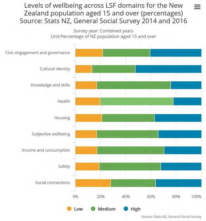
cusp.ac.uk                                                                wwf.org.uk

The Centre for the Understanding of Sustainable Prosperity is funded by the Economic
and Social Research Council (ESRC). The overall aim of CUSP is to explore the economic,
ecological, social and governance dimensions of sustainable prosperity and to make
concrete recommendations to government, business and civil society in pursuit of it. For
more information about the research programme, please visit: cusp.ac.uk.

Publication
Corlet Walker, C and T Jackson. Measuring Prosperity—Navigating the options. CUSP
Working Paper No 20. Guildford: University of Surrey.
Online at: www.cusp.ac.uk/publications.

Acknowledgements
This paper is based on a review commissioned by WWF. The financial support of the
Economic and Social Research Council for the Centre for the Understanding of Sustainable
Prosperity (ESRC grant no: ES/M010163/1) is gratefully acknowledged.

Contact details
Christine Corlet Walker, University of Surrey, Guildford, GU9 7XH, c.corlet@surrey.ac.uk
Tim Jackson, University of Surrey, Guildford, GU2 7XH. Email: t.jackson@surrey.ac.uk

© CUSP 2019
The views expressed in this document are
those of the authors and not of the ESRC or
the University of Surrey. This publication and
its contents may be reproduced as long as the
reference source is cited.
1 | CUSP WORKING PAPER No. 20

      Abstract
      Since its development in the 1930s, GDP has been the most widely used
      measure of the health and progress of an economy, being adopted as the
      principal policy objective of countless national and international bodies
      across the world. Its many shortcomings as a measure of progress are well
      documented, and the alternative indicators of progress developed in
      response to these shortcomings have been diverse and numerous. This
      paper synthesises the literature, discusses the benefits and disadvantages of
      the different types of indicator, and elaborates on five prominent case
      studies in detail. It further considers two of the key debates in the
      literature—the challenge of aggregation and the question of monetisation—
      through a lens of policy and practice. In this way, we lay a roadmap for
      interested parties to navigate the many alternative indicators of progress.
      This work highlights the importance of context and purpose in determining
      what makes a 'good' indicator. We, therefore, propose a key distinction
      between two common indicator types: 1) indicators which primarily act as
      narrative or 'story-telling' devices, and 2) indicators which primarily act as
      decision aids for policy. We reflect in detail on what makes a successful and
      influential indicator in each of these contexts.

      Scope and structure of the working paper
      This working paper has three main objectives:

      1.   Draw together the existing literature on alternative indicators of
           progress, for reflection
      2.   Provide a guide for navigating the many indicators available to
           governments and other interested parties
      3.   Outline what makes a good indicator, and how their use and influence
           can be encouraged

      In order to address these objectives, we reviewed the most up-to-date
      literature on alternative indicators of progress, beyond GDP (alternative
      indicators hereafter), assessing the technical benefits and limitations of
      different types of indicator. This work was further grounded in discussions
      with practitioners about their main concerns and priorities with regards to
      the use of indicators in policy-making.

      The paper has been structured around the objectives above, with Section 1
      focusing on the traditional arguments about the shortcomings of GDP as a
      measure of wellbeing, economic welfare and distribution. Section 2 moves
      'beyond' GDP to present a typology of alternative indicators of societal
      progress, discussing key examples of each indicator type. Section 3 provides
      a detailed account of five of the most widely used indicators to explore some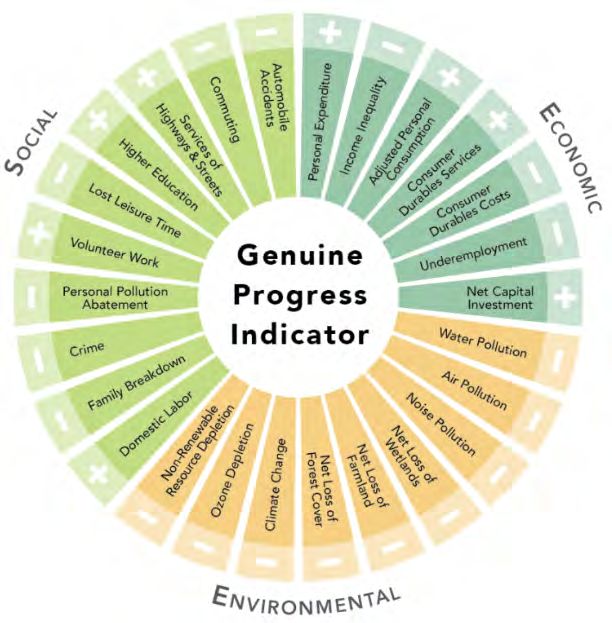
2 | CUSP WORKING PAPER No. 20

      of the benefits and disadvantages of the different indicator types more
      tangibly. Section 4 lays a roadmap for navigating the main debates in the
      literature around indicator aggregation, monetisation and use of subjective
      wellbeing indicators. It also aims to outline what characteristics make a
      good 'story-telling' indicator, as compared to a good decision-support
      indicator. Section 5 offers some concluding remarks.

      1 | What’s GDP got to do with it?
      “Indicators” are often chosen as the medium for delivering information
      about the economy, human wellbeing and environmental sustainability
      (among other issues) to decision-makers. This is, in part, because they allow
      extensive and detailed information to be condensed into a concise and
      simple format.1 This is particularly useful in the context of high-level policy
      decisions which deal with complex, large-scale systems. However, due to the
      multifaceted and often subjective nature of topics such as wellbeing,
      debates over which are the best indicators for the job are ongoing and far
      from resolved.

      Since its development in the 1930s, Gross Domestic Product (GDP) has been
      the most widely used measure of the health and progress of an economy,
      being adopted as the principal policy objective of countless national and
      international bodies across the world. 2 . “One of the reasons for this is the
      tendency to equate increasing GDP with improved wellbeing and a better quality
      of life. Rising GDP traditionally symbolises a thriving economy, more spending
      power, increased family security, greater choice, richer and fuller lives, more
      public spending and better public services”, p3.3 But does it actually measure
      what we want it to measure?

        How is GDP calculated?

        There are three common ways to calculate GDP:

        1)   The expenditure-based approach, which is the total money spent within the economy in a
             given time period. This is calculated as the sum of the all the private consumption (C), gross
             investment (I), and government spending (G), plus net exports (X-M).
        2)   The income-based approach, which is the total income generated by the goods and services
             produced in the economy in a given time period. This is calculated as the sum of the total
             national income, sales taxes, depreciation and net foreign factor income.
        3)   The production approach, which is the sum of the value added through the production
             process to all the products produced in an economy in a given time period.

        The expenditure-based approach is the most common; however, the preferred method is often
        selected based on convenience of local data collection.

                                         Box 1 | Source: Lacey, D., 2000. UK regional gross domestic product
                                         (GDP): methodological guide. Economic Trends, 565.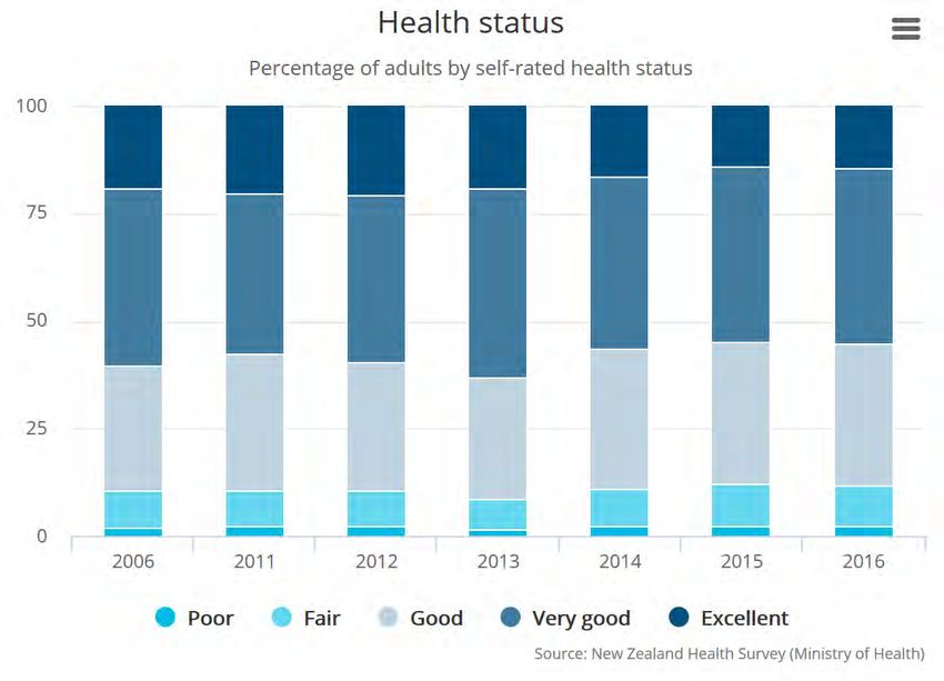
3 | CUSP WORKING PAPER No. 20

      1.1 GDP as a measure of wellbeing
      There have been many empirical studies showing that individual income is
      indeed related to subjective measures of wellbeing, 4 although the exact
      shape of this relationship is still contested.5 Historical GDP growth has also
      arguably brought with it some large-scale improvements in wellbeing; in
      particular, contributing significantly to poverty alleviation across the world
      (although this is also contested). 6 However, at high income levels
      diminishing marginal returns to income mean that other factors may become
      more important in determining an individual’s subjective wellbeing than
      income.7 This argument could be extended to national-level wellbeing; for
      example, with the quality of our social relationships potentially being more
      important in determining aggregate national wellbeing than GDP (in places
      where GDP is already high). This raises concerns about potential unintended
      consequences of neglecting these ‘other factors’ in our decision-making.

      1.2 GDP as a measure of economic welfare
      Gross Domestic Product only counts the costs and benefits of economic
      activity which are captured in the market. This is a problem for a number of
      reasons. First, the diverse costs, or ‘negative externalities’, associated with
      economic activity are not properly accounted for. For example, manmade
      and natural disasters are captured in GDP primarily through increases in
      defensive expenditures (i.e. those expenditures which aim to prevent or
      minimise damages incurred by an individual or group)—such as
      reconstruction of destroyed public infrastructure, pollution clean-up efforts
      and fines for offending parties—and through indirect damages, such as
      reductions in income as a result of reduced opportunities for production.8
      This often leads to net increases in short-run GDP after such events and does
      not reflect the potentially large non-market costs to society and nature
      (both short and long-run), such as the permanent loss of cultures,
      livelihoods and ecosystem goods and services.

      Second, the focus of GDP on market activity alone fails to incorporate the
      benefits to society of those goods and services which are provided outside
      the market,9 such as household labour, volunteer work, services provided
      through the sharing economy, and ecosystem goods and services, among
      others. These goods and services contribute substantially to the economy.
      For example, using average market earnings, the Office for National
      Statistics calculated that the total economic value of unpaid work in the UK
      in 2014 was more than £1.01 trillion, or 56% of GDP.10 One significant result
      of omitting information about such costs and benefits is that it obscures
      which sectors of the economy (both within and outside of the market) are
      generating the greatest net wellbeing benefits to society, thereby leading to
      a potential misallocation of resources by decision-makers.11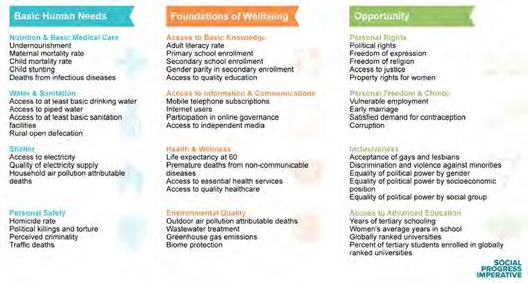
4 | CUSP WORKING PAPER No. 20

      On a related point, GDP fails to distinguish appropriately between
      intermediary and final goods, and can therefore not be regarded as a
      consistent measure of economic welfare. For example, it counts investment
      in roads and work-related spending by households as final goods, although
      they are clearly only intermediary in the production of economic welfare.12
      These factors reveal that GDP is even a poor measure of economic welfare,
      and give us pause to think about whether there are better ways to capture
      the values we are interested in.

      1.3 Distribution of income and the GDP
      Gross Domestic Product does not capture the distribution of the costs and
      benefits of economic activity among different groups within society. 13
      Understanding the distribution of income, and wellbeing more broadly, is
      important for two main reasons. One, the concept of diminishing marginal
      utility of income tells us that high-income individuals are likely to experience
      a smaller increase in wellbeing as a result of one additional unit of income
      than low income individuals. 14 This indicates that if GDP is highly
      concentrated, with a few people earning the majority of the income, those
      few individuals would achieve less additional wellbeing from every extra unit
      of income than if that income were to be redistributed to individuals who
      have very little. Taking this concept, Jackson (2018) estimated that the
      welfare lost in the UK as a result of inequality in 2016/17 was equivalent to
      £240 billion.15 From a purely economic point of view, therefore, this might
      lead us to view reducing inequality as one key component of improving
      aggregate wellbeing.

      Two, empirical evidence shows that high levels of income inequality might
      act as a catalyst for other social issues, which detract from societal wellbeing.
      Income inequality is, for example, associated with a number of factors at the
      national scale, including high rates of violent crime, low educational
      achievement and poor health.16 Although these relationships need further
      investigation to account for confounding factors, these studies suggest that
      income inequality can have a substantial effect on wellbeing outcomes.

      2 | Moving 'beyond' GDP
      There have been many initiatives to replace, augment and complement GDP
      over the years, with many dozens of indicators being devised and
      implemented at the local, national and international scales. These
      indicators have ranged widely in their focus, with some aiming to account
      better for human wellbeing, whilst others aim to reflect more accurately the
      state of our natural environment, and others still aim to capture economic
      activity more holistically.17 The indicators further vary in their approach to
      measurement, from the data they use to the aggregation processes they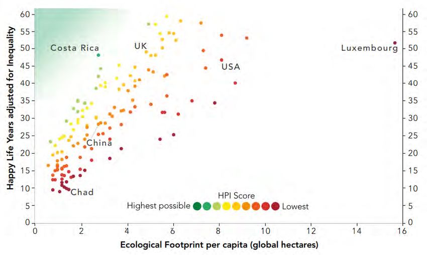
5 | CUSP WORKING PAPER No. 20

      implement.18 This diversity makes the ecosystem of indicators difficult to
      navigate, and it can become an overwhelming task to identify the 'best'
      indicator for any given context.

      Below we will provide an overview of the various types of indicator that have
      been developed, with a short description of how they work, some brief
      examples, and their key benefits and disadvantages. Alongside the case
      studies in Section 3, this overview will provide a backdrop for the
      discussions in Sections 4.

      We use here a common categorisation of indicators, distinguishing between
      the following types:

          •   indicator sets (or dashboards);
          •   aggregate non-monetary indices;
          •   aggregate monetary indices; and
          •   subjective wellbeing indices.

      We chose this categorisation approach because it best reflects the key points
      of tension in the indicator debate to date; namely around the monetisation
      of wellbeing and nature, the aggregation methodologies used to create the
      indices, and the validity of measures of subjective wellbeing.19 These are all
      areas that will be explored in more detail in Section 4. Other classification
      approaches do exist, which instead reflect factors such as the objectives of
      the indicator, its disciplinary origins, or the content of the sub-indicators;20
      however, these are less informative for this working paper.

      2.1 Quality of life indicator sets or dashboards
      Quality of life indicator sets are comprised of a wide range of physical or
      socio-economic factors which are considered important contributors to
      wellbeing. They are then often arranged into a set of domains (and
      sometimes sub-domains), which are considered to represent the main
      contributors to wellbeing or progress. The fundamental aim of such
      indicator sets is that they should “make up a ‘quality of life barometer’
      which will be used to measure ‘overall progress’ towards ‘a better quality of
      life for everyone, now and for generations to come’”.21

      Examples of dashboard indicator sets include:

          •   the UK’s Sustainable Development Goal Indicators, which are
              comprised of 114 indicators that are considered to sit with the
              domains of economy, society and environment. Each indicator is
              assessed according to its short and long term trends.22

          •   the System of Environmental- Economic Accounting (SEEA), which “is
              a framework that integrates economic and environmental data to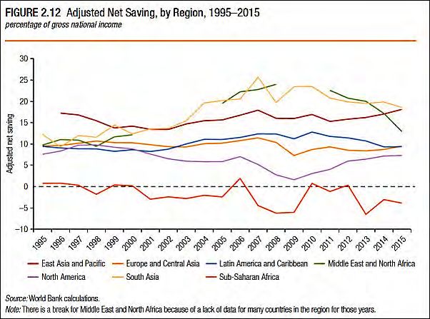
6 | CUSP WORKING PAPER No. 20

              provide a more comprehensive and multipurpose view of the
              interrelationships between the economy and the environment and
              the stocks and changes in stocks of environmental assets”.23

          •   the Eurostat Quality of Life indicators, which are comprised of nine
              distinct domains of wellbeing, determined by an expert group. It
              does not include environmental measures, but does capture
              subjective assessments of wellbeing.

      “The advantage of developing extended indicator sets of this kind is obvious. It
      allows Governments at any one point in time to assess progress towards key
      social or environmental policy targets, and to understand how trends in different
      factors are evolving”24

      One of the major advantages of sets of indicators is that there are no
      restrictions on which indicators can be included since they don’t need to be
      aggregated. Therefore, the main constraint on the number of indicators
      included in such sets is simply the aim of producing a succinct and simple
      tool for use. There is also no need for a normative direction to be associated
      with success for these indicators; however, the use of goals and trends can
      be useful in allowing some quite obscure statistical quantities (e.g. natural
      capital) to become meaningful and resonant concepts for the public and
      policy makers.

      In spite of these advantages, Barrington-Leigh and Escande (2018) found
      little evidence of policy impact associated with these kinds of indicator sets.
      According to the authors, they seem to have good longevity (perhaps
      because national statistical agencies often collect this kind of data for other
      purposes anyway), but limited practical use in policy making thanks to their
      somewhat unwieldy nature and subsequent lack of resonance with policy-
      makers. In particular, these kinds of indicator sets give policy makers no
      indication of the importance of one indicator with respect to another,
      leaving them with questions about how to interpret these dashboards when
      some indicators improve and others decline. How can we understand and
      articulate a notion of ‘overall progress’ with this kind of indicator system?
      Hence, while preserving a distinct set of indicators “avoids the dumbing-
      down of the complex and multidimensional concept of progress, it may
      relegate such efforts to the role of data clearinghouses, rather than
      significant contributions to reframing and redirecting public conceptions
      and dialogue, or to providing accountability for policy”.25

      2.2 Aggregate non-monetary indices
      Aggregate non-monetary indices attempt to combine the values for a set of
      ‘objective’ contributors to quality of life into one single number, or ‘scalar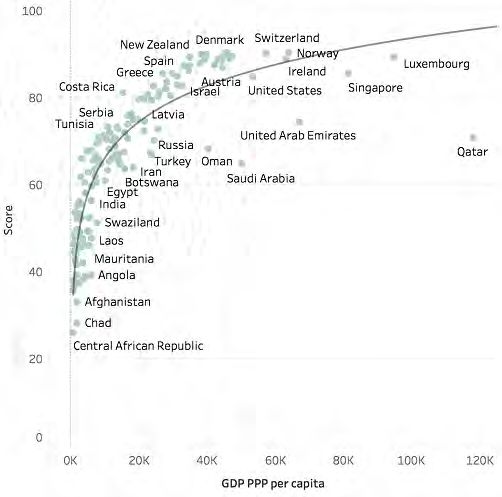
7 | CUSP WORKING PAPER No. 20

      index’. This scalar index is generally calculated as the weighted sum of these
      contributors after they have gone through some rescaling or ranking process.

      Examples of this type of indicator include:

          •   the Human Development Index (HDI), which is arguably the most
              well-known of this kind of indicator. It combines life expectancy at
              birth, mean years of schooling and gross national income per capita
              using an unweighted average. Minimum and maximum ‘goalpost’
              values are used for each sub-component to generate values for
              inclusion in the index along a scale from 0 to 1.

          •   Bhutan’s Gross National Happiness (GNH) index, which uses
              threshold values to calculate sufficiency across nine happiness
              domains. If someone meets the sufficiency threshold for six out of
              nine of the GNH domains, they are considered to be happy. It then
              uses the Alkire-Foster method for measuring multidimensional
              poverty to aggregate the individual happiness data into a measure
              that reflects GNH across Bhutan.26

          •   the Canadian Index of Wellbeing (CIW), which uses an unweighted
              average of the ‘percentage change’ from the base year in the
              underlying indicators in order to generate the index value. The index
              domains cover community vitality, democratic engagement,
              education, environment, healthy populations, leisure and culture,
              living standards and time use.

      Aggregate non-monetary indices can capture a concept like progress or
      wellbeing in a single value, which holds a number of advantages. It allows
      the summary measure to be tracked over time, compared easily between
      nations, and effectively communicated. This offers a neat way of articulating
      the ‘general direction of travel’ for a society, and can provide an accessible
      way for the public and policy makers to understand the data underlying it.27

      It is possible for these indices to offer a useful tool to support cost-benefit
      analyses by exploring the impacts of different policy decisions on the
      indicator values. However, the usefulness of these kinds of indices as such
      tools is “limited by the meaningfulness of the index”.28 In other words, if
      there is no robust theory or empirics underpinning the weightings used in
      the index, then the resulting number, and any changes in it may be
      essentially meaningless. This is because the weighting process applied to
      the values of the underlying indicators can dramatically change the outcome
      of the index.

      Becker et al. 198729 showed that, when measuring quality of life in the United
      States, the exact weight given to each sub-indicator dramatically changed
      the inter-region rankings. In the extreme, the authors found that for 59
      cities, their rank could shift from first place to last, depending on how the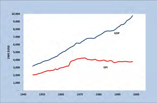
8 | CUSP WORKING PAPER No. 20

      sub-indicators were weighted. The lack of cohesive theory supporting
      indicator weights is troublesome not only in terms of relative rankings but
      also in an absolute sense. For example, the effects of trade-offs (e.g. between
      GDP and tonnes of CO2 emitted) and synergies (e.g. between years in
      education and quality of employment) between sub-indicators can be either
      exaggerated or diminished, depending on weightings. Hence, if the
      weightings are arbitrarily chosen, or chosen to manipulate the index, then
      the resulting number may be at best meaningless and at worst misleading.

      2.3 Aggregate monetary indices
      Aggregate monetary indicators describe the set of alternative indicators that
      aggregate all those factors contributing to (or detracting from) wellbeing
      which can be expressed in monetary terms. These kinds of indicators could
      be most accurately described as alternative measures of economic welfare,
      rather than measures of human wellbeing or societal progress. This
      approach to indication is largely a response to the critique that the GDP
      leaves out valuable economic activity that happens outside the market, and
      ignores many of the negative externalities associated with economic activity
      that happens inside the market.

      Some well-known aggregate monetary indicators include:

          •   Adjusted Net Savings/ Inclusive Wealth Index, which attempts to
              measure the “true rate of savings in the economy” after taking
              account of the depreciation of, and investments in, man-made,
              natural and human capital.30

          •   the Index of Sustainable Economic Welfare (ISEW)/ Genuine Progress
              Indicator (GPI), which aimed to “include the contribution to
              economic welfare of the informal economy, correct for the social and
              environmental costs of production, and take account of so-called
              defensive expenditures”.31 The ISEW methodology is based on the
              assumption that estimates of market price can tell us something
              about the how much individuals are willing to pay for a particular
              ‘welfare-enhancing’ good or service, and hence how much the value
              it.

      The main advantage of this approach is its acceptability to decision-makers.
      As Barrington-Leigh and Escande (2018, p902) describe, “in the context of a
      strong existing focus on GDP growth and a widespread implicit assumption
      that other desirable outcomes are likely to be correlated with GDP”, these
      kind of monetised accounts “wield rhetorical power in highlighting the
      differences resulting from more inclusive or more discerning coverage in the
      accounts”. Further, having one, scalar value that is intuitive to interpret
      makes these indices highly resonant with the public and policy-makers.
9 | CUSP WORKING PAPER No. 20
One drawback of monetised indicators is that, because the additional
activities they are trying to capture do no fall within the confines of the
market, they have to be valued using arguably more normative
methodologies, such as contingent valuation and shadow pricing. Decision-
makers may view these methods as more difficult to justify, which
undermines their faith in the resulting values. A further, and potentially
more damning drawback is that these indicators fall foul to some of the same
criticisms levelled at GDP to begin with. In particular, although monetised
indices like the GPI greatly extend the activities and investments included
in the measure of wellbeing, it can still be considered limited by what it is
‘feasible’ to put a value on. This leaves potentially significant contributors
to sustainable wellbeing, such as cultural values out of the equation.
Additionally, these indicators do not overcome the challenge that the link
between the market value of economic activity and “experienced human
wellbeing” is weak.32
2.4 Subjective wellbeing indicators
“A very different approach to the measurement of wellbeing derives from
the understanding that economic resources are not in themselves final
goods, but only intermediary in the ‘production’ of human wellbeing. Final
welfare, according to one economist, ‘consists of states of consciousness
only and not material things’ at all”. 33 This perspective has led many to
develop indicators that capture an individual's subjective measure of their
own experienced wellbeing, which can be aggregated at the national level.34
Examples of subjective wellbeing indices include:
• NEF’s National Accounts of Wellbeing, which is a composite indicator
comprised of a range of subjectively-assessed sub-indicators. These
sub-indicators cover personal wellbeing, social wellbeing, and
wellbeing at work; assessing a range of subjective feelings, from self-
esteem to autonomy, trust and belonging, among others.
• the Gallup World Poll Cantril Ladder, which is a simple single life
evaluation question that is averaged across a country’s population.
One suggested advantage of subjective measures of wellbeing is that
subjective wellbeing is an apparent or observed outcome, which means that
there is no need to guess at the contributing factors to quality of life. Hence,
“individuals can aggregate their experience in accordance with their own
priorities and values in a way that no one else can and, according to many
proponents, indeed in a way to which any other concept of wellbeing should
ultimately be accountable”.35
Subjective measures of wellbeing vary in their form, from single ‘life
evaluation’ questions, to more complex, weighted indices, which include10 | CUSP WORKING PAPER No. 20
subjective evaluations of different contributors to wellbeing (e.g. housing
quality). Although the more simple subjective wellbeing (SWB) measures do
not face the same challenges of aggregation that more complex indices do,
they can be more susceptible to one off-events, mood swings, etc. These
fluctuations in a single ‘life evaluation’ measure cannot be ground-truthed
in the same way that a subjective index, based around certain objective
components of wellbeing, could be. Further, although these metrics may
provide a reflection of human wellbeing, there is no reason that they will
necessarily reflect sustainability priorities. Here we see the importance of
complementing such metrics with ideas about constraints on resource use
and pollution.
3 | Indicator case studies
In this section we discuss in detail five prominent indicators that are
representative of the types of indicators explored in the previous section:
1. New Zealand’s Living Standards Framework (NZ LSF)
2. Social Progress Index (SPI)
3. Adjusted Net Savings (ANS)
4. Genuine Progress Indicator (GPI)
5. Happy Planet Index (HPI)
The first exemplifies the ‘dashboard’ approach; the second an aggregate
non-monetary index; the third and fourth are examples of monetised
aggregate indicators and the fifth, something of a hybrid, incorporates
subjective wellbeing as a key component. Across the five types of indicators
are varying degrees of policy-readiness, narrative strength, and distance to
implementation.
For each indicator we outline the genesis of the idea and its main
proponents, if and where the idea has gained traction, and the level of
acceptance and uptake achieved. We analyse enabling factors and barriers
to uptake, political and practical feasibility of the indicator, as well as data
availability and methodological robustness. See Table A.1 in Appendix A for
a summary of key indicator characteristics for each of the selected case
studies.
3.1 New Zealand Living Standards Framework
Indicator background
The NZ LSF dashboard was built on 10-15 years of work within Treasury
developing the framework, and even longer developing the wellbeing
concepts behind it, spanning all the way back to the 1988 Royal Commission11 | CUSP WORKING PAPER No. 20
on Social Policy. The development of the NZ LSF was ultimately precipitated
by a few key individuals who wanted to do something about the discrepancy
between what GDP can reflect and the ultimate aim of the Treasury: to make
life better for the people of New Zealand. This reflected a recognition that,
if Treasury is making decisions about the government’s expenditure on
health and education, then they should consider a broader set of factors than
just GDP. Although having key figures pushing the NZ LSF agenda forwards
has been key to its success, it has also resulted in one of its main challenges:
achieving widespread buy-in. This was exacerbated by the new Labour
government, who took power in 2017, asking for rapid progress in a range of
areas. This left little time to bring civil servants on side.
Indicator construction
The NZ LSF dashboard is comprised of 38 indicators, which sit across 12
domains of wellbeing. It draws heavily on the OECD’s wellbeing approach in
order to allow comparisons with other nations. Indicator selection was
informed by expert advice and public consultation, and outlined through a
series of formal discussion papers.36 The final selection of indicators was
ultimately constrained by the availability and quality of data.
The dashboard is comprised of three sections, each of which allow for
distinct but important analyses:
• “Our people—describes the distribution of wellbeing across nine
current wellbeing domains37 for different population groups of New
Zealanders, using characteristics such as sex, age, ethnicity, family
type, region, hours worked and neighbourhood deprivation.
• “Our country—describes the current wellbeing of New Zealanders at
a national level with comparisons within New Zealand population
groups and other OECD countries, using 38 indicators that measure
the 12 current wellbeing domains.
• “Our future—provides indicators for the resources that underpin the
ability to sustain higher living standards in New Zealand now, and in
the future”38.
From these indicators we can see that there is a fairly comprehensive
treatment of the economic, social and environmental dimensions of
wellbeing. Of particular note: the dashboard includes both objective and
subjective measures of wellbeing; it treats distribution across a range of
characteristics; and it considers the long-term sustainability of its activities
through changes in capital stocks. In this way, the NZ LSF aims to capture
the wellbeing and resilience of current and future generations.
Importantly, the Treasury opted not to aggregate its indicators. The decision
was rooted in the idea that the aggregation process is ultimately very value-
laden, and that it is the role of elected ministers to decide what factors are12 | CUSP WORKING PAPER No. 20
more and less important than others. One practitioner also commented that,
from a policy perspective, if you see a change in an aggregate indicator, you
immediately want to know what’s causing it. For that, you have to go back
to the dashboard anyway. Further, the Treasury chose not to opt for a
monetary account within the LSF. Despite diverse views within Treasury on
this front, practitioners noted that the decision was ultimately taken on the
grounds that you might lose valuable information through the monetisation
process.
Considering the dashboards’ treatment of the environment more closely, we
see that environmental indicators are included in the LSF in two ways. First,
the ‘our country’ domain of the dashboard specifically considers the
contribution of the environment to current generations’ wellbeing. This is
reflected through four indicators: air quality, access to the natural
environment, water quality and perceived environmental quality. Second,
within the ‘our future’ domain of the dashboard the environment is
considered as a stock of natural capital which underpins the resilience of life
and human activity, now and in the future. Natural capital here is measured
through six indicators: natural hazard regulation, climate regulation,
sustainable food production, drinking water, biodiversity and genetic
resource, and waste management.
The selection of indicators in the natural capital sub-domain was based on
a mix of pragmatic considerations about data availability, and the
indicator’s relevance to policy and future wellbeing. This process was
informed by international natural capital frameworks, such as the United
Nations System of Economic-Environmental Accounting Experimental
Ecosystem Accounting (SEEA-EEA), the Mapping and Assessment of
Ecosystem Services (MAES) and the Common International Classification of
Ecosystem Services (CICES). The disaggregated nature of these indicators
also maintains a strong sustainability approach, where natural capital
cannot be simply substituted by another form of capital and must be
maintained in its own right. These environmental indicators within the LSF
both send a strong message about the importance of nature for human
wellbeing, and also about the importance of maintaining a constant (or
increasing) stock of natural capital for the wellbeing of future generations.
Indicator outputs
The online dashboard can be used in a variety of ways. It can be used to track
each of the nine wellbeing domains over time for different sub-groups of the
population, or at the national level. For example, Figure 1 shows the
percentage of adults with low, medium and high levels of wellbeing in each
of the nine wellbeing domains. Figure 2 then focuses in on one of the
wellbeing domains, asking what percentage of the adult population rates
their health as poor, fair, good, very good, or excellent, for the years 2006-
2016.13 | CUSP WORKING PAPER No. 20
Figure 1 | Graph showing the levels of wellbeing across LSF domains for the New Zealand population
aged 15 and over (percentages). Source: Stats NZ, General Social Survey 2014 and 2016.
Figure 2 | Graph showing the percentage of adults with a self-rated health status of poor, fair, good, very
good and excellent, for the years 2006, 2011, 2012, 2013, 2014, and 2015. Source: New Zealand Health
Survey (Ministry of Health)14 | CUSP WORKING PAPER No. 20
It can also be used to produce comparison graphs, showing how different
sub-groups fair against one another for a given year, as per Figure 3, which
shows the performance of Maori New Zealanders, as compared to European
New Zealanders, along all nine wellbeing domains.
Figure 3 | Difference in the probability of having low and high wellbeing across LSF domains (percentage
points), for selected population groups. Source: Stats NZ, General Social Survey
This information, along with other functions of the dashboard, can be used
as a diagnostics tool to identify where the headline problems are across a
range of areas. For example, New Zealand has an issue with low labour
productivity. 39 That shows up on the LSF dashboard as a combination of
mediocre income and long hours worked. If New Zealanders were
prioritising leisure time, then we would expect the hours worked to be lower.
Low productivity is therefore revealed through the dashboard to be an issue
for living standards as well as for economic performance.
Indicator use
In practice, the LSF and its accompanying dashboard are “increasingly being
integrated into the Treasury’s advice processes”.40 This is happening in a
number of ways, including the development of a social cost-benefit analysis
tool (CBAx), using the indicators in the dashboard to support decision-
processes for the 2019 budget. 41 In addition, the LSF is being used to
determine 2019 budget priorities, which has been pitched as the wellbeing
budget. Using the dashboard, the Treasury selected five priority areas:
creating opportunities for businesses to transition to a low-emissions15 | CUSP WORKING PAPER No. 20
economy; supporting digital innovation; lifting Maori incomes; reducing
child poverty; supporting mental wellbeing.42 Those priorities shape which
budget bids are accepted. In support of this, agencies are being asked to
submit analyses of how their bids will affect Living Standards, including
both current wellbeing and the different capitals in the LSF. Here we can see
how this alternative indicator system is being used alongside GDP to
determine the allocation of funds across health, education, housing, and
more, based on its likely effects on wellbeing. The Treasury is expanding its
capabilities to make these assessments by building the Living Standards
Analysis Model, which supports policy-makers to identify trade-offs and
synergies across different policy areas.43
3.2 Social Progress Index
Indicator background
The Social Progress Index (SPI) is an aggregate non-monetary index, which
was developed by the non-profit organisation, the Social Progress
Imperative, in 2013. The index was the product of a two-year consultation
process with academics and policy experts, and was designed to complement
GDP, rather than replace it.
Indicator construction
The SPI is underpinned by a wide body of literature, including Amartya Sen’s
capabilities approach to human wellbeing,44 as well as work “emphasising
the role of institutions in shaping economic and social performance”.45 The
result of these inspirations is an index that centralises ideas of human needs,
individual wellbeing and opportunity for flourishing. The framework tries to
answer the following three questions:
1. “Does a country provide for its people’s most essential needs?
2. Are the building blocks in place for individuals and communities to
enhance and sustain wellbeing?
3. Is there opportunity for all individuals to reach their full potential?”46
In line with these questions, the index is comprised of three dimensions,
under which sit four categories of outcomes (or ‘components’) each. “The
selection of the dimensions and the elaboration of the components within
each dimension occurred through an iterative process involving review of
the literature and input from the Social Progress Imperative Advisory Board.
Finally, each of the individual outcome variables making-up the
components were selected on the basis of three criteria: “internal validity,
public availability, and geographic coverage”47 (Figure 4).16 | CUSP WORKING PAPER No. 20
Figure 4 | The individual indicators within the Social Progress Index Framework. Source: Social
Progress Imperative 2018
In order to account for the fact that there is some conceptual overlap
between sub-indicators (e.g. undernourishment and depth of food deficit)
factor analysis was used to assign weightings within the components (by
estimating the amount of overlap between the subdomains and adjusting
their contribution to the index accordingly). At the top level, by contrast,
the three dimensions are equally weighted as the indicator developers did
not feel there was sufficient evidence to support a differentiated weighting.
“As in weighting across dimensions, the Social Progress Index architecture
equally weights components for constructing a dimension-level score
because there is no clear theoretical or empirical reason to weight any of the
components more highly than any other. For this reason, each dimension
score is composed of the simple average across the four components”.48
Although they weight the sub-indicators within each component using
factor analysis, by giving all components and dimensions equal weights, the
different components are implicitly being giving equal importance in
determining wellbeing. This ignores the existence of trade-offs, synergies
and the fundamental underpinning of one factor by another. The potential
impact of this in a decision-making context should not be underestimated.
The treatment of the environment in the SPI is meant to reflect both its
contribution to human survival, in an immediate sense, and to the long-
term resilience of communities. This is captured in the most recent version
of the index with “Environmental Quality” as one of the four components in
the “Foundations of Wellbeing” domain. The component is comprised of
four indicators: outdoor air pollution attributable deaths and wastewater
treatment (which contribute to immediate health of communities); and
greenhouse gas emissions and biome protection (which contribute to future17 | CUSP WORKING PAPER No. 20
resilience of communities and the planet more broadly). This approach to
capturing the importance of the environment for human wellbeing is fairly
light-touch and does not reflect either an extensive, or a theoretically
grounded, approach to including the environment in the SPI.
Indicator outputs
The SPI has been calculated for a very large number of countries. As a result,
it offers a promising index for high-level international comparisons. If given
an international platform, this level of data coverage and transparency may
act as an accountability tool, bringing into sharp relief the ability of a
country to meet the basic needs of its citizens. This characteristic of the
index comes largely as a result of the prioritisation of global data availability
and consistency in its design. Further, the comprehensive nature of the data
allows interesting analyses to be conducted which can help to decompose
the relationship between GDP and societal progress. For example, Figure 5
shows the relationship between GDP per capita and the SPI index score for
each country in the index.49 Here we can see that the SPI shows diminishing
returns to GDP per capita when calculated across countries.
Figure 5 | Graph of SPI score against GDP per capita for each of the 146 countries in the index (Ref. 49)
The Social Progress Imperative have also produced scorecards for each of
the 146 countries in the index, which indicates how the country is18 | CUSP WORKING PAPER No. 20
performing when compared to 15 other countries with similar GDP per
capita. In other words, it gives a relative impression of how efficiently the
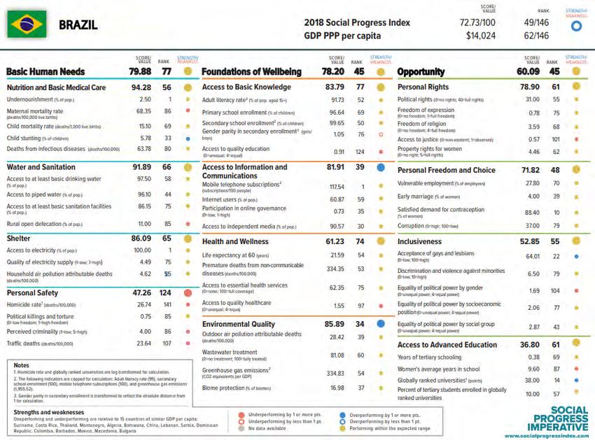
country is producing wellbeing for its citizens. For example, if we consider
Brazil, according to the SPI it is underperforming on Personal Safety, with
higher than average homicide rates and traffic deaths, given its GDP per
capita. However, it is performing better than expected on Access to
Information and Communication, and Environmental Quality (see Figure 6
for scoreboard). This presentation of the information contained in the index
might highlight productive avenues for policy learning and best-practice-
sharing between countries.
Indicator use
The appealing and flexible presentation of the results of the SPI allows for
an engaging story to be told about global social progress. There is now a
global network of actors from government, business, academia and civil
society championing the use of SPI. Notably, the Paraguayan government
have officially adopted the index as part of their National Development Plan.
This has already led to tangible impact, with the government doubling its
funding for nutrition programmes in response to the SPI data. Further, “in
Brazil, multinational corporations like Coca-Cola, Natura and Fiat-Chrysler
are using customized indexes to ensure their supply chains are socially and
environmentally sustainable”. 50 In this way, the index is arguably more
useful as a dashboard of indicators, rather than an aggregate index,
particularly given the socially-ambiguous weighting choices.19 | CUSP WORKING PAPER No. 20
Figure 6 | SPI Scorecard
for Brazil.
Source:
www.socialprogress.org20 | CUSP WORKING PAPER No. 20
3.3 Adjusted Net Savings
Indicator background and construction
The Adjusted Net Savings (ANS) (also called Genuine Savings) is a monetary
indicator which aims to capture the true savings rate of the economy. It is
defined as “gross national savings adjusted for the annual changes in the
volume of all forms of capital”.51 In other words, it looks beyond traditional
measures of national wealth/ savings, to include measures of natural
resource depletion, damages from pollution, and investments in education.
The ANS indicator can be approximated by the following equation:
!"#$%&'" )'& *+,-./% = )'& )+&-1.+2 *+,-./%
+ 4"$5+&-1.+2 '67'."-&$8'
− 4.'8/: "'72'&-1.
− ;-.'8+2 "'72'&-1. (1)
− )'& -%%-1.%
− =+>+/' 7+8&-5$2+&' '>-%%-1.%
Adjusted Net Savings is then presented as a percentage, by dividing it by the
Gross National Income. 52 The idea of considering the sustainability of an
economy in terms of changes in the stock of wealth was formally developed
by Pearce and Atkinson in 1993, drawing on theories about weak
sustainability.53 Weak sustainability suggests that in order for the economy
to be considered sustainable, the overall stock of natural and manmade
capital must not be decreasing. This definition of sustainability is based on
the assumption that there is perfect substitutability between these two
forms of capital. In other words, increases in manmade capital can
compensate—in terms of maintaining a constant stream of consumption per
capita—for the loss of natural capital (e.g. through technological
advancements that allow us to use the remaining natural capital more
efficiently).54
Indicator outputs
The ANS work was expanded by the World Bank, who have now developed a
47-year time series for every country (data permitting).55 This data was first
published for more than 200 countries in the World Bank’s Little Green Data
Book in 2000. These figures are now reported annually.56 The World Bank
database allows for rapid and extensive comparisons over time and across
countries. In particular, their online tool allows the ANS data of individual
countries, or groups of countries, to be plotted over time and decomposed
according to its base components. For example, in Figure 7 we can see the
trend in Adjusted Net Savings for each continent, from 1995-2015.21 | CUSP WORKING PAPER No. 20
Figure 7 | Graph of Adjusted Net Savings (ANS) for seven continents, for the years 1995-2015.
Source: World Bank. Note: There is a break for the Middle East and North Africa because of a lack of
data for many countries in the region for those years.
Indicator use
The World Bank-led Wealth Accounting and Valuation of Ecosystem
Services (WAVES) partnership are working with national governments
around the world to promote sustainable development. They try to achieve
this through the mainstreaming of natural capital into development
planning and national economic accounts, using indicators such as the
ANS.57 Their core implementing partners so far include: Guatemala; Costa
Rica; Colombia; Zambia; Botswana; Madagascar; Rwanda; Indonesia and
the Philippines. This indicates that governments may be receptive to the
ideas captured through the ANS indicator. However, given the implicit
treatment of all capitals as essentially substitutable, this indicator may not
provide these governments with a suitable reflection of long-term
sustainability.
3.4 Genuine Progress Indicator
Indicator background and construction
In order to talk about the Genuine Progress Indicator (GPI), we first must
look at the Index of Economic Welfare (ISEW), which was developed by
Herman Daly and John Cobb in the appendix of their 1990 book “For the
Common Good”. 58 . The ISEW is an extended monetary account that was
designed to start from a baseline of personal consumption (much like GDP),22 | CUSP WORKING PAPER No. 20
and to adjust that figure to account for a number of additional costs and
benefits not included in the GDP metric, such as non-market production and
environmental degradation. 59 The main components of the ISEW can be
approximated as follows:
ISEW/GPI = Cadj + Gnd + W – D – E − N
“where Cadj is personal consumption expenditures adjusted for income
inequality, Gnd is non-defensive government expenditures, W is nonmarket
contributions to welfare, D is defensive private expenditures, E is the costs
of environmental degradation, and N represents depreciation of the natural
capital base”.60
This approach to measuring economic welfare is rooted in the ‘threshold
hypothesis’: “the notion that when macroeconomic systems expand beyond
a certain size, the additional cost of growth exceeds the flow of additional
benefits”.61 ISEW-style metrics of progress represent an attempt to measure
the benefits and costs of economic activity not usually captured in GDP, in
order to act as a kind of signal for when growth in an economy becomes
uneconomic. The exact methodology of the ISEW has evolved over the last
30 years, undergoing a rebranding as the Genuine Progress Indicator in 1995,
led by the think tank Redefining Progress. Both the ISEW and GPI are still in
use today, with very similar methodologies. Most iterations of the ISEW/ GPI
now include some close variation on the list of sub-indicators shown in
Figure 8.
The methodological advances achieved for the GPI include both the
inclusion of additional factors in the index and the advancement of
valuation methodologies for specific sub-indicators in the GPI.
Approximately one third of the sub-indicators in the GPI represent
environmental factors. They include water, air and noise pollution; loss of
wetlands, farmland and forest cover; climate change; ozone depletion; and
non-renewable resource depletion. The indicators are monetised using a
range of methodologies, which often vary depending on the specific GPI
initiative or study. For example, some studies measure the value of
ecosystem services, whilst others measure the cost of their loss. Each GPI
study should therefore be evaluated individually for robustness. They are,
however, all based on the idea of attempting to bring the negative
environmental externalities associated with economic activities—at least
those which can be monetised—into our assessment of societal progress.23 | CUSP WORKING PAPER No. 20
Figure 8 | Diagram showing the subcomponents of the Genuine Progress Indicator, and whether they
are included as a cost or benefit in the index. Source: Donella Meadows Institute, 2014.
Indicator use and outputs
The GPI has also managed to gain some political traction in a number of
countries, including, Australia, the UK62 and the US. Most notably, a handful
of US states have adopted the GPI, embedding it in their state-level policy
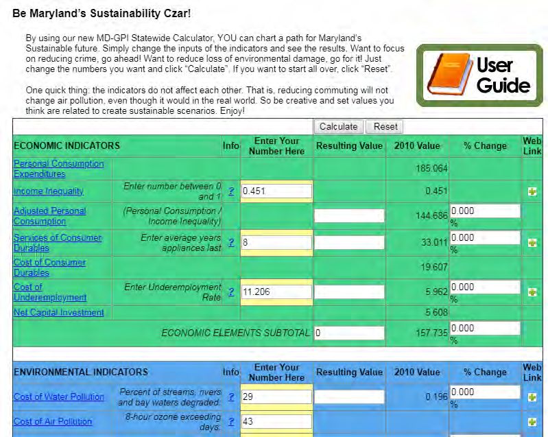
processes. In particular, Maryland state government has adopted the GPI at
the behest of the Governor, who has promoted the Maryland GPI since its
unveiling in 2010. 63 As a result, GPI statistics are “regularly updated and
used in analysis of state-level policies and decisions”. 64 Maryland state
government also set the gold standard in accountability with an online tool
that allows the public to see how changing policy priorities (e.g. reducing
water pollution) might affect the GPI. It achieves this by allowing them to
select target values for key components within the index (Figure 9).6524 | CUSP WORKING PAPER No. 20
Figure 9 | Screenshot from http://dnr.maryland.gov/mdgpi showing Maryland's online GPI calculator.
Yellow-lined boxes indicate where users can manipulate the index based on their preferred level of
unemployment/ inequality etc.
The opaqueness of government decision-making makes it difficult to say
with certainty how well the GPI is being integrated into budgetary decision
processes and policy priority-setting in places like Maryland. However, the
GPI also plays an important role in shifting the public discourse, with
striking and intuitive analyses revealing the disparity between trends in
GDP and trends in GPI across a multitude of countries, globally.66 See Figure
10 below for a graph showing the estimated global trends in GPI and GDP,
from 1950-2005. This illustrates the often divergent patterns shown by
these indicators.
Figure 10 | Adjusted global GPI/capita
& GDP/capita. GPI/capita was
estimated by aggregating data for the
17 countries for which GPI or ISEW had
been estimated, and adjusting for
discrepancies caused by incomplete
coverage by comparison with global
GDP/capita data for all countries. All
estimates are in 2005 US$. Source:
Kubiszewski et al. 201325 | CUSP WORKING PAPER No. 20
Regardless of its limitations, the GPI offers a more holistic view of the level
of economic welfare being generated through the economy than GDP. When
we assess the economy on the basis of the GPI, we see that our economic
welfare may in fact be stagnating or declining, even where GDP is increasing.
Examining the sub-indicators underpinning the GPI then allows policy
makers to understand exactly what is causing the observed trends. This
offers an intuitive and accessible way for policy-makers to conceptualise
progress in the economy.
3.5 Happy Planet Index
Indicator background
The Happy Planet Index (HPI) is an aggregate non-monetary index with a
strong focus on subjective wellbeing. It was developed by the New
Economics Foundation (NEF) in 2006.67 The HPI “compares how efficiently
residents of different countries are using natural resources to achieve long,
high wellbeing lives”.68
Indicator construction
The above description of the HPI is reflected quite literally in the
components of the HPI, which can be approximated by the following
equation:
@+77: A2+.'& B."'6
(E-'% (2)
≈
45121/-5+2 K11&78-.&
where Life Expectancy is “the average number of years a person is expected
to live in each country based on data collected by the United Nations”;
Experienced Wellbeing is “how satisfied the residents of each country feel
with life overall, on a scale from zero to ten, based on data collected as part
of the Gallup World Poll”; Inequality of Outcomes is “the inequalities
between people within a country in terms of how long they live, and how
happy they feel, based on the distribution in each country’s life expectancy
and wellbeing data”; and Ecological Footprint describes “the average impact
that each resident of a country places on the environment, based on data
prepared by the Global Footprint Network”.69
The HPI has a different underlying rationale to some of the other metrics we
have considered. Unlike the NZ LSF, SPI, ANS, and GPI, which focus largely
on the means through which wellbeing is achieved, the Happy Planet Index
is centred around the ends themselves (long and happy lives), measured in
direct terms. NEF argue that this approach circumvents assumptions about
what makes individuals (un)happy, instead asking them directly through a
life satisfaction question, adjusted for length of life, inequality and
resources use (or fundamental inputs as they call them).26 | CUSP WORKING PAPER No. 20
As discussed in Section 2.4, subjective measures of life satisfaction have
been subject to criticisms at the individual level, with mood swings and one-
off events potentially affecting an individual’s score on a given day. Some
argue that these variations likely balance out when aggregated at the
population level. However, others emphasise the longer-term role that
cultural factors might play in an individual’s response to subjective
wellbeing questions. Another criticism is that such measures tend not to
move much over time, making them less useful for policy development.
Hence, subjective wellbeing may not be considered a “valid absolute
measure of wellbeing”.70
With respect to the environment, the HPI takes a theoretically consistent
approach to its inclusion by relying on the Ecological Footprint indicator.
The Ecological Footprint of a given nation reflects the bio-capacity required
to produce all of the natural resources it consumes, and to absorb all of the
waste it produces. Although it doesn't necessarily reflect localised
environmental concerns, the Ecological Footprint provides a clear indicator
of sustainability at the aggregate level. This aggregation of all impacts into
one unit (global hectares) can be criticised as being a reductionist approach
to considering the contribution of the environment to human wellbeing.
However, in a context where many environmental impacts do not obey
country borders, this approach provides a notion of sustainability that is
consistent with a global lens of analysis, and which explicitly considers the
capacity of future generations to provide for themselves.
Indicator use and outputs
As a decision-making support tool, the HPI has several drawbacks. As soon
as there is a change in the SWB indicator, any decision-maker would
rightfully ask: what is causing that change? And can I do anything about it?
For this, we need some understanding of the drivers of subjective wellbeing,
which takes us back to the means of wellbeing delivery, and therefore to the
other indicators discussed above. However, the HPI tells a clear, accessible,
and relatable story about the world and the people who inhabit it. It
challenges notions of wellbeing being tied to economic growth, and paints
a vastly different picture of global success. In particular, those countries that
are considered successful by traditional metrics, such as GDP, often do not
rank highly on the HPI (Table 1).
The indicator also lends itself to analyses of the relationship between
happiness and ecological impact. It can highlight those countries which
appear to be delivering wellbeing in a (relatively) ecologically efficient way.
For example, Figure 11 shows that shows that Costa Rica is performing well,
achieving almost 50 on the ‘Happy Life Years adjusted for Inequality’ axis,
and with a low Ecological Footprint of approximately 2.5.You can also read