Redesigning Craigslist.org for Older Adults - Keenan May Sahithya Baskaran Nikita X. Xiong Abhishek Nandakumar Psych 6023, Fall 2012
←
→
Page content transcription
If your browser does not render page correctly, please read the page content below
Redesigning Craigslist.org for Older Adults

                 Keenan May

              Sahithya Baskaran

                Nikita X. Xiong

             Abhishek Nandakumar

                 Psych 6023,

                  Fall 2012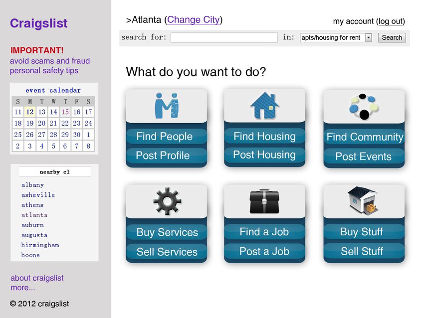
Abstract

        Craigslist.org is a popular ‘online classifieds’ website. It provides basic tools that allow users to

buy or sell goods and services locally, or to meet up with like-minded people or groups. This is a site that

offers services that older adults (aged 65+) might want to use; however, the current site design presents

usability problems that may prevent this. The present paper makes redesign recommendations based on

the capabilities, preferences and tendencies of older adults, as determined by a review of existing

literature, an accessibility assessment, a questionnaire, and a focus group session.

Keywords: website accessibility, aging, human-computer interaction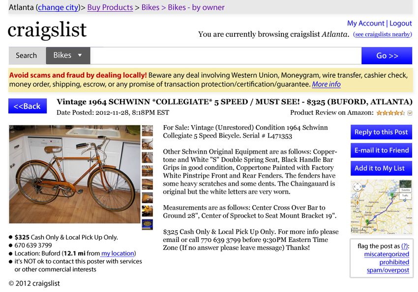
Before we began considering the design of craigslist.org we wanted to familiarize ourselves with

the capabilities and usage habits of older adults, along with the web design principles that arise by

considering these things. There are a variety of well-documented differences in the cognitive, perceptual

and motor abilities in older adults, many of which are relevant to website design.

        Older adults often have a reduced ability to maintain focused attention (Rogers & Fisk, 2004),

and may have reduced working memory spans, or analogous correlates (Salthouse, 1994). They also tend

to have trouble constructing, maintaining and visualizing mental models of complex site hierarchies, and

remembering how they got to a particular location in a site (Coyne and Nielsen, 2002). Accordingly,

relatively shallow, broad structures should be used (Zaphiris et al., 2002). The decline in working

memory and ability to maintain focused attention can lead to periodic losses of bearing. As such, designs

that do employ hierarchies should incorporate very clear ‘breadcrumbs’ or other indications of past

activity and location within a structure; users should always be able to orient themselves at a glance

(Rogers & Fisk, 2004). In addition, it should be made extremely clear which links have been visited and

where the user currently is on a site. Pages should be bookmarkable (instead of content loading

dynamically), since older adults may rely on bookmarks to access previously visited locations.

           While using broad, shallow site structures helps the designer increase usability in light of the

dropoff in focus and working memory, there is also evidence that the presence of too many links on a

page can be confusing to older adults. Fisk et al. (2004) provides the recommendation that site

organization should be shallow and broad, with a large number of descriptive, task-driven links on a

given page. This allows for effective navigation even given a potential decrease in working memory

capacity and the ability to maintain attention/ keep in mind the previous steps taken towards that goal,

without leading to overly complex counterintuitive pages individual pages. Using expandable ‘walking

menus’ that allow for hierarchical structure without requiring users to drill down into the hierarchy (and

potentially get lost) are one common solution Zaphiris (2004).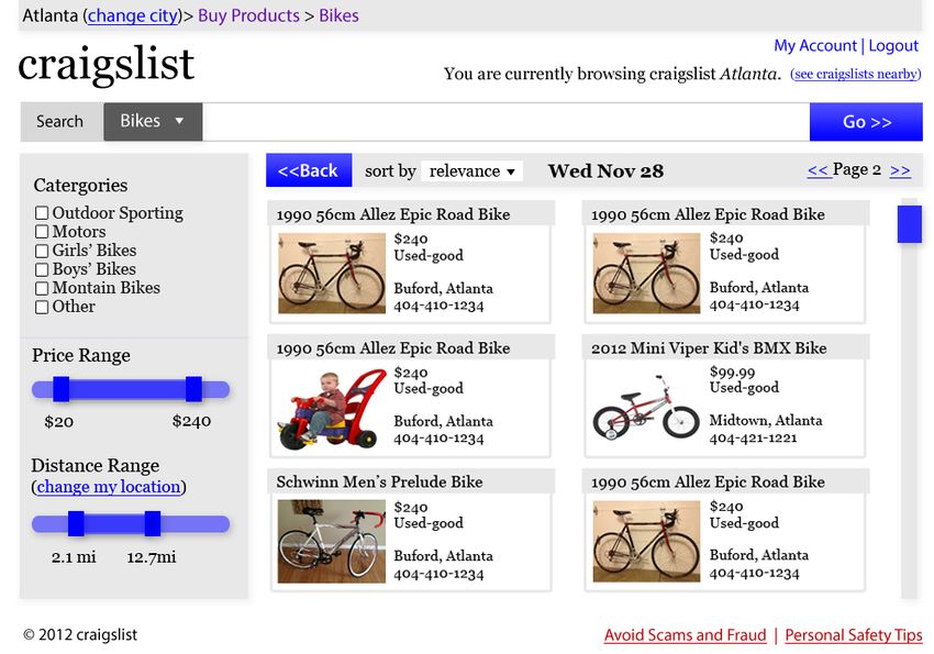
Older adults may have increased difficulty making inferences about site functions and the

meaning of text (Fisk et al., 2004), perhaps due to the oft-cited decline in so-called ‘fluid intelligence’.

For example, deciding that ‘contact us’ would be the place to look for ‘help’ requires a level of inference.

Fisk et al. (2004) notes that older adults may becomes easily misled by extraneous information or

misleading links, which is supported by research by Zacks & Hasher (1997), who found that older adults

had a diminished ability to inhibit task-irrelevant stimuli. In addition, many older adults may not be

familiar with the jargon and terminology used on the web, and designers should replace such terms with

language that is not specific to this domain (Chisnell, Lee & Redish, 2004). Older adults may also be

extremely cautious about what links they choose to follow, but tend to be more confident and less hesitant

to click on links that are described as actively voiced actions (Chadwick-Dias, McNulty & Tullis, 2004).

In short, when creating links, designers should use simple, directly representative descriptions that

indicate active functions that can be clearly linked to a user’s goal without requiring specialized

knowledge or logical leaps. However, older adults may have a larger existing semantic knowledge base,

and Rogers et al (2005) advises the use of metaphorical resemblance to conventional items (skeumorphs,

for example) in order to support understanding of the meaning of site elements, when this is appropriate.

        Visual Capabilities: There are often declines in visual acuity, color discrimination, color

sensitivity, and immunity to glare, as well as a gradual yellowing of the lens, as humans age (Rogers et al,

2005). In addition, there are reductions the range of effective peripheral vision. In light of this, high

contrast color schemes should be employed, and yellow, violet, blue and green should not be used in close

proximity (Tumosa, 2003). In addition, care should be taken not to use subtle interface elements such as

small clickable bullets or fold-down carrots (Czaja & Lee, 2003). Due to the reduced contrast sensitivity,

older adults may occasionally get lost when leading large bodies of text, so designers should create

frequent anchor points, paragraph breaks, and subheaders in order to allow for quick reorientation if this

occurs (Czaja & Lee, 2003).

           In addition, larger font sizes should be used, particularly if an item is close to the edge of the

screen and needs to be seen. Echt (in Morrel, 2002) recommends font sizes of 14 pt for body text and 18-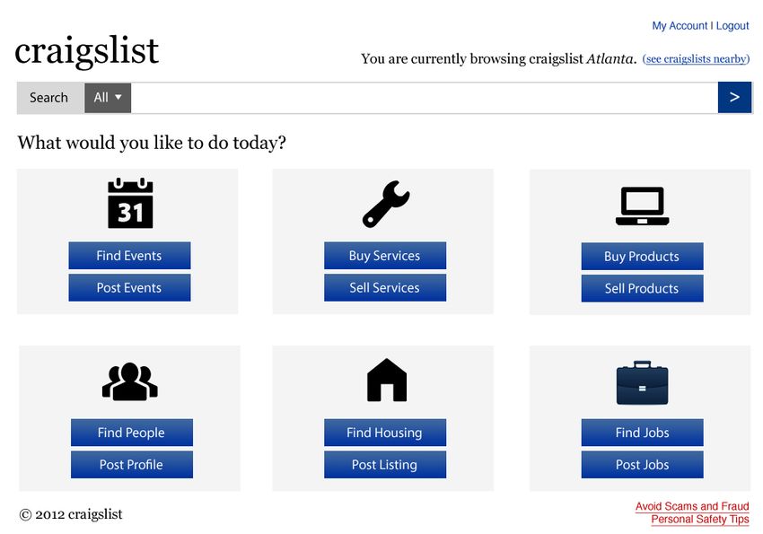
24 pt for headers. Bernard et al. (2001) found that a group of older adults tended to prefer 14 pt, serif

fonts, and had increased reading speed using this font compared to 12 pt fonts and 14 pt sans serif fonts.

Coyne and Nielsen (2002) propose another approach: include a button for changing font size. In order to

support this, it is important to format and style pages such that resizing text will not break the layout.

Older adults employ page-scanning methods similar to other groups, but they tend to attend heavily to

cues such as highlighting and boldness when carrying out such searches (Redish, 2004). Finally, pages

also need to format and display correctly when printed.

           There also tends to be a decline in fine motor control over time- more specifically, there is

evidence for an increase in the force to noise ratio and reduced perceptual processing efficiency (Walker,

Philbin, & Fisk, 1997). As such, designers should ensure that mouse and touch targets exceed a certain

size. In addition, menus that involve fine movement (hierarchical drop-downs, for example) should be

avoided (Dickinson, Eisma, Gregor, 2003, in Van de Watering, 2005).

        Older adults also tend to have different general usage patterns and attitudes toward technology

when compared with younger people. They tend to only employ a technology when it is clear that that

there will be a benefit to doing so, rather than employing a lower-tech or more familiar solution (Rogers

et al., 2005). With this in mind, designers should make benefits to usage explicit.

                                                  Methods

Functional Accessibility Evaluator

           Improving support for accessibility tools is a good way to expand the group of users that can

adequately interact with websites, and often leads to better web development practices, which can benefit

everyone involved. Many of the issues described earlier (visual decline, hearing loss, motor skill

diminishment and cognitive decline) can be counteracted through the use of accessibility-minded

technologies and features. Curran et al. (2007) provides a overview of accessibility concerns and

guidelines. For example, the visually impaired may use screen readers, which interpret parts of the

website HTML and use text-to-speech to read page contents to the user. In order to support this, web

pages have to be constructed and annotated in a certain way: images must be given ‘alt text’ descriptions
to be read. If this text description is missing, visually impaired users may not be able to adequately
interact with the page.
We employed the Functional Accessibility Evaluator (FAE) to evaluate the accessibility of
craigslist’s code. The FAE is an open source tool that analyzes several layers and sub-domains of a
website simultaneously. It measures adherence to the iCITA HTML Best Practices, which in turn
measures adherence to W3C WCAG, US EITA standards, and IITAA standards- essentially, whether site
programming supports the use of accessibility tools.
FAE analyzes a site and provides results in the following categories: navigation/orientation
(‘inclusion of structural markup that facilitates navigation and contextual orientation’), text equivalents
(‘proper use of images for interoperability … text descriptions’), scripting (‘avoidance of scripting
techniques’), styling (‘Use of CSS styling techniques’), HTML standards (‘support for HTML standards
to improve interoperability and provide more choices in the use of technologies for rendering web
content’.) In short, the way the page is coded should support customizability and flexibility in how the
content is represented in order to allow it to be responsive to the unique needs of each user.
We analyzed three levels of Craigslist pages using the FAE: the homepage, category, and
specific item pages. Craigslist has a fairly consistent set of problems with accessibility, centered around
navigation, styling, and HTML standards compliance. See Appendix A for detailed findings.
In terms of navigation, Craigslist had problems with properly tagging elements for use with
screen readers and other assistive devices. It fails to use header tags, which used by screen readers to
provide logical divisions of the page to users. In addition, subheadings were not nested properly- that is,
subsection titles were not ‘inside’ of section titles due to the improper use of header tags, which again
obfuscates the hierarchy and reading sequence to assistive tools. Input forms were missing title and label
properties, which again will cause many screen readers to fail. In addition, the default language (‘lang’
attribute) was not specified, which could cause problems with customizable text-to-speech voicing and
automated translations.With regards to styling, many pages were laid out using tables. This is a deprecated feature in
current HTML- formatting should be done with CSS elements. In practical terms, the structure of
the pages should be described so that alternative devices can properly parse and represent the sequence of
items- this means using tags, not HTML tables (Fisk et al., 2004). Pages also used discrete font,
styling and position HTML tags. Hard-coding style elements like this in the HTML (which should focus
on content, not style) does not allow those with limited vision to apply their own CSS stylesheets in order
to do things like increase element size or contrast. Finally, pages were often missing metatags specifying
character encoding, which has can hinder the use of alternative rendering tools and screen readers.
Questionnaire Design.
Gathering quantitative data is always important when trying to inform designs. With this in
mind, we constructed a brief questionnaire (Appendix B). We first asked several basic demographic and
web usage questions. After this, we addressed user habits and desires related to using things like
classified ads, primarily to allow us to arrange content in the redesign in a way that emphasizes features
which older adults might find most useful. Finally, we asked a few direct questions about familiarity with
Craigslist, so that we could plan our subsequent focus group effectively.
Questionnaire Findings
We distributed our questionnaire to a group of five older adults from the Atlanta area. These
adults were generally familiar with technology and using the internet, but only one of them had used
Craigslist before. As such, we decided to provide participants in our subsequent focus group with
extensive information about Craigslist.org, instead of asking about prior experiences and existing
likes/dislikes. In addition, we chose to ask questions about analogous experiences like paper classified
ads. The goal of asking these questions was to find out about interests and usage habits; however, we did
get some of this information from our questionnaire. These results, generally put, were that older adults
indicated a high interest in finding local events, finding local groups with shared interests, buying and
selling items, and buying and selling services. Conversely, they were less interested in finding jobs,
houses, or local discussion groups. Based off of this, we chose to emphasize and de-emphasize certainparts of the front page, and to combine or split off some categories. In our first mockup, for example, we
arranged ‘find a job’ at the end of the page (based off of normal scanning/ reading direction principles),
and chose to retain the event calendar function, which we had previously thought did not necessarily
support user goals on Craigslist. We had previously assumed that user goals would primarily be to buy
used items, but the results of the questionnaire indicated that this was not the case.
Respondent Interests, from questionnaire
Initial Mockup (Appendix D)
Before conducting a focus group session, we mocked up a redesign in order to have something to
show to participants. This redesign incorporated a simplified visual organization for the content headers
from original website. It maintained much of the existing structure in the left column and the header bar.
We endeavored to make the search function more visible, and wanted to clearly demarcate posting
actions from browsing actions.
Focus Group Design
The focus group was comprised of five older adults with varying levels of computer experience.
Participants were both married and unmarried, and only one had experience with Craigslist. They were
recruited through the Human Factors and Aging Laboratory database. The point of doing a focus group,
which is a sort of moderated and prompted panel discussion, was to get organic feedback from real users
about usage habits and original and redesigned craigslist designs. We drafted a moderator script
(Appendix C) but did not try to adhere to this verbatim.We wanted to address three general points during this session: what participants might want to do
on a site like craigslist, what specific usability problems participants might see and whether participants
like the direction of initial redesigns, and why. We chose to address these in sequence when conducting
the focus group session.
Participants were first given printed copies of the website home page, a page displayed on
selection of a sub-menu and a page displayed on selecting an item, along with a copy of the redesign. The
discussion was then directed to their thoughts on various aspects of the website, such as the size of the
text used, the colors used on the website, the layout of the page, use of multimedia on the page, thoughts
on navigation and visibility of critical functions on the site.
Participants provided valuable pertinent design suggestions about various aspects of the website
that were not covered in the questions. It was a highly motivated group that was eager to participate and
contribute toward the design of a more accessible craigslist website.
Focus Group Findings
Part of the craigslist website evaluation was the usage of a focus group to gain feedback
especially for older adults. Focus groups are sessions in which a moderator guides discourse by a small
group of representative participants around a topic of inquiry. The main purpose of conducting the focus
group discussion was to find out about general habits regarding Craigslist and classified ads, gauge
usability of the existing site, and get feedback on our initial redesign. The discussion and opinions
expressed helped determine accessibility design recommendations for older adults using the web site.
In response to general questions about internet usage, participants reported that they tended to use
the internet for communication, ordering merchandise, financial actions, and travel. They also were
interested in finding health and dietary information online. Common complaints included the lack of
customization, cluttered/ overfilled pages, and popups. They also tended to be wary of making non-
banking transactions online due to the possibility of scams. It should be noted that we did not consider
this aspect in our redesigns of Craigslist, since part of the appeal of the site is the fact that it does not
require buyers or sellers to go through a complex system to register, give feedback, etc. However, we diddecide to retain the persistent page element that allows Craigslist users to report scams, and made sure
this was consistently present, but not obtrusive (in the bottom right). Adding a robust feedback system
might be a good direction for future study, however.
Participants mentioned they used to read classifieds in newspapers earlier but do not anymore
probably because of the perception that fewer people placed ads in newspaper classifieds. One worked in
market research reported frequently using Craigslist to find people with specific qualifications. However,
most participants did not know what Craigslist was and, when shown the site, were not clear on what
exactly it was for. Seeing this, we wanted to make it very clear what one could actually do on the site,
and chose to emphasize active voice and functional, descriptive language. Participants reported that they
were more likely to use the website to search for specific things, rather than just browse without distinct
direction. However, one participant who was seeing the website for the first time said it seemed to have a
lot to offer and that he would browse through it if he had the time. When asked to go through a basic
task, one participant responded that he would simply type search terms in the search field, eschewing the
navigation structure entirely. As such, we chose to support this direct search behavior by adding a
‘category’ search pulldown, and increasing the visual prominence of the search bar.
Participants were generally confused about aspects of the content organization scheme employed
by the existing main page. They felt that the purpose of the site was unclear, were unsure about what the
‘gigs’ section was for, and did not know whether the site was automatically customized by city. In light
of this, we chose to eliminate the ‘gigs’ section, to make the fact that the current city meant results were
limited to that city more obvious, and to make overall site function more apparent with use of active
dialogue labels. However, participants as a whole were interested in the site, which translates what they
had liked about classifieds into digital form. The main barrier, thus, seemed to be usability.
We had group members walk through a few basic tasks with the existing interface (Appendix E)
in order to identify failure points and problems. When giving the task of finding local events, participants
did not appear to even notice the search bar or event calendar for almost a minute. In addition, when
asked where they would look to sell an item, group members were unable to find the ‘post’ button.Interface elements in the upper left of the screen were not being noticed as interactive; instead the focus
appeared to be on using the content area for navigation, which is generally not web design convention.
Finally, we had participants delve into submenus in order to search for a specific item. When at
subscreens, participants wanted to know whether they were able to filter or sort the list of results, and did
not realize that the price range function was available. This is again due to poor visual design and layout
that deemphasizes crucial elements and their relevance to page content. On the specific item page,
participants liked the large image and terse description, but were completely unclear on how to actually
proceed with buying the item. “Reply to post” requires a novel inference, uses web jargon, and is not
appropriately located or visually emphasized- all things that were likely to make it less clear or obvious to
older adults.
Finally, participants offered brief comments on the mock-ups of the redesign. They found the
larger print (size 14) helpful and easier to read, and liked the structure and organization of content, in
addition to the appearance of the main page. On the item list page, they liked the visual price filter
option, and felt that using this might motivate them to search for the best deal and continue the process.
Finally, they enjoyed the alphabetical ordering of items and the way they were arranged on the page.
Overall, the participants were happy with the direction taken by the redesign, and they were comfortable
with the flow of tasks on the mock-up, especially the procedural method of performing tasks.
Discussion
Craigslist’s site does a good job of matching the desires and needs of its clientele. A posting on
craigslist frequently consists of a few words describing what the item is, a price and contact information
of the seller. Craigslist ads typically do not have a lot of potential for confusion and visitors to the site
understand its purpose. They know when they click on an item and see the price that the seller is looking
to sell that item for that price. However, there are several aspects of the website which could be improved
further, and we tried to use our usability evaluation and focus group discussion to design a mock-up
illustrating some of our design recommendations.While feedback on the mockups was generally positive, we wanted to respond to the data
gained from the focus group by iterating on it. The second version of our redesign of the homepage
maintains our earlier decomposition of main page functions into six sets of ‘buy and sell’ buttons, but
tweaks the verbiage to add consistency and descriptiveness (Appendix F). We also added an option for
users to increase the font size, which is responsive to recommendations made by Coyne and Nielsen
(2002).
Because craigslist covers such a wide array of tasks and categories, it can sometimes be difficult
for the users to find a specific topic, even so with categories do not have very clear headings. It is evident
that a search feature is essential for such a website; we made the search function more salient through the
use of high contrast in our redesign, keeping with recommendations made by Czaja & Lee (2003) that
older adults responded well to visual guidance cues. Users in the focus group had found the event
calendar to be ambiguous; in addition, they were unclear on what kind of events the calendar was
providing information about. In response to (Rogers et al., 2005) and to observations during the focus
group, we realized that older adults may be less likely to notice content in the edges of the page. By
keeping only the logo in the upper left and organizing the page such that crucial content was in the center,
users would not miss out on crucial links and information in the periphery. We chose to maintain the
generally monochromatic color scheme of Craigslist in order to preserve visual identity, but employed
grouping and contrast in order to communicate page divisions and structure.
It is recommended (Rogers & Fisk, 2004) that designs that employ hierarchies incorporate
indications of past activity, and we maintained the existing format of indicators that show the links that
have been visited for the re-design (Appendix G) by using breadcrumb navigation. From the focus group
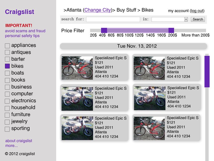
discussion, users specified that they could not locate any filters despite a price range filter being provided.
Filters are especially important in craigslist as there are large number of listings under each category, all
of which may not be relevant to users. In our redesign, we included a side bar, which contains specific
filters such as category, price and location so that users can filter the listings easily. We also included
images in a preview of each listing that can help users to make a decision before viewing further details.We also included a sort function that can sort listings based on relevance and price. By default, the search
bar on the page with listings searches within the specific category to help them find specific listings in
that category easily. By changing the category to ‘All’ users can search the entire website.
On selecting a specific item/listing, we recommend using the design as shown in Appendix H.
We maintained the large image and format of description as in the existing website as it conveys the
required information easily but made the ‘Reply to Post’ feature more prominent by using high-contrast
for the button and placing it right next to the description. Clear indicators of the path taken to reach this
page are provided to help users navigate easily through the website.
Participants in the focus group liked having lots of information available, but the found the
grouping unintuitive, and felt overwhelmed due to the lack of segmentation and grouping. To tackle this,
we propose an alternate version of our redesign of the homepage (Appendix I) that is more directly
responsive to research by Fisk et al. (2004) and Zaphiris et al. (2004), which recommend the use of a
shallow, broad design with clearly grouped content. When doing this drop-down menu version, we
placed logically related items in proximity without subdividing the page visually. The homepage uses a
‘walking menu’ and has icons that are indicative of the actions that the links are related to. This creates a
shallow hierarchy yet avoids overwhelming users by displaying a lot of information at once. We would
have liked to have done a card-sorting activity, in which participants place heading items into what they
see as logical categories, but we did this ourselves during the redesign using the results of our
questionnaire.
Conclusion
In our user studies, we found that the functionality of Craigslist is generally desirable by older
adults, but that the usability problems present a barrier to usage. Implementing one of our final redesigns
would lower this barrier, based off of our research, user testing, and design iteration.References
Journal Articles
Bernard, M., Liao, CH., Mills, M. (2001) Effects of Font Type and Size on the Legibility and Reading
Time of Online Text by Older Adults. Proceedings of ACM SIGCHI 2001. Retrieved from
http://psychology.wichita.edu/surl/usabilitynews/3W/fontSR.htm
Chadwick-Dias, A., Tedesco, Tullis, T. (2004) Demographic Differences in Preferred Website Content.
Conference paper, Usability Professionals’ Association Proceedings 2004.
Chisnell, D., Lee, A., Redish, J. (2004). Designing Web Sites for Older Users: Comparing AARP’s
Studies to Earlier Findings. AARP. Retrieved from www.aarp.org/olderwiserwired/oww-
features/Articles/a2004-03-03-comparisonstudies.html.
Coyne, Kara Pernice and Jakob Nielsen. Web Usability for Senior Citizens. Nielsen-Norman Group.
April 2002.
Curran, K. D. (2007). Investigating the problems faced by older adults and people with disabilities in
online environments. Behaviour & Information Technology, 26(6), 447-453.
http://prx.library.gatech.edu/login?url=http://search.ebscohost.com/login.aspx?direct=true&db=cp
h&AN=27217264&site=ehost-live
Czaja, S. J., Sharit, J., Ownby, R., Roth, D. L., & Nair, S. (2004). Examining age differences in
performance of a complex information search and retrieval task. Psychology and Aging, 16, 564-
579. Retrieved from http://www.ncbi.nlm.nih.gov/pubmed/11766912
Czaja, SJ., Lee, C. (2003). Designing Computer Systems for Older Adults. Chapter in The Human-
Computer Interaction Handbook: Fundamentals, Evolving Technologies and Emerging
Applications. pp 414-427. Julie A. Jacko and Andrew Sears, eds. Lawrence Earlbaum Associates,
2003.Gamberini, L., Alcaniz, M., Barresi, G., Fabregat, M., Ibanez, F., & Prontu, L. (2006). Cognition,
technology and games for the elderly: an introduction to eldergames project. PsychNology
Journal, 4(3), 285-308. Retrieved from
http://207.210.83.249/psychnology/File/PNJ4(3)/PSYCHNOLOGY_JOURNAL_4_3_GAMBER
INI.pdf
Redish, J. (2004). Letting Go of the Words. Intercom. Society for Technical Communication. 5- 10
Redish, J., & Chisnell, D. (2004). Designing web sites for older adults: a review of recent
research. Retrieved from http://assets.aarp.org/www.aarp.org_/articles/research/oww/AARP-
LitReview2004.pdf
Redish, J., Chisnell, D. (2004). Designing web sites for older adults: a review of recent research.
AARP
Rogers, W. A., Stronge, A. J., & Fisk, A. D. (2005). Technology and aging. Reviews of Human Factors
and Ergonomics, 1(30). http://rev.sagepub.com/content/1/1/130.full.pdf
Salthouse, T. A. (1994). The aging of working memory. Neurophysiology, 8(4), 535-543. Retrieved from
http://faculty.virginia.edu/cogage/publications2/Pre 1995/Aging of Working Memory.pdf
Tumosa, N. (2003). Aging and the Eye. The Merck Manual of Geriatrics Retrieved 20030915, from
Van de Watering, M. (2005) The Impact of Computer Technology on the Elderly. Retrieved from
http://www.few.vu.nl/~rvdwate/HCI_Essay_Marek_van_de_Watering.pdf
Walker, N., Millians, J., & Worden, A. (1996). Mouse accelerations and performance of older computer
users. In Proceedings of the Human Factors and Ergonomics Society 40th Annual Meeting. Santa
Monica, CA: Human Factors and Ergonomics Society.
Zaphiris, Panayiotis with Sri Hastuti Kurniawan, and R. Darin Ellis. (2002) “Age Related Differences and
the Depth vs. Breadth Tradeoff in Hierarchical Online Information Systems.” Chapter in
Universal Access: Theoretical Perspectives, Practice, and Experience (7th ERCIM International
Workshop on User Interfaces for All. Paris, France, October 2002. Revised Papers.) 23-42.
BooksFisk, A. D., Rogers, W. A., Charness, N., Czaja, S. J., & Sharit, J. (2004). Designing for older adults:
Principles and creative human factors approaches. Boca Raton, FL: CRC Press.
http://www.amazon.com/Designing-Older-Adults-Principles-Approaches/dp/1420080555
Morrell, R.W., ed. (2002) Older adults, Health Information and the World Wide Web. Lawrence Erlbaum
Associates, 2002.
Rogers, W.A., Fisk, A.D. (2000) Human Factors, Applied Cognition, and Aging in Craik, F.I.M. and
Salthouse, T.A. Handbook of Aging and Cognition. Lawrence Erlbaum Associates, 2000.
Appendix A: Line Item Analysis of Accessibility Test Results
Main Page
Navigation and Orientation
Titles: There are a lot of missing H1 tags. That is to say, lots of the headings (section titles) are not
technically headings.
Subheadings: Subheadings are not nested properly, due to the lack of H1 tags.
Form Control Labels: Some input elements are missing title and label attributes (type attributes).
Default Language: There was no default language (lang attribute) specified in the HTML metatag. If the
screen reader wanted to provide an appropriate voicing or translate the page, it would not know how to do
so.
Layout Tables:
There are tables used for formatting; elements should be used instead. This makes the reading
order easier to manage. In addition, using CSS means that some users can employ their own stylesheets
in order to increase legibility.List of Items Page Navigation and Orientation Titles: There are a lot of missing H1 tags. That is to say, lots of the headings (section titles) are not technically headings. Subheadings: Subheadings are not nested properly, due to the lack of H1 tags. Form Control Labels: Some input elements are missing title and label attributes (type attributes). Default Language: There was no default language (lang attribute) specified in the HTML metatag. If the screen reader wanted to provide an appropriate voicing or translate the page, it would not know how to do so. Frames: Many frames were lacking title attributes Styling Text Styling: The site should not be using bold tags. In general they should be using header classes. Also, the ‘font’ element should not be used; instead this should done in css. Layout Tables: There are tables used for formatting; elements should be used instead. This makes the reading order easier to manage. In addition, using CSS means that some users can employ their own stylesheets in order to increase legibility.
Html Standards

W3C Specifications: there was no character encoding metatag specified

                                              Specific Item Page

Navigation and Orientation

Titles: There are a lot of missing H1 tags. That is to say, lots of the headings (section titles) are not

technically headings.

Subheadings: Subheadings are not nested properly, due to the lack of H1 tags.

Default Language: There was no default language (lang attribute) specified in the HTML metatag. If the

screen reader wanted to provide an appropriate voicing or translate the page, it would not know how to do

so.

Html Standards

W3C Specifications: there was no character encoding metatag specified
APPENDIX B: Questionnaire
This questionnaire is a part of the research project related to the design of a commonly used website
conducted by students of Georgia Institute of Technology. You have been chosen as one of the
participants of the survey because you belong to the group of potential users that we are interested in. The
results of this survey will be used for academic purposes only. Estimated time for this questionnaire
completion is 5-7 minutes. The research team greatly appreciates your help and support with this research
and thanks you for your valuable contribution!
1. What language are you most comfortable using?
2. What is your highest education level?
3. How interested are you in doing the following things?
• Find a local group of people with a shared interest
• Find schedule and location information on local events
• Meet new individuals
• Join a local discussion group
• Find a new house or apartment
• Find a vacation home
• Buy used items
• Sell your stuff
• Look up classified ads for services
• Find a job
• Sell a service locally
4. When trying to find a specific thing on a website, which of the following are you most likely to do first:
Use a search function
Browse by clicking links (clicking a category, for example)5. How likely would you be to do each of the following on your computer, if it was very convenient?
• Find a local group of people with a shared interest
• Find schedule and location information on local events
• Meet new individuals
• Join a local discussion group
• Find a new house or apartment
• Find a vacation home
• Buy used items
• Sell your stuff
• Look up classified ads for services
• Find a job
• Sell a service locally
6. Which of the following device do you use to read/browse a website:
Computer
Touchscreen Tablet (iPad, etc.)
Mobile Phone
Other
7. Which of the following methods would you use to find specific information about a lost dog:
Newspaper classifieds ,Community notice board, Online, Ask a friend, Other
8.When you visit a website home page, would you rather have all options available, or have the site help
you approach your goal through a series of steps?
• Lots of information on one page
• Step by step guide
9. How often do you go to the following websites: eBay, Craigslist, Amazon?
10. What is your favorite way to look for and buy second-hand items that others want to sell?Garage/ Estate Sale, Online auctions (like eBay), Pawn Shops/ Antique Shops, Classified ads, Other
APPENDIX C: FOCUS GROUP SCRIPT
Introduction
We’re learning about how to do usability studies on websites, and we chose Craigslist.org.
We want to know what you think about this site so we can make it easier to use.
Opening Question
0) When did you last look at classified ads in the newspaper?
(pivot: oh, last week? -> get anything interesting?)
(pivot: a long time ago? €→ (transient))
Transient Questions
1) Have you ever bought used stuff online?
(pivot: what is that? -> like craigslist or ebay)
(pivot: yeah, all the time -> (key questions 2a)
(pivot: no, not often or never -> (key question 2b)
Key Questions
2a) (If they buy things online all the time) It sounds like a lot of you buy stuff online. Have you ever used
craigslist.org for this?
(pivot: yes, I have (key question 3a)
(pivot: no -> (key question 3b)
(pivot: seriously mixed -> (key question 3c)2b) (If they haven’t bought used stuff often or never) It sounds like a lot of you don’t like to buy things
online. Why is that?
3a) (If yes) You guys have all used craigslist? What did you use it for? How did you like it?
3b) (If no) Y’all don’t use craigslist much? Why not? Do you use other sites for similar tasks?
3c) (If seriously mixed) Why did you guys use it, and why did you guys not? For those who used it, what
did you use it for?
4) (Ok, for those of you hasn’t seen the site), here is what it looks like (pull up the site) So here is how
you buy something on the site: (walk through it) Do you see any problems?
(prompt: Is the text readable?
(prompt: would you know what to do on this page?
(prompt: would you want to see more or less information?
5) Let’s say you wanted to buy a bicycle. How would you do it?
(we are running the computer, they yell out what to do)
6) How could that have been easier?
7) Here’s the current sketch of a redesign. What do you think of this design?
Ending Questions
10) so you have given us some really useful information that will help us redesign craigslist.org. Is there
anything else you would like to tell us?APPENDIX D: INITIAL MOCKUP APPENDIX E : ORIGINAL HOMEPAGE
APPENDIX F : HOMEPAGE REDESIGN 1

APPENDIX G : LIST VIEW REDESIGN
APPENDIX H : ITEM VIEW REDESIGN

APPENDIX I : HOMEPAGE REDESIGN 2
You can also read