Responsive Web Design - What & How - Manjunatha A Hosur
←
→
Page content transcription
If your browser does not render page correctly, please read the page content below
Responsive Web Design – What & How

                        Manjunatha A Hosur

                                             1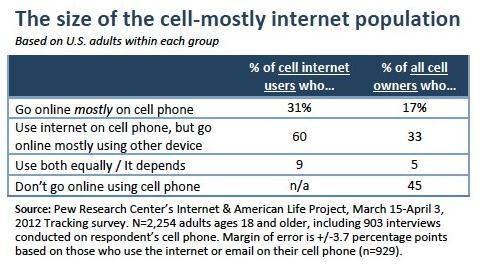
•   Introduction
             •   What
             •   Layouts
 Agenda      •   Media Queries
             •   Responsive Media
             •   Considerations
             •   Pros & Cons
             •   Useful resources
             •   Q&A

Responsive
Web Design
                                    2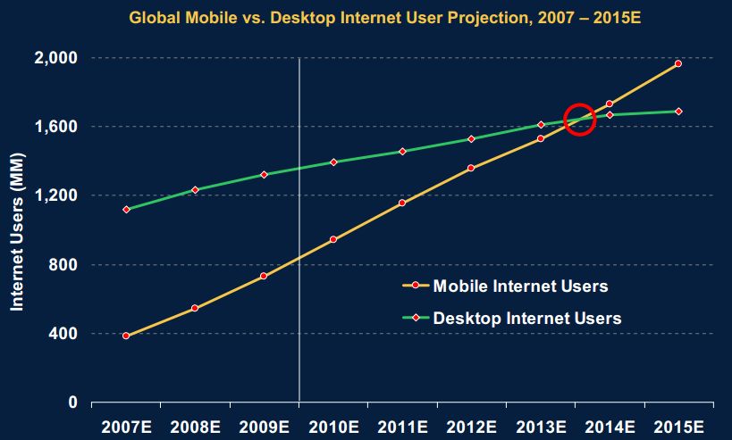
• With 5.9 billion
  mobile-cellular
  subscriptions, global
  penetration reaches
  87%, and 79% in the
  developing world.
• Mobile-broadband
  subscriptions have
  grown 45% annually
  over the last four
  years and today
  there are twice as
  many mobile-
  broadband as fixed
  broadband
  subscriptions.
                          3
17% of cell phone owners do most of their online browsing on
their phone, rather than a computer or other device

                                                               4
Mobile users greater than desktop in near future

Mobile users greater than desktop in near future

Source: Morgan Stanley Internet Trends
                                                       5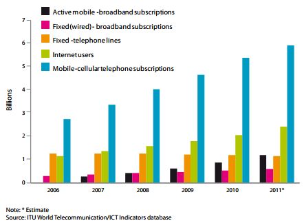
Users are always in control

     Web designers v/s Web users – Who is in control

Designers                      Users
  • Target specific browser      • Choose browser they want
  • Optimize for specific          to use
    width                        • Zoom-in & zoom-out to
  • Implement hacks to             increase and reduce font
    create identical               size
    experiences cross-           • Maximize browser or view
    browser & cross-platform       it at half available width
                                 • Full control over where and
                                   how, they access our
                                   content

                                                                 6
So many devices
7Screen sizes
Screen Size
800x480 482x320 1024x600
Samsung Galaxy S Vibrant iPhone 3GS
Galaxy Tab
& lower
Nexus One Blackberry Playbook
HTC Incredible
960x640
HTC EVO
iPhone 4
HTC Desire HD
Windows Phone 7
854x480 1024x768 1920x1080
Droid PC
iPad
Droid 2 TV
PC
Droid X
8Input devices
9Summarize the issues
Summarize the issues
Users are in control
Display size
Hundreds of devices now, thousands more to come
Network speeds
Standards support
Input method
Context
10Is Separate sites the solution?
Creating separate sites for specific No hope of convergence
kinds of devices
• Desktop site
• Tablet site
• Site for touch enabled mobile devices
• Site for mobile devices without touch Building separate sites is
support not future friendly.
• m.website.com
• tablet.website.com
• tablet.version.website.com
Adapting to flexible web is the only way
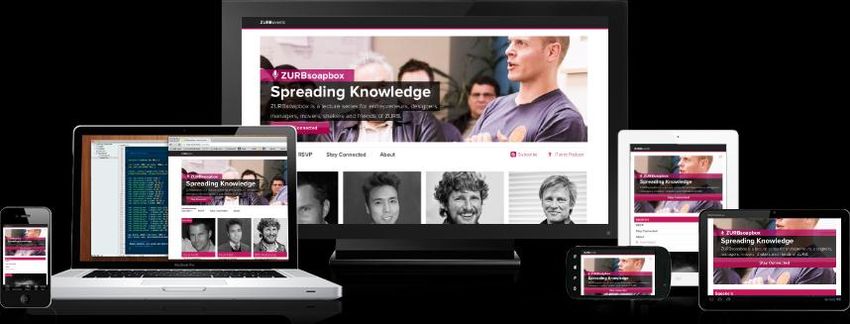
11Responsive Design Approach
Small + Medium + Large
One site for every screen.
12Fluid Sizing of Grid Layouts
Layouts fonts
• Better site
- Percentages structure
or ems • Consistency.
Layouts
Converting fixed units to CSS tables
flexible units
display:table-
Target / Context = Result cell;
13Media Queries - Introduction
Media queries define which styles should apply under
specific circumstances by allowing you to query the
values of features such as resolution, colour depth,
height, and width. By carefully applying media queries,
you can iron out the remaining wrinkles in fluid layout.
14Viewport tags and properties The viewport meta tag lets us control the scaling and layout viewport of many devices. Meta Tag Width Height User-Scalable
Media query

Let you question the browser to determine if       Basic components
certain expressions are true. If they are, you
can load a specific block of styles intended for
that situation and tailor the display.
                                                   - Media Types
                                                   - Media Expressions
@media [not|only] type [and] (expr) {              - Logical Keywords
       rules                                       - Rules
}

                                                                         16
Media Types
Source : http://www.w3.org/TR/CSS2/media.html
17Media Types - Components
Tells user agent to whether or not to load a particular stylesheet for a given type of media.
Syntax : @media print { }
or externally, using the media attribute on a link element, it would be:
Most devices support screen instead of specific devices.
Media Expressions
Ability to test against different features of a device using expressions that evaluate to either true or
false.
Syntax : @media screen and (min-width: 320px) { }
Width Device-Height device-aspect-ratio monochrome
Height Orientation Color Resolution
Device-Width aspect-ratio Color-Index Grid
18Media Types - Components
• Combination with media types and media expressions would make media
queries more powerful.
• and – Used to test against more than one expression - @media screen and (color)
• not - The not keyword negates the result of the entire expression
@media not screen and (color) {...}
or - There is no ‘or’ keyword for media queries, but the comma acts as one. This lets you
load a set of styles if any one of a series of specified expressions evaluates to true:
@media print and (color), tv and (color)
• only keyword can be used to hide media queries from older browsers, as they won’t
recognize it.
@media only screen and (color)
Rules @media only screen and (min-width: 320px) {
These are basic CSS style rules that included a{ color: red; }
within media query. }
19Using media queries
Media queries could be used in two ways
Placed in media attribute of link element to
a{ include an external stylesheet.
text-decoration:none;
}
960px) {
a{
text-decoration: underline;
}
}
20Media query order
Desktop
The default layout is what you typically
Mobile
Using media queries to adjust the
see on the screen of a browser on a layout for mobile experience first.
laptop or desktop computer. Then,
using a series of media queries
(typically max-width), the layout is
simplified and adjusted for smaller
screens
/* base styles */ /* base styles */
@media all and (max-width: 768px) { ...} @media all and (max-width: 320px) {….}
@media all and (max-width: 320px) {….} @media all and (max-width: 768px) {…}
21Responsive Navigation
Responsive Navigation
Designing proper site Following are some of popular techniques for
navigation is key to handling navigation in responsive designs
responsive design.
• Top Nav or “Do Nothing” Approach
• The Footer Anchor
• The Select Menu
• The Toggle
• The Left Nav Flyout
• The Footer Only
Good responsive navigation • The “Hide and Cry”
adheres to following criteria
• Less screen real
estate Navigation needs to be
• User friendly and accessible and easy to use,
Source:
intuitive no matter the screen size. http://bradfrostweb.
• Support variety of com/blog/web/resp
devices Example, onsive-nav-patterns/
www.indochino.com
22Responsive Media
Increasing page load time increases performance.
71% of mobile phone Users 74% of mobile phone Users Main reason for
degraded
expect mobile phone will only wait 5 performance of
users to load as seconds or less for a mobile sites is due to
quickly on their page to load. large media assets
mobile phones as being downloaded
their desktops. like images and
video.
57% of mobile web users
who were are unlikely to return to a
disappointed will not slow loading site.
recommend the site.
Source: Equation Research on behalf of Compuware
23Solution to performance issues
Solution
matchMedia() javascript Responsive Image options
Selectively serving images
to mobile
Sencha.io Adaptive
if Images
http://src.sencha.io
(window.matchMedia("(min /768/http://www.d
-width: 38em)").matches) omainname.com/im
{ ages/product1.jpg Cloudinary
…..
}
Better handling of Handling devices with Retina display
background images. using –webkit-min-device-pixel-ratio
24When to use?
Time Support Performance Content Mobile
& Ads
Money
25Pros & Cons
• Responsive design is not a • Its not a silver bullet
technology, it’s a powerful • Detailed planning need.
development philosophy. • Longer build time
• Multiple teams maintaining • Testability
different device specific sites is
costly and drags the innovation.
• Enables a new approach to web
development intended to support
optimized web experience from
single front end codebase.
26Sketching / Templates and js scripts
Where can we learn more
• CSS3
Wireframing Grids Mediaqueries JS
tools • Gridless • Respond
• metaltoad.com • Skeleton • Adapt
• csswizardry.com • Less Framework
• Adobe Dreamweaver • Bootstrap
6 • Mobile Boilerplate
Responsive design elements Testing tools
• Responsive Images • Responsinator
• Responsive Titles • Media queries
• Responsive data Tables debugger
• Responsive Videos • Responsivepx
• Responsive Sliders • Screenfly
• Responsive Carousel • RWD Testing Tool
• Convert Menu to dropdown
• Adaptive ImagesQ & A
Thanks
28You can also read


