Search Cost, Intermediation, and Trade: Experimental Evidence from Ugandan Agricultural Markets - NOVAFRICA
←
→
Page content transcription
If your browser does not render page correctly, please read the page content below
Search Cost, Intermediation, and Trade:
Experimental Evidence from Ugandan Agricultural
                    Markets
                              Lauren Falcao Bergquist1∗, Craig McIntosh2
                                    1 University   of Michigan and NBER
                                    2 University   of California, San Diego

                                               April 16, 2021

                                         PRELIMINARY DRAFT

                                                    Abstract

            High search costs weaken market integration in developing country agricultural markets,
        harming both farmers and consumers. We present evidence from a large-scale experiment de-
        signed to reduce search costs in randomly selected subcounties in Uganda by introducing a mo-
        bile phone-based marketplace for agricultural commodities. The intervention drives increases in
        trade flows and reductions in price divergence across treated markets. Profits of intermediaries
        in treated markets decrease. However, small-scale farmers find it difficult to reach the scale
        necessary to find buyers on the platform; only the largest farmers use the platform. As a result,
        we are only able to detect significant increases in revenues among the farmers most likely to
        use the platform. Point estimates suggest effects that are meaningful in magnitude, but not
        statistically significant for the majority of farmers. Since farmers are so numerous and the cost
        per-farmer is low, these income gains per household aggregate to make the intervention strongly
        cost-beneficial from an overall welfare perspective.

JEL codes: O13, D51, Q12
      Keywords: agriculture, market integration, randomized controlled trials

  ∗
     We gratefully acknowledge funding from USAID/BASIS, USAID/DIL, the Agricultural Technology Adoption
Initiative, the International Growth Center, the Policy Design and Evaluation Lab, and an anonymous donor. We
thank IPA, Stephanie Annyas and Laza Razafimbelo for excellent project management. This trial was registered as
AEARCTR-0000749, and is covered by UCSD IRB #140744. All errors are our own.

                                                        1
1        Introduction

The integration of agricultural markets in developing economies is an issue of central welfare im-

portance. On the production side, access to deep output markets is critical for farming households,

for whom agricultural sales comprise the majority of their income. On the consumption side, well-

functioning food markets are necessary to direct food to locations where it is most needed. Trading

frictions that limit the movement of crops from relative surplus to relative deficit areas therefore

have large welfare costs (Barrett, 2008; Rashid and Minot, 2010).

        While transport costs are known to constitute a large fraction of these trading frictions, partic-

ularly in sub-Saharan Africa (Teravaninthorn and Raballand, 2009), growing attention has recently

been paid to non-transport frictions. One of the most prominent of these is search costs: the fric-

tions that prevent buyers and sellers from easily finding each other in a marketplace (Allen, 2014).

These frictions can thwart otherwise profitable trades, leading to lower prices for suppliers and

higher prices for consumers. Market-wide, they generate larger patterns of price dispersion across

areas of relative surplus and relative deficit (Jensen, 2010). Search costs may also be a source of

market power for intermediaries, as information frictions prevent traders from competing across

larger geographical areas (Goyal, 2010; Antras and Costinot, 2011).

        Against this backdrop, the introduction and rapid spread of mobile phones across sub-Saharan

Africa has generated much excitement, offering the promise of dramatically reducing search costs.

Indeed, the rollout of cell-phone towers in the early 2000s has been shown to have substantially

reduced price dispersion in grain markets (Aker and Mbiti, 2010). Building off this success, recent

efforts have attempted to move beyond the passive reduction in search costs facilitated by easier

bilateral communication via mobile phones, and into more active facilitation of search on mobile

platforms design for agriculture.

        The first generation of these initiatives focused on the dissemination of price information to

farmers via mobile phone. However, price information alone has had mostly disappointing results

(Aker, 2010; Fafchamps and Minten, 2012).1 The premise of these price-alert platforms is that
    1
    One notable exception is Svensson and Yanagizawa (2009), who find evidence that broadcasting prices via radio
lead to higher farmgate prices in Uganda; however, a follow-up paper suggests that once accounting for general
equilibrium effects, average farmer revenues impacts are minimal (Svensson and Yanagizawa-Drott, 2012).

                                                                                                               2
farmers will be able to sell in better markets after receiving price information; however, in practice,

farmers typically sell at farmgate or in very local markets, perhaps because of limited access to

transport small surpluses in a cost-effective manner.

   A second generation of search technologies has emerged to offer more comprehensive, mobile-

based marketplaces to farmers, intermediaries, and buyers of agricultural goods. These mobile

trading platforms serve as clearinghouses, in which those buying and selling agricultural commodi-

ties can “match” on their phones. They have the potential to offer two advances over existing

price-alert systems. Most directly, they may allow farmers to sell to a wider set of buyers at far-

mgate, as they no longer needs to travel to far-away markets to reach additional buyers. And

indirectly, because the platforms are open to traders as well, they may encourage wider movement

and greater competition among intermediaries, which could also “trickle up” to benefit farmers,

even if farmers do not directly themselves trade on the platform.

   This paper presents the results from the first large-scale randomized control trial of such a

mobile trading platform, designed to reduce search costs for agricultural commodities in Uganda.

At the center of this platform is a novel mobile marketplace for food crops, which links potential

buyers and sellers through a simple SMS-based platform. In-village support services are provided

by a private-sector Ugandan brokerage firm. Finally, like other information services, the platform

also gathers price data and broadcasts it back to farmers and traders using SMS. However, the

information is drawn from a large set of national, regional, and local markets, providing a uniquely

tailored information set to each user.

   The introduction of the platform is randomized across 110 subcounties across Uganda, each of

which contains a population of about 30,000 individuals. This at-scale randomization enables us to

measure impacts on local market prices, as well measure the impact on trade flows across treated

subcounties. To measure these impacts, we gathered data on market-level prices in 236 markets

every two weeks for the three years in which the intervention ran. We also collect multiple survey

rounds with a representative sample of traders in the study markets to analyze how the intervention

drives their trading behavior, prices, and profits. Finally, we collect surveys of farming households

to study the impacts of the platform on farmer revenues and welfare.

                                                                                                     3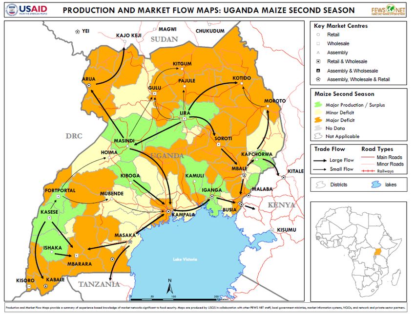
We find that the search platform increases the probability of any trade, the number of traders,

and the volume of trade between treated markets. Prices increase in relative surplus areas that are

treated and (weakly) decrease in relative deficit areas that are treated. As a result, price dispersion

between treated market decreases. Effects are concentrated in local markets, despite evidence that

search costs rise with distance.

   We also find that the platform reduces the profits of incumbent traders. Evidence suggests that

trader markups are squeezed, despite volumes increasing. However, pass-through is incomplete.

Though traders’ sales prices follow the path of market prices, going up in relative surplus areas and

down in relative deficit areas, we see limited evidence of similar effects on the price at which they

purchase from farmers.

   We see that usage of the platform is concentrated among intermediaries; only the largest farmers

find it profitable to use the system. These farmers see significant increases in maize revenues and

quantities sold. The typical farmer in treated areas, however, only benefits from the general equi-

librium effects on prices, and therefore she experiences revenue increases that imprecisely measured

and not statistically significant. Nevertheless, given the large number of people to whom these

gains apply in general equilibrium and the relatively low cost per-person of running the platform,

we find the platform is still cost-effective.

   The rest of the paper is structured as follows: Section 2 discusses the setting and study design.

Section 3 discusses the platform’s effects on market integration, trade flows, and price convergence.

Section 4 and 5 explore impacts on traders and farmers, respectively. Section 6 discusses findings

from other sub-experiments that help to shed light on the mechanisms at play and on other related

trading frictions. Section 7 explores the business case and the welfare case for the marketplace.

Section 8 concludes.

                                                                                                     4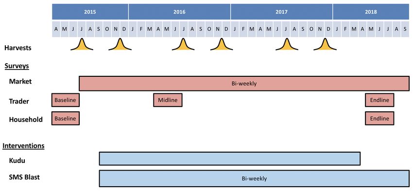
2        Setting and Study Design

2.1       Study Setting

The data collected for the study include market-level outcomes as well as representative samples of

traders and farmers. We identified all permanent trading centers (hereafter referred to as markets)

within the 11 study districts; these 231 markets are located in 110 subcounties, which were the unit

for random assignment of the intervention. Biweekly market surveys, as well as three rounds of

trader surveys and two rounds of farmer surveys provide the data on which our analysis is based.

The experimental protocols are described in Section 2.2 and the details of the data collection in

Section 2.3.

        Market prices for maize, our core study crop, show strong variation both over space and over

time (see Table A.1).2 An East Africa-wide drought saw the price of maize rise from 19 cents per kilo

in September of 2016 to almost 44 cents by the following June, and then fall again to 11 cents by the

end of the study in September 2018. As a result, time fixed effects account for 83% of the variation

in prices. However, we also see strong evidence of meaningful spatial heterogeneity in prices (see

Table A.2). A major driver of this price dispersion observed across markets is transportation costs,

which in Africa are the highest in the world (Teravaninthorn and Raballand, 2009). Transportation

costs cannot, however, explain the full gap in prices observed across markets. Figure 1 presents the

gap observed in prices across each pair of markets in our sample (black solid line). The dotted line

presents the gap we would expect to see if the only factor driving this dispersion were transport

costs, as predicted using self-reported transport costs from our trader surveys.3 While transport
    2
      Maize is the most commonly grown and consumed crop in our study area (and, as we will describe later, was the
crop most commonly traded on the platform). Our market survey also follows beans, another non-perishable staple,
and two perishable crops, tomatoes and bananas (green bananas are steamed and eaten as the most important staple
starch crop in many parts of Uganda). Looking across crops, we see that maize and beans, storable crops with defined
growing seasons, display moderate predictable seasonal variation across years (month-of-year R-squared of about .15
for maize and beans). In contrast, bananas and tomatoes do not have well-defined harvest seasons and display no
seasonality in prices. Instead, the high transport costs associated with these perishable crops can be seen in the
substantial explanatory power of trading center fixed effects. Bananas, being both perishable and heavy, display the
strongest spatial variation in prices.
    3
      Traders reported the costs of traveling one-way along each of their five most commonly travelled routes, and
the vehicle size typically used. From this data, we construct an estimate of per kg transport costs, which we then
estimate as a non-parametric function of the km traveled. This non-parametric estimate is presented in the dotted
line in Figure 1.

                                                                                                                  5
costs explain a majority of the observed price dispersion at longer distances, they do little to explain
the substantial price gaps across nearby markets. The intervention studied in this paper seeks to
work in the space between the transport-driven dispersion and the actual, much higher price gaps
observed across the markets in our study.
Figure 1: Price Differentials and Transport Costs. The y-axis presents the absolute difference
in prices across each market dyad (pair) in the sample. The solid black line presents the gap
observed in prices across each pair of markets in our sample. The dotted line presents the gap
we would expect to see if the only factor driving this dispersion were transport costs, as predicted
using self-reported transport costs from our trader surveys. To generate this prediction, we asked
surveyed traders to report the costs of traveling one-way along each of their five most commonly
travelled routes and the vehicle size typically used. From this data, we construct an estimate of
per kg transport costs, which we then estimate as a non-parametric function of the km traveled.
The gray area represents the portion fo price dispersion that cannot be explained by transportation
costs.
The average market in our study has 11 traders, with a sharp distinction between “hubs” (the 19
regional or district trading centers, which have an average of 36 traders per market) versus “spokes”
(the remaining 213 more rural TCs, with an average of nine). Churn among traders is low, with the
median market seeing a little over one new and one exiting trader per year, though a few markets
see a large amount of entry, such that the average number of traders per market increases from nine
6at baseline to over 12 at endline. Traders appear to work with large margins; at baseline traders
bought maize at an average of 12.7 cents/kilo and sold at 16.4 cents/kilo, a nominal markup of
29%. From baseline monthly revenues of $2,243, traders report an average monthly profit of $297.4
By comparison, average total monthly household expenditure in our farmer sample is $65.
Given the complex price dynamics in these markets, traders and farmers operate in an information-
hungry market environment. 84% of traders report at baseline that they would expand into new
markets if they had the information to do so (placing it second behind credit, and ahead of per-
sonal connections, buyer contacts, and risk as a self-reported barrier to expansion). Mobile phone
calls are the dominant form of price discovery. The average trader reports attempting 23 purchase
transactions a week by phone, of which 16 are successful, but only four attempts (of which three are
successful) to make a purchase by visiting a seller without prior information. The overall number
of sales is lower, but similarly dominated by transactions arranged over the phone; six successful
phone-initiated sales per week versus one from traveling without prior information. Only 2% of
our traders report no purchases initiated by phone calls. At baseline almost a half of traders were
using radio broadcasts as a price discovery tool, and a tenth were using any kind of SMS service.
Therefore, traders are partially informed, with access to some search technologies, but with demand
and scope for additional market information and connections.
Farmers are less well-informed than traders. In the endline control sample, only 7% of farmers
report discovering prices through radio broadcasts, and 2% through SMS. The platform studied
here attempts to bridge this gap directly taking price information and new trading opportunities
directly to rural traders. The aim is to reduce search costs in these markets, promote trade, reduce
price gaps, and – ultimately – improve farmer welfare.
2.2 Intervention Design and Randomization
We conducted a cluster-randomized RCT covers that operated in the field for three years. We began
the study selection process by identifying 11 districts of Uganda that our implementing partners
selected as promising districts for the platform roll-out. These 11 districts are surplus producers
4
Consistent with these figures, Bergquist and Dinerstein (Forthcoming) estimate that the median trader in their
sample in Kenya retains 12% of total revenues in profits.
7of maize, have strong potential for commercialization, and yet are not immediately proximate to
Kampala or the other major trading centers of the country (see Figure B.1 for a map from FEWS-
NET of surplus maize areas in Uganda presented alongside a map of the 11 study districts).5
We then listed all markets that were permanent (e.g. not meeting only on specific days of the
week) and featured both buying and selling of maize (as opposed to wet markets where fruits
and vegetables are only sold). This process identified 236 trading centers, hereafter referred to as
markets. Markets were classified as “hubs” (major local commercial centers that are centers for
aggregation and transshipment) and “spokes” (more remote local markets that typically trade with
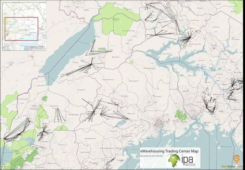
the outside world only through a hub). See Figure B.2 for a map of the hub-and-spoke structure
of the study.
The multi-dimensional intervention used technology to provide farmers and traders with novel
ways to understand prices and gain access to new markets. The heart of this was a platform
called Kudu, developed at Kampala’s Makerere University. The goal of Kudu is to provide a novel
means for producers to reach the market, reducing search costs and potentially circumnavigating
intermediaries who may exploit search-based market power to depress farmgate prices. Users
can post asks (sale offers) and bids (purchase offers) onto Kudu either using a smartphone or by
registering their location and then using a basic feature phone to send text messages to the platform.
A call-center also collects asks and bids by phone. Based on the price, quantity, and location of the
buyer and seller, the system then matches supply to demand each day to find the Pareto-optimal
set of sellers for each buyer.6
To deploy Kudu, we worked with AgriNet, a private sector agribusiness firm, to employ and
train 210 Commission Agents (CAs) to serve as the on-the-ground agents of the project, promoting
the mobile marketplace. Farmers and CAs could either post to Kudu through an AgriNet agent, or
they could engage independently on the platform. In practice, almost all farmers who sold on the
platform did so directly, rather than engaging in AgriNet brokered deals. Similarly, CAs, who were
5
These districts are Apac, Budaka, Butaleja, Dokolo, Hoima, Iganga, Kamwenge, Kasese, Masaka, Mubende, and
Oyam.
6
The algorithm is designed for both buyers and sellers to post their “reservation price.” However, in practice,
qualitative interview suggest that buyers and sellers post prices that reflected strategic price offers, much in the way
that one would typically make offers in more traditional, in-person negotiations.
8recruited from pools of existing traders in the area, operated almost exclusively as independent
traders on Kudu. CAs were also not reliable promoters of Kudu, and the project ultimately hired
salaried staff, not drawn from the local trader population, to promote the platform.
Once bids and asks were posted to the platform, there were two processes by which buyers
and sellers could be matched. First was the Kudu algorithm that cleared the market each day,
attempting to maximize the Pareto surplus from matches by crop, using a penalty function de-
creasing in the price difference between the bid and ask and increasing in distance.7 Second was a
hand-matching process conducted by employees who could view a dashboard of the business on the
platform and attempt to match trades manually.8 The hand-matching process proved dominant
in the overall operation of the platform, accounting for 80% of all matches conducted on the plat-
form. Hand-matched trades also had a higher success rate in translating matches into completed
transactions, 9.2% versus 1.1% for the algorithm-matched bids and asks.
This core intervention (Kudu and AgriNet CAs) was randomly assigned at the subcounty level.
In order to create a 2x2 design at the spoke level (is the spoke treated, is the hub treated) we
blocked the design by whether the sub-county contains a hub (17%) or not (83%), and we stratified
by a sub-county level price index (mean of the z-scores of the prices of each of our four crops at the
trading centers in each sub-county). This generated a design in which half of the hubs are treated
and half are not, but with random variation in the fraction of spokes for each hub that are treated.
In total, this design results in 55 treated subcounties with 10 treated hubs and 115 treated spokes.
We also set up and ran a system to distribute high-frequency price information to both sides of
the market for three years in treatment villages. Our “SMS Blast” system sent out market price
information on the four crops study crops every two weeks to treatment traders, CAs, and farmers,
as well as to all buyers registered on Kudu, regardless of location. All treatment traders and CAs
were included in the Blast system, as well as a randomly selected two-thirds of the treatment farmer
7
For more technical details on the Kudu platform, see Newman et al. (2018).
8
Hand-matching was conducted by three AgriNet employees. When possible, they were asked to broker commis-
sioned trade for AgriNet, and were explicitly permitted to favor AgriNet CAs and priority buyers to promote the
commercial viability of the platform for AgriNet. However, it was often not possible to broker a commissioned trade
for AgriNet, and therefore the majority of hand-matched trades were direct exchanges between the Kudu buyer and
seller.
9households in the study.9 Four core types of information were contained in the Blast system. First,
a “Downstream Blast” gave each market participant price information for his or her respective
local market, hub, and superhub. Second, a “Random Blast” randomly sampled five treatment
TCs each week and circulated price information on these markets to the entire treatment set of
CAs, traders, and buyers. The purpose of this was to give a statistically high-powered estimate of
whether prices in a given market change when traders all over the country know about that market
in that week. Third, there was promotional information for Kudu; this included an advertisement
and information on how to trade on the platform, either by registering directly on Kudu or by
contacting their local CA, whose contact information was provided. The Blast system sent more
than 25,000 SMS message a month and represents one of the largest experimental efforts to provide
market price information; the farmer-level randomization allows us to understand the causal effect
of the Blast system on the supply side of the market.
2.3 Survey Sampling and Timeline
The intervention ran for three years, starting in 2015 and concluding in 2018. This time period
spans six major agricultural seasons. Figure B.3 presents a timeline for the project, and Figure B.4
provides a CONSORT diagram of study recruitment and attrition for each type of data.
We collect three core types of data for this project, using the 236 markets in our study as
the primary sampling units. The first of these datasets is a high-frequency market survey. This
survey gathered information in each market every two weeks by calling a key market informant,
typically a trader whose store was based in the market. We collected data on the buying and
selling price, availability, and average quality of four major food crops (maize, nambale beans,
matooke bananas, and tomatoes). We also surveyed 20 hub markets in adjacent, non-study districts
to provide an additional measure of potential spillover effects, as well as in the four ‘super-hub’
markets of Uganda.10 The total number of markets reporting the biweekly Market Survey is thus
260, of which 236 form the core experimental sample. The market survey was collected for the
9
This randomization was conducted at the household level, blocked on subcounty.
10
These super hubs are the capital, Kampala, plus three border markets that trade grain with neighboring countries:
Kabale on the border with Rwanda, Busia on the border with Kenya, and Arua which trades to the DRC and South
Sudan.
10three years during which the intervention ran.
The second dataset collected is a survey of traders in each study market. We first conducted a
census of traders who were based in that market and who bought and sold at least one study crop.
For markets that had fewer than 10 traders identified in the census, we surveyed all traders; for
markets with more than this, we randomly sampled 10 traders. These traders were administered
a baseline survey in 2015, prior to the initiation of any treatment, a midline survey in 2016 after
one year of treatment, and an endline in 2018 after three years of treatment. The trader analysis
is weighted to make it representative of all traders in study markets.
Finally, to understand the impact of the platform on farmers, we drew in a sample of agricultural
households. We first listed all villages located in the sub-county.11 We then selected the village
containing the market (which are typically more urban) and randomly sampled one of the remaining
villages within the same parish (which tend to be more rural). For these two villages, we then listed
all the households based on administrative records held by the village chairperson, and randomly
sampled households from these lists. We randomly sampled 8-9 farming households located within
each village containing the market and another 4 in each rural village that does not contain the
market. We imposed two eligibility criteria: (i) the household had to be engaged in agriculture,
and (ii) the household had to have sold some quantity of any of the four crops included in the
study in the previous year. Study households completed a baseline in 2015 and an endline survey
in 2018 covering agricultural activities, farmgate prices, and marketed surpluses. Farmer analysis
is weighted to make it representative of all farming households in sampled study LC1s.
2.4 Attrition and Balance
We now present the attrition and balance for each of the three types of data captured in the study:
the market surveys, the trader surveys, and the household surveys. In total, we have 88% of the
attempted (market x survey round) observations, but 13% of markets in both the treatment and
the control groups answer fewer than 75% of the market survey waves they were supposed to.12 For
11
In Uganda, these villages are called Local Council 1, or LC1s.
12
As a robustness check for attrition, we present appendix tables that show the main market survey data using
interpolation; given the long panel (83 rounds of market surveys) and the highly interspersed nature of the missing
observations this provides a reasonable check on the extent to which market survey attrition may influence our results.
11the trader midline, we were able to survey 1,358 of the 1,457 baseline traders (93.2%). For both the
trader and household endlines, we ran standard panel tracking, and then conducted an intensive
tracking exercise that attempted to follow up with a random sample of attritors. The trader
endline originally located 1,248 traders (85.7%), after which we randomly sampled 20% of attritors
(41 individuals) for intensive tracking, and successfully located 37 of these (92.7%). The weighted
tracking rate in the trader endline is therefore 98.6%. The household endline originally located
2,744 of the 2,971 baseline respondents, and we then randomly sampled 17% or 39 households for
intensive tracking. 31 of these households were successfully intensively tracked (79.5%), giving us
a weighted household tracking rate of 98.7%.
Appendix Figure B.5 and Tables A.3 and A.4 present tests comparing attrition in the treatment
to the control across the three data types. Among all the tests that we conduct only the intensive
tracking rate in the trader survey appears differential, and given that this arises from finding 14 out
of 14 control versus than 24 out of 27 treatment traders in the intensive tracking, this has relatively
little influence on study-level effects. Overall, weighted attrition rates are very low and the overall
unweighted attrition rate from the combination standard and intensive tracking is similar across
treatment arms for all data types.
Table A.5 examines the balance of the market survey for the two main study crops (maize and
beans) and the core variables in the market surveys (buying and selling price, number of traders,
and quality measured on a 1-3 scale). Table A.6 uses the market survey data in dyadic form and
examines the baseline balance of the experiment on price dispersion within dyads. The experiment
is well balanced at the market level. For the trader and household analysis, balance is analyzed
using the sample still present at endline and is weighted using the attrition weights so as to mirror
the structure of the outcome analysis. Table A.7 analyzes the baseline attributes of traders across
seventeen different attributes and finds no evidence of baseline imbalance. Table A.8 conducts the
same exercise for households, finding two out of seventeen outcomes significantly different at the
10% level and one at the 5% level, in line with what we would expect by random chance. We
therefore proceed to the analysis section with confidence that the study is both representative and
well-balanced.
122.5 Platform Usage
Over the three years that the Kudu platform was operational as a part of this project, it received
23,736 unique asks and 30,499 unique bids. Maize accounts for 67% of asks on the platform, though
19 total crops were successfully traded, with the next most common being soya, rice, and beans.
Among those posting bids to buy on the Kudu system, 48% were study traders and 11% were
AgriNet CAs. For those posting asks to sell, the corresponding percentages are 45% and 14% for
study traders and CAs, and 6% of sellers are study farmers. 80% of treated traders and 24% of
treated households posted to the platform at least once. Despite this heavy participation on the
platform from study subjects, we still see 58% of bids and 55% of asks emanating from outside the
study sample altogether, providing an initial suggestion that the study may have the potential to
move market-level outcomes. Figure B.6 shows the smoothed quantity of new bids and asks posted
on the platform per day, with supply climbing steadily through the first year to reach a steady
maximum of about 200 tons per day, and demand following a similar time path to reach average
levels about twice demand.13 Figure B.7 shows the spatial distribution of asks, indicating study
market centers across the country posting upwards of 1,000 asks each.
Subsequent to a Kudu match, the buyer was contacted by SMS and informed that the match
had occurred, along with the contact information of the seller. The fully disintermediated version
of trade would then be that the buyer directly contacts the seller and arranges for a sale, which
occurred very rarely in our study. More common was that a project employee would hand match a
buyer and seller, and then reach out by phone to both to inform them about the match and gauge
their interest in the deal. The manual matching process could also deal with failed matches in a
flexible way (moving on immediately to the next counterparty), while the Kudu algorithm required
them to go back into the matching pool for the next iteration.
Kudu instructs buyers to post their reservation bid prices and sellers to post their reservation
ask prices. It was therefore assumed at the launch of the platform that there would be a sizable
gap between the two, ideally substantial enough for the platform to broker trades with comfortable
13
Standing up supply and demand simultaneous was an issue at inception of the project; an initial surge of asks
from farmers in the first season overwhelmed demand, but then a drive to recruit buyers on to the platform was
highly successful and for the remainder of the project the total demand on the platform exceeded supply.
13margins for all parties, such it could eventually charge commissions in order to make the platform
self-sustaining financially. However, in practice, this rarely happened. Qualitative interview suggest
that sellers often posted prices that reflected strategic price offers, fishing for higher prices, much
in the way that one would typically make offers in more traditional, in-person negotiations. In fact,
sellers often posted prices that were not only higher than their local market price, but even in excess
of what was being paid in hubs or superhubs. As a result, ask prices were on average substantially
above bid prices. 14 Buyers’ average bid prices, on the other hand, track hub market prices very
well. Figure B.8 plots these values over time for maize, and Figure B.9 provides a box-and-whisker
plot of bid and ask prices within each season, in which we can see that the median bid price is
typically at or below the 25th percentile of ask prices
Nonetheless, about 7,300 tons of grain were successfully transacted, worth about $2.3 million
USD. 22% of treated traders and 2% of treated households successfully traded on the platform.
Figure B.10 shows the cumulative sales over the platform during the duration of the study.
3 Market Integration
We now turn the impacts of the platform. We first explore the effects on market integration and
trade flows. Figure 2 presents impacts of the platform on several outcomes: whether any trade is
occurring between subcounties, the number of traders engaged in trade between subcounties, the
volume of trade flowing between subcounties, and price dispersion between markets. The first three
of these outcomes is drawn from our panel survey of traders, in which we asked detailed questions
about their trading behavior at the subcounty level (the level of randomization). The last is drawn
from our market-level price surveys and is therefore at the market dyad level. Within these dyads,
we analyze the experiment using indicator variables for dyads in which both markets are treated
and dyads in which one market is treated, using no-treatment dyads as the control. Figure 2
presents Fan regressions of each outcome on the distance between the pair, estimated separately
for our three treatment groups. Distance is measured as the road distance of the shortest route
14
In recognition of this, Kudu developed a feedback system that sent a message back to unmatched sellers stating
“You would have had to ask for X price in order to match on Kudu.” However, this failed to align prices, as average
ask prices remained above bids the for the duration of the study.
14Figure 2: Effects on trade linkages, number of traders, and trade volumes, and price dispersion
by distance.
connecting the two.
Before examining treatment effects, we first note some important patterns observed among
our control-only pairs. In the upper left panel, we see that while the probability of any trade is
high for nearby subcounties, this diminishes rapidly with distance. The probability of any trade
occurring between the subcounties is close to zero beyond 200km distance. Consistent with this, the
number of traders (upper right panel) and total trade volumes (lower left panel) also falls quickly
with distance.15 These increasing trade costs with distance lead to notably higher price dispersion
between markets located at further distances, as shown in the bottom right panel.
15
It is important to note that our study traders are those who live in study markets, and hence are likely involved
in more localized forms of trade. It is possible that there is more long-distance trade directly connecting our study
markets than we find among our traders, but it is being conducted by large-scale traders who live in major cities and
hence were not sampled into our survey.
15What is the effect of introducing a mobile clearinghouse? In Figure 2, we see increases in the
probability of any trade occurring, the number of traders engaged in trade between subcounties,
and the volume of trade flowing between subcounties. We also see a drop in price dispersion. These
effects are more pronounced when both subcounties (or markets) are treated than when just one
subcounty (or market) is treated.
Table 1 presents these results in regression form, running the following specification:
Ydr = α + β1 T 1d + β2 T 2d + β3 Dd + εdr (1)
Here, Ydr is the outcome of interest in subcounty or market dyad d in round r, pooling all
post-treatment survey rounds in the same analysis. For the first three columns, the outcome of
interest is whether any trade is reported, the number of traders trading, and the volume of trade
flowing between subcounty dyads, as reported by traders in the traders midline and endline. In
the fourth column, the outcome is the inverse hyperbolic sine transformation of the absolute value
of the gap between prices across each possible market dyad (d) in round (r), which is two-week
intervals as measured in the market survey. These outcomes are regressed on T 1d , a dummy for
one subcounty or market in the dyad being treated, T 2d , a dummy for both being treated, and Dd ,
a measure of the shortest road distance between dyads. Standard errors are clustered two-way by
each subcounty (the unit of randomization).16
16
Dyads in the same subcounty are dropped both here and in Figure 2, as they mechanically have the same
treatment status.
16Table 1: Effects on trade linkages, number of traders, and trade volumes, and price
dispersion
Any Trade Number Traders Volume (tons) Price Dispersion
One treated 0.01 0.07∗ 2.47 -0.05∗
(0.01) (0.04) (1.75) (0.03)
Both treated 0.02 0.09 4.29∗ -0.09
(0.01) (0.07) (2.38) (0.07)
Dist (10km) -0.00∗∗∗ -0.02∗∗∗ -0.53∗∗∗ 0.01∗∗∗
(0.00) (0.00) (0.13) (0.00)
Observations 11664 11236 11664 1443397
Mean DV 0.05 0.22 4.90 4.56
Again, we see increases in the probability of trade occurring (albeit not significantly so), in-
creases in the number of traders operating between subcounties (significant for one-treated; not
quite significant for both treated); increases in trade volumes (significant for both), and reductions
in price dispersion (significant for one-treated; not significant for both treated).17
Returning to Figure 2, we also note a striking pattern by distance. Treatment effects are strongly
concentrated among nearby subcounties and markets. In fact, we see almost no treatment effect
beyond 200km, the point at which the probability of trade drops close to zero (the exception to
this is price dispersion, which continues to drop in our treated market pairs beyond 200km – albeit
at a slower rate – due to transitive convergence).
Table 2 explores this further, estimating Equation 1 separately for subcounty (or market) pairs
above and below the median distance observed in our sample (282 km). We again see that treatment
effects for all outcomes are concentrated in nearby subcounties and markets.
17
Note the number of pairs in which both members of the pair are treated is lower than those in which one is
treated, which may explain the difference in power between the estimated treatment effects for each group.
17Table 2: Effects on trade linkages, number of traders, and trade volumes, and price
dispersion by distance
Below Mean Above Mean
Any Trade Num Traders Vol (tons) Price Disp Any Trade Num Traders Vol (tons) Price Disp
∗∗ ∗∗
One treated 0.01 0.19 5.83 -0.08 -0.00 -0.00 0.04 -0.03
(0.01) (0.09) (4.29) (0.04) (0.00) (0.00) (0.14) (0.03)
Both treated 0.05∗∗ 0.24∗ 11.27∗ -0.16∗ 0.00 0.00 -0.03 -0.05
(0.02) (0.14) (5.76) (0.09) (0.00) (0.01) (0.12) (0.08)
Dist (10km) -0.02∗∗∗ -0.10∗∗∗ -2.27∗∗∗ 0.02∗∗∗ -0.00∗ -0.00∗ -0.01∗ 0.01∗∗∗
(0.00) (0.01) (0.57) (0.00) (0.00) (0.00) (0.00) (0.00)
Observations 4443 4270 4443 559270 7221 6966 7221 884127
Mean DV 0.13 0.58 12.58 4.31 0.01 0.01 0.17 4.71
The platform is therefore quite successful in generating additional trade between relatively
localized areas. However, it falls short of the often-touted promise of such online marketplaces
to connect physically distant markets and directly link remotely-located farmers with urban con-
sumers. While perhaps initially surprising, this pattern of large effects over the shortest distances
is consistent with Figure 1, which shows that very little of the existing price dispersion at short
distances is explained by transport costs. Given the ubiquity of mobile phones even in the con-
trol group, it is likely that the very large price gaps necessary to motivate long-distance trade are
already arbitraged away, meaning that the more marginal trading opportunities uncovered by our
system are only able to clear the pecuniary costs to trade over shorter distances.
3.1 Unpacking price convergence
What is driving the observed price convergence? Figure 3 presents treatment effects on price levels
in relative surplus vs. relative deficit areas, as measured by average marketed surplus per farmer
at baseline. First, we note in the lefthand panel that, as expected, prices in the control group are
higher in relative deficit areas and lower in relative surplus areas. However, we see a less steep
relationship in the treatment group, as treatment lowers prices in relative deficit area and raises
prices in relative surplus areas. The righthand panel presents this treatment effect, along with
the 90% and 95% confidence intervals. We see that prices are weakly lower in deficit areas and
statistically significantly higher in surplus areas.
18Figure 3: Effects on price levels by relative surplus vs. deficit areas. The left panel shows the level
of prices in treatment vs. control treatment centers, with respect to the average market surplus per farmer,
as measure in tonnes at baseline. The right panel shows the difference between the two (the treatment
effect), along with the 90% and 95% confidence intervals from a bootstrap estimation.
900
100
1.5
Control Treatment Pt Est 95% CI 90% CI Density
Treatment - Control Price
50
850
1
Density
Price
0
800
.5
-50
-100
750
0
0 .5 1 1.5 2 2.5 0 .5 1 1.5 2 2.5
Baseline marketed surplus Baseline marketed surplus
19Table 3 presents similar results in regression form. We see in Column 1 that the overall effect
on price levels is a statistical zero. This is consistent with the netting out of two competing effects
seen in the previous figure (the density in the right-hand panel of Figure 3 shows that for the
median trading center, the average price effect is roughly zero). Column 2 presents heterogeneity
by baseline average marketed surplus. We again see that prices are weakly lower in relative deficit
areas (as evidenced by the negative coefficient on the treatment term) and higher in relative surplus
areas (as evidenced by the significant and positive coefficient on the interaction term). With an
average baseline marketed surplus of about 1 tonne, these effects almost exactly offset each other
for the median market. Column 3 divides our sample into areas of relative surplus and deficit, with
the cutoff defined by being above or below 1 tonne.18 . First, we note that prices are significantly
lower in surplus areas overall, as expected. Second, we see that, with the introduction of Kudu,
these surplus area experience significantly higher prices than they would have otherwise, while
deficit areas experience weakly lower prices.
Table 3: Effects on price levels by relative surplus vs. deficit areas
(1) (2) (3) (4)
Treatment -4.801 -20.78 -11.58
(11.56) (16.40) (13.74)
Baseline marketed surplus -28.66∗∗∗
(7.716)
Treat*Baseline marketed surplus 19.23∗
(9.995)
Surplus -48.60∗∗∗ -47.88∗∗∗
(9.868) (9.834)
Treat*Surplus 29.39∗ 17.81∗
(15.10) (9.369)
Treat*Deficit -10.26
(13.62)
Observations 15211 15161 15211 15211
Mean DV 831.6 831.6 831.6 831.6
Mean Baseline Marketed Surplus 0.907
Percent Surplus 0.275 0.275
P-Val Treat*Deficit=Treat*Surplus 0.0640
R2 0.844 0.847 0.847 0.847
18
In addition to being roughly the mean surplus level, this is also the empirically-driven definition of surplus vs.
deficit, as this is where treatment effects cross zero in Figure 3, suggesting that areas below this cutoff saw inflows
and higher prices, while areas above saw outflows and lower prices.
20In terms of impacts on average outcomes in study markets, our intervention has no detectable
effects. Buying and selling prices, the trading margins within a market, and the number of traders
in treatment markets all remain comparable to control markets. These results are presented in
Table A.9. Hence, while the intervention had meaningful effects on price dispersion among nearby
market dyads, it led to no average shift in market-level outcomes.
4 Trader Effects
We now turn to our trader surveys to unpack how the platform affected intermediaries. We have
already seen in the previous section that the platform encouraged greater intermediary activity in
treated subcounties and markets. Here, we explore in greater detail trader take-up of the platform
and effects on their businesses.
Table 4 presents trader take-up results. We see that, by the endline survey, 91% of treated
traders report having heard of Kudu, while only 32% of control traders have heard of the platform.
Therefore, while Kudu was not restricted to be operational only in treated areas, we do see a
significant and large difference in awareness of the platform generated by our encouragement design.
We also observe a 42 percentage point increase in the likelihood of receiving any price information
via SMS (from any source).
However, in terms of knowledge of prices, we do not see a substantial treatment effect. We ask
traders to report their best guess of the current market price in their local market, their hub market,
and their superhub market, which we then compare the the actual price as measured by our market
surveys. We call the absolute value of the gap the “error” in price knowledge. Although traders’
knowledge of nearby local and hub markets is slightly better than their knowledge of superhub
prices, we see no differences between treatment and control traders in knowledge for any market
type. This may be because knowledge in our control is already quite high, as demonstrated by the
relatively small error size.
We do, however, see strong treatment effects in terms of self-reported impacts on negotiations,
both with farmers from whom traders buy and with buyers to whom they sell. Treated traders
are more likely to report that they are aware of farmers and buyers receiving price information via
21SMS. They are also more likely to state that this information changed how they negotiated with
their trading partner.
Finally, in terms of Kudu take-up, 80% of treated traders used Kudu (meaning they placed an
ask or a bid), while 22% successfully completed a deal on the platform. In comparison, only 12%
of control traders tried Kudu, and only 3% successfully completed a transaction.
Table 4: Trader take-up
Treat Control Obs T-C
diff p-val
Heard of Kudu 0.91 0.32 1,281 0.59 0.00
Received SMS price info 0.86 0.44 1,281 0.42 0.00
Ever used Kudu 0.80 0.16 1,457 0.65 0.00
Completed deal on Kudu 0.22 0.03 1,457 0.19 0.00
Local market price (abs error) 90 82 1,277 8 0.39
Hub market price (abs error) 83 90 1,270 -7 0.47
Superhub price (abs error) 117 125 1,248 -9 0.96
Aware farmers receive SMS price info 0.26 0.08 1,281 0.18 0.00
Aware buyers receive SMS price info 0.42 0.13 1,281 0.28 0.00
Farmer info changed negotiations 0.16 0.05 1,281 0.10 0.00
Buyer info changed negotiations 0.22 0.09 1,281 0.13 0.00
Table 5 presents effects on trader profits, volumes traded, markups, and prices.19 The main
specification pools the post-treatment survey rounds and runs:
Yir = α + βT reati + γYi0 + δr + Xi + εdr (2)
In which Yit is outcome Y for trader i in round r (either midline or endline), T reati is a dummy
for being a treated trader, Yi0 is the baseline level of the outcome variable, δr is a dummy for survey
round, and Xi is a vector of controls.20 Treatment effects are given by the coefficient β.
19
Since X% of sample is comprised of maize traders, for variables for which we must specify the crop – i.e. volumes,
markups, and prices – we present result for maize.
20
Our pre-analysis plan specified that we would include baseline controls that are most predictive of the outcome.
We do this by identifying controls to include via a double lasso procedure, set to predict endline profits, our main
trader outcome. Those covariates considered were: gender, age, education, length of time in business, number of
subcounties in which purchase, number of subcounties in which sell, profits, net revenues, annual costs, annual
revenue, monthly costs, and markups, quantities purchased and sold, prices at which purchased and sold, revenue,
22By reducing search costs and encouraging traders to enter into new markets, mobile market-
places like Kudu have often been promoted as fostering greater competition among intermediaries.
Indeed, we do see that traders located in treated subcounties see a significant reduction in profits,
by about 14% of their average value (Column 1). This appears to come mainly from a reduction
in markups; point estimates suggest a reduction of about 8%, though this effect is measured with
imprecision and is not significant (Column 3). Volumes traded appear to increase, perhaps sizably,
though again, this point estimate is not significant (Column 2).
Columns 4-5 present effects on the price at which traders sell maize, while Columns 6-7 present
treatment effects on the price at which traders purchase maize. Similar to results presented in
Table 3, we see no significant effects on the level of prices (Columns 4 and 6). However, looking
at heterogeneity by relative deficit and surplus areas (as proxied by baseline marketed surplus), we
see that in relative deficit areas (those with low baseline marketed surplus, where prices tend to be
high), treatment results in trader sale prices that are significantly lower (Column 5). Conversely,
in areas that are relative deficit (those with high baseline marketed surplus, where prices tend to
be low), we observe that treated traders sell at higher prices. We see similar, albeit slightly muted,
effects for the trader purchase price in Column 7. We will return later to discuss the relative
magnitudes of the sale vs. purchase price treatment effects.
Table 5: Effects on trader profits, volumes, markups, and prices
Profits (’000) Tons Traded Markups Sell Price Buy Price
Treat -1025.1∗ 133.2 -10.6 -10.4 -25.5∗ -3.4 -14.7
(555.5) (106.3) (9.3) (10.0) (13.9) (8.4) (11.7)
Baseline marketed surplus -18.0∗∗ 0.6
(7.0) (6.4)
Treat*Baseline marketed surplus 15.0∗ 10.5
(8.9) (6.8)
Observations 2592 2370 2268 2295 2295 2282 2282
Mean DV 7279 243 135 735 735 602 602
Mean Baseline Marketed Surplus 1.00 1.00
R2 0.12 0.04 0.06 0.06 0.07 0.02 0.03
Controls Yes Yes Yes Yes Yes Yes Yes
net revenue, and cost per kg for maize and beans, all as measured at baseline. Those selected by the lasso procedures
and therefore included in Xi are: baseline profits, baseline annual costs, and baseline monthly costs.
23Finally, we explore treatment effects based on baseline heterogeneity. Figure 4 presents treat-
ment effects on profits, markups, and trade volumes based on their baseline levels (as measured in
the baseline survey). The top panels plot Fan regression estimates of the outcome at endline on
baseline levels separately by treatment and control, while the bottom panel presents the difference
(i.e. the treatment effect), along with the 90% and 95% confidence intervals. Density in the baseline
measure is presented in red.
While the negative effects on profits and positive effects on volumes traded appear fairly con-
sistent across their baseline distribution, we do interestingly see that markups are higher among
treated traders at the low end of the baseline markup distribution and lower among treated traders
at the high end of the baseline markup distribution. These estimates therefore suggest that the
introduction of the mobile marketplaces appears to lead to convergence in markups, helping low
markup traders and harming high markup traders.
24Figure 4: Heterogeneous effects on trader profits, markups, and volumes by baseline
levels
Profits ('000 UGX) Markups, Maize (UGX) Tons Traded, Maize
20000
200
200
Markups, Maize (UGX)
180
Tons Traded, Maize
150
Profits ('000 UGX)
15000
160
100
140
10000
120
50
100
5000
0
0 5000 10000 15000 20000 25000 -200 0 200 400 0 100 200 300 400 500
Control Treat Control Treat Control Treat
Profits ('000 UGX) Markups, Maize (UGX) Tons Traded, Maize
.00015
150
100
.01
.005
5000
.008
100
.004
50
.0001
.006
0
.003
50
Density
Density
Density
T-C
T-C
T-C
0
.004
.002
0
.00005
-5000
-50
.002
.001
-50
-10000
-100
-100
0
0
0
0 5000 10000 15000 20000 25000 -200 0 200 400 0 100 200 300 400 500
Pt Est 95% CI 90% CI Pt Est 95% CI 90% CI Pt Est 95% CI 90% CI
255 Farmer Effects
We have seen thus far that the introduction of a mobile clearinghouse platform induces greater
market integration and lowers intermediaries’ profits. These results are often seen as stepping
stones along a causal chain ending in the ultimate goal of improving the welfare of smallholder
farmer. We turn now to effects of the platform on farmers.
First, we explore measures of awareness and take-up of the platform among farmers. Table
6 presents these results. We see that 52% percent of farmers in treated subcounties have heard
of Kudu, compared to only 12% in control subcounties. Similarly, 55% of treated farmers have
received price information via some form of an SMS-based platform, compared to only 16% of
control farmers.
Next, we explore impacts on price knowledge. We first note that overall price knowledge is
lower among farmers than among traders, with error rates that are 42-84% higher than observed
among traders. This is consistent with the presence of information asymmetries between farmers
and traders. Similar to those of traders, farmers’ error rates grow with distance. In contrast to
traders, however, we do find some suggestive evidence that information to farmers improves their
knowledge of prices; errors rates are smaller among treated farmers than among control farmers,
albeit not quite significantly so (with p-values ranging from 0.12 to 0.16). 23% of farmers in treated
subcounties report using price information received via SMS when negotiating prices in the past
year, compared to only 1% in control subcounties.
Turning to take-up of Kudu itself, we see that 24% of treated farmers have ever used Kudu
(meaning placing an ask or bid), compared to 1% of control farmers. However, the success rate for
study farmers managing to transact on Kudu is relatively low; only 2% of treated farmers completed
a transaction on Kudu. Though this rate is significantly higher than the 0% observed in the control
group, this low adoption of Kudu is notable, and suggests that farmers either see low benefits or
high barriers to adoption of the platform. We will explore determinants of adoption below.
26Table 6: Farmer take-up
Treat Control Obs T-C
diff p-val
Heard of Kudu 0.52 0.12 2,707 0.40 0.00
Received SMS price info 0.55 0.16 2,774 0.39 0.00
Ever used Kudu 0.24 0.01 2,775 0.24 0.00
Completed deal on Kudu 0.02 0.00 2,775 0.02 0.00
Local market price (abs error) 108 117 2,761 -8 0.12
Hub market price (abs error) 122 125 2,671 -3 0.15
Superhub price (abs error) 214 230 2,491 -17 0.16
Used SMS price info when negotiating price 0.23 0.08 2,774 0.15 0.00
We turn now to effects on farmer revenue, volumes sold, and prices. We run the following
specification in Columns 1, 3, 5, and 7:
Yi = α + βT reati + γYi0 + Xi + εi (3)
In which Yi is outcome Y for farmer i at endline, T reati is a dummy for being a treated farmer,
Yi0 is the baseline level of the outcome variable, and Xi is a vector of controls.21 Treatment effects
are given by the coefficient β.
Table 7 presents results. We see no statistically significant effect on total revenues, maize
revenues, maize volumes sold, or price received for maize sold. Point estimates are positive and,
in some cases, quite large (for example, the point estimate on total revenues is 9.7% of average
revenue), but estimates are imprecise.
Our pre-analysis plan specified that we would analyze heterogeneity in treatment effects by
propensity to use Kudu. To do so, we first model the likelihood of adopting Kudu as a probit
function of the controls used in Equation 3, estimated for the treatment group only. We then
21
Our pre-analysis plan specified that we would include baseline controls that are most predictive of the outcome.
We do this by identifying controls to include via a double lasso procedure, set to predict endline total revenue, our
main farmer outcome. Those covariates considered were: gender, age, high level of educational attainment, number of
household members, revenues, quantity sold, land holdings size, quantity harvested, number of times told, any sales
at the market, percent sold to market, distance to market, distance to Kampala, total value of all assets, expenditures
in the last 30 days, food expenditure in the past 30 days, value of inputs used in the last year, all as measured at
baseline. Those selected by the lasso procedures and therefore included in Xi are: baseline revenues, baseline quantity
sold, and baseline value of inputs used in the last year.
27You can also read