Singapore School Crests - The Stories Behind the Symbols - THE SINGAPORE - Singapore Memory Portal
←
→
Page content transcription
If your browser does not render page correctly, please read the page content below
THE SINGAPORE   MEMORY PROJECT

 Singapore
 School
 Crests
 The Stories
 Behind the Symbols

THE SINGAPORE   MEMORY PROJECT
THE SINGAPORE                    MEMORY PROJECT

All rights reserved National Library Board,
Singapore (NLB) 2013                                 INTRODUCTION                              03
Text by: Justin Zhuang
Design by: Somewhere Else                            SECTION A
Photos by: Jovian Lim
                                                     SCHOOLS OF ART
Published by:                                        (i) COLONIAL HERALDRY
National Library Board, Singapore
                                                     (ii) CHINESE PATRIOTISM
100 Victoria Street
#14-01 National Library Building                     (iii) SEEING THE LIGHT
Singapore 188064                                     (iv) FROM SHIELDS TO SHAPES               05
Republic of Singapore                                (v) MANY WAYS OF SEEING THE FUTURE
Tel: +65 6332 3255
email: ref@library.nlb.gov.sg
www.nlb.gov.sg                                       SECTION B
                                                     MY SCHOOL CREST                           57
The opinions expressed in this publication are
solely those of the author.
                                                     SECTION C
ALL RIGHTS RESERVED. The text, layout and
designs presented in this book, as well as           CRESTS OF MEMORIES                        75
the book in its entirety, are protected by the
copyright and intellectual property laws of the
Republic of Singapore and similar laws in other
                                                     SECTION D
countries. Commercial production of works            THE SCIENCE OF MEMORY-MAKING              91
based in whole or in part upon the text, designs,
drawings and photographs contained in this book
is strictly forbidden without the prior written
permission of the copyright owner.

ISBN 978-981-07-6524-8

This work was exclusively
created for the Singapore
Memory Project
www.SingaporeMemory.sg                              THE SINGAPORE                    MEMORY PROJECT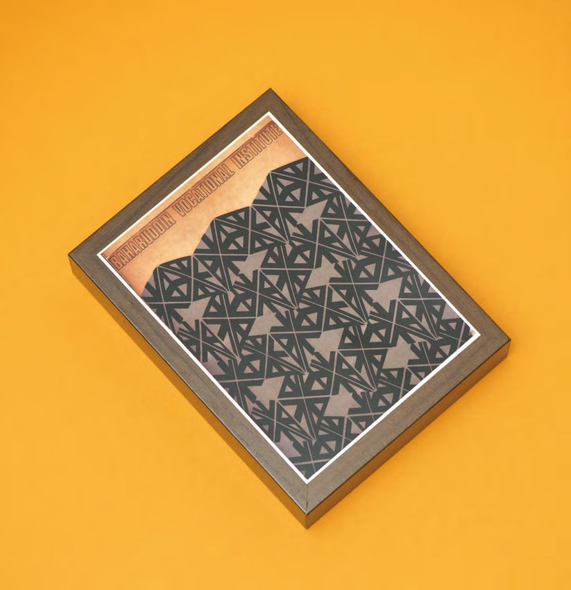
INTRODUCTION
INTRODUCTION

                                                                                                       03
                              Every school in Singapore has one. The school crest is the
                              graphical symbol that represents an educational institution and
                              the values it aims to inculcate in its students. All things related to
                              the school are branded with the crest, from its building down to
                              its stationery, and even its students, who wear it as a badge that is
                              part of their school uniform.

                              The Ministry of Education oversees over 350 primary, secondary,
                              and tertiary institutions in Singapore today, making sure they
                              adhere to a standard curriculum and are provided with facilities like
                              school buildings as well as staff. Schools are left to determine how
                              they represent themselves — giving rise to the myriad designs that
                              make up the Singapore school crest landscape.

                              This book examines a selection of crest designs from both defunct
                              and existing schools in Singapore, as well as the iconic Young
                              Scientist badges, looking at the stories behind how they were
                              created, their place in the nation’s education history, and the
                              memories that principals, teachers and students have of them.
               INTRODUCTION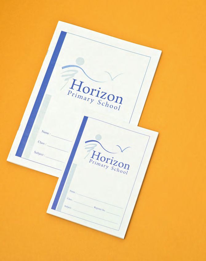
SECTION   A

                               SCHOOLS
                               OF ART
SCHOOLS OF ART

                                                                                                    05
                               Some school crest designs are guided by the schools’ origins and
                               history, others towards their imagined future, and while many
                               conform to societal conventions of the times, there are those that
                               express their designers’ personal tastes and beliefs.

                               Despite these different approaches and philosophies, school crests
                               all share one intention, which is to project a particular image of
                               an institution’s values and beliefs. Behind each crest is a unique
                               response from the people setting up the school — their answer to
                               the question of what does a school represent.

                               No matter how much time and effort is put into it, school crest
                               designs are never truly complete. They evolve with time, changing
                               societal conditions, and most importantly, how students take home
                               their memories of what their school crest means to them.

                 SECTION   A
SECTION                             A                                                                    SCHOOLS OF ART

                     CRESTS: A CLASSIFICATION

          COLONIAL      CHINESE          SEEING             FROM SHIELDS                     MANY WAYS
          HERALDRY     PATRIOTISM       THE LIGHT            TO SHAPES                        OF SEEING
                                                                                             THE FUTURE

                                                    Classify the school crests into five main categories. You
                                                    may have more than one crest per category. This question
                                                    is worth 5 marks. Not all crests have to be included.

SECTION                             A                                                                            06
                                                                                                                      07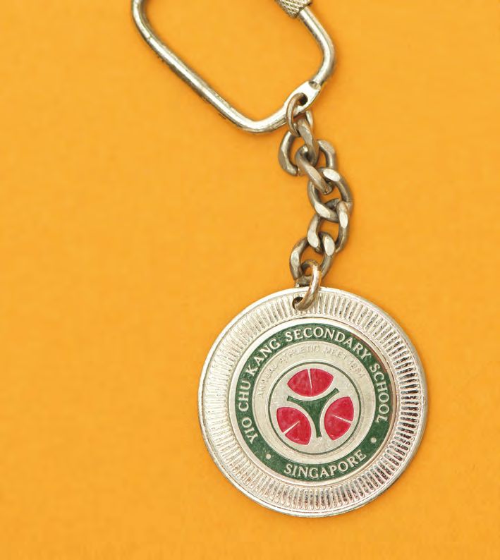
SECTION   A                                                               SCHOOLS OF ART

              COLONIAL
              HERALDRY
              The oldest school in          in 1819. The crest is shaped
              Singapore, Raffles            in the form of a shield with
              Institution, was set up       a gryphon at the top and
              in 1823 as the Singapore      a motto scroll below. A
              Institution. The school’s     double-headed eagle and
              crest was based on the coat   gold medallions constitute
              of arms of its founder, Sir   the central elements.
              Thomas Stamford Raffles,      (Facing page)
              who established Singapore     Raffles Instituition (1966)
                                            by Wong Suan Shea
              as a modern trading port      and Lee Suan Hiang.
SECTION   A                                                                       08
                                                                                       09
SECTION                                                                   A   SCHOOLS OF ART

Such a school crest,            These forms of school crests
derived from a coat of          were typically made up of
arms, originates from the       a shield and included
European tradition of           objects and symbols that
heraldry. This practice of      told a school’s history,
graphic representation          background and affiliations.
emerged out of Europe           On the crest of St. Gabriel’s
in the mid-12th century as      Primary (1953-2006) are
a way to identify feudal        trappings of Christianity
lords and knights, and it       including the letters D+S
was later adopted by            (Dieu Seul) surmounted
citizens and schools to         by a cross, which means
establish connections           “God Alone”, the French
with age-old traditions.        motto of its founder St.
                                Louis-Marie Grignon de
This was also the case for      Monfort. Another example
many of Singapore’s earliest    is the Anglo-Chinese School
schools, which were set up      (1930) crest, which has a
by Christian missions and       mythical animal made up of
the colonial government.        a lion head, eagle wings and
The crests of these schools     a dragon body with claws
either adopted heraldic         — inspired by the school’s
elements from their original    founding during China’s
institutions in Europe or       Manchu Dynasty in the then
were inspired by one.           British colony of Singapore
                                by the American Methodist
An example of the former        Mission.
is the crest of St. Nicholas
Girls’ (1933), a Catholic
school by the Convent of
the Holy Infant Jesus (CHIJ),
while the latter includes       (From left to right)
                                CHIJ St. Nicholas Girls’ (17th century)
Beatty Secondary (1954),        by students in France, St. Gabriel’s
whose crest is based on the     Primary (1953-2006);
                                Beatty Secondary (1954) by A. G.
coat of arms of its namesake    Meyer, Anglo-Chinese School (1930)
Admiral David Richard           by Yap Pheng Geck;
                                Willow Avenue Secondary (1960s),
Beatty, a distinguished naval   St. Joseph’s Instituition (1950) by
officer from Britain.           Richard Walker.

SECTION                                                                   A           10
                                                                                           11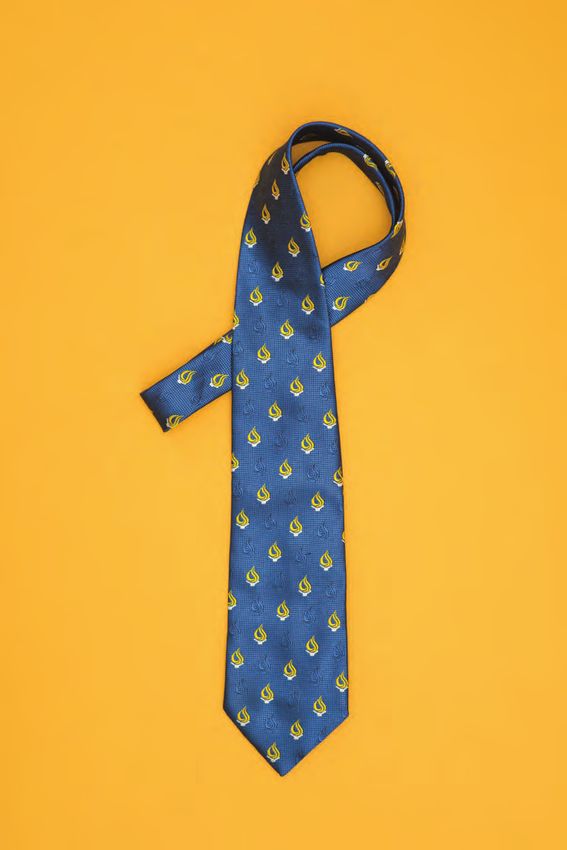
SECTION     A                                                       SCHOOLS OF ART

“These forms of school
 crests were typically
 made up of a shield
 and included objects
 and symbols that
 told a school’s history.”
                Particularly in the context of Singapore, heraldic crests
                became a way of identifying institutions in an education
                scene that was divided along language lines during a time
                when schools taught in the respective languages of the
                different immigrant communities that founded them — the
                Chinese, Malay, Indians and Europeans. A heraldic crest
                was a badge for those who attended English schools, the
                language of the ruling colonial power then.

SECTION     A                                                               12
                                                                                 13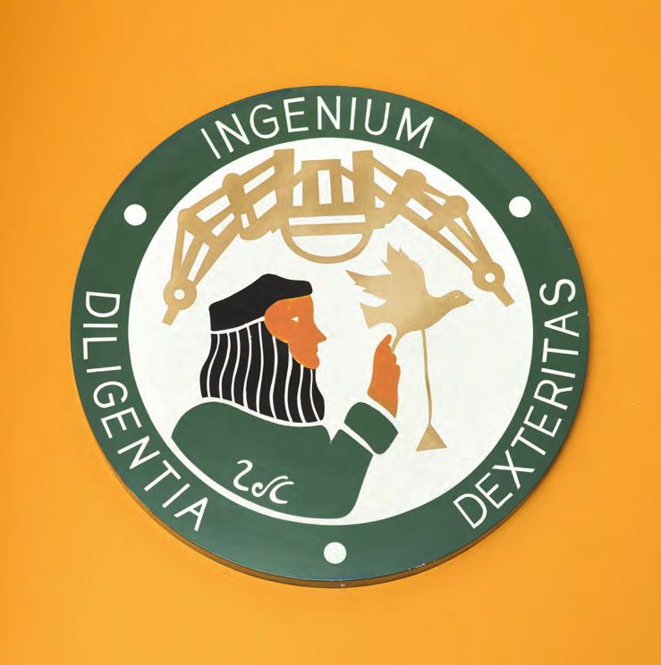
SECTION                                                                  A                                                            SCHOOLS OF ART

  CREST TEST
 JACKSON
                                                                                 Correct answer:

                                                                                 Crown: Symbolises victory of faith over evil. It is a reminder of the
                                                               40                school’s founding when Singapore was part of the British colony.

 TAN
                                                                                 Five-pointed star: Sign of faith and logo of the Brothers of the
                                                                    50           Christian Schools founded by St. John Baptist de La Salle.
                                                                                 White cross: Symbol of the Christian faith.
                                                                                 Objects in crest:
                                                                                  · Three interlocking circles: Games and the sporting spirit.
                                                                                  · Lamp of knowledge atop a book: Symbol for learning.
  Designer and Artist at PHUNK                                                    · Lion: Courage and determination, and the founding of the school in
  School: St. Joseph’s Institution (SJI)                                             Singapura (Singapore), the Lion City.
  Graduation Year: 1990                                                           · SJI monogram of the school
                                                                                 Motto: Ora et Labora, Latin for “Pray and Work”.

1. Please draw us your school crest. (10 marks)                      8/10      3. What memories do you have of your school crest?                         25/25
                                                                                  (25 marks)

                                                                                 I had to design the hockey and class T-shirts so I used to trace the
                                                                                 crest a lot as I was part of the art team. Everybody will pay like $8 or
                                                                                 something, and we’ll go to Queensway to make T-shirts. There was no
                                                                                 computer then, so we had to draw the crest by hand, and the printers
                                                                                 would use it to make our T-shirts and jerseys.

                                           Correct answer

2. What does your school crest stand for? (10 marks)                 2/10      4. What are some other school crests you remember? Why?                    5/5
                                                                                  (5 Marks)
  I don’t know what the individual objects stand for but the three rings
  reminded me of Led Zepplin! I know the motto means “Pray and Work”,            I remember the Raffles Institution, Anglo-Chinese School and St.
  but I remember we used to say “Play and Play” instead!                         Andrew’s crests because they were our rivals in hockey and soccer.
                                                                                 When you play for the teams, you were always trying to see which
                                                                                 school team had more cool jerseys. Ours was quite cool: our home
                                                                                 jersey was green with white stripes and the away version was white
                                                                                 with green stripes.
  SECTION                                                                  A                                                                         14
                                                                                                                                                            15
SECTION                                                                    A                                                            SCHOOLS OF ART

  CREST TEST                                                                       Correct answer:

 JACK
                                                                                   ACJC: The golden creature has a lion head, eagle wings and a dragon
                                                                                   body with claws, representing the fact that the school was founded
                                                                  41               during China’s Manchu Dynasty in the then British colony of Singapore by

 & RAI
                                                                        50         the American Methodist Mission. The overall shield shape represents the
                                                                                   knightly virtues of chivalry, honour, loyalty, valour and manliness.
                                                                                   RI: The double medallion represents the Order of the Golden Sword
                                                                                   conferred upon Raffles by the Sultan of Aceh in 1811. The upper medallion
                                                                                   bears the salutation by the sultan, which is in Jawi. The lower medallion
  Musicians                                                                        bears the image of a kris, which symbolises heroism. The twin-headed
  School: Anglo-Chinese Junior College (ACJC) / Raffles Instituition (RI)          eagle represents the Rafflesian ability to look at issues from multiple
  Graduation Year: 1995 / 1994                                                     perspectives, and the search for inspiration from the East and West. The
                                                                                   two heads point in opposite directions: one head draws lessons from the
                                                                                   past, while the other looks towards the future.

1. Please draw us your school crest. (10 marks)                           7/10   3. What memories do you have of your school crest?                           25/25
                                                                                    (25 marks)

                                                                                   Jack: Being in the rugby team, I always remember the flag flying high
                                                                                   during major tournaments. It reminds me of the camaraderie we had in
                                                                                   JC, definitely one of the schools where I had fun and made good friends.
                                                                                   Rai: The crest was always a point of pride for me. It was always an
                                                                                   honour to wear the sports crest when I was in the athletics team.

          Jack                  Rai                  Correct answers             4. What are some other school crests you remember? Why?                      5/5
                                                                                    (5 Marks)
2. What does your school crest stand for? (10 marks)                      4/10
                                                                                   Jack: St. Joseph’s Institution. It was my secondary school and it taught me
  Jack: There is a phoenix or some creature but I don’t know what                  a lot about humility. I would always forget to wear the badge, so I was pun-
  it represents. I assume the shield serves to remind the students to              ished countless times by having to buy one from the bookshop!
  defend their school! But any hardcore ACJC-ian will remember the
  motto is “The Best Is Yet To Be”.                                                Rai: I would like to think I remember the CHIJ crest because IJ girls were
                                                                                   eye candy for us, but I don’t! I remember my primary school crest, Qifa.
  Rai: The two-headed eagle has something to do with British tradition.            I never knew what it meant, but it was easy to remember because it was
  The school motto means “Hope for a Better Age”.                                  simple.

  SECTION                                                                    A                                                                           16
                                                                                                                                                                17
SECTION A SCHOOLS OF ART
CHINESE
PATRIOTISM
In contrast to the heraldic active in the politics of his White Sun and a Wholly (From left to right)
The Chinese High School (1919),
crests of English schools homeland China like many Red Earth” flag that the The Chinese High School (1930-2004),
were those of the Chinese of his contemporaries, this Republic’s first president Ngee Ann Secondary (1940).
schools that made up the particular crest was inspired Sun Yat-Sen would later
other majority of Singapore’s by the state and army flag declare as its new
education scene in the of the short-lived Republic national flag.
early 20th century. Chinese of China (1912-1949). It bore
schools had relatively the colours red, yellow, blue, Subsequent schools set up
simpler crests, often just white, as well as black, and by the Chinese immigrants
the school name written in had 18 stars encircling the in Singapore also adopted
Chinese calligraphy inside Chinese characters of the similar elements in their
a particular shape, for school name. Before the crests — particularly the star,
example, The Chinese High civil war in China between as well as the colours, red,
School’s first crest in 1919. the government and the white and blue — although
As its founder Tan Kah Kee, communists, the school’s they did not make explicit
a prominent businessman crest was even changed connections to such political
in Singapore, was very to match the “Blue Sky, symbolism like Chinese High.
SECTION A 18
19SECTION A SCHOOLS OF ART
“...used the
triangle to
symbolise
the moral, (From left to right)
Nan Hua High, Yangzheng Primary (1988), Catholic High.
physical and In 1930, Chinese High
had a new crest. The
new triangular-shaped
members, teachers and
students of Chinese High,
school crests from Nan
intellectual
crest reflected another Hua High and Chung Cheng
distinct trait of the crests High used the triangle
from Chinese schools, to symbolise the moral,
which typically contain physical and intellectual
development
elements that represent the development of their
harmonious relationship students. Another Chinese
between values and people. school, Nan Chiau High, also
While the crest’s shape sought to express this, but
of its students.”
signified the three-way link with three interlocking rings
between the school’s board instead.
SECTION A 20
21SECTION A SCHOOLS OF ART
CREST TEST
EESHAUN 40
50
Correct answer:
The logo draws inspiration from the Chinese character “华”, which
reflects the school’s mission of promoting Chinese language and
culture.
Illustrator
School: The Chinese High School
Graduation Year: 1996
1. Please draw us your school crest. (10 marks) 10/10 3. What memories do you have of your school crest? 25/25
(25 marks)
I remember drawing it on school T-shirts I designed for my class and
a Secondary 3 camp T-shirt. It was quite an easy crest to draw, plus it
was single coloured and had a distinctive form, so it was quite easy
to remember.
Correct answer
2. What does your school crest stand for? (10 marks) 0/10 4. What are some other school crests you remember? Why? 5/5
(5 Marks)
“学” is the Chinese word for “learn”. It also looks like a torch with a
flame. The old crest of The Chinese High School. I had to pin
the badge onto the breast pocket of my school uniform
everyday, so after a while, you subconsciously
remember the design, although I think I actually
remember the colours (yellow, blue, red) more than
the details on it.
SECTION A 22
23SECTION A SCHOOLS OF ART
CREST TEST
BENNY
Correct answer:
The four arrows symbolise the four educational aims of the
45 college: the moral, intellectual, physical and social development
50
NG
of the students. The horizontal bar holding the arrows together
represents the synthesis of the four aims in developing the
character and corporate unity of the students.
Co-founder of Uyii Bags
School: Hwa Chong Junior College
Graduation Year: 1998
1. Please draw us your school crest. (10 marks) 6/10 3. What memories do you have of your school crest? 25/25
(25 marks)
I‘m less of a graphics person, so symbols don’t mean as much to me as
words. I think mottos are easy to remember and abide by, and these are
philosophies that anchor people, such as Victoria Junior College’s Nil
Sine Labore (Latin for “Nothing Without Labour”). Another way people
remember a school and form an association with it is through its physical
premises. I studied in Beijing University, where the campus is over a
hundred years old and the room where writer Lu Xun worked as a librarian
Correct answer is still there! When you walk into the campus, it feels different — you know
generations have passed through it.
2. What does your school crest stand for? (10 marks) 9/10 4. What are some other school crests you remember? Why? 5/5
(5 Marks)
The arrows represent the four aims of the school: the moral, intellectual,
physical, and social development of a student. My secondary school, The Chinese High School. It was where I learnt
about a “win-win” philosophy, which is if you want to benefit yourself,
you should benefit others too. It is the idea of finding a way for both
parties to advance. Whenever I meet people who ascribe to such a
philosophy, it turns out they were from Chinese High too.
SECTION A 24
25SECTION A SCHOOLS OF ART
SEEING
THE
LIGHT
Singapore’s education was set up in 1955. MOE’s
system was transformed logo was designed by Mr
with the 1957 Education Kwan Sai Kheong, who was
Ordinance. This act the ministry’s permanent
established the basis for secretary cum Director of
equality in education by Education from 1964 to
giving attention and equal 1975. MOE’s logo is a red
treatment to the major shield made up of two lions
ethnic groups in Singapore. holding an open book,
All schools, including with a flaming torch sitting
langauge medium schools, atop the book and a blue
had to be registered with scroll beneath it. These
the government and have elements are also found on
syllabuses of similar Singapore’s National Coat
content. of Arms (1959) and that of
the University of Singapore (From left to right)
Leading the transformation (1962), one of the country’s University of Singapore (1962-1980),
Ministry of Education, by Kwan Sai Kheong.
was the Ministry of two institutions of higher
Education (MOE), which education then.
SECTION A 26
27SECTION A SCHOOLS OF ART
(From left to right)
Bartley Secondary (1952) by Chua Leong Hean,
Singapore Polytechnic (1960), Sang Nila Utama
Secondary (1961–1988);
Gan Eng Seng School (1950s) by P. R. Aroozoo and
Charton, Telok Kurau Secondary, Yusof Ishak Secondary;
Monk’s Hill Secondary, Lee Kuo Chuan Primary (1987),
Bukit Merah Primary.
That the logo of the state’s highest education order was
associated with a visual language inherited from its former
colonial masters reflected the trend then. An alternative
would have been to take inspiration from the crest of the
country’s other university, the then Nanyang University
whose crest consisted of a star and three interlocking rings
that established its lineage with other Chinese-language
schools then.
The MOE logo and the crests of most schools in the 1950s
and 1960s adopted some form of heraldry, essentially
shields supported by a scroll emblazoned with the school
name or motto. These include Bartley Secondary (1952),
Singapore Polytechnic (1960), and even the nation’s
first Malay-medium secondary school, Sang Nila Utama
Secondary (1961-1988).
SECTION A 28
29SECTION A SCHOOLS OF ART
Commonly found inside these crests were the open book
and flaming torch — such as Elling North Primary (1958-
1993), Corporation Primary (1975), and Eunos Primary
(1984) — two stereotypical elements used to represent
schools. Also popularly used in school crests were the
colours blue, red and white, which symbolise “knowledge”,
“passion” and “purity” respectively. Together, these design
elements form the archetypal school crest in the early
years of independent Singapore.
That Singapore schools were largely represented by
heraldic crests was perhaps an early indication of the future
of education here. While equal treatment for all language
streams was established at first, English gradually became
the working language of Singapore over the decades, and
many parents started sending their children to English-
stream schools instead. While the Primary One cohort
was equally divided between English-stream and Chinese-
stream schools in 1959, over 90 percent were enrolled in
the former some two decades later. In December 1983,
it was announced that all pupils in Singapore schools
would be taught English as their first language by 1987. A
progressive conversion to English medium began in 1984.
(From left to right)
Elling North Primary (1958–1993), Corporation Primary
(1975) by Fong Kim Chong, Eunos Primary (1984);
Sembawang Secondary (1999), Playfair Morning School
(1949), Changkat Primary;
Pioneer Secondary (1994) by Tay Kay Sui, Joo Avenue
School (1964), Heng A Khe Bong (1970s);
Jin Tai Secondary, MacRitchie Primary (1970s),
Bukit Merah North Secondary.
SECTION A 30
31SECTION A SCHOOLS OF ART
CREST TEST
ROBERT
Correct answer:
The school crest bears the motto ‘Be Diligent and Helpful’, with the
36 belief that diligent pupils know their work well and should always
ZHAO
50 help those who need assistance.
At the top of the crest is a book of knowledge. Beside the school’s
initials is the educational torch, which is a beacon of truth and
light.
Visual Artist Colour significance
White: Everlasting purity and honesty.
School: Corporation Primary School Green: Youthful vigour in our pupils.
Graduation Year: 1995
Orange: Alertness in our pupils’ minds.
1. Please draw us your school crest. (10 marks) 6/10 3. What memories do you have of your school crest? 25/25
(25 marks)
I remember it was on my PE T-shirt. I also drew the school crest
when I could not concentrate in class, and on the last day of
primary school when I had to fill up autograph books. It was not
a very memorable crest.
Correct answer
2. What does your school crest stand for? (10 marks) 0/10 4. What are some other school crests you remember? Why? 5/5
(5 Marks)
Have a burning passion to learn.
Commonwealth Secondary. It was my
secondary school and the crest looked more
symbolic. Its initials CSS translate into tiny
flames on the crest.
SECTION A 32
33SECTION A SCHOOLS OF ART
FROM SHIELDS
TO SHAPES
Over the years, school crests moved away from the shield
as a frame, favouring simple shapes instead. However,
the idea of picking elements to create meaningful crests
remained at the heart of many designs. Good examples
are Bukit Panjang Government High (1960) and Chestnut
Drive Secondary (1960s), which have crests filled with
illustrations of their students’ expected abilities upon
graduation.
From the 1970s, crests formed from the schools’ initials
started gaining popularity as seen in that of Bedok Town
Secondary (1984-2012). Some schools also used their
initials to create distinct and abstract shapes such as
Shuqun High (1985). Others created familiar graphical
symbols instead. For instance, the initials of Peirce
Secondary (1994) were transformed into the typical flame
and torch, while Bishan Park Secondary (1993) had its
initials designed to resemble a leaf.
(From left to right)
Marsiling Primary, Chestnut Drive Secondary (1960s),
Tanjong Katong Girls’ School (1953) by Maude Scott;
Bukit Panjang Government High (1960), Bedok Town
Secondary (1984–2012), Shuqun High (1985);
Peirce Secondary (1994) by Keng Thiang Kee,
Bishan Park Secondary (1993) by Goh Lye Kiat.
SECTION A 34
35SECTION A SCHOOLS OF ART
(From left to right) (From left to right)
Deyi Secondary (1980), Damai Primary (1984); Yuhua Secondary (1985) by Leong Chye Chye,
Beng Wan Primary, Fajar Secondary. East Payoh Secondary (1975-1998);
Juying Primary, Pioneer Primary (1995).
SECTION A 36
37SECTION A SCHOOLS OF ART
“ Some schools used
their initials to
create distinct and
abstract shapes
while others
created familiar
graphical symbols
instead.”
(From left to right),
Fengshan Primary, Anderson Junior College (1984) by Heng Eng Hwa;
Zhangde Primary (1984), South View Primary (1990) by Thomas Yeo,
Boon Lay Secondary (1977);
Braddell Secondary (1985-1999) by Dolores Chia, Clementi Town
Secondary (1980) by Lim T.W. and M. Yazid.
SECTION A 38
39SECTION A SCHOOLS OF ART
As MOE began naming organisations around
schools after the areas they the world, who wanted
were located in, schools also to represent themselves
sought inspiration from the graphically with logos.
surroundings for their crests. Nowadays, some schools
This is why Bukit Merah even have crests that are
Secondary (1967) has a red inspired by the logos of
hill-like crest that reflects its major brands. These include
Malay name, which means the crests of the National
“Red Hill” in English, and University of Singapore’s
its Chinese name, “红山”. High School of Mathematics
The school’s initials “bm” in and Science (2004) and the
white, stand out against the Singapore Sports School
red background. Similarly (2004). While most schools
for Seng Kang Secondary have their logos designed by
(1999), the history of its their art teacher, the sports
location as a harbour led school crest was designed
to the school using its by Ukulele, a commercial
initials to create a crest that brand consultancy.
includes an anchor.
(From left to right)
The movement from Bukit Merah Secondary (1967),
traditional shields towards Seng Kang Secondary (1999);
Pioneer Junior College (2004)
abstract crests matched by Ling Wan Yan,
the rising popularity Northland Secondary (1994);
NUS High School (2004),
of corporate identities Singapore Sports School (2004)
among businesses and by Ukelele.
SECTION A 40
41SECTION A SCHOOLS OF ART
CREST TEST
LOH
Correct answer:
The two Ps represent Pandan Primary and the head is “S”, which
46 stands for School. The crest is actually an anchor.
50
YUIN-HAN
Scientist at the Institute of Molecular and Cell Biology
School: Pandan Primary School
Graduation Year: 1989
1. Please draw us your school crest. (10 marks) 8/10 3. What memories do you have of your school crest? 25/25
(25 marks)
It looks like a face to me as there is a pair of eyes and a smile at
the bottom. Before the badge was sewn onto the uniform, it was
to be pinned on and I would always forget to do so. So I always
got scolded or punished by having to stand in class.
Correct answer
2. What does your school crest stand for? (10 marks) 8/10 4. What are some other school crests you remember? Why? 5/5
(5 Marks)
It actually stands for Pandan Primary, with two Ps, one a reflection
of the other. My secondary school, Bukit View. I remember drawing it for
some school project when we had to put the crest on the cover.
It’s very easy to draw, just three triangles and another inverted
one below.
SECTION A 42
43SECTION A SCHOOLS OF ART
MANY WAYS
OF SEEING
THE FUTURE
The school as an institution for knowledge
and learning has remained at the core of
its existence. This is why the open book
and flame remain evergreen symbols on
Singapore’s school crests, although over
the years, the latter has been updated
to more modern interpretations. In place
of the flame, Rulang Primary has a rising
sun, Admiralty Secondary (2001) has a
lighthouse, while Yuhua Primary (2002)
uses a lightbulb. Another approach used to
represent the important role of schools in
nurturing young minds is through symbols
of nature, such as animals and plants. Farrer
Park Primary (2002) has a plant growing
out of a book, while Westwood Secondary
and Zhonghua Secondary use a plant and
leaf respectively to show how hardy their
students are.
(From left to right)
Guangyang Secondary, Yuhua Primary (2002),
Admiralty Secondary (2001);
Rulang Primary (1955) by Yar Wee Har, Chong Shan
Primary (1982), Westwood Secondary;
Farrer Park Primary (2002), Zhonghua Secondary,
Jurongville Secondary (1994) by Ruth Lee Ng Gek.
SECTION A 44
45SECTION A SCHOOLS OF ART
(From left to right)
Anglican High Secondary, Concord Primary,
As for animals, birds like the eagle have been used by
Anglican High (1959) and Concord Primary (2000) to
symbolise how their students “soar to new heights”.
The importance of the student in the school has also led
to crests with abstract human figures such as Bukit View
Primary (1986) and Xinmin Secondary. Another way to
represent this is through stars, as how Hong Kah Secondary
(1994) has done.
(From left to right)
Ghim Moh Secondary, Xinmin Secondary;
North Vista Primary (2007) by Phua Kia Wang and Sim
Choon Tee, Hong Kah Secondary (2009) by Muhammad
Radzif Anif.
SECTION A 46
47SECTION A SCHOOLS OF ART
(From left to right)
Yuan Ching Secondary (1979–2007),
Yumin Primary (1985), Evergreen
Primary (1999);
Hong Wen School, Red Swastika
School, Rangoon Road Secondary;
Zhenghua Secondary (2000),
Anderson Primary (2000).
In the schools’ quests to create unique crests and
project themselves as having moved with the times,
some have even made use of contemporary objects.
When manufacturing was seen as an important part of
Singapore’s industrialisation, the gear wheels in the crests
of Yuan Ching Secondary (1978–2007) and Yumin Primary
(1985) made them look ready for the future. However, as
Singapore’s shifted towards a service economy, their crests
became dated. A similar case is Evergreen Primary, the only
school to have a CD-ROM on its crest. This made sense
because when it was founded in 1999, multimedia was
touted as the next big thing, but who would have thought
that just over a decade later, the CD-ROM is hardly in use?
The one element introduced in crest designs post-
millennium that has stayed relevant is the globe. The crests
of Zhenghua Secondary (2000) and Anderson Primary
(2000) have incorporated the globe, promising to mould
students with a global outlook. This has become ever more
important in today’s globalised world.
SECTION A 48
49SECTION A SCHOOLS OF ART
CREST TEST
SHEERE
Correct answer:
The logo is a stylised initial of its name in a circle. The main motif
42 is a blossoming bud, emphasising the significance of its Chinese
50
NG
characters “Qi Fa”. The blue represents aspiration for excellence in
every endeavour, the red circle signifies an all-rounded education
within a multiracial society, and the white background depicts the
importance of character building.
Food Writer
School: Qifa Primary School
Graduation Year: 1998
1. Please draw us your school crest. (10 marks) 10/10 3. What memories do you have of your school crest? 25/25
(25 marks)
I thought it looked very distinctive. The symbol inside the crest
is not your usual shape such as a triangle, or an object like a leaf.
I think Qifa is the only school with a symbol like that.
Correct answer
2. What does your school crest stand for? (10 marks) 2/10 4. What are some other school crests you remember? Why? 5/5
(5 Marks)
I always wondered... It looks like a tree, maybe growth?
The Chinese High School’s crest. I was a prefect at Jurongville
Secondary and as we were in the same cluster as Nanyang Girls’
High, we often had activities there. From Nanyang, we could see
The Chinese High School’s crest, and I’ve always remembered it
as I used to wonder what life was like in such good schools.
SECTION A 50
51SECTION A SCHOOLS OF ART
CREST TEST
ADRIANNA
Correct answer:
The heart represents the highest of all emotions, love — the love
36 of God for man and the love of man for his neighbour. When the
TAN
50 heart is pure and honest, the Holy Spirit can dwell within and
transform the nature of the individual, ennobling and refining it.
The torch of knowledge and wisdom illuminates the mind and
broadens the vision of all who seek its light. Emblazoned in a band
of gold across the heart are the initials of the school, representing
IT Consultant, loyalty for the alma mater. The two stars reflect the school motto,
Founder of The Gyanada Foundation “Pure & Honest”.
School: Fairfield Methodist Primary School
Graduation Year: 1997
1. Please draw us your school crest. (10 marks) 6/10 3. What memories do you have of your school crest? 25/25
(25 marks)
I had to wear my school badge, name tag and tie to school
everyday, so I remember putting them on in a set of three: the
badge first, the name tag and then the tie. I also remember
playing football and sepak takraw in the volleyball court during
PE lessons. We had to be in our PE attire, but when the boys did
not wear theirs, they would remove their school badge and name
tag, and play wearing only their uniform.
Correct answer
2. What does your school crest stand for? (10 marks) 0/10 4. What are some other school crests you remember? Why? 5/5
(5 Marks)
I only remember the motto, “Pure & Honest” because it always made
me giggle. Purity is such a Christian school thing. I remember the badge My secondary school, Singapore Chinese Girls’. Compared to
colours were yellow and blue, and so was the school uniform. Fairfield, the crest was more symbolic of what the school stood
for. The yin and yang crest and kim gek (Hokkien for gold and
jade) colours represent well-rounded students, who are good in
English and Chinese, as well as intellectual women who have no
problems getting married!
SECTION A 52
53SECTION A SCHOOLS OF ART
SCHOOL SYMBOL,
STUDENT IDENTITY
The crest designs of Over the years, some Dunman Secondary school will understand why
Singapore schools have schools have had their crests wanted to update its more changing the school badge
changed little over the span changed because of mergers than 30-year-old crest in is not about evolution.”
of the last five decades with other schools or simply 2008 to “better reflect the
since a unified education to keep up with the times Dunman of the 21st century”. Dunman’s school crest did
system was established. While the crests of some However, both decisions change eventually, but such
Most changes have been schools may be lacking caused an uproar with their sentiment shows how
updates to keep up with the aesthetically, they remain a alumni, who started online the crest is an important
times, although sometimes source of pride for present petitions to protect their graphical symbol for students
this has led to unexpected and former students of the school’s identity. to identify themselves with
results such as when their schools. the school. It is one of the
choice of elements became One former Dunman few items all students,
obsolete. One reason for the In 2012, Catholic Junior student, who opposed to regardless of when they
lack of innovation in crest College unsuccessfully the change, wrote in to the enrolled, how well they
design is that most crests proposed to refresh its newspaper forum saying: performed, or who they
are put together by art 37-year-old crest that bears “My point is, symbols that become, remember their
teachers in schools rather a dove. The school wanted build an identity hold school. A school’s building
than professional graphic to replace the dove with a meaning for their uses and may change, principal and
designers. Often, crest flame that is already worn create continuity of culture teachers may leave, students
designs have to be approved by students as collar pins on and sense of belonging. will graduate, but as long as
by a committee whose their uniform as the flame To Dunman’s principal — the crest remains, the school
members may have differing has “a more modern feel and try the idea of changing exists — even if it’s just as a
views on the design. universal appeal”. Similarly, the national flag and the fragment of a memory.
SECTION A 54
55SECTION B
MY
SCHOOL
CREST
MY SCHOOL CREST
57
Crest designs are exercises for the principal and teachers to
visually translate what they hope to achieve as a school. Starting
from a school name assigned by the Ministry of Education, most
principals conceptualise what the school’s mission and values are
before working with their art teachers or professional graphic
design studios to express these in visual form. Here are some
stories behind the designs of school crests from over the decades,
which show the different inspirations and intentions, and how
designs sometime get lost in translation!
SECTION BSECTION B MY SCHOOL CREST
FLAMES OF
PASSION
The torch has always been associated
with education. When Commonwealth
Secondary’s art teacher Miss Ruth Ng Lee
Gek discovered that the school’s initials
could be designed to resemble flames,
Commonwealth she created the crest of a torch emitting
Secondary (1972)
by Ruth Ng Lee Gek flames.
She was tasked by the principal to work
on the design in 1972. Without any brief,
Miss Ng decided to depart from the
traditional shield and focus on a single
object instead. “I wanted something that
could be with the school forever, and
nothing can beat the flame. This idea of
lighting up the students’ passion was
almost natural,” she says.
The art teacher was so passionate about
her design that she even wrote a poem to
explain its significance:
Behold our school crest
With our motto “Ever with the Best”
See the flame burning with zest
It proudly stands for CSS
Blue for infinite resourcefulness
Gold for faith and fruitfulness
Ever-glowing is our flame
Ever-growing is our name
School tie of alumnus Ang Song Nian.
SECTION B 58
59SECTION B MY SCHOOL CREST
STUDENT
POWER
To mark Yio Chu Kang Secondary’s
relocation to bigger premises in 1982,
then principal Mdm So Bie Leng decided
to revamp its shield-like crest to something
more modern. At the same time, she
Yio Chu Kang wanted a crest that better reflected
Secondary (1982)
by So Bie Leng, the school’s original motto, “Pursuit,
Mr Goh and Mr Teo Knowledge, Service”, which was written by
its founding principal.
Mdm So worked with two art teachers and
they came up with the idea of using a
generator. Its core is the letter ‘Y’ to stand
for the school’s name, with three blades
representing the values in the original
motto. The ‘Y’ and three blades are bound
by a circle that represent the staff and
students.
Says Mdm So, “We wanted a crest
that involved all three ideas, to say
they combined as one and powered
our students.” Souvenir keychain from the 1984 Annual
Athletic Meet.
SECTION B 60
61SECTION B MY SCHOOL CREST
BEYOND THE
HORIZON
As its school name suggests, the principal
of Horizon Primary, Mrs Janet Ang, looked
beyond existing crest designs when
conceptualising this crest. Mrs Ang worked
with Graphic Masters & Advertising, a
Horizon Primary (2009) design studio she had previously worked
by Graphic Masters
& Advertising with, to come up with the crest.
“I did not want the standard kind of school
logo, i.e. a crest with a torch or a book,”
she explained. “We are entering the 21st
century and I think we should think out of
the box and the school logo should really
reflect what Horizon is.”
The result is a crest made up of the sun, a
horizon line and a soaring bird. When seen
together, the sun and horizon line also
resemble a human form, which Mrs Ang
says represents everyone in the school
helping each of its students soar like a
bird. The crest also has no boundaries so
as to not restrict the soaring bird.
A set of standard exercise books used
by students.
SECTION B 62
63SECTION B MY SCHOOL CREST
SAILS OF
EXCELLENCE
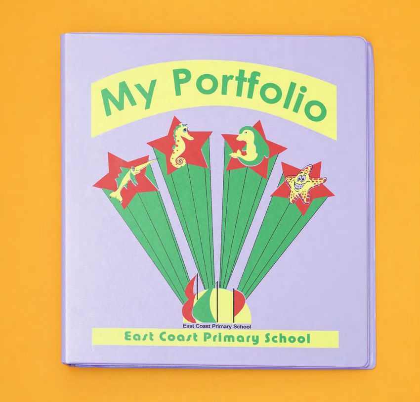
When East Coast Primary was formed
from the amalgamation of three schools in
the 2000s, it asked its uniform supplier,
United Uniforms, to design a new school
crest. Then company director, Mr Brian
Leong Kuen, volunteered to create this
East Coast
Primary (2000s) crest, which articulates the school’s hope
by Brian Leong Kuen, for its students to pursue excellence.
United Uniforms
“The principal didn’t want an old-style
badge with colonial influences. By the
same token, she didn’t want a human form,
which was used in many logos of that
era... one dot and a shape that together
represent a human form. This idea that
students are all important,” he says.
Instead, Mr Leong took inspiration from the
school’s location in the east to come up
with the background of a rising sun, and
introduced the idea of movement in the
form of sails, which were shaped after the
school’s initials.
A portfolio folder used by all Primary 1
and 2 students.
SECTION B 64
65SECTION B MY SCHOOL CREST
CLASSICAL
INSPIRATION
Tanjong Katong Secondary started as a
technical school for students until 1993
when it assumed its current name and
offered mainstream curriculum subjects. Its
first principal, Mr N. Vaithinathan, strongly
believed in his students’ potential, and he
expressed this belief by putting the image
Tanjong Katong of Leonardo da Vinci on his school’s crest.
Secondary (1957)
by N. Vaithinathan
“I was looking for things to inspire, and I
saw this picture in a book about famous
engineers,” he says. “I thought this was the
right thing because not only was da Vinci a
great engineer, he was also a multi-talented
personality, a philosopher, an artist, an
inventor...”
An art teacher from the neighbouring Haig
Boys’ School, Mr S. Arulampalm, helped
draw and colour the original black-and-
white image. Completing the crest is the
school’s motto, “Diligence · Ingenuity · A hand-painted sign of the school’s
Dexterity”, which is written in Latin because original crest.
this was the language of great classics, and
was regarded as an important language of
learning then.
SECTION B 66
67SECTION B MY SCHOOL CREST
FUTURE
SHOCK
Baharuddin Vocational Institute’s lecturers
were shocked when they saw his school
crest design, recalls Mr Wee Chwee Beng,
Baharuddin Vocational
one of the school’s pioneer teachers.
Institute (1971-1990) For Singapore’s first design school, now
by Wee Chwee Beng known as Temasek Polytechnic School of
Design, Mr Wee proposed using the school
initials “BVI” to create a modern crest
that departed from the norm then of using
shields with tigers and lions.
Instead, he created an easily recognisable
crest that looked identical regardless
which side of the flag one saw it. Up
against other more traditional-looking
proposals by his colleagues, Mr Wee’s
design eventually won the most votes and
was chosen to be the school’s crest.
“I felt strongly at that point in time that we
should break away from the norm of what is
expected. I am designing for the future, not
for the present or the past,” he says. “Mine
was the most popular probably because I
was a very good politician!”
Cover of the school’s first and only
magazine, published in 1971.
SECTION B 68
69SECTION B MY SCHOOL CREST
“I am designing for
the future, not
for the present or
41
the past.”
— Mr Wee Chwee Beng,
Baharuddin Vocational
Institute
SECTION B 70
71SECTION B MY SCHOOL CREST
GLOBAL
TRADITION
In line with Singapore’s vision to be a
world-class education hub in the early
2000s, the first principal of Balestier Hill
Primary School, Dr Ho Seng Tuck and art
teacher Mr Hamzah bin Mahmid, came
up with the idea of using a globe on the
school’s crest.
Balestier Hill Primary (2002)
by Ho Seng Tuck and Hamzah
bin Mahmid Said Mr Hamzah, “The global vision was
in line with the ministry’s vision of making
Singapore an education hub... When the
school started, our pupils made up of about
30 nationalities, so that also inspired us.”
While the school was forward-looking in
this aspect, Dr Ho suggested the crest
take on a traditional form of the shield.
According to Mr Hamzah, the shield was
believed to be an evergreen symbol and
best suited the school’s traditionally
designed uniform.
Original school uniform used up till 2012.
SECTION B 72
73SECTION C
CRESTS
OF
MEMORIES
CRESTS OF MEMORIES
75
A revamp of Singapore’s education system began with the
enactment of the 1957 Education Ordinance. Since then, the
education landscape has evolved with the nation’s development
— even as more schools were built with more diverse offerings,
others have closed or merged with other schools. The crest is often
the only reminder of a school that has closed, a doorway into the
memories of Singapore’s educational development over the last
50 years.
SECTION CSECTION C CRESTS OF MEMORIES
Sang Nila Utama
Secondary (1961-1988)
1950s: THE LANGUAGE
DIVIDE
Education in early Singapore was divided along language
lines — Chinese, Malay, English and Tamil — as many
schools were founded by the country’s immigrant
communities. In anticipation of self-governance from
British colonial rule, the 1957 Education Ordinance unified
the education landscape, stipulating that all schools be
registered and have similar syllabuses across the different
languages.
Even as the government introduced secondary education,
it kept the tradition of different language-medium
schools. Sang Nila Utama Secondary was the nation’s
first Malay-medium secondary school established after
Singapore attained self-government in 1959. It was
named after Sang Nila Utama, a Palembang prince who
called this island “Singapura” (Sanskrit for “Lion City”)
after supposedly spotting a lion upon landing here.
This is why its crest had a lion accompanied by an open
book, an object schools commonly used to represent
themselves then.
SECTION C 76
77SECTION C CRESTS OF MEMORIES
(left)
Buona Vista Secondary
(1967-2000)
(right)
Kim Seng Technical School
(1966-1992)
1960s: 3 LANGUAGES 1960s: GEARING UP
SPEAKING IN 1 VOICE FOR THE FUTURE
When the People’s Action schools offering a bilingual As the young nation An example is the million-
Party (PAP) formed the education, while secondary industrialised, technical dollar Kim Seng Technical
government in 1959, schools became trilingual. and vocational education School, one of six first built
it implemented the Students finishing were developed to address by the government. Kim
recommendations of the secondary school were Singapore’s manpower Seng’s school crest was
1956 report by the All- expected to have a working needs. To overcome the designed by artist Loh Khee
Party Committee of the knowledge of Chinese, prejudice against blue-collar Yew, and it consisted of a
Legislative Assembly on Malay and English. jobs, seen by many as lower wheel that symbolised its
Chinese Education. One in status and less rewarding, industrial nature, while the
of them was a bilingual Buona Vista Secondary’s the government built individual pictorial symbols
education policy, which crest reflects this with its workshop facilities for within it represented a
emphasised equal name written in English, metalwork and woodwork school that prepared
treatment of the four Chinese and Malay (in in new schools, breaking students for the academic,
language streams of Jawi script). Together, down the traditional manufacturing and shipping
education — English, they represent Singapore’s separation amongst the sectors.
Chinese, Malay and Tamil. multicultural society, academic, technical and
and this is bounded by a vocational units.
With an eye on a future wheel symbolising how
merger with Malaya, the the different groups
government made Malay built Singapore into a
the national language, progressive nation.
and this led to primary
SECTION C 78
79SECTION C CRESTS OF MEMORIES
1970s: 1970s:
NO STUDENT EFFICIENT
LEFT BEHIND EDUCATION
In the early years of Singapore’s education Singapore Armed Forces Whampoa Secondary In 1978, then Education Minister Dr Goh Keng
Boys’ School (1975 -1984) (1961-1994)
system, students who struggled academically Swee revolutionised Singapore’s education
had few choices but to drop out of school. system by introducing streaming based
The Singapore Armed Forces (SAF) saw on students’ academic abilities to avoid
an opportunity to instil discipline in these “educational wastage”.
“wayward youths” and grow the young
nation’s defence by starting a school for The bilingual education policy led to more
them. parents sending their children to English
medium schools, causing many vernacular
The SAF Boys’ School offered military, schools to close. The Special Assistance
technical and academic training to students Plan (SAP) Programme was started in 1979
between the ages of 14 and 16. During their for selected Chinese medium secondary
two-year residential programme, students schools so as to enhance students’ learning of
were given a monthly allowance, and upon Chinese language and culture, and upgrade
graduation, served six years in the military as the teaching of English to develop effectively
tradesmen or combat non-commissioned bilingual students. Non-SAP Chinese schools
officers. became less popular as parents increasingly
sent their children to either SAP or English
However, the school closed in 1984 — “a medium schools to secure a better future.
victim of our improved national education
system”, explained then Defence Minister To address the falling enrolment in Chinese
Goh Chok Tong. By then, less academically schools, a government Chinese school,
inclined students could study in the many Whampoa Secondary, became an integrated
technical and vocational institutions instead. institution in 1980, and redesigned its crest in
1987 to reflect its bilingual status. However,
the school still closed in 1994 due to low
enrolment.
SECTION C 80
81SECTION C CRESTS OF MEMORIES
1980s: ENGLISH
FOR ALL
After decades of debate, the government announced in
December 1983 that Singapore schools would be run on
Nanyang University
a single national stream with English as the first language (1956-1980)
and mother tongue as the second by 1987.
Prior to this, there was a major shake-up of the education
system when the National University of Singapore was
formed in 1980. This came about from the merger of the
English-medium University of Singapore and the Chinese-
medium Nanyang University. “ ... symbolising
it as a place
Nanyang University’s closure was a disappointment for
the Chinese community here, as it was the first Chinese-
language university outside China. Affectionately known
as Nantah, the university was a bastion of Chinese culture
and tradition, as portrayed in its crest’s three rings —
symbolising it as a place for cultural exchange, pride and
unity for the community.
for cultural
exchange, pride
and unity for the
community.”
SECTION C 82
83SECTION C CRESTS OF MEMORIES
“ Its crest had an illustration
1980s: BETTER
of a public housing NATION, BETTER
block near its location at SCHOOLS
Clementi Avenue 3, which As Singapore prospered economically in the 1980s,
the government invested more money to improve the
education system. Schools were upgraded with air-
indicated the school was conditioned classrooms, language laboratories and audio-
visual aid equipment. To allow students to participate in
more activities besides studying and have more interaction
a ‘New Generation School time with teachers, schools were also encouraged to switch
to single-sessions from the existing two-sessions a day.
in a New Town’.” As the government built new Housing Development Board
(HDB) public housing estates across Singapore, it also
pledged to ensure there were schools conveniently located
near homes. Clementi Town Primary was one such example
built in 1980. Its crest had an illustration of a public housing
block near its location at Clementi Avenue 3, which
indicated that it was a “New Generation School in a New
Town”.
Clementi Town Primary
(1980-2001)
SECTION C 84
85SECTION C CRESTS OF MEMORIES
1990s:
1990s: GLOBAL
ALTERNATIVE EDUCATION
PATHWAYS AT HOME
Seletar Institute German-Singapore
(1988-1997) Institute (1982-1992)
To help students who were unable to In 1992, a fourth polytechnic was established
continue with their education at junior to boost Singapore’s technical education
colleges, centralised institutes (CI) were system. Nanyang Polytechnic and its school
set up in 1986. They replaced pre-university of engineering was formed from the merger
courses offered in secondary schools then, of three existing training institutes the
which had a high attrition rate. Unlike Economic Development Board (EDB) had set
existing junior colleges, which offered up separately with the German, Japanese and
a two-year programme towards a GCE French governments in the 1980s.
Advanced-Level certificate in arts and
science subjects, students in CIs spent three Such institutes were first created to train the
years in school and also had the option of necessary manpower to serve in industries
taking commerce courses. that EDB had attracted to set up shop in
Singapore, including the petrochemical,
Seletar Institute was one of the four CIs automotive and aerospace industries. While
established, and it opened in 1988. However, the French and Japanese schools specialised
it barely lasted a decade and closed in in electronics and software technology
1997 due to decreasing enrolment. Only respectively, the German-Singapore Institute
one CI still stands today, Millennia Institute, of Production Technology offered a two-year
which was formed by the merger of Jurong diploma course based on the German system
Institute and Outram Institute in 2004. of technical training. Its graduates worked
as skilled craftsmen in the precision and
engineering industries.
SECTION C 86
87SECTION C CRESTS OF MEMORIES
2000s: Yung An Primary
(1978-2003)
PROGRESS
FOREVER
To prepare its citizens for the 21st century, Singapore
articulated a new vision of “Thinking Schools, Learning
Nation” for its education system in 1997. This was
followed by the launch of the $4.46-billion “Programme
for Rebuilding and Improving Existing Schools” (PRIME)
to create an environment where students could think
and learn creatively through the use of information
technology.
Schools were upgraded or completely rebuilt to
accommodate new computer laboratories, media
resource libraries, health and fitness rooms, as well as
bigger classrooms. One example was Yung An Primary,
which merged with two others to form Lakeside Primary
in 2003. While the school crest no longer exists, it
symbolised Yung An’s desire to “progress forever”, as
represented by the kite formed from its initials ‘Y’ and ‘A’.
SECTION C 88
89SECTION D
THE
SCIENCE
OF
THE SCIENCE OF MEMORY-MAKING
MEMORY-
MAKING
91
Three decades on, primary school students in Singapore
continue to discover the wonders of science through the
Young Scientist Badge Scheme.
SECTION DSECTION D THE SCIENCE OF MEMORY-MAKING
Dr Loh Yuin-Han is recognised as one of
Singapore’s top young scientists today.
“ I got a lot budding interest in science, so he signed up
for what became his first activity towards
He has won accolades both locally and
overseas for his work in the field of stem
cell research, including the inaugural of satisfaction earning the Young Botanist badge. Learning
science through activities turned out to be
so much more fun than attending lessons
in completing
Massachusetts Institute of Technology’s in class. In his quest to become a young
Technology Review 35 Award (2012), which botanist, the 11-year-old not only maintained
recognises top innovators in the Asia-Pacific the school garden, but also carried out
region under the age of 35. other activities, including writing a story
some of these
about plants and creating a collection of
But over two decades ago, Dr Loh was seeds from 20 different plant species.
already winning “Young Scientist” awards
as a student in the now-defunct Pandan “I got a lot of satisfaction in completing
Primary School. In fact, he received
not just one, but a series of 12 badges
across the science disciplines of botany, projects. some of these projects. It gave us
something we did not get in the classroom,
as there was a lot of work in gathering
It gave us
geology, astronomy, mathematics, ecology, resources to complete a project,” recalls
environmentalism, chemistry, ornithology, the scientist with the Institute of Molecular
zoology, physics, meteorology, and and Cell Biology (IMCB).
entomology. These were given by the
something
Primary Science Activities Club, a national After earning his first Young Scientist badge
scheme started to get primary school in 1989, he set out to earn the remaining 11
students interested in science. Students badges in his final year of primary school.
who completed a series of science While many of his classmates were working
projects listed on activity cards were
rewarded with these badges.
we did not hard for their Primary School Leaving
Examination (PSLE) and worrying which
secondary school they would be posted to,
get in the
Dr Loh was introduced to the scheme when Dr Loh and three of his classmates spent
his science teacher asked the class for their time after school pursuing activities to
volunteers to maintain the school’s garden. earn the badges instead.
The then Primary 5 student already had a
classroom.”
SECTION D 92
93You can also read