Sweet - The Goldstein Group
←
→
Page content transcription
If your browser does not render page correctly, please read the page content below
Sweet

22   JANUARY/FEBRUARY 2012
By Linda Casey
Rewards Night-sky-inspired packaging rockets
MoonPie sales to new frontiers.
D uring Tory Johnston’s 12-year tenure at
Chattanooga Bakery (Tennessee), which
makes MoonPie marshmallow cookie sandwiches,
man—country singer Bill Lister sang its praises in
his song “RC Cola and Moon Pie” in 1951.
For much of the brand’s nearly 100-year history,
he’s seen the brand enjoy terrific sales growth— middle-class Americans have been buying Moon-
even during the recession. “We kind of perk up in a Pies in white packages with a blue-and-yellow logo.
down economy,” he says. “MoonPie is a comfort But the problem with MoonPie’s specific color
food and a trusted brand that people grew up with. combination was that it wasn’t unique or even
It’s a relatively inexpensive way to relive those fond unusual. When The Goldstein Group did a com-
memories.” Even so, Johnston, vice president of petitive analysis of the current marketplace, it
marketing, saw an opportunity for growth. And it found blue and white playing prominent roles in
was all about the packaging. snack packaging for Entenmann’s, Little Debbie,
Johnston brought on board The Goldstein Hostess, Mallomar, Tastykake, and Famous Amos.
Group and charged the agency with this goal: Cre-
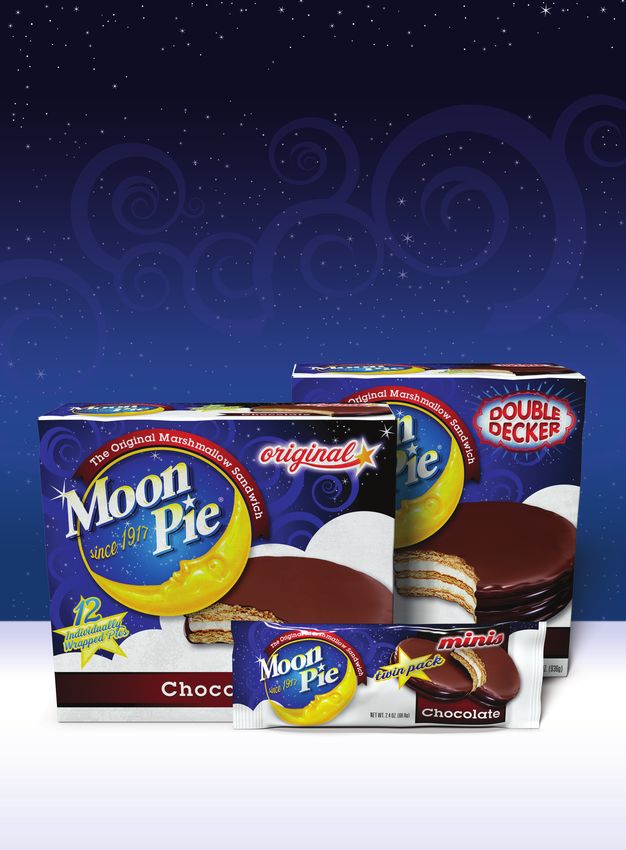
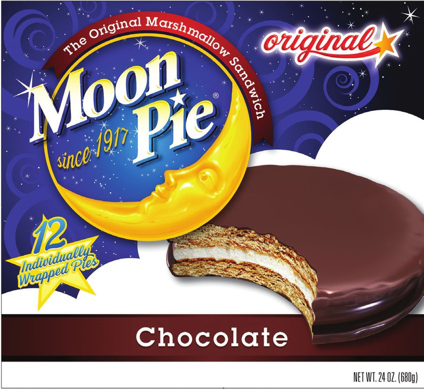
ate a fabulously fresh look for Chattanooga Bak- A heavenly new look
ery’s No. 1 selling product—MoonPie Minis—that To differentiate MoonPie Minis on shelf, its pack-
plays up the brand’s heritage in an authentic way. aging was redesigned with a darker shade of blue
MoonPie has plenty of heritage to play up. The than its competitors. Light-blue swirls represent
sandwich was invented in 1917, when Earl Mitch- the fluffy texture of marshmallow while adding
ell, Sr., saw a need for a substantial between-meal depth to the graphic; small white stars complete
snack for local coal miners on the job. Mitchell was the night-sky feel. “We love how the new packaging
inspired by his bakery employees, who made their celebrates the night sky, overtly plays up the ‘moon’
own snacks by dipping graham cookies into marsh- part of MoonPie, and also transforms the white—
mallow. The company added another graham which holds big brand equity for us—into a fluffy
cookie and a generous chocolate coating to the rec- cloud,” says Johnston.
ipe, and the MoonPie was born. Over the years it The changes to the logo embody the cosmic
became a strong symbol of the Southern working- emphasis as well (see sidebar, page 26). And the
PACKAGEDESIGNMAG.COM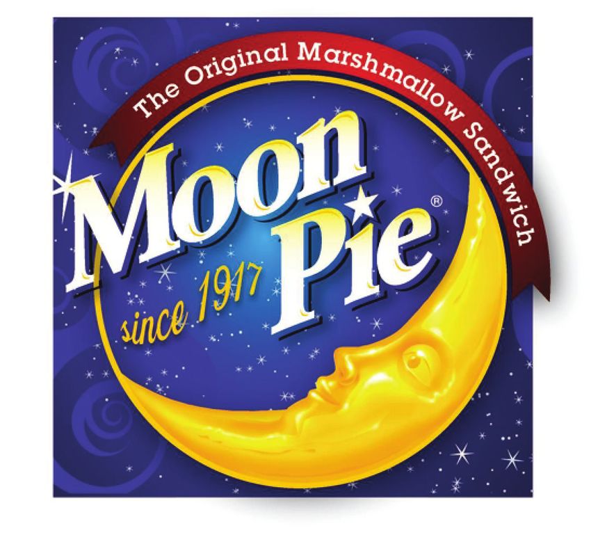
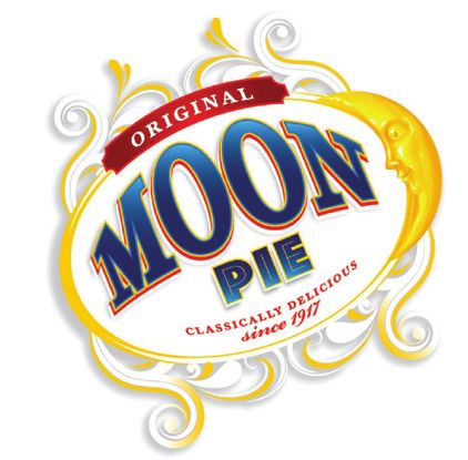
u                                                         A COSMIC UPGRADE

                                                                                       1   The new brand mark plays up the brand’s heri-
                                                                                           tage while keeping a sense of whimsy. The

                                                                           v               descriptor “since 1917” was given a fun, wavy
                                                                                           type treatment, and a “ting” was added to the
                                                                                           “M” in the upper left corner of the brand mark.

                                                                                       2   Each size has a distinctive callout in high-
                                                                                           contrast red type. The Original’s callout (shown
                                                                           w               here) has a nostalgic feel with elegant script and
                                                                                           a playful star. The Minis’ lettering is tracked
                                                                                           tightly, reinforcing the idea of small and com-
                                                                                           pact, while the brawny shape of DoubleDecker’s
                                                                                           bulging type and red outline conveys the idea of
                                                                           x               two layers of gooey goodness in each snack.

                                                                                       3   The rich, new color palette distinguishes itself
                                                                                           from MoonPie’s competitors. It also reinforces
                                                                                           the MoonPie brand with its night-sky imagery.

                                                                                       4   Digital renderings of MoonPie sandwiches bet-
                                                                                           ter convey the taste and textures of the snack’s
                                                                                           rich coating, delicate graham cookies, and
                                                                                           creamy marshmallow filling.

BEFORE

                                                                    u
                                                                                       1   The previous brand mark had the word MoonPie
                                                                                           on one line.
                                                                v                      2   A large, primarily white block is the dominant
                                                                                           color treatment for this package.

                                                                                       3   The sandwich photo faithfully depicts the prod-
                                                                                           uct inside the package but is less effective at
                                                                    w                      conveying the snack’s taste attributes.

                                                                                       4   Despite its large type, the size designation gets
                                                                                           lost in a sea of white.

                    x
             product imagery represents a strong departure from         So the agency suggested using high-end digital
             how Chattanooga Bakery used to display its Moon-       illustration versus photography for the product
             Pie sandwiches on pack.                                shot. “Digital rendering captures the highlights
                  “The new beauty shot is probably the thing we     and the appetite appeal better than photography
             had to be sold on most,” says Johnston. “We’ve         could ever do,” says Terri Goldstein, founder
             always focused on making the product photo very        and principal.
             literal, very true.” But The Goldstein Group               The resulting illustration, says Johnston, “has
             insisted that merely showing the consumer what’s       unbelievable taste appeal.” There’s also a practical
             inside the package wasn’t enough. The image has to     benefit. “From a printing standpoint, a digital ren-
             convey the textures of the pie’s rich coating, crum-   dering wins because it prints clearly and consis-
             bly graham cookies, and light marshmallow filling.     tently,” he adds.

JANUARY/FEBRUARY 2012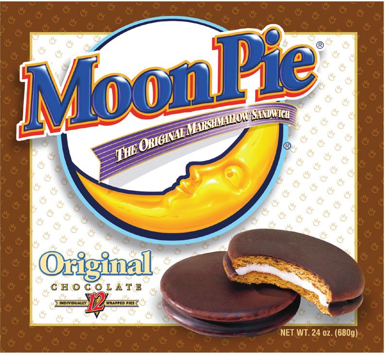
Made in the U.S.A.
The new design is printed by Southern Champion
Tray, LP, on recycled 0.020-pt. clay-coated back-
board for the cartons and trays, and by The Robi-
nette Company on 80-gauge metalized
polypropylene film for the twin-pack wrappers.
Both package converters are U.S.-based companies.
“We use 100% American packaging vendors,”
Johnston says. “As an iconic American brand, that’s
not negotiable. And why look anywhere else?”
Johnston has been pleased with his vendors’ costs,
quality, and service.
The original design was set up to print in both
process and spot colors. Johnston hired a free-
lancer to convert the design into a pure CMYK job,
which would negate recurring spot-color printing
costs for MoonPie Minis cartons or trays. The
twin-pack wrappers are reverse-printed with nine
colors, including a PMS 2728 blue, on a servo-
driven press. A clear polypropylene layer is printed
and then laminated to a metalized layer. The
results are twin-pack wrappers so vibrantly colored
that they virtually command a shopper’s attention.
The finished multi-layer film also provides excel-
lent barrier properties, which increase shelf life.
Not that it’s needed. “In our chain-wide distribu-
tion at Cracker Barrel, sales of the Minis in the new
packaging have really picked up,” Johnston says. “It
looks like we’re heading for a double-digit lift.”
Ecstatic with the results, Chattanooga Bakery
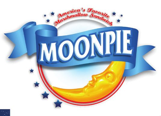
LA BELLA LUNA plans to use the new design to help refresh packag-
The brand mark redesign was carefully considered ing for the entire MoonPie product line. The Gold-
to play up the night-sky theme while retaining stein Group has already adapted the design for the
brand recognition. Several iterations were devel- other two MoonPie sizes, and the new packaging
oped, each with a different focus on nostalgia, will start hitting store shelves in the second quarter
whimsy, and indulgence. of 2012. PD
Ultimately, the logo that prevailed (top) includes
a brand name that’s now on two lines versus its For articles on similar topics, visit the Food channel
previous treatment as one continuous word. on PackageDesignMag.com.
“Stacking the words ‘Moon’ and ‘Pie’ draws more
attention to the word ‘Moon’ and makes that part
of our name unforgettable,” says Tory Johnston,
vice president of marketing. Dotting the “i” with a
star, he adds, plays up the nostalgia and reinforces
the night-sky theme, while the prominent descrip-
tor “since 1917” spotlights the brand heritage.
FOR MORE INFORMATION, VISIT
Wrapped around the top of the brand mark is a red The Goldstein Group, www.thegoldsteingroup.net
banner with the MoonPie’s longtime tagline, “The Southern Champion Tray, LP, www.sctray.com
Original Marshmallow Sandwich,” in white type. The Robinette Company, www.therobinetteco.com
JANUARY/FEBRUARY 2012
You can also read