THE EARTHBORN
 COLOUR GUIDE
←
→
Page content transcription
If your browser does not render page correctly, please read the page content below
THE EARTHBORN COLOUR GUIDE
Our simple guide to Earthborn Colours The colour wheel
The colour wheel is a tool used by artists and
At Earthborn we believe that paint has the ability to transform designers to help visualise the relationship
our spaces for the better... between different colours, and is a useful guide
when selecting a colour palette for a room for a
Not only are our paints eco friendly and virtually VOC free* - with no nasty harmonious scheme.
paint smells or harmful emissions - a beautiful dose of our uniquely formulated
Usually a colour wheel shows three main colour groups. These are primary
colour can also improve your surroundings and even uplift your mood.
colours, which are colours that cannot be made by mixing other colours
But if you’re looking for a together (red, blue and yellow), secondary colours, which are made by mixing
brand new colour scheme the primary colours (purple, green and orange) and tertiary colours. These are
and don’t know where colours made by mixing primary and secondary colours together, for example
to start, or even if you’ve turquoise is a mixture of green and blue.
chosen your wall colour but
are stuck on what to put Earthborn shades are a complex mix of various colours. So when it comes
with it, help is at hand in this to using the colour wheel to select a scheme for your project, it helps to
simple guide to Earthborn understand that these bold shades represent the undertones of a paint colour.
colours. You may not go for primary red walls, for example, but your chosen paint
colour may contain warm red undertones.
Where to start
You can use the colour wheel to help you select a variety of colour palettes:
Thanks to social media,
Monochromatic colours
interiors magazines and
These are the light and dark tones of the
online influencers, access to
same (or very similar colour).
inspiration is at our fingertips.
Complementary colours
Pinterest is a great starting point for creating your own online moodboard;
At opposite sides of the colour wheel,
bringing together ideas that you like in one place. Another tip is to pick out a
these colours often work together
favourite piece artwork or fabric and carry across colours from there.
surprisingly well. Think green and pink,
Choosing a colour palette for example.
After pouring over colour cards and testing out sample pots, many of us start Analogous colours
with the main paint colour for a room. But doors, skirting boards, cornicing These sit side by side on the colour
and other architectural features often benefit from a multi-layered approach to wheel. An analogous colour scheme
create depth and interest. Not to mention the fifth wall, that’s the ceiling! might include yellow, green and blue,
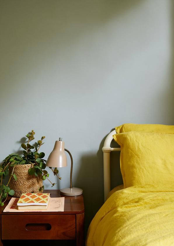
such as this children’s room which
*Volatile Organic Compounds, known as VOCs, are carbon based chemical compounds found in most paints.
VOCs are harmful to health, the environment and contribute to global warming. It is a legal requirement for paint
includes Hobby Wood, Milk Jug and
labelling to state the VOC content of the product. The VOC content in Earthborn paints is negligible so that’s why Sapling with bright yellow accents.
we label our paints as virtually VOC.
Neutral and beige paint colours                                                                                   Neutral and brown paint colours

                  “A warm, natural white; perfect                        “Straw is a perennial favourite of                         “Nearly white but not quite. An                       “Warm bread dough & all things wholesome.
                  for creating a soft yet clean                          ours because it is so easy to live                         elusive, enduring neutral that’s a                    Tom’s Bakery can appear more grey or
                  sanctuary.”                                            with, whichever room.”                                     crisper alternative to White Clay.”                   brown depending on the light.”
                                                                         Perfectly paired with:
                  Perfectly paired with:                                                                                            Perfectly paired with:                                Perfectly paired with:
   White Clay                                               Straw        Warm browns, reds and oranges such as        Flutterby                                            Tom’s Bakery
                  Any shade!                                             Freckle.                                                   Any shade!                                            Blues, reds and purples; Inglenook is perfect

                  “Cool, calm and collected. Up Up                       “A natural choice for living room, its                     “A more subtle white reminiscent                      “A fawny-tawny tone of brown is
                  Away is a relaxed off-white shade                      faintest green undertone lends Crocky                      of vintage lace, deriving its colour                  perfect for kicking off the boots
                  that’s at home in all spaces.”                         Road an easy quality.”                                     exclusively from white clays.”                        after a long, autumnal walk.”
                  Perfectly paired with:
                                                                         Perfectly paired with:                                     Perfectly paired with:                                Perfectly paired with:
   Up Up Away     Warm peach tones or earthy greens      Crocky Road                                                  Marbles                                              Muddy Boots
                  like Grassy.                                           Green, blue and aqua shades.                               Red based shades like Lady Bug                        Earthy tones or White Clay

                  “An enigmatic cream with a hint of                     “Deeper and richer than a standard                         “A warm, chalky off-white. Use                        “A soft and luxurious brown, this
                  green, Mittens is ideal for hallways                   beige, Little Rascal has a distinctly                      alone or as a fitting framework for                   trusty steed won’t let you down.”
                  and living rooms.”                                     soft, warming undertone.”                                  any colour scheme.”
                                                                         Perfectly paired with:                                     Perfectly paired with:
                  Perfectly paired with:                                                                                                                                                  Perfectly paired with:
     Mittens                                             Little Rascal   Warm, deep colours, as well as soft         Hopscotch      Warm greys such as Kissing Gate or     Rocky Horse
                  Olive greens like Secret Room.                         neutrals such as Marbles.                                  greens like Hobgoblin                                 Pink, peach or cream

Spotlight on Crocky Road                                                                                          Spotlight on Rocky Horse
Easy to live with in both modern and                                                                              An updated take on brown with a grey
traditional settings, the rich earthy tones of                                                                    undertone, Rocky Horse is perfect with
Crocky Road show off retro and architectural                                                                      warm toned pinks, peaches and cream.
features impeccably.                                                                                              Use as an accent colour, on furniture or all
                                                                                                                  over walls to create a cosy feel.
As it’s not too affected by light, Crocky Road
is a consistent colour that could easily take                                                                     The velvety hues of Rocky Horse are
you through all areas of the home. While it                                                                       reminiscent of Hollywood glamour; think
works beautifully with neutrals, it’s ideal for                                                                   gold accessories, smoked glass and
contrasting with brighter home accessories                                                                        marble. However, it works just as beautifully
and especially when paired with unexpected                                                                        in a pared back scheme, mixed with
shades like Milk Jug.                                                                                             natural textures and neutral colours.

                                       Mittens                                                                                                         Paw Print

        Crocky Road                   Milk Jug                                                                            Rocky Horse                    Piglet
Neutral and grey paint colours                                                                                                    Grey paint colours

                    “White with subtle grey undertones;                       “Another versatile, stable colour                                       “With its timeless appeal, Tick-Tock                         “Could this be the perfect grey?
                    for grown up spaces in need of a                          that combines a number of tones,                                        offers (in equal measure) warmth,                            Not too light, not too dark, Kissing
                    calming effect.”                                          creating a complex, soft beige.”                                        freshness, light and shade.”                                 Gate is invitingly soft and warm.”
                    Perfectly paired with:                                    Perfectly paired with:                                                  Perfectly paired with:
                                                                                                                                                                                                                   Perfectly paired with:
     St John        Most shades as a versatile neutral,        Donkey Ride    Warm browns and neutrals; think Hopscotch               Tick-Tock       Pastel yellows like Jemima or deep            Kissing Gate
                    especially blues & greens.                                or Muddy Boots.                                                         greens like Hobgoblin.                                       Browns, neutrals and charcoal greys.

                        “A sharper white with the faintest                    “A calm, nostalgic neutral more sophisticated                               “A cool pastel grey with blue-ish                        “Hippo Hooray for this honest, well
                        hint of violet, which works                           than a true grey.”                                                          undertones, Tuffet is a truly versatile                  balanced grey. A perfect accent colour,
                        beautifully alongside muted tones.”                                                                                               shade.”                                                  it’s ideal on woodwork and trims.”
                    Perfectly paired with:                                    Perfectly paired with:                                                                                                               Perfectly paired with:
                                                                                                                                                      Perfectly paired with:
  Wood Smoke        Whites, browns and earthy, soft            Cat’s Cradle   Rich colours with a warm undertone, try                   Tuffet                                                      Hippo Hooray   Bright colours like Delilah or Daisy Chain,
                    greens like Sunday Stroll.                                Trumpet for a luxurious pairing.                                        Blues, greens and pastel tones.                              for an unexpected twist.

                        “Highly versatile, this soft neutral                  “Raise your hat to this traditional, honest grey.                           “You’ll never forget this solid and                      “Create your own cocoon. Watch bold colours
                        will transform any room into a                        More versatile than at first sight appears;                                 safe grey! A flattering mid grey,                        sing against a backdrop of this deep charcoal
                        light, warm yet cosy space.”                          works well with natural textures and finishes.”                             best paired with earthy shades.”                         grey, or use as an accent to soft neutrals.”
                                                                              Perfectly paired with:                                                  Perfectly paired with:                                       Perfectly paired with:
                    Perfectly paired with:
  Feather Pillow                                                  Trilby      Soft neutrals like Feather Pillow, or warm,               Nellie        Rich, deep colours like Flower Pot             Hidey-Hole    Brights, pastels or neutral tones; it’s a
                    White Clay and Humpty Dumpty.                             grey-greens like Gregory’s Den.                                         or Trilby.                                                   surprising all-rounder.

Spotlight on Cat’s Cradle                                                                                                         Spotlight on Kissing Gate
At first sight Cat’s Cradle appears a classic light grey, but look a little closer and you’ll see its                             A supremely flattering grey, whilst
brown-ish undertone is extremely flattering.                                                                                      Kissing Gate adds a definite dose of
                                                                                                                                  gentle colour, it’s still light and neutral
                                                                                                                                  enough not to impose.

                                                                                                                                  It’s dreamy when paired with neutrals,
                                       Little Rascal                                                                              browns and charcoal greys - especially
                                                                                                                                  when combined with crumpled velvets
                                                                                                                                  and natural linens.

                                                                                                                                  Try it in a relaxed living space or cosy
         Cat’s Cradle                      Trilby                                                                                 bedroom with soft green accents.
A grey that would work well in
north facing rooms because of
its warm undertone, Cat’s Cradle
works particularly well paired with                                                                                                                                        Gregory’s
                                                                                                                                                                             Den
warm neutrals and off-blacks for a
contemporary look; Little Rascal and
Trilby are ideal.

Or try it with rich tones like Trumpet for                                                                                                                                  Wood
                                                                                                                                           Kissing Gate                     Smoke
a luxurious combination.
Green paint colours                                                                                                           Green paint colours

                     “A soft and soothing colour, Seagull                 “An elegant grey-green with a                                         “As the name suggests, this very                     “A light, breezy green. Like its
                     is a pale grey with a hint of green;                 slightly blue undertone inspired by                                   soft green-white gives a fresh, airy                 namesake, this shade subtly alters in
                     think open spaces and freedom.”                      misty, mountainous landscapes.”                                       feel in all rooms.”                                  the changing light, to a beautiful effect.”
                     Perfectly paired with:                                                                                                     Perfectly paired with:
                                                                          Perfectly paired with:                                                                                                     Perfectly paired with:
     Seagull         Grey-greens like Grassy or keep it       Grassy                                                               Fresh Air    Other greens where it acts as an       Grasshopper
                     simple with White Clay.                              Warm, off-whites and earthy shades.                                   alternative to white.                                Soft neutrals like Ballet Shoe or Flutterby.

                     “For those who want to escape,                       “Create a calming retreat away from it all with                       “Oh Fiddletsicks! Don’t despair…                     “You’ll never be on a sticky wicket with
                     this is a perfect backdrop with its                  this enveloping shade of green. As at home                            find sunshine in this finely tuned                   this genuine all rounder! A beautifully
                     oh-so-subtle mellow greenish grey.”                  with soft neutrals as it is with bolder colours.”                     pale green.”                                         soft, summery green with a playful feel.”
                                                                          Perfectly paired with:                                                Perfectly paired with:
                     Perfectly paired with:                                                                                                                                                          Perfectly paired with:
  Gregory’s Den                                             Secret Room   Brownish greys and rich colours like                   Fiddlesticks   Soft pinks and whites for a              Cricket
                     Pinks, peaches and greys.                            Freckle.                                                              contemporary feel.                                   Brown based neutrals like Feather Pillow.

                     “Easy like Sunday morning! A                         “An easy-going green with a subtle hint of                            “A mellow and creamy green,                          “A bold woodland green, ever ready to help
                     relaxed green with calming grey                      blue, the deep tones of Hobgoblin help create                         Sapling is the perfect pastel for a                  bring the outside in, Hobby Wood is deep,
                     undertones.”                                         relaxed and positive spaces.”                                         calming living room or bedroom.”                     dramatic without being too overbearing.”

                     Perfectly paired with:                               Perfectly paired with:                                                Perfectly paired with:                               Perfectly paired with:
  Sunday Stroll                                              Hobgoblin                                                             Sapling                                             Hobby Wood
                     Warm neutrals and richer tones.                      Greys, beiges and warm yellows.                                       Lots of colours, especially greys.                   Lots of colours as a striking accent colour.

Spotlight on Hobgoblin                                                                                                        Spotlight on Grasshopper
An Earthborn favourite! Surprisingly                                                                                          A yellow-based green, Grasshopper
versatile, Hobgoblin sits well with so                                                                                        brings a light, fresh touch to living
many different colours, especially rich                                                                                       spaces. As a feature colour, it works
yellows and oranges (such as Humpty                                                                                           wonderfully with warmer neutral shades
Dumpty or Flower Pot), as well as warm                                                                                        and is ideal in south facing rooms.
neutrals like Marbles.
                                                                                                                              In traditional styles of decor,
Due to it’s rich, slightly blue-ish                                                                                           Grasshopper complements natural
undertone, Hobgoblin is highly flattering                                                                                     woodwork, woven textures and
in both north and south facing lights,                                                                                        greenery. Whilst in children’s spaces
and would work just as well in a                                                                                              it adds a playful feel especially when
contemporary home as it would in a                                                                                            paired with yellows, blues and greens.
traditional style of decor.

                                         Humpty
                                         Dumpty                                                                                Fiddlesticks

         Hobgoblin                       Marbles                                                                                Flutterby               Grasshopper
Blue paint colours                                                                                                                Blue paint colours

                     “A clean, cool grey which works                        “A light, contemporary turquoise, which works                             “This pale blue creates cotton-wool-                 “Create a comfortable, easy-going feeling
                     well with blues and greens to                          well with both punchier colours or tonally                                soft, calming spaces, especially                     with this true Earthborn favourite. Polka Dot
                     provide a sharp contrast.”                             similar shades for a coastal feel.”                                       suited to bedrooms & bathrooms.”                     is a sophisticated yet versatile shade.”
                     Perfectly paired with:                                 Perfectly paired with:                                                    Perfectly paired with:                               Perfectly paired with:
    Whisker          Deep blues, greys and greens like          Milk Jug    Pale yellows, deep greens and soft, natural               Bo Peep         Other mid-blues such as Dorothy or     Polka Dot     Lots of shades, especially dark charcoal or
                     Nellie or Polka Dot.                                   shades.                                                                   natural, light beiges like Mittens.                  light lemon colour palettes.

                     “Somewhere between grey                                “This colour instantly transports the mind to                             “More subtle than a true blue,                       “Reminiscent of still ocean waters,
                     & blue, the enigmatic nature                           the bright, clear waters of the Caribbean….or                             Gingham brings Scandinavian style                    this warm denim shade has a casual
                     of Teacup maintains its allure                         maybe to Tooting Bec Lido!”                                               and serenity to a room.”                             charm.”
                     regardless of time.”
                                                                            Perfectly paired with:                                                    Perfectly paired with:
                     Perfectly paired with:                                                                                                                                                                Perfectly paired with:
     Teacup                                                     The Lido    Soft whites or warm, rich colours as a fun                Gingham         Warm greys and off-whites like          Skipper
                     Cool lemons and aqua colours.                          accent.                                                                   Hopscotch and Kissing Gate.                          Cream and beige or with brighter colours.

                     “Captures the colour of                                “With its roots firmly in nature, this rich, lagoon                       “A true and honest blue. Well                        “Stand to attention with this deep midnight
                     shimmering water which makes                           blue is guaranteed to add vibrancy and                                    suited to rooms with little ones, or                 blue. Let your furniture make a statement or
                     this a perennial favourite.”                           sophistication to any space.”                                             in more grown up spaces.”                            be bold and paint out your whole room.”
                     Perfectly paired with:
                                                                            Perfectly paired with:                                                    Perfectly paired with:                               Perfectly paired with:
    Shallows         Brighter colours for a playful feel, or   Bobble Hat                                                             Dorothy                                                Toy Soldier
                     earthy shades for an unexpected twist.                 Jewel tones, pale greys or warm neutrals.                                 Creams, beiges and deeper blues.                     Both neutrals and brights as a bold accent.

Spotlight on Bobble Hat                                                                                                           Spotlight on Skipper
Bobble Hat suits lots of styles of décor,                                                                                         Aye aye captain! This versatile, mid-toned blue is as absorbing as the sea, ideal in sociable
but is particularly striking and beautiful                                                                                        areas of the home. From living rooms to dining rooms to kitchens, it’s a fresh, enigmatic shade
in period properties, alongside vintage                                                                                           designed to add vibrancy to a space.
touches and architectural details.
It’s also great in small spaces like a
downstairs W.C. or a petite guest room,
where you can afford to be a little braver                                                                                                                             Freckle
with your colour choices.

Pair with rich blues and golds for a
luxurious feel, or brown-based neutrals
for a more contemporary feel.                                                                                                               Skipper                  Up Up Away

                                                                                                                                  For a retro, fun feel, Skipper
                                                                                                                                  complements pops of bright colour like
                                                                                                                                  warm oranges and mustards.
                                      Tom’s Bakery
                                                                                                                                  Or create a little nautical impact by
                                                                                                                                  pairing it with natural wood, beige tones
                                                                                                                                  and soft creams like Up Up Away, for a
                                                                                                                                  relaxed look that’s easy to live with.
        Bobble Hat                     Toy Soldier
Yellow and cream paint colours                                                                                               Peach and orange paint colours

                  “Yellow for those that don’t like                       “A luxurious cream with complex undertones,                         “If you’re unsure, Maybe Maggie is                      “Unlike its namesake, safe on any wall! This
                  yellow! A sweet treat for light and                     Vanilla is an Earthborn classic suitable for any                    the colour to go for? A warm neutral                    colour is derived directly from the ochre
                  fresh spaces.”                                          room.”                                                              tone, at home in any room.”                             clays it’s made from.”
                                                                                                                                              Perfectly paired with:                                  Perfectly paired with:
                  Perfectly paired with:                                  Perfectly paired with:
     Posset                                                   Vanilla                                                          Maybe Maggie   Warm colours including strong           Humpty Dumpty   A variety of shades, particularly Hobgoblin or
                  Lush greens like Hobby Wood.                            Yellows, greens and warm earthy shades.                             shades like Trilby or Flower Pot.                       Tom’s Bakery.

                  “We’ve captured the feeling of                          “A youthful, natural yellow with a clean, fresh                     “Is it a pink or a cream? A colour                      “This easy going, subdued orange
                  sunlight on sand to create our                          feel, making it ideal for adding a touch of                         with hidden complexity, ideally                         obtains its character from the ochre and
                  own take on cream.”                                     sunlight to hallways and bedrooms.”                                 suited for a relaxing environment.”                     terracotta clays that it is blended from.”
                  Perfectly paired with:                                                                                                                                                              Perfectly paired with:
                                                                          Perfectly paired with:                                              Perfectly paired with:
  Sandy Castle    Greens or greys, next to which it          Jemima                                                             Ballet Shoe                                              Freckle      So many shades from blues and greys, to
                  reads as a white.                                       Warm blues and greys like Bo Peep.                                  Soft greens and greys.                                  warm red or neutrals.

                      “A little stronger yellow than                      “Inspired by the natural yellow of wild flowers,                    “A gentle tone, the uplifting feel of                   “A Mediterranean terracotta that appears
                      Posset and a classic for children’s                 guaranteed to make an impact in even the                            Peach Baby is highly versatile and                      warm and vibrant in south facing rooms or
                      bedrooms and nurseries.”                            darkest corner.”                                                    can work wonders in all rooms.”                         deep and dramatic in north facing light.”
                  Perfectly paired with:                                                                                                                                                              Perfectly paired with:
                                                                          Perfectly paired with:                                              Perfectly paired with:                                  Rich shades like Freckle, with which it shares its
    Lemony        Bold, bright colours like Delilah or      Daisy Chain                                                         Peach Baby                                              Flower Pot
                  Bobble Hat.                                             White or grey as an accent colour.                                  Earthy green, deep blue or charcoal.                    clay heritage, or lighter neutrals to make it pop.

Spotlight on Daisy Chain                                                                                                     Spotlight on Peach Baby
A vibrant shade of yellow, Daisy Chain will                                                                                  Peaceful and uplifting, Peach Baby gently
bring a cheerful dose of sunshine to any                                                                                     nods at the trend for pinky-plaster colour
scheme. It’s a bright pop of colour that works                                                                               whilst maintaining a classic, timeless
well for colour blocking, used as an accent                                                                                  appeal. Like many Earthborn shades,
such as a door, or on furniture.                                                                                             Peach Baby is surprisingly versatile and can
                                                                                                                             be paired with a variety of colours from our
While yellow and white are a classic pairing                                                                                 range including off-whites and neutrals.
(a great combination for kitchens!) Daisy
Chain also works brilliantly with grey. We love                                                                              As part of a modern, Scandi inspired
the combination of Daisy Chain and true-grey                                                                                 scheme, it’s an easy backdrop to earthy
Hippo Hooray. This unexpected partnership                                                                                    greens like Secret Room alongside striking
adds a little something extra to this fun                                                                                    charcoal accents of Hidey-Hole, as shown
children’s bedroom!                                                                                                          in our kitchen colour palette.

                                         Hippo
                                         Hooray                                                                              Secret Room

                                                                                                                               Maybe
        Daisy Chain                      St John                                                                               Maggie                  Peach Baby
Pink and red paint colours Purple paint colours
“A delicate colour, this soft white “Delilah, what a beauty you are! This “A simple, pale neutral lilac-grey. “A warm tone ideal for spaces that take
has a hint of pink for a playful edge.” flattering hue sits between orange and pink, Cool and unobtrusive, ideal for their inspiration from nature. ‘Mushroom’
and works fabulously in smaller spaces.” creating a relaxing space.” for grown ups.”
Perfectly paired with:
Perfectly paired with:
Pastel shades for a pretty colour Perfectly paired with: Perfectly paired with:
Piglet scheme, or with bolder colours as an Delilah Eyebright Purples like Trumpet where it reads Paw Print
alternative to white. Minty greens, grey and white. as a white alternative. Warm, off-whites and earthy neutral colours.
“Sweet pink icing! Ideal for creating “Moulin Rouge inspired Can-Can gives a “The undertone of violet in this pale “A sophisticated combination of taupe,
indulgent, feminine spaces.” good kick of pinky red colour to your décor.” grey gives it a clean edge; ideal for grey and lilac. A complex shade that
modern kitchens and bathrooms.” works well with natural finishes.”
Perfectly paired with: Perfectly paired with: Perfectly paired with:
Perfectly paired with:
Cupcake Tuffet and Rosie Posie for a heavenly Can-Can Warm colours including cream, orange and Bugle Cool colours and bold shades. Inglenook
combination. brown-toned greys like Cat’s Cradle. Unexpected yet striking with Can-Can. Eyebright, Lady Bug or Hidey-Hole.
“A vintage pink with dusky rose “A richly toned burgundy, this dramatic, jewel “Our homage to John Singer “Blow your own Trumpet with this deep,
undertones, ideal with faded colour would impress in both contemporary Sargent’s famous painting. A bluey purple. Its dark yet chalky undertones
florals and soft linens.” kitchens and stately drawing rooms.” subtle shade of pink, lilac & grey will jazz up any space.”
blended to surprising depth.”
Perfectly paired with: Perfectly paired with:
Perfectly paired with: Perfectly paired with:
Rosie Posie Lady Bug Both warm and cool tones, including Lily Lily Rose Trumpet Other violet and pink tones like Piglet, but also
Greys and whites. Peach Baby and Bugle. Tonal greys, pinks and purples. warmer, richer colours.
Spotlight on Rosie Posie Spotlight on Paw Print
A grown up pink that’s an obvious choice for romantic bedrooms, Rosie Posie also works One of our most beloved neutral shades, Paw Print is a pale mushroom tone that’s been a
surprisingly well in living rooms, hallways and bathrooms because it is so easy to live with. consistently best-selling paint colour ever since it first graced our colour card. This beautifully
warming colour is light enough not to impose, with a gentle taupe hue that flatters any room.
A popular shade of pink, it pairs
perfectly with white for a simple,
pastel palette. Or for a fresh, up to
date look, pair this delicious pink with Grassy
minty greens and greys like Sapling or
Whisker. For high impact, use with the
deep, dark Hobby Wood or coral tones
of Delilah. Then just add some metallic
Feather
accessories and fresh greenery for a Paw Print Pillow
contemporary look!
A complex shade, Paw Print carefully
balances pinkish-red undertones with a
natural beige-brown, resulting in a colour
that subtly alters depending on the time of
Delilah
day and direction of light.
As an alternative to grey, it works well with
earthy colours, off-whites and and soft
greens; Grassy and Feather Pillow are a
Rosie Posie Whisker
perfectly mellow combination.
For technical data, FAQs and
 lots of colour inspiration head to
earthbornpaints.co.uk where you
 will also find our online shop and
      local stockist information.
You can also read